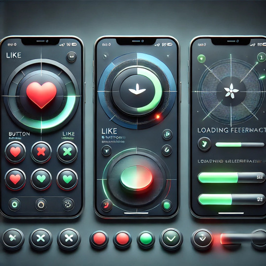
#Background Color Change JavaScript
Explore tagged Tumblr posts
Visit Tumblr Blog
Explore Tumblr blogs with no restrictions, modern design and the best experience.
Last Seen Tumblr Blogs


Fun Fact
Average visit duration of Tumblr.com is 10 mins and 25 secs.
Text
Background Color Change JavaScript
#Background Color Change JavaScript#codenewbies#frontenddevelopment#html css#html5 css3#javascript project#javascript snippets#webdesign
1 note
·
View note
Text


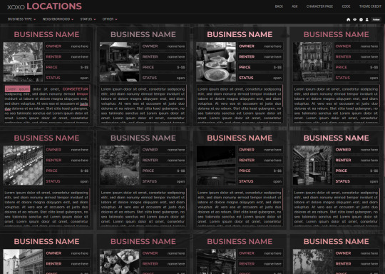
XOXO - RPG THEME SET - 1k SPECIAL !!!
This theme set is completely free. It is a special thank you for 1k followers. Please support me and my work by liking and reblogging this post!
[ BLOG THEME INFORMATION ]
Option between 400px, 450px, 500px and 540px posts.
Custom Body Fonts and Body Font sizes (11px - 13px)
Two Custom Header Links
Two Dropdown Links with unlimited link options
Dropdown Links are optional
Fully supports NPF (beta editor) posts.
The theme adjusts to different screen sizes.
Visible Source Link & Scroll to top button.
A lot of the design can be changed in the editing panel. Everything else is explained in the code.
Sidebar Boxes for: Welcome, Events, Admins, Quick Links and Schedule
Quick RPG Information on the header (Member & Application count, short rp information and Plot description)
Disclaimer and further blog information in the footer.
Sticky Sidebar
Footer can be turned off.
[ LOCATION PAGE ]
The Page does not contain any javascript (100% java free)
Comes in 2 versions (with and without filters)
Location picture sizes are 130 x 130. They will resize automatically.
Option for a background picture.
3 Custom Links
All colors can be easily edited on top of the css code
The theme will resize to different screen sizes.
Custom accent colors (explanation in the code)
[ CHARACTER PAGE ]
The Page does not contain any javascript (100% java free)
Comes in 2 versions (with and without filters)
Character picture sizes are 155 x 150. They will resize automatically.
Option for a background picture.
3 Custom Links
All colors can be easily edited on top of the css code
The theme will resize to different screen sizes.
Character boxes have custom links.
Custom accent colors (explanation in the code)
[ GUIDELINES ]
Do not claim as your own.
Do not remove the credit!
Do not use as a base code or take parts of this code for your theme.
Feel free to edit as much as you want!
All credits are mentioned in the code!
Static Blog Theme Preview + Page Preview Links + All Codes Location Page Preview + All Codes Character Page Preview + All Codes All codes (without preview)
#rpg theme#rp theme#free theme#non contained theme#character page#location page#page theme#rph#rpc#rp resources
838 notes
·
View notes
Text
dark flat ao3 skin v2.0


1. log in and go HERE
2. click button "Create Site Skin"
3. name it whatever
4. copy/paste code from below in "CSS" field
5. "Submit"
6. make sure you clicked button "Use" HERE in the list of skins
7. change it as you like
CSS:
outer .region,
footer .group,
.post fieldset fieldset, fieldset fieldset { background: none; }
body, .group, .group .group, .region, .flash, fieldset, fieldset fieldset ul, form dl, textarea,
main .verbose legend,
.verbose fieldset, .notice, ul.notes, input, textarea, table, th, td:hover, tr:hover, .symbol .question:hover,
modal,
.ui-sortable li, .required .autocomplete, .autocomplete .notice, .system .intro, .comment_error, .kudos_error, div.dynamic, .dynamic form,
ui-datepicker-div,
.ui-datepicker table { color: #eee; border-color: #151619; outline: #111; box-shadow: none; }
form .notice, form ul.notes { box-shadow: none; }
workskin {
font-size: 1.2em; margin: auto; padding: 0 0.25em; max-width: 60em; overflow-x: auto; overflow-y: hidden; position: relative; }
.actions a, .actions a:link, .action, .action:link, .actions input, input[type="submit"], button, .current, .actions label { border-radius: 0; }
header ul.primary,
outer #footer,
.toggled form { background: #1a1b1f; }
header .primary {
background: none; padding: 10px 0; width: 100%; box-shadow: none; }
fieldset, form dl, fieldset dl dl, fieldset fieldset fieldset, fieldset fieldset dl dl, dd.hideme, form blockquote.userstuff { background: #1a1b1f !important; }
.user.navigation.actions>li { margin-top: 0.3em !important; }
header .menu,
small_login {
border: 1px solid #1f2126; box-shadow: none; padding: 0; }
.tags.group, .more.group { margin-top: 0.6em; }
header .actions a:hover,
header .actions a:focus,
header .dropdown:hover a,
header .open a,
header .menu,
small_login,
.group.listbox, fieldset fieldset.listbox, form blockquote.userstuff, input:focus, textarea:focus, li.relationships a, .group.listbox .index, .dashboard fieldset fieldset.listbox .index,
dashboard a:hover,
th,
dashboard .secondary,
.secondary, .thread .even, .system .tweet_list li, .ui-datepicker tr:hover { background: #151619; }
.userstuff p { text-align: justify; margin: 1.286em auto; padding: 0; line-height: 1.5; }
.tags.commas { margin: 1.5em auto; }
header .dropdown .menu a:hover,
header .dropdown .menu a:focus,
.splash .favorite li:nth-of-type(odd) a, .ui-datepicker td:hover,
tos_prompt .heading,
tos_prompt [disabled] {
background: #22262a; }
outer,
.javascript, .statistics .index li:nth-of-type(even),
tos_prompt,
.announcement input[type="submit"] { background: #151619; }
.filters .submit input { border: 1px solid #202227; background-color: #202227; height: 110%; margin: 1em 0; min-height: 2.286em; padding-left: 0; padding-right: 0; text-align: center; white-space: normal; }
header ul.primary,
footer,
dashboard ul,
dl.meta, .group.listbox, fieldset fieldset.listbox,
main li.blurb,
form blockquote.userstuff, div.comment, li.comment, .toggled form, form dl dt, form.single fieldset,
inner .module .heading,
.bookmark .status span, .splash .news li, .filters .group dt.bookmarker { border-color: #1a1b1f; }
.work.navigation.actions { width: 100%; }
dl.meta { border: none; }
.splash .news li { padding: 1em; }
fieldset, form dl, fieldset dl dl, fieldset fieldset fieldset, fieldset fieldset dl dl, dd.hideme, form blockquote.userstuff { padding: 1em; }
.logged-in .splash>.module { width: 100% !important; }
dl.meta { max-width: 75em; margin: auto; clear: right; padding: 2em 1.75em; position: relative; overflow: hidden; }
.group.listbox, fieldset fieldset.listbox,
main li.blurb,
.wrapper,
dashboard .secondary,
.secondary, form blockquote.userstuff, .thread .comment, .toggled form { box-shadow: none; }
dashboard .current,
.actions a:active,
outer .current,
a.current, .current a:visited, span.unread, .replied, span.claimed, dl.index dd, .own, .draft, .draft .unread, .child, .unwrangled, .unreviewed, .ui-sortable li:hover { background: #1a1b1f; border-color: #1f2126; }
greeting .menu {
right: 0; border: 1px solid #1f2126; box-shadow: none; }
select { background-color: #202227; color: #fff; border: 1px solid #202227; min-height: 3em; border-radius: 0; padding: 0 0.6em; }
input:focus, select:focus, textarea:focus { background: #202227; }
body, .toggled form, .dynamic form, .secondary, .dropdown { background: #202227; color: #fff; margin: 0; padding: 0; }
footer a:hover,
footer a:focus,
.autocomplete .dropdown ul li:hover, .autocomplete .dropdown li.selected, a.tag:hover, .listbox .heading a.tag:visited:hover, .symbol .question, .qtip-content { background: #a7a7a7; color: #111; }
.splash .favorite li:nth-of-type(odd) a:hover, .splash .favorite li:nth-of-type(odd) a:focus { background: #a7a7a7; color: #111; }
header #greeting img,
header .heading a,
header .heading a:visited,
header .user a:hover,
header .user a:focus,
header fieldset,
header form,
header p,
dashboard a:hover,
.actions a:hover, .actions input:hover, .delete a, span.delete, span.unread, .replied, span.claimed, .draggable, .droppable, span.requested, a.work, .blurb h4 a:link, .blurb h4 img, .splash .module h3, .splash .browse li a:before, .required, .error, .comment_error, .kudos_error, a.cloud7, a.cloud8,
tos_prompt .heading {
color: #a7a7a7; }
header .menu li {
border-bottom: 1px solid #2c2c2c; margin: 0; text-align: left; }
greeting .icon,
dashboard,
dashboard.own,
.error, .comment_error, .kudos_error, .LV_invalid, .LV_invalid_field, input.LV_invalid_field:hover, input.LV_invalid_field:active, textarea.LV_invalid_field:hover, textarea.LV_invalid_field:active, .qtip-content { border-color: #151619; }
dashboard.own {
border: none; }
form.filters dl { margin-left: 0; margin-right: 0; }
.filters .expander:focus { outline: none; }
.filters .expander { padding: 0.45em 0 0.45em 14px; }
.filters .group dt.search, .filters .range dt { padding: 1.25em 0 0.4em 0; }
a.tag { border-bottom: 1px dotted !important; }
a, a:link, a.tag,
header a,
header a:visited,
header .primary .open a,
header .primary .dropdown:hover a,
header .primary .dropdown a:focus,
header #search input:focus,
header #search input:hover,
dashboard a,
dashboard span,
dashboard .current,
.heading, .group .heading, .filters dt a:hover { color: #fff; }
header .dropdown .menu a {
padding: .75em .5em .75em; }
header #search .text {
background: #151619 !important; border-radius: 0; margin: 0.2857em 0.429em; }
a:visited, .actions a:visited, .action a:link, .action a:visited, .listbox .heading a:visited, span.series .divider { color: #999; }
a:active, a:focus, button:focus { outline: none; }
.actions a, .actions a:link, .action, .action:link, .actions input, input[type="submit"], button, .current, .actions label,
header .actions a {
background: #23252a; border-color: #23252a; color: #eee; box-shadow: none; text-shadow: none; }
.actions a:hover, .actions input:hover,
dashboard a:hover,
.actions a:focus, .actions input:focus,
dashboard a:focus {
color: #fff; border-color: #101214; box-shadow: none; background-color: #101214; }
.actions a:active, .current, a.current, .current a:visited { color: #fff; background: #101214; border-color: #101214; box-shadow: none; }
.delete a, span.delete { box-shadow: none; }
ul.required-tags, .bookmark .status span, .blurb .icon { opacity: 0.9; border: 0; }
outer .group .heading,
header .actions a,
fieldset.listbox .heading, .userstuff .heading, .heading, .userstuff h2 { text-shadow: none; color: #fff; background: none; }
header .actions a,
fieldset fieldset, .mce-container button, .filters .expander { box-shadow: none; }
fieldset fieldset.listbox { outline: none; }
form dd.required { color: #eee; }
.mce-container input:focus { background: #F3EFEC; }
.announcement .userstuff a, .announcement .userstuff a:link, .announcement .userstuff a:visited:hover { color: #fff; }
a, a:link, a:visited:hover { color: #fff; text-decoration: none; }
.announcement .userstuff a:visited { color: #666; }
.announcement .userstuff a:hover, .announcement .userstuff a:focus { color: #999; }
.event.announcement .userstuff a, .filters .expander { color: #eee; }
form.verbose legend, .verbose form legend { background: #151619; }
.listbox li.blurb { box-shadow: none; background: #1a1b1f; }
li.blurb, fieldset, form dl { border: none; }
li.blurb, .blurb .blurb { display: block; position: relative; clear: left; padding: 1em 1.4em; overflow: visible; background: #1a1b1f; }
dashboard ul {
float: none; display: block; padding: 0.26em 0; text-align: right; position: relative; background: none; }
user-fandoms {
padding: 1.4em 0; background: #1a1b1f; }
.listbox .index { padding: 0.6em 0; }
.bookmark div.user { background-color: #151619; }
.bookmark dl.stats { margin-bottom: 1.5em; margin-top: 1.5em; }
.dashboard .own, .comment span.unreviewed { background: #1a1b1f; opacity: 1.0; }
.own, .draft, .draft .wrapper, .unread, .child, .unwrangled, .unreviewed { background: #1a1b1f; opacity: 0.95; }
.actions a, .actions a:link, .action, .action:link, .actions input, input[type="submit"], button, .current, .actions label { padding: 0.5em 1em; border-radius: 0; }
header {
margin: 0 0 3em; }
.tags.group, .more.group { padding: 0.6em; }
dashboard a,
dashboard span {
line-height: 2.2; padding: 0 0.5em; }
.listbox>.heading, .listbox .heading a:visited { margin-left: .6em; }
.listbox, fieldset fieldset.listbox { border: 1px solid #1a1b1f; margin: 0.5em auto; box-shadow: none; }
.reading .user { margin-top: 1.5em; padding-top: 0.5em; border-top: 1px solid #23252a !important; }
.comment .userstuff { background-color: #1a1b1f !important; }
input, textarea { box-shadow: none; background: #151619; padding: 0.4em; }
.filters .indicator:before { background: #404248; color: #aaa; display: inline-block; border: 1px solid #404248; margin-right: 0.25em; background-image: none; }
.filters [type="checkbox"]+.indicator:before { padding: 0 0.25em; border-radius: 2px; }
.filters [type="checkbox"]:checked+.indicator:before { background: #970000; color: #ffffff; background-image: none; }
.filters input:checked+.indicator:before { border-color: #1a1b1f; }
.filters input:checked+.indicator+span { font-weight: 500; }
.filters .exclude [type="checkbox"]:checked+.indicator:before { background: #970000; color: #ffffff; background-image: none; }
.filters [type="radio"]:checked+.indicator:before { background: #970000; background-image: none; }
ui-datepicker-div,
.ui-datepicker table { background: #1a1b1f; }
.ui-datepicker td { border: 1px solid #23252a; }
.notice, .comment_notice, .kudos_notice, ul.notes, .caution, .error, .comment_error, .kudos_error, .alert.flash { background: #2e3138; border: 1px solid #2e3138; margin: 0.6em auto; padding: 1em; box-shadow: none; border-radius: 0; }
.listbox .index { padding: 0.6em; box-shadow: none; }
dl.meta { max-width: 75em; background: #1a1b1f; margin-top: 1em; }
dl.index dd { background: #151619 !important; }
form.search input[type="text"] { border-top-color: #151619; background-color: #202227; padding: 0.45em 0.45em; border-radius: 0; }
modal {
background: #1a1b1f; border: 10px solid #1a1b1f; margin: 3% 0; max-width: 800px; min-width: 200px; padding-bottom: 44px; position: relative; text-align: left; width: 80%; z-index: 501; }
.post .meta dd ul li { display: block; padding-bottom: 0.6em; }
workskin {
font-size: 1.2em; max-width: 52em; }
div.comment, li.comment { padding: 0.6em; background: #1a1b1f !important; }
188 notes
·
View notes
Text
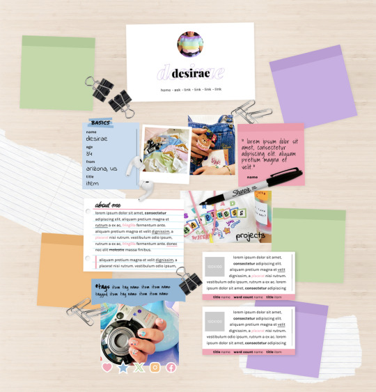
MEL: ABOUT PAGE BY ETHEREAL THEMES
View on payhip ($6.00), check out the preview or support me on patreon for more themes + pages, header templates, coloring psds and more every month!
About Page
Navigation: Home, ask + 4 links (room for more if needed)
**No Javascript Needed**
Color options for: background, links, all content boxes, five accents + more
Sections include:
Profile with avatar, name and links
Basics/info list
Sticky note quote
About me notecard
Tags links
Scrolling Project/WIPs cards
Social media sticker links
Images Include:
100x100 Avatar
170x170 Polaroid
Three additional images
Advanced HTML to edit colors and information as this is only available as an HTML page; box + table size changes not recommended. Let me know if you come across any issues.
81 notes
·
View notes
Note
hii i tried following that one forum post for a splash screen that you mentioned before in an ask, i didnt really understand it TT could you make a version for dummies? thank you!
Hi Anon,
Do you mean this ask? about this Forum post? I'll try to make it easier then, cause it mainly is some copy-pasting and some light editing.
The Splash Screen, more explanation
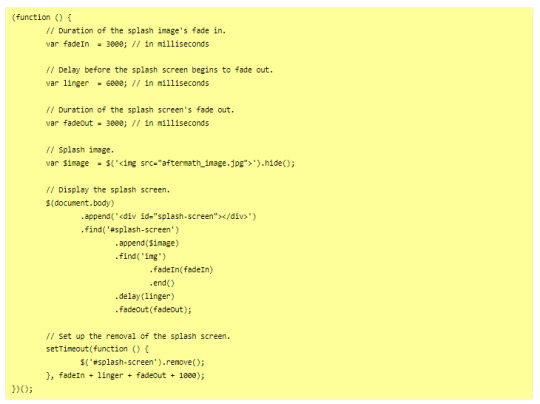
The code from the post will create an element that will cover the whole page, and be triggered every time the game loads (or the tab refreshes).
So first, get on the Forum post, and copy the code in the correct places:
Stylesheet
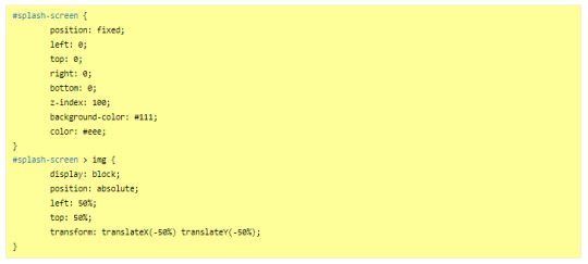
JavaScript
---
Then you will want to edit it to customise it for your project. There is code to change in both block of code:
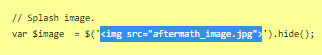
In the JavaScript, you will need to indicate the correct image you want to display on the screen, or any other element (like text).
In the Stylesheet, you will want to edit the colour of the background (and potentially the text colour) to match the vibe.
JavaScript
Here, you will want to edit the correct URL of the image you want to have on the screen.
If you want text instead of the image, you can do so by wrapping it with a < p > markup (or other relevant HTML markup):
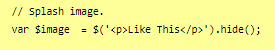
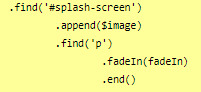
though, you will need to edit one more thing to make it work, in the .find() line, like below (p for the < p > element, and so on):
StyleSheet
The biggest change you'd need to make for the code in the style sheet will be with the code below:
currently, the colours match the basic SugarCube UI colours. So if you've changed the UI palette for your project, you will want to edit those colours (background especially, color is only useful for text)
If you are not using an image, but some text in your splash screen, you will also need to edit this part of the code, to replace the img with the correct HTML markup:
(in the example above, you'd need to change the img with p)
Testing
One important thing afterwards, will be to test the splash screen (for colour, position, or even animation). Note: if you are coding in Twine and used a local image in the splash screen, don't forget to publish to file and open the HTML, rather than test/play through Twine/
If you want to test the Splash Screen, and fiddle with the CSS with the Inspect Tool of your browser, I advise you change the amount of this line in the JavaScript:
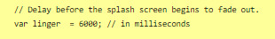
Add a bunch of zeros to increase the time (but don’t forget to remove them before uploading your file anywhere).
---
Hope this helps!
27 notes
·
View notes
Text
I need your help finding an app I played with when I was younger
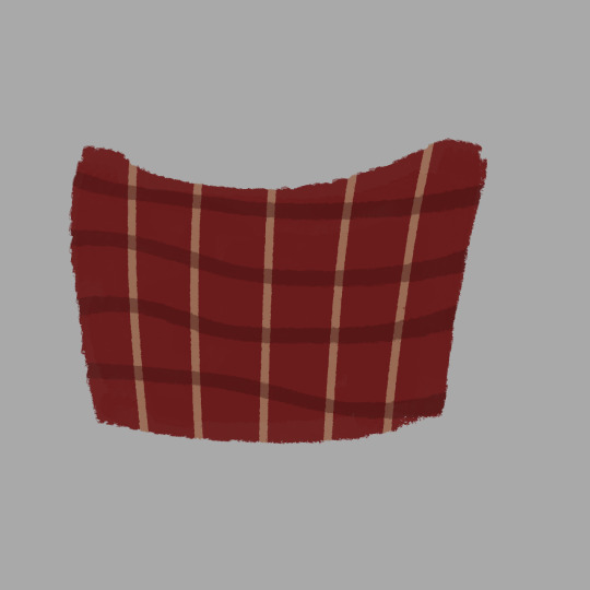
It was a "game" where you could rip up a piece of cloth. That's it. You could change the pattern (and the background color I think?). It rendered the cloth similar to this site
And I have a vague memory of what it looked like upon opening it
I think it moved with the device too but I'm not entirely sure. It was on the play store for Android devices sometime between 2015/2018
I really hope you can help me and I hope this wasn't a fever dream lol.
(reblogs are appreciated for a wider audience but don't feel pressured 👍)
2 notes
·
View notes
Text
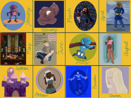
My art year in review!
I learned so much this year and made a ton of cool stuff! These are my favorites from each month, but it was so hard to choose. A lot of stuff didn't even get posted--I'll be sure to at least post the ones that made it to this list!
It's amazing to see how much I've changed and learned over this year, and to see the things that are emerging as part of "my style."
Here's to another year of delight, creation, connection and fun!
Some monthly reflections beneath the cut, but here's the highlights:
I participated in 3 art challenges, Artfight, OC-tober and Huevember.
I made fanart for the first time!
I created a piece I conceived of before I started drawing
Made some big breakthroughs in techniques and skills in April, July and November
January: My first branch into full character design, Rodd is the culmination of training on Hero Forge renders to make dnd portraits! I was doing this cool thing with neon rim lighting, I should bring that back!
February: I saw a piece on here with this amazing glowing effect, so I color picked it and experimented to figure out what relationship between the colors was making it do that! The answer was saturation. This rose is meant to be glowing from within, and I think I did a good job for my knowledge level at the time! As Chuck Tingle would tell us, it's beautiful because only I could have made it in that moment on the timeline.
March: I spent a million years on every detail of this one, it has at least 5 clipping overlay/saturation layers for lighting, multiple line work groups and I want to rework that background but! I never felt more accomplished than I did when I finished this one. I learned a lot, especially about things I could skip or simplify. And the symbolism really pops off ngl
April: I read Gideon the Ninth for the first time this month and I immediately needed to draw Jeannemary Chatur, Cavalier of the Fourth House, the worst teen to do it. She's the first fanart I ever made and posted! I also discovered a new pen tool with this one, which CHANGED THE GAME.
May: This one is an idea I had written down before I ever picked up the tablet and stylus. I thought I might commission someone to make it, the image of it came to me so clearly during our VTM session I just had to make it real somehow. Well I did it! This is one I will come back to redraw in like 5 years bc I love the concept so much. Also rife with symbolism and inside nods to the Low Kings.
June: I made a bunch of ref sheets in the run-up to Artfight in July. Caleb hadn't even been in my plans to upload, but I had time and inspiration! I will be uploading this and a few more of him <3
July: This is one of my faves from Artfight! This character is Blueberry, by way of OrchidEatsBread on artfight. I have still never played... rainworld? But I love me a slug cat. In July I drew a TON of people, it really drilled anatomy basics into me and how to get clothes looking like actual clothes a bit more. Also solidified some things I would consider "my style" at the moment, like no irises, and my approach to noses and mouths and fingers!
August: Another fanart for the Locked Tomb series, I never posted this!!! Will be rectifying that soon.
September: I got really into javascript and css this month, and I made this to be a landing page image on my neocities website XD I'll get back around to that eventually...
October: At the last minute, I discovered OC-tober and the prompts from @/bweirdart, a worthy follow up to the rush of Artfight two months previous. I developed so much stuff for the Low Kings, including this drawing/character, Amayah/Girl-Z, who has been a figment of my pintrest board for 2+ years.
Huevember: Chasing that OC-tober high, I found Huevember! I did not expect to actually do every day, but it proved to be an amazing exercise! I learned so, so much about color, discovered amazing new brushes and techniques and found I really enjoy working in those one day capsules! I loved a lot of the stuff that came out of this month, including my highest note post ever!!!, but this one is still my phone background and I'm maybe developing an OC world around it. We'll see what happens in 2024.
December: I got hit HARD with the writing bug this month, so this was my only choice for this month but I WOULDA CHOSEN IT ANYWAY. I unlocked something here that I'm really excited to visit again, in fact I'm working on a companion piece rn! This is also fanart btw, prepare for me to get even weirder about this guy in the coming months.
If you've read this far, thank you so much! I have so much fun writing these little reflections and making my posts on here.
xoxo, wren
4 notes
·
View notes
Text
A Bookmarklet (Javascript Bookmark)
Light text on a dark background quickly gets hard for me to read, so I have a Javascript bookmark that replaces the color settings of the page and forces every piece of text to be black on a white background, with boring old-fashioned blue/purple colors for links. It’s not aesthetically pleasing, but it’s more or less guaranteed to be readable. (An example and the text of the bookmark below the fold.)
As a demonstration, here’s a screen capture of a randomly-selected Tumblr blog with color as it appears normally:

After running the script, it looks like this:
(If you have other color preferences, you can just swap out “black” and “white” in the script with your choices.)
To make this work, add a bookmark in your browser, then use whatever mechanism your browser has for editing bookmarks to rename it something appropriate and replace the URL with the red text below:
javascript:(function(){var%20newSS,%20styles='%20{%20background:%20white%20!%20important;%20color:%20black%20!important%20}%20:link,%20:link%20%20{%20color:%20#0000EE%20!important%20}%20:visited,%20:visited%20*%20{%20color:%20%23551A8B%20!important%20}';%20if(document.createStyleSheet)%20{%20document.createStyleSheet(%22javascript:'%22+styles+%22'%22);%20}%20else%20{%20newSS=document.createElement('link');%20newSS.rel='stylesheet';%20newSS.href='data:text/css,'+escape(styles);%20document.getElementsByTagName(%22head%22)[0].appendChild(newSS);%20}%20})();
(That should be one single line with no spaces or line breaks, in case either Tumblr or your browser decides to play games with it.)
…as long as I’m at it, here’s a second very specialized utility script bookmark. Years ago, there was an epidemic of sites which would hijack your browser window and refuse to let you close the window or quit the browser, and the only way to get out of it was to force-quit your browser — and then make sure it wouldn’t auto-reload the content from the previous session when you opened it back up. I believe there are technical fixes in place now which prevent that form of attack, but just in case I still have my script bookmark which breaks out of that deadlock. Without changing the URL (which lets the page know you’re trying to get away) it uses the “document.write” function… which, notoriously, if used when the page has finished loading, replaces the entire page. This breaks any scripts the page may have in place to monitor your behavior, and the window/tab can then be closed. (But the URL in the location bar remains the same, and the browser thinks you’re still on the page, so the reload button will restore whatever was there before.) It is possible that this might be useful in other contexts, so here it is. The result looks like this:

To make it work, do the same as for the previous script, but replace the URL with this instead:
javascript:%20void(function(){document.write('%3Chtml%3E%3Chead%3E%3Ctitle%3E%2D%2D%20Page%20has%20been%20erased%20%2D%2D%3C%2Ftitle%3E%3C%2Fhead%3E%3Cbody%20style%3D%22margin%3A0in%3Bpadding%3A25%25%3B%22%3E%3Ch1%20style%3D%22size%3Axx%2Dlarge%3Btext%2Dalign%3Acenter%3Bcolor%3Ared%3Bmargin%3A25%25%3Bfont%2Dweight%3Abold%3B%22%3EThis%20page%20was%20erased%20using%20a%20bookmarklet%2E%3C%2Fh1%3E%3Cp%20style%3D%22text%2Dalign%3Acenter%3B%22%3EThis%20page%20has%20had%20its%20content%20replaced%20with%20this%20message%2E%20If%20you%20want%20the%20content%20back%2C%20you%20will%20need%20to%20reload%20the%20page%2E%3C%2Fp%3E%3C%2Fbody%3E%3C%2Fhtml%3E');}())
(Once again, that should be one long line with no spaces or line breaks.)
2 notes
·
View notes
Text
Several people asked how to use this userscript on mobile, and also how to modify it for darkmode, so I will do my best to explain!
Installing Userscripts on Mobile
FIRST: Make sure you are using a mobile web browser which supports installing extensions or supports userscripts. I use Firefox for Android, so that's what these directions will be for, but there are a few other options that might work if you are on iOS or elsewhere.
In Firefox for Android, open the options menu > Add-ons, and select the Add-ons Manager. In the list of recommended Add-ons, find Tampermonkey and install/enable it.
Go back to the Add-ons menu and tap Tampermonkey. You can use Tampermonkey's search function to find the userscript, or simply go to the userscript's GreasyFork link and install it from there.
Repeat with any other userscripts you'd like to install! Searching "AO3" on GreasyFork can turn up some fun options, and AO3 themselves link to a few in this guide.
✅ The userscript is now installed! You can go on and use the script on AO3 now as OP described. Everything after this is just optional tweaks, mostly cosmetic.
Further tweaks...
Note: All of the tweaks below also work for desktop.
Optional: Modify AO3 Floating Comment Box for Darkmode
By default, the background of the input text box is white and doesn't change with your browser/phone settings. Fortunately, a quick edit fixes this. (Note: you can also do this same kind of edit if you use this userscript in a computer browser. The code change is the same.)
Open the Tampermonkey add-on and navigate to settings.
Select the Installed Userscripts tag, then tap the "Edit" button on AO3 Floating Comment Box (the little pencil and paper)
This will open the code editor. It might look like a bunch of nonsense unless you're already familiar with JavaScript/userscripts, but don't be intimidated: we're just finding one word and changing it!
At the top of the editor, click Find. Search for white
You will see the following chunk of code:
".float-box": {
"min-height": "70%",
"max-width": "98%",
"background-color": "white"
},
replace white with 333 (i.e., changing the color of the background of the text box from white to a dark grey). Make sure you don't accidentally alter any of the punctuation!
-> if you want it to be a different color than the one I picked, you can use an HTML Color Picker or names list to get the hexadecimal code or official name for the color you want. (Don't include the #)
Close the Find dialogue, then at the top, select File > Save. All done!
In your browser, open a works page on AO3 and open the floating comment box to check that the result was what you wanted.
Other Optional Tweaks
---- FOR AUTHORS: Ensure that the script doesn't try to modify the New Works page:
Toward the top of the script, in the header/settings section, immediately below the //include line, add:
// @exclude *://archiveofourown.org/works/new
----- Add the AO3 logo as an icon for the script:
Toward the top of the script, in the header/settings section, immediately above the // @namespace line, add:
// @icon https://archiveofourown.org/favicon.ico
---- Make the text box take up less vertical room on your screen:
under const allStyles, in the float-div section, change "height = 30%" to "height = 20%"
(you can also play around with these numbers to tweak it to your preferences)
Mentions for the folks who @-ed me: @inahc3 @harleyqueerner @sunset-diamond @fuctacles
Hope this helps!
(edited for clarity 2023-11-03)
In the spirit of encouraging people to comment on fanfics while also making it easier to do so, I feel obliged to share a browser extension for ao3 that has quite literally revolutionized the comment game for me.
I present to you: the floating ao3 comment box!
From what I've seen, a big problem for many people is that once you reach the comments at the bottom of a fic, your memory of it miraculously disappears. Anything you wanted to say is stuck ten paragraphs ago, and you barely remember what you thought while reading. This fixes that!
I'll give a little explanation on the features and how it works, but if you want to skip all that, here's the link.
The extension is visible as a small blue box in the upper left corner.
(Side note: The green colouring is not from the extension, that's me.)

If you click on it, you open a comment box window at the bottom of your screen but not at the bottom of the fic. I opened my own fic for demonstrative purposes.

The website also gives explanations on how exactly it functions, but I'll summarize regardless.
insert selection -> if you highlight a sentence in the fic it will be added in italics to the comment box
add to comment box -> once you're done writing your comment, you click this button and the entire thing will automatically copied to the ao3 comment box
delete -> self explanatory
on mulitchapter fics, you will be given the option to either add the comment to just the current chapter or the entire fic
The best part? You can simply close the window the same way you opened it and your progress will automatically be saved. So you can open it, comment on a paragraph, and then close it and keep reading without having the box in your face.
Comments are what keep writers going, and as both a writer and a reader, I think it's such an easy way of showing support and enthusiasm.
#ao3#ao3 userscripts#how to#ren gets technical#or something#AO3 Floating Comment Box#edited for clarity
80K notes
·
View notes
Text

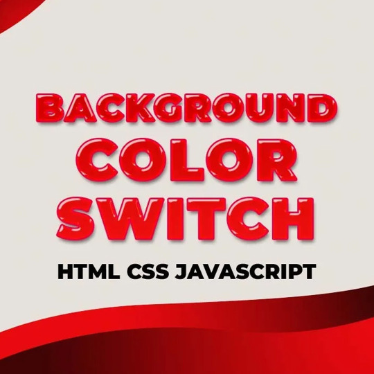
Javascript Background Color Change
#background color change#javascript#javascript projects#javascript projects for beginner#html css#frontenddevelopment#codenewbies#code#css#html5 css3
0 notes
Text
React vs Vue vs Angular: Which One Should You Use in 2025

Overview: (React)
React continues to dominate the frontend development world in 2025, offering developers unmatched flexibility, performance, and community support. Built and maintained by Meta (formerly Facebook), React has matured into a robust UI library that startups and tech giants use.
What Is React?
React is an open-source JavaScript library designed for building fast, interactive user interfaces, primarily for single-page applications (SPAs). It's focused on the "View" layer of web apps, allowing developers to build encapsulated, reusable components that manage their state.
With the release of React 18 and innovations like Concurrent Rendering and Server Components, React now supports smoother UI updates and optimized server-side rendering, making it more future-ready than ever.
Key Aspects
Component-Based Architecture: React's modular, reusable component structure makes it ideal for building scalable UIs with consistent patterns.
Blazing-Fast UI Updates: Thanks to the virtual DOM, React efficiently updates only what's changed, ensuring smooth performance even in complex apps.
Hooks and Functional Components: With modern features like React Hooks, developers can manage state and lifecycle behavior cleanly in functional components—there is no need for class-based syntax.
Concurrent Rendering: React 18 introduced Concurrent Mode, improving performance by rendering background updates without blocking the main thread.
Massive Ecosystem: From Next.js for SSR to React Native for mobile apps, React integrates with an enormous ecosystem of tools, libraries, and extensions.
Code: App.jsx
Import React from 'react';
function App() {
return (
<div>
<h1>Hello, World! </h1>
</div>
);
}
export default App;
Entry Point: main.jsx
import React from 'react';
import ReactDOM from 'react-dom/client';
import App from './App.jsx';
ReactDOM.createRoot(document.getElementById('root')).render(
<React.StrictMode>
<App />
</React.StrictMode>
);
HTML Template: index.html
<!DOCTYPE html>
<html lang="en">
<head>
<meta charset="UTF-8" />
<title>React App</title>
</head>
<body>
<div id="root"></div>
<script type="module" src="/main.jsx"></script>
</body>
</html>
Overview (Aue)
Vue.js continues to be a strong contender in the frontend framework space in 2025, primarily for developers and teams seeking simplicity without sacrificing power. Created by Evan You, Vue has grown into a mature framework known for its clean syntax, detailed documentation, and ease of integration.
What Is Vue?
Vue is a progressive JavaScript framework for building web user interfaces. Its design philosophy emphasizes incrementality—you can use Vue for a small feature on a page or scale it up into a full-fledged single-page application (SPA).
With Vue 3 and the Composition API, Vue has evolved to offer better modularity, TypeScript support, and reusability of logic across components.
Key Aspects
Lightweight and Fast: Vue has a small footprint and delivers high performance out of the box. It's fast to load, compile, and render, making it an excellent choice for performance-sensitive projects.
Simple Integration: Vue can be dropped into existing projects or used as a complete app framework. It works well with legacy systems and new apps alike.
Easy to Learn: Vue's gentle learning curve and readable syntax make it a top choice for beginners and teams with mixed skill levels.
Composition API: The Composition API in Vue 3 allows for better code reuse and more scalable application architecture, similar to React's hooks.
Code: App.vue
<template>
<div>
<h1>Hello, World! </h1>
</div>
</template>
<script setup>
</script>
<style scoped>
h1 {
color: #42b983;
}
</style>
Entry Point: main.js
import { createApp } from 'vue';
import App from './App.vue';
createApp(App).mount('#app');
HTML Template: index.html
<!DOCTYPE html>
<html lang="en">
<head>
<meta charset="UTF-8" />
<title>Vue App</title>
</head>
<body>
<div id="app"></div>
<script type="module" src="/main.js"></script>
</body>
</html>
Overview (Angular)
Angular, developed and maintained by Google, remains a top choice for enterprise-level applications in 2025. As a fully integrated framework, Angular provides all the tools a development team needs to build large-scale, maintainable apps out of the box.
What Is Angular?
Angular is a TypeScript-based frontend framework that includes built-in solutions for routing, state management, HTTP communication, form handling, and more. Unlike React or Vue, Angular is opinionated and follows strict architectural patterns.
Angular 17 (and beyond) introduces Signals, a new reactive system designed to improve state management and performance by offering more predictable reactivity.
Key Aspects:
All-in-One Framework: Angular offers everything you need—from routing to testing—without needing third-party libraries. This consistency is great for large teams.
Strong Typing with TypeScript: TypeScript is the default language in Angular, making it ideal for teams that prioritize type safety and tooling.
Ideal for Enterprises: With its structured architecture, dependency injection, and modular system, Angular is built for scalability, maintainability, and long-term project health.
Improved Performance: Angular 17 introduces Signals, improving reactive programming, rendering speed, and resource efficiency.
Angular Drawbacks
A steep learning curve due to its complex concepts like decorators, DI, zones, etc.
More verbose code compared to Vue and React.
Slower adoption in smaller teams and startups.
Project Setup:
bash
Copy
Edit
ng new hello-world-app
cd hello-world-app
ng serve
Component: app.component.ts
import { Component } from '@angular/core';
@Component({
selector: 'app-root',
template: `<h1>Hello, World! </h1>`,
styles: [`h1 { color: #dd0031; }`]
})
export class AppComponent {}
Module: app.module.ts
import { NgModule } from '@angular/core';
import { BrowserModule } from '@angular/platform-browser';
import { AppComponent } from './app.component';
@NgModule({
declarations: [AppComponent],
imports: [BrowserModule],
bootstrap: [AppComponent]
})
export class AppModule {}
Entry Point: main.ts
import { platformBrowserDynamic } from '@angular/platform-browser-dynamic';
import { AppModule } from './app/app.module';
platformBrowserDynamic().bootstrapModule(AppModule)
.catch(err => console.error(err));
Which One Should Use
If you're looking for simplicity and speed, especially as a solo developer or on smaller projects, Vue.js is your best bet. Its gentle learning curve and clean syntax make it ideal for quick development and maintainable code.
For scalable, dynamic applications, React strikes the perfect balance. It offers flexibility, a vast ecosystem, and strong community support, making it a top choice for startups, SaaS products, and projects that may evolve over time.
If you're building large-scale, enterprise-grade apps, Angular provides everything out of the box—routing, forms, state management—with a highly structured approach. It's TypeScript-first and built for long-term maintainability across large teams.
In short:
Choose Vue for ease and speed.
Choose React for flexibility and modern workflows.
Choose Angular for structure and enterprise power.
0 notes
Text
Future-Proof Your Website: 5 Web Design Strategies That Will Dominate in 2025

Web design is no longer just about making a site look good.
In today’s digital world, your website acts as your brand's voice, your store, your customer service desk, and your sales team. With user behaviors changing fast and technology advancing even faster, your website must be ready to adapt.
That is why future-proofing your website is more important than ever before.
Let’s explore five major design strategies that are reshaping how websites are built and used in 2025. These strategies are not just trends. They are shifts in how we think about digital experiences.
Speed is the New Standard for Online Success
First impressions happen fast. Visitors decide in seconds whether they want to stay on your site or leave. If your page takes too long to load, they are likely to click away before they even see what you offer.
This is why speed is no longer just a bonus. It is a requirement.
In 2025, websites are being built with speed as a core priority. Developers are moving away from heavy frameworks and bloated designs. Instead, they are using lighter code, optimizing images using formats like WebP, and loading only the content that is needed at the moment.
Minimizing unused CSS and JavaScript, reducing the number of third-party scripts, and caching intelligently can all dramatically boost your load time.
Speed matters to users and to search engines. Google now considers page speed when ranking websites. So a faster website does not just improve the user experience. It can improve your visibility in search as well.
Make speed your foundation. It supports everything else you build.
Designing for the Eyes: The Rise of Dark Mode and Visual Comfort
More people are browsing the web at night or in low-light settings. This has made visual comfort an important factor in web design. One of the clearest signs of this shift is the growing popularity of dark mode.
Dark mode gives users an interface that uses darker backgrounds with lighter text. It reduces eye strain and looks more modern to many users. Some devices even switch to dark mode automatically at certain times of the day.
A good website in 2025 respects user comfort. That means giving them options. More and more designers are creating flexible themes where users can toggle between light and dark modes. This not only improves the experience but also gives users a sense of control.
But visual comfort goes beyond color themes. It includes avoiding harsh contrasts, using calm color palettes, and ensuring text is always easy to read. Typography, spacing, and line height all play a role in making sure your content is welcoming and effortless to consume.
A visually comfortable website encourages longer visits, repeat visits, and greater trust.
Micro-Interactions Make the Web Feel Human
We often focus on big elements like headers, layouts, and graphics. But sometimes the smallest touches have the biggest impact.
Micro-interactions are the tiny animations or responses that happen when a user performs an action. Think of a button that changes color when hovered. Or a subtle animation when a form is submitted successfully. These small movements provide feedback. They tell the user something happened.
In 2025, websites that feel alive and responsive are winning attention. Micro-interactions make a site feel more intuitive and engaging. They help users understand how things work without needing instructions.
For example, a progress bar that fills up as someone scrolls down a blog post encourages them to keep reading. A playful animation when a product is added to a shopping cart makes the process feel rewarding.
These touches are not just decoration. They create smoother experiences and help build a sense of flow as users move through your site.
The best micro-interactions are simple, fast, and purposeful. They make the digital feel more human.
Personalization Powered by AI Brings Better Experiences
A one-size-fits-all approach no longer works in web design. Today’s users expect personalized experiences. They want to feel like your website understands their needs.
With AI becoming more accessible, personalization is easier and more powerful than ever.
Websites in 2025 can analyze user behavior and adjust the experience in real time. They can show different headlines based on a visitor’s location. They can recommend products based on past purchases or browsing history. They can greet returning users with content that feels relevant instead of generic.
Smart content blocks, predictive search, and AI chat assistants are some of the ways personalization is being built into websites.
It is not about spying on users. It is about making the experience smoother, faster, and more helpful. When users feel understood, they are more likely to engage, stay longer, and return again.
Always remember to keep personalization subtle and respectful. It should feel helpful, not intrusive.
Accessibility First Means Designing for Everyone
One of the most powerful changes in modern web design is the shift toward inclusivity. Accessibility is no longer a feature. It is a foundation.
An accessible website ensures that everyone can use it, including people with disabilities. This might mean adding alt text to images so screen readers can describe them. It might involve using proper heading structure so the content is easy to follow. Or making sure buttons are large enough to tap and links are keyboard-friendly.
Designing with accessibility in mind helps people with visual, hearing, cognitive, or mobility challenges navigate your site with ease.
But accessibility benefits everyone. Clean, readable design helps all users focus. Keyboard navigation can improve site speed. And accessible sites often rank better in search engines because they are built with better structure and clarity.
More importantly, building accessible websites is the right thing to do. It shows that you care about your entire audience.
When you design for all, your reach and impact grow naturally.
Final Thoughts on Future-Proofing Your Website
Technology moves fast, but user expectations move even faster.
By focusing on speed, visual comfort, micro-interactions, personalization, and accessibility, you are not just chasing trends. You are building a digital experience that will last.
Websites in 2025 need to be fast, responsive, human-centered, and inclusive. That is what it means to be future-proof.
The best time to update your design was yesterday. The second-best time is now.Want more insights on where web design is heading?
Explore our full blog: Top 5 Latest Web Design Trends in 2025 and Beyond
0 notes
Text
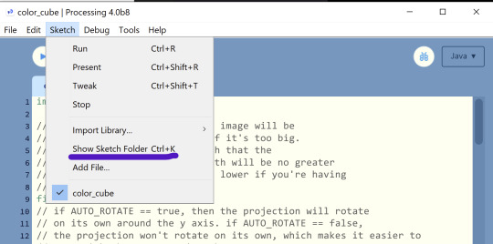
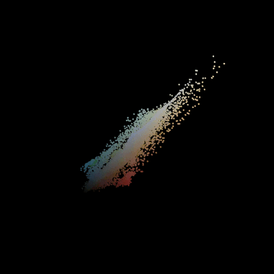
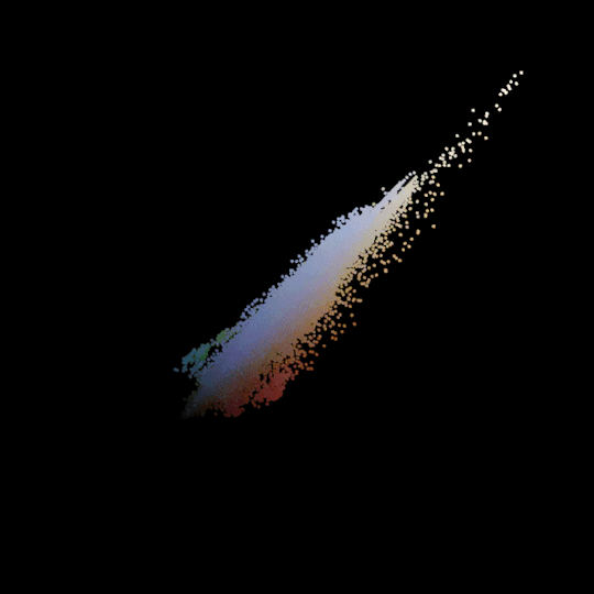
so I had a completely normal day (<- girl who hyperfixated on making this) and managed to get something working that's similar? it's not completely the same; in a different post the OP talks about how they scaled the size of each point based on how frequently the color it represents appeared in the image, and I haven't found a way of doing that that's efficient enough to not give me out-of-memory errors. I also don't have the cool wireframe cube outline that the OP does that basically shows the progression of the color along each axis. but I think it's enough to get the point across! Plus, you can choose whether you want it to rotate on its own or whether you want to click and drag to control the rotation yourself! Here's the code; I'll put a guide on how to use it (and some examples of the results!) under the read more.
A guide on how to use it
You'll need to install Processing to run this, unfortunately, but it should be relatively simple to get working! When you first open processing, it'll create a new sketch for you; just copy-paste the code into that new sketch and edit line 20 (line numbers are on the left) so that the name of your file is between the quotes. If my file was called "image.jpg", my line 20 should read
final String FILENAME = "image.jpg";
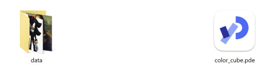
Lastly, we need processing to actually be able to find our image. To do that, we'll want to create a subfolder named "data" in the same folder as this sketch (make sure you save it first, or else you won't be able to do this because the sketch won't be in any folder). You can quickly get to the same folder as your sketch on Windows by just pressing Ctrl-K while you have the sketch open in Processing. Or you can click on the Sketch menu at the top and then on "Show Sketch Folder".
Yes, one of those images from before was Shadow the Hedgehog.
There are also a couple more options right at the beginning that let you do stuff like turn off auto-rotation, or scale large images down to make them perform better. They do require you to edit the code, but I've commented them to explain what they do and I hope it shouldn't be too overwhelming.
Please let me know if anything's unclear or if you run into any weird bugs/glitches. But other than that, have fun!
Now, the spinnies:
The Spinnies
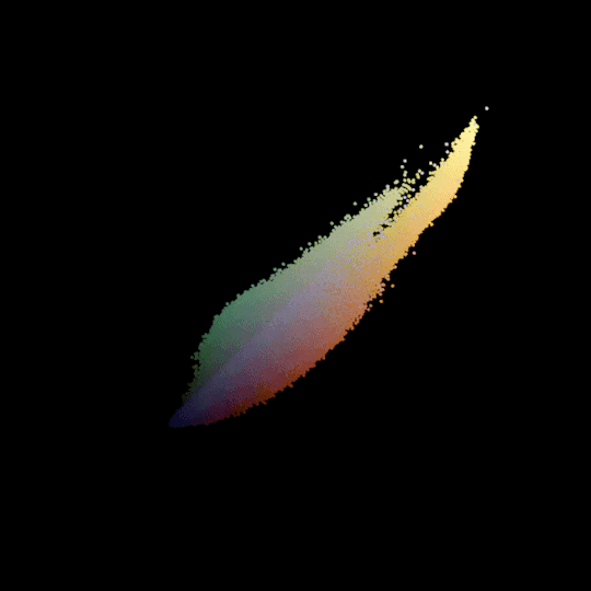
Here's my version of the Mona Lisa, which was in the original post. Just as a point of comparison, so you can see how mine's a little bit different.

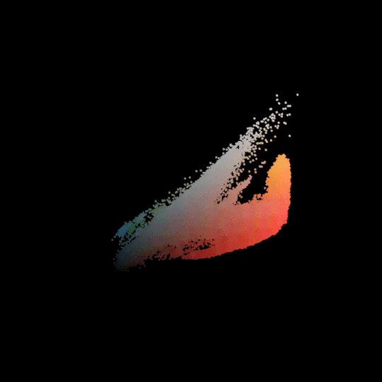
These are all based on screenshots I took from various areas in Elden Ring! Most of them look pretty similar, but you can at least tell which one is Caelid. because of the red.
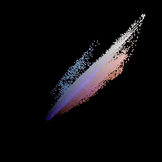
This one's actually based on a picture I took in real life! Obviously the colors are a little more muted, but I thought it would be interesting to see what happened.
This one looks a little weird! It's based on my phone background, which I generated myself (in the Javascript version of Processing, ironically). It was made with saturation and brightness set to constant values and only the hue changing. So you can see how the hue kind of wraps around this "color cube". I think that's interesting!
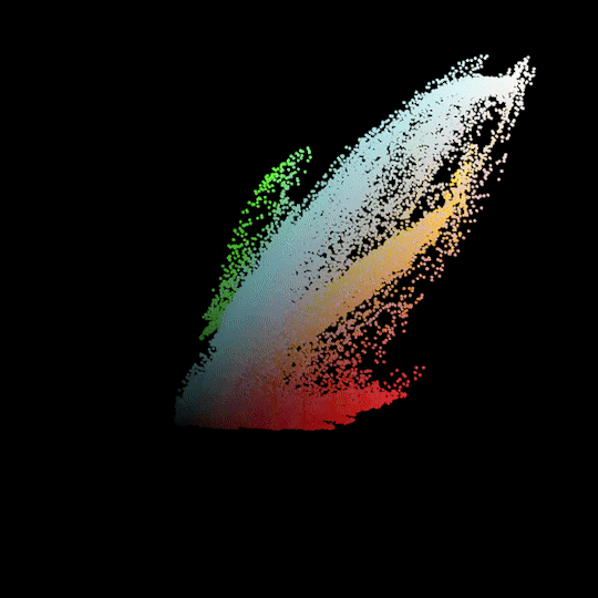
This one's Shadow the Hedgehog. I was expecting it to be a lot more focused towards black and red, so to see all the blues and greens and oranges was a really pleasant surprise! This one's one of my favorites.
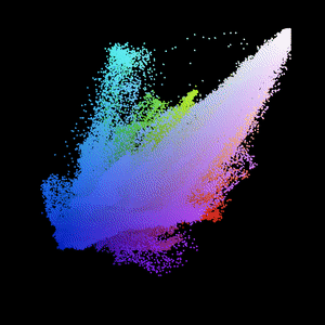

THIS one has got to be my absolute favorite so far. I've included the image it's based on as well; it's a piece of official Majora's Mask artwork and it just has. SO much color in it. I love it so much.
that's pretty much it from me though. I might try to modify this to work with the HSB color mode and see how that works out, and I could also probably make a tutorial on how I made these gifs in the first place, but I have been working on this for so long today and I want a break. if you choose to use this, have fun!! and if you don't but just wanted to see the projections, I hope you had fun also!
i've just had a terrible idea
49K notes
·
View notes
Text
Micro-Interactions: How Small Details Enhance User Experience
Micro-Interactions: How Small Details Enhance User Experience
Micro-interactions are subtle animations and feedback mechanisms that make digital experiences more engaging, intuitive, and user-friendly. These small details significantly impact usability, engagement, and delight without overwhelming users.
1. What Are Micro-Interactions?
A micro-interaction is a small, functional animation that occurs in response to a user’s action. They guide users, provide feedback, and improve the overall UX.
🔹 Examples:
✅ A “like” button that animates when clicked ❤️
✅ A password strength meter while typing 🔒
✅ A loading spinner when fetching data ⏳
💡 Micro-interactions improve UX by making interfaces feel alive, intuitive, and responsive.
2. Key Components of Micro-Interactions
Every micro-interaction consists of four key parts:
1️⃣ Trigger — The user action or system event that initiates the micro-interaction.
2️⃣ Rules — Define what happens once the interaction starts.
3️⃣ Feedback — Provides real-time response (e.g., animation, vibration).
4️⃣ Loop & Mode — Determines if the interaction repeats or adapts based on context.
🔹 Example: Toggle Button Animation
Trigger: User taps the toggle switch.
Rules: The toggle state changes from “Off” to “On.”
Feedback: The switch smoothly slides and changes color.
Loop & Mode: The toggle remains in its new state until changed.
3. Why Micro-Interactions Matter in UX Design
✅ Enhance User Engagement: Makes the UI more interactive and fun.
✅ Provide Instant Feedback: Shows the result of an action in real time.
✅ Improve Usability: Helps guide users intuitively.
✅ Add Personality to a Brand: Creates a more human and relatable experience.
4. Common Micro-Interaction Examples
🔹 Loading Animations
🔄 Prevent frustration by keeping users informed.
Instead of a boring “Loading…” message, a creative animation can improve perceived performance.
✅ Example:
Spinning loader (⏳)
Skeleton screens (gradually load content)
Progress bars (indicate completion)
🔹 Button Feedback & Hover Effects
📍 Enhances interactions and confirms user actions.
✅ Example:
Buttons change color or size when hovered.
A ripple effect when clicking a button.
cssCopyEditbutton:active {
transform: scale(0.95);
}
🔹 Form Validations & Input Feedback
✍️ Makes form-filling easier and error-free.
✅ Example:
Inline validation messages (✅ or ❌).
Password strength indicators.
Shake animation for incorrect input.
javascriptif (password.length < 6) {
inputField.classList.add("shake");
}
🔹 Like, Share, & Favorite Animations
❤️ Encourages engagement and interaction.
✅ Example:
Clicking a heart icon makes it pop & change color.
Social media reactions (e.g., Facebook’s Like button).
javascriptheartIcon.addEventListener("click", () => {
heartIcon.classList.add("animate-heart");
});
🔹 Toggle Switch & Dark Mode
🌗 Smooth transitions improve experience.
✅ Example:
A toggle switch animates when switching between light and dark modes.
Background and elements smoothly transition between themes.
javascripttoggleButton.addEventListener("click", () => {
document.body.classList.toggle("dark-mode");
});
5. Best Practices for Designing Micro-Interactions
🎯 Keep it Simple — Subtle animations work best; avoid overuse.
⚡ Make it Fast — Animations should be quick (0.2–0.5s).
🎨 Match the Brand Personality — Ensure animations align with the app’s tone.
🎯 Provide Feedback — Always let users know what’s happening.
📱 Ensure Accessibility — Avoid relying only on color; support screen readers.
6. Tools to Create Micro-Interactions
🚀 For UI Designers:
Figma, Adobe XD, Sketch — For prototyping animations.
Lottie (Airbnb) — Lightweight animated SVGs & JSON-based animations.
💻 For Developers:
CSS Animations & Transitions — For simple hover and click effects.
JavaScript & GSAP — For dynamic and interactive animations.
Framer Motion (React) — For smooth UI animations.
7. Conclusion
Micro-interactions may seem small, but they greatly enhance user experience by making interfaces more engaging, intuitive, and fun. When used effectively, they improve usability, reduce friction, and add a human touch to digital products.
WEBSITE: https://www.ficusoft.in/web-designing-training-in-chennai/
0 notes
Text
Best Press Component Manufacturing Service in Hosur - TSK
Understanding the Press Component: A Fundamental Element in Web Development
In the realm of modern web development, interactivity plays a crucial role in crafting engaging user experiences. One of the core elements that allow users to interact with websites and applications is the Press component. From submitting forms to navigating between pages, the Press component—often represented by buttons or clickable elements—forms the backbone of user interaction on the web. This blog will explore the fundamental aspects of the Press component, its importance, and how developers can implement it effectively.
What is a Press Component?
The Press component refers to an interactive element within a website or application that responds to user input, typically in the form of a click or tap. Most commonly, this takes the shape of a button, link, or other clickable areas that, when pressed, trigger an event or action on the website. Examples include submitting a form, triggering a modal popup, navigating to a new page, or changing content dynamically.
While simple in concept, the Press component is a vital part of the web's interactive experience. Without it, websites would be static and unresponsive, hindering user engagement.
Why is the Press Component Important?
User Interaction: At its core, the Press component facilitates user interaction, allowing visitors to perform actions on a webpage. Whether it's clicking a "Submit" button, pressing a "Next" link, or toggling between different sections of content, these interactive elements are central to how users navigate and engage with digital content.
Feedback and Usability: A critical aspect of the Press component is the feedback it provides. Users need to know that their actions have been acknowledged. Visual feedback, like changes in button color, text changes, or animations, assures users that their input was successful. This immediate feedback not only improves usability but also contributes to a positive user experience.
Mobile Responsiveness: With the rise of mobile web browsing, ensuring that Press components are optimized for touchscreen interactions is essential. Press components must be large enough to be easily tappable on small screens, and they should offer smooth responses to touch gestures. Mobile-friendly design is no longer optional but a necessity.
Accessibility: An often overlooked yet crucial benefit of the Press component is its role in web accessibility. Properly designed Press components with clear labels, focus states, and support for keyboard navigation ensure that users with disabilities can interact with a website effectively.
How to Implement a Press Component
Basic HTML and CSS
The most fundamental way to create a Press component is through simple HTML and CSS. For example, a basic button can be created using the <button> tag:
<button>Click Me</button>
By adding some CSS, you can make the button more interactive:
button {
padding: 10px 20px;
background-color: blue;
color: white;
border: none;
cursor: pointer;
}
button:hover {
background-color: darkblue;
}
In this example, the button changes color when hovered over, providing visual feedback to the user.
Adding JavaScript for Interactivity
To enhance the Press component further, JavaScript is often used to add functionality. For example, you can use JavaScript to trigger an action when the button is clicked, such as showing an alert or changing the content on the page:
<button onclick="alert('Button Pressed!')">Press Me</button>
In this case, when the user clicks the button, an alert box will appear on the screen, confirming that the press action was successful.
Advanced Implementation with Frameworks
For more complex applications, many developers turn to JavaScript frameworks like React, Vue, or Angular. These frameworks offer more powerful ways to manage user interactions and state changes within the application.
For example, in React, a Press component might look like this:
import React, { useState } from 'react';
function PressButton() {
const [pressed, setPressed] = useState(false);
const handlePress = () => setPressed(!pressed);
return (
<button onClick={handlePress} style={{ backgroundColor: pressed ? 'green' : 'blue' }}>
{pressed ? 'Pressed' : 'Press Me'}
</button>
);
}
Here, the button changes color based on its state (pressed or not), making the interaction even more dynamic and engaging.
Best Practices for Press Components
Clear Labeling: Buttons and other pressable elements should have clear, descriptive labels that indicate their function. For example, use labels like "Submit," "Next," or "Learn More" rather than ambiguous terms.
Visual Feedback: Always provide visual feedback when a Press component is activated. This could be a color change, a shadow effect, or a subtle animation.
Mobile Optimization: Ensure that Press components are large enough for mobile users to interact with easily. Make buttons and links easily tappable, with enough spacing to prevent accidental clicks.
Keyboard Accessibility: Make sure interactive components are accessible via keyboard. Buttons should be focusable and activated using the Enter or Space keys, providing an inclusive experience for all users.
Conclusion
The Press component is a fundamental part of the web development toolkit. It empowers users to interact with websites and applications, triggering actions and events that shape the user experience. By understanding its importance and implementing it with care—through clear labeling, visual feedback, and accessibility considerations—developers can create seamless, engaging, and user-friendly digital experiences. Whether it's a simple button or a complex interactive element, mastering the Press component is key to building modern, functional, and responsive websites.
0 notes
Text
5 Easy Tips to Customize SharePoint Image Galleries
Adding an image gallery component to SharePoint can be a great way to showcase photos, graphics, or other visual media. However, the default SharePoint image gallery may only sometimes fit your specific needs.
In this article, we'll cover five helpful tips to customize the default image gallery component in SharePoint Online and adapt it to your requirements.
Whether you want to change branding colors, resize thumbnails, modify image spacing, or alter the overall layout, these tips will show you how.
1. Switch Between Gallery Layout Options
SharePoint offers three main layout options for image galleries:
Slideshow - Images display one at a time in full-size
Grid - Images display in an evenly-spaced grid pattern
Carousel - Images rotate through horizontally in a slideshow-style carousel
To change the layout:
Go to your SharePoint site and edit the page with the image gallery web part.
In the web part toolbar, click the ellipses (...) icon.
Select Gallery Layout and choose your desired option.
The carousel or slideshow styles work great for hero images or featured content. The grid layout makes better use of space for multiple smaller images.
2. Adjust Gallery Image Sizing and Spacing
In a SharePoint image gallery, you can customize the display of thumbnails in a grid layout:
Thumbnail Size - Pixel width/height of each thumbnail
Spacing - Amount of space between thumbnails
Columns - Number of columns to display per row
To modify these settings:
Edit the page and select the image gallery web part.
Open the web part toolbar and click Web Part Settings.
Under Images, adjust the values for Size, Spacing, and Columns.
Reducing spacing and columns allows you to fit more thumbnails without needing to shrink them too drastically.

3. Add Custom Branding Elements
You can introduce custom branding to your SharePoint image gallery to match company colors or themes:
Colors - Set background/text colors
Icons - Replace default icons
Logos - Add a header logo
To apply custom branding:
Download theme assets like images, CSS, etc.
Upload files to Site Contents document library.
Edit gallery web part > Web Part Appearance > Customize.
Adjust background, text colors, add CSS overrides.
Add element ID tags to insert logos/icons.
Even small branding tweaks make the gallery feel more integrated into your unique site.
4. Build Custom Galleries from Scratch
For full customization control, you can build your image gallery web part from scratch:
Create HTML image gallery markup yourself
Style it with custom CSS
Add any desired functionality with JavaScript
Embed gallery in web part HTML editor
Some key elements to include:
Container div for gallery
Image thumbnail grid layout
Lightbox plugin for overlays
Image titles/captions
Control buttons
Going fully custom allows unlimited adaptations but requires more effort. Great for advanced users with specific needs.
5. Use Third-Party Gallery Extensions
If you want robust gallery features but don't have coding expertise, gallery extensions are a great option:
Column Slider - Add image sliders in columns
Filter - Filter images by tags/categories
Lightbox - Expand images into full-screen overlays
Videos - Embed videos in your galleries
SEO - Optimize galleries for search engines
Learn how to customize SharePoint Online image galleries with 5 simple tips for modifying default layouts, adding custom branding, changing thumbnail sizes, and more.
0 notes