#Book cover
Text
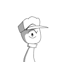
Hi little potatoes! sorry for disappearing and not posting anything for a while now.
Uni is getting too much. Too much task to do and not enough time. I’m having my bachelorette degree at the end of may and beginning of June. After that I’ll come back with regular drawings again!
I thought I’ll share with you the sketches I started doing for my graphic design portfolio (applied there too haha). These are for book covers which I hope I’ll have enough time to finish. Let me know what you think of them, and don’t be shy to recommend books to do covers for :D
I hope you all are doing well ~ <3

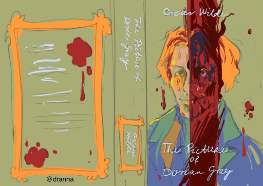
#dranna blogs#the picture of dorian gray#dorian gray#Dorian gray book#books#bookworm#book cover#book cover art#the strange case of dr jekyll and mr hyde#jekyll and hyde#dr jekyll#henry jekyll#edward hyde#mr hyde#oscar wilde#sketches and doodles#illustration digital#sketches and wips#book cover sketch#update
101 notes
·
View notes
Text
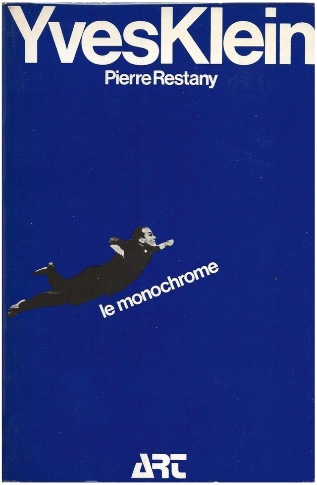
Pierre Restany, Yves Klein le monochrome, Foreword by Pascal Claude, Hachette, Paris, 1974
112 notes
·
View notes
Text
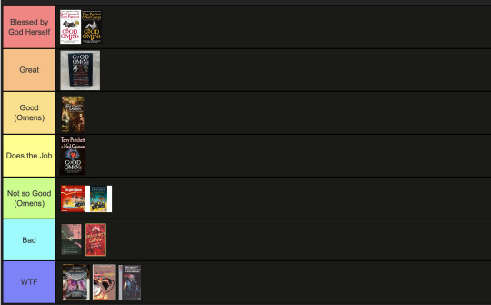
The art director & the Good Omens book cover tier list of doom, part 1
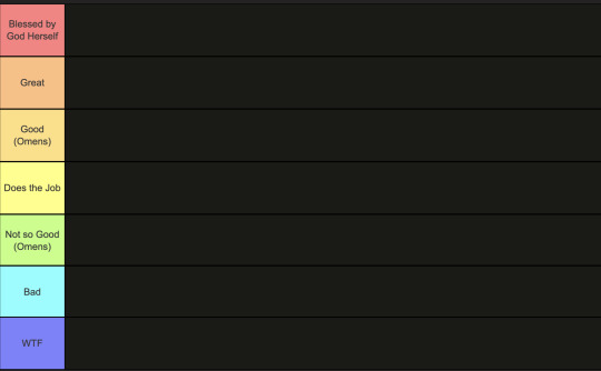
This is going to have to be a multi-part series because there are *checks notes* 64 different covers that I've found so far.
I am your resident Art Director/Good Omens enthusiast,
and welcome to my completely meta-free book cover tier list.
Listen, making a book cover is HARD. I should know. But while we salute these artists for their hard work and time, I think we can all admit that once in a while, the vision is just not on. And on very rare occasions, publishers seemed to have managed to commission the cover art directly from hell...
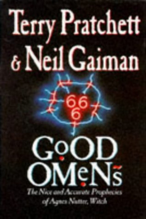
1. The original UK cover
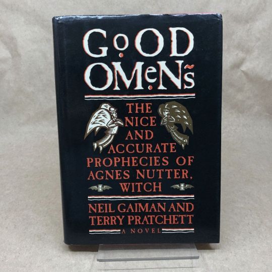
Ahh, the standard by which all shall be judged. We're starting off with a nice & easy cover, with adorable woodcuts of Aziraphale and Crowley flanking a custom Good Omens font! While I have to take a few points off for the terrible kerning of the word "GoOD", the blockprint vibes and general bitchiness of Aziraphale's teeny weeny wittle face, along with the sick colour palette puts the orignial in my good graces.
Tier: Great
2. The duelling US covers
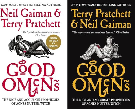
Progress! Hail to the designer who figured out trying to make "GoOD" and "OMeNs" fit the same width was a fool's errand, and even managed to IMPROVE on the original handmade title by adding a little halo and devil's tale to the design. Aziraphale and Crowley are facing each other, while also managing to serve absolute cunt. Aziraphale is wearing EIGHTIES SNEAKERS. Crowley's little snake boots have HEELS. They've managed to keep the woodcut vibes and colour simplicity, while balancing out the full title of the book. Both authors get to trade off on who's name comes first! Dare I say, this is a work of genius. I could dock some points for Crowley's sad bat wings growing out of his right clavicle, but who am I to question greatness.
Tier: Blessed by God Herself
3. The Halo Master Chief(?) cover

How the mighty have fallen... As a Canadian child, I was subjected to maybe the most horrifying ad in existence by the War Amps warning children about machine safety. This cover is the paper embodiment of that ad. I am confused by the purple haze. I am frightened by the seeming ethereal flatness of Adam and Dog. I am strangely aroused by Aziraphale's eyebrows, and intensely saddened by the terrible outline/drop shadow they had to inflict on the type to fit "Pratchett" in that god awful space.
Tier: WTF
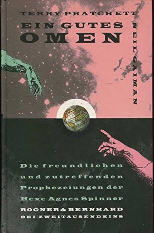
4. Germany, Ein Gutes Omen covers
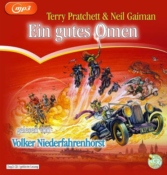
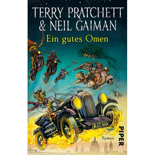
This cover inexplicably exists in two colour ways: red and teal. I put the audiobook cover here so you could experience the full illustration, and also how fucked up it is that they cropped the book version to include three horse-people of the apocalypse, but cut off DEATH on the regular cover. Points must be given for drawing a pretty slick Bentley, but I think we have to take even more points away for turning Crowley into a Ray Charles/Mike Wazowski hybrid. The ducks are nice.
Tier: Not so Good (Omens)
5. Germany, Ein Gutes Omen covers continued
I don't know if the German designer of this cover *knew* that they were using western yeehaw cowboy woodblock letters when they made this cover, but judging by how they spaced the rest of the text at the bottom, THEY DID NOT CARE. And that seems to be a running theme for this one. We get kind of a duality thing going on with the black and pink background, but it just seems like somebody whispered the general themes of Good Omens into a jar, and threw it down a well, and this poor chap came along and picked it up. The baffling choice to align every piece of text on the cover *except* Neil Gaiman's name which is right aligned and rotated 90 degrees (not even real vertical type) will haunt my dreams, I think.
Tier: Bad
6. US, UK The Traffic Jam cover
For the love of Good Omens, WHY. I can think of so many more interesting symbols to put on the cover of this book than the ODEGRA SIGIL TRAFFIC JAM. Props for keeping the good colours and type, but like, I think this cover was secretly designed by @amtrak-official, or someone who just really, really likes public works.
Tier: Does the Job
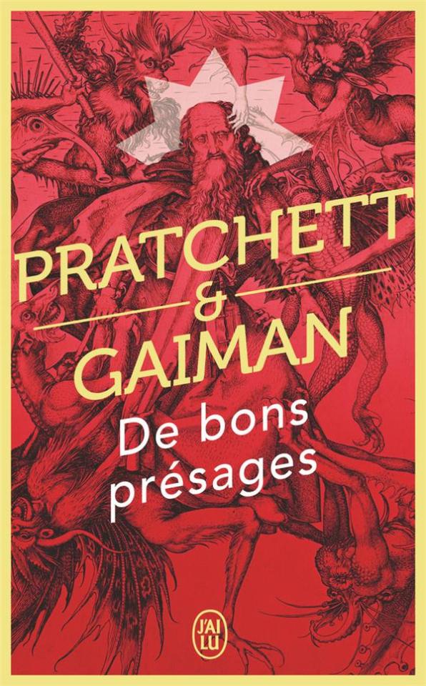
7. France, De bons présages cover
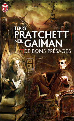
Leave it to France to make sure people know that Aziraphale and Crowley fuck severely. While I can't condone leaving out half the title of the book (and thinking a red carpenter's square counts as decoration), I can begrudgingly acknowledge that Ron Pearlman and Benedict Cumberbatch's love child is excellent Crowley casting. I think I give this a solid dark academia/10.
Tier: Good (Omens)
8. France, De bons présages covers continued
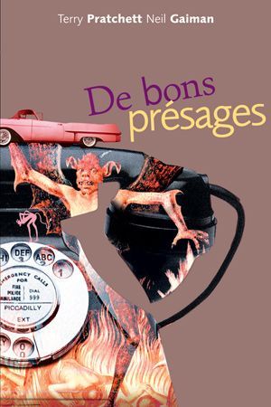
Just imagine with me, if you will, the absolutely hilarious reality that this cover posits: Good Omens is exactly the same in every respect, but Crowley drives a pink 1950s convertible. Why do all of the colours on this cover look like they've been pre-digested? Why are the font choices and placement so bafflingly bad. My face is the demon's face holding that car. I feel his pain.
Tier: WTF
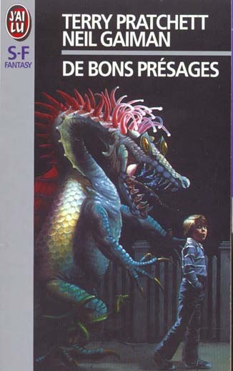
9. France, De bons présages covers continued
Minus points for not managing to write the full title of the book once again. I don't know what it is with the French. They seem pretty set on Good Omens being demonic. While I do appreciate a good Bosch-style demon party, the dude in the middle confounds me. All-caps Museo Sans that isn't even *centred* in the frame is just so lazy. I am le tired.
Tier: Bad
10. France, De bons présages covers continued
Uhh. The font. The font is okay.... I think? Yeah. The font and kerning are. Okay. OHHH GOD I LOOKED DOWN BELOW THE TEXT WHYYYY.
Tier: WTF
END of round one. I need a nap.
#good omens 2#good omens fandom#good omens#art director talks good omens#tier list#cover art#aziraphale and crowley#aziraphale x crowley#book cover#go s2#gomens#good omens analysis
135 notes
·
View notes
Text
I WISH YOU WOULDN'T COVER REVEAL!

so thrilled to be able to share the final cover design for my next novel! designed and illustrated by yours truly🩵☀️
I WISH YOU WOULDN'T comes out this summer, the perfect queer road trip read if you love found family, self-exploration, enemies-to-lovers where one of them is Just minding his business, breaking free from shame (kicking and screaming), and a whole lot of gay mouth kissing.
"I thought I hated Aman Khalil as much as it was possible to hate a person, but that was before he broke my best friend’s heart. (And then mine, but I don’t want to get into that just yet.)"
Connor hates everything about his best friend’s Natalie’s boyfriend, from his dumb basketball shorts to his penchant for giving life advice nobody asked for. Aman Khalil’s good looks and over-the-top nice guy act might be fooling Nat, but Connor sees right through it, and Aman is wasting the limited time Connor has with his friends before they go their separate ways for university.
All year, Connor’s been planning the summer road trip to end all road trips—the last hurrah for the best friends he’s ever had—and it’s going to be foolproof. Meticulously planned itinerary through western Canada’s luxurious landscapes? Check. Perfect moments with each of his friends, so goodbye won’t hurt so much? Check. Distance from his overbearing mom? Check.
Aman, invited without Connor’s permission?
... Check.
When Nat and Aman break up two days into the six week trip, Connor’s house of cards comes crashing down. With Aman constantly underfoot and the foundations of their friend group slowly cracking, Connor is forced to confront the growing feelings he can’t squash, properly face what happened six months ago, and start answering the real questions:
What is he really running from? What is Aman trying to tell him? And is there room in his life for the person he might be at the end of the road?
OUT AUGUST 7th 2024!
ADD ON GOODREADS
#cover reveal#book cover#iwyw#i wish you wouldn't#y'alllll i'm so excited#boost if you can i'd appreciate it!
63 notes
·
View notes
Text
Please, Tumblr, judge my book by its cover.
I'm begging you to be unhinged.
I crave the chaos
#writeblr#book cover#book community#author#writerscommunity#book blog#book#novel#writer#dark fantasy#gay romance#religious trauma
18 notes
·
View notes

Text
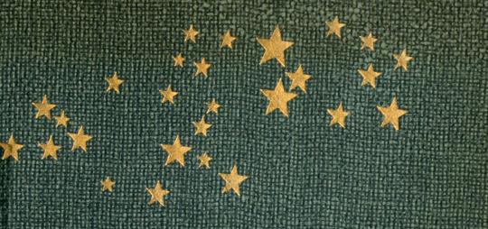
Golden stars of the Milky Way. Die Milchstrasse. 1908. Cover detail.
Internet Archive
10K notes
·
View notes
Text


A school project: book cover redesign for Heroes of Olympus
Basically is just me trying to make fanarts for pjo during classes
#percy jackson#percy jackson and the heroes of olympus#heroes of olympus#pjo#hoo#book cover#percabeth#annabeth chase#percy and annabeth#jason grace#hazel levesque#piper mclean#frank zhang
25K notes
·
View notes
Text


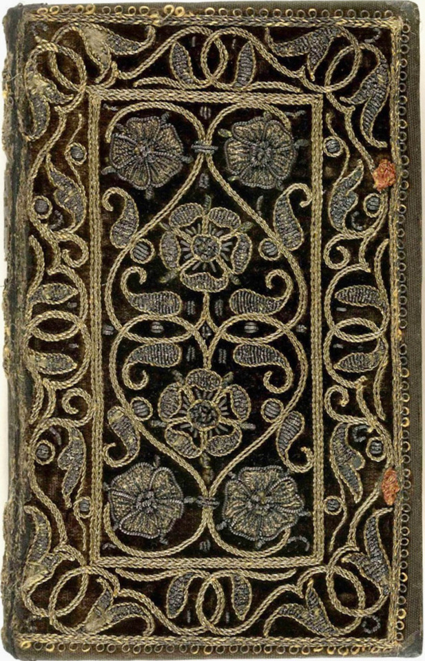
Embroidered book covers
#beautiful books#book blog#books books books#book cover#books#rare books#embroidered#embroidery#book design#book binding
5K notes
·
View notes
Text
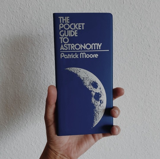
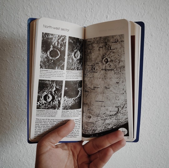
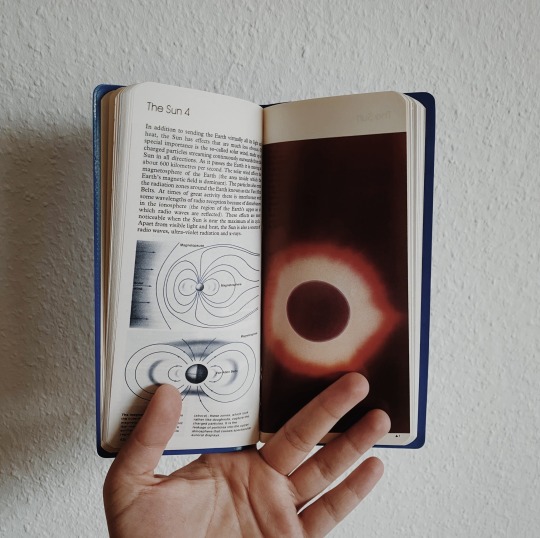


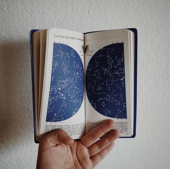
bought this gem secondhand and can’t get over how stunning it is 🪐 reblog is okay, don’t repost/use
#my photos#space science#study space#space#outer space#astronomy#science#stem#stemblr#astrophysics#books#book cover#bookworm#booklover#bookaddict#bookaholic#book aesthetic#bookblr#book blog#studyblr#academia#stem academia#stem aesthetic#light academia#light academia aesthetic
2K notes
·
View notes
Text

Drawing skeletons is goofy ahh
Ngl Ianthe is my fav character ever. The way she acts, totally careless of others but following some sort of fucked up plan she made, very girlboss of her. And also I LOVE how Muir potrays her, as a tall seraphic crazy lady thirsty of blood but yet very pale and weak. I haven’t read Nona the Ninth yet, I hope to see her again there.
Imagine a whole book abt her tho (delusional)
#tlt ianthe#ianthe the third#ianthe the first#ianthe tridentarius#tlt fanart#tlt fandom#tlt#tlt spoilers#tlt series#the locked tomb#the locked tomb fanart#harrow the ninth#gideon the ninth#tlt trilogy#the locked tomb trilogy#tlt art#book cover#book fanart
3K notes
·
View notes
Text

"It seemed as if the whole, awful creature were simply gorged with blood; he lay like a filthy leech, exhausted with his repletion."
Bram Stoker's Dracula | portfolio | prints
#dracula#acrylic painting#evelyne park#illustration#book illustration#traditional media#my art#traditional painting#book cover art#artists on tumblr#dracula daily#vampire art#gothic horror#horror art#dark fantasy#book cover#evydraws#fantasy artist#count dracula#bram stoker
3K notes
·
View notes
Text
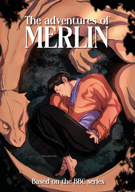
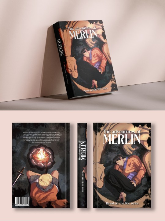
Fictional book cover of Merlin from the BBC because why not !
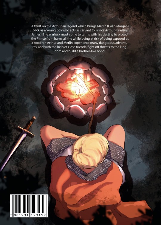
#art#artists on tumblr#digital art#my art#original art#artist#artwork#merthur#merlin#arthur#arthur pendragon#merlin bbc#medieval#book cover#editorial#editorialart#editorial portfolio#collin morgan
2K notes
·
View notes
Text

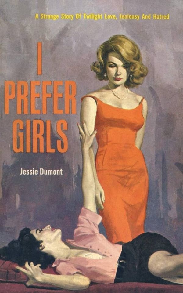
I saw this trend on Twitter and I wanted to do it with my favorite necromancer non-girlfriends 😅 hope you like it!!
Prints stickers and more here on my shop :D
#the locked tomb#gideon the ninth#harrow the ninth#griddlehark#gideon nav#harrow nonagesimus#trend#i prefer girls#book cover#meme#fanart#illustration#digital art#wlw#otp#violetfanart
2K notes
·
View notes
Text

I've never tried posting my art on here. Should I make this a thing?
3K notes
·
View notes
Text
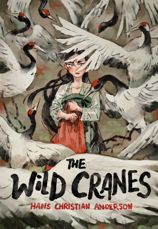
You ever think about Hans Christian Anderson's Wild Swans but set in a fantasy historical c-drama where the Empress Dowager curses the 12 imperial princes?
Well apparently I did, so I made a little cover for that hypothetical situation and had a lot of fun with it!
2K notes
·
View notes
Last Seen Blogs

pujipuspitakwu-blog
Kewirausahaan
melancholialapelada7
No longer potato