#css image hover text animation
Explore tagged Tumblr posts
Visit Tumblr Blog
Explore Tumblr blogs with no restrictions, modern design and the best experience.
Last Seen Tumblr Blogs


Fun Fact
Mobile US users spent an average of 115.8 minutes on Tumblr app monthly.
Text

CSS Hover Animation
#css hover animation#codenewbies#html css#frontenddevelopment#html5 css3#css animation examples#css animation tutorial#pure css animation#css#code#webdesign#css image hover text animation#css cards
4 notes
·
View notes
Text

CSS Animated Text Overlay
#css animated text overlay#css animation examples#html css animation#css animation tutorial#html css#codingflicks#frontend#css#html#css3#frontenddevelopment#learn to code#webdesign#animation#css image hover effects
10 notes
·
View notes
Text

🧡 Tuesday Tips #3 🧡
Your website is more than just a collection of pages—it’s your digital home. It should reflect you, your interests, and your personality. But with so many sites out there, how do you make yours stand out?
Here are 25 ways to make your website feel more personal, unique, and personalized to you!
........................................................................................................
🎨 Design & Aesthetics
1. Custom Color Palette – Pick colors that resonate with your personality and aesthetic.
2. Unique Typography Choices – Use a mix of fonts that match your vibe.
3. Handwritten or Doodle Elements – Add personal sketches or notes.
4. Custom Cursor – Let visitors use a fun, themed cursor on your site.
5. Personalized Favicon – A tiny but powerful detail that makes your site feel complete.
6. Themed Layouts for Different Pages – Make each page visually distinct but cohesive.
7. Custom Backgrounds – Textures, gradients, or even a personal photograph.
8. Retro or Experimental CSS Styles – Go wild with unique styles that make your site stand out.
9. Create a Custom Hand-Drawn Logo – Instead of a standard logo, try sketching one yourself for a unique touch.
10. Add Subtle Animations – Small hover effects, background animations, or cursor trails can bring your site to life.
11. Play With Layering Elements – Overlap images, text, and shapes for a more dynamic look.
12. Design a Personalized Loading Screen – A custom loading animation or message adds a fun detail visitors will remember.
13. Add Your Own Handwriting as a Font – Convert your handwriting into a web font for a truly personal touch.
14. Design a Seasonal Theme Switcher – Let visitors toggle between different seasonal or mood-based color palettes.
........................................................................................................
�� Content & Personality
15. Create a Behind-the-Scenes Page – Show how your website was built, share your thought process, or include fun bloopers.
16. Add a "The Making Of" Section – Share drafts, sketches, or early concepts behind your creative works.
17. Include a Personal Dictionary of Words You Love – A list of favorite words, phrases, or slang you frequently use.
18. Design a "Things That Make Me Happy" Page – A simple, uplifting page filled with personal joys.
19. Show Your Progress on a Learning Goal – Track and share your journey in learning a new skill, language, or hobby.
........................................................................................................
💾 Interactivity & Engagement
20. Add a Clickable Mood Indicator – Let visitors see your current mood with an emoji or phrase that changes over time.
21. Create a Dynamic Banner That Updates Automatically – Display different messages depending on the time of day or special occasions.
22. Add a "What I'm Listening To" Widget – A live-updating display of your current favorite song or playlist.
23. Embed a Poll or Voting Feature – Let visitors vote on fun topics or help you make creative decisions.
24. Introduce a Mini Personality Quiz – Something quirky like “Which of my favorite books/movies are you?”
25. Make an "Ask Me Anything" Page – An interactive page where visitors can submit questions for you to answer.
Closing: Make It Yours!
Your website should be you in digital form—fun, unique, and engaging. Whether you add just one or all 25 ideas, the most important thing is to have fun and make it your own.
If you try any of these ideas, let me know—I’d love to see what you create!
-----------------------------------------------------------------
Want to help the Small Web movement grow?
Join us on other platforms. ♥
FB Page & Group:
facebook.com/thesmallweb
facebook.com/groups/thesmallweb
Twitter/X:
x.com/smallweblove
Tumblr Community:
tumblr.com/communities/thesmallweb
Mastodon:
indieweb.social/@thesmallweb
#small web#indie web#web revival#old web#blog#neocities#2000s web#decentralized social media#decentralizedfuture#old internet#decentralization
16 notes
·
View notes
Text
Future-Proof Your Website: 5 Web Design Strategies That Will Dominate in 2025

Web design is no longer just about making a site look good.
In today’s digital world, your website acts as your brand's voice, your store, your customer service desk, and your sales team. With user behaviors changing fast and technology advancing even faster, your website must be ready to adapt.
That is why future-proofing your website is more important than ever before.
Let’s explore five major design strategies that are reshaping how websites are built and used in 2025. These strategies are not just trends. They are shifts in how we think about digital experiences.
Speed is the New Standard for Online Success
First impressions happen fast. Visitors decide in seconds whether they want to stay on your site or leave. If your page takes too long to load, they are likely to click away before they even see what you offer.
This is why speed is no longer just a bonus. It is a requirement.
In 2025, websites are being built with speed as a core priority. Developers are moving away from heavy frameworks and bloated designs. Instead, they are using lighter code, optimizing images using formats like WebP, and loading only the content that is needed at the moment.
Minimizing unused CSS and JavaScript, reducing the number of third-party scripts, and caching intelligently can all dramatically boost your load time.
Speed matters to users and to search engines. Google now considers page speed when ranking websites. So a faster website does not just improve the user experience. It can improve your visibility in search as well.
Make speed your foundation. It supports everything else you build.
Designing for the Eyes: The Rise of Dark Mode and Visual Comfort
More people are browsing the web at night or in low-light settings. This has made visual comfort an important factor in web design. One of the clearest signs of this shift is the growing popularity of dark mode.
Dark mode gives users an interface that uses darker backgrounds with lighter text. It reduces eye strain and looks more modern to many users. Some devices even switch to dark mode automatically at certain times of the day.
A good website in 2025 respects user comfort. That means giving them options. More and more designers are creating flexible themes where users can toggle between light and dark modes. This not only improves the experience but also gives users a sense of control.
But visual comfort goes beyond color themes. It includes avoiding harsh contrasts, using calm color palettes, and ensuring text is always easy to read. Typography, spacing, and line height all play a role in making sure your content is welcoming and effortless to consume.
A visually comfortable website encourages longer visits, repeat visits, and greater trust.
Micro-Interactions Make the Web Feel Human
We often focus on big elements like headers, layouts, and graphics. But sometimes the smallest touches have the biggest impact.
Micro-interactions are the tiny animations or responses that happen when a user performs an action. Think of a button that changes color when hovered. Or a subtle animation when a form is submitted successfully. These small movements provide feedback. They tell the user something happened.
In 2025, websites that feel alive and responsive are winning attention. Micro-interactions make a site feel more intuitive and engaging. They help users understand how things work without needing instructions.
For example, a progress bar that fills up as someone scrolls down a blog post encourages them to keep reading. A playful animation when a product is added to a shopping cart makes the process feel rewarding.
These touches are not just decoration. They create smoother experiences and help build a sense of flow as users move through your site.
The best micro-interactions are simple, fast, and purposeful. They make the digital feel more human.
Personalization Powered by AI Brings Better Experiences
A one-size-fits-all approach no longer works in web design. Today’s users expect personalized experiences. They want to feel like your website understands their needs.
With AI becoming more accessible, personalization is easier and more powerful than ever.
Websites in 2025 can analyze user behavior and adjust the experience in real time. They can show different headlines based on a visitor’s location. They can recommend products based on past purchases or browsing history. They can greet returning users with content that feels relevant instead of generic.
Smart content blocks, predictive search, and AI chat assistants are some of the ways personalization is being built into websites.
It is not about spying on users. It is about making the experience smoother, faster, and more helpful. When users feel understood, they are more likely to engage, stay longer, and return again.
Always remember to keep personalization subtle and respectful. It should feel helpful, not intrusive.
Accessibility First Means Designing for Everyone
One of the most powerful changes in modern web design is the shift toward inclusivity. Accessibility is no longer a feature. It is a foundation.
An accessible website ensures that everyone can use it, including people with disabilities. This might mean adding alt text to images so screen readers can describe them. It might involve using proper heading structure so the content is easy to follow. Or making sure buttons are large enough to tap and links are keyboard-friendly.
Designing with accessibility in mind helps people with visual, hearing, cognitive, or mobility challenges navigate your site with ease.
But accessibility benefits everyone. Clean, readable design helps all users focus. Keyboard navigation can improve site speed. And accessible sites often rank better in search engines because they are built with better structure and clarity.
More importantly, building accessible websites is the right thing to do. It shows that you care about your entire audience.
When you design for all, your reach and impact grow naturally.
Final Thoughts on Future-Proofing Your Website
Technology moves fast, but user expectations move even faster.
By focusing on speed, visual comfort, micro-interactions, personalization, and accessibility, you are not just chasing trends. You are building a digital experience that will last.
Websites in 2025 need to be fast, responsive, human-centered, and inclusive. That is what it means to be future-proof.
The best time to update your design was yesterday. The second-best time is now.Want more insights on where web design is heading? Explore our full blog: Top 5 Latest Web Design Trends in 2025 and Beyond
0 notes
Text
Lightboxes
YAYINDA! https://mguzel.com.tr/lightboxes/
Lightboxes
Lightboxes Shortcodes
The lightboxes are driven by Visual Composer Single Image shortcodes.
Single Image
Simple popups with different styles.
DEFAULT
DEFAULT WITH BORDER
WITH ICON
HOVER EFFECT
Simple Image Gallery
Image gallery in the same row.
Zoom Image Gallery
Image gallery in the same row.
Zoom Image Gallery + Carousel
Dialog with CSS animation
Animations are added with simple CSS transitions, you can make them look however you wish.
Open with fade-zoom animation
Dialog example
This is dummy copy. It is not meant to be read. It has been placed here solely to demonstrate the look and feel of finished, typeset text. Only for show. He who searches for meaning here will be sorely disappointed.
Open with fade-slide animation
Dialog example
This is dummy copy. It is not meant to be read. It has been placed here solely to demonstrate the look and feel of finished, typeset text. Only for show. He who searches for meaning here will be sorely disappointed.
Popup with video or map
In this example lightboxes are automatically disabled on small screen size and default behavior of link is triggered.
Open YouTube Video
Open Vimeo Video
Open Google Map
Open YouTube Video
Open Vimeo Video
Open Google Map
Ajax
You have full control of what is displayed in popup, align it to any side via CSS, enable or disable scroll on right side of window.
Load Ajax Content
Form
Entered data is not lost if you open and close the popup or if you go to another page and then press back browser button.
Open Form
Hata: İletişim formu bulunamadı.
0 notes
Text
Top UI/UX Trends in Website Design for 2025

As the digital landscape continues to evolve, website design trends in 2025 focus on enhancing user experience, functionality, and aesthetics. Here are the top UI/UX trends shaping the future of web design:
1. Dark Mode Evolution
Why It’s Trending: Dark mode is no longer a feature; it’s a design standard. Users love it for its aesthetic appeal and reduced eye strain, especially in low-light conditions.
What’s New in 2025:
Dynamic dark mode that adapts based on ambient light.
Improved color contrast for better accessibility.
How to Implement: Use CSS media queries like:
@media (prefers-color-scheme: dark) {
body {
background-color: #121212;
color: #ffffff;
}
}
2. AI-Powered Personalization
Why It’s Trending: AI is transforming how websites deliver personalized experiences, tailoring content, design, and navigation to individual users.
Key Features:
Dynamic content based on user behavior and preferences.
Predictive design elements that adjust in real-time.
Examples: Netflix-style recommendations for content or products.
3. Minimalist, Neobrutalist Design
Why It’s Trending: Minimalism meets boldness. Neobrutalism combines stark, raw elements with clean, functional layouts.
Key Features:
Bold typography.
Monochromatic or muted color palettes.
Strong grid structures.
Use Case: Perfect for creative agencies and portfolio websites.
4. Immersive 3D and AR Elements
Why It’s Trending: Advanced web technologies like WebGL and AR bring a new level of interactivity to websites.
Applications:
3D product previews (e.g., for e-commerce sites).
AR features for virtual try-ons or room design.
Tools to Use: Three.js or A-Frame for 3D elements, AR.js for augmented reality.
5. Motion Design and Micro-Interactions
Why It’s Trending: Subtle animations and micro-interactions make websites feel alive and engaging.
Examples:
Hover effects on buttons.
Animated loading indicators.
Smooth scrolling transitions.
Best Practices:
Ensure animations are quick (0.3–0.5 seconds).
Avoid overwhelming users with excessive motion.
6. Inclusive and Accessible Design
Why It’s Trending: Accessibility is now a priority for user-centric websites, driven by legal requirements and user demand.
Key Trends:
Color schemes with strong contrast.
Voice-enabled navigation.
Text resizing options.
Pro Tip: Follow WCAG guidelines for accessibility compliance.
7. Voice User Interface (VUI) Integration
Why It’s Trending: The rise of smart speakers and voice assistants has led to voice-controlled web experiences.
Features:
Voice search functionality.
Hands-free navigation for better accessibility.
Example: Using the Web Speech API for voice recognition.
8. Bold, Experimental Typography
Why It’s Trending: Typography is taking center stage as a design element, with creative and expressive fonts becoming a focal point.
Key Characteristics:
Oversized headings.
Layered or animated text effects.
Best Practices: Ensure readability remains a priority.
9. Data Visualization and Interactive Charts
Why It’s Trending: Interactive and visually appealing data presentations help users better understand complex information.
Tools:
D3.js for advanced data visualization.
Chart.js for simple, responsive charts.
Example: Financial dashboards or analytics platforms.
10. Sustainability-Focused Design
Why It’s Trending: Users are increasingly aware of eco-friendly practices, including web design.
How It Works:
Optimized images and files for lower energy consumption.
Minimalist design to reduce data transfer.
Pro Tip: Use tools like Website Carbon Calculator to measure your website's carbon footprint.
11. Continuous Scrolling (Infinite Scroll 2.0)
Why It’s Trending: Continuous scrolling keeps users engaged by presenting content dynamically as they scroll.
Where It’s Effective:
Social media platforms.
News and blog websites.
Caution: Avoid endless scroll on content-heavy websites where navigation is essential.
12. Customizable User Interfaces
Why It’s Trending: Websites are becoming more adaptable, offering users control over how they interact with the interface.
Features:
Light/dark mode toggles.
Adjustable font sizes and layouts.
Example: Websites that let users personalize their dashboards.
13. AI Chatbots and Virtual Assistants
Why It’s Trending: AI chatbots provide real-time support, improving user satisfaction and reducing workload on customer service teams.
Improvements in 2025:
Context-aware chatbots that understand natural language better.
Integration with voice assistants.
Tools to Use: Dialogflow, Microsoft Bot Framework, or ChatGPT API.
14. Retro and Nostalgic Aesthetics
Why It’s Trending: A touch of nostalgia resonates with users emotionally, creating memorable experiences.
Features:
Retro color palettes (neon, pastel).
Pixelated graphics or vintage typography.
Use Case: Entertainment or creative industry websites.
15. Asymmetrical Layouts
Why It’s Trending: Asymmetrical grids create unique, visually striking designs that break the monotony of traditional layouts.
Best Practices:
Maintain balance even with uneven elements.
Use white space strategically to avoid clutter.
16. Privacy-Focused UX
Why It’s Trending: As users become more privacy-conscious, websites need to be transparent about data usage.
Key Features:
Clear cookie consent banners.
Minimal data collection for better user trust.
Example: Offering anonymous browsing options.
Conclusion
In 2025, UI/UX trends are pushing boundaries to create more immersive, inclusive, and user-centric designs. By embracing these trends, designers can create websites that not only look stunning but also deliver exceptional user experiences.
0 notes
Text
How do front-end web development companies ensure the best user experience on websites?
Creating an exceptional user experience (UX) is one of the primary goals of front-end web development. Front-end companies focus on several critical aspects to ensure that visitors have a smooth and enjoyable interaction with a website. Here are some ways they achieve this:
Responsive Design: A responsive website adapts to different screen sizes, from desktop monitors to mobile phones. This approach guarantees that users have a consistent experience, regardless of the device they use to access the website.
Intuitive Navigation: User experience is heavily influenced by how easy it is to navigate a website. Front-end development companies prioritize clear and simple navigation structures. By organizing content intuitively, users can find what they're looking for quickly, leading to a more satisfying experience.
Fast Load Times: Website speed is critical to keeping users engaged. Front-end companies use techniques such as image optimization, minification of CSS/JS files, and caching to ensure that a website loads quickly. Slow-loading websites can lead to higher bounce rates and negatively impact user experience. Fast load times are also important for SEO.
Interactive Features: Interactive elements such as buttons, forms, animations, and hover effects can significantly enhance user engagement. Front-end developers use JavaScript and CSS animations to make the website more dynamic and interactive. This encourages users to explore the website, providing them with a richer experience.
Accessibility: A front-end development company ensures that websites are accessible to all users, including those with disabilities. This means following accessibility guidelines (WCAG) to make sure the website can be easily navigated by people who rely on screen readers or keyboard navigation. Features like high contrast, alternative text for images, and easy font readability are crucial in creating an inclusive user experience.
Consistent Branding: Consistency in branding is key to building trust and recognition. Front-end developers ensure that the website maintains consistent visual elements such as colors, fonts, and logos, which align with the business's brand identity. This coherence creates a unified and professional look, which reinforces the business's image and makes the site more visually appealing to users.
By focusing on these principles responsiveness, navigation, speed, interactivity, accessibility, and branding front-end web development companies ensure that users have a seamless, enjoyable, and effective experience when visiting your website. This leads to higher satisfaction, better engagement, and potentially increased conversions.
0 notes
Text
Ao3 HTML/Coding References-Part I
I recently made a code-heavy choose your own adventure fic, and I wanted to compile all of the really helpful resources I've found along the way. Basics, Text altering and Fancy Formatting (adding dividers, columns, photos, videos, tabs etc.) is below!
(Note: I've had to split this in two, so see Part II for all the website mimic HTML)
Basics:
This Ao3 Posting Doc converts Google doc into HTML, adding bold, underline, italics, strikethrough, paragraph breaks, and centered text. Major game changer for heavy HTML works
The Fic Writer's Guide to Formatting by AnisaAnisa: This is a masterpost in itself, covering links, images, boxes, borders, fonts etc. So I'm putting it here since it's amazingly helpful
HTML References by W3 schools- I've linked the HTML colors here, but this is a platform designed to help people learn/reference HTML
Ao3's own guide to HTML on their site Lovely Q&A for Ao3 specific HTML questions
A Guide to Ao3 HTML by Anima Nightmate (faithhope) This walks through what HTML code means SO WELL!
Text resources: (altering the color, font, emoji, style etc.)
Font's chapter: The Fic Writer's Guide to Formatting: okay I know I already linked it above, but listen it's very good so I'm linking again
Fonts colors and work skins oh my by Charles_Rockafeller takes fonts to a different level.
Multicolored text skin by ElectricAlice GRADIENT TEXT
All the Emoji by CodenameCarrot while Ao3 has signifigantly improved on hosting emojis, this code helps with using some more unconventional emojis. Amazing resource.
Upsidedown text and Zalgo text generators - these specific text generators allow for you to see their direct HTML codes
Fun CSS Text Effects by DoctorDizzyspinner
Workskin for showing and hiding spoilers by ElectricAlice makes text appear when hovered/clicked. Amazing for Trigger Warnings
Make text appear when you click [Work skin] by Khashana clickable end notes buttons for your work, similar to the spoiler button text
Hide spoilers like Discord by Professor_Rye
Desktop/mobile friendly short tooltips workskin by Simbaline
How to make Linked Footnotes on Ao3 by La_Temperanza
User-selectable Names in a Fanfic work by fiend Ever want people to select between different names in a fanfic? I could also see this used as ability to switch gender in a fanfic.
AO3 Comic Text Effects using CSS by DemigodofAgni Ever want a giant comicbook POW in your fic?
How to override the Archive's Chapter Headers by C Ryan Smith
Collection: CSS Guides by Goddess_of_the_arena (many helpful text walkthrough resources)
Fancy Formatting {Note: this got long so I split it up into more manageable sections}
Coding Masterpieces (Multiple things within the same fic)
Personal Experiment with HTML and CSS by MohnblumenKind This has a variety of help, Chapter 6 & 7 were great for choose your own adventure, Chapter 4 talks about columns and skins, and Chapter 10 even has a newspaper made entirely from site code.
Repository by gaudersan google searches, ao3 stats, instagram and text messages galore
CSS in Testing/Bleed Gold by InfinitysWraith Masterclass in cool formatting, including overidding default headers, Doors opening animation, Grid interactive photos, Hovering to change a photo, Retroactive text etc.
CSS in Testing:Second in Series by InfinitysWraith: Interactive keypads, Mock news site and interactive locking mechanism.
Coding Encyclopedia by Anonymous: chess, opening html envelopes, functioning clocks, HTML Art– this book is genuinely the most advanced stuff I’ve seen with HTML code on Ao3– and I’ve looked at every guide on this list.
Decorations (Boxes, Dividers, letters/background)
How to mimic letters, fliers and stationary without using images by La_Temperanza Really helped with box formatting
Decorations for Fic (HTML/CSS): Fanart, Dividers, Embedded Songs and More by Jnsn this has SO MANY cool coding features, including a chessboard that moves when you hover over it
Build a divider tool demo by skinforthesoul
How to make custom Page Dividers by La_Temperanza
Found Document work skin by hangingfire
Embedding other formats: (Images, gifs, youtube videos, audio, alt text)
Embed that Audio by Azdaema
Newbies guide to Podficcing by Azdaema
Embedding youtube videos on ao3 to scale with the screen by pigalle add youtube videos mid fic
Conlangs and Accessibility by Addleton this fic instructs how to have accessible translations in fic
How to make Images Fit on Mobile Browsers by La_Temperanza great image adding code
How to Wrap text around images by La_Temperanza image text wrapping
How to put pictures and gifs on Ao3 from Google Drive by gally_hin
Choose Your Own Adventure Code
How to make a Choose Your Own Adventure Fic by La_Temperanza allows for clickable links and hidden text.
Interactive fiction Workskin Tutorial by RedstoneBug BEST CHOOSE YOUR OWN ADVENTURE RESOURCE
How to make your fic look like the game by MelsShenanigans, ThoughtsCascade (I was a Teenage Exocolonist is the game but it’s a Choose your own adventure re-skin)
Newspaper/Article/Blog mimic
How to make a News Website Article Skin on Ao3 by ElectricAlice
Newspaper/Magazine Article Template by deathbymistletoe
Newspaper Article by lordvoldemortsskin --basic but adaptive for mobile
Newspaper Article Adaptation by KorruptBrekker modification for different columns
TMZ WorkSkin by Anonymous
Basic blogpost skin by Anonymous
Blog Post Work Skin by Anonymous
Journaling App by egnimalea
Email Mimic
How to insert Gmail emails in your fic by DemigodofAgni
How to mimic Email Windows by La_Temperanza
Gmail Email Skin by Sunsetcurbed
The idiot’s incoherent guide for learning css & html for ao3 in dystopia by anonymous (Gmail skin)
Search Engine Mimic
Google Search Suggestions Work Skin and Tutorial by Bookkeep
Baidu Search History Work Skin by Bookkeep
Repository by gaudersan
Misc. General formats with HTML (mission reports, spreadsheets, other documents)
Screenplay skin by astronought
Screenplay workskin by legonerd
Mock Spotify Playlist WorkSkin by Anonymous
How to make a rounded playlist by La_Temperanza Ever want to show a character's music playlist within your fic
Workskin for in Universe Investigative/Mission Report with Redaction by wafflelate case files/CSI reports
Learn to Microsoft Excel by ssc_lmth insert a spreadsheet in your fic
Ao3 Work skin: a simple scoreboard by revanchist shows how to code a scoreboard
Colossal Cave Adventure by gifbot Working Keyboard anyone?
Tabbing experiment by gifbot (clickable tabs)
Bonus: Ever wanted to see how crazy HTML can be on AO3? Try playing But can it run Doom? or Tropémon by gifbot
Happy Creating!
Last updated: Dec 28 2024 (Have a resource that you want to share? My inbox is open!)
See Part II for Website Mimics here!!
#html coding#archive of our own#ao3 fanfic#fanfic#fanfiction#ao3 writer#ao3#ao3 author#fanfic writing#fanfic authors#fanfic ideas#ao3fic#fanfics#archive of my own#fanfic help#fanfic coding
949 notes
·
View notes
Text
Popping Comments With CSS Anchor Positioning and View-Driven Animations
New Post has been published on https://thedigitalinsider.com/popping-comments-with-css-anchor-positioning-and-view-driven-animations/
Popping Comments With CSS Anchor Positioning and View-Driven Animations
The State of CSS 2024 survey wrapped up and the results are interesting, as always. Even though each section is worth analyzing, we are usually most hyped about the section on the most used CSS features. And if you are interested in writing about web development (maybe start writing with us 😉), you will specifically want to check out the feature’s Reading List section. It holds the features that survey respondents wish to read about after completing the survey and is usually composed of up-and-coming features with low community awareness.
One of the features I was excited to see was my 2024 top pick: CSS Anchor Positioning, ranking in the survey’s Top 4. Just below, you can find Scroll-Driven Animations, another amazing feature that gained broad browser support this year. Both are elegant and offer good DX, but combining them opens up new possibilities that clearly fall into what most of us would have considered JavaScript territory just last year.
I want to show one of those possibilities while learning more about both features. Specifically, we will make the following blog post in which footnotes pop up as comments on the sides of each text.
For this demo, our requirements will be:
Pop the footnotes up when they get into the screen.
Attach them to their corresponding texts.
The footnotes are on the sides of the screen, so we need a mobile fallback.
The Foundation
To start, we will use the following everyday example of a blog post layout: title, cover image, and body of text:
The only thing to notice about the markup is that now and then we have a paragraph with a footnote at the end:
<main class="post"> <!-- etc. --> <p class="note"> Super intereseting information! <span class="footnote"> A footnote about it </span> </p> </main>
Positioning the Footnotes
In that demo, the footnotes are located inside the body of the post just after the text we want to note. However, we want them to be attached as floating bubbles on the side of the text. In the past, we would probably need a mix of absolute and relative positioning along with finding the correct inset properties for each footnote.
However, we can now use anchor positioning for the job, a feature that allows us to position absolute elements relative to other elements — rather than just relative to the containment context it is in. We will be talking about “anchors” and “targets” for a while, so a little terminology as we get going:
Anchor: This is the element used as a reference for positioning other elements, hence the anchor name.
Target: This is an absolutely-positioned element placed relative to one or more anchors. The target is the name we will use from now on, but you will often find it as just an “absolutely positioned element” in other resources.
I won’t get into each detail, but if you want to learn more about it I highly recommend our Anchor Positioning Guide for complete information and examples.
The Anchor and Target
It’s easy to know that each .footnote is a target element. Picking our anchor, however, requires more nuance. While it may look like each .note element should be an anchor element, it’s better to choose the whole .post as the anchor. Let me explain if we set the .footnote position to absolute:
.footnote position: absolute;
You will notice that the .footnote elements on the post are removed from the normal document flow and they hover visually above their .note elements. This is great news! Since they are already aligned on the vertical axis, we just have to move them on the horizontal axis onto the sides using the post as an anchor.
This is when we would need to find the correct inset property to place them on the sides. While this is doable, it’s a painful choice since:
You would have to rely on a magic number.
It depends on the viewport.
It depends on the footnote’s content since it changes its width.
Elements aren’t anchors by default, so to register the post as an anchor, we have to use the anchor-name property and give it a dashed-ident (a custom name starting with two dashes) as a name.
.post anchor-name: --post;
In this case, our target element would be the .footnote. To use a target element, we can keep the absolute positioning and select an anchor element using the position-anchor property, which takes the anchor’s dashed ident. This will make .post the default anchor for the target in the following step.
.footnote position: absolute; position-anchor: --post;
Moving the Target Around
Instead of choosing an arbitrary inset value for the .footnote‘s left or right properties, we can use the anchor() function. It returns a <length> value with the position of one side of the anchor, allowing us to always set the target’s inset properties correctly. So, we can connect the left side of the target to the right side of the anchor and vice versa:
.footnote position: absolute; position-anchor: --post; /* To place them on the right */ left: anchor(right); /* or to place them on the left*/ right: anchor(left); /* Just one of them at a time! */
However, you will notice that it’s stuck to the side of the post with no space in between. Luckily, the margin property works just as you are hoping it does with target elements and gives a little space between the footnote target and the post anchor. We can also add a little more styles to make things prettier:
.footnote /* ... */ background-color: #fff; border-radius: 20px; margin: 0px 20px; padding: 20px;
Lastly, all our .footnote elements are on the same side of the post, if we want to arrange them one on each side, we can use the nth-of-type() selector to select the even and odd notes and set them on opposite sides.
.note:nth-of-type(odd) .footnote left: anchor(right); .note:nth-of-type(even) .footnote right: anchor(left);
We use nth-of-type() instead of nth-child since we just want to iterate over .note elements and not all the siblings.
Just remember to remove the last inset declaration from .footnote, and tada! We have our footnotes on each side. You will notice I also added a little triangle on each footnote, but that’s beyond the scope of this post:
The View-Driven Animation
Let’s get into making the pop-up animation. I find it the easiest part since both view and scroll-driven animation are built to be as intuitive as possible. We will start by registering an animation using an everyday @keyframes. What we want is for our footnotes to start being invisible and slowly become bigger and visible:
@keyframes pop-up from opacity: 0; transform: scale(0.5); to opacity: 1;
That’s our animation, now we just have to add it to each .footnote:
.footnote /* ... */ animation: pop-up linear;
This by itself won’t do anything. We usually would have set an animation-duration for it to start. However, view-driven animations don’t run through a set time, rather the animation progression will depend on where the element is on the screen. To do so, we set the animation-timeline to view().
.footnote /* ... */ animation: pop-up linear; animation-timeline: view();
This makes the animation finish just as the element is leaving the screen. What we want is for it to finish somewhere more readable. The last touch is setting the animation-range to cover 0% cover 40%. This translates to, “I want the element to start its animation when it’s 0% in the view and end when it’s at 40% in the view.”
.footnote /* ... */ animation: pop-up linear; animation-timeline: view(); animation-range: cover 0% cover 40%;
This amazing tool by Bramus focused on scroll and view-driven animation better shows how the animation-range property works.
What About Mobile?
You may have noticed that this approach to footnotes doesn’t work on smaller screens since there is no space at the sides of the post. The fix is easy. What we want is for the footnotes to display as normal notes on small screens and as comments on larger screens, we can do that by making our comments only available when the screen is bigger than a certain threshold, which is about 1000px. If it isn’t, then the notes are displayed on the body of the post as any other note you may find on the web.
.footnote display: flex; gap: 10px; border-radius: 20px; padding: 20px; background-color: #fce6c2; &::before content: "Note:"; font-weight: 600; @media (width > 1000px) /* Styles */
Now our comments should be displayed on the sides only when there is enough space for them:
Wrapping Up
If you also like writing about something you are passionate about, you will often find yourself going into random tangents or wanting to add a comment in each paragraph for extra context. At least, that’s my case, so having a way to dynamically show comments is a great addition. Especially when we achieved using only CSS — in a way that we couldn’t just a year ago!
#2024#ADD#amazing#amp#anchor positioning#animation#animations#approach#Articles#awareness#background#Blog#border-radius#browser#bubbles#Color#Community#content#CSS#development#display#dx#easy#Features#Foundation#gap#hover#how#inset#it
0 notes
Text
Essential The Elements of Effective Website Design for 2024
In today's digital-first world, your website is often the first point of contact for potential customers, clients, or readers. Having a well-designed website not only helps establish credibility but also influences how users interact with your brand. As we move deeper into 2024, web design trends continue to evolve, focusing on user experience, accessibility, and aesthetics. Whether you're a designer, a business owner, or simply looking to refresh your current site, here are the essential elements to consider for effective website design in 2024.
1. Mobile-First Design
With mobile traffic accounting for more than half of global web traffic, a mobile-first approach is no longer optional. In 2024, websites should be designed with smaller screens in mind from the start. This means responsive layouts, touch-friendly navigation, and ensuring that all elements from buttons to fonts are optimized for smaller displays.
Key considerations for mobile-first design:
Prioritize touch gestures over mouse navigation.
Simplify content to fit within a mobile frame without overwhelming the user.
2. Speed and Performance Optimization
A fast-loading website is a user-friendly website. According to studies, 53% of users will abandon a site if it takes longer than three seconds to load. Optimizing your site’s speed not only improves user experience but also boosts your SEO rankings, as speed is a key factor in Google’s search algorithm.
Ways to enhance speed:
Compress images and videos.
Minimize HTTP requests by combining files (CSS, JavaScript).
Use Content Delivery Networks (CDNs) to serve content faster across the globe.
3. Minimalistic and Clean Design
Minimalism continues to be a popular trend in 2024, driven by the need for clear, focused user experiences. A clean, uncluttered design allows users to navigate easily and concentrate on the content that matters most. This approach also translates into faster load times and improved performance, especially on mobile devices.
Tips for minimalistic design:
Use plenty of white space to create a visual breathing room.
Limit color palettes to a few complementary colors.
Focus on simplicity in typography and iconography.
4. Interactive and Engaging User Experience
With increasing competition online, engaging users has become more critical than ever. Incorporating interactive elements can help your website stand out while keeping visitors on the page longer. From hover effects and scrolling animations to chatbots and interactive product demos, these features contribute to a dynamic user experience.
Some ways to engage users:
Include micro-interactions (e.g., button animations, hover effects).
Add videos or GIFs that communicate key messages in a visually engaging way.
Use interactive forms and surveys to gather user feedback.
5. Accessibility and Inclusivity
Web accessibility is a priority in 2024. Designing for inclusivity ensures that your website can be used by people with disabilities, whether they are visually impaired, hearing impaired, or have motor difficulties. By adhering to Web Content Accessibility Guidelines (WCAG), you not only make your site more accessible but also improve its overall usability for all visitors.
Key accessibility practices include:
Providing text alternatives for images (alt text).
Using descriptive link text for screen readers.
Ensuring color contrast meets accessibility standards.
Implementing keyboard navigation and focus indicators for users who cannot use a mouse.
6. Strong Visual Hierarchy
Visual hierarchy is all about guiding the user’s eye through your site’s content in a logical flow. The most important elements (like calls to action) should naturally draw attention first, while less important information can be de-emphasized. This not only improves usability but also helps users achieve their goals faster.
How to create effective visual hierarchy:
Use size and contrast to make headings stand out.
Place essential elements like CTAs in prime locations (above the fold, center of the screen).
Break up text with subheadings and bullet points to make content digestible.
7. SEO and Content Strategy
Even the most beautiful website needs a solid content strategy to attract visitors. An effective SEO plan ensures that your site ranks well in search engines, driving organic traffic. In 2024, the focus remains on creating high-quality, valuable content that meets users' needs.
SEO best practices:
Use descriptive meta tags, titles, and keywords.
Structure content with header tags (H1, H2, etc.) for easy readability.
Optimize images with alt text and appropriate file names.
Ensure your website is SSL certified for security and trustworthiness.
8. Dark Mode Options
Dark mode has been trending across apps and websites, and it’s here to stay in 2024. Offering a dark mode option can enhance user comfort, especially in low-light environments.
Implementing dark mode:
Use a toggle switch to allow users to switch between light and dark modes.
Adjust color schemes to avoid eye strain (use softer tones and contrasting text).
Ensure that all elements are legible in both modes.
Conclusion: Designing for the Future
Website design is not just about aesthetics — it's about creating a seamless user experience. In 2024, the focus is on making websites faster, more accessible, and more engaging while also keeping design clean and minimal. Whether you’re launching a new site or revamping an existing one, consider these design trends and best practices to ensure your website stands out in an increasingly competitive digital landscape.
By prioritizing user experience and accessibility, you not only boost engagement but also build trust and credibility with your audience — the ultimate goal of any effective web design.
1 note
·
View note
Text
The Ultimate Guide to Scalable Vector Graphics (SVG)
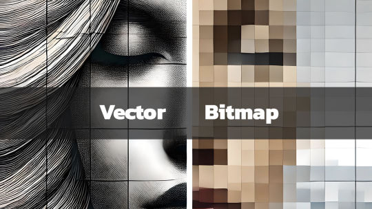
What They Are and Why They Matter
In today’s digital age, graphics play a key role in communication, design, and branding. Whether you're a professional designer, a hobbyist, or someone curious about digital art, you’ve likely come across the term Scalable Vector Graphics (SVG). But what exactly is SVG, and why is it important? What is a Scalable Vector Graphic (SVG)? Scalable Vector Graphics, commonly known as SVG, is an XML-based image format used for defining vector-based graphics for the web. Unlike traditional image formats such as JPEG, PNG, or GIF, SVGs are resolution-independent, which means they can scale to any size without losing image quality. This scalability makes SVG an essential tool for designers, developers, and anyone concerned with delivering crisp, high-quality visuals in a world where screen sizes vary from tiny watches to large 4K monitors. Key Characteristics of SVG: - Vector-Based: SVGs use mathematical equations to define shapes, lines, and colors instead of pixels. This makes them different from raster images, which are pixel-based. - Scalability: Because they're vector-based, SVGs can be resized infinitely without losing quality or becoming pixelated. - Lightweight & Optimized: SVG files are typically smaller in size compared to traditional image formats, which helps improve website loading times. - Interactive and Programmable: SVGs can be styled with CSS and animated with JavaScript, giving them greater flexibility for web design and interactive graphics. - Text-Friendly: SVGs can contain searchable and selectable text, making them great for accessibility and SEO. 2. Lightweight for Faster Load Times SVG files tend to be smaller in size compared to raster images, especially for simpler graphics like logos, icons, or geometric designs. This reduction in file size can improve your website’s load time—a critical factor for SEO and user experience. For eCommerce sites like the Vector Graphic Store, fast-loading graphics ensure that potential customers aren't stuck waiting for images to load, leading to lower bounce rates and higher conversions. 3. Resolution Independence With more high-resolution displays like Retina and 4K monitors becoming the norm, delivering images that look sharp across all devices is essential. SVGs shine in this area since they are resolution-independent. Whether viewed on an old smartphone or a high-definition television, SVG images will appear sharp and clear. 4. Interactive Capabilities SVGs aren’t just static images. Because they’re based on XML, SVGs can be easily manipulated using CSS and JavaScript. This means you can animate parts of an SVG, add hover effects, or even make parts of an image clickable. For example, an SVG logo could morph or change colors when a user hovers over it, providing an interactive experience. This is something that’s difficult, if not impossible, to achieve with formats like PNG or JPEG. How SVGs Are Used in Design SVGs are incredibly versatile, and designers use them in a wide variety of applications, including: - Logos and Icons: Logos, icons, and other small graphic elements are perfect for SVG format. They remain sharp on all screen sizes and devices, ensuring your brand looks its best. - Infographics and Data Visualization: SVG is ideal for creating charts, graphs, and infographics because of its scalability and ability to display crisp, clear text. - Illustrations and Artwork: Artists and illustrators can use SVG to create complex vector illustrations that can be scaled for use on anything from business cards to posters. - Responsive Web Design: SVG is a staple in responsive web design since it adapts perfectly to different screen sizes and resolutions without quality degradation. At the Vector Graphic Store, we specialize in providing high-quality SVG assets for artists, designers, and businesses. Our collection spans various themes, including the popular Gunframe Mech Series, where each vector is designed to be highly scalable and customizable. Pros and Cons of SVG Pros: - Infinite Scalability: Perfect for logos, icons, and detailed illustrations. - Small File Size: Typically smaller than raster images, helping with page load speeds. - Editable and Customizable: Easy to edit in graphic software like Adobe Illustrator and Inkscape, or programmatically in text editors. - Responsive and High-Resolution: Looks great on any screen size or resolution, without pixelation. Cons: - Complexity: SVG is not always the best choice for highly detailed or photographic images, as those require complex patterns that might be easier to achieve with a raster format like JPEG or PNG. - Browser Support: While most modern browsers support SVG, some older browsers (especially legacy versions of Internet Explorer) may have trouble rendering them. - Learning Curve: Editing or animating SVG files programmatically using CSS and JavaScript can require a bit of a learning curve. The Importance of SVGs in Modern Design As design and web development continue to evolve, SVG remains an essential tool for creating fast, scalable, and versatile graphics. Whether you’re working on a website, an app, or print material, SVG can provide the flexibility and quality you need. The Vector Graphic Store embraces the power of SVG, offering a wide range of designs that can be used for everything from product packaging to video game assets. With the rise of mobile-first design and the increasing demand for fast-loading websites, SVG is likely to continue growing in popularity. And with its ability to deliver sharp, clean visuals across all platforms, it’s clear why SVG is here to stay. Read the full article
#benefitsofSVG#bitmapcomparison#bitmapimages#bitmaplimitations#high-qualitygraphics#imageresolution#responsiveSVG#scalablegraphics#scalableimages#ScalableVectorGraphics#SVGadvantages#SVGfileformat#SVGgraphics#SVGimageformat#SVGvsbitmap#vectorart#vectordesign#vectorfilebenefits#vectorillustrations#vectorimagequality#vectorimagescaling#vectorimages#vectorvspixel#vectorvsraster#webdesignwithSVG#whatisSVG
0 notes
Text
How to Overcome Common Challenges in Custom Web Design

The ability to be unique and stand out from the crowd
The ability to scale the website whenever necessary
Better SEO
More personalized user experiences
These are some of the main reasons why businesses opt for custom website design over template websites. But, that does not mean going custom is easy.
Giving a website a 100% customized design is a complicated process full of unexpected challenges
From custom graphics to personalized checkout processes - there are simply too many variables to consider and too much room for error
That is why professional web designers always prepare for specific challenges long before they start the actual design process
In this article, we’ll discuss 5 common challenges in custom web design. We’ll explain how to overcome each of these challenges so that you too can prepare in advance.
Challenge #1. Usability Issues
Businesses opt for custom website design because they want to give their users inimitable experiences. Unfortunately, in their bid for inimitability, they make mistakes like:
Prioritizing aesthetic appeal or flashy features over the core user experience
Creating unique designs that do not meet real-world needs.
Packing their sites with too many features or options that overwhelm users
Adhering to outdated design trends
Using cursive fonts, hand-drawn letters, or other design elements that make website content unreadable
Creating complex designs that are not optimized for different devices or browsers
These types of design mistakes can kill a website’s usability. To overcome this challenge, designers must:
Ground their design decisions on user research
Use a limited number of visuals and optimize each one for fast-loading
Create a brand narrative and use only a limited number of media elements that fit that narrative
Follow established design conventions and webpage layouts that your user base is familiar with
Choose fonts that are easy to read on phone screens
Maintain consistent font styles, weights, and colors throughout the site
Use descriptive anchor text that indicates the destination of every link on the website
Use color to create a visual hierarchy
Make use of whitespace between elements
Use clear and concise menu labels
Implement breadcrumbs to help users understand their location on the site
Provide a robust search feature
Implement lazy loading for images and other content
By following these basic conventions, you can create custom websites that are just as easy to use as template sites.
Challenge #2. Mobile-Desktop Inconsistency
Over 60% of the world’s web traffic today comes from mobile devices. Despite this, many custom web designs are not optimized for smaller touchscreens. They are optimized for desktop screens and they feature design elements that pose major challenges on smaller screens:
Dropdown menus and nested navigation are very difficult to use on small screens
Flash animations that are slow-loading and do not render correctly on mobile devices
Large image galleries that slow down page load times on mobiles
Hover effects that don’t function as intended on touchscreens
Fixed header navigation that obscures content on smaller screens
Flashy pop-ups that take up whole phone screens
To avoid these challenges, web designers must:
While these elements and tricks can enhance the desktop experience, they often pose challenges on smaller screens:
Use simple, streamlined, and phone screen-friendly navigation structures like hamburger menus or a single dropdown menu
Use HTML5 animations or CSS transitions (instead of Flash animations)
Optimize image galleries for smaller screens and consider lazy loading
Use tap events or alternative interactions (not complex hover effects) that are more suitable for mobile screens
Make use of a collapsible header or a sticky navigation bar that scrolls with the page
Use unobtrusive notifications or in-line messaging – not intrusive pop-ups
In addition to taking these specific steps, custom web designers should always adopt a mobile-first approach. That means optimizing each element for touch and each page for a 6 to 9-inch touchscreen.
Challenge #3. Following a Strict Design Language
Improvisation and obedience often do not get along. It can be hard to follow a strict ‘design language’ when you are custom-creating your own custom layouts and design elements.
This challenge leads to design inconsistencies that confuse users:
Using colors that clash with the brand’s color palette
Making use of inconsistent spacing between elements, leading to an unbalanced layout
Using different icon styles throughout the site
Having elements that are not aligned properly
Using different button shapes, sizes, colors, or labels for similar actions on different pages
Using layouts that are not in line with user expectations (e.g., not using the F-shaped layout)
These subtle inconsistencies make website interfaces feel unfamiliar to users. Unfamiliarity breeds dislike. Design inconsistencies also increase project fees and development times.
That is because custom web designers have to create new components for each webpage instead of reusing existing ones. The only way to avoid this challenge is by creating a well-defined design system.
A design system is a comprehensive collection of design assets, guidelines, and principles that define a brand's visual identity and user experience
It serves as a centralized repository for designers
By looking at this system, designers can know what fonts, color palettes, iconography, layouts, grids, UI elements, etc., they should and should not use
By creating documentation that outlines the project’s design principles, best practices, and component usage guidelines, custom web designers can:
Ensures a cohesive and familiar brand experience across all digital touchpoints
Streamlines the design process by using reusable components across the website
Improve collaboration with developers and other stakeholders
Eliminate all inconsistencies from their design
Challenge #4. Browser Compatibility
Can you guarantee that your custom web design will function consistently across different browsers? Probably not if you are implementing responsive web design, which relies on CSS3 media queries and JavaScript for adaptive layouts:
Different browsers have their own unique CSS rendering engines
They interpret and render styles differently
This leads to variations in how elements are displayed across browsers
JavaScript engines also vary between browsers
While most new browsers support CSS3 media queries, older or less popular browsers have limitations in their implementation
Some browsers might have feature flags or built-in settings that affect media query behavior
These challenges lead to a website design that does not work as expected in certain browsers. To overcome this challenge, web designers must:
Exclusively use responsive design frameworks like Bootstrap or Foundation that come with built-in cross-browser compatibility features
Regularly test the website in a variety of browsers and devices
Use a CSS reset to normalize design styles across different browsers
Employ polyfills to provide fallback functionality for features that may not be natively supported
Monitoring of the site’s performance on different browsers should continue even after implementing these steps.
Challenge #5. Scalability
Businesses opt for custom designs because they want their websites to be flexible enough to grow with their brands. However, they often fail to define their long-term growth plans.
This failure leads to poor preparation which leads to a custom website that is unable to cope with evolving business/user needs.
So, many businesses are now questioning whether going custom is the right option if you want scalability. After all:
Many template marketplaces now offer themes with built-in scalability features (ThemeForest, TemplateMonster, etc.)
Platforms like Shopify and WooCommerce can handle large volumes of traffic and transactions in 2024
They offer scalable features like product variants and scalable inventory management plans
So, is scalability a challenge that is beyond custom web design today? Not if you prepare accordingly. Processing more user transitions and traffic will make your site work harder and designers need to prepare for that by:
Clearly outline your business' growth plans, including anticipated user growth, product expansion, and potential geographic expansion
Ensure your website is optimized for speed, even when traffic increases
Consider future scalability when designing the site’s information architecture, content structure, and navigation
Implement caching techniques to store frequently accessed data locally
Cloud providers like AWS, GCP, and Azure offer managed database services that can be easily scaled up/down based on demand. Providers like AWS, GCP, and Azure also offer scalable infrastructure that can handle varying traffic loads.
Make sure your tech stack features these types of technologies.
Conclusion
The best way to overcome these challenges is by working with experienced providers of custom web design & development services. If you can find a provider like that, discuss these challenges beforehand.
Once you overcome these challenges, you will realize that custom web design is still the quickest path to building a strong and inimitable online presence!
1 note
·
View note
Text
CSS Animated Text Overlay
#css animated text overlay#css animation tutorial#html css animation#css animation#html5 css3#html css#neduzone#CSS Image Hover#frontend#css#html#frontenddevelopment#webdesign#css animation examples
7 notes
·
View notes
Text
Webflow 101 (LO1)
I researched webflow not only for my final outcome but for my website. Also, it's important as a designer to learn all these necessary terminologies.
The box model for beginners
All content can be expressed in a box. This is why wireframes and rough sketches are often done in box.
The boxes flow like a text document.
It allows control of the document. This allows designers to have a fit structure and not place elements recklessly on the page.
Padding - Space inside the element.
Margin - Space outside the elements.
Intro to HTML (HyperText Markup Language)
HTML - Content
CSS - Style
HTML elements - Heading, paragraph, button, div (boxes that contain other elements together)
Inspect pages to see html and css (right click and inspect) Inspecting allows you change things. Inspecting is temporary and done locally.
Intro to CSS (Cascading Style Sheets)
CSS - Color, font, background image, spacing and layout, 3d perspective, animated transitions on hover.
Selectors - Applies similar style to objects.
Classes - Similar to component group as features are passed down.
Site Build (Part 1)
Content used in Section - Similar to chapters in a book.
Containers - put everything in it as a form of structure to contain things. It follows the box model and has default margins set on it (mostly placed in the center). Like every other element it's often placed in the Section.
Flexbox - In layout (make it vertical) not manually arranging everything.
CSS - Create Color Swatches (It keeps things consistent)
Typography - Select body and child elements will change type instead of manually. (add fonts)
Alt and drag affects the padding on both sides (top and button is different)
Styling a button creates a class
180 degrees is the modern angle for a shadow.
Body > Section > Containers > content (e.g grid, divblock, flexblock, etc)
Website navbar (Part 2 of Site Build)
Add navbar
Navlinks are link blocks with the menu components
Create style class for navlinks by adding features
Comboclass - in selector for contact page as it's a different button (this will bring up the contact page or form which is important for users as that's every designer's end goal)
Website logo section (Part 3)
(Structure) Add section and container for footer.
Add div block and change layout style to grid
Turn on flexbox
CCS grid - switch to grid in CSS - (Add columns and remove rows) align it,
Website cards section (Part 4)
Create heading 2
Add div block within the grid.
Hold Control and drag elements into div so they stack up on each other.
Create card style.
Style manager - to remove unused elements.
Headings don't need class.
Website form (Part 5)
Add section and container
Command + E = to add elements
Add form block which contains field label and text field
Alt + drag in div to duplicate
Remove heading from container
Flexbox on form
Add divs
Settings in the right hand panel to check success and error state for form.
Website footer (Part 6)
Text link
Alt G for copyright logo
Responsiveness (Part 7)
Navbar settings panel shows the hamburger menu and screens it's visible on.
Custom Interactions (Part 8)
Change style on hover in the selector pane.
Transitions can be made in the none or default state
2d and 3d transformations can be done (use child perspective to give a more 3d feel)
Page load animation
Interactions - bolt
Ease in out quart for animation
Control click - select multiple objects
Accessibility review (Part 10)
Alt text for people using a screen reading
Page settings for SEO Search Engine Optimization (Metadescription)
Open graph title (social media)
Publish custom domain
Add domain
Introducing QuickStack
Presets - quickstacks - grids filled with divs. - grids
Flexbox is good for building 1d
CSS grids is for 2d
Grids - good for auto-layout (the disadvantage is you have to manually add divs)
Quick stacks = divs and grids
V flex and h flex = similar.
0 notes
Text
Web design that incorporates motion graphics and animation
In Web Design, Animation In web design, animation gives static pages movement and interest, which increases user engagement. Animation uses everything from subtle hover effects to smooth transitions to guide readers through the content and highlight important elements. Animation may improve navigation, bolster branding, and convey information when done properly. However, it's imperative to make sure that animations improve usability rather than worsen it. When implemented properly, animation enhances a website's visual appeal, usefulness, and capacity to captivate and stick in the minds of visitors.
Animation Types: GIFs, JavaScript, SVG, and CSS Web designers employ a variety of animation techniques to improve user experience and aesthetic appeal. Keyframe animations and seamless transitions are made possible using CSS animations right within the browser. JavaScript offers sophisticated control over animations, enabling intricate interactions with the help of frameworks like GSAP and jQuery. Vector images are used in SVG animations to create scalable, high-quality effects. GIFs are a simple way to add brief, recurring animations to webpages. Designers of Digital Marketing strategies select the best method based on performance factors and intended outcomes.

Using Micro Interactions to Improve UX By incorporating minor interactions throughout a website or application, micro interactions significantly improve user experience (UX). Instant feedback is provided by these little animations or feedback systems, which improves the intuitiveness and interest of interactions. Micro interactions help to increase usability by providing guidance to users, such as a loading animation that shows progress or a button that changes color when under hover. By paying attention to these little things, designers make the user experience more enjoyable and smooth, which increases user loyalty and retention.
Guidelines for Effective Animation Good animation guidelines guarantee that animations are intuitive, have definite functions, and are consistent in timing and action. They should be optimized for performance on all platforms and blend in with the brand's overall design look and identity. These rules aid designers in producing captivating animations that improve user experience and accomplish design objectives.
Using Motion Graphics to Establish Brand Identity Motion graphics provide a dynamic way to show brand identity in web design. To create a cohesive user experience, designers combine text, animated components, brand colors, and logos. Consistency across several platforms improves brand recognition, and integrating motion graphics with advertising builds emotional connections with viewers. When all is said and done, motion graphics are a powerful tool for strengthening brand identification online.
Increasing the Performance of Animation Optimizing animation performance is crucial in Web Design to provide smooth user experiences. This entails prioritizing simpler CSS animations over options that need a lot of resources, such JavaScript-based animations. Limiting the number of animations that run simultaneously and optimizing hardware acceleration are other essential steps. By using these strategies, designers may strike a balance between visual appeal and performance to build experiences that are fluid across devices and network conditions.
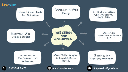
Innovative Web Design Examples Innovative methods for enthralling users are demonstrated in creative web design examples. With their unique navigation and engaging multimedia experiences, these websites push the envelope and establish new benchmarks for design brilliance. Designers may broaden their skill set and keep on top of the ever-changing web design scene by taking inspiration from these examples.
Animation Tools and Libraries Animation tools and libraries are essential resources for web designers aiming to create dynamic and engaging animations. These resources offer a variety of functionalities, from simple CSS animations to complex JavaScript animations. Popular libraries like GSAP and Anime.js provide pre-built animations and easy-to-use APIs, while design software such as Adobe After Effects allows for the creation of intricate animations. With these tools, designers can streamline their workflow, save time, and produce stunning animations that enhance the user experience.
Upcoming Developments in Web Animation Future developments in online animation will change how users interact with new tools and methods of design. Among these are WebGL and WebGPU-enabled 3D animations for enhanced realism and depth. Smooth and easy browsing is provided by motion-based navigation and micro interactions. AI-powered animations promise tailored experiences that raise user interest. All things considered, web animation has a lot of potential to produce engaging, dynamic, and user-focused digital experiences.
0 notes
Text
Banner Bliss: Animation Techniques with CSS

Introduction
Welcome to the world of web design where creativity meets functionality! In this blog post, we'll delve into the fascinating realm of CSS animations, focusing particularly on techniques to breathe life into banners. Animated banners not only capture attention but also contribute to a dynamic and engaging user experience. Whether you're a seasoned web developer or just starting, understanding the basics of CSS animations and exploring advanced techniques can significantly enhance your design repertoire. Get ready to embark on a journey of 'Banner Bliss' as we unravel the secrets behind creating captivating and effective animated banners using CSS.
Understanding CSS Animation Basics
Before diving into the intricacies of crafting captivating banner animations, let's establish a solid foundation by exploring the fundamental basics of CSS animations. CSS Animations: Cascading Style Sheets (CSS) animations allow developers to bring elements on a webpage to life through smooth transitions and transformations. These animations are achieved by changing an element's CSS properties over a specified duration. Key Animation Components: - Selectors: Define which elements on the webpage will be animated. - Properties: Specify the CSS properties that will change during the animation (e.g., opacity, width, height). - Duration: Set the time it takes for the animation to complete. - Timing Function: Determine the acceleration or deceleration pattern of the animation (e.g., ease-in, ease-out). - Keyframes: Define specific points in the animation sequence and specify the CSS properties at each point. Transitions vs. Animations: While CSS transitions are suitable for simple, one-off changes, animations offer more control and flexibility for creating complex and dynamic effects. Animations are particularly powerful when crafting banners that require a combination of movements and transformations. Browser Compatibility: It's crucial to consider browser compatibility when working with CSS animations. Fortunately, modern browsers support CSS animations, ensuring a consistent experience for users. However, it's wise to test your animations across different browsers to address any potential compatibility issues. Using the @keyframes Rule: The @keyframes rule is the backbone of CSS animations. It allows you to specify the intermediate steps or keyframes of an animation sequence. By defining the styles at different keyframes, you can create complex and dynamic animations that smoothly transition between states. Example: CSS@keyframes slide { 0% { transform: translateX(0); } 100% { transform: translateX(100%); } }
Creating Eye-Catching Banners
Now that you've grasped the fundamental concepts of CSS animations, let's channel that knowledge into crafting visually stunning and attention-grabbing banners. Banners play a crucial role in conveying messages, promoting products, or enhancing the overall aesthetics of a website. In this section, we'll explore various CSS animation techniques to elevate your banner designs. 1. Entrance Animations: Start your banners with an impressive entrance animation to immediately capture the user's attention. Utilize @keyframes to define an animation that introduces the banner elements in a visually appealing manner. 2. Hover Effects: Enhance user interaction by incorporating subtle hover effects. Use CSS properties such as transform and transition to create smooth and responsive animations triggered by mouse hover. Consider effects like scaling, fading, or color transitions to make your banners interactive. 3. Text Animations: Make your banner messages dynamic by animating the text content. Experiment with properties like opacity and transform to create fading text, typewriter effects, or text rotations. Ensure the animations align with your brand style and messaging. 4. Carousel Banners: For banners showcasing multiple images or messages, implement a carousel effect. Utilize CSS animations along with JavaScript or pure CSS solutions to create a smooth transition between banner slides. This adds a professional touch and keeps users engaged. 5. Color Transitions: Experiment with color transitions to add vibrancy and visual appeal to your banners. Use @keyframes to smoothly transition between different color schemes. Consider the psychology of colors to evoke specific emotions or convey particular messages through your banners. 6. Interactive Elements: Take banner animations to the next level by incorporating interactive elements. This could include buttons, clickable areas, or animated call-to-action elements. Ensure that these interactive features enhance user engagement without compromising the overall user experience. 7. Responsive Design: Make your banners visually consistent across various devices by implementing responsive design principles. Use media queries to adjust animation properties based on the screen size, ensuring a seamless experience for users on both desktop and mobile devices. 8. Testing and Optimization: Before deploying your banners, thoroughly test them across different browsers to ensure compatibility. Optimize your animations for performance by minimizing unnecessary complexities and utilizing CSS animation best practices. By integrating these techniques, you can transform ordinary banners into captivating visual experiences that leave a lasting impression on your website visitors. See the Pen Sale banner by @BrawadaCom (@Anna_Batura) on CodePen.
Key Animation Properties
As you continue your journey into the world of CSS banner animations, it's essential to understand the key properties that govern the behavior and appearance of your animated elements. These properties empower you to control the timing, duration, and style of your animations effectively. 1. Animation Name: The animation-name property defines the name of the animation, referencing the @keyframes rule that describes the animation's behavior. This property establishes the foundation for your animation sequence. 2. Duration: Specify the duration of your animation using the animation-duration property. This value determines how long the animation will take to complete one cycle, influencing the overall speed and feel of the animation. 3. Timing Function: The animation-timing-function property dictates the pacing of the animation, controlling the acceleration and deceleration throughout its duration. Common values include ease, linear, ease-in, ease-out, and ease-in-out. 4. Delay: Introduce a delay before the animation starts using the animation-delay property. This delay allows you to synchronize multiple animations or create a suspenseful effect before the animated elements come into view. 5. Iteration Count: Determine how many times the animation should repeat with the animation-iteration-count property. Setting it to infinite ensures a continuous loop, while a specific number will control the number of animation cycles. 6. Direction: The animation-direction property manages the direction of the animation sequence. Choose from values like normal, reverse, alternate, or alternate-reverse to control the flow of your animation. 7. Fill Mode: Define how the animated element should appear before and after the animation with the animation-fill-mode property. Options include none, forwards, backwards, and both, influencing the styling during animation playback. 8. Play State: The animation-play-state property allows you to pause or resume an animation dynamically. Toggle between running and paused values to control the animation state based on user interactions or specific events. Table of Animation Properties: PropertyDescriptionanimation-nameSpecifies the name of the animation.animation-durationSets the duration of the animation.animation-timing-functionDefines the pacing of the animation. Mastering these animation properties provides you with the tools to create nuanced and polished banner animations that align with your design vision. In the upcoming sections, we'll delve into practical examples to showcase how these properties work together to produce compelling visual effects.
Optimizing Performance
Efficient performance is paramount when implementing CSS banner animations to ensure a smooth and delightful user experience. Let's explore strategies and best practices to optimize the performance of your animations and keep your website running seamlessly. 1. Hardware Acceleration: Take advantage of hardware acceleration to offload the rendering of animations to the device's GPU, enhancing performance. Utilize the transform and opacity properties for hardware-accelerated animations, ensuring better rendering speeds. 2. Limiting Animations: While animations add flair to your banners, overusing them can lead to performance issues. Be judicious in your use of animations, focusing on key elements and actions to avoid overwhelming the user with excessive movement and transitions. 3. Optimal Frame Rate: Consider the frame rate of your animations. Aiming for a standard 60 frames per second (fps) ensures smooth and visually appealing motion. Use tools like browser developer tools to assess the frame rate and make adjustments accordingly. 4. Minimizing DOM Manipulation: Excessive manipulation of the Document Object Model (DOM) can impact performance. Limit unnecessary DOM changes during animations to reduce the workload on the browser. Opt for CSS-only animations whenever possible, avoiding JavaScript-based animations for improved efficiency. 5. CSS Hardware Acceleration: Apply CSS properties that benefit from hardware acceleration, such as translate3d and scale3d. These properties trigger hardware acceleration, enhancing the rendering speed of your animations. 6. Animation Shorthand: Consolidate your animation properties using the animation shorthand property. This not only simplifies your CSS code but also helps the browser optimize the rendering process. Include name, duration, timing-function, and other relevant properties within the shorthand declaration. 7. Debouncing and Throttling: Implement debouncing and throttling techniques when using JavaScript in conjunction with CSS animations. These strategies prevent excessive function calls, reducing the likelihood of performance bottlenecks and ensuring a smoother animation experience. Table of Performance Optimization Techniques: TechniqueDescriptionHardware AccelerationUtilize GPU for rendering animations.Limiting AnimationsUse animations judiciously to avoid overload.Optimal Frame RateAim for 60 frames per second for smooth motion. By implementing these optimization strategies, you can strike a balance between engaging CSS banner animations and optimal website performance. In the next sections, we'll explore advanced animation tricks and techniques to further enhance your banner designs.
Responsive Animation Design
Ensuring that your CSS banner animations look and function seamlessly across a variety of devices is crucial in today's multi-device landscape. Let's explore the principles of responsive animation design to create a consistent and engaging user experience regardless of screen size or device type. 1. Media Queries: Integrate media queries into your CSS to tailor your animations based on the device's screen size and characteristics. Adjust animation properties, durations, and even the existence of certain animations to optimize the visual experience on different devices. 2. Flexible Units: Use relative units like percentages and viewport units (e.g., vw for viewport width) instead of fixed pixel values. This ensures that your animations scale appropriately, adapting to the varying screen dimensions of different devices. 3. Breakpoints: Identify key breakpoints in your design where the layout or content structure changes. Implement specific animation adjustments at these breakpoints to accommodate the shift in design and maintain a visually pleasing experience. 4. Fluid Grids: Incorporate fluid grid systems to create layouts that adapt proportionally to the screen size. This allows your animations to seamlessly adjust to different screen dimensions, promoting a harmonious visual flow across devices. 5. Touch-Friendly Animations: Consider the touch interface when designing animations for mobile devices. Implement touch-friendly gestures and interactions, ensuring that your animations respond intuitively to swipes, taps, and other touch-based inputs. 6. Retina-Ready Graphics: Optimize your graphics for high-density displays, commonly found in modern smartphones and tablets. Use high-resolution images and vector graphics to ensure crisp and clear animations on devices with Retina or similar high-DPI screens. 7. Test Across Devices: Thoroughly test your responsive animations on a variety of devices and browsers to identify and address any inconsistencies or issues. Emulators and real-device testing are essential to ensure a reliable and uniform experience for all users. Table of Responsive Design Techniques: TechniqueDescriptionMedia QueriesAdapt animations based on screen characteristics.Flexible UnitsUse relative units for adaptable animations.BreakpointsAdjust animations at key design breakpoints. By implementing these responsive design principles, your CSS banner animations will not only look visually appealing but also provide a consistent and enjoyable experience across the diverse landscape of devices. In the following sections, we'll delve into advanced animation tricks to elevate your banner designs even further.
Advanced Animation Tricks
Ready to take your CSS banner animations to the next level? Let's explore advanced techniques and tricks that add flair, sophistication, and a touch of magic to your animated banners. 1. Parallax Scrolling: Introduce depth and dynamism to your banners by incorporating parallax scrolling effects. Create an illusion of layered movement as background and foreground elements scroll at different speeds, providing a captivating visual experience. 2. 3D Transforms: Enhance the visual appeal of your banners with 3D transforms. Utilize properties like rotateX, rotateY, and perspective to add depth and perspective, creating eye-catching animations that simulate three-dimensional space. 3. Morphing Shapes: Transform shapes seamlessly during animations to create mesmerizing morphing effects. Use the @keyframes rule to transition between different shapes, adding a dynamic and fluid quality to your banners. 4. SVG Animations: Incorporate Scalable Vector Graphics (SVG) for intricate and scalable animations. SVG graphics can be animated using CSS animations and provide a lightweight and responsive solution for creating complex visual effects within your banners. 5. Particle Animations: Add an element of enchantment to your banners with particle animations. Use CSS and JavaScript to simulate particle movements, creating dynamic backgrounds or interactive elements that respond to user actions. 6. Staggered Animations: Introduce a sense of rhythm and coordination by staggering animations. Apply different delays to individual elements within a group, creating a cascading effect that adds complexity and sophistication to your banner designs. 7. Custom Easing Functions: Move beyond standard easing functions and create custom easing curves for your animations. Experiment with cubic bezier curves to fine-tune the acceleration and deceleration of animated elements, achieving a unique and polished look. 8. Dynamic Gradients: Bring vibrant color transitions to your banners with dynamic gradients. Use CSS animations to smoothly change gradient colors over time, creating visually stunning effects that catch the eye and enhance the overall aesthetic. Table of Advanced Animation Tricks: TechniqueDescriptionParallax ScrollingCreate depth with scrolling background layers.3D TransformsAdd perspective and depth to animations.Morphing ShapesSeamlessly transition between different shapes. These advanced animation tricks offer a myriad of creative possibilities to elevate your banner designs. Experiment with these techniques to craft visually stunning and memorable animated banners that leave a lasting impression on your website visitors.
Case Studies
Let's dive into real-world examples to witness the impact and effectiveness of CSS banner animations. These case studies highlight successful implementations, demonstrating how thoughtful animation design can enhance user engagement, convey brand messages, and elevate the overall user experience. Case Study 1: E-Commerce Product Showcase In this case, a leading e-commerce platform incorporated CSS animations to showcase their featured products. Read the full article
0 notes