#Information Architecture
Explore tagged Tumblr posts
Visit Tumblr Blog
Explore Tumblr blogs with no restrictions, modern design and the best experience.
Last Seen Tumblr Blogs


Fun Fact
In Q3 of 2020, 31% of US users access the Tumblr app daily.
Text

The Science Underground: Mycology as a Queer Discipline Patricia Kaishian and Hasmik Djoulakian
#mycology#subjectivity#article#fungi#science#queer#oppression#Donna Haraway#Patricia Kaishian#Hasmik Djoulakian#native american#language#interaction#information architecture#catalyst
5 notes
·
View notes
Text
instagram
An #informationarchitecture of a #recycling #app that aims to #changetheworld. ♻️🌍 #uxflowcharts turned out to be handy and very useful in building the recycling #userexperience. If you don't skip this part of #userresearch, you can make the #userinterface and prototyping more efficient, and the product can meet the expectations and needs of all users. And recycling can become easier and more popular. #uxdesigner #recyclingapp #savetheplanet #hardworkpaysoff💪
#inspiration#ux#ux research#uxuidesign#uxuimaster#ux flowchart#information architecture#inspection#graphic design#Instagram
2 notes
·
View notes
Quote
Visual information — the arrangement, or layout, of text, shapes, colors, textures, and images — is always what establishes the bond between information and attention.
The Fragile Bond Between Attention and Information - Christopher Butler
3 notes
·
View notes
Text
Information Architecture IA
To break down further and understand how the app is going to be structured, I drafted a quick breakdown of Information that we will later translate into the app. The target is to make myself aware of possible options, user flow with page breakdown and information with consistency. I broke the information into 2 IA- One for the basic layout with home page and further navigation, and the possible features.
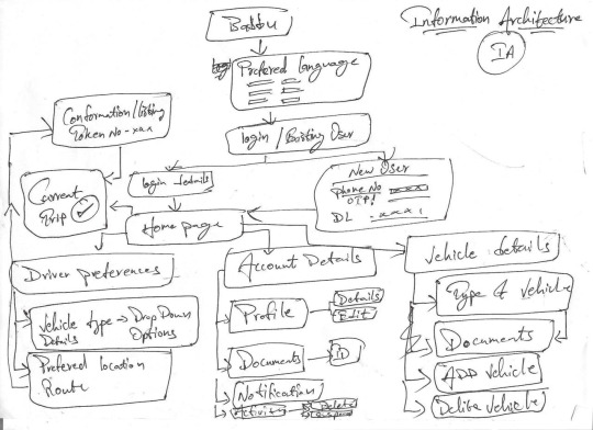
The first illustration is a breakdown of Login/New user, Homepage, Account details, and Vehicle Details. These three will be the guiding sections and will be further broken down.
My entire idea for the app is to be simple so that anyone with minimal to no knowledge of a smartphone can handle the app. Yet, the user flow seems too dynamic and complicated at first glance. So, I thought I would just summarise all the information first and then refine and fine-tune it later.

I had to further write/draft information, but the paper size was restrictive with less space, and I had to draft on a new paper.
It's an extension of the first draft.
Homepage, is further divided in to Driver preferences, Account Details, Vehicle Details.
So the navigation goes ( After downloading the app)
The user is given an option to either log in or register for the app. Registration is as simple as logging in; you just need a registered phone number. If the user is registering, they need a registered mobile number and an ID (driver's license number/photo). Verification for the ID is done later, but the user is navigated to the homepage and is ready for further steps.
Once the user is in, he is given options to put his preferences, such as the Type of vehicle and route that he prefers. He gets a token number and verification of confirmation. That's all—the user is on the list! The driver can be an existing or new user, but it's still the same amount of friction and time taken to get to the listing.
Once there is a match for the driver's preference, he gets a notification request for an order. Once the driver agrees, he gets a detailed breakdown of freight charges and the exact location for pickup. After confirming he the details are shared with the consignee and consignor. WIF, the driver rejects the request? Then the order will be processed to the next waiting person on the list as per the token. This will assure the driver about a strong system in place and guaranteed orders with low commission rates.
On confirming, the driver can either complete his registration with a Driver's licence and vehicle RC or provide his phone numbers. Until the point of order confirmation, both registered and new users only need their phone numbers; the rest can be provided once the order is confirmed.
The homepage is going to be the pilot of the app, which displays driver preferences along side current trip status.
Other key Pages would be Account details and Vehicle Details, which are data stored for the user and vehicle, such as past trips and general info.

0 notes
Text
New listings added today! (5/5/25): So, where do we go from here? That's the main question following the closing of STC. Here are some suggestions that I've gathered: #techcomm
#business communication#Communication#content#Content management#content strategy#Design#digital literacy#education#elearning#globalization#indexing#information architecture#information design#information development#instructional design#knowledge management#learning and development#localization#medical writing#proposal management#proposal writing#scientific communication#service innovation#talent development#tech comm#Technical communication#technical communications#technical editing#technical writing#technology
0 notes
Text
The user experience design process is evolving at an unprecedented rate, largely driven by advances in artificial intelligence (AI). As businesses strive to enhance digital interactions, AI's role in UX design has become more crucial than ever, offering a sophisticated blend of efficiency and insight. This integration streamlines the design process to ensure that digital platforms are more intuitive, responsive, and tailored to user needs. This post explores how AI is revolutionizing the UX design process, from initial user research to the final stages of implementation, providing practical insights for those considering its adoption.
#UI/UX Design Services for Startups in Dubai#Affordable Web Design for Small Businesses in Dubai#Custom App Design Solutions in Dubai#Professional Branding Services for New Companies in Dubai#Responsive Website Design Experts in Dubai#User-Centric Mobile App Design in Dubai#E-commerce Website UI/UX Design in Dubai#Innovative Digital Product Design Agency in Dubai#High-Converting Landing Page Design Services in Dubai#Comprehensive UX Strategy Consulting in Dubai#UI ( User interface )#UX (User experience)#Wireframe#Design#User Research#Usability Testing#User persona#User Flows#Information Architecture#High Fidelity#Web design#Website development#Responsive web design#UX/UI design#Graphic design for websites#Web design company#Flat web design#Brand identity design#Logo design#Social media branding
0 notes
Text
The user experience design process is evolving at an unprecedented rate, largely driven by advances in artificial intelligence (AI). As businesses strive to enhance digital interactions, AI's role in UX design has become more crucial than ever, offering a sophisticated blend of efficiency and insight. This integration streamlines the design process to ensure that digital platforms are more intuitive, responsive, and tailored to user needs. This post explores how AI is revolutionizing the UX design process, from initial user research to the final stages of implementation, providing practical insights for those considering its adoption.
#UI ( User interface )#UX (User experience)#Wireframe#Design#User Research#Usability Testing#User persona#User Flows#Information Architecture#High Fidelity#Web design#Website development#Responsive web design#UX/UI design#Graphic design for websites#Web design company#Flat web design#Brand identity design#Logo design#Social media branding#Brand logo design#Mobile app design#iOS app design#Android app design#Flat app design#user experience design#ui and ux design#ux design services#ux web design#web app design
0 notes
Text
Information Architecture (IA) is the practice of organizing, structuring, and labeling content to make information easily accessible and understandable for users. It plays a crucial role in web design, mobile apps, software interfaces, and digital systems, ensuring users can navigate content efficiently and achieve their goals.
Visit Our Web Design Blog
1 note
·
View note
Text

In a world saturated with products, packaging design has become a crucial battleground for brands to capture consumer attention. Beyond aesthetics, effective packaging design hinges on a well-structured information architecture. This intricate interplay between form and function determines how consumers interact with a product, influencing purchase decisions and brand perception.
In this blog post, we delve into the fascinating world of information architecture and its transformative impact on packaging design. We'll explore how strategic planning and organization of content can elevate a product's shelf appeal, enhance user experience, and drive sales. From understanding consumer behavior to creating intuitive layouts, we'll uncover the secrets to designing packaging that not only looks great but also delivers results.
Let's unpack the power of information architecture in packaging design together.
1 note
·
View note
Text
Building a Logical Flow: Information Architecture for Engaging Blog Posts

We bloggers pour our hearts into crafting compelling content, meticulously researching topics, and sharing our unique perspectives. But what about the unseen forces that shape how readers experience our work? Enter the unsung heroes of blogging: typography, information architecture, and title tags. While often overlooked, these elements play a crucial role in transforming our content from a collection of words into an engaging and impactful blog.
1. The Art of Speaking Volumes: Typography’s Silent Power
Imagine a captivating story whispered in a monotone. While the content itself might be interesting, the delivery falls flat. Typography, similar to vocal inflection, adds depth and meaning to your written content. The right font choice can:
Set the Tone: A playful script can create a lighthearted atmosphere, while a bold serif conveys authority.
Enhance Readability: Easy-to-read fonts with appropriate size and spacing prevent reader fatigue.
Guide the Reader’s Eye: Using different font styles for headings, subheadings, and body text creates a visual hierarchy that guides readers through your content.
2. Building a Mental Map: Information Architecture for Clarity
Information architecture (IA) is the architect within you, meticulously designing the layout of your blog to optimize user experience. Strong IA ensures a smooth reading journey by:
Creating a Clear Navigation: A well-organized menu with logical categories and subcategories allows readers to easily find the information they seek.
Structuring Content Logically: Imagine a recipe instructing you to frost a cake before mixing the batter. A logical flow within blog posts keeps readers engaged and prevents confusion.
Internal Linking: Connecting related posts within your blog keeps readers engaged, allows them to explore further, and improves SEO.

Title tags are the first impression your blog posts make on search engines and readers alike. They’re like the catchy headlines of a newspaper that entice you to delve deeper. A compelling title tag should:
Be Keyword-Rich: Include relevant keywords that people might search for, but avoid keyword stuffing that sounds unnatural.
Offer Clarity: Clearly reflect the content of your post, accurately setting reader expectations.
Spark Curiosity: Intrigue readers with a hint of what they will learn, prompting them to click and discover more.
The Synergy of Success
These unsung heroes, when working together, weave magic on your blog. Typography draws readers in, IA guides them through your content, and title tags act as the initial pull. When all three elements work in harmony, your blog becomes a well-designed space that fosters engagement, clarity, and ultimately, a loyal readership. So, the next time you sit down to create a blog post, don’t just focus on the content itself. Remember the power of typography, information architecture, and title tags. By wielding these unsung heroes strategically, you can transform your blog into a powerhouse of reader engagement and success.
0 notes
Text
The ROI of Great Web Design: How a Smart Website Boosts Your Business
There's a secret weapon for boosting your online success... and it's not what you think! Discover the power of exceptional web design in our new eBook.
In today’s digital age, your website is your storefront to the world. But is it a thriving marketplace or a dusty forgotten corner? This ebook, written by Mwenya Chongo, CEO of Mukwood Digital Web Design Studio (registered in Zambia), dives deep into the power of well-crafted web design and how it directly impacts your business’s bottom line. Uncover the hidden potential of your website and…
View On WordPress
#affordable web design#best web design companies#branding#Content Marketing#conversion rate optimization (CRO)#digital marketing#domain name registration#ecommerce website design#email marketing#graphic design#information architecture#landing page design#logo design#mobile-friendly web design#responsive web design#responsive web design cost#ROI for web design#search engine marketing (SEM)#SEO cost#SEO web design#social media marketing#user experience (UX) design#user interface (UI) design#web analytics#web copywriting#web design#web design agency#web design case studies#web design for non-profits#web design for small businesses
0 notes
Text
📚 Let's talk about the power of subheadings in academic analysis projects! 📚
Subheadings play a crucial role in guiding the academic reader through the process of our analysis projects. Each subheading acts as a signpost, directing readers to specific sections and helping them navigate the wealth of information presented. Which subheading from my brainstorm project design offers the most efficient information architecture?
"Data and Data Analysis"
Why this choice of subheading? Well, This subheading encapsulates the heart of the analysis, offering a comprehensive overview of the data collected and the subsequent analysis conducted. It serves as a one-stop destination for readers seeking insights into engagement metrics and data interpretation.
Within this section, visualizations such as graphs and tables are included to present the data in a visually appealing and easily digestible format. These visual aids enhance comprehension and facilitate deeper understanding of engagement trends and patterns.
Not only does this subheading present raw data, but it also delves into the interpretation of key findings. By offering insights into engagement metrics over the specified period, readers gain valuable insights into the impact of content types and posting frequencies on audience engagement.
Importantly, the "Data and Data Analysis" subheading leads to discussions on the implications of the findings for content strategy. It provides actionable recommendations for influencers based on the engagement analysis, empowering readers with practical insights derived from the data.
The "Data and Data Analysis" subheading serves as the backbone of the analysis project, offering a structured and efficient information architecture that guides readers through the journey of data exploration, interpretation, and actionable insights.
The mighty subheading and its role in illuminating the path to academic enlightenment! 🌟💡
#subheadings #academicwriting #dataanalysis #contentstrategy #informationarchitecture
1 note
·
View note
Text
LinkedIncrease
I like LinkedIn, and I value my connections there. I try to be responsible in connecting with people on LinkedIn. I don't agree to connect with just anyone. It has to be someone I know. Either I've met you in person, or we've at least had a conversation of some sort online. Just because you went to the same school, live in the same city, work at the same company, or are practicing the same profession doesn't mean I know you. I used to accept connections from anyone who was a member of IxDA or an alumnus of one of CMU's UX-related programs, but I stopped doing that. If I don't recognize your name and you don't leave a message with your connection request, I won't even bother checking your profile. Given my position as a Senior Manager at Boeing, at just get way too many connection requests to spend the time.
And yet, I'm getting close to breaking 1,000 connections. I consider my connections list a valuable resource, but if it gets too long, it's going to be harder to use. I'd like to see some ability to manage that list. If I could tag my connections to categorize them, that would be very helpful. I can filter them by location, company, school, and industry, which is helpful, but I want to create categories like "CMU MHCI Students I met in critique" and "Designers I met briefly at conferences" and "My past students" and "Friends of my wife". I'd probably need a category for "People I don't remember". That would really help me when I'm looking for people.
1 note
·
View note
Text
A Revolution in UI/UX Development with Kickr Technology
In the fast-paced world of technology, where user interfaces and experiences dictate the success of digital products, the intersection of creativity and functionality becomes paramount. Enter Kickr Technology, a game-changer in UI/UX development, revolutionizing the way we design and interact with digital experiences.
The Visionary Approach: Kickr's UI/UX Philosophy
Kickr Technology stands as a beacon for a new era in UI/UX development, emphasizing a user-centric approach that goes beyond aesthetics. The philosophy is clear: crafting interfaces that are not only visually appealing but also seamlessly intuitive, ensuring users feel empowered and engaged from the moment they interact with an application.
Unified Experiences Across Platforms
One of the standout features of Kickr in UI/UX development is its ability to deliver unified experiences across platforms. With a single codebase, developers can create applications that seamlessly adapt to various devices and operating systems, ensuring a consistent and familiar experience for users whether they're on a smartphone, tablet, or desktop.
Real-time Interactivity: Beyond the Ordinary
Kickr Technology elevates UI/UX development by introducing real-time interactivity into the equation. From fluid animations to responsive touch gestures, applications developed with Kickr are not just static interfaces; they are dynamic, living entities that respond to user actions in real-time. This level of interactivity enhances the user experience, making interactions more natural and engaging.
Intuitive Design Tools for Creativity Unleashed
Creativity knows no bounds with Kickr's intuitive design tools. UI/UX designers can bring their visions to life with precision, leveraging Kickr's capabilities to create interfaces that are both visually stunning and highly functional. The result is an immersive user experience that seamlessly guides users through the application while delighting them with thoughtful design elements.
Data-Driven Decision Making
Kickr Technology empowers UI/UX developers with valuable insights through its data-driven approach. By providing analytics and user behavior metrics in real-time, developers can make informed decisions to optimize and enhance the user experience continually. This iterative process ensures that applications evolve based on user interactions and preferences.
Collaborative Development: Breaking Silos
Kickr fosters collaboration between UI/UX designers and developers, breaking down silos that traditionally hindered seamless communication. With a shared codebase and design principles, the development process becomes a collaborative effort, resulting in faster iterations, fewer discrepancies, and ultimately, a more cohesive user experience.
Looking Ahead: The Future of UI/UX with Kickr
As we navigate the ever-evolving landscape of technology, Kickr Technology stands as a guiding force in shaping the future of UI/UX development. The marriage of intuitive design, real-time interactivity, and unified experiences across platforms positions Kickr as a catalyst for innovation in digital experiences.
In conclusion, Kickr Technology is not merely a tool; it is a paradigm shift in UI/UX development. By seamlessly blending creativity, functionality, and data-driven insights, Kickr empowers designers and developers to push the boundaries of what's possible. As we embrace the era of designing tomorrow, Kickr stands at the forefront, shaping the digital experiences that will define our interaction with technology in the years to come.
0 notes
Text
New on TechCommGeekMom: Unruly Content: Why Governance Matters
#content#content design#content engineer#content governance#content strategy#digital governance#digital literacy#governance#information architecture#tech comm#TechCommGeekMom#Technical communication#technical communications#technical writing
0 notes