#user interface (UI) design
Explore tagged Tumblr posts
Visit Tumblr Blog
Explore Tumblr blogs with no restrictions, modern design and the best experience.
Last Seen Tumblr Blogs


Fun Fact
Tumblr is used by 21% of adults online aged 18-29 years.
Text
Honestly, the thing that really burns my ass about mobile web design these days isn't even the bloated ads – it's the pages where there's nowhere that's safe to touch to scroll because every single pixel is a clickable hotspot that whisks you away to somewhere else, including the text. I truly believe the owners of websites that do this should die.
#life#computers#technology#internet#web design#user interface#user experience#ux#ui#grumping#death mention#swearing
5K notes
·
View notes
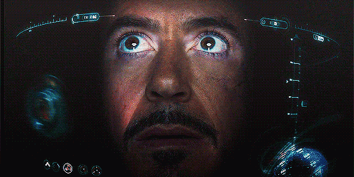
Text


Blame! (2017)
#blame!#cyberpunk aesthetic#scifi anime#user interface#anime#user interaction#graphic design#aesthetic#japanese animation#scifi aesthetic#japanese anime#anime gif#ui ux design#uidesign#ui#glitch video#glitch#glitch art#glitch aesthetic#robotics
1K notes
·
View notes
Text
“I Need Your Support to Continue My Studies and Build My Future from Gaza🍉🍉

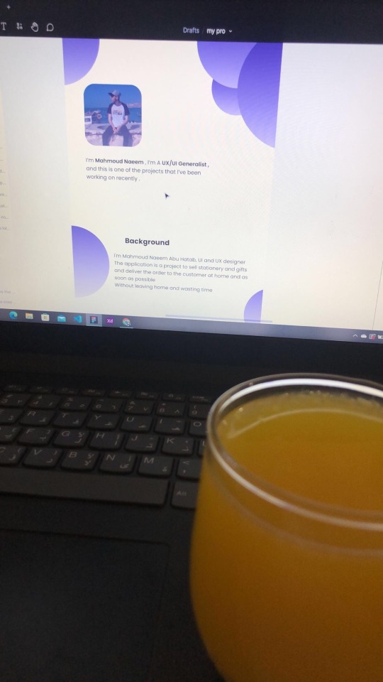
My name is Mahmoud Naeem Abu Hatab, from Gaza.
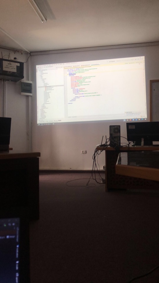
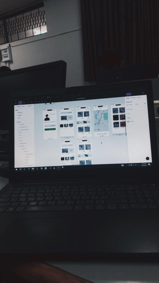
I am a university student majoring in Software and Databases at Al-Azhar University. Since the beginning of my academic journey, I have been passionate about User Experience (UX) and User Interface (UI) design, as well as website development. These fields inspire me, and I dream of advancing my skills and building a professional career in them.
Unfortunately, during the recent war, I lost my laptop, which was essential for both my studies and work. I was forced to flee my home and relocate to southern Gaza due to the difficult circumstances. Despite my efforts to replace my laptop, the financial situation has made it impossible to afford a new one.

Without a laptop, continuing my studies or seeking job opportunities in programming and design has become extremely challenging. This directly affects my academic progress and future career.
Today, I am reaching out to ask for your support to help me purchase a new laptop. Having a laptop would allow me to resume my studies and work on programming and design projects that are crucial for improving my skills. It is a vital step towards completing my education and pursuing my dream of becoming a professional in programming and UX/UI design.
I know that the situation in Gaza is difficult, but I believe education is the only path to building a better future for myself and my family. If you are able to contribute any amount to help me get a new laptop, it would be a real opportunity for me to get back on track academically and professionally.
I am determined to keep learning and working despite the challenges, but I need your support to achieve this goal. Every donation or act of help, no matter how small, will make a significant difference in my life.
If you’d like to support me, you can donate through:
GoFundMe
OR
USDT

If you can assist in any way, please don’t hesitate to reach out to me.
Thank you for your support and kindness! 🌿
@gaza-evacuation-funds @appsa @nabulsi27 @palestinegenocide @orblesbian @palebluebutler @pallasisme @fallahifag-deactivated20240722 @vakarians-babe @sayruq @ @plomegranate @riding-with-the-wild-hunt @queerstudiesnatural @tamamita @apollos-boyfriend @riding-with-the-wild-hunt @queerstudiesnatural @palestinegenocide @sar-soor @akajustmerry @annoyingloudmicrowavecultist @feluka @marnosc @flower-tea-fairies @flower-tea-fairies @tsaricides @tsaricides @belleandsaintsebastian @ear-motif @brutaliakent @raelyn-dreams @troythecatfish @4ft10tvlandfangirl @90-ghost @paper-mario-wiki @nabulsi @prisonhannibal @beepiesheepie @walcutt @schoolhater98 @commissions4aid-international @sar-soor @zigcarnivorous@tododeku-or-bust@turtletoria @brutaliakhoa @flower-tea-fairies @schoolhater @baby-girl-aaron-dessner @sayruq @omiteo777 @malcriada @neptunerings @bat-luun @kaneverse @nightowlssleep @staretes @friendshapedplant @soon-palestine @aria-ashryver @heritageposts @magnus-rhymes-with-swagness-blog @khangerinedreams @kordeliiius @mazzikah @feluka @dlxxv-vetted-donations @girlinafairytale @a-shade-of-blue @vakarians-babe @babygoatsandfriends @self-hating-zionist @mangocheesecakes @dlxxv-vetted-donations @gazaboovintage @gazavetters @wellwaterhysteria @sar-soor @applebunch @irhabiya @sayruq @xxx-sparkydemon-xxx @junglejim4322 @reptilianspecies @dr-lapdance @tamamita @cantsayidont @fairweathermyth @dear-indies @eruthiawenluin @katealot @lenasai @stalinistqueens @ayeshjourney @gaza-evacuation-funda @el-shab-hussein @irhabiya @nabulsi @ibtisams @dlxxv-vetted-donations @tododeku @a-shade-of-blue @gaza-relief-fund @catnapdreams @northgazaupdates @buttercuparry @stuckinapril
#voic of gaza#gaza#free palestine#palestine#free gaza#save gaza#save palestine#help gaza#help palestine#programming#studying#uxdesign#ui ux design#uidesign#ui#ux#user interface#user experience#figma#xd#web design#web development#web developers#mobile design#html#css#js#javascript#java#front end development
296 notes
·
View notes
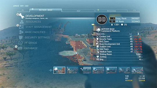
Text


Fake UIs part 6
457 notes
·
View notes
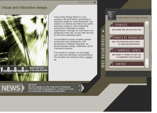
Text

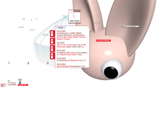

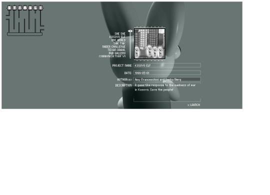

Future Farmers website (2001)
#3d#2001#2000s#01#00s#art#cgi#cybercore#cyber y2k#design#future farmers#graphic design#graphics#internet archive#kaybug#old tech#screenshots#uidesign#ui ux design#user interface#y2kcore#y2kore#y2k aesthetic#y2k core#y2k cyber#y2k design#y2k future#y2k graphics#y2k
274 notes
·
View notes
Text
Y'know what'd be a great UI improvement?
Categorization of fonts. Especially if it's user-controlled. Put that shit in folders.
"Standard", "Web-safe", "Script", "Headers", "Retro PC"...
66 notes
·
View notes
Text
does anyone else feel pure unfiltered rage towards the new samsung ui update? everything is rounder and uglier. not to mention the amount of ai they're using and promoting. i dont think ive ever hated an update more
#autism#adhd#audhd#neurodiversity#neurodivergent#samsung#one ui 7#i just want my phone back#this is not what my baby looks like#user interface#ui design#ui#how do i go back
19 notes
·
View notes
Text
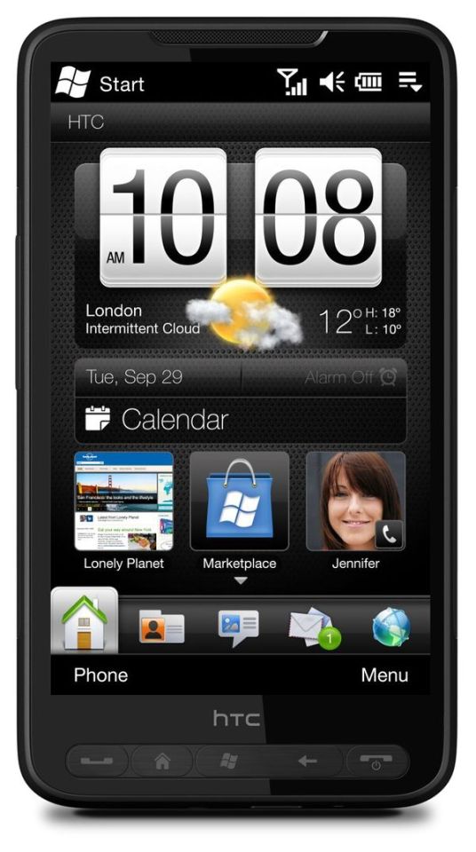
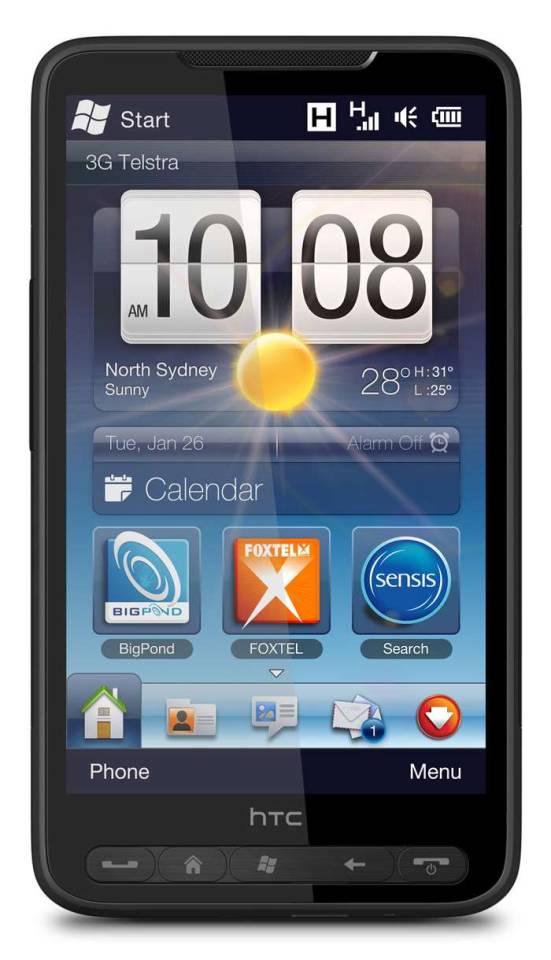

#art#cellphones#design#frutiger aero#graphic design#graphics#htc#icons#mobile#phones#smartphones#tech#technology#touchscreen#user interface#ui
235 notes
·
View notes
Text


I've made hundreds of icons for Nightingale, here is a glimpse at some of them! The metal bases for ingots was hand painted, the ores are a mixture of painting, 3D models, and photobash. I referenced Soulslike icon conventions heavily, especially Elden Ring. The alchemical symbol alphabet was developed to help with accessibility (differentiate all the ingots accounting for colour blindness).
8 notes
·
View notes
Text
Excited to share a glow-up for Mighty Marbles! 🎉 Check out the old vs. new level transitions—what a difference! Now every level even has its own name. 🚀 Which style do you prefer?
I love making this game with passion and I am so excited to share it with the world, but somehow I need to let the world know. Unfortunately the way steam works is the more wishlists the more visibility, so if you are interested it is super appreciated :)
Wishlist on steam or visit the website to find out more mightymarbles.com
#ui#gamedev#indiedev#video games#game development#indie games#indiegamedev#unity3d#puzzle games#puzzle#ui ux design#uidesign#user interface
11 notes
·
View notes
Note
My friend is making an arcade racer and I've been playtesting his builds for him. He didn't go into it thinking it'd be easy but there's a ton of things he didn't at all realize would be a headache going into it. Obviously all games are hard to make but some are more apparent about their daunting nature. Which genres are deceptively difficult even if reasonably possible by a small indie team? What surprised you when you hit the big leagues?
Whenever I do solo dev work, the feature that always takes the longest and tends to require the most work to get something playable by actual players is the UI. Building out the gameplay features is always a lot of fun, but you can only go so far by fiddling with variables and restarting. There's always a significant amount of UI groundwork that needs to be done in order to make a game playable at all, just because of how much information needs to be conveyed to the player.
Whenever I build support into a game for different characters, cars, tracks, loadouts, etc. then each of those options needs its own way to choose that option from a list of available choices. That display must show a lot of information to the player so she can make an informed decision (e.g. this car has fast acceleration, that one has high top speed, this other one corners well, etc.), which all requires an intuitive screen layout, information presented, and so on and so forth.
Small-team dev also tends to build more system-driven games because it's more dev-time-efficient than creating single-use narrative-driven content. The tradeoff is that system-driven content also requires significantly more UI to convey all of that information to the player. This means games with a lot of options for players to choose tend to require a lot of UI work, which is something many hobbyists don't think about when starting.
[Join us on Discord] and/or [Support us on Patreon]
Got a burning question you want answered?
Short questions: Ask a Game Dev on Twitter
Long questions: Ask a Game Dev on Tumblr
Frequent Questions: The FAQ
40 notes
·
View notes
Text
Okay, so: there's a local restaurant whose online ordering process involves various selecting various sauces to be included with one's order – so many units of teriyaki sauce, so many units of hot sauce, so may units of peanut sauce, and so forth.
The idea is supposed to be that you can select any combination of sauces you want, as long as it adds up to no more than four units. However, what the app actually required is that you select exactly four units of sauces; it wouldn't let you submit the ordering form if the total wasn't exactly four.
Just today I discovered that they seem to have fixed it... not by correcting the errant validation rule, but by adding a "no sauce" option, which counts toward the required total of four.
Thus, it's now possible to place an order with, say, two units of teriyaki sauce rather than four by entering 2x "teriyaki sauce" and 2x "no sauce". Similarly, an order with no sauce at all is 4x "no sauce".
This is quite possibly the least intuitive ordering process I've ever encountered, and I've literally worked in e-commerce.
19K notes
·
View notes
Text


The Fifth Element (1997)
#the fifth element#90s#cult classic#retro futuristic#cyberpunk aesthetic#retrofuture#retro futurism#new york city#aesthetic#90s movies#90s aesthetic#cyberpunk#graphical user interface#user interaction#user interface#graphic design#motion graphics#ui#ui ux design#uidesign
1K notes
·
View notes
Text

Skunkworks Project 01 SW1-TCH/OS Full case study here — https://arkotype.co/project/sw1tchos
5 notes
·
View notes
Text
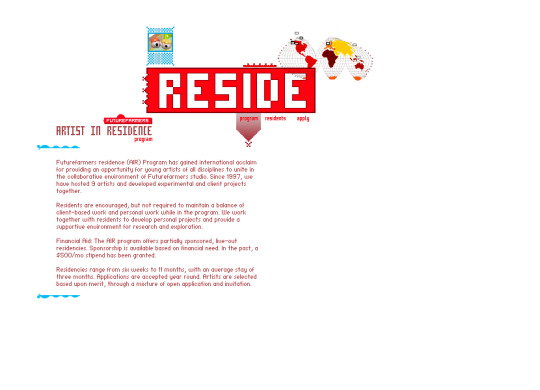
Visual Opera Design Studio in 2002
#2002#2000s#02#00s#abstract#art#brown#cybercore#cyber y2k#design#graphic design#graphics#green#internet archive#kaybug#screenshot#techcore#uidesign#ui ux design#user interface#vector#visual opera design studio#website#y2kcore#y2kore#y2k aesthetic#y2k core#y2k cyber#y2k design#y2k futurism
30 notes
·
View notes
