#LineChart
Explore tagged Tumblr posts
Visit Tumblr Blog
Explore Tumblr blogs with no restrictions, modern design and the best experience.
Last Seen Tumblr Blogs


Fun Fact
Tumblr has been providing a Korean-language service since 2013.
Text
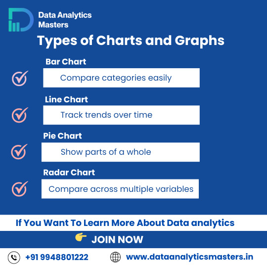
Types of Charts & Graphs
Understanding the right type of chart can help you tell a better story with data.
🔹 Bar Chart – Compare categories easily 🔹 Line Chart – Track changes over time 🔹 Pie Chart – Visualize parts of a whole 🔹 Radar Chart – Compare multiple variables
🎓 Learn how to visualize data like a pro! ✅ Why Choose Us?
✔️ 100% practical training
✔️ Real-time projects & case studies
✔️ Expert mentors with industry experience
✔️ Certification & job assistance
✔️ Easy-to-understand Telugu + English mix classes
📍 Institute Address:
3rd Floor, Dr. Atmaram Estates, Metro Pillar No. A690, Beside Siri Pearls & Jewellery, near JNTU Metro Station, Hyder Nagar, Vasantha Nagar, Hyderabad, Telangana – 500072 📞 Contact: +91 9948801222 📧 Email: [email protected] 🌐 Website: https://dataanalyticsmasters.in
#DataVisualization#DataAnalytics#BarChart#LineChart#PieChart#RadarChart#ChartTypes#DataScienceTraining#AnalyticsCourse#LearnDataAnalytics#VisualizeData#DataDriven#DataAnalyticsMasters#BusinessIntelligence#UpskillWithAnalytics
0 notes
Text
The Importance of Legends in Line Graphs: Enhancing Clarity in Data Representation
Data Visualization: Key Questions Explained
1.Which chart is best for analysis?
The best chart for analysis depends on the data and the insights you want to convey. Bar charts are effective for comparing categories, line charts are great for trends over time, pie charts can show proportions, and scatter plots are useful for relationship analysis. Choose the chart type that best represents your data and highlights key points.
2. What is the limitation of line charts?
A limitation of line charts is that they can be misleading when displaying data with significant fluctuations or irregular intervals. They may oversimplify complex data trends, leading to misinterpretation. Additionally, line charts are not effective for comparing multiple datasets at once if they overlap, making it difficult to discern individual trends clearly.
3. What is the application of line graph?
Line graphs are used to display data points over time, showing trends and changes. They effectively illustrate relationships between variables, making it easier to compare information and identify patterns. Common applications include tracking sales performance, monitoring temperature changes, and visualizing stock market trends. Overall, line graphs aid in understanding data dynamics and making informed decisions.
4. What are the characteristics of a line graph?
A line graph displays data points connected by straight lines, showing trends over time or continuous data. Key characteristics include an x-axis (horizontal) and y-axis (vertical), which represent different variables, the use of scales to quantify data, and the ability to easily visualize changes, patterns, and relationships within the data. It often includes markers for data points.
5. What is a legend in a line chart?
A legend in a line chart is a key that explains what each line represents. It typically includes labels or colors corresponding to different data series, helping viewers understand the chart's information briefly. The legend is essential for interpreting the data accurately, especially when multiple lines are displayed.
Visit: VS Website See: VS Portfolio
#DataVisualization#LineChart#ChartAnalysis#GraphCharacteristics#StatisticalAnalysis#LegendInCharts#DataPresentation#InformationDesign
0 notes
Text
Increase your data visualization using Iconadda’s free graphic assets
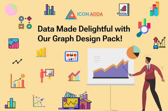
An important aspect of modern design is data visualization, and the right graphic elements bring everything together. We offer a series of free graphic assets to help display data in an attractive way in IconAdda . Our SVG graphics provide a simple solution for your design requirements, whether you design dashboard, infographic or business presentation.
Why choose our free graphic resource? Completely free: The graph elements in Iconadda are all independent, making them ideal for both individual and professional applications. Superior SVG format: Regardless of the size of the screen, our SVG property remains clear and scalable. Various collections: Our free illustrations, free icons and free stickers meet all your data visualization requirements, from pie charts and bar charts to line maps and infographic. Easy to customize: Change styles, colors and sizes that fit your design requirements.
Popular graphic assets Bar graph icons are ideal for presentations and reports. Pie chart are great for dashboards and infographics. Line map stickers are good for modern user interface design. Infographic elements: Increase your visual story.
How to download free SVG Graph features? Downloading free SVG graphics, icons and stickers is easier than IconAdda: Go to our site IconAdda . Go through the Graph asset category. You can immediately download the desired feature by clicking on it.
Increase your photos with IconAdda Iconadda is your Go-Context for high quality SVG graphics because of our growing library with free graph elements. See it and use our free illustrations , stickers and icons to increase data visualization!
Get it now to make facts beautiful!
#GraphDesign#DataVisualization#GraphIcons#ChartIllustration#AnalyticsDesign#InfographicAssets#DataDrivenDesign#GraphVectors#BusinessAnalytics#FinancialCharts#DataIcons#StatisticalGraphics#InformationDesign#VisualData#GraphIllustration#EconomyGraphics#LineChart#PieChart#BarGraph#CreativeData
0 notes
Video
youtube
How to Generate Dynamic Line Charts in PHP Using Chart.js
Whether you’re building dashboards, analytics tools, or reporting systems, mastering dynamic chart creation enhances your ability to showcase data effectively online.
Article Link: https://bit.ly/3UTZiXW.
0 notes
Text
[redacted] linechart save me
1 note
·
View note
Text
Mastering Recharts in React: A Beginner’s Guide | Memetic Solutions

Visualizing data effectively is crucial in creating impactful web applications. Recharts is a robust charting library built on D3, enabling developers to create stunning and responsive charts with ease in a React environment. In this blog, we’ll guide you through the fundamentals of Recharts, share actionable tips, and explain how you can leverage its features to improve your applications.
What is Recharts and Why Use It? Recharts is a versatile and lightweight library tailored specifically for creating charts in React applications. It simplifies data visualization by offering an easy-to-use interface while ensuring high customization and responsiveness.
Key Benefits of Recharts: 1. React Integration: Built for React, allowing seamless component-based development. 2. Declarative Syntax: Enables developers to create charts with minimal code. 3. Customization: Offers extensive options to tweak chart properties and styles. 4. Responsive Design: Automatically adjusts to different screen sizes. 5. Built-in Animations: Enhances user experience with smooth transitions.
Getting Started with Recharts: A Step-by-Step Guide 1. Install Recharts: Begin by adding Recharts to your React project. Use the following command to install recharts Installs the library along with all its required dependencies into your project.
2. Set Up Your Data: Recharts requires a structured dataset, usually in JSON format.
3. Create Your First Chart: Import the necessary components from Recharts, such as LineChart, XAxis, and YAxis, and render the chart in your React component. Diving Deeper into Recharts: To fully utilize Recharts, it’s essential to understand its advanced features. Here are some tips to help you: 1. Explore Chart Types: Recharts supports a variety of chart types like bar charts, pie charts, and scatter plots. Choose the one that best suits your data representation needs. 2. Leverage Custom Components: Use custom tooltips, legends, and labels to enhance chart readability and interactivity. 3. Use Responsive Container: Wrap your chart in a Responsive Container component to ensure it adjusts perfectly to screen sizes: 4. Customize Appearance: Adjust chart colors, line thickness, and more to align with your branding guidelines. 5. Combine Charts: Create complex visualizations by combining multiple chart types within the same component.
Common Use Cases of Recharts:- 1. Business Dashboards: Display KPIs like sales, revenue, and customer growth. 2. Market Analysis: Represent trends in stock prices or marketing campaign performance. 3. Health Metrics: Visualize patient data and health trends for healthcare apps. 4. Education Platforms: Track student progress through graphs and charts.
Why Choose Memetic Solutions? At Memetic Solutions, we specialize in crafting innovative solutions tailored to your business needs. Our services include:
Web Development: From interactive dashboards to full-scale web platforms.
Custom App Development: Building scalable and user-friendly applications.
Data Visualization Services: Transform your raw data into actionable insights with our expertise in many tools and Power BI.
AI-Powered Solutions: Leverage artificial intelligence to optimize your business processes.
Looking to bring your data to life? Visit our website Memetic Solutions to explore more about our services and how we can help you build smarter applications. Unlock the potential of your data with Memetic Solutions — your partner in innovation and growth.
#Recharts#ReactCharts#DataVisualization#ReactDevelopment#RechartsInReact#ReactJS#DataVisualizationWithReact#InteractiveCharts#ReactUI
0 notes
Photo

Great Britain (Wielka brytania) got to have its very own right Y axis.
315 notes
·
View notes
Text
The Essential Role of Line Charts in Business Analytics
Data Visualization: Expert Q&A Insights
1.How do I insert a line chart?
To insert a line chart, first select your data in a spreadsheet program like Excel. Then, go to the "Insert" tab, click on "Chart," and choose "Line Chart" from the options. Adjust the chart design and layout as needed. Finally, click "OK" or "Insert" to add the chart to your worksheet.
2. Where is line chart in Excel?
In Excel, you can find the line chart option by selecting the "Insert" tab on the Ribbon. Then, look for the "Charts" group, where you'll see the line chart icon. Click on it to see different line chart styles, and choose the one you want to create your chart.
3. What are the two types of line graph?
The two types of line graphs are:
1. **Simple Line Graph**: Displays data points connected by straight lines, showing trends over time or categories.
2. **Multiple Line Graph**: Features two or more lines, allowing for comparison between different data sets or groups over the same time period or categories.
4. How to read a line chart?
To read a line chart, identify the x-axis (horizontal) and y-axis (vertical). The x-axis typically represents time or categories, while the y-axis shows values. Follow the line(s) to see how values change over time or across categories. Look for trends (increasing, decreasing, or stable), peaks, and troughs to interpret the data effectively.
5. What are the advantages of line graph?
Line graphs effectively display trends over time, making it easy to identify patterns and changes. They allow for quick comparisons between multiple data sets and can show relationships between variables. Line graphs are also straightforward to read and interpret, making them useful for presenting data in a clear and concise manner.
Visit: VS Website See: VS Portfolio
0 notes
Photo

Different types of charts 1. Candlestick chart 2. Heiken ashi chart 3. Bar chart 4. Line chart 5. Renko chart Candlestick charts are one of the most commonly used chart bu stock traders. Candlesticks are useful when trading as they show four price points (open, close, high, and low) throughout the period of time the trader specifies. A line chart is a graphical representation of an asset's historical price action that connects a series of data points with a continuous line. This is the most basic type of chart used in finance and typically only depicts a security's closing prices over time. Heikin-Ashi, also means "average bar" in Japanese. The Heikin-Ashi technique can be used in conjunction with candlestick charts when trading securities to spot market trends and predict future prices. It's useful for making candlestick charts more readable and trends easier to analyze. A Renko chart is a type of chart, developed by the Japanese, that is built using price movement rather than both price and standardized time intervals like most charts are. #sharemarketmalayalam #technicalanalysis📊📈📉 #technicalanalysis #technicalanalysisdaily #cabdlestickchart #barchart #heikenashi #heikenashicandles #heikenashibars #heikenashicandlestrategy #heikenashistrategy #linechart #linecharts #renkochart #renkocharts #renkochartpatterns #renkochartexplanation #candlestickcharts #candlestickcharting #candlestickchartpatterns #typesofcharts #stocktrader #stockchart #intradaytrading #intradaytrader (at Teqmo Charts - Share Market Malayalam) https://www.instagram.com/p/CLvlAU2nqQv/?igshid=udkjujn2u2gj
#sharemarketmalayalam#technicalanalysis📊📈📉#technicalanalysis#technicalanalysisdaily#cabdlestickchart#barchart#heikenashi#heikenashicandles#heikenashibars#heikenashicandlestrategy#heikenashistrategy#linechart#linecharts#renkochart#renkocharts#renkochartpatterns#renkochartexplanation#candlestickcharts#candlestickcharting#candlestickchartpatterns#typesofcharts#stocktrader#stockchart#intradaytrading#intradaytrader
0 notes
Photo
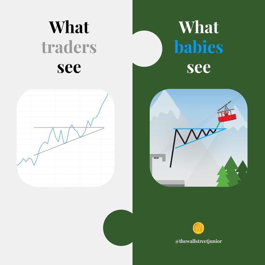
🤔 💭 💡 If there’s a children’s book on Astrophysics for Babies by Chris Ferrie; if there’s another one on ABC Biochemistry by Cara Florence, and another on Computer Coding by Ruth Spiro, or even Hip Hop culture by Jessica Chiba... then why can’t there be a book on Chart Patterns and trading? These wonderful books are no longer a novelty to show off to other parents. These books are for our children. These books are a way to simplify, explain, and inspire even the littlest of babies the most complex of subjects we have in the world. Because if a child can get excited, be inspired, or at the very least—be aware of such things... imagine how better off they will be instead of us parents? That’s why we are here. Inspire your future millionaire! Don’t be Buffet, be better. Start going, play long. #financialliteracy #readabook #readabookchallenge #bookchallenge #moneyforbaby #peterlynch #warrenbuffet #benjamingraham #marketwizards #charliemunger #linechart #technicalanalysis #tradingplan #ascendingtriangle #thewallstreetjunior #tradingforbabies #fidelityinvestments #charlesschwab #robinhoodapp #webull #thinkorswim #forextrading #binance #coinmarketcap #commoditiestrading #acorn #acornsapp (at Murren, Switzerland) https://www.instagram.com/p/CE31GvQH_np/?igshid=1dgeq3861vkui
#financialliteracy#readabook#readabookchallenge#bookchallenge#moneyforbaby#peterlynch#warrenbuffet#benjamingraham#marketwizards#charliemunger#linechart#technicalanalysis#tradingplan#ascendingtriangle#thewallstreetjunior#tradingforbabies#fidelityinvestments#charlesschwab#robinhoodapp#webull#thinkorswim#forextrading#binance#coinmarketcap#commoditiestrading#acorn#acornsapp
0 notes
Text
Free web design & development vector fill icons pack 8

15 web design & development fill icons pack include Browsing, globe, seo, seo keyword, gps, location pin, Launch, missile, Business, cog, seo, seo keyword, seo label, Analysis, chalkboard, Bullhorn, mobile, Locked, network security, Concept, creative mind, Bar chart, diagram, Line chart, line graph, Approved, checklist, Internet speed, free vector icons in SVG, PSD, EPS and AI format file available for commercial use. Read the full article
#Analysis#Approved#Barchart#Browsing#bullhorn#business#Chalkboard#checklist#cog#Concept#creativemind#diagram#globe#Gps#Internetspeed#Launch#Linechart#linegraph#locationpin#Locked#Missile#mobile#networksecurity#seo#seokeyword#seolabel
0 notes
Photo

Learn Data Visualization with Tableau 10.Tableau 10 for Business Intelligence, Data Analytics and Data Science.Tableau Worksheets and Create Professional Dashboards.Get Tableau Certification and dwarf.Understand Heatmap, Geographic Mapping, Impressive Barchart, Bullet Graph, Gantt Chart, Data Calendar, Circle View, General Operation. Today @ 8:30pm Check our Info : www.incegna.com Reg Link for Programs : http://www.incegna.com/contact-us Follow us on Facebook : www.facebook.com/INCEGNA/? Follow us on Instagram : https://www.instagram.com/_incegna/ For Queries : [email protected] #tableau,#datavisualization,#businessintelligence,#Analytics,#heatmaps,#overlappingdata,#datasource,#dataprocessing,#dualaxis,#wafflecharts,#bargraphs,#dimensionfilter,#GeographicalData,#SpatialMapping,#worksheets,#Linechart,#datascience,#datatype,#operation,#datadriven,#businessanalyst,#tablecalculation,#WMS,#dualaxis,#tableaufilter,#patterns,#bulletgraph https://www.instagram.com/p/B62oWglgjKb/?igshid=1qc6lxs73aukq
#tableau#datavisualization#businessintelligence#analytics#heatmaps#overlappingdata#datasource#dataprocessing#dualaxis#wafflecharts#bargraphs#dimensionfilter#geographicaldata#spatialmapping#worksheets#linechart#datascience#datatype#operation#datadriven#businessanalyst#tablecalculation#wms#tableaufilter#patterns#bulletgraph
0 notes
Photo

“This was a social media chart that I've made and illustrated for a classmate of mines on her story on social media comparison and whats mostly used at school, enjoy #Chokers ! “ - Patrick David Jenkins #artillustartions #digitalart #photoshop #cartoon #drawing #sketch #digitalpainting #design #artwork #editorialillustration #original #college #newspaper #traditionalart #chart #socialmediasites #piechart #linechart #percentage #distraction #facebook #school https://www.instagram.com/p/B5nsUqfA-L_/?igshid=1e5rlxy4r67po
#chokers#artillustartions#digitalart#photoshop#cartoon#drawing#sketch#digitalpainting#design#artwork#editorialillustration#original#college#newspaper#traditionalart#chart#socialmediasites#piechart#linechart#percentage#distraction#facebook#school
0 notes
Link
A forex chart shows a graphical illustration of the exchange rate between two currencies. You can see both the real-time data and the past history.
Read the article to know more. https://tradersir.com/types-of-forex-charts/
#forex#fxtrading#technicalanalysis#forexcharts#linecharts#barcharts#candlestickcharts#bearish#bullish#tradingeducation#tradersir
0 notes
Text
The Power of Line Charts in Data Analysis
Data Visualization Chart Types: Common Queries Answered
1. What are the most common types of data visualization charts?
The most common types of data visualization charts include bar charts, line charts, pie charts, scatter plots, histograms, and area charts. Each type serves different purposes, such as comparing categories, showing trends over time, displaying proportions, and illustrating relationships between variables. Choosing the right chart depends on the data and the insights you want to convey.
2. How do I choose the right data visualization chart for my data?
To choose the right data visualization chart, consider the type of data you have: use bar charts for comparisons, line charts for trends over time, pie charts for parts of a whole, and scatter plots for relationships. Also, think about your audience and the story you want to tell, ensuring clarity and effectiveness in your presentation.
3. What are the differences between bar charts and pie charts in data visualization?
Bar charts display data using rectangular bars to represent values, making it easy to compare different categories. Pie charts represent parts of a whole with slices of a circle, illustrating proportions. Bar charts are better for comparing quantities, while pie charts are effective for showing percentage distributions. Each serves different purposes in data visualization.
4. What is the purpose of a scatter plot in data visualization?
A scatter plot is used in data visualization to display the relationship between two quantitative variables. It helps identify patterns, trends, correlations, or clusters within the data. By plotting individual data points, it allows for easy observation of how changes in one variable may affect another, making it a valuable tool for analysis and interpretation.
5. How do line charts help in visualizing trends over time?
Line charts display data points connected by lines, making it easy to see trends over time. They highlight increases or decreases in values, allowing for quick comparisons between different time periods. The continuous nature of the lines helps identify patterns, fluctuations, and overall progress, making it a powerful tool for analyzing changes and forecasting future behavior.

Visit: VS Website See: VS Portfolio
0 notes
Link
0 notes