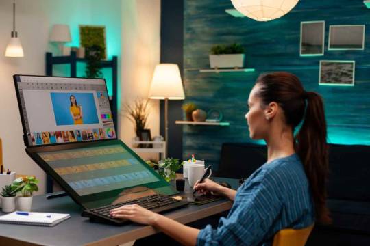
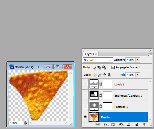
#Manipulate Photoshop Files
Explore tagged Tumblr posts
Visit Tumblr Blog
Explore Tumblr blogs with no restrictions, modern design and the best experience.
Last Seen Tumblr Blogs


Fun Fact
China blocked Tumblr because of pornography and censorship problems in 2013.
Text
How to Cancel Photoshop Subscription
Are you here as you don’t want to retain your Adobe Photoshop subscription anymore? Oh yes, you can cancel it seamlessly!!
Do you know that even after you cancel your Adobe Creative Cloud subscription, you can still access your Adobe account.
#learn#how to cancel#photo editing#GIMP#GNU Image Manipulation Program#photoshop#graphic designing Adobe#Photoshop Tutorials#manage subscriptions#View Your Plans#cancel subscription#follow the prompts#blogs#confirmation#adobe account#edit your Photoshop files#Status Post Cancellation#Alternatives to Photoshop#Photoshop Elements#Affinity Photo#bloggers#adobe photoshop#Pixlr#cloud platform#indesign#graphic design#illustrator#adobe stock#technical support#bug fixes
0 notes
Note
if you ever have time/feel so inclined, i would love to see a tutorial or some tips from you about how to do color isolation sets!! they are absolutely incredible and I love them so much! <3
absolutely! thank you so much 💙
here are a few examples of my color isolation sets:
the substance (yellow) || beetlejuice (red) || us (red) || conclave (blue) || sleeping beauty (cyan/blue) || crimson peak (yellow) || smosh (purple) || conclave (red)
beneath the cut, i'll walk you through my coloring process!
notes: tutorial assumes basic gifmaking knowledge & i'm using adobe photoshop 2023 (though afaik, your version shouldn't matter much)
i don't color my gifs until they're sharpened and i'll give you a quick overview of my process: file -> import -> video frames to layers -> trim any extra frames -> crop to desired dimensions -> run sharpening action (i used this tutorial and just made it into an action) which also converts to timeline
once i'm in timeline, i go through my normal coloring process. unless i'm giffing similarly colored scenes that i've already colored and saved a psd for, i usually color from scratch every time. obviously, some adjustment layers vary depending on the source material, but these are almost always my main adjustments, just with differing values
a brightness/contrast layer set to screen - this is a gamechanger for especially dark scenes. note: i do not adjust the values, i leave them both at 0 and just change the blending mode
a curves layer utilizing the black & white eyedropper tools. first, i select the black eyedropper and then click on the blackest area of the gif. i do the same with the white one, using it to select the brightest/whitest spot. this can help a lot if you're dealing with heavily tinted scenes!
a selective color layer (set to absolute, not relative) where i adjust the blacks usually anywhere from 1-5 notches higher and the neutrals either up or down the same amount depending on the scene. be careful with the neutrals when giffing poc as lightening them can result in whitewashing. if need be, i will also adjust the whites, making them slightly whiter with the black slider. selective color is by far my fave adjustment layer and i use it in every single coloring.
after this, i sometimes add a black & white gradient map adjustment layer set to soft light. i'll play around with the opacity, leaving it anywhere between 5-100% depending on the scene. i think this adds depth to your colors and adds some contrast, but i don't use it in every psd.
occasionally, i'll mess around with vibrance/saturation, and that'll be my final layer, but oftentimes i won't actually add this layer until i've finished the rest of the coloring. this is just where the layer will go.
these are the main 5 layers i almost always start every single coloring with and they act mostly as a base and to color-correct any weirdly tinted or exceptionally dark scenes.
now, let's talk about scene selection. i try to set myself up for success by choosing scenes that either already have a very noticeable pop of color or have a color i know can easily be manipulated. you'll want to pick scenes that aren't drenched with the color you want to isolate though, or you won't have the contrast of the black & white.
here are a few examples of good scenes:

the only red here is the covered bridge and it will be easy to adjust only that and not the blue, green, or yellow.

same as above, apart from ralph fiennes's face, which obviously contains red undertones. i'll go more in-depth on this in a bit, but because this scene doesn't have a lot of movement, this will be able to be fixed with layer masks.

again, here we have one bright occurrence of yellow surrounded by blue that we'll easily be able to neutralize.
and a few of bad/less than ideal scenes:

while this scene is an absolute dream for making super vibrant sets or color palettes, it's no good for color isolation. this yellow covers basically everything, leaving no other colors to cancel out.

while i definitely did try this one out, the scene is ultimately too dark and too cyan-tinted to properly isolate the red of the blood or the cyan in her eyes and on the walls.

just like the first one, this scene is fully just. color drenched. would make a great base for a vibrant or color palette set but not useful for color isolation.

bad and wrong!! coloring this movie, however beloved, was a test of my sanity. you have this yellow/green filter over everything and so much of it that isolating or changing one or the other is pretty much impossible.
with all that being said, play around! the best way to learn what does what is to try it out yourself. selective color, though there are other ways of getting the same or similar effects, will be your best friend. it's how i'm able to make sets like this & this!
let's look at this adjustment layer using a scene from conclave:

truthfully, you could either isolate the orange of the wall or the blue of her outfit. i'm going for the latter at the moment.
add a selective color layer by clicking this button:

i like to really emphasize the color i'm going to isolate, make sure it's as consistent with the other scenes i'm using and that it pops. from the dropdown in the layer properties, i select blue.

each color from the dropdown will look like this. you have adjustable sliders for cyan, magenta, yellow, and black. the more to the right, the more you're emphasizing that color in any blues in your image. the further to the left, the more of that color's opposite you'll adjust. each opposite pairing is as follows:
cyan + red magenta + green yellow + blue black + white
if you're struggling with this (i did at first), visualize it. pull up one of those "bad" examples. say we take the yellow scene from the gorge. add a selective color layer to it and select yellow from the dropdown. play with the sliders to see how AND how much each adjustment changes the coloring. decreasing the yellow slider all the way to -100% is adding blue to anything ps identifies as yellow. because yellow and blue are opposites, it pretty much neutralizes the scene. instead, if you use the magenta slider and push it all the way to the left, you make any yellows become green. if you move the magenta slider all the way to the right, you'll add magenta to any yellows, making the scene orange. it's all about knowing the color wheel and experimenting!
back to the conclave gif! i want to bring out the blue as much as possible, under the blue dropdown, i crank the cyan slider all the way up and bring the yellow all the way down.

is it a massive difference? no, but you can definitely see the difference between the left (with the adjustment) and the right (without).
depending on the scene and color i'm working with, i'll play around with other layers from the dropdown. but i prefer to do each color in a different layer and i right-click on the box with the eye in the layers panel and change it to the applicable color. that way, it's easier to adjust something later on. you can also rename your layers, but this is quicker and easier imo.

with this particular scene, this is the only adjustment i want to make to the blue for the time being. now, it's all about getting rid of any other colors. to do this, add a hue/saturation layer and select every color, one at a time, EXCEPT the color(s) you're isolating and bring the saturation all the way down to -100. in this case, it's everything but the cyans & blues.

and this is what i'm left with:

from here, you can leave it, but a lot of the time, i'll add a vibrance layer or even another blue/cyan selective color layer and crank that shit up.

this is after adding a vibrance layer (increasing both vibrance & saturation to 100) AND a selective color layer (decreasing the yellows to -100 in the blues).
i would consider this finished, but this can also be super fun to mess around with, again, using selective color:


and if the way her hair changed colors is bugging you, toggle your layers on and off until you find which one(s) changed it and add a layer mask, coloring over her hair with a soft black brush:

once you're happy with everything, save your gif in your preferred way. these are my save settings just for shiggles:


et voilà!
overall, the best advice i can give is to try. experiment! if you're not sure a scene will work, give it a shot. even if it doesn't, you've still learned something. i know it can seem confusing at first, especially if you're not super familiar with these layers or the color wheel, but please feel free to ask any questions. also, let me know if anyone wants another tutorial(s) where i go more in-depth on other colors. i'm happy to do it!
#answered#daynascullys#my tutorials#gif tutorial#gifmakerresource#completeresources#dailyresources#emilyblr#usercats#userholloway#tuseruta#usertina#userrobin#uservivaldi#userchibi#userbunneis#userbambie#useraljoscha#tusermira#userelio#userscourt#userishh#angelblr#heymaur#elwintersoldado#tuserhol#usermaguire#useraashna
109 notes
·
View notes
Text
Writing Notes: Book Cover

“Don’t judge a book by it’s cover!” We’ve all heard the phrase and we all know that’s impossible. Because the cover of a book is the first thing a potential reader sees—it should stop them in their tracks. It’s a very powerful marketing tool; having a well-designed book cover is crucial.
Tips for Making a Great Book Cover Design
Using more than two to three typefaces on a cover is discouraged, as it can look really messy.
Keep things simple. Your cover will be in a sea of other covers so try to keep your design from getting muddy and make sure it stands out.
Show your designs to people who have a design eye and/or you trust. It’s great to get feedback.
If you hire a professional designer, write a brief and send them info. Be really clear on what you want. Designers usually do a certain number of design rounds included in the agreed upon fee and any extra rounds of design will be extra.
If you hire a professional designer, they will likely have ideas about printing and may have connections to printers. They are a resource so don’t forget to ask questions.
Don’t forget: a book cover is an important part of selling any book. Whether you decide to do it yourself or collaborate with a professional, pay special attention to this part of the process, as a great cover goes a long way.
6-Step Guide: Professional Book Cover
STEP ONE Generate Ideas. Look around at book covers you like. Go to a bookshop and peruse what’s currently happening in book cover design. Take notes of what elements you like on the cover image. A certain typeface? Color? Do you prefer an image or an illustration or something purely typographic on the cover? Another option is to create a mood board. You can use a platform like Pinterest or Evernote, or create a folder on your desktop, and pull book cover inspiration from the web. While you’re gathering inspiration, keep in mind what genre your book is and what kind of book design feels appropriate.
STEP TWO Find a Designer (Who Could Be You!). Do you have design skills? If so, your next step is to begin layouts and mock-ups of the covers. You should use whatever software program you are comfortable with. Most professional book cover designers use a program from the Adobe Creative Suite:
InDesign. InDesign is a multi-page design platform but can also be used for single page design.
Photoshop. Used to manipulate and experiment with photography.
Illustrator. Illustrator is a vector-based program, which means you can create graphic art that can be scaled up or down without loss of quality.
Photoshop and Illustrator. These can also be used together as you can bring your Photoshop file into Illustrator to set the type after you have worked with your cover image.
If you don’t have design skills, now is a great time to hire a book cover designer. The first step is to figure out what kind of budget you have for this. A designer’s fee will range depending on their expertise. Get a figure in mind and then write a design brief which should include the book specs:
Size
Print-run
Intended audience
Where and how the book will be published
Anticipated publish date
You should also include a summary of what the book is about and what you are looking for in a cover. Also share the inspiration you’ve gathered with the designer.
If you don’t have design skills but want to create the cover without the help of a professional, there are a few software programs you can use, such as Canva or 100 Covers, design tools that allow you to DIY the cover (for free or a fee).
STEP THREE Decide on the Dimensions. If you’re self-publishing and printing with a local printer you can work with them to make sure your book dimensions will fit on their printer (remember a book prints front, back, and spine in one sheet of paper). It’s also a good idea to find examples of books whose size you like and feels good to hold. Use that as a jumping off point for your book.
Book Cover Dimensions List. If you are printing for a specific market, from print to ebook, here is a handy list:
Amazon Kindle Direct Publishing File Format: JPEG or TIFF Cover Size (Recommended): 2560x1600 pixels Cover Size Requirements: between 1000x625 pixels and 10,000x10,000 pixels (one side must be at least 1000)
Apple iBooks File Format: JPEG or PNG Cover Size (Recommended): 1400x1873 or 1600x2400 pixels Cover Size Requirements: at least 1400 pixels wide
Barnes & Noble File Format: JPEG or PNG Cover Size (Recommended): Rectangle height and width, at least 1400 pixels Cover Size Requirements: Min. 750 pixels height and width
Kobo Books File Format: JPEG or PNG Cover Size (Recommended): 1600x2400 pixels Cover Size Requirements: Min. 1400 pixels width
Smashwords File Format: JPEG or PNG Cover Size (Recommended): 1600x2400 pixels Cover Size Requirements: Min. 1400 pixels width Draft2Digital
File Format: JPEG Cover Size (Recommended): 1600x2400 pixels Cover Size Requirements: Tall rectangle
STEP FOUR Choose Your Style
Photo-based cover. If you’re creating an photo-based book cover, you’ll need to source stock imagery. There are lots of great resources online to find stock imagery including ShutterStock, Getty Images, and Adobe Stock. (Keep in mind: most photography archives require payment to use their images. Always investigate the copyright of images you’re interested in using.) Look for images that convey or allude to your book’s genre. You can use programs like Photoshop to manipulate your image, making it black and white instead of color or cropping it in a certain way.
Illustration-based cover. If you’re considering a more graphic approach to your cover, Illustrator is the tool to use. You can bring hand-drawn drawings into it and outline them to create scale-able, high-res illustrations which you can manipulate within the program. You can also create shapes, patterns, experiment with typography within illustrator and play with color, transparency, size and much more.
Typography-based cover. Finally, many successful book covers use typography as the main graphic device. This takes some skill and knowledge of typefaces, the historical context of a typeface, and how to manipulate it thoughtfully. That said, using type as a graphic can be very impactful.
STEP FIVE Pick a Typeface (Font). No matter what kind of cover you are designing, you are going to need the title of the book and the author’s name on the cover. As mentioned above, picking an appropriate typeface is very important. You want to pick something that feels right for your book—is it a sans serif or serif? A heavy weight or lighter weight? You want to make sure it’s not something with a lot of baggage, like Comic Sans or Papyrus. It is a good idea to actually do a little research on when, where, and who your typeface was designed by to give you context and feel out if it will be right for your book. You might also consider using up to two different typefaces, one for the title and one for your name. A serif and sans-serif mix can give a bit of contrast and visual interest. There are some typefaces that pair really well together. Check out the website TypeWolf to get ideas of what fonts pair well together.
STEP SIX Test, Tweak, and Repeat. Once you have a few versions of your cover, print them out on your home printer and take a look with a critical eye. Does the type size feel chunky? Too bold? Too small? How does your image look? Is it cropped right? Are the lines of your illustrations too thin and not showing up? Go back and refine your design and then repeat! Don’t forget to look at your book cover as a small thumbnail as well. People are on their mobile phones and you want to make sure your cover still stands out and is impactful.
Book Cover - serves as your first impression with potential readers—and though book covers don’t always look the same, they do tend to contain the same essential elements.
Design standards may be different in the world of traditional publishing than they are in self publishing, and book cover templates for physical paper books may differ from those of ebooks—but they all serve the same purpose.
Some Functions of a Book Cover
A book’s cover provides essential information. At its most elemental, a good cover includes a book’s title, the author’s name, the publisher, and the price.
A good cover offers clues about your book’s content and tone. Your cover design indicates whether your book is a work of high-minded literary fiction, a pulpy page turner, or a compelling work of non-fiction.
A front cover reveals a book’s genre. You can usually tell if you’re holding a thriller, a memoir, a sci-fi epic, or a nineteenth century classic just by looking at a book’s cover art and typography.
A back cover offers broader context. It may feature quotes from reviewers and fellow authors. Softcover books may contain a plot summary or author biography on the back; those summaries and bios are typically moved to the inner flaps of a hardcover book.
How to Hire a Professional Book Cover Designer
Book covers are marketing materials, and a well-designed professional cover can make your book stand out among the competition. If you want someone with expertise in the realm of cover design to work on your book, you may want to hire a professional book cover designer. Here are some steps to consider when hiring creatives to design your book cover:
Hire a cover artist. A cover artist produces the cover art and imagery that will appear on your book cover, either on their own or with heavy input from an author or publisher.
Hire a graphic designer. Certain graphic designers specialize in layout; they incorporate cover art that you provide them—whether that’s an original illustration, photograph, or even a stock image—into the overall design of the cover.
Find a cover designer online. Reedsy is one of a number of online resources for independent authors, self-publishers, and anyone connected to the world of books. Many professional book designers list their services on Reedsy.
Use your personal network. Seek out writers’ groups, either locally or on Facebook. In these groups, people share professional referrals and help support one another when a member has a new book in the works. A group of like-minded individuals can be an invaluable resource when creating your own book cover for the first time.
When to Call a Pro:
You have a budget (a designer’s fee will vary depending on experience and location).
You have enough time to work with the designer.
You have a clear idea of what you want or at least what you don’t want.
You don’t have any design skills.
You don’t want to invest in the design software.
Your book isn’t selling.
How to Design a Book Cover Yourself
If you don’t have the budget for a pro designer or just have a DIY itch you want to scratch, it is easier than ever to design your own book cover. While it may not be quite as rudimentary as when you covered your textbooks in a brown paper bag back in fifth grade, modern technology has made cover image design accessible to anyone with a computer. Here are some tips:
Use a template. There are numerous websites that offer book cover templates and step-by-step tutorials covering basic cover design skills. Some even have a free book cover creator tool, along with cover ideas, design tips, pre-made design templates, and digital cover image tools.
Use standard design software. Book covers can also be made using standard home computing software including Photoshop, Microsoft Word, and even (with a little sweat equity) Google Docs. This is particularly easy if you are importing a pre-made cover image from another source.
Make a prototype. The process for assembling a book is straightforward and satisfying. If you want to test out how your book will appear in print, you can learn to bind a copy yourself.
When to DIY:
You don’t have any budget for design.
You have design skills to do it yourself.
You have the design software.
You have a template and know exactly what you want.
You have people with an eye for design that can guide you.
How to Make a Hardcover Book
So you’re ready to bind your own book. Here’s what you’ll need:
Content, of course.
Uncoated printer paper for book pages
Decorative paper for endpapers, such as wrapping paper or cardstock
Davey board (aka bookbinder’s board), thin chipboard, or cardboard for the book covers
Craft knife
Polyvinyl acetate (PVA) glue such as Elmer’s glue
Hot glue gun and glue sticks
Ruler or straight edge
A long stapler
Thin fabric or book cloth for cover
Binder clips
Thick decorative paper (optional, for dust jacket)
Paper trimmer (optional, for trimming book pages)
Paintbrush (optional, for spreading glue)
There’s more than one way to bind a book, and you’ll find tons of great tutorials online for making homemade books, including Japanese bookbinding and perfect bound softcover books. The most popular style of hardcover book binding is called case binding, which is traditionally done by stitching pages together with thread. Here is how to make a hardcover book step-by-step—no sewing or special materials required:
Assemble the content. The number of pages and the type of paper you work with depends on whether you’re binding a novel, a full-color photo book, or a sketchbook. Familiarize yourself with the format by taking some hardcover books down from your bookshelf and observing how they were made.
Format your pages. If you’re creating a blank book, you can skip this step. If you’re printing a book with text, you'll need to format the text so that you can print it into a book. You can get help with this at a copy shop, or you can download book design software and print at home. Eventually, you’ll end up with a PDF with a page count. This page count has to be divisible by four so that your book can be bound as folios made up of eight sheets of paper (32 pages) each. You may need to add some blank pages at the end of the book to keep your page count correct for the folios.
Print and fold. Once all of your pages are printed, fold pages in half and stack eight within each other, making sure the pages are in the correct order. Staple the folios together in the folds, alternating the location of the staples so that you don’t end up with a bulge in the spine.
Bind your folios together. Arrange all of the folios in the correct order and flatten them between heavy books. Once your folios are flat, it’s time to glue them together. Hold the folios together with binder clips and use a glue gun to glue the folios together along the stapled edge. This will become your book’s spine. Be careful not to overdo it on the glue: Use just enough to keep the folios together. Before the glue cools, use a thin piece of fabric to cover the spine only.
Even out the pages. Carefully trim the edges of the pages with a paper trimmer or craft knife, if needed.
Make the hardcovers. Cut two pieces of cardboard for the front and back covers of your book. For the spine, cut a piece of cardboard that is the same height as the front and back covers, with a width equal to the thickness of the spine plus the front and back covers.
Attach the hardcovers. Paint the cardboard (both covers and the spine piece) with a thin layer of PVA glue and attach to the cloth you’ll use to cover your book, leaving a space between the covers and the spine equal to one and a half times the thickness of the cardboard. Let dry.
Assemble the book. Use PVA glue to attach the fabric-lined spine of your bound folios to the cardboard spine. Keep the book propped up between other books while you wait for it to dry.
Attach the endpapers. Trim the paper lining so that it’s twice the size of the first page and fold it in half. Paint glue onto the inside of the front cover and the front page, and attach paper lining. Repeat with the back cover.
Make the dust jacket. If you’d like to cover your book with a dust jacket, measure a piece of thick decorative paper as tall as your book and as wide as the entire book, plus a few extra inches to fold over the edge of the cover. Fold the dust jacket over the bound book. Lay another heavy book on top of it to help the dust jacket keep its shape. This is the place to add a cover design, if you’d like.
Sources: 1 2 3 4 ⚜ More: Notes & References ⚜ Writing Resources PDFs
#books#book cover#writing tips#writeblr#booklr#literature#writers on tumblr#writing reference#dark academia#spilled ink#writing prompt#creative writing#bookblr#writing inspiration#writing ideas#writing advice#on writing#light academia#writing resources
118 notes
·
View notes
Text
SPOTIFY WRAPPED 2024 TEMPLATE:
Here is a Spotify Drama Wrapped 2024 template I made to commemorate this year. Feel free to use! If you enjoyed this template, please consider liking/reblogging this post, following us and joining userdramas here so we can continue producing similar content :) Link for template under the cut. Photoshop knowledge required for this template as it requires some keyframes manipulation.
Feel free to message @deokmis if you have any questions and please feel free to use the #udeokmis tracking tag if you use this template!
Includes:
1 intro gif in .gif form
6 PSD files for gifs, each editable to your liking (the last gif template has 2 versions based on your preference)
Font files used in the template
Instructions for individual gifs:
Gif 1: Upload as is
Gif 2: Not much required, enter the text as you like. Everything is set up
Gif 3: After placing your gif over the gif carrier, make sure to right click and select "Create clipping mask" and make sure to create the transform keyframes in line with the gif carrier keyframes so they both move together. Gif dimensions are 180px x 180px
Gif 4: As with gif 3, make sure to line up the transform keyframes exactly with the carrier layer keyframes. Gif dimensions are 50px x 50px
Gif 5: Not much required, enter the text as you like. Everything is set up
Gif 6 (one actor version): As with gif 3 and 4, make sure to line up the transform keyframes exactly with the carrier layer keyframes. Gif dimensions are 109px x100px
Gif 6 (2 actor version): As with gif 3 and 4, make sure to line up the transform keyframes exactly with the carrier layer keyframes. Gif dimensions are 109px x100px
Click here for folder link! Credit appreciated, please like and reblog if you download/use! Enjoy :)
#spotify wrapped template#photoshop template#admin post#photoshop resources#resources#ps resources#completeresources#allresources#chaoticresources#itsphotoshop#templates
92 notes
·
View notes
Text
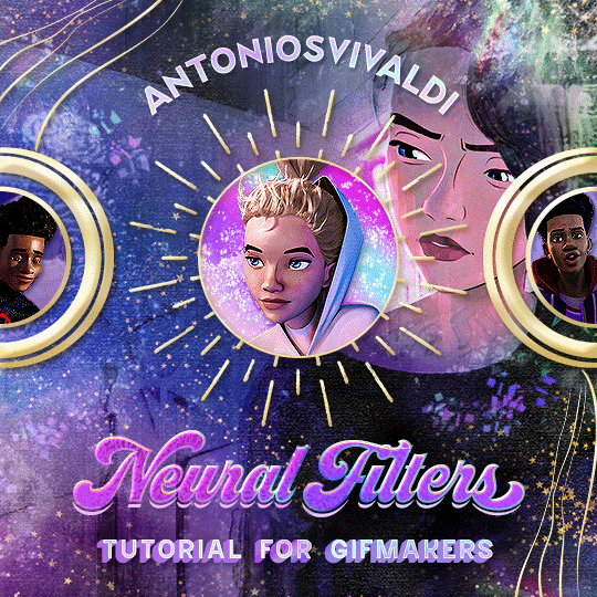


Neural Filters Tutorial for Gifmakers by @antoniosvivaldi
Hi everyone! In light of my blog’s 10th birthday, I’m delighted to reveal my highly anticipated gifmaking tutorial using Neural Filters - a very powerful collection of filters that really broadened my scope in gifmaking over the past 12 months.
Before I get into this tutorial, I want to thank @laurabenanti, @maines , @cobbbvanth, and @cal-kestis for their unconditional support over the course of my journey of investigating the Neural Filters & their valuable inputs on the rendering performance!
In this tutorial, I will outline what the Photoshop Neural Filters do and how I use them in my workflow - multiple examples will be provided for better clarity. Finally, I will talk about some known performance issues with the filters & some feasible workarounds.
Tutorial Structure:
Meet the Neural Filters: What they are and what they do
Why I use Neural Filters? How I use Neural Filters in my giffing workflow
Getting started: The giffing workflow in a nutshell and installing the Neural Filters
Applying Neural Filters onto your gif: Making use of the Neural Filters settings; with multiple examples
Testing your system: recommended if you’re using Neural Filters for the first time
Rendering performance: Common Neural Filters performance issues & workarounds
For quick reference, here are the examples that I will show in this tutorial:
Example 1: Image Enhancement | improving the image quality of gifs prepared from highly compressed video files
Example 2: Facial Enhancement | enhancing an individual's facial features
Example 3: Colour Manipulation | colourising B&W gifs for a colourful gifset
Example 4: Artistic effects | transforming landscapes & adding artistic effects onto your gifs
Example 5: Putting it all together | my usual giffing workflow using Neural Filters
What you need & need to know:
Software: Photoshop 2021 or later (recommended: 2023 or later)*
Hardware: 8GB of RAM; having a supported GPU is highly recommended*
Difficulty: Advanced (requires a lot of patience); knowledge in gifmaking and using video timeline assumed
Key concepts: Smart Layer / Smart Filters
Benchmarking your system: Neural Filters test files**
Supplementary materials: Tutorial Resources / Detailed findings on rendering gifs with Neural Filters + known issues***
*I primarily gif on an M2 Max MacBook Pro that's running Photoshop 2024, but I also have experiences gifmaking on few other Mac models from 2012 ~ 2023.
**Using Neural Filters can be resource intensive, so it’s helpful to run the test files yourself. I’ll outline some known performance issues with Neural Filters and workarounds later in the tutorial.
***This supplementary page contains additional Neural Filters benchmark tests and instructions, as well as more information on the rendering performance (for Apple Silicon-based devices) when subject to heavy Neural Filters gifmaking workflows
Tutorial under the cut. Like / Reblog this post if you find this tutorial helpful. Linking this post as an inspo link will also be greatly appreciated!
1. Meet the Neural Filters!
Neural Filters are powered by Adobe's machine learning engine known as Adobe Sensei. It is a non-destructive method to help streamline workflows that would've been difficult and/or tedious to do manually.
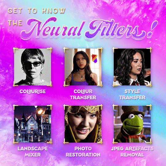
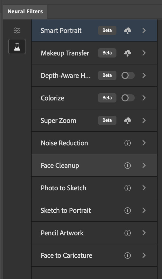
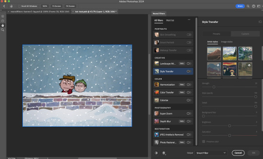
Here are the Neural Filters available in Photoshop 2024:
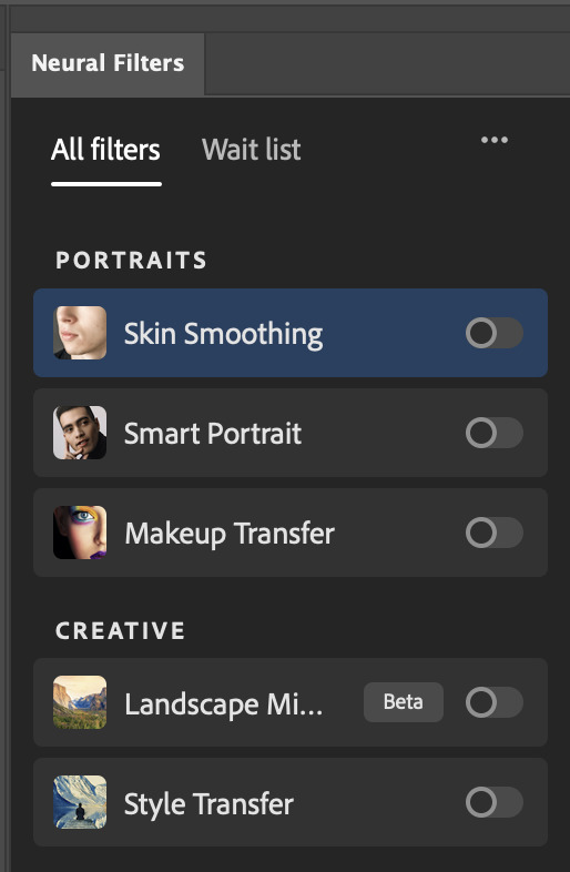

Skin Smoothing: Removes blemishes on the skin
Smart Portrait: This a cloud-based filter that allows you to change the mood, facial age, hair, etc using the sliders+
Makeup Transfer: Applies the makeup (from a reference image) to the eyes & mouth area of your image
Landscape Mixer: Transforms the landscape of your image (e.g. seasons & time of the day, etc), based on the landscape features of a reference image
Style Transfer: Applies artistic styles e.g. texturings (from a reference image) onto your image
Harmonisation: Applies the colour balance of your image based on the lighting of the background image+
Colour Transfer: Applies the colour scheme (of a reference image) onto your image
Colourise: Adds colours onto a B&W image
Super Zoom: Zoom / crop an image without losing resolution+
Depth Blur: Blurs the background of the image
JPEG Artefacts Removal: Removes artefacts caused by JPEG compression
Photo Restoration: Enhances image quality & facial details
+These three filters aren't used in my giffing workflow. The cloud-based nature of Smart Portrait leads to disjointed looking frames. For Harmonisation, applying this on a gif causes Neural Filter timeout error. Finally, Super Zoom does not currently support output as a Smart Filter
If you're running Photoshop 2021 or earlier version of Photoshop 2022, you will see a smaller selection of Neural Filters:

Things to be aware of:
You can apply up to six Neural Filters at the same time
Filters where you can use your own reference images: Makeup Transfer (portraits only), Landscape Mixer, Style Transfer (not available in Photoshop 2021), and Colour Transfer
Later iterations of Photoshop 2023 & newer: The first three default presets for Landscape Mixer and Colour Transfer are currently broken.
2. Why I use Neural Filters?
Here are my four main Neural Filters use cases in my gifmaking process. In each use case I'll list out the filters that I use:
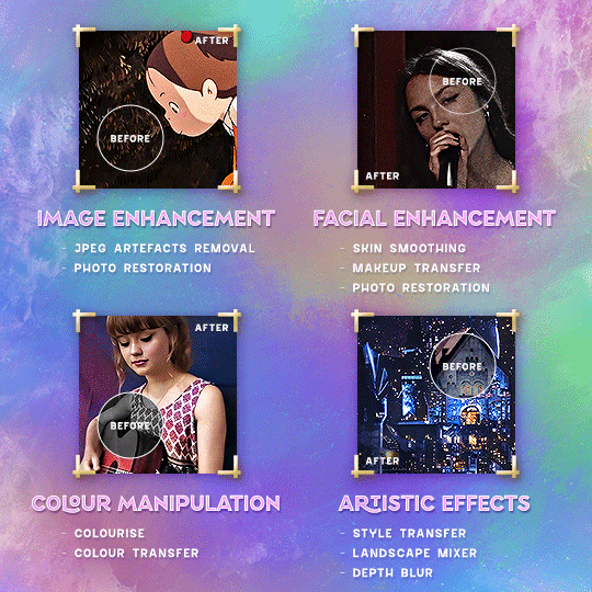
Enhancing Image Quality:
Common wisdom is to find the highest quality video to gif from for a media release & avoid YouTube whenever possible. However for smaller / niche media (e.g. new & upcoming musical artists), prepping gifs from highly compressed YouTube videos is inevitable.
So how do I get around with this? I have found Neural Filters pretty handy when it comes to both correcting issues from video compression & enhancing details in gifs prepared from these highly compressed video files.
Filters used: JPEG Artefacts Removal / Photo Restoration
Facial Enhancement:
When I prepare gifs from highly compressed videos, something I like to do is to enhance the facial features. This is again useful when I make gifsets from compressed videos & want to fill up my final panel with a close-up shot.
Filters used: Skin Smoothing / Makeup Transfer / Photo Restoration (Facial Enhancement slider)
Colour Manipulation:
Neural Filters is a powerful way to do advanced colour manipulation - whether I want to quickly transform the colour scheme of a gif or transform a B&W clip into something colourful.
Filters used: Colourise / Colour Transfer
Artistic Effects:
This is one of my favourite things to do with Neural Filters! I enjoy using the filters to create artistic effects by feeding textures that I've downloaded as reference images. I also enjoy using these filters to transform the overall the atmosphere of my composite gifs. The gifsets where I've leveraged Neural Filters for artistic effects could be found under this tag on usergif.
Filters used: Landscape Mixer / Style Transfer / Depth Blur
How I use Neural Filters over different stages of my gifmaking workflow:
I want to outline how I use different Neural Filters throughout my gifmaking process. This can be roughly divided into two stages:
Stage I: Enhancement and/or Colourising | Takes place early in my gifmaking process. I process a large amount of component gifs by applying Neural Filters for enhancement purposes and adding some base colourings.++
Stage II: Artistic Effects & more Colour Manipulation | Takes place when I'm assembling my component gifs in the big PSD / PSB composition file that will be my final gif panel.
I will walk through this in more detail later in the tutorial.
++I personally like to keep the size of the component gifs in their original resolution (a mixture of 1080p & 4K), to get best possible results from the Neural Filters and have more flexibility later on in my workflow. I resize & sharpen these gifs after they're placed into my final PSD composition files in Tumblr dimensions.
3. Getting started
The essence is to output Neural Filters as a Smart Filter on the smart object when working with the Video Timeline interface. Your workflow will contain the following steps:
Prepare your gif
In the frame animation interface, set the frame delay to 0.03s and convert your gif to the Video Timeline
In the Video Timeline interface, go to Filter > Neural Filters and output to a Smart Filter
Flatten or render your gif (either approach is fine). To flatten your gif, play the "flatten" action from the gif prep action pack. To render your gif as a .mov file, go to File > Export > Render Video & use the following settings.

Setting up:
o.) To get started, prepare your gifs the usual way - whether you screencap or clip videos. You should see your prepared gif in the frame animation interface as follows:

Note: As mentioned earlier, I keep the gifs in their original resolution right now because working with a larger dimension document allows more flexibility later on in my workflow. I have also found that I get higher quality results working with more pixels. I eventually do my final sharpening & resizing when I fit all of my component gifs to a main PSD composition file (that's of Tumblr dimension).
i.) To use Smart Filters, convert your gif to a Smart Video Layer.
As an aside, I like to work with everything in 0.03s until I finish everything (then correct the frame delay to 0.05s when I upload my panels onto Tumblr).
For convenience, I use my own action pack to first set the frame delay to 0.03s (highlighted in yellow) and then convert to timeline (highlighted in red) to access the Video Timeline interface. To play an action, press the play button highlighted in green.

Once you've converted this gif to a Smart Video Layer, you'll see the Video Timeline interface as follows:

ii.) Select your gif (now as a Smart Layer) and go to Filter > Neural Filters
Installing Neural Filters:
Install the individual Neural Filters that you want to use. If the filter isn't installed, it will show a cloud symbol (highlighted in yellow). If the filter is already installed, it will show a toggle button (highlighted in green)
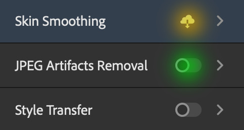
When you toggle this button, the Neural Filters preview window will look like this (where the toggle button next to the filter that you use turns blue)

4. Using Neural Filters
Once you have installed the Neural Filters that you want to use in your gif, you can toggle on a filter and play around with the sliders until you're satisfied. Here I'll walkthrough multiple concrete examples of how I use Neural Filters in my giffing process.
Example 1: Image enhancement | sample gifset
This is my typical Stage I Neural Filters gifmaking workflow. When giffing older or more niche media releases, my main concern is the video compression that leads to a lot of artefacts in the screencapped / video clipped gifs.
To fix the artefacts from compression, I go to Filter > Neural Filters, and toggle JPEG Artefacts Removal filter. Then I choose the strength of the filter (boxed in green), output this as a Smart Filter (boxed in yellow), and press OK (boxed in red).
Note: The filter has to be fully processed before you could press the OK button!
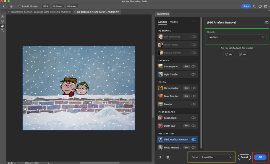
After applying the Neural Filters, you'll see "Neural Filters" under the Smart Filters property of the smart layer

Flatten / render your gif
Example 2: Facial enhancement | sample gifset
This is my routine use case during my Stage I Neural Filters gifmaking workflow. For musical artists (e.g. Maisie Peters), YouTube is often the only place where I'm able to find some videos to prepare gifs from. However even the highest resolution video available on YouTube is highly compressed.
Go to Filter > Neural Filters and toggle on Photo Restoration. If Photoshop recognises faces in the image, there will be a "Facial Enhancement" slider under the filter settings.

Play around with the Photo Enhancement & Facial Enhancement sliders. You can also expand the "Adjustment" menu make additional adjustments e.g. remove noises and reducing different types of artefacts.

Once you're happy with the results, press OK and then flatten / render your gif.
Example 3: Colour Manipulation | sample gifset
Want to make a colourful gifset but the source video is in B&W? This is where Colourise from Neural Filters comes in handy! This same colourising approach is also very helpful for colouring poor-lit scenes as detailed in this tutorial.
Here's a B&W gif that we want to colourise:

Highly recommended: add some adjustment layers onto the B&W gif to improve the contrast & depth. This will give you higher quality results when you colourise your gif.
Go to Filter > Neural Filters and toggle on Colourise.
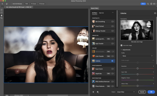
Make sure "Auto colour image" is enabled.
Play around with further adjustments e.g. colour balance, until you're satisfied then press OK.
Important: When you colourise a gif, you need to double check that the resulting skin tone is accurate to real life. I personally go to Google Images and search up photoshoots of the individual / character that I'm giffing for quick reference.
Add additional adjustment layers until you're happy with the colouring of the skin tone.
Once you're happy with the additional adjustments, flatten / render your gif. And voila!

Note: For Colour Manipulation, I use Colourise in my Stage I workflow and Colour Transfer in my Stage II workflow to do other types of colour manipulations (e.g. transforming the colour scheme of the component gifs)
Example 4: Artistic Effects | sample gifset
This is where I use Neural Filters for the bulk of my Stage II workflow: the most enjoyable stage in my editing process!
Normally I would be working with my big composition files with multiple component gifs inside it. To begin the fun, drag a component gif (in PSD file) to the main PSD composition file.
Resize this gif in the composition file until you're happy with the placement

Duplicate this gif. Sharpen the bottom layer (highlighted in yellow), and then select the top layer (highlighted in green) & go to Filter > Neural Filters

I like to use Style Transfer and Landscape Mixer to create artistic effects from Neural Filters. In this particular example, I've chosen Landscape Mixer
Select a preset or feed a custom image to the filter (here I chose a texture that I've on my computer)
Play around with the different sliders e.g. time of the day / seasons
Important: uncheck "Harmonise Subject" & "Preserve Subject" - these two settings are known to cause performance issues when you render a multiframe smart object (e.g. for a gif)
Once you're happy with the artistic effect, press OK
To ensure you preserve the actual subject you want to gif (bc Preserve Subject is unchecked), add a layer mask onto the top layer (with Neural Filters) and mask out the facial region. You might need to play around with the Layer Mask Position keyframes or Rotoscope your subject in the process.
After you're happy with the masking, flatten / render this composition file and voila!

Example 5: Putting it all together | sample gifset
Let's recap on the Neural Filters gifmaking workflow and where Stage I and Stage II fit in my gifmaking process:
i. Preparing & enhancing the component gifs
Prepare all component gifs and convert them to smart layers
Stage I: Add base colourings & apply Photo Restoration / JPEG Artefacts Removal to enhance the gif's image quality
Flatten all of these component gifs and convert them back to Smart Video Layers (this process can take a lot of time)
Some of these enhanced gifs will be Rotoscoped so this is done before adding the gifs to the big PSD composition file
ii. Setting up the big PSD composition file
Make a separate PSD composition file (Ctrl / Cmmd + N) that's of Tumblr dimension (e.g. 540px in width)
Drag all of the component gifs used into this PSD composition file
Enable Video Timeline and trim the work area
In the composition file, resize / move the component gifs until you're happy with the placement & sharpen these gifs if you haven't already done so
Duplicate the layers that you want to use Neural Filters on
iii. Working with Neural Filters in the PSD composition file
Stage II: Neural Filters to create artistic effects / more colour manipulations!
Mask the smart layers with Neural Filters to both preserve the subject and avoid colouring issues from the filters
Flatten / render the PSD composition file: the more component gifs in your composition file, the longer the exporting will take. (I prefer to render the composition file into a .mov clip to prevent overriding a file that I've spent effort putting together.)
Note: In some of my layout gifsets (where I've heavily used Neural Filters in Stage II), the rendering time for the panel took more than 20 minutes. This is one of the rare instances where I was maxing out my computer's memory.
Useful things to take note of:
Important: If you're using Neural Filters for Colour Manipulation or Artistic Effects, you need to take a lot of care ensuring that the skin tone of nonwhite characters / individuals is accurately coloured
Use the Facial Enhancement slider from Photo Restoration in moderation, if you max out the slider value you risk oversharpening your gif later on in your gifmaking workflow
You will get higher quality results from Neural Filters by working with larger image dimensions: This gives Neural Filters more pixels to work with. You also get better quality results by feeding higher resolution reference images to the Neural Filters.
Makeup Transfer is more stable when the person / character has minimal motion in your gif
You might get unexpected results from Landscape Mixer if you feed a reference image that don't feature a distinctive landscape. This is not always a bad thing: for instance, I have used this texture as a reference image for Landscape Mixer, to create the shimmery effects as seen in this gifset
5. Testing your system
If this is the first time you're applying Neural Filters directly onto a gif, it will be helpful to test out your system yourself. This will help:
Gauge the expected rendering time that you'll need to wait for your gif to export, given specific Neural Filters that you've used
Identify potential performance issues when you render the gif: this is important and will determine whether you will need to fully playback your gif before flattening / rendering the file.
Understand how your system's resources are being utilised: Inputs from Windows PC users & Mac users alike are welcome!
About the Neural Filters test files:
Contains six distinct files, each using different Neural Filters
Two sizes of test files: one copy in full HD (1080p) and another copy downsized to 540px
One folder containing the flattened / rendered test files
How to use the Neural Filters test files:
What you need:
Photoshop 2022 or newer (recommended: 2023 or later)
Install the following Neural Filters: Landscape Mixer / Style Transfer / Colour Transfer / Colourise / Photo Restoration / Depth Blur
Recommended for some Apple Silicon-based MacBook Pro models: Enable High Power Mode
How to use the test files:
For optimal performance, close all background apps
Open a test file
Flatten the test file into frames (load this action pack & play the “flatten” action)
Take note of the time it takes until you’re directed to the frame animation interface
Compare the rendered frames to the expected results in this folder: check that all of the frames look the same. If they don't, you will need to fully playback the test file in full before flattening the file.†
Re-run the test file without the Neural Filters and take note of how long it takes before you're directed to the frame animation interface
Recommended: Take note of how your system is utilised during the rendering process (more info here for MacOS users)
†This is a performance issue known as flickering that I will discuss in the next section. If you come across this, you'll have to playback a gif where you've used Neural Filters (on the video timeline) in full, prior to flattening / rendering it.
Factors that could affect the rendering performance / time (more info):
The number of frames, dimension, and colour bit depth of your gif
If you use Neural Filters with facial recognition features, the rendering time will be affected by the number of characters / individuals in your gif
Most resource intensive filters (powered by largest machine learning models): Landscape Mixer / Photo Restoration (with Facial Enhancement) / and JPEG Artefacts Removal
Least resource intensive filters (smallest machine learning models): Colour Transfer / Colourise
The number of Neural Filters that you apply at once / The number of component gifs with Neural Filters in your PSD file
Your system: system memory, the GPU, and the architecture of the system's CPU+++
+++ Rendering a gif with Neural Filters demands a lot of system memory & GPU horsepower. Rendering will be faster & more reliable on newer computers, as these systems have CPU & GPU with more modern instruction sets that are geared towards machine learning-based tasks.
Additionally, the unified memory architecture of Apple Silicon M-series chips are found to be quite efficient at processing Neural Filters.
6. Performance issues & workarounds
Common Performance issues:
I will discuss several common issues related to rendering or exporting a multi-frame smart object (e.g. your composite gif) that uses Neural Filters below. This is commonly caused by insufficient system memory and/or the GPU.
Flickering frames: in the flattened / rendered file, Neural Filters aren't applied to some of the frames+-+
Scrambled frames: the frames in the flattened / rendered file isn't in order
Neural Filters exceeded the timeout limit error: this is normally a software related issue
Long export / rendering time: long rendering time is expected in heavy workflows
Laggy Photoshop / system interface: having to wait quite a long time to preview the next frame on the timeline
Issues with Landscape Mixer: Using the filter gives ill-defined defined results (Common in older systems)--
Workarounds:
Workarounds that could reduce unreliable rendering performance & long rendering time:
Close other apps running in the background
Work with smaller colour bit depth (i.e. 8-bit rather than 16-bit)
Downsize your gif before converting to the video timeline-+-
Try to keep the number of frames as low as possible
Avoid stacking multiple Neural Filters at once. Try applying & rendering the filters that you want one by one
Specific workarounds for specific issues:
How to resolve flickering frames: If you come across flickering, you will need to playback your gif on the video timeline in full to find the frames where the filter isn't applied. You will need to select all of the frames to allow Photoshop to reprocess these, before you render your gif.+-+
What to do if you come across Neural Filters timeout error? This is caused by several incompatible Neural Filters e.g. Harmonisation (both the filter itself and as a setting in Landscape Mixer), Scratch Reduction in Photo Restoration, and trying to stack multiple Neural Filters with facial recognition features.
If the timeout error is caused by stacking multiple filters, a feasible workaround is to apply the Neural Filters that you want to use one by one over multiple rendering sessions, rather all of them in one go.
+-+This is a very common issue for Apple Silicon-based Macs. Flickering happens when a gif with Neural Filters is rendered without being previously played back in the timeline.
This issue is likely related to the memory bandwidth & the GPU cores of the chips, because not all Apple Silicon-based Macs exhibit this behaviour (i.e. devices equipped with Max / Ultra M-series chips are mostly unaffected).
-- As mentioned in the supplementary page, Landscape Mixer requires a lot of GPU horsepower to be fully rendered. For older systems (pre-2017 builds), there are no workarounds other than to avoid using this filter.
-+- For smaller dimensions, the size of the machine learning models powering the filters play an outsized role in the rendering time (i.e. marginal reduction in rendering time when downsizing 1080p file to Tumblr dimensions). If you use filters powered by larger models e.g. Landscape Mixer and Photo Restoration, you will need to be very patient when exporting your gif.
7. More useful resources on using Neural Filters
Creating animations with Neural Filters effects | Max Novak
Using Neural Filters to colour correct by @edteachs
I hope this is helpful! If you have any questions or need any help related to the tutorial, feel free to send me an ask 💖
#photoshop tutorial#gif tutorial#dearindies#usernik#useryoshi#usershreyu#userisaiah#userroza#userrobin#userraffa#usercats#userriel#useralien#userjoeys#usertj#alielook#swearphil#*#my resources#my tutorials
538 notes
·
View notes
Text
well, dear fellows, I've spent days on blinding spectrograms and the song stuck in my freakin head for it being on loop. And with the next episode just dropping hours away, I thought to share this.
Did I really do this? Yes.
Was this completely pointless? Oh, absolutely—
Picking Apart the Flareglow Audio
⚠️ DISCLAIMER IN INTRO POST ⚠️
CONTEXT
if you somehow did not see what was going on and probably questioning "what the hell is flareglow?" (exactly like Cube tweeted), I'll give a quick rundown:
News of a new song "Flareglow", appearing on the official SMG4 artist page on multiple platforms (spotify, apple music/itunes, iheart radio, amazon music, and others) on Jan 4.
The song itself (here's my basic analysis) sounds nothing like the Team has done before in every way you can imagine, from the gmod-made cover art to AI-sounding lyrics
fans started to speculate rather or not this was another hack or if it was an intentional by the Team, who have not confirmed anything about it. y'know it's bad when casual viewers are pointing it out
then there's people like me that suspected that the Team was scheming for some future thing
Ben tweeted about it (the first one by the Team as far as i know)
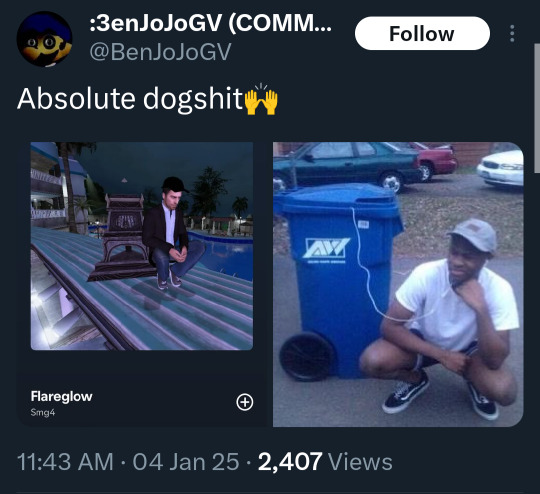
Cube was the next one to bring it up AND on that same day, the song gets slowly taken down by the multiple platforms it was on
a week later giving out a comment to clarify (quote on quote) this as well as the SMG4 Steam strangely changing its username (ft. Shadow reposting)


Now, you are valid in what you want to believe here while i suspect Cube with every inch of my mind palace. and since you're reading this...
AUDIO INVESTIGATION
Clues and codes can be hidden in multiple ways and one of those is through audio files, most commonly found in video games.
If you play a coded audio file, it might sound distorted and weird. But if you manipulate it as easily as putting the audio in reverse, you might've found a clue. Images can also be hidden and be seen through a spectrogram. This is considered one of the more fragile ways of coding since any small alterations to the file could change the image.
Before it got taken down, i managed to snag a copy and send it through a visualizer. ofc the image can't be seen right away and have to toy with the settings for it to work.
Admittedly, this was the most frustrating part of the whole investigation, constantly zooming in and out of the spectrogram preview, going back and forth to some classic photoshop photo manipulation. Hours and hours. So here's what i got:
zoomed in i found what looked like an "e" in 39 seconds (yeah not sure what past Ink was thinking there)
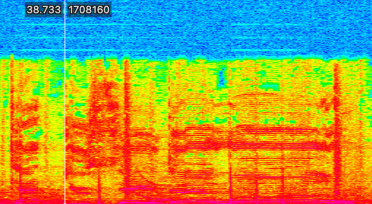
having it squished kinda forms a word but it's not clear enough to distinguish
(take it with a chunk of salt that it said "Princess", well i found the letter "P" ok)
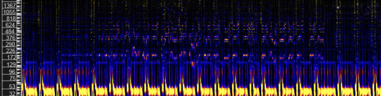

photo manipulation cleared to "a image" of a series of almost identical corridors
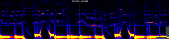
honestly it could just be nothing lol
yeah i might be reaching at this point, starting to see things too. I really did try everything, including using a backwards copy of it to use it as a filter on top. Like I said, it may not be nothing and that's okay. At least I gave it a shot. i know it must be disappointing.
But it's not over just yet. Have you found it strange that the title "flareglow" isn't in the lyrics itself? Even knowing what the lyrics may be about, it doesn't make sense. "A glint of bouncing light, can be captured on camera" hmmmm.
"But some songs are like that?"
True, but knowing the Team and the Steam mystery going on, yeah no. Not to mention the song being a one-sided convo perspective AND a theory that 4 may turn out like Leggy and be pushed to be an assistant to Mr Puzzles due to a grudge. Clues based on 2 of Ben's tweets,


4 being the second minion. Hence doing the idea of the copied spectrogram.
Then there was the other idea, what if there's 2 songs? we got one half of the code, there might be another.
I guess I should clarify: maybe "Flareglow" is the title for song 2 while the song 2 title is the true title for this one.
Anyway, it would be too early for us to figure it out.
if there is, we need to be on the lookout for that one bc overlapping them might show the full image.
Two halves of the same coin :)
close enough, welcome back 4 & Puzzles being narrative foils
.・-: ✧ :--: ✧ :-・.
well uh this was something.
But for real tho, I have absolutely no idea what's gonna happen and this is just for the sillies 😋 either way thanks chat for listening to my ramblings for the past couple of days, I must've looked insane.
Now, that's a lesson to learn: sometimes it's okay to overanalyze stuff as nourishment for theorist brains and for me to morph into matpat
If anything does come up, I'll be there with everything I have and can totally count you guys being there too 💙
and on that note,
oh my god i'm never gonna listen to that song ever again not even a single second this better be a joke bc i swear i will crawl through the screen and into my spotify account and burn the entire platform on sight and maybe strangle that fuckin cover art while i'm at it as my body's decomposing into pixels watch me—
#smg4#smg4 theory#ink rambles#it's like past 3 am rn#please. deliver me from this hell#if i'm dead wrong tho. can the Team include it as a bit into an episode or smth#even if it wasn't them it would be so fuckin funny dude
20 notes
·
View notes
Text
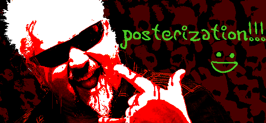
Tidbit: The “Posterization” Effect of Panels Due to the Consequences of GIF Color Quantization (and Increased Contrast (And Also The Tangential Matter of Dithering))
There’s this misconception that the color banding and patterned dithering found in panels is an entirely deliberate, calculated effect Hussie manipulated the image into looking with some specific filter, but this isn’t the case, exactly. It wasn’t so much a conscious decision he took but rather an unavoidable consequence of the medium he partook in: digital art in an age where bandwidth and storage was at a premium.
Not to delve too deeply into the history and technicalities of it, but the long and the short of it is back in the early nineties to late aughts (and even a bit further into the 10s), transferring and storing data over the web was not as fast, plentiful, and affordable as it is now. Filesize was a much more important consideration than the fidelity of an image when displaying it on the web. Especially so when you���re a hobbyist on a budget and paying for your own webhosting, or using a free service with a modest upload limit (even per file!). Besides, what good would it be to post your images online if it takes ages to load them over people's dial-up Internet? Don't even get me STARTED on the meager memory and power the average iGPU had to work with, too.

The original comic strip's resolution was a little more than halved and saved as a GIF rather than a large PNG. That's about an 82.13% reduction in filesize!
So in the early days it was very common for people to take their scans, photographs, and digital drawings and scale them down and publish them as smaller lossily compressed JPEGs or lossless GIFs, the latter of which came at the cost of color range. But it had a wider range of browser support and the feature to be used for animations compared to its successor format, PNG ("PNG's not GIF").
You'd've been hard-pressed to find Hussie use any PNGs himself then. In fact, I think literally the only times he's ever personally employed them and not delegate the artwork to a member of the art team were some of the tiny shrunken down text of a character talking far in the distance and a few select little icons.
PNGs support semi-transparency unlike GIFs, which is why Hussie used them to preserve the anti-aliasing on the text without having to add an opaque background color.
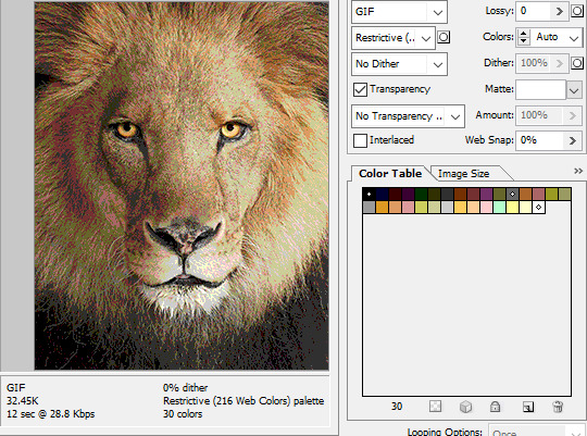
While PNGs can utilize over 16 million colors in a single image, GIFs have a hard limit of 256 colors per frame. For reference, this small image alone has 604 colors:

For those who can't do the math, 256 is a pretty damn small number.
Smaller still were the palettes in a great deal of MSPA's panels early on in its run. Amazingly, a GIF such as this only uses 7 colors (8 if you count the alpha (which it is)).
Not that they were always strictly so low; occasionally some in the later acts of Homestuck had pretty high counts. This panel uses all 256 spots available, in fact.
If he had lowered the number any smaller, the quality would have been god-awful.
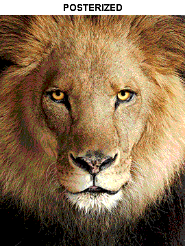
To the untrained eye, these bands of color below may seem to be the result of a posterization filter (an effect that reduces smooth areas of color into fewer harsh solid regions), but it's really because the image was exported as a GIF with no dithering applied.

Dithering, to the uninitiated, is how these colors are arranged together to compensate for the paltry palette, producing illusory additional colors. There are three algorithms in Photoshop for this: Diffusion, Pattern, and Noise.

Above is the original image and below is the image reduced to a completely binary 1-bit black and white color palette, to make the effect of each dithering algorithm more obvious.

Diffusion seemingly displaces the pixels around randomly, but it uses error diffusion to calculate what color each pixel should be. In other words, math bullshit. The Floyd-Steinberg algorithm is one such implementation of it, and is usually what this type of error diffusion dithering is called in other software, or some misnomer-ed variation thereof.
The usage of Pattern may hearken back to retro video game graphics for you, as older consoles also suffered from color palette limitations. Sometimes called Ordered dithering because of the orderly patterns it produces. At least, I assumed so. Its etymological roots probably stem from more math bullshit again.
True to its name, Noise is noisy. It’s visually similar to Diffusion dithering, except much more random looking. At least, when binarized like this. Truth be told, I can’t tell the difference between the two at all when using a fuller color table on an image with a lot of detail. It was mainly intended to be used when exporting individual slices of an image that was to be “stitched” back together on a webpage, to mitigate visible seams in the dithering around the edges.
To sate your curiosity, here's how the image looks with no dithering at all:
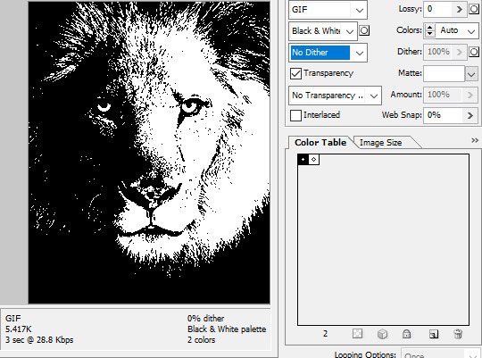
People easily confuse an undithered gif as being the result of posterization, and you couldn't fault them for thinking so. They look almost entirely the same!
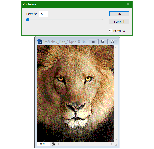
Although I was already aware of this fact when I was much younger, I'm guilty of posterizing myself while editing images back then. Figured I may as well reduce the color count beforehand to help keep the exported GIF looking as intended. I view this as a complete waste of time now, though, and amateurish. Takes away a bit of the authenticity of MSPA art, how the colors and details are so variable between panels. As for WHY they were so variable to begin with, choosing the settings to save the image as requires a judicious examination on a case-by-case basis. In other words, just playing around with the settings until it looks decent.
It's the process of striking a fine balance between an acceptable file size and a "meh, good enough" visual quality that I mentioned earlier. How many colors can you take away until it starts to look shit? Which dithering algorithm helps make it look not as shit while not totally ruining the compression efficacy?
Take, for example, this panel from Problem Sleuth. It has 16 colors, an average amount for the comic, and uses Diffusion dithering. Filesize: 34.5 KB.

Then there's this panel right afterwards. It has 8 colors (again, technically 7 + alpha channel since it's an animated gif), and uses Noise dithering this time. Filesize: 34.0 KB.
The more colors and animation frames there are, and the more complicated dithering there is, the bigger the file size is going to be. Despite the second panel having half the color count of the first, the heavily noisy dithering alone was enough to inflate the file size back up. On top of that, there's extra image information layered in for the animation, leaving only a mere 0.5 kilobyte difference between the two panels.
So why would Hussie pick the algorithm that compresses worse than the other? The answer: diffusion causes the dithering to jitter around between frames of animation. Recall its description from before, how it functions on nerd shit like math calculations. The way it calculates what each pixel's color will be is decided by the pixels' colors surrounding it, to put it simply. Any difference in the placement of pixels will cause these cascading changes in the dithering like the butterfly effect.
Diffusion dithering, 16 colors. Filesize: 25.2 KB
This isn't the case with Noise or Pattern dithering, since their algorithms use either a texture or a definite array of numbers (more boring nerd shit).
Noise dithering, 16 colors. Filesize: 31.9 KB
Pattern dithering, 16 colors. Filesize: 23.1 KB
There's a lot more I'd like to talk about, like the different color reduction algorithms, which dither algorithms generally compress better in what cases, and the upward and downward trends of each one’s use over the course of a comic, but since this isn’t a deep dive on GIF optimization, I might save that for another time. This post is already reaching further past the original scope it was meant to cover, and less than 10 images can be uploaded before hitting the limit, which is NOWHERE near enough for me. I should really reevaluate my definition of the word “tidbit”… Anyway, just know that this post suffers from sample selection bias, so while the panels above came from an early section of Problem Sleuth that generally had static panels with diffusion dithering and animated panels with noise dithering, there certainly were animated panels with diffusion later on despite the dither-jittering.
Alright, time to shotgun through the rest of this post, screw segueing. Increasing the contrast almost entirely with “Use Legacy” enabled spreads the tones of the image out evenly, causing the shadows and highlights to clip into pure black and white. The midtones become purely saturated colors. Using the Levels adjustment filter instead, moving both shadow and highlight input level sliders towards the middle also accomplishes the same thing, because, you know, linear readjustment. I'm really resisting the urge to go off on another tangent about color channels and the RGB additive color model.
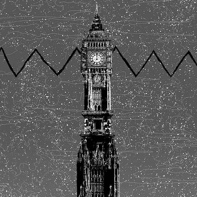
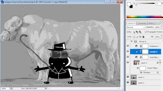
Anyway, there aren't any examples in MSPA that are quite this extreme (at least in color, but I'll save that for a later post), but an image sufficiently high in contrast can be mistaken for being posterized at a glance. Hence the Guy Fieri banner. In preparation for this post, I was attempting to make a pixel-perfect recreation of that panel but hit a wall trying to figure out which and how many filters were used and what each one's settings were, so I sought the wisdom of those in the official Photoshop Discord server. The very first suggestion I got was a posterization filter, by someone who was a supposed senior professional and server moderator, no less. Fucking dipshit, there's too much detail preserved for it to be posterization. Dude totally dissed me and my efforts too, so fuck that moron. I spit on his name and curse his children, and his children's children. The philistines I have to put up with...
In the end, the bloody Guy Fieri recreation proved to be too much for me to get right. I got sort of close at times, but no cigar. These were some of the closest I could manage:

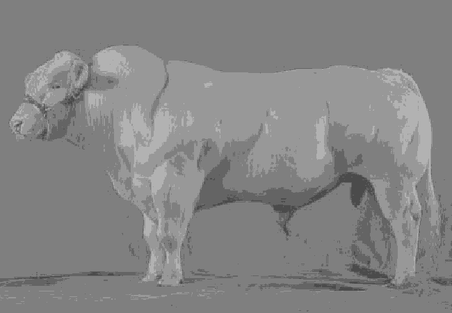
You might be left befuddled after all this, struggling to remember what the point of the blogpost even was. I had meant for it to be a clarification of GIFs and an argument against using the posterization filter, thinking it was never used in MSPA, but while gathering reference images, I found a panel from the Felt intermission that actually WAS posterized! So I’ll eat crow on this one... Whatever, it’s literally the ONE TIME ever.
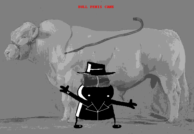
I can tell it's posterization and not gif color quantization because of the pattern dithering and decently preserved details on the bomb and bull penis cane. There would have had to have been no dithering and way fewer colors than the 32, most of which were allotted to the bomb and cane. You can't really selectively choose what gets dithered or more colors like this otherwise.
Thank you for reading if you've gotten this far. That all might have been a lot to take in at once, so if you're still unclear about something, please don't hesitate to leave a question! And as always, here are the PSDs used in this post that are free to peruse.
371 notes
·
View notes
Text
A graphic designer has sparked controversy by using design software to analyze and debunk the authenticity of Barack Obama’s official White House birth certificate.
In a shocking video demonstration, the designer downloaded the official document directly from the White House website and proceeded to dissect its layers in Adobe Illustrator.
The designer claims that the birth certificate, which was publicly released during Obama’s presidency to quell speculation about his birthplace, is not a single, cohesive document. Instead, he alleges it is made up of multiple separate boxes that were poorly assembled in what he described as a “terrible Photoshop job.”
As he manipulated the file in Illustrator, the designer pointed out inconsistencies he says indicate the document was digitally altered, such as mismatched text layers, inconsistent fonts, and alignment issues.
“No legitimate document would ever look like this,” he declared, explaining that official certificates are typically scanned as a single, uneditable file. Watch:
28 notes
·
View notes
Text
The Curse of Artistic Vision
I think being an artist comes down to developing an image in your head and then feeling compelled to manifest it. Sometimes you are able to improve upon that image in your head. Or you end up with something different that you like better.
But sometimes, for various reasons, you can't quite make that image a reality. And I don't know if other artists feel this way, but it feels like heartbreak every time. Not quite on the level of an incident of human decoupling, but it definitely sticks with you for a long time.
Sometimes I am limited by the current state of my skillset. I just haven't learned enough and gained enough experience to take a photo like the one in my brain.
And sometimes I am limited by my body, which puts huge restrictions on the amount of energy I can dedicate to crafting a photo.
I feel my knowledge and experience has never been at the level I am currently at. I think I have the *potential* to shoot just about anything I can imagine. Which is a cool feeling. I also feel like my image editing and manipulation skills are at the highest they have ever been. Which means anything I can't do in-camera, I can achieve in Lightroom and Photoshop.
But I just don't have a lot of energy to capture photos right now. And I am very limited by how much physical effort I can dedicate to the photographic process. Which is very frustrating. I'm hoping if I build a new studio in the house that will help a lot.
In the meantime, I have this library of images I took before 2017. Many of them I was not able to achieve my artistic vision.
But... I came close.
Which means on many of these old images I can use my editing skills of today to achieve what I could not back then.
And so I have started a huge re-edit project where I go back and realize my images as I wanted them to be.
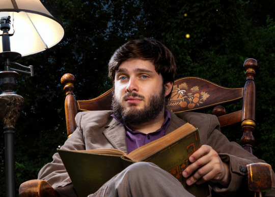
I had this idea for an image of someone in the middle of a dark forest in an open field reading a book and the only illumination was a lamp that seemed to be plugged into nothing. It popped into my head and it just seemed like a cool photo to create.
In July of 2016, my friend Ryan was visiting and we decided to try it. We even rented a big fancy 50 megapixel camera for a few days. I had never used a professional level camera and it was my birthday and I wanted that experience.
I even had this cool idea to hide a flash in the lamp so it would look like it was illuminated.
The resulting image was not anything like I had in my head. And for some reason, I edited it super bright, and you can barely even notice the cool lampshade flash trick. If you lower the exposure of the RAW file there is a well-defined circle of light in the grass, but it is hard to see in the 2016 edit.
Where is the dark background? Why didn't I underexpose the background to make it look like night or sunset? I knew how to do that back then. I totally could have crafted the photo in my head at that time.
But then I noticed I only took like 8 photos of this scene. And I *always* overshoot. I took 300 photos of a bridge recently.
Then I remembered what happened. We moved a giant rocking chair, a lamp, and lighting equipment to the middle of my neighbor's yard and by the time I was ready to take the photo, I was about to pass out. I believe it was very hot as well.
And so the above was the best I could do under that circumstance. My body limited my artistic vision. And this has been bothering me for years. Sometimes I will think back on this photo and how cool it looked in my head and I will feel that heartbreak again.
When I look at the RAW file... it is actually much better than my edited image.
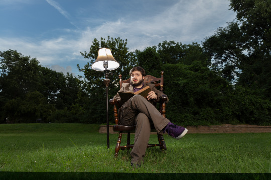
Which makes me curious why I made it so damn bright. My best theory is I had a monitor that was slowly dying and I didn't realize how dim it got because our eyes are so good at adjusting, and it's possible all of my images from that era were overly bright because I was overcompensating for a dying display.
That fancy camera (Canon 5DS R) was a dream to work with. And having so many extra megapixels to play with is such a joy. People say you don't need more megapixels these days, but when you are doing high level image manipulation, having as much information as possible makes it a lot easier. Especially when making complex selections.
So, I've got a good start. I have a lot of pixels to play with. I was almost certain I could manifest my vision with modern knowledge and tools.
I'll start with the baseline edit in Lightroom. I'm not going to worry about the sky, as that will need to be swapped for my nighttime aesthetic.
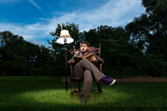
The circle of light was there! It was just hiding in my bright exposure. So that's neat. And when you lower the exposure of the background, the lampshade trick presents itself as well.
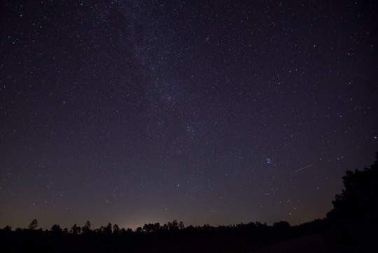
At this point I was getting excited because I could see the potential. I just had to find the right sky. This one looks perfect.
Okay, it is time for the big reveal.
Did I finally get this image out of my brain and into reality?

I DID!
I don't know if people will like this or find it artistically interesting, but Ryan and I were both very happy with the new version.
Also, I think Ryan's purple shoes really steal the show.
Though I had one idea that was never in my head originally.
Should I try it?
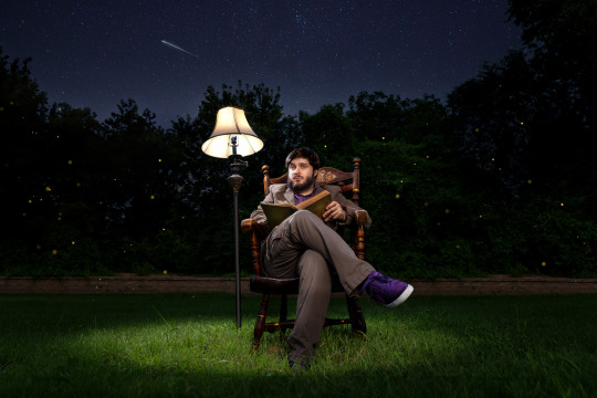
I still haven't decided on the fireflies yet, but Ryan and Katrina like them.
I can't state how nice it was to work on a 50 megapixel photo from a full frame sensor coming from a 10 year old camera with 4 stops less dynamic range and 24 megapixels.
This is zoomed in to 100%!
And the image doesn't even get soft at 300%.
Sorry, I got caught up in the megapixels.
And there is one detail you'll probably never notice unless I point it out, but I completely rebuilt the lampshade because I overexposed it.
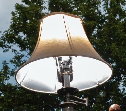
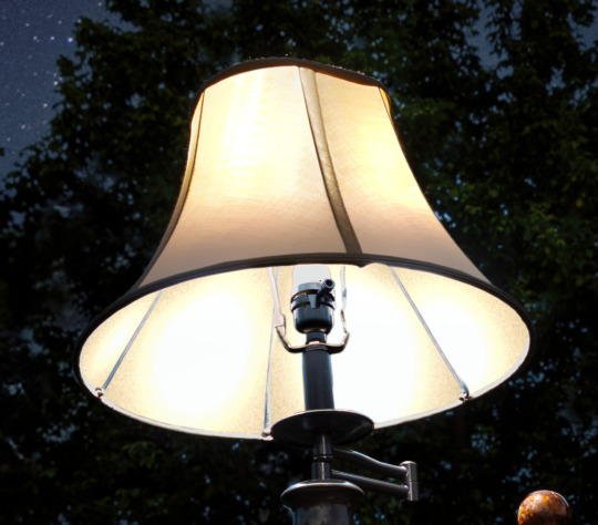
I always say small details add up to big results. Plus I had to use some creative problem solving to figure out how to recreate a lampshade and I always enjoy that part of the process—where you don't know how to do something and then you figure it out. Very satisfying.
In any case, my brain feels better now. I feel like I was able to settle something that has been bothering me for ages. And I am grateful I was able to realize my artistic vision—even if it took 8 years.
Here is the before and after. It's fun to switch back and forth.

On to the next photo. And it may involve a furry little orange friend.
57 notes
·
View notes
Note
sorry if you’ve answered something similar before but how do you format things for your website? in the collections you have for poems
i love how it looks. the book kind of format it has
and i want to do similar/the same formatting for my own works but im really struggling…
i've been asked stuff like this a lot and i don't mind explaining it often because i want people to make websites more. i made a tutorial video at some point but it's kind of hard to make a curriculum or tutorial or whatever around this kind of thing because it's really just a self expression thing. i'll try to break down as much of my thought process as makes sense.
i design my pages in photoshop with either double/single page display in mind and then i use html to set them next to each other. most of the choice here comes down to how overwhelming i want my designs to feel. in the case of the lonely leaver page, the entire book was designed to be something that could be a physical book, and so from the getgo i made the pages in that kind of format. i previewed things in acrobat which has a booklet view mode (which singles out the front and back cover around the contents of the file) & allows you to process double page view as well. as for the actual process in photoshop before that point, i typically will open a canvas that is the size of the full 2 page spread (i.e. 8 inches wide for 2 pages which are both 4 inches wide) and i set grid lines for bleed margins and to mark the center of the page so that i can make the composition something that im comfortable with having a gap in the middle from the book folding. with lonely leaver i had to reformat about half the book at some point because i wanted to make it a larger resolution which was annoying but i just keep my guidelines for a print size in mind while im working. often if im a certain amount of time into a project that i feel like i will be spending a lot more time with i'll create a dummy psd file at this point which is devoid of content but which has all of the margins/resolution stuff set up already so i can just open that up and save a different version of it when i'm done.
my actual writing process and my design process is generally extremely intertwined, that's why things tend to be varying degrees stream of conscious in my work i think. i'll for instance, have a thought im stuck on for several days, and then open photoshop without having a poem or comic in mind, but i'll fill the canvas with some kind of color like red or yellow or a photo or whatever, and then open a text box or start drawing. telling a story through composition (i.e. page layout itself) is generally my favorite aspect of art and design because i enjoy how violent and dramatic framing angles can make the content of a piece feel so i'll try to move stuff around as much as possible in order to get my desired effect, often times using place holder shapes in lieu of finished design elements in order to get a rough blocking. as i do this i tend to react to what i'm writing/making as i'm doing it, and i do a lot of selective self editing during this part. for instance, i'll start manipulating rasterized text or cutting around images or whatever. i'll reread and look at whatever im doing for a couple of hours and then when i'm done with a spread or whatever i will save the document as a psd with a combined full spread and then each page separately as pngs or whatever (split at the middle grid line, back to the example, i'll save 2 different 4 inch wide images by changing the canvas size).
when it's time for me to put stuff on my website i then batch convert whatever pngs i exported into webp's because they load faster and take up less space on the server/my computer. you can look at my direct html/css files in your internet browser's explorer mode to see exactly what i do but essentially i just have either 1 or 2 images in a block and then a series of repeating vertical blocks containing images. i don't have an extremely efficient way of uploading pages and i'll typically just copy the same
"<p><img src="01.png"> <p><img src="02.png">"
like, 30 or 40 times or whatever into a html document. i use visual studio code for this stuff because it lets me do a bunch of stuff like having several files open at once & the navigation pane is nice & there's a live server extension that automatically refereshes the html file in my web browser on file save which is really awesome. i have a css page that i made like, 5 years ago, and i usually just link new projects to that because it has a bunch of different settings in it which i'll toggle on or off depending on the needs of whatever page or i'll add new div id's to it. it's kind of messy at this point, but it gets the job done. i use filezilla and something like bluehost or something for webhosting/file management.
i arrange and organize all of my art extremely methodically so usually in my like "<root catch all poetry folder>" inside of my "<root catch all art folder>" there will be a "<name of specific poem book>" folder which just contains the poems named by their actual name e.g. "dedication to saint eulalia 4.png" and then another folder inside of that is called "paginated" where i, using the acrobat document i arrange stuff in as reference, rename copies of my pages which i have placed in that folder to be named things like "01.png" so that i can then manually flip through it sequentially in the windows photo viewer and also just so that i don't have to go through the arduous process of renaming and tracking stuff inside of the root folder i'm containing that project's files in.
i'm 26 now and i made my first website when i was like 18, and my first zine project and i'm tired of feeling feeling around that same time, so i've got like, coming up on a decade of trial and error behind this and this is generally what has worked for me. my website isn't super complicated and mostly just gets the job done but because i try to think about style and presentation up front with whatever projects i'm doing i tend to just make plans based around that as early as it makes sense. to me having a website for art presentation has always been the Primary Method and intended landing zone for my art so it's genuinely always been a consideration in my process to try to plan around how i will put it on my website. i do this because i believe having my own curated space for containing my art allows it to exist in a context which best heightens whatever message i'm trying to convey. if there's an issues with my website right now they are that i'm very bad at mobile browser formatting & i havent updated the main look of the website in something like 4 years barely at all.
anyway, at the end of the day i think really as long as you can identify whatever your intentions are and do some planning/problem solving around that you should probably be able to find your own method which works for you better than mine might but if you do just want to copy my website the tools to do so are within your brain and internet searches and i believe in you. i think the biggest strength of my website is that it shows how easy it is to just put art big as fuck on a webpage and how effective that kind of minimalism can be. i just want my website to be like a museum's walls. and it's not super complicated to get to that level of html knowledge.
11 notes
·
View notes
Text
"I have seen three pictures of the man".
Picture_01
The boy stood still, staring at the camera, his gaze fixed, unyielding. A absent smirk, just the stark, unadorned plane of his face. It was a face that already knew the weight of scrutiny, the silent judgment that settled like dust. No empathy, but a rigid mask, the skin stretched taut over the bones, revealing nothing.
"What a dreadful child!", a silent testament to the cruelty of first impressions. "What a hideous little boy! A monkey! That's why he looks so miserable and nobody wishes to play with him.". Parents would quietly whisper to each other upon seeing him arriving at the playground, shamelessly blessing God for having not so ugly sons.
Even in childhood, the contours of our features are being etched into a narrative not of our making. A single, unyielding look, and the world begins to define us: dreadful, wizened, hideous. Labels whispered and solidified, a prison built of glances. How swiftly the gaze of society could strip innocence, how easily a child could become a stigma, a grotesque caricature, simply for the way he appears, and becomes no longer human.
#GlitchArt + #AIportrait + Text inspired by a paragraph from No Longer Human by #OsamuDazai.

Childhood and Body Shaming.
Society's judgmental and pitiful gaze.
Physical appearance and discrimination.
Art inspiration and creative process.
Experimental Art and New Media.
Body Horror and Body Positivity.
How was the video made?
Initial AI Image Generation and Glitching:
Eight AI-generated portraits were compiled into a PDF (JPG compression).
The PDF's raw data was manipulated using a text editor (Notepad++) by replacing hexadecimal characters, creating initial glitches.
The glitched PDF was viewed in SumatraPDF.
Each glitched image was copied and pasted into a single Photoshop file as separate layers (PSD).
The PSD file's raw data was again manipulated in Notepad++, further glitching the image layers.
The glitched layers were then adjusted in Photoshop using Hue and Saturation adjustments.
All layers were blended into a final PNG image.
Image Sorting and Animation:
The PNG image was processed using the "UltimateSort" script by GenerateMe, creating a series of sorted frames.
A selection of these frames was exported.
The frames were compiled into an animated GIF.
The GIF was encoded into an MP4 video.
The GIF's raw data was databended in Note++
The glitched GIF was played in IrfanView and screen recorded via ShareX.
The two MP4 video files that were made from the GIF were edited together in Adobe Premiere.
Video Glitching and Audio Integration:
The edited video track was exported as an MP4.
The MP4 was converted to an AVI file using the ASV1 codec.
The AVI video's raw data was imported into Audacity as a RAW file, glitched, and saved.
The glitched AVI was converted back into an MP4 video using FFmpeg.
The glitched video was imported into Adobe Premiere.
Audio was added: a Mubert-generated musical track and a voiceover.
The voiceover was created using TTSMaker, based on text generated by Gemini 2.0, which drew inspiration from a paragraph in No Longer Human.
#digital art#new media art#artificial intelligence#glitch art#glitch#art#artists on tumblr#databending#dark art#macabre#dark aesthetic#dark artwork#glitchart#glitch aesthetic#glitchartistscollective#glitch artists collective
13 notes
·
View notes
Text
Sometimes a happy family can be a controlling manipulative illithid, their small eager loyal disciple and their cuddly brain-kitten!
A LOT of thought has been put behind this and I hope everyone likes the end result <3 It was a bit of an experiment so it might not look AS good as it could be, but I was just testing some stuff out~
///////////////////////////////////////////
💎 To see the HD version, get your hands on the Photoshop file or just support me: https://www.patreon.com/bludermaus 💎
#bludermaus#bg3 fanart#fanart#baldurs gate 3#baldurs gate fanart#baldur's gate 3#baldur's gate iii#bg3 spoilers#baldur's gate spoilers#tavflayer#mind flayer#illithid#the emperor#bg3 the emperor#bg3 tav#gothic aesthetic#intellect devourer#bg3 us#family portrait#bludermaus art
82 notes
·
View notes
Text
A few days ago, I re blogged a post describing the intense backlash Adobe is getting for certain policies involving permissions with their cloud services, and posted an article citing these agreements lack of changes until recently - and upon thinking on it for a few days, I AM noticing the apparent lack of transparency, especially since they updated those terms. But the lack of trust for Adobe remains true regardless, and further updates on this matter are far more alarming then the initial read. So, definitely try to find other programs then Adobe's products. I'll likely need to search for something myself. Sadly, I am mostly comfortable with photoshop's features, and clip studio does not work in the way that I like or prefer. I'm a user who likely does not spend as much yearly on a sub, since (and I'm not joking) my uncle does indeed work for Adobe as a programmer, and unfortunately has no clout to stop this higher level lunacy from happening. Though I might pay a smaller price tag, it doesn't change the fact that the price for their programs is astronomical. I'll likely keep using it and other software as I don't have many other options that work the way I'd like them to for my process. However some other options are always nice to look up on. Keep in mind, I am an advanced user, and simple photo manip tools are not going to cut it for painting/drawing/and visual development. I am keeping my eye on a few promising options. Thankfully for Photo manipulation and editing, there is plenty of good and free software to use. Some recs for those who can't just get off the burning Adobe Train - use your firewall to protect you from potential spying from their programs. On Windows, you can change these settings directly within your firewall settings. "No problem.
And for those wondering, on Windows both 10 & 11, go to Control Panel > Windows Defender > Advances Options > Manage Outgoing Connections > Add new rule.
From here you'll enter a wizard menu where you can pick and choose programs to block access to."
(credit to @kevinreijnders.bsky.social for this tip). I also suggest not to use the cloud for your file storage, and I rec getting a different storage device for your art files anyway, as you can take it with you anywhere you go with either an external hard drive, or usb memory stick.
27 notes
·
View notes
Text
DBG3 is Looking for Mods!
What we're looking for:
As we continue to grow and the inbox continues to explode, we're looking to add 4-5 new mods to the team.
Our ideal mods have a great sense of humor, are not easily squicked by unhinged confessions, and can easily meet the below qualifications:
Ability to take high quality screenshots within BG3
Proficiency and access to Photoshop, GIMP, or equivalent photo editing software capable of manipulating .psd files
Wiling and able to join a discord server for mod related group chat
Able to add min. 30 edited confessions to the dbg3 queue a week
How to apply:
Drop in the ask box OFF ANON to state your interest! Let us know (briefly) what experience, if any, you have with photo editing/community moderation/etc.
Within 24 hours you will get a message from me (mod tri) with the confession template and a confession to edit
After completing your edit, you will send the completed png back to me (still mod tri) before the deadline below.
We're looking to get new people in the mix sooner rather than later, so ASK BOX APPLICATIONS WILL CLOSE AT 12:01 AM EST ON SATURDAY, DECEMBER 2nd
ALL CONFESSION EDITS ARE DUE BEFORE 10AM EST ON SATURDAY, DECEMBER 2nd Everyone who applies will be notified of the result later that day.
Thanks in advance to everyone who throws their hat in the ring, and we look forward to having you join the ranks of horny wardens!
76 notes
·
View notes
Text
PSA: Free Software
Reading this may really save your time, privacy, and money! Reblog or share to spread awareness!
Folks often use software that’s expensive and sometimes even inferior because they don’t know there are alternatives. So to those unfamiliar: basically, free and open-source (FOSS) or "libre" software is free to use and anyone can access the original code to make their own version or work on fixing problems.
That does not mean anyone can randomly add a virus and give it to everyone—any respectable libre project has checks in place to make sure changes to the official version are good! Libre software is typically developed by communities who really care about the quality of the software as a goal in itself.
There are libre alternatives to many well-known programs that do everything an average user needs (find out more under the cut!) for free with no DRM, license keys, or subscriptions.
Using libre software when possible is an easy way to fight against and free yourself from corporate greed while actually being more convenient in many cases! If you need an app to do something, perhaps try searching online for things like:
foss [whatever it is]
libre [whatever it is]
open source [whatever it is]
Feel free to recommend more libre software in the tags, replies, comments, or whatever you freaks like to do!
Some Libre Software I Personally Enjoy…
LibreOffice
LibreOffice is an office suite, much like Microsoft Office. It includes equivalents for apps like Word, Excel, and Powerpoint, which can view and edit files created for those apps.
I can't say I've used it much myself yet. I do not personally like using office software except when I have to for school.
OpenShot
OpenShot Video Editor is, as the name suggests, a video editing program. It has industry-standard features like splicing, layering, transitions, and greenscreen.
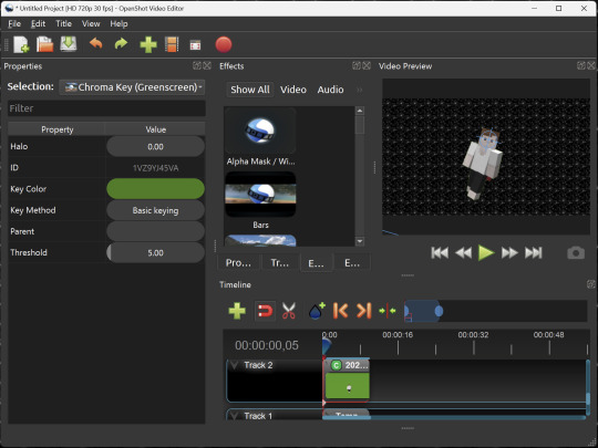
I've only made one video with it so far, but I'm already very happy with it. I had already paid for a video editor (Cyberlink PowerDirector Pro), but I needed to reinstall it and I didn't remember how. Out of desperation, I searched up "FOSS video editor" and I'm so glad I did. There's no launcher, there's no promotion of other apps and asset packs—it's just a video editor with a normal installer.
GIMP
GNU Image Manipulation Program is an image editor, much like Photoshop. Originally created for Linux but also available for Windows and MacOS, it provides plenty of functionality for editing images. It is a bit unintuitive to learn at first, though.
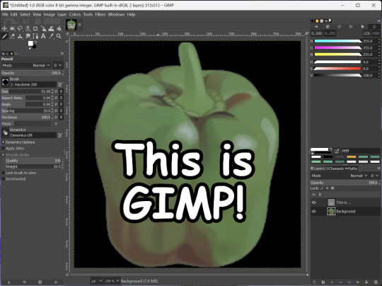
I've used it to create and modify images for years, including logos, really bad traceover art, and Minecraft textures. It doesn't have certain advanced tech like AI paint-in, but it has served my purposes well and it might just work for yours!
(Be sure to go to Windows > Dockable Dialogs > Colors. I have no idea why that's not enabled by default.)
Audacity
Audacity is an audio editing program. It can record, load, splice, and layer audio files and apply effects to them.
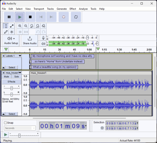
Audacity is another program I've used for a long time. It is not designed to compose music, but it is great for podcasts, simple edits, and loading legacy MS Paint to hear cool noises.
7-Zip
7-Zip is a file manager and archive tool. It supports many archive types including ZIP, RAR, TAR, and its own format, 7Z. It can view and modify the contents of archives, encrypt and decrypt archives, and all that good stuff.
Personally, I use 7-Zip to look inside JAR files for Minecraft reasons. I must admit that its UI is ugly.
Firefox
Firefox is an internet browser, much like Google Chrome, Microsoft Edge, or Safari. While browsers are free, many of them include tracking or other anti-consumer practices. For example, Google plans to release an update to Chromium (the base that most browsers are built from these days) that makes ad blockers less effective by removing the APIs they currently rely on.
Aside from fighting monopolies, benefits include: support for animated themes (the one in the picture is Purple Night Theme), good ad blockers forever, an (albeit hidden) compact UI option (available on about:config), and a cute fox icon.
uBlock Origin
As far as I know, uBlock Origin is one of the best ad blockers there is.
I was on a sketchy website with my brother, and he was using Opera GX's ad blocker. Much of the time when he clicked on anything, it would take us to a random sponsored page. I suggested that he try uBlock Origin, and with uBlock Origin, that didn't happen anymore.
Linux
Linux is a kernel, but the term is often used to refer to operating systems (much like Windows or MacOS) built on it. There are many different Linux-based operating systems (or "distros") to choose from, but apps made for Linux usually work on most popular distros. You can also use many normally Windows-only apps on Linux through compatibility layers like WINE.
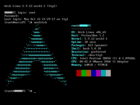
I don't have all four of these, so the images are from Wikipedia. I tried to show a variety of Linux distros made for different kinds of users.
If you want to replace your operating system, I recommend being very careful because you can end up breaking things. Many computer manufacturers don't care about supporting Linux, meaning that things may not work (Nvidia graphic cards notoriously have issues on Linux, for example).
Personally, I tried installing Pop!_OS on a laptop, and the sound output mysteriously doesn't work. I may try switching to Arch Linux, since it is extremely customizable and I might be able to experiment until I find a configuration where the audio works.
Many Linux distros offer "Live USB" functionality, which works as both a demo and an installer. You should thoroughly test your distro on a Live USB session before you actually install it to be absolutely sure that everything works. Even if it seems fine, you should probably look into dual-booting with your existing operating system, just in case you need it for some reason.
Happy computering!
#196#psa#foss#open source#tech#software#apps#computer stuff#I really hope Tumblr doesn't block this for having links or something. Someone mentioned that being a possibility and now I'm worried.#please reblog#2024-01-26
47 notes
·
View notes
Text

not the usual set. some test gifs because i'm trying out new gifmaking methods <3 gifs are of ep12 and 15 respectively
i used affinity publisher with the photo and designer personas for colouring + resizing/cropping and giftedmotion to convert to gif. photoshop tutorials 1, 2, 3 by @shaunashipmn gave me some directions + @cryptidafter helped me figure out how to make batch sreenshots work for vlc
method documentation down below:


affinity project screenshots (in german) --> i created mastersides for global sizing/cropping + colouring --> applied to the needed number of pages (1 page = 1 frame) --> changed screenshot per page manually --> exported the chosen number of pages as batch pngs
pros: high quality image manipulator, 1 time purchase of reasonable prize, on a level with photoshop; cons: lots of repetitive manual work, no timeline, no giffing option


giftedmotion project screenshots (in german) --> batch import image sequence (either as stack or random images) --> check "apply to all images" and change speed; the higher the number the slower the speed --> toggle colour transparency in the export preferences to avoid black spots after the converting process
pros: much higher quality conversion than ezigif.com imo, low filesize, easy to use, free; cons: extremely simple animation tools
Tip: don't use 4k-files to make batch screenshots with vlc. the screenshot process will lag and skip frames
#my gif#gifmaking#gif#should i put this in the official tags??#nah#tutorial#kinda. more or less#no photoshop
2 notes
·
View notes