#SVG editor
Explore tagged Tumblr posts
Visit Tumblr Blog
Explore Tumblr blogs with no restrictions, modern design and the best experience.
Last Seen Tumblr Blogs


Fun Fact
Kazakhstan’s Minister of Communications and Informatics has blocked the Tumblr site because it contained 60 sites of terrorism, extremism, and pornography in 2015.
Text
your bag is the IRL version of the SVG files i sometimes edit


#if you're going to upload an svg file to#wikimedia commons#maybe *don't* fill it with hidden embedded images#or unused definitions#or empty groups#or off-canvas circles with radius zero#crashing other people's image editors when they try to edit your files is not a win condition
68K notes
·
View notes
Text
Flag Making Tutorial
This will be a more technical step-by-step tutorial on how I make my flags (also a long post because I wanted to be thorough, plus I love flags lol).
The program I use is Inkscape, a free vector (.svg) editor program for pc.
I have templates set up, so the actual flag making process is pretty easy/quick.

Hotkeys/Locations/Other Reference
I'll be mentioning these options, so I thought to put them here all in one list. (They list the keyboard shortcuts first)
Snapping: magnet symbol (top right of screen), or under the adjacent arrow ◀️ symbol.
Document properties: shift+ctrl+D, or under the file menu (top left corner of screen). Display (1st tab) Guides (2nd tab) Grids (3rd tab)
Fill and Stroke: shift+ctrl+F, or under object (top of screen).
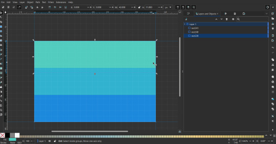
Layers and Objects: ctrl+shift+L, or under object (top of screen).
Align and Distribute: ctrl+shift+A, or under object (top of screen).
Import (Images): ctrl+i, under the file menu, or by dragging into the Inkscape window.
Save As: ctrl+shift+S, or under the file menu.
Export: shift+ctrl+E, or under the file menu.
Selector Tool: S, or cursor symbol (left side of screen). Click, or click and drag around the objects, to select them.
Locking a selection: lock symbol between the width and height boxes at the top of the screen.
Transform Selections: the width/height and x y position can be changed by typing in the X,Y,W,H boxes (near top middle of screen), or by dragging the corners/edges (resize) and inside the object (move).
Duplicate: ctrl+D.
Delete: delete key, or right click on the object.
Node Tool: N, or below the selector tool (left side of screen).
Rectangle Tool: R, or square symbol (left side of screen).
Pen Tool: B, or pen symbol (left side of screen).
Gradient Tool: G, gradient square symbol (left side of screen).
Mesh Tool: swirly square symbol (left side of screen).
Dropper Tool: D, or dropper symbol (left side of screen).
Undo: ctrl+Z.
Redo: ctrl+Y.
Creating the Template
Download Inkscape and open it, under the Time to Draw tab, click New Document.
First, snapping needs to be enabled, and under advanced mode enable grids and guide lines snapping. (This is crucial for making the stripes equally sized, spaced, and the overall flag in the right ratio.)
I'll be making a template with a 2:3 flag ratio.
Open document properties. (I like to move these types of windows to the right side.)
Under display, set the width to 42px and height to 28px.
Under guides, just click create guides around the current page.
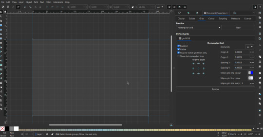
Under grids, make sure rectangular grid is selected, and click new. (Grid units should be in px.) For the major grid line every option, change it to 2. (I also prefer to change the minor grid line color to be transparent.)
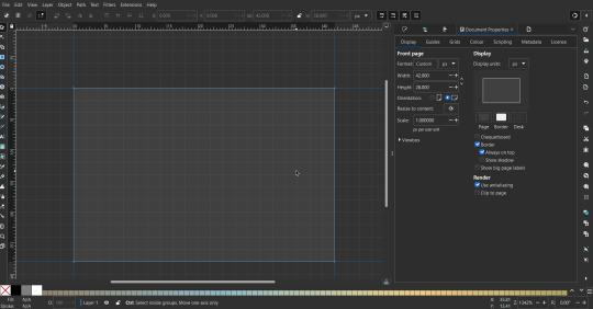
That's pretty much it, your template is done :D ! Just save it wherever you want. I like putting it in an easy-to-access flag folder, as it is needed to open it every time to make new flags.

You can use a different width / height / grid size / flag ratio if you want, these are just the numbers I'm comfortable with / used to.
Also, since this is a vector, the image can be infinitely big or small without any quality loss, so the small dimensions above don't actually translate to a low res image.
Creating the Flag
(I'll be using the rainbow flag to demonstrate.)
Start by having the template open.
You can import images (like .png/.jpg files) to color pick / reference if you want. Said images can be transformed (resized/moved) by selecting and transforming them using the options mentioned in reference. (This is optional, they should just be off to the side so they don't get in the way.)
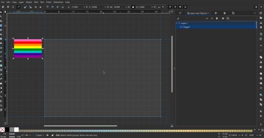
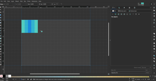
To create the stripes, use the rectangle tool. Click and drag from one grid corner, to a lower grid corner.
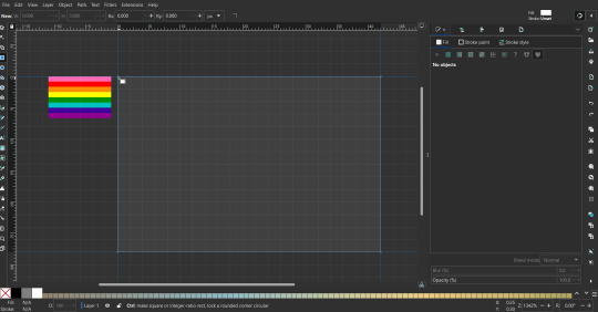
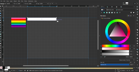
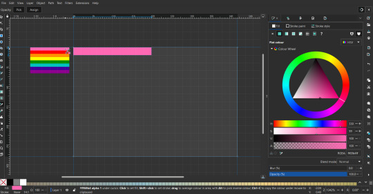
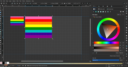
While the rectangle is selected, use the dropper tool to pick a color from a imported image. You can also use the fill and stroke (shown on right) tab to create your own colors / edit colors / etc.
You can make these stripes however you want, they just need to all be equally sized. (They don't have to all have the same height, if you intentionally want that (like the demisexual flag for example).)
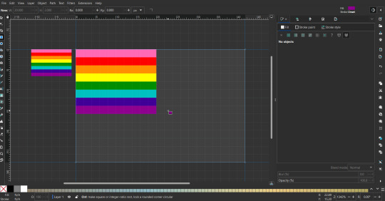
Then select all the stripes and transform them so that they fit the page.
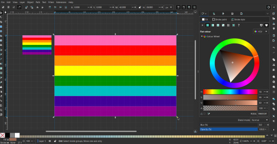
All that's left is to save/export it.
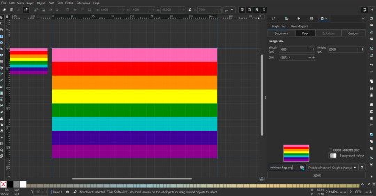
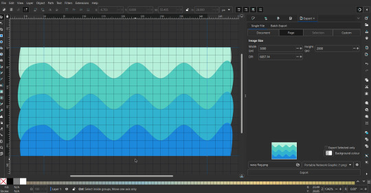
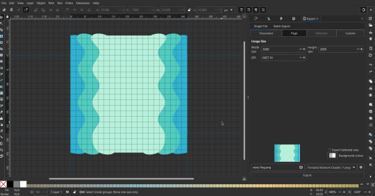
To export it, use the export tab, under single file, page, adjust the width and height (in px) to however high res you want your image to be. (I usually do 3000 by 2000.)
Type in the desired file name in the box next to the folder symbol, use the folder symbol to choose its export location (which can also be used to determine the file name and save/export it), the adjacent drop-down-menu to select what to save it as (,png, .jpg, .svg, etc.), and the gear symbol to adjust other settings (I leave it as default, with antialias turned off (set to 0)).
And done, you've made a flag :D 🏳️🌈
Extra Notes
Layers and Objects: a menu that can be used to manage objects. Like their layering position (whether they are above or below another object), and other options can also be done here instead of with keyboard shortcuts.
Vertically striped flags: it's very similar to above. You would just make the rectangles taller rather than wider.
Wavy stripes: first use the pen tool to create zigzags. (The pen tool works like a outline, so just click along the grid corners, and join the line at the end. The fill and stroke menu can be used to make it a solid colored shape, and remove/add outlines). The steepness/frequency of the zigzags is up to personal preference, they just need to extend off the page a bit. To create equally sized wavy stripes, have the all side lengths (highlighted in red) be equal except (depending on how you draw your zigzags) the first or last wave, which should have half the side length of the others.

Select everything, and with the node tool, select all the zigzag nodes (the corners don't need to be selected), and click make selected nodes smooth (half circle with point in middle symbol, at top of screen). (It'll likely look like it has weird lines in-between the waves, see glitch section at the end for how to fix that.)
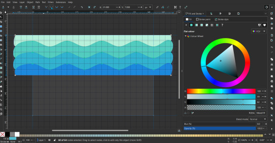
Then resize it all to the height of the canvas. And done :)
This can of course be vertical too.
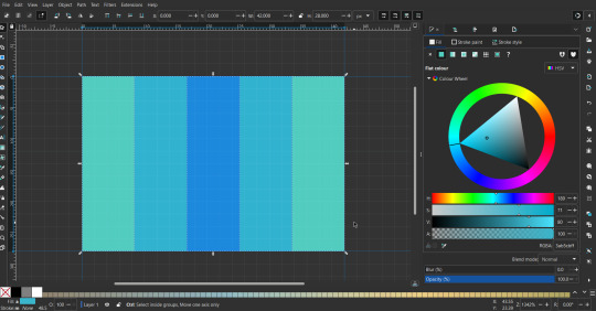
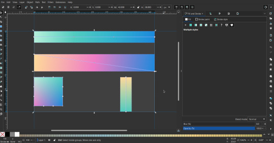
Gradients: You can use the fill and stroke dialogue, gradient tool, or mesh tool to do this.
To create the gradient, select the object, click the linear gradient symbol (gradient box) under fill and stroke. Or dragging / double clicking with the gradient/mesh tools. (The mesh tool is what I used to create the square gradient.)
To change the colors, click on the arrows or circles under fill and stroke, or by clicking the points on the shape, to select the nodes. Then use fill and stroke to change the colors.
To create new colors/stops, click on the plus+ symbol under stops (under fill and stroke), or double click on the gradient. Edit the new colors in fill and stroke again.
To change the location of stops, use stop offset under fill and stroke, or drag the nodes on the gradient. You can also move the end points on the object to make the gradient slanted or vertical.

Symbols: I make my own when I can (like the demi- triangle can be drawn with the pen tool, and resized to the correct proportions). When the symbol is too complicated, I import a .svg of it. Wikimedia commons is a great resource, and the popular twemoji comes in .svg format too. You could also edit it on over the .png in a rastor program if need be.
The align and distribute tab can be used to center symbols (or any other selected object). Select page for the relative to option, and use the symbols underneath to center/align it however you want. (You can also use different relative to options, like last selected, if you want to align it to an object instead.)
Deleting imported reference images: you can do this before saving it as a .svg, if you don't want to keep them / want to clean up the .svg file.
Antialiasing: an option that blurs things basically. A image with antialiasing off will be sharp pixels, while a image with antialiasing on will have transition colors between the main colors.
Below is an example. The left side is without antialiasing, and the right side is with antialiasing.

I can see why it might be preferable to have it on (like for diagonal shapes), but antialiasing can make recoloring .png (not .svg) files hard. The extra different colors messes with fill tools. I also think it looks cleaner without, so I prefer it off.
Exporting glitch: sometimes an exported image will have a thin line between the stripes, despite the fact the stripes are perfectly next to each other. (This seems to not just be a problem with Inkscape, but with vectors in general.)
Below is a zoomed in example of what it'd look like. The left side shows the stripes are all next to each other, but the right image has a transparent line in-between the stripes.
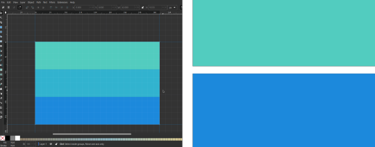
This can be fixed a number of ways.
You could select all the objects, and duplicate them twice.
Or overlap them. The stripes will still be the same size when overlapped, but they will technically be behind each other, so there will be no gap.
With all the different stuff mentioned, you can basically think of them as building blocks with the grid as reference. They can all be mixed and matched together.
I didn't mention all the options, just because there's that many different things you can do in Inkscape. I'd encourage you to play around with all the different options/tools yourself.
There's also some great Inkscape guides on YouTube, it's where I learned how to do a lot of this from (even if they're not for flags specifically, the concepts in those videos can be applied to flags).
Here's an overly elaborate flag I made, just to demonstrate some (but not all) of the things that can be done.

Anyways what a long post haha. But maybe this will be helpful for anyone interested in making (pride) flags.
218 notes
·
View notes
Text
getting this primal urge to create a rudimentary SVG editor (aka a vector based illustrator) for this project at my job like.... ARURGUHAAAAAAARGH
4 notes
·
View notes
Text
@strangerinthesecretforest, who commented about trying to find a library book they saw this image in. Reblogging and tagging you instead of comment replying because this is long, there are links others might be interested in, and also I wanted better formatting options. This image is uploaded to WikimediaCommons as "own work" by Wikimedia user McGeddon here https://commons.wikimedia.org/wiki/File:Survivorship-bias.png, and the current version of the file - after other Wikipedia Commons users edited it a bit more and converted it to a vector image - is here
The description on the older version of the file says, "Illustration of hypothetical damage pattern on a WW2 bomber, dot pattern roughly based on that given at http://www.motherjones.com/kevin-drum/2010/09/counterintuitive-world which gives credit to Cameron Moll. This file was derived from: Lockheed PV-1 Ventura BuAer 3 side view.jpg".
Lockheed_PV-1_Ventura_BuAer_3_side_view.jpg is the airplane diagram without the dots the Wikimedia Commons user apparently added themself.
The description of the newer version of the file says, "Illustration of hypothetical damage pattern on a WW2 bomber. Loosely based on data from an unillustrated report by Abraham Wald (1943), showing that a similar plane survived a single hit to the engine 60% of the time, but a hit to the fuselage or fuel system closer to 95% of the time. Picture is based on US Air Force "hit plots", such as this F-4 hit plot published in 1991. New version by McGeddon based on a Lockheed PV-1 Ventura drawing (2016), vector file by Martin Grandjean (2021)."
Here is the F-4 hit plot that mentions. It looks cool https://apps.dtic.mil/sti/pdfs/ADA245827.pdf.
Anyway, tldr, since this is an image uploaded to Wikimedia Commons in 2016 by its creator (presumably for use in the survivorship bias Wikipedia article) under a Creative Commons Attribution-Share Alike 4.0 International license, this image appears to have been used by a loooot of different people, all over the place. (Many of whom appear to be totally ignoring the "Attribution-Share Alike" part of that license. Maybe because some people assume Wikipedia images are always public domain, though CC-BY-SA licenses actually seem to be more common, at least in my anecdotal experience.)
So I think it probably appears in multiple books that you could have seen it in. But, it was uploaded in 2016, so you can at least rule out anything published before that date (unless one was re-printed with additions after that date).
I’m so glad that things like survivorship bias and statistical outliers became memes I wish more critical thinking skills would become widely-understood this way, I’m not kidding let’s get on this
#survivorship bias#wikimedia commons#wikipedia pictures#wikipedia#wikimedia#thank you McGeddon and subsequent editors for giving us an image that gets used a lot all over the place apparently#mcgeddon#tbh I'm not sure why the .png and .svg are uploaded in two different places instead of as different versions of the same file.#might be an error or might be some technicality that prevents uploading vector image versions to the original png page? I don't know#I guess maybe it's just because the url includes the file extension#this seems like a fractured way to keep track of an image but c'est la vie I guess#I found this out by reverse image searching the image and then looking at the image info on wikimedia to see if they'd written down who#made it/owned the copyright#which it fortunately turns out they did
26K notes
·
View notes
Text
ok screw it im gonna learn how to make scratch mods and edit svgs, gonna use my PC more and im not really used to using that device but im gonna try even with the screentime set up
i found out how to open scratch editor on phone so that'll help
ill probably forget abt other stuff im supposed to be working on but at least itll be something to do while its school vacay and yknow what
we need our pluto
#not giving srs tags#you know what im talking about#i have 0 experience whatsoever but fuck it#ill just wing it#i2might proctastinate tho ughhh
3 notes
·
View notes
Note
also followup to what i just asked, is there any chance you could make a version of the alterpathy template without the anti-aliasing? i'd like to make an alterpathy flag version of something and prefer using aliased templates since they're easier to use the fill tool on ^_^
sorry for not answering this ask sooner. i unfortunately don't and i think that is because system made the template in a png only online flag editor. your ask made me think, though, and i have tried out a couple other flag makers which can export in .svg. i am considering remaking the flag in it. would an svg file be helpful to you?
2 notes
·
View notes
Note
SVG is XML, so just use a text editor like everyone else
I think that's just you but ok
2 notes
·
View notes
Text
I made this in an SVG editor (I had to export as a PNG because tumblr doesn't like SVGs lmao
did this while listening to ESCPE, he makes really good wave music
some of ESCPE's tracks under the cut
#furry community#furries#furry fandom#protogen#proot#sfw furry#furry character#phonk music#music#wave music#ESCPE#soundcloud#you might be deterred because I put phonk there#just give it a listen it's not actually the phonk you think#it was just played at a live event called “phonk around and find out”#SoundCloud
2 notes
·
View notes
Text
Explore the World of Food and Drink Icons for Your Projects

->Icons are now an essential component of site design in the digital age, making navigating simpler and more aesthetically pleasing. We at IconAdda provide a large selection of food and drink icons to suit all kinds of projects, including mobile apps, food delivery systems , and restaurant websites. Our selection of premium icons includes everything for every need, whether you're creating a menu, an e-commerce website, or simply want to improve the project's appearance.
Modification at Your Fingertips: What separates our icons is the flexibility to adapt them to your website's branding. Our icon editor allows you to: ->Change the colors to match your palate.
->Rotate or flip the icons to fit your design arrangement.
->Adjust the size for different positions.
->Modify forms or add distinctive components to make them genuinely yours.
Why Do You Choose Our Food and Drink Icons?
->Variety:We provide icons in a variety of styles, from flat design to intricate images.
->Quality: We create all of our icons with precision and clarity, so they appear excellent on any device.
->Ease of Use: Our icons are ready to download and integrate into any project, which saves you time and work.
->Customization: With basic editing tools, you may easily modify the icons to your specific needs.
When choosing food and drink icons for your project, there are various factors to consider to guarantee that you get the best one for your needs. First and foremost, consider the typeface used in each icon; ensure that it is consistent with your overall design aesthetic and seems nice on screen. Consider the color pallet; choose colors that complement each other while still providing enough contrast to prevent them from blending too much. Finally, consider size; often larger is better when utilizing food and drink icons because it allows them to stand out more clearly against other items on screen.
How to Use Our Food and Drink Icons: Including food and drink icons in your project is straightforward. Simply visit IconAdda, choose the icons you want, then utilize our editor to make any necessary changes. Once satisfied, you can download the icons in a variety of formats, including PNG, SVG, and others, making them appropriate for a wide range of digital contexts.

Conclusion: Whether you're creating a new food-related website, releasing a mobile app, or developing a marketing campaign, our food and drink symbols will help enhance your project.
Begin exploring our collection today and elevate your designs to the next level!
here to go ~ IconAdda .
#ui#ui ux design#uidesign#user interface#ux#programming#coding#computing#creative#icons#logo#design#web design#graphic design#photoshop#home design
2 notes
·
View notes
Text
no mere stone addendum: extras/easter eggs/long thoughts
thanks to everyone who's voted in the poll! it was made so i could decide which quote to add onto the 2nd poster <3
thanks to @laurellleaf and @zhongscara for commenting on my liyue film crew post <3 your input was v helpful :D
—
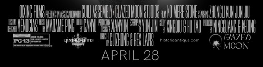
[transcription: a mock movie credit box that reads: "Qixing Films presents, in association with Guili Assembly, a Glazed Moon Studios film No Mere Stone starring Zhongli Kun Jun Jiu. Costume designer Menogias, music by Madame Ping, edited by Ganyu, production designer Xianyun, screenplay by Yun Jin, story by Xingqiu & Hu Tao, produced by Ningguang & Keqing. Directed by Guizhong & Rex Lapis". there are several logos below and a PG 13 rating. The film is released on April 28. end transcription]
crew casting: it ended up being about a 50/50 split between liyue adepti and mortal characters—this was mostly a happy coincidence though! I remembered that Menogias canonically likes designing intricate outfits and also made Zhongli's clothes, so he's the costume designer instead of cloud retainer. since she's handy w mechanical things and inventions + has a sense of the arts and style (eg ganyu + shenhe), I put her on production designer instead. she'd probably be able to come up w some pretty inventive set designs I think. I was between madame ping, guizhong, xinyan, and yun jin for music—originally I intended to make the cast most/all adepti, so i'd decided against yun jin + xinyan. in the exquisite night chimes cutscene with madame ping and guizhong, ping was stated to value music's human expressiveness and emotion—and I thought that was more fitting for a movie composer!
originally i was going to have yanfei be editor LOL, since she's probably pretty detail oriented as a lawyer and able to do the fine tuning and editing of cuts/scenes—went for ganyu in the end, partly because she feels more connected to the rest of the crew, and also because the vibes of secretary and editor just fit together better lol. they're both one of those mostly under the radar jobs that don't get much attention but are really important to something's success. I added in xingqiu and hu tao as story writers pretty late; originally yun jin was going to do both story and screenplay, but I split it up and put them both on story after seeing the vision (below).
xingqiu's legend of sword flop combined with hu tao's reputation gives this hypothetical movie a greatly increased chance of absolutely tanking in liyue's box office!!!
keqing and ningguang are producers just because they're members of the qixing—originally guizhong was going to be a third producer but I bumped her to director later on (for a rather mundane reason: i was running out of space on that line). ok finally we've come to the directors. I thought it would be funny if rex lapis was listed as a director, given Zhongli has too many names and outfits. you can use your imagination to make this make sense in a real au :) guizhong getting added as co-director was also a nice thing that happened coincidentally—I found it neat to have the two founders of liyue as directors and kept it.
logos: I decided to go all in and slapped some designs together for qixing films and glazed moon studios! these were lowkey fun and they turned out pretty well honestly! quality is bad tho, i didn't make them full size or svg RIP


2 versions of the glazed moon studios logo—the 1st one is unused bc i decided against the way the m and o are joined together. tbh I don't know whether this looks enough like a logo for a movie studio instead of say, a perfume brand or high end pastry bakery, but it's good enough
the website is a fake but there is a real page at that link about ancient history school presentations
april 28 was the release date of the no mere stone quest! and pg13 is. idk warnings for character death i guess. and genshin is supposedly rated for people 12 and up so i went with that
concepts/process: originally I was going to have the entire thing be one poster:
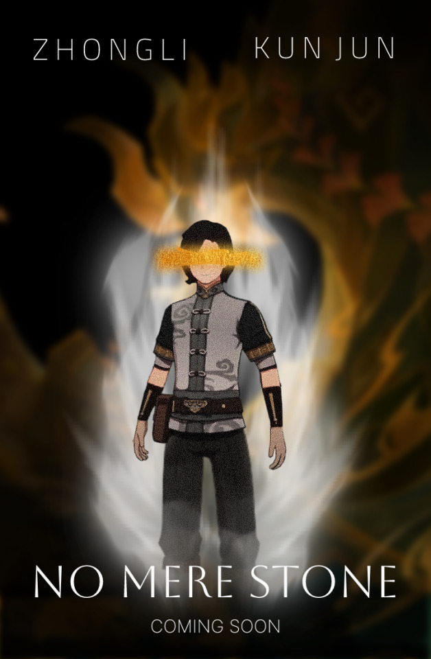
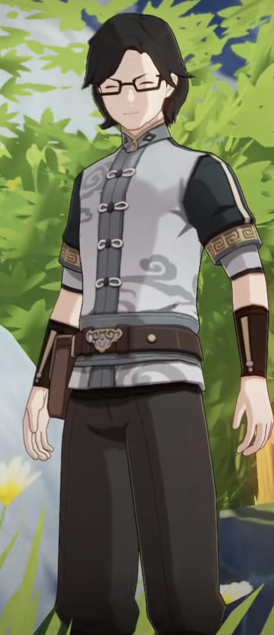
the white stuff behind kun jun is supposed to resemble the white wisps of energy that he had near the end of the quest when he's close to disappearing. and I struck out his eyes because of the huge huge thing the quest had about Morax's gift of sight—his glasses, Zhongli as the sun to a blind dragon, I thought it was a fitting nod to that whole theme. overall tho this version was too cluttered, had no focus, and also didn't have enough room for a potential credits block. so i split it into two—one with the background, and added the small retuo in front, and another w kun jun and the credits. i think it worked pretty well!
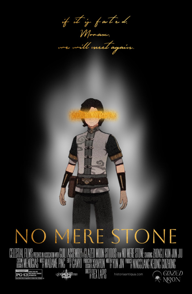
and. 1 final version of the kun jun poster, with the alternate quote "if it is fated, Morax, we will meet again." you can see some of the old crew choices and logo designs—and Qixing Films was originally Celestial Films haha
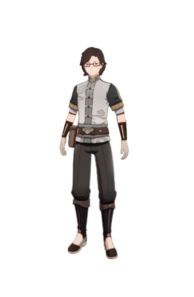
oh! one last thing: take this transparent kun jun (and several others) for the road :)

#genshin impact#teyvat posts#genshin edit#retuo longwang#azhdaha#genshin graphics#zhongli#kun jun#ive never been this attached to an npc i think... he's a real one
7 notes
·
View notes
Text
What’s new in React?
React is a continuously evolving library in the ever-changing web development landscape. As you embark on your journey to learn and master React, it’s important to understand the evolution of the library and its updates over time.
One of the advantages of React is that its core API has remained relatively stable in recent years. This provides a sense of continuity and allows developers to leverage their knowledge from previous versions. The conceptual foundation of React has remained intact, meaning that the skills acquired three or five years ago can still be applied today. Let’s take a step back and trace the history of React from its early versions to the recent ones. From React 0.x to React 18, numerous pivotal changes and enhancements have been made as follows: 1. React 0.14: In this version, the introduction of functional components allowed developers to utilize functions as components, simplifying the creation of basic UI elements. At that time, no one knew that now we would write only functional components and almost completely abandon class-based components.
2. React 15: With a new versioning scheme, the next update of React 15 brought a complete overhaul of the internal architecture, resulting in improved performance and stability.
3. React 16: This version, however, stands as one of the most notable releases in React’s history. It introduced hooks,a revolutionary concept that enables developers to use state and other React features without the need for class components. Hooks make code simpler and more readable, transforming the way developers write components.Additionally, React 16 introduced Fiber, a new reconciliation mechanism that significantly improved performance, especially when dealing with animations and complex UI structures.
4. React 17: This version focused on updating and maintaining compatibility with previous versions. It introduced a new JSX transform system.
5. React 18: This is the latest stable release, which continues the trajectory of improvement and emphasizes performance enhancements and additional features, such as the automatic batching of renders, state transitions, server components, and streaming server-side rendering.
Setting up a new React project There are several ways to create a React project when you are getting started. In this section, let's explore three common approaches: • Using web bundlers • Using frameworks • Using an online code editor
Using web bundlers Using a web bundler is an efficient way to create React projects, especially if you are building a Single-Page Application (SPA). Vite is known for its remarkable speed and ease of setup and use.
Using frameworks For real-world and commercial projects, it is recommended to use frameworks built on top of React. These frameworks provide additional features out of the box, such as routing and asset management (images, SVG files, fonts, etc.). They also guide you in organizing your project structure effectively, as frameworks often enforce specific file organization rules. Some popular React frameworks include Next.js, Gatsby, and Remix.
Online code editors Online code editors combine the advantages of web bundlers and frameworks but allow you to set up your React development environment in the cloud or right inside of the browser. This eliminates the need to install anything on your machine and lets you write and explore React code directly in your browser. While there are various online code editors available, some of the most popular options include CodeSandbox, StackBlitz, and Replit. These platforms provide a user-friendly interface and allow you to create, share, and collaborate on React projects without any local setup.To get started with an online code editor, you don’t even need an account. Simply follow this link on your browser:(https://codesandbox.io/p/sandbox/react-new?utm_source=dotnew). In a few seconds, you will see that CodeSandbox is ready to work with a template project, and a live preview of the editor is available directly in the browser tab. If you want to save your changes, then you need to create an account.Using online code editors is a convenient way to learn and experiment with React, especially if you prefer a browser-based development environment.
Reference material: React and React Native

2 notes
·
View notes
Note
Lol, nice profile pic! :)
Did you make it from that one meiker.io?
Boop! 🐾
I have no idea what you're talking about because my avatar is obviously nothing more than a photograph of me, but
If hypothetically I did have to alter a picture simply by overlaying another image atop it, such as a false nose or fake glasses, I would almost certainly just do so in Inkscape. I would never do such a thing, since we at Sufficiently Large Ndustries strive to provide only perfectly true and accurate representations of the world, but in some hypothetical world where it became necessary to do so that's what I would do.
I haven't heard of meiker.io; looks like it's some sort of picrew-style engine generator? I never really liked those very much, mostly because a proper image editor gives you waaaay more flexibility, albeit with the caveat that you have to source your image components yourself. But, like, if a system doesn't have a way for me to reorder the objects in an image, I don't know why I'd choose it over inkscape or boxy svg or something.
4 notes
·
View notes
Text
0 notes
Text
I'M DRAWING NOW!
Well? Haha no. Not well.
But heeey, I got this here stylus working! I didn't expect an actual Lenovo stylus - this thing is refurbished - but it seems to be one. It works good! It just needed a new battery!
I got a paperlike (ish, it's not brand name) screen protector for this because I'm going to be using a stylus a lot and I don't wanna hurt it but ohhhhh baby this thing glides like butter on the screen itself. Excellent drag. And I am wobbly as all hell without lots of drag, so that is AWESOME 🤩. Paint.net still can't straighten me out with its smoothing feature, as you can see - but GIMP can! GIMP got way different and more Photoshop like a while back, and I stopped used it because I didn't like the interface. I still don't, but I love that line smoothing so I WILL figure it out. I've also got an SVG editor to learn, Inkscape! I don't know if I'll use it often, but if it's not too difficult I'll at least use it to resize things.
So, the new computer is a Lenovo Flex 5, 14 inches, Windows 11, 16 gig of RAM! Best Buy Canada still has some at this price, which is LESS THAN I paid for my tablet with 8 gigs (admittedly, over 4 years ago). AND I had to buy the keyboard and stylus separately for that. It's four inches bigger. It feels HUGE. It's on the chunky side, because it has that cool hinge that'll let me fold it into a tent. It also has a weird French Canadian keyboard - there are SO MANY special characters on it and I DO NOT KNOW HOW TO ACTUALLY TYPE ANY OF THEM. I can't always used shift to type @ anymore. Why? I HAVE NO IDEA!
Aw, frig, my eyes are tired and the text is dancing. I'm not at the point where it gets blurry and stays like that, but I'll get there if I don't take a break. Prrrrobably don't have enough stamina to illustrate yet, but give me a while. I CAN GET STRONGER!
Typed but not proofread! I need to stop reading!
#updates#new computer#i can draw!#sorta#hahaha typing is weird tho!#i'll figure it out#stupid eyes#i want to do things with details again#complicated things that take HOURS#not a minute-long kitty sketch!#LET ME PLAY WITH MY COMPUTER YOU STUPID FRAGILE MEAT SUIT
4 notes
·
View notes
Note
with the dashboard unfucker im having a bit of a weird problem (i dont know how to use github i apologize ;-;) but im using firefox multi containers and on most of them the unfucker works perfectly! one of my tabs, however, all of the icons on the menu sidebar are just gone, as well as the reblog symbol. i've forced an update and tried mimicking settings on my other accounts but nothing has changed. im stumped haha
also thank you for the unfucker, i love it so much <3
Weird...It would seem that it's failing to correctly link the SVGs for the icons to the icon sources for some reason, and as for how that would happen, I have no clue.
It could just be a weird bug with the containers? The container I'm writing this in right now no longer lets me use keyboard shortcuts in the editor and my bookmarks sidebar CSS is broken, so it might be an external issue with the browser itself.
3 notes
·
View notes