#The Thing Marvel
Text

my nomination for funniest comment
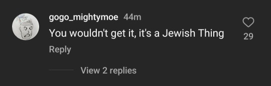
(id the first image is a screenshot from an article by screenrant showing a picture of ebon moss-bachrach next to a picture of michael chiklis as the character ben grimm aka the thing. text above the two reads "ebon moss-bachrach will be first jewish actor to play the thing in live-action". the second image is a screenshot of an instagram comment from user gogo_mightymoe that says "you wouldn't get it, it's a jewish thing." end id]
#ebon moss bachrach#ben grimm#the thing#the thing marvel#the fantastic four#fantastic four#marvel#mcu#swift-tricker's posts
23 notes
·
View notes
Text
Rating the New Champions Variant Covers
So marvel recently revealed a bunch of Varient Covers of "What if every hero had a sidekick/youth counterpart" and while I love most of the designs, some definately are better then others
#22
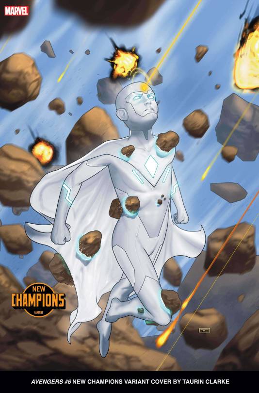
I hate the Vision Design and I dont know why. Something just feels fundamentally off about it/ Maybe its the fact its a pitch white, skintight 8 year old? Maybe its the posing? The Debris? IDK Man is feels weird.
#21
and
#20
These two get paired together for a single reason
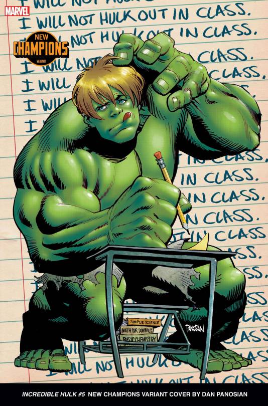
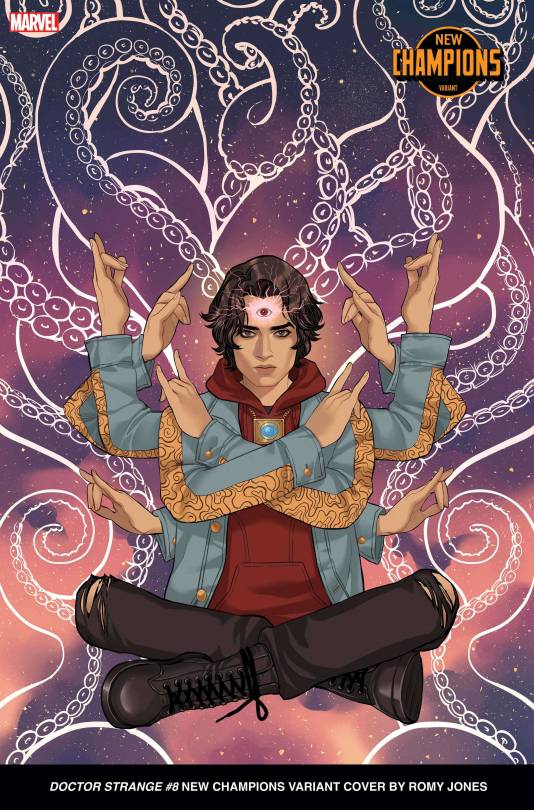
It's just Billy and Teddy. I love Billy and Teddy, their some of the only actual Gay Men in Marvel, but come one guys. Certainly you can do a young Dr. Strange and Young Hulk thats different? Strange goes higher if only because I like the art more, the Young Hulk I just dislike entirely
#19
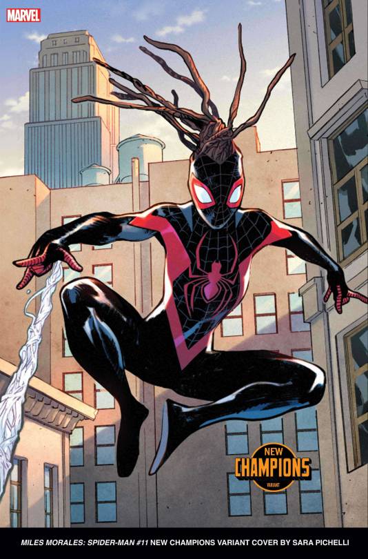
Speaking of uninspired, the only reason Miles is above Billy & Teddy is that at least shes a different gender then her mainline counterpart. Other then that its probably the laziest design here. Also, you may notice the webbing seems off, that will be a recurring trend here where limbs or background elements were layered improperly or something.
#18
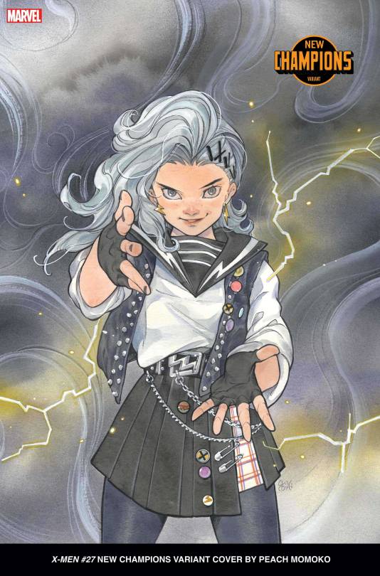
I actually really like this character design. It looks like a fun character in a superhero elementry school spin-off book. The only issue um... thats Storm. Its the next gen Storm and she's white. That's basically my only issue, and why shes above the 3 I actively somewhat dislike designwise, but... Storm is one the premiere Black Superheros. Having her next gen counterpart be white feels so weird. I
#17
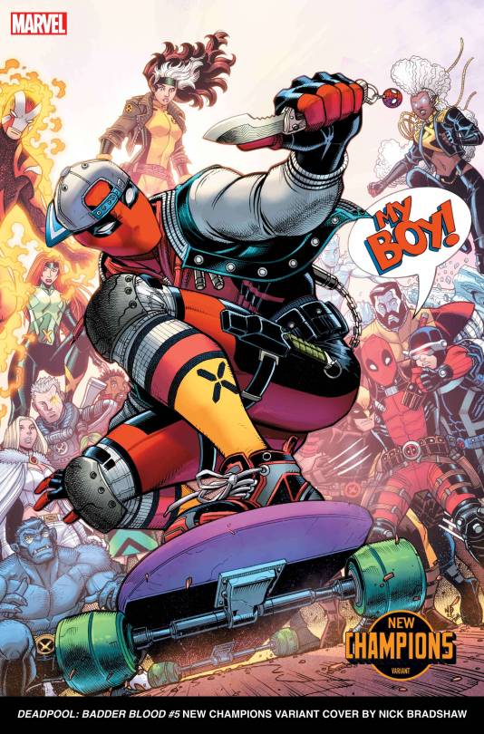
On one hand, I can 100% see normal Deadpool wearing this. On the other, the My Boy adds way to much charm for me to rate it with the other uninspired ones, and at least I dont feel like its whitewashing anything. We are at the point where I'd unironically love to see any of these designs in a book, even if its an Elseworld instead of main universe one.
#16
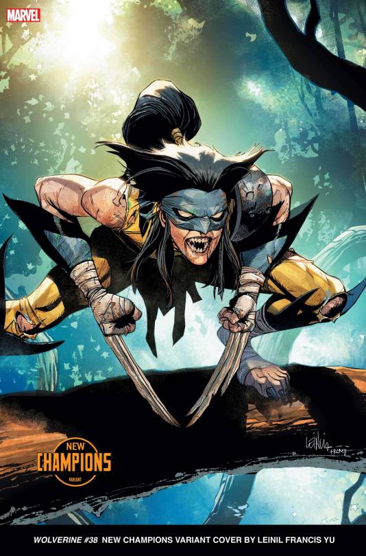
Teen Female Wolverine has been done to death, but I do like how this one goes for a more monstrous Angle compared to Laura and Gabby. The tattered, beast up costumes, beastial feet, large Ponytail giving off the deelling of a mane, nasty looking teeth, and BONE CLAWS very much makes it feel more like a feral forest mutant then the more clean, assassin design Laura had.
#15
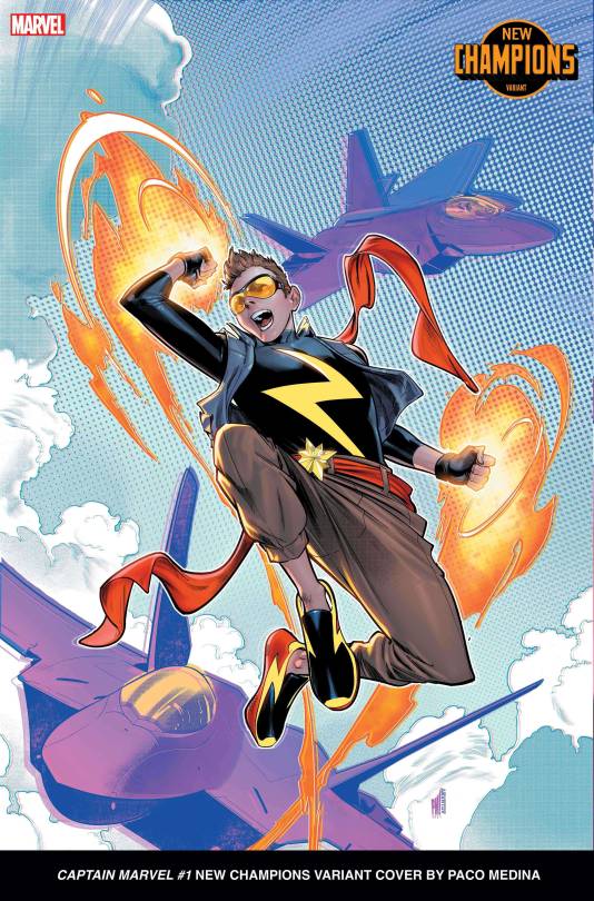
The big thing I like here is it isn't a reimagining of Carol Danvers current, captain marvel outfit, but her Miss Marvel ones. We already have Kamala for a new gen version of Carols current design, so a reimigining of the old one, in a way that doesn't feel super fetishy is nice. First I thought it was a dude, but it might be a girl? Unsure.
#14
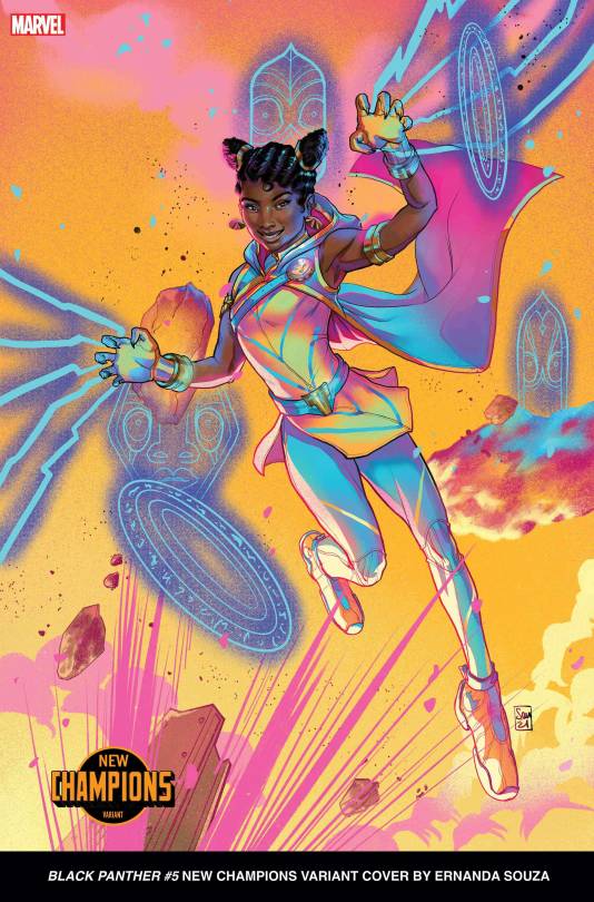
I really love this design, but it doesn't really scream Black Panther... and I honestly dont care. I love bright colors, makes my brain go byr, and the fact she has a completely different powerset most likely intrigues me.
#13
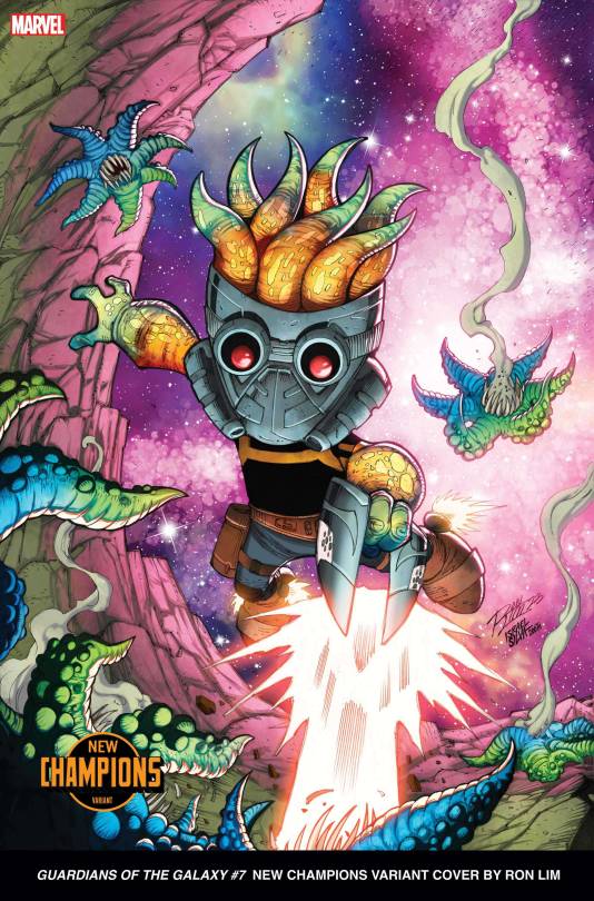
I have a weakness for fishpeople of all types ok? I find the designs naturally appealing. Even still, Starlord's Chibi Starfish Successor is neat, but not amazing. The ideas done a lot better later on.
#12
He looks like he is having so much fun with his Mentor. I also like how, unlike everyone else, Black Cat's Apprentice is kinda chubby. I don't know man he just seems like he'd be a fun guy to hang out with at college.
#11
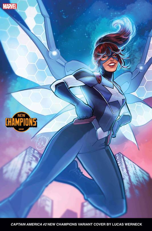
Whats better then a succesor to one hero? a Succesor to TWO HEROES! The Captain America Succesor I feel very much has some elements of Wasp design, and I always am down for High Tech Wingspans even if they weren't intentionally going for it.
#10
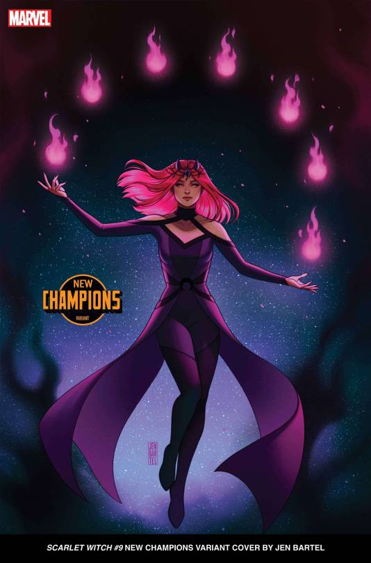
Instead of being the Scarlet witch they made her the Magenta Witch. All in all I just really like the sorta sorceror design, especially the chosen color scheme. Also ghostly mystical fire is fun you should follow it into the swamp.
#9
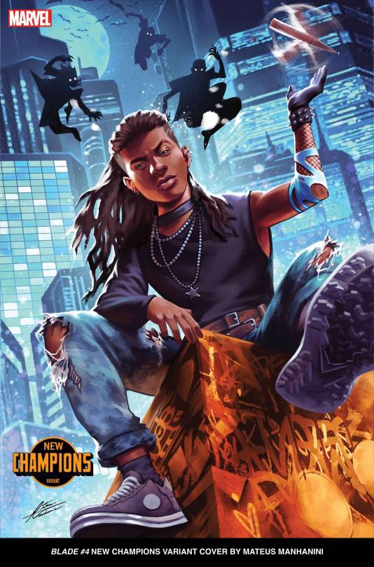
Listen I love this design. Its in the top 10 for a reason but man... that arm. Every time I see the image I cant help but notice how insanely small his arm is, like he was supposed to have both arms resting but they decided "Have him twirl a stake so people know its blade."
#8
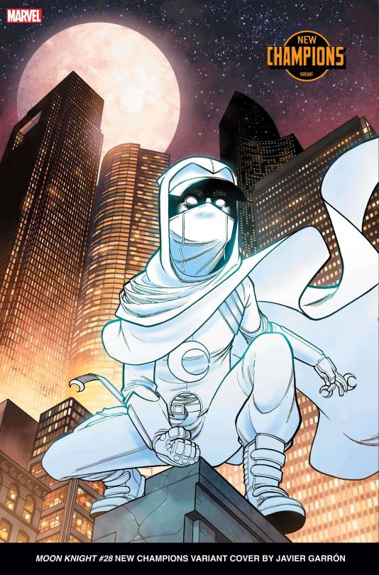
Moon Squire is here to kick ass and pass third grade math! I just like the Cowl mixed with baseball cap design lol. Moon Knight always fucking kills it with the drip though so im not surprised.
#7
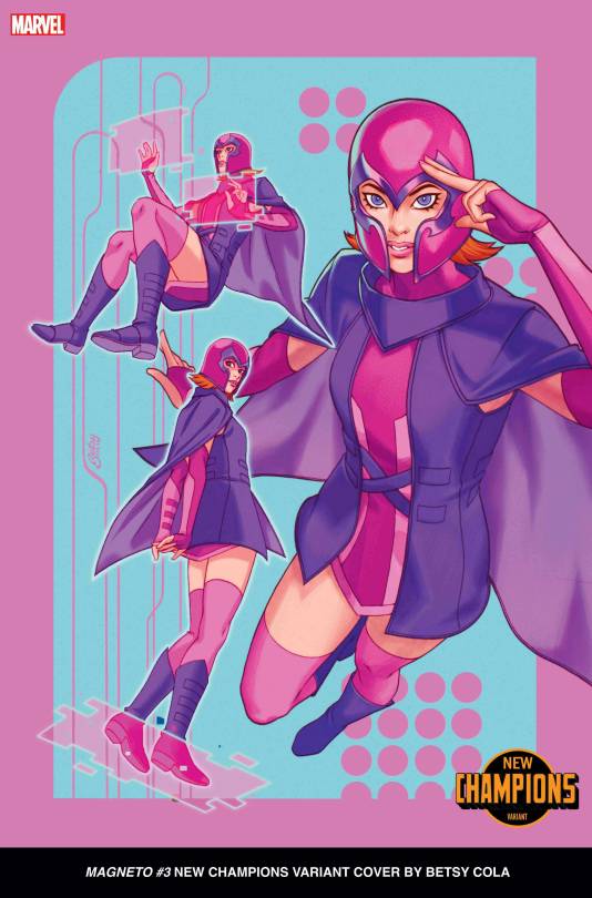
A Friend told me It's Gwen Tennyson cosplaying Magneto and now I cant not see it. I do like that shes implied to have a different powerset then Eric as well, always fun when they did that.
#6
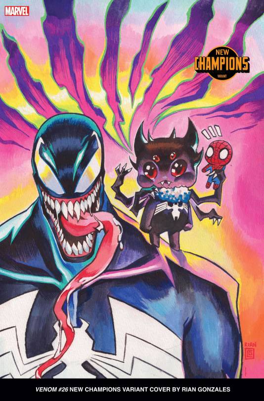
The better Chibi Venom. Only missed the top 5 since I dont think he'd be able to carry a book as the main protag, he is the perfect sidekick though. Just this mildly creepy cutie pootie handing with the fairly creepy Symbiote. After Extreme Venomverse shouldn't be surprised the Venom varient is amazing, but I am suprised thats the direction they went.
#5
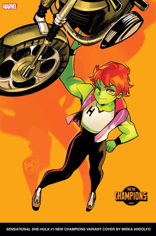
If Next Gen Storm and Next Gen Moon Knight are in the Elementary School book, Wee-Hulk is the main god damn character. She's just a very fun little kid hulk, I especially love how shes doing the Iconic "She-Hulk holds a Car Above her head" pose with an electric scooter.
#4
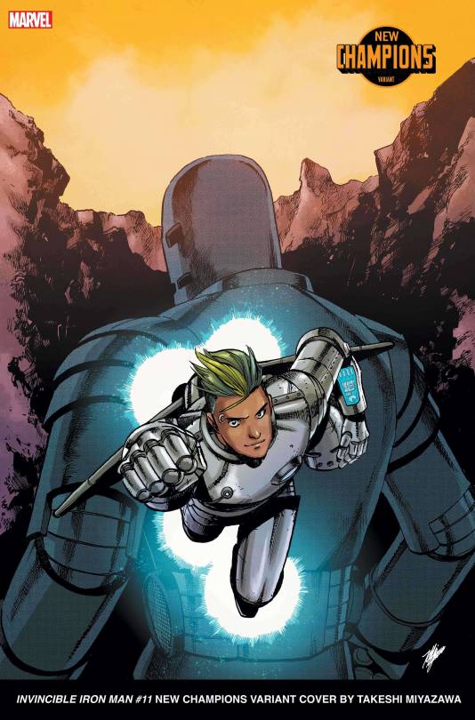
Listen, Non-Binery Latin America Iron Man with the Criminally Underused Grey Armor design is great. They gpt Green Hair, Pronouns, and the backing of Americas #1 Arms Dealer, ready to take on the world!
#3
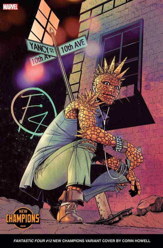
The Thing has become one of them Yancy Street Kids, and the Fantastic Four are his gang. I just love the design, Spiky Rock person is always a favorite of mine.
#2
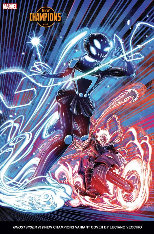
Miku Ghost Rider. On Roller Skates. With a fucking Hellfire Flail. I am imagining she has an entire like, Magical Girl Transformation Sequence whenever she transforms, just with a lot more demons and fire then normal.
#1
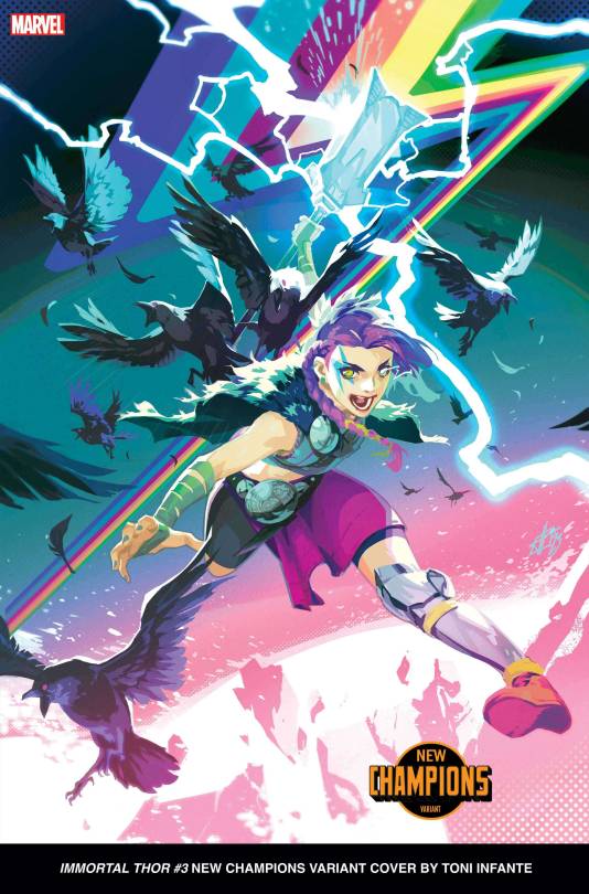
Listen, I get it. Legs dont bend like that. She is objectively less creative then the last 3 or 4. But, I like Crows. I like Ravens. I like Thor. And this Thor looks like she wont take any of Odins BS when he goes shit dad mode.
#Marvel#Marvel Comics#Variant Covers#Trigger Warning: Whitewashing#Vision#Dr. Strange#Hulk#Black Cat Marvel#Black Panther Marvel#Iron man#Miles Morales#Spider-Man#Miss Marvel#Captain Marvel#Carol Danvers#Thor Marvel#Ghost Rider#The Thing Marvel#She-Hulk#Moon Knight#Venom Marvel#Magneto#Scarlet Witch#Blade Marvel#Captain America#Starlord#Deadpool#Wolverine Marvel
37 notes
·
View notes
Text


A BATTLE ROYALE FOR THE PROVERBIAL HISTORY BOOKS -- IN THE MIGHTY MARVEL MANNER!
PIC(S) INFO: Spotlight on a Hulk Vs. Thing homage piece by MC Wyman & Bob Almond, after the historic cover by late, greats John Romita Sr. & Frank Giacoia for "Fantastic Four" Vol. 1 #112 ["Battle of the Behemoths!"]. July. 1971. Marvel Comics.
Pencils by MC Wyman
Colors by Tom Smith
Inks by Bob Almond
Resolution at 1280x1914 & 607x800.
Sources: www.comicartfans.com/gallerypiece.asp?piece=57543 & Pedrigree Comics.
#The Incredible Hulk#Incredible Hulk#Fantastic Four Vol. 1#Fantastic Four#The Blue Eyed Thing#The Thing#1971#The Thing Marvel#John Romita Sr. Art#Marvel Universe#Ben Grimm#Cover Art#Frank Giacoia#Ben Grimm The Thing#Battle of the Behemoths!#Bob Almond#MC Wyman#70s Marvel#The Hulk#Hulk#John Romita#70s#Sci-fi Art#Hulk VS. The Thing#John Romita Sr.#Bronze Age of Comics#Marvel Comics#American Style#It's Clobberin' Time!#1970s
1 note
·
View note
Text
listen. i know it's not 2014 anymore and i know it's just a throwaway line and that the russo brothers didnt intend for marvel action blockbuster captain america the winter soldier to become the tragic gay love story that never was but man. having steve say "it's kind of hard to find someone with shared life experience" in a conversation about romantic relationships right before the bucky reveal is so cruel. it's not just about steve and bucky obviously having the shared experience of being "out of time," it's the fact that they've both been stripped of their humanity in opposite directions. steve is a legend, he is an american hero and a national icon before he is a human being the same way that bucky is a weapon and a killing machine before he is a human being. steve knows that anyone who falls in love with him in the 21st century fell in love with captain america first, and that's just not him. but then the one person who knew him first and knew him best and loved him (not captain america, that little guy from brooklyn) so much he died for it is alive, impossibly. and it's a miracle because he's back and it's horrific because he's back under the worst possible circumstances. but to steve, the winter soldier is worth tearing the world apart for because he's always been bucky first. they find each other and suddenly they're human again. and maybe, despite it all, being "out of time" becomes a blessing, because in this century they'd finally be allowed to love each other the way they've always wanted to. like real people do.
like. no. the captain america trilogy isn't about two queer men traumatized and alienated by war and modern life rediscovering and reclaiming their humanity through their love for each other. but. i mean. it couldve been
#like you get why all the fics about those two are insane right. the narrative is just so goddamn compelling#and thats not even getting into the whole thing abt the serum curing steve of every ailment except his love for bucky#which makes him realize it was never an ailment to begin with (despite the commonly held beliefs about homosexuality in the 1940s)#and bucky being *electroshocked* again and again into forgetting steve#like howd you make your gay ass movie that gay and not realize it. its kinda impressive#sorry for the ridiculous stucky retrospective its 4am and i rewatched the winter soldier recently#its not that deep. its not its not its not . but if it was anything other than what it is it could have been. and thats the worst part#shut up riley#marvel#stucky
24K notes
·
View notes
Text

grabbing lunch from earth-50101 before saving the multiverse🍟
#across the spiderverse#favourite squad!!! what’s their name#miles morales#gwen stacy#hobie brown#pavitr prabhakar#spiderman#spider gwen#spider punk#spiderman india#artovna#spiderman across the spiderverse#this is my subtle way of spreading the McAloo tikki burger agenda bc it’s the best thing on the McDonald’s menu#marvel
33K notes
·
View notes
Text


#the Nowhere Man who waits and the God of Stories who watches
#mobius#loki#lokius#mcuedit#lokiedit#marveledit#loki spoilers#owen wilson#tom hiddleston#owenwilsonedit#marvel#dianagifs#😩😭#what... in the most tragic of romances did i just witness#gotta rewatch tomorrow but cannot BELIEVE how okay i am with everything atm???#their story clearly isn't done their burden is obviously going on without each other and they exist fundamentally connected#they've lost everything but being able to see mobius every step of the way is enough for loki to make the sacrifice#and mobius left for his timeline with no other purpose than to make sure loki could do just that#now they're lost without each other?? the only thing mobius can do is exist for a moment in loki's creation i'm UNWELL#god this is the star crossed angst that's gonna keep me going for the rest of my LIFE they're my everything#loki s2 spoilers
11K notes
·
View notes
Text
“this ship isn’t canon” to YOU. I, however, am delusional
#watch me list all my ships#ships#steddie#ronance#elmax#byler#byler better be canon tho istg#stranger things#marvel#avengers#blackhill#carolval#stucky#ironstrange#thorbruce#spideypool#marauders#jegulus#wolfstar#dorlene#pandalily#marylily#rosekiller#swanqueen#wenclair#i forgot what other fandoms im a part of#carol x valkyrie
53K notes
·
View notes
Text
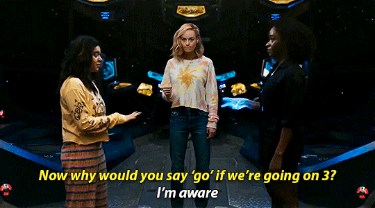
The three distinct types of found family:
Commits crimes together.
Fights crimes together.
Constantly switching back and forth between the other two at a horrifying speed.
#found family#found family things#trope talk#tlou#the last of us#toh#the owl house#sing#sing 2#the 100#avatar the last airbender#avatar the legend of korra#the good place#the mandalorian#the magnus archives#batfam#dc#marvel#5k#10k
11K notes
·
View notes
Text
Spider-Man: No Way Home (2021) Post-Credits Scene (Colorized)
Been wanting to draw a thing including that cursed MCU Peter photo for a while.
Tumblr ate the image in my last post so here it is again.
#I can't stop laughing at the cartoon man being pissed off at literal human being Tom Holland#miguel was building meter on that “beefing with teenagers" thing for about a year#my art#across the spiderverse#miguel o'hara#atsv fanart#atsv miguel#spider man#spider man 2099#atsv#spider man no way home#no way home#spider woman#jessica drew#atsv jessica#peter b parker#atsv peter b parker#spiderman#marvel cinematic universe#mcu spider man#a spell that affects ‘everyone who knows peter parker is spider man’ is a problem if that description applies to 100% of your members#Miguel really regretting everyone in the society being on a first name basis
3K notes
·
View notes
Text
ngl, I'm beginning to take issue with how in conversations about anti-intellectualism almost automatically, the face of girls and women will be slapped on the problem.
#'all those tiktok girls who only like marvel films and' - why do you always say girls and women? are the guys filling opera halls instead?#'women in their mid 20s who still only read YA novels' okay sure that's an example and relevant discussions can be had#but it reminds me of the mocking tone in which people speak of 'chick-lit' to use women's interest as an indicator of lower value#while in fact women are reading more than men in EVERY single genre of fiction. Women are doing a lot of (often unpaid) labour#supporting libaries supporting theatres supporting cultural events#meanwhile there is a pretty big overlap between toxic masculinity and anti-intellectualism#(especially misogyny and homophobia)#especially when it comes to things like ballet or opera or musical or generally dance#in fact it is often the female investment in specific things that makes them less 'valuable' in general consciousness#for thousands of years the theatre was well-respected and a high form of art - and now it's a 'wife-thing'#the father who will teach his son that theatre and dance are for girls - how is that never an example for anti-intellectualism
16K notes
·
View notes
Text
Spider-Verse Artists Say Working on the Sequel Was ‘Death by a Thousand Paper Cuts’
Why don’t more animated movies look this good? According to people who worked on the sequel, Across the Spider-Verse, it’s because the working conditions required to produce such artistry are not sustainable.
Multiple Across the Spider-Verse crew members — ranging from artists to production executives who have worked anywhere from five to a dozen years in the animation business — describe the process of making the the $150 million Sony project as uniquely arduous, involving a relentless kind of revisionism that compelled approximately 100 artists to flee the movie before its completion.
While frequent major overhauls are standard operating procedure in animation (Pixar films can take between four and seven years to plot, animate, and render), those changes typically occur early on during development and storyboarding stages. But these Spider-Verse 2 crew members say they were asked to make alterations to already-approved animated sequences that created a backlog of work across multiple late-stage departments. Across the Spider-Verse was meant to debut in theaters in April of 2022, before it was postponed to October of that year and then June 2023 owing to what Entertainment Weekly reported as “pandemic-related delays.” However, the four crew members say animators who were hired in the spring of 2021 sat idle for anywhere from three to six months that year while Phil Lord tinkered with the movie in the layout stage, when the first 3-D representation of storyboards are created.
As a result, these individuals say, they were pushed to work more than 11 hours a day, seven days a week, for more than a year to make up for time lost and were forced back to the drawing board as many as five times to revise work during the final rendering stage.
"For animated movies, the majority of the trial-and-error process happens during writing and storyboarding. Not with fully completed animation. Phil’s mentality was, This change makes for a better movie, so why aren’t we doing it? It’s obviously been very expensive having to redo the same shot several times over and have every department touch it so many times. The changes in the writing would go through storyboarding. Then it gets to layout, then animation, then final layout, which is adjusting cameras and placements of things in the environment. Then there’s cloth and hair effects, which have to repeatedly be redone anytime there’s an animation change. The effects department also passes over the characters with ink lines and does all the crazy stuff like explosions, smoke, and water. And they work closely with lighting and compositing on all the color and visual treatments in this movie. Every pass is plugged into editing. Smaller changes tend to start with animation, and big story changes can involve more departments like visual development, modeling, rigging, and texture painting. These are a lot of artists affected by one change. Imagine an endless stream of them."
"Over 100 people left the project because they couldn’t take it anymore. But a lot stayed on just so they could make sure their work survived until the end — because if it gets changed, it’s no longer yours. I know people who were on the project for over a year who left, and now they have little to show for it because everything was changed. They went through the hell of the production and then got none of their work coming out the other side."
#across the spider verse#spider man: across the spider verse#spiderverse#spiderman#marvel#atsv#phil lord#film#animation#vfx#post production#read the whole thing pls!
10K notes
·
View notes
Text
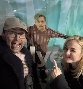
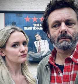


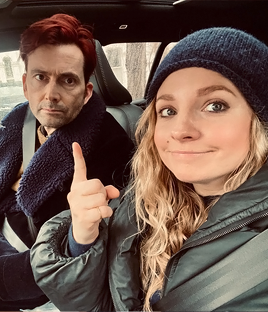


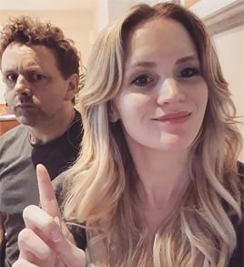
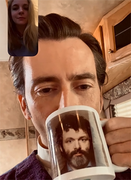
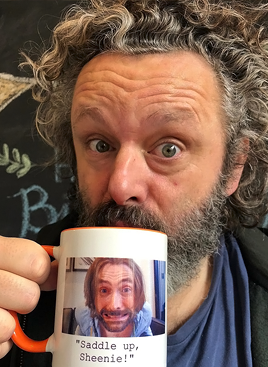
Parallel photos: The Tennants and the Shebergs
#david tennant#georgia tennant#michael sheen#anna lundberg#because I love posting parallels#and apparently these two couples enjoy making them#who knew good omens#would lead to so many good things#good omens#nye#good the play#and their marvelous mugs#stuff i posted#parallels#tennant sheberg parallels#cute couples being cute together#staged#bbc staged#I nearly included the taking babies home from the hospital photos#will include those if I ever do a part 2#but I liked this set with everyone's faces
3K notes
·
View notes
Text


THE MARVELS (2023) dir. Nia DaCosta
#i'm counting down the days until this movie#this trio is gonna be the best thing#the marvels#brie larson#iman vellani#teyonah parris#marveledit#themarvelsedit#mcuedit#mcu#captain marvel#ms marvel#photon#monica rambeau#kamala khan#carol danvers#dailymarvelgifs#marveldaily#userbbelcher#useraurore#tusershay#tuserssam#userriah#marvelladiesdaily#captainmarveledit#500#1k#2k#3k#4k
6K notes
·
View notes
Text
I don’t think you all grasp the depth of the finale and the show as whole: Loki used to be a side chracter who was killed off several times and often used only as a comic relief, and now he’s one of the most important character in the whole mcu… His character arc is incredible, one of the best in the whole mcu.
And all some of you seems to care about is that your ship didn’t become canon. Are you kidding me?!
#and that’s why we can’t have nice things#and not to speak about the fact that those ships are based on delusions#loki#loki laufeyson#loki season 2#loki spoilers#mcu loki#mcu#marvel#loki odinson#mobius#loki the god of mischief#loki now also the god of stories
5K notes
·
View notes
Text


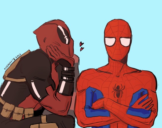
wearing a mask
(click for better quality!)
#yes this is based on the sunglasses thing#spideypool#spider-man#deadpool#peter parker#wade wilson#marvel#my art#fanart#comics#regular disclaimer: NOT MCU SPIDEY!! THANKS!!
6K notes
·
View notes
Text


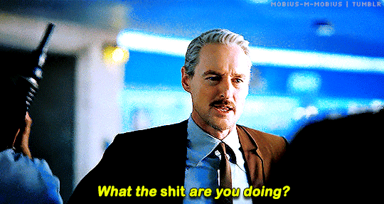
Mobius + being the only one to notice
#mobius#loki#lokius#mcuedit#lokiedit#marveledit#loki spoilers#owen wilson#tom hiddleston#the INSTANT 'you okay?' from mobius when loki timeslipped back the very first time 😭😭#he saw he noticed he asks he CARES#the only one who does#literally became his glorious purpose and now it's the only thing in this world he can't do oh i'm DISTRAUGHT#(and also working 'what the shit are you doing' into my life as an essential but that's beside the point)#anyway. back to giffing and crying lol#loki s2 spoilers#marvel#owenwilsonedit#dianagifs
6K notes
·
View notes
Last Seen Blogs

struck-by-us
MUSE
marcos-h-c
Twitter refugee.
alectology
moved to @hauntedmoors

cafekyu
CAFEKYU
carniferous
diabolically angelic looking