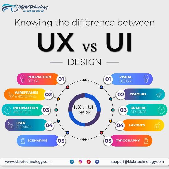
#User-centered web design
Explore tagged Tumblr posts
Visit Tumblr Blog
Explore Tumblr blogs with no restrictions, modern design and the best experience.
Last Seen Tumblr Blogs


Fun Fact
25% of US internet users with an annual income of $80-100K use Tumblr.
Text
Why User-Centered Design is the Key to Online Success: Leveraging Psychology and Design Principles to Create Meaningful Experiences
User-Centered Design (UCD) is crucial in today’s digital world, where success relies not just on aesthetics or functionality but on crafting a user experience that resonates with users on a deeper psychological level. UCD prioritizes not only visual appeal but also the way users think, feel, and behave. Creating effective User-Centered Design is simpler than it may seem; it involves applying psychological principles, such as understanding cognitive load and paying careful attention to even the smallest design details. By focusing on these aspects, we can develop experiences that are not only intuitive but also rewarding. In this blog, we will explore why this approach is essential and how real-world examples highlight its significant impact.

Understanding Human Behavior: The Psychological Pillars of User Centered Design
Every user interaction with a product involves mental processing. If this process is considered overly cumbersome—in other terms if the user experiences a high cognitive load then—there is a likelihood that users will feel an overload and thus get annoyed and quit your site/product. One of the key ideas in user-centric design is reducing cognitive load, or the amount of mental effort required to use and understand a product.
Hick’s Law: Simplifying Choices
Hick’s Law states that the time taken to make a decision increases with the number of alternative choices available to the individual user and hence the more choices available to be used by or have the decision the more prolonged it will take for the user to make a decision. Thus, if a website bombards users with too many actionable options then the users may hesitate or leave entirely. Because of this same reason platforms like Netflix offer recommendations to its users to limit the choices and to show the user what’s most relevant. So, Instead of overwhelming users with the entire library, Netflix focuses on curating options that best fits the user preferences, thus making decision-making easier and faster.

Netflix Interface Showcasing Uses Hick’s Law to Simplify Choices
Fitts’s Law: Designing for Ease of Access
Fitts’s Law explains that why large, well-placed buttons are more effective than small buttons that are hard to reach. Users must have no friction or struggle to find key actions on your website/product. Amazon implements this really well by placing the "Add to Cart" buttons in prominent locations.

Design comparison showing familiar interface versus unfamiliar
These buttons are easy to spot and are large enough to click effortlessly, and also the buttons are placed so strategically to minimize user effort. This simple but thoughtful design element can significantly increase conversions because by doing so Amazon reduces the friction in the user's buying journey.
The Impact of Small Design Decisions: Tiny Tweaks that Leads to Big Results
Small design decisions can lead to a significant difference in how users interact with a product, even if the differences seem atomic or minute at first glance.
The Importance of Spacing
Strategic spacing between elements can drastically improve focus and comprehension. According to the Gestalt Principles of Perception, specifically the Proximity Principle, items placed closely together are perceived as related, while those spaced apart draw more attention individually. Even something as simple as reducing visual clutter makes an enormous difference.
For example, Airbnb uses this principle beautifully. Their listings have plenty of white space, making it easier for users to digest information like pricing, property details, and reviews without feeling overwhelmed. By strategically spacing elements, they guide user attention to what’s most important—booking a stay.
FAQ
Que 1. What is User-Centered Design (UCD)?
Ans 1. User-Centered Design (UCD) is a design method that prioritizes the end user's demands, behaviors, and preferences. It entails studying and understanding customer expectations in order to develop products that are intuitive, simple to use, and aligned with user objectives.
Que 2. How does psychology influence user-centered design?
Ans 2. Psychology has an effect on UCD because it helps creators understand how people think, act, and make decisions. Making digital systems easier to use and more interesting is based on psychological principles such as Hicks' Law (choice time), Fitts' Law (interaction efficiency), and the Gestalt principles (perception and organization).
Que 3. What is the difference between user-centered and conventional design?
Ans 3. The user's demands are prioritized in user-centered design, as opposed to traditional design that prioritizes aesthetics or corporate goals. Whereas traditional design may overlook important user feedback, resulting in usability problems, UCD constantly tests and refines based on user input.
Discover the Full Story
#User-Centered Design#UX design principles#psychology in design#cognitive load#Hick's Law#Fitts's Law#UCD#web design#UI/UX#online success#user behavior#scarcity effect#user experience#digital success#e-commerce UX#Miller's Law#UX design#conversion optimization#UX laws#web design psychology#psychology in Ux#netflix#amazon#Millar's Law#Jakob's law#Instagram#shopify#client centric design#spotify#werbooz
2 notes
·
View notes
Text
Dive into the world where human intuition seamlessly integrates with AI brilliance in web development. Elevate your online presence with the perfect fusion of creativity and technology.
#Benefits of incorporating human touch in AI-driven web development#Enhancing user experience through human-centered AI web development#Balancing automation and human input in modern web development#The role of empathy in AI-driven web design and development#Strategies for infusing creativity into AI-powered web development#Understanding user behavior for personalized AI web development#Building trust through human-like interactions in AI web development#Improving accessibility with human-centric AI web design#Ethical considerations in integrating human touch with AI in web development#Tailoring AI algorithms for diverse user experiences in web development
5 notes
·
View notes
Text
How to Create a User-Centered Web Design: A Step-by-Step Guide

In today's digital landscape, crafting a website that resonates with users is paramount. As a leading Website Design Company in Mumbai, we understand the significance of user-centered design in creating impactful online experiences. This guide delves into the step-by-step process of developing a user-centered web design that not only meets business objectives but also delights users.
Understanding User-Centered Design (UCD)
User-Centered Design is an iterative design process that focuses on the users and their needs at each phase of the design process. It involves users throughout the design and development process to create highly usable and accessible products for them.
Step 1: Research and Understand Your Users
Objective: Gain deep insights into your target audience's behaviors, needs, and motivations.
Actions:
Conduct User Interviews: Engage with potential users to gather qualitative data about their preferences and challenges.
Surveys and Questionnaires: Distribute surveys to collect quantitative data on user behaviors and expectations.
Analytics Review: Analyze existing website data to understand user interactions and identify pain points.
Outcome: A comprehensive understanding of your users, forming the foundation for design decisions.
Step 2: Define User Needs and Business Goals
Objective: Align user needs with business objectives to ensure the website serves both effectively.
Actions:
Create User Personas: Develop detailed profiles representing key segments of your audience.
Establish User Scenarios: Outline scenarios that depict how users will interact with your website.
Set Clear Objectives: Define what success looks like for both users and the business.
Outcome: A clear roadmap that guides design decisions, ensuring they meet user expectations and business goals.
Step 3: Design Solutions
Objective: Translate user insights and business objectives into tangible design solutions.
Actions:
Information Architecture: Organize content logically to facilitate easy navigation.
Wireframing: Create low-fidelity sketches to outline the structure and layout of pages.
Visual Design: Develop the aesthetic aspects, including color schemes, typography, and imagery, ensuring they align with brand identity.
Outcome: A cohesive design that provides a seamless and intuitive user experience.
Step 4: Prototype and Test
Objective: Validate design solutions through user testing to identify areas for improvement.
Actions:
Develop Prototypes: Build interactive models of the website to simulate user interactions.
Conduct Usability Testing: Observe real users as they interact with the prototype to uncover usability issues.
Gather Feedback: Collect user feedback to understand their experiences and perceptions.
Outcome: Refined designs that have been validated by actual users, ensuring usability and satisfaction.
Step 5: Implement and Launch
Objective: Develop the website based on the refined designs and prepare for launch.
Actions:
Front-End Development: Translate designs into functional code, ensuring responsiveness and accessibility.
Back-End Development: Set up the necessary infrastructure to support website functionalities.
Quality Assurance: Test the website across different devices and browsers to ensure consistency.
Outcome: A fully functional, user-centered website ready for deployment.
Step 6: Monitor and Iterate
Objective: Continuously improve the website based on user feedback and performance metrics.
Actions:
Analytics Monitoring: Track user behavior and engagement metrics to identify areas for enhancement.
User Feedback Collection: Encourage users to provide feedback to gain insights into their experiences.
Regular Updates: Implement changes and updates to address user needs and technological advancements.
Outcome: An evolving website that adapts to user needs and maintains relevance over time.
Conclusion
Creating a user-centered web design is a dynamic and ongoing process that places users at the heart of every decision. By following this step-by-step guide, businesses can develop websites that not only meet their objectives but also provide meaningful and engaging experiences for their users.
As a Website Design Company in Mumbai, we specialize in crafting user-centric websites that drive results. Our approach ensures that every aspect of your website is tailored to meet the unique needs of your audience, fostering engagement and loyalty.
#User-Centered Design#Web Design#UX Design#Website Design Company in Mumbai#Web Development#Mumbai Web Designers
0 notes
Text
Leading Global UI UX Design Company for Mobile & Web Applications

A Fictional Journey of CQLsys Technologies: The Founder Who Transformed Her Startup with World-Class UI/UX Design
Introduction: The Startup Dream Meets Design Reality
CQLsys Technologies, a passionate tech entrepreneur based in Toronto, envisioned a powerful mobile-first productivity app tailored for remote teams. She had invested heavily in developing robust features to streamline workflows and increase productivity. However, despite the app's technical brilliance, the number of users dropped significantly within the first few days. Users found it difficult to navigate the app, and its visuals were outdated and unappealing.
This wasn't just a matter of having an innovative product—it was clear that the user experience (UX) needed to be optimized to make her app stand out. Design was treated as a primary force, not a final layer, ensuring user experience led the product’s growth strategy
Determined to fix this problem, she turned to global UI/UX design services to help solve the issues plaguing her app. This decision marked the beginning of a pivotal transformation for her startup, and this fictional journey illustrates the profound impact of partnering with the right UI/UX design agency.
Chapter 1: Understanding the Role of UI/UX Design Services

Before diving into hiring a design agency, CQLsys Technologies first took the time to learn what UI/UX design services actually entail. She quickly realized that it wasn’t simply about making the app look beautiful—it was about creating a holistic experience for the user.
UI (User Interface) design focuses on the aesthetics of the app—the layout, typography, color schemes, and interactive elements. UX (User Experience) design, on the other hand, focuses on the overall usability, ease of use, and satisfaction of users as they interact with the app.
Through comprehensive research, CQLsys Technologies learned that effective UI/UX design isn’t a one-size-fits-all solution but a tailored process that involves careful user journey mapping, understanding the pain points of the target audience, and translating those insights into actionable design improvements.
Key Takeaways About UI/UX Design:
It's more than just visuals: UI design might make an app look attractive, but it's UX design that makes it feel intuitive and usable.
User retention starts with seamless interactions: A user-friendly experience keeps customers coming back, while frustration leads to drop-offs.
Investing in design pays off: Good design isn't just a luxury—it's an essential component that can influence the success of your product.
Data-driven decision-making: User feedback and usability testing guide design decisions, ensuring that the app is always evolving based on real-world insights.
Chapter 2: Strategy First — UX Strategy and Consulting

While design is important, CQLsys Technologies soon discovered that it’s the UX strategy behind the design that would truly make a difference. She sought out an agency specializing in UX strategy and consulting to guide the design process. With their help, she was able to clarify her goals and establish a clear vision for the app.
The strategy started with identifying her target users and understanding their needs, pain points, and expectations. She also conducted extensive user research and competitor analysis to better understand the market landscape. This helped in building user personas—fictional representations of her app's ideal users, based on real data.
A solid UX strategy created the foundation for the design team to deliver precise, goal-oriented solutions, ensuring that every design decision was purposeful and aligned with her business objectives.
UX Strategy Delivered:
Clear persona definitions: Better targeting of app features based on real user behaviors.
Reduced design guesswork: Creating design solutions backed by user insights rather than assumptions.
Data-driven design decisions: Ensuring that every design iteration was supported by user feedback.
A scalable foundation for growth: Establishing design systems that can easily adapt to future changes.
Chapter 3: Partnering with a UI/UX Design Agency for Enterprises

Though still a startup, CQLsys Technologies understood the importance of thinking big. She partnered with a UI/UX design agency that had extensive experience working with both startups and enterprise clients. Their diverse portfolio gave her confidence that they could meet her startup’s unique needs while adhering to enterprise-level standards.
The agency’s expertise went beyond just design—they also brought deep knowledge of enterprise-grade design solutions, such as the need for scalability, security, and cross-platform integration. They worked with her team to ensure the app’s UX would seamlessly scale as the user base grew and the product evolved.
Enterprise-Focused Benefits Included:
Support for complex systems: Designing for scalability and multi-user environments.
Accessibility and compliance: Ensuring the app met all accessibility guidelines for diverse audiences.
High-level collaboration: Helping CQLsys Technologies navigate stakeholder requirements and feedback.
Long-term product vision: Designing with future updates and expansions in mind.
Chapter 4: Mobile App UI/UX Design That Delights Users
CQLsys Technologies’ decision to focus on a mobile-first design approach brought significant changes. Her agency's team implemented principles of mobile app UI/UX design, which focused on optimizing the experience for smaller screens and touch interfaces. This included designing intuitive navigation, ensuring responsive layouts, and improving the app’s speed and performance.
Incorporating animations, microinteractions, and other delightful visual elements made the app more engaging and easier to use. The goal was to ensure that users would immediately understand how to navigate the app without feeling overwhelmed.
The Impact Was Clear:
Increased engagement: Users interacted with the app more frequently, with sessions lasting longer.
Fewer user complaints: The drop-off rate decreased significantly, and customer support queries related to navigation were reduced by 40%.
Enhanced brand image: A beautifully designed app elevated CQLsys Technologies’ brand in the eyes of both users and investors.
Chapter 5: Working with a Global UI/UX Agency
The next step was to work with a global UI/UX agency, which provided the team with insights into international user behavior, cultural differences, and regional design preferences. This global perspective helped her design a truly inclusive app.
Her design partner brought in-depth knowledge of international usability standards, ensuring that her app was optimized for various languages, regions, and cultures. This is especially important for products targeting a global audience, as user expectations and preferences can vary widely across borders.
Global Design Advantages:
Cultural localization: Adapting design and content to resonate with diverse audiences.
Global usability testing: Gathering feedback from international users to ensure universal appeal.
Competitive insights: Understanding market-specific trends and adapting the app to stand out.
Wider reach: Ensuring the app was accessible and intuitive for users across different continents.
Chapter 6: The Power of a Human-Centered Design Agency

Incorporating human-centered design into the development process was a game-changer. This design philosophy places the user at the center of every decision, focusing on empathy and understanding real user needs. CQLsys Technologies’ agency worked closely with users to conduct live usability testing, gathering invaluable feedback.
Rather than relying solely on assumptions or client preferences, the team involved real users in the testing process, observing them interact with the app to identify areas for improvement. This process not only improved the app’s usability but also helped build a loyal user base.
Human-Centered Design Results:
More intuitive user flows: Simplified navigation based on real user needs.
Reduced support queries: Fewer users needed assistance as the app became more intuitive.
Higher user retention: The app became indispensable to users, resulting in increased daily active users.
Deeper emotional connection: Users felt like the app truly understood their challenges and solved them.
Chapter 7: Building UI/UX for Startups That Scale
For CQLsys Technologies’ startup, it was crucial to maintain agility while also ensuring the design could scale as the product grew. The design agency used a lean approach, focusing on fast iterations, prototyping, and refining designs in real-time.
They adopted a minimal viable product (MVP) mindset, ensuring the first version of the app was feature-rich enough to engage users but simple enough to avoid unnecessary complexity. As user feedback rolled in, the design evolved to meet their needs.
Startup Design Essentials:
Testable MVP interfaces: Quickly building and testing core app features.
Rapid iteration: Continuously evolving the design based on user feedback.
Modular UI kits: Easy-to-update components to facilitate future iterations.
Short feedback cycles: Quickly addressing any issues as they arise.
Chapter 8: Collaboration with Figma UX/UI Designers
Collaborating on Figma, the design team worked remotely, refining UI/UX prototypes and receiving input from various stakeholders. Figma’s collaborative nature made it easy for CQLsys Technologies to interact with her design team in real time.
Using Figma allowed the team to streamline communication, reduce design iteration cycles, and improve collaboration with developers, ensuring the final design aligned perfectly with the app's technical requirements.
Figma’s Key Advantages:
Real-time collaboration allows instant feedback and collaboration, no matter where the team is located.
Interactive prototypes: Creating interactive demos for clients and stakeholders.
Quick version control: Easily manage design updates and keep everyone aligned.
Faster approvals: Reducing wait times and speeding up the development process.
Conclusion: From Startup to Industry Leader with the Best UI/UX Designers
In just 18 months, CQLsys Technologies’ mobile app went from being a startup project to a globally recognized productivity tool used by thousands of companies. Her decision to invest in professional UI/UX design transformed her product and helped her achieve remarkable success.
By choosing to work with the best UI/UX designers, she not only improved the user experience but also ensured her app would continue to evolve as user needs changed. With the right design partner, any startup can thrive.
#UI UX Design Services#UX Strategy and Consulting#UI UX Design Agency for Enterprises#Mobile App UI UX Design#Global UI UX Agency#User Experience Design Experts#UX Audit and Usability Testing#Custom UI UX Design Services#Top UX Design Company#User Interface Design Company#Human-Centered Design Agency#UI UX for Startups#Best UI UX Designers#Web & App UI UX Design#Figma UX UI Designers#Award-Winning UX Agency#Enterprise UX Design Solutions#SaaS Product UX Design#UX UI Design for Digital Products#Responsive UI UX Design Services
0 notes
Text
10 UX Mistakes That Are Costing You Conversions
How to Fix Them?

User Experience (UX) is one of the most critical factors influencing conversions on your website or app. A poor UX can frustrate users, leading them to abandon their journey before completing a purchase or desired action. In this post, we’ll explore 10 common UX mistakes that could be hurting your conversion rates—and how you can fix them.
1. Slow Loading Speed
Problem: If your website takes more than 3 seconds to load, users may leave before even seeing your content. Solution:
Optimize website speed using tools like Google PageSpeed Insights
Compress images and enable caching
Use a Content Delivery Network (CDN)
2. Poor Mobile Optimization
Problem: A website that isn’t mobile-friendly leads to a frustrating experience for smartphone users. Solution:
Implement a responsive design
Test across various screen sizes
Ensure buttons and links are easily clickable on mobile screens
3. Complicated Navigation
Problem: If users struggle to find information, they’ll bounce rather than explore. Solution:
Use simple, intuitive navigation
Reduce the number of clicks to reach key pages
Follow UI/UX navigation best practices
4. Lack of Clear Call-to-Action (CTA)
Problem: If your CTA buttons are unclear or blend into the background, users won’t know what action to take. Solution:
Use action-focused text like “Get Started” or “Claim Offer”
Apply contrasting colors for visibility
5. Cluttered Layout & Too Much Text
Problem: Overloading users with excessive text or elements can overwhelm and confuse them. Solution:
Embrace minimalist design principles
Use whitespace effectively
Break up content into sections and bullet points for easy reading
6. Annoying Pop-ups & Auto-Playing Media
Problem: Intrusive pop-ups or auto-playing media can negatively impact user experience. Solution:
Use pop-ups sparingly and based on user behavior
Offer value (e.g., discount or newsletter) to justify interruptions
Allow full control over autoplaying content
7. Forms That Are Too Long or Complex
Problem: Long or complex forms can result in form abandonment. Solution:
Keep forms concise
Enable auto-fill where possible
Use progress indicators for multi-step forms
8. Ignoring Accessibility Standards
Problem: A non-accessible website may exclude a large audience and violate legal standards. Solution:
Follow WCAG accessibility guidelines
Ensure high contrast, readable fonts, and alt text
Design for screen readers and keyboard navigation
9. Unclear or Missing Trust Signals
Problem: Lack of trust leads to hesitation during transactions. Solution:
Display trust badges, verified reviews, and client testimonials
Offer secure payment options and clear return policies
10. Lack of User Testing & Feedback
Problem: Relying on assumptions instead of real feedback often leads to UX flaws. Solution:
Use tools like Hotjar or Crazy Egg for heatmaps and session recordings
Conduct usability testing
Collect user feedback through surveys or interviews
Final Thoughts
Fixing these UX mistakes can significantly improve your website’s conversion rate and overall customer satisfaction. Prioritize continuous testing, user feedback, and performance tracking to ensure your design evolves with your users’ needs.
Need help auditing your UX? Contact us for a UX consultation.
#UX mistakes#UX design#conversion rate optimization#user experience tips#website UX issues#mobile UX design#call to action#form optimization#website speed#accessibility in UX#trust signals#user feedback#usability testing#responsive design#UI/UX best practices#web design flaws#boost conversions#improve UX#user-centered design#digital product design
0 notes
Text
Crafting Seamless Experiences: UI/UX Excellence by Kickr Technology
At Kickr Technology, we redefine digital interactions through unparalleled UI/UX design. Elevate user experiences with our innovative approach, blending intuitive design with cutting-edge technology. Discover the art of user-centric interfaces – choose Kickr Technology for a journey into seamless, visually stunning digital realms.
#User Interface Design#User Experience Development#UI/UX Services#Responsive Design#Mobile App Design#Web Design Agency#Interaction Design#User-Centered Design
0 notes
Text
UI/UX Principles
UI/UX Principles are fundamental guidelines governing both User Interface (UI) and User Experience (UX) design. They dictate how visual elements and interactive features should be designed to optimize user satisfaction!
#https://www.techaheadcorp.com/blog/best-ux-design-practices/#ux design#user experience#design best practices#ui/ux principles#mobile app design#web design guidelines#user-centric design#interaction design#usability tips#human-centered design#responsive design#user interface design#ux research#prototyping#wireframing#accessibility in design#visual hierarchy#information architecture#design thinking#mobile app usability
0 notes
Text
Building Empathy for the Users
Building Empathy for the Users
I already mentioned how you can elicit or gather requirements directly from your users. However, that is only one of the steps to understand and empathize with your users to create a system that meets their needs. Continue reading Untitled

View On WordPress
0 notes
Text
Designing Beyond Aesthetics: The Importance of User-Centered UI/UX

Welcome to a world where design goes beyond just looking pretty. In an era dominated by technology, user-centered UI/UX holds the key to unlocking a seamless and immersive experience for every digital interaction. Gone are the days when aesthetics alone could captivate users; now, it’s all about understanding their needs and crafting interfaces that effortlessly cater to them.
Join us on this enlightening journey as we delve into the importance of designing with users at the forefront – get ready to witness how thoughtful design can transform mere interactions into unforgettable experiences.
Introduction to UI/UX Design
User experience (UX) and user interface (UI) design are important considerations for any product, but they are especially critical for web and mobile applications. A good UX can make the difference between a successful app and one that fails to attract users. Likewise, a well-designed UI can improve the usability of an app and make it more enjoyable to use.
When designing an app, it is important to keep the user in mind at all times. The goal should be to create an app that is easy to use and provides a great user experience. To do this, designers need to think about how users will interact with the app and what their needs are. They also need to consider how the UI will look and feel.
Aesthetics are important, but they should not be the only focus when designing an app. By keeping the user in mind, designers can create apps that are not only visually appealing but also easy to use and enjoyable to interact with.
User-Centered Design Principles
Designing a UI/UX that is both aesthetically pleasing and user-friendly can be a challenge. It is important to keep in mind, however, that the most important aspect of any design is how well it meets the needs of the users. With that in mind, here are some user-centered design principles to keep in mind when designing your next UI/UX:
Keep the user in mind at all times – The most important thing to remember when designing a UI/UX is that it must be designed with the user in mind. Everything from the layout to the color scheme should be chosen with the user’s needs and preferences in mind.
Make it easy to use – A good UI/UX will be intuitive and easy to use. Users should be able to navigate through your design easily and find what they are looking for without difficulty.
Keep it consistent – Consistency is key when it comes to design. Inconsistent elements can confuse users and make your design look sloppy. Stick to a consistent layout, color scheme, and typography throughout your design for a polished look.
Test, test, test! – Always test your design with real users before launch. This will help you identify any areas that need improvement and make sure that your final product is as user-friendly as possible.
Make it accessible – Accessibility is an important part of any design. Make sure your UI/UX is accessible to users who may have disabilities or other impairments. This can be done by making sure that all elements are easily scannable and that the colors used are high contrast for maximum visibility.
The Role of Aesthetics and Visuals in UI/UX Design
Aesthetics and visuals are important elements in UI/UX design, but they are not the only elements. User-centered design focuses on the needs of the user first and foremost. This means that designers must take into account the user’s goals, tasks, and workflow when designing the interface.
Aesthetics are important because they can influence the user’s first impression of the interface. The visuals must be pleasing to the eye and help guide the user’s attention to the most important elements on the screen. But ultimately, it is more important that the interface is easy to use and helps the user accomplish their goals.
Designers must strike a balance between form and function when creating an effective UI/UX design. A beautiful interface that is difficult to use will frustrate users and ultimately fail. On the other hand, an ugly interface that is easy to use can be successful if it meets the needs of its users.
Techniques for Usability Testing
User-centered design is a process that helps ensure that the products we design meet the needs of the people who will use them. One important part of user-centered design is usability testing, which helps us understand how people interact with our designs and identify areas for improvement.
There are many different techniques that can be used for usability testing. Some common methods include:
Task-based usability testing: In this type of test, participants are asked to complete specific tasks using the product under test. This allows us to see how well users are able to accomplish their goals and identify any areas of confusion or difficulty.
2. Eyetracking: Eyetracking involves using special equipment to track where users look while they are using a product. This can help us understand what parts of the design are attracting attention and identify areas that may need further refinement.
Clickstream analysis: Clickstream analysis involves tracking the sequence of clicks made by users as they navigate through a product. This can help us understand how users interact with the design and identify areas where they may get lost or confused.
Survey research: Survey research involves asking users questions about their experience with a product. This can be done either before or after using the product, and it can help us gather valuable feedback about what works well and what could be improved .
Interviews: Interviews provide a more in-depth look into users’ experiences with a product and can help us understand underlying motivations and behaviors.
Focus groups: Focus groups involve bringing a group of people together to discuss their experiences with a product in an open and interactive environment. This can be useful for gathering feedback on large designs or complex products.
Prototype testing: Prototype testing involves having users interact with early versions of a product before it is released, allowing designers to quickly identify areas that need refinement before launch.
Accessibility and Responsive Design Considerations
When it comes to user-centered UI/UX design, accessibility and responsive design considerations are extremely important. After all, if your site or app isn’t accessible to users with disabilities, or doesn’t look good on different screen sizes, you’re not going to meet their needs.
Here are some key things to keep in mind when designing for accessibility and responsiveness:
• Use clear and concise text that can be easily read by everyone, regardless of their disability.
• Make sure your site can be navigated using a keyboard or other assistive technology.
• Design your site so that it looks good on all screen sizes, from mobile devices to desktop computers.
• Pay attention to color contrasts and make sure your text is visible against any background color.
By keeping these considerations in mind, you can ensure that your UI/UX designs are truly user-centered and meet the needs of all your users.
Tips for Creating Intuitive Experiences with UI/UX Design
As a UI/UX designer, it is important to create intuitive experiences for users. Here are some tips to help you achieve this:
1. Keep the user in mind at all times – When designing your UI/UX, always keep the user in mind. What do they need? What do they want? How can you make their experience as smooth and enjoyable as possible?
Use familiar design patterns – Don’t try to reinvent the wheel when it comes to design patterns. Instead, use familiar patterns that users will be able to understand and navigate easily.
Make use of negative space – Use negative space in your designs to help guide the user’s eye and create a more intuitive experience.
Use color carefully – Color can be a powerful tool in user-centered UI/UX design, but it should be used carefully so as not to overwhelm users or create confusion.
Use fonts judiciously – As with color, fonts should be used judiciously in order to create an easy-to-read and intuitive experience for users.
Conclusion
To sum up, user-centered UI/UX design is an essential part of any digital product development process. It helps ensure that users have positive experiences when interacting with a website or app and it can help increase customer loyalty and satisfaction. By putting the user at the center of your design decisions, you will be able to create products that look great but also offer useful functionality. As designers, we should never forget our ultimate goal: creating exceptional experiences for all users!
#Designing Beyond Aesthetics: The Importance of User-Centered UI/UX#web design#web devlopment#app development#web development#webdevelopment#app devlopment#digital marketing#software devlopment company#graphic design
0 notes
Text
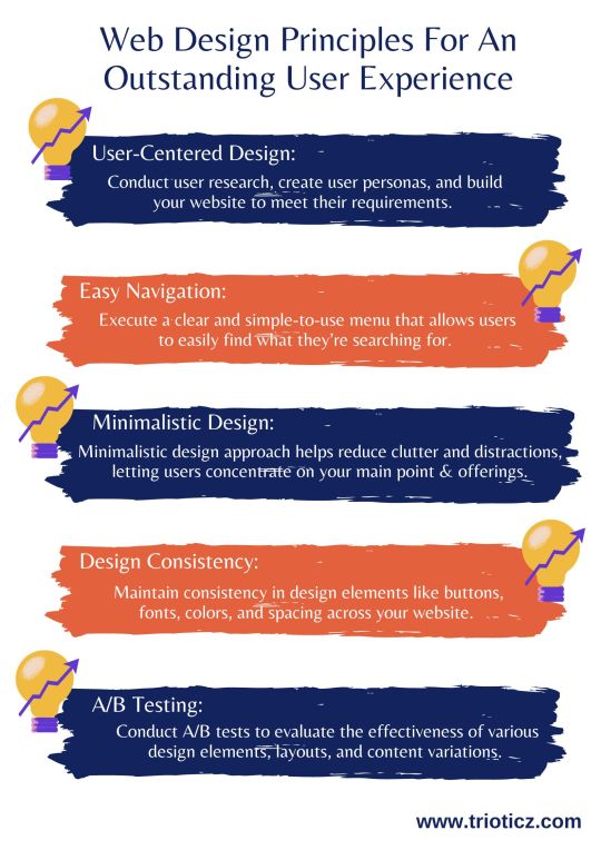
In today’s digital age, a web page is often the initial point of interaction between a business and its customers. To know which layout, and design suite to your website, consult a reputed Website Development Company in Coimbatore or a Web Development Company in Chennai and know the best for your business.
#A/B Testing#Accessibility for Everyone#Attractive Imagery and Visuals#Design Consistency#Easy Navigation#Minimalistic Design#Quick Loading Times#Responsive Design#User-Centered Design#Visual Hierarchy#Web Design#Web Design Company#Web Design Principles#Web Development
0 notes
Text
Tumblr Hack Week, January 2024 Edition
Once again it was Hack Week (more than just a day!) at Tumblr! This is getting repetitive in the best way. A couple of times per year we slow down our normal work and spend a week working on scratching a personal itch or features we want as user and see how far we can get with our hacks. One thing from the last Hack Week in September made it all the way to a new experiment out to some testers: Tumblr Patio!
Here are some of the projects that got built for our most recent Hack Week in January. Some of these things you may also end up seeing on the site…
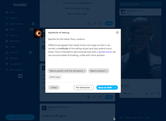
Spoiler text, spoiler blocks, and centered text!
This one is so obvious and amazing, it’s wild we don’t already have it. For Hack Week, Katie added the ability to select text in a paragraph to be hidden behind a wall of black that can be revealed with a tap. This can be super useful to hide spoilers. And even better: whole spoiler blocks. And while we’re here, the ability to center text!
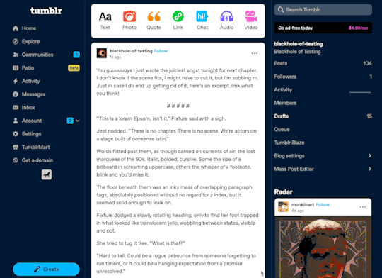
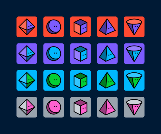
A plethora of new default blog avatars
We haven’t updated our default avatars in several years. (Some of you may remember this one from 10+ years ago.) They’re feeling a bit stale to us, so why not update them? And while we’re at it… make a ton more variations! Paul from the Tumblr Design team came up with a suite of new default avatars, using our latest Tumblr color palette. Here’s a look at some of them, but there are actually many dozens more using different colors:
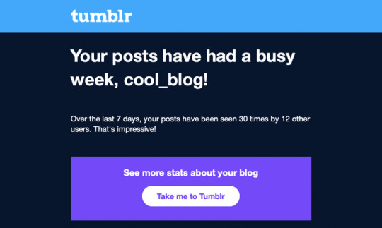
Notifications and emails about engagement on your posts
This one is for the folks on Tumblr who love numbers and their Activity page. Daniel, @jesseatblr, and the Feeds & Machine Learning team worked on some new notifications and emails we could send out to people about how their posts have been doing lately on the platform, such as how many views they’ve gotten, and by how many people. We already have this available (and more) when you Blaze a post, but why not open it up to more people? It’s really useful to the folks who use Tumblr to help build an audience for their work!
A new way of navigating the web: the Command Palette
Some apps we use a lot have a “command palette” accessible via a keyboard shortcut for quick keyboard-driven access to different parts of the platform. For example, Slack and Discord have Command + K to access their quick switchers to hop around conversations. What if Tumblr had one? Kelly and Paul built one! Press Command/Control + K on Tumblr and you can use your keyboard to jump to your blog, Activity, your recent conversations, search, dozens of places!
As always, stay tuned to the @changes blog to see if any of these hacks make it on Tumblr for real!
2K notes
·
View notes
Text
In late January, a warning spread through the London-based Facebook group Are We Dating the Same Guy?—but this post wasn’t about a bad date or a cheating ex. A connected network of male-dominated Telegram groups had surfaced, sharing and circulating nonconsensual intimate images of women. Their justification? Retaliation.
On January 23, users in the AWDTSG Facebook group began warning about hidden Telegram groups. Screenshots and TikTok videos surfaced, revealing public Telegram channels where users were sharing nonconsensual intimate images. Further investigation by WIRED identified additional channels linked to the network. By scraping thousands of messages from these groups, it became possible to analyze their content and the patterns of abuse.
AWDTSG, a sprawling web of over 150 regional forums across Facebook alone, with roughly 3 million members worldwide, was designed by Paolo Sanchez in 2022 in New York as a space for women to share warnings about predatory men. But its rapid growth made it a target. Critics argue that the format allows unverified accusations to spiral. Some men have responded with at least three defamation lawsuits filed in recent years against members, administrators, and even Meta, Facebook’s parent company. Others took a different route: organized digital harassment.
Primarily using Telegram group data made available through Telemetr.io, a Telegram analytics tool, WIRED analyzed more than 3,500 messages from a Telegram group linked to a larger misogynistic revenge network. Over 24 hours, WIRED observed users systematically tracking, doxing, and degrading women from AWDTSG, circulating nonconsensual images, phone numbers, usernames, and location data.
From January 26 to 27, the chats became a breeding ground for misogynistic, racist, sexual digital abuse of women, with women of color bearing the brunt of the targeted harassment and abuse. Thousands of users encouraged each other to share nonconsensual intimate images, often referred to as “revenge porn,” and requested and circulated women’s phone numbers, usernames, locations, and other personal identifiers.
As women from AWDTSG began infiltrating the Telegram group, at least one user grew suspicious: “These lot just tryna get back at us for exposing them.”
When women on Facebook tried to alert others of the risk of doxing and leaks of their intimate content, AWDTSG moderators removed their posts. (The group’s moderators did not respond to multiple requests for comment.) Meanwhile, men who had previously coordinated through their own Facebook groups like “Are We Dating the Same Girl” shifted their operations in late January to Telegram's more permissive environment. Their message was clear: If they can do it, so can we.
"In the eyes of some of these men, this is a necessary act of defense against a kind of hostile feminism that they believe is out to ruin their lives," says Carl Miller, cofounder of the Center for the Analysis of Social Media and host of the podcast Kill List.
The dozen Telegram groups that WIRED has identified are part of a broader digital ecosystem often referred to as the manosphere, an online network of forums, influencers, and communities that perpetuate misogynistic ideologies.
“Highly isolated online spaces start reinforcing their own worldviews, pulling further and further from the mainstream, and in doing so, legitimizing things that would be unthinkable offline,” Miller says. “Eventually, what was once unthinkable becomes the norm.”
This cycle of reinforcement plays out across multiple platforms. Facebook forums act as the first point of contact, TikTok amplifies the rhetoric in publicly available videos, and Telegram is used to enable illicit activity. The result? A self-sustaining network of harassment that thrives on digital anonymity.
TikTok amplified discussions around the Telegram groups. WIRED reviewed 12 videos in which creators, of all genders, discussed, joked about, or berated the Telegram groups. In the comments section of these videos, users shared invitation links to public and private groups and some public channels on Telegram, making them accessible to a wider audience. While TikTok was not the primary platform for harassment, discussions about the Telegram groups spread there, and in some cases users explicitly acknowledged their illegality.
TikTok tells WIRED that its Community Guidelines prohibit image-based sexual abuse, sexual harassment, and nonconsensual sexual acts, and that violations result in removals and possible account bans. They also stated that TikTok removes links directing people to content that violates its policies and that it continues to invest in Trust and Safety operations.
Intentionally or not, the algorithms powering social media platforms like Facebook can amplify misogynistic content. Hate-driven engagement fuels growth, pulling new users into these communities through viral trends, suggested content, and comment-section recruitment.
As people caught notice on Facebook and TikTok and started reporting the Telegram groups, they didn’t disappear—they simply rebranded. Reactionary groups quickly emerged, signaling that members knew they were being watched but had no intention of stopping. Inside, messages revealed a clear awareness of the risks: Users knew they were breaking the law. They just didn’t care, according to chat logs reviewed by WIRED. To absolve themselves, one user wrote, “I do not condone im [simply] here to regulate rules,” while another shared a link to a statement that said: “I am here for only entertainment purposes only and I don’t support any illegal activities.”
Meta did not respond to a request for comment.
Messages from the Telegram group WIRED analyzed show that some chats became hyper-localized, dividing London into four regions to make harassment even more targeted. Members casually sought access to other city-based groups: “Who’s got brum link?” and “Manny link tho?”—British slang referring to Birmingham and Manchester. They weren’t just looking for gossip. “Any info from west?” one user asked, while another requested, “What’s her @?”— hunting for a woman’s social media handle, a first step to tracking her online activity.
The chat logs further reveal how women were discussed as commodities. “She a freak, I’ll give her that,” one user wrote. Another added, “Beautiful. Hide her from me.” Others encouraged sharing explicit material: “Sharing is caring, don’t be greedy.”
Members also bragged about sexual exploits, using coded language to reference encounters in specific locations, and spread degrading, racial abuse, predominantly targeting Black women.
Once a woman was mentioned, her privacy was permanently compromised. Users frequently shared social media handles, which led other members to contact her—soliciting intimate images or sending disparaging texts.
Anonymity can be a protective tool for women navigating online harassment. But it can also be embraced by bad actors who use the same structures to evade accountability.
"It’s ironic," Miller says. "The very privacy structures that women use to protect themselves are being turned against them."
The rise of unmoderated spaces like the abusive Telegram groups makes it nearly impossible to trace perpetrators, exposing a systemic failure in law enforcement and regulation. Without clear jurisdiction or oversight, platforms are able to sidestep accountability.
Sophie Mortimer, manager of the UK-based Revenge Porn Helpline, warned that Telegram has become one of the biggest threats to online safety. She says that the UK charity’s reports to Telegram of nonconsensual intimate image abuse are ignored. “We would consider them to be noncompliant to our requests,” she says. Telegram, however, says it received only “about 10 piece of content” from the Revenge Porn Helpline, “all of which were removed.” Mortimer did not yet respond to WIRED’s questions about the veracity of Telegram’s claims.
Despite recent updates to the UK’s Online Safety Act, legal enforcement of online abuse remains weak. An October 2024 report from the UK-based charity The Cyber Helpline shows that cybercrime victims face significant barriers in reporting abuse, and justice for online crimes is seven times less likely than for offline crimes.
"There’s still this long-standing idea that cybercrime doesn’t have real consequences," says Charlotte Hooper, head of operations of The Cyber Helpline, which helps support victims of cybercrime. "But if you look at victim studies, cybercrime is just as—if not more—psychologically damaging than physical crime."
A Telegram spokesperson tells WIRED that its moderators use “custom AI and machine learning tools” to remove content that violates the platform's rules, “including nonconsensual pornography and doxing.”
“As a result of Telegram's proactive moderation and response to reports, moderators remove millions of pieces of harmful content each day,” the spokesperson says.
Hooper says that survivors of digital harassment often change jobs, move cities, or even retreat from public life due to the trauma of being targeted online. The systemic failure to recognize these cases as serious crimes allows perpetrators to continue operating with impunity.
Yet, as these networks grow more interwoven, social media companies have failed to adequately address gaps in moderation.
Telegram, despite its estimated 950 million monthly active users worldwide, claims it’s too small to qualify as a “Very Large Online Platform” under the European Union’s Digital Service Act, allowing it to sidestep certain regulatory scrutiny. “Telegram takes its responsibilities under the DSA seriously and is in constant communication with the European Commission,” a company spokesperson said.
In the UK, several civil society groups have expressed concern about the use of large private Telegram groups, which allow up to 200,000 members. These groups exploit a loophole by operating under the guise of “private” communication to circumvent legal requirements for removing illegal content, including nonconsensual intimate images.
Without stronger regulation, online abuse will continue to evolve, adapting to new platforms and evading scrutiny.
The digital spaces meant to safeguard privacy are now incubating its most invasive violations. These networks aren’t just growing—they’re adapting, spreading across platforms, and learning how to evade accountability.
57 notes
·
View notes
Text

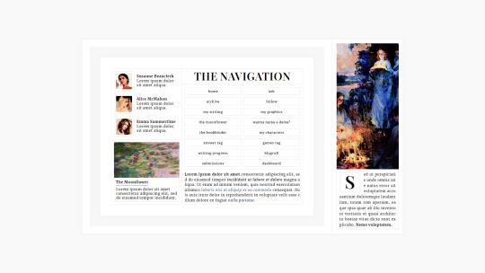


MOONFLOWER: WRITERBLR PACK
[ live preview ] ♡ [ get on payhip ] From the moment I understood their concepts, reading, writing, and everything related to literature has been an important part of my life. While I've centered my online presence around graphic and web design I discovered those online spaces thanks to literature. And while I've favored working over writing—which is unfortunately very relatable—in my time as a spectator, I've had the opportunity to get acquainted with Writerblr and their incredible community members. From this experience, I fell completely in love with how Writerblr members curate their blogs and communicate their projects to their followers, and the idea of a package made for them became one of my main goals for this blog.
The Moonflower Writerblr pack was made for writers looking for something elegant and uncomplicated. With user-friendly customization options, a contained layout, and strong typefaces, your words are the focal point. This theme package can be as minimalist—or as maximalist—as you wish. Whether you're sharing updates, writing dissertations in response to anonymous questions, or presenting graphics alongside your projects, Moonflower is for you! I fell absolutely in love with it and adapted it to my needs as an RPC content creator. So it's flexible if you would like to use it for something outside of Writerblr. With that being said, I hope you like it! And good luck with those manuscripts!
Package Features
theme [ contained npf compatible ]
navigation
works in progress
blogroll
Terms + Conditions
please do not redistribute / claim as your own
please do not remove credit
[ reblogs are appreciated ♡ ]
147 notes
·
View notes
Text
Leading Global UI/UX Design Company for Mobile & Web Apps Discover how CQLsys Technologies scaled globally through expert UI/UX design. Learn how world-class design transforms startups into industry leaders.
CQLsys Technologies' Fictional Journey to SuccessTransform Your App with Global UI/UX Experts – Let’s Design a User Experience That Drives Real Results. Get a Free Consultation Today!
#UI UX Design Services#UX Strategy and Consulting#UI UX Design Agency for Enterprises#Mobile App UI UX Design#Global UI UX Agency#User Experience Design Experts#UX Audit and Usability Testing#Custom UI UX Design Services#Top UX Design Company#User Interface Design Company#Human-Centered Design Agency#UI UX for Startups#Best UI UX Designers#Web & App UI UX Design#Figma UX UI Designers#Award-Winning UX Agency#Enterprise UX Design Solutions#SaaS Product UX Design#UX UI Design for Digital Products#Responsive UI UX Design Services
0 notes
Text
The Evolution of UI/UX
From Skeuomorphism to Neumorphism & Beyond

User Interface (UI) and User Experience (UX) design have undergone a remarkable transformation over the years. From the early days of skeuomorphism to the sleek, modern neumorphism, the way we interact with digital interfaces continues to evolve. In this blog, we explore the history, key transitions, and the future of UI/UX design.
For more design insights, visit our UI/UX blog collection.
The Era of Skeuomorphism: Making Digital Feel Familiar
What is Skeuomorphism? Skeuomorphism is a design approach that mimics real-world objects and textures to make digital interfaces more intuitive. This style was widely used in the early days of computing and mobile apps.
Key Characteristics:
Realistic textures and shadows (e.g., leather-bound calendar apps, glossy buttons)
3D effects and depth
Gradients and detailed illustrations
Why It Was Popular: Skeuomorphic design helped users transition from physical to digital interfaces by offering a familiar look and feel. Early Apple iOS interfaces exemplified this approach.
Downfall: As mobile-first design became the norm, these visuals began to feel outdated and cluttered.
The Rise of Flat Design: A Minimalist Revolution
What is Flat Design? Flat design focused on simplicity and usability by eliminating 3D effects and textures.
Key Characteristics:
Clean, minimalist layouts
Bold colors and sharp edges
Simple, legible typography
No shadows or depth
Why It Became the Standard: With better performance and mobile responsiveness, companies like Google and Microsoft embraced flat design, helping it become mainstream.
Material Design: Adding Depth Back
What is Material Design? Material Design by Google blends flat design with depth and motion to create more intuitive interactions.
Key Characteristics:
Soft shadows and layering
Card-based structure
Fluid animations
Emphasis on usability and feedback
This hybrid approach improved UX without sacrificing performance.
The Neumorphism Trend: A Fusion of Old and New
What is Neumorphism? Neumorphism, or “New Skeuomorphism,” combines depth and simplicity, giving UI components a soft, tactile appearance.
Key Characteristics:
Embossed look with soft shadows
Muted color palettes
Minimalist yet interactive elements
Rounded corners and subtle gradients
Why It’s Trending: Neumorphism aligns well with dark mode, reducing eye strain and enhancing modern UI elements. However, it faces criticism over accessibility and contrast limitations.
Beyond Neumorphism: The Future of UI/UX
The future of UI/UX is shaped by emerging technologies and evolving user expectations:
Glassmorphism: Popularized by macOS and Windows 11, it adds frosted glass effects and layered transparency.
AI-Powered Design: Adaptive interfaces using AI in UX to anticipate user needs.
AR & VR: Transforming navigation, e-commerce, and gaming with immersive experiences.
Sustainable & Ethical Design: Prioritizing accessibility, energy efficiency, and inclusive digital experiences.
Final Thoughts
UI/UX design has evolved from skeuomorphic realism to flat simplicity, material fluidity, and now to neumorphic softness. As technology and user behaviors continue to change, designers must focus on creating digital products that are not only beautiful but also intuitive and inclusive.
Stay ahead of the curve—explore more on Pixelizes for design trends, resources, and tips that shape the future of UI/UX.
#UI Design#UX Design#History of UI/UX#UI/UX Trends#Design Evolution#Skeuomorphism#Flat Design#Material Design#Neumorphism#Glassmorphism#AI in UX#AR/VR in Design#Future of UX#Ethical Design#Sustainable UX#Accessibility in Design#User-Centered Design#Visual Design Trends#Minimalist UI#Interaction Design#Web Design#Mobile UX#Creative Inspiration#Digital Interfaces#Design Thinking
1 note
·
View note
Text
The latest round of AO3 comment discourse crossing my dash made me suddenly realize that people are just taking it as a given that AO3 is a "fandom community website". AO3 is often directly compared to Livejournal and other older fandom hubs amidst laments about how "no one cares about participating in their community anymore".
But AO3 is not a "community" website. It's not social media. It's a fanfic archive that was designed to center the fics first and foremost. There is no space on the site for general, casual fandom discussion. You can't even DM other users. The site was designed this way on purpose to protect writers, because its creators were familiar with the ways in which writers have been harassed on other sites and wanted to minimize direct access to writers as much as possible, but that decision comes with the tradeoff of limiting the amount of communication and discussion between fans that is possible on the site.
This is, to be clear, not a criticism of AO3. It accomplishes its goal of being an archive very well. I don't particularly want DMs or larger discussion forums on the site, and I enjoy how it centers the writing it hosts. But as it exists now, it is simply not built to be a "community" and does not function as one. Unlike sites like Livejournal where fic posting and general interpersonal fandom interactions all took place in the same space, fics are posted to AO3 while the "community" for any given fandom now largely takes place on Twitter, Tumblr, Discord, or another site, depending on the fandom.
You're free to personally dislike those spaces and voice valid criticisms about how they function as communities, but they are undeniably where the actual "community" parts of most fandoms currently reside. These sites, not AO3, are where most fans talk to one another, form friendships, and express themselves. It's not impossible to do these things on AO3, but it is not the norm because the site simply is not designed that way.
The latest posts I have seen about commenting culture have gotten this dynamic exactly backwards. If readers are discussing a fic amongst themselves on Twitter or Discord, they're characterized as antisocial and accused of "not participating in the fandom community". But Twitter and Discord are the fandom community sites! The "bookclub" servers and Twitter threads are where the community bonds are being forged between fans! These spaces are the modern analogue to the old Livejournal groups and web rings, not the comments section of any one individual fanfic on AO3.
If an author's only interaction with their fandom is to post fics to AO3 and passively wait to be found, and they aren't seeking out their fellow fans in these other spaces and interacting with them... they are the ones who are "not participating" as much as the readers that are so readily being cast in so much of this discussion as "selfish" or deliberately spiteful for not commenting "enough".
I understand why many of my fellow writers feel this way. I too often find socialization on sites like Twitter and Discord draining and difficult. It takes time and effort to build friendships organically, discuss ideas and share snippets to pique people's interest in a fic before it is posted, and provide reciprocal effort when it comes to everyone else's ideas and snippets and stories, and there are many days when I just don't have the energy for it all. At the same time, I'm also very curious about my readers' thoughts on my stories, and if I learned that they were being discussed in a server I couldn't access, I would want to know what was being said. It's a natural impulse to feel curiosity like this when it comes to one's creative work. And of course, I also love getting comments on my own fics and I'm not immune to feeling disappointed when a fic seems to "flop".
However, it's not fair to take out feelings of disappointment and frustration on readers for participating in their fandom in the spaces where their fandom's community actually exists. If you find out that fandom discussions are happening in a place where you are not present, you have a choice in what action you will take. You can either make the effort to join the discussion, or you can knowingly distance yourself from it. Neither of these choices are objectively correct for every single individual's situation, but you, the AO3 denizen, are the one who needs to choose whether or not to engage with your fandom's community, because AO3 is not where the community lives.
If you choose not to join your fellow fans in their actual community hubs because of low social battery, annoying features, or a site culture you dislike, that's perfectly fine and a valid choice... but you shouldn't be surprised when the author who is participating in their fandom outside of AO3 gets more comments on their fics. And you certainly don't have the right to project your own social withdrawal onto your readers and accuse them of maliciously withholding "community" from you.
Comments are wonderful, and positively encouraging people to leave comments on the fics they enjoy is completely fine, but comments are not community. AO3 is not a community website and in fact is designed to put us writers behind a wall for our own protection. We are the ones who need to choose whether or not to venture out from behind the wall and join our communities, instead of getting angry that the community isn't spontaneously appearing in our comments sections.
71 notes
·
View notes