#about web design and development
Explore tagged Tumblr posts
Visit Tumblr Blog
Explore Tumblr blogs with no restrictions, modern design and the best experience.
Last Seen Tumblr Blogs


Fun Fact
Kazakhstan’s Minister of Communications and Informatics has blocked the Tumblr site because it contained 60 sites of terrorism, extremism, and pornography in 2015.
Text
Get a Fun, New Website: Simple & Affordable!!
Hi~ I want to share my website design services with you, because you may be seeking a creative answer to your portfolio or business website that stands out from others in your field. For under <$200*, I will design a multi-page, detailed and customized website for your personal or professional use.
I have designed websites for several types of businesses, from financial to creative, and I always add a classic, personal flare to each one. You deserve more than just Web 3.0, after all!
These websites can see hundreds of visitors a day, not just because of mindful SEO, but because every web page provides exactly what your audience is looking for with beautiful and personal presentation.
Key Benefits:
+ Display and promote your highlights + Collect ethically organized interest data + Speak directly to your audience on your own platform + Receive maintenance and updates* + Publish and market your website in less than a week!
You can view my previous work on my dedicated webpage: Darya Talia Web Services. I encourage you to do so!
If you're ready for a free consultation, complete this Google Form describing the goals and aesthetics of your website and I'll book you to review your design options. Websites are primarily designed using Wix Web Builder, and the *cost of my services plus domain registration and hosting will be discussed during your consult!
Thank You for supporting an independent designer and developer!
#Web Design#Web Development#Share this Post#Thank you for Reading#Yes I am also a Video Game Designer! Ask me how I can assist your game portfolio!#Accepting asks that are interested in more information about my process and services!
5 notes
·
View notes
Text
The Future of Visuals: From Flat to Immersive
From flat design to depth and dimension: Exploring the impact of 3D graphics and animation. The evolution of holographic elements: Bringing virtual objects to life on websites. Creating a truly immersive experience: How to integrate these elements for maximum impact.

Get Free website designing course 2025 👈
Clear Purpose and Goals: Define the primary objective of the website. Ensure that every element on the site supports this goal.
User-Friendly Design: Prioritize intuitive navigation and clean layout. Make sure the design is accessible and easy to use for all users.
Responsive and Mobile-First Design: Ensure the website works well on all screen sizes. Start with mobile design as more users access websites on mobile devices.
5 Important ways to develop responsive website
Fast Load Time and Performance
Optimize images and code for faster loading.
Use caching, a good hosting provider, and efficient coding practices.
Strong SEO and Content Strategy
Use relevant keywords, proper headings, and metadata.
Create valuable, high-quality content that helps your audience and ranks well on search engines.
#us school system#education system#high school education#free science education#learn web development#learn design#learn about physics#learn graphic design#learn animation#learn web design#learn website design#responsive web design#responsive website#responsive wordpress template#website optimization#website developer near me#3d banner design#3d image design#3d vector design#3d website#well designed website#website development
5 notes
·
View notes
Text
i love spending so much time developing world building stuff like the ecosystem and culture of a fake early 2000's exclusive gore forum for my horror novel instead of actually writing chapters lol
#im just currently really in a I Need to Develop everything before i get to deep into writing phase#i have some draft chapters but i am having fun developing the dark web ecosystem that is semi-integral to the plot#ive spent too long thinking of the logistics of it and how it would work and develop over time#which is both fucked up but fun to flesh out#like creating moderators and regular users on this forum like what kind of fucked up people exist on this place#coming up with hyperspecific jargon and terms that develop in this essentially closed ecosystem#my word docs look absolutely insane lmao#eventually i want to do like UI mockups for fun whether really accurate for the time and capabilities bc designing UI is an interest of min#i always feel weird publicly talking about anything related to my writing since its horror focused but this is my main thing atm#like the writing falls into transgressive horror which is probably why im less inclined to speak on it publicly#so i will shout into the void that is my tags#i just love horror i love writing horror#azael ranting
2 notes
·
View notes
Text
They should add a turn based combat mechanic to scrolling on Tumblr mobile. I deserve to be catapulted across the page if I lose the battle, but if I win, I get one more post
15 notes
·
View notes
Text
Coders who follow me, on a scale of 1-10 how hard is it learning to code if I decide to try learning to code again
#rambles#i took a web development class in highschool and a game design class#i wanna learn about animation and gaming coding#which is neither of the things I've learned from tue classes i had#plus it involves me going back into blander to learn more than the basics#with a laptop that i know probably can't render anything
2 notes
·
View notes
Text
"Boil water to turn fan" as if multistage steam turbine generators are not one of the sexiest kinds of machines every made
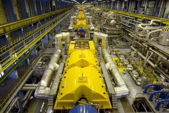
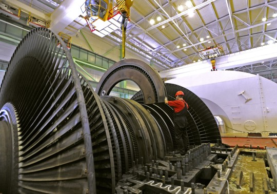
nuclear power is impressive until you get up to why. "we use the most precisely engineered machinery ever created to split atoms to release energy" oh yeah how come? "boil water to turn a fan" get the fuck out
#its genuinely crazy the math and engineering that go into making these absolutely massive steam turbines#its an incredible balancing act to optimize between the interconnected variables of pressure velocity and temperature in order#to extract as much energy as possible from the steam as it moves through the system#especially like. those generators need to maintain a very precise rotational speed in order to prevent the coupled generator#from going out of phase with the power grid#(3000 RPM for 50 Hz grids and 3600 RPM for 60 Hz grids)#like the reactor part sounds like a lot of engineering work (and it is!) but like. the turbine is fucking incredibly impressive too#each one of those turbine stages needs to have very specifically shaped blades in order to control steam pressure drop and steam velocity#and the blades need to be able to physically handle being in a wet (at least for nuclear plants where the steam is pretty wet) high temp#environment and constantly being spun at high rotational speeds for decades at a time.#we had to develop specialized nickel titanium superalloys with tightly controlled crystalline structures in order to build turbines this big#stare into the depths of “wow we really just use steam to spin a big fan that sounds simple” and you encounter#the lifes work of thousands of mathematicians computer engineers material scientists and mechanical engineers#the first device we could call a steam turbine was made as a toy in tthe first century ancient greece and egypt#the first steam turbine with a practical use was described in 1551 in Ottoman Egypt. it was used to turn a spit of meat over a fire.#the first modern multistage impluse steam turbine was made in 1884 and revolutionized electricity generation and marine propulsion#in the 141 years since there have been more improvements than one could even list#from major design changes credited to great men to miniscule efficiencies and optimizations gained from tweaking the composition of an alloy#idk. i think its beautiful to think about the web of human knowledge woven collectively by thousands of hands across history#could you imagine what the ancient greek engineers who first put together the prototype for an aeolipile would think to see what we have#made now. could they even recognize our designs as belonging to the same category of object as their little toy#anyway#appreciate the humble steam turbine with the same eye you give to the reactor core#mine#just my thoughts
73K notes
·
View notes
Text
A2z About Website Designing
#A2zAboutWebsiteDesigning #WebsiteDesign #WebDevelopment #WebDesignServices #WebsiteDesigning
0 notes
Text
Progress. Slow, eventual progress.
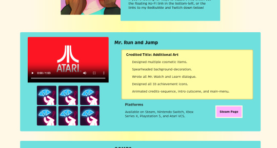
Getting a bit tired of staring at this, but at least it's no longer color-vomit.
#web design#front end development#portfolio#mr. run and jump#i do not remember if that's actually what i was credited under rip#edited the colors of the entire site hows about that#it's cleaner and better but definitely needs more improvement#htmlcoding#html5#css#html css
0 notes
Text
Viral Yuri Manga 'The Guy She Was Interested In Wasn't a Guy at All' Released in English
On Tuesday, Yen Press released the first volume of Sumiko Arai's popular Yuri manga The Guy She Was Interested In Wasn't a Guy at All (Ki ni Natteru Hito ga Otoko Janakatta) digitally and in paperback.

The manga, which started its weekly run on X (formerly Twitter) in 2022, follows gyaru Aya Oosawa, who develops a crush on the alt clerk at the CD shop she frequents, unaware that it is her female classmate, Mitsuki Koga. Yen Press further describes the series:
Fashionable and upbeat high schooler Aya falls head over heels for an employee at a local CD shop. He’s got an air of mystery about him, always dressed well, and has impeccable taste in music. Little does she know―this supposedly male employee is actually her female classmate Mitsuki! Mitsuki generally keeps to herself, but since her seat is right next to Aya’s, she can't help but be extremely aware of the other’s crush. Revealing the truth is out of the question―but perhaps getting closer to Aya wouldn’t be so bad...
The series became incredibly popular after its release online, with fans internationally drawn in by the series' distinctive artwork, character designs, and green-color pallet. According to the English publisher, the manga was one of the most demanded series in the recent past and is set to become one of Yen Press's biggest releases of the year.
In April 2023, Kadokawa published the first volume of The Guy She Was Interested In in Japanese. The manga began serialization on Pixiv Comic the same month. The series also won Kadokawa's 2023 Next Manga Award in the web manga category. The second collected volume was released in Japanese in April and is scheduled for English release on February 18, 2025.

The series is translated into English by Ajani Oloye.
You can check out Volume One of The Guy She Was Interested In Wasn't a Guy at All in English digitally and in paperback: https://amzn.to/3YxI0kW
Edit: 10/24/24 - Corrected a character's name in the description.
#yuri#lgbt#gay#girls love#the guy she was interested in wasn't a guy at all#lgbtq#gl#lesbian#anime#manga#queer
7K notes
·
View notes
Text
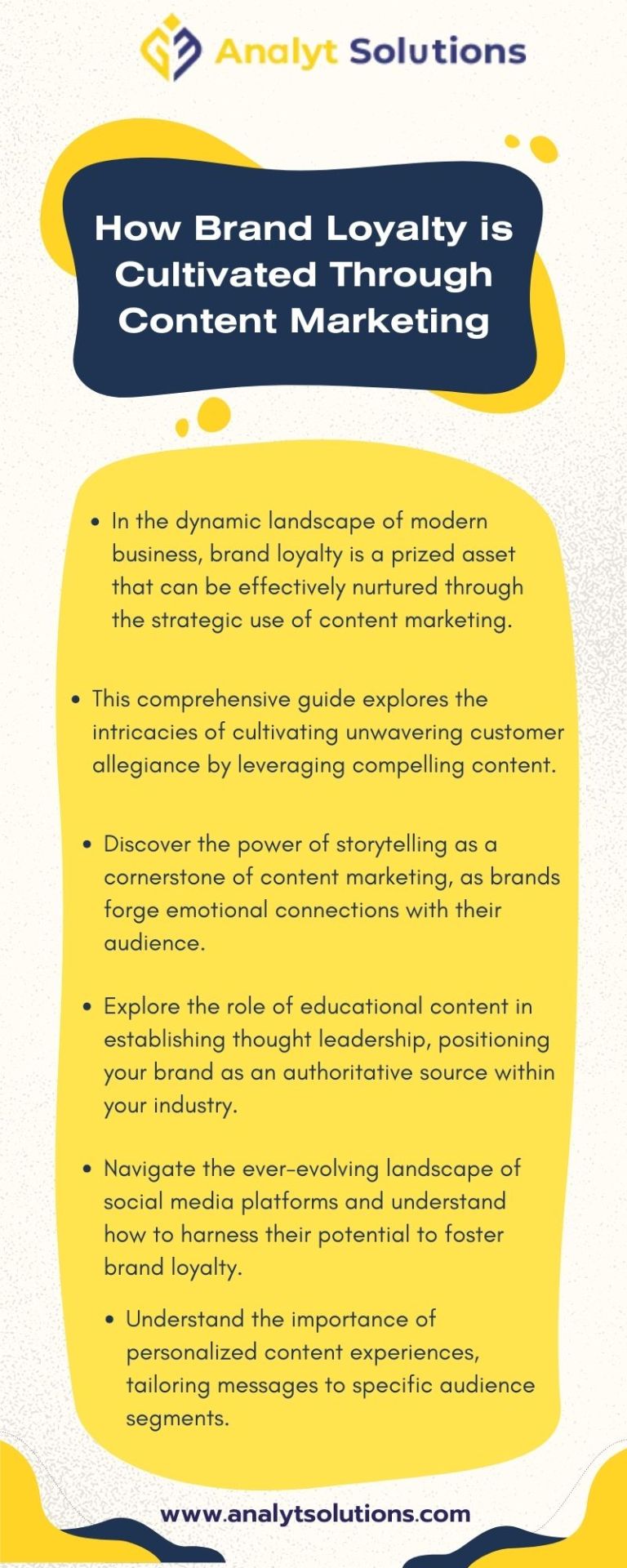
How Brand Loyalty is Cultivated Through Content Marketing
Dive into the dynamic landscape of Content Marketing in NJ. Analyt Solutions brings you insights into crafting compelling content that resonates with your target audience. Elevate your brand's online presence through the power of infographics. Reach out at +1 (201)-857-7538.
#digital marketing agency in nj#web design company in nj#content marketing agency nj#conversion rate optimization agency nj#seo company in nj#ppc management agency#social media marketing agency nj#about our company#our team#digital marketing and web development#ecommerce website#website traffic#mobile conversions
0 notes
Text
#web development Agency#web development Agency London#web development Agency in UK#web development Agency in#united kingdom#design web development Agency#web development Agency near me#best web development Agency#web development Agency manchester#web design Agency new york#web development for business#services of web development Agency#web development Agency about us#web development Agency us#Usa web development Agency#web development Agency Canada#web development Agency in California
0 notes
Text
-
#i wish someone could give me a bunch of money so i could go back to school without having to worry about paying my bills#i so desperately want a web design/development degree#i could get one in a few semesters but i just don’t have the means right now :(#plus i’d rather go to school full time instead of part time plus work#GAH#i just think i’d be really good at web design and i want to make a career out of it 😭#moxie.txt#delete later
1 note
·
View note
Text

#Digital Marketing Course in Nagpur | Best Digital Marketing Course in Nagpur#Join now and you will learn:#✔ To design and develop powerful modern web applications that form the foundation for apps and websites.#✔ About Website Creation#Design#Search Engine Optimization#Social Media Marketing#Email Marketing#and Digital Marketing Strategy and Planning from experts.#✔ The entire depth of a computer system application#Contact us:- 7030772573#Visit us:- https://lnkd.in/dyXt7J2S#.#softwareinstitutenagpur#digitalmarketing#marketing#socialmediamarketing#socialmedia#business#seo#branding#marketingdigital#onlinemarketing#contentmarketing#marketingstrategy#digital#marketingtips#smallbusiness#webdesign#design
0 notes
Text
The Top 10 Freelancing Websites: Your Guide to Remote Work Opportunities
Upwork (www.upwork.com)Fiverr (www.fiverr.com)IntroductionOverviewUser Experience and InterfaceDiverse Freelancer CommunityAffordability and FlexibilityConclusionFreelancer (www.freelancer.com)Toptal (www.toptal.com)Guru (www.guru.com)99designs (www.99designs.com)Empowering Creativity and Collaboration:How It Works:Diverse Design Categories:Community and Collaboration:Security and…

View On WordPress
#all about freelancing#best freelancing sites#fiverr freelancing#freelance agency#freelancing#freelancing account#freelancing and copywriting#freelancing and taxes#freelancing apps#freelancing apps for students#freelancing as a graphic designer#freelancing as a software engineer#freelancing as a web developer#freelancing definition#freelancing jobs#freelancing jobs remote#freelancing meaning#freelancing websites#how to start freelancing#upwork freelancing#what is freelancing and how does it work
0 notes
Text
‧₊˚🕷‧₊˚ 𝐬𝐩𝐢𝐝𝐞𝐫-𝐰𝐨𝐦𝐚𝐧!𝐞𝐥𝐥𝐢𝐞 𝐡𝐞𝐚𝐝𝐜𝐚𝐧𝐨𝐧𝐬 ‧₊˚🕷‧₊˚
cw: nsfw and sfw themes ahead. mentions of a strap, sex, bondage, public sex, pussy eating, etc.
ᯓ★
𝐬𝐟𝐰:
✶ she developed her webs in joel's garage. he damn near had a heart attack when he caught her stuck to the ceiling of her room after her taking a "sick day" from school. very early stages of her spider-woman era, but joel still teases her about it. he tells you the story once ellie lets him know that you know.
✶ she has a bad habit of not pulling her punches. she can't quite help it — joel didn't raise her to play nice with others like that. especially others who like to prey on innocent people.
✶ she doesn't like calling herself a super-hero. she's not one, really. she'd say she's a vigilante more than anything else. she's very adamant about it. its endearing.
✶ she absolutely loves giving the cops a hard time and she takes credit for every bad guy that gets caught. she's known for making them go on wild goose chases and exhausting their "resources" too. she makes them work for the arrest. if she's busting her ass every night, they should be too. joel (captain miller...) is not very fond of it.
✶ speaking of captain joel, thats the only reason she really helps the cops. otherwise, she wouldn't be handing them these arrests. there's certain things the cops can't do that a vigilante can. and if captain joel turns a blind eye, so will everyone else.
✶ because she's got a healing factor, she smokes. she smokes more around the holidays. she’ll go through a pack a week if she doesn’t reel herself in. she usually doesn’t, honestly, but such is life.
✶ she loves seeing little kids dressed as her. she does her best to interact with them when she's making rounds.
✶ villains don't really like fighting her because she doesn't dodge. she'll take the hits because she just doesn't care. its a sight to see, really — this chick with her suit ripped up, hands relaxed at her sides, staring straight at whoever just threw the punch. make sure to clear the area if she starts laughing.
✶ she has perfectly curated playlists for her swinging sessions. only join her if you're prepared to invest in good headphones so she can share her playlist.
✶ she takes you around the city if you don't want to take the train, bus or a taxi. its just easier, honestly.
✶ super dork. loves comic books and she was ecstatic to design her first suit. she keeps it in the back of her closet to look at every now and then.
✶ she's a photographer for the local paper. guess who always gets the best angles of spider-woman?
𝐧𝐬𝐟𝐰:
✶ she uses her webs for things she probably shouldn't. she likes tying you up and using you to her hearts content. she'll web your mouth shut if you don't quiet down.
✶ she's insanely strong so if she's out of webs, she'll just hold you down herself. she's got a bad habit of doing it anyway.
✶ she's also very flexible. it comes in handy when you want to have your way with her, too — knees pushed to her shoulders, your tongue lapping up every drop of slick that drips out of her cunt.
✶ she loves fucking you with the mask on. you don't admit to having fantasized about it, but she clocks you as soon as you guide her hands to your ass one night after she came back from patrol.
✶ she'll take you to the highest skyscraper just to fuck you over the edge. it takes a few times to get used to the swoop! in your stomach when she takes you up there the first few times, but now its just a part of the foreplay.
✶ she'll snatch you up when you least expect it and then eat you out in an alleyway if she's missing you that bad. she just can't help it.
✶ she really likes roleplaying, specifically when you pretend to be in trouble and she comes around to rescue you. how else do you expect to repay her if not by riding her strap?
✶ she's very possessive when she's a civilian with you. and she hates that she can't be loud and proud about it when she has the mask on. at the end of the day, though, its her tongue in your cunt as you whimper her name. such is life when your girlfriend is spider-woman.
✶ she's the worst at flirting but can't help dirty talk in bed. it just falls off the tongue.
#sooooooo..... do we like?#ill post more.....#also working on smth for abby but i shan't share until its done#can't forget abt the abby bear#but also would anyone want a fic lmao#im thinking abt writing a one shot#its the spiderman fan in me#ೃ⁀➷; ellierium writes#ೃ⁀➷; ellierium is a yappasaurus rex#ellie williams x you#ellie x fem reader#ellie williams x reader#ellie williams x female reader#ellie x reader#ellie x y/n#ellie williams tlou#ellie williams#ellie williams x y/n#ellie williams headcanons#ellie williams smut#tlou2 fic#ellie tlou2#ellie tlou#tlou2 fanfic
901 notes
·
View notes
Text
I have gotten a lot of messages saying that they really love the presentation of CURSE/KISS/CUTE. Often the commenter in question can’t say what exactly it is about the formatting that they appreciate, but that it just reads well and looks good. Well!!! Allow me to bare my wealth of secret knowledge for you once and for all:
I sorta just did some research into book typography...?
Here’s something you should know about web development, alright: typography on the web is really, really bad. The tools we have at our disposal—HTML and CSS—are incredibly powerful, but they are set up to fight you every step of the way towards Good Typography. When you know what you’re looking for, you can fix all the common issues quickly and easily. But it’s not easy to know what to look for, because
problematic typography is overwhelmingly the norm on the web, and
good typography is invisible.
Here’s a screenshot from CURSE/KISS/CUTE episode 0:

Now, I don’t want this post to come across as prescriptive. It is not my intention to tell you, “This is what good typography looks like, so follow my lead exactly.” I made a lot of choices with the typography of my web novel: many of those choices would not make sense in other contexts. What I want to convey to you is what those choices are, so that you will know they’re available to be made.
I mentioned that the web “fights you” when it comes to good typography. What do I mean by that? Well, check this out:

This is how that passage of text renders “by default.” In other words, this is how a web browser would render that text without any input from me about what styles to apply. It kind of sucks ass! But it also looks pretty familiar, right? This is not that far off from how a lot of websites—even websites full of prose (looking at you, AO3)—render text.
I think the most illustrative thing to do here would be to walk you through my thought process and show you, step by step, what decisions I made to turn this unstyled text into the styled version you see in the novel.
So, first things first:
1. We have got to shrink that text column.
Computer monitors... are wide. They are wider than they are tall. They are so wide, and they have so many pixels. This means you can fit a lot of characters on them. If you wanted, you could just have a wall of characters from the left side of the screen all the way to the right side. Talk about efficient!!
You should never, ever, ever do this.
This is one choice that I actually will make a prescriptive statement about, because it’s supported by quite a lot of research: fairly narrow text columns are more legible. Specifically, research seems to support the idea that a width in the range of 50 to 70 characters per line is the most comfortable for people to read*. Every font is different, so it takes a little doing to turn that “characters” figure into a pixel measurement; I went with 512 CSS pixels for the maximum width of my text column:

Isn’t that just so much nicer to read already?
*A commenter reminds me that I’d be remiss not to point out that the research on column width legibility isn’t completely conclusive. You do want to limit the width of your text columns, but going over the 70 character-per-line recommendation isn’t necessarily the end of the world, and you might have good reasons to do so. I did not: as mentioned, one of my goals was to mimic book-style typography, and books by nature have fairly restrained column widths, on account of they’re books.
2. Picking a font.
I’m not going to give you the blow-by-blow on how I decided what font to use. The short story is that I asked some designers, and one of the recommendations I got was the free font Crimson Pro, which I took a liking to immediately:

It’s just an all-around attractive serif font, but one thing I really like about it for use in a novel is its highly-visible quotation marks. They’re just kinda jumbo! They’re real big! Easy to see! In a novel, those things aren’t just ornamentation. It makes a great deal of practical sense for them to stand out just a bit. It also has a fairly large x-height, unlike a lot of the more traditional options, which is good for legibility on a computer screen.
3. Adjusting the line-height
Web browsers default to a line-height of about 1.2em, which, as you can probably tell, is quite cramped. If you go and Google “optimal line height for legibility”, you’ll get a number of results right off the bat suggesting 1.5em. Sounds good! Let’s do that:

Well... hmm. That’s definitely an improvement, but between you and me, it actually looks a bit too spacey to my eyes. I wonder why?
I’ll cut to the chase: the 1.5em recommendation makes some assumptions about the font you’re using. In Arial, the letter “A” is about 0.6em tall; in Crimson Pro, it’s about 0.5em. That means that there’s no one-size-fits-all solution to spacing your lines, because different fonts have different amounts of empty space baked in. How annoying!
Let me tell you something about the kind of nerd I am. When I had this realization, I grabbed some books off my shelf and pulled out a literal micrometer. I started measuring the line-heights against various font features to see if there were any patterns I could spot in professional typesetting. Here’s what I found:

Almost every book on my shelf spaces lines such that the distance between one baseline and the next is about three times the x-height. How cool is that? I clapped my hands like a seal when I put this together.
Adjusting the line-height to match what I observed in the wild gives us this:

It’s a subtle difference, but to my eyes it feels just right. It’s almost like magic!
4. Paragraph spacing...
Let’s address the elephant in the room. Probably the most controversial choice I made with CURSE/KISS/CUTE’s typography was to opt for book-style paragraph indentation rather than web-style paragraph spacing—like so:

I did this for a few reasons:
It’s what I’m used to. I’ve read a lot of books, and this is just the way that books are formatted. I think for something aspiring to the title of “novel”, there’s value in making it look the way a reader probably expects a novel to look.
A novel has a lot of paragraph breaks in it. A paragraph in, say, an encyclopedia entry might go on for half a page or more; whereas it is unusual for a paragraph in a modern work of narrative prose to run for more than a handful of sentences, especially in any scene with dialogue. Because paragraph breaks are so common, spacing between paragraphs in a novel results in a lot of wasted space. Also, subjectively speaking, the additional space seems to me to lend an undue amount of weight to paragraph breaks. I’m just starting a new thought; there’s no need for a 21-gun salute, you know?
Having said that, here are some good reasons you might decide not to do paragraph indentation anyway:
Doing it right requires a bit of extra legwork. Notice how the very first paragraph in the image above has no indentation. That’s because it’s the start of a new section, and the first paragraph in a section traditionally goes unindented. This is an easy detail to miss, and it can be difficult to wrangle CSS into doing it for you automatically.
Web users don’t expect it. For the first decade of the web’s existence, there was no good way to do paragraph indentation; by the time CSS rolled around and made it easy, paragraph spacing had already become the norm. And while CURSE/KISS/CUTE may be a novel, it is also, specifically, a web novel!
But it’s my house and I get to make the rules, so I went with indentation. Incidentally, there seems to be a dire lack of research into the question of whether indentation or spacing is more legible for readers—but the data that does exist appears inconclusive at best. So, the choice really does come down to vibes.
5. The tragedy of justification.
You’ll note that one way in which I did not make my web novel look like a paper novel is the text alignment. It’s un-justified: the right margin is ripsaw-ragged.
This is because it is not possible to justify text on the web.
Oh, you can try. Look right here: there’s a CSS property for it and everything. Just turn on “text-align: justify” and...

Nightmare! The interword spacing on that first line is almost as wide as the indentation!
Reader, I’m afraid that your web browser is simply too dumb. That’s not the browser’s fault: robust algorithms for justifying text without creating these distractingly huge gaps between words have existed for many decades, and modern computers are powerful enough to run them in real time with little performance impact. It’s just, uh—nobody has ever bothered to implement them into web browsers. It is the damnedest thing.
I tried, I really did. You can mitigate this problem a bit if you enable automatic hyphenation, but browsers are unfortunately also kind of dumb at hyphenating. Firefox, for example, will refuse to hyphenate any word containing a capital letter, so any sentence with a lot of proper nouns in it is a lost cause. I tried manually inserting soft hyphens with a text preprocessor I wrote myself, but still these overjustified lines plagued me: when the text column narrows, for example on a phone, even hyphens can’t save you. The line-breaking algorithm is simply too naïve to optimize for well-justified text, and that’s not something you can fix as a web developer.
As a result, my heavy-hearted recommendation is to never use text justification. It’s just too distracting.
6. And then some extra stuff just for me
I added drop-caps because it looks neat and I made the ellipses spacier because I think it looks good when it, uh, when they are spacier. I think that looks pretty good that’s just my opinion though.
That’s all! Hope you learned something bye!!!
527 notes
·
View notes