#also I find it really neat . how well all their color palettes mix???
Text
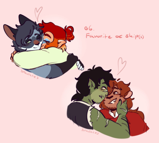
Oc-tober Day 6: Favorite oc ship(s)
DOUBLE GAY PEOPLE JUMPSCARE because I could not choose just one out of these two - both these relationships mean the world to me they're so sweet <33
(Moka belongs to @coffiicorgii)
Prompt list under the cut!
Prompt list made by Askanslostfins on tik tok
#also I find it really neat . how well all their color palettes mix???#like how there is mainly reds/oranges + blues + greens . I did not notice that at first#oc-tober#oc tober#oc tober 2023#october challenge#dnd#art tag#oc tag#oc: Adelia#oc: Zhēnlián#oc: Angus Thistle#rnr
5 notes
·
View notes
Text
follow up to this ask! this time im just gonna be talking about my coloring process (i also want to let you all know that im not an expert in color theory since im still learning, im quite literally just going random bullshit go on the blending modes 💀 lots of explanation under the cut)
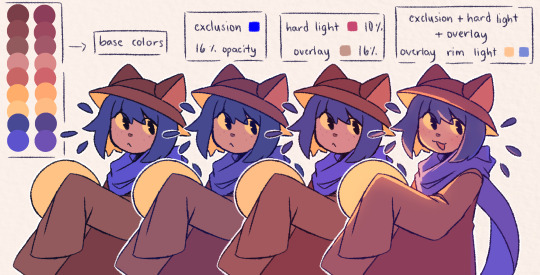
the three blending modes i mainly use are exclusion, hard light, and overlay. from the guide above you could see how the blending modes work on their own, and how they look like combined altogether. the cool thing about blending mode layers is that it really is all about experimentation and finding the best combination for a piece (also to any fellow inabakumori enjoyers GRAHH lagtrain pose jumpscare)
i went through a bunch of blending mode phases before i ended up with those main three, though it's funny how ive been using the same overlay color for about 4 years now (multiply used to be one of them, and i still use it from time to time, just not as much). im gonna be honest the whole reason why i know about blending modes being helpful was because one time i accidentally had the fill bucket on and had a certified eureka moment 😭
the best way i could explain these three modes is:
exclusion - honestly i still dont understand how it works either 💀 when i use a really saturated blue color and lower the opacity, it gives a cooler feeling to the palette. feels like a mix of multiply and overlay with how it adjusts the colors without making it darker
hard light - gives more saturation and color
overlay - gives off a glowy effect, especially if the lineart isnt completely solid (this is why it isnt clipped on the folder as shown in the example below, keeping it above the layers gets that glowy effect)
i still use the same colors for exclusion and overlay (while i do alter them with hue saturation brightness from time to time, i just use the same blue and brown for most of my works) though hard light is what i use to make drawings lean towards a temperature
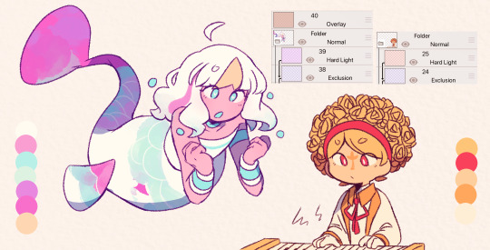
i tend to use warm colors a lot because i think theyre neat and also im biased sorry <3. as a warm palette example, i drew yinu and used this orange color on hard light and lowered the opacity
cold colors have a similar process, it's just the matter of adjusting the hard light layer. i wouldnt really say it's completely cold since i still add warm colors because im still biased </3. as a cold palette example, i drew sayu and used this purple-pink (??) color with the same settings
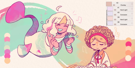
when it comes to drawings that have characters with contrasting palettes, it does take a bit of trial and error but i most of the time i mix both warm and cold methods like the example above. this also helps for art with several characters in general, since the blending modes help make the colors go well together despite the variety
theres also instances where i dont always use the warm + cold combo, since sometimes drawings lean towards a specific temperature instead (like environments with set lighting/shading, so usually i follow that even with characters with different palettes)
tldr; there are lots of palette combos you could make, not necessarily with just the three blending modes i mention. random bullshit go genuinely helps with experimenting with colors!!
#chiimo art shenanigans#uhhhh should i tag the fandoms these characters are from#fanart is fanart ig???#oneshot#oneshot niko#no straight roads#nsr#chiimo ask shenanigans
139 notes
·
View notes
Text

"The Record Store"
These types of stores are always a neat place to visit if you happen to have any interest in music.
While they're probably not as easy to find nowadays since many prefer the digital route when it comes to getting music, they're definitely worth seeking out to take a look. You can find all sorts of records here.
A rare cassette bootleg from an indie band, a out of print album that's only available on vinyl, a famous album that managed to find its way in the bargain bin, or tons upon tons of one dollar soundtrack CDs that are usually ignored.
But on top of finding different kinds of records in these stores, you can find all kinds of people too. Music lovers, casual browsers, music collectors, audiophiles, and sometimes musicians.
And when you bring all these types together, you get all kinds of conversations too!
Record Collector: "I'm telling you, a Japanese import of this Cars album can go up ten times as much as this used one. The sound quality is amazing compared to this!"
Casual Browser: "So I'd be dropping an extra grand just to hear less cracks and pops?"
Max Goof: "...oh sure, and Powerline's my older brother!"
Grunkle Stan: " No really, I know these guys. Let me tell you how I once got in a slugfest with Henry Rollins at Lollapalooza!"
Phillip J Fry: Weird, I thought these things died out before I went to the future. ( looks around) I am still in the future aren't I?"
Wakko Warner: "Hey, Rumplestiltkin! Can I look at that when your done?"
Groundskeeper Willie: "Ay. Sure thing, laddie. Just don't call me that again."
Seller: "You sure you can't take em? Only half of these skip!"
Record Store Guy: "Sir, we only take non warped records here. Begone, record warper!"
This is one of the places I always try to go to whenever I get the chance.
One thing I love aside from drawing is collecting and listening to music. And most of my musical tastes were forged from the various finds that caught my attention within these stores.
I don't visit these places that often nowadays, one because I rarely have the time, two it gets really expensive. You'd be surprised how much money you can end up burning through just from going through the bargain bin selections week after week.
So I wanted to do a new crossover fanart piece that's loosely based on my experiences in visiting these stores. While I tend to go for a retro look in my artwork already, I decided to do something different by using a standard comic book color sheet. One that contains only 64 colors. While I did end up doing a lot of extra color mixing further down line, I mainly kept with colors in the pallete, one so I would have less difficulty in choosing colors, but also so it would have more of an old school look.
Here's a link below to the various comic book color palletes if anyone is interest in trying that out.
http://www.madformidcentury.com/2013/10/mid-century-color-palette-in-comics.html#.ZCujJXbMKM8
See how many characters you can spot here! And for a harder challenge, see how many album covers are here as well!
#crossover fanart#digital painting#traditional drawing#mixed media#pen and ink#made with krita#cartoon characters#disney xd#nickelodeon#cartoon network#fox animation#warner bros animation#gravity falls#hey arnold#class of 3000#futurama#animaniacs fanart#a goofy movie#rick and morty#the simpsons#grunkle stan#max goof#wakko warner
90 notes
·
View notes
Note
MH and EMH with reader who wears mixed matches clothes, like bright colors with dark colors, crazy hair dye colors, different colored shoes, socks, yk? ✨a colorful and dark mess✨
꒦꒷꒦꒦꒷꒦꒷꒷꒦꒦꒷꒦꒦꒷꒦꒷꒷꒦꒦꒷꒦꒦꒷꒦꒷꒷꒦꒦꒷꒦꒦꒷꒦꒷꒷꒦
Warnings: HABIT is here
Author’s Snip: I too, like to mismatch some of my clothes so this was nice to think about
Notes: I felt like I kept saying the same thing. So if this is boring, my bad.
I’ll shut up now. Enjoy! And don’t be afraid to request.
꒦꒷꒦꒦꒷꒦꒷꒷꒦꒦꒷꒦꒦꒷꒦꒷꒷꒦꒦꒷꒦꒦꒷꒦꒷꒷꒦꒦꒷꒦꒦꒷꒦꒷꒷꒦
Marble Hornets
Tim
I think he'd like it actually
Just a little
It's something different and kinda weird, but in a nice way
He wears and likes bright and funky colors
I don't know when the color palette changed for our man but I know we all saw him in Alex's film footage wearing that yellow tied-eye shirt
You guys can wear funky colored clothes ✨together✨
Brian
Brian would like your unique fashion too
He just thinks its fun
He honestly thinks you're really cool
Brian will tell someone off it they make fun of your clothes
I don't know why but I feel like he will just love being out in public, like on a date, with you
Jay
Jay tends to where more neutral clothes. Not too bright of colors or too dark. Nothing fully mismatched
So standing next to you is something for sure
I think he won't really comment too much on it
He does find it interesting but that's kind of just it
Alex
I feel like he would also enjoy this but it depends what Alex we're talking about
I'm gonna go with pre-mh events Alex cause that gives me a bit more to work with
So in the sense. He likes it a lot
I feel like Alex in general likes people who are "out there"
So you're choice in clothings is something that he likes about you
Might just ask and want to know why you dress the way that you do
Simply out of curiosity
EveryManHYBRID
Evan
Man he's so fucking into this
Evan's a neat and funky guy and I think he'd enjoy your weird taste in clothing and mismatching pretty neat
Similar to Brian, he'll tell someone to leave you tf alone if they try to make fun of your clothes
He likes seeing what outfits you come up with each day
He likes seeing what you can do
Vinny
Doesn't really comment on it
But he does like the way that it makes you stand out
I'm gonna be honest he doesn't know how to handle someone as brightly colored as you he feels like Scot with Ramona
He doesn't know how to feel
I mean this in the least rude way possible but Vinny is the graham cracker of men
Jeff
Since you wear dark clothes with bright clothes, and he wears some pretty dark/grey clothes sometimes
He will gladly let you have some of his clothes to use as part of your outfits
He likes your sense of clothing
It just looks so weird and different /pos
Compliments you all the time
HABIT
This bitch wears weird combos of clothes too tf?
Join the club bb
Honestly likes it a lot too
You guys can wear weird clothing combos together and he loves that
Love it when you come up with something new as well
#marble hornets#everymanhybrid#slenderverse#mh tim#mh jay#mh brian#mh alex#mh jay merrick#mh brian thomas#mh alex kralie#mh tim wright#emh evan#emh vinny#emh jeff#emh habit#vinny everyman#evan myers#jeff koval#emh evan x reader#emh vinny x reader#emh jeff x reader#emh habit x reader#mh tim x reader#mh alex x reader#mh jay x reader#mh brian x reader#slenderverse x reader#everymanhybrid x reader#marble hornets x reader
62 notes
·
View notes
Note
man i just rly adore ur colors!! how do u go about choosing them? urs fit really well with the mood while also still remaining like they fit the color palette of a character. i feel mine end up super boring 😓
Hello anon, thank you for asking, I’ll try to explain my process, and I hope it makes sense!

Once I have some lineart done, I usually just put down some colours, they don’t have to be accurate, but they still fit the characters. It’s messy, and I use a brush that blends too, so some of the colours mix together.

Gradient maps/sets are great, I use them all the time on every piece. You can also just put down a lot of different colours on a picture, and work on it that way.

I use a lot of gradients, to help me build up interesting colours. Even though it may not show in the end result, it is a start, a base, that I can continue to build on. A strong base of colours is your goal, whether they are soft or saturated.

It doesn’t seem like much, but there is a difference, and even a little bit of a colour change can help you along. You can be very subtle or very bold with your choice of colours and gradients, there really isn’t a wrong answer.


The difference between these two pictures, is that I used some more gradients + a multiply layer to add shadows. I love warm, dark colours. I’m not a professional artist, and when I work on a picture, I tend to go with what looks good, rather than what looks realistic. I put down colours and shade in ways that I personally find interesting, even if it isn’t totally accurate

Here’s an example of my layers. I build my colours using gradient maps/sets/overlays/screens, etc. Experiment with colours, learn some colour theory, even if you only know a little bit, it can help. I erase what I don’t like from a gradient, and keep what I do like. I always check my original layers and make sure I don’t lose colours that I find interesting. I work those colours back into the picture.


From here, I paint, and just work on the picture using the colours and shadows I have made. It can be messy, or neat, whatever you feel is best for your art.

Add effects, additonal colours, edits, whatever you like, it’s all up to you! I hope this helps at least a little, and I’m sorry if it’s confusing at all.
494 notes
·
View notes
Note
hi! i was hoping i could request a danganronpa and mha matchup? i use they/she pronouns and im bisexual! i think i might be a demigirl and demisexual. im a gemini and an INFJ-T. i like cats and iced coffee. i dont like crowds, public speaking, school, etc. i listen to emo music the most, but i also like listening to metal and goth music! im emo and my closet consists of black dresses, belt corsets, fishnets/stockings, and platform shoes. my clothes color palette just consists of black (unless im not out). im 5'3, blonde, and i have a (very grown out) pixie cut with two longer strands in the front of my face and bangs! my hair is dirty blonde. my hobbies include playing video games and researching/practicing witchcraft! i think i kin chiaki and jirou.
i have a blood phobia and a fear of the dark and bugs. i'm veryyyyy indecisive. i'm much more of a follower than leader, and i usually go with someone else's decision rather than mine. i dont like arguing and i try to avoid it. think i get really jealous with people that i'm attatched to. i'm an introvert and i've been diagnosed with social anxiety. im also a little gullible lol and im pretty forgetful
i would like to own a bakery when i'm older and become a professional baker. i also have two cats that i adore a bunch! i'm a cat person over a dog person.
thank you if you do my request!!
Sure thing Anon! I hope you like it!
I match you with….
.
.
.
.
.
.
.
.
Momo Yaoyorozu, Eijiro Kirishima, and Sonia Nevermind!
I chose Momo because I think she would honestly balance you out well. Although she is a bit more preppy, she doesn’t mind the punk vibes (seeing as Jirou is like her bestie) and probably enjoys a bit of the music so you two could start an interaction through that. However, where you are more anxious and indecisive, Momo is a strong leader who can help assist you when need be, even with just staying organized and reminding you of stuff. However, Momo does have her own insecurities and indecisiveness, so she would also be able to empathize with you which could help you both grow. She also isn’t the best at games first, but she picks them up pretty fast so she would be down to play any video game you wanted to with her. She is good at setting up plans, but is also very sweet as a leader and just in general as a person, so I think you two would work out very well together. :)
I chose Kirishima because he is a lovable goofball who is just an amazing guy. He never seemed like the type to judge anyone based on looks or style negatively, and I think he would actually find your darker and emo aesthetic intriguing and neat. He would so be the type to just get iced coffee with you and relax in the car while listening to any music you want to play. He would also be down to ho to shelters to pet all the cats if you wanted to, and to help you bake (he would honestly have fun doing whatever with you.) he would also be amazed by your witchcraft interest and would watch you in amazement whenever you researched or practiced it.
I chose Sonia because she seems like a mix of both the things I saw in Momo and Kirishima for you. Sonia is a good leader who can help you make decisions and ease stressful situations, but is also very kind hearted and considerate. She is also lighthearted and goofy, and loves the darker vibes (seeing as how well she gets along with Gundham). She would definitely be down to help take care of your cats if need be, to listen to any emo or goth music you wanted to play, to bake cookies with you, or to help you practice witchcraft. Genuinely Sonia would be an amazing partner for all of your interests, and her personality would work well with yours and help balance you out as you would do so for her in return.
#cassierole the ultimate writing prodigy#request 0w0#my hero academia#mha#bnha#boku no hero academia#danganronpa#sdr2#danganronpa matchups#mha matchups#momo yaoyorozu#eijiro kirishima#sonia nevermind
4 notes
·
View notes
Text
Lair Review for TazerPones
whoo! my last one! And what a great lair to end with :)
@flight-crashing
You specifically asked me to pay close attention to your G1s but I’d like to give you some first impressions of your whole collection first. At a glance most of your lair is filled with dragons that stay in the cool color range, and that’s something that I really like about your lair! Purples, blues, blacks, and greens are all among my favorite colors and you’ve done a great job with your dragons.
Beluga

Beluga is such a fantastically put together G1. The greyscale is just something to be marveled at, but I am totally going gaga over how you paired up the pink silks with the subtle lavender in her primary...I mean wow. The veined also goes soooo nicely with marbled and seraph. Beluga truly is a queen amongst genones.
Mar

Mar is a buckwild looking bogsneak. The glowing eyes with the mischievous post of these gals makes for a fantastic combination. I also really like just how well the blues of the poison blend in soooooo nicely with the glowtail gene. Her overall look is so flawless, you’ve used her blues so well in her whole design.
Rose Quarts

I love this proud papa. You’ve married the greys from the white seraph so well with the silvers of the vest and tail bauble. And the matching eyes are to die for. I also found how you incorporated the ice tomb to compliment his goldenrod tertiary. I also love how he gets a happily ever after in his lore where he gets to be so proud of his adopted daughter ;;w;;
Roden

Roden looks SPOOKY and I’m absolutely here for it. Giving him the horns just bumps up that creep factor by ten fold. And I love the small detail where you’ve matched his eyes with the necklace. I just love this funky lad so dang much. I wish him all the best in his (evil?) adventures.
Waverly

Excuse me while I pick my jaw up off the floor because Waverly is stunning. I love how you took peridot and used bee to give it those nice murky greens taht match nicely with swamp. The added touch of using the legbows to match with the lead glimmer is also appreciated. The combined sparkle of the rest of her outfit goes well with her shimmery appearance here, making her such a treat to look at as a whole.
North

I wanted to include North even thought she’s not one of you G1s because of just how well her lore ties in with her outfit. The way the steampunk set is used as a device to help her be mobile again is such a cool story aspect. I love the choices of color here too, the steampunk’s golds pop nicely against her dominant white palette, as do the reds from the bandages. What a fantastic use of storytelling!
Canyon

I enjoy Canyons neutral-red tones and how well they go with the more naturally looking genes. I always enjoy the combination of more natural colors with genes that are based on animals, and canyon here is no exception for that love. Not only does he look great though, he’s got a great...er...personality to boot? Since he has no brain I’m...wondering if there’s much to go off of there, but REGARDLESS of his head being empty it’s still a neat character trait to include.
SirBreunor

Sir Breunor is a stunning pastel gen one. I love the gradients we get from the Blend and Fade and I can’t wait for that beautiful tertiary to be added into the mix. It’s going to go so well with that. Also those daybreak decorations overtop the cloak is just beautiful. UGh I’m so in love with Beunor’s aesthetic.
Gawain

ok so I’m probably incredible biased with Gawain but I love her and can relate to this dragon because it’s my own goal to become a veterinarian ;w;
Apparel-wise I love how you’ve meshed the purples from the Herald’s Wrap and her tertiary (and speaking of that tertiary...those matching eyes are SO lovely). Plus the tail ring to match those reds and oranges is such a neat little detail.
Honorable mention: Medusa

I couldn’t help but notice your plans for Medusa and oh my gosh she’s going to look SO good. I’m envious at how you were able to find blue in both her primary and secondary to match her tertiary. I can’t wait to see her all gened and dressed up!
Thank you for letting me review your lair! You’ve taught me a lot about making the most of G1s even if they don’t quite have a ‘desirable’ color scheme. You’ve really made a beautiful lair out of your collection, thank you for sharing.
3 notes
·
View notes
Photo
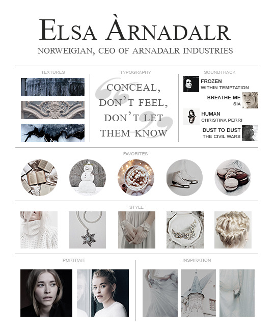
Task 001 : Getting to Know You ✧・゚: *✧・゚:*
What were their best subject(s) in school?
Literature, History, and Geometry.
Do they have any allergies?
She’s not allergic to anything specific, but her allergies every spring and summer can be fairly intense.
What is their opinion on Mystiques and Supernaturals?
Elsa regards them cautiously. She can’t control her own powers as a Mage and doesn’t understand how others not only have full control, but also show off their abilities without any fear. She actually might be a little jealous. When it comes to Mystiques like Fae and Merfolk, Elsa finds them fascinating and beautiful. Supernaturals are darker and often dangerous, but she sees many of them as just misunderstood. After all, is she not dangerous as well?
How they react to being flirted with? How do they flirt?
While she is very intelligent in most all areas of life, Elsa is completely dense when someone is flirting with her. She doesn’t understand the concept of someone being romantically or sexually interested in her and will almost never read someone’s actions towards her as flirtatious. For that same reason, she herself never flirts.
Do they prefer white, milk, or dark chocolate?
Intensely dark chocolate is the only kind she doesn’t like. She thoroughly enjoys both milk and white and struggles to pick between the two.
How are they with children?
Around children she tends to be rather distance/awkward at first, but if the child is sweet then she all but melts.
Are they religious?
Elsa considers herself to be Agnostic.
Which of the seven deadly sins do they most embody? Which virtue?
None of the sins really align with Elsa’s personality, but if I had to pick one I would probably say Envy? Not that she’s a jealous person, she just constantly wishes for something she does not have (control over herself). As for her heavenly virtue, I think she best aligns with temperance. Her whole life has revolved around self-restraint - though it isn’t exactly a good thing.
What’s their sense of humor like?
Elsa isn’t the type to crack jokes, but she can be heard making little sarcastic comments under her breath every now and then.
How do you know when you’ve upset them?
Concealing her emotions is something she’s become very good at, so if she looks/acts upset then you know you really hurt her. She often has to remove herself from situations where she knows she is becoming upset.
What does their room look like?
Back home in Norway she has a nice size room that she moved into after the accident - she used to share a large room with Anna. The walls are covered in a lilac colored wallpaper on all sides of the room. On the opposite wall from the door there’s a large, triangular window with a widow seat. The color scheme is blue, purple, and white. On the left wall is her bed, a nightstand, and her desk. The right wall is covered in bookshelves with dozens upon dozens books from her childhood into her teenage years.
Here in Porthaven, her apartment is very sleek and minimalist. It’s modern, but has a slightly rustic feel to it.
Do they have a favorite color?
Blue. More specifically: icy blue or teal. Though she really likes purple as well.
What do they usually eat for breakfast?
Since taking over the company she’s found herself increasingly more busy in the mornings and often skips breakfast. She often picks up a cup of coffee and a muffin or danish on her way to work. On the weekends when she actually makes an effort to have something substantial for breakfast she enjoys a small fruit and cheese platter with some sort of bread and a soothing cup of tea. Or crepes!
At what time of the day are they most productive/have the most energy?
Elsa doesn’t have much of an issue with being productive except for in the evenings when her energy begins to drain.
How do they handle money?
Elsa is very careful with her money and prefers saving to spending. Outside of necessities she doesn’t often shop for herself. The only time she “indulges” herself is when she occasionally buys herself an expensive clothing item for a formal event. Anna’s spending habits are more difficult to control, but Elsa doesn’t often reprimand her sister about it.
When a craving kicks in what’s the first thing they go for in the kitchen?
Macarons! As a child she used to sneak into the kitchen late at night and bring some back for her and Anna during their midnight adventures. In her current apartment she keeps a small container of them in a cabinet for whenever she needs a sweet pick-me-up.
Are they patient?
Incredibly so, though she does have her limits.
What’s their favorite kind of weather?
Elsa may not like that she has magic, but she truly does love the snow. It’s the weather she feels most comfortable in and she finds it absolutely beautiful.
If they were to attend Hogwarts which house would they be placed in?
Ravenclaw! Once Elsa begins questioning something, she develops an intense need to understand and learn more about it. She also loves learning for the sake of learning and loves to read classic literature. Elsa has incredible creativity, but she puts restraints on herself that limit her expressiveness and individuality.
What is their voice like?
That depends on who she’s talking to. Those closest to her are see a side of her that is gentle and soft-spoken. She sounds lighter and more genuine. At work, around people she finds gruesome, or when she is feeling cautious her voice becomes cold and formal. She can take on a very authoritative tone. For Anna, it’s often a mix of both. Elsa tries to be as gentle and warm as she can to her sister, but often has to become more firm if Anna begins acting out or starts getting too close.
Do they feel like their astrological sign is accurate?
Certainly not. Elsa doesn’t know a whole lot about astrology, but from what she’s heard about Sagittarians remains entirely confused as to how she could be classified as one. She feels much more connected to the star sign that comes the day after her birthday: Capricorn.
Which of the four elements do they feel the most connected to?
Water, of course. Though she does sometimes feel an odd pull towards the other elements. Like she’s drawn to them somehow. She’s not sure if it’s just her mind playing tricks on her or something to do with her being a Mage.
What’s the easiest way to annoy them?
Push her beyond what she’s comfortable with or is willing to permit. People who repeatedly questions her gloves also tend to irritate her.
Can they dance?
She can, but won’t.
What’s their personal style? What do they most often wear?
Multiple layers. Lots of turtlenecks and long sleeves. Color palette consists of blue, teal, dark purple, white, and black. Hair in a neat bun whenever she leaves the house. Minor gold or silver accents. Always gloves.
Are they affiliated with any political groups?
Elsa tries her best to stay out of politics, both for the sake of her company and because she just finds them exhausting.
What is their favorite hobby?
Reading! It’s what she spends a great majority of her free time doing.
Where were they born?
Arendelle, Norway (fictional city located along one of Norway’s many fjords)
What is one question they’ve always wanted an answer to?
“Why was I born with magic?” Her parents never found any trace of Mages in their family tree, nor any other reason as to why Elsa was born with magic.
How do they sleep?
She’s a very light sleeper and is prone to waking up to any noise outside her room. Often has trouble sleeping as well and takes melatonin on the nights she’s most restless. Usually wakes up in the same position she fell asleep in.
What’s their favorite game?
Chess, and she’s very good at it.
Are they a very private person or, for the most part, an open book?
She is incredibly private. The only person who’s really seen a deeper side of Elsa is Anna. If she shares something personal with you without feeling obligated to, then you are a special person. It takes a while for that to happen though. She tends to keep to herself and doesn’t like discussing private matters with anyone outside of her sister.
Have they ever had or currently have any pets?
Anna and Elsa always wanted a pet when they were little, but their parents didn’t think it was a good idea. She currently believes herself to be too busy for a pet of any kind.
Do they have any reoccurring nightmares and/or dreams?
It’s rare that Elsa dreams. Or if she does, she never wakes up with an idea of what it could have been about. On various occasions she does have a reoccurring nightmare - the night when she almost killed Anna. As she’s gotten older the nightmare hasn’t occurred as frequently, but it still makes occasional appearances. On days when she isn’t feeling good she often goes to sleep with her gloves on in case her negative emotions follow her into her dreams as well. As a child she would sometimes wake up from a bad dream to her room covered in ice. It seems like even when she drifts into her subconscious she still can’t control her powers.
Is there a music genre they prefer over all others? How about one they can’t stand?
She adores classical music and often has it playing quietly in the background whenever she’s home. Doesn’t care for most other music genres, as she prefers instrumental songs over those with lyrics.
Have they ever played any sports?
Never on a team or competitively, but she does have a talent for ice skating.
What things make them feel the most comfortable/relaxed?
Being alone (oddly enough), reading, a mug of hot chocolate, and being somewhere high above the ground.
How intuitive are they? Can they read people easily or are they oblivious?
Elsa is pretty intuitive. She’s very wary of people so she looks into everything way too much. She isn’t oblivious to other people’s feelings either, but often feels like she has to ignore them for the sake of keeping her formal composure.
What are their eating habits/typical diet?
Elsa doesn’t eat much. She doesn’t intentionally avoid meals of course, she just often forgets to eat. She’ll get absorbed by work or a book that it’s not until a while later that she feels any hunger. Most days she just has a cup of coffee and a muffin or some other pastry. Lunch is usually whatever she can get ordered to her office. If she’s home then she tends to just lightly snack throughout the day rather than sit down to have a proper meal. She used to be a picky eater, but boarding school helped force her to expand her diet.
Do they have a favorite season? What about a favorite holiday?
Winter! Nothing matches the excitement she felt as a child when she would wake up to the first snowfall of the season. She and Anna would rush outside and spend all day making snowmen and sledding, then cozy up by the fireplace in the evening with their parents drinking hot cocoa. Even after those days were over, she still enjoyed watching other children play in the snow outside. She considers the icy patterns on her window during the winter to be one of the most beautiful things in nature. Her favorite holiday, Christmas, also happens to fall within the winter season.
Are they ruled by logic, emotion, or some combination thereof?
Elsa considers herself to be a very logical person. She thinks with her head before her heart and tries not to let her emotions get in the way of her life. However - whether she’s aware of it or not - many of the important decisions she makes are driven by fear. Fear keeps her from letting people in and being open to new possibilities.
How do they feel in regards to their sexuality and/or gender?
Elsa has always felt comfortable being a woman, but her sexuality is something she’s uncertain of. She tries to never actively think about or question it, but as a teenager it was something that sometimes took up the residence in the back of her mind.
What’s their most distinguishable/noticeable feature?
Definitely her hair. It’s incredibly light - almost unnaturally so - and she keeps it very well taken care of. Unfortunately she usually keeps it up in a bun, so no one really knows it’s true length or volume except for Elsa herself and probably Anna. She also has piercingly blue eyes and very fair skin that help people instantly pick her out from a crowd.
Do they have any particular speech patterns or mannerisms?
She tends to fiddle with her gloves whenever she’s uncomfortable and is prone to keeping her arms crossed at all times. When a stray lock of hair slips out from her bun she is often seen repeatedly tucking it back behind her ear rather than trying to place it back in her updo.
Can they speak more than one language? Do they have an accent?
Elsa is fluent in Norwegian, Danish, French, and English. Since she is from Norway she has a Norwegian accent, but it is slight since she’s been practicing her English since she was a child.
What’s their opinion on Porthaven, Maine?
Her opinion on Porthaven is not yet conclusive, as she’s trying to give herself more time to warm up to the city. However, she does miss Norway and prefers the old cities and fjords of her home to the rocky beaches and modern buildings in Porthaven. She isn’t a fan of how warm it gets in Maine compared to Norway and seeing so many Mystiques and Supernaturals living openly is quite a culture shock.
4 notes
·
View notes
Note
1, 8-10, 15, 23, 53, 55, 56, 69, 90 -- Fatherhead :3c
1. What is their favourite food?
so unlike his children, i think fh actually does enjoy most foods. i think he enjoys trying new, exotic cuisines, and i think he has a fairly sophisticated palette (which means i’m SUPER unqualified to answer this). i don’t think he actually has a favorite food necessarily--he certainly has preferred dishes. if he were to actually answer, he’d probably say veal because of the implications (the aesthetic of lobster is also nice, the whole boiling an animal alive thing, except lobster really is Glorified Peasant Trash and he actually doesn’t eat it unless he’s a guest and that’s what’s being served). if he were to actually think on it, the absolute best food he’s ever had was when he was 17 and on family business in Louisiana and was served 3 am jambalaya. he hasn’t eaten it since though because he knows nothing will live up to the memory of how good it was.
8. What are their good and bad traits?
good: none
bad: all
okay the real answer:
good: resourceful, highly intelligent, analytical, well educated, articulate, (outside of his treatment of his family) fair and just, good sense of seeing the big picture and not getting too caught on the details
bad: sadistic, cruel, selfish, rigid, unable to forgive
9. Do they have any artistic talent?
cannot even draw a stick figure. certainly has no capacity for framing when he takes pictures. theoretically he appreciates and enjoys art, but deep down he actually doesn’t really understand what makes a work “good” or “important” aside from parroting researched talking points.
10. What is their favourite room to be in, in the house they live in?
his lab. possibly his study. not his bedroom, certainly. beds are too informal and offer no back support.
15. What was the last thing they cried about?
crying generally isn’t his go-to for when he’s sad. the last time he actually produced tears (aside from a pure physical response from, like, toxic fumes or something) out of grief was...damn. i’m not sure. he certainly experiences sadness and disappointment and grief, but he just doesn’t typically cry when that happens. possibly when his mother died.
23. How do they usually wear their hair?
depending on age or personal aesthetic for the day, in my mind it’s either
impeccably trimmed and slicked back. doesn’t look dyed because there’s streaks of silver and grey, but it’s actually heavily chemically enhanced and processed to make sure it’s the right level of grey mixed in with black
or
tied into a very neat, low ponytail (color is the same--he was a Premature Greying dude)
(usually the former)
53. What is something that they want but can’t have?
an equal
55. What is something they always wanted to do but too scared?
true emotional vulnerability probably
56. Do they own their own baby pictures?
yes and no. he has access to them, official portraits and videos to document his youth (though his father was negligent in his role of keep records), but they’re technically not “his”, they’re family archival property.
69. Are they allergic to anything?
aspirin
90. What is a joke that they would find funny?
What do you call a rich elf?Welfy.
2 notes
·
View notes
Text
Honest Review of Beta (So Far)
Hello guys, gals, and nonbinary pals!
So I was selected for the Beta recently and even with @staff‘s latest update, allowing me to switch back to the old dashboard, I decided to give it a go and see what all of the fuss is about. I’ll leave my honest opinion at the end of each ‘feature’ with either a PRO, CON, or MIXED review.
First impressions were not great. I was immediately hit with a large font and different typeface. It was so bad that I swore that I had somehow zoomed my browser in and that’s why it looked so terrible. I’m not sure why this was added, most browsers have a setting that allows you to increase or decrease the size of the font for people with vision problems and for everyone else that doesn’t have vision problems, it just looks awful. New typeface and font size: CON
I also started to notice ads at first, I have an AdBlocker and a Xkit Anti-Capitalism extension installed so I’m not sure what was going on. It may have been glitched since I hadn’t started a new browser, but after opening a new window, restarting my AdBlocker and signing into XCloud (issues to follow) I thankfully no longer see those eyesores. Ads: MIXED
One thing that @staff really wanted us to look at was the new color palettes. These palettes change the colors of your dashboard. I guess they listened to our feedback regarding the new ‘True Blue’ color scheme. There are only a few palettes that I actually enjoy however, a couple of them are just WAY too bright and hard to look at. Compared to these palettes I enjoy the ‘True Blue’ way better, however there is also a ‘Low Contrast Classic’ which is very appealing and a welcomed sight for the Tumblr veterans, the ‘Dark Mode’ which is what I’m currently using, and the ‘Cybernetic’ which is kind of neat because it looks like the old software programmers use for typing code for websites. There are a few places where the new palettes don’t work like the activity page and rebloging something while on another user’s page, but hopefully this will be patched soon. All in all, I’m glad they are giving us options and this will definitely improve my eye strain while using the site. Color palettes: PRO
Those of you with multiple side blogs are going to love this next one. Notifications now work similar to those that are on mobile. You now have a counter that will appear with each new notification, indicating how many unread notifications you have. Time will tell if it craps out like mobile does and shows unread notifications when you’ve already looked at them. On top of that, when you click the drop down, you no longer have to hunt and peck for which blog has a new notification, it will have a marker next to the blog with the new one right there. I find this extremely important as I was relying on my phone notifications to tell me when I had a new reply, reblog, like and what blog it was on. Notifications: PRO
The forced beta was a real kick in the gonads but I’m glad they’ve now allowed us to switch back and forth between the new and old dash. This is a good thing because some ‘features’ don’t work. I know a lot of you use and love Xkit. Staff has been working with them for the transition and I’m happy to report that...some of @xkit-extension sill works. For now my blacklist isn’t working as well as a few other things like my mutual checker, but one-click reblogs still are working. To try to fix the issue is by signing into your XCloud. The problem with this is any keybinding that has a function in the dash, like the ‘j’ or ‘k’ will trigger while you’re typing in Xkit and won’t type the letter in the text box. I had to switch back to my old dash to sign it and try to fix some of the extension issues. Xkit Compatibility: CON
Staff has also added a few new animations like a rainbow loading bar and new posts/threads slide up from the old ones when you click on the home button. I’ve noticed some slight delays when loading blogs/notifications so I’m not sure if it is linked to the new animations but they are a neat little touch. New Animations: MIXED
All in all, the change could be worse. Yes, I know it’s got some kinks to work out but if we give Xkit Devs and Staff time to work together, I think most of these things will be resolved. Honestly my biggest issue with the change, outside of being forced into it, is the way the text looks. Other than that everything else will be fixed over time.
1 note
·
View note
Photo
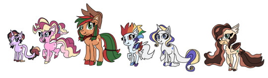
mane six redesigns for an au!!! idk what exactly to call it yet but its basically what the show would’ve been like if i made it. btw theyre all teens and live with their parents (well except for applejack and pinkie) since i thought they were teens when i was younger (and i find it easier to relate to teen characters considering how i am one)
infodumping time
twilight was fairly simple, i just based her off of a generated palette via cssdrive. her cutie mark was the most difficult part, but the core idea is that it represents her and her closest friends. she also has a beard bc thats just the general look for wizards in equestria
(didnt intend for her to be so tiny but it Works)
pinkie was also pretty easy, i just added some yellow based on her rainbow power design and a different shade of pink in her mane bc i like the way that looks. plus some freckles, pigtails, and leg markings bc its CUTE
her cutie mark is based off her original one, just with different colors and confetti
applejack was kinda hard bc i had trouble with the shades, but i just settled with it being kinda dark since it looked nice to me skjdhgfvghjk. i think she might be a bit more of a loner at first so it could work well in that case?
anyways, the green and red mane is based off of irl apples and her rainbow power palette, and i just. splattered more freckles on her djhfghj. i also gave her a bandanna cuz i like seeing that in fanart, and im not sure wtf her cutie mark means i was just coming up with random stuff
shes BIG and supposed to be BULKY but i cannot convey that well. F
rainbow dash was also tricky since i have issues with coloring her mane. it always ends up looking off to me and idk why??? well this time it hit with her tail, so i was just like “fuck it” and made it white. id like to think thats some kind of rare coloring condition (so mixed in with the rare rainbow hair, she generally looks more cool to ponies i guess dgfghjk)
her mane is based off the wonderbolts, and originally i wasnt gonna give her rainbow eyes, but i couldnt pass that oppurtunity It Looks Neat Ok. and i also didnt know what i was doing with her cutie mark, i already have enough trouble drawing it as it canonically is ldkjfvg
rarity was a pain to draw (bc curls are a difficult thing to line in my case) and color, mainly bc i was thinking of other redesigns and how they drastically change her palette. then i realized i dont have to do what other ppl do and just threw in some gold to represent her affinity with gemstones
shes getting a bit fatter (continuously does so throughout the series), which is mainly inspired by fanart portraying her as such, and i really like that idea!!! she gets it from her mom, but doesnt really mind as equestria doesnt judge anyone for their weight in this verse. she is considered one of the most beautiful ponies
some of her horn is missing some color bc of a weird genetics thing. her dad and likely sweetie belle has it, and her cutie mark is just a watered down version of her official one bc i couldnt think of anything else
fluttershy’s colors were hard to decide on, i based them off of a monarch butterfly. it isnt exactly the same obviously, but i liked what i saw sjdhgfghj. i mainly wanted to go off of earth tones but i also like how they dont really come off as brightly warm? its calm and chill, kinda reminds me of fall, but her eyes also remind me of spring
(idk why i put that muzzle marking there)
her cutie mark was yet again, on the spot and random, but its like a mix between a butterfly and pegasus wings, alongside grass towards the end
i plan on adding a seventh member, but whether they’ll end up being a canon character or an oc is something im thinking of
(annyyways im done with my rambling dgfghjkl)
20 notes
·
View notes
Note
id say youre mainly a mix of description and feelings writer, perhaps slightly more description than feelings? you mention the feelings and you write them well and they fit, but you dont dwell and linger on them the way a feelings writer would, more content to let them brew in the background or just make their presence known by letting them flavor the characters words/actions in oncoming scenes. you describe their environments, what they see and such v thoroughly
this is hecking fascinating for me to hear, because the way characters feel is often the most fascinating part of characters for me, and it’s what I worry about the most on keeping consistent, but the more I think about it the more I think I get how my writing turns out the way it does. Most scenes I write actually start with dialogue worms that I get at random and then scribble down. From there I try to add tags and action descriptors for how the characters are saying it (tone of voice, gestures, pacing, etc), and I usually rely on those to get across how they feel about The Thing. Like my goal is to describe to you how the movie looks, rather than get too deep in the character’s head. So at that point I almost panic because I haven’t said where they are yet but I want everyone to have a sense of spacial awareness for the scene (not having that is a pet peeve of mine) so I gotta crunch something out for that. I try to put character into writing that description because I hella admire the way Rick Riordan can establish completely different tones of 3rd person narration for each of his characters, but I never know how successful I am.That sounds way more check-listy than I actually think about as I write, and it doesn’t always happen in that order, it’s just whatever I manage to think of first, but it’s always a lot of filling in blanks. And it’s not always like that. the first drafts for chapters 1 and 2 of MoM were almost entirely stream of thought, whereas I’d probably be hard-pressed to find a scene in Heroes Under Drinking Age that didn’t start as just dialogue. But I’ve also been writing a lot more action scenes since then The more I think about it, the more I know that all I’m really doing is trying to take a comic that I have in my head and turn it into words, because I want whatever it is to exist in words instead of pictures for whatever reason (usually because words are much faster). I dont really want to describe how they feel, I want to draw the expression; I don’t really want to describe the room and the blocking, I want to scribble out a background and innovate on shot-reverse-shot until my eyes bleed and to make a color palette for the moodnone of this to say I want to change how I write, it’s just neat to think about
#THANK YOU#i feel so Aware#primtheamazing#ask KA#me talking#my writing#i do wonder if it comes through the same for my older writing#or if its a current staple because Church and Wash are#to put it lightly#a bit emotionally constipated#alsohearingthatmydescriptionsaregoodisfanheckingtasticiWorry
5 notes
·
View notes
Text
Here's How 'Lady Bird' Created an Iconic Teenage Bedroom From Scratch
by Laura Schocker, Mar 4, 2018.
source: https://www.apartmenttherapy.com/lady-bird-set-design-bedroom-meaning-256361
The coming of age movie is a Hollywood staple, which often depicts a young woman whose story is defined by a romantic relationship. Part of what made this past year's Lady Bird so special is that its subtle telling of a teenage female experience—from tenuous mother/daughter relationships to shifting friendship dynamics—relied on Lady Bird's personal growth as the main storytelling device. Its actors have received plenty of accolades ahead of Sunday night's Oscars. But one supporting role we think deserves mentioning is Lady Bird's wonderfully-nostalgic, turn of the millennium bedroom.
The teenage bedroom is also often integral to the coming of age story (think: Frenchy's bedroom in Grease or Dawson's movie-poster plastered room in Dawson's Creek). And Lady Bird is no different — the room is both the site of and the refuge from parental fights, as well as an expression of her personality. "We really wanted to show that she was somebody who cared about things as much as she's going through these pains, and trying to fit in," production designer Chris Jones told Apartment Therapy. We spoke to Jones about how he, along with writer and director Greta Gerwig, set decorator Traci Spadorcia, and the rest of the team built those feelings from scratch in a real home in Van Nuys, California.
I read that Greta Gerwig said she wanted Lady Bird to "look like a memory." I think a lot of us have these very real memories about our teenage bedrooms—whether it's the posters that hung on the walls, or the books on the shelves, what we stashed in the desk drawers. How did you go about creating those memories from scratch for Lady Bird? What feelings were you trying to convey with the objects?
We wanted the bedroom, most importantly, to show the layers of history that Lady Bird already had. The movie is about what happens to her throughout the film, but also what happened to her and what could happen to her in the future, that whole transitional period. We wanted the bedroom to feel like it was also in that transition and growing from something younger to something older.
We went looking for furniture that could be little girl furniture, but that she had kept. The desk in the corner was really an old white desk from, say the 80s and the 90s. Then the bed, it's missing a spindle here and missing a piece there, because it's been around for a long time. We wanted that to be the basic structure of the room. Then we built on top of that with the items that would be more teenage and more adult.
Why did you choose pink for the walls?
Greta and I had spoken about colors, and we wanted the entire film to have a pastel color palette, based on paintings by Wayne Thiebaud, a painter in Sacramento. When it came to her room, we talked about pink or purple. But purple is kind of a royal color, and pink is a bit more playful, and we felt that the character was more playful and strong.
The paint was something that we also thought might harken back to being a little girl, but it's a hip cool color. And it blended with her hair color that we had in the film. It was also very different, shockingly different, from the rest of the house. We did a lot of camera tests with the pink to make sure it was going to work, and to make sure it wasn't going to be too different from the rest of the house so it felt separate.
And how did you build on top of that?
When you work on a film with the budget that Lady Bird had, you can't always get everything you want. And one of the things that's hard to do in a room that's covered with all kinds of imagery like that, for a film or any kind of media, is getting the clearance on items you're showing. One of the things that was relatively inexpensive was album covers. We decided to pick music from the time to show bands she'd be interested in. There was a Bikini Kill cover, a Pixies cover—albums we thought would be cool in that time period and that Greta listened too as well.
We loved making it look like she was always working on something. Besides the art we found and made ourselves, one of the things that really added to the room and that she was proud of were those "Lady Bird for President" posters, and we ended up putting those on the walls too, and it just added to the mix. What was really cool was that we were designing those posters and doing samples for Greta early on, and we used construction papers and feathers and bird heads, until we decided to get kind of weird with it, which were the ones we ended up using in the film. But some of those early prototypes ended up being on the wall, and it was really a beautiful little addition because we tried to use birds throughout the film without being too heavy handed.
The messiness of the room felt very real. It reminded me of actually walking into a teenage bedroom. How did you create those layers?
We were working with April Napier, the costume designer, so we had the actual costumes she was wearing in the film in her closet. As we were doing that, we would find ourselves bringing the clothes in that wardrobe had on their racks, and we would lay them on the bed and start hanging them on the closet or getting them ready for the shot. We realized it was great that she hadn't put her clothes away. There's that whole scene where her mom comes in and is unhappy with the fact she's not taking care of her things.
Because the room has a very busy, jewel-like quality, we wanted to keep it messy. The clothing was a big part of it and the rest of it really came from the way the way the room is dressed. We wanted to get it chock full. We started sticking stickers and little plastic spiders, and hanging Mardi Gras beads from a lamp or whatever. Once that layering started to happen, it really began to give a cluttered, yet not-difficult-to-look-at feel.
Where did you source everything from?
All of the furniture actually came from two big prop houses at the studios. They have furniture that is not in the best shape, which we wanted and the nice thing is that you can rent it. But all the ephemera, all the little pieces, the stuff that filled the room—the day before we were supposed to shoot the first scene in that room, we all agreed that we didn't really have enough stuff. So I went to a store in Downtown LA called Moskatels. Moskatels had all the stickers, all the hearts, all the spiders, all the snakes, all the bird feathers, all the green, all the dead roses. Everything you see in that whole room, a lot of those little pieces came from Moskatels in one big shopping trip I took the morning of the shoot. Then all of us worked together to get it up on the walls.
Any computers, phones, lights, clocks—any technology needed to feel just right. It's amazing to think that even in 2003, we barely had the phone technology we have now. Only 15 years ago, we were really lacking all the cords, cables, USBs, and chargers we have now.
What about the rest of her house? How did you design her room to be different in mood?
There's this line about the house being from the other side of the tracks, which can be a negative reference. But for us, wherever they lived, we knew that Marion and the husband loved this house, and it had been their house for a long time. We wanted the house to feel well loved, not sad or disgusting. It was always neat, it was always clean, but it was a muted tone. It showed there was a bit of sadness in the house.
So Lady Bird grows up with that, and starts her life with that as a kid. I felt with all of the items on the walls in her room, and everything that filled the space, it really felt loved. The house also had that, but it wasn't so blatant. It was more about the care and the placement of items.
It seems like bedrooms always play such an important role in classic movies and TV shows. Why do you think they're such a storytelling staple?
It's a person's private zone. It's important to show the character's personality in the bedroom, because that is where they will spend a good portion of their young life. It is almost like your psyche; your bedroom becomes a place where you lie and look at the ceiling—it's the place where you look at your world and experience your world.
It's also the place you go to escape. When you want to go someplace to get away from it all, you tend to go to your bedroom and lock the door.
Do you have a favorite pop culture teenage bedroom?
Maybe Ferris Bueller's bedroom. I was really into music so the fact that John Hughes used music so effectively in his films and that Ferris Bueller had posters for Morrissey and all the bands that I was into, struck a chord with me.
What's funny is that as old as it is, The Brady Bunch boys' bedroom is very similar to the way I grew up with a brother. We had bunk beds and you spend a lot of time connecting and communicating with your siblings on those bunk beds. Even though it's a bit generic and less naturalistic, I still feel that—I can picture The Brady Bunch bedroom in my head to this day, which is odd, but good.
We talked a bit about Greta's influence on Lady Bird's bedroom. Were there any of your own childhood bedroom influences, or anyone else involved in making the film?
Traci Spadorcia, the set decorator—she did little things that were personal touches, like tying up a ribbon that didn't make sense why it was there, putting a picture at a certain angle, or layering one picture over another because that's what she had in her bedroom.
At the end of the movie, when she's moving out, Lady Bird paints over the walls. Can you talk a bit about what that literal fresh start symbolized for you?
That wasn't in the script. But when we talked about how we had to put the room back for the homeowner, Greta and I talked about how long it was going to take to get all of these little items off of the wall. And she said, "Why don't we all help?" And I said, "Yeah," laughingly, and I included Saoirse [Ronan, who played the title character]. And then we all started thinking about it, and we thought, well what if Saoirse and the mom were taking the items off the wall?
We decided the art department would take down quite a bit of it, but we would have them take over. It happened organically. Yes it's symbolizing the end of something, but also the beginning of something else, which Greta has talked a lot about in interviews. They did it together for a while, but then Saoirse just kept going, she just kept wanting to do it. It was really nice to get a lot of footage of her really making the room fresh and clean. It's almost like she cares now. Before it didn't seem like she cared, but she's leaving something for her mom, who she hasn't spoken to much for the summer.
It's not just change, it's a clean slate. It means she's going to go on to something new. And in the next few scenes, you see she starts using her real name. She starts using Christine instead of Lady Bird after she does that change for herself.
31 notes
·
View notes
Text
Love Interruption 4
So, I accidentally wrote another Sam chapter. The thing is, he’s a better exposition monkey and also maybe I’m in love with Odie a little bit. Why do you keep talking about my shoulders? LOL, we are all Velma. ANYWAY here’s a long chapter and the next one has Destiel FEELINGS and AWKWARD SILENCES and GROUP THERAPY so if that’s your jam please keep reading I love you all like Sam loves books.
Sam awoke to the sound of the surf. He sighed deeply and raised his head off his pillow on the floor palette Odie had fixed him up in her small living area directly off her kitchen. After ducking in the bathroom, he investigated the tiny cabin looking for her, but it was empty. He helped himself to a bowl of the sweetened coconut rice pudding-type dish he found on the stovetop. Grabbing a mango from a bowl in the center of the metal folding table and a knife, he made his way outside.
He scored a mango half into edible cubes, which clung to the thin green skin until he chewed them off, their sweet juice dribbling down his chin. Odie strode confidently up the beach carrying her surfboard, water droplets on her skin and hair catching the morning sun. She gave Sam a grin that was all white teeth and a big wave with her free hand. Sam waved back and tried not to notice the way her board shorts hugged her strong thighs or the way her yellow bikini top set off her radiant skin.
Sam ducked his head until she was close enough to call to him over the morning waves. “Do all American hunters go to the beach in jeans and boots?” Odie propped her surfboard in its spot along the cabin wall and grabbed a towel from the clothesline.
Sam chuckled self-deprecatingly. “Don’t have many other duds, I guess. This is our first beach trip in a while.” Or ever, he thought. “Plus,” He tapped his boots together firmly where they sat at the end of his crossed legs in the hammock. “It’s sort of our all-purpose uniform. Protect the feet, the skin, layers for different temperatures.” His smile fell a bit. Their lives were not like normal people’s. Sam had a tendency to make himself sad. The downside of being smart, he guessed.
Odie pulled on a graphic tee and gave him a knowing look. “It’s the same here, but you need clothes that won’t get in the way. Loose, sweat-wicking so you don’t dehydrate. Light colors to reflect heat. Flip flops can be lost in a hurry. Sport sandals are better for the jungle.” She jerked her head toward the beach. “Good luck running something down in the sand in those huge clodhoppers.”
Sam made as if he was actually willing to haul himself out of the hammock. “Wanna race? Put your money where your mouth is?”
Odie swatted him with the towel. “I’d hate to humiliate you on your first day. Besides, we have work to do.”
They set up research headquarters at her kitchen table. Odie boasted a premium wifi connection one of her hunter network friends had spliced off the line running to the Stone Jaguar resort where Cas and Dean were staying.
“So, these couples all checked into the resort, and then disappeared on the last day of the couples’ retreat.” Sam summarized. Odie nodded, indicating the proto-murderboard she had rigged up, complete with photos of the couples, their names, and details of their cases underneath it.
“We already had our hunters work with local law enforcement but they’re worthless.” sighed Odie. “They all think the couples were mixed up in drug business in town or kidnapped by Guatamalans near the border.” She tossed her hair disdainfully. “Both theories are ridiculous, of course, but they are eager to write them off because nobody in this part of the country wants to hurt tourism.”
Sam nodded. Made sense, and reminded him of plenty of cases he had worked before. People were pretty much the same everywhere. Willing to turn a blind eye as long as it didn’t affect the status quo.
Odie stood, putting her hands on her hips, pacing in front of the posterboard she had tacked to her kitchen wall. “We also tried interviewing resort employees. They didn’t have any further details. The couples went to the retreat’s final ceremony-a graduation kind of thing. They returned to their rooms, and nobody ever saw them again after that.”
Sam sat back, clicking his pen. “Run through them for me again.” They had been through all of this online already, when he had agreed to come down. A former acquaintance of Eileen’s based in Mexico had connected them. Sam felt a pang at the memory of the brunette hunter, with her sass and bravery and great smile…
“Four couples with no connection I can find. Two in their 50s, one in their 20s, and one in their 30s. One from New York City, one from Sydney, one from rural Alabama, and one from a small town in Northern England. One white couple, one Asian couple, and two mixed-race couples. Three hetero, one same-sex. Two had children; two didn’t.” Odie blew air through her lips in frustration. “It must be opportunity rather than profile.”
Sam agreed, typing on his laptop rapidly. “And the reason we think it’s something supernatural is…” He trailed off. This had been a sensitive topic online. If he was being entirely honest, he didn’t think there was a case here. Maybe the local police were right. Just missing couples in a developing area with higher-than-usual crime.
If he was really willing to look honesty in the face, he’d admit he only agreed to the case to get some beach time and possibly, maybe, just a little part of him wanted to get his brother and Castiel into a couples’ retreat. But Sam was not on trial here.
Odie immediately bristled. “We’ve been over this. It’s too clean. Too neat for humans.” All the couples were found missing the morning they were to check out. Their rooms were undisturbed and locked. All luggage, valuables, and passports remained in place. Nobody saw or heard anything in the night or the morning. No bodies were ever found. They simply vanished.
Sam held a hand out, placating. “Okay. I believe you.” He didn’t, but Sam was good at talking people down. With patience borne of years dealing with jittery victims and his histrionic brother, he changed tack. “Who are the usual suspects in these parts? Vampires? Werewolves? Ghosts? Shifters?”
Odie gave a weird half shrug. “Yes. And no.” I’ve hunted all of those, but what we get here is a little different. After all, our folklore and indigenous gods are different than what you find in middle America.”
Sam raised his hands over his keyboard again, eager. “Okay, well, I’m okay in Spanish, too. What should I look up? Aztec or Inca?” Odie was silent long enough that Sam looked up to confirm she had heard him. She was doubled over, laughing so hard she wasn’t capable of making sound. She drew in a deep breath and schooled her features.
“Well,” she began in the prim tones of a schoolmarm. “Begin by researching all the lore from Mayan/Mestizo peoples whose cultures were indigenous here. Then add in all the French/Creole traditions of the Garifuna people, those descended from shipwrecks of enslaved Africans bound for the West Indies. Don’t forget the British Hondurans. Then of course the British colonizers themselves. In recent generations the Amish with German-descended lore can be found in many of our farming areas, and our cities are full of Chinese immigrants with their myriad religions.”
Sam pushed back from the table. He realized, of course, how reductive he had been, but he was also frustrated. How would they even begin to pinpoint what they were dealing with here?
He looked up at Odie who was watching him with less mirth now and more wariness. “I’m sorry. That was incredibly stupid. You obviously have been over all of this already, and know more than I even will about your community. What do you need from me? How can I help?”
Odie’s brown eyes measured him, assessing. “First,” she walked over and shut the lid of his laptop with a ‘click.’ “The answer’s not going to be online.” She leaned over him and quirked an eyebrow. “And due to the largely oral culture here, it’s not going to be in one of your books.” She pushed one of the tomes Sam had crammed into his carry-on away from him on the table.
She flopped into a chair next to Sam, sighing. “The reason I wanted a second set of eyes-experienced eyes-” here she cut her gaze to Sam who shifted, uncomfortably. The Winchester brothers were becoming somewhat of elder statesmen as far as hunters were concerned. “-is because I can’t figure it out. It’s…” she pressed her knuckles to her lips, and her gaze fell on a small framed photo on the opposite wall. “It’s not the first case that’s been unsolved here.”
Sam followed her eye line to the photo. A small girl with chubby cheeks and arms clung to a woman in a long skirt with armfuls of jewelry and a long, dark braid. A man with a beard and kind eyes had his arm around her, gazing at the girl adoringly. “Your parents?” Sam nodded towards the picture. They had talked about it a bit online. Hunters were often orphans.
Odie’s lips hardened into a line. She took a deep breath as though to begin a story, then stood abruptly. “I need a drink” she announced, grabbing a worn denim jacket from the hook by the door. She opened the door, then paused with her hand on the handle. “You coming?” She didn’t look behind her. Sam didn’t reply. He just walked past her into the warm night, resplendently clear with a beautiful three-quarter moon.
#supernatural#spn#fanfic#Sam Winchester#destiel#deancas#fake boyfriends#couples retreat#tropes#case fic
1 note
·
View note
Text
Ash’s Inktober Art Supply Megalist
a Because Inktober is such a huge event and because it’s relatively new and doesn’t have a huge masterlist of art supply lists associated with it, I have decided to post and maintain a masterlist of art supplies ranging from inks, pens, and sketchbooks to use as well as art supply stores online and other useful hints based off of my own, my friends, and other helpful artists who have given me pointers on this site.
INKS
Author’s Note: Anything called India Ink is waterproof by default most of the time. Shellac based ink tends to have a sheen, though there are exceptions. Most if not all color ink aside from black and white will not be light fast.
Dr. PH Martin’s Black Star India Ink
It is water proof and lightproof and does not contain a sheen like most other illustration inks, which means it won’t have light reflections when you scan or photograph your work. I have used it in dip pens and brushes, and it works well even when diluted with water to create shading effects. It has a rich black tone.Not entirely copic proof.
Koh-I-Noor Water-resistant Inks
These inks are water-proof and ideal to use in dip pens. It isn’t lightfast, at least the color versions aren’t, but the black and white inks are. Black and white are opaque colors while the other colors (numbering 17 in all) are transparent, similar to watercolors. Unlike a few others on this list, they come in plastic bottles rather than glass.
Yasutomo Black Sumi Ink
It’s a good brush ink, although there are some drawbacks. One would be the fact that if exposed to air long enough it will get thick, as well as the fact that it has a strong scent due to the fact that it does contain various eye and skin irritants, so don’t get any on your hands. It is very waterproof though, and works nicely if you know how to use it. It is not copic proof. It does come in a plastic container. There’s a vermillion color I haven’t used, but looks nice and bright.
Windsor-Newton Inks
Basically the go to for all and any illustration inks you’ll ever worked with. This is the ink you’ll use in art class (at least the art classes I’ve been to). They come in two different sets, though you are most likely to see the first set. They also come in metallic colors, which is a good thing if you want to go fancy. They are waterproof, but not light proof, so care must be taken when displaying them. They come in glass bottles that do not tip over.
Deleter Black 4
The ink for manga artists. It’s not only a rich solid black, it’s also resistant to fading from erasers, as well as being copic/marker proof. Excellent to use with dip pen and brush. Also waterproof, like most Deleter brand inks.
Keimei Manga Pen Ink
Not only is it waterproof and copic proof, it also has a matte finish, excellent for scanner in your work.
PENS
Staedler Pigment Liner
Lightproof, waterproof, and smear proof. Similar to microns, but from what I’ve heard better. It is erasable though on certain surfaces. Does not bleed through and won’t dry out for 18 hours if left uncapped.
Sakura Pigma Microns
Won’t feather, won’t bleed through, and a favorite of many artists. It is not Copic proof however, so try to use them after using copic. I’m not too big of a fan of these, as the think nibs do break if you use them on sharp curves and such.
Marvy Le Pen
This is becoming a surefire favorite of mine. Not only is it quite cheap, it’s also waterproof and copic proof (the permanent pen however, is not copic proof). It has a stronger nib than the Micron and it does comes in a brush tip, unlike a few others.
Windsor-Newton PITT
One of the more famous pens used for illustration, the PITT pen comes in a variety of nib sizes as well as brush pens. They are waterproof, lightfast, and acid free. They are not copic proof however, and should be used after a copic drawing.
Pentel Technica Stylo Pen
I think these pens are servely underrated. Not only are they a cheap alternative to a lot of other pens on this list, they are also waterproof and copic proof. They come in a variety of sizes and excellent with any medium, including watercolors. However you need to watch out as the ball point can get clogged up. I own at least four and they have lasted me for at least a year.
Pentel Color Brush Pen
Waterproof and really neat for those who like using brush pens, these are nice for those who travel around and use ink. It’s technically a brush pen with a reservoir of black ink you can squeeze out. Warning, there’s a few setbacks, as it does take a while to dry if laying in thick amounts of black ink. It is not copic proof, but can be used on top of copics. A good note of caution is not to squeeze too hard as the ink will drip right out. If the ink runs out, you can refill it with your own ink.
Copic Multiliner
If you are using copics, you should definately have a number of these at your disposal. They are waterproof, smearproof, and won’t bleed through paper. The other good part is the fact that they come in a SP version which can be refilled and reused, although they’re more expensive.
Sakura Gelly Roll
The white pens are excellent for making highlights and contrast.
Watercolors and Markers
Copic Markers
Literally the go to markers and my favorite markers to use overall. They come in a wide variety of colors and types and can be refilled. However they are pricey, but I feel like all in all they are worth the extra cash. Many come in pre-made sets in certain color combinations, though I would start in either a blue palette, a red palette or a grey palette to test them out. Like many markers, they will bleed through, and I would use either marker paper or a thick paper to use them on.
Sharpies
Not too much of a fan of these. but they are cheap and found everywhere. They come in a range of sizes and types, but like most markers, they bleed through paper. They are waterproof and fast drying.
Windsor Newton Watercolors
These come in either pans or tubes, but I use a mix of them. The ones I use are cotman, which are the cheaper version and comes in a plastic travel palette kit which can be put in a lot of places. I have added a number of tubes, due to the number of colors avaliable. They have rich and vibrant colors. The pan colors don’t mix as well in my experience, but the tube colors work lovely. The fact that they come in travel kits is the main reason why I put them on here.
M. Graham Watercolors
A professional set of watercolors, and they have super rich colors. They only seem to come in tubes, which aren’t as good for travel.
Ecoline Liquid Watercolors
I wasn’t sure to put these in inks, but given that they are called watercolors, I’m putting them here. They are dye based and bright and come in wide mouth jars. They can also be dluted with water. Unlike any of the watercolors here, you can use them in dip pens and airbrushes.
Sketchbooks
Author Notes: The paper to get is paper that is 100 gsm and up, as anything 100 gsm and up will hold to water better. The higher you get the better the paper will hold to washes and won’t buckle.
Moleskien Cahier Journal
I personally find the whole Moleskien brand pretty expensive, but they are recommended by the Inktober site. However, you’ll need to watch out as ink won’t dry fast and markers will bleed through the paper
Bee Creative Mix Media/Marker
I really like this paper as it’s thick and holds up to watercolors and markers well. It also doesn’t warp as badly as the watercolor version of this sketchbook. It has a thick black cover but it is wirebound so watch out for shoving it into backpacks and bags.
Bee Sketchbooks
These tend to have thicker paper, and good tooth for pen and ink, copics and illustration.
Canson Sketchbooks
A lot of these are good for watercolors and pen and ink, especially the Mix Media Art Book, Artist Series Mix Media, and the field books. The XL series is also great for those looking to save a little for a big bang.
Derwent Sketchbooks
These are a thing, but unfortunately the only one I can find at the moment is one that has premade designs in it.
Online Stores
Oozak
I have used this store in the past and it has some great deals on Copics
Jetpens
A new store I have discovered, it offers a large variety of pens, inks, and nibs
Blick’s
A very famous art store, they do offer gifts in your online purchases and have some good shipment deals
Poses and Reference
Senshi-Stock
Offers a lot of awesome poses, must be on DevArt to view. They also have a Pateron if you want to support them.
Pose-Maniacs
Rather limited, but good for some poses
Photo Reference for Comic Artists
A site I just discovered which has lots of royalty free pose references ranging from action and everyday to clothing reference
Music
Dark5 Radio
Offers dark syth-techno tunes
Electronic Gems
Some really good tunes here
Artzie Music
Mainly Future Funk and Vaporwave
Walt Ribeiro
Ever wanted to hear “Take on Me” done by an orchestra? This is the place
NOTES
Have at least two erasers at your disposal, one of them should be a kneaded eraser as they lift graphite marks and do not leave a dusty mess.
It’s alright to draw with pencil first
Take breaks to drink water and stretch every 30 minutes or so
It’s good to invest in B nibs and manga art nibs if you plan on using bottled ink. Maru and school points are the best for manga and illustration style.
Round and liner brushes are the best brushes to use for inking lines
You can plan ahead your drawings, sometimes it helps.
Listen to music while drawing helps in getting some ideas.
Official Page for Inktober
Thanks to @ancaxbre , @ayasunflower ,and @ps-art for suggestions
#inktober#art supplies#inktober art supplies#ink#copic#art#art supply masterlist#inktober masterlist
22 notes
·
View notes
Text
Agilenano - News: Seven Steps to An Organized Closet
When preparing for an organized closet, the goal is to come up with a system that will allow you to maintain it with minimal effort, while maximizing your space, time, and wardrobe. And remember that the closet works in conjunction with other storage spaces as well — you’ll want to also cull through clothing in your dresser(s) during this process, as well as any other clothing stored under the bed or elsewhere in your home.
Do the laundry. This might sound like a strange place to start, but make sure that any dirty clothing is laundered before you begin the process so you can see everything you have.
Once all your clothing is rounded up, start sorting. Pull out everything from the closet and dressers, finding logical categories. Put casual clothing in one area on the bed or floor by category (t-shirts, tanks, yoga wear, shorts, pajamas, etc.) and work or dressier clothing in another (skirts, dresses, dressy pants, button-downs, sweaters, jackets). Also group together shoes, belts, scarves, and other accessories. Even socks, bras, camis, and underwear need to be sorted.
Once everything is sorted into categories, now is the time to pare down. Once you have everything sorted, you may discover that you own multiples of the same item. How many black t-shirts do you really need? This is your chance to get rid of those items that don’t fit, are out of style, or are not practical. Remember, it’s important to let your clothing have a little breathing room to keep it wrinkle-free, as well as to allow you to easily view your closet’s contents. Toss out anything stained, ripped, or out of shape. Did you know that most people wear 20% of their clothing 80% of the time? Donate or consign items that don’t flatter your figure or coloring. If you haven’t worn it in the past 12 months, let someone else enjoy it!
Now, figure out where everything is going to “live” and assign a “home.” Consider the storage spaces in your bedroom… both your closet and dresser(s) will come into play. Designate a shelf, section of rod, or drawer for each category of clothing. There is no single “right” way to do this, but it will be helpful to separate your closet by item type, then group similar items by color. Button-down shirts, dress pants, blazers, dresses, skirts, etc. should all be batched together so you can quickly see and assess your options when you look in your closet. Dressers are a good option for your folded casual clothing, such as t-shirts and yoga wear, as are shelves in your closet. And where will off-season clothing go? Only keep your “A” team or current clothes in your main closet and dresser. Shift seasonal clothes, maternity, and “other size” items to another storage space, such as under your bed. Many people can reduce the amount of clothing in their closet by half if they follow this guideline.
Reconfigure your closet if necessary. If the closet only has one rod across the top, you may want to consider redesigning your closet for maximum space efficiency. Consider simple, inexpensive modifications such as adding a double hang closet rod to double your hanging space. You may also be able to adjust your shelves and rods to better accommodate your space needs. Be sure to use the entire closet space, including the vertical space under hanging clothes. For instance, underneath short-hanging garments, place a low trunk full of sweaters. A set of plastic drawers or a simple wooden dresser could hold lingerie, swimsuits, and socks. Really want to makeover your closet? Give it a clean, fresh coat of light-colored paint. This reflects the light and gives you a solid neutral background to view your clothing against. Give the closet a good vacuuming and dusting, too.
Find storage containers that are sturdy and sized appropriately. Use containers you already own or shop for new ones at stores like Target, Bed, Bath & Beyond, or The Container Store. Sweaters, t-shirts, and sweatshirts line up nicely on shelves with the help of vertical shelf dividers or when placed in clear plastic boxes or hanging canvas shelves. Accessories such as purses, scarves, and belts can be placed in clear boxes or attractive wicker baskets on open shelves. Place hooks on the back of the closet door to hang bathrobes or belts or to lay out your next day’s wardrobe. For shoes, consider clear plastic shoeboxes, which keep shoes dust-free and easily viewed. Or use over-the-door shoe bags or a neat shoe rack on the floor.
Return clothing to the closet. Organize your clothing to work with your lifestyle. Section garments by type, then by color, so you can always easily see what you have. Hang pants, jackets, button-front shirts, dresses, and skirts. T-shirts, pajamas, sweaters, yoga wear, and underthings should be folded and put in dresser drawers, on shelves, or in bins. Don’t put matching tops and bottoms together, since this stops you from seeing other ways to combine them. Arrange clothes so those you wear most often are nearest to the front of the closet.
Keep reading to learn about my secret to a pulled-together wardrobe for busy women…
Stressed About Looking Pulled Together & Polished? Join the Fall Style Challenge!
I love fashion but haven’t always felt totally put-together. And over the years, my wardrobe had become more yoga pants than hot mama. So when I stumbled upon the Get Your Pretty On Style Challenge, I was so excited! Each season, I receive a detailed guide that helps me build a fashionable, functional wardrobe “capsule.” Some items are basics that I already own, and others are things that I need to purchase. Then, each day for a month, I receive a photo of the outfit of the day, complete with shoe and accessory recommendations. This fall will be my sixteenth time participating in the Style Challenge. Since I started doing them, I have felt more fashionable and confident. Want to give it a try?
For just $39, you’ll receive a 37-piece shopping list of on-trend fall essentials (including accessories + shoes) with links to shop recommended items online or in-store (or shop your closet for many of the basic pieces, as recommended and like I do!) These are then mixed and matched to create 33 days of outfits + 4 bonus outfits. Full shopping list + outfits are available immediately upon sign up. This capsule wardrobe builder creates 33 days of mix and match casual chic outfit ideas with dress it up and dress it down options that can be easily styled for your fall activities!
As a special bonus, you’ll also receive access to the Fall 2018 Capsule Wardrobe (doubling your outfit ideas!), Color Palette Resource, Daily Outfit Calendars, and 4 bonus outfits!
You can sign up by clicking here. Registration runs September 6-20. Outfits begin September 23, so you have plenty of time to shop (or shop your closet!)

Agilenano - News
from Agilenano from shopsnetwork (4 sites) https://agilenano.com/blogs/news/seven-steps-to-an-organized-closet
0 notes
Last Seen Blogs
maneskin-my-belovedd
Ramblings on Pretty Italian Rockers

ossielv
Ossiel V

parrotbutter10
Tảo Xoắn Đà Nẵng

paranggi
Tanpa judul

pahlawanayam
Untitled