#and each character has a unique nose shape
Text
Have you heard of same face syndrome in art? It's when you get too used to draw a specific face that you know looks beautiful, so all your characters end up looking like the same person with different clothes and a wig.
A while back, I started studying different face and body structures to counter that.
What I didn't expect though, was how much it has made me change the way I saw actual people. How it would make me start to admire different traits and what makes each person unique. That not everyone has to have a delicate nose and a V shaped chin and perfect symmetry.
That's the impact art can have on people, and I love it. It makes me think that perhaps we as feminists should be supporting art studies for girls, too, because this is so impactful in counteracting the effects of beauty culture
(Also there's something incredibly funny in looking at someone real and thinking, wow, their character design is great)
#radblr#radical feminist safe#radical feminists do interact#radical feminists please interact#terfblr#rad fem#radical feminism#terfsafe
17 notes
·
View notes
Text
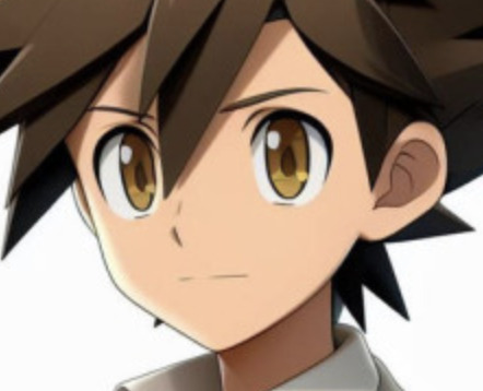
The dungeon meshi art style is very good my favorite thing is that whenever a character is at a side view you can actually see their nose shape
#dungeon meshi#delicious in dungeon#they dont have anime nose syndrome where its just a flattened deal and their noses arent just little lines#and each character has a unique nose shape#the animation is also very charming i think marcille is the best visually i love how shes always doing something new with her hair#that one image of laios waking up in the end credits is actually the most important thing ever i need it framed on my wall#and most importantly THE SENSHI PANTY SHOTS YESSSSSS#i am very much enjoying so far i thiiiink im on episode 7 now? its very cute!
69 notes
·
View notes
Text
Omg guys what about a child of Hephaestus reader who specializes specifically in sculptures??
As much as they enjoy creating new machines, gadgets, and weapons, they can’t help the urges to create and sculpt the world around them. From small animals to human figures, reader loves capturing beauty in this still life form of art.
Now hear me out. What if they make sculptures of their significant other? Reader is just so in love with their other that they are always making them out of anything that they can manipulate in shape. Iron, brass, hell even wires, readers siblings always manage to find their lovers face one way or another near their section of the cabin.
Each sculpture is handled with such care and admiration that anyone who see one of their art works, they can see how much love reader put into it. They’re usually busy for hours and hours on end perfecting every small detail to resemble the one they love the most.
For years to come, readers lover will be immortalized through these sculptures and no one complains with how many statues there are because of how beautiful they are.
Honestly I can see this reader working out with any character.
For an example, Percy in particular would find this emotional. He would stumble upon a small statue made of brass at your work station while hanging out in your cabin and trace over the small yet intricate details of its features, the soft slope of its nose and daring eyes familiar to him. It’s then he realizes it’s him you’ve made.
This causes a flood of emotions because is this how you really see him? Is he as beautiful as this statue in his hands, forged and molded in the idea of him?
Percy finds this love language extremely flattering and endearing and has even agreed to multiple real time sculptings, not minding how it takes during these sessions.
He’s your muse and you’re not afraid to let him know that. Honestly if they could, I think reader would spend the rest of their life creating and spreading their lovers beauty.
Each piece is unique and always manages to convey a different and delicate emotion. Everyone at camp admires the way you show your love, many using you as a standard when looking for a partner lol.
#pjo x reader#percy jackson and the olympians x reader#Percy jackson x reader#pjo#pjo imagine#pjo headcanon#percy jackson#percy jackson and the olympians#percy jackson pjo#pjo headcanons#x reader#imagine#headcanons#percy jackson headcanons
299 notes
·
View notes
Text
Ryoko Kui's Daydream Hour
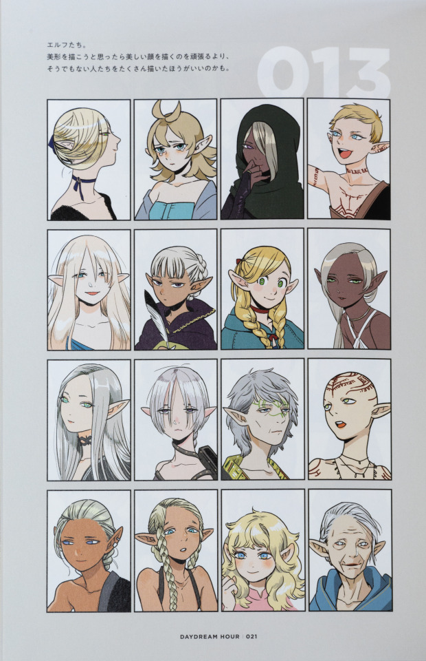
I am moving at a glacial pace with tidying up and editing the images of this art book, so I'm going to take a break and talk about Kui's incredible character design on Delicious In Dungeon, using elves here as an example
So, first of all, race-defining traits. With the elves, it's obviously ears as the first. But, Kui plays around with that far more and in an incredibly natural way. The size of their ears differs, the angle at which they protrude from the side of the head can be different, their rotation in terms of where the opening of the ear faces can change, and even the "pointyness" is unique to each elf.
It creates incredibly varied views and "styles" of elf within the world, and complements a lot more of the physical traits that reflect ethnicity in our world.
Take, for example, the hair of elves. In the vast majority of cases it remains blonde or silver/white, and is straight. As you can tell with some of the images, it's not always smooth or silky like some exhibit, but in the vast majority of cases, for elves that are pure elves, their hair is straight (potentially with some shape/volume as you can see with the gray-haired elf with green markings on their face).
Similarly, elves are shown to have characteristically blue or green eyes. Which begins to draw your attention towards an outlier.
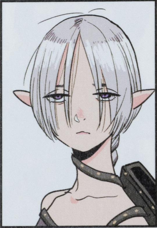
This elf. The one with purple eyes. Immediately, you might think "oh, they must only be part elf", but Ryoko Kui was only laying a trap with that idea. This elf is certainly 100% elf, it's just that they exhibit traits that are heterogenous to how Kui's defined elves as a race.
The biggest outliers being the purple eyes, but then also the ears. Here's the thing though, there's not a race that strongly exhibits purple eyes throughout Ryoko Kui's work on Delicious In Dungeon. It's just that elves exhibit strong homogeneity in regards to eye color. A similar thing can arguably be said about the ears which may make viewers think something's up. They're certainly the smallest of the bunch, and the most rotated, but other elves also see aggressively rotated ears, just not to the degree that this one does.
If you want to talk about how the traits of elves mix with that of other races we actually have two examples. Marcille Donato, obviously, as a half elf and half tall-man, but also this other blonde woman with blue eyes.
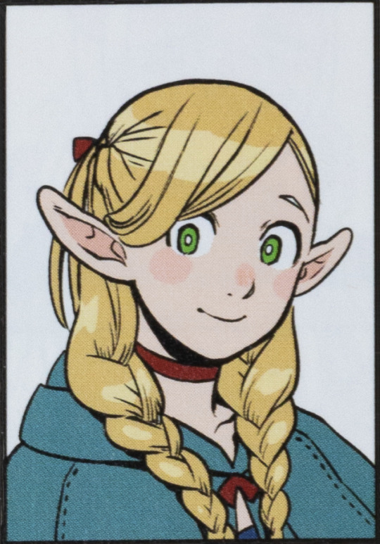

We know of Marcille's heritage so let's focus on the woman on the right. The first thing that you notice as a heterogenous is her hair: it's wavy. It's a trait that's very much separate from Kui's depiction of elves. Similarly, the shape of the eyes betrays that much more narrow and sharp style.
Then there's also the ears, which are larger, noticeably shorter, more round, and most noteworthy are thicker.
With that last piece I'm sure many are thinking, "Oh, she has to be half Gnome!". Yes, the shape and size of the ears does very much fit Kui's style of Gnome (as does her height, I'll say more later), but let me show you a (bad and unedited) image of how Kui draws gnomes.
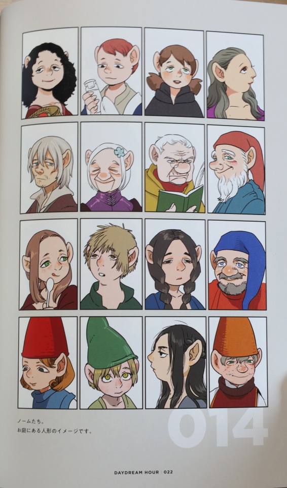
Their eyes are far more slanted and downturned. It's a very strong trait of the Gnomes, alongside their very prominent noses and hair that isn't noticeably curly or wavy.
So no, it's not Gnome, and I wouldn't say it's Dwarf either. My guess is that this woman is part half-foot. The smaller stature (yes, the headshot shows that she's shorter than the other elves), the curly hair, the shorter yet more prominent and thicker ears, the rounder eyes, it all speaks to similarities expressed by Half-Foot characters.
And I think that's really incredible. It's just a wonderful highlight of how thoughtful and creative Kui is with their character design, and how unique they're able to make a race.
At a glance, you can tell who's what, but they don't all look the same by any means.
That's something that's really driven home with Ryoko Kui's Daydream Hour, and something I really want to talk about more. Though, as you can tell, I've got a lot of work ahead of me to get images that are actually good and presentable, so we'll see when I'm able to squeeze out a proper post.
#ryoko kui#daydream hour#delicious in dungeon#dungeon meshi#dunmeshi#marcille dunmeshi#marcille dungeon meshi#marcille donato#delicious in dungeon marcille#anime art book#anime art#manga art book#manga art#anime and manga#anime#manga
240 notes
·
View notes
Note
Honestly after all the designs you've made and posted, I'm curious what your character design process is?
(Also new pfp, same sapphic me that will gush over your designs)
I usually get a lot of my designs from following a few core principles!!
1. Simple and effective designs that aren’t overly complex
2. Limited color palettes
3. Reoccurring motifs and recognizable characters
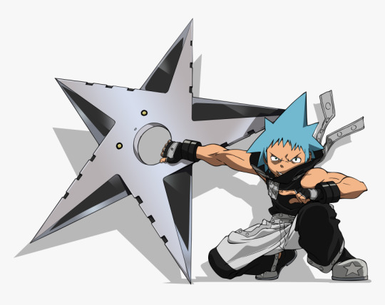
Like for example. Lumata guys. I’m gonna draw them again ok I prommy. But Kay el is short and has sharp edges, similar to Yoko, but what makes them stand out from each other is he’s got a more slender masc muscular build, a more yellow/orange color palette and a reoccurring star motif. His bleached fluffy hair is meant to resemble the shape of a star, he’s got a subtle star shape in his eyes, his scars and broken nose and missing tooth showing a lifetime of hardship and fending for himself.


I could talk at LENGTH about all I’ve learned about character design over the years but I’m so tired rn. BUT. ALSL. check out Pinterest for clothing and face inspo and even general character inspiration to give them unique traits and quirks!
93 notes
·
View notes
Note
Hey your art is pretty whimsical and radical my gender non specific broseph, per chance would thou be able to enlighten us on how you draw such bodacious fine art? Like how you draw bodies and fave and what have thee. (Fr tho your art really cool and I'd like to see how you make it)
okay i have whipped up a quick little visual of my thought process while drawing!! it might not be the best cause im not the greatest at teaching but if anyones curious ^_^
first lets start with how i draw bodies

a lot of people like to do the "skeleton" method which is where you draw lines and circles to plan out where the limbs should be. honestly i really dislike doing that because i like to always have volume and shape in mind when drawing bodies, but if it works for you thats great.
instead i separate the body into different pieces, kinda like an articulated doll. i think it helps visualize all the moving parts in a 3d space and makes posing and perspective a lot easier. i can also always add the detailed anatomy on top of this basic model like you see on the left. its always important to work from simple -> complex. drawing a pose while being too worried on anatomy will really hinder your drawing process.
to improve doing this it really just takes practice and observation. i could be here all day talking about proportions, and how many heads high a person is, and each specific muscle group, but i reccomend you go and watch videos and study professional artists on your own. as someone who has been drawing and studying these things for so long, i barely think about how many heads high a person is when im drawing a body. its kind of like learning how to play and instrument or driving a car. it becomes second nature eventually, but you have to apply those skills and work through that period of time where youre still trying to program it into your brain.

after you get a hang of the basics you can take this basic model and draw all types of body shapes with it. i say its always important to play around with making your body types diverse. its not only fun to do but helps make all the characters you draw unique and recognizable. (dont be like vivziepop).
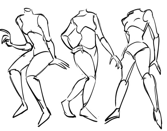
dynamic posing can be the hardest thing to master for a lot of people. the best way to learn how to pose is to not think about it too much and just doing it. for example in my figure drawing class we had to sketch out gesture drawings from a picture in 15 seconds. excercises like that help a ton in making you feel more comfortable when drawing from a reference. you should definitely reference a LOT when it comes to poses, it helps build this visual database so that eventually you can get to the point where you can just draw accurate and dynamic poses from memory. after getting to this point eventually you kind of start thinking of your canvas as this tangible 3d space and considering your characters in 3d space helps make the poses feel a lot more realistic and interesting.
ok now a quick little tour into how i draw different faces yaaaayy!!!1!1!1
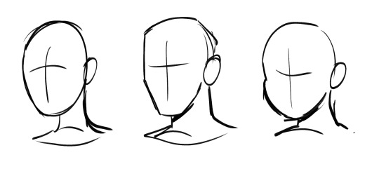
main thing with my art is that i LOVEEE drawing dynamic face shapes i think its so important to avoid drawing the same slim faces over and over. shape language plays a big role into this. like for example the face on the middle is more square, the one on the left is more oval and the one on the right is more circle. shape language helps communicate so much about your character without even saying a word about them and just helps differentiate people from a glance.

facial features also play a huge role into making your faces different. these are all drawn from the same exact face shape but look like entirely different characters by adding variety in the features. different noses, eye shapes, lips, etc. can make such a huge difference
i think before any of that its important to learn the anatomy of the face though. again im not gonna go into how many eyes wide a face it or how far the nose is from the mouth but like its always important to learn the fundamentals before stylizing stuff. again the face is a 3d space and if you dont consider your face a 3d plane the features will kind of just look like theyre floating on your characters face like soup...theres a lot of great resources and tutorials online take advantage of those!!! and reference from artists you like too it helps a ton.
and then you mix that all together and Boom you have cool and interesting faces. you will best that same face syndrome in no time if you take my advice Trust...
anyways yeah thats the soda design philosophy hit that like button if you liked it or douse me with tomatoes and kick me off the stage if you think i give bad advice ill leave the decision up to you
114 notes
·
View notes
Text

Basidia Post #4
Vintage CGI:
Modus Interactive and I have been spending the last week or so learning how to use Alias Power Animator 9 which is essentially an old version of maya. It was used on sgi workstations back in the day on games like ff7 and mario64 for all the pre-rendered stuff. For a long time Modus and I have been pretty invested in learning how to replicate the look of old pre-rendered stuff, and, as it turns out, the best way was just to do it how they did it. For so long I tried to wrap my head around how old cgi stuff was modeled because the sorts of shapes that were often created seemed like they'd be unnecessarily hard to create with polygons. The thing that specifically stumped me for a while was how they handled wrinkles in clothing and organic shapes. As it turns out, the answer was hidden right under my nose the whole time. They weren't using polygons at all! Instead they were modeling with NURBS! It seems very obvious in hindsight, but I feel like I deleted the memory of NURBS once I exited highschool, and nobody ever seems to talk about or use them these days. If you don't know what they are, it's basically a style of modeling that involves making a bunch of bezier curves and using them to define surfaces. It's a totally different style of modeling from polygons with a lot of pros and cons, but it achieves that smooth look we're after extremely well.
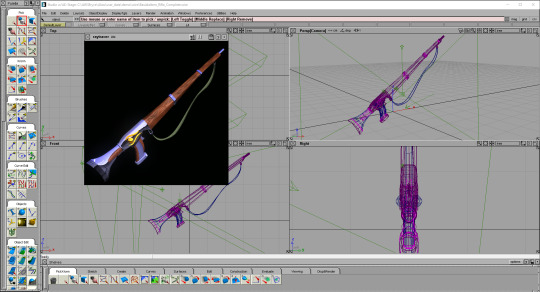
Scout Rifle Render:
As shown in the pics above, I decided to make a model of the scout rifle in Basidia so that we could use it for an item icon. The process was definitely a learning experience, and one of the things I learned is that modeling like this is super fun. It's like creating each shape is a puzzle where you need to theorize what is the best approach to take, and following through is always a multi-step process of defining a surface and slicing it up. I find it super satisfying to pull off, and making slapping materials on it is always fun as well. Moving forward we are probably gonna use this program and/or older versions of maya to create any pre-rendered item icons or backgrounds that we'll be needing. Modus actually made new versions of the vials in it as well which I will put right here \/
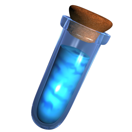
Wow there it is would u look at that. Power Animator just has an amazing way of outputting some unique, rich colors that are hard to get in modern software. I mean, just look at that cork. How do you make a cork have such interesting colors? Amazing. Fuck it, I'm gonna show off a little guy I made in power animator that has nothing to do with Basidia. I've been hyperfixating on this program since I downloaded it so I owe this to myself.
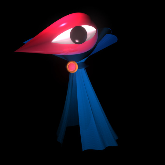
Here he is! Power animator has this amazing glow effect you can put on any shader that adds this bloom as a post processing layer. I used it on the head in this one, and I think it achieves a particular dreamlike effect really well. The sorts of shapes I can get for cloth out of NURBS is also super fun and rewarding, as shown with the cape here. Character modeling is something I'm always really excited about, and I'll definitely be modeling some Basidia characters in this thing.
Conclusion:
I am loving this program and I cannot stop thinking about it. Anyway, I have some commissions to take care of before switching back to midwest lost development, so I may or may not be posting about that game next week. I'm trying to buy an old sgi workstation with the commission money, and, if I can pull that off, then I will have access to all the old software they used back then (including the IRIX version of poweranimator). If you want to check out power animator yourself then here is a link to the program, and here is a helpful tutorial. Oke bye take care!
#lowpoly#power animator#maya#vintage cgi#old cgi#raytracing#indie game#indie games#game development#gamedev#indiedev#indiegames#indiegamedev#indiegame#the winds of basidia#basidia#winds of basidia#snow of basidia#the snow of basidia#3d art#screenshotsaturday#nintendo 64#n64#haunted ps1#rpg#pre rendered#prerendered
412 notes
·
View notes
Text
Spoiler-Free Advance Review:
Exordia by Seth Dickinson
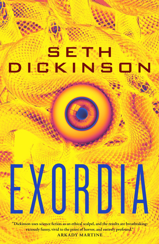
I could not put this book down, my god. Staying up super late multiple nights because I couldn’t stop reading is such a great problem to have, and Exordia gave me that problem more than any book I’ve read in a few years.
This is a very different book than Baru, but Seth’s evocative prose and dark humor is familiar from page one, and the laser focus on defamiliarizing real world injustices is again the core of the work. Despite being far more immediate (Exordia is set during the Obama administration in our world, with an alternate history beginning from the moment the book starts), the heaviness of the topics never gets overwhelming. There’s some incredible (and extremely fitting) tonal dissonance here, with every perspective character having their own sense of disaffected humor about the apocalyptic situation they’ve been thrown into.
I described this to my friend after just starting as “if the Books of Sorrow were written with Gideon the Ninth’s tone and just straight up in our world,” and I think that remains true throughout. There’s a huge amount of references peppered in, and it helps maintain that lighter tone to balance the despair of what is essentially a doomsday clock ticking down throughout the book - and it helps keep things grounded, honestly. I never felt it took away from the gravity of things, or was unnatural - after all, if I, an early 21st century sci fi nerd, was thrown into some fucked up alien bioweapon mystery, it’s hard to say my first thought wouldn’t be “oh shit, this is just like the Andromeda Strain!”
Having seven (eight?) different protagonist (or deuteragonist, I don’t know which they qualify as) PoVs is pretty wild but works perfectly here. Every character has such a unique outlook that you can instantly figure out whose head you’ve popped into even before any identifying names or things are mentioned - Seth’s mastery of the tonally cohesive PoV shifts was something I had loved in Tyrant, especially, and they’re equally impressive here. The characters are lovable, hatable, and everything in between - and each as mentioned is so distinct and compelling that I can’t say there was a single character who I was unhappy to get into their head. And that’s saying something, given who some of these characters are, but I’ll leave the specifics a surprise. Predictably, my favorites were the dysfunctional autistic butch-femme lesbians, but I really loved all of them in the end.
The base premise is almost comical in how small it starts to how much it escalates - a cynical, disillusioned Kurdish genocide survivor, Anna Sinjari, meets a terrifying (and yes…very hot. I’m a simple woman) alien in Central Park, and this seemingly chance encounter sees her roped into a small group of scientists, soldiers, and her own mother in a desperate countdown to solve an otherworldly mystery and save their world. The twists and turns of the plot are intense, so engaging that I was bouncing up and down at times (there’s plenty of sci-fi insanity that I absolutely eat up), and tightly paced.
Seth seems to really enjoy writing ethical dilemmas to great effect, and Exordia is ruthless in that area, taking the base concept of the trolley problem and the moral justification for what someone would sacrifice for the greater good and carving it apart for narrative weight. What greater good does the sacrifice serve? Is it actually good? Who gets to make the choice, and do they have a choice but to make it? There’s a lot to dig into here, and Exordia is a four course meal.
One aspect of this simply taking place in our world, rather than being an alternate universe like Baru, is that the defamiliarized commentary is even more on the nose. Whereas Baru is a commentary on empire and homophobia as a whole, transparently pulling from primarily American history of genocide and imperialism to shape a culture unlike our own in many ways to defamiliarize this moral exploration, Exordia is just literally about real world American imperialism and enabling of genocide in the MENA region, primarily the ramifications of the military industrial complex’s usage of drone warfare and the extremist regimes armed and encouraged by “counterterrorism.”
All this sets the stage for the question of what happens when a bigger fish arrives, one just as hell bent on empire building and justifying its own atrocities. The sci-fi intervention into this banal evil is at the same time a reflection of that evil, and asking if the world has the capacity for resistance to both. Exordia’s answer is profound, and far from easy, but entirely fitting for the ethical dilemma that runs throughout the book, creeping up on you slowly as you start to recognize what shape it takes in this story.
The central material conflict of the book, a locked box mystery of sorts that you piece together with the characters, is fucked up and fun and scary, a reality shifting threat that treads the line between body horror, meta-narrative, and lovecraftian math. It’s extremely cool, and I think it’ll be right up the alley of fans of The Andromeda Strain, The Locked Tomb, The Books of Sorrow and other parts of Destiny lore, and a lot of other SFF stories where ethics, horror, and mystery mix together.
I don’t want to say too much about the climax and the ending - going into this book without knowing too much was an incredible experience that had me on the edge of my proverbial seat - but the ending left me asking myself some very similar questions as I had at the end of Traitor, and I cannot wait for a reread when the physical book is in my hands to see what little foreshadowed things I can pick up on.
I don’t think people are going to be quite as completely emotionally Destroyed at the ending of this one as Traitor, but…it is very much a Seth Dickinson book, and they have quite the talent for making every thread tie together at the end to make the reader feel every emotion at once and realize that this could never have gone any other way. I cried, I laughed, sometimes simultaneously, and a book that can do that to me is entirely worth the experience - and what an experience this was.
Absolutely fucking incredible, I want more of these characters and everything they’re wrapped up in, 10/10.
I received an ARC of this novel from NetGalley in exchange for an honest review.
78 notes
·
View notes
Text
It sounds really silly but like the noses are genuinely a huge part of the appeal of Naoki Urasawa's manga. Every character has a huge fucking schnoz, each one unique, defining the shape of the character's face, accentuating and pushing expressions, making the characters feel so much more human that nearly any other manga artist I've ever seen. Genuinely I love these noses so much. Thank you Naoki Urasawa for the schnozzes.
233 notes
·
View notes
Note
Do you have any advice for running a design blog that features so many characters? Your designs are all so expressive and distinct from each other.
i think the main thing it all boils down to is "get a little silly with it", in particular mess around with different shapes bc thats the big thing that makes characters look different at a glance. im not even talking shape language (warriors has too many cats that dont speak more than a couple words for each character to have unique shape language), but using different features to make each character stand out
facial features in specific have a lot of range, nose types, eye shapes, eye brows, ear shapes, you can do so much! and just mixing and matching traits can give you so many outcomes and that helps with distinct character design.
take a look at animal crossing characters, all characters of the same species have the same model, but each character has a very unique face. and the devs arent scared to give characters traits that a lot of people consider """"""ugly""""" and i think character designers should feel similarly! (obviously some people want their characters to be what they consider attractive, which is fine! as the character designer you have full control of what you do. but if you want your characters to be distinct i think you have to be willing to deviate from your personal definition of attractiveness for the sake of having unique faces) have fun!! dont worry what others will perceive the design as, do whatever you want to do
same goes for body types! every body part can be customized to fit whatever you want the character to be, fur/hair length, torso length, body type, etc etc. go nuts!!!
30 notes
·
View notes
Text
How to Spot an AI-Generated Tai in the Wild!
Because I am insanely obsessed with the blorbo and AI art is a hot-button topic right now, here's a silly thing. I'm sure most artists can tell the difference between real and AI art. But my autistic brain wants to pick apart Tai's character design a bit so here you go. This applies to all seasons, touching on basic traits Tai has between them. So I won't go too much into clothing here (people like to dress him up in different cool outfits anyway- keep doing that).
Note that this isn't true to all models, but works 90% of the time. AI art is advancing so quickly that this may be obsolete by tomorrow. Also, real art might "fail" these little tests simply due to lack of experience drawing the character. If you suspect someone is posting AI art, just block and move on. Report if you want, but you know how Tumblr feels about AI. Most importantly? Don't use this post to be a dick.
WARNING: This post uses AI-generative images found from around the Internet for demonstrative purposes. No credit is given because if the "creators" wanted credit, they should've learned how to actually draw. :)
SKIN TONE
Tai has this nice, tanned skin tone that the rest of the Adventure DigiDestined do not have. While he keeps it in 02 and tri, he loses his color in Kizuna. A real fanart piece is most likely to reflect this, or even add color to his paler designs.
Most AI models have a generic pasty white skin tone for anime characters. This applies to any anime character, not just Tai. I believe this model might have gobbled up his Kizuna skin tone. But I've seen fake Tais even paler than this.

There are some AI models that combat this. But the standard AI identification tricks apply. Here, the tongue is mushy, and the highlights on his goggles make no sense.
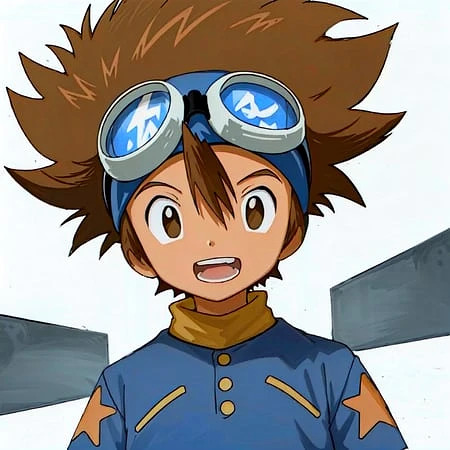
HAIR OF FLOOF FLOOF
Ah yes- my point of expertise. Tai's hair is a difficult thing to draw. I don't blame anyone for dropping the ball here. But AI does have some notable, repetitive failings.
A "legit" Tai tends to have fluff, rather than spikes. The bangs consist of one stripe over the forehead. The few spikes present designate messiness, but the general shape is actually curvy (look at the top right side of the head for the most wavy lines). The size of the floof ranges between adaptions and even storyboard artists.
AI-generators are convinced that all "anime hair" is spiky. Notice this AI Tai has more spikes and less curved lines.
Then, there's this one, which drops the ball on Tai and Matt so bad that both characters resemble Bakugou from My Hero Academia.

WHO'S THAT DIGIDESTINED?
Eye shape and color has some leeway depending on the artist's style. Adventure/02, tri., and Kizuna supply three different eye styles. However, there are still some dead giveaways.
Revisiting this AI-generated image, the eyes look...familiar. No?
How about now? The modern Pokemon anime style has been completely absorbed by AI models. Sometimes, Digimon and Pokemon will be confused for each other, resulting in similar eye shapes and other traits (look at the noses, too).
HUMAN TOUCH
There's some times you can look at an art and know with confidence it was human-made, such as-
MS Paint blobs/sketches on lined paper/anything showing layers/etc. They're too unrefined for an AI image creator to want to profit off of, so why would they make them?
Some fetish art. A lot of kinksters are using AI, which is why deviantArt made good ammunition for this post. But many have distinct art styles that AI has not copied yet.
Western-cartoony art with hard or thick lines. AI is allergic to these traits atm. Notice the softer, thinner outlines on all three fakes.
Clearly attempting to master Tai's unique traits, even if they don't translate well (e.g.- a dome vaguely shaped like his hair is more credible than a "perfect" hairdo with too many spikes).
FINAL NOTES
All of this could change tomorrow, at the rate at which AI advances. I'm fairly good at deducing AI art from human-made art. But a recent piece almost tricked me (interestingly, it was Davis- not Tai- who looked off). These things are constantly evolving. But in addition to the usual tricks, knowing your blorbos can help identify AI images so you can freely block (or, when applicable, report) the idiots who made them.
#tai kamiya#digimon#taichi yagami#taiposting#fuck ai art#all of this will change in three days#character design#ai art#ai art identification#might go into tai's hair more one day there's a lot i want to say about drawing it
32 notes
·
View notes
Text
Soul Eater OC Tip #4: Give weapon forms facial features
The incorporation of facial features in Soul Eater’s weapon designs is a major characteristic that makes the series unique. Many Demon Weapons are shown to have eyes, mouths, or even a face. These design choices visually communicate the core concept of Soul Eater by hinting that the weapons in Soul Eater are actually people.
The following are examples of Demon Weapons with facial features in Soul Eater.
Soul Eater
Soul’s weapon form has the same red eyes as Soul’s human form. Visually, the eyes serve as a focal point for the weapon design. The eyes also allow Soul to show emotion in more comical scenes.
Tsubaki Nakatsukasa


Tsubaki’s various weapon forms subtly present facial features, most notably in the anime. For example, Tsubaki’s smoke bomb form is shown to have Tsubaki’s actual face. Her Shuriken form also has a face formed by two rivets representing eyes, a small hole as a nose, and the large hole in the center as the mouth. The same rivets that represent eyes on her Shuriken form are present in her chain scythe and ninja sword forms too.
Liz & Patty Thompson

Liz and Patty’s Demon Twin Gun forms have eyes on each side. The eyes were first seen on their Death Eagle .42 forms in the Soul Eater manga. In the Soul Eater NOT manga, their base forms were also updated to have eyes. It appears that the white semi circle pieces on the sides of the initial pistol design may have been intended to subtly represent eyes too.
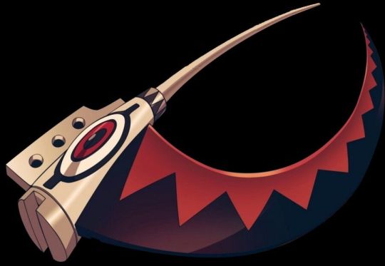
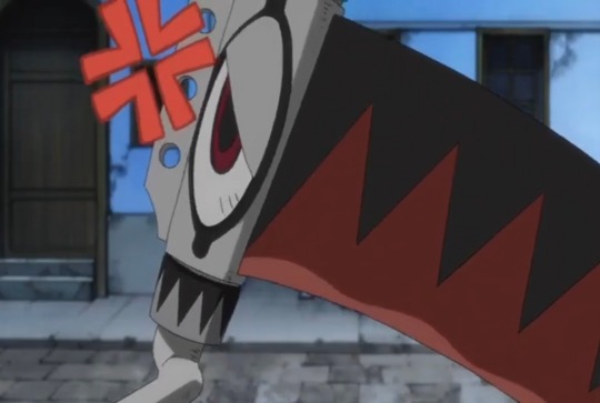
Ragnarok
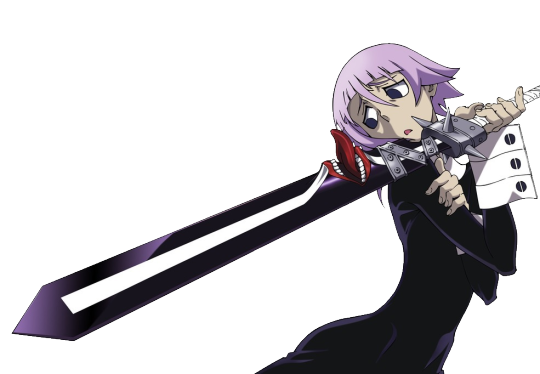
Ragnarok’s mouth is located at the base of the blade of his weapon form. This mouth appears to have several functions such as speaking, emitting Scream Resonance based attacks, and possibly, consuming souls.
Jacqueline O’Lantern Dupre
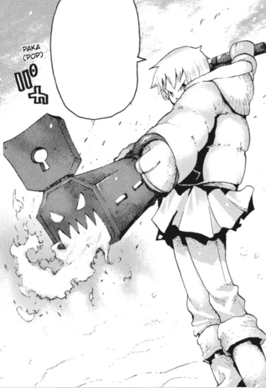
Underneath the keyhole cover on the bottom of Jacqueline’s weapon form are holes shaped like the face of a Jack-o-lantern. This mouth of this face is where fire is expelled out of like a flamethrower.
Fire and Thunder
Fire and Thunder’s weapon forms have a pair of eyes engraved into a metallic-looking piece covering the knuckles of the glove.
Giving facial features to a Demon Weapon OC is not mandatory as there are still many weapons in Soul Eater that do not have this trait. However, successfully incorporating facial features into a weapon design can make the character look more unique, expressive, and visually consistent with the image of Soul Eater.
206 notes
·
View notes
Text
An easy way to beat Sameface Syndrome

So you've got a cast of characters, but their faces look way too similar to visually distinguish them as individuals. What's there to do?
One technique that really helps me is drawing different characters' facial features in their own clusters: Heads, eyes, noses, and mouths. (Eyebrows and ears aren't super necessary since the former can be easily styled to look different at any time, and the latter has an only superficial involvement in facial expressions. But if you're feeling spicy and want an extra challenge, draw clusters of these as well.)

A core component of this exercise is drawing everything in the same color. No skin tones or eye colors to fall back on here, and no color-coding different characters' features. The only way you'll be able to tell which features belong to who is through their shape.
The next step is assigning the features to each face and lining 'em up to see how they compare. You can mess with size and facial proportions to get even more variety. A character's age has a lot to do with this, so it definitely helps to have cast members who were born in different decades. (You'll also want to tweak the shapes of the features as needed so they flow well with the contours of the face. Also, don't forget about how shape symbolism communicates personality!)

You can also try a similar process with nonhuman characters of the same species. Just make sure you don't distort features so much that the species is unrecognizable.

The less realistic your art style is, the easier this process will typically be. Folks working in more abstract or cartoony styles have a lot of freedom to exaggerate features and emphasize shape language to make their characters distinct.

(Photos from earthsworld.com, shown here: 1 2 3)
That's not to say everyone drawn in a realistic style will look the same, though- far from it. Just look at how unique people's faces are in real life! The differences are much more subtle than they are in an exaggerated cartoon, but they're still there. Adding the relevant anatomical terms to your vocabulary will help you take note of which features are most pronounced and which are relatively de-emphasized.

(More photos from earthsworld.com: 4 5 6 7)
That's all for now. If you found this post helpful, consider leaving a tip to help me prioritize making more of these in the future. I'm always open to feedback, so let me know if you have questions or suggestions for further character design ramblings. See you in the next one!

111 notes
·
View notes
Note
i LOVE the way you draw faces and expressions—where do you usually get references/learn how to do it? i’ve been trying to make characters of my own and the face just always throws me off
thank u!!! faces are the most important thing about a character to me and they are my absolute FAV thing to draw
i feel like i learned mostly from manga, but have been bolstering that foundation by just LOOKING at art in general. i dedicate a lot of time for looking at art and finding inspiration. i mainly use twitter to find cool artists and pinterest to find everything else, ie manga panels, fashion photography, random insp stuff. helps to find a lot of artists u like so u can have an idea of where u wanna take your style
nothing beats refs of actual ppl/studies but sometimes it can be kinda hard to know where to start. i personally pull a lot from the manga i read. i'll use takehiko inoue's art as an example for this post bc hes my fav artist.


these are some of the characters from vagabond. takehiko inoue's style is super realistic w unique faces. i esp like how he does his characters' eyebrows and the ridge of the eye socket. the latter literally was a revelation to me earlier this year in establishing shading and planes of the face, which always gave me trouble before.


each character is super consistent. no matter his age, this guy's (kohei tsujikaze) face is unmistakeable bc of his bottom eyelashes, eyebrow shape, light irises, and full bottom lip. kohei makes that same smirk with the left corner of his mouth all throughout his life. i think details like that are cool so i try to keep my character's facial features and expressions consistent too. it depends on the character a bit. some characters are more emotional than others and might show a wider variety of expressions.
so what i usually do is define in my brain what each facial feature looks like for each character. for example, rohan has bold eyebrows and small, downturned eyes w no visible pupil. he has heavy eyelids, a strong nose w a bump, :3 mouth expression, and a wide chin. he looks calm, gentle, and mature. he has a lot of square-ish shapes


vs volo, who has a pretty mid appearance in game (lol) so i like to exaggerate the sharpness of his features to show his energy. he is loud and passionate, so i like making him look kinda wild. his points make him look like a dangerous porcupine beast which is funny but also cool and fun to draw


takehiko inoue is like my one example here bc if i had to pic a singular artist who's had notable influence over my style, it'd be him. but really the list of influences is enormous. i really stress just looking at art while making time to practice. with time your eyes and hands improve, so keep pushing
#THANK U!!! 🤍🤍🤍#hope this helped omg i tried to keep it only about faces specifically#but yeah manga is my no. 1 and pinterest is what i recommend most as a resource for insp#ask#long post /#also this pertains heavily to my own style and experience w drawing but hopefully#translates across to anyone who was wondering and wants to go w a different look#also part 2: do style studies. some ppl are ok w u posting them some arent so make sure to ask#but its totally ok to do it privately to figure out how ppl approach different stuff
13 notes
·
View notes
Note
I love your young!Rose design with the braids & hair beads, it reminds me of the Black girls i knew in elementary school (2005-2011), so its deffo “period accurate” and also a delightful choice. The way you draw the human kids in general is really nice, youre really good at conveying specific features with minimal lines (like her & Mom’s nose shape). Do you have any tips for how you draw faces to make them not same-face or repetitively “white” features, especially when drawing in a less “realistic” style (i dont wanna say your style is cartoony but idk what i would call it tbh)? I took a life drawing class back in 2019 but we mostly drew the same two models or our classmates, and it was both a limited pool of features plus feels hard to translate into art that isnt attempting to be 100% realistic.
Sorry if this is rambly. Congrats on 10k. Love ur new icon, tho i miss the Horb. Do you take commissions? I think i asked this before but i forgetful af.
thank you for the ask :)!! i'm really flattered that you think i'm good at avoiding same-face syndrome because i am VERY LAZY when it comes to drawing and i could definitely be doing a better job ;^^ i'm also not the best at drawing people diversely(?), it's just something i have to get better at. there are people way more qualified than me to give advice about this... but i can try giving some tips
the first is that, like with anything, if i'm not confident that i can accurately portray something or a specific feature i will usually look up a reference. i like paying attention to things like the position of the browbone, height of the cheekbones, shape of the chin, shape of the eyes, length/width of the face, width of the nostrils, shape/position of the bridge of the nose, roundness of the cheeks, etc. when i draw characters (specifically the homestuck characters i like, because i think about them a lot) i have an idea in my head of how they look and how they differ from one another. for example i see jade with a longer diamond-shaped face while rose has a shorter heart-shaped face, so i do my best to depict that in my drawings
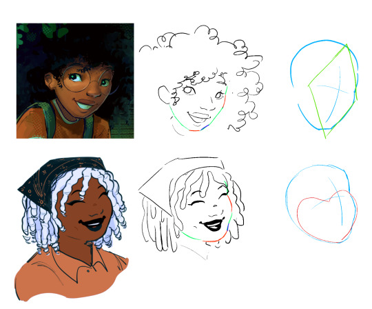
(idk if this illustration makes ANY SENSE bc like i said i think that i also struggle with pushing myself in regards to this and i think i still have more to learn/practice)
i think it comes down to paying attention to the proportions/types of specific facial features and adjusting them each to create a unique face
that said when it comes to stylizing what you see from photographic references, i understand that it can be tricky to simplify it. i really don't have any advice for this.... i just play around with it until it looks good while also being recognizable as the specific thing i'm trying to draw.......... so in that case i think it helps to use other people's art as a reference too! i don't really care about sticking to one "style" so i don't mind drawing in a slightly different way if i want to do something another artist is also doing. so for example if you're struggling with drawing 4c hair i recommend looking at other people's drawings of characters with 4c hair that you like and playing around with if you can incorporate their techniques into your own art.
i hope this all made sense ;^^ there are definitely a lot of tutorials out there that are way more informative than this one
also, to answer your last question, i plan to open up a few commission slots next week! (as long as i have enough time to that is)
53 notes
·
View notes
Note
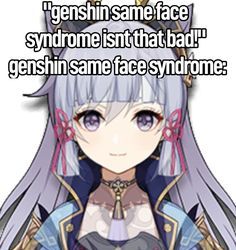
Wanted to give my two cents on the whole wuwa character design. The person saying that having distinct facial feature is not aspiring or interesting needs to watch their wording especially towards POCs.
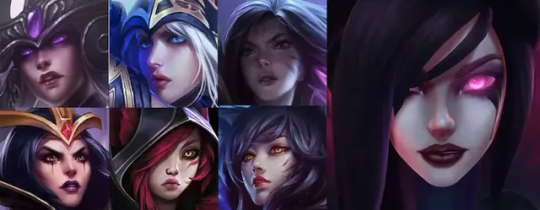
Most game always suffer from same face syndrome. This is mostly prominent with the females. No matter what a distinct a character looks like with their hair color or eyes. You plaster them on another character they practically identical. Genshin Impact and League of Legends suffer this big time.
Genshin Impact
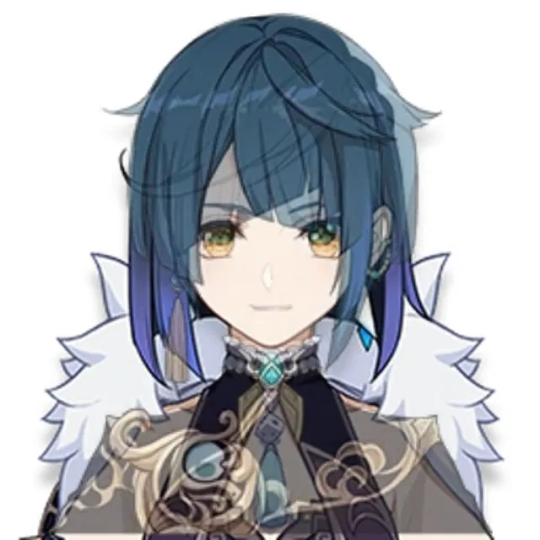
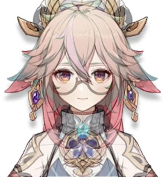
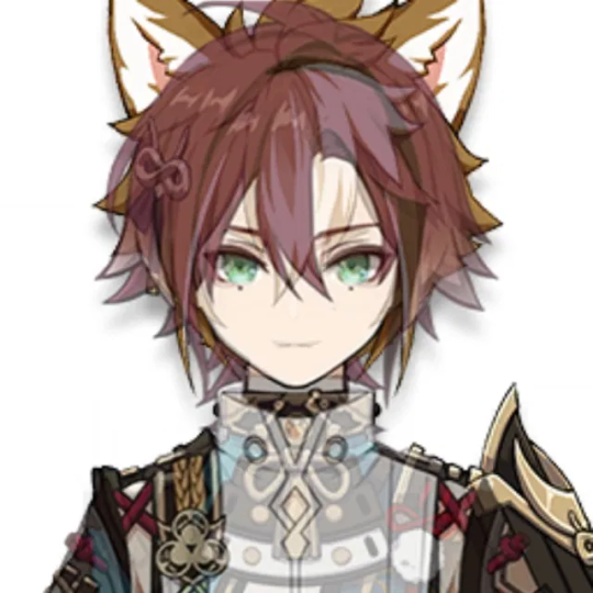
(Link to where I got the first 4 images: https://m.hoyolab.com/#/article/11600510)
League of Legends
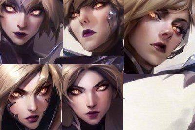
Besides their face ornaments you would believe these are all the same characters right? Nope! They are all different characters.
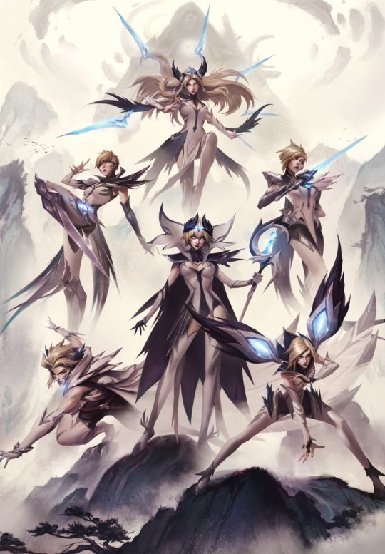
This is just for a skinline. When compared with the other female characters og skinline they still have all the same faces.
As far as I know the males have distinct facial features.
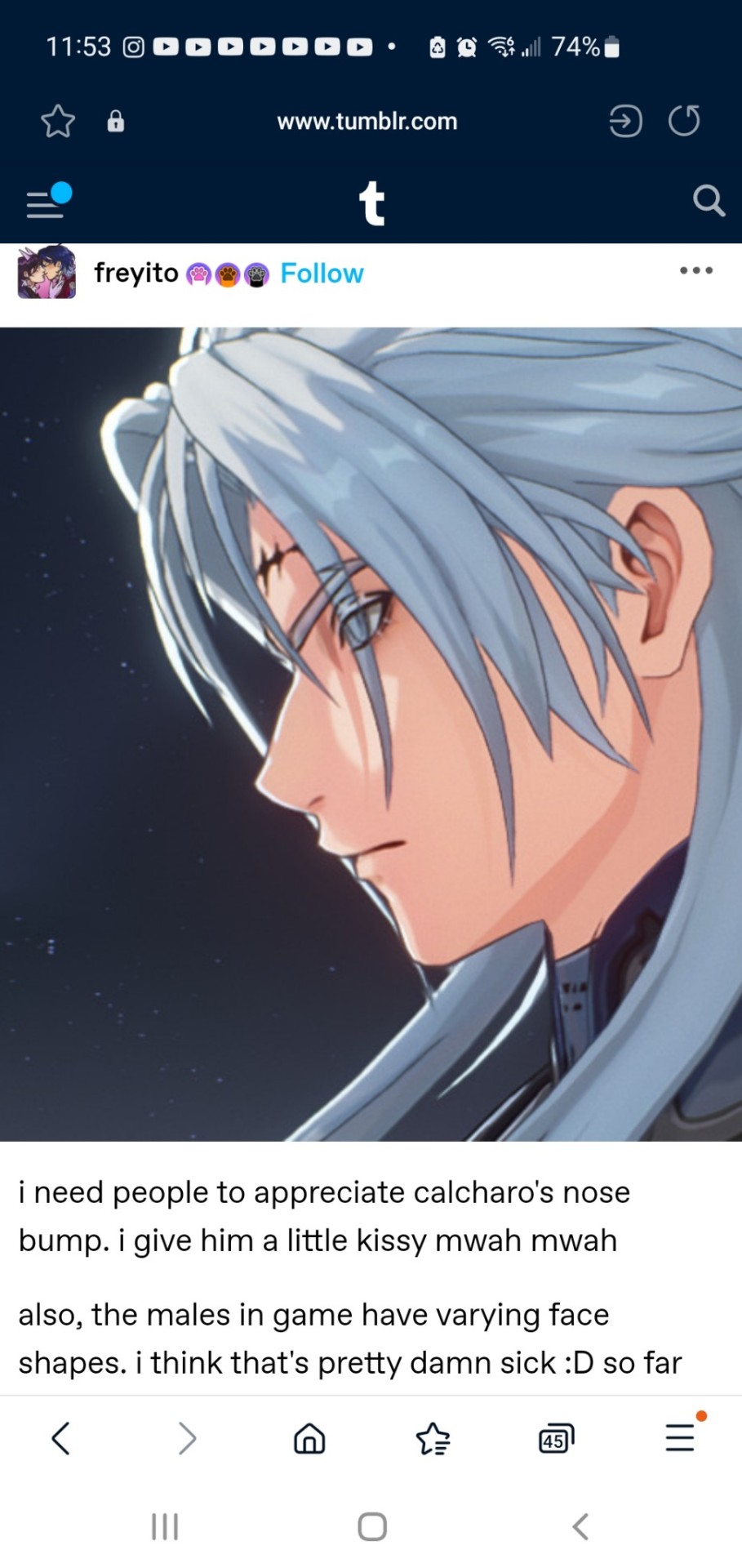
https://www.tumblr.com/freyito/751527973863178240/i-need-people-to-appreciate-calcharos-nose-bump?source=share
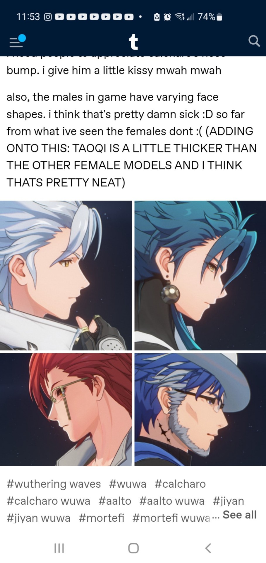
Same person has point out that Taoqi is a thicker than most of the female girls and I agree. Look at the comparison.
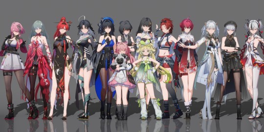
Small things like these make the game interesting and unique. Ethnic features and facial differences are important to everyone because it makes the character feel unique and we can relate them physical.
Not everyone is going to have the same eye shape, lips, nose, and mouth. But society excepts us to have the same feature and shuns/discriminates those who lack them or chose to embrace their features.
Which is why character creation games like Baldur's Gate, Elden Ring, Sims 4, and Cyberpunk allows players to adjust and modify their character to look like them so they won't feel like they need look a certain way.
Sorry for the rant. That post really trigger me.
First of all, thanks for sharing your thoughts. A rant it may be, but it was really interesting! Mainly because I didn't think about it from this angle before, but now that you mention it, it's so obvious :9
As a person of color myself, it is a little disheartening when non-white characters look the same but with a different shade of skin, lmao.
I don't play LoL, and haven't actually seen anything about it at all, so I hadn't seen this, though it doesn't surprise me. It's a common joke that women have less variety in their designs than men, and it gets pointed out a lot.
It's mostly modern anime poisoning or something, it's in the water I swear. Where it's just the same character but different colors and personality...
About the Genshin vs Wuwa thing, I agree that the comment of "faces" not being enough seems almost... insensitive? I don't know how to describe it, but I get it. They are so focused in the intricate clothing of Genshin and the large amount of accessories and at the same time disregard what actually matters when it comes to uniqueness, lol.
(In my eyes, clothing in character design, doesn't have to be incredibly decorated, it can be either way as long as it portrays accurately the character that's wearing them. So that whole argument is moot to me, since it's just a matter of stylistic choices and how you wish to portray an environment, etc, etc.)
Meanwhile, the fact that Genshin only uses like two bases for their characters feels like they've streamlined their design production to pull out 'bangers' each time. Just dressing up the same doll each time, changing out the wig and repainting their faces. I still like some designs from them, but it's clear they don't put much effort in the actual body of the character LMAO, they just let the fancy colors and accessories do the talking.
Anyways, hopefully we get more characters with more unique traits instead of some outfit change, both in Wuthering Waves, and in other franchises.
#thanks for the ask! and sorry for my own rant lmao#funnily enough taoqi is one of my favorites aside from danjin. though it's clear she is mainly there for those who like big girls.#it's still a win#i don't hate on genshin. or mihoyo that hard. since it's an issue with pretty much every other gacha game. who are we kidding.#hsr is pretty much the same. and it does make me wish for more differences. it gets tiring to see the new 5 star be the exact same model#with no differences other than clothing#i always check how they walk around and things like that and it never stops dissapointing me lmao#ALSO. genshin and hsr have like different areas and yet... they all look the same. lmao??? you would think they would at least try... but n#it's only the clothes they change. so superficial imo#ask#long post
16 notes
·
View notes
Last Seen Blogs