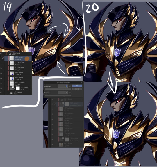
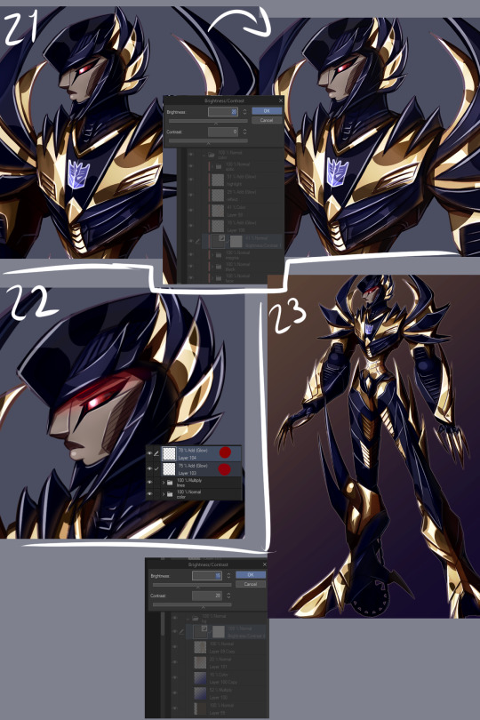
#cause some of them are too desaturated but others are too saturated
Text

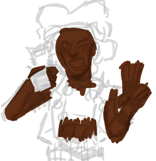
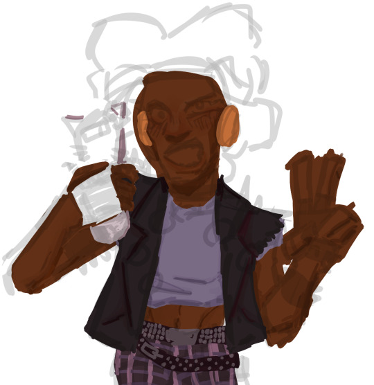
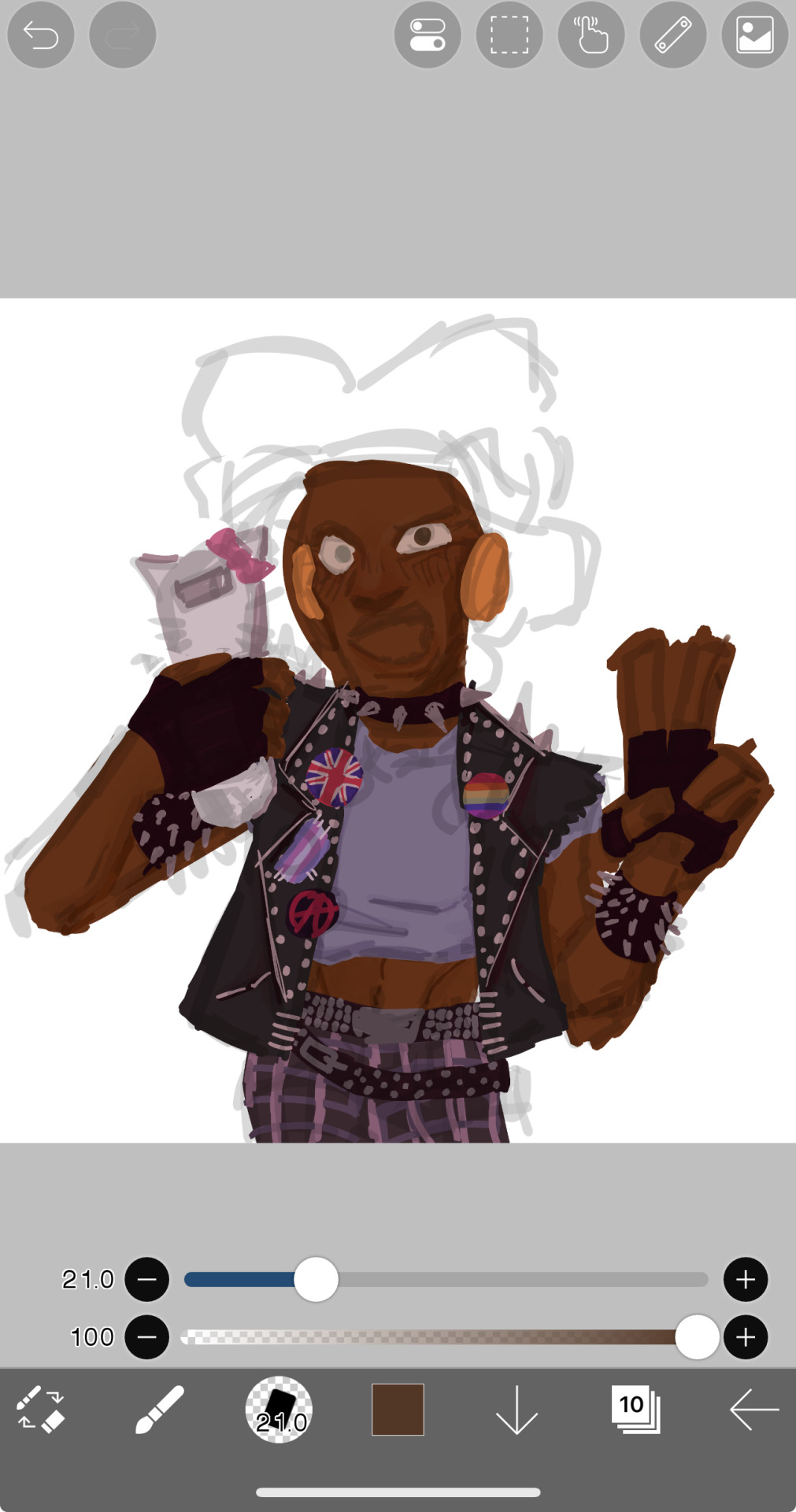
drawing this has been the worst thing ever
#im not even finished either#still gotta do the lineart#and the shading#and clean it up#and fix the colors#cause some of them are too desaturated but others are too saturated#and fix the phone#the way he’s holding it looks weird#i’m going to explode
4 notes
·
View notes
Text
rough art tips to learn and then break at your leisure.
the distance between your eyes is roughly one eye. the corners of your mouth dont extend past the middle of each eye. ears are roughly in the middle of the tip of the nose and the eyebrow. the eyes are in the very centre of the head. the neck is just a Little slimmer than the width of the head (varies with fat distribution, but fat tends to build up under the chin). hair is easier to draw when you plot out the hairline and then where it parts. leaving appropriate distance on the side of the face (cheekbone area and back to ear) contributes to making characters look more realistic/hot as hell. i dont know specific tips for that so use reference. an amazing reference/study site is lineofaction.com . if you think of the face in planes it makes it easier to construct (look up tutorials). if you draw a spiral like a tornado it can help you figure out awkward perspective for extended limbs (look up foreshortening coil technique). tangent lines are when two lines intersect and cause visual confusion (when it looks like a line that defines an arm is part of the line that defines a building, for example) and avoiding them makes your art way easier to comprehend. quick trick to good composition: choose a focal point (where you want your viewer to focus), detail that area the most, and make sure various elements of the piece are pointing to that focal point. you can use colours to contrast hue, saturation, and brightness and make certain elements of your drawing stand out. drawing in greyscale can help you figure out values. using black in a piece isn't illegal but you should know what you're doing when you do use it- it desaturates a piece and if used as a shading colour can desaturate and dull whatever youre shading too. if you use almost-black lineart and then add black to darken the very darkest areas it will do a lot to add some nice depth. the tip of your thumb ends just above the start of your index finger- your thumb also has two knuckles and all your other fingers have three. if you see an artist doing something you like (the way they draw noses or eyes or hair or anything else) you can try to copy that and see if you want to incorporate it in your style <- this is ENCOURAGED and how a lot of us learned and developed our styles. there are ways to add wrinkles to faces and bodies without making the character look a million years old, you just have to keep experimenting with it. The smile wrinkles around your muzzle dont connect to your mouth or to your nose; there should be a small space in between smile or nose and the wrinkle line. eyes when viewed in profile are like < aka a little triangle shape. think of the pupil like a disk and apply foreshortening to it (it looks like a line when seen from the side instead of a full round dot). subtle gradients can add a LOT to a piece. texture can also add a LOT. look up Tommy Arnold's work (his murderbot pieces are some of my FAVOURITE) and zoom in. find those random little circles he added and try to figure out why he added them there. light bounces. there's lots of way light bounces. sometimes it even spreads through the skin. i do not know these light tricks yet but i want you to know that they exist. draw a circle to indicate hand placement, draw a straight line between that circle and the shoulder, and then (normally at a right angle) draw a straight line on top of that line to find the placement of the elbow. elbows are normally placed Just above the hip when standing and your arm is at rest. there are no bad colour combos if you're brave enough about it, just fuck with the saturation and brightness until it works. keep playing. try new things. add your own tips to this post if you want or even expand on some ive mentioned here. good luck go ham etc
#look at this post#the sum of almost all of my art knowledge#all that i can remember rn anyway lmaooo#shit i didn't mention the tips for backgrounds that i know#eh that's environment most of this deals with character work anyway#i learned most of this from tutorials and kind artists who like to talk about their work#i would not know NEARLY as much about creative shit as i do if it weren't for the people who were willing to talk about their skills#and their tricks and their observations. id be nothing without them i dont remember most of them but i am so so grateful for that kindness#so ig here ill spread that a little further#if you have any questions go ahead and ask i am a NERD about art okay i do not know everything but i am always willing to talk about what i#do know#art tips#one of the most important things for you to do as an experienced or beginner artist tho#is to PLAY#experiment#figure out what's fun and what looks nice and what looks nice faster and just. whatever the fuck you want to learn#it is SUCH a joy
259 notes
·
View notes
Text
Chimata is pretty neat :)
SO I just want to talk about Chimata for a lil bit because I think she's pretty cool.
First off is her design, it's a rainbow design which most of time can look really ugly. Due to a lack of color consistency making it really hard to focus on the character. However, Chimata's design circumvents this by using colors' natural values.
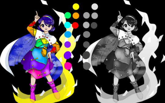
Some colors are just naturally darker (or have lower values) than other colors. Chimata's design uses these natural values.
Just in case if you're a bit confused, I have all the colors all the way to the top right, yet, some of them are still darker.
Our eyes naturally tend to look at what is the lightest. In this case, you're going to look at Chimata's center, her face and her white coat. Then they're going to travel downwards to the yellow, portion, then to the blue/green, then to the purple. Then again from chimata's center, your eyes travel to the orange, and then to the red of her arms.
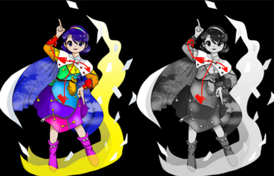
This is such a clever way to do a rainbow design and I love it so much cause of that. It might still look off to some people though because of the really high saturation, which is why some artists desaturate her colors just a teensy bit.
Ok now i wanna talk about her theme, "Where is that Bustling Marketplace Now ~ Immemorial Marketeers", specifically the Rainbow-Colored Septentrion version of the theme. Unlike most Touhou final boss themes, these theme feels desperate and powerless. The closest theme that I think gets to the feeling of desperation this theme has is Sukuna's theme with it's final part. Zun described the song as being split into two halfs, a 'wailing' section and a 'upbeat' section. The trumpets that appear 50 seconds into the song which really emphasizes that wailing part, they're slow and completely cut off the climax that the song was building up to at that point. Then once more, it builds tension up and up again, but once more it fails to capitalize on it and goes into THE BELL SECTION (my fav part !) A calm before the storm before the actual climax with a cool fast piano!
This part always feels like a last resort, I know to many it sounds upbeat but to me it always sounded desperate. It has barely any long notes, and is a super frantic. The melody also has this funky lil shape I like
Picture from chronondecay's transcription of Chimata's theme
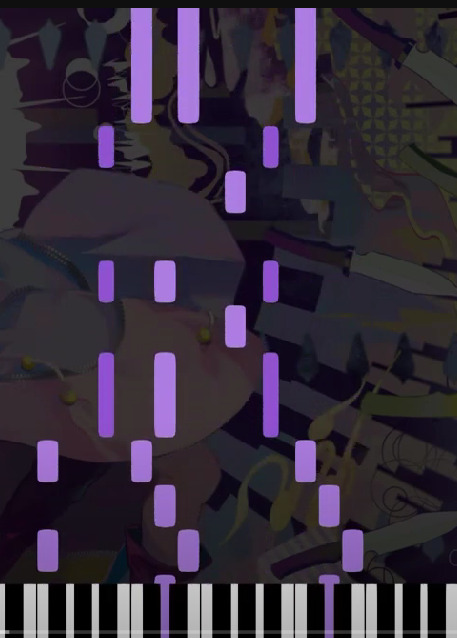
The melody is constantly going up and down in fast sucession. The stops within it, especially with the zunpets, feel like gasps of air to just barely continue.
Until it falls down again into a repeating zunpet part that sounds like it's trying to recapture the feeling of the previous section, but just can't.
That thing this song does, of rising to a climax that just doesn't come is so cool in my opinion. It feels so desperate and confused as to the direction of where it has to go. Showing Chimata's feelings during the incident where she is completely at a disadvantage due to the pandemic of the outside world, and being a newcomer to Gensokyo. She's trying to survive, but doesn't know how to go about it.
Well thats my best try at an analysis of a song 😎 since my knowledge of music just comes from looking at midis lol.
I'd like to talk about some of her story stuff too, like the incident and her relationship with Megumu that get's explored in Lotus Eaters but I AM TIRED. Instead of doing my homework thats due in 5 hours I did this for like an hour so I'mma stop for now. Hope you all like Chimata a bit more!
#touhou#touhou project#東方#東方project#東方イラスト#myart#touhou18#unconnected marketeers#chimata tenkyuu#she's really cool trust me.
202 notes
·
View notes
Note
Hey !! I just wanted to say your art is CRAZY good and I was wondering if you had any tips on picking color palettes?
Sorry for taking forever to respond, but hi!!! Thank you so much!!! wahh always wild when I am percieved, makes me v happy :)) As for color, your ask got me really excited since it my favorite part of the artistic process! So sorry if this post is very long and wordy, but I really wanted to talk about colors.
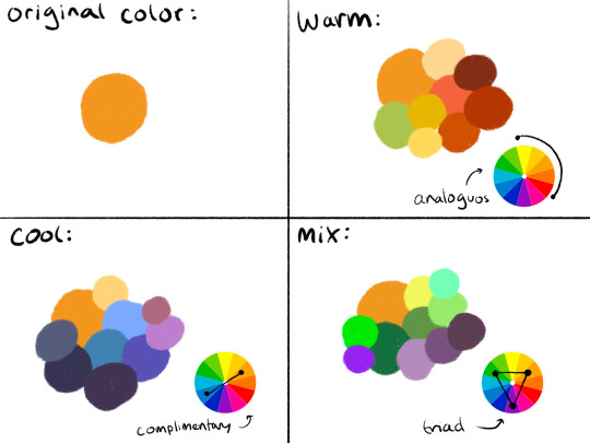
The long and short of it is that I like to use color theory (complimentary, analogous, triadic colors, etc) to minimize the amount of color in my work while using a variety of saturation and value to create the variation! Complimentary being colors across eachother on the color wheel, analogous are the colors next to eachother, and triadic are colors equidistant from each other,,, triangularly.
I typically don’t like starting out with a rigid number of colors of specific shades when I do my work cause it feels really limiting, and I enjoy adding color when it feels right. However, when I do color pick, I like to get a main big overall color scheme in mind then start placing various shades and saturations within that minimized pallete. The important part for me is not to stray too far from my pallete without some intent.
For example, when creating my character Peter, my goal was to make her a very warm colored character. To do that, I used an analogous color scheme of oranges and yellows with green sparingly. By minimizing the amount of different colors used, it helped the piece feel far more cohesive, but the amount of saturated and desaturated forms of the color created a lot more energy. And even though the colors I used were all next to eachother on the color wheel, the green provided a cooling contrast that I used in the eyes and portion of her costume to connect the two and emphasize. I also tried to use saturation and value to separate her from her outfit. Her skintone, hair petals, and markings are all very bright, while the outfit is desaturated tones. This made the seperation of the two more apparent to the viewer that this is body and this is clothes. I also like throwing in multiple color schemes to create even more visual interest. For example, for the lineart I used a deep saturated blue since blue is the complimentary to orange, her main color. This caused the lineart to stand out against her even more so than black lineart would.

To the upper right I also sketched out a different costume for her while maintaining the motif of orange and green (though some of the colors I’m not necessarily happy with).
Here are examples of some of my other stuff to show the “main colors” of the work. And as a secret, if a color isn’t matching my scheme, I like putting a color from my color scheme over it with a lower opacity and color pick from there ;) helps with melding it into it.

Of course these rules are not set in stone and I break them when I gotta, but this is generally how I like to find my colors. Anyways,, I hope this made some sense!! I’m not very good at writing my thoughts down, but I really enjoy color :)))
50 notes
·
View notes
Note
If you’re still doing it, Johnny and Whiskers for the Headcanon Meme: ൠ. By the way, have you gotten my other asks? I sent another one for the Headcanon Meme, one for the Ship Game, and one clarifying what I meant when I said story ideas for Johnny and Whiskers. You don’t have to rush to answer them, I just want to make sure you got them.
figured id get to this one first cause its easier for me to articulate a response.
yes, i have been getting your asks, and ive been intending to get to them, but for some reason im just. struggling. 😭😭😭 i have some progress on the ship game, its currently in my drafts, but other than that, everything else is collecting dust in my inbox. im trying to get around to it i swear 😔😔😔😔
okie now for the actual game part of the ask
ൠ: random headcanon
johnny: johnnys eyes have a few unique properties, with very minor colour changes based on emotion. his iris is like a red-brown-orange gradient-ish?? and saturates or desaturated depending on which spectrum of emotion hes on. saturated for the positive, desaturated for the negative. the interesting ones is when hes become too pissed off for his own good, and thats when it turns red. seeing red when im mad taken literally HAGAJDGJAHSA and when hes frightened or startled, they go just a slight off-white, this might be a slight reference to his original eye colour???, which is a dark grey, im not sure why i changed his eye colour, but i did. theyre also able to glow in the dark at will, similar to a torch, but dont actually project much light, or, like a cat, the pupils also reflect light, and do that thing where it goes like a greeny-yelliw colour. ough this was a long one.
whisker: uhhhh whisker cant stay afloat in water if hes stationary. he has to keep paddling to keep himself afloat, or he just. sinks like a fuckin rock. he most commonly doggy paddles (or kitty paddle HAGAGDGAHRWSH)
1 note
·
View note
Note
What is your step by step drawing process like, if you don't mind my asking?
I'll just use Sunstealer as an example since he's the most recent thing I did. Under the cut because this is horridly long. You wanted step by step, I’ll give you step by step.
That is a threat.
And every step of the way I use a sharp pen with high pressure sensitivity and a sharp eraser with high pressure sensitivity, unless stated otherwise.
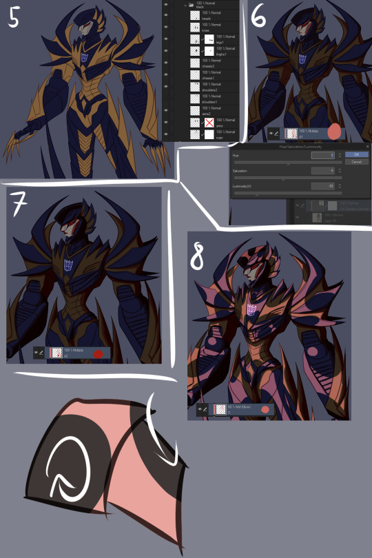
1. Alright, sketch first of all. I pick a whatever color, set a folder to multiply, and add layers in it. I start with the face/helm and take moderate care with making it look decent.
2. From there I sketch the rest of the the pic, preferably very loosely. I aim to not lift the stylus from the pad very much and instead just SCRIBBLE lines into the vague shape I'm after.
3. Set the sketch folder’s opacity real damn low, like somewhere under 10%, create a new folder, set it to multiply, and this is where the horrid amount of layers and layer folders I use comes in. But, you can see I actually did a second sketch of the arms (and legs, though that isn’t visible here) ‘cause I couldn’t make them look right based on my initial sketch.
4. On top of my second sketch I draw the rest of the clean lines. The lines were drawn with this purplish color, btw. I use something akin to it pretty often in my lineart.

5. After all that I use the Auto Select tool to select everything outside my lineart, e.g. everything I don’t want to have color. I then invert the selection and lay down my flats. At this point I used the gold as my base color, but then added separate folders for each following color, clipping them to the gold base layer below. In the case of black, its folder has a whole bunch of layers while I tried to figure out what parts to color black. With layers for the different parts, I can just click them on and off to see what things look like with or without them.
6. Okay, now to the meat of things. I use a correction layer (hue/saturation/luminosity in this case) to change the base gold to a far darker color that I can easily edit later without losing my initial color choice, and create a new layer on top of all my colors, set it on multiply, and in this case used a sort of peachy color to add my first shadows on top of the whole entire picture. At this point the exact colors in use don’t matter one bit, though, as long as you see what you’re doing.
7. I create a second multiply layer on top of the last one, and go over the whole thing again, adding deeper shadows, this time using bright red. But again, color doesn’t matter yet. I like contrast too, so you can see some areas turn almost black.
8. Shinies! We add our first Add (Glow) layer (that can be named differently in other programs, in SAI it was just “Luminosity”). Once again, color doesn’t matter, just as long as you see what you’re doing, but I was working with about the same peach I used on my first multiply layer. And how I add the shines is basically just color the glow over the whole area, then use the eraser in sweeping and circling motions to remove parts of it. I don’t treat each plate/portion separated by lines individually, because then you’ll just end up with mismatched areas that don’t communicate with each other at all and just fight. (Remember to erase the shine from over your shadows too. Auto Selecting the shadows and erasing the glow from the selected area is a good trick.)
9. More shinies! This time we want it to show up as a bit lighter/brighter than our previous shiny. Using a brighter color or higher opacity does the trick. I do the same thing of coloring large areas and erasing shapes out of them afterwards, but this time I make it argue with my first glow layer a bit. Some overlap is good, but I also want them to live their own lives. (I included a view of the second glow layer alone, but I worked with both glow layers visible.)
10. We now have two multiply layers and two glow layers. What we also have, is a base color (gold) and separate folders for every subsequent color (black, face, insignia in this case. And optic, but let’s not touch that yet). We now copy our two multiply layers and two glow layers, and move copies of them into each folder (sans optic) and clip them to the base layer in that folder. We move copies of the multiply and glow layers right over our base layer too, below our other color folders. (I deleted the glow layers from the “face” folder because I don’t want the face to be as shiny, and the multiply layers from the “insignia” folder because there’s actually no shadow over the insignia.) We can make our original multiply and glow layers invisible so they’re not messing things up, and what we should have is... The same exact thing as in step 9. Wow.
11. Now we actually make it look good! Though let’s just color the optic while we’re at it so it’s not all empty. Anyway, this is the stage where we really start to think about color and opacity. I want a neutral lighting to showcase his colors best, so let’s see how we get that. The thing we’ll just do is use Tonal Correction > Hue/Saturation/Luminosity to change our multiply and glow layers one by one, starting from our first multiply layer. I turn the other multiply and glow layers off so I can see what I’m doing and and tweak the colors until I get something that doesn’t scream “interesting lighting”, because I want neutral lighting.

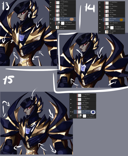
12. Then I go through all of the layers one by one and do the same thing to each of them. The reason I have them each on separate layers is exactly this, that I can affect all of the drawing’s colors individually and make them look just as I want to and always have the option of just going back and easily editing things. I also add a glow layer to the face, but with a brush rather than a pen so I get a softer look, buuut then add a second glow layer with a low opacity to add just a little bit of sharp light in there. And now we have a thing! But it looks pretty flat, doesn’t it? We don’t want that.

13. First of all, let’s add some soft glow to the gold. New glow layer below our multiply and other glow layers, choosing a soft color to accentuate the gold, and then using either a brush or airbrush we add just a bit of color in there. Arrows point to the spots where I added it, because we want the effect to be subtle and easy to miss.
14. We can do better than that, though. Let’s add a multiply layer and do the same thing, adding juuuust hints of darker color here and there. It adds a touch more depth, but again, we want it to be easy to miss.
15. Let’s have a look at the black, next. You may have noticed I turned off the second glow layer on it entirely, and that’s because it was decided that the black shouldn’t be as shiny as the gold. We still want to add some life to it though, and because Sunstealer’s black tints towards blue, let’s make some blue happen by adding a glow layer, and again, very softly with a brush or airbrush, add just hints of color in there.
16. It still doesn’t really good though, does it? It’s pretty boring and lifeless despite our efforts. More layers, then! Some fucking edges, this time. A glow layer above all of our existing layers and folders to affect all of them (except optic, ‘cause optic doesn’t need it), take good ol’ bright white, turn the opacity down a bit, and add sharp light to the edges. Like, all the edges that are touched by light. Seams, everything. We want this motherfucker to shine.
17. Okay, now do the same, except this time on the shadows. The layer is on lower opacity and I didn’t use white but desaturated blue instead. Just add a bit of reflected light in there.
18. Slowly getting there, but let’s do a couple more things. First of all, warm color. Basically, I just like to slap a random color on top of the whole damn thing when I’m finishing a drawing, using either a color, a glow, or a normal layer, depending which one gets me the best results that time. Or, all three, if that’s what I feel like. This time I used a color layer with briiiiiight neon orange. I switched the layer to normal and opacity to 100% so you can see where it’s actually applied, which is, again, on top of all the layers. A pretty large area, but even on 100% opacity with a normal layer you can see it’s pretty transparent. If I had wanted to do a more interesting lighting, I would’ve left it more visible and maybe added another similar layer in a different color, but I wanted neutral lighting so we leave it as just a tiny, tiny hint in there.

19. Still not done. Colors reflect other colors, so let’s make that happen on the black and have it reflect our gold some.
20. Almost there. What are we missing? Color correction, that’s what. I didn’t do much of it for this piece, but with some I really play around with correction layers and layers set to overlay and whatnot. But let’s see what we have here. First of all, there’s one brightness/contrast correction layer affecting the gold only, increasing the contrast so things look a bit brighter.
21. There’s also a second brightness/contrast correction layer, this one simply increasing the brightness a bit. It’s mostly for the sake of the black, because I wanted to make it look a bit more blue by making it lighter, but it worked to make the whole image a little brighter along with it. Aside from the optic, that’s still on top of everything else. But like said, how many corrective layers I have going on depends entirely on what I’m doing. In some cases I can have around a dozen in effect, not all of them always affecting the entire image, but split around to do their thing on different layers.
22. But speaking of the optic! It glows, so let’s make it glow with two layers on top of both of the “color” and “lines” folders. One layer is for the blurred red glow, the second is for the sharply reflected light.
23. And for things like these I like a simple background, which I generally do by just using a couple of gradients and altering their color to whatever looks decent. I also often add an outline to the entire character in pieces like this to make the character pop a bit more, by just copying my base color layer and performing gaussian blur on it.
WHEEZE. That’s that, though. Finished product can be viewed here.
Oh, and ctrl+shift and tap will jump you straight to the layer you tapped on. Makes moving between layers and finding the damn layer you wanted to edit a hell of a lot easier.
Annnnnd obsessively naming layers and layer folders so you can tell what the heck they actually are when you have way, way many layers to work with.
*thumbs up*
#asks#anonymous#is that step by step enough#i might've forgotten to mention some layers because there is A Bunch even just for the colors#but i tried to be thorough#but yeah non destructive editing and editability#that's how we get to some overachieving layer counts but make sure we can always go back and always have control
9 notes
·
View notes
Text
How to Pick and Use Colour in Your Art

rainbow
We all know the feeling of dread that kicks in when you finish your line art. You’ve spent hours meticulously sketching your art out, then cleaning the sketch up and getting it perfect, only to hit a blank when you have to add colour. There are hundreds of colours to choose from, each of them with varying saturations and intensities that could totally change the mood of your art. You add the wrong shade of red to your art and it totally changes the feel of the piece and you have to start over. Colours are difficult to pick, and difficult to make look good. I personally struggle with colour palettes, but I’ve found a few tricks that make it a lot easier. Those tips are what I’d like to share with you today in this blog, so keep reading to check them out!
Take from nature
Nature has some beautiful colours, so why not use them? Take some pictures of the fall trees, the flower fields, the setting sun, whatever looks nice! Make sure to be careful though, as sometimes even natural colour palettes can look cluttered. Avoid using things like rainbows as colour palettes, and try not to use pictures off the internet, as the colours might be altered and it might not look as good. Once you have your picture, take the colour that shows up most and make that your main colour. Then find commonly reoccurring colours and use those as your secondary and tertiary colours. Then, BOOM! You have a colour palette!
Lower the Saturation
Having bright and vibrant colour palettes can be great and super fun, but you can’t make them too bright. Make sure you don’t over-saturate your colours, or you’ll end up hurting your eyes. You can desaturate your colours by adding a little black or white to them. This will make the colour less intense, and spare your eyes from agony. If you want a vibrant colour palette, don’t use super bright colours. Use complementary colours like pink and light green. Put them near each other, and they’ll pop out and look more vibrant. If you’re confused, there’s more about colour theory in the next section.
Colour theory
Having good colours is important, but knowing how and where to use those colours is just as crucial. That’s where colour theory comes in. Remember back in fourth grade art class when the teachers would talk about warm and cool colours and complementary colours? Yeah, that’s colour theory. Well, kind of. To sum it up, warm colours are red yellow and orange, and cool colours are blue green and purple. Greys can be cool or warm too. If a grey has a red undertone it's a warm grey, and the opposite for blue. Warm colours are better if you want to have a warm environment, like a fireplace or a summer’s day. Cool colours are good for cold environments like snowy tundra. If you want to show a warm place near a cold spot, like a log cabin in winter, you can use warm colours for the inside of the cabin and cool colours for the outside. This will make the inside feel warm, and the outside feel cold and treacherous. The contrast between the two colours will further emphasise this, and make it feel more alive and interesting.

Colour wheel
In colour theory, there are also contrasting and complimentary colours. Take a look at a colour wheel. Draw a straight line from one colour to another. Those colours are complementary. For instance, blue and orange are complementary. Complimentary colours next to each other look very vibrant, and will pop out. If you use them too much though, it will hurt your eyes. Make sure to use them sparingly or turn down the saturation if you use them unless you want to hurt your eyes. You can use complimentary colours to bring focus to something. For instance, if you want the focus to be on a character’s eyes, you can use purple as a base colour and add yellow highlights to make it stand out. This will bring the focus to the eyes of the character.
This video does a really good job at explaining colour theory!
Just ditch the colour entirely!
If you’re having a lot of trouble with colour, and it's getting to the point where it isn’t fun anymore, just go monotone! Monotone colour palettes take a lot more skill to convey emotion, but they can be very pleasing to look at. The key is adding just the right amount of grey scale. Don’t totally go black and white, use some greys and browns too. Warm browns can add just the right amount of colour to your piece. You can also add some warmth to your blacks and whites by using a very dark, or almost black, red or an off white. This will save you the trouble of a colour palette without causing hindrance to your piece. In fact, it could make your piece feel old or graceful, like an ink written letter from the 1800’s! If colour isn’t your strong suit, then improvise and find something that works better and is easier for you! Here’s a monotone colour palette that looks really nice!
Colour is really fun, and can add a lot to an artwork, but it can be really tough to find a good palette. Hopefully my tips have helped out, even a little bit. If they haven’t, please tell me what you struggle with in the comments, I’d love to help! If I did help at all, please feel free to leave a like or tell me what you liked about my tips. I’d love to hear how it helped!
#colour pallette#How to pick a colour palette#colour#colours#how to pick colours#art#arts#artsy#creative#colour schemes#colourtheory#picking colours#how to#tips#tips and tricks
7 notes
·
View notes
Note
i hope this doesn't sound rude bcus the other anon who first brought it up was really rude about it, but your card is actually kind of hard to read. i'm only one person and i don't think i even have any sensory issues, so i don't know how it feels for anyone else, but here are the things i think might be the reason for this: (1/5)
1. the bright neon pink/red text on a black background. things that might help this would be desaturating the text color a little bit, or just making it lighter, or maybe making the background white. the font size and thickness may also contribute to this, though i think that may be a me thing?
2. i think maybe double spacing the paragraphs might also help + maybe a third space in between the end of a paragraph and a title / new faq question, given the space between each paragraph is kind of small and in some places things wind up looking like a huge chunk of text that can become hard to read, especially when combined with the text colorregardless of that, putting spaces between each entry of your byf would likely also help
3. having the titles/faq questions/Large Text be in an at least slightly different color/shade of the normal text color might also be a good idea? not really needed, just came to my mind. maybe making bolded text slightly different too? (bolded text color might be another thing that's just a me thing)
again, hoping none of this comes across as rude especially cause of the other anon but i wanted to point out why it might be hard to read for some and some ways that might help make it more readable. sorry this was so long! also sorry if i sent any pieces of this multiple times i got kind of confused and it thought i had a link in one of them
thanks for taking the time to type all this out! that’s super cool of you to do.
i’m gonna be real, most of this is stuff i might have to figure out how to do on carrd, like text colour/font i can obviously play around with but paragraph spacing might be harder ^^; but once i get a day off or some time to myself i can see if i can make it better.
i’d just ask that ppl be patient w me because at the end of the day my carrd is what i personally find readable and pleasing to my own sensory issues--the saturation, for instance, is because i hate reading fonts that aren’t high contrast and bright. blaring colours make my brain go good. so a lot of the time it is just genuinely gonna be neuroclash and i can’t always do much abt that. but i will try to find a medium.
6 notes
·
View notes
Text
Types of Aesthetics
*from Aesthetics Wiki
How to create your own aesthetic
Aesthetics 101: Create Your Own Aesthetic
Reminder: It IS possible to mix aesthetics and create your own.
1. Color Theory
The color wheel:
The color wheel is a starting concept of color theory. Primary colors are colors needed to create other colors.
For paint, primary colors are red, yellow, and blue.
For light, it’s red, blue, and green.
For printing, the colors are cayan, magenta, and yellow. They use subtractive color model, using the secondaries from light.
We’ll be focusing on the RYB (red, yellow, blue) model. These colors are mixed to create secondary colors-red+yellow=orange, yellow+blue=green, blue+red=violet.
Complimentary colors:
Colors opposite on the color wheel-red & green, orange & blue, yellow & purple. These colors contrast with each other.
An aesthetic using complimentary colors with full saturation would be Slimepunk. The main colors used are black, green, red, and purples.
An aesthetic using complementary colors at low saturation would be Warriorcore. The main colors used are brown, red, green, and grays. It’s a common aesthetic on tumblr right now.
Full saturation can be an eye strain while low saturation can make certain images pop.
Split complementary colors:
Split complementary colors take two colors on one side of the color wheel (ex: red+orange) and pairing it with a color on the opposite side of the wheel (in this example, blue). This creates a sense of unity and a sense of energy.
An example would be Fallencore.
Analogous colors:
Analogous colors are colors beside each other on the color wheel (ex: red, orange, yellow). These go together harmoniously, creating a sense of unity.
Some aesthetics would be
Light Academia. It’s main colors are beige, off-white, white, plaid, dim shades.
Red. It’s main colors are shades of red.
YamiKawaii. It’s main colors are black, red, pink, purples.
Triads:
Triads are colors equally spaced on the color wheel; red, yellow, and blue or orange, green, and purple.
Some aesthetics would be
Halloweencore. It’s main colors are orange, green, and purple, black, and red.
The Art Hoe aesthetic mainly uses triads-red, yellow, and red.
Hatchimitsu Core also uses some triads in it’s color scheme. It’s main colors are cadmium yellow, navy blue, white, beige, and warm earth tones.
a. Saturation
Saturation uses a high to low scale, where 1 is gray and 10 is the brightest version of the color. This can make something look light or dark, but it doesn’t mean that is is. Saturation is great for focal point, but high amounts of saturation can worsen headaches and seem chaotic. Desaturation can seem tired or old.
Neon/Florescent Colors:
Neons are highly saturated colors, causing a sense of chaos, disquiet, discomfort, and eye strain.
An aesthetic using neons are Psychadelica
Scene uses neon colors, which separates it from emo, which main colors are blacks.
Cyberpunk and Vapor Wave use desaturated colors to prevent too much discomfort. Vapor Wave’s main colors are blue, pink, and purple neons.
Pastels
Pastels are colors that have white added to them, making them tints, and have high value (closer to white than black). Pastels are often baby blue, baby pink, mint, lavender, and lilac.
Some aesthetics using pastels are
Bubble Goth. It’s main colors are silver, blue, white, black, and pastel pink.
Pastel Goth, using black and pastel colors.
Soft Grunge
Pastel Punk, using pastel colors.
Pastel aesthetics can also show femininity. Some examples are
Lolita and Mori Kei (Miri Kei’s main colors are green, brown, white, pink, and yellows).
It can also be used to convey sweetness and happiness, as used in
Cottagecore. Cottagecore uses green, brown, yellow, cram, and off-white colors.
Candycore.
Light Academia can also be put in patels.
Can be used to show child-like qualities like Kid Core, which main colors are pastels, neons, and bright colors.
And innocence and purity, as used in Angelcore and Fairycore.
Earthtones
Earthtones are desaturated colors made to look like nature. It includes browns, greens, blues, and yellows. It can symbolize life, nature, adventure, and the woods.
Some examples of Earthtone Aesthetics are,
Naturecore, Adventurecore (also uses whites/off-whites), and Art Nouveau.
Bright Colors
Bright colors have high saturation, but of any hue. They seem childish and hard to style together or bold and by themselves in a single person or group. These are associated with the 70s and 80s, and 90s-early 2000s.
Some exaples are,
Vintage/Retro
Nostalgiacore. Main colors are magenta, neon greens, bright reds, bright yellows, bright blues, and animal print.
Art Hoe
Hypebeast
Wormcore
b. Value
Value is how much white or black is added to a color. If black is added, its a shade and if white is added its a tint. Value is about how light or dark something is.
Tint=closer to white
Shade=closer to black
Darker colors are more serious, but not more masculine (the “little black dress”), however, tints are seen as purity (white is also seen as pure) and femininity.
Muted Tones
Desaturated colors and low value.
Closer to black.
Used to make things old and official, like in,
Dark Academia. Dark Academia mostly uses earth tones.
Dolly Kei.
Can be used to fit certain eras such as cryptidcore.
Can also be used to seem dull and lifeless such as Lovely Darkness.
Gray Scale and Monochromatic Colors
They’re not actually colors, but are colors with different variations in values.
Examples are
Poolcore, which mainly uses variations in blues.
You can see it in other colors like Purple.
High Contrast
High contrast is a limited color scheme that relies on the contrast of black, dark gray, and white to achieve it’s effect. Many goths use this color scheme.
Examples:
Vampire, mainly uses black and red.
Cybergoth.
c. Others
Jewel Tones
It was originally based off of crystals and precious stones. It’s main colors are medium to low contrasting purples, turquoise, aqua, emerald green, yellow, and red. It’s seen more in fall/autumn.
Some examples are,
(obviously) Autumn; main colors being red, orange, brown, yellow, gold, turquoise, violet, and indigo.
Fractal Art
Ethereal
Crystalcore
Metallic
Metallic rely on metals. They can be silver, gold, bronze, chrome, steel, and copper.
Some examples are
Y2K, using silver and bright and vivid colors.
Kinstugi, main color gold.
Crowcore, using rustic silvers, copper tones, white, green, and black.
Cyberprep, using chrome and leather.
And, arguably, Holosexual, using holographic colors and metallics.
Cool Colors
It can be cool colors like crimson red and ultramarine blue, and make a different feeling than warm toned reds and blues and make better purples and blacks in paintings, or colors associated with winter or water.
Examples:
Sea Punk. Main colors are blue, green, purple, and blue.
Ice Punk. Main colors are white, pale blue, and muted pastels.
Warm Colors
Warm colors are warmed toned, such as Cadimun Red, Cerulean Blue, and Cadimun Yellow. These colors will make better oranges. They’re associated with warmth, summer, or food.
Examples:
Coffee House. It’s main colors are dark brown, black, mustard, forest green, and maroon.
Warmcore. Main colors are soft/pale yellows, warm white, and light grays.
Golden Hour which is about sunsets, sunrises, and the color gold.
No Color Pallet or Scheme
Examples:
Cleancore, main colors being pale blue, white, and mint green.
Goblincore, main colors are earth tones.
2. Suffix Meaning
Academia focuses on academic styles. It doesn’t just focus on studyblr, it can go with other styles like Librarian Chic. It’s not limited to western academics, it can include academics from anywhere in the world.
Core N/A
Goth is a subculture that branches out of 80s punk. Dark clothes, Victorian, and Edwardian era fashion, makeup, and decorations are inspirations, but it has many branches to the aesthetic. Here is more information on goth subculture.
Kei is a Japanese suffix mainly used in the sense of “type”, and can range from theme to personality type.
Punk is referred to as a time rejecting social norms or a subgenre of speculative fiction. It originated with Cyberpunk, born in a new wave science fiction in the 70s. It can involve anything that would fit into the fictional high tech dystopia, including fashion, architecture, music, products, vehicles, etc. Some exceptions are Pastel Punk and Sea Punk.
List of aesthetics are posted seperately
#aesthetic#vintage#retro#colortheory#red#orange#yellow#green#blue#indigo#violet#redaesthetic#orangeaesthetic#yellowaesthetic#greenaesthetic#blueaesthetic#vaporwave#kawaii#studyblr#white#whiteaesthetic#black#blackaesthetic#astrology#cottagecore#witch#spring#witchaesthetic#springaesthetic#summer
5 notes
·
View notes
Text
My quick review of the ASUS XG27UQ monitor (4K, HDR, 120Hz)
I originally wanted to tweet this series of bullet points out but it was getting way too long, so here goes! I got this to replace a PG278Q, which was starting to develop odd white stains, and never had good color reproduction in the first place (TN film drawbacks, very low gamma resulting in excessively bright shadows, under-saturated shadows, etc.)
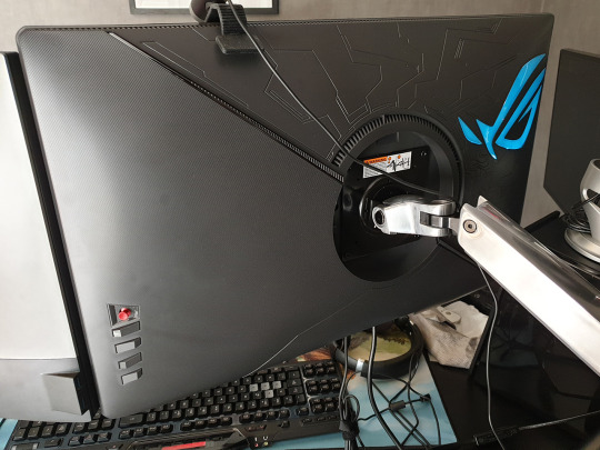
The hardware aesthetic is alright! The bezels may feel a bit large to some people, but I don’t mind them at all. If you’re a fan of the no-bezel look, you’ll probably hate it. There is a glowing logo on the back that you can customize (Static Cyan is my recommendation), but it isn’t bright enough to be used as bias lighting, which would’ve been nice.
The built-in stand is decent; it comes with a tacky and distracting light projection feature at the bottom. It felt quite stable, though I don’t care about it because it got instantly replaced by an Ergotron LX arm. (I have two now, I really recommend them in spite of their price.)
The coating is a little grainy and this is noticeable on pure colors! You can kinda see the texture come through, a bit more than I’d like. Not a huge deal though.
The rest of the review will be under the cut.
The default color preset (”racing mode”), which the monitor is calibrated against, is very vivid and saturated. It looks great! But it’s inherently inaccurate, which bothers me, so I don’t like it. It looks like as if sRGB got stretched into the expanded gamut of the monitor.
sRGB “emulation” looks very similar to my Dell U2717D, whose sRGB mode is factory-calibrated. However, the XG27UQ’s sRGB mode has lower gamma (brighter shadows), so while the colors are accurate, the gamma is not. It feels 1.8-ish. Unless you were in a bright room, it would be inappropriate for work that needs to have accurate shadows. This mode also locks other controls, so it’s not the most useful, but the brightness is set well on it, so it is usable!
The “User Mode” settings use the calibrated racing mode as a starting point, which is a big relief. So it’s possible to tweak the color temperature and the saturation from there! I checked pure white against my Dell monitor and my smartphone (S9+) and tried to reach a reasonable 3-way compromise between them, knowing that the Dell is most likely the most accurate, and that Samsung also allegedly calibrates their high-end smartphones well. My configuration ended up being R:90/G:95/B:100 + SAT:42. This matches the saturation of the U2717D sRGB mode fairly closely. You also get to choose between 1.8, 2.2, and 2.5 gamma too, which is not too granular, but great to have. It kinda feels like my ideal match is between 2.2 and 2.5, but 2.2 is fine.
The color gamma according to lagom.nl looked fine, but I had to open the picture in Paint, otherwise it was DPI-scaled in the browser, and that messed with the way it works!! (That website is an amazing resource for quick monitor checks.)
Colors are however somewhat inaccurate in this mode. It’s easy to see by comparing the tweaked User Mode vs. sRGB emulation. There are some rather sizeable hue shifts in certain cases. I believe part of this is caused by the saturation tweak not operating properly.
Here’s a photo of what the Photoshop color picker looks like when Saturation is set to 0 on the monitor, vs. what a proper grayscale conversion should be. It’s definitely not using the right coefficients.
So in practice, when using the Racing & User modes, compared to the U2717D sRGB, here’s a few examples of what I see:
Reds are colder (towards the purple side) & oversaturated
Bright yellow (255,215,90) is undersaturated
Bright green (120,200,130) is undersaturated
Dark green (0,105,60) is fine
Magenta (220,13,128) is oversaturated
Dark reds & brown (150,20,20 to 90,15,10) is oversaturated
Cyan (0,180,240) is fine
Pink (230,115,170) is fine
Some shades of bright saturated blue (58,48,220) have the biggest shifts.
The TF2 skin tone becomes slightly desaturated and a bit colder
It’s not inaccurate to the point of being distracting, and you always have the sRGB mode (with flawed gamma?) to check things with, but it’s definitely not ideal, and some of these shifts go far enough that I wouldn’t recommend this monitor for color work that needs to be very accurate.
I’ve went back and forth, User vs sRGB, several times, on my most recent work (True Sight 2019 sequences). I’ve found the differences were acceptable for the most part; they bothered me the most during the Chronosphere sequence, in which the hazy sunset atmosphere turned a bit into to a rose gold tint, which wasn’t unpleasant at all — and looked quite pretty! — but it wasn’t what I did.
I’m coming from the point of view of a “prosumer” who cares about color accuracy, but who ultimately recognizes that this quest is impossible in the face of so many devices out there being inaccurate or misconfigured one way or the other. In the end, my position is more pragmatic, and I feel that you gotta be able to see how your stuff’s gonna look on the devices where it’ll actually be watched. So while I’ve done color grading on a decent-enough sRGB-calibrated monitor, I’ve always checked it against the inaccurate PG278Q, and I’ve done a little bit of compromising to keep my color work looking alright even once gamma shifted. And so, now, I’ll also be getting to see what my colors look like on a monitor that doesn’t quite restrain itself to sRGB gamut properly.
Well, at least, all of that stuff is out of the box, but...
TFTCentral (one of the most trustworthy monitor review websites, in my opinion) has found suspiciously similar shifts. But after calbration, their unit passed with flying colors (pun intended), so if you really care about this sort of stuff and happen to have a colorimeter... you should give it a try!
I hope one day we’ll be able to load and apply an ICC/ICM profile computer-wide, instead of only being able to load a simple gamma curve on the GPU with third-party tools like DisplayCAL. Even if it had to squeeze the gamut a bit...
Also, there are dynamic dimming / auto contrast ratio features which could potentially be useful in limited scenarios if you don’t care about color accuracy and want to maximize brightness. I believe they are forced on for HDR. But you will probably not care at all.
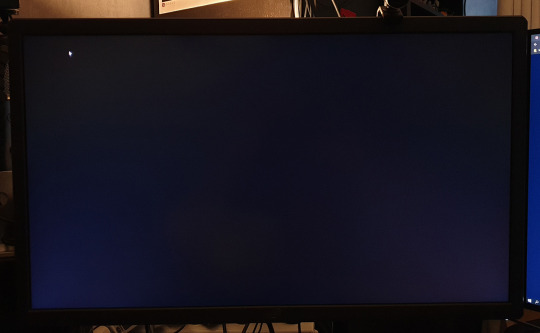
IPS glow is not very present on my unit; less than on my U2717D. However, when it starts to show up (more than a 30°-ish angle away), it shows up more. UPDATED: after some more time with the monitor, I wanna say that, in fact, IPS glow isit's slightly stronger, and shows up sooner (as in, from broader angles). It requires me to sit a greater distance from the monitor in order to not have it show up and impede dark scenes. It is worse than on my U2717D.
Backlight bleed, on the other hand, is there, and a little bit noticeable. On my unit, there’s a little bit of blue-ish bleed on the lower left corner, and some dark-grey-orange bleed for a good third of the upper-left. However, in practice, and to my eyes, it doesn’t bother me, even when I look for it. It ain’t perfect, but I’ve definitely seen worse, especially from ASUS. The photo above was taken at 100% brightness, and I’ve tried to make it just a tad brighter than what my eyes see, so hopefully it’s a decent sample.
Dead pixels: on my unit, I have 5 stuck dead green subpixels overall. There are 4 in a diamond pattern somewhat down and right to the center of the screen, and another one, a bit to the right of that spot. All of them kinda “shimmer” a little bit, in the sense that they become stronger or weaker based on my angle of view. They’re a bummer but I haven’t found them to be a hindrance. Took me a few days to even notice them for the first time, after all.
HDR is just about meaningless and uses some global dimming techniques, as well as stuff that feels like... you know that Intel HD driver feature that brightens the content on the screen, while lowering the panel backlight power in tandem, to save power, but it kinda flattens (and sometimes clips) highlights? It kinda looks like that sometimes. Without local dimming, HDR is just about meaningless.
Unfortunately, the really nice HDR support in computer monitors is still looking like it’s going to be at the very least a year out, and even longer for sub-1000 price ranges. (I was holding out for the PG27UQX at first, but it still has no word on availability, a whole year after being announced, and will probably cost over two grand, so no thanks.)
G-Sync (variable refresh rate) support is... not there yet?! The latest driver does not recognize the monitor as being compatible with the feature. And it turns out that the product page says that G-Sync support is currently being applied for. Huh. I thought they had special chips in those monitors solely for the feature, but it’s possible this one does it another way? (The same way that Freesync monitors do it?)
DSC (Display Stream Compression) enables 4K 120Hz to work through a single DisplayPort cable, without chroma subsampling. And it’s working for me, which came as a surprise, as I was under the impression this feature required a 2000-series Turing GPUs. (I have a 1080 Ti.) I was wrong about this, it’s 144 Hz that requires DSC. And I don’t have it on this Pascal card. But I don’t really care since I prefer to run this monitor at 120 Hz, as it’s a multiple of the 60 Hz monitor next to it.
Windows DPI scaling support is okay now. Apps that are DPI-aware, and the vast majority of them are now, scale back and forth between 150% and 100% really well as they get dragged between the monitors! The only program I’ve had issues with is good old Winamp, which acted as if it was 100% on the XG27UQ... and shrinked down on another monitor. So I asked it to override DPI scaling behaviour (”scaling performed by: application”), which keeps the player skin at 100% on every monitor, but any call to system fonts and UI (Bento skin’s playlist + Settings panel) are still at 150%. So I had to set the playlist font size to 7 for it to look OK on the non-scaled monitor!

A few apps misbehave in interesting ways; TeamSpeak, for example, seen above, scales everything back from 150% to 100%, and there is no blurriness, but the “larger layout” (spacing, etc.) sticks.
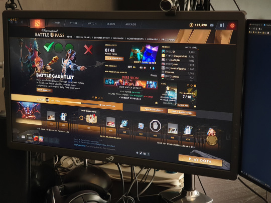
Games look great with 4K in 27 inches. Well, I’ve only really tried Dota 2 so far, but man does it get sharp, especially with the game’s FXAA disabled. It was already a toss-up at 1440p, but at 4K I would argue you might as well keep it disabled. However, going from 2560x1440 to 3840x2160 requires some serious horsepower. It may look like a +50% upgrade in pixels, but it’s actually a +125% increase! (3.68 to 8.29 million pixels.) For a 1080 Ti, maxed-out Dota 2 at 1440p 120hz is really trivial, but once you go to 4K, not anymore... you could always lower resolution scale though! (Not an elegant solution if you like to use sharpening filters though, looking at you RDR2.)
Overall, the XG27UQ is a good monitor, and I’m satisfied with my purchase, although slightly disappointed by the strong IPS glow and the few dead subpixels. 7/10
6 notes
·
View notes
Photo

A more in-depth look at their color palette. Bugg has incredibly saturated colors because of his glitchy nature, and Lead has a somewhat more desaturated palette, largely as a representation to him not having a soul. I tried to keep Bugg's colors as close to the primaries as possible.
Random bits of info about them below the cut:
Bugg got his nickname from Lead, who started calling him that because he bugged him a lot. It's also a reference to his nature as an error/glitch.
Lead got his nickname from various other people. After multiple AUs where he refused to call himself 'Sans', a few people in those AUs started calling him Lead because his usual art medium is sketching with a mechanical pencil in a sketchbook. There's an AU where he's called Arty.
The line across Bugg's shirt is a reference towards his former identity as Geno Sans. He's a bit more closely tied to his past in this AU, which is the main cause of his emotional imbalance.
Bugg's design in comparison to Lead's is very basic, especially with the amount of colors that each of them use.
Bugg's color scheme is a reference to the typical primary colors that are used in computers and/or programs: Red, yellow and blue. I may end up brightening his tear marks a little more to help them stand out in the future.
Lead may or may not have a bag added around his waist at some point in the future where he keeps his phone and can pull whatever he needs out of his dimensional boxes. He does still have his jumper, but he prefers wearing either his scarf or his jumper because otherwise he feels too heavy.
Lead's design was also simplified from Ink's because Ink has a lot going on for him and it's a bit much to draw repeatedly.
Unlike the original Ink design, Lead doesn't wear long sleeves to cover up any sort of black bones or tattoos. He covers them up for a different reason altogether.
#undertale#undertale au#sans#sans undertale#ink#inktale#ink sans#error#errortale#error sans#ink!sans#error!sans#ink and error#undermine#my art#my undertale
28 notes
·
View notes
Note
hello! your gifs are so sharp and vibrant! could i ask how you make them - is there a certain method you use or do you change it for each gif? (thank you for sharing your gifs!) (feel free to not answer if it's a trade secret tho :D)
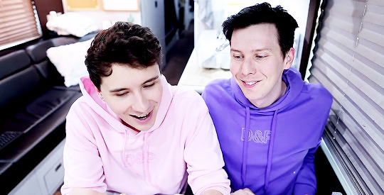
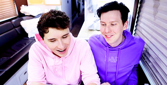
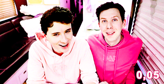
oooh thank you so much! it took me a long time to feel comfortable with my gifs tbh i’ve been learning for 6 years now! but anyway, pretty much everything i do to make sure my gifs look the way they do:
FIRST:
i use Photoshop CS5 because i personally prefer the end result for gifs in CS5 rather than CS6 but it’s just a detail, whatever you have is good;
it’s not really a full-on tutorial, i just explain what i do in each step for my gifs to look like that;
it requires basic gifmaking knowledge and some familiarity with photoshop but overall i think (and hope) it’s easy and understandable;
BASICS:
high quality videos (1080p is ideal, 720p works for most gifs) and good lighting help A LOT.
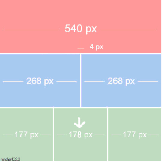
if you’re using kmplayer to capture your frames make sure you have ‘every frame’ selected in the ‘frames to extract’ section.
it’s very important to respect the tumblr dimensions to avoid stretched out/blurry gifs (the column in the middle of the a 3 columns gifset is 178px instead of 177px):
SHARPENING: i still use this sharpening action and apply it twice to the original layer (sometimes i have to adjust one of the ‘smart sharpen’ options to make it look better). if you don’t like to use actions, just apply ‘Smart Sharpen’ in these settings (most commonly used but you can changed it to fit your own personal taste, add more sharpening if you think it’s necessary):
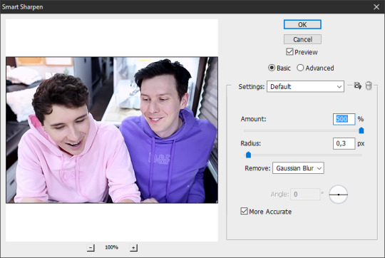
let’s start with this, then (i’m using the sharpening action):

COLORING: that can be a pretty tricky but it’s mostly personal taste. i like bright, contrasting and vibrant. another thing that is very important to me is making sure the person’s skin doesn’t look all fucked up and overexposed. sometimes i fail. but anyway, i tend to focus my coloring process on highlighting the whites and blacks and making colors pop.
for this blog i mostly gif dan and phil who are pretty pale and have dark hair so it’s easier to apply my coloring preferences on them, but when i gif people of color i change my process to avoid whitewashing them and to make their skin color pop (there are a few tutorials on how to color poc out there like x and x)
when i don’t use psds (pro tip: ALWAYS save the psds of the gifs you make, even if you don’t like the coloring. save it cause you may want to use it later) and do my coloring from scratch i usually start by darkening the blacks. for that i’ll use the ‘Levels’ adjustment layer:


and then i’ll start adjusting their skin tone in the same ‘Levels’ layer:


some brightness and contrast to add some shine:

and hue/saturation to adjust the colors:
and from this point on i just keep adding more adjustment layers, changing colors until i reach a result the pleases me:
CURVES: i subtly drag the line upwards to enhance their skin tones, depending on what you’re giffing you may need to drag the line higher or drag different points of the line to adjust the contrast.
EXPOSURE: i add some light ‘Exposure’ (if you add too much it kind of ruins the skin details, for this one i added +0,10); then i darken the dark areas by moving back the ‘Offset’ arrow (-0,0287 for this one) and in ‘Gamma Correction’ i moved the arrow to 1,12 to adjust their skin tone.
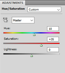
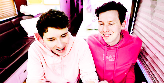
HUE/SATURATION: you can use to increase saturation and change colors. in ‘Master’ settings i usually only move the arrow a bit to the right to subtly change the red in their faces to a more yellow-y tone. to change the color of phil’s hoodie i switched to ‘Magenta’ settings and moved the arrow until i found a color that i liked (pink) and for a better result i did the same with the ‘Blue’ settings. if you don’t want to change a color but just make it pop (for example, blue) you can select ‘Blue’ and just enhance the saturation until you think it’s good enough.
SELECTIVE COLOR: i use this adjustment layer in all of my colorings mainly for the ‘Blacks’, where in the ‘Black’ section i increase it as much as i can without ruining the coloring to make sure the darks are Dark for that good contrast. for this specific coloring i also went to ‘Reds’ and dragged the arrow in the ‘Black’ section to the right to highlight the curves/lines of their faces and their lips. and then in ‘Neutrals’ i keep changing it depending on how i want my coloring to look like. if i think their skin tone is too magenta-y i enhance the ‘Yellow’ section, etc.
COLOR BALANCE: does what the title says, drag the arrows in the different sections until you’re satisfied. for this one, in the ‘Midtones’ i slightly enhance the ‘Green’ and ‘Yellow’ because their skin was too magenta for my liking.
VIBRANCE: i don’t usually change the saturation here (i usually do it in hue/saturation) and i focus on vibrance just for a special final touch.
my final result:
AS YOU SAVE YOUR GIFS:
make sure they’re under 3mb! if they’re not you can crop the timeline before saving or delete frames after saving and re-save (you’ll probably have to re-save anyway as i’ll explain later)
these are the settings i (and most gifmakers) use for saving gifs:

after you save, the frame delay in your gifs may switch to ‘0,07′ it always happens to me and i believe it’s because i use the animation timeline to make my gifs so i always open the gifs i just saved and i see them at a 0,07 delay:

however 0,07 is too slow for me (this one gif doesn’t really help but trust me, it’s kind of really slow) and i prefer 0,05 or 0,04 delays. i’ve been using 0,04 more often recently because imo they look closer to the real speed in their videos but sometimes i think they’re too fast and switch back to 0,05. in general, i think 0,05 is a safer bet:

then i re-save the gifs the same way i’d save a normal gif (’Save for Web & Devices’) and i replace the old gif.
doing this will NOT affect the quality of your gif as you can see in the gifs above!
take in consideration that these delays (0,05 and 0,04) work for gifs that use every frame instead of every 2 or 3 frames. in that case you might need to readjust the delay to different numbers. test it as many times as necessary.
FINAL CONSIDERATIONS:
i started making gifs in a time where most gifsets were pastel and desaturated and i personally really disliked the style back then and wanted to see more bright/vibrant gifs again so that’s why i started making gifs, to see what i wanted to see in gifs, not what other people wanted.
even though i just gave a bunch of instructions here it’s important to remember that there are no rules to gifmaking just common sense (don’t steal, don’t just edit someone else’s gifs and call it your own, don’t whitewash poc, etc.). do whatever you want with your own gifs, try all the styles you like, change the colors, make it thermal, make it slow, fast, etc. just do what you like.
not all gifs/colorings will be winners and it’s ok. keep trying.
it’s okay to ask your friends for help! and make sure to help your friends when they need it!
we are all learning here
we are all doing it for free
i wasn’t expecting this answer would end up being this long hehe sorry! but i hope this is helpful! if you need anything else feel free to ask me again and i’ll do my best to help you!
#descendio#sorry it took me so long!#i saw this ask last night in bed and started answering this morning#but i had to leave for lunch and only got back to it now!#lola.ask
72 notes
·
View notes
Text
Violet
1940′s!Bucky Barnes x Reader
Colors: Part 3
Word Count: 1.3k+
Summary: In which you both spend a day enjoying the color you share before it has to leave.
Warnings: Angst
Author’s Note- Oh, the pain is only beginning. There’s a lot of fluff too don’t worry. Btw, ‘dead hoofer’ is 1940′s slang for bad dancer. I worked really hard on this series so I would love love love to hear what you guys think of it so far!
Masterlist | Ask Box | Taglist
Blue | Red | Violet | Black | Gold | White | Green | Epilogue
1942
It was almost as if that desaturated world he remembered had returned. Gray suddenly replaced the deep shades of red and the pastel blues that should have been there.
Black and white suits. Black and white coffee cups. Black and white buildings. As if the color had been drained from the world too soon after the pigment had been spilled.
The lilac curtains that framed yours and Bucky’s kitchen filtered gray light as he looked at them now. The cloudy skies outside causing pale colorless sunlight to drip through the thin fabric.
Bucky sighed. Thin wired glasses sat on his nose as he read. A book he’d bought long ago and had read so many times since. White cracks now ran down the paperback spine, but the words The Hamlet could still be made out. The quiet sizzle of the pan on the stove and the sound of the record playing sat in the background as he tried to focus on the words that sunk into the pages.
But then you walked in, draped in your faded purple nightgown. A violet above your ear, pinned into your cropped hair. He’d left a small vase of the flowers on the nightstand, hoping you’d see their vibrant, rich color though he couldn’t seem to.
He couldn’t help but notice that the colors began to seep in again, like a path behind you. Splashes of paint for the world spilled from your feet each time they touched the ground before drifting upwards to fill the room. You made your way over to him, a faint smile on your lips, matching the one he’d seen when he first worked up the courage to talk to you, a smile forgotten to be taken down.
You both knew. Him from the telegram, you from the pale green uniform that had sat folded on the top of his dresser.
“Good morning.” He murmured. Setting the book down on the counter and pushing the glasses to the top of his head.
“Hey.” You replied just as softly, your hand coming to rest on his jaw as you reached him.
He kissed you softly.
It was light, and didn’t last long, but color seemed to explode from your lips as he pulled back from you. The violet color of the flower in your hair and the saturated yellow that looked like paint from the end of a pin in the center of it’s petals. The specks of blue pushing past the overcast sky. The bright red of the outstanding cabinet handle, one that Bucky had picked out when the white one that matched all the others had broken.
“You are so beautiful.” He whispered, his left hand falling down your side to rest on your hip.
“Thank you.” You responded, eyes turning to the floor as heat flushed your cheeks.
“You really are.” He insisted, recognizing your hesitancy to accept the compliment. He brushed away strands of hair and pressed a kiss you your forehead.
Neither of you wanted to talk about it, but you both knew you should. “I take it you got your orders?” You asked.
“Shipping out to England first thing tomorrow, the 107th.” He replied, willing himself not to let the tears that glazed his eyes fall down his cheeks. “How’d you know.”
“Your uniform. On top of the dresser.”
He pushed a piece of hair behind your ear, “Our dresser.”
“Yeah.” You giggled. “Why’s that important?”
“I just want to remember, and I want you to remember, everything in here is ours. This place is ours. Even when I’m not here, it’s ours.” He lifted your hand and pressed a kiss to your knuckles before letting it drop back to your side.
He reached into his pocket and fingered the ring inside. A golden band with a single small diamond on it. He'd asked his mother for it not long ago. She’d smiled and slipped it off her finger before placing it in his palm, “good choice”, she had told him.
He was just waiting. Waiting for the perfect day, the perfect time. But when? Maybe now would be the only time. He began to pull it out, but dropped it back. He couldn’t do that to you. He couldn’t make the promise that he’d be there to place a second ring on your finger, and that he’d be there to place that sealing kiss on your lips. That you’d never have to take that ring off your finger, give it back to his mother with tears streaming down both your cheeks.
You kissed him lightly, “Don’t talk like that.”
“‘M sorry, doll.” He whispered.
He slipped his hand out of his pocket and instead folded it with yours. You rolled your eyes fondly and let your palm fall onto his shoulder. The music found its way to the forefront of both your minds as you began to dance.
“You stepped out of a dream, you are too wonderful to be what you seem!” The singer belted from the recording, as if reading your thoughts. The record held a faint static, the voice breaking briefly every few lines.
Bucky turned you out on his arm, and you quickly got into step with him, twirling around the room between pieces of furniture, holding onto each other. You stepped on his feet a few times, but Bucky guided you through it, and giggles often followed from both of you. The music, the early gray sunlight, the smell of bacon sizzling in Bucky’s pan on the stove, the way you danced together, interlocked with one another, it was all so… colorful.
“I think Steve went to go see a movie.” Bucky said, voice carrying from the bedroom as he changed out of his pajamas. Pale yellow afternoon sunlight streamed through the window, shining on the plates that sat on the table still unwashed from breakfast hours ago. You and Bucky had spent those few hours dancing, or with you wrapped in his arms laying on the couch together, neither of you wanting to talk much about anything. “I was thinking we’d drop by the cinema and pick him up to go with us to the Stark Expo. Then maybe we could go dancing.
“Thoughts?” He entered the kitchen, dressed mostly in uniform, though his tunic remained unbuttoned over his shirt, and he held his cap in his hand.
“Sure. Even though you know I'm a terrible dancer.” You said, getting up from your chair to meet him halfway to the table.
“You’re a dead hoofer, but I love you.” He replied with a smile. “Maybe we'll have the band play somethin’ slow.”
You nodded, a smile coming to your lips. “Should I invite Connie? We could double date?”
“I think Steve would like her.” Bucky replied.
“Let’s hope she likes him.” You muttered, buttoning up the tunic for him. You stared up at his eyes, the steel blue you’d grown so familiar with. You wondered what it’d be like to not wake up looking into them each morning. They were almost like cigarettes. You were fine without them, but then once you had even one. Once you looked into his eyes even once, you could barely live without them.
You took the cap from his hand and placed it on his head. “You look handsome.”
“Thank you.” He hummed, pressing a kiss to your lips.
“I don't want you to go.” You leaned your head against his chest, finally letting the thought that had been running through your head ever since you had first seen his uniform sitting on the dresser that morning slip over your lips.
Bucky wrapped his arms around you, holding onto you tightly. He stayed silent, knowing if he so much as opened his mouth he'd start to cry. And he had to stay strong for you- he couldn't let you see that he was afraid- he was so so incredibly afraid- that when he left on that ship, as Sergeant James Barnes of the 107th, he'd never see you again.
Read part 4 here!
@badsongwinchester* @bigamora @waywardswain @chinalois @stevieboyharrington
You can add yourself to my taglist here if you so choose! (I’ll also accept asks or replies to this post or messages or whatever if for some reason the form is not working for you)
*tumblr isn’t letting me tag you! 😭 I might’ve gotten your url wrong? Let me know if you think there might be a way to fix it!
#bucky barnes x reader#bucky barnes imagine#reader insert#marvel imagine#writing#colors#bucky x reader#bucky barnes#reader#bucky barnes x reader angst#bucky barnes x reader fluff#bucky x you#40s!bucky#1940s!bucky#bucky imagine#bucky angst#bucky fluff#bucky barnes fanfic#bucky barnes fanfiction#bucky fanfic#bucky barnes x you#bucky barnes x y/n#series#bucky x reader series#bucky barnes series#bucky barnes x reader series
23 notes
·
View notes
Text
Colour Theory Research- Character Design


Colour Theory within Character Design
Colour theory is a vital component within character design as there are few things that are more subjective than that of the use of colour. A colour can evoke reaction and emotion from the viewer due to culture, prior association or even just personal preference.
The attributes of colour
Hue: This is the identity of the colour separate from its saturation or value. The hue establishes whether the colour is blue, orange, green or yellow.
Saturation:Saturation refers to the intensity of a colour. Can be used to create a focal point as areas of high saturation draw the eye. High saturation gives a vibrant and joyous feel while desaturated colours feel serious, dull, old and sad.
Value: Value refers to how light or dark it is .Areas of high value contrast, that is a difference of light and dark values, become the focal point as this also draws the eye
Warm Colours
Red , orange and yellow are considered warm colours. Red and yellow are primary colours with orange a secondary colours. Warm colours are truly warm and are not made by combining a warm colour with a cool colour. Warm colours reflect passion, happiness , enthusiasm and energy.
Red: Associated with fire, violence, warfare and anger. However it is also associated with love and passion. In history it has been associated with both the devil and cupid. Red can also be associated with importance and can dictate danger like the stop light on a set of traffic lights. The physical effect of the colour red on the human body can cause the body to raise blood pressure and respiration rates.
Orange: Can be associated with Autumn as the leaves begin to change colour and fall to the ground. Orange can represent change and movement in general. Orange is considered inviting and friendly compared to red as it is less in your face.
Yellow: Yellow us the brightest and most energising of the warm colours. It is associated with warmth, happiness, hope and the sun. However yellow can also be associated with deceit ,cowards and danger.In some countries, yellow has very different connotations. In Egypt, for example, yellow is for mourning. In Japan, it represents courage and in India it’s a colour for merchants.
Cool Colours
Cool colours include green, blue and purple. They are colours of the night, of water and nature. They are usually calm, relaxing and reserved. Blue is the only primary colour within the cool spectrum which means blue has to be combined with a warm colour to create green and purple.
Green: Green can represent new beginnings and growth. Alternatively it can also represent jealousy and envy as well as a lack of experience. Green is a stable colour and helps to balance character designs as it incorporates the energy of yellow and the calming attributes of blue.Green can be used for characters who have a position of wealth and who are stable. It can also be used in characters who are nature based, more olive greens are used for this as they represent the natural world.
Blue: Blue is often associated with sadness, calmness and responsibility. Light blues are friendly and refreshing like the colour of Andy’s room in Toy story as this is a room of a child. Dark blues represent reliability and strength. Blue is also associated with peace and has spiritual and religious connotations in many cultures and traditions.
Purple:Purple is associated with royalty and is a combination of red and blue.In Thailand, purple is the colour of mourning for widows. Dark purples are traditionally associated with wealth and royalty, while lighter purples are considered more romantic. It is also associated with creativity and imagination.
Neutral colours
The meanings of neutral colours are much more affected by the colours that surround them. Neutral colours serve as the backdrop in design and are most commonly combined with brighter accent colours.
Black: Black is the strongest of the neutral colours associated with power, elegance and formality. Furthermore , it can also be associated with evil, death and mystery. Black can be used as an accent in character design and is common in edgier design as well as in elegant design.
White: White is on the opposite end of the spectrum to black but has the same amount of use as black as it can work with any colour. White is often associated with purity, cleanliness and virtue. However, In the east in countries like India whit his traditionally the only colour widows are allowed to wear and is associated with death.
Grey: On the cool end of the colour spectrum grey is considered moody and depressing. Grey is conservative and formal. Grey is also considered as the colour of mourning. Grey is commonly used in corporate design where formality and professionalism is key. This would be evident in a businessman character design where he would wear a grey suit for example.
Brown: Brown is associated with art, wood and stone. It is a completely neutral colour and is in the warmer end of the colour spectrum. Brown is associated with dependability, reliability but can also be considered dull. Brown is commonly used as a background colour but can also be present in characters of the earth.
Beige and Tan: Beige can be used in both the warm and cool end of the colour spectrum depending on the colours used surrounding it. It has the warmth of brown but the coolness of white. It is a conservative colour and in most instances is usually reserved for backgrounds.
Cream and Ivory: Ivory and cream are sophisticated colours they evoke a sense of history , elegance and calmness.
Colour Harmony
Colour schemes are different ways to harmony between colours within a piece. Different schemes and different levels of harmony can create different moods or feelings.
Monochromatic: A single hue is used while the value and saturation is varied.
Analogous: Three adjacent hues, the colour scheme is harmonious and pleasing to the eye. Frequently seen within nature. An example of this is Green arrow within Dc Comics as he has a yellow and green colour scheme of varying hues.
Complimentary:Two Hues on opposite side of the wheel to create maximum contrast. It is good to use one as a dominant colour and the other for highlights.
Split complimentary: Uses the two hues adjacent to one of the complementary hues. Is used to create a high degree of contrast but is not as drastic as the complimentary scheme.
Triadic: A triangle of hues. Can appear childlike. This is synonymous with Super Mario’s design as he is a combination of red, yellow and blue the three primary colours.
Tetradic: Two sets of complimentary pairs. Where warm and cool hues need to be balanced well as having equal amounts can be chaotic.
Using colour within my character design process:
When creating my characters for this project I wanted to convey two contrasting personalities which have an aspect of duality between them. For the first character the accountant on wall street I chose to have a blue suit that signifies stability and responsibility as he is respected in his work place. But it also suggests the sadness within the character as he longs for something more , he wants to make more money and live a better life. The ace of spades character is mainly black and white. As I wanted to create and elegance and strength within his character design. This reflects his decision making as within his decision making he is head strong and ruthless appearing cold to some. I also decided for each of the characters to have alternative colour schemes to see which would best represent their personalities. I still chose the blue Suit for the first character as the black variation was too cold and didn’t contrast well in relation to the other character. However, for the ace of spades design the purple variation and black and red variation both stood out for me. As the purple represents royalty and could show how ace of spades works himself higher and higher in the hierarchy of the mob. Whereas the black and red design directly contrasts the black and red design as it takes inspiration from the contrasting colours in a deck of cards being black and red.
Sources:
https://www.smashingmagazine.com/2010/01/color-theory-for-designers-part-1-the-meaning-of-color/
https://111426studio.wordpress.com/2015/11/30/the-role-of-colour-in-character-and-scene-design/
https://www.futurelearn.com/courses/video-game-character-design/0/steps/31703
https://zevendesign.com/color-association/
https://www.youtube.com/watch?v=W2LJAP-Srhk
https://www.youtube.com/watch?v=yoO0_QC2ob8
https://www.youtube.com/watch?v=Qj1FK8n7WgY
0 notes
Note
I'm curious, sorry of it's been talked about before, but what do the Watcher's people look like? Cause I somehow got it into my head that whatever you decide your appearance to be could 100% be what you looked like all that time ago. :P
Thank you for the well timed question!! I have been trying to write up a "MC creation guide" type thing that would answer this for the past few days and it's been taking a bit too long, haha.
Their people do have a canonical appearance- while it would be super cool to leave it up to imagination, (spoilers) your pursuer does have a canon appearance based on his original appearance, so it's not really feasible... rip.
The short answer to this is "imagine Javier Botet but greyish" or "Doll Chateau-esque." But also like whatever you want. The longer answer shall be below the cut, because it's a bit long!
They're humanoid and look similar to humans in a lot of ways. On average they are significantly taller, without a corresponding average change in other proportions- to a human eye their bodies would look very elongated. They don't have any form of sexual dimorphism so traits that we would see as gendered (like wide hips or shoulders for example) are more evenly distributed. The most common body type is probably wider shoulders, a well defined waist and hips, and little muscle definition. Of course, it varies wildly by person.
Their skin tends to be very desaturated, almost completely grey (quite corpse-like haha), with undertones generally in the blue-purple-redish range. In terms of tone it varies just like humans, from very dark to very light, although in their culture there's no concept of race associated with skin tone. As a general rule, the darker the skin, the more saturated the colour.
They do have hair, and their hair similarly ranges from dark to light, although only grey hair is naturally occurring (with the most common colour being a light grey). Of course, just like humans, they dye their hair- most commonly cool colours, as that's what's most available to them, but warmer colours like maroon, yellow, and brown are also possible.
Their eye colours are a bit more varied, with colours in the same blue-purple-reddish range but more highly saturated. Rarely, a dark blue that looks almost black is possible.
Of course, that's only half of the equation. In the higher echelons of society, most people receive basic tutoring in creating illusions. The sense of sight is the most easy to trick, so creating a quick "glamour" to look different in some way is extremely common- especially in pursuit of fashion and looking newer, more unique, and more elaborately dressed than your peers. Choosing to look different than you did yesterday wouldn't be seen as any weirder than wearing a different outfit. You in particular were pretty much the (second?) most powerful person in the world (in terms of abilities, not rank) so it's entirely possible you could have had moth wings or eyes all over your body or literally just looked like a skeleton all the time. That would be extremely befitting of somebody of your status, even if it's not natural.
Sorry this ran a little long (and sorry if I missed anything!), but I hope that helps anybody who needs some inspiration! I will continue working on that reference guide for making MCs, hopefully I'll have that out very soon!
15 notes
·
View notes
Link
In the last 3–5 days, a mountain of anecdotal evidence has come out of NYC, Italy, Spain, etc. about COVID-19 and characteristics of patients who get seriously ill. It’s not only piling up but now leading to a general field-level consensus backed up by a few previously little-known studies that we’ve had it all wrong the whole time. Well, a few had some things eerily correct (cough Trump cough), especially with Hydroxychloroquine with Azithromicin, but we’ll get to that in a minute.
There is no ‘pneumonia’ nor ARDS. At least not the ARDS with established treatment protocols and procedures we’re familiar with. Ventilators are not only the wrong solution, but high pressure intubation can actually wind up causing more damage than without, not to mention complications from tracheal scarring and ulcers given the duration of intubation often required… They may still have a use in the immediate future for patients too far to bring back with this newfound knowledge, but moving forward a new treatment protocol needs to be established so we stop treating patients for the wrong disease.
The past 48 hours or so have seen a huge revelation: COVID-19 causes prolonged and progressive hypoxia (starving your body of oxygen) by binding to the heme groups in hemoglobin in your red blood cells. People are simply desaturating (losing o2 in their blood), and that’s what eventually leads to organ failures that kill them, not any form of ARDS or pneumonia. All the damage to the lungs you see in CT scans are from the release of oxidative iron from the hemes, this overwhelms the natural defenses against pulmonary oxidative stress and causes that nice, always-bilateral ground glass opacity in the lungs. Patients returning for re-hospitalization days or weeks after recovery suffering from apparent delayed post-hypoxic leukoencephalopathy strengthen the notion COVID-19 patients are suffering from hypoxia despite no signs of respiratory ‘tire out’ or fatigue.
Here’s the breakdown of the whole process, including some ELI5-level cliff notes. Much has been simplified just to keep it digestible and layman-friendly.
Your red blood cells carry oxygen from your lungs to all your organs and the rest of your body. Red blood cells can do this thanks to hemoglobin, which is a protein consisting of four “hemes”. Hemes have a special kind of iron ion, which is normally quite toxic in its free form, locked away in its center with a porphyrin acting as it’s ‘container’. In this way, the iron ion can be ‘caged’ and carried around safely by the hemoglobin, but used to bind to oxygen when it gets to your lungs.
When the red blood cell gets to the alveoli, or the little sacs in your lungs where all the gas exchange happens, that special little iron ion can flip between FE2+ and FE3+ states with electron exchange and bond to some oxygen, then it goes off on its little merry way to deliver o2 elsewhere.
Here’s where COVID-19 comes in. Its glycoproteins bond to the heme, and in doing so that special and toxic oxidative iron ion is “disassociated” (released). It’s basically let out of the cage and now freely roaming around on its own. This is bad for two reasons:
1) Without the iron ion, hemoglobin can no longer bind to oxygen. Once all the hemoglobin is impaired, the red blood cell is essentially turned into a Freightliner truck cab with no trailer and no ability to store its cargo.. it is useless and just running around with COVID-19 virus attached to its porphyrin. All these useless trucks running around not delivering oxygen is what starts to lead to desaturation, or watching the patient’s spo2 levels drop. It is INCORRECT to assume traditional ARDS and in doing so, you’re treating the WRONG DISEASE. Think of it a lot like carbon monoxide poisoning, in which CO is bound to the hemoglobin, making it unable to carry oxygen. In those cases, ventilators aren’t treating the root cause; the patient’s lungs aren’t ‘tiring out’, they’re pumping just fine. The red blood cells just can’t carry o2, end of story. Only in this case, unlike CO poisoning in which eventually the CO can break off, the affected hemoglobin is permanently stripped of its ability to carry o2 because it has lost its iron ion. The body compensates for this lack of o2 carrying capacity and deliveries by having your kidneys release hormones like erythropoietin, which tell your bone marrow factories to ramp up production on new red blood cells with freshly made and fully functioning hemoglobin. This is the reason you find elevated hemoglobin and decreased blood oxygen saturation as one of the 3 primary indicators of whether the shit is about to hit the fan for a particular patient or not.
2) That little iron ion, along with millions of its friends released from other hemes, are now floating through your blood freely. As I mentioned before, this type of iron ion is highly reactive and causes oxidative damage. It turns out that this happens to a limited extent naturally in our bodies and we have cleanup & defense mechanisms to keep the balance. The lungs, in particular, have 3 primary defenses to maintain “iron homeostasis”, 2 of which are in the alveoli, those little sacs in your lungs we talked about earlier. The first of the two are little macrophages that roam around and scavenge up any free radicals like this oxidative iron. The second is a lining on the walls (called the epithelial surface) which has a thin layer of fluid packed with high levels of antioxidant molecules.. things like abscorbic acid (AKA Vitamin C) among others. Well, this is usually good enough for naturally occurring rogue iron ions but with COVID-19 running rampant your body is now basically like a progressive state letting out all the prisoners out of the prisons… it’s just too much iron and it begins to overwhelm your lungs’ countermeasures, and thus begins the process of pulmonary oxidative stress. This leads to damage and inflammation, which leads to all that nasty stuff and damage you see in CT scans of COVID-19 patient lungs. Ever noticed how it’s always bilateral? (both lungs at the same time) Pneumonia rarely ever does that, but COVID-19 does… EVERY. SINGLE. TIME.
— — — — — — — — — — — — -
Once your body is now running out of control, with all your oxygen trucks running around without any freight, and tons of this toxic form of iron floating around in your bloodstream, other defenses kick in. While your lungs are busy with all this oxidative stress they can’t handle, and your organs are being starved of o2 without their constant stream of deliveries from red blood cell’s hemoglobin, and your liver is attempting to do its best to remove the iron and store it in its ‘iron vault’. Only its getting overwhelmed too. It’s starved for oxygen and fighting a losing battle from all your hemoglobin letting its iron free, and starts crying out “help, I’m taking damage!” by releasing an enzyme called alanine aminotransferase (ALT). BOOM, there is your second of 3 primary indicators of whether the shit is about to hit the fan for a particular patient or not.
Eventually, if the patient’s immune system doesn’t fight off the virus in time before their blood oxygen saturation drops too low, ventilator or no ventilator, organs start shutting down. No fuel, no work. The only way to even try to keep them going is max oxygen, even a hyperbaric chamber if one is available on 100% oxygen at multiple atmospheres of pressure, just to give what’s left of their functioning hemoglobin a chance to carry enough o2 to the organs and keep them alive. Yeah we don’t have nearly enough of those chambers, so some fresh red blood cells with normal hemoglobin in the form of a transfusion will have to do.
The core point being, treating patients with the iron ions stripped from their hemoglobin (rendering it abnormally nonfunctional) with ventilator intubation is futile, unless you’re just hoping the patient’s immune system will work its magic in time. The root of the illness needs to be addressed.
Best case scenario? Treatment regimen early, before symptoms progress too far. Hydroxychloroquine (more on that in a minute, I promise) with Azithromicin has shown fantastic, albeit critics keep mentioning ‘anecdotal’ to describe the mountain, promise and I’ll explain why it does so well next. But forget straight-up plasma with antibodies, that might work early but if the patient is too far gone they’ll need more. They’ll need all the blood: antibodies and red blood cells. No help in sending over a detachment of ammunition to a soldier already unconscious and bleeding out on the battlefield, you need to send that ammo along with some hemoglobin-stimulant-magic so that he can wake up and fire those shots at the enemy.
The story with Hydroxychloroquine
All that hilariously misguided and counterproductive criticism the media piled on chloroquine (purely for political reasons) as a viable treatment will now go down as the biggest Fake News blunder to rule them all. The media actively engaged their activism to fight ‘bad orange man’ at the cost of thousands of lives. Shame on them.
How does chloroquine work? Same way as it does for malaria. You see, malaria is this little parasite that enters the red blood cells and starts eating hemoglobin as its food source. The reason chloroquine works for malaria is the same reason it works for COVID-19 — while not fully understood, it is suspected to bind to DNA and interfere with the ability to work magic on hemoglobin. The same mechanism that stops malaria from getting its hands on hemoglobin and gobbling it up seems to do the same to COVID-19 (essentially little snippets of DNA in an envelope) from binding to it. On top of that, Hydroxychloroquine (an advanced descendant of regular old chloroquine) lowers the pH which can interfere with the replication of the virus. Again, while the full details are not known, the entire premise of this potentially ‘game changing’ treatment is to prevent hemoglobin from being interfered with, whether due to malaria or COVID-19.
No longer can the media and armchair pseudo-physicians sit in their little ivory towers, proclaiming “DUR so stoopid, malaria is bacteria, COVID-19 is virus, anti-bacteria drug no work on virus!”. They never got the memo that a drug doesn’t need to directly act on the pathogen to be effective. Sometimes it’s enough just to stop it from doing what it does to hemoglobin, regardless of the means it uses to do so.
Anyway, enough of the rant. What’s the end result here? First, the ventilator emergency needs to be re-examined. If you’re putting a patient on a ventilator because they’re going into a coma and need mechanical breathing to stay alive, okay we get it. Give ’em time for their immune systems to pull through. But if they’re conscious, alert, compliant — keep them on O2. Max it if you have to. If you HAVE to inevitably ventilate, do it at low pressure but max O2. Don’t tear up their lungs with max PEEP, you’re doing more harm to the patient because you’re treating the wrong disease.
Ideally, some form of treatment needs to happen to:
Inhibit viral growth and replication. Here plays CHQ+ZPAK+ZINC or other retroviral therapies being studies. Less virus, less hemoglobin losing its iron, less severity and damage.
Therapies used for anyone with abnormal hemoglobin or malfunctioning red blood cells. Blood transfusions. Whatever, I don’t know the full breadth and scope because I’m not a physician. But think along those lines, and treat the real disease. If you’re thinking about giving them plasma with antibodies, maybe if they’re already in bad shape think again and give them BLOOD with antibodies, or at least blood followed by plasma with antibodies.
Now that we know more about how this virus works and affects our bodies, a whole range of options should open up.
Don’t trust China. China is ASSHOE. (disclaimer: not talking about the people, just talking about the regime). They covered this up and have caused all kinds of death and carnage, both literal and economic. The ripples of this pandemic will be felt for decades.
Fini.
0 notes
Last Seen Blogs
withoutalice
How can we know the future?
she-wrote
Moon

phobophobia-au
Phobophobia
chocogi
Playing: Spotify - Liked Songs

johnkatsmc5
return to the underground,the other side of music