#data-visualisation
Explore tagged Tumblr posts
Visit Tumblr Blog
Explore Tumblr blogs with no restrictions, modern design and the best experience.
Last Seen Tumblr Blogs


Fun Fact
Post activity is at the highest at 4:00 pm EDT; notes peak at 10:00 pm EDT.
Text
Wither
Artist: Thijs Biersteker
Biersteker, T. (2022) Wither [Sculpture]. Available at: https://thijsbiersteker.com/wither-2021 (Accessed: 8 October 2024).
"In his practice, he collaborates with the world’s top scientists and institutions to turn their climate data into art installations that make the overwhelming challenges ahead accessible, understandable and relatable." (https://thijsbiersteker.com/about-1)
youtube
"Controlled by the latest deforestation data, the leaves of this digital slice of rainforest turn transparent before your eyes. Every second, ten leaves disappear, with each flicker signifying the loss of 1280 square meters of rainforest." (https://thijsbiersteker.com/wither-2021)
Climate: The work is based on scientific data to bring to life data related to deforestation. Interested in producing something that gets us closer to how climate change feels.
Time: Engages with the temporal dimension of the changes happening in rain forests to express the speed of change. Helping the audience to see the data.
#realtime#installation-art#trees#artistic-activism#artwork#climate-change#attunement#relation-time#extinction#forest#data-visualisation
0 notes
Text
ABC election summary: infographics ahoy
A review of country-wide swings, an overview of what happened in key seats, and the whole-country hexagon seat predictions graphic.
10 notes
·
View notes
Text
SHIP STATS #1 -all unique ranked characters/ships/fandoms in AO3 2013-2023 data sets - diagrams mega post-
(original data by AO3 user @ centreoftheselights, cleaned/completed/visualised by ME (check my github for more details & methodology/why I labelled things the way I did))
Overview
A total of 922 characters across 600 unique ships made the AO3 rankings between 2013 and 2023.
Fandom Market Share
These are the fandoms that accounted for the most ships:
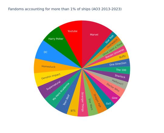
Marvel had 33 ships, followed by Youtube with 24 and the Harry Potter Universe with 21.
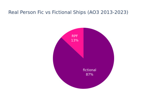
RPF
13% of total ships were Real Person Fic while 87% were of fictional characters.
Hottest Characters
These are the characters who were in the most ships in their fandom (with a minimum of 3 ships to qualify):
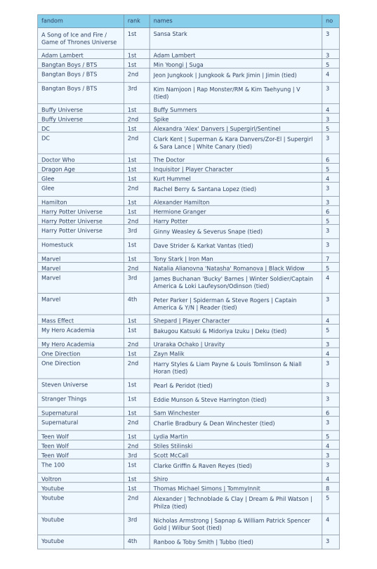
Minecraft youtuber TommyInnit leads overall with 8 ships (out of 24 Youtube ships), followed by Tony Stark with 7 (out of 33 Marvel ships), and Sam Winchester from Supernatural and The Doctor from Doctor Who with 6 respectively.
((gender & race stats under the cut! :)))
Gender statistics
Characters
This is the overall gender distribution:
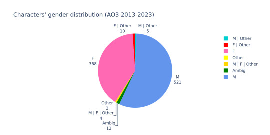
It is currently scewed by the fact that one of out usually 3 rankings each year is exclusively femslash, inflating the number of female characters in the overall set. This number will be decimated once we look at the actual co-ed, yearly rankings. However even with these inflated numbers, male characters still solidly outnumber female ones.
These are the numbers for any gender tags other than straight up "M" and "F":

"M | Other" was represented by exactly 5 characters/people. All of the fictional ones are some variety of deity or otherwise celestial being. All but one of "F | Other" were (alien) Gem characters from Steven Universe.
The only two unaligned nonbinary characters in the set are the canon nonbinary character from Owl House, and the Venom Symbiote. (Yes, the goop. The Venom goop.) All of the drag queens represented explicitly use she/her in drag and he/him (x3) or he/they (x1) out of drag (at time of data collection).
All of these are out-numbered by ambiguously-gendered self-insert characters like player characters and "x Reader".
There are no (binary(-aligned) or explicitly medically) trans characters in the set, as (as far as I can find on the wiki) the Owl House nonbinary one does not have in-universe transition portrayed or birth assignment specified (they are voiced by transmasc nonbinary actors). This is in spite of canon trans characters and real life trans people, who didn't make the ranking, existing in the fandoms represented, like in DC's Supergirl, My Hero Academia, RuPaul's Drag Race, One Piece, Marvel Comics, Heartstopper, etc. There are no explicitly intersex characters/people represented either (as far as I'm aware).
Ships Overview
As for ship gender combinations, men loving men outnumbers any other type, even with the inclusion of, again, one whole ranking (of the three total) per year with ONLY women loving women ships:

Straight ships are outnumbered by both same-sex categories, although, once again, I expect this to change once we look at the co-ed rankings without the femslash bump, with straight ships likely out-numbering wlw ships there.
Taking out straight up mlm, wlw, and het ships, these combinations are left:

Although there are less "M | Other" characters than "F | Other", they account for almost the same amount of ships as each other, likely due to the male-aligned characters/people not being shipped with each other (like the Crystal Gems) and spanning more fandoms (5 rather than 2), leading to a wider spread of ships.
Our "Other" characters are shipped with characters of opposite genders, providing balance to their (small) contribution. The singular canon-nonbinary non-goop character is shipped with their canon ex-partner.
In the ambiguous stack, the vast majority is men (and male-aligned folks) being shipped with ambiguous characters (ie self-inserts).
Ships per fandom
This is the average number of ships of the given type per fandom:
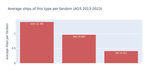
These are the fandoms with the most ships of the given type:

Marvel (as the fandom with the most ships) has ranked second for all of them. Youtube is the fandom with the most mlm ships, as the only woman that made it into its 24 ships is the real life wife of the guy she's being shipped with.
This chart shows the number of fandoms that either do not contain any ships of this type, consist exclusively of ships of this type, or where over half of the fandom's ships are of this type.

The only two (2) fandoms (with multiple ship types) that have more than 50% straight ships are Game of Thrones and Doctor Who, so congrats to them on having the best-written hets and the least homoeroticism in media apparently. 👏
Race statistics
Characters
This is the total distribution of racial groups among the characters:
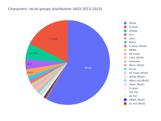
White folks vastly outnumber any other racial group. East asians are the next-biggest portion, followed by ambiguous and non-human characters.
These are the smaller groups without the white, east asian, and un-specified or non-human chunks:

Latin folks make up the largest portion, followed by black folks. All other groups have less than 15 characters in the entire (922 character) set. There are more indigenous folks in the set than there are south asians.
Ships
This chart shows the number of ships with at least one white person, with at least one east asian person, non-white ships, and ships without white or east asian people:

I call the last one of those "The Big Oof" as there were only 12 ships (out of the 600 total) that didn't contain any white or east asian people.
This is the ratio of interracial, non-interracial and ambiguous ships:
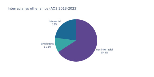
Most ships are explicitly between people of the same racial group.
Fandoms
These last two diagrams show the amount of racial groups per fandom.
The first one shows how many fandoms only have one racial group and how many have multiple:

It is more balanced than the interracial figure, pointing to there being a number of fandoms where there are multiple racial groups overall but several characters are only being shipped with characters of their own group.
The second diagram shows the fandoms with the highest number of different racial groups:
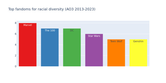
Marvel once again leads with 8 groups (due to its overall higher numbers of characters/ships). It is followed by The 100 and DC tied for second with 7 groups each, and Star Wars in third with 6. Teen Wolf and Genshin Impact follow in fourth with 5 groups respectively. All other fandoms had less than 5 racial groups represented.
THANKS FOR READING, STAY TUNED FOR MORE DIAGRAMS ONCE I'M DONE WITH THE RANKING STATS WOOOO
#ship stats#data visualisation#fandom#shipping#marvel#dc#the 100#harry potter#star wars#teen wolf#genshin impact#homestuck#supernatural#mha#bts#kpop#stranger things#dragon age#game of thrones#glee#doctor who#haikyuu#sherlock#one direction#buffy#steven universe#once upon a time#overwatch#star trek#TIL there is a tag limit????
13 notes
·
View notes
Text
mapsontheweb is so fun, every map they share is bad in a new, exciting way
#most of the time it's a very questionable source or data#other times it's just data that is better not visualised on a map#some of the maps are meant as light-hearted and yet taken seriously#i know this is the pissing on the poor reading comprehension website but the notes are absolutely fascinating#liz talks
6 notes
·
View notes
Text

3 notes
·
View notes
Text
people on my graph post: good work on this op 👍
me: yeah i fucking hope so
#this is mean sorry. i have a data science degree i get paid to present data that visualisation was garbage that i made in two minutes#but thank you#text#my post#mobi
8 notes
·
View notes
Text
tumblr may be messing up this website in many ways rn but that new reblog bubble map thing? popped off with that
10 notes
·
View notes
Text
There lay the days between
Artist: Katie Paterson (Scottish, b. 1981)
"Collaborating with scientists and researchers across the world, Paterson’s projects consider our place on Earth in the context of geological time and change." (https://katiepaterson.org/about/)
Artwork: There lay the days between, 2022
"A ticker board which displays the number of times the Sun has risen since the Earth was formed. The changing flap display switches by one digit each day, at sunrise." (https://katiepaterson.org/artwork/there-lay-the-days-between/)

Climate: The work has involved extensive scientific research and engagement tidal systems, moon systems and thermal evolution, for example, drawing upon data which is documenting how these systems are changing over time.
Time: Engages with the temporal cycle of the sun rising and setting as a marker of time.
#installation-art#realtime#data-visualisation#attunement#timekeeping#geological#deep-time#climate-change#rhythmic-pedagogies
0 notes
Text
Ok i handled two things. Now there are two more things. This is actually the end of my work week..and i have too much going on in my personal life that i need to fix to work tomorrow. ... Can it wait? Yes.... I think so. If I manage a good monday
#my stuff#personal#let...it..go#for three days. let it go.#its insane that the most important map layers are so so so so hard to arrange.#fucking hell why is it so difficult to just get the data#well i look forward to the map course now because i found all these cool national map data sets#wouldnt it be cool if i could just load them in.#i didny even know i was a nerd like that...? i just visualisations make things way more clear.#wish i was part of the assetteam or perhaps even the DATA ASSET TEAM so i could just ask people face to face#the simple questions like: who thr fuck is in charge of this project here#wouldnt it. be stupid if in the end its not used. ....damn that would be really ...no. normal people dont even entertain notions like that#itll be a roaring success!!#thats what they think
0 notes
Text


Now this may not seem like a massive change in format, but boy howdy do I feel proud of myself for writing the functions to automate this ehehehehehe (unfortunately for me ao3 ship stat op used a different formatting for the pre-2020 tables, so I'll have to write another function to sort those ones out too ToT)
#coding#ship stats#python#csv#ao3 ship stats#I'm gonna visualise their annual ship rankings data!#(and likely the tumblr fandom ones too)#but first I gotta clean the source data & build a data base#run all the raw data sets through my code#and then I will have a huge updated more uniform and complete data set#which I can then learn how to visualise#for data portfolio purposes#translation for non-coders: wow code is fun but it looks unimpressive if you don't know#I basically took the base text I copied off the ao3 ship rankings posts on ao3#and wrote a bunch of code that automatically formats it from a to b#into a format that's easier to work with in my code#to be able to put it into a proper database later
9 notes
·
View notes
Text
Choosing the Right Data Visualisation Solution for Your Business Needs

Introduction
Businesses rely heavily on data visualisation solutions to extract meaningful insights and facilitate informed decision-making in the modern data-driven world. However, selecting the right solution can be overwhelming with the vast array of data visualisation tools available. A well-chosen visualisation tool can enhance business efficiency, improve collaboration, and provide deeper insights.
Understanding Data Visualisation Solutions
Data visualisation solutions transform raw data into graphical representations such as charts, graphs, dashboards, and maps. These solutions help businesses interpret complex data patterns, trends, and correlations more effectively. Choosing the right tool requires a thorough understanding of business objectives, data complexity, and user requirements.
Key Considerations When Choosing a Data Visualisation Solution
1. Business Objectives and Use Cases
Before selecting a tool, businesses must define their primary use cases. Are they looking to improve internal reporting, track key performance indicators (KPIs), or create real-time interactive dashboards? Understanding these objectives will narrow down suitable options.
2. Ease of Use and User Experience
A data visualisation solution should be user-friendly, catering to both technical and non-technical users. A tool with an intuitive interface and drag-and-drop functionalities can empower business users to generate insights without extensive technical expertise.
3. Integration with Existing Systems
The chosen tool must integrate seamlessly with existing databases, business intelligence (BI) platforms, and cloud services. Compatibility with data sources such as SQL databases, spreadsheets, and cloud applications ensures smooth data flow.
4. Customisation and Scalability
Businesses should consider whether the tool can be customised to meet specific needs and scale as the company grows. A scalable solution will support increasing data volumes and more complex analytics over time.
5. Advanced Analytical Capabilities
Some businesses require more than basic visualisation; they need predictive analytics, artificial intelligence (AI)-driven insights, and machine learning capabilities. Selecting a tool that provides these features can give businesses a competitive edge.
6. Collaboration and Sharing Features
For organisations with multiple teams, a tool that allows collaborative data exploration, report sharing, and real-time updates is essential. Cloud-based solutions enhance teamwork and remote access.
7. Security and Compliance
Data security is a top priority. Businesses must evaluate whether the solution meets compliance regulations (such as GDPR or HIPAA) and offers encryption, role-based access control, and secure authentication methods.
8. Cost and ROI Consideration
While budget constraints are important, businesses should weigh the cost against potential benefits. A higher-priced tool with robust features may offer greater long-term value compared to a cheaper, limited-scope solution.
Popular Data Visualisation Tools in the Market
Several tools cater to different business needs. Some of the most popular include:
Tableau – Best for advanced analytics and interactive dashboards.
Power BI – Ideal for Microsoft ecosystem users and enterprise-level reporting.
Google Data Studio – Great for free, cloud-based reporting and collaboration.
D3.js – Suitable for developers who need custom visualisation capabilities.
Looker – Best for integrating BI and data analytics into workflows.
Conclusion
Choosing the right data visualisation solution requires careful evaluation of business needs, technical requirements, and budget. By considering factors such as ease of use, scalability, integration, and security, businesses can select a tool that maximises the value of their data. Investing in the right data visualisation solution empowers organisations to turn raw data into actionable insights, driving business growth and success.
0 notes
Text
Enhancing Project Management with Power BI Reporting and Dashboards
Efficient project management is the cornerstone of successful businesses, and having the right tools can make all the difference. Power BI, a leading business analytics platform, is revolutionizing project management by offering robust reporting and dashboard capabilities that provide real-time insights and data-driven decision-making.
Transforming Project Management with Power BI
Power BI empowers project managers by consolidating data from multiple sources into interactive dashboards. These dashboards enable teams to monitor project progress, track key performance indicators (KPIs), and identify potential bottlenecks—all in real time. With customizable reports, managers can tailor insights to align with specific goals, ensuring that every stakeholder has the information they need at their fingertips.
For example, Power BI’s real-time monitoring allows project managers to oversee task completion rates, budget utilization, and resource allocation. Alerts and automated notifications can be set up to identify risks early, ensuring timely interventions. By offering a centralized view of project data, Power BI eliminates the need for time-consuming manual updates, freeing teams to focus on what matters most—delivering successful projects.
Seamless Integration and Scalability
One of Power BI’s standout features is its ability to integrate seamlessly with tools like Microsoft Excel, Azure, and even ERP systems like Acumatica. This means project teams can work within a familiar ecosystem while leveraging the advanced analytics and visualization capabilities of Power BI. Whether your business is a small startup or a large enterprise, Power BI’s scalable solutions grow with you, ensuring consistent performance and reliability.
Empowering Teams with Exceptional Support
At Power BI Solutions, we specialize in delivering tailored dashboards and reports designed to meet the unique needs of your business. Our certified professionals provide end-to-end implementation and ongoing training, ensuring your team is equipped to unlock the full potential of Power BI. From automating reporting processes to creating actionable insights, we are dedicated to empowering businesses with data-driven project management solutions.
Conclusion
With its interactive dashboards, real-time reporting, and seamless integration, Power BI is transforming project management. By simplifying data analysis and enhancing decision-making, Power BI equips businesses to achieve their project goals efficiently and effectively.
0 notes
Text
India’s Top Valued Quick Commerce Brands: Leaders in Instant Delivery

Most Valued Quick Commerce Brands in India: Who’s Leading the Game?
Quick commerce is rapidly becoming the new normal in India’s grocery shopping landscape. As the demand for ultra-fast delivery services grows, several players have emerged as key contenders in this space. In fact, 31% of urban Indians now use quick commerce for their primary grocery shopping, while 39% rely on it for top-ups. This trend has given rise to intense competition among quick commerce brands, with a few emerging as leaders. Let’s take a closer look at India’s top valued quick commerce brands and how they’ve positioned themselves in this booming market.
The Dominant Players in India’s Quick Commerce Market
When we talk about quick commerce in India, three names come up repeatedly: Blinkit, Swiggy Instamart, and Zepto. These brands have become synonymous with fast, reliable grocery deliveries, and each has carved out a unique position in this competitive market.
Blinkit: The Market Leader
Blinkit, backed by Zomato, with 39% market share, has taken a commanding lead in India’s quick commerce space. Originally known as Grofers, Blinkit rebranded itself and shifted focus to deliver groceries and essentials within minutes. The company’s massive infrastructure, efficient delivery systems, and strong funding from Zomato have given it a significant edge over competitors.
Blinkit’s ability to fulfill customer orders in under 10-15 minutes has become its biggest selling point. As convenience becomes more critical for urban shoppers, Blinkit continues to dominate by improving its delivery speeds and expanding its network of dark stores (localized warehouses for quick delivery). Today, Blinkit is synonymous with quick grocery shopping in major Indian cities.
Swiggy Instamart: Leveraging a Massive Customer Base
Swiggy Instamart, Swiggy’s grocery delivery arm, has emerged as a serious player in the quick commerce market. The main rival of zomato commands a whooping 37% of the market share. What sets Instamart apart is its ability to tap into Swiggy’s massive customer base, built over years of being one of the leading food delivery platforms in India. With its established network, Swiggy Instamart has been able to quickly scale operations, offering a wide variety of grocery items that can be delivered in under 30 minutes.
Instamart has focused heavily on improving distribution, leveraging Swiggy’s expertise in logistics to make rapid deliveries possible. As a result, it has become a preferred option for many urban customers looking for convenience and speed.
Zepto: The Fast-Moving Challenger
Despite entering the market later than its competitors, Zepto has quickly risen to the forefront, leaving behind more established players like Dunzo and BigBasket in the quick commerce space. Zepto with a market share of 20%, has built its reputation on delivering groceries in under 10 minutes, a feat that has resonated strongly with younger, urban customers. This focus on ultra-fast deliveries has allowed Zepto to capture significant market share, even in a crowded space.
One of Zepto’s strategies has been to focus on smaller basket sizes but higher frequency of orders, catering to customers who need quick top-ups rather than bulk grocery orders. This has helped the brand stay nimble and scale rapidly in key metropolitan areas.
Why These Brands Are Thriving
What makes these three brands stand out from the crowd? The answer lies in their ability to scale rapidly, streamline logistics, and meet the growing demand for ultra-fast deliveries. Each brand has its strengths: Blinkit’s market leadership and Zomato backing, Instamart’s access to Swiggy’s user base, and Zepto’s promise of lightning-fast deliveries.
The Indian quick commerce market is still in its early stages, but these brands have already established a strong foothold. Their ability to adapt to customer needs, invest in infrastructure, and innovate in delivery times will likely keep them at the top of the game for years to come.
The Future of Quick Commerce in India
As India’s top valued quick commerce brands continue to evolve, the market shows no signs of slowing down. With more urban Indians relying on quick commerce for both primary grocery shopping and top-ups, the demand for ultra-fast delivery services will only grow. The competition will get fiercer, but Blinkit, Swiggy Instamart, and Zepto have already demonstrated their ability to thrive in this environment.
In the future, we can expect even faster deliveries, broader product offerings, and more localized solutions as these brands look to solidify their positions and expand into new markets. Quick commerce is here to stay, and India’s urban consumers are more than ready for it.
0 notes
Text
Industry-Leading Visualization with Tableau Data Visualization

1. User-Friendly Interface: The intuitive design allows anyone to easily start visualizing data.
2. Seamless Integration: Connects easily with various data sources for efficient analysis.
3. Quick Insights: Generate actionable insights within minutes.
4. Integrated Collaboration Tools: Share dashboards and insights with your team effortlessly.
5. Regular Updates: Tableau continuously evolves with new features and improvements.
Want to take your skills to the next level? Join our 1-day Tableau Bootcamp on 2nd November (Online)!
#tableau#tableau software#data visualization#data visualisation#dataviz#software#technology#cavillion#cavillion learning#data analytics#data#tableau online training#tableaudesktop#tableau dashboard#big data#business analytics#data analysis#data science#tableau course#salesforce#Tableau Tutorial#Tableau Visualization#Tableau Training#learn tableau#tableau certification#Tableau Visualisation
1 note
·
View note
Text
Ce site aussi intrigant qu’étonnant propose une cartographie des genres musicaux présents sur la plateforme Spotify. Imaginé par un ingénieur informatique Glenn McDonald, développeur de Spotify, un nuage de 6282 genres musicaux se déploie sur la page web. Chaque étiquette correspondant à un genre permet d’accéder à un extrait de quelques secondes pour en découvrir la couleur musicale.
L’exploration est possible aussi à partir d’une liste (choisir le menu « list ») qui permet de rebondir vers des playlists de différents artistes se rapportant à un genre précis.
Bref, c’est un peu labyrinthique, complètement hypnotisant et captivant, très intéressant et parfaitement fou !
Dépaysement et découverte garantis !
Bibliothèque des Côtes d'Armor
0 notes
Text

IT solutions for insurance companies provide tailored technologies to streamline operations, enhance customer experience, and ensure regulatory compliance. These solutions often include policy management systems, claims processing software, CRM platforms, and data analytics tools to improve decision-making and risk management. By integrating digital tools, insurers can automate processes, reduce costs, and deliver personalized services efficiently.
0 notes