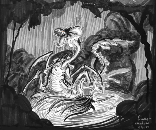
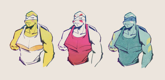
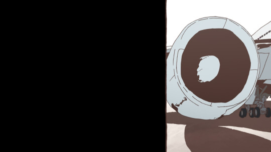
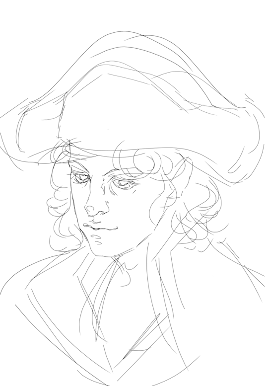
#even the lineart is far from my best
Text

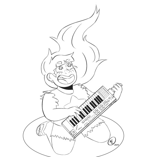
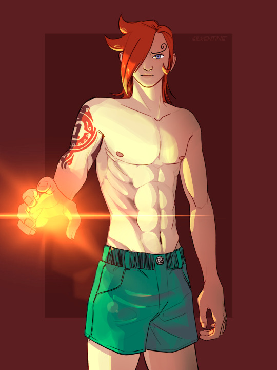
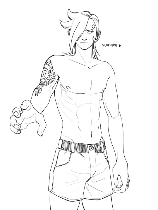
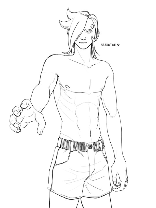
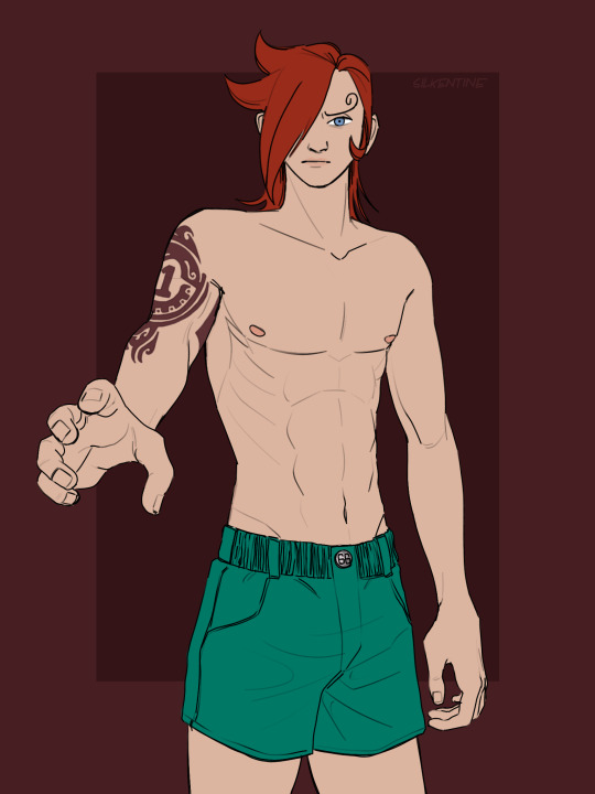
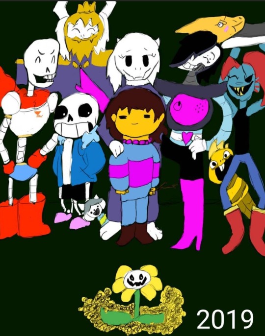
Genuary2024 prompt Dream/Imagination
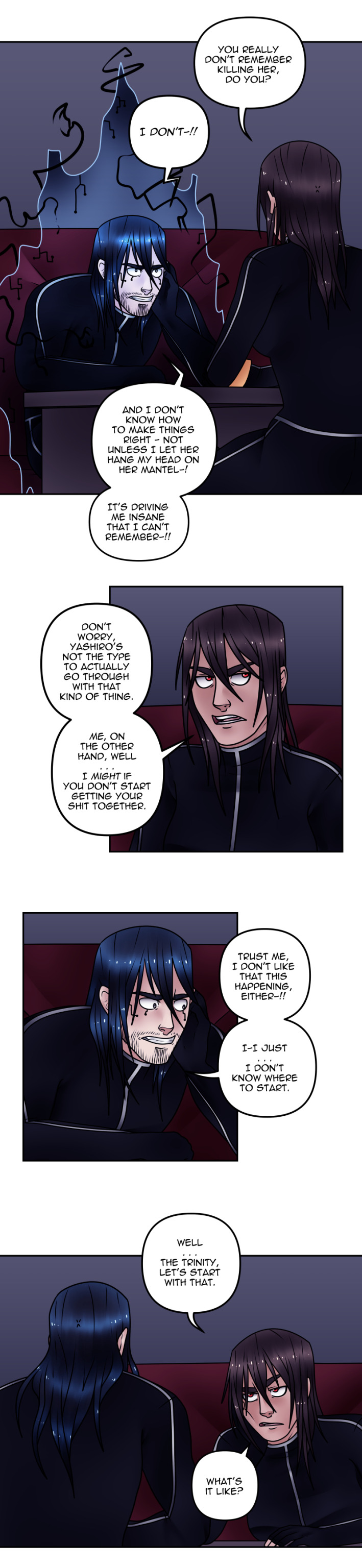
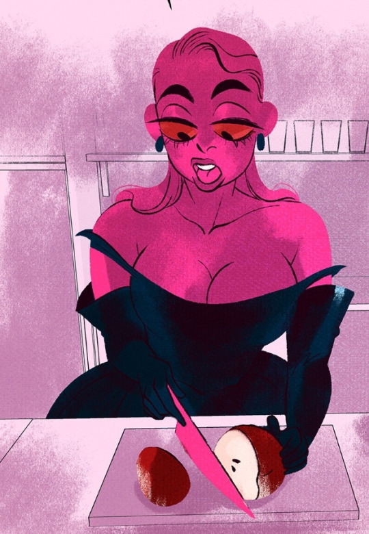
Why Gene signing "Like a Commet" (Steven Universe) for this first prompt?
Well cause you need a lot of imagination to think it XD
Kidding, uhm this is confidential information but I kinda been thinking about making a comic with Gene as the protegonist, I won't say anything else. Second protagonist Jimmy Jr. Okay nothing else. Is about Gen in his first year of High Schol. THIS IS NOT ABOUT THIS.
So the comic start with Gene dreaming of his first day in high school and the dream is Gene singing "Like a Comet" in front of the whole school everyone calling their name and cheering for them.
Rebuscado? Rebuscadisimo. Which mean over elaborate and overthinked. But it was the first thing I thought.
Oh and there's some reference to "The Frond Files" and other episodes specially on Gene's keyboard.
#bob's burgers#my art#geneuary2024#genie beanie#people im super dissapointed with the results#even the lineart is far from my best#but i decided this post would be about my baby#and not about me whining#I'll whine later#I love Gene and one symbol that I really associate with her is the Star#so her singing about being a comet which for me is like a big star with tail seems right#I don't think Gene and Greg had that much in common#but I think this is a really fitting song for my bean#and I swear the bi colors were an accident#I was making a mess with the color palette#and ended like this#hope you like it#kinda
60 notes
·
View notes
Text
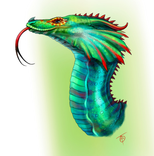
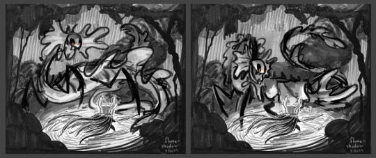
Welcome back to Overcomplicating the Pyrrhian Tribes! This week: the beloved RainWings!!
You know what's up. Joy Ang and Tui are so cool and I am just me.
Details and explanation below!
Otherwise, next week are the chilly IceWings! See you then!!!
More overcomplicated dragons.
I knew the RainWings would be really important, and I think they turned out the best of all the ones I've done. I think they're my favourite because they are basically the perfect mix of extra realism spice without altering Joy's design too much. The SkyWing design is awesome and I love it to bits, but it is one of the two that are the farthest from canon.
As for the RainWing.... I had. So. Much. FUN. I heavily used chameleons and snakes - they're basically the two main species on my research board - but there is a dash of cuttlefish and frilled lizard in there. Where, you ask? Well if you look closely, all over the RainWing are little tiny flecks of darker colour. I found a beautiful reference of a close-up on a cuttlefish eye. Its skin is dotted in thousands of little marks and I thought that would be perfect for the RainWing, who can camouflage just as well as them. I don't know if it's been discussed in canon but I bet they could animate their scales more than just colour shifting - cuttlefish are known for using their rapidly shifting patterns to hypnotize prey. RainWings could do it too, sort of like Ka from Disney's 2D animated Jungle Book.
Speaking of Ka - snakes. I love snakes. The head structure of the RainWing here is very smooth and rounded with muscles based on snakes like the python. I was even going to originally draw them in a venom striking pose and got as far as completing the lineart, but ultimately decided it wouldn't fit the calm portraits of the other tribes.
Will you see it in the future? Hell yeah! Pure, unhinged, magical death spit. Looking at it now I might try to alter it to be a full piece of Glory attacking Scarlet or Crocodile.
In the striking pose you can see the frills much better, but I still took my time on this serene pose (this is where the frilled lizard influence comes in). If you notice that I've drawn every scale (every single scale) then, yes, I am insane. If you didn't know that yet, you know it now. You have to draw guide lines and follow them meticulously while you wonder why you don't make a scale brush, and then cry because you know the randomness and imperfections that come from drawing a thousand circles is how it looks natural. The eye area is actually my favourite part, since drawing dragon eyelids was the original inspiration for doing this. Did I mention that? I wanted to draw eyelids.
EYELIDS.
I digress. Besides the eyelids, I like the frills on the action pose, but this pose is where I like the body scales more. When zooming in on my chameleon colour refs, I noticed the very rhythmical distribution of their scales and figured I would give it a try. They actually do have extra large circular scales along their bodies, which is where I guess the canon RainWing design gets it from. Very clever, Joy!
Anyway, on this version, those small circular scales appear on the face. Not only that, but I added a bit of influence from the snouts of my ref chameleons by extending the nose bridges to wrap around the nose horn. They blend in so seamlessly and that's the reason why I love this design - it's subtle, barely there, mostly Joy but a little extra.
Wow, I talk too much. If you're here, thank you! It's not mandatory to read, but very appreciated. I heard once that visitors at an art gallery look at each piece an average of 2-3 seconds. Or was it 3-6? Idk, but it was shockingly short, and ever since then I've tried to encourage myself to pay more respect to other artists and glean their work for little details I skip after that quick glance. I could talk so much more about these designs but that would be like an hour long video, each, lol. If you have questions about anything, ask away!
#wof#wings of fire#wof art#my art#digital art#art#rainwing#wof rainwing#wof fanart#Overcomplicating the WOF Tribes
435 notes
·
View notes
Text

Just listen to your instincts and do what feels natural!
[SR Music Week] Yuhua joins the battle as a dancer and backup vocalist for Hazard/Riff! Many thanks to @raguiras2 for hosting this Music Weeks event!
Voicelines and concept sketches beneath the cut~
~
Summon: Don’t think that I’m in this to win, I’m here to have fun and do what I love. That’s fine, right?
Groovification: — LOCKED —
Set to Home Screen: A little rocking never hurt anybody, did it?
Home Transition 1: Actually, confession time, I’ve started to feel a little shy. Everyone in this group is so talented in their own way, y’know? …But I gotta keep up and pull my weight.
Home Transition 2: To think Deuce would be a leader for Hazard/Riff… Well, not what I expected, but where else would he go? It just seems right. …Sorry, just thinking out loud.
Home Transition 3: So this is what Allen looks like when he’s in his natural habitat… Ah, I’m just making some observations. I’m not trying to say anything bad, rather—the opposite of that. Like, he seems… more sincere?
Home, after login: Practice waits for no one~ I’m gonna go start warming up. Wanna join me?
Home Transition (Groovification): — LOCKED —
Tap Home 1: Eh? You didn’t think I’d ask to join this group? …Rude~ We can’t all be soft all the time.
Tap Home 2: It’s funny to me—all you have to do here is call something a competition and—boom. Even someone like Leona’s motivated. …Oops, did he hear me say that?
Tap Home 3: Working with Floyd is a double-edged sword—when he’s having fun here, I get all excited, too. But if he’s not in the mood, then… haha, we just gotta hope and pray.
Tap Home 4: Don’t worry, I’m used to wearing loose clothing when I dance. Compared to the long pants and dresses I sometimes wore, this fit is like a breath of fresh air~
Tap Home 5: I wouldn’t touch me if I were you—I’m all sweaty and tired from rehearsal.
Tap Home (Groovification): — LOCKED —
Duo Magic (yes I know SRs don't have them but let us dream):
YUHUA: How about we give them one hell of a show, Vizzie?
VIZZIE ( @twistedwonderlandshenanigans ): We’ll blow them away with the sound we’ve got, Yuhua!
~

ALRIIIIGHT let's get into the design of this bad boy

the idea was ... basically just a bit of techwear, modern street style, all that-- i was sort of winging it haha. i wanted a very loose and free style with the cargo pants, belts, and unzipped jacket, while the hood was added for dramatic effect when i started the lineart~
i felt like experimenting with his hair so once again i slicked back the right-hand side of his part, i would have given him his pre-overblot hair (for more variety w/ the long hair) but to be honest i kind of like the short hair with this look~ it kind of screams kpop idol but whatever HAHAHAHAHA
fishnet under clothing was an absolute must, and i went a little more on the ""bad boy"" look by giving him the chain and cuff earring on one side... plus the dramatic eyeliner/eyeshadow... yeah. RIP yuhua's lip gloss we will always miss you
also shoutout to V for volunteering vizzie for the duo magic-- i love me a good RIOFY friendship
(as for headcanons on how yuhua would act during this whole event, um-- he'll behave i promise 🥰🥰 he'll try not to let his inferiority complex get the best of him I MEAN WHAT WHO SAID THAAAT)
i can't think of anything else that i thought about particularly hard during the process, so uhm-- thank you for reading this far and no promises on when i'll get the groovified version out if ever LMAO
~
art taglist (ask to be added or removed, i'm very sorry if i forgot someone): @thehollowwriter @theleechyskrunkly @elenauaurs @casp1an-sea @nahelenia
@skriblee-ksk @boopshoops @scint1llat3 @nyx-of-night @nemisisnemi
@beneathsakurashade @ramcatshackle @kathxrat-01 @the-banana-0verlord
#my art#twst oc#yuusona#ragu music weeks#oc stuff#EXPLODES AHHHHH#idk why this card was so fun to make#maybe because it's showing yuhua's true personality and tastes#and he gets to be SILLY#giggling and kicking my feet#by the way. the hazard/riff playlist is like ENTIRELY TO MY TASTE i was genuinely surprised#i didn't know a lot of songs but they all go so hard#conclusion: yuhua was simply meant to be in this group <3
84 notes
·
View notes
Text
A breakdown of my quirrel!nosk comic from last year (original post here) since I like doing breakdowns and talking about my process, and I know at least some people like reading those things. :)
First of all, a little background. I made that comic in an evening with just a pencil, a black marker, two grey markers, and a yellow-orange marker. (All markers had a thick tip and a thin tip, and all were water-based markers, so they don't blend like alcohol markers, but they can still be layered to affect the values) I had a text post from @g0at0ad saved in my drafts that said "gotta say. massive missed opportunity to not have nosk mimic quirrel to lure the knight into its lair." and finally, I had an idea for how to illustrate the reveal and felt I had a decent idea for the nosk's design.
I wanted to follow the same encounter order as the game provides, and by happy coincidence, I realized that the route from first sighting to nosk den includes the hot spring, so it made perfect sense for that location and the real Quirrel to appear in the comic.
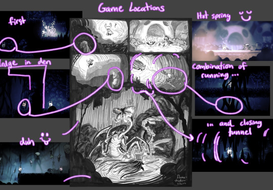
Ghost spots a Quirrel-like figure in the darkness in the first panel, and then as the path continues and drops into the hot spring, there's (real) Quirrel, so clearly that's who Ghost saw a minute ago. Yay, friend! And since Quirrel explores around, it's not strange that Ghost would spot him again in an area not so far away, though it's odd how he got ahead of them. Perhaps a different tunnel? And it seems like Quirrel wants to lead the way to something, so Ghost follows, until-
That's not Quirrel.
In addition to the potential of a reader already knowing the game's locations and recognizing the path to the nosk's den, there are other visual clues that subtly communicate that something might not be right. I made it so every panel but the hot spring one has black silhouettes encroaching on the space within.
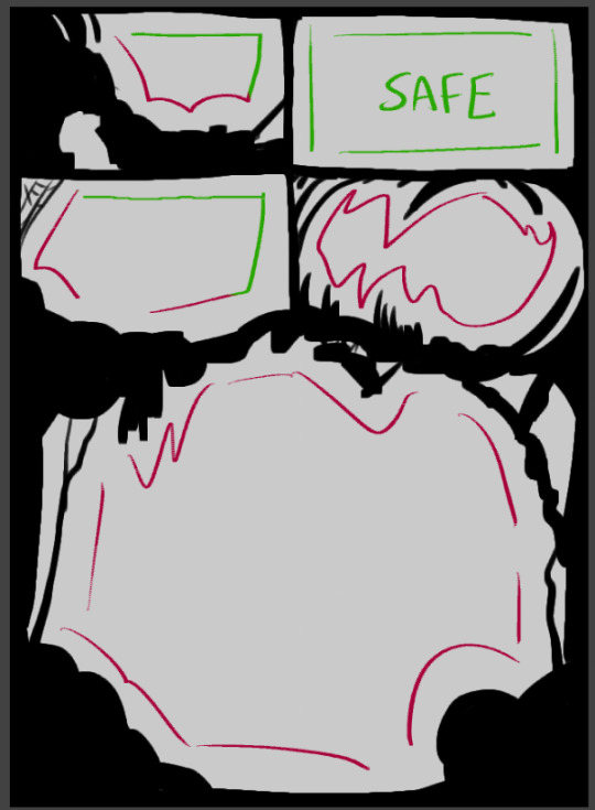
The third panel is the mildest one being encroached upon because Ghost doesn't yet feel like something is off (still reassured from seeing Quirrel in the safe hot spring) but the trap is coming together. The existence of the spider web in the corner is a nod to the trap because it's a common visual symbol for being trapped.
Also note how both the first and third panels have some safety via straight panel edges. Contrasted with the fourth and fifth panels which have no straight edges as Ghost cannot escape and there is no safety.
Another subtle reinforcement of danger vs safety is how the use of black is very limited in the hot spring panel. It's a brighter room mechanically, yes, but it's also a Safe Room. The only black is Ghost's void parts and a thin outline around Quirrel (and also a bit of shading on his arm that I did out of habit before remembering that I wasn't going to use black to shade him here, oops!)
And, note that in the only panel with Real Quirrel, he isn't framed against a darker shape in the background.
Okay, and finally, I will share a bit about the nosk reveal panel and its design...
This pose and angle are dramatic and all, but they're The Worst for showcasing the actual design of the nosk! Just a complete mistake on my part that I did my best to roll with, since I didn't realize until too late how I'd messed myself up.
Which happens! I don't always get it right, and especially when I'm working traditionally, there's a point where I can't go back, so I just have to make do with what I gave myself. :) I don't hate what I have here, but I have been dissatisfied with it ever since I drew the lineart.
A thought I have had since then was that maybe I should've drawn it larger, to be more threatening? Maybe a different pose to show off the side-body frills? I explored a couple ideas below, but honestly, I think the whole panel would have to be reworked to get it right.
Making sure that the background frames the nosk effectively would be one of the main things I'd redo, but I'm getting tired and don't feel like drawing more, so I'll just leave it at the nosk replacement sketches.
And since I don't think I did a good job with displaying the nosk's design effectively, I quickly sketched some of the features to maybe show them off a bit better.
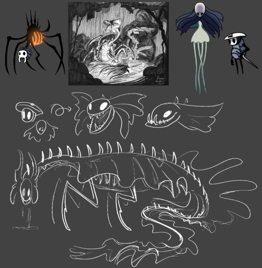
I like the gimmick of the nosk turning its head, so I pretty much always maintain that with my nosk designs. This one is no exception. Quirrel's head and face become the cranium and upper jaw while Monomon's mask becomes the lower jaw - the extra length causes an underbite. I've always been a fan of when people add a veil hanging from Monomon's mask while Quirrel is wearing it, so that's where the frills come from. ("Why didn't you include the veil in your Quirrel drawings, then?" I hear you ask. And honestly..... I don't know! That could've been an oversight or it could've been deliberate and I just don't remember my justification. That happens sometimes XD)
Anyway uhhh yeah! I think that's it. I like making comics. I like thinking about nosk. Tadaa~
#hollow knight#nosk#quirrel#comic breakdown#flameshadowart#long post#id in alt#this took longer than intended lol but it's done now~#i like doing analyses like this both to show where i do cool things and consider where things could be improved
71 notes
·
View notes
Photo
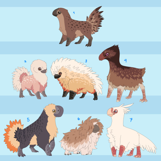
Wanted to expand on some domesticated animals of Mirum. These are basically cat-dog birds, ranging in size from cat to medium sized dog. Still need a name for group over all, suggestions appreciated! In depth info below the cut!
1. The OG
This is the wild ancestral form, basically the wolf to the dog. They are from the grass/shrub lands of Mirum and spend most of the year scrounging around for food until the end of the wet season. Once the floods are over they pop out babies like nobodies business while feeding on the debris left by the flooding. By the time fire season rolls around their numbers are pretty scarce. They travel in little groups with multiple hens and one big buff man! But this man does not necessarily need to be a male, or a bird even! They were the first species domesticated by the chimera and the only one to leave Mirum with them.
The ‘Natural’ Breeds
These are just the morphs bred into these fellas without any magical manipulation involved, so they still look relatively close to their wild ancestors.
2. The Cupid
These are purely pets, originally kept just for eggs they lost that purpose as more efficient birds came around for that. Now they just make docile lil lapbirds. Though inattentive owners will find old eggs hidden throughout the house if they’re not careful. Most of the time though they tend to stay by their owners ankles.
3. The Ruff
Fluffy lil guys who make for great pest control, they’re a very sporty breed despite everything and need a lot of energy to stop them from destroying their surroundings out of boredom. Will do well with another ruff or dog of similar size, though they can be a bit of a bully in the care of a lax owner.
4. The Gallop
Literally just made for running, can keep up with a chimera at full sprint and at a normal long distance run. For those with a more active lifestyle. Though they will just as happily laze around all day, just happy to be included honestly. These are also the best swimmers of the natural breeds with their extra oily coat.
5. The Dome
This is a purely ornamental bird, stocky and colorful they are the most relaxed of all the birds. Most prefer chimeric company to that of other birds and have a habit of separation anxiety when not with their owner. In line with that, these are the most accepting of chimeric ‘talk’ with most quickly getting accustomed to projected commands. Though please don’t overwhelm your bird, casting the full range of sentient experience unto lesser beings CAN and WILL cause them existential distress! Not to mention your personality may displace your pet’s.
6. The Fluff
The original pillow stuffing. These guys feathers are softer than any other. Keeping a mostly downy ‘undercoat’ for their whole life. That being said these guys can get absolutely RANCID if not kept clean and tidy. Only for the most advanced and attentive of owners unless you want an unholy dingleberry beast skulking around. They also are VERY bitey.
7. Crested
These are historically for eating, but have grown to be a very pish posh fancy breed. Most are pure white, thanks to inbreeding, and albeit are not the sharpest tools in the shed. But if you are looking for a bird who may just ignore your commands but love you eternal, this is your bird!
That’s them so far, will make the magical monstrosities later. Also wanted to try a different lineart style. Thin is nice but I miss my chunky brush. Glad to have tried it though!
#mirum#chimera#chimera adjacent really#fantasy#birds#need name aaaah i cant think of a good one for these still tho HM#speculative biology#spec bio#Speculative Evolution#spec evo#art#no true north
517 notes
·
View notes
Text
nerd talk: how i did the riso thingy
the riso effect is achieved through riso printing, printing by layer with CMYK. a lovechild of screen printing/photocopying. it starts with the lightest color to darkest, in this case; yellow (Y), magenta (M), cyan (C), and lastly black (K). the same principle even applies to markers and watercolors
somewhat fun fact from what I've learned so far: while CMYK is subtractive, replicating riso digitally works best with ADDITIVE blending modes (darken, multiply, color burn, linear burn, etc)
crazy (i was crazy once—), right :D ? obviously there's no "correct way" to do it, so i suggest experimenting to fit your preferences <3
here's the separate layers. i cheated a little since i wasn't sure what i was doing (or if it would even WORK), the lineart isn't layered but hey ! the coloring sure is 😅😅
here's the colors together without the lineart. riso prints tend to look "misaligned" so i did the same thing (kinda looks like chromatic aberration 😬😬😬 whatever !!!)
psst.... color palette is from this post!
opacity matters as well ! to get the desired color, i had to experiment and constantly adjust the opacity of each layer 💀💀 (i did say "the workflow is deffo slowing me down atm" thats because i intended to make a color chart FIRST AND FOREMOST !!! GRRR)
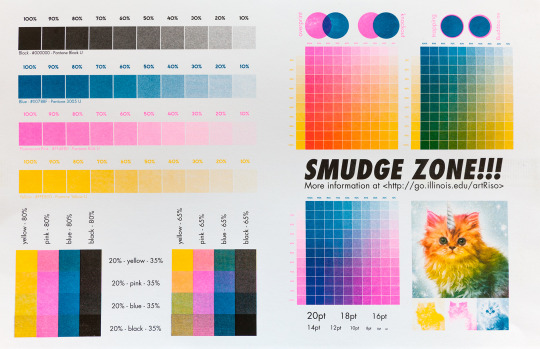
(an example of a color chart would be like this. i'd like to make one with my chosen color palette but noooo instead I eyeballed everything 💀💀 i was excited. sue me)
anyways ! sorry not sorry for infodumping. and im not an expert. however, riso is one of my recent favorite things to learn about. its a lengthy process to do it with illustrations imo. for my graphic design projects however? i might use this technique :D
72 notes
·
View notes
Text
An anatomy and lighting practice that turned into Ichiji! 😊❤️🎇✨🔥 I’ve been really inspired by @dannymans66 lately so I’ve got #1 on the mind.
ALSO!!! I HAVE AN OPPORTUNITY TO WIN A FREE COMMISSION BELOW (Check it out and see if you can win!)
So I jokingly shared the lineart for this piece with my friend and said that it looked like a page from a coloring book and the idea humored me so much that I decided to hold a competition. I’ll give you all TWO WEEKS (ending June 4th 2024 at 23:59 EST) to color this picture of Ichiji using the blanks provided below and submit your illustrations here on tumblr with the tag #ichijirecolor (and it’s probably best if you @ me as well @silkentine). I’ll judge all the submissions (with the help of my unbiased mom) and the one that I like the best* will receive a free commission from yours truly :) anything you want!!! Feel free to color outside the lines, add stuff to the illustration, use the “wrong” colors, print it out and color it traditionally, whatever floats your snail-boat! 🐌 The only requirement is that my original illustration is included in some way (it doesn’t even have to look like Ichiji at the end, I suppose!)
*If my first place winner declines the prize or fails to respond with a week of the announcement, I’ll move on to the second place and so on and so forth.
Below the Read More, I’ve provided two versions of the lineart with and without the tattoo. Also, they are all 1526x2048 pngs either with a white background or no background at all. To color using a white background, place it as your top layer and set it to a Multiply blending mode, then you can add colors on a layer below without having to fuss with the lineart or delete the background. I’m not going to check if you keep the original size or ratio of the images; I like to work really big, so feel free to compress it if necessary. Feel free to move the watermark around, and it would delight me so if you added yours alongside mine!
Thanks in advance to all who decide to participate!!! I’m so excited to see what you can create!!!


Also here’s my version without any shading, you could use this too if you wanted to but isn’t it more fun to start blank? Idk I just think this is fun to look at.
If you made it this far and you’re still not sure if you want to participate or not, let me sweeten the pot and let you know that I’m a very small creator and I’m not expecting to get many submissions, so your chances of winning could be much higher than usual with these kinds of things!!! I’m not someone who judges on technical skill either, it’s purely my own taste that will decide the winner, so don’t let your skill level hold you back! I love funny things and getting to know people in the One Piece community!!! This is all my selfish attempt at making some new friends hahaha!! Thanks for reading all of this 😋🥰 you mean the world to me.
#ichijirecolor#vinsmoke ichiji#art challenge#coloring page#digital art challenge#one piece#one piece fanart#op fanart#germa 66
102 notes
·
View notes
Text
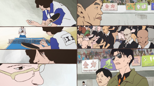
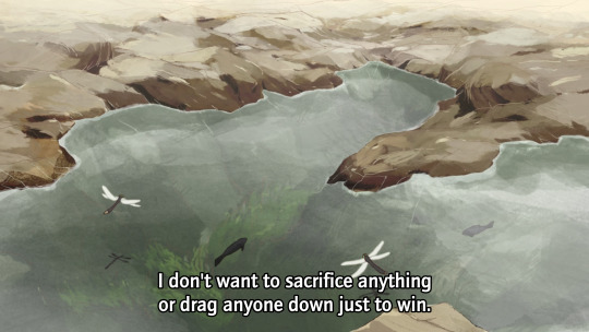
Ping-Pong The Animation: eps 1-3
So Masaaki Yuasa [AN12, AN28, AN150] can do no wrong, right? OK, well, I'll admit Ride Your Wave was kinda mid, and Devilman Crybaby goes hard as hell at the beginning and end but sorta treads water in the middle, but... generally speaking! No-one does it like Yuasa.
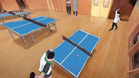
For reasons I don't really remember, I didn't get very far watching Ping-Pong The Animation some years ago. It should be entirely my shit: Yuasa pulling in a gang of wildly creative animators to put their unique spin on something. However, the first episode didn't entirely hook me, and I never got round to trying the second before something else punted 'watching Ping Pong' out of my brain. ADHD, y'know.
This is a shame because even the very next episode seriously goes, as does the one after that. But also this anime isn't entirely what I was expecting (crazy sakugafest full of Yuasa weirdness). Not to say it doesn't do a lot of really unique stuff with its cinematography and animation, but these first episodes at least are more about like... dissociation! ennui!
But more on that in a mo. First I wanna continue the thread of 'how do you animate sports'.
So, ping-pong, or table tennis. Not a sport I know much about, I'll be honest. (To be fair I don't know a lot about sports in general outside of some very specific niches. The sports I've pursued so far are rather eclectic: swimming, fencing, tai chi chuan, and roller derby; I never got particularly far in any and it's been years since I've done them.)
I'll inevitably be drawing a lot of comparisons to The First Slam Dunk, the other sports anime I've watched recently. I do think it's a productive comparison though! Both of them bring something of the visual language of manga into their presentation in unique ways. I have not yet read the Ping Pong manga, but it's by Taiyō Matsumoto, otherwise known for scifi manga like Tekkonkinkreet (god tier movie, still need to read the manga) and Number Five. So that's a pretty impressive track record!
If you go take a look at some scans of Ping Pong, what will immediately jump out is the shaky, rough line style and unusual camera angles and compositions.
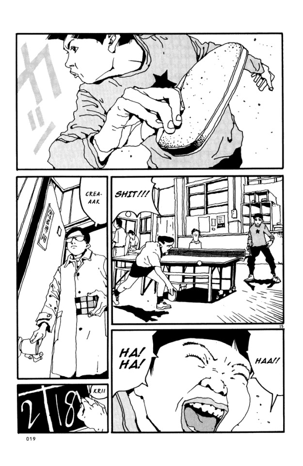
The stylisation is also very different from a lot of manga. Noses are fully drawn, eyes are realistically small, and in contrast, lips and mouths tend to get the emphasis - as well as hands.
Knowing this makes a lot of the creative choices in the anime make sense! It also adopts a shaky lineart style, and makes use of heavy line weights and spotting blacks to add definition. It also has a lot of crazy closeups and layouts, and it loves a visual metaphor. But most of all, the most striking element of this anime is how often it loves to split the picture up into little panels...
...which [eli]'s subs do a really good job of typesetting, incidentally, moving the dialogue to fit naturally into the split composition. And while this shot with 7 smaller shots is perhaps on the extreme end, splits of three or more are pretty frequent. It's a really interesting way to evoke the effect of seeing a whole page of manga
So, as you proooobably know, ping-pong is a game of bouncing balls off a little table and directing them into places the opponent will find it hard to hit them back. From watching this anime I picked up that there are a number of styles of holding the racket (e.g. 'penhold grip' and 'shakehand') and approaches to hitting the ball (e.g. 'chopping'). A lot of this pretty much went over my head, but honestly it didn't matter, since the narrative significance was pretty much always evident.
Compared to basketball, though, ping-pong is a pretty tricky sport to make visually interesting! Sure, you have the players running to and fro, and that can lead to some interesting poses, but how do you get the drama and tension into this?
Ping-pong additionally is all 2D, it doesn't have the sort of resources that Toei could throw at making the best looking 3DCG basketball game ever. It is limited to a TV-feasible drawing count. So it has to make use of clever limited-animation tricks to get the most impact out of fewest drawings.
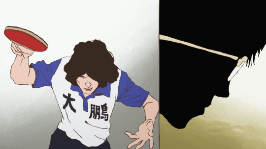
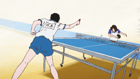
Let's take an example sequence from episode 3. A minor character is about to get his ass kicked by Tsukimoto. Tsukimoto is something of a pingpong prodigy, and yet he is very emotionally closed-off and even standoffish; he doesn't particularly seem to like the game very much, and doesn't particularly feel inclined to flex on other players and get into the status games. But other players, like Wenge, have heard about him and want to see what he's got.
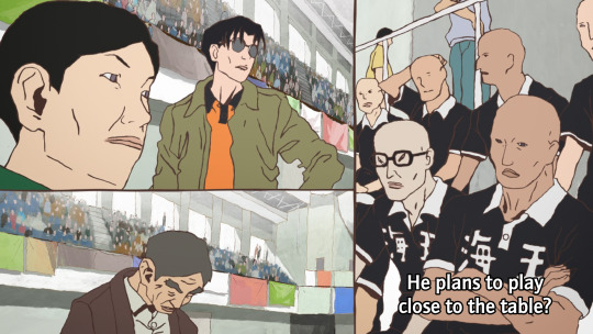
First we have the setup. Other characters are observing and discussing the game. Since ping-pong tends to involve very rapid exchanges, it can follow the classic shōnen model where there's a lot of talking, flashy fight sequence, more talking...

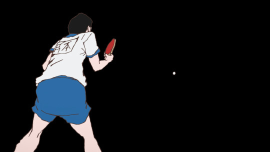
The cut happens in two steps, maintaining the vertical dividing line. This approach to cutting is used a lot in Ping-Pong, and it's quite a creative way to keep visual interest when it's using a lot of largely static shots. The panel on the right is more animated than the panel on the left, a naturalistic depiction of bouncing the ball off the table.

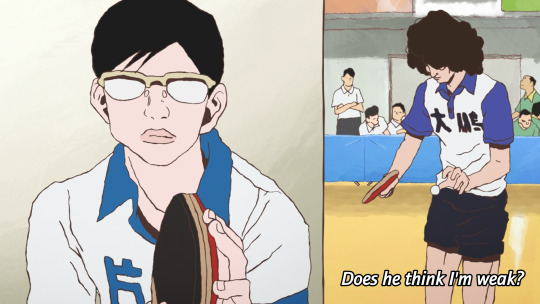
Things start moving faster here. A rapid pan on the image on the left disguises the fact that this anticipation pose is actually not moving at all. This then goes into a rapid, explosive moment as this guy serves.
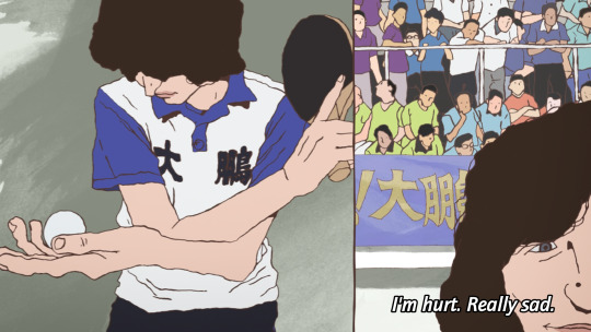
The final pose is held for a couple of seconds while the voiceover line discussing his intended move finishes. This sort of elasticity of time is a very Osamu Dezaki type of move - it's something that Hayao Miyazaki and Isao Takahata actually really disliked.
A sound effect hits as Tsukimoto appears on the right in silhouette, anticipating his reaction, and setting up the next shot which leaves the split picture and hides the background for just a moment, as if to put us in Tsukimoto's shoes: he only sees the ball.

Tsukimoto follows through and holds this pose - the ball is the only thing moving here. The ball moves mainly on 2s while Tsukimoto moves on 3s and 2s, and he and the ball move on alternating frames. He holds the pose as the ball zips off to the right (bouncing off the corner of the table), with a speed lines-like effect. At the end of the shot, the ball freezes in the air for the moment while the sound echoes.
The actual table-tennis round lasts just seconds, and the drawing count involved is pretty minimal, but it does a lot with those drawings.
We go back to voiceovers and reactions in the next few shots, returning to the split video as Tsukimoto's opponent thinks about how he'd really rather be at the beach...
Often, these comic-like compositions will change one panel at a time, and while one panel is animated another panel will be still, naturally moving your eyes across the screen. It is an approach similar to some experiments I've seen in 'animated comics' viewed in a web browser, where the panels do not appear all at once, but enter with some animation.
So this is the sort of animation technique that Ping Pong uses. It's effective! Elsewhere the cuts are used in a less direct, continuity-editing way and more in a juxtaposition/montage way. For example, Wenge's desire to return to China is symbolised by match cutting/fading to shots of an aeroplane.

And there is a recurring image, which I'm sure will be expanded on, of Tsukimoto hiding in a cupboard and wishing for a tokusatsu hero to come save him from his isolation. As Tsukimoto's feelings about himself change, the toku hero is replaced by a robot. At this points it starts to feel like an outright Ikuhara anime.
There is occasionally a little bit of CG, mainly when Tsukimoto uses a different type of racket surface, and the way the ball and racket make contact is the crucial thing that the shot is trying to convey...
It gets the job done, but I'm glad they stuck with 2D for most of it.
So I went in the first time expecting like, crazy elaborate sakuga - and to be fair, the OP, animated by none other than Shinya Ohira, delivers on that front - but if anything what I've seen so far in Ping-Pong is actually a triumph of storyboarding and limited animation techniques. I think back then I didn't have the eyes to appreciate it in the same way.

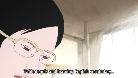
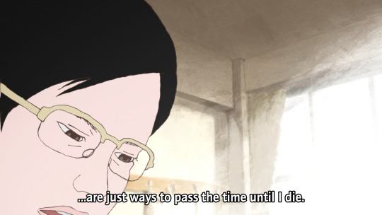
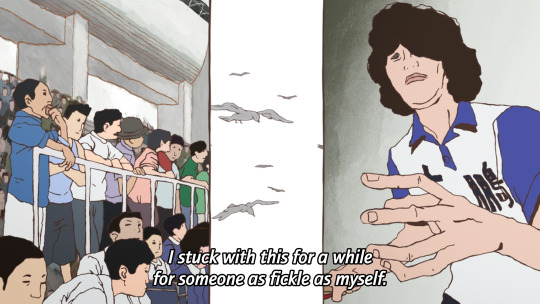
OK, that's the film nerd stuff, but what about the story? Ping Pong follows two school friends, Makoto Tsukimoto aka "Smile" (right), and Yutaka Hoshino aka "Peco" (left). Smile is defined by a flat affect and a standoffish persona. He's just going through the motions. He's very good at ping-pong, but to him it's just a way to pass time, and he's scornful about the idea of caring all that much about it. Much like Shinji with his casette player, Tsukimoto is pretty much always staring at a handheld games console rather than make eye contact with anyone.
Peco on the other hand is the more childish one - playful, kinda arrogant, very much an 'emotions on his sleeve' kinda guy. He sulks when he loses and gloats when he wins, and is constantly seen with bubblegum or other kinds of candy. He provides a lot of our commentary when he chats with the other players.
日本語上手 readers probably noticed the tsuki (moon) vs hoshi (star) symbolism thing they've got going on here!
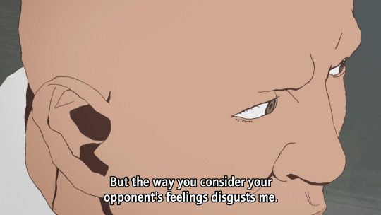
High-school table tennis in this story seems to be a rather 'tough love' kinda world. Most of these players tend to look down on those who can't meet their level. Going easy on someone is seen as weakness, or cultivating bad habits, by almost everyone. Tsukimoto doesn't play at his full potential because he isn't as invested in winning as all these weirdos, but it seems that might be starting to change...
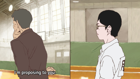

The coach is interesting. He's an old man and fairly disdainful of the club at large, and prone to speaking English randomly with a heavy accent. But he gets excited at the prospect of getting Tsukimoto to unleash his full potential, in terms that are repeatedly metaphorically compared to romance/marriage.
And when Tsukimoto gets sick of it, he challenges him to a game, with the stakes as...
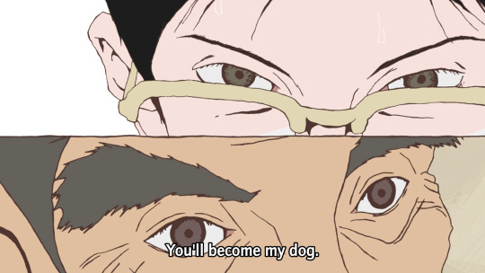

Cue Makima/Beatrice images here I guess.
Tsukimoto de facto wins when the coach collapses, but this episode marks a change of heart. He starts to think of himself as a robot - the affect of a robot replacing the affect of the toku hero in his fantasy. And in this way he does what people seem to want and plays ping pong with mechanical precision, expressed once again in visual metaphor (shot here from a cool transformation sequence)...

What if I just dissociate harder? This is gonna end well.
So it really is one of those kind of like 'ennui of being a teenager' kind of stories - c.f. say FLCL. 'Boy with complicated emotional landscape' is Yuasa bread and butter, but the particular variant here seems a little unusual for him - they tend to be a little more earnest. I'm curious to see how Tsukimoto develops.
I am definitely enjoying the arrogant Chinese player Kong Wenge. Dude's got a lot of screen presence, and while I'm sure he'll get shown up sooner or later, he makes for a very fun antagonist of sorts.
In comparison to Slam Dunk... one thing that's significantly different about table tennis is that it's an individual rather than a team sport, which means it's harder to have an ensemble cast all contributing to the protagonists' eventual victory - instead it's about a lot of individual arcs interweaving with each other, individual duels. Besides that, it does seem like it will be following a similar arc of a character in an emotional hole (grief for Ryota, depression for Tsukimoto) finding new meaning and purpose through sports - though I can't be sure how things are gonna go for Tsukimoto here!
The tone however is quite different. Even when it's silly, I feel like Slam Dunk is a very sincere story. There's little detachment or irony, or false consciousness - with perhaps the major exception of Ryota's mother, who lets her own grief and trauma get in the way of understanding her son. But ultimately 'why would you care this much about basketball' is not a question that anyone would ask in Slam Dunk. Even the judo guy in the manga who's trying to recruit Sakuragi is just as hot-blooded about his own sport of choice.
There's a difference in like, general affect about the players as well, which has something to do with the sport itself. Yeah, Sakuragi's superpower is his 'genius' ability to predict rebounds, and there is plenty of strategising in Slam Dunk - but basketball is still a sport that very much emphasises physical power, and as much as Slam Dunk will work hard to sell you on a clever trick pass, the visuals are also emphasising the speed that players are dashing, the height they're jumping, their physique. Table tennis by contrast seems to be a sport that's more about prediction and mind games.
That said it is equally just like Matsumoto's style being different from Inoue's. Now I know it's by the guy who wrote Tekkonkinkreet, a lot about this series falls into place! There's a sense of tension here, of being fundamentally at odds with the world. The autismfeels. This is reflected also in the drawings - the characters don't entirely seem comfortable in their embodiment.
So if that's what I'm getting from just three eps, I'm very excited to see what the remaining 8 have to offer. This series is probably too long to cram into Animation Night format, but we'll see...
80 notes
·
View notes
Text
jax is back at it again btw i fucking hate editing in this app it keeps failing me istg /lh
Jax's Personality Swap AU:
SHAW/SOLAIRE PIPELINE: Porter > Milo > Vincent > David > Asher > Sam > Porter
(i struggled w the choice to swap asher and sam cuz pattern,,,,)
Porter > Milo:
Hunting Werewolf
- quite mysterious and flirty
- "all alone by yourself, sweetheart?"
- suspicious as fuck
- but it works
- a weapon
- "i've been raised to kill, sweetheart. get too close and your last kiss will be on my lips."
- just really lonely, wanted to make his father proud and protect his pack
- "Gabe knew he would be gone sooner or later... so he had a project. Me."
——————
Milo > Vincent:
Skeptical Vampire
- "why are you here all alone by yourself??"
- uhhh
- "listen, youre lovely and im glad you think im lovely too, i got the lineart right too after all, butwecantbeherefortoolongpleasego"
- nope, not leaving
- "ugh, youre lucky youre cute, lovely"
- snarky
- kinda a loser but so hot
- likes to dress pretty
- best friends with sam
- he supports lovely
- independent, still a prince but really not seen as one
——————
Vincent > David:
Charming Alpha
- "well look who we got here~ do we share the same path or do you follow me, cause i am too pretty to resist?"
- he chuckles a lot, he is totally amazed by angel
- "arent you a little rebellious angel~"
- an alpha, he takes the role seriously, but he is still enjoying being out of his pack
- clearly flirty
- he likes to push buttons but is aware to not go too far
- protective? possesive?
- and he brings food for angel when theyre late from their joh home
- "you need to rest, angel. sleep tight. I'll stay by your side"
- actually very caring and soft
——————
David > Asher:
Serious Beta
- takes the beta role very seriously
- "david. youre late."
- gets stuck with baabe in an elevator and is not happy about it
- "stupid elevators, god fucking dammit."
- he is not comfortable to be with you here
- can be mean at first, but he is frustrated
- "this has to be a joke, someone had to put us up in here together on purpose..." mumble mumble
- protective
- david, angel, sweetheart and milo ship asher and baabe so clearly lmao, but dont tell him that
- feel responsible for everything, may have breakdowns
- he needs a hug
——————
Asher > Sam:
Goofy Vampire
- Vincent's right hand
- and a teaser
- still southern ofc this is a personality swap
- "well well well, late romantic Vincent Solaire! why are ya so red~?"
- number one fan of darlin'
- is not taken very seriously by the clan
- despite that, he tries his best to help vincent and the pack however he can
- has tendenc to avoid serious talks but darlin' helps him settle down and talk
- "...'m sorry, darlin'. i just didn't want ya to think of me otherwise..."
- god you love this goof
——————
Sam > Porter:
Vampire Knight
- he is like a security for Vincent, even when they don't see eye to eye sometimes
- doesnt kill until necessary
- really caring
- his weapon is his words, fangs are secondary
- "calm down, treasure, no need for a fight. now, why are you looking for me, huh?"
- suspicious of treasure, but helps them as they help him
- reveals that theyre like older brother figure for vincent, since he is the prince and need someone to guide him
- "why arent you the prince?"
- he doesn't answer... There is a lot you dont know about him...
#redacted audio#redacted asmr#redacted verse#jax's personality swap au#redacted vincent#redacted asher#redacted david#redacted porter#redacted milo#redacted sam#redacted shaw pack#redacted solaire clan#redacted au
86 notes
·
View notes
Text
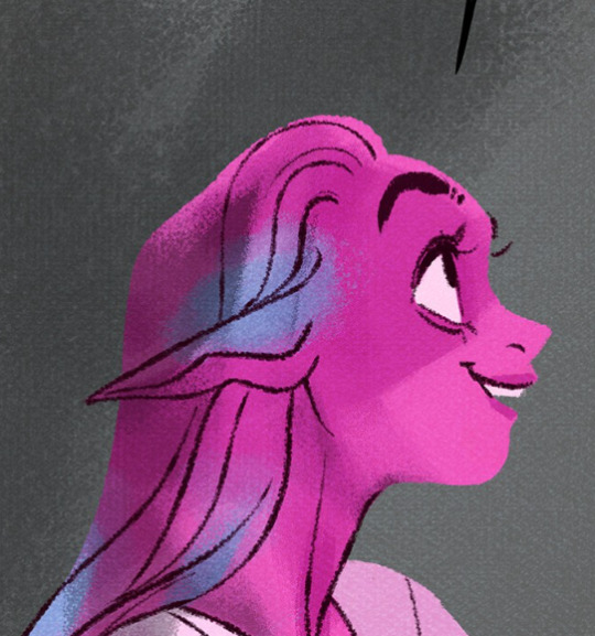
On today's episode of "Rachel exaggerates things to make herself sound cooler-"
Soooo this is a lie.
No seriously, this has to be a lie. I don't make these kinds of accusations willy-nilly. This has to be a lie.
First of all, if her file sizes are truly 11GB for each episode, that would mean her file resolutions would have to be stupid high, and I just ain't buying that when so much of her art comes out looking like fried chicken.

But again, look at the backgrounds. Crystal clear. Which supports my theory that Rachel has her assistants draw the characters flat and exports them as PNG's so that she (or another one of her assistants) can slap the backgrounds in afterwards which is why when they pinch and zoom, the backgrounds look fine (as they're added in afterwards) and the characters look like they've been drawn with chalk. The shading itself isn't deep fried though, which is, again, because Rachel adds in the shading in post after her assistants have sent her all the flats.
Anyways, moving on from that, if her file sizes are actually 11GB per episode, that would mean her resolution would have to be STUPID high and that would mean there's no excuse for panels to look like this. This is not a Webtoons compression problem, Webtoons does compress images for you if you don't do it yourself but they don't result in specifically deep fried textures like this, that's ALL happening on Rachel's side. If it were a Webtoons' problem, the entire comic would look like that, not just select panels.
This is also what the panels tend to look like in book form. The book art is clearly very compressed and blurred from being too low of a resolution for print, which means either the editor is not being provided the root files, or the root files weren't ever that crisp to begin with. Either one is plausible and either one isn't good.
But of course, I'm not going to make these claims without my own proof. So here's the file sizes for Episode 12 of Rekindled, the longest episode in the series so far by panel count and page length, clocking in at 42 panels and an average of 25 layers per page (and that's including the text layers which adds a good chunk on its own, the actual art layers are like, half of that).
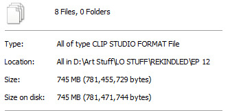
Also, here's what a pinch and zoom panel in Rekindled comes out looking like:

You can still pick up on some fuzziness, but the lineart doesn't look straight up chunky like it does in LO.
Meanwhile, one of my longest episodes of TIME GATE: [AFTERBIRTH] has a file size that honestly shocked me with how small it was.
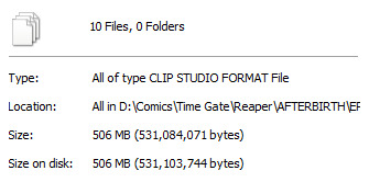
Guess how many panels that episode had?
Go on, guess. Take a second. Compare it to the file size of Episode 12 of Rekindled, take your best educated guess. Time Gate: [AFTERBIRTH] is also a full color webtoon with full shading and rendering that I used to upload once a week. Go ahead, I'll wait.

Ninety-seven.
Ninety. Seven.
Not only is that more panels than what LO dishes out on a weekly basis, but its overall file size doesn't even come out to be 10% of what Rachel is claiming LO's file sizes to be.
This is what Time Gate: [AFTERBIRTH] looks like, by the way:

(don't mind the blurriness that's working against my point, that's Tumblr, not me LMAO)
But, let's face it, I didn't want to just use my own examples as a comparison, because that seems unfair. I'm not an Originals creator, I just put myself under similar pressures as one because I'm an idiot who tries too hard.
So I asked one of my Originals pals. I will not disclose their name, but they are someone who works for Webtoons Originals and has similar panel requirements and deadlines. They also work with a similar flatting + shade workflow as LO, they have cel-shaded colors and bold flat coloring.
When I asked them how big their file sizes were, they said that at 2500px width - similar to what I draw at, 2400px width - and 200-300k pixel length (again, they're drawing an entire episode on one canvas) their episode file sizes come out to roughly one gigabyte, very rarely much bigger than that.
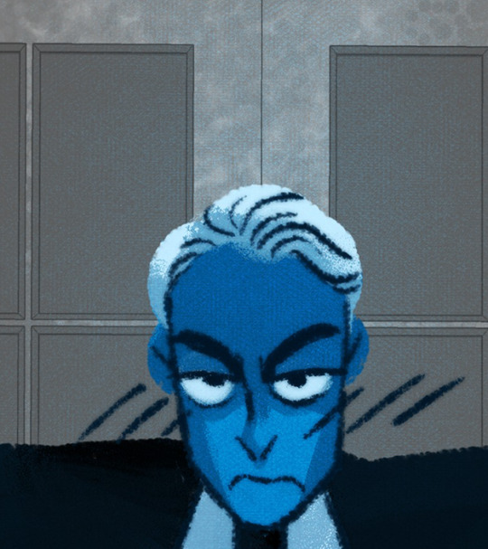
Rachel is full of shit. This is some Tommy Tallarico level shit, exaggerating stupid things that don't matter to try and make herself seem impressive. It isn't impressive. It makes her look like an unorganized dunderhead at best, and at worst, makes her look like a flat out liar who needs to prop herself up on the dumbest shit to make herself look good. File gigabyte size isn't impressive or indicative of anything, you can achieve high quality art without your file size amounting to 11 GB, and let's face it, Lore Olympus is not high quality art. You're telling me art like this:
amounts to 11 GB?
Now the only way I can see this happening is if maybe, maybe she had like, a bajillion layers full of garbage-

Oh. Oh no. Lore Olympus. Is a sprite comic.*
(*edit for clarification: I've had people confused over what I mean by sprite comic because LO clearly isn't made with 16/8 bit sprites. Sprite comic was a term universally used back in the day for comics that reused the same body parts, heads, expressions, etc. much like how sprites are designed, often keeping an entire file full of different layers made up of these assets to make for easier development. This technique was utilized in comics like CTRL + ALT + DEL. LO is definitely not literally a sprite comic but the way its layers are designed feel very much like something that's being cobbled together like 'sprite' comics were. I'm old.)
Even with these pics for proof, with 600+ layers on one canvas, if there's barely anything on those layers, then it still wouldn't make up that 11GB file size because the amount of layers doesn't necessarily add to file size on its own, at least not by that much, unless they're actually filled with stuff. And again, Rachel's art in LO doesn't scream "highly detailed with many layers". It only had many layers because for some reason she insists on working that way even to its own detriment.
From the looks of it, Rachel's importing all of her assistants' PNG's as separate layers and adding all the shading and the extra details on their own separate layers and basically dividing everything up into tiny bite sized pieces. That's the only clear explanation I can come up with. But if so, that means she's being INCREDIBLY inefficient with her workflow that it's amounting to SIX HUNDRED+ LAYERS AT 11 GB PER EPISODE. THAT IS ABSURD. THIS COMIC IS WAY TOO LOW QUALITY TO JUSTIFY THESE FILE SIZES AND LAYER COUNTS. RACHEL DOESN'T KNOW WHAT THE FUCK SHE'S DOING-
She's also very clearly using the cloud as a way to backup her work and work with her assistants. God knows how much she's spending on cloud space because of her own incompetency.
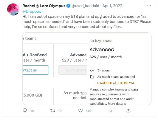
Honestly, at this point, as I sit here playing the Photoshop equivalent of Cookie Clicker, clicking the 'new layer' button over and over and over again with my mouse to truly understand what it would feel like to operate at 600+ layers per episode of a webtoon, I'm more inclined to believe she's just lying. Capping. Pulling shit out of her ass. Straight up making shit up. It wouldn't be the first time she's done that. But also because the alternative is a lot more grim - the #1 best selling webtoon on the platform is being operated like the world's worst group project and still coming out on the other side looking like deep fried garbage despite its stupid high file size.

#hoo boy i wasn't expecting to write an essay today#but i got tagged in this discussion in ULO#my 10+ years of being a deadbeat washed up webcomic creator with zero street cred finally pay off#lore olympus critical#lo critical#antiloreolympus#anti lore olympus
258 notes
·
View notes
Note
Do you have any tips or tricks on how to start a comic like this? Or even just how you got started?? I've had my own au for years that I so badly wanna put out into the world but I've been struggling with finding a good way to start it!!!!
Hm!! Ok!! This is a tough question with many different answers even just from me. I'll do my best to answer tho!! 😮
The main bit of advice I want to give, and which I think is vital to anyone creating anything:
☆ Know yourself.
When looking up advice for creating, people love to tell you that by doing things a specific way is the best and only way to go. Often advice of this sort has solid points, you should plan ahead, you should have easy character designs, buut... You don't have to.
I do not work well with outlines or scripts. I dislike sketching. You'd think that'd make being a long form comic artist impossible for me, but nope.
I know theres things I cannot do, so I've put all my practise to what I can do. My lineart style allows me to almost skip sketching completely, my scripts are more of an A to B structure than law. I improv 90% of the time when making pages. It's kinda like dnd with myself.
I would absolutely not reccomend what I'm doing to others, but I know it works for me. People can tell me I'm doing it wrong but its either wrong or no comic at all, SO. Suck it. 👍
Er. Rambling now.
My point is, figure out what you can and cant do, and do your best to give yourself the ideal work enviorment and process.
☆ Deal with being overwhelmed
Making just a few panels and suddenly realising its gonna take years to get anywhere is SO demoralising. It's gonna happen and its gonna happen again, and again, and—
But continuing with the earlier advice, you gotta ask yourself what would help you. Are you willing to sacrifice quality? Do you just need a break? Maybe you're like me and like to include smth you love in every update so you'll have something to get excited about making.
That feeling of overwhelm is trying to tell you something, so figure out what that is so it wont end the project for you.
☆ Start it
You wont like what you make when starting. I've never heard of an artist who has.
I'm not saying start this instant, not everyone is as into improv and flailing around as me. But I will say you'll never feel ready. Figure out the minimun of what you need to start and do it. Show friends first if youre afraid to post.
Also where to start? Well sure there's lots of good advice online about that, but you can also just doodle random stuff until you feel like diving deeper. That's what LV started with, just Twi and Wild hanging out with animals and some headcanons. It may not be the most tightly written work but theres beauty in the humanity of a mess.
☆ Extras
A "failed project" or "forgotten WIP" is only a failure if you let yourself feel that way. Yea it can be a hauntingly strong feeling thats hard to deal with... But it can be beaten. WIPS are proof you tried and not everyone can say they have.
Lv is far from done and I have no intention of dropping it, but because the journey has been so nice I'd satisfied even if I had to call it here. Its smth that helps me with the overwhelm... What I've made is beautiful even now.
Comparing yourself to others is gonna rip your heart out. I love that theres other links meet aus out there and hope the best for those artists but I caNNot follow any of them or I'll crumble to dust.
So Uhm.
Basically. Have fun and be yourself. 👍
Ps. Readability is basically the most important thing for a comic artist to pay attention to, that and not destroying yourself with details and rendering. 🙌 Good luck out there!
#Ask#I love discussing stuff like that but it always ends up so rambly and long ahsjjdjr#I hope I said at least smth slightly concrete
84 notes
·
View notes
Text
Four years ago, I drew my first ever finished digital art piece, using a Huion 420 tablet off of Amazon, and Krita. I was so proud of it, I showed it off to my friends and family on instagram, and I didn’t think I could get any better than this. Fast forward to the next year, and I drew it again, just to see how much better I could make it.

This time I used a Wacom tablet with Krita. It was one of the cheaper ones, but still an upgrade. I was even more proud of this one, but I wasn’t really that happy with it. I didn’t like how Papyrus turned out, and it seemed so awkwardly spaced and posed. I knew I still had more to learn, and I rushed it, since I didn’t think I could do any better. I then decided to redraw it again the next year.
This time I used Ibis Paint X and a small stylus on my phone. I was ecstatic with how this came out. I thought this was the absolute best I could ever do, but I still had little nitpicks about it. Again, I struggled a lot with drawing Papyrus, but this time I was also unhappy with the colors and shading, and how Sans was drawn (I have no idea why I made him thicc). But again, I redrew it the next year.

This one was a huge confidence booster for me. I had just gotten a brand new laptop from my parents: A Lenovo Yoga, with a Wacom bamboo ink stylus. It was the best gift I ever received, but on top of that, they got me Clip Studio Paint PRO. So I was ready to make some good ass art. This time I sketched everything out on paper, then finished it in CSP. I even attempted a background, which didn’t come out too bad. Papyrus doesn’t look horribly off model, and the poses and composition overall was just better. I used a clean sketch for the lineart, since that was a big struggle with my previous versions, and I used colors other than black and white for shading. After I made this, I felt like I didn’t need to continue redrawing it, because I thought I was at my peak.
I redrew it this year.
I used my Lenovo Yoga, but this time I had a Wacom bamboo plus, and Clip Studio Paint EX. I added more characters, and took a little bit more inspiration from the original, but I mostly wanted it to feel more alive. I finally perfected how I draw Papyrus, and Toriel, Asgore, and Frisk aren’t statues anymore. I showed off what I’ve learned about lighting and shading, did actually clean lineart, and I even did a full background! I’m so proud of this, and so happy with how far I’ve come as an artist, and I can’t wait to see what my future self draws next year.
#art#digital art#artist#artwork#digital artwork#art progress#art process#undertale#undertale fanart#undertale anniversary#sans undertale#mettaton#napstablook#frisk#toriel#asgore#papyrus#muffet#undyne#alphys#froggit#whimsun#flowey#temmie#annoying dog#toby fox#wd gaster#asriel#chara#monster kid
88 notes
·
View notes
Text
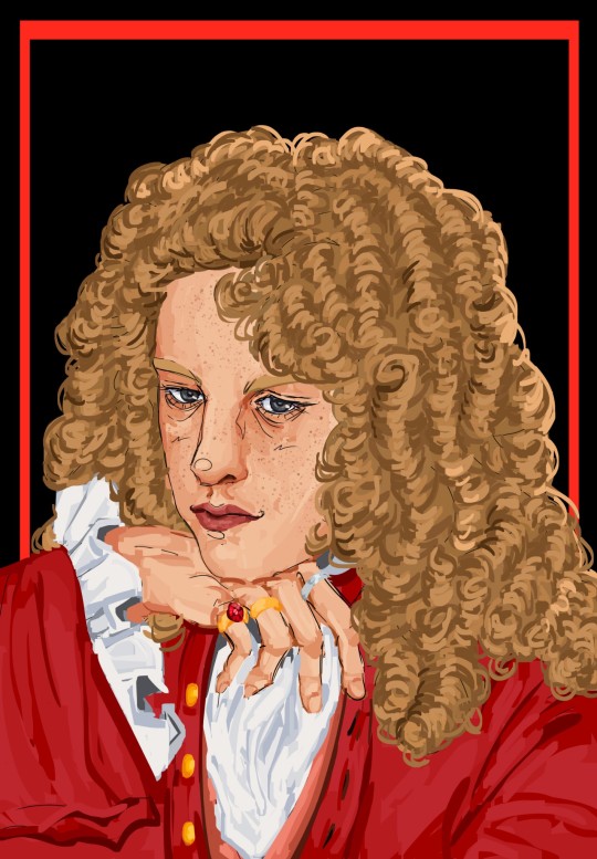
Prince Jenson of Somerset
+ process & lore
Yayyyyy omg finally have drawn portraits of the four main characters!!!! I'll show the process of Jenson's first and then them all four together. Though it's a shame the Seb/Fernando ones are older, I think it's hopefully obvious how much I've improved since November?
Look at him in all his handsome, princely glory 🥹 It's funny, I'm always happy with the second sketch and initial lineart, and then I start coloring it and I absolutely hate it, and it takes a significant amount of time into the painting for me to like it again. And then I reach a certain point and I'm in love with it again. Ugh though I gotta say, I love drawing the curls, it's just so 18th century, but at the same point, man I always will love my original lineart for the hair the best ah. Also yes I absolutely had to give him a big ass hat with feathers, he really is that kinda guy to me. I originally drew a bicorne and then realized that those don't really exist until basically almost a century later oops, so tricorne it is!!
Okay now omg look at them all together 🥹
Haha wow I have improved a lot! Just like the Seb/Fernando ones, Mark and Jense's were meant to be put together. I think there's a lot of inherent characterization in their poses that highlight the difference between them. Mark is looking up, very wistful, looking up to greater people, greater things. Jenson's head is tilted down, almost looking at the viewer, he is very satisfied with his role and revels in it, he's here to slay!
Okay, yes, lore, characterization, sorry that it is so far down on the post!!
Jense would probably be the fan favorite if this AU was an actual book or show or something. He's the guy you randomly find while browsing Wikipedia and you're like, woah this guy is so cool??? Unlike Sebmarknando, he doesn't really have the same level of angst, he's kinda just chilling. He's a bit harder to write a lore post about, because he's basically that character who is always magically around the corner, ready to witness some crazy thing and just breeze past it.
He is less linked to Seb than people like Mark and Fernando, because he's basically just his personal minister of transportation(read: horse fucker), so he avoids a lot of the relationship complications and drama, but that isn't to say he's completely uninvolved. He really likes Seb, and loves to hang around with him and serve him, but he's not as beholden to him. He's who everyone goes to air their grievances or to get away from the others, and he's very happy with this role. He's generally willing to play any side in an argument, but does tend to have a pretty big soft spot for Seb overall(Seb also gives him cuteness aggression, and he wants to bite him. Especially when Seb puffs himself up and acts super bratty when he gets offended at not being seen as a proper ruler.)
He's royalty from other kingdom, but pledged his loyalty to Seb's kingdom when he was quite young and has served him(his father first) ever since. He started off somewhat low in the military, rose to a pretty high rank, was a renowed war hero, and then ended up retiring pretty early to tend to Seb's horses. That's an oversimplification, but yeah. He liked the military life, was very good at it, but decided he had done enough, and wanted to be involved in more direct service, albeit more laid back. As I mentioned in Mark's post, Mark *really* doesn't understand his choice to do this, because if Mark had been in Jense's position, he can't ever imagine being able to let all that go and living the quiet life.
He is the palace whore, everyone has been with him honestly. It'll be like, some man walks into his bedroom, only to see Jenson in bed with his wife, but instead of being angry, he's like "wow you couldn't even wait for me??" He's just very carefree, and happy to just slut around and tend to Seb's horses.
I think he definitely still advises Seb, and would go to battle if truly need be, but generally seems to be living in a different world than the weird psychosexual homoerotic political drama that the others seem to be living in. But as I said, it's not like he doesn't contribute to it! He loves to goad Fernando, and constantly plays devil's advocate in "debates" between Fernando and Seb. He's also obviously the one that keep "accidentally" locking them in rooms and forgetting where the key is.
Sorry if this isn't very explanatory, I hope it gives a general idea to the type of character he is???? As always, let me know if you have any questions! I kinda struggled on what to write here because I'm finishing this at almost 8 am 😭 so I'm not sure if it's great or not. But basically you need to know: horse fucker who is generally breezy and carefree but also can be a bit of a menace to society every once in a while.
#YAYAAAAAAA PRETTY HAPPY WITH THIS ONE!!!!#lmfao tho not 100% sure about the lore notes because i wrote this at like 8 am#hope its understandable 😭 and that you love jense as much I do#hes probably the funniest character in the AU#and like if it wasn't centered on seb/nando he would be the favorite#hes just often there as my kinda reaction character#tho both he and Mark are reaction characters but on opposite sides of the scale and they play off each other#jenson walks into a room where sebnando are psychosexually glaring at each other from across the room#and hes like hmmm how can i make this worse#and mark is the type to walk into the room. see whats going on. and briskly walk away#so jense absolutely loves to tease him w this kinda thing and just make any situation 100x worse(aka funnier)#well funnier for him probably not the other people involved#but its okay bcs they love him. hes jense!!! who wouldn't love him!! hes our favorite guy!! our jense!!!#I just love to imagine he gets all the sides of the gossip and is like hmm yes yes interesting#but doesnt use it for scheming or evil but rather just to tease and be annoying and make everyone blush :)#okay well anyways wow im not really discussing the art itslef sorry!!!@#I think he looks so handsome pretty in this 🥺#hes pretty difficult to draw but i think it came together when i gave him freckles tbh#i hope he gives off carefree but seductive but laidback prince 🙏🙏#f1#formula 1#jenson button#catie.art.#boy king au#*not sure about his title officially yet. i mean hes from somerset but yeah idk its okay
49 notes
·
View notes
Text

Thanks for the ask, @strrwbrrryjam ! i'm flattered that you think I do a good job of that, because I'm still learning! (and I also struggle heavily with proportions. I have to resize my heads and arms so, so much...)
I'm afraid I don't have any secrets. I think the answer is to just practice, over and over again. But specifically, this is what I try to focus on as I'm learning:
references
quick practices - 30 second to 5 minute studies that help with getting a full scope of the shape and energy of the body, not meant to be perfect
studies - deep dives into certain anatomical structures (videos linked below)
Below the cut is how I use references go from this to this:

References:
Use a bunch of references! Pictures you take, stock images, from shows--practice real people. Even if your style is heavily stylized, it all starts from an understanding of anatomy.
How I Use a Reference When I Struggle With Proportions:
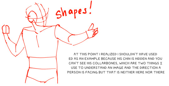
The first step I take while looking at a reference is to just draw a very loose sketch with a line of action that goes then entire length of the piece, and I try to section it out. I find if I don't think about the body as a whole, and just start drawing a head, the head will be way bigger than the rest of the image. So my first step is just really boxy and basic, just to get all appendages on paper. My first pass could look like this:
Okay, not bad. But the right arm is going way too far down--the forearm is really long. The head is too big for the style I want, and the left arm is at a 90 degree angle, unlike the picture. But, I have the general scope of everything on the page, so it's easier to adjust and look at the full picture!
Then, I try to focus on landmarks. I look at where certain body parts fall in the reference. For instance, Blackbeard's right elbow doesn't reach his belt, so his elbow shouldn't be near his waist. I can tell that his left arm is closer to being straight than at a right angle, and I can see that his head isn't as big on his shoulders as I have. I can also look at the negative space and see that the gaps between his right arm need to be smaller. So my next pass might look like this:
(I don't usually draw on the reference image, and I just "draw" the lines in my mind, but the for sake of things...)
Now it's looking a bit closer!
The next is the harder part. It's making things shapes, and is closer to the lineart stage. I try to follow curves, separate the chest from the torso, get the angle of the shoulders and head, etc. I have some video links at the end that explain this step much more in def.
You may notice that the head angle is a bit different than the image, and the shoulders are a bit lower. Sometimes, following a reference image completely either doesn't fit your style or, in some cases, the more accurate drawing following a reference can actually look "wrong" (anatomically) when drawn. Figure out what works best for you, and for the message you're trying to get across in the piece!
[sliiiight flashing in timelapse]
And here is the final timelapse, with a little refining and polishing of the anatomy. Not everything is completely accurate to the reference image, but I've created a believable image in the likeness.
I hope this helped! This was a quick and dirty post of something I'm still learning. Here are some youtube tutorial artists, resources, and books that I use to learn!
Youtube:
-ModerndayJames has lots of videos on creating shapes and understanding anatomy, and placing people in perspective. He has a lot of free videos, and then some cheap ones on gumroad that go more into it.
-Proko has lots of videos on anatomy!
Practice Resources:
-Pose Maniacs - figures in different poses. You can move the camera around to see different angles.
-QuickPoses has images for figure drawing and quick gesture drawing! You can even have different timers.
Books:
Morpho Series. There used to be the one on "Fat and Skin Folds" that was a free PDF download that was on tumblr for a while, but I don't believe the books are that expensive.
Taco's Books, published by Lezhin. This is heavily anime styled, but talks a lot about anatomy, and is a great resource!
#art tutorial#asks#mytutoirals#myart#proportions#turns out you can't add videos to asks and if you try it makes the post uneditable#so i couldn't answer your ask directly. hope you see it sorry!#anatomy tutorials
59 notes
·
View notes
Note
if it's okay, would you mind sharing your art process? your style is SO gorgeous dude. keep it up spardacest nation!!!
Thank you so much anon, and of course!
I kinda posted about it on twitter a while ago, but for anyone not also on there, here's a paraphrasing of what I said there!
(under a cut bc it's gonna get a bit long)
(speedpaint video from procreate mostly bc like I also said in that post, it's one of the few pieces I've done entirely on procreate and thus entirely recorded kdfjhdk I usually don't do the sketching + painting parts on there but every now and then I get lazy and want to get it all done quick in one program lol! It's not as good as it would look if I were using krita to render (which is what I normally use) but it gets the idea across decently of what it is that I do)
The short version of my process is:
sketch, clean up sketch for lineart, then flat colors, then paint over the flats (i make the flats my shadows and paint on the light), then a multiply layer for skin details (like lips, eyebags, etc), then an overlay layer for skin transparency details (red over the ears/nose/fingertips etc), then i do hair over the lineart, then a multiply layer with the contact shadows in a light beige/grey/neutral tone on top of everything else, and then i unify layers, paint over the details, and color correct the HELL out of it
The longer version is:
SO, first of all, I will say, my entire process for a finished/fully redered piece is pretty scattered and uses a lot of different apps, because after many years of trying out different drawing apps I found that I just worked better when I could incorporate the parts I liked best from each individual one rather than having to adapt to another app entirely!
In total, what I use is: autodesk sketchbook and procreate for the first half I do on my ipad, then krita and photoshop on my computer when I'm actually rendering (but any photo editing app instead of ps will do, I'm just used to photoshop bc that's what I learned as my first drawing app WAAAY back in the day lol), and then meitu on my phone for color filters (also any phone editing app with filters in it will do), AND also optional just for references: blender and daz3d on computer + magicposer on my phone
The actual step by step of what I do:
First of all, if I want to do a detailed, well rendered piece I will start by getting my references ready. That means either just grabbing a screenshot from the game if it's like, a simple portrait, or a photo reference, taking a picture of myself in the right pose/lighting, and if it's something more complex I will recreate the scene in Daz3D to simulate a realistic lighting, OR even just blender (i have the game models for the dmc characters downloaded, so I can just pop them in, pose them and change the lighting to get a realistic idea of what shadows their faces will cast in that specific angle/lighting.)
Note: references are pretty essential to me, and there's nothing to be ashamed about for using them! Personally I don't struggle a lot with the drawing/sketching part of art, but my tiny little pea brain cannot fathom how to make an object 3D in my mind, and how to visualize shadows realistically... thus the reliance on 3D programs to do that for me, and then all I have to do is draw what I'm seeing lol. My art improved significantly ever since I started making 3D refs so I could get /exactly/ what I needed - there's still a lot of leeway you need to learn though, because as realistic as the lighting will be in a rendering program, you'll never really get a fully natural looking image, as far as stuff like the body stretching/squishing/pulling when it's in movement, facial expressions, folds in clothing/fabric, etc... so really it's more a guide than something meant to be followed 1:1.
Then, once I'm confident I know exactly what I'm gonna draw/have the idea in my head, I start sketching it in sketchbook. Not really getting very in depth, just blocking out rough shapes - I like sketchbook and to be on my ipad for that because it feels very reminiscent of traditional sketching on paper to me, which while I'm not super confident on my traditional art abilities, I do get the most natural/fluid/non-stiff figures out that way.
Then when I think I have the general idea ready, I export the sketch layer as a png and import it into procreate - which is where I kinda start picking at the sketch and polishing it like i'm carving it out haha. Lots of liquify tool, flipping the canvas to check if it's even, blending out some of the lineart to help out with the rendering later, and then polishing up what was once the sketch into serviceable lineart. I usually reimport it back into sketchbook at this stage - while I like procreate for drawing I don't love the brushes I can use for lineart there, and so I usually only draw the "base" naked figure in there - when I'm in sketchbook I use a hard pencil to refine the details, then on a separate layer add all the things "on top" like hair, clothing, etc - usually I can get it pretty easily in one go, and once I'm satisfied I erase the naked body under the clothes and unify the lineart layers.
Then I will just do the flats with a hard brush, turning the lineart layer into an overlay layer and coloring things in with the shadow colors.
At this point, I export the file as a psd and import it on my computer - I give it a once over in photoshop first to see if there needs to be any adjusting (like whether any layer that has an effect needs to have a different effect, if all the colors look right since the ipad screen isn't the most faithful, if i wanna change the background color, etc), and once I think it's ready enough, I open it up in krita, where I do the actual bulk of the painting/rendering (as to why specifically krita: it's because I've gotten very comfortable with the brush/painting brush dynamics there and cannot seem to get as good results anywhere else, it's just the goldilocks spot of a brush for me haha.)
If anyone's curious, here's the brushes I usually use for painting:
The one in the middle is my go to painting brush, left one for tinier/more refined details, right one for blending out soft shadows (though I learned the hard way to not overuse it, or it will look like I went ham with an airbrush tool lol).
(I don't change any of the settings on these brushes, so if you wanna try out the exact ones I use! Just fresh off how they come out the app haha)
I paint on the lights on top of the shadows, and just focus on that for the time being - once I'm done with the basic painting, I'll make a separate multiply layer for details like lip color, eye waterlines, makeup if there is any, eyebags, etc, and then adjust the opacity until it feels right - then I'll make an overlay layer with skin translucency details (like, when you hold your hands in front of a light and see the tips of your fingers become bright orange - many parts of your body are always a bit translucent to the blood underneath, specifically parts where the skin is thin like noses, cheeks, joints, knuckles, etc, and I found it makes the character look a lot more alive to add that subtle coloring in) - then usually I do hair on a separate layer on top of the lineart (because that way I can add small flyaways, more details, etc, and just use the lineart as a guide)
After that, I'll usually make a multiply layer on top of everything where I'll add contact shadows in a neutral color (usually pretty pale, it'll be darker anyway since it's multiply), and once I feel like I've rendered everything out properly, I save the psd and re-open it on photoshop.
In photoshop, I'll mess around with the layers a little bit more (changing hue/saturation, opacity, etc), fuck around with the background to make it look pleasing, and once I'm happy with it, I'll unify the layers and start color correcting - usually by duplicating the unified layer and messing with the curve/hsl of the image and then changing the opacity of that edited layer until it's as strong or muted as I want it to be - then I also edit the RGB curves individually and adjust the opacity of that also (because I just really like how it ends up looking if I give a bit of a red/warm tint to the shadows lol), and at that point often I will reimport the finished image into procreate for some finalizing touches! Like, blending out shadows that came out too harshly, painting over anything that came out not the way I wanted it, redefining the lineart if it got messy during painting, and adding any extra small detail that might have gotten lost like catchlights, hair shines, hair flyaways, tears, etc. I also do one last round of flipping the canvas and liquify if needed!
At this point, I export the finished image both to my computer and my phone - on my phone I open it up on the photo editing app, and add a bunch of different color filters - I don't hesitate from going completely balls to the walls here, and just kinda applying as many filters as will make an image look pleasing to my eye.
Once I think it looks good, I'll export the edited image to my computer - and then open both the version without filters and the one with them on photoshop, and use the filtered version as an opacity layer, and adjust it until it doesn't look as crazy anymore lol.
One last step I recently started incorporating was also changing the image to grayscale after I'm done, and doing one last round of curves in greyscale to make sure the values look right, and nothing is getting too lost because the values are too similar (because i know i get a bit swept up in getting repulsed by harsh contrasting lighting and can end up washing out all of rendering if I don't check myself kjdfgk)
AND that's it!
Yes it's a pretty long and chaotic process, but it's coming from years of trial and error and realizing I can just let myself fo whatever makes me happier with the results, and I don't have to stay constrained to one program if I don't like every tool it has to offer/don't have to accept the final image fresh off the painting app as the "finished" image with no adjustments allowed after, lol. I don't find it takes a lot more time than if I didn't do it this way, but YMMV.
Hope this was helpful and sorry for taking so long to explain! I just wanted to give a thorough explanation dfhdkhkx
#asks#sorry i know its a bit chaos hfdgd#but i hope its helpful anon! thanks for asking#also for anyone wondering#no i am not paying for ps lmao#fuck adobe#it is always morally correct to pirate adobe products people#if you have an alternative photo editing app you like best youre welcome to use it#but if youre too used to photoshop. everything is free on the internet if you know where to look#i also wouldnt recommend meitu bc it feels like a pretty sketchy app all things considered#im just too lazy to care to change my go to app but i would look for a different phone app#p sure theres billions that let you add funky color filters instead#actually i think you could use photoshop camera raw filters for that too#its just way too intensive of a process for my tiny potato computer and it feels a lot faster + seamless on phone
13 notes
·
View notes
Text
FLIRTING IS HARDER THAN IT LOOKS
genre. fluff.
warnings. soobin's (failed) attempts at flirting. beomgyu is a menace as usual. kissing.
pairing. soobin x fem!reader.
wc. 714.


Beomgyu had been teasing Soobin all day about how often he made girls blush with his perfect face, and how Soobin probably didn’t make you blush at all even though you were his girlfriend. Soobin knew that Beomgyu was just throwing out more and more absurd comments to get a reaction out of him, but he had even gone so far as to say that whatever charm Soobin had must have worn off in the 3 years he had been dating you. And that pushed Soobin past his limit of teasing.
Now, Soobin and Beomgyu had made a bet over whether Soobin could make you blush. 15,000 won was on the line for whoever won the bet, but Soobin was more determined to win it for the sake of his pride.
Now, as he walked with you to the park, he was determined to make you blush at least once. Blush hard. He would do whatever it took to prove his worth as your charming boyfriend. He could manage it, right?
He had a strategy planned out in his mind with several different approaches in case the first couple didn’t work. He would start by asking you to draw him.
“Y/n?”
“Hm?”
“Can you draw me?” He asked, trying to add a cute tone to voice to see if that would help.
You smiled, “Sure, but you didn’t have to ask, I was going to already. You look cute today.” You sat down against one of the trees, grabbing your sketchbook and a pencil, deciding to do some messy sketches that you might add lineart to later. Soobin sighed, seeing how he was the one blushing while your cheeks didn’t have a hint of pink to them yet. He’d have to try something else…
He decided he would try to maintain eye contact with you since he had heard that staring sometimes makes people blush. If he stared you down hard enough, there’s no way you wouldn’t blush.
He focused his big doe eyes on your focused ones, waiting for you to look up from your sketch to get the next details of his face. You soon did, but then looked down again, completely ruining Soobin’s second attempt.
Still, he continued his eye contact, waiting for you to look up once more. When you did, he smoothly winked at you, dimple out on display. He was trying his utmost best. You giggled a little, lips turning up into a smile, but cheeks staying the same colour. Soobin frowned. He’d have to go to the next thing on the list.
“I’m done!” You grinned, turning over the sketchbook to show Soobin the drawing of him. His eyes lit up looking at it. He loved every single drawing you did of him. But he huffed when he realised he had failed to make you blush for the fourth time.
As you were walking around, Soobin decided to take some pictures with his camera since the scenery was nice. You posed for him and he snapped some pics, looking them over with you afterwards.
“You look so cute in this one!” He gushed, turning towards you with a big smile. You smiled back, cheeks just starting to turn a slightly brighter shade. Soobin noticed immediately and rushed forward to do more. He leaned down a bit, mouth right next to your ear and whispered a sincere, “I love you.”
You laughed a bit out of shyness, cheeks successfully covered in pink blush. Soobin grinned at his success, dimples on full display. You stood up on your tiptoes, hands finding their place on Soobin’s shoulder and behind his head. His eyes fluttered closed as he anticipated the incoming kiss, soft lips soon coming into contact with yours.
Once he pulled out, you were both blushing 3 times harder. Lost my charm, my foot! Soobin thought, already planning how he would rub it in Beomgyu’s face that he still was able to make you blush. He pulled you into a back hug, arms hugging your figure tightly.
“You seem very happy today.” You commented curiously.
“I won the bet.” Soobin grinned, and your face furrowed in confusion.
“What bet?”
“I made you blush.” He murmured, kissing your cheek which, of course, only made you blush even harder.
↳ txt taglist: @kangtaehyunzzz,, @yeonjuns-redhair,, @90steele,, @ddeonudepressions,, @multi-stan-jenny
#fics ❀˖°#soobin#choi soobin#txt soobin#txt choi soobin#soobin fluff#soobin fic#txt fluff#txt fic#txt x reader#soobin x reader#choi soobin x reader#txt soobin x reader#txt soobin fluff#txt soobin fic#txt fanfic#soobin fanfic#fluff#fic#fanfic#kpop#tomorrow by together#tomorrow x together
132 notes
·
View notes
Last Seen Blogs

travellikeamit
Travel Like Amit

lildevilkitten
Sadness, Sex and Cigarettes

hybrid2go
Hybrid 2 Go


illiterate--poet
illiteratepoet