#flex css
Explore tagged Tumblr posts
Visit Tumblr Blog
Explore Tumblr blogs with no restrictions, modern design and the best experience.
Last Seen Tumblr Blogs


Fun Fact
69% of Tumblr users are millennials.
Text
Hello audience. Unfortunately, I am still on my break. However, I am happy to announce that I am still alive and kicking. In fact, I decided to make use of my unemployment and revisit HTML, CSS, and JavaScript to create... A visual novel.
Good News: code is 100% reusable because I used a JSON (i do not know how that works, someone can kindly explain to me...)
Bad News: this code sucks ass, and NOTHING works except playing the story. Transitions? Doesn't work. UI/UX? Ass. Effects? Hell no... Also, 70% of the features aren't present yet I'm gonna do it later.
Oh, this is CrossDust, if you can't tell.
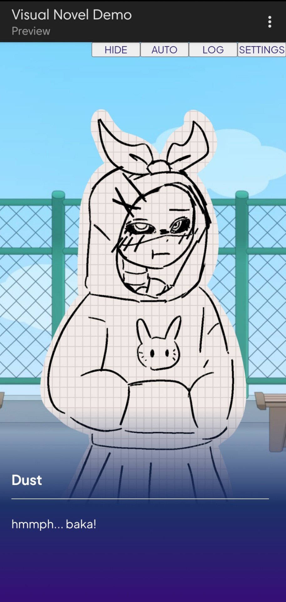
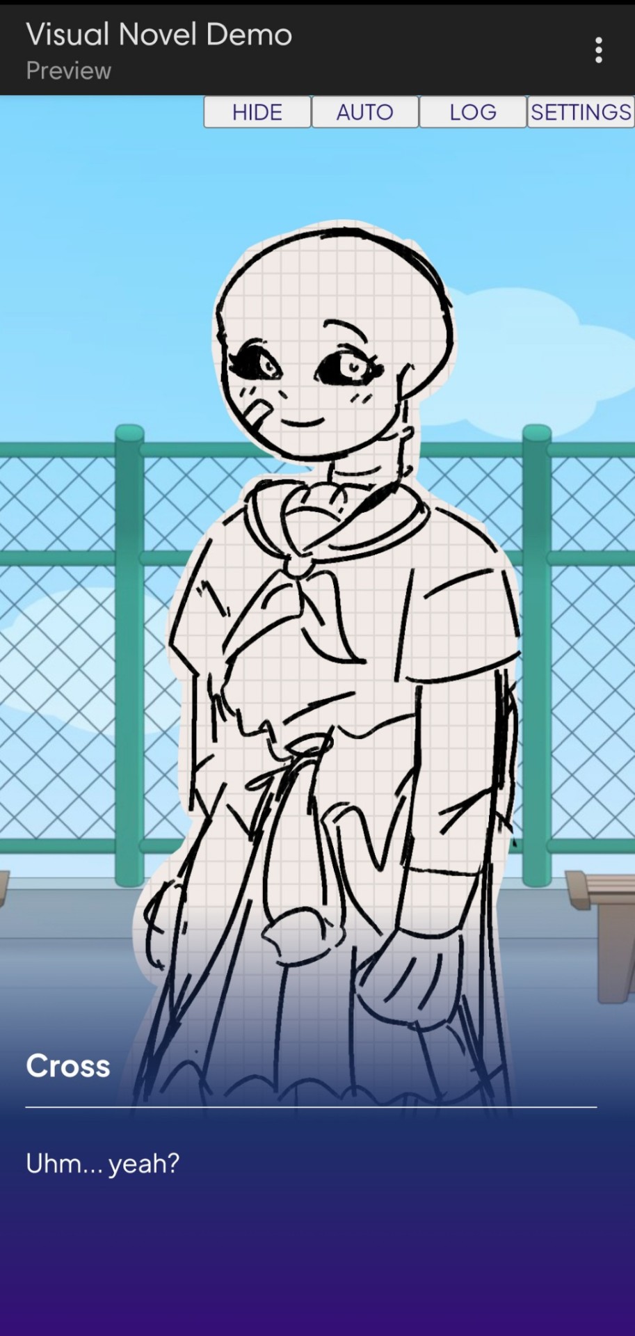
Dust Sans by Ask-Dusttale, Cross Sans by Jakei
I'm gonna respond to asks and do requests later (After my break is over). This is just a small update teehee.
#dsevalyappuccino#TIME TO GO INSANE IN THE TAGS!!#i hate css#i still hate css#css hell no#guys why is css so hard. ive literally been doing this for months and css is still hard#i was about to use css spritesheets for the sprites and emotions#but my ass gave up and instead i just use seperate images#GUYS!!! DISPLAY: FLEX 💪. DISPLAY: GRID?!?!#javascript i hate you tooq#i hate java script naurrrr#what do you mean DOM objects#what do YOU MEAN#also i do not understand error handling and JSON integrations#papaGPT doesn't explain anything#i don't know what I just wrote#coding???????????#kids don't be unemployed#actually maybe if you're unemployed but still making money that's great#also the sprites are just for testing purposes im probably gonna make new better ones if i chose to expand this into#a full blown anime high school visual novel project#i don't wanna think of all that story crap but then again i can just write the cringiest thing on earth
23 notes
·
View notes
Text

Working on a neocities website! So far I have learned how to redirect a page and how to load one html file into another using (extremely simple) JavaScript.
#sewing#sewing patterns#neocities#I thought I already understood#HTML and CSS#but flex and block display#are causing me problems
20 notes
·
View notes
Text
dem boys
#i'm really building a whole ass website!#taught myself how to use flex boxes today holy shit#css/html/js is just as picky as i remember haha
20 notes
·
View notes
Text
the flexbox isnt doing what i want....!!!
#css#grid would be better but i need the space to the side to be able to disappear if nothing is in it omggg#i feel like what im doing should be feesible#flex works but only if i dont define the width of the container i need to be able to collapse when empty#omg omg#im done#it looks fine enough for now#but ill try again later#my god#codeblr#webdev#i just wanna make the container to the left slightly smaller when the screen is small orz#i cant do that apparently#it might be a tailwind issue too#like its too complicated for it#or i need to read 500 things to figure it out
2 notes
·
View notes
Text
major site layout update: I figured out how to make a responsive collapse w/o bootstrap🎉
I'll likely not roll out with animations since it's purely cosmetic, and I feel too inexperienced with them to include it in the initial update (if I do it'll probably be way later)
#rambles#art on main#html#website#personal website#There's already a lot of stuff I'm trying to catch before release so I don't have to do it later#like proper flex classes & semantic html#so something cosmetic I can just add to the main CSS & JS later is low priority
4 notes
·
View notes
Text
Responsive Layouts: Flex, Grid and Multi-Column by Abdelfattah Ragab
Welcome to the book “Responsive Layouts: Flex, Grid and Multi-Column” In this book I explain the three best-known responsive layouts: the Flexbox, the Grid and the Multi-Column layout. Flexbox is a one-dimensional layout that only works in one dimension at a time, either horizontally or vertically. The grid layout is a two-dimensional layout that distributes the elements horizontally and vertically at the same time. The multi-column layout is a special layout for magazines and newspapers, where the text should flow in columns with spacing, rules, etc. I'll explain all the properties and their values and how they affect the distribution of elements on the screen. So let's get started.
Available on https://shop.tredition.com and https://www.amazon.com

0 notes
Text
coding themes where you can't control the html is kind of enriching actually
#花話#css grid and flex properties doing a lot of heavy lifting here lol#but also stuff like :has() and :not() doing perhaps even more when it comes to making layouts responsive#n rearranging items when other modules are introduced into the frame#anyway been coding a dw theme from scratch for funsies basically n i have to consider how it looks on the various#different pages with all the different modules that can be turned on n off hehe#n also have to consider how to keep it responsive for mobile layouts n stuff... is a fun challenge in selectors
0 notes
Text
Centering an image with media queries when in mobile mode
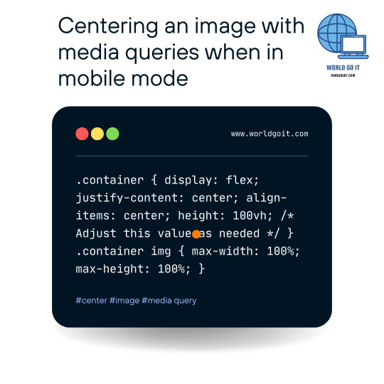
To center an image vertically and horizontally on a web page using CSS, you can use the following CSS code: .container { display: flex; justify-content: center; align-items: center; height: 100vh; /* Adjust this value as needed */ } .container img { max-width: 100%; max-height: 100%; } In this example, we create a container element with the class name "container" that will hold the image. The container is styled as a flex container using display: flex, which allows us to use flexbox properties for alignment.
The justify-content: center property horizontally centers the image within the container, and align-items: center vertically centers the image. The height: 100vh sets the height of the container to 100% of the viewport height, but you can adjust this value as needed. The img selector inside the container sets max-width: 100% and max-height: 100% to ensure the image doesn't exceed the container's dimensions. To use this CSS, you need to wrap your image with a container element like this: Replace "your-image.jpg" with the actual path or URL of your image, and "Your Image" with an appropriate alt text for accessibility purposes. With this setup, the image will be centered both vertically and horizontally on the page. Read the full article
0 notes
Text
So I created an ao3 skin and I would like to share it for anyone who wants to use it 💞
Here’s the code >>>
•Wizard Settings
Can be overridden by custom CSS :
Background color:
#FCEBFC
Text color:
#AF7E98
Header color:
#B34A81
Accent color:
#EABEE4
•CSS:
:root {
--background-color: #f9e3f2;
--text-color: #4d494a;
--form-background: #fdeff5;
}
body {
font-family: sans-serif;
}
.wrapper {
background-color: white;
border: 2px solid #f3c2e3;
}
#header {
padding: 10px;
margin-bottom: 15px;
}
#header a {
text-decoration: none;
}
#header a:hover {
text-decoration: underline;
}
#header ul.navigation.actions.user.signed-in {
display: flex;
justify-content: flex-end;
padding: 10px;
}
#main {
padding: 20px;
}
.heading {
padding: 8px;
margin-bottom: 10px;
font-weight: bold;
}
input[type="text"],
input[type="date"],
textarea,
select {
border: 1px solid #f3c2e3;
padding: 8px;
margin: 5px 0;
}
input[type="radio"],
input[type="checkbox"] {
margin-right: 5px;
}
.button,
input[type="submit"],
button {
border: none;
padding: 10px 20px;
cursor: pointer;
border-radius: 4px;
margin-bottom: 5px;
}
.button:hover,
input[type="submit"]:hover,
button:hover {
background-color: #e687b0;
}
#new_work_form .actions .button {
border: none;
padding: 10px 20px;
margin: 5px 5px 5px 0;
cursor: pointer;
border-radius: 4px;
}
.actions .button.current {
border: none;
padding: 10px 20px;
margin: 5px 5px 5px 0;
cursor: pointer;
border-radius: 4px;
}
#work_search_form .submit .button {
border: none;
padding: 10px 20px;
margin: 5px 0;
cursor: pointer;
border-radius: 4px;
}
#work_search_form .submit .button:hover {
background-color: #e687b0;
}
I decided to write it down for easier access🌸
I’ll leave a Reddit link below ⬇️ that explains how to use the code if it’s your first time easily. Credit to @tired-library-ghost on Reddit for this amazing explanation ❤️

67 notes
·
View notes
Note
Hi, I was wondering if there are any updated tutorials on how to make themes? Also, if you publish this message, maybe some might suggest tutorials, base codes? Thank you, have a great one *hug*
hello hello nonny! sorry it took me days to reply but basically:
start with the tumblr documentation and familiarize yourself with the post blocks. then, you can choose base codes. the most updated ones are by eggdesign which are:
npf based template (this one supports new posts)
and this basic base one
if you opt to build your own, it is important that you have these scripts:
unnested captions by magnusthemes and neothm
npf fix by glenthemes
lightbox tutorial by shythemes
then, there's the designing parts:
google fonts for fonts of any kind
learn html x learn css by w3schools
phosphor icons. or you may browse glen's collection of icon fonts.
flex-box tutorial to make your designing easier
and on the advanced side, learn how to make anything responsive/mobile friendly
additional tutorials maybe found in w3schools and css-tricks.
idk if you'd like modals/popups but this is the tutorial that i use. and as for multiple tabs, i use this script too.
and shamelessly advertising my credits page because it's a masterpost of some sort that helped me with my coding journey
also just a tip, when coding anything, picture the lines that u input as a language of its own and picture how it wants to portray a div ^^
14 notes
·
View notes
Text
Resource: Responsive Web Design
Starter kit basically.. for those working on jcink skins. Viewport plus using media queries, css variables, grid, and flex will ease the process of making responsive skins but I advise keeping them in mind early on.
10 notes
·
View notes
Text
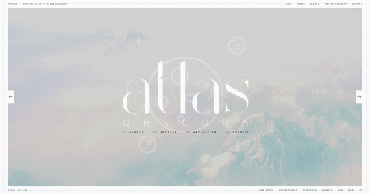
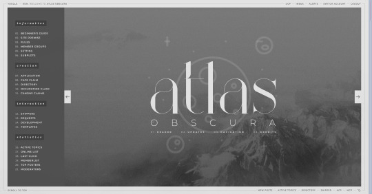
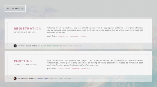
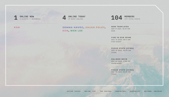
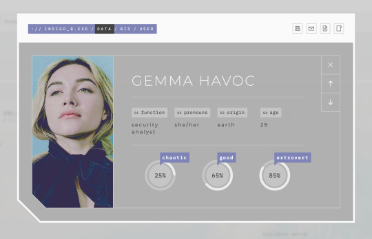
ATLAS OBSCURA (60$)
ATLAS OBSCURA is a fully flex skin optimized for Chrome but has been adjusted for compatibility across Firefox and Safari. A low contrast, dark background is recommended. A live preview can be requested at any time through my support discord. PURCHASE HERE: https://ko-fi[DOT]com/s/740013f3a4 WEBPAGES HERE: https://ko-fi[DOT]com/s/07654e42a0 TEMPLATES: https://ko-fi[DOT]com/s/020489ee5a
Includes:
light/dark toggle sidebar that auto transitions to a module for mobile custom forums, topics, memberlist, posts (optional larger post avatar with sticky) tabbed, popup application profile member group colors set up across the skin css variables set up for images, fonts, and colors for ease of editing guest to member links on login for easy navigation various indicators for messages/alerts customized tooltips tabbed header basic post template with all basic styles (bold, italics, h1 through h7, blockquote, hr, lists, etc)
Files:
full xml file html templates xml file easy to import field set json file general installation guide pdf skin specific instructions with member group prefix/suffix codes and user fields
Policies:
credit must remain intact and unchanged you may not claim my codes as your own at any point, nor may they be used as a base for other projects I offer unlimited support for bugs present at purchase
Please review the rest of my my policies prior to making any purchases: koncodes[DOT]tumblr.com/policies For questions or a live preview, you can contact me through ko-fi or my support discord: discord[DOT]gg/MXD5nDgDzq
152 notes
·
View notes
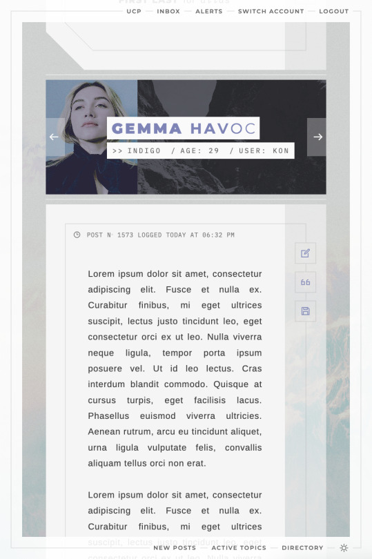
Note
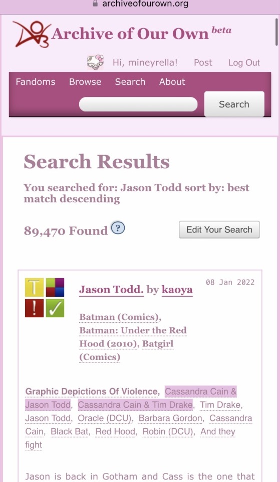
Your neos skin looks so cool! And I wanted to ask you, if it's okay, how did you the
[fanfic name] by [author]
[fandom(s)]
[rating—relationships—warnings—work status]
going just like that, in three rows? I'm very new to css but I want to patch my own skin from different pieces
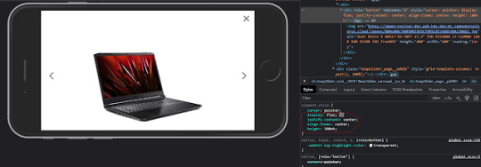
Hi! I'm glad you like the previews!
The code to position these elements as shown in the following picture is below the cut.

Edit (23 March 2025): Altered the code slightly so it doesn't mess up blurbs for mystery works.
/* remove the space for the icons on the right side */ .blurb:not(.picture.blurb, .mystery.blurb) .header .heading { margin-left: 0; } /* the following part changes the position of the content icons */ .blurb .header ul.required-tags { display: flex; flex-wrap: wrap; column-gap: 4px; position: unset; width: auto; margin-block: 0.375em; } .blurb .header ul.required-tags li { position: unset; }
5 notes
·
View notes
Text
nothing makes me want to shoot myself in the head more than writing css. what the fuck are we talking about. why is the display flexing at me.
#i HATE css like okay web programming isn't my favorite but you do what you gotta do#love hate relationship with javascript like i mess with making objects and then doing stuff to them#even html isn't like evil its just making stuff and giving it names#but css is actually devil spawn#im so lost in the sauce#all my menus are gone for no good reason#really i just hate trying to format shit differently for mobile and desktop im so lost in the sauce#web dev#ew that tag smells
3 notes
·
View notes
Text
HI, so long time no talk! I haven't gone anywhere, I just had some personal financial troubles that were resolved via...lots of overtime! I am a physicist by day, so that meant I became one by night for a couple months. But I remained coding, designing, & sketching things in my scant moments.
More importantly, I've been doing a lot of reading & observing of the Jcink RPC & I am really gutted by the lack of free resources I've seen become manifest. As a result, I've been percolating some easy design methods I could use to fast track totally free skins to give out as bi-monthly as I can manage in the near future.
Because I'm not one to stick to an aesthetic or design style so much as following a settled philosophy of coding, each of my skins will be entirely unique (no reused assets besides utility scripts, perhaps fonts, etc) but will all be;
Designed to be entirely responsive, with fallback & default setups for Custom Fields, image appearance or omission, etc.
Designed to load in a second & half or under, universally.
Neatened to be readable, cascade-organized, & fully notated with CSS & HTML notes to explain important components, how they work, & how to edit them.
Provided with a dark, light, & middle theme colour option as well as High Contrast option.
Provided with Staff, Member & Character profile & miniprofiles.
Provided with a full Custom BBCode suite of site templates to match the skin.
Based on the UI/UX design of a game with striking visuals that can be used for similar genres.
Now, this is a tall order, but I really want to flex my muscle & try to give folks something to be optimistic over in a landscape of drama-blog wastelanded distress. I want to put out something productive & positive, to make the community better & bring us together a bit <3 As a result, I'm going to need a little help from you all. I need to figure out which "Inspos" to work off of first based on desire for them, to fill the starving niches from most important to "least" so to speak. For the next few weeks, I'll post some polls & would be endlessly grateful if you all paid it forward by boosting but also voting on the games whose vibes you want to see MOST PRESSINGLY manifested as skins in the Jcink RPC.
I will, also, eventually port each one to Forumactivo, so for my Forumactivo folks, please let me know when you get specific polls so I can prioritize converting those skins for you! You deserve just as much love!
Of course, if there's a specific game you want to see feel free to comment on this post & I'll make sure to put it in the first poll, but for now that's all. The first list of inspo options will come out later today or tomorrow, Stay tuned & stay awesome, may the Dance keep you all absolutely blessed!
19 notes
·
View notes
Text
CSS Multi-Column Layout by Abdelfattah Ragab
CSS Multi-Column Layout by Abdelfattah Ragab
Welcome to the book "CSS Multi-Column Layout". In this book I will explain how you can use the Multi-Column Layout module. It is the third layout module after the Grid and Flex layout. The multi-column layout is specifically used for newspapers and magazines to create elegant and responsive columns where the content automatically fills the columns. You will learn how to create the columns and how to set the properties of rules, span, column breaks, etc… By the end of this book, you will have full control over the multi-column layout and be able to master all possible scenarios. Let’s go!
Available on https://shop.tredition.com and https://www.amazon.com

0 notes