#grid css
Explore tagged Tumblr posts
Visit Tumblr Blog
Explore Tumblr blogs with no restrictions, modern design and the best experience.
Last Seen Tumblr Blogs


Fun Fact
BuzzFeed published a report claiming that Tumblr was utilized as a distribution channel for Russian agents to influence American voting habits during the 2016 presidential election in Feb 2018.
Text
Hello audience. Unfortunately, I am still on my break. However, I am happy to announce that I am still alive and kicking. In fact, I decided to make use of my unemployment and revisit HTML, CSS, and JavaScript to create... A visual novel.
Good News: code is 100% reusable because I used a JSON (i do not know how that works, someone can kindly explain to me...)
Bad News: this code sucks ass, and NOTHING works except playing the story. Transitions? Doesn't work. UI/UX? Ass. Effects? Hell no... Also, 70% of the features aren't present yet I'm gonna do it later.
Oh, this is CrossDust, if you can't tell.
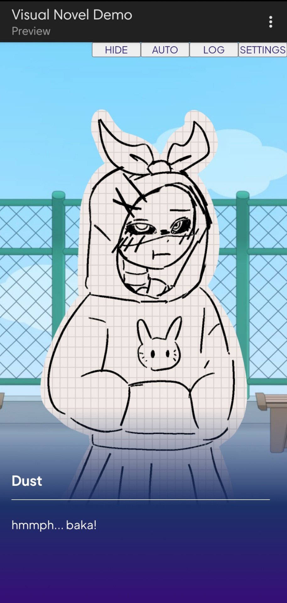
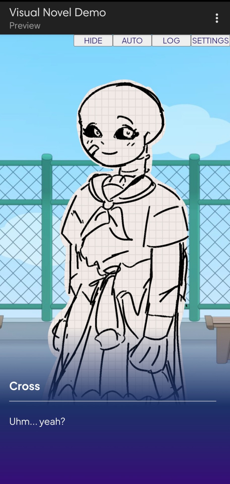
Dust Sans by Ask-Dusttale, Cross Sans by Jakei
I'm gonna respond to asks and do requests later (After my break is over). This is just a small update teehee.
#dsevalyappuccino#TIME TO GO INSANE IN THE TAGS!!#i hate css#i still hate css#css hell no#guys why is css so hard. ive literally been doing this for months and css is still hard#i was about to use css spritesheets for the sprites and emotions#but my ass gave up and instead i just use seperate images#GUYS!!! DISPLAY: FLEX 💪. DISPLAY: GRID?!?!#javascript i hate you tooq#i hate java script naurrrr#what do you mean DOM objects#what do YOU MEAN#also i do not understand error handling and JSON integrations#papaGPT doesn't explain anything#i don't know what I just wrote#coding???????????#kids don't be unemployed#actually maybe if you're unemployed but still making money that's great#also the sprites are just for testing purposes im probably gonna make new better ones if i chose to expand this into#a full blown anime high school visual novel project#i don't wanna think of all that story crap but then again i can just write the cringiest thing on earth
23 notes
·
View notes
Text
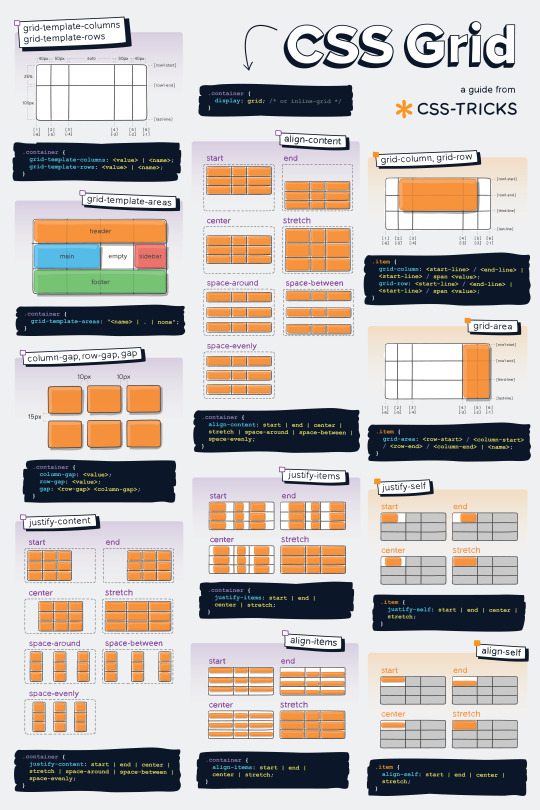
Helpful Poster Guide from CSS-Tricks for CSS Grid
#codeblr#coding#studyblr#studying#progblr#programming#programmer#coder#study#css#code blog#grid#css grid
172 notes
·
View notes
Text
Adding color to my website design⭐
6 notes
·
View notes
Text
the flexbox isnt doing what i want....!!!

#css#grid would be better but i need the space to the side to be able to disappear if nothing is in it omggg#i feel like what im doing should be feesible#flex works but only if i dont define the width of the container i need to be able to collapse when empty#omg omg#im done#it looks fine enough for now#but ill try again later#my god#codeblr#webdev#i just wanna make the container to the left slightly smaller when the screen is small orz#i cant do that apparently#it might be a tailwind issue too#like its too complicated for it#or i need to read 500 things to figure it out
2 notes
·
View notes
Text
Yet Another Anchor Positioning Quirk
New Post has been published on https://thedigitalinsider.com/yet-another-anchor-positioning-quirk/
Yet Another Anchor Positioning Quirk
I strongly believe Anchor Positioning will go down as one of the greatest additions to CSS. It may not be as game-changing as Flexbox or Grid, but it does fill a positioning gap that has been missing for decades. As awesome as I think it is, CSS Anchor Positioning has a lot of quirks, some of which are the product of its novelty and others due to its unique way of working. Today, I want to bring you yet another Anchor Positioning quirk that has bugged me since I first saw it.
The inception
It all started a month ago when I was reading about what other people have made using Anchor Positioning, specifically this post by Temani Afif about “Anchor Positioning & Scroll-Driven Animations.” I strongly encourage you to read it and find out what caught my eye there. Combining Anchor Positioning and Scroll-Driven Animation, he makes a range slider that changes colors while it progresses.
Amazing by itself, but it’s interesting that he is using two target elements with the same anchor name, each attached to its corresponding anchor, just like magic. If this doesn’t seem as interesting as it looks, we should then briefly recap how Anchor Positioning works.
CSS Anchor Positioning and the anchor-scope property
See our complete CSS Anchor Positioning Guide for a comprehensive deep dive.
Anchor Positioning brings two new concepts to CSS, an anchor element and a target element. The anchor is the element used as a reference for positioning other elements, hence the anchor name. While the target is an absolutely-positioned element placed relative to one or more anchors.
An anchor and a target can be almost every element, so you can think of them as just two div sitting next to each other:
<div class="anchor">anchor</div> <div class="target">target</div>
To start, we first have to register the anchor element in CSS using the anchor-name property:
.anchor anchor-name: --my-anchor;
And the position-anchor property on an absolutely-positioned element attaches it to an anchor of the same name. However, to move the target around the anchor we need the position-area property.
.target position: absolute; position-anchor: --my-anchor; position-area: top right;
This works great, but things get complicated if we change our markup to include more anchors and targets:
<ul> <li> <div class="anchor">anchor 1</div> <div class="target">target 1</div> </li> <li> <div class="anchor">anchor 2</div> <div class="target">target 2</div> </li> <li> <div class="anchor">anchor 3</div> <div class="target">target 3</div> </li> </ul>
Instead of each target attaching to its closest anchor, they all pile up at the last registered anchor in the DOM.
The anchor-scope property was introduced in Chrome 131 as an answer to this issue. It limits the scope of anchors to a subtree so that each target attaches correctly. However, I don’t want to focus on this property, because what initially caught my attention was that Temani didn’t use it. For some reason, they all attached correctly, again, like magic.
What’s happening?
Targets usually attach to the last anchor on the DOM instead of their closest anchor, but in our first example, we saw two anchors with the same anchor-name and their corresponding targets attached. All this without the anchor-scope property. What’s happening?
Two words: Containing Block.
Something to know about Anchor Positioning is that it relies a lot on how an element’s containing block is built. This isn’t something inherently from Anchor Positioning but from absolute positioning. Absolute elements are positioned relative to their containing block, and inset properties like top: 0px, left: 30px or inset: 1rem are just moving an element around its containing block boundaries, creating what’s called the inset-modified containing block.
A target attached to an anchor isn’t any different, and what the position-area property does under the table is change the target’s inset-modified containing block so it is right next to the anchor.
Usually, the containing block of an absolutely-positioned element is the whole viewport, but it can be changed by any ancestor with a position other than static (usually relative). Temani takes advantage of this fact and creates a new containing block for each slider, so they can only be attached to their corresponding anchors. If you snoop around the code, you can find it at the beginning:
label position: relative; /* No, It's not useless so don't remove it (or remove it and see what happens) */
If we use this tactic on our previous examples, suddenly they are all correctly attached!
Yet another quirk
We didn’t need to use the anchor-scope property to attach each anchor to its respective target, but instead took advantage of how the containing block of absolute elements is computed. However, there is yet another approach, one that doesn’t need any extra bits of code.
This occurred to me when I was also experimenting with Scroll-Driven Animations and Anchor Positioning and trying to attach text-bubble footnotes on the side of a post, like the following:
Logically, each footnote would be a target, but the choice of an anchor is a little more tricky. I initially thought that each paragraph would work as an anchor, but that would mean having more than one anchor with the same anchor-name. The result: all the targets would pile up at the last anchor:
This could be solved using our prior approach of creating a new containing block for each note. However, there is another route we can take, what I call the reductionist method. The problem comes when there is more than one anchor with the same anchor-name, so we will reduce the number of anchors to one, using an element that could work as the common anchor for all targets.
In this case, we just want to position each target on the sides of the post so we can use the entire body of the post as an anchor, and since each target is naturally aligned on the vertical axis, what’s left is to move them along the horizontal axis:
You can better check how it was done on the original post!
Conclusion
The anchor-scope may be the most recent CSS property to be shipped to a browser (so far, just in Chrome 131+), so we can’t expect its support to be something out of this world. And while I would love to use it every now and there, it will remain bound to short demos for a while. This isn’t a reason to limit the use of other Anchor Positioning properties, which are supported in Chrome 125 onwards (and let’s hope in other browsers in the near future), so I hope these little quirks can help you to keep using Anchor Positioning without any fear.
#amazing#amp#anchor positioning#animation#animations#approach#Articles#attention#browser#change#chrome#code#colors#comprehensive#CSS#eye#fear#focus#Future#game#gap#grid#how#inset#it#Method#One#Other#positioning#Read
3 notes
·
View notes
Text
every so often i rediscover css and rediscover why i hate it
#caique posts#i hate absolutely everything about css but if there's one thing i hate more than using css it's not using css#why is flexbox?#it's like a horse. powerful but fragile. most other parts of css are robust but flexbox will just die for no reason even though#you did your all to take care of it#grid layouts (like the one pictured here) are fun to make though
3 notes
·
View notes
Text
Vivale
Page 50 by @eossa
A responsive grid-based all-in-one page inspired by Pantone's color of the year 2023, "Viva Magenta".
For more information, please follow the source link or click here.
Grab the code here: buymeacoffee | ko-fi | payhip
#eossa#tumblr page#aidpaidcontent#support content creators#responsive#css grid#minimal#all in one#all in one page#pantone#viva magenta#blog#my codes#my pages#page 50#p50 vivale#price: prm
9 notes
·
View notes
Text
2 notes
·
View notes
Text
wow spent hours not understanding that what i was trying to do was nest grids, which is not what “inline grids” mean 🫠
4 notes
·
View notes
Text
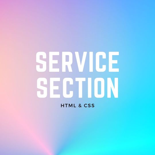
Responsive Neumorphism Service Section
#service section design#dark neumorphism#css neumorphism#responsive web design#html css#codingflicks#learn to code#code#frontend#html#css#css3#frontenddevelopment#webdesign#css flexbox layout#css flexbox grid
5 notes
·
View notes
Text
just found out i have to make a whole website by tuesday night…
if y’all don’t hear from it’s bc i’m crying trying to throw it together
#thankfully i can use filler text#but i’ve never made an external style sheet#and i’m so rusty with css#i don’t remember how to make a grid#but i can do it#chats ☕️
2 notes
·
View notes
Text
Responsive Grid Image Gallery
#responsive image gallery#responsive grid css#html css#learn to code#css3#frontenddevelopment#divinectorweb#image gallery css#responsive grid image gallery
1 note
·
View note
Text
CSS Grid Guide
This CSS grid guide from CSS-Tricks is super helpful, and of course, if you're interested and want to check it out feel free to.
Happy Coding!
#codeblr#coding#studyblr#studying#progblr#programmer#programming#coder#study#css#code blog#grid#css grid
48 notes
·
View notes
Text
4 Practical Use Cases for CSS Grids in Modern Web Design
CSS Grid is a powerful layout system that has transformed the way web designers structure and style websites. It provides a flexible, two-dimensional grid-based approach, making it easier to create complex layouts without the need for excessive code or tricky workarounds.

Download Infographic
Building Stunning Image Galleries

Image galleries are a staple in modern web design, and CSS Grid is an ideal tool for creating them. Unlike traditional layout methods, CSS Grid allows you to define precise rows and columns, making it easy to align images without breaking the overall design.
Why Use CSS Grid for Image Galleries?
Flexible Layouts: Easily control the number of columns and rows based on screen size.
Gap Control: Use the grid-gap or gap property for perfect spacing.
Responsive Design: Adjust column sizes and row heights without breaking the layout.
Layering and Positioning: Position images in creative ways, including overlapping elements.
Basic Image Gallery Example
<div class=”gallery”> <img src=”image1.jpg” alt=”Image 1″> <img src=”image2.jpg” alt=”Image 2″> <img src=”image3.jpg” alt=”Image 3″> <img src=”image4.jpg” alt=”Image 4″> <img src=”image5.jpg” alt=”Image 5″> </div>
.gallery { display: grid; grid-template-columns: repeat(auto-fill, minmax(200px, 1fr)); gap: 16px; } .gallery img { width: 100%; display: block; border-radius: 8px;
Advanced Image Gallery Layouts
Experienced web designers can also create more intricate layouts by spanning images across multiple rows or columns using the grid-column and grid-row properties, giving your galleries a more dynamic and polished look.
In this infographic blog post, we’ll explore four practical use cases for CSS Grids that can elevate your web design projects.
Try CSS Grid Generator
Creating Main Website Layouts

CSS Grid shines when it comes to designing the main structure of a website. Whether you’re building a blog, portfolio, or business website, grids provide the framework for responsive and organised layouts.
Why Use CSS Grid for Main Layouts?
Clear Structure: Define headers, sidebars, content areas, and footers precisely.
Responsive Design: Create layouts that adapt effortlessly to different screen sizes.
Efficient Code: Reduce the need for excessive wrapper divs and floats.
Complex Designs: Easily create overlapping sections and layered effects.
Basic Main Layout Example
<div class=”main-layout”> <header>Header</header> <nav>Navigation</nav> <main>Main Content</main> <aside>Sidebar</aside> <footer>Footer</footer> </div>
.main-layout { display: grid; grid-template-areas: “header header header” “nav main sidebar” “footer footer footer”; grid-template-columns: 1fr 2fr 1fr; gap: 20px; } header { grid-area: header; } nav { grid-area: nav; } main { grid-area: main; } aside { grid-area: sidebar; } footer { grid-area: footer; }
Advanced Main Layouts
For more complex designs, consider using CSS Grid in combination with Flexbox for greater flexibility and control over nested elements.
Designing Attention-Grabbing Banners

Banners are crucial for grabbing user attention, and CSS Grid makes it easy to create stunning, multi-layered designs without relying on complex positioning hacks.
Why Use CSS Grid for Banners?
Flexible Positioning: Easily place text, images, and buttons exactly where you want them.
Responsive Design: Maintain structure across different devices.
Layer Control: Use grid layers to create engaging, multi-dimensional designs.
Basic Banner Example
<div class=”banner”> <div class=”overlay”></div> <h1>Welcome to Our Website</h1> <p>Discover our range of services.</p> <button>Learn More</button> </div>
.banner { display: grid; grid-template-areas: “overlay”; position: relative; background-image: url(‘banner.jpg’); background-size: cover; background-position: center; height: 300px; color: #fff; text-align: center; } .overlay { grid-area: overlay; background-color: rgba(0, 0, 0, 0.6); position: absolute; top: 0; left: 0; right: 0; bottom: 0; z-index: 1; } .banner h1, .banner p, .banner button { position: relative; z-index: 2; }
Perfectly Centring Items

Centred layouts are a common design choice, and CSS Grid provides a simple way to centre content without relying on margin hacks or flexbox tricks.
Why Use CSS Grid for Centring?
Simplicity: One line of code can achieve perfect centring.
Cross-Browser Support: Reliable centring across all major browsers.
Versatility: Works for both single items and entire sections.
Basic Centring Example
<div class=”centre”> <h2>Centred Content</h2> </div>
.centre { display: grid; place-items: center; height: 300px; background-color: #f4f4f4; }
Conclusion
CSS Grid is an incredibly versatile tool that can streamline your web design workflow, reduce code complexity, and enhance the overall user experience.
Whether you’re building image galleries, main layouts, banners, or perfectly centred designs, CSS Grid offers a flexible and powerful solution.
Experiment with these practical use cases to unlock the full potential of CSS Grid in your projects.
0 notes
Video
youtube
🇺🇦 Грід для новачків. CSS GRID - як користуватися? Complete beginners gr...
#youtube#🇺🇦 Грід для новачків. CSS GRID - як користуватися? Complete beginners grid tutorial. Частина 3 ч1 - https://www.youtube.com/watch?v=RUu14
0 notes
Text
Revisiting CSS Multi-Column Layout
New Post has been published on https://thedigitalinsider.com/revisiting-css-multi-column-layout/
Revisiting CSS Multi-Column Layout
Honestly, it’s difficult for me to come to terms with, but almost 20 years have passed since I wrote my first book, Transcending CSS. In it, I explained how and why to use what was the then-emerging Multi-Column Layout module.
Hint: I published an updated version, Transcending CSS Revisited, which is free to read online.
Perhaps because, before the web, I’d worked in print, I was over-excited at the prospect of dividing content into columns without needing extra markup purely there for presentation. I’ve used Multi-Column Layout regularly ever since. Yet, CSS Columns remains one of the most underused CSS layout tools. I wonder why that is?
Holes in the specification
For a long time, there were, and still are, plenty of holes in Multi-Column Layout. As Rachel Andrew — now a specification editor — noted in her article five years ago:
“The column boxes created when you use one of the column properties can’t be targeted. You can’t address them with JavaScript, nor can you style an individual box to give it a background colour or adjust the padding and margins. All of the column boxes will be the same size. The only thing you can do is add a rule between columns.”
She’s right. And that’s still true. You can’t style columns, for example, by alternating background colours using some sort of :nth-column() pseudo-class selector. You can add a column-rule between columns using border-style values like dashed, dotted, and solid, and who can forget those evergreen groove and ridge styles? But you can’t apply border-image values to a column-rule, which seems odd as they were introduced at roughly the same time. The Multi-Column Layout is imperfect, and there’s plenty I wish it could do in the future, but that doesn’t explain why most people ignore what it can do today.
Patchy browser implementation for a long time
Legacy browsers simply ignored the column properties they couldn’t process. But, when Multi-Column Layout was first launched, most designers and developers had yet to accept that websites needn’t look the same in every browser.
Early on, support for Multi-Column Layout was patchy. However, browsers caught up over time, and although there are still discrepancies — especially in controlling content breaks — Multi-Column Layout has now been implemented widely. Yet, for some reason, many designers and developers I speak to feel that CSS Columns remain broken. Yes, there’s plenty that browser makers should do to improve their implementations, but that shouldn’t prevent people from using the solid parts today.
Readability and usability with scrolling
Maybe the main reason designers and developers haven’t embraced Multi-Column Layout as they have CSS Grid and Flexbox isn’t in the specification or its implementation but in its usability. Rachel pointed this out in her article:
“One reason we don’t see multicol used much on the web is that it would be very easy to end up with a reading experience which made the reader scroll in the block dimension. That would mean scrolling up and down vertically for those of us using English or another vertical writing mode. This is not a good reading experience!”
That’s true. No one would enjoy repeatedly scrolling up and down to read a long passage of content set in columns. She went on:
“Neither of these things is ideal, and using multicol on the web is something we need to think about very carefully in terms of the amount of content we might be aiming to flow into our columns.”
But, let’s face it, thinking very carefully is what designers and developers should always be doing.
Sure, if you’re dumb enough to dump a large amount of content into columns without thinking about its design, you’ll end up serving readers a poor experience. But why would you do that when headlines, images, and quotes can span columns and reset the column flow, instantly improving readability? Add to that container queries and newer unit values for text sizing, and there really isn’t a reason to avoid using Multi-Column Layout any longer.
A brief refresher on properties and values
Let’s run through a refresher. There are two ways to flow content into multiple columns; first, by defining the number of columns you need using the column-count property:
Second, and often best, is specifying the column width, leaving a browser to decide how many columns will fit along the inline axis. For example, I’m using column-width to specify that my columns are over 18rem. A browser creates as many 18rem columns as possible to fit and then shares any remaining space between them.
Then, there is the gutter (or column-gap) between columns, which you can specify using any length unit. I prefer using rem units to maintain the gutters’ relationship to the text size, but if your gutters need to be 1em, you can leave this out, as that’s a browser’s default gap.
The final column property is that divider (or column-rule) to the gutters, which adds visual separation between columns. Again, you can set a thickness and use border-style values like dashed, dotted, and solid.
These examples will be seen whenever you encounter a Multi-Column Layout tutorial, including CSS-Tricks’ own Almanac. The Multi-Column Layout syntax is one of the simplest in the suite of CSS layout tools, which is another reason why there are few reasons not to use it.
Multi-Column Layout is even more relevant today
When I wrote Transcending CSS and first explained the emerging Multi-Column Layout, there were no rem or viewport units, no :has() or other advanced selectors, no container queries, and no routine use of media queries because responsive design hadn’t been invented.
We didn’t have calc() or clamp() for adjusting text sizes, and there was no CSS Grid or Flexible Box Layout for precise control over a layout. Now we do, and all these properties help to make Multi-Column Layout even more relevant today.
Now, you can use rem or viewport units combined with calc() and clamp() to adapt the text size inside CSS Columns. You can use :has() to specify when columns are created, depending on the type of content they contain. Or you might use container queries to implement several columns only when a container is large enough to display them. Of course, you can also combine a Multi-Column Layout with CSS Grid or Flexible Box Layout for even more imaginative layout designs.
Using Multi-Column Layout today
Patty Meltt is an up-and-coming country music sensation. She’s not real, but the challenges of designing and developing websites like hers are.
My challenge was to implement a flexible article layout without media queries which adapts not only to screen size but also whether or not a <figure> is present. To improve the readability of running text in what would potentially be too-long lines, it should be set in columns to narrow the measure. And, as a final touch, the text size should adapt to the width of the container, not the viewport.
Article with no <figure> element. What would potentially be too-long lines of text are set in columns to improve readability by narrowing the measure.
Article containing a <figure> element. No column text is needed for this narrower measure.
The HTML for this layout is rudimentary. One <section>, one <main>, and one <figure> (or not:)
<section> <main> <h1>About Patty</h1> <p>…</p> </main> <figure> <img> </figure> </section>
I started by adding Multi-Column Layout styles to the <main> element using the column-width property to set the width of each column to 40ch (characters). The max-width and automatic inline margins reduce the content width and center it in the viewport:
main margin-inline: auto; max-width: 100ch; column-width: 40ch; column-gap: 3rem; column-rule: .5px solid #98838F;
Next, I applied a flexible box layout to the <section> only if it :has() a direct descendant which is a <figure>:
section:has(> figure) display: flex; flex-wrap: wrap; gap: 0 3rem;
This next min-width: min(100%, 30rem) — applied to both the <main> and <figure> — is a combination of the min-width property and the min() CSS function. The min() function allows you to specify two or more values, and a browser will choose the smallest value from them. This is incredibly useful for responsive layouts where you want to control the size of an element based on different conditions:
section:has(> figure) main flex: 1; margin-inline: 0; min-width: min(100%, 30rem); section:has(> figure) figure flex: 4; min-width: min(100%, 30rem);
What’s efficient about this implementation is that Multi-Column Layout styles are applied throughout, with no need for media queries to switch them on or off.
Adjusting text size in relation to column width helps improve readability. This has only recently become easy to implement with the introduction of container queries, their associated values including cqi, cqw, cqmin, and cqmax. And the clamp() function. Fortunately, you don’t have to work out these text sizes manually as ClearLeft’s Utopia will do the job for you.
My headlines and paragraph sizes are clamped to their minimum and maximum rem sizes and between them text is fluid depending on their container’s inline size:
h1 font-size: clamp(5.6526rem, 5.4068rem + 1.2288cqi, 6.3592rem); h2 font-size: clamp(1.9994rem, 1.9125rem + 0.4347cqi, 2.2493rem); p font-size: clamp(1rem, 0.9565rem + 0.2174cqi, 1.125rem);
So, to specify the <main> as the container on which those text sizes are based, I applied a container query for its inline size:
main container-type: inline-size;
Open the final result in a desktop browser, when you’re in front of one. It’s a flexible article layout without media queries which adapts to screen size and the presence of a <figure>. Multi-Column Layout sets text in columns to narrow the measure and the text size adapts to the width of its container, not the viewport.
Modern CSS is solving many prior problems
Structure content with spanning elements which will restart the flow of columns and prevent people from scrolling long distances.
Prevent figures from dividing their images and captions between columns.
Almost every article I’ve ever read about Multi-Column Layout focuses on its flaws, especially usability. CSS-Tricks’ own Geoff Graham even mentioned the scrolling up and down issue when he asked, “When Do You Use CSS Columns?”
“But an entire long-form article split into columns? I love it in newspapers but am hesitant to scroll down a webpage to read one column, only to scroll back up to do it again.”
Fortunately, the column-span property — which enables headlines, images, and quotes to span columns, resets the column flow, and instantly improves readability — now has solid support in browsers:
h1, h2, blockquote column-span: all;
But the solution to the scrolling up and down issue isn’t purely technical. It also requires content design. This means that content creators and designers must think carefully about the frequency and type of spanning elements, dividing a Multi-Column Layout into shallower sections, reducing the need to scroll and improving someone’s reading experience.
Another prior problem was preventing headlines from becoming detached from their content and figures, dividing their images and captions between columns. Thankfully, the break-after property now also has widespread support, so orphaned images and captions are now a thing of the past:
figure break-after: column;
Open this final example in a desktop browser:
You should take a fresh look at Multi-Column Layout
Multi-Column Layout isn’t a shiny new tool. In fact, it remains one of the most underused layout tools in CSS. It’s had, and still has, plenty of problems, but they haven’t reduced its usefulness or its ability to add an extra level of refinement to a product or website’s design. Whether you haven’t used Multi-Column Layout in a while or maybe have never tried it, now’s the time to take a fresh look at Multi-Column Layout.
#:has#ADD#almanac#Article#Articles#back up#background#book#box#browser#challenge#clamp#colours#columns#container#content#course#creators#CSS#CSS Grid#css-tricks#Design#designers#desktop#developers#digitalocean#display#easy#English#Explained
2 notes
·
View notes