#i just like clean and readable UI
Text
Was looking through some RPG rulebooks recently, and had developed enough opinions on the topic of NPC stat blocks that I had to get them out somewhere. Check below the break for a rant.
I've come to a unilateral and flawless conclusion: if you have a tabletop RPG or a wargame with big squads of people/NPCs, if you can't put the unit's stat block on a Yu-Gi-Oh card with no art and have it be legible, I want no part in it.
Was looking through some systems for a tabletop campaign idea I had, and found one that I won't name but thought I'd really enjoy. And for the most part, I did! I loved so much of the player-facing systems and was gearing up to start really digging into this campaign when I hit a snag with the system.
See, the system is a 2d6-rolling skill-based system. Which is awesome, I want to get away from D&D type stuff and this was a really good path to go. There are 24 skills split up into 3 categories of 8. Really nice way to categorize things. But... All the enemies ALSO had numbers for all 24 skills. Plus the other stuff that's actually important for running mook NPCs in an RPG battle.
The enemy stat blocks felt so bloated, my eyes just kind of glazed over while reading them and all interest in the system dried up. And that kind of disappointed me!
Throwing my mind to wargames and skirmish games for a reference here, I'm reminded of both Battletech and Battletech Alpha Strike, two opposing ends of the unit card spectrum.

Battletech Classic has BIG record sheets, each mech is its own 8.5"x11" piece of printer paper. However, because the system is crunchy and simulationist, all these gubbins and tables are necessary for play, and each player only runs 3-5 of their own mechs, which really limits the overhead on what they need to have in front of them.
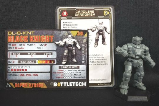
On the flip side, you get Alpha Strike. The Alpha Strike rules cut down heavily on the simulation and crunch in order to streamline the game, for an alternative ruleset that plays faster and can also more easily support large amounts of units. Everything fits on basically an index card, and if you cut out the art you can make the card even smaller if you made a custom layout.
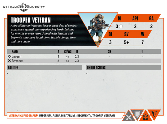
Outside of Battletech, I think these unit cards for Warhammer 40k Kill Team are also very readable. This has a lot of empty space, as the unit itself is pretty simple, but it has all the necessary numbers on it without making my eyes glaze over because there's no chaff numbers.
I probably haven't been looking long enough at other systems, but I hope that combat heavy tactical tabletop RPGs start picking up some formatting styles from skirmish games. I feel it would do so much (for me at least) to make things easier and faster to run.
If anybody who took the time to read this knows about any combat-focused TTRPGs with really slick formatting on unit stat blocks, let me know, I wanna check them out.
#tabletop rpg#ttrpg#tabletop wargaming#wargaming#i just like clean and readable UI#all your cool design is meaningless if your formatting makes me not want to read it
0 notes
Text
writing-sharing sites and my research on them
A few months ago I started looking into all of the potential sites I could use to share Her Broken Magic, to make sure the ones I chose properly fit the story's needs. I'll add everything I found here, and if anyone has more info, more sites, or corrections (I am far from a professional researcher) please add them to this post!
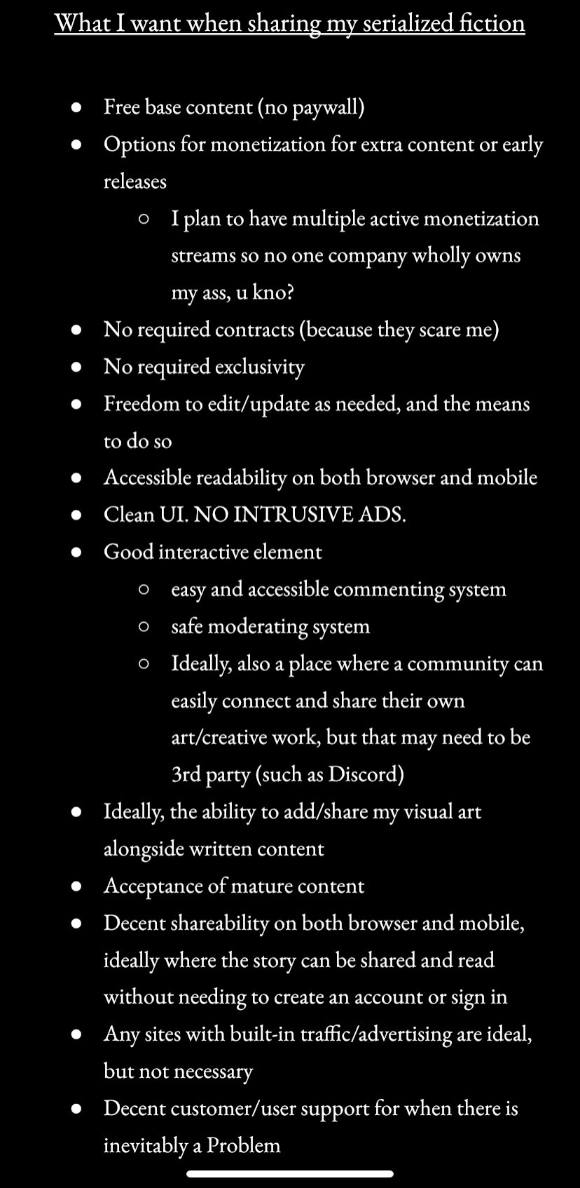
So, I started by making a list of what was important to me when sharing my story. For example, I do NOT want to put HBM behind a paywall, but I would also like to add ways to monetize the story otherwise, through donations, ads, paid subscriptions for exclusive or early released content, etc.
This is the full list I came up with:
Once I had that, I then converted that into a kind of fill-out form/checklist that I could hold up to each site and see how they met my needs.
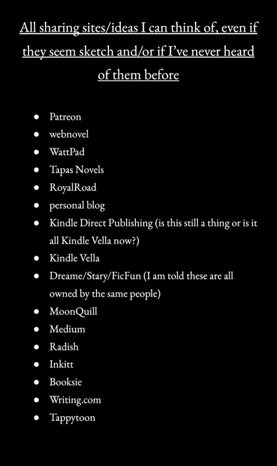
Then, I made a list of all sites and ways I could think of to share my story. I have since heard of more sites, but I don't currently have research on them bc by the time I'd heard of them I had already chosen 3 sites I wanted to post to. But again, if anyone has suggestions/additions, please rb with them!
The sites:
I think tumblr is going to freak out if I try to post the research I did on each site as an image, so I'm going to start just copy/pasting instead.
Patreon
Allows free base content: Yes
Offers monetization options for extras, early releases: Yes
Requires contract: No
Requires exclusivity: No
Ability to edit/update content: Yes
Accessible readability on both PC and mobile: Yes
Clean UI/no intrusive ads: Yes
Good interactive element (comments, moderation, bonus: community aspect): Decent comment system, moderated by the creator (afaik), but no space for fans/patrons to create and share their own work.
Allows visual art alongside written content: Yes!
Accepts mature content: According to Community Guidelines Yes, according to some anecdotal evidence they are not consistent or transparent with what is or isn’t allowed, nor clear when something will be taken down/banned.
Decent shareability on both PC and mobile (and does reading/sharing require an account): Yes, but it does require an account.
Built-in traffic or advertising: No. There’s like no discoverability from the site itself.
Decent customer support: No
The Vibe: probably best used supplementally for paid content/early releases, not as the main sharing platform.
webnovel
Allows free base content: Yes
Offers monetization options for extras, early releases: No
Requires contract: No, but popular stories may get offered contracts.
Requires exclusivity: No, unless signing a certain contract.
Ability to edit/update content: Yes
Accessible readability on both PC and mobile: Yes
Clean UI/no intrusive ads: Yes
Good interactive element (comments, moderation, bonus: community aspect): Love that they allow comments on each paragraph plus longer reviews for the overall work. Seems largely self-moderated, so it will be on the author to get rid of spam or harmful comments. There does seem to be a very active forum to provide some community aspect.
Allows visual art alongside written content: No
Accepts mature content: Apparently stuff that’s too mature for wattpad gets posted here, so yes.
Decent shareability on both PC and mobile (and does reading/sharing require an account): Yes, no account required
Built-in traffic or advertising: Yes
Decent customer support: No, but there is the active forum for troubleshooting, advice, etc.
The Vibe: the company/site seems to be negligent at best and predatory at worst, but gd I love the commenting, readability, and shareability of the writing. There are some great features. Would never sign a contract with them tho.
we all know it, we all fear it: WattPad
Allows free base content: Yes
Offers monetization options for extras, early releases: No, but popular stories have the chance to become monetized/subscription-based
Requires contract: No
Requires exclusivity: No (not sure if this extends to the Paid Stories)
Ability to edit/update content: Yes
Accessible readability on both PC and mobile: Yes
Clean UI/no intrusive ads: Yes, there are ads for free version, but non-intrusive (so far)
Good interactive element (comments, moderation, bonus: community aspect): Also allow comments on paragraphs as well as longer reviews, seems to be mostly self-moderated, community events but no forum (it got yoinked bc it was too toxic lmao)
Allows visual art alongside written content: I’ve seen gifs at the end of chapters so maybe?
Accepts mature content: Yes (to a degree)
Decent shareability on both PC and mobile (and does reading/sharing require an account): Yes, no account required on browser, but I think it might be required on the app
Built-in traffic or advertising: Yes, but the site is so bloated it’s difficult to stand out
Decent customer support: Not really
The Vibe: wattpad is so heavily geared toward teens and fanfic that I don’t think it’s right for my story, plus I’ve heard the community there can be pretty toxic. However, seems like it could be good when just starting out.
Tapas Novels
Allows free base content: Yes, though most are not free
Offers monetization options for extras, early releases: Yes, for early release
Requires contract: No
Requires exclusivity: No
Ability to edit/update content: Yes
Accessible readability on both PC and mobile: Yes
Clean UI/no intrusive ads: Yes
Good interactive element (comments, moderation, bonus: community aspect): They don’t do paragraph comments, but do have chapter comments and their moderation system seems decent. Also, there is an official forum where readers and creators can interact, and actually I see a lot of WEBTOON users going to the Tapas forums to get their questions about WT answered lmao.
Allows visual art alongside written content: Yes, I think so!
Accepts mature content: Guideline quote on sexual content: “Any novel’s intended purpose should not be to solely provide erotic satisfaction (i.e. porn without plot).” On violence, it says the “glorification or promotion of self-harm” is restricted.
Decent shareability on both PC and mobile (and does reading/sharing require an account): Yes, and reading/sharing does not require an account
Built-in traffic or advertising: Yes
Decent customer support: Not really, from what I can tell, though there is an active forum which can help with troubleshooting.
The Vibe: I’m very impressed with this one so far. Seems well-maintained, professional, legit, and accessible.
Updated note on Tapas: Apparently there is a 15k character limit on Tapas chapters, which according to a friend I know who uses it, that usually equals around 2.5k words, so keep that in mind.
Royal Road
Allows free base content: Yes
Offers monetization options for extras, early releases: No, BUT they have a donation link on stories that connects directly to the author’s Patreon or PayPal, and they don’t take a cut.
Requires contract: No
Requires exclusivity: No
Ability to edit/update content: Yes
Accessible readability on both PC and mobile: Decent
Clean UI/no intrusive ads: They have the bane of my existence on mobile, which is those ads that change size so they make the screen jump randomly. However, they do have a Premium version where you can remove ads.
Good interactive element (comments, moderation, bonus: community aspect): Yes. I have heard a ton of very positive experiences with the community here, and there is an active forum.
Allows visual art alongside written content: I don’t think so, but you can share any visual art on the forums Someone corrected me on twitter and apparently it does!
Accepts mature content: Yes if tagged appropriately, but check the guidelines for specifics, and no sexual artwork is allowed at all and will result in an immediate ban.
Decent shareability on both PC and mobile (and does reading/sharing require an account): Decent (must share the link), doesn’t require an account
Built-in traffic or advertising: Some
Decent customer support: Yes
The Vibe: seems like a really great community, a bit smaller but therefore more dedicated, maybe a little stricter with the rules when it comes to story content.
Update: this is anecdotal evidence, but I have heard from a friend who uses RR that there can be a little non-welcoming if your story has LGBTQ+ elements to it. Again, I want to reiterate that this is anecdotal, but still wanted to mention it.
Personal Blog
All of the answers to the checklist items depend on you, how you format your blog, how much effort/time you want to put in, etc.
The Vibe: god this seems like so much work, but the complete and total freedom is appealing.
Kindle Direct Publishing
Not made for serialized fiction. That’s what Kindle Vella is for apparently. Or Kindle Vella is just a branch of KDP? Not sure.
Kindle Vella
Allows free base content: No, only the first 3 episodes are free. Also, all of the reviews on stories I’ve seen so far have been very positive for the story but said they hate Vella and it’s too expensive lmao
Offers monetization options for extras, early releases: No
Requires contract: No
Requires exclusivity: No, as long as it is not shared for free elsewhere.
Ability to edit/update content: Yes
Accessible readability on both PC and mobile: I can’t find a way to change size/font/etc but that may be because I am not smart enough to do so
Clean UI/no intrusive ads: Yes
Good interactive element (comments, moderation, bonus: community aspect): No, only reader interaction available (that I see) is reviews on the story. Oh, except episodes do have polls for the readers, which is kind of cool.
Allows visual art alongside written content: I don’t think so
Accepts mature content: Yes, but “Stories with mature content will not surface in general searches as they could include content of a sexual or explicit nature, which is not appropriate for all readers. These stories will surface in general searches for customers who choose to allow mature content.”
Decent shareability on both PC and mobile (and does reading/sharing require an account): Yes (but obviously reading paid content requires an account)
Built-in traffic or advertising: Yes
Decent customer support: It’s amazon
The Vibe: It’s not for me because I want to offer my story for free. Also it’s hilarious that all the reviews I read said how much they hate Vella lmao
Dreame/Stary/FicFun
I will admit I went into this one having heard how sketch these sites are already but figured I should give them a look anyway.
Allows free base content: Yes
Offers monetization options for extras, early releases: No
Requires contract: No
Requires exclusivity: No
Ability to edit/update content: Yes
Accessible readability on both PC and mobile: Can’t adjust text font/size/etc.
Clean UI/no intrusive ads: Yes
Good interactive element (comments, moderation, bonus: community aspect): No. I don’t even see comments???
Allows visual art alongside written content: Don’t think so
Accepts mature content: Yes
Decent shareability on both PC and mobile (and does reading/sharing require an account): Must share by link, so account required unless it’s paid content
Built-in traffic or advertising: Yes kinda
Decent customer support: No
The Vibe: sketch vibes are off the chart. I would never sign a contract with these people, they seem predatory as heck.
MoonQuill
Allows free base content: Yes
Offers monetization options for extras, early releases: Don’t think so, but it does offer publication if you apply and are accepted. Also, includes donation links on the story.
Requires contract: No
Requires exclusivity: No
Ability to edit/update content: Yes
Accessible readability on both PC and mobile: No option to edit text font/size/etc.
Clean UI/no intrusive ads: Yes, there are ads but they are not intrusive
Good interactive element (comments, moderation, bonus: community aspect): Basic comment system and that seems to be it. Self-moderated I think.
Allows visual art alongside written content: Don’t think so.
Accepts mature content: Yes
Decent shareability on both PC and mobile (and does reading/sharing require an account): Share via link. No account required.
Built-in traffic or advertising: Yes, some
Decent customer support: Can’t find any posts about their customer support, but their Contact Us link just pulls up their support email, so I don’t have high hopes
The Vibe: seems a bit lacking on the tools, feels a little unpolished, and I don’t know if I trust their publishing program, but otherwise seems solid.
Medium
Allows free base content: Yes
Offers monetization options for extras, early releases: Not directly
Requires contract: No
Requires exclusivity: No
Ability to edit/update content: Yes
Accessible readability on both PC and mobile: Yes, but can’t adjust text size/font/etc
Clean UI/no intrusive ads: Yes
Good interactive element (comments, moderation, bonus: community aspect): Just the basic comments/likes as far as I can tell. Self-moderated.
Allows visual art alongside written content: Yes
Accepts mature content: Yes, but read guidelines for specifics.
Decent shareability on both PC and mobile (and does reading/sharing require an account): Yes, BUT. The way Medium works, it looks like you only get a certain amount of free reads without creating an account.
Built-in traffic or advertising: Yes, somewhat
Decent customer support: Unsure
The Vibe: seems solid. Kinda like a personal blog that’s already made for you. People say it’s like Twitter but longer, and that sounds accurate from what I’ve seen. I don’t think I’d use it by itself to share my story, but could be a helpful supplementary site
Radish
Allows free base content: Yes? I’ve heard conflicting things. I think it can be free if you do the “wait to unlock” thing.
Offers monetization options for extras, early releases: Yes for early release
Requires contract: Don’t think so, but you must apply and your story be accepted. I think all accepted writers are paid tho
Requires exclusivity: No
Ability to edit/update content: Can’t find anything on this from an initial search, but I assume that you can because it wouldn’t really make sense for them to not allow you to do that.
Accessible readability on both PC and mobile: There is no browser/PC version of Radish. It’s all through their app. But the app readability is great, text and background can be adjusted, etc.
Clean UI/no intrusive ads: Yes
Good interactive element (comments, moderation, bonus: community aspect): Just a basic comment system, mostly self-moderated.
Allows visual art alongside written content: Yes. I’ve seen webcomics on here have full novel text versions. Pretty cool that it allows both within the same story.
Accepts mature content: Yes
Decent shareability on both PC and mobile (and does reading/sharing require an account): No PC version, and an account is required
Built-in traffic or advertising: Yes
Decent customer support: Unsure on preliminary search
The Vibe: seems very professional, looks really polished, gives the vibe that the content there is decent quality. Not sure if it is right for me because it seems the app is heavily geared toward romance, and my story has romance but is not a Romance story u kno?
Inkitt
Allows free base content: Yes
Offers monetization options for extras, early releases: Don’t think so
Requires contract: No(?)
Requires exclusivity: No
Ability to edit/update content: Yes
Accessible readability on both PC and mobile: Yes
Clean UI/no intrusive ads: Yes
Good interactive element (comments, moderation, bonus: community aspect): Yes, there is a community tab where readers and writers can interact, and the site holds writing contests with monetary prizes.
Allows visual art alongside written content: Unsure
Accepts mature content: Yes, though I can’t find specific guidelines that say where they draw the line, which is odd.
Decent shareability on both PC and mobile (and does reading/sharing require an account): Yes, no account required
Built-in traffic or advertising: Yes
Decent customer support: Unsure. Have heard some good experiences, but the technical support group in their community tab has a lot of questions that went ignored.
The Vibe: seems like a better, less toxic WattPad with more resources for writers and better payment options
(This is where I started to lose my marbles a bit, I apologize for the limited commentary)
Booksie
The website is ugly and my brain is melting from doing all this research and there was a typo on the main page so I’m immediately writing this one off unless someone tells me how Booksie saved their dog’s life or something
Tappytoon
Apparently they don’t accept unsolicited stories/are not accepting submissions right now
Writing.com
It’s going to make me create an account to read anything and they trademarked “Where the Writers Go” so I’m also skipping this until further notice
And that is all I got so far. I personally decided to go with webnovel, Royal Road, Inkitt, and possibly Tapas now that I'm reading back over this list. I had initially written Tapas off for the 15k character limit thing, but I think I might be able to work with that.
tagging @vsnotresponding who wanted to see this!
23 notes
·
View notes
Text
The Role of Typography in UI/UX Design: Choosing Fonts and Layouts That Improve Readability and Engagement in Web and Mobile Apps
In the ever-evolving world of digital design, typography plays a crucial role in shaping user experiences. Whether it's a sleek mobile app or a content-rich website, the choice of fonts and layouts can make or break the user's engagement with your product. This blog post delves into the importance of typography in UI/UX design and provides insights on selecting fonts and layouts that enhance readability and user engagement.
The Importance of Typography in UI/UX Design
Typography is more than just picking a nice-looking font. It's an art and science that can significantly impact how users perceive and interact with your digital product. Here's why typography matters:
First Impressions: Typography is often one of the first things users notice. It sets the tone and personality of your app or website.
Readability: Good typography ensures that your content is easy to read, reducing eye strain and improving comprehension.
User Experience: Well-chosen fonts and layouts guide users through your interface, making navigation intuitive and enjoyable.
Brand Identity: Typography is a powerful tool for reinforcing your brand's personality and values.
Accessibility: Proper typography choices can make your content more accessible to users with visual impairments.
Choosing the Right Fonts
Selecting appropriate fonts is a critical aspect of typography in UI/UX design. Here are some factors to consider:
1. Serif vs. Sans-Serif
Serif fonts (e.g., Times New Roman, Georgia) have small lines or strokes at the ends of characters. They're often associated with tradition, reliability, and formality.
Sans-serif fonts (e.g., Arial, Helvetica) lack these extra strokes and are perceived as modern, clean, and minimalist.
For digital interfaces, sans-serif fonts are generally preferred due to their cleaner appearance on screens. However, serif fonts can be effective for headings or in content-heavy applications like news websites.
2. Readability
Choose fonts that are easy to read at various sizes. Consider factors like:
x-height: The height of lowercase letters relative to uppercase ones.
Character width: Ensure letters aren't too narrow or wide.
Distinction between similar characters: For example, 'I', 'l', and '1' should be easily distinguishable.
3. Font Pairing
Using multiple fonts can add visual interest, but be careful not to overdo it. A common practice is to use:
A sans-serif font for headings
A highly readable serif or sans-serif font for body text
Ensure your chosen fonts complement each other while providing sufficient contrast.
4. Brand Consistency
If your brand already has established fonts, incorporate them into your digital products for consistency. If not, choose fonts that align with your brand's personality and values.
Optimizing Layouts for Readability
Font choice is just one part of the equation. How you lay out your text is equally important:
1. Line Length
Aim for 50-75 characters per line on desktop and 30-40 on mobile. This range helps readers' eyes flow comfortably from one line to the next without losing their place.
2. Line Spacing (Leading)
Adequate space between lines improves readability. A general rule of thumb is to set line height to 150% of the font size.
3. Paragraph Spacing
Give your paragraphs room to breathe. Add more space between paragraphs than between lines within a paragraph.
4. Alignment
For most web content, left-aligned text is easiest to read. Justified text can work for print but often creates awkward spacing on screens.
5. Hierarchy
Use size, weight, and color to create a clear hierarchy of information. This helps users quickly scan and understand your content.
Typography for Mobile Design
Mobile devices present unique challenges for typography:
Screen Size: Use larger font sizes (minimum 16px) and increase line spacing for better readability on small screens.
Contrast: Ensure sufficient contrast between text and background, especially for outdoor use.
Touch Targets: Make interactive elements (buttons, links) large enough to tap comfortably.
Responsive Design: Use relative units (em, rem) instead of fixed pixels to allow text to scale appropriately across devices.
Improving Engagement Through Typography
Beyond readability, typography can actively improve user engagement:
Emotional Impact: Different fonts evoke different emotions. Choose fonts that align with the mood you want to create.
Visual Interest: Use contrasting fonts, sizes, or weights to create focal points and guide the user's attention.
Whitespace: Don't be afraid of empty space. It can make your design feel more open and inviting.
Micro-interactions: Subtle typographic animations (e.g., hover effects on links) can enhance the user experience.
Consistency: Maintain consistent typography throughout your app or website to create a cohesive experience.
Testing and Iterating
Typography isn't a "set it and forget it" aspect of design. Continually test and refine your typographic choices:
A/B Testing: Compare different font choices and layouts to see which performs better.
User Feedback: Gather qualitative feedback on the readability and appeal of your typography.
Analytics: Monitor metrics like time on page and bounce rate to gauge how your typography affects user behavior.
Accessibility Tools: Use tools to check color contrast and readability for users with visual impairments.
Conclusion
Typography is a powerful tool in the UI/UX designer's arsenal. By carefully selecting fonts and optimizing layouts, you can create digital experiences that are not only visually appealing but also highly readable and engaging. Remember, good typography should be invisible – it should enhance the user's experience without calling attention to itself. As you design, always keep your users' needs and preferences at the forefront, and don't be afraid to experiment and iterate to find the perfect typographic solution for your project.
Devoq Design is a leading UI/UX design agency with a significant presence in both Alaska and Arizona. As a premier UI/UX design agency in Alaska, Devoq Design specializes in crafting visually appealing and user-friendly digital experiences tailored to the unique needs of local businesses. Similarly, as a top UI/UX design agency in Arizona, Devoq Design excels in delivering innovative design solutions that enhance user engagement and satisfaction. With a team of skilled designers committed to excellence, Devoq Design ensures that each project is customized to meet the specific requirements of their diverse clientele, driving growth and success in both states.
0 notes
Text
Accessibility
The only theme I have been given for this project is "alternative control", a game that uses a form of control not commonly used such as the laser gun from Nintendo. I would also really love to explore the horror genre in this project.
Accessability
One of the largest reasons for creating alternative controllers for games is to make the game more accessible. An example of this could be the student at my college that made a game that used only one button, made for visually impaired people. The games themselves can also be designed to be accessible to as many people as possible and it is becoming increasingly common to have an accessibility tab in the settings menu of most games.
Making games for the deaf and hard of hearing.
youtube
The thing that took me off guard the most when watching this was how awful some subtitles are in games. Developers would rather stick to their brand identity than make a font that's easily readable. In future project it's going to be increasingly important to have alternative routes or information to bypass sound queues in my games. I don't know if I will have to add subtitles to any games I make but I can carry over the ideal subtitle look over to my dialogue lines. I think a game that does really well with this particular impairment would be Fortnite due to the visual sound effects option. I really love the clean UI and easily readable visual queues for sound effects in the game, aside from Fortnite specifically, a laid back puzzle game that you know doesn't have much to do with sound would also be great. I would stay away from a game like Hitman if you are audibly impaired just due to it not subtitling pretty crucial voice lines, I would also definitely stay away from rhythm games for obvious reasons.
Making games for people with visual impairments.
youtube
What surprised me the most is that unlike rhythm games which don't bother tailoring to the deaf or hard of hearing, games that bas themselves around colour almost always have a setting for colourblind people, such as Hue which puts symbols on each colour. I think the thing to take away from this into my other projects is to be aware of what colours I am using in my game, if I ever try to use contrasting colours, especially in a competitive game, I will have to keep visually impaired people in my mind to avoid my game becoming less accessible for people. A lot of competitive games would be ideal for people as they usually have settings to change the enemy colour to accommodate colour blind people. Other games that have a high contrast mode and a detailed sound scape such as a fighting game would be really good for a player with low vision. Although a lot of colour based games try to help there players, I don't think the same experience could be taken away from it so they would be the games I would avoid.
Games for people with motor disabilities
youtube
This is definitely one of the most difficult impairment to accommodate for as a lot video games do require complex motor functions to progress, such as quick time events. The fact that most developers do not add remapping for controller is probably the most surprising thing I'm learning from this video. Some motor impairments make reaching for certain inputs extremely difficult so remapping really should be a must. The thing I would try to integrate into my game would be an assist mode such as celeste or Mario odyssey. It wouldn't change the difficulty in the traditional sense but would more provide the ability for the player to enable certain things that would make it more comfortable to play with their impairment. A game that works really well to be inclusive to this impairment is the witness, which allows the player to control the whole game with just the mouse using a point and click style movement. Detroit become human would be a game to avoid with this particular impairment as it requires specific analogue stick movement just to interact with an object, making this easier would require the player to change the entire difficulty of the game. Most games with quick time events are usually not very accessible to this impairment.
Making games for people with cognitive disabilities.
youtube
I knew that flashing lights could trigger autistic and epileptic people but I had no idea it could also be brought on by certain patterns and just general over stimulation. It should be crucial for me to identify all the possible risks of overstimulation in my games and at a minimum, warn players against them. A navigations aid should also be introduced with the assist mode I was talking about with the previous video to stop players getting lost. For people with this impairment I would suggest some sort of tutorial, an assist mode and accessibility options to turn of effects that may cause over simulation. I would definitely avoid a game like beat saber. Beat saber can cause motion sickness and over stimulation. Games that use a lot of flash post processing would best be avoided for players with this impairment
Although accommodating to all of these impairments seems like a mountainous task, I don't think it fair to make a game that not everyone can play, especially if this is only because a players experience is completely ruined because they can't differentiate the enemies from their own team.
You can also combine alternative controls with accessibility.
youtube
What makes this specific controller so good for people with disabilities is that it is completely adaptable to fit the person. Whatever that specific person struggles with when using a normal controller can be helped by remapping the adaptive controller to fit that persons needs.
Another example of accessible controllers would be the quadstick which uses the inputs from a person blowing into one of the holes.
youtube
This is also fully remappable although I imagine it would take a while to get used to it.
0 notes
Text
Version 510
youtube
windows
zip
exe
macOS
app
linux
tar.gz
I had a good week improving notes and UI quality of life. It is Hydrus's 11th birthday today!
full changelog
highlights
File notes got several updates this week, mostly for copying notes from one file to another. First off, the 'duplicate metadata merge options' finally support notes! All users will get some basic 'yes please, merge my notes' defaults set, copying from worst to best and copying both ways when the files are the same quality. If you do a lot of duplicate filtering and have been waiting for this, double check your options (under the duplicates processing page) to make sure you are happy. Relatedly, the notes dialog now has copy/paste buttons for copying from one file to another. To get this all to work, these actions use some Note Import Options tech to handle conflicts, generally by extending existing sub-notes where possible and renaming on conflicts. If you want to work with notes in the Client API, this 'easy merge' tech is also optionally available in the Client API. Let me know how this works for you--I think I am going to have to adjust the logic to handle two-way related note merges a little better, so feedback on IRL situations would be great.
I significantly improved how the taglist handles shift-selections and drag-selections. A bunch of position and logic jank is cleaned up, and now you can 'undo' a multi-selection, just like I did for thumbnails recently. Best way to test this is just click and drag down the list, and then move your mouse up--it undoes the selection as you move up, and it remembers what was originally selected before! Also, holding ctrl down to start a deselection drag is cleaner and more human. Give it a go, and you'll feel the difference.
next week
Just one more week of work and then I am on my vacation. I'll do some more cleanup/small jobs and try to catch up on github bug reports, which I have been neglecting.
birthday
The first non-experimental beta of hydrus was released on December 14th, 2011. We are now going on eleven years.
I had a challenging 2022. Several IRL problems appeared from nowhere, but I decided to keep on trudging, and we got some work done regardless. I'm satisfied with the result. We started the year with the run up to multiple local file services, a long-planned expansion to the sheer shape of the database, and with that, beyond the new file services, came an array of new database search tech, from the ability to search deleted files and search unions of different file domains to enhanced cancel tech for snappier UI and more accurate tag counts and the nice user-made file history chart. We also saw new time search tech, with nicer UI, the ability to search the last view time of a file, the recording of archive times, and the broad 'modified time' parsing expanson, which combines post times from many sources to give you a more precise 'source time' of the things you download. Thanks to user help, we also figured out the new help, which looks great, is easily searchable, and is simple to edit. We hammered out more stable versions of mpv and other spicy libraries for the different builds and user environments. The UI had numerous quality of life improvements, from dejanked layouts and sizing calculations to fixed custom widgets and overhauled hover windows to cleaner selection logic and quick-action buttons for easy pastes and mass-application actions. File notes are finally parsable and now display on the media viewer. Sidecar importing and exporting became more powerful. EXIF and other human-readable file metadata is now parsed and viewable. The serverside janitor workflow finally received some improvement. The Client API grew to support autocomplete tag searching, note editing, cleverer file reference and file delete, nicer thumbnail fetching, better error/disconnect handling, tag display type support, more hash fetchings and lookups, and the new timestamps and file metadata statuses like EXIF. And the program became significantly easier for any user to run from source.
There is still no end of work to do, and I am thankfully able to continue, so I plan to keep going into 2023. I deeply appreciate the feedback, help, and support over the years. Thank you!
If you would like to further support my work and are in a position to do so, my simple no-reward Patreon is here: https://www.patreon.com/hydrus_dev
0 notes
Photo

So I may have gotten momentarily distracted about The Dating Sim
Honestly most of this is UI design and thinking around the mechanics of how a Dating Sim could be made with some spoilery(???) uses of said mechanics; I am completely enamoured by game design and player accessibility but it can be kind of a weird niche lol ♪
Starting off with text boxes!
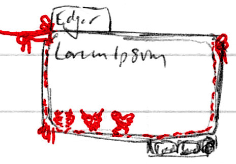
Tried out a design with yarn acting as the entire border and bows tied throughout. The little scribbles of red in the lower left corner were supposed to be stitched/knitted heart patterns to represent Edgar’s Affection Points, but I still haven’t settled on a design I’m happy with |P

This is probably the closest, but it’s also the most simple - nothing wrong with simple! But I still feel like I can do better. 10 stitches for 10 possible Affection Points ♪
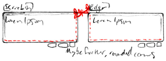
A slightly more refined take on the text box(es), especially to do with how Scriabin and Edgar’s complement each other - both sides of the yarn would go offscreen for either of them, but it’s mean to look like if you could zoom out the screen they would be tied to each other. The three bows are a bit much for such a confined space lol, but maybe if they were a bit more spread out. And giving each of them a directional border on the side the yarn ties in as well, I like that it’s more subtle :)

Still working on Edgar’s Affection display, I just can’t find a good balance of simple and thematic >:/ I do like the knitted text box tho, if it was subtle enough and I could get it to look right, I wouldn’t mind certain threads turning from a light grey to red ♪ I just worry that might be too much yarn, if such a thing exists haha

Down to just one loop-de-loop - it could reasonably show for both of them, cut off just after it on each side to indicate they share the one ♥
All menus all the time!
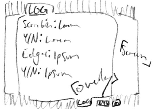
The buttons at the bottom of the text boxes would open up three different overlays with either a darkened BG or see-through screened effect, I’d have to test them digitally to see which is the most readable :P But they open to LOG (this screen: The current scene’s dialogue in case you clicked too fast or forgot a detail) - MENU - and a gear that opens OPTIONS

The aforementioned OPTIONS; mostly the basics for now, Text and Size, Music volume (I’d probably change it to overall volume and/or SFX specific) - I did forget one option here, toggling Adult Content since y’know, Vargas can get kind of A Lot sometimes haha ♪

A potential MENU layout, though I also like the SAVE/LOAD/TITLE/EXIT options being at the bottom of the screen, decisions decisions. I think leaving them to the side to allow the saves to have a multiple page listing at the bottom and keeps it all pretty clean and readable tho, hmm. Both OPTIONS and MENU would have the same overlay as LOG from earlier as well ♪ Unified design!

Me, just completely lost in the sauce: What is the most organic/non-utilitarian but still readable layout I can make so that the options are integrated but not a clusterfuck hmmmmmmmmm. Lol, it’s important to me! Depending on how tall and centralized the splash art is, either a stack would be too dividing or would cover up details - but it could also be used as an intentional divider! You can see I tried separating the buttons to each take a corner and hated that lol (which sucks ‘cause that would allow the art to be very centralized lol), and my notes from the OPTIONS spilling over haha
Next up: Endings Chart! Edgar’s on the left, Scriabin on the right; an ↑ indicates high Affection (7+), a - means mid-range Affection (~5), and a ↓ means low Affection (3-)

I actually forgot about the Neutral Ending, but that’s ‘cause it’s the Neutral Ending lol - it’s basically what happens if you get to the end without raising either of their affection high or low enough to get any other ending - basically if you start ignoring them and run out the days as normal. Technically the lowest one could be considered the Worst Ending, but it’s meant to be a joke ending lol :P

And finally thinking about a secret on the Title Screen, if I could figure out how to do it lol - since there’s like seven endings, it could be a pain to see how many you’ve gotten up to this point/how many are left, and how to get the last one(s), so why not a handy flow chart? But just leaving that out in the open feels like spoilers to new players and cheating for those who haven’t gotten at least one ending yet, so I liked the idea of hiding it in the yarn tied to their hands; on a first boot-up, the cursor wouldn’t react to it and the image wouldn’t look like something that can be clicked on, but if you did, it could still take you to the chart, but the intended route is to complete the game at least once, and then once the cursor is hovered over the yarn it would glow and change from a regular cursor to a clickable indicator, so anyone who got curious would get a bigger hint ♪ Still hidden, but easy to access :D
Those are most of my design notes and ideas for an over-excited first run lol, all the rest of my ideas were dialogue- and scenario-based :3c
#💟#Doodles#Art#Scriabin#Edgar#Dating Sim#Yeah I can already tell this is gonna need its own tag lol#It's a bit early for a sketchdump but I'm not sure how interesting a bunch of UI and other video game design updates would be lol#I have just realized I put different ''an'' and ''a'' to refer to the arrows because I was still thinking of their words and not symbols lol#''An upward arrow'' and ''a downward arrow'' why don't I just type out the word at that point#Anyway lol#There's something funny to me about Scriabin saying ''Y/N'' - as well as all the cutesy floral stuff meanwhile Edgar is crying and bruised#Juxtaposition eh lol#I don't have a go-to player name these days so sure [Your Name Here] will do lol#All my notes just refer to them as ''The Player'' so it's not like I've got much to go on lol#I have also written out all the endings and the basics of how to get them! I think six main routes and one joke ending are pretty good :3c#Then again I haven't actually played that many dating sims - but for two options? Yeah I still don't know that might not be a lot#I did have fun with it tho ♪
18 notes
·
View notes
Note
15, 16, & 18 :]
15 - Super specific but:

I predicted MK would have no barring on the main plot and there would be no returning characters there either.
Less so predictions and moreso gut feelings; after seeing the differences in KATFL and KSA's art styles I started to doubt any Dream Friend cameos in the gacha figures, closer to release I thought evil Elfilin was less and less likely with how marketable he looks, and there is a late game plot point for Clawroline where I thought the day before the leaks "naw that's too obvious they wouldn't do that".
16 - Ignoring minor nitpicks, just the characters and story felt lacking. I should preface that while I've bitched about them a lot, there is an aspect to the story I really really like, it's just that's spoiler territory lol. I don't think we've had a real strong story since TDX/RtDL, but at least I was entertained by PR and KSA. Though unique to this game is that it feels like they were trying to cover Shimomura's template this time around, and while mixing things up is appreciated I don't think that's where Kumazaki's strength lies. Kumazaki likes these campy antagonistic types, not the simple and sweet you'd expect from the Animal Friends. Shimomura's don't have as obvious of a personality as Sakurai's or Kumazaki's, but they make up for it in fun character dynamics which I don't think Kumazaki excels in. Kuma likes characters that react to Kirby, but Kirby doesn't react much in return and that's the same feeling with Elfilin. And everything about the Beast Pack feels like an after thought.
18 - Dude the UI tho. It's so clean and sharp, just the world transitions are eye candy. It's got style but it's still perfectly readable. It's everything Star Allies did but better and more fitting. The stat boosts are once again reminiscent of the City Trail stats, but I don't think they are explicit references so much as I'm impressed that's been consistent for over a decade while still fitting the series' current aesthetic. I am but a simple man, I see the winter and lava worlds transitions with the gradients and I am giddy.
14 notes
·
View notes
Photo
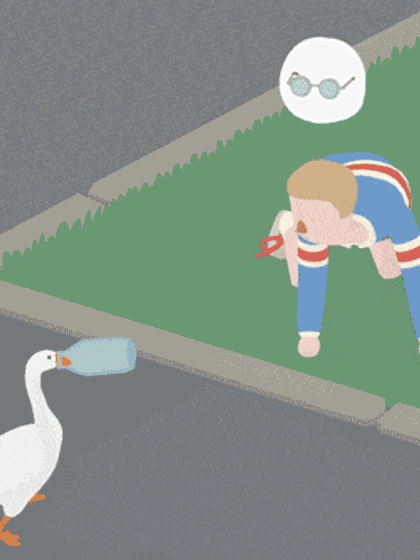
Indie Game Spotlight: Untitled Goose Game
Oh, boy, do we have an extra super horrible Indie Game Spotlight exclusive for you today! We’re talking, of course, of Untitled Goose Game, a slapstick simulator, where you play a goose hassling a town full of people who would very much like you to stop hassling them, please. It feels a bit like playing the videogame version of an old cartoon, complete with reactive soundtrack. Everything that happens in the game is very low stakes (the goose doesn’t get involved in political scandals, or drive a car off a ramp etc.), but there’s a lot of room for comedic performance in doing things like stealing clothes off a washing line and dumping them in a pond.
The team at House House shares roles a lot, and so the game was predominantly designed collaboratively by four people. We chatted with Stuart Gillespie-Cook, who mostly works on animation. Also within House House is Jake Strasser, largely responsible for the design of levels and environments, Nico Disseldorp who does all the programming, and Michael McMaster who mostly works on art direction and UI. The iconic sound effects were made by Em Halberstadt, and Dan Golding designed the music. There’s also art from Kalonica Quigley and additional UI programming from Cherie Davidson. Stuart Gave us the lowdown on the curious title, the game mechanics, and dream crossovers. Read on!

What's the story behind the title of the game?
This more or less happened by accident; at first, we just needed something to put on a video we were submitting to a festival. It’s become one of the best things about the game, and I’m so glad we stuck with it. I will say it’s a weird thing to explain when your very not-online hairdresser asks you “oh, what game are you working on?”
How did the team come up with the animation style?
The whole visual style of the game is designed to be nice and clean, very readable and approachable. The animation specifically takes a lot of inspiration from slapstick and pantomime—with big, over the top reactions that are impossible to miss. We wanted to squeeze as much emotion as possible out of these people without facial expressions, so everything has to be evoked with body language. We also lean heavily on two dimensional, hand-drawn effects that are lifted from comics—lines to represent the direction of a honk, stars when someone hits their thumb with a hammer, etc.

Untitled Goose Game offers a unique take on the puzzle genre. What other mechanics can we expect?
Because it’s a game that’s largely about interacting with a bunch of people, the game borrows heavily from AI systems in stealth games. Playing with a character’s awareness of where the goose is, where they left their stuff, where that sound came from etc. is a big part of the comedy of the game. So, while it’s less restrictive than most stealth games, and there’s no real fail state (ie. if a character sees a goose, they’ll think “ah, there’s a goose” rather than “I’d better shoot and kill that spy”), those explicit behaviours that are so present in the stealth genre are really important in our goose game.
youtube
If you could have the goose cross over into any cinematic or game universe, what would it be and why?
It would be nice to see the goose chase Postman Pat over a hedgerow. That era of British children’s television has been a huge influence on the game. Otherwise, we’re always open to having the goose in Smash.
Are you ready to fulfill your wildest dreams of becoming a mischevious goose and harassing people? Of course you are! Check out the website to find out how you can get your hands wings on Untitled Goose Game!
8K notes
·
View notes
Note
Favourite Winamp skin?
For most of my time using Winamp, I’ve mainly been using... well, this needs some setup, I guess.
Winamp was purchased by AOL (America Online, the internet ISP) at some point. AOL did what most big tech corporations do, and they messed with a good thing. Winamp 5 launched with a revamped skinning system intended to compete with Windows Media Player. Media Player had just added skinning support, and it went far beyond what you could do in Winamp -- which is where you started getting all kinds of weirdly-shaped players, like the famous Windows Media Player Head.
To demonstrate the new Winamp skinning system, AOL had the Winamp team create a brand new default Winamp skin. It was based on the existing Winamp player layout, but the interface was slightly larger and it was given a more modern, “professional” look.
Unfortunately a lot of people didn’t like it. Being slightly larger made the player a bit too bulky for the types of docking you’d normally use Winamp for, and the alpha transparency and extended feature set made it significantly slower to render. I want to say Winamp 5 did not originally launch with backwards compatibility for old Winamp skins, but after enough people complained, future versions of Winamp 5 included backwards compatibility and the original classic Winamp skin.
This is a long way of saying eventually somebody ported the modernized Winamp 5 skin to the classic skin form factor, and for like 13 years, that’s the one I used.

Over the last 2-3 years I guess I got bored with that and I’ve been trying on new skins. Generally I settle for something that’s clean, readable, and stylish. Like CitySkin, which reminds me of the old pre-Steam Half-Life 1 menu system.

I also latched on to ClassAmp for a while, because it reminds me of the classic Winamp skin, but cleaner and brighter.

I used DarkPi for a while, which adapts UI elements from FruityLoops in to a Winamp skin:

I actually dug in and edited DarkPi a bit, because the v2 of the skin out there is a little broken, so I fixed some graphics and cleaned up some buttons on it. The skin I’m currently using, THUG, is the same way. Normally THUG has this big ugly logo on it:

So I simply painted that out:

But I suppose what’s important here is that I don’t usually see the skins like this. Mostly I have Winamp docked in the thin player at the top of my screen:

A lot of the skins I pick are generally whatever’s the most readable in this thin player format.
You can find most of the (unmodified, original) skins I mentioned here on the Winamp Skin Museum.
11 notes
·
View notes
Text
Wisdom from Years of Android Development
Source of Information: Android Classes In Pune
I still keep in mind that day back in 2014 once I chose to begin Android growth, and this was among the greatest decisions I required in my entire life. It's been approximately two and a half a year today and that I had the opportunity to understand and un-learn a good deal of items in Android.
Originally when I began, I did not have a mentor or someone who could direct me to do things the ideal way. I have done a LOT of errors and wasted a great deal of time later rectifying them.
Afterwards, after one and a half a year, I have the opportunity to use some really gifted and expert Android programmers, who advised me and allow me to shape matters in a far greater manner. Both these stages helped me find out a hell lot of stuff in the tricky way.
It's been quite a while I have been attempting to assist other programmers in a sense possible for me personally, indirectly and directly.
In the following guide, I'll be sharing a few of the gems I have gathered lately. It may help a person to get started quicker rather than repeat the mistakes which I did.
Disclaimer: I could largely be focussing on Android plus a few notions of product and programming development within the following guide, so if you aren't acquainted with some of them, you may rather not read any farther. Others, just dip. :--RRB-
Do not Reinvent the Wheel
Originally I had a lousy notion of not utilizing open-source libraries. Whatever I wanted, I only wanted to make it . It has was severely a terrible thought.
When you've got a problem whilst creating your program, and if this problem was solved by another person earlier and in a fantastic way, why don't you use this? You may save yourself a good deal of time.
Focus on the core business logic of your program. If you wish to create network calls on your program, you do not have to earn a Retrofit yourself.
Bonus: Android Arsenal keeps a record of nearly all of Android libraries made. Go take a look.
Pick Libraries Wisely
You will find lots and a lot of open-source libraries out there in Github that you use at no cost. But do not get too excited and begin using libraries .
Assess the amount of celebrities that library gets, the greater the better. Assess whether the writer of the library also have established some other popular libraries too. Verify the topics (both closed and open ), which may provide you a clearer idea of how powerful and secure the library is in creation.
If you're able to spend the time, then you ought to dip into the code of the library and assess yourself whether its really worthwhile.
You only wish to make certain that the code you're likely to use is dependable, bug-free and high quality.
Pro Suggestion: Try any library hosted straight from the command line with Dryrun.
If you aren't doing this, START today.
Whatever code you're in a position to write now is simply because you've read and heard something, somewhere, someday. It is only a manifestation of what you know. You may just grow and improve your self by studying and learning from other's work.
The fantastic thing about Android is the fact that it's an entirely open-source platform. Dive in the code and assess how they've implemented the frame. There are hundreds and hundreds of open minded libraries in Github. Simply select a library and find out the way the programmer have employed it.
Bonus: here's a curated collection of a few of the greatest libraries and here's a list of nearly all accessible Android programs out there. You're welcome:--RRB-
Should you compare coding together with composing, then coding criteria is similar to your own handwriting.
Since you'd be studying more of the others code, other folks are also studying a great deal of your code and you do not wish to frighten the shit from these, do you really? And if you're working within a business and cooperating with other programmers greatly, do take particular care of it.
Write brief, readable and clean code which you and people reading your code will like thoroughly. Your code should read as a narrative.
Do not complain if you compose a bit of code along with your coworkers do not speak to you for a couple of days.
You Want ProGuard, YesYou Want It!
ProGuard not just minifies your code, but it also obfuscates your code which makes it tougher for reverse-engineers to comprehend, replicate and control it.
Its free and comes bundled with all the Android SDK, and there's simply no reason for you to not use it.
I've observed many developers releasing their program in the marketplace with no ProGuard. It shouldn't require more than a couple of hours to get a not-so-skilled hacker to control an the program published without Proguard.
Pro Suggestion: But if you'd like top-notch protection, then ProGuard is just like a cardboard at the same time you want a secure, and here it's, DexGuard.
Use a Suitable Architecture
You may thank yourself for choosing a suitable structure in the first location.
It's possible to utilize MVP (Model-View-Presenter) structure that may decouple your code to various easy-to-manage layers thereby enhancing code flexibility and significantly reducing maintenance period.
There's a good demo job for you to begin. And if you're having trouble grasping it, here's a thorough guide for the novices.
Bonus: Do provide a check out this, this and most significantly this. Every one these can help you in executing MVP on your undertaking. User Interface Is just like a Joke, Should You Need to Explain It, It Is Bad
Should you work for any company playing the use of"only" a Android programmer, you likely won't have to be overly concerned about that, since there really are UI/UX designers to look after this.
However, if you're a single programmer, you have to get this directly in your mind. I've seen programmers creating really great programs with good performance, however, the UI looks horrible along with the UX makes it a hassle to use.
Layout a clean, easy and gorgeous interface that's easy on the eyes. You shouldn't just think as a programmer, instead you need to focus on igniting the concealed designer in you.
Attempt to make a lasting impression in your customers by designing a gorgeous UI, so they return to your program more frequently than others and often convert more (purchase your premium variant ( possibly ).
You ought to find a kick by eliminating elements from your own design, instead of adding. Keep it minimal and clean.
And there's this book you probably would really like to see if you want to know more about design.
Analytics Is Your Very Best Friend
If you would like to produce a really amazing program, then you have to heavily rely on analytics programs to assess the operation and utilization of different sections of your program.
By analytics, I refer to both the collision reporting and program usage monitoring and you want both of these.
Anything you do, you can't ever make something ideal. When actual users will begin using your program on various Android apparatus and on different Android variants available, you may also find a few of the greatest written code to drop flat on the floor.
Crash reporting programs can allow you to monitor and fix themone crash at one time.
You also will need to begin thinking like a marketer and also examine the use of various elements of your program. This is what's going to allow you to bridge the gap between what you've created and what your customers' actually desire.
Pro Suggestion: I strongly suggest looking for the crash reporting tool in Instabug. You're going to appreciate it.
Make a Marketing Ninja If you're a single programmer, you need to consider beyond being"a programmer" and need to understand marketing too.
I've observed great products fail because of lack of suitable marketing, and also the not-so-good ones become hugely successful only because of fantastic advertising.
If you're seriously interested in your work and need it to reach a huge audience, you want to spend your time and cash in properly advertising your program. But prior to beginning your marketing and advertising campaigns, make certain your program is totally stable with all attributes prepared. You need maximum conversions out of each penny you pay, right?
Spend some time exploring who your opponents are and how you can overcome them. Identify the ones you're able to compete quickly as well as also the ones which you need to keep aside for a long term struggle.
Pro Suggestion: This is an inexpensive market evaluation instrument, I really like to use.
It Is Time to Boost Your Program
This is something which the majority of us don't do, however, you need to and you want to.
Write code which runs fast, takes less memory and absorbs less apparatus storage.
An unoptimized program works well under ordinary conditions, but when placed to various stressful circumstances, it may show you its true colours.
Bear in mind, a very small leak can sink a large ship. Spend some time on knowing how the Garbage Collector works in Java, produce heap dumps and examine your live items.
Pro Suggestion: Use Leak Canary to discover your memory flows. It can save a great deal of time by accomplishing this job for you.
Save Over 5 Hours Each Week with Gradle Builds
It is very very possible that you're utilizing Android Studio to create Android programs and utilizing Gradle as your own build platform. Gradle is excellent but its slow and it becomes much thinner than a snail as soon as your job size begins to increase in proportion.
I recall the countless hours I've wasted just sitting and awaiting the Gradle assembles to complete. On hefty workouts, I wasted around one hour just Gradle assembles and that is like 5 hours each week draining the gutter.
However, there are ways to speed this up too.
It is possible to stick to this and this article to greatly enhance your construct rates. My construct time fell from 4 minutes to less than 30 minutes following appropriate optimization.
Evaluation, Evaluation and When You're Finished, Test Again!
There isn't anything more significant than testing. This is something which needs to be on very top of your list.
Test your program as completely as you can. Create various stressful scenarios for your program and see whether it can endure.
I'd formerly made the mistake of publishing my program from rush and did not spend appropriate time analyzing it. I had been waiting for my customers to confront bugs, report it and then I'd go and mend them.
You may spare a day, or 2, or per week by cutting time from studying, but will most likely have to spend over double afterwards.
Make a visionary. Sow today, reap afterwards.
There are a massive assortment of all Android devices with different display sizes and hardware specifications from plenty of different apparatus manufactures that personalize the OS for their heart's content.
Added to this are the a variety of Android variants at which Google adds/removes API performance from nowhere to raise your workload further (an example here).
By way of instance, not just one Android programmer has completed a program without using SharedPreferences API. It is so common, however it had been broken up in Samsung Galaxy S using Android 2.2 (bug report ).
Spend additional time creating different designs for different screen dimensions. Evaluation on various apparatus, having different variations, different specifications and from various OEMs.
Never presume something could work, simply as it appears so.
Start with Git, Now!
If you're still not utilizing Git, go right ahead and begin using it straight away.
Once I began Android advancement, I was unlucky enough to not understand exactly what the fudge Git was. I used to replicate my whole project regular and keep 1 backup in my hard disk and another from the cloud. Seems foolish? Yes, it was.
Git can radically enhance your workflow. If a person asks me to mention a tool I use everyday and can not quit using? It is Git and Git each time.
And likely after using it for a couple of days you'd fall in love with it and wish to understand how Git works tirelessly, so here it's prepared for you.
And after some time, you'd be starting a large project your self and get confused about how you should keep a suitable branching model, so that you go.
Bonus: If you're only starting out and can not manage to pay the monthly subscription fee for keeping private repositories from GitHub, it is possible to attempt BitBucket which permits you to do this free of charge.
Make It Hard for the Hackers
The open minded nature of Android is exactly what makes it susceptible to attacks.
You do not need it to happen for your program, right?
You ought to be aware of how to safely store API keys everywhere on your program. If you're managing sensitive information from those consumers, then you have to understand how to encrypt themwhat algorithm to select (secure yet quickly ).
It's also advisable to keep the encryption keys safely in the host or locally (if desired ). If you're storing sensitive information in the database, then think about obfuscating it.
If your program includes a premium version that gets cracked and has published at no cost. You'd incur a critical reduction in company, right?
There are many things you can do to stop your program from becoming tampered. There's not anything like 100% safety. Any proficient and recognized hacker with the proper tools, patience and tools may crack your program.
Whatever you need to do is make it hard, rather very tricky for the hacker to decode it.
A luxury apparatus will hide a great deal of flaws while creating your program. Suppose you're doing something from the UI thread that makes its way to get a laggy UI, however onto a potent device, you might never ever observe that.
A classic, low-end apparatus, dumped with a lot of programs makes it perfect for a development apparatus.
That is an investment which will pay you eternally.
Whilst creating large and intricate programs, you may face some common issues that have probably been solved before by somebody more capable than you, that is when designing patterns comes in to play.
Here's a Github job that shows all of the design patterns known to humanity.
Looks like a great deal? It really is not. You'll begin enjoying them after you dip in.
It Is Time to Give Back
Most of us have a great deal of assistance from folks around us and by the net. Lets declare it. When you have a issue, the very first thing you'd do is Google that and find the very first link from StackOverflow. Sometimes you're in a rush and you wind up copying and pasting the alternative in the response with the greatest votes.
Ever believed the amount of libraries you're using from Github free of charge and the way in which they have significantly reduced your development efforts and time. Its because somebody somewhere has taken the opportunity to construct it and donate to make the community better.
Recall the day, if you had been stuck in knowing a challenging idea or something that's completely new to you, and you wind up finding an wonderful blog post that made it super simple for you. Its because someone skipped a film date and wrote this post.
We're active in our work and also we find it too hard to handle time and do something for others. But try to get some time each week to donate and make this particular Android community wealthier.
I've attempted to discuss a few of the lessons I have discovered in this brief journey with Android improvement. I'll continue my trip, find out more and share more. I hope it will help somebody and makes their life somewhat simpler.
Android Course In Pune | Android Training In Pune | Learn Android Development In Pune
1 note
·
View note
Link
(Note: This is a copy of the Kickstarter story, which you can read in full up above.)
It’s been a little more than two weeks since the Kickstarter concluded, so compared to some of these updates, this one will probably be a bit sparse. A lot of the work right now has been managing people, drafting up work orders, looking over offers, and juggling a lot of plates that we’ve set spinning.
With that in mind, a fair bit of work has been done on the game proper. Most of it has been bugfixing and polishing up the UI, options menu, and doing a lot of station work. The things you see here (minus a few tidbits) will be released in the next demo, patch 1.4, which hopefully will be this month. However, not every devlog with coincide with or preview a patch.
Also: If you haven’t filled out the reward survey yet, be sure to do so! Now onto the PROGRESS.
Option Menu Changes And Fixes
First-time players will find that the options menu will properly set default settings, so no more snow-white UI and weird option choices. We’ve also integrated a better way to handle updates to the UI, whenever new keys or options are added with updates.

On the subject of defaults, every options tab now has an option to restore their defaults. Previously only the keybinds had this button (which also wasn’t working due to a programming error), both fixed now.
Station UI Changes
A common problem I noticed during playthroughs is players on stations would tend to break the menus quite easily, either by walking away from NPCs they were trading with, or warping to a new room, or opening a menu that wouldn’t close the other menus. Basically, there were issues.
Such issues are now gone. The player can’t accidentally screw up menus, and menus can’t open over one-another. This will obviously greatly reduce issues where the player pulls up to a station and finds a dialogue box occluding their view.
Docking and undocking on stations had some issues, especially when players would accidentally die, undock, and find themselves phasing into the station. This was because a lot of autopilot and engine settings weren’t getting reset when the player docked on a station (which now happens, of course).
The dialogue UI and camera on stations has gone through a few changes. It’s moved over and shrunk a bit, giving the NPCs you talk to a bit more breathing room. To help with this, there’s now a dedicated dialogue camera when speaking to NPCs.

We’re still working on hooking up voice files to animated portions, such as this Macrovari’s glowy bits modulating with their speech.
Other UI/Effect Changes
Incorporating feedback from testers and players who played the demo, a few changes have been done to the UI, as well as fixes to things you didn’t notice, but I had and really annoyed me. Tooltips pop up much quicker now, having gone from around two seconds to a quarter of a second. Offscreen indicators (those arrows that tell you where things are) had weird issues where they’d take a second or two to appear. I’m still… not sure why they did this, but as it seemed to be related to them being outright disabled rather than simply hidden, the whole system was changed around. Now, indicators will update much quicker, but will also not show up for enemies that aren’t in range (so no more red arrows when you’ve left some pirates in the dust).
Waypoints had a variety of issues. Well, not exactly issues or bugs, just their current behaviors could be a little confusing. For starters, when a player was traversing a laneline and said laneline would be disrupted, the waypoint wouldn’t update to reflect what ring the player should dock at. It does now, allowing one to more easily pick up on the route they were following.
Speaking of routes and following, setting a path in the navmap menu wouldn’t refresh it properly, requiring the player to open and close the menu to get an idea of where they were supposed to go. This has been rectified. In addition, the player also gets an initial path that points them to the first location they should be heading towards.

As for miscellaneous effects, a few text fields have had their fonts changed for a more uniform look, you can no longer click buttons while the main menu loading screen is up, and there are now some minor new camera effects for when the player is thrusting. Work also began on ship debris: pieces left over after something dies horribly. It can be bashed around and will eventually fade, but otherwise is mostly an effect. That whole system is still a WIP, as it’ll require existing ship models to be taken and broken into tiny tiny pieces and smashed with a hammer before it’ll be fully integrated in-game.

Ship Customization and Trading Hangars
Probably the biggest change in the last few weeks has been a complete overhaul of the trading UI, as well as the proper addition of ship customization. Both of these will of course be included in demo 1.4.
One of the things we’ve wanted to do for some time with both inventory and trading was give the player a better preview of what they’d be buying or equipping, as well as clean up readability and adding various functionality to the whole thing. And now, we did!

The first change is readability, with the tab categories being moved up top, and the entire UI expanded and rearranged to make it easier to navigate and look through. We also added a search bar to the NPC section, though we all know nobody’s ever going to use it. On a more useful note, selecting individual hardpoints will not only filter it to show the valid equipment for that slot, but if an item is already on that point, you’ll be able to quickly compare stats. Items you cannot use (either because you have no valid hardpoints at all, or its ammunition for guns you don’t use), are greyed and shown after any valid items.
On the visual side of things, trading will now bring the player into the trading hangar, a separate room where, when selecting different items, will show a nice preview. Cargo items that are just things like ammo or commodities will be lifted up on a crate, while selecting equipment will give you a preview of it on your ship.

Next up, customization! Most of this tech was in-game already, but lacked a UI, saving options, blah blah blah the whole thing was kind of vestigial and half-baked. This is no longer the case. Now, any shipdealer also has the ability to color and customize your ship. A lot of new tech had to go into this, closely tied with the trading hangar, which also meant creating things a new icon system for both ships and equipment.

You can change the color of your headlights, the ship’s paint, and the color of the engines (a requested feature from a few people). Things like putting on decals will also be coming, though in a later update. We’ll be looking for feedback on what additional features you’d like to see here (color controls or other aspects of said color you’d like to control), as this feature is still WIP and the most subject to change out of all of these things. Once it’s in a more complete state, we’ll be releasing demo 1.4.
We’ve also been working on adding more assets, like remaining greyboxes for battleships, and going back over station models. More on this next update, when we have more to show.

That’s all for this month. Keep an eye on our pages on itch.io and indiedb for 1.4, which will be releasing once the last few changes to ship customization are in (namely: getting it to properly apply and save to ships).
10 notes
·
View notes
Text
UI/UX Design👀
Designing Better UX:-
Users are more than just looking at screens. Experiences matter. User interface (UI) and user experience (UX) design play a significant role in the customers’ overall experience of your product or service. In this article, we will look at how UI/UX design can impact customer satisfaction and retention rates.
What is UX and UI design?
User experience (UX) and user interface (UI) design are important parts of any product, whether it’s a website, app, or software program. They determine how users interact with the product and how easy it is to use. Good UX and UI design make products more enjoyable to use and can even increase sales.
The importance of UX:-
User experience (UX) is critical to the success of any website or app. A good UX can mean the difference between a user staying on your site or leaving it. It’s important to design a UX that is not only visually appealing but also easy to use. Here are some tips to help you design better UX:
1. Simplicity is key – When it comes to UX, less is more. Keep your designs clean and simple. Too much clutter will only serve to confuse users and make your site difficult to navigate.
2. Use whitespace – Whitespace is your friend when it comes to UX. Use it to break up content and make it easier on the eyes.
3. Consider typography – The font you use on your site can have a big impact on UX. Choose a font that is easy to read and doesn’t strain the eyes.
4. Get feedback – Ask friends, family, and even strangers for their opinion on your site’s UX. Getting feedback from others will help you see things that you may not have noticed before.
Important Design Principles
When it comes to creating a great user experience, there are certain design principles that you should always keep in mind. These principles will help ensure that your designs are not only visually appealing, but also easy to use and navigate.
Some of the most important design principles to keep in mind include:
Layout: The layout of your website or app should be easy to understand and use. All elements should be clearly defined and positioned in a way that makes sense.
Color: The colors you use in your design should be eye-catching but not overwhelming. They should also be easy to read and contrast well with each other.
Typography: The fonts you use should be easy to read and understand. They should also be used consistently throughout the design.
Images: The images you use should be high quality and relevant to the content they are accompanying. They should also be sized appropriately and placed in a way that doesn’t interfere with the overall layout of the design.
Interactivity: Your design should be interactive and engaging. Users should be able to easily navigate through your site or app and find the information they’re looking for
Visual Design Principles
The visual design of your website or app is important for several reasons. First, it needs to look good in order to make a positive impression on users. Second, the design needs to be functional and easy to use. Third, the visuals need to be consistent with the overall branding of your company.
Some basic principles of visual design include using contrast, balance, and hierarchy. Contrast is important for making things stand out and for making text readable. Balance ensures that everything looks evenly spaced and organized. Hierarchy helps users understand where to look first and what is most important.
When designing your UX, keep these principles in mind in order to create a visually appealing and easy-to-use interface.
Why you should use a UX design workflow
As a UX designer, it's important to use a design workflow that will help you create the best possible user experience for your project. There are many different workflow models out there, but one that I particularly like is the UX Methodology by Jesse James Garrett.
This methodology is based on five key principles:
1. User Needs: Every design decision should be based on what the user needs.
2. Iterative Design: The design process should be an iterative one, with constant feedback and testing.
3. Simplicity: Keep the design as simple as possible.
4. Flexibility: The design should be flexible enough to accommodate changes.
5. Usability: The end goal of the design should be to create a product that is easy to use and enjoyable for the user.
Mobile Design Principles
When it comes to mobile design, there are a few key principles to keep in mind in order to create a successful user experience. First and foremost, simplicity is key. Mobile users are typically looking for quick and easy access to information, so your design should be clean and uncluttered.
Second, focus on usability. Make sure your design is easy to navigate and use, and that all the important information is easy to find.
Third, consider the context of use. Mobile devices are often used on the go, so take into account things like screen size and user location when designing your UX.
Finally, always test your design before launch. Get feedback from real users and make sure everything works as it should before you go live.
following these simple principles will help you create a great UX for your mobile users.
Other Important Guidelines to Follow in UX/UI Design
1. Keep the user in mind at all times – especially when it comes to the design. The user should be able to easily navigate your site and find what they are looking for.
2. Make sure your site is responsive – more and more people are using their mobile devices to access the internet. You want to make sure your site can be viewed on all devices.
3. Use clear and concise text – users should be able to understand what you are trying to say without having to guess.
4. Use high-quality visuals – photos, videos, and infographics can help break up text and make your site more visually appealing.
5. Pay attention to the overall design – everything from the layout to the color scheme should be well-thought-out.
6. Always test your site before launch – put yourself in the user’s shoes and see if you can easily navigate your site. If not, make changes until it is perfect!
Mail:- [email protected]
Contact:- +91 9840718691
Website:- www.datashaft.in
1 note
·
View note
Text
Huawei Band Review: A little different from the pack
The Huawei Band slots right in between regular fitness bands and a fitness watch
Huawei has been a constant presence in the fitness wearables segment in India over the past several years. The Band 6 that we have for review today is the sixth iteration of their fitness band, and it's an interesting one. One thing I generally miss in fitness bands is a larger display. I know, it's a band and needs to be sleek, but Huawei has looked to address that issue here. The Huawei Band 6 slots right in between regular fitness bands and a fitness watch, courtesy of its larger than usual display. The slightly larger footprint also lets it pack a higher capacity battery and a bunch of useful sensors. The pricing is more than entry level fitness bands but it also offers some features that are hard to find on most of its competitors. Let's see how it performs and if it deserves the premium.
Design and comfort
Looks pleasantly different; comfortable to wear all day SpO2 and heart rate sensors are located at the back, along with charging points
The Huawei Band 6 is well built and comes with a smooth matte finish that gives it a premium look. Despite that, the band is fairly light and weighs just 18gm (without the straps). This band does not use standard sized straps, and the pre-installed ones are not so easy to replace. The straps are made of UV-treated silicone that is skin-friendly, and they are indeed comfortable to wear all day without any irritation. The SpO2 and heart rate sensors are located at the back, along with two charging points. There is a single physical button on the side that turns on the screen when pressed and also doubles up as a shortcut to all the key functions of this band. That button along with the touchscreen display let you access the menus and different functions of this device. All in all, this fitness band looks good around the wrist even if you have slim ones, and the larger display offers better readability.
About the display
Sharp and sizeable display, but best watch faces are paid Swipe left or right to cycle through widgets like daily activity progress
Speaking of display, this Huawei band has a rectangular 1.47-inch AMOLED touchscreen display with a resolution of 194x368 pixels and a curved glass on top. The screen is sharp and colors pop nicely. There is no mention of scratch protection or oleophobic coating in the spec-sheet, but there were absolutely no scratches on the screen after a few weeks of usage. There were hardly any fingerprints or smudges on the screen either, and rarely did I need to wipe it. The screen has five levels of brightness; it is perfectly legible indoors at level 3, but you will need to push it to level 4 or 5 outdoors under bright sunlight. Flicking the wrist turns the screen on, and it works as expected. This feature can be scheduled to stay off during your sleep hours or one can simply turn on night mode that also disables incoming call alerts and other notifications. You will need to press the physical button to wake the screen during that period. The watch comes preloaded with a handful of faces, and you can add more of your choice from the companion app. While the watch face library is fairly elaborate, most of the options I liked were not free. They aren't expensive but the app often keeps recommending a lot of paid options even when you are sampling the free ones, and it can get irritating after a while. You get a good mix of digital and analog faces and also some artistic variety that show useful fitness data along with time. The good part is the watch helps you store and switch between a lot of these faces without the need to go back to the app. Generally, fitness bands let you store about half a dozen faces. I tried storing 14 on the Huawei Band 6, including the preinstalled ones, and they happily coexisted.
UI and App
Simple user interface, well-organized companion app The app interface looks neat and clean and displays information about various fitness parameters
The user interface of this fitness band is simple and straightforward. Swipe down on the screen for quick settings, swipe up to check the notifications from various apps, and swipe left or right to cycle through widgets like daily activity progress, heart rate, stress levels etc. Touch and hold gesture on the home screen lets you cycle through and change watch faces. And lastly, pressing the physical button grants you access to all the functions and workout modes of this watch. You need to install the Huawei Health app on your smartphone and sync the Band 6 with it over Bluetooth. It is available on both Android and iOS. The app, however, asks for way too many permissions to perform multiple tasks. Allow whatever you are comfortable with. The app interface looks neat and clean and displays last workout record, steps count, workout duration, calories burnt, distance traveled, most recent SpO2 reading, sleep data, stress level and heart rate graphs. You can tap on either of the tiles to gain deeper insight into each aspect. You can also access watch settings and watch faces, along with detailed breakdown of daily, weekly or monthly fitness activities. In case you aspire to train for marathons, this app guides you through your training process suggesting the kind of speeds and heart rate you should maintain at different stages of the run.
Overall Performance
Brisk oximeter, detailed sleep and fitness tracking, except steps counter The SpO2 sensor is quite good and provides accurate readings
The SpO2 sensor is quite good and provides accurate readings that are comparable to a basic over-the-counter Oximeter. While it's not as fast, I did find it noticeably faster than those you get in most budget fitness watches. You need to keep your hand steady for about 20 seconds to get an accurate reading. This band supports all day SpO2 monitoring too, and even when you are asleep. As always, these readings are meant to serve as a broad guideline and not replace dedicated medical equipment. Sleep tracking on this band is fairly accurate and detailed. It not only measures the quantum of light sleep, deep sleep, REM sleep and awake time, it also tracks your deep sleep continuity and breathing quality. Based on all these parameters, you get a sleep score and a variety of advice on how to improve it further. You get all day stress monitoring too, and it provides some guided breathing techniques to lower it. Menstrual cycle tracking is also available on this band. Huawei claims that one can choose from 96 different exercise modes. I could spot the usual walking, running, swimming, jump rope, elliptical, rowing and a few others. I believe the rest are derivatives of these workouts. Some activities have indoor as well as outdoor tracking options. This band doesn't have built-in GPS, and during outdoor activities, you can use assisted GPS to track distance. For that you need to carry your phone along for the band to utilize its GPS. Otherwise, the band uses the built-in pedometer to count steps, which is temperamental to say the least. It tends to be too generous with your steps count and registers steps if you throw your arms around even when stationary. Long story short, it records a lot of false steps when not in a workout mode. The device is 5ATM water resistant and can survive up to 50 meters deep water.
Smart features, Battery
Good battery life for a fitness band, quick charging The charging module has two pins that magnetically attach to the base of the band
This is not a smartwatch and you only have a handful of so-called smart features. Beyond fitness, you can receive call alerts, messages and app notifications on the phone screen, but you can't answer calls or reply to messages. However, most of the stuff is legible on its decent sized screen. You also get controls to manage the music playback on the phone from the watch without touching the phone. Further, you get weather updates from time to time and sedentary reminders if you are stationary for too long. The company advertises a battery life of two weeks for the Huawei Band 6 under typical usage scenario that is defined as 'heart-rate monitoring and sleep tracking on, screen checked briefly 200 times within 24 hours and workout for 30 minutes per week'. The battery life figure may seem a bit too ambitious for a fitness band, but I did manage to get close to 12 days out of it with similar parameters as above but with three hours of workout in that period. Include a couple of SpO2 readings daily and that's not a bad number at all. The charging module here is really tiny and is essentially just two pins that magnetically attach to the base of the band, and on the other end of the cable is a USB port that can be connected to any standard USB charger. It takes well under an hour to charge this band fully, and the company states that just five minutes of charging can keep the band powered for two days; a claim I could not verify as I forgot to stop charging it after five minutes.
Price and verdict
Slightly expensive but offers a few extras over budget band Pressing the physical button grants you access to all the functions and workout modes
The Huawei Band 6 is priced at Rs. 4,490 in India with a one year warranty and often drops by Rs. 500 on Amazon India. The price may seem a little higher than popular fitness bands from OPPO, OnePlus or Xiaomi that sell under Rs. 3,000, and while they offer comparable features, none of them sport a screen this big or offer as much battery backup. Barring the steps counter, most of the things function as expected, and the level of tracking is quite impressive. Add to that an uncomplicated user interface, a good companion app, and the Band 6 justifies the small premium that it demands. If a larger display is not a necessity, you can consider the OPPO Band Style and save a few bucks. In case you need a bigger display (though not AMOLED) and built-in GPS in this budget, you have options like the Amazfit BIP U Pro and Realme Watch 2 Pro that sell for a similar price. Take your pick!
Our rating
Huawei Band 6 Review synopsis
Review:
A semi-premium fitness band with a larger AMOLED display, feature-rich companion app, reliable SpO2 and heart rate sensors and good battery life.
Good Stuff:
Lightweight, comfortable, easy to use
Relatively larger sharp AMOLED display
Satisfactory overall performance
Accurate SpO2 sensor and heart rate monitor
Sleep tracking, all day stress monitoring
Bad Stuff:
Best watch faces are not free
Proprietary watch straps may be hard to replace
0 notes
Text
What’s the Best Font for Subtitles? 5 Examples Compared
When it comes to choosing the best font for subtitles (or any other captioning), nothing matters more than readability. Clear subtitles are more than just identification on the screen, they can be a means of accessibility for many users.
You’ve probably seen a fair share of good – and bad – subtitle font options. (I remember watching a movie where the subtitles were yellow and nearly unreadable in some scenes. That’s not a good choice!) Closed captions are also common for viewing video on social media – who wants to play the sound at work? – and to understand content in another language.
Today, we’ll look at some of the best fonts for subtitles, and tips for creating small text elements on a moving video background that people will actually want to read.
Roboto

Roboto is one of the most common typefaces in the modern era. It’s used pretty universally across device types, screen sizes and for a number of purposes. Subtitles and captions are no exception.
And because the eye is so used to this typeface, it’s quick and easy to read. The goal of using a subtitle is to make the content easier for the user to understand, and that’s why Roboto is a good option.
Wired magazine explains that people are using captions for everything:
“Closed captions are a must for foreign-language movies and shows like Netflix’s 3%, and they’re great for shows with heavy accents or jargon. But more and more people are leaving them on for everything. Why?”
Getting into the answer can be a little complicated – you can read about it in Wired – the takeaway is that people are using lots of subtitles and captioning. As a designer, you need to be ready to accommodate it.
Roboto has a wide range of weights and styles, but for subtitles and captions, avoid condensed or super-thick or thin weights. You might recognize Roboto Medium as the font YouTube uses for subtitles by default.
Find it here: Roboto is available from Google Fonts (and plenty of other providers) as an open-source typeface.
Cinecav

I like this option because some of the extra type options are just as readable as the monospaced version.
Cinecav Closed Caption Fonts is a set of sans serifs with monospaced and proportionally spaced options for all subtitle usage. What makes this font a good option is that it specifically designed to meet FCC requirements for closed captioning (CEA-708).
“They are more elegant, more legible, and more consistently designed for television applications than fonts provided by other suppliers and have been tested and refined on a broad range of DTV platforms,” according to the typemaker. “The font set also includes Cinecav UI, designed specifically for guide information and menu systems where space efficiency and legibility are extremely important.”
In addition, this typeface includes italics that are suitable for captions – which can sometimes be hard to come by – and include character sets for dozens of languages. The latter is why this font is widely used for television and movies.
I like this option because some of the extra type options are just as readable as the monospaced version. (Monospaced fonts are often a preferred choice for subtitles and captions.) It includes small caps, a light casual option and script.
Find it here: Cinecav license pricing depends on your needs.
Tiresias Infofont

There’s a reason the BBC uses Tiresias Infofont for subtitles: It’s a readable option that’s specifically made for people who must read to understand what’s happening on the screen.
Tiresias includes two typeface options – the free Infofont and a premium Screenfont, that has larger spaces and dashes, made specifically for TV.
The family includes a complete set of fonts with six styles that are designed for legibility with clean lines in a pleasant sans serif. This might be one of the most legible fonts you will find, making it highly appropriate for this usage.
The BBC has a phenomenal guide to subtitles that answers almost any question you might have about text for reading on screens. While you don’t have to follow every one of these guidelines, it is a strong starting point for anyone using subtitles and captions.
Find it here: Tiresias Infofont was created by The Royal National Institute for the Blind and is available for free use thanks to an open source license.
Arial

Arial gets a bad reputation among designers for being the less-cool, Helvetica knockoff. But it is a good option for closed captions and subtitles because it is universally-supported, has a robust character and glyph set and has an unassuming shape.
Character and symbol support is a key element here. For subtitles and closed captions, you might need a symbol (such as a music note) to signal what is happening on the screen. You need a subtitle font option that includes these characters, so you don’t come up short in certain situations.
Choosing a font with Unicode character support is a must-have element. Find the supported characters in Arial here.
Find it here: Arial is one of the most widely used fonts of the last three decades and comes standard on Windows and Mac computers.
Antique Olive

Some designers place subtitles inside a black box using white lettering for all uses, although this can take away from the action on the screen.
Antique Olive is a sans serif with some personality that’s popular for subtitles on the big screen. The letterforms are rounded and have a uniform stroke width (attributes that contribute to readability), but with some subtle design elements that make the typeface a little more interesting than something such as Arial.
When using a font for a subtitle it is important to think about how the weight of the typeface will render on different background colors and against movement. Some designers place subtitles inside a black box using white lettering for all uses, although this can take away from the action on the screen.
Another option that’s popular is to use a light shadow element to help provide contrast between text and screen elements. A subtitle font with a nice medium stroke is best-suited for this type of treatment.
Find it here: Antique Olive is available as part of Adobe Fonts. For subtitles, start with the regular weight.
Conclusion
Subtitles and captions are everywhere in design. While usage in video is the most common example, you’ll also find them in music lyrics, to translate languages, for emphasis and in voice-overs. They can also be used for titles of elements in the design such as books, newspapers, art or music.
At some point, you will need to add a subtitle or captioned element to a design project. Here, you have a set of tools to make those projects that much easier.
from Design Shack https://ift.tt/2UIYL9t
What’s the Best Font for Subtitles? 5 Examples Compared is courtesy of Simply PSD Blog
from https://ift.tt/2Y4Ju57
0 notes
Text
Let’s make a form that puts current location to use in a map!
I love shopping online. I can find what I need and get most things for a decent price. I am Nigerian currently working and studying in India, and two things I dread when shopping online are:
Filling out a credit card form
Filling out shipping and billing address forms
Maybe I’m just lazy, but these things are not without challenges! For the first one, thanks to payment processing services like PayPal and e-wallets, I neither have to type in my 12-digit credit card number for every new e-commerce site I visit, nor have to save my credit card details with them.
For the second, the only time-saving option given by most shopping websites is to save your shipping address, but you still have to fill the form (arrghh!). This is where the challenge is. I've had most of my orders returned because my address (which I thought was the right address) could not be located or confirmed by the app for one reason or another.
Address inputs are challenging
Getting a user's address through an input form is a clean solution but can also be a herculean task to the user. Here's why:
If the user is new in a particular city, they might not know their full address
If the user wants to ship to a new address which isn't saved (e.g shipping to a workplace or a friend’s address instead of the saved home address)
If the user resides in a city with very difficult address systems
If the user is plain lazy like me
A potential solution: get the address automatically
Getting the user's address by the tap/click of a button. Yup, that's easy! The UX is great as it saves the user both the time and effort of filling out some form. It will also save the store owner time, effort, and even money in some cases, as there'll likely be a reduction in the number of incorrectly placed orders or shipments.
Let’s build a mini app that gets a user's address and shows it on a Google Map interface using vanilla JavaScript. The concept is as follows:
Get the HTML button and listen for a click event
Get the user's location (latitude and longitude) on a button click
Show the user’s location on a Google map
Pass the latitude and longitude to the Google Maps Geocode API URL
Display the returned address (or list of addresses) on the UI for the user to select one
Listen for map events and repeat steps 4 and 5
Pre-fill the form with the address data the user selects
Getting started and setting up
To build this app, we’re going to use the Materialize CSS framework to save us some time fussing with styles. Materialize is a modern responsive front-end framework based on Google’s Material Design system. The beta version works with vanilla JavaScript.
A basic setup using Materialize’s CSS and JavaScript files in a document is like this:
<!DOCTYPE html> <html lang="en"> <head> <meta charset="UTF-8"> <meta name="viewport" content="width=device-width, initial-scale=1.0"> <title>Address Locator</title> <link rel="stylesheet" href="https://cdnjs.cloudflare.com/ajax/libs/materialize/1.0.0-beta/css/materialize.min.css"> <link rel="stylesheet" href="css/main.css"> </head> <body> <script src="https://cdnjs.cloudflare.com/ajax/libs/materialize/1.0.0-beta/js/materialize.min.js"></script> <script src="js/main.js"></script> </body> </html>
We’re also going to use the Google Maps API for displaying the map and getting the user's human-readable address. We’ll need an API key to do this. Here’s how to get one:
Sign in to your Google Developer's Console Account
Create a new project or select an existing one
Click on "Enable APIs and Services"
Select the “Maps Javascript API” option
Click "Enable" on the new page that comes up. Go back to the previous page and do a search for "Geocoding API," click on it and enable it as well
Then, on the right nav of the page, click on Credentials, copy the API key on the page and save it to a file
Now, let’s update our document to show the map and let the user know it can be used to get their current location as the address. Also, we will add a form that’s pre-filled with the address the user selects.
... <body> <div class="container"> <h3>Shipping Address</h3> <p>You can click the button below to use your current location as your shipping address</p> <div id="map"> </div> <button id="showMe" class="btn">Use My Location</button> <form id="shippingAddress"> <div id="locationList"></div> <br> <div class="input-field"> <textarea class="input_fields materialize-textarea" id="address" type="text"></textarea> <label class="active" for="address">Address (Area and Street)</label> </div> <div class="input-field"> <input class="input_fields" id="locality" type="text"> <label class="active" for="locality">Locality</label> </div> <div class="input-field"> <input class="input_fields" id="city" type="text"> <label class="active" for="city">City/District/Town</label> </div> <div class="input-field"> <input class="input_fields" id="postal_code" type="text"> <label class="active" for="pin_code">Pin Code</label> </div> <div class="input-field"> <input class="input_fields" id="landmark" type="text"> <label class="active" for="landmark">Landmark</label> </div> <div class="input-field"> <input class="input_fields" id="state" type="text"> <label class="active" for="State">State</label> </div> </form> <!-- You could add a fallback address gathering form here --> </div> <script src="https://cdnjs.cloudflare.com/ajax/libs/materialize/1.0.0-beta/js/materialize.min.js"></script> <script src="https://maps.googleapis.com/maps/api/js?key=YOUR_API_KEY"></script> <script src="js/main.js"></script> </body> </html>
While we are here, let's style things a bit to make this look a little better:
.container { width: 50%; max-width: 800px; } #map { height: 50vh; margin-bottom: 10px; display: none; } #locationList .card { padding: 10px; } #toast-container { top: 50%; bottom: unset; } .toast { background-color: rgba(0, 0, 0, 0.8); } @media only screen and (max-width: 768px) { .container { width: 80%; } }
This CSS hides the map until we are ready to view it. Our app should look like this:

Let’s plan this out
Our app will be making use of the HTML5 Geolocation API to determine our user's current location as well as Google's Geocode API with a technique called Reverse Geocoding. The Geocode API takes a human-readable address and changes it into geographical (latitudinal and longitudinal) coordinates and marks the spot in the map.
Reverse Geocoding does the reverse. It takes the latitude and longitude and converts them to human-readable addresses. Geocoding and Reverse Geocoding are well documented.
Here’s how our app will work:
The user clicks on the "Use My Location" button
The user is located with the HTML5 Geolocation API (navigator.geolocation)
We get the user's geographic coordinates
We pass the coordinates to the geocode request API
We display the resulting addresses to the user
Most times, the geocode returns more than one address, so we would have to show the user all the returned addresses and let them choose the most accurate one.
Phew! Finally, we can get to the fun part of actually writing the JavaScript. Let’s go through each of the steps we outlined.
Step 1: Clicking the button
In our main.js file, let's get a reference to the HTML button. While we are at it, we’ll set up some other variables we’ll need, like our API key.
//This div will display Google map const mapArea = document.getElementById('map'); //This button will set everything into motion when clicked const actionBtn = document.getElementById('showMe'); //This will display all the available addresses returned by Google's Geocode Api const locationsAvailable = document.getElementById('locationList'); //Let's bring in our API_KEY const __KEY = 'YOUR_API_KEY'; //Let's declare our Gmap and Gmarker variables that will hold the Map and Marker Objects later on let Gmap; let Gmarker; //Now we listen for a click event on our button actionBtn.addEventListener('click', e => { // hide the button actionBtn.style.display = "none"; // call Materialize toast to update user M.toast({ html: 'fetching your current location', classes: 'rounded' }); // get the user's position getLocation(); });
When the click handler for our button runs, it:
Hides the button
Alerts the user that we are getting their current location (a “toast” in Materialize is like a popup notification)
Calls the getLocation function
Step 2: Get the user's location (latitude and longitude)
When our getLocation function is invoked, we need to do some more work. First, let’s check if we can even use the Geolocation API:
getLocation = () => { // check if user's browser supports Navigator.geolocation if (navigator.geolocation) { navigator.geolocation.getCurrentPosition(displayLocation, showError, options); } else { M.toast({ html: "Sorry, your browser does not support this feature... Please Update your Browser to enjoy it", classes: "rounded" }); } }
When we have support, it calls geolocation's getCurrentPosition method. If it doesn't have support, then the user is alerted that there's no browser support.
If there is support, then the getCurrentLocation method is used to get the current location of the device. The syntax is like this:
navigator.geolocation.getCurrentPosition(*success, error, [options]*)
success : This is a callback function that takes a position as its only parameter. For us, our success callback function is the displayLocation function.
error : [optional] This is a callback function that takes a PositionError as its sole input parameter. You can read more about this here. Our error callback function is the showError function.
options : [optional] This is an object which describes the options property to be passed to the getCurrentPosition method. You can read more about this here. Our options parameter is the options object.
Before writing our displayLocation function, let's handle the showError function and options object:
// Displays the different error messages showError = (error) => { mapArea.style.display = "block" switch (error.code) { case error.PERMISSION_DENIED: mapArea.innerHTML = "You denied the request for your location." break; case error.POSITION_UNAVAILABLE: mapArea.innerHTML = "Your Location information is unavailable." break; case error.TIMEOUT: mapArea.innerHTML = "Your request timed out. Please try again" break; case error.UNKNOWN_ERROR: mapArea.innerHTML = "An unknown error occurred please try again after some time." break; } } //Makes sure location accuracy is high const options = { enableHighAccuracy: true }
Now, let’s write the code for our displayLocation function inside our main.js file:
displayLocation = (position) => { const lat = position.coords.latitude; const lng = position.coords.longitude; }
We now have our user's latitude and longitude and we can view them in the console by writing the code below inside displayLocation:
console.log( `Current Latitude is ${lat} and your longitude is ${lng}` );
Step 3: Show the user’s current location on a Google Map
To do this, we will be adding these lines of code to our displayLocation function.
const latlng = {lat, lng} showMap(latlng); createMarker(latlng); mapArea.style.display = "block";
The first line takes our lat and lng values and encapsulates it in the latlng object literal. This makes it easy for us to use in our app.
The second line of code calls a showMap function which accepts a latlng argument. In here, we get to instantiate our Google map and render it in our UI.
The third line invokes a createMarker function which also accepts our object literal (latlng) as its argument and uses it to create a Google Maps Marker for us.
The fourth line makes the mapArea visible so that our user can now see the location.
displayLocation = (position) => { const lat = position.coords.latitude; const lng = position.coords.longitude; const latlng = { lat, lng } showMap(latlng); createMarker(latlng); mapArea.style.display = "block"; }
Now, let's get to creating our functions. We will start with the showMap function.
showMap = (latlng) => { let mapOptions = { center: latlng, zoom: 17 }; Gmap = new google.maps.Map(mapArea, mapOptions); }
The showMap function creates a mapOptions objects that contain the map center (which is the lat and lng coordinates we got from displayLocation) and the zoom level of the map. Finally, we create an instance of the Google Maps class and pass it on to our map. In fewer words, we instantiate the Google Maps class.
To create a map instance, we specify two parameters in the constructor: the div the map will be displayed and the mapOptions. In our case, our div is called mapArea and our mapOptions is called mapOptions. After this, our created map will show up, but without a marker. We need a marker so the user can identify their current position on the map.
Let's create our marker using the createMarker function:
createMarker = (latlng) => { let markerOptions = { position: latlng, map: Gmap, animation: google.maps.Animation.BOUNCE, clickable: true }; Gmarker = new google.maps.Marker(markerOptions); }
A few things to note in this code:
The position property positions the marker at the specified latlng
The map property specifies the map instance where the marker should be rendered (in our case, it’s Gmap)
The animation property adds a little BOUNCE to our marker
The clickable property set to true means our marker can be clicked
Finally, we instantiate the Marker class in our Gmarker instance variable
So far, our user's location has been fetched, the map has rendered and the user can see their current location on the map. Things are looking good! 🕺

Step 4: Pass the latitude and longitude to the Geocode API
Google's Geocoding API will be used to convert our user's numeric geographical coordinates to a formatted, human-readable address using the reverse geocoding process we covered earlier.
The URL takes this form:
https://maps.googleapis.com/maps/api/geocode/outputFormat?parameters
...where the outputFormat may either be a json or xml which determines the the format used to deliver the data. The parameters part is a list of parameters needed for the request.
Our request URL will look like this:
https://maps.googleapis.com/maps/api/geocode/json?latlng=${latlng}&key=${__KEY}
Let's go ahead and connect to the API. We would do this in a function called getGeolocation.
getGeolocation = (lat, lng) => { const latlng = lat + "," + lng; fetch( `https://maps.googleapis.com/maps/api/geocode/json?latlng=${latlng}&key=${__KEY}` ) .then(res => res.json()) .then(data => console.log(data.results)); }
The getGeolocation function takes two arguments ( lat and lng } concatenates them to form a new latlng variable that is passed to the URL.
Using the Fetch API (more on this here), we add the new latlng and __KEY into the Geocode request URL. Then, on the response object we get back, we pass the .json method to resolve the promise with JSON. Finally, we log the response in our console.
To make use of our newly created function, we have to call it in the displayLocation function. So let's update our displayLocation function to contain the getGeolocation function call:
displayLocation = (position) => { const lat = position.coords.latitude; const lng = position.coords.longitude; const latlng = { lat, lng } showMap(latlng); createMarker(latlng); mapArea.style.display = "block"; getGeolocation(lat, lng)// our new function call }
The returned data should look something like this:
{ "results" : { "address_components": { "long_name": "1600", "short_name": "1600", "types": ["street_number"] }, { "long_name": "Amphitheatre Pkwy", "short_name": "Amphitheatre Pkwy", "types": ["route"] }, { "long_name": "Mountain View", "short_name": "Mountain View", "types": ["locality", "political"] }, { "long_name": "Santa Clara County", "short_name": "Santa Clara County", "types": ["administrative_area_level_2", "political"] }, { "long_name": "California", "short_name": "CA", "types": ["administrative_area_level_1", "political"] }, { "long_name": "United States", "short_name": "US", "types": ["country", "political"] }, { "long_name": "94043", "short_name": "94043", "types": ["postal_code"] } ], "formatted_address": "1600 Amphitheatre Parkway, Mountain View, CA 94043, USA", "geometry": { "location": { "lat": 37.4224764, "lng": -122.0842499 }, "location_type": "ROOFTOP", "viewport": { "northeast": { "lat": 37.4238253802915, "lng": -122.0829009197085 }, "southwest": { "lat": 37.4211274197085, "lng": -122.0855988802915 } } }, "place_id": "ChIJ2eUgeAK6j4ARbn5u_wAGqWA", "types": ["street_address"] } ], "status" : "OK" }
Step 5: Display the returned address(es) for the user to select
At this stage, we have made a request to Google's Geocoding API and have gotten our result logged in the console. Now, we have to display the results in a UI for our user. This requires two things:
Create a new function that handles creating HTML elements
Update our getGeolocation function to make the function call
Let's create the function that would take care of creating the HTML elements and updating the DOM.
populateCard = (geoResults) => { geoResults.map(geoResult => { // first create the input div container const addressCard = document.createElement('div'); // then create the input and label elements const input = document.createElement('input'); const label = document.createElement('label'); // then add materialize classes to the div and input addressCard.classList.add("card"); input.classList.add("with-gap"); // add attributes to them label.setAttribute("for", geoResult.place_id); label.innerHTML = geoResult.formatted_address; input.setAttribute("name", "address"); input.setAttribute("type", "radio"); input.setAttribute("value", geoResult.formatted_address); input.setAttribute("id", geoResult.place_id); addressCard.appendChild(input); addressCard.appendChild(label) return ( // append the created div to the locationsAvailable div locationsAvailable.appendChild(addressCard) ); }) }
In this function, we iterate through our results and create some HTML elements (div , input and a label), append the input and the label to the div and finally append the new div to a parent div (which is locationsAvailable). Once we get the result from our API call, our DOM will be created and displayed to the user.
Next, we update our getGeolocation function to call our populateCard function by replacing the last line of getGeolocation with this:
.then(data => populateCard(data.results));
...which means our updated function should look this:
getGeolocation = (lat, lng) => { const latlng = lat + "," + lng; fetch( `https://maps.googleapis.com/maps/api/geocode/json?latlng=${latlng}&key=${__KEY}` ) .then(res => res.json()) .then(data => populateCard(data.results)); }
At this point, everything should be working fine. Our user clicks a button, gets a location displayed on the map along with a list of addresses that match the current location.

Step 6: Listen for map events and repeat steps 4 and 5
If our user decides to move the map or marker, nothing happens to the UI — new addresses aren’t not displayed and everything remains static. We’ve got to fix this, so let's make our app dynamic by listening for map events. You can read all about Google Map Events here.
There are three events we want to listen for:
drag: This is fired once the user starts dragging and continues to drag the map
dragend: This is fired once the user stops dragging the map
idle: This is fired once every event has been fired and the map is idle
Quick Question: Why are these events best suited for our app?
Quick Answer: The first two events will make sure that our map marker stays in the center of the map during the drag event while the idle event will make a geocoding request with the new coordinates.
To listen for these events we have to update the showMap function with the following:
Gmap.addListener('drag', function () { Gmarker.setPosition(this.getCenter()); // set marker position to map center }); Gmap.addListener('dragend', function () { Gmarker.setPosition(this.getCenter()); // set marker position to map center }); Gmap.addListener('idle', function () { Gmarker.setPosition(this.getCenter()); // set marker position to map center if (Gmarker.getPosition().lat() !== lat || Gmarker.getPosition().lng() !== lng) { setTimeout(() => { updatePosition(this.getCenter().lat(), this.getCenter().lng()); // update position display }, 2000); } });
As explained above, the first two event listeners simply ensure that the marker remains in the center of our map. Pay closer attention to the idle event listener because that is where the action is.
Once the idle event is fired, the marker goes to the center, then a check is done to find out if the current position of the marker is the same with the lat or lng values received by the displayLocation function. If it is not the same, then we call the updatePosition function after two seconds of idleness.
Having said that, we have to make a few updates to the showMap function. First, on the function header, we have to include more parameters and on the showMap function call. We need to add the new arguments there, too. Our showMap function should look like this:
showMap = (latlng, lat, lng) => { let mapOptions = { center: latlng, zoom: 17 }; Gmap = new google.maps.Map(mapArea, mapOptions); Gmap.addListener('drag', function () { Gmarker.setPosition(this.getCenter()); // set marker position to map center }); Gmap.addListener('dragend', function () { Gmarker.setPosition(this.getCenter()); // set marker position to map center }); Gmap.addListener('idle', function () { Gmarker.setPosition(this.getCenter()); // set marker position to map center if (Gmarker.getPosition().lat() !== lat || Gmarker.getPosition().lng() !== lng) { setTimeout(() => { updatePosition(this.getCenter().lat(), this.getCenter().lng()); // update position display }, 2000); } }); }
And our displayLocation function should look like this:
displayLocation = (position) => { const lat = position.coords.latitude; const lng = position.coords.longitude; const latlng = { lat, lng } showMap(latlng, lat, lng); //passed lat and lng as the new arguments to the function createMarker(latlng); mapArea.style.display = "block"; getGeolocation(lat, lng); }
Having listened for the map events, let's repeat Step 4 and Step 5.
We start by writing our updatePosition function. This function will perform only one action for now, which is to pass the new lat and lng values to the getGeolocation function:
updatePosition = (lat, lng) => { getGeolocation(lat, lng); }
After getting the new position and fetching addresses, our DOM should re-render for the user, right? Well, it doesn't. And to fix that, we create a function that will force the DOM to re-render:
// check if the container has a child node to force re-render of dom function removeAddressCards(){ if (locationsAvailable.hasChildNodes()) { while (locationsAvailable.firstChild) { locationsAvailable.removeChild(locationsAvailable.firstChild); } } }
It checks if the locationsAvailable div has any childNodes, and if it does, it deletes them before creating new address cards. The populateCard function is now updated to this:
populateCard = (geoResults) => { // check if a the container has a child node to force re-render of dom removeAddressCards(); geoResults.map(geoResult => { // first create the input div container const addressCard = document.createElement('div'); // then create the input and label elements const input = document.createElement('input'); const label = document.createElement('label'); // then add materialize classes to the div and input addressCard.classList.add("card"); input.classList.add("with-gap"); // add attributes to them label.setAttribute("for", geoResult.place_id); label.innerHTML = geoResult.formatted_address; input.setAttribute("name", "address"); input.setAttribute("type", "radio"); input.setAttribute("value", geoResult.formatted_address); input.setAttribute("id", geoResult.place_id); addressCard.appendChild(input); addressCard.appendChild(label); return ( locationsAvailable.appendChild(addressCard); ); }) }
We are done and are now able to fully get and display the user's address!
Step 7: Pre-fill the form with the address data the user selects
The final step is to fill the form with the address the user selects. We need to add a click event listener to the address card and pass the address as argument to the callback function.
Here’s how we add the event listener in the populateCard function:
input.addEventListener('click', () => inputClicked(geoResult));
You should note that the geoResult argument in the above callback is the selected address object from the results array. That said, update the populateCard function to accommodate our new line of code.
The inputClicked function uses a series of if statements to assign values to our form elements. so before working on it, let’s bring our form elements into the equation:
const inputAddress = document.getElementById('address'), inputLocality = document.getElementById('locality'), inputPostalCode = document.getElementById('postal_code'), inputLandmark = document.getElementById('landmark'), inputCity = document.getElementById('city'), inputState = document.getElementById('state');
Having done this, let us now work on pre-filling the form with the address_components in the inputClicked function.
inputClicked = result => { result.address_components.map(component => { const types = component.types if (types.includes('postal_code')) { inputPostalCode.value = component.long_name } if (types.includes('locality')) { inputLocality.value = component.long_name } if (types.includes('administrative_area_level_2')) { inputCity.value = component.long_name } if (types.includes('administrative_area_level_1')) { inputState.value = component.long_name } if (types.includes('point_of_interest')) { inputLandmark.value = component.long_name } }); inputAddress.value = result.formatted_address; // to avoid labels overlapping pre-filled input contents M.updateTextFields(); // removes the address cards from the UI removeAddressCards(); }
The above block of code iterates over the clicked (or selected) address component, checks the types of components and finally assigns them to the input fields if they match.

M.updateTextFields() function is from Materialize and it ensures that the label does not overlap with the input fields values and the removeAddressCards() function removes the address cards from the UI.
With this, we are done with our app and have saved our users lots of typing and headaches! Surely they will thank us for implementing such a hassle free solution.
This whole UX experiment can be seen as a shortcut that will help the user pre-fill the shipping address form. We should clearly state here that the returned addresses isn’t always 100% accurate. But that’s why we allow the address to be manually edited in the UI.
Demo!
See the Pen Prefill Address Form with Geolocation and Google Maps by CSS-Tricks (@css-tricks) on CodePen.
The post Let’s make a form that puts current location to use in a map! appeared first on CSS-Tricks.
via CSS-Tricks https://ift.tt/2AM5ytE
0 notes
Text
Dev Blog - April 2017
Justin - Creative Director
It’s been bloody mental here at Dream Harvest this month and the rush hasn't even let down one bit!

I had the clever idea of wanting to demo Failure at three events this month while trying to move to a new house half way across the country. What could go wrong?
I type this update currently surrounded by boxes and acoustic foam as we had to fly out to Croatia the day all of my studio equipment was delivered by the removal firm and since getting back on Wednesday morning it's been full steam ahead while we prepare to move into our new office, did I say new Office?
Yep, so we're finally going to have a place to call home, next month, as the funding from certain sources come in later this month, yay!


We'll be sharing more about our new Studio setup, including lots of photos and videos as we move into the new space. I'm super excited to finally be working with a large portion of the team in the same building rather than online and this will allow us to pick up the pace on development immensely as several members of the team move into full-time work with Dream Harvest.

Anyway, for now, I wanted to share some of the feedback we received from the three events we went to over the past month:
First up was the monthly WeGeek event. This is always a fun little event held at a number of the WeWork offices around London. Unfortunately, this one wasn't really the right crowd for us this time around and I made the big mistake of only bringing a single laptop with me so demoing the core focus of our game, multiplayer, was almost impossible.
The small number of people that sat down and played Failure: NeuroSlicers seemed to really enjoy it, but I very quickly realised that there were some usability and readability issues; things that we actually already knew about, but in the process of fixing for the next two events we were due to attended this month, Intel Buzz and Reboot Develop.
The Intel Buzz event was a completely different story.
We had quite a few people coming to play the game. I even had to pitch the game with our new teaser trailer in front of a big audience of people in the main hall.
The demo we were showing off still lacked the tutorial we were building for Reboot Develop and there was still some issues with player's struggling with new game-play concepts that we'd introduced.
Although Failure: NeuroSlicers is a Real Time Strategy (RTS) at heart there are quite a number of new mechanics and systems which are new to this genre and without a tutorial, the learning curve is a bit steeper than we'd like.
What we've found though is that once players understand these new concepts they really enjoyed the fresh experience we're giving them with the game. We're even finding players who aren't normally competitive gamers really getting into the matches.

Last up and by far the coolest experience of last month was Reboot Develop in Dubrovnik Croatia. What a mind-blowingly, beautiful place to have a game conference.
We met some amazingly cool people creating some really amazing games; the quality level from some of the teams in Eastern Europe is amazing.

Milcho and I spent three days at the conference and was happily joined by Amelie and her boyfriend Charlie (who's developing a super cool Portal like first person puzzle / space game) in a great spot which allowed us to really observe people playing through our work in progress tutorial and then play a couple of multiplayer matches, either between Milcho or I or even other attendees.
We had several people come back again and again over the three days to play more matches with some even telling us that "they could play the game all day!" - it was a really lovely thing to hear.
My one regret was not putting us forward for the Reboot Indie Game Awards as several people came up to us after saying that we would have had a good chance of possibly winning some of the categories or at least being nominated. Well, there's always next year!

Anyway, if you want to check out some of the photos from the event check out the Reboot Develop section of this month’s newsletter where you can see some nice shots of both the Conference and magical city of Dubrovnik.
Until next month - Keep Gaming!
Sven - CTO / Lead Programmer

So what happened in the last month? I got a year older, had some non Failure related changes in my life so I was a bit busy outside of working on Failure.non Failure related changes in my life so I was a bit busy outside of working on Failure.
As we had Reboot coming up I was mostly working on smaller improvements and bugfixes as I didn’t want to mess up the build we did for Reboot. Not much else to say about that, nothing really new, just less bugs, minor graphical improvements etc.
While it didn’t make it into the build for reboot I was also investigating some graphical effects for level loading. A good example for the stuff I did is this little test
youtube
Also, we upgraded the project to Unity 5.6, so I’m currently looking into existing code/shaders etc. to see if we can make use of some of the improvements that came with 5.6.
The most useful feature so far has been the additions to the frame debugger as they helped me to detect a few possible performance issues as some stuff isn’t exactly working as it’s supposed to. I'm also looking forward to seeing what Kelvin can do with the new particle system stuff when he’s back working on effects.
Milcho - Lead Designer / Programmer

Justin had the astonishing idea to sign us up for three events in one month while having an incomplete game. Yeah… you can imagine how that went for the poor soul that had to prepare a build for all of them. Oh, you thought that poor soul was someone else? Of course not.
Apart from my suffering, the rest of the team did a great job of fixing issues and polishing different aspects of the game – UI/UX, VFX, Environment etc. The main feature of the builds was a newly designed tutorial which eased people into our core systems and gave them a good chance to compete in a multiplayer match.
Plenty of people were able to enjoy the game because of it, which fills me with confidence that we’re making something that not only we enjoy playing, but also and there’s market for it. All-in-all it went smoother than I would’ve ever expected – the only downsides being a lack of sleep and exhaustion. The only thing we need to do next works restlessly until and after final release – it’s all good.

Now that all the excitement is beginning to settle down, we’re planning lots of changes based on the feedback and observations from those events – from small UX tweaks to big system changes. We’re in full production force here, so expect lots of content in the near future. I’ll leave you with the rest of the team now, because (as we all know) people love talking about themselves.
Loic - Art Director / Designer
This month the art focus has been on cards for our user interface and polishing our main level to show the game at Reboot Develop.

so I sculpted on-board fixed blockers to replace the placeholders we had before, with real-time lights that gives much more volume to the center of the board.
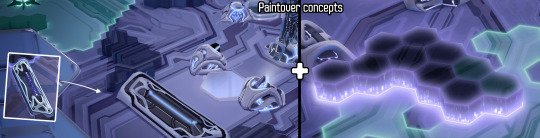

I then created more environment assets to have a wider diversity in the city-scape to create a symmetrical layout instead of the chaotic one we had before.
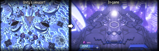
Lastly, I created the Access Node, which is your base building, from modeling to animation so we can emulate the feeling of the player jacking into the level and being ejected or destroyed when the Access Node loses all its Hit Points (HP).
Kelvin - VFX Artist

Hello all, for me this month it’s been a lot of UI work with some FX fixes sprinkled in. Reboot was around the corner and there was a lot we wanted to get done so that the players could give us feedback on it. Along with some fixes to the Transmission tower FX, I've been doing a ton of UI iterations.
We built a look for the script cards (both small and large versions), resource visuals, and general in-game UI. The most challenging task, besides reformatting my brain to think of UI again, was creating the script cards. We really had to find the balance between visually appealing cards and the amount of information given to the player.
youtube
I lean more towards giving the player a little bit less information and making the UI more appealing. This way, new players will have an easier time trying to adjust to the UI. You can't give them every piece of information and expect them to look through the UI thoroughly. So by putting less information, the players will be able to adapt to the game easier in the beginning and then look for more detailed information later down the line.
Also, by putting less information, this will keep the UI looking clean in the long run. Once players become veterans of the game, they need less information on the screen anyway. Although the current UI is still a WIP, I think the route we're going is heading in a good direction.
Amelie – UX Designer & Writer

Hey, everyone! So this month we focused a lot on the UI and the UX in order to show the best possible version of the game at Reboot Develop. The dynamic of the team was great and everybody was really motivated to iterate on the UX.
Our main interrogations were mostly about how to fit all that info on the cards that describe the scripts but still keep them easy to read, we need to prioritize information between the mini version of the card that remains visible at the bottom of the deck and the larger version of the card that you can access by hovering over it.
Other aspects we've worked on and are still investigating are how to make the link between data and territory more obvious and how to make your tech resource really intuitive to read when you're purchasing new scripts.
What we've got is much better than our previous version, I think, but there are still some tweaks we need to test. Apart from that, we worked on a first version of the tutorial. It was really valuable at Reboot to have this because we can now analyse the data we collected in our observations and interviews with the players and see where we need to focus more or how the steps and pace of the tutorial flow.
I wrote a questionnaire that our players filled in after playing which also allows us to set our next priorities regarding the improvement of the UX.
Last but not least I started to work on the narrative, this is probably the most exciting part for me. I just love the cyberpunk atmosphere that the team is bringing with this game and the really deep and contemporary questions that we want to broach on in Failure.
I believe that the narrative is going to be a central part of the game identity and so everybody's expectations are quite high with this, it's very challenging but when we'll get to the nitty gritty part it's going to be very rewarding as well. Maybe the title of the game even will take an even deeper meaning then...
Anyway, I have loads of ideas. I'm reading Snow Crash at the moment and it's the perfect inspiration, the characters are in my opinion very compelling and the themes are tackled in a subtle way, I'm also a big fan of Ghost In the Shell, the original anime and the comics. Using those masterpieces and others help me organize my thoughts and think about how we want to approach this question of the link between our access to unlimited information and the definition of our humanity.
When Ghost in the shell came out in 1995, it was a completely different context, the internet was a very new thing, and it's within this context that they questioned the definition of our humanity, through the dilemma of the body and the mind.
Today we're glued to our phones, we are connected almost constantly even if it's not yet through implants but I believe this relation to information and our ability to verify what is true or false instantly without relying on each other so much creates a whole new environment to look at this same old question.
We already started to work on an intro and we're going to iterate on that probably ten times before we get it right! I'm reusing the timeline that Anthony wrote for us when he could work on the project and of course, the work done on the factions from David but my focus now is to develop our main character.
What is his or her motivation at the start, what brings him into this slicers universe and how will this evolve as we progress in our investigation and understand what brought humanity to this state? Work on the antagonist force as well, our conflict, our controlling idea, the values and the emotions we want to manipulate, oh dear.... there is so much to do I should probably get back to it!
Ciao ciao
Daniel - Composer

This month we say a warm welcome to our latest member of the Dream Harvest Team, Daniel Elms. We’ll let his impressive bio speak for itself because it helps solidify his thoughts on the world of Failure: NeuroSlicers.
Composer of humanist, post-minimal music. Daniel crafts emotive soundscapes from intricate orchestral textures that are bursting with geometric rhythms and patterns; this rich orchestral language is interwoven with the electroacoustic instruments and urban sounds synonymous with his hometown, Hull, which together create a unique voice in the world of contemporary composition. He uses his music to make intimate commentaries on the plight of the individual, and to address the social and economic inequalities of his home, taking inspiration from the ideologies and philosophies of anarcho-syndicalist and progressive literature.
As well as creating music for both expansive and intimate performance venues, Daniel has a large and varied repertoire of collaborative works across feature film and theatre, including: the BAFTA- nominated ‘Ralph’, the Academy-Award-nominated ‘Library of Burned Books’, ‘Plaques and Tangles’ at Royal Court Theatre, and additional music for ‘Taboo’ by Ridley Scott and Tom Hardy, for which he worked closely with fellow composer Max Richter. In 2016, Daniel was commissioned by the British Film Institute to create a new work to celebrate his hometown as part of Hull City of Culture 2017 and was awarded Performing Right Society Foundation’s New Music Biennial Award as part of the commission; he was the recipient of the Musicians’ Benevolent Fund Emerging Excellence Award in 2013.
In 2017, Daniel will record and release his debut album of concert material, ‘Islandia’: an album of new music written for chamber orchestra and electronics in which expansive sonic landscapes are interspersed with driving rhythms and expressive textures. His BFI/PRS Foundation commission ‘Bethia’ will premiere as part of Hull City of Culture 2017 and will be performed in Hull and at the Royal Festival Hall, London, with a recorded broadcast by BBC Radio 3. Daniel will also be working on a soundtrack for the computer game ‘Failure: NeuroSlicers’ by game developer Dream Harvest Games, create the score for Abner Pastoll’s second feature film ‘A Good Woman is Hard to Find’, and record and produce various musical artists from his hometown, Hull, as part of City of Culture 2017.
ON FAILURE: NEUROSLICERS
Beneath the awesome visual styling and game mechanics of Failure, there are a lot of pertinent questions being asked by the story that can — and should — be applied to our own lives in the face of recent political, social, and technological upheavals. What this means for me as a composer is that there is a vast amount of content within the game that has the potential to bring relatable questions and commentary to the fore for those playing it and that there is the opportunity to blur the lines of distinction between our world and the world of Failure.
1 note
·
View note
Last Seen Blogs

mekamekabridged
we're the goddamn mekamekadan

horroror-blog
trash

paoutopia
Simplemente Una Extensión De Mí

glee-eyes
History

carolxdanvers
long-term long-distance low-commitment casual gf