#ok hope this helps :)
Text
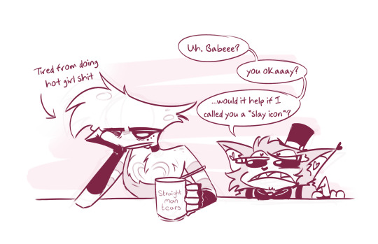
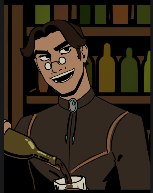
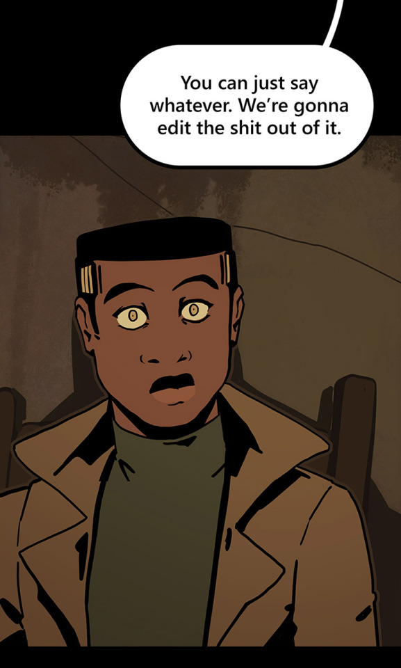
the thing is is that i don’t believe that odo would know he’s in love with kira. because he doesn’t eat or really have bodily functions but then out of nowhere his (nonexistent) stomach starts getting butterflies. he’d be like i’m literally dying. and then he’s go to julian and describe his symptoms, “doctor, major kira has a contagion and i believe she has spread it to me.” and julian is listening with his anime eyes nodding his head and then he says, “well, i’m afraid the diagnosis has no cure. you’re in love.” and then zoom in on odo. also at some point he spontaneously bursts into a swarm of insects to cope.
#ok hope this helps#he’s like my detective novels didn’t teach me this#also it’s so funny because i’m like mid season four and kira has THREE men after her#bareil is sobbing rn#ba bareil#ba ba bareil#speaketh the empress
1 note
·
View note
Text

the weirdest fucking thing to me is how men will be like "it's so hard being a man. no one cares that i'm sad. the loneliness we experience could NEVER be understood by a woman" and then also be like "btw i never talk to my friends and i don't know their names and i love hanging out with men because they don't talk about their stupid emotions all the time. women could never understand a bond like this." like ???
#this thread was so rancid lmfao#my favorite was 'we don't care if someone wants to relax on the couch!!! STOP NAGGING US!!!' like ????#go take care of your kids you deadbeat????#also SO many guys complaining that no one compliments them#ok so compliment another man.....#oh no you only want a woman to compliment you? ok.#women compliment each other that's why we get compliments lol#we do not want men to 'compliment' us hope this helps
17K notes
·
View notes
Text
I WANNA DRAAWW!! RAHHHGG!! Absolutely swamped with college work, im so tired TT (hence whatever tf this is lmao)
#posted this doodle on twitter yesterday but it's still very relevant today#fr cant do anything until I get 12 posters drawn make my homemade paper and finish/publish my 200 page book I'm gonna-#Send help#i miss being active sm :'((#SORRY TO THE 60+ ASKS IN MY INBOX I PROMISE ILL GET TO YOU SOON <333#anyway I hope everyone else is doing ok#sending love#(also husk please- stay off the internet lmao)#angel dust#angel dust fanart#husk#husk fanart#huskerdust#huskerdust fanart#hazbin hotel#hazbin hotel fanart#tribbleart#<3
5K notes
·
View notes
Text

tloz y2k fashion series???? anyone??? just me???
#ok 💔#trying desperately to get out of art block hope this helps#pls be extra nice to this piece im demotivated these days💔💔💔#my art#tloz#loz#the legend of zelda#zelink#zelda#link#tloz fanart#breath of the wild#botw#tloz botw#legend of zelda#botw zelink#botw zelda#botw link#princess zelda#zelda fanart#digital art
1K notes
·
View notes
Text
How I save time on backgrounds as a full-time webcomic artist
Hi! I make webcomics for a living, and I have to be able to draw a panel extremely fast to keep up with my deadlines. I draw about 50 panels a week, which gives me about 45 minutes per panel if I want any semblance of a healthy work-life balance.
Most webtoon artists save time on backgrounds by using 3d models, which works for them and is great! but personally I hate working in 3d... I went to school for it for a year and hated it so much I completely changed career paths and vowed never to do it again! So, this is how I save time without using any 3d, for those of you out there who don't like it either!
This tactic has also saved me money (3d models are expensive) and it has helped me converting my comic from scroll format into page format for print, because I have much more art to work with than what's actually in the panels. (I'll touch on this later)

So, first, I make my backgrounds huge. my default starting size is 10,000 x 10,000 pixels. My panels are 2,500 pixels wide, so my backgrounds are 4x that, minimum. Because of this, I make them less detailed than I could or that you might expect so it doesn't look weird against my character art when I shrink portions of it down.
I personally find it much easier to add in detail than to make "removing" details look natural at smaller sizes, but you might have different preferences than I do.
I also make sure to keep all of my elements on separate layers so that I can easily remove or replace them, I can move them to simulate different camera angles more easily, and it's simple to adjust the lighting to imply different times of day.

Then I can go ahead and copy/paste them into my episodes. I move the background around until it feels like it's properly fitting how I want.
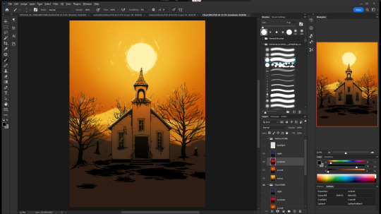
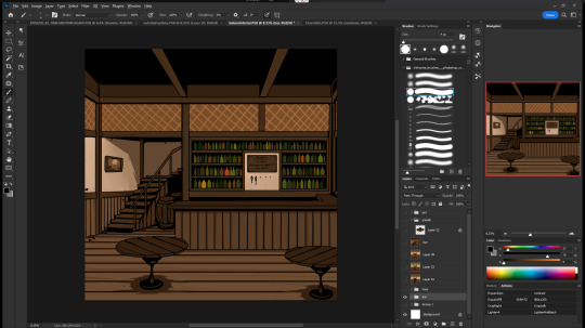
Once I've done that in every panel, I'll go back through the episode and clean up anything that looks weird, and add in solid blacks (for my art style) Here's a quick before and after of what that looks like!
This makes 90% of my backgrounds take me just a few hours. This is my tactic when I'm working in an environment that an entire scene, or multiple scenes, will take place.
But many panels will inevitably have a location that's used exactly once, and it would waste time and effort to draw a massive background for those. So in 10% of cases, I just draw the single panel background in the episode. I save all of these, just in case I can re-use it later (this happens more often with outdoor locations, but I save them all nonetheless!)
I generally have to draw about 2 big backgrounds per episode, and 3-5 single-panel backgrounds per episode! At the beginning of an arc/book the number is higher, but as the series is continuing and I'm building up an asset library of indoor and outdoor elements to re-use for the book, the number generally goes down and I save more time.
My series involves time travel and mysteries, so there's a lot of new locations in it and we're constantly moving around. If I were working on a series that was more consistent in this aspect, this process would save me even more time!
Like I said earlier, this also saves me a lot of pain and gives me a lot more options as I'm converting from scroll format to print format!
panels that look like this in scroll format...

can look like this in print!

because I drew the background like this, so I didn't need to go through the additional effort to add in the extra detail to expand it outwards at all.
Anyways, I hope this helps someone! As always if it doesn't help, just go ahead and disregard. This is what I do and what works for me, and I feel like I only ever see time-saving tips for comics that involve 3d models and workflows, which don't work for me at all! I know there's more people like me out there, so this is for you!
Enjoy!
Also obligatory "my webcomic" if you want to see this in action or check it out!
#webcomic tips#webcomic making#comic tips#comic tutorial#art tutorial#art tips#time and time again#my ocs#digital art#ttawebcomic#hmmmm....#longpost#yeah it's a long post#I'll claim this one#lots of images#I hope this helps#I'm always worried when I make some kind of guide or tutorial people are gonna get mad at me lmao#I'm not saying 3d models are bad to use!!!#I just dont like them!#my brain doesnt work like that and it feels SO so so so tedious to me#TO ME PERSONALLY!!!#plenty of people see 3d models as a total lifesaver#and that's perfectly fine!#but yeah I don't see tutorials about saving time in comics that like... dont... mention 3d models...#like what about me and the other extremely particular girlies who hate 3d#anyways#yeah#just hoping this helps#nothing against 3d at all#I mean. ok personally yes against it cause it sucks for me to use
1K notes
·
View notes
Text
bugs when you lift up a rock
#GYAAAAAH oh god the tags. help me#project sekai#pjsk#prsk#emu otori#proseka#tsukasa tenma#nene kusanagi#rui kamishiro#mmj#leoneed#wxs#more more jump#wonderlands x showtime#HAPPY BRITHDYA SAKI I FAKWKNG LOVE YOUUU#ichika hoshino#saki tenma#honami mochizuki#shiho hinomori#minori hanasato#haruka kiritani#airi momoi#shizuku hinomori#Time for my secret tags. IF YOU'LL BE AT ANIME NORTH THIS SATURDAY AND SUNDAY I WILL BE HANDING SOME OF THESE OUT ..#and i will FINISH VBS AND NIIGO GOD WILLING 🤞#um itll just be paper i dont know i dont have sticker paper. im making some into magnets for friends w what i have left of magnet paper#THERES A 30 TAG LIMIT? ok well im makign cosplayer for the next 2 weeks and im so scared ALSO MIKUEXPO TORONTO GYAAAAAH!!!!!#if youll be at mikuexpo toronto i hope to being some with me to give no promises tho. i'll be .. cosplaying tsukasa .... on public transit.#AGAIN. to get there. anyways i need to lock in goodnight love you sorry to asks i havent answered im sleepy#yhis ones dedicated to the person who said my art tastes like hard candy. little candy bobbleheads for you
1K notes
·
View notes
Text
tbh as someone with largely invisible disabilities it’s so validating when people see me and are like “woah u look dead rn” like yeah thats how i always feel 😭 it just happens to show rn
#my cousin walked in n was like oh damn u look like shit are u ok 😭#no i am not ! hope that helps 🫶#0#disability#chronic fatigue#disabled#chronic pain
835 notes
·
View notes
Text


jakey + dirkjake sandwiched between my organic chem notes. a poem in there somewhere
#homestuck#hom3stuck#home24uck#home2t4ck#jake english#dirk strider#erisolsprite#brobot#dirkjake#admin draws#fanart#ok so the latter two are. a bit old and drawn in a rush because as usual i had thoughts about dirkjake and hair BUT ALSO#while reading the post-timeskip chatlogs i was like hm jake's hair looks kinda long here. i might be crazy tho#and then i continued thinking. because Ive had jakes haircut and t has to be trimmed often and i dont trust his ass to competently do that#so i think brobot helped out there and post entry it fell on dirk to trim it#and i think as their relationship worsened the first thing to properly go was the haircuts. because jake couldnt be assed to sit in dirk's#company for the duration of a haircut. direct line of strider word vomit while ur held captive basically (massive overdramatization)#so. its a good thing he got interrupted after trying to cover the tattoo up. because i guarantee you he wouldve been waking up on that#quest bed with breakup bangs.#finally formatted this one in drafts to post so im not leaving yall too high and dry again#i see my askbox and i appreciate it btw! its terraria night but i hope to be drawing tomorrow :]
721 notes
·
View notes
Text
The Autism Urge to be Helpful

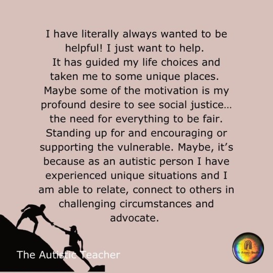
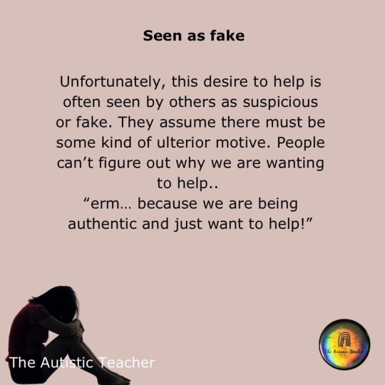

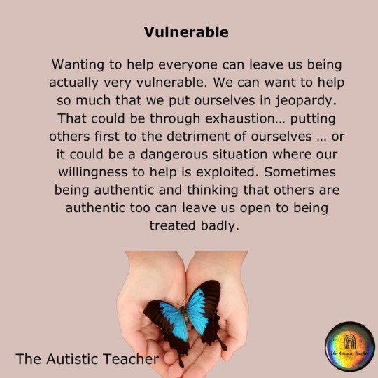

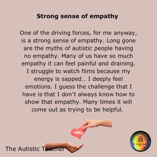
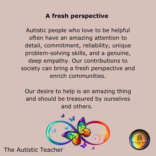
The Autistic Teacher
#autism#actually autistic#the urge to be helpful#some might think it’s fake#I hope some don’t think I’m TOO helpful#helping others can leave us vulnerable#we unique why of thinking#some of us have a strong sense of empathy#but it’s ok to have little or no empathy#neurodivergence#neurodiversity#actually neurodivergent#feel free to share/reblog#The Autistic Teacher (Facebook)
1K notes
·
View notes
Text
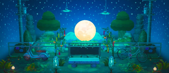
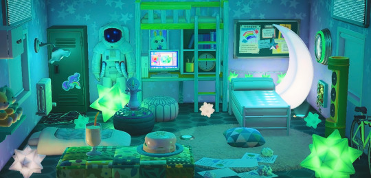
sasha's house
#my post#animal crossing#animal crossing new horizons#acnh#achhp#animal crossing happy home paradise#sasha achhp#idk if it's just my phone or tumblr mobile in general but my pics always look so blurry before i post them#but on my laptop it looks fine HELP i hope these look ok 😫
2K notes
·
View notes
Text
I CANT SEE THE END OF THE HORIZON

HATSUNE STANLEY?!!!!
sum stanley sketches from when i was trying to figure out just how to draw this man


#HELP#hatsune stanley..save me hatsune stanley#this is what happens when i realize i can draw anything#anyway i hope this looks ok this is my first time drawing stan the man#hes so cute i wanna vomit#the stanley parable#tsp stanley#digital art#my art#artwork#art#tsp#tspud#the stanley parable: ultra deluxe#the reassurance bucket#tsp bucket#this is a call for help
476 notes
·
View notes
Text
been thinking about pok a lot again and that moment when riz told him sklonda was dating gorthalax (in some capacity or another) and pok just went quiet for a bit before he wished her well and like. he's riz's father to such a degree that it hurts. he died young, got to paradise and then said, ok time to go back to work, chop chop. and he does take breaks to listen to riz at his grave and he works in a beautiful meadow when he's not down in hell and -literally speaking- he does sit down but metaphorically he keeps on going and going.
and i'm just imagining that- obviously he knows that he's dead, right? but the human* brain is weird in that way where you'll know things, and you might even sit with them and think you've processed them, but then something will hit you out of left field and you'll realize there are so many aspects of the situation you hadn't internalized yet, and i think that one of those aspects for pok was sklonda, or rather all the dimensions in which her life branched off after he died. because with riz he'd always been painfully aware that his kid was growing up and changing, but with sklonda it's a bit more complicated, it's a bit easier to process the grief of being apart from her, purely on an unconscious level, as being away for work. he's working, she's working, she probably tells him about her work and about riz and riz includes his mom in his stories and it's like, oh this is horribly painful, that i can't be there, but in a way he and sklonda share a lot of what they used to when he was working abroad, no matter how far apart- they're always connected by their love for each other and the quiet but omnipresent nuptial tie and the state of being riz's parents.
and then he's suddenly hit with the reality of an area of sklonda's life that hadn't been on his mind before, considering they were happily and monogamously married. truly just a matter of like, this is not a space you occupy anymore, you're fucking dead, until death do us part and all that, and she might still love you but she loves you like a dead husband like a source of grief like the man she once knew not a living partner. and it's neither of their faults, it's purely a tragedy, and he genuinely wishes her the best because he loves her, he doesn't want her to be alone nor does he expect her to be faithful past reason and the vow they made to each other. but the grief of it still really fucking stings, doesn't it?
#pok gukgak#sklonda gukgak#riz gukgak#the gukgaks#fantasy high#fhsy#fantasy high sophomore year#i have no idea if this makes sense it's an attempt at articulating mush and they exist as multitudes in my brain#and the tenses are all over the place but rly if u get it u get it#im just incredibly abnormal about pok and sklonda ok its so fucking sad#i do hope that at least i articulated that i dont think pok was jealous or anything so benign and unimportant#i do gen see it as him being grief stricken. keep moving keep moving so u dont have to think abt the pain of others moving#and then GAH riz is so much like him. he rly is so much like his dad. help me#dan talks
507 notes
·
View notes
Text
top ten most devastating yaoi breakups
EDIT: omg please click for better quality this app sucks
#sort of redraw of the photo from tim medical records unboxing#idk if it help to tag it but i hope ur eyeballs are ok#eyestrain#marble hornets#my art
475 notes
·
View notes
Text
Game Informer's Dragon Age: The Veilguard coverage archive (MASTERPOST)
---
Please note that in some cases article titles were updated at some point after first being published, e.g. the "A Deep Dive Into Dragon Age: The Veilguard’s Expansive Character Creator" article is the same article as "Dragon Age: The Veilguard's Character Creator Is BioWare's Most Robust Yet".
First, here is an archive of the 'index/contents' page, GI's DA:TV "Hub" - [link, Wayback Machine link]
---
✅ "Cover Reveal - Dragon Age: The Veilguard" - by Wesley LeBlanc - June 9th. [link, Wayback Machine link]
✅ "Get Your First Look At Dragon Age: The Veilguard's Real-Time Action Combat In First Gameplay Trailer" - by Wesley LeBlanc - June 11th. [link, Wayback Machine link]
✅ "The Dragon Age: The Veilguard Digital Issue Is Now Live" - by Kyle Hilliard - June 18th. [link, Wayback Machine link]
✅ "Returning To The Magic" - by Wesley LeBlanc - June 18th. COVER STORY. [link to screenshots of article, link to another collection of screenshots, link to typed transcript (credit: @acealistair), link to reblog of typed transcript]
✅ "A Deep Dive Into Dragon Age: The Veilguard's Combat, Abilities, Skill Tree, And More" - by Wesley LeBlanc - June 18th. [link, Wayback Machine link]
✅ "Dragon Age: The Veilguard's Leads On The Name Change And Solas' Role In The Story" - by Wesley LeBlanc - June 20th. [link, Wayback Machine link]
✅ "Ahead Of Dragon Age: The Veilguard, The Entire Series Is On Sale For $10" - by Wesley LeBlanc - June 21st. [link, Wayback Machine link]
✅ "Breaking Down Dragon Age: The Veilguard's Classes And Factions" - by Wesley LeBlanc - June 25th. [link, Wayback Machine link]
✅ "Dragon Age Cover Story And Shadow Of The Erdtree Review | GI Show" - by Alex Van Aken - June 27th. CONTAINS A GAME INFORMER VIDEO. [link, Wayback Machine link, link to video on YouTube, backup link to video]
✅ "Dragon Age: The Veilguard's Character Creator Is BioWare's Most Robust Yet" - by Wesley LeBlanc - June 27th. [link, Wayback Machine link]
✅ "Here's How Dragon Age: The Veilguard's 'Unbound' Option Lets You Customize Difficulty And More" - by Wesley LeBlanc - July 1st. [link, Wayback Machine link]
✅ "Dragon Age: The Veilguard Will Feature A 'Robust' Transmog System At Launch" - by Wesley LeBlanc - July 4th. [link, Wayback Machine link]
[character limit text break!]
✅ "Companions Can Romance And Form Relationships With Each Other In Dragon Age: The Veilguard" - by Wesley LeBlanc - July 8th. [link, Wayback Machine link]
✅ "Yes, Dragon Age: The Veilguard Has Nudity, And I've Seen It" - by Wesley LeBlanc - July 10th. [link, Wayback Machine link]
✅ "A Deep Dive Into BioWare's Companion Design Philosophy In Dragon Age: The Veilguard" - by Wesley LeBlanc - July 15th. [link, Wayback Machine link]
✅ "Dragon Age: The Veilguard Is 'Respectful And Referential' To Previous Games Without Making Them Mandatory" - by Wesley LeBlanc - July 17th. [link, Wayback Machine link]
✅ "BioWare Leads Discuss The Making Of Dragon Age: The Veilguard" - by Alex Van Aken - July 19th. CONTAINS A GAME INFORMER VIDEO. [link (post contains the video), Wayback Machine link]
✅ "Here's The Main Voice Cast For Dragon Age: The Veilguard" - by Charles Harte - July 22nd. [link, Wayback Machine]
✅ "Everything We Know About Dragon Age: The Veilguard's Bellara Lutara [later corrected to Lutare]" - by Wesley LeBlanc - July 22nd. [link, Wayback Machine link]
✅ "Here's Your First Look At Dark Horse's Upcoming 'The Art Of Dragon Age: The Veilguard' Book'" - by Wesley LeBlanc - July 24th. [link, Wayback Machine link]
#dragon age: the veilguard#dragon age the veilguard spoilers#dragon age: dreadwolf#dragon age 4#the dread wolf rises#da4#dragon age#bioware#video games#solas#acealistair#long post#longpost#ref stuff#hope this helps ^^#if any of the links don't work or seem to go to the wrong place please let me know#ok thats this project done :) this post has my link + wayback machine's link to every piece of DA:TV coverage#there are around 20 pages/features#each post contains the images and formatting etc as well
208 notes
·
View notes
Text
why Aurora's art is genius
It's break for me, and I've been meaning to sit down and read the Aurora webcomic (https://comicaurora.com/, @comicaurora on Tumblr) for quite a bit. So I did that over the last few days.
And… y'know. I can't actually say "I should've read this earlier," because otherwise I would've been up at 2:30-3am when I had responsibilities in the morning and I couldn't have properly enjoyed it, but. Holy shit guys THIS COMIC.
I intended to just do a generalized "hello this is all the things I love about this story," and I wrote a paragraph or two about art style. …and then another. And another. And I realized I needed to actually reference things so I would stop being too vague. I was reading the comic on my tablet or phone, because I wanted to stay curled up in my chair, but I type at a big monitor and so I saw more details… aaaaaand it turned into its own giant-ass post.
SO. Enjoy a few thousand words of me nerding out about this insanely cool art style and how fucking gorgeous this comic is? (There are screenshots, I promise it isn't just a wall of text.) In my defense, I just spent two semesters in graphic design classes focusing on the Adobe Suite, so… I get to be a nerd about pretty things…???
All positive feedback btw! No downers here. <3
---
I cannot emphasize enough how much I love the beautiful, simple stylistic method of drawing characters and figures. It is absolutely stunning and effortless and utterly graceful—it is so hard to capture the sheer beauty and fluidity of the human form in such a fashion. Even a simple outline of a character feels dynamic! It's gorgeous!
Though I do have a love-hate relationship with this, because my artistic side looks at that lovely simplicity, goes "I CAN DO THAT!" and then I sit down and go to the paper and realize that no, in fact, I cannot do that yet, because that simplicity is born of a hell of a lot of practice and understanding of bodies and actually is really hard to do. It's a very developed style that only looks simple because the artist knows what they're doing. The human body is hard to pull off, and this comic does so beautifully and makes it look effortless.
Also: line weight line weight line weight. It's especially important in simplified shapes and figures like this, and hoo boy is it used excellently. It's especially apparent the newer the pages get—I love watching that improvement over time—but with simpler figures and lines, you get nice light lines to emphasize both smaller details, like in the draping of clothing and the curls of hair—which, hello, yes—and thicker lines to emphasize bigger and more important details and silhouettes. It's the sort of thing that's essential to most illustrations, but I wanted to make a note of it because it's so vital to this art style.
THE USE OF LAYER BLENDING MODES OH MY GODS. (...uhhh, apologies to the people who don't know what that means, it's a digital art program thing? This article explains it for beginners.)
Bear with me, I just finished my second Photoshop course, I spent months and months working on projects with this shit so I see the genius use of Screen and/or its siblings (of which there are many—if I say "Screen" here, assume I mean the entire umbrella of Screen blending modes and possibly Overlay) and go nuts, but seriously it's so clever and also fucking gorgeous:
Firstly: the use of screened-on sound effect words over an action? A "CRACK" written over a branch and then put on Screen in glowy green so that it's subtle enough that it doesn't disrupt the visual flow, but still sticks out enough to make itself heard? Little "scritches" that are transparent where they're laid on without outlines to emphasize the sound without disrupting the underlying image? FUCK YES. I haven't seen this done literally anywhere else—granted, I haven't read a massive amount of comics, but I've read enough—and it is so clever and I adore it. Examples:


Secondly: The beautiful lighting effects. The curling leaves, all the magic, the various glowing eyes, the fog, the way it's all so vividly colored but doesn't burn your eyeballs out—a balance that's way harder to achieve than you'd think—and the soft glows around them, eeeee it's so pretty so pretty SO PRETTY. Not sure if some of these are Outer/Inner Glow/Shadow layer effects or if it's entirely hand-drawn, but major kudos either way; I can see the beautiful use of blending modes and I SALUTE YOUR GENIUS.
I keep looking at some of this stuff and go "is that a layer effect or is it done by hand?" Because you can make some similar things with the Satin layer effect in Photoshop (I don't know if other programs have this? I'm gonna have to find out since I won't have access to PS for much longer ;-;) that resembles some of the swirly inner bits on some of the lit effects, but I'm not sure if it is that or not. Or you could mask over textures? There's... many ways to do it.
If done by hand: oh my gods the patience, how. If done with layer effects: really clever work that knows how to stop said effects from looking wonky, because ugh those things get temperamental. If done with a layer of texture that's been masked over: very, very good masking work. No matter the method, pretty shimmers and swirly bits inside the bigger pretty swirls!
Next: The way color contrast is used! I will never be over the glowy green-on-black Primordial Life vibes when Alinua gets dropped into that… unconscious space?? with Life, for example, and the sharp contrast of vines and crack and branches and leaves against pitch black is just visually stunning. The way the roots sink into the ground and the three-dimensional sensation of it is particularly badass here:

Friggin. How does this imply depth like that. HOW. IT'S SO FREAKING COOL.
A huge point here is also color language and use! Everybody has their own particular shade, generally matching their eyes, magic, and personality, and I adore how this is used to make it clear who's talking or who's doing an action. That was especially apparent to me with Dainix and Falst in the caves—their colors are both fairly warm, but quite distinct, and I love how this clarifies who's doing what in panels with a lot of action from both of them. There is a particular bit that stuck out to me, so I dug up the panels (see this page and the following one https://comicaurora.com/aurora/1-20-30/):

(Gods it looks even prettier now that I put it against a plain background. Also, appreciation to Falst for managing a bridal-carry midair, damn.)
The way that their colors MERGE here! And the immense attention to detail in doing so—Dainix is higher up than Falst is in the first panel, so Dainix's orange fades into Falst's orange at the base. The next panel has gold up top and orange on bottom; we can't really tell in that panel where each of them are, but that's carried over to the next panel—

—where we now see that Falst's position is raised above Dainix's due to the way he's carrying him. (Points for continuity!) And, of course, we see the little "huffs" flowing from orange to yellow over their heads (where Dainix's head is higher than Falst's) to merge the sound of their breathing, which is absurdly clever because it emphasizes to the viewer how we hear two sets of huffing overlaying each other, not one. Absolutely brilliant.
(A few other notes of appreciation to that panel: beautiful glows around them, the sparks, the jagged silhouette of the spider legs, the lovely colors that have no right to make the area around a spider corpse that pretty, the excellent texturing on the cave walls plus perspective, the way Falst's movements imply Dainix's hefty weight, the natural posing of the characters, their on-point expressions that convey exactly how fuckin terrifying everything is right now, the slight glows to their eyes, and also they're just handsome boys <3)
Next up: Rain!!!! So well done! It's subtle enough that it never ever disrupts the impact of the focal point, but evident enough you can tell! And more importantly: THE MIST OFF THE CHARACTERS. Rain does this irl, it has that little vapor that comes off you and makes that little misty effect that plays with lighting, it's so cool-looking and here it's used to such pretty effect!
One of the panel captions says something about it blurring out all the injuries on the characters but like THAT AIN'T TOO BIG OF A PROBLEM when it gets across the environmental vibes, and also that'd be how it would look in real life too so like… outside viewer's angle is the same as the characters', mostly? my point is: that's the environment!!! that's the vibes, that's the feel! It gets it across and it does so in the most pretty way possible!
And another thing re: rain, the use of it to establish perspective, particularly in panels like this—

—where we can tell we're looking down at Tynan due to the perspective on the rain and where it's pointing. Excellent. (Also, kudos for looking down and emphasizing how Tynan's losing his advantage—lovely use of visual storytelling.)
Additionally, the misting here:

We see it most heavily in the leftmost panel, where it's quite foggy as you would expect in a rainstorm, especially in an environment with a lot of heat, but it's also lightly powdered on in the following two panels and tends to follow light sources, which makes complete sense given how light bounces off particles in the air.
A major point of strength in these too is a thorough understanding of lighting, like rim lighting, the various hues and shades, and an intricate understanding of how light bounces off surfaces even when they're in shadow (we'll see a faint glow in spots where characters are half in shadow, but that's how it would work in real life, because of how light bounces around).
Bringing some of these points together: the fluidity of the lines in magic, and the way simple glowing lines are used to emphasize motion and the magic itself, is deeply clever. I'm basically pulling at random from panels and there's definitely even better examples, but here's one (see this page https://comicaurora.com/aurora/1-16-33/):

First panel, listed in numbers because these build on each other:
The tension of the lines in Tess's magic here. This works on a couple levels: first, the way she's holding her fists, as if she's pulling a rope taut.
The way there's one primary line, emphasizing the rope feeling, accompanied by smaller ones.
The additional lines starbursting around her hands, to indicate the energy crackling in her hands and how she's doing a good bit more than just holding it. (That combined with the fists suggests some tension to the magic, too.) Also the variations in brightness, a feature you'll find in actual lightning. :D Additional kudos for how the lightning sparks and breaks off the metal of the sword.
A handful of miscellaneous notes on the second panel:
The reflection of the flames in Erin's typically dark blue eyes (which bears a remarkable resemblance to Dainix, incidentally—almost a thematic sort of parallel given Erin's using the same magic Dainix specializes in?)
The flowing of fabric in the wind and associated variation in the lineart
The way Erin's tattoos interact with the fire he's pulling to his hand
The way the rain overlays some of the fainter areas of fire (attention! to! detail! hell yeah!)
I could go on. I won't because this is a lot of writing already.
Third panel gets paragraphs, not bullets:
Erin's giant-ass "FWOOM" of fire there, and the way the outline of the word is puffy-edged and gradated to feel almost three-dimensional, plus once again using Screen or a variation on it so that the stars show up in the background. All this against that stunning plume of fire, which ripples and sparks so gorgeously, and the ending "om" of the onomatopoeia is emphasized incredibly brightly against that, adding to the punch of it and making the plume feel even brighter.
Also, once again, rain helping establish perspective, especially in how it's very angular in the left side of the panel and then slowly becomes more like a point to the right to indicate it's falling directly down on the viewer. Add in the bright, beautiful glow effects, fainter but no less important black lines beneath them to emphasize the sky and smoke and the like, and the stunningly beautiful lighting and gradated glows surrounding Erin plus the lightning jagging up at him from below, and you get one hell of an impactful panel right there. (And there is definitely more in there I could break down, this is just a lot already.)
And in general: The colors in this? Incredible. The blues and purples and oranges and golds compliment so well, and it's all so rich.
Like, seriously, just throughout the whole comic, the use of gradients, blending modes, color balance and hues, all the things, all the things, it makes for the most beautiful effects and glows and such a rich environment. There's a very distinct style to this comic in its simplified backgrounds (which I recognize are done partly because it's way easier and also backgrounds are so time-consuming dear gods but lemme say this) and vivid, smoothly drawn characters; the simplicity lets them come to the front and gives room for those beautiful, richly saturated focal points, letting the stylized designs of the magic and characters shine. The use of distinct silhouettes is insanely good. Honestly, complex backgrounds might run the risk of making everything too visually busy in this case. It's just, augh, so GORGEOUS.
Another bit, take a look at this page (https://comicaurora.com/aurora/1-15-28/):

It's not quite as evident here as it is in the next page, but this one does some other fun things so I'm grabbing it. Points:
Once again, using different colors to represent different character actions. The "WHAM" of Kendal hitting the ground is caused by Dainix's force, so it's orange (and kudos for doubling the word over to add a shake effect). But we see blue layered underneath, which could be an environmental choice, but might also be because it's Kendal, whose color is blue.
And speaking off, take a look at the right-most panel on top, where Kendal grabs the spear: his motion is, again, illustrated in bright blue, versus the atmospheric screened-on orange lines that point toward him around the whole panel (I'm sure these have a name, I think they might be more of a manga thing though and the only experience I have in manga is reading a bit of Fullmetal Alchemist). Those lines emphasize the weight of the spear being shoved at him, and their color tells us Dainix is responsible for it.
One of my all-time favorite effects in this comic is the way cracks manifest across Dainix's body to represent when he starts to lose control; it is utterly gorgeous and wonderfully thematic. These are more evident in the page before and after this one, but you get a decent idea here. I love the way they glow softly, the way the fire juuuust flickers through at the start and then becomes more evident over time, and the cracks feel so realistic, like his skin is made of pottery. Additional points for how fire begins to creep into his hair.
A small detail that's generally consistent across the comic, but which I want to make note of here because you can see it pretty well: Kendal's eyes glow about the same as the jewel in his sword, mirroring his connection to said sword and calling back to how the jewel became Vash's eye temporarily and thus was once Kendal's eye. You can always see this connection (though there might be some spots where this also changes in a symbolic manner; I went through it quickly on the first time around, so I'll pay more attention when I inevitably reread this), where Kendal's always got that little shine of blue in his eyes the same as the jewel. It's a beautiful visual parallel that encourages the reader to subconsciously link them together, especially since the lines used to illustrate character movements typically mirror their eye color. It's an extension of Kendal.
Did I mention how ABSOLUTELY BEAUTIFUL the colors in this are?
Also, the mythological/legend-type scenes are illustrated in familiar style often used for that type of story, a simple and heavily symbolic two-dimensional cave-painting-like look. They are absolutely beautiful on many levels, employing simple, lovely gradients, slightly rougher and thicker lineart that is nonetheless smoothly beautiful, and working with clear silhouettes (a major strength of this art style, but also a strength in the comic overall). But in particular, I wanted to call attention to a particular thing (see this page https://comicaurora.com/aurora/1-12-4/):

The flowing symbolic lineart surrounding each character. This is actually quite consistent across characters—see also Life's typical lines and how they curl:

What's particularly interesting here is how these symbols are often similar, but not the same. Vash's lines are always smooth, clean curls, often playing off each other and echoing one another like ripples in a pond. You'd think they'd look too similar to Life's—but they don't. Life's curl like vines, and they remain connected; where one curve might echo another but exist entirely detached from each other in Vash's, Life's lines still remain wound together, because vines are continuous and don't float around. :P
Tahraim's are less continuous, often breaking up with significantly smaller bits and pieces floating around like—of course—sparks, and come to sharper points. These are also constants: we see the vines repeated over and over in Alinua's dreams of Life, and the echoing ripples of Vash are consistent wherever we encounter him. Kendal's dream of the ghost citizens of the city of Vash in the last few chapters is filled with these rippling, echoing patterns, to beautiful effect (https://comicaurora.com/aurora/1-20-14/):

They ripple and spiral, often in long, sinuous curves, with smooth elegance. It reminds me a great deal of images of space and sine waves and the like. This establishes a definite feel to these different characters and their magic. And the thing is, that's not something that had to be done—the colors are good at emphasizing who's who. But it was done, and it adds a whole other dimension to the story. Whenever you're in a deity's domain, you know whose it is no matter the color.
Regarding that shape language, I wanted to make another note, too—Vash is sometimes described as chaotic and doing what he likes, which is interesting to me, because smooth, elegant curves and the color blue aren't generally associated with chaos. So while Vash might behave like that on the surface, I'm guessing he's got a lot more going on underneath; he's probably much more intentional in his actions than you'd think at a glance, and he is certainly quite caring with his city. The other thing is that this suits Kendal perfectly. He's a paragon character; he is kind, virtuous, and self-sacrificing, and often we see him aiming to calm others and keep them safe. Blue is such a good color for him. There is… probably more to this, but I'm not deep enough in yet to say.
And here's the thing: I'm only scratching the surface. There is so much more here I'm not covering (color palettes! outfits! character design! environment! the deities! so much more!) and a lot more I can't cover, because I don't have the experience; this is me as a hobbyist artist who happened to take a couple design classes because I wanted to. The art style to this comic is so clever and creative and beautiful, though, I just had to go off about it. <3
...brownie points for getting all the way down here? Have a cookie.
#aurora comic#aurora webcomic#comicaurora#art analysis#...I hope those are the right tags???#new fandom new tagging practices to learn ig#much thanks for something to read while I try to rest my wrists. carpal tunnel BAD. (ignore that I wrote this I've got braces ok it's fine)#anyway! I HAVE. MANY MORE THOUGHTS. ON THE STORY ITSELF. THIS LOVELY STORY#also a collection of reactions to a chunk of the comic before I hit the point where I was too busy reading to write anything down#idk how to format those tho#...yeet them into one post...???#eh I usually don't go off this much these days but this seems like a smaller tight-knit fandom so... might as well help build it?#and I have a little more time thanks to break so#oh yes also shoutout to my insanely awesome professor for teaching me all the technical stuff from this he is LOVELY#made an incredibly complex program into something comprehensible <3#synapse talks
760 notes
·
View notes
Text
"a plate, a fork and knife, and a drinking chalice are at the end of a massive table...both a funny and sad look at solas' isolated existence"


#9 years of this btw 👍👍👍#dragon age the veilguard#dragon age#solas#datv spoilers#dragon age the veilguard spoilers#da4 spoilers#ok i still dont know how to tag this game but i hope these will help people avoid the spoilers#im gonna go lie down now#me when he wasn't joking about din'anshiral#im soo glad the lighthouse is his place!!!#we're going to get so much of his story not just via murals letters and notes (do u guys think he has a diary......) but by just looking at#the design of the lighthouse :')
299 notes
·
View notes
Last Seen Blogs

elxgantcaptain
World's most famous crook

techbazaar
Untitled


skal-grim
The Eremitt's Tale

futbolheadz
FutbolHeadz Apparel