#the bird is iconic and recognizable
Text

#twitter#it is such nothing#like its nothing#x marks the death wound#the bird made sense#the bird is iconic and recognizable#for all that i hate twitter#this doesn't even make sense#but i guess tumblr already took the t
2 notes
·
View notes
Text

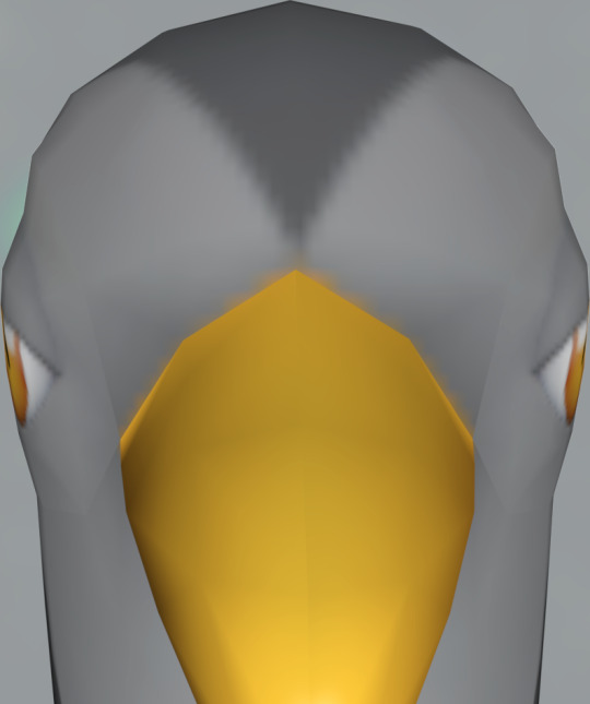
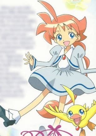
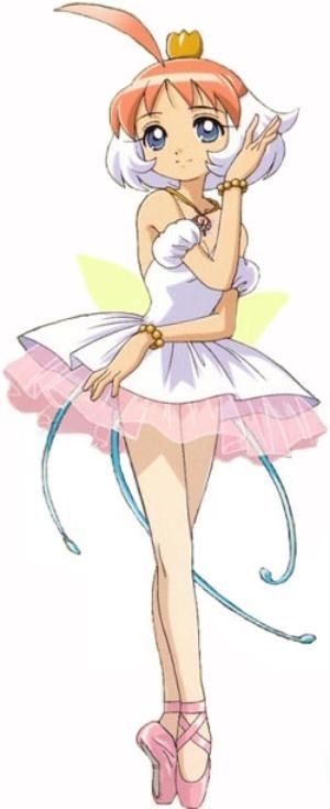
#unfezant#female under the cut. i think the male one is more recognizable since it's at the very least not Just A Bird#again nothing to say. i guess this is more iconic than tranquill
54 notes
·
View notes
Text
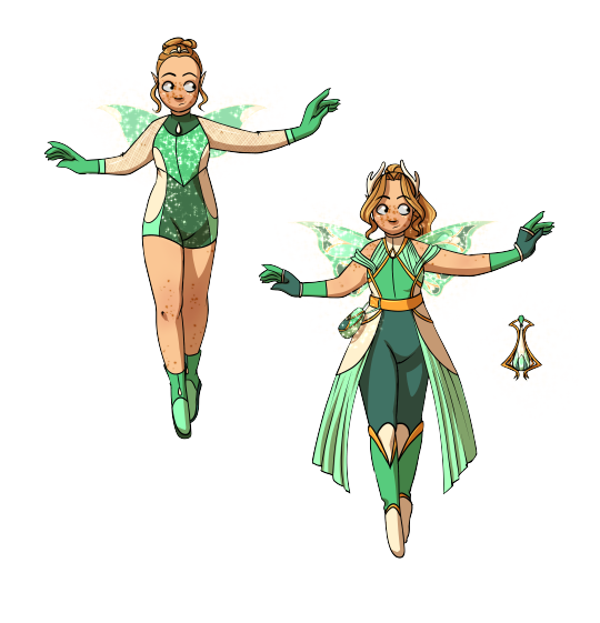
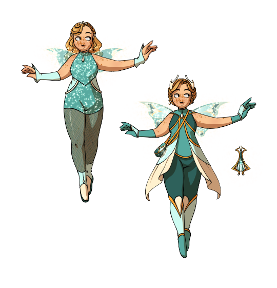
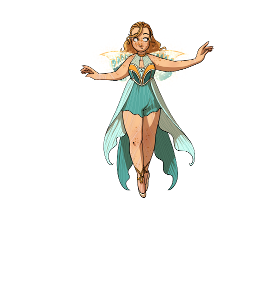

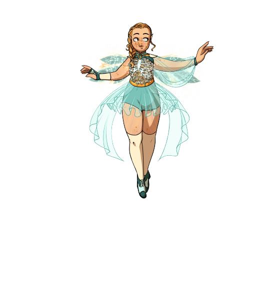
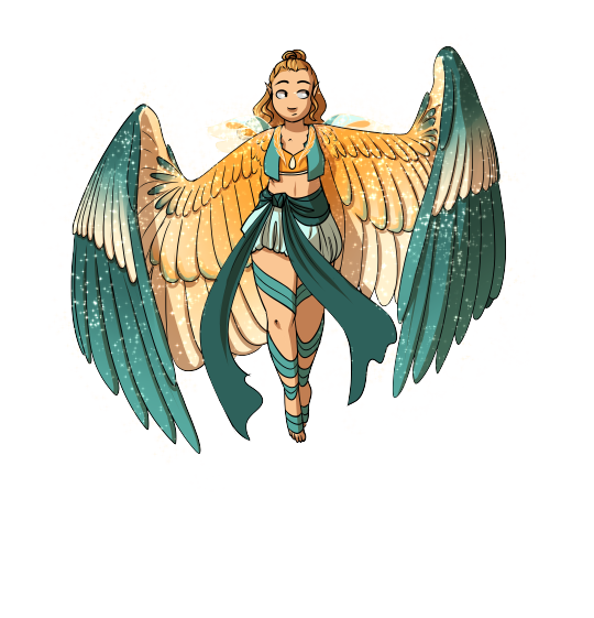
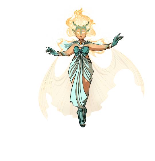
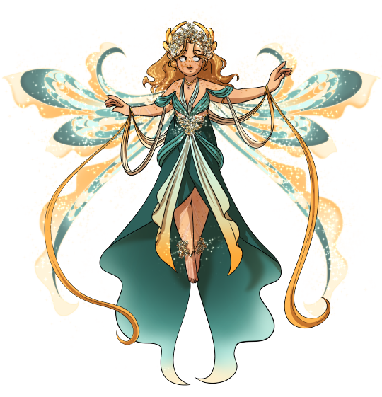
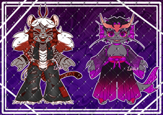
ALL OF DAPHNE'S TRANSFORMATIONS. INCLUDING UPDATED NYMPHIX.
Previously Fairy of the Dragon Flame now Fairy of Embers. She doesn't have any transformations others than these because she was fast tracked into the nymphix path, and unlike the winx the majority of fairies don't pursue additional transformations past enchantix. (i think Daphne would be interested in Dreamix tho, so maybe I'll draw that eventually.
Her major color shifted after dying and being revived, which is shown in her winx and enchantix.
other lore and design notes below!
I changed her major color from orange/yellow to more of a teal/green because. she just doesn't look good in yellow I'm sorry I really tried but it wasn't working. Also little updates to her hair color, nothing huge tho. Daphne's primary motifs are a branching "Y" shape and a double oval/tear drop. She's a pants when possible girlie and a one set winger(yes her nymphix looks like it have multiple wings but they all merge into one stem on each side) . Her scars from her Sirenix being ripped out of her caused her winx/enchantix to change a little to cover them(mostly seen in the arms) due to insecurity. Her Dryadix/nymphix flower is a daffodil! because pun Daph-Daff, and Daffodils symbolize rebirth and new beginnings (also creativity, energy, resilience, forgiveness and vitality). Her Harpix wings aren't super specificly patterned, but she has darting wings common in small song and seed birds (robins, finches, brown birds etc.) the coloring is referential of a Shrike (also called a Butcher Bird), because Daphne was. incredibly dangerous and if she had sided with the ancestral probably would have been given a moniker similar to Butcher of Domino or Daphne the Slaughterer. (some people do call her these but its mostly among people who dislike Domino/The Royal Family.)
Lore! Daphne doesn't have a great sense of self, she was planned as a necessary successor to Marion/the dragon flame in a period as the ancestral witches were escalating their attacks and search for the dragon flame. Bloom was a back up baby in case both Daphne and Marion got dead and basically worked as intended haha. Daphne was also much more publicly involved in the kingdom than many of the other royals in winx (Stella, Aisha, Krystal and even Galatea to an extent all had rather sheltered upbringings) in a way Daphne is much more like Sky and Thoren in the since that none of them really had the space to develop their own personality outside of their familial duty.
Daphne's 1st winx and enchantixes are as direct a copy of her mom's Enchantix as you can get with transformations, right down to the more greenish tint of her major color. Growing up Marion used her fairy form liberally, so that, combined with being the next Dragon Flame holder left a deep impact on Daphne's subconscious. Daphne was also heavily influenced by Faragonda during her Alfea and Nymphix Quest years, but since she was older this isn't as deep an influence. After being revived, Daphne's years of defining herself as her connection to Bloom causes her major color to shift more blue in response to her trauma. Daphne is slowly starting to develop a sense of self outside of her titles/connections but it's unlikely her major color will shift again unless she has another major trauma.
(for the record the Winx do have trauma over the timeline I have laid out that would potentially cause their major colors to shift but I didn't do that for a couple reasons 1, their colors are iconic and make them easily recognizable as characters; 2, I'm a tired bitch. )
#winx#winxems#winx club#winx daphne#enchantix#harmonix#sirenix#dryadix#harpix#coatlnix#nymphix#DONT look at these too closely the line art and some coloring is a mess i got sick of them half way through#Fairy of embers title subject to change but i like it for now#something about Daphne is so wrong I want to put her in a jar and study her <3
329 notes
·
View notes
Text

MOST ICONIC BIRD CALL BRACKET: ROUND TWO: MOURNING DOVE vs. COMMON LOON
IN THE BLUE CORNER, we have a very special guest, the mournful monstrosity, the MOURNING DOVE!
this opponent is beloved by fans across north america for its plaintive, distinctive call. that recognizable series of coos is sometimes mistaken for an owl - and folks, much like the owl, the mourning dove is a true predator once it enters the ring. this isn't any ordinary match - it's a battle of heart and soul, of determination and grit. and tonight, there can only be one winner. will the mourning dove be able to claim victory? or will its opponent prove to be too much to handle? there's only one way to find out!
IN THE RED CORNER, from the crystal clear waters of the north, we have the pop culture phenomenon, the COMMON LOON!
with its sleek black and white plumage and piercing red eyes, this bird means business. the most common thing about this bird is its call, which has found its way into the backgrounds of dozens of movies whether the loon has any business being there or not. you can blame that on how haunting and otherworldly it is - a true shortcut to sending a shiver down the spines of audiences everywhere. so brace yourself for a match like no other as the common loon takes flight and dominates the competition. its strength and agility will leave you in awe, and its ferocity will leave you trembling. get ready, bird call fans, because the common loon is here to rule the ring!
1K notes
·
View notes
Text

Another warbler for the collection! This one's an icon, the Yellow Rumped Warbler is a common and recognizable songbird throughout its extensive range in North America :3 I based this particular design on the "Myrtle" subspecies, as these occur in my area (Florida) but there are several different subspecies with varying plumages. If you'd like to grab this guy on a sticker or something, you can find it here:
68 notes
·
View notes
Text
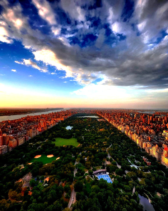
Central Park is a famous and iconic urban park located in the heart of Manhattan, New York City. It is one of the most visited and well-known parks in the world, covering an area of approximately 843 acres (341 hectares). Central Park offers a wide range of recreational, cultural, and natural attractions for both residents and visitors to enjoy.
Here are some key features and aspects of Central Park:
History: Central Park was designed by landscape architects Frederick Law Olmsted and Calvert Vaux and was officially opened in 1858. It was created to provide a green oasis in the midst of the rapidly growing and industrializing city, serving as a place for relaxation, recreation, and cultural enrichment.
Landscape and Design: The park's design incorporates a diverse array of landscapes, including open meadows, woodlands, ponds, lakes, and formal gardens. It features winding pathways, picturesque bridges, and scenic vistas. The design was influenced by the "romantic" or naturalistic style, with the intention of creating a harmonious environment where visitors could escape the hustle and bustle of the city.
Attractions: Central Park boasts numerous attractions, including:
The Central Park Zoo: A small but popular zoo within the park.
The Central Park Conservatory Garden: A beautifully landscaped formal garden.
The Great Lawn: A vast open space often used for concerts and events.
The Jacqueline Kennedy Onassis Reservoir: A scenic jogging and walking track around a large reservoir.
Bethesda Terrace and Fountain: An iconic gathering spot with stunning architectural features.
Strawberry Fields: A tribute to John Lennon, featuring the "Imagine" mosaic.
The Loeb Boathouse: Offering boat rentals and dining with a view of the Central Park Lake.
The Metropolitan Museum of Art: While not technically part of the park, it is located along its eastern edge, often referred to as the "Museum Mile."
Activities: Visitors can engage in a wide range of activities within Central Park, such as jogging, picnicking, biking, bird-watching, horseback riding, and ice skating in the winter. The park also hosts various events, including concerts, theater performances, and outdoor movies during the summer months.
Conservancy: The Central Park Conservancy is a private, nonprofit organization that plays a significant role in maintaining and preserving the park. It raises funds for park improvements, restoration projects, and ongoing maintenance efforts.
Filming Location: Central Park has been a popular location for movies and television shows over the years, making it instantly recognizable to audiences around the world.
Central Park's enduring popularity and iconic status make it a must-visit destination for anyone traveling to New York City. It provides a peaceful and natural escape in the midst of the urban jungle and serves as a testament to the value of green spaces in urban planning.
#Central Park#new york city#new york#manhattan#newyork#new-york#nyc#ny#urban#city#usa#United States#buildings#travel#journey#outdoors#street#architecture#visit-new-york.tumblr.com
173 notes
·
View notes
Text
Aciddrop is a Barn Swallow (Hirundo rustica)!

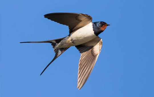
Artist credits: Lanzi
Passeriforme from the family of the Hirundinidae (swallows), the Barn Swallow is without any doubt the most widespread species of swallow in the world, easily recognizable with its red throat, cone shaped body, and its long rectrices. The bird is mostly known for nesting in man-made structures, hence their name, and its closeness with humans. Insectivore, it catches its preys during flight, usually flies and aphids. In culture, the Barn Swallow is often seen as a symbol of the coming of spring, as it returns to the northen hemisphere countries to breed after the passage of winter.
Aciddrop is commonly represented with Barn Swallows, may it be on her Elite 2 artwork, her Afternoon Teatime skin, or even on her designer's personal artworks. In general, swallows spend the most of their lives in flight, hunting, drinking, and even bathing during flight - which led to a common belief that those birds lacked of feet. Its ease of flight and speed are probably what inspired Lanzi to chose this bird for the character, a great skateboarder, and even a champion in local Columbian tournaments, as well as an excellent marksman with the ability to use her crossbow while skateboarding. Her reputation as a street icon can be associated to how the Barn Swallow is a popular city bird, and a largely appreciated one.
She used to shine like a sun and be a model for the youth, but an accident where she has been victim of an agression had left her Infected, and to disappear from Columbia. Maybe one day she will return to the front of the scene, shining like a star on the podium of the tournaments, just like swallows will return to announce the coming of better days.
"A toast to freedom, a toast to oinion rings, and a toast to myself." - Aciddrop
56 notes
·
View notes
Text
Remember to read about the contestants before voting!
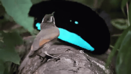
Superb Bird of Paradise!
This little dancing bird should be recognizable to most internet patrons. Their distinctive dance, in which their feathers form an elliptical disc around their face with the vibrant blue popping against the dark black as they hop about the female, is mesmerizing to say the very least. The female to male ratio is considerably different, and with there being less females to woo, this gives the males a better incentive to have an elaborate dance. Learn more!
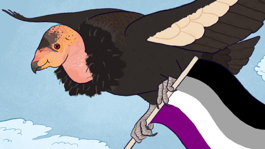
California Condor
The blast from the past, the California Condor is not entirely unlike the Coelacanth. They are from a time of giants, a prehistoric creature who is STILL WITH US today! This particular Condor is sporting an asexual flag because there is evidence that they have performed parthenogenesis! An asexual icon! There are so few of them, almost all of them are tagged with particular names. It was brought back from the brink of extinction, and we are very lucky to still have them here with us. Learn More!
(Superb Bird of Paradise gif by BBC)
(California Condor Art by @tertain-the-original )
#bird battle#round three#birds#polls#superb bird of paradise#bird of paradise#California condor#condor
247 notes
·
View notes
Text
Rambling about character design
I could talk hours about this topic
This will include examples of my own characters and characters from media!
I personally love when people take the concept for their character and incorporate things like:
Backstory
Personality
Etc into their design
For example!
I have a character who’s a spider monster.
And you can still incorporate spider like details into her without making it to obvious. Liiiike, the sides of her bangs cut down and curve inward, resembling spider pinchers
Also, clothes help a lot with this as well if you want things like subtle character design
Shape language is also great.
I have a character whose main shape is hearts.
I gave her high pigtails to resemble the shape of a heart. But she’s also a villainous character, so if she’s in the middle of battle and the wind is in her hair, her pigtails fly up and resemble the shape of horns
(ALSO WEAPONS OMG!!! So, i gave her two weapons.
A bow and a staff.
I gave her the bow for two reasons. One, to represent Cupid (not the heart themes). But also to represent her personality. In her regular civilian form, she’s very distant and reserved, always keeping people at an arms length. That’s what the bow represents. But for her staff, which is used for violent bludgeoning, it represents her villainous persona, where she’s extremely violent and forward.
The reason why in this story i wrote for her, she’s the only one to get two weapons is because every other character who is a hero uses their personas to amplify and be the person they want to be.
But with this character, neither her civilian nor her villainous character are who she really is. Weapons can do so much to tell you about the character)
This guy explains it better than I can
One of my favorite character designs is of Ahiru from Princess Tutu. She is heavily based on Swan Lake, The Swan Princess, and The Ugly Duckling.
In her regular form, her hair puffs up at the front in order to represent bird plumage.
But in her transformed appearance, her underpart of her hair is white to represent feathers and a transformation, her tiara looks like a broken egg shell
Small details like that can go a long way with telling people who your character is and can indirectly take someone’s brain to a certain idea or image.
And silhouettes are hugely important as well!! Recognizable silhouettes can do so much to get both you as an artist and your characters to be so iconic.
Even for basic human designs, you can do so much.
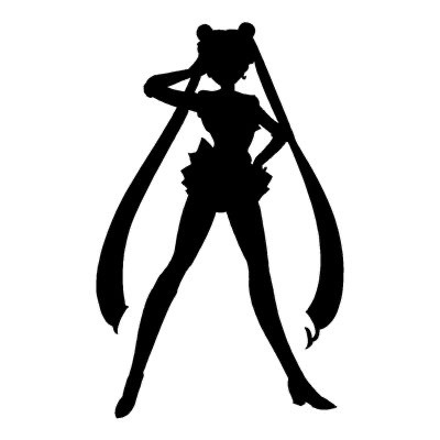
An absolutely iconic example of this is Sailor Moon. Her whole silhouette is basic and normal,

but one simple aspect of her, her hair, can tell the viewer immediately who the character is
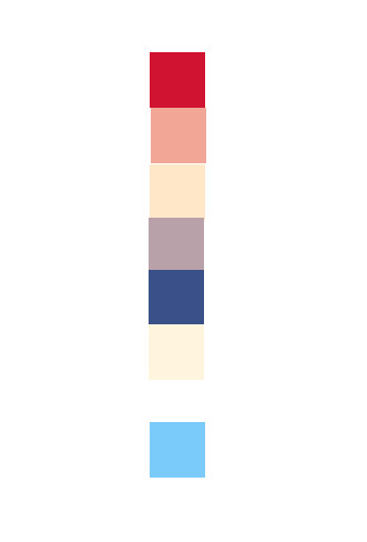
Colors too are huge! An example of a good and recognizable color scheme is what I call the pixel rule
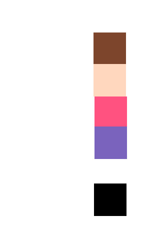
When you see these pixel, does a certain character come to your mind? Are those colors in the order making you think of someone?
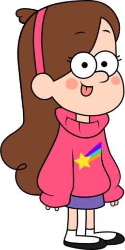
If you said Mabel Pines, you’d be correct!
Ok, let’s get a bit trickier.
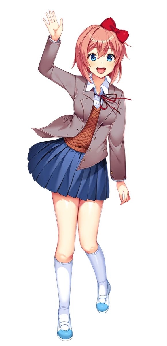
What about this one? It’s a bit longer, meaning there’s more complexities to her design. But do the colors in that order make you think of anything?
Recognizable color patterns can do so, SO much. And that’s not even talking about color theory!!
I’m not nearly skilled enough to talk about color theory, but I’ll do the basics.
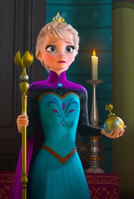
Warm colors can make a person think of comfort, safety, and kindness. An example is Anna!
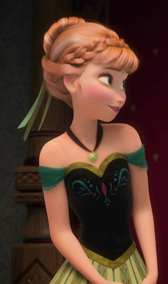
Her colors are heavily summer based to contrast:
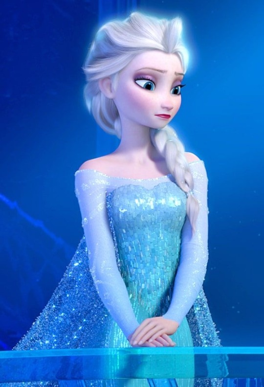
Elsa, who has cool colors. Cool colors can make a person think distant, cold, and reserved.
But warm colors don’t always automatically mean a safe and comfort feeling.
An example is Toilet Bound Hanako. This series is known for prioritizing warm colors 24/7
It makes the environment seem cozy and comforting, but the series knows how to use this safe feeing of colors to its advantage.
This image is still warm, but with the dark colors and eery shades of red-pink, it no longer feels comforting or safe.
At the moment I can’t think of anything cool colored that manages to subvert expectations as well, but it definitely is possible.
Anyways, thank you for listening to my rambles ❤️
#character design#Art#color theory#Princess tutu#sailor moon#gravity falls#Ddlc#doki doki literature club#Frozen#tbhk#rambles#Flora rambles#character art#character analysis#Ptutu#silhouette
12 notes
·
View notes
Text
Animal adopts!!
Do they make sense or really look like the animal? No. Are they cute? Yes. Made these little guys on my mini's base so I can hit the up coming bills and gets me a little treat!! As always these are Payp*l only and for an extra $15 I will draw an icon for them!! DM me if interested. And please remember to read my rules there have been a few changes!!!
Banyana Goldie(15): SOLD
Betta Fish Fuschia(10): SOLD
Rock'n Tiger Rust(15): SOLD
I prommy it's a shark Violet(10): SOLD
Lyre Bird Rust(10): SOLD
Gargoyle Geko Anon(15): ON HOLD
Mystic Fennec Purple(20): SOLD
Outlawed Squid Fuschia(20): SOLD
Please keep the design recognizable. But I don't mind changes.
You may NOT edit my work in any form or way.
Please credit me for the design!
You may NOT repost the original art anywhere except for toyhouse to which you will still need to credit me for the design.
IF THE ADOPT IS POC DO NOT CHANGE THAT DETAIL
Blood color and gender up to you!
I don't mind if you change their species
Please do not resell. Gifting is fine.
I can hold for 3 days max
Any future commissions of adopts brought from me will have discount.
PLEASE DO NOT USE THE ADOPTS FOR GROSS STUFF ( hate messages, racism, N/FTS etc etc use common sense)
ADOPTS WILL NOT BE USED FOR COMMERCIAL USE. (you can however buy commercial use license)
ABSOLUTELY NO USE OF AI WITH ANY OF MY WORKS
Message me the word Goat so I know you read the rules!
15 notes
·
View notes
Text
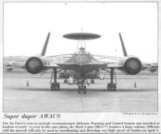
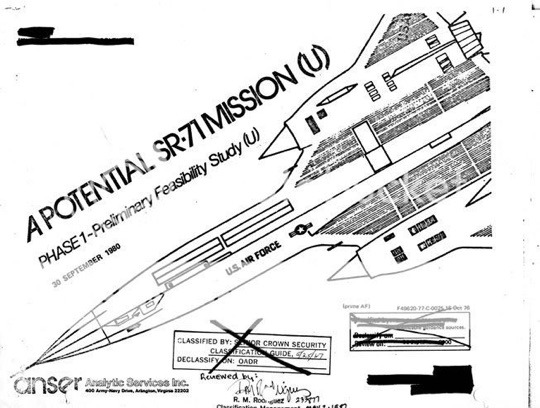
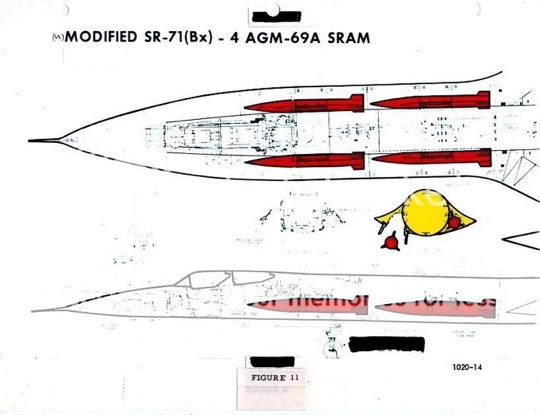
BREAKING NEWS: A recent poll by the United States Air Force revealed that the American people want to see the SR-71 Blackbird brought back to the skies! We need all former SR 71 pilots and RSO’s to check and see if they can fit into their flight suits.
As a result and after very successful tests conducted in 2022, during which retired SR-71s were reactivated for test trials, the U.S. Air Force and DoD decided to team up to allow new pilot recruits into the SR-71 program.
Not only will these new elite SR-71 pilots experience flying faster than a speeding bullet with stunning views at the edge of the stratosphere, they will feel pride in serving their country in one of the most recognizable aircraft to ever exist.
As an added incentive and early bird bonus, the new pilots will receive free t-shirts printed with the image of the iconic Blackbird! ( see pictures below for your T-shirt design)
Do you think you’re ready to be accepted into this elite program? Please send all pilot applications to: [email protected]
Good luck, everyone😄~Linda
PS: I have my father‘s old orange flight suit I can fit into it so I am ready to fly!
THIS IS A APRIL FOOLS JOKE🤣🤣
@Habubrats71 via X
8 notes
·
View notes
Text
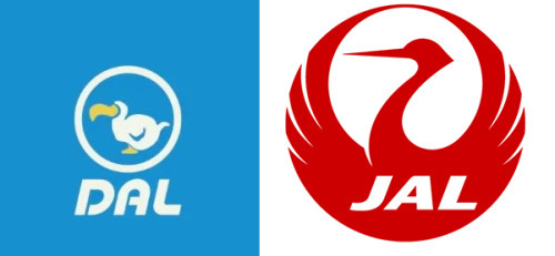
No. 11 - Japan Airlines(’s logos)
Last time on Runway Runway, @vultureworth asked me to cover the fictional little plane from cartoon animal doing cute things game Animal Crossing. The airline featured in the game, Dodo Airlines, has a logo which is a nod to JAL’s iconic Tsurumaru crane logo.
...can we talk about the JAL logo? And the liveries which came with it, I guess, but I’m really here to talk about JAL’s old logos.
(but someone did request JAL, and the logos and liveries are absolutely not independent from each other, so we will also discuss the liveries.)

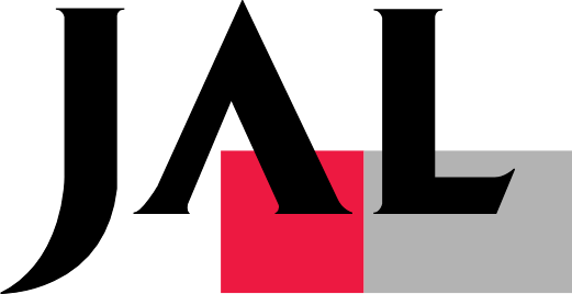
The Tsurumaru, designed by Jerry Huff at Botsford, Constantine and Gardner of San Francisco, has been a mainstay of the airline since its 1959 introduction, but it hasn’t always been the main logo. In that sense there’s been a real on-off relationship with it, and they’ve had some pretty weird stuff in the interim. Like, does anyone else remember this? This...thing?

From 2002 to 2011 this was the JAL logo. Am I alone in hating this so so so so much? The shaded three-dimensional curve overlaid on the entirely flat black text is, frankly, the stuff of nightmares. I cannot believe anyone would willingly replace the Tsurumaru with this monstrosity, even if you try to jazz it up with a fancy name like 'arc of the sun'. I have an even harder time believing this was designed by Landor Associates. Did something terrible happen to them in 2002? How does something like this get created and approved?
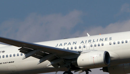
Okay, okay. Fine, it’s ugly. How does the plane look overall?
Sure. Sweet and simple. Okay. I like the metallic color framing in the slice of red on the winglets, I like the shade of red used on the plane itself. The fully matte circular cutout is striking. My issue here is that this feels like three liveries hastily stapled together - the logo, the red winglets and fin, and then the full JAPAN AIRLINES text. Nothing is stringing them together at all. Why is the red so matte if the logo is reflective and shiny?! Why are the tail and winglets the only elements that tie into each other in any way?!
This is straight up blue. This color doesn’t appear anywhere on the rest of the livery. It’s just blue.
I thought for a minute I was inventing the concept of this and that it was just the same metal color used for accents elsewhere but...no...I got out CSP and did some eyedropping in a bunch of different places just to make sure it wasn’t an artifact of the lighting and
Yeah, I’m pretty sure that’s blue. I feel like this is definitely blue. Am I insane or is this blue. What in the world. I hate it when a livery has features I like at first glance but then you look closer and it starts falling apart.
D+. This weird 2002 livery and logo gets a D+. I don’t like this.
Moving on. Moving on promptly.
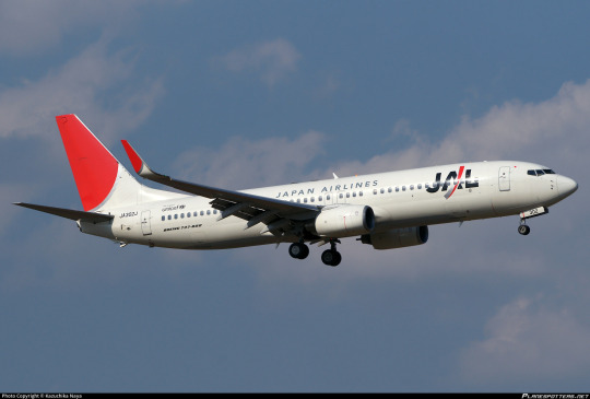
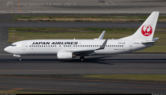
From 1989 to 2002 they also had this wordmark, another Landor design, which I actually don’t hate. For one, they kept the Tsurumaru on the tail throughout instead of canning it entirely - already a huge plus. Also, the typeface is better (darker, better contrasting, DELIGHTFULLY spikey), the red used is a lot nicer, and the uniform flatness makes the text actually pop somewhat, versus the 2002-2011 logo which kind of obscures it. This is fine. I don’t dislike this at all. But okay. Okay. Enough about wordmarks. How does it look on the plane?

This is very messed up. Last time I hated the logo but thought the high concept of the livery itself was fine. This time I like the logo but I think this livery is sort of nonsense. It’s almost all white, and then it has a bunch of features stapled on - the Tsurumaru, the ‘J Bird’, and the picture of a bird that’s just there? And it has a tiny illegible little ‘Japan Airlines’ written on it, as if people don’t know what JAL stands for. As if they’re not one of the biggest and most recognizable airlines on this planet. And as if this text for ants would help them if they didn’t.
I really, really like the logo and how it’s integrated here. The grey wrapping around the nose is really fantastic. I like that part. I like that part a lot.
I still have to give this a D+ because the rest of it is so incoherent.
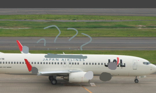
At this point I’ve sort of come to a conclusion about JAL - oh, I should probably mention their modern livery while I’m going into this dramatic mental spiral, shouldn’t I?
Font choice is good. Tsurumaru looks nice as always. Really a shame they realized this and went “awesome, we don’t need to design the rest of the plane then”.
D+. Try harder. Apply yourself. Meet me after class. This is making me sad.
It somehow just feels like all of JAL’s liveries were an afterthought that nobody thought to put any creativity or real consideration into. It sucks because Japan is obviously full of incredible graphic designers and rich artistic traditions to pull on for iconography. (Bafflingly, in the 50s they used an American advertising agency, so the Tsurumaru was actually designed by a Westerner, which feels so wrong, doesn’t it?) Look, I lived in Japan as a child, so even if just having eyes and seeing photographs and accounts wasn’t enough to know this - Japan has way more to offer than a plain white fuselage with elements that feel like they were picked at random to just get the design process over with. The white doesn’t feel clean and intentional and meaningful like it does on some of the nearly-all-white liveries that I actually like (yes, they exist, I have two queued right now!), it just feels like nobody bothered to design the plane! It makes me very sad.
One of the reasons it’s making me sad is that I have a vision of what this could be. Keep the red and grey logo and the little line that goes around the nose. Keep the red winglets and fins. Maybe make the red circle on the fin larger so it envelops more of the rear fuselage. Put the Tsurumaru silhouette over it, so the bits of the logo which are white are painted over it and you clearly see its head. Does that make sense? Am I conjuring an image in your head?
Well, JAL certainly doesn’t see my vision. And I don’t currently have a graphics tablet so I can’t do anything to make anyone see it. You’ll just have to use your imagination, I’m afraid.
And I also have to mark all of these down for not also having the airline’s name in kanji. Especially when JAL’s nickname in Japanese, ‘Nikkō’, is literally written in two characters - “日航” - which would take up next to no space at all and be pretty easy to integrate. I know it’s like three letters, a fairly large portion of Japanese people read at least some English, and even those that don’t can probably recognize the text for ‘JAPAN AIRLINES’, but it kind of goes beyond an accessibility thing. I don’t think Japanese people actually have any meaningful issue with planes only having English text on them, or at least I hope not, because I can’t find a single airline in the country that does feature kanji (or any other form of Japanese text) on its livery, but I actually still think that JAL should do it anyway. A flag carrier is meant to represent the country it flies for. Latin is not the official or most commonly used script in Japan, and it feels very wrong for what is basically the country’s brand to exclusively use it.
But we’re not here to talk about their liveries anymore, even though they make me sad.. That verdict has been passed. No...what brought me here is their logo.
JAL first adopted the Tsurumaru in 1959, like I said. The airline, however, has existed since 1951.
So...what is this mystery logo from the dark ages of JAL’s branding?
This Star Wars situation.
I don’t know what I think about this. I don’t know how to feel. This just isn’t a JAL logo. My mind refuses to comprehend this fact. This is sincerely bizarre.
...this typeface is so weird that I almost think I like it.
I can’t find any properly sourced images of planes from this era, but they seem to only have the logo very small and lack anything except the airline’s name written in plain black kanji on a blank metal fuselage, which is...typical for that period. This is barely about the livery at this point anyway. This post was all an excuse to expose you all to the 1951 JAL logo.
Well. You’re welcome.
A D+ for Japan Airlines, shockingly consistent in their shocking incoherence since at least 1989.
#tarmac fashion week#grade: d+#region: japan#region: east asia#region: asia#era: 1980s#era: 1990s#era: 2000s#era: 2010s#era: 2020s#japan airlines#flag carriers#retired liveries#landor portfolio#double sunrise#long haul#requests
31 notes
·
View notes
Text
#staravia#constantly getting this one and staraptor's names mixed up. something about route 1 birds that just makes them so memorable but#simultaneously so forgettable at the same time. does that make any sense?? i think it does. this is like. objectively a clean middle-evo#it makes a lot of sense to come after starly. it just looks like a grown-up version of starly. and it makes sense to evolve into staraptor#but it's just *kinda* boring! i have to say. starly is cute and recognizable. super iconic. staraptor is cool and has hair. badass. this guy#really just is the middle child i feel like. revolutionary commentary i know
47 notes
·
View notes
Text
I thought you guys might enjoy reading me infodump about my watcher and avian head canons, so uh here ya go! (This also relates to some of the hcs I have for Grian)
All avians are short (4-5 feet) and have bird-like double jointed legs. Their bones are hollow, but flexible, and their skeleton is more fit for to be streamlined. Specifically their skull has a less defined nose that allows for them to not suffocate when flying at high speeds. The muscular structure is and the muscles themselves are different from a regular human. For example, four pecs (two for arms, two for wings). Internal organs are switched around to make room for the expanded lungs and air sac. Avians have tail feathers and ear feathers and a second pair of eyelids. Their eyes also have a much higher shutter speed and depth perception. And the wings are large (to allow for lift and to avoid hitting shoulders) and attach on the lower middle back. Avians tend to be weaker than your average human because the muscle mass mostly goes towards the wings. And also because of their hollow bones. Their hands have harder keratin in the nails, but nothing too much. And a lot of other features, but these are the basic physical things. Avians are all different types so features can vary depending on the species of bird they are derived from. Avians also tend to have bird like instincts.
Watchers, on the other hand, absolutely defy every law of physics and biology. Their physical form has six sets of wings (the primary back ones, set further up the back, and the secondary lower back ones, then the trinary ear ones). The wings are iridescent and have been described as mesmerizing, likened to gazing into the void. It is hard to tell much about their genetic make up because they aren't really living things, they are gods. They do not necessarily have blood and flesh in their true forms. In their most recognizable form that can be imbibed by mortals the majority of the time is a tall, skeletal humanoid with vastly large wings (larger than an avian's). The wings sometimes appear to look like a cloak. They do not have tail feathers or taloned feet. Nor do they have the make up of an avian body. However, they have clawed hands that appear to be stained black. Strange. This form is clothed a purple cloak and robes and most often adorned with gold jewelry. And the iconic white mask. Often times, the area under the mask (which only covers the eyes) is stained purple. They bleed void and are basically made of it, they can't go anywhere without the void, but can still See even with no void. There are numerous eyes over their body and wings (most numbering on the primares, face, neck arms, legs, and torso) but are often closed and unseen. Watchers also sometimes have various tatoos of different symbols specific to them. They do not need to eat, sleep, breathe, or anything else that a living thing needs to do. But they do need the void. This form can be described as imposing and a harbinger of dread. Ethereal and godly and ominous. Watchers are known shapeshifters, condensing or expanding their forms to Watch. Watchers have admin abilities as well and can easily alter code.
How does this apply to Grian?
Grain was born an avain. When he got kidnapped by the Watchers, they basically ripped out his essence out of his body, made him into a watcher. But instead of forming a new vessel for his watcher form, he fought back into his original body. That body changed. He has ear wings, and his back pair sometimes switch to a magenta/white with eye patterns. He does have multiple eyes, but not as numerous and are closed. And his fingers are clawed. It was a struggle for him to breathe properly in that body because of being in the void and his avian-ness.
But he would not give it up. Because of using his original body, he was susceptible to much more human issues. Like pain, starvation, exhaustion, etc. And it hindered his watcher abilities. Like his shapeshifts into solid forms arent as smooth. But the Watchers thought it to be funny and sort of like a punishment. Once Grian had been with the Watchers for awhile, they planned to get rid of his body. Grian escaped from them and connected to Mumbo in his panic and got to hermitcraft. His watcher features might not be very distinguishable from an avain, but those who know what they are looking for can tell immediately.
Okay that's all! If you read all of this, you get a cookie of your favorite flavor. Here ya go! 🍪
#watcher#evolution smp#grian#watcher grian#hermitcraft#headcanon#listen to me infodump about random topics#avian#evo smp
23 notes
·
View notes
Text

MOST ICONIC BIRD CALL BRACKET: ROUND 3: WOOD THRUSH vs. KOOKABURRA
IN THE BLUE CORNER, prepare yourselves for a mesmerizing encounter with nature's symphony. let's give a harmonious ovation to the enchanting songstress, the WOOD THRUSH!
wth feathers adorned in earthy hues and a voice that rivals the sweetest symphonies, this avian virtuoso is a mesmerizing sight to behold. the wood thrush is capable of singing two notes at the same time, harmonizing with itself with every song. but don't underestimate the wood thrush's gentle demeanor, for beneath its delicate exterior lies a spirit of resilience and determination.
prepare to be serenaded as we witness the harmonious fusion of athleticism and beauty in the wood thrush. tonight, this avian maestro will take flight, captivating us all with its breathtaking grace and melodic prowess.
IN THE RED CORNER, get ready for a wild ride of laughter and excitement! coming in from the land down under, brace yourselves for the uproarious and electrifying presence of the KOOKABURRA!
with a beak that carries the promise of echoing laughter and feathers that shimmer with a bronze palette, this avian jester is a true master of entertainment. known for its infectious chuckles and mischievous charisma, the kookaburra embodies pure joy and exhilaration. this comical daredevil thrives in the spotlight, reminding everyone that laughter is indeed the best medicine. that famous laugh is recognizable from the foley work in almost any scene that takes place in the jungle, whether it's the kookaburra's native australia or not.
so, get ready to giggle and cheer as we witness the uproarious antics and high-flying stunts of the kookaburra. tonight, this feathered comedian will take center stage, bringing laughter and excitement to new heights. prepare for a whirlwind of hilarity and unparalleled entertainment, as the kookaburra spreads its wings and delivers a show that will leave you in stitches!
140 notes
·
View notes
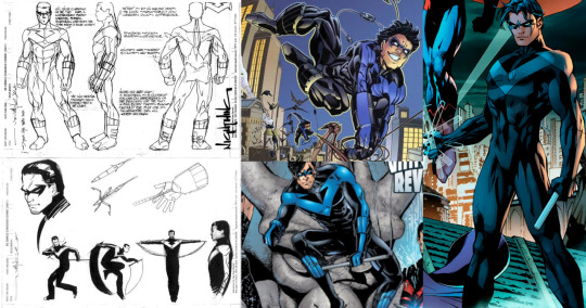
Photo

Dick Grayson’s Nightwing Suits (1/2) - Comics Canon Edition
Over the years Dick has had many Nightwing suits. Some of them look quite different - especially in his first decade as Nightwing - while others have gotten slight variations over the years. Dick’s most recognizable Nightwing suites can be seen above.
70s-80s suit: DISCOWING
Created by: George Perez
First Appearance: Tales of the Teen Titans #44 (1983)
Dick’s first Nightwing suit is the most colorful of the bunch. It owes its name to the popular disco fashion of its time. Even though the darker fabric of Dick’s first costume is often colored in a darker blue, it’s actually intended to be black. The variations of the suit mostly differentiate themselves by the height of Dick’s collar and the deepness of his neckline. On some occasions, the golden feathers already get replaced by the golden squares more prevalent to Dick’s second outfit.
The origin of Dick’s suit depends on his Nightwing origin. In some cases, it was his father's old aerial suit that later got repurposed by Alfred to make Dick a suit, while in other cases Starfire made him the suit. In Nightwing Year One, we see that Deadman also had a suit inspired by John Grayson’s aerial suit.

90s suit: MULLETWING
Created by: Tom Grummett
First Appearance: The New Titans #88 (1992)
Dick’s second distinct Nightwing suit owes its name to his hairstyle - though on some occasions Dick had his mullet in a ponytail. While it retains the same blue-black-gold color scheme, the blue isn’t as prevalent as before. In some cases, Dick can use his golden wings as a parachute. Ironically, the golden feathers had by then been replaced by golden squares. The outfit mostly stayed the same over the years. Only his belt comes in slight variations. Though the most recent modern versions of it that appeared during the New 52 and in Future State: Teen Titans are quite different from the original suit.
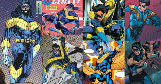
90s-2000s suit: FINGERSTRIPES
Created by: Brian Stelfreeze
First Appearance: Nightwing (1994) #1
Dick’s most famous and beloved suit was created for his first solo-comic. It rarely changed visuals in an obvious way. Mostly, the arm and shin guards were drawn differently depending on the artist - Rick Leonardi made them much more obvious and bulky, reflecting street fashion in the early 2000s, while Jim Lee slimmed them down, making them almost invisible. While on Titans, Phil Jimenez decided to color Dick’s shin guards blue. It’s one of the more obvious design deviations from the initial suit. Though this design started with Dick having a long ponytail, early in Nightwing (1996) his hair was cut, which became the most iconic version of this design.
2011-2014:The New52 Red Suit
Created by: Jim Lee & Cully Hammer
First Appearance: Nightwing (2011) #1 (2011)
This is an awkward one. The suit is mostly known for doing away with the blue color scheme and the fingerstripes and is therefore not liked by many fans. That only changed a little when Brett Booth did not only bring back the fingerstripes but also gave Dick some nice stripes to accent his hips. Interestingly the concept art put Dick in black and blue instead of black and red. In an interview with Polygon in 2021, DC co-publisher Dan Didio said that he had several arguments with artists who wanted to make the suit blue.
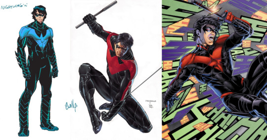
2016 - 2021: Rebirth Suit
Created by: Javier Fernandez
First Appearance: Nightwing: Rebirth #1 (2016)
When Rebirth was announced, one of the first things Dan Didio proclaimed was that Blue Nightwing would be back. While the fingerstripes remained sorely missing, the Rebirth suit grew on people. The suit remained largely consistent. The quite thin chevron-bird became thicker as time went by. Brett Booth brought the hip stripes back for this costume while he drew Dick on Titans. He also gave the costume a more distinct collar.

2022 - Now: Redondo Suit
Created by : Bruno Redondo
First Appearance: Nightwing (2016) #88 (2022)
Redondo’s suit saw the return of the fingerstripes after about a decade without them. His first concept art introduced some other changes that sadly didn’t make it into the comics. Redondo’s primary design innovations have been in the gadgets hidden in Nightwing’s escrima.
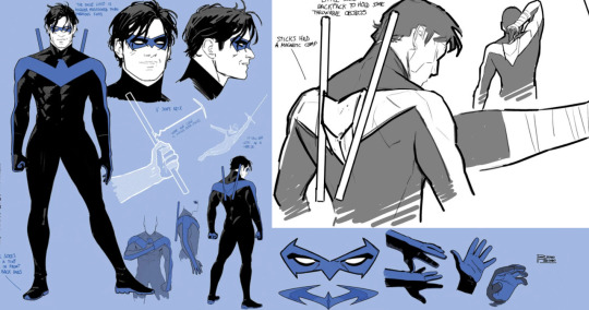
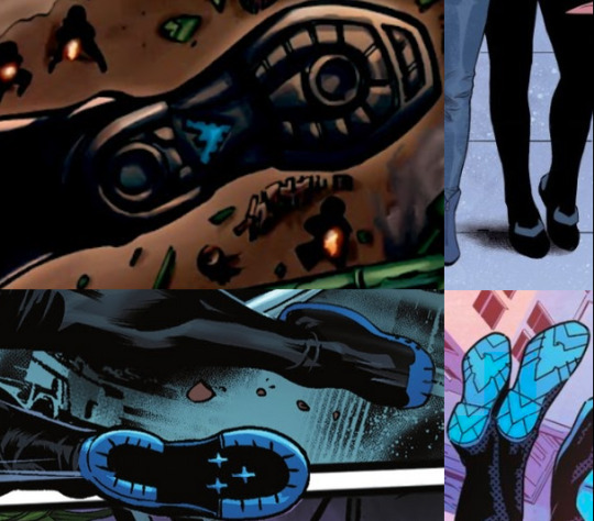
Nightwing’s Shoes
Some artists like to give Dick’s Nightwing shoes some extra flourish.
Nightwing’s Jackets
Some artists occasionally give Nightwing a jacket, either plain or emblazoned with his crest. There are also two Elseworlds Nightwing designs that include jackets.

#dick grayson#nightwing#discowing#mulletwing#batfamily#titans#nightwing60thanniversary#spotlights#dick grayson spotlight#dc comics#mod post
55 notes
·
View notes
Last Seen Blogs

ygmravsr
ygmr
indraruray-blog
Neptunus'
michaelaltieri
there’s only one thing youcan do...
foresttdreams
sweet dreams

gaypersonalscouple03
Gay personals couple