#the only necessary context is that the first image is in reference to 4-4
Text
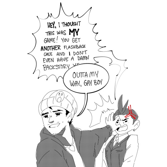
spotlight stolen yet again
later:

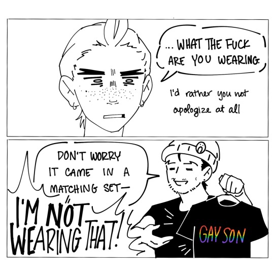
dw he got apollo to wear the shirt eventually
#more sdt stream doodles lmfao#the only necessary context is that the first image is in reference to 4-4#and the overarching story of AJ tbh lol#not a diss on the game i have many thoughts that won’t fit into just the tags on a shitpost tho lol#will add to this later#ace attorney#apollo justice#phoenix wright#my art#comic#id in alt text
3K notes
·
View notes
Text
✭ Series Masterlist ✭
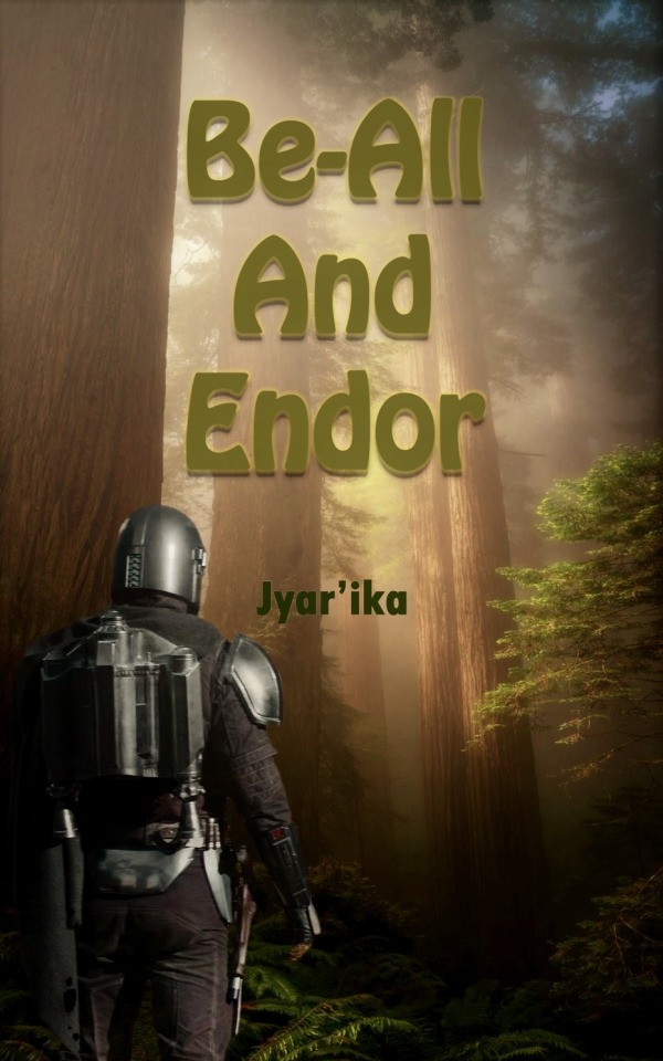
Languishing in a dull and lonely existence on the forest moon of Endor after travelling there to help salvage Death Star wreckage, a nearly fatal encounter with a mysterious bounty hunter out in the forest heralds an opportunity to utilise long-forgotten skills and develop something more profound than you ever thought possible.
Second person POV, present tense. Set post-season 2, diverges from Canon events before TBoBF and season 3. This is a novel-length, exceptionally slow burn with an original plot, worldbuilding, and fully-developed characterisation. SWU concepts and lore are accurately researched.
WORDS: 404,920
PAIRING: Din Djarin x Female Reader/You
RATING: Explicit (18+)
CHARACTERS: Din Djarin, Reader/You/Female OC, Original Non-Human Character(s), Original Human Characters, Greef Karga, Cara Dune, Leia Organa, Luke Skywalker, Grogu, Peli Motto
TAGS: Slow Burn, Slow Build, Romance, Love, Sexual Tension, Eventual Smut, Smut, Sex, Sexual Content, Explicit Sexual Content, Fluff, Fluff and Smut, Fluff and Angst, Light Angst, Hurt/Comfort, Emotional Hurt/Comfort, Relationships, Healthy Relationships, Canon-Typical Violence, Blood and Injury, Dark Past, Additional Warnings In Author's Notes, Bounty Hunter Din Djarin, Soft Din Djarin, Touch-Starved Din Djarin, Din Djarin Needs a Hug, Smart Din Djarin, Soft Dominant Din Djarin, Ewok Species, Mandalorian Culture, Mando'a Language, New Razor Crest, Thoroughly Researched, Worldbuilding, No use of y/n.
AUTHOR'S NOTE: This took me almost a year to write and four months to edit/proof. Each chapter is prefaced with specific tags and (where necessary) warnings, plus word counts. End notes contain translations and comments… this baby is thoroughly researched, so I’m sharing context where appropriate. I’ve also added definitions of in-universe terms so people less familiar with the franchise won’t be left wondering what the hell certain words or references mean. This is a slow burn (adult themes), and although the explicit content only occurs in the latter half, when it does, it warrants the ‘E’ rating. Basically, the first half is a love story, and the second half gets spicy. I hope you enjoy it!

READ THE COMPLETE STORY ON AO3:
(Chapters containing explicit content marked †)
Chapter 1: The Obstacle
Chapter 2: The Interrogation
Chapter 3: The Covenant
Chapter 4: The Snare
Chapter 5: The Strike
Chapter 6: The Groundwork
Chapter 7: The Genesis
Chapter 8: The Progression
Chapter 9: The Hide
Chapter 10: The Beast
Chapter 11: The Adjustment
Chapter 12: The Storm
Chapter 13: The Broadside
Chapter 14: The Intercourse
Chapter 15: The Village
Chapter 16: The Confession
Chapter 17: The Reprieve
Chapter 18: The Fortification
Chapter 19: The Ambush
Chapter 20: The Meridian
Chapter 21: The Homestretch
Chapter 22: The Union †
Chapter 23: The Overture
Chapter 24: The Crescendo
Chapter 25: The Harmony †
Chapter 26: The Cadence †
Chapter 27: The Ride †
Chapter 28: The Veneration †
Chapter 29: The Spree †
Chapter 30: The Tribute †
Chapter 31: The Courage
Chapter 32: The Feast
Chapter 33: The Exhibition †
Chapter 34: The Reward
Chapter 35: The Binding †
Chapter 36: The Synergy †
Chapter 37: The Match †
Chapter 38: The Flag †
Chapter 39: The Foundling †
Chapter 40: The Future †

✨Additional Media✨
@burntheedges has written a spectacular little drabble detailing what Din was up to during the paragraph break near the end of chapter 1 (*SPOILERS* you don’t find this out until chapter 27).
@djarin-desires has created some awesome AI images of a few scenes using Midjourney.
I spent a stupid amount of money on the Hot Toys official Din Djarin action figure, simply so I could photograph him in poses from my fic 🤷🏼♀️ This is just a taster of what’s to come, but here he is offering to help Reader climb onto the speeder in chapter 8.
🧡💚 Thank you for reading! 💚🧡

Dividers by @samspenandsword
#star wars#the mandalorian#din djarin#din djarin smut#din djarin x reader#din djarin x you#mando x reader#mando x you#the mandalorian x reader#the mandalorian x you#mando#mandalorian#the mandolarian#the mandolorian#pedro pascal#pedro pascal characters#star wars fanfiction#the mandalorian fanfiction#din djarin fanfiction#be all and endor
342 notes
·
View notes
Text
retromeda seems to have rediscovered lee sangeun while looking for clips for the channel and genuinely got into the rest of her music too they posted a short about her album gongmudohaga (1995) talking about how it's high art with traditional korean influences and was a complete transformation from having a dance pop idol image into a music artist that composes and writes lyrics for all her own work.
they include a quote from lee sangeun talking about releasing the album:
"i am an in-between person. i see between eastern and western, korean and japanese, reality and unreality, music and visual, and person and person to create art from the space in between."
she studied visual/fine art in new york and music composition in japan and the album is a culmination of that while focusing deeply on korean traditional art. the first korean poem/song recorded is a gojoseon era (which the first korean kingdom and lasted until the year 108 BCE) is gongmudohaga, a song where a woman laments the death of her husband who drowned while crossing a river. the story is an essentially korean one, crossing rivers is a symbol of death in general in korean culture.
in the quote she uses sino-korean character 간 to mean the space between things. this word is colloquially used to mean a period of time, so it's a word that refers to space in both location and time. in the album she looks far into the past and brings it into the present. the musical composition is a mixture of korean traditional, modern westernized, and contemporary music forms specifically in the japanese scene. the album itself is a very elegant exploration of the in-between-ness while having context and substance and craft substantiating the artwork.
she was only 25 years old and it is still one of her most ambitious, craft-heavy, and philosophical albums when she was had been a dance pop star just 4 years ago. it's rly amazing to me to see her career because of how she committed so much to changing herself. she chose to leave an easy version of the same career and instead change into being a serious and respected artist in the same field. she spent years learning the skills necessary to do that and finding her artistic vision but looking back it's rly such a short amount of time where she changed from representing youth and joy and exuberance and visual trends into being an artist that grapples with connection to her culture from the oldest place she can and the grief, love, and beauty that comes from that.
8 notes
·
View notes
Text
Augmented Reality: A Guide to B2B Marketing
As we move further into the digital age, more and more businesses are beginning to explore the potential of B2B augmented reality (AR). AR is a technology that uses digital images and computer-generated imagery to create a realistic experience for users. It can be used for everything from marketing and advertising to training and product demos. This article provides an overview of AR and its various applications, as well as tips for using it in your business. By understanding how AR can help you achieve your goals, you’ll be on your way to creating a powerful marketing platform that will take your business to new heights.
What is Augmented Reality?
Augmented Reality refers to a technology that superimposes digital objects or images on top of the physical world. By doing so, AR allows users to interact with these digital objects in a natural way, enhancing their experience.
AR can be used in a number of ways, including for gaming, shopping, navigation, and more. By adding digital objects that represent real-world objects and locations, AR can provide an immersive experience that is difficult to replicate with traditional online content.
How does Augmented Reality work?
Augmented Reality is a technology that blends the real world with computer-generated images, sounds, or experiences. It can be used to create marketing materials, training manuals, product demos, and other interactive content.
To create an augmented reality experience, you first need a device that can display digital content. Popular devices include smartphones and tablets. You can also use augmented reality apps for devices like the Nintendo 3DS and iPad.
Once you have your device and the necessary software, you will need to create your augmented reality content. There are many free or cheap tools available online that make this process easy. You can also purchase specific software for creating AR experiences.
Once you have your content created, you will need to share it with your target audience. AR content is best consumed in close proximity to the device on which it is viewed. This means that you should create mobile AR applications that can be used on smartphones and tablets.
Finally, you will need to promote your augmented reality content! The best way to do this is through traditional marketing channels like ads and social media posts. You can also distribute AR content through invite-only groups or forums dedicated to the technology.
How Augmented Reality Can Help Your Business
Augmented Reality can be a powerful tool for business owners and marketers. It allows users to experience products in a new way, providing a more immersive shopping experience. Additionally, AR can help businesses target their customers more effectively by allowing them to see how products would look on different body types or in different settings.
AR can be used for a variety of purposes, from marketing to product development.
Here are five ways augmented reality can help your business:
1. Augmenting Product Photos and Videos
Many businesses use augmented reality to add extra detail and context to product photos and videos. For example, by adding additional information like product specs or customers’ feedback, you can give buyers a more complete picture of what they’re buying.
2. Enhancing Marketing Materials
Rather than using static images or text, you can augment these materials with interactive elements like 3D models or simulated environments. This gives your customers a more engaging experience and helps them learn more about your product quickly.
3. Assisting With Product Design Processes
AR can help designers create concept sketches and 3D models quickly and easily. This is especially helpful when creating products that need to be designed for multiple market segments (like tech products).
4. Supporting Field Sales Teams
AR can be used to enhance sales materials, such as product manuals and training videos. This helps sales teams better understand products and provide customers with more comprehensive support.
5. Helping With Product Development Processes
AR can also be used to test products in real-world settings before they’re released to the public. By using AR, you can quickly and easily assess how customers will use your product and make necessary adjustments.
AR also has other potential uses for businesses, such as training employees or demonstrating product features. Finally, AR can be used to create brand awareness and promote sales.
What are the Benefits of Augmented Reality for Businesses?
Augmented reality can be a powerful tool for businesses. By using AR in marketing, businesses can create more engaging experiences for their customers. Here are some benefits of augmented reality for businesses:
Enhanced customer engagement. With AR, businesses can provide customers with unique and personalized experiences. For example, a bakery might let customers choose their own cake flavor by putting virtual cakes in front of them on the screen. This allows customers to have an infinitely customized experience, which fosters loyalty and keeps them coming back.
Increased brand awareness. By incorporating AR into marketing campaigns, businesses can create a more immersive experience for consumers. This means that people will be more likely to remember your brand and take action based on what they’ve seen.
Improved conversion rates. When customers have a positive experience with AR, they are more likely to convert on subsequent visits or purchases related to that company or product. In other words, using AR can increase your business’s bottom line quickly and easily!
Tips for using Augmented Reality in Your B2b Marketing
There is no doubt that augmented reality (AR) has the potential to revolutionize how we interact with digital content and landscapes. However, before you can begin using AR in your marketing efforts, it’s important to understand the basics of the technology. This guide will provide you with tips on how to get started with AR in your business.
1. Plan Your Strategy
Before starting any AR project, it’s important to have a strategy in place. This includes determining what type of content you would like to create, who your target audience is, and what type of AR applications are available. Once you have a plan, start by researching available apps and platforms.
2. Choose the Right Content
Once you know what type of content you want to produce, it’s time to find a way to showcase it in an engaging way. One approach is to use AR as a way to integrate new video or audio content into your existing website or blog posts. You can also create custom experiences featuring specific brands or products.
3. Get Creative With Audiences and gestures
When it comes to designing an AR experience for your target audience, don’t be afraid to get creative! One simple way to do this is to encourage users to make gestures while interacting with the content. For example, if you are promoting a new product launch, allow customers to scan product labels using their device's camera or touch screens acting as interface panels!
Conclusion
Augmented Reality (AR) is a growing trend in business, and it can have a huge impact on your marketing efforts. In this guide, we'll look at the different ways AR can be used to help you market your business, from creating digital ads to developing custom customer experiences. We'll also discuss some of the risks and benefits of using AR in your marketing campaigns, so be sure to read through before taking any action. Finally, we'll provide you with some tips on how to get started using AR in your business today!
0 notes
Text
best UI UX Design Course In Pune With DigitalBerry Training Institute
User interface:
Good design vs. Bad design
What is User Interface (UI)?
User interface refers to how a website interacts with the user, including human-computer interaction, interface logic and appearance. The benefit of communicating the idea and product to the user is more important than how pretty the website/app is.
User Interface is how the website interacts with the user: these are the features of the website that people use to understand how it works. It has nothing to do with beauty or aesthetics – it's more about usefulness in delivering your product to users of your website.
The purpose of the user interface is to communicate the product to the user in the fastest and most elegant way possible. Let's see what is the difference between bad and good UI?
What is a Good User Interface?
When we think of a user interface, our mind usually goes towards websites, mobile apps and desktop software. But one of the most important things you can use to deliver an engaging user experience is design. Every product, service, website and app is a visual experience. So if you are planning to develop a product, there are both technical and visual aspects to consider.
It is also necessary to consider UX design from the user's point of view. So if you're designing a product or a website, it's essential to make sure you consider the various factors that affect how users interact with it.
When we talk about user interface design, we often think about aesthetics. For example, we think about colors, typography and graphics. But there is much more to UI design than that.
Effective UI design is a matter of how it interacts with the user and how the user interacts with the site. Good UI design has familiar threads. Although this is my first time visiting your page or app, I want to understand how it works - and quickly. Let's see how to make a good user interface.
1.Simplicity :
User interface design should be simple.
Less number of mouse clicks and keystrokes are required to complete this task.
New features are only important if they are absolutely necessary and add great value to the application.
2. Consistency:
User interface should be more consistent.
Consistency An online designer also prevents information clutter, ambiguity and inconsistency.
We must apply font, style and size conventions across all screen elements which adds familiarity to the screen and improves screen
readability. In this we can provide fixed objects as fixed reference points around which the user can navigate.
3. Intuitiveness:
The most important quality of good user interface design is intuitive.
Easy to learn intuitive user interface design so the user can choose quickly and easily.
Signs and designations must be concise and accurate. A clear, legible icon helps make the user interface more intuitive, and it's good practice to make labels consistent with the terminology the app supports.
4.Prevention :
Good UI design prevents users from doing the wrong thing and this is achieved by disabling or "graying out" certain elements under certain circumstances.
5.Forgiveness :
This quality encourages users to use the software to its fullest potential.
Designers must provide users with an exit when they find themselves somewhere they shouldn't be.
6.Graphical User Interface Design :
Graphical user interface design provides a presentation that creates an operating environment for the user and creates a clear visual and functional context for user’s actions.
It includes standard objects such as buttons, icons, text, fields, windows, images, drop-down menus, and pop-up menus.
What is a Bad User Interface?
Bad UI drops you in the middle of the desert and expects you to reach the rainforest on your own. It won't take you where you want to go. This often happens because websites try to cater to an impossible demographic, thereby neglecting a core audience in favor of appealing to a wider audience.Poor user interface design can make users think that a website is complicated and difficult to operate; A good site guides users how to interact in a clear and intuitive way, even if it's their first time visiting the site. A bad UI design not only completely destroys the creativity behind the designers but also misleads the users. All of this can leave users confused, frustrated and even angry. Obviously, bad UI design leads to bad user experienceEvery app is different and there is no simple formula for creating the perfect interface. But there are some common mistakes we make.
1.The design lacks of contrast
When browsing a website, we want to see it with new clarity and contrast. It helps us to read and understand the information better and learn how to manage the process. If no contrast is included, we will be confused by both the color combination and the overall appearance of the site. The content on the following site is very difficult to read.
2. Not-responsive design
Using responsive design is very popular because we feel that there is no reason to create a website that does not adapt to a certain resolution and device size. This is especially important for shopping cart websites/apps that target audiences from mobile.
3. Bad IA (Information Architect)
Everyone wants to stand out from the crowd and his design work can attract the attention of others. However, sometimes if we overemphasize creativity in design, it goes the other way. A better balance in the visual hierarchy can make a better impression on users and provide them with more information.
4. Inconsistent style
That's not to say the blending style isn't good, but if the entire interface is a huge and ugly visual conflict, it's better to redesign it. A great UI design should clearly understand specific content and adapt to the style of responsive users. It also works well to improve work efficiency.
5. Clunky and sluggish form
Sometimes we need to collect information about a user by designing a good form, but a slow and clumsy form is a waste of time. It is best to simplify the steps to make the form concise and clear.ss
If You are searching ui ux design courses and classes then join our Best UI UX Design Course In Pune. Contact Us- 9503499149.
0 notes
Photo


MISC. TITLES AND AUTHORS.
FROM: Danganronpa 4KOMA Vol. 3
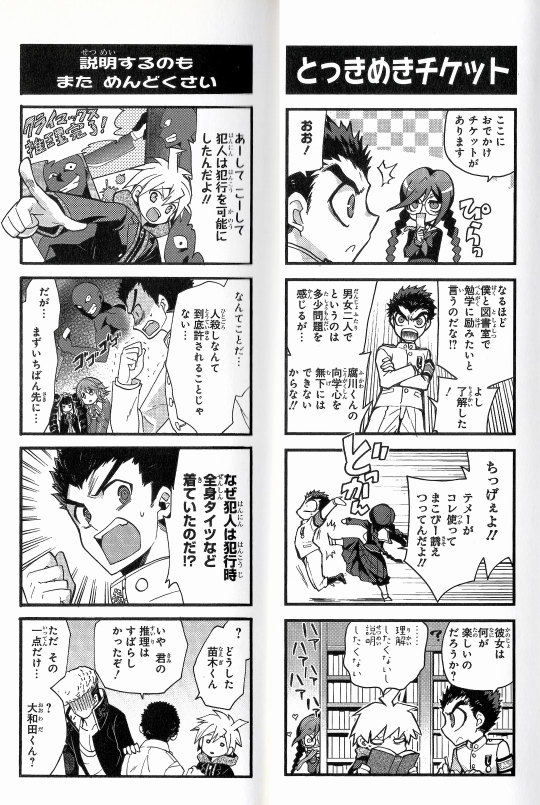
hello! i’m once again challenging myself this month by attempting to put out several collections of ishimaru-centric content from the 4komas (and one anthology comic) leading up to his birthday at the end of the month. seeing as i’m already behind the schedule i put myself on, we’ll see how this goes.
obviously these aren’t the only comics from the third 4koma volume that he features in, but these are some of the ones he features in more prominently/needed a few extra to throw in just to make it look nice! forgive my awful frankensteining of putting comics together, but i was worried about how it’d look on tumblr otherwise. images are in order from left to right, but when referring to the summaries under the cut, the comic on the right is listed first, and the left is listed second; following the way that manga is actually formatted.
disclaimer, i’m not fluent in japanese, nor would i call this a perfect translation, just a rough one to get the basic understanding! i have the comics individually on imgur with fuller translations (i didn’t finish translating the sfx orz i’m sorry), i only have rough summaries under the cut here!
(i’d also like to briefly disclaimer that the 4komas are gag comics, i.e. meant to be taken jokingly. that doesn’t necessarily mean i agree with some of the things that are used for jokes here, like hifumi being used as a joke simply for his weight or syo’s fetishization [of gay men] as a fujoshi)
as for usage: if you’re going to use the raws for anything, or reference the rough translation that i’ve given, i’d appreciate some credit (via a reblog is fine!), or a link back! however, such is not necessary, and otherwise, you’re free to use however you wish, since the only thing i really own are these particular scans.
1: Gutsy Chihiro-Chan by Akazuki Sho : The general jist of this one is that Chihiro tries to be strong by interupting Mondo and Kiyotaka’s arguing...only to be interrupted and pushed around when they try to do so.
Handsome Guy Criteria by Akazuki Sho : Because Genocider Syo’s targets are ‘handsome guys’, the boys in this comic feel safe. Byakuya tells them to take a look at the profiles [the joke being here that Syo’s targets aren’t exactly ‘handsome’, resulting in them feeling less safe]
2: Heart-Pounding Ticket by Watarizora Tsubamemaru : Syo gives Kiyotaka an outing ticket (school mode). Kiyotaka’s under the impression that he’s speaking to Toko, and presumes she wants to study with him. Syo however, wants him to use the ticket to ‘ask out’ Makoto, and the pair are confused about how this outcome is enjoyable for her.
It's also troublesome to explain by Itagaki Hako : Makoto concludes how the killer could commit the crime. Kiyotaka isn’t fully satisfied, and inquires about the relevance of the killer’s clothing to the crime. When he receives no response, he asks what’s wrong, saying Makoto’s deductioning was fine.
3: Needless concern by Nananse Ichika : Kiyotaka expresses concern that Makoto’s shoes don’t fit him, and gifts him a set of ‘properly fitting shoes’. The implication here being that these are a pair of boots (either a pair of Kiyotaka’s or ones similar to his), as Makoto notices a sudden height difference, and finds it overwhelming-- as Kiyotaka remarks that he’ll take care of getting rid of his old ones, Makoto yells at him to give it back.
Disturbance by Natsuka Kudan : Kiyotaka remarks on the way the other students dress, saying that they should be more like Toko (in the sense that she follows dress code). As Kiyotaka comments on how perfect [in a public morals sense] it is, Toko sneezes and causes Syo to emerge, and he retracts his statement.
4: First Impressions by Kawashima Rumi : Kiyotaka wakes up in the classroom at the beginning of the game, under the impression that he’d accidentally fallen asleep, he thinks he’s a failure [as a morals committee member], and barges into the entrance hall asking to be punished [by the teacher]. It then transitions to Kiyotaka introducing himself, noting that people [here] refer to him as ‘M’, to which Makoto suggests has to do with his bangs. [It seems to imply that this is the ‘punishment’ Monokuma gave him, although this is still a little...odd, I guess. Maybe because Monokuma or Mastermind start with the letter M? ]
Forced to make a detour by Kawashima Rumi : Based on the conversation between Makoto and Kyoko in Chapter Three, when Makoto says that he’s taking Kiyotaka to the dining hall, Kyoko insists on going with them. Makoto gets the impression that she’s trying to keep an eye on him initially, but later realizes that she just seems to be hungry.
5: Hypnotism by Shirataki Neko : This one’s a little nonsensical. Kiyotaka rambles a little bit about duties and such, but you only get parts of the conversation as the comic goes on, reflecting the joke of the comic. Which is that as they’re being ‘hypnotized’, they’re paying less and less attention to what he’s actually saying.
Bousou-debu** by Aoi Gamu : Not much that isn’t plainly obvious— Mondo uses Hifumi as a vehicle. Kiyotaka interrupts, but only to comment that they’re on the wrong side of the hallway, basically.
** I’ll include the break down translation notes for this comic’s title since it’s a little much... I wasn't entirely sure how to best translate this here, so I left it as it was. The title is clearly meant to be a play on Mondo's talent, SHSL Bōsōzoku. Debu is usually a rather derogitory way to refer to a fat person ( so think something along the lines of fatty/fatso ). If I had to translate the title, it'd probably be something like 'recklessly driving fatty', maybe 'fatty riding delinquent' given the context of the comic itself?
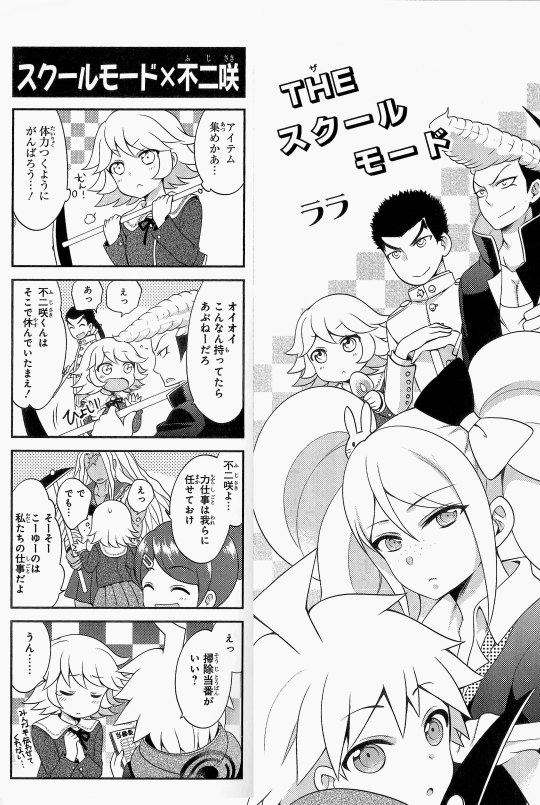
6: The School Mode ( Splash Page ) + School mode × Fujisaki by Rara (Lala) : Chihiro intends to try and get stronger while gathering items; however both pairs (Kiyotaka/Mondo and Sakura/Aoi) insist on doing it for her. Makoto seems surprised when Chihiro comes to do cleaning duty, but it’s only because they have no other work to do.
#danganronpa#dr1#kiyotaka ishimaru#makoto naegi#chihiro fujisaki#mondo owada#toko fukawa#okay techincally it's syo that's the most reoccuring but#i'm not entirely certain which tag fandom uses most for them. rip#anyways that should be enough tags that's the most important ones i think.#on god okay. uh. i still have no clue if people read the tags or not BUT#if the ishida fans are wondering YES i do have ishida 4komas.#i'll be doing an ishida-centric* post for all of them at some point this month ideally#* most of them are ishida one of them is taka/mondo bc it's tangentially related to the ishida comic that follows#* mine#* zhi translations
98 notes
·
View notes
Note
Would you be willing to talk about how standards of masculinity and femininity in Asia differ from those in Europe/North America? I know, it's a ridiculously broad question but I think you mentioned it in passing previously and I would be really interested in your answer especially in the context of the music industry and idols. I (European) sometimes see male Asian idols as quite feminine (in appearance, maybe?) even if they publicly talk about typically masculine hobbies of theirs.
Hi Anon,
Sorry that it took me over a month to get to this question, but the sheer volume of research that is necessary to actually answer this is significant, as there is an enormous body of work in gender studies. There are academics who have staked their entire careers in this field of research, much of which isn’t actually transnational, being that regional gender studies alone is already an incredibly enormous field.
As such, in no way can I say that I’ve been able to delve into even 1% of all the research that is out there to properly address this question. While I can talk about gender issues in the United States, and gender issues that deal with Asian American identity, I am not an expert in transnational gender studies between Asia and Europe. That being said, I’ll do my best to answer what I can.
When we consider the concept of “masculinity” and “femininity,” we must first begin with the fundamental understanding that gender is both a construct and a performance. The myth of gender essentialism and of gender as a binary is a product of patriarchy and compulsory heterosexuality in each culture where it emerges.
What you must remember when you talk about gendered concepts such as “masculinity” and “femininity” is that there is no universal idea of “masculinity” or “femininity” that speaks across time and nation and culture. Even within specific regions, such as Asia, not only does each country have its own understanding of gender and national signifiers and norms that defines “femininity” or “masculinity,” but even within the borders of the nation-state itself, we can find significantly different discourses on femininity and masculinity that sometimes are in direct opposition with one another.
If we talk about the United States, for example, can we really say that there is a universal American idea of “masculinity” or “femininity”? How do we define a man, if what we understand to be a man is just a body that performs gender? What kind of signifiers are needed for such a performance? Is it Chris Evan’s Captain America? Or is it Chris Hemsworth’s Thor? What about Robert Downey Jr.’s Tony Stark? Do these characters form a single, cohesive idea of masculinity?
What about Ezra Miller’s Barry Allen? Miller is nonbinary - does their superhero status make them more masculine? Or are they less “masculine” because they are nonbinary?

Judith Butler tells us in Gender Trouble (1990) and Bodies That Matter: On the Discursive Limits of “Sex” (1993) that what we call gender is inherently a discursive performance of specific signifiers and behaviors that were assigned to the gender binary and enforced by compulsory heterosexuality. She writes:
Insofar as heterosexual gender norms produce inapproximate ideals, heterosexuality can be said to operate through the regulated production of hyperbolic versions of “man” and “woman.” These are for the most part compulsory performances, ones which none of us choose, but which each of us is forced to negotiate. (1993: 237)
Because gender norms vary regionally, there are no stable norms that coalesce into the idea of a single, universal American “masculinity.” What I mean by this is that your idea of what reads as “masculine” might not be what I personally consider to be “masculine,” as someone who grew up in a very left-leaning liberal cosmopolitan area of the United States.
What I am saying is this: Anon, I think you should consider challenging your idea of gender, because it sounds to me like you have a very regionally locked conception of the gender binary that informs your understanding of “masculinity” and femininity” - an understanding that simply does not exist in Asia, where there is not one, but many different forms of masculinity.
China, Japan, and South Korea all have significant cultural differences and understandings of gender, which has a direct relationship with one’s national and cultural identity.
Japan, for example, might consider an idol who has long, layered hair and a thin body to be the ideal for idol masculinity, but would not consider an idol to be representative of “real” Japanese masculinity, which is epitomized by the Japanese salaryman.
South Korea, however, has a very specific idea of what idol masculinity must look like - simultaneously hypermasculine (i.e. extremely muscular, chiseled body) and “feminine” (i.e. makeup and dyed hair, extravagant clothing with a soft, beautiful face.) But South Korea also presents us with a more “standardized” idea of masculinity that offers an alternative to the “flowerboy” masculinity performed by idols, when we consider actors such as Hyun Bin and Lee Min-ho.

China is a little more complex. In order to understand Chinese masculinity, we must first understand that prior to the Hallyu wave, the idea of the perfect Chinese man was defined by three qualities: 高富帅 (gaofushuai) tall, moneyed, and handsome - largely due to the emergence of the Chinese metrosexual.
According to Kam Louie:
[The] Chinese metrosexual, though urbanized, is quite different from his Western counterpart. There are several translations of the term in Chinese, two of the most common and standard being “bailing li'nan” 白领丽男 and “dushili'nan” 都市丽男,literally “white-collar beautiful man” and “city beautiful man.” The notion of “beautiful man” (li-nan) refers to one who looks after his appearance and has healthy habits and all of the qualities usually attributed to the metrosexual; these are also the attributes of the reconstituted “cool” salaryman in Japan, men who have abandoned the “salaryman warrior” image and imbibed recent transnational corporate ideologies and practices.
[...]
In fact, the concept of the metrosexual by its very nature defines a masculinity ideal that can only be attained by the moneyed classes. While it can be said to be a “softer” image than the macho male, it nevertheless encompasses a very “hard” and competitive core, one that is more aligned with the traditional “wen” part of the wen-wu dyad that I put forward as a conventional Chinese ideal and the “salaryman warrior” icon in Japan. Unsurprisingly, both metrosexuality and wen-wu masculinity are created and embraced by men who are “winners” in the patriarchal framework.
The wen-wu 文武 (cultural attainment – martial valor) dyad that Louie refers to is the idea that Chinese masculinity was traditionally shaped by “a dichotomy between cultural and martial accomplishments” and is not only an ideal that has defined Chinese masculinity throughout history, but is also a uniquely Chinese phenomenon.
When the Hallyu wave swept through China, in an effort to capture and maximize success in the Chinese market, South Korean idol companies recruited Chinese idols and mixed them into their groups. Idols such as Kris Wu, Han Geng, Jackson Wang, and Wang Yibo are just a few such idols whose masculinities were redefined by the Kpop idol ideal.

Once that crossover occurred, China’s idol image shifted towards the example South Korea set, with one caveat: such an example can only exist on stage, in music videos, and other “idol” products. Indeed, if we look at any brand campaigns featuring Wang Yibo, his image is decisively more metrosexual than idol; he is usually shot bare-faced and clean-cut, without the “idol” aesthetics that dominate his identity as Idol Wang Yibo. But, this meterosexual image, despite being the epitome of Chinese idealized masculinity, would still be viewed as more “feminine” when viewed by a North American gaze. (It is important to note that this gaze is uniquely North American, because meterosexual masculinity is actually also a European ideal!)

The North American gaze has been trained to view alternate forms of masculinity as non-masculine. We are inundated by countless images of hypermasculinity and hypersexual femininity in the media, which shapes our cultural consciousness and understanding of gender and sexuality and unattainable ideals.
It is important to be aware that these ideals are culturally and regionally codified and are not universal. It is also important to challenge these ideals, as you must ask yourself: why is it an ideal? Why must masculinity be defined in such a way in North America? Why does the North American gaze view an Asian male idol and immediately read femininity in his bodily performance? What does that say about your North American cultural consciousness and understanding of gender?
I encourage you to challenge these ideas, Anon.
“Always already a cultural sign, the body sets limits to the imaginary meanings that it occasions, but is never free of imaginary construction.” - Judith Butler
Works Cited
Butler, Judith. Gender Trouble. New York, NY, Routledge, 1990.
Butler, Judith. Bodies That Matter: On the Discursive Limits of Sex. New York, NY, Routledge, 1993.
Flowerboys and the appeal of 'soft masculinity' in South Korea. BBC, 2018,
Louie, Kam. “Popular Culture and Masculinity Ideals in East Asia, with Special Reference to China.” The Journal of Asian Studies, Volume 71, Issue 4, November 2012 , pp. 929 - 943
Louie, Kam. Chinese, Japanese, and Global Masculine Identities. New York, NY, Routledge, 2003.
#masculinity#asian masculinity#gender performativity#wang yibo#gender studies#Anonymous#ask#peek answers
179 notes
·
View notes
Text
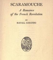
JACOBIN FICTION CONVENTION MEETING 7: SCARAMOUCHE (1921)
Hello, Citizens, and welcome to the seventh meeting of our lovely Convention!
I deeply appreciate your wishes for my speedy recovery and I assure you that I’m right as rain.
So, with that out of the way, let us begin.
1. Introduction
“Scaramouche” is a historical fiction novel written by Rafael Sabatini, who might be familiar to some of you via works like “Captain Blood”, which was among my favorite novel series when I was growing up as I’ve always loved (and still love) me a good swashbuckling story and I never quite grew out of these tastes in literature.
In the case of this novel, it never was a blip on my radar when I was a kid but my renewed interest in the French Revolution and my research of topics for future reviews led me to this story. Apparently there’s a sequel and I might review it in the future.
I found the ebook readily available in English on Project Gutenberg so it’s pretty much in public domain now.
I guess it shouldn’t be surprising that there’s a swashbuckling novel set in Frev - the setting is like a perfect fertile soil for external and internal conflicts, adventures and drama, so it was only a matter of time before someone came up with an adventure novel in this setting.
That being said, at first I had quite a few fears that this book would be just another propaganda piece, especially since the author was technically Anglophone.
Did my fears come true? Let’s find out.
2. The Summary
The story’s protagonist is one André-Louis Moreau - a ward and godson to a Breton nobleman and a lawyer by education who swears revenge on a Marquis who kills his friend in a duel.
To escape the gallows after landing himself in hot water for igniting the fire of revolution in Rennes and Nantes, André-Louis joins a troupe of traveling actors and performs as a character called Scaramouche, hence the title.
3. The Story
Like I said, I have a soft spot for swashbuckling novels so I actually quite enjoyed reading the book. And, on a pleasantly surprising note, the revolution is NOT demonized. If anything, the protagonist actually becomes an idealistic republican by the end, which is a really uncommon narrative choice in Frev media.
The narrative clearly portrays the nobility as too privileged and corrupt and the people are in the right - at least, this is what the protagonist understands during his arc.
There’s also not that much Thermidorian bullshit, at least no popular stereotypes, which I really appreciate.
That being said, I do have three main issues with the story.
Firstly, sometimes there’s too much filler and it feels like the narrative is barely dragging along, which got tiresome at times.
Secondly, I didn’t like the romantic subplot between André and the niece of his godfather, Aline. For context, the two were childhood playmates and grew up referring to each other as cousins, only to fall in love as adults.
Maybe it’s just me, but I find romance between family members (no matter how honorary) gross even if there are no shared genes involved. I know cousin marriages were more common in the past but personally I think the novel would’ve benefited from Aline and André only sharing a platonic bond and familial love.
(Spoiler alert!)
Thirdly, I highly doubt the “I’m your father” twist was necessary here as I usually dislike such plot points because they’re hard to do right.
Here there was no proper building up to the revelation, at least in my opinion, and the twist itself can (and most likely will) seem predictable to modern audiences.
However, it was resolved in a fairly realistic way. Marquis de la Tour and André don’t immediately reconcile just because they’re father and son but André calls off his revenge quest, grants the Marquis a safe passage out of the country and doesn’t want to see him again, which is understandable considering their prior enmity.
On that note, let’s take a closer look at the characters.
4. The Characters
Right off the bat, the biggest issue the modern readers might have is that the characters are too “black and white”. In the era of “grey morality” and complex characters, these archetypes might come off as done to death and boring but, other than that, the characters were mostly easy to empathize with.
Personally, I didn’t like André himself in the beginning but he grew on me.
He starts off as a stoic almost to the point of coldness, a cynic and a borderline nihilist who believes fighting against the noble class is futile and there’s no point in trying to improve the country.
But when his idealistic best friend is killed, André vows to take the Marquis down by using the volatile revolutionary climate to his advantage. Slowly, André too becomes a revolutionary and an idealist, which is admittedly rare as usually people in stories become cynical by the end.
Seeing this character ark but played in reverse felt quite refreshing to me so even though at times André’s sarcasm and stoic attitude made him insufferable, I think he is pretty well-written and fleshed out as a protagonist.
Next is Aline, and unfortunately she is underdeveloped in the novel, more so than a female lead should be. She is ambitious, which makes her consider marrying the Marquis, prejudiced against actors due to her upbringing and in general is a typical noble ingenue.
Her and André are playfully witty at times and verbally cruel to each other at others and, unfortunately, they suffer from the “misunderstanding” trope which makes them unable to talk things out. I always find this trope annoying and, coupled with prejudice and not being fleshed out enough, it played into my apathy for Aline as a character.
Then there’s Marquis de la Tour, the typical privileged corrupt noble. He loves women, is a master of fencing and has no heart. André even calls him the embodiment of sin various times.
I know despicable people can and do exist, but here it seemed like he was made a bit too evil, to the point of being simply cartoonish and hard to perceive as a threat or, for that matter, take seriously.
At least he wasn’t threatening for me personally as a character and was more amusing than anything else.
Interestingly enough, historical figures don’t feature much in the story but we do get cameos of Marat, Danton, Robespierre and Desmoulins, as well as Mirabeau.
Mirabeau is called a hypocrite by the author but the other four, surprisingly, aren’t portrayed as evil villains. Marat is even called a philanthropist and his pamphlets inspire André! How rare is that, Citizens?!
Anyway, let’s continue.
5. The Setting
Although at times the text is overloaded with descriptions, all of them were vivid enough for me to imagine myself in the story with the characters.
Sabatini sure knows how to convey the images of villages, cities, nature, inns, etc in an exciting and engaging manner. I just wish that the descriptions were a bit shorter.
6. The Writing Style
Seeing as the novel was published in 1921 and I’m pretty good at English, I didn’t have many problems with reading but there were some outdated grammatical structures and vocabulary so be prepared.
Besides, in the version I read didn’t have translations of French and Latin phrases that occasionally pop up in the text, which was a bit annoying but not that much as I could understand the context of the phrases and therefore figure out what they mean more or less.
In general though, despite occasional overload of descriptions and the aforementioned grievances I have with the text, the writing style is engaging, very easy to understand and not too complex.
7. The Conclusion
In short, I can definitely recommend this novel to anyone who loves good swashbuckling stories and hates propaganda. Not the most original story but enjoyable and a good read regardless.
With that, I announce the end of the meeting. Stay tuned for updates and stay safe, Citizens!
Love,
- Citizen Green Pixel
#french revolution#frev#history#maximilien robespierre#jacobin fiction convention#robespierre#frev art#frev propaganda#frev literature#camille desmoulins#georges danton#scaramouche#rafael sabatini#jean paul marat
26 notes
·
View notes
Text

The Crusader Vlad and the organization of his country's army and its defensive system
When we refer to the remarkable merits of Vlad Țepeș's head of state and army [1], we cannot ignore his takeover of a politico-military conception that has its origins in the old Byzantine imperial crusade tradition, Dragula being indisputably the first of our voivodes who rose to fight against the Ottoman Turks after the entry of Byzantium into the rule of Sultan Muhammad II the Conqueror [2]. Of course, this takeover was also made because he considered himself the legal continuator of the anti-Ottoman struggle of the Byzantine basilicas (emperors) and the great Romanian rulers, especially after the death of Iancu de Hunedoara [3], "the last great European crusade" [4].
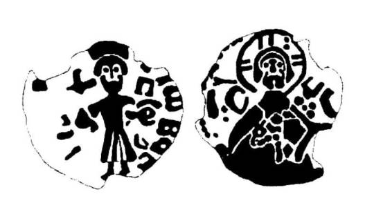
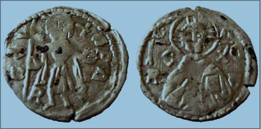
Thus, edifying for the pro-crusade politico-military thinking of Vlad Țepeș is also the “crusade duchy [5]” discovered at Târgșor (in Prahova county), ie in the place where Vlad built a church (…) and where there was, in the 15th century, a royal court ”[6]. The currency was struck, in all probability, between 1459-1461, in this case being a second monetary issue made during the reign of Vlad Tepes [7], because, wanting to intensify trade for economic development of the country (which resulted in the procurement of the financial resources necessary to fight the anti-Ottoman struggle), the Romanian voivode was also concerned with this aspect. The only copy of the respective monetary issue, discovered so far, the silver duchy mentioned above, has on its two facets images inspired by the Byzantine iconographic tradition. On the obverse, there appears the face of Vlad Ţepeş with a beard, seen from the front, standing, wearing a crown [on his head] and holding a long cross in his right hand, and the cruciferous globe in his left ”[8], practically“ the typical representation of the Byzantine emperor, in his double position of defender of Christianity and holder of the power of universal aspiration ”[9]. On the reverse is shown "the bust of Jesus Christ, seen [all] from the front, blessing with his right hand, and with his left holding the gospel to his chest" [10].
Practically "this image was also taken from the Byzantine iconographic tradition, being the representation on coins of rex regnantium, ie the hierarchical top of all Christian sovereigns" [11]. Putting the two effigies together on the same coin, certainly on the initiative of Vlad Ţepeş, leads to the conclusion that we are dealing with “a crusade duchy", the Romanian lord considering himself the direct heir of the old Byzantine crusade traditions and , therefore, the main Christian adversary of the Crusent [12], after the disappearance of Iancu de Hunedoara ”[13].
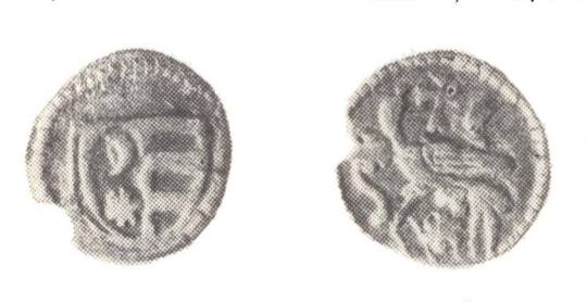
It is interesting to mention the fact that the first coin struck by Vlad Țepeș was a “penny” of anepigraphic silver (ie without any inscription) on the reverse of which appears a star with a tail in the shape of the letter «S», so a comet. The fact that, according to astronomical data, on June 8, 1456, the famous comet Halley (which could be seen for a whole month) appeared in the sky of Europe, led the specialists to conclude that Vlad Ţepeş was influenced in choosing the image for the reverse of the coin. issued from his order, right at the beginning of the second of his reigns, precisely by this rare and interesting astronomical phenomenon, "disturbing image, as it seems unique in the European numismatics of the time" [14]. Considering the uniqueness of Dracula in our history, but also in the universal one, we cannot fail to notice the amazing connection between the evolution of his politico-military career and the mentioned astral phenomenon, which, while at that time instilled a terrible horror in the population. For Europe, it was for him a "heavenly" sign under which he managed to defeat (and kill) his rival (Vladislav II [15]) and ascend to the royal throne of his ancestors [16].
Aiming to consolidate and protect the royal authority and the economic and socio-political bases of the anti-Ottoman resistance and “preparing the reopening of the war
with the Ottoman Empire to ensure state independence and restore the territorial unity of Wallachia, Vlad Țepeș took numerous measures to strengthen the court army (The permanent army- nnTC), the backbone of the "great army", making full use of its revenues for its reorganization, endowment and training, according to the requirements of the time ”[17].
Dragula was also concerned with hiring a large number of specialized fighters from the sister countries (ie Transylvania and Moldova - nnTC), especially those trained in the campaigns of Iancu de Hunedoara, giving a similar status to the soldiers in the country "[18 ]. At the same time, he "raised and strengthened in military positions faithful and talented people (…), chosen with discernment, according to the value criterion" [19].
In the time of Vlad the Impaler, the country's "small army" (as well as its personal guard) consisted of mercenaries, viteji(Braves)[20], courtiers and servants or princely servants, while "the great army" ( mobilized only in case of great danger) was composed of all those able to bear arms and fight (mostly of them, these being inhabitants of villages, but also of fairs and cities, which, "unlike the guard the lord [as well as the army of the courtiers, the troops of the princely servants and the troops of mercenaries], an elite army, were inhomogeneously armed, that is, each came with the weapon he had in the household ”[21]) [22]. In fact, Dragula is the first Romanian ruler, since Mircea the Elder, who raised to battle all those capable of wielding a weapon, an act of great courage that proves his ability to maneuver large masses of people on the battlefield [ 2. 3].
Constantly in a categorical and overwhelming numerical inferiority to the Ottoman invaders he had to face [24], Vlad Țepeș always resorted to a series of measures aimed at a "consistent application of the strategy of the struggle of the whole people (specific to the Romanians - nnTC), he destroying everything in the way of the invading army - thus depriving it of any logistical support in the invaded territory - and triggering bold actions of harassment, the latter - the prelude to a decisive battle - must undermine the combative potential of to the enemy and to decisively weaken his morale ”[25].
Relevant to the care given to military matters is the fact that according to tradition, after the end of any of the battles in which he took part, Dragula (who was a good fighter himself instilling in the whole army a spirit of order and discipline" [26], as well as great courage and love for the country to the point of self-sacrifice), he personally searched each fighter and “who was wounded in the face, gave him great honor and made him brave, [but] who was struck in the back , he ordered that he be put (put - nnTC) on the stake ”[27].
Being "agile and as good as possible in military affairs" [28], a fact recognized even by his enemies, the Ottoman Turks [29], Vlad Țepeș " enlarged and strengthened the military institution promoting peaseants to small rank boyars , exempt them from taxes and benefits in exchange for military service, thus cementing ties with the majority class of the time - the peasantry - a class that understood to serve with devotion the one who defended it from the abuses of the great nobility "[30].
Therefore, "the peasant soldiers of Vlad [Țepeș] defended the entire land of Wallachia, from the Danube, where the Ottoman fleet could not be controlled, until the mountains transformed into a natural fortress of resistance" [31], and Dracula "He himself, as an example of bravery and heroism, often fighting in the front lines, personally leading the attacks on enemy camps, established himself as a valiant defender of his country's independence, [as] a great lord and army commander, [he being] one of the the most brilliant leaders of the Romanian people ”[32].
Vlad Țepeș also paid special attention to the defensive system of his country (as, moreover, was normal in the context of his anti-Ottoman policy), he strengthened it with new cities of refuge, fortresses on
the probable directions of invasion and fortified monasteries ”[33]. Dracula proceeded both to repair, enlarge, strengthen and even raise the foundations of some fortresses, and to "build or rebuild the defensive walls" [34] of some monasteries, such as Cozia, Govora, Tismana, Snagov and Comana [ 35].
Among the fortresses rehabilitated, consolidated and enlarged by the worthy Romanian voivode is the fortress of Poienari (on the upper course of the river Argeș), which, between April-May 1457, he renovated and expanded, which was done according to Povestirilor about Vlad Ţepeş and the forced labor of a significant number of boyars and townspeople from Târgovişte (along with their families), who had plotted against him (these are the ones who took part in the murder of his older brother, Mircea]) [ 36].
The next is the fortress of Bucharest (on the river Dâmbovița), where, in order to monitor the Danube line (given that the fortress of Giurgiu had been occupied by the Turks), he ordered the construction of a strong fortress (which was built in the current area). center of Bucharest, now the well-known archeological ensemble "Curtea Veche"), which is considered the most important plain fortification erected by Dracula (practically, it rebuilds, expands and strengthens the fortress existing here since the time of his grandfather, of Ungrovlahia ”Mircea the Old) [37]. In fact, the first definite documentary attestation of Bucharest dates exactly from the time of Vlad Țepeș, more precisely from 1459, when, through the deed of September 20 (“true birth certificate of our Capital today” [38]), the great Romanian ruler it exempts donations and strengthens the property rights of some inhabitants [39]. The document, very damaged, was discovered around 1900 [40], it represents, more precisely, a deed that strengthened, through the signature of the fierce voivode, an act of sale-purchase of some estates from Ponor (locality today in the county Mehedinti). The act concludes with the following text: "It was written on September 20, in the city of Bucharest, in the year (according to the" Byzantine era "- nn TC) 6968 (ie 1459 [according to" our era "- nn TC]), Io Vlad voivod, by the mercy of God, sir ”[41]. Also, on the last line of this document is mentioned the name “Bucharest [42]. If we take into account the large number of documents written on the orders of Vlad Ţepeş from his residence in Dâmboviţa, we can conclude that, starting with 1459, he led the affairs of the state here, practically Bucharest (or Dâmboviţa Fortress, as it was also called urban settlement at that time) becoming (along with Târgoviște) the second capital of the Romanian south-Carpathian state [43].
Finally, another fortress built by Vlad Țepeș is the fortress of Frumoasa, which, being located on the valley of the river Vedea (right on its bank), "controlled the access road coming from the Danube ford, from the right Zimnicea locality ”[44]. This "fortification, with an area of 2.5 ha, consisted of three rows of waves and two ditches arranged concentrically, the central wave, square in plan with a side of 43 m, carrying the wooden structure of the palisade [45], and the other two were of the simple type, having a rectangular route (the second) and trapezoidal (the outer one) ”[46]. Vlad Țepeș also ordered the expansion of the military constructions of all voivodship residences [47], such as the one in Târgovişte (at that time the largest urban settlement in the country and the main royal residence) [48], where, among other things, he “rebuilt the walls of the fortress with Transylvanian stonemasons” [49] and at the same time, “it seems to have been erected [by his command] and the famous tower of Chindia” [50], which was built , initially, for military purposes, the building serving as a guard point, and later it was also used as a fireplace, as well as for storing the country's treasure [51].
By investing large sums of money in the construction of solid buildings, made of stone and brick, Vlad Ţepeş made both the city and his royal court in Târgovişte to
have a truly princely appearance [52]. "The repair and enlargement of the walls of the royal court made it much stronger and, from now on, to be called a 'fortress'" [53] (on this occasion the royal palace was extended here, erected in a first form by Mircea the Old) [54]. In this sense, the opinion of Ştefan Báthory [55] (the supreme commander of the Transylvanian troops sent to Wallachia by King Matia Corvin to help Vlad Ţepeş to return for the third time to his reign) is also relevant. 1476, he visited Târgoviştele (after it was occupied by the army led by the Transylvanian “captain” and Dracula) and, at his sight, he stated that it was “a real fortress” [56], his opinion being an informed one, because where he came from, the art of building large fortifications was well represented, "and the notions of the military were much more precise."
Referring to the exceptional qualities proved by Vlad Ţepeş as organizer of the defense of his country, and not only, as well as as a fighter with a gun in his hand and a leader of the army on the battlefield, a great specialist in military history in the eighteenth century , the Frenchman M. de Follard, appreciated them as remarkable, which is why, in his vision, the brave Romanian prince proved to be "one of the greatest captains (army leaders - nn TC) of his century" [58] , bringing as the main argument for this cataloging his famous victory obtained after his unprecedented and daring night attack, executed on 16/17 June 1462 on the camp of the huge Ottoman army near Targoviste (led by the conqueror of Constantinople, Sultan Muhammad of II), a battle that entered the popular tradition and historiography under the name of "Night Attack" [59].
________________________
[1] Also nicknamed Dragula, Vlad III Ţepeş was the son of Vlad II Dracul (in his turn illegitimate son of Mircea cel Bătrân [who ruled the medieval Romanian state in the South Carpathians between 1386-1418 - History world in data, Romanian Encyclopedic Publishing House, Bucharest, 1972, p. 567], he ruled Wallachia between 1436-1442 and from 1443 to 1447 [Ibidem]) and Mrs. Anastasia (one of the daughters of Alexander the Good [Virgil Ciocâltan, Between the Sultan and the Emperor: Vlad Dracul in 1438, in “Revista de istorie”, XXIX, No. 11, Bucharest, 1976, pp. 1777, 1782], the lord of Moldavia between 1400-1432 [History of the world in data, p. 569]), he being, therefore, nephew of the two great voivodes, who completed the Romanian statehood in the south and east of the Carpathians. Dracula ruled over "Ungrovlahia" (the name of Wallachia in internal documents written in Slavonic) three times, namely from October (before 17-19) until the beginning of November (certainly after October 31) 1448; from July (before 3) 1456 to November (before 26) 1462 and from October (after 7) / November (before 📷 until the end of December 1476, possibly even until the beginning of January (certainly before of 10) 1477 (Constantin Rezachevici, Encyclopedia of Romanian Lords. Critical Chronology of the Lords of Wallachia and Moldova, vol. I [XIV-XVI Centuries], Encyclopedic Publishing House, Bucharest, 2001, pp. 101, 103, 115, 117, 801 , 802).
[2] Mehmed II ruled the Ottoman Empire between 1444-1446 and 1451-1481 (History of the World in Dates, p. 567).
[3] Remarkable politician and brilliant leader of the Romanian army, who lived between 1407-1456 and held high dignities in the Kingdom of Hungary, including that of regent or governor general of Hungary (between 1446-1453), he being the main promoter of the struggle of Christendom against the expansion of the Ottoman Empire, which he led, practically, between 1441-1456. Also, Iancu de Hunedoara was the father of the most important king of Hungary, Matia I Corvin, who reigned between 1458-1490 Tiberiu Ciobanu, «Fortissimus athleta Christi», Iancu de Hunedoara 555, Eurostampa Publishing House, Timișoara, 2011, p 15-28, 118, 192-193).
[4] Ioan-Aurel Pop, The name of the family of King Matthias Corvinus: from period sources to contemporary historiography, in "Studies and materials of
medieval history", XXVI, Bucharest, 2008, p. 138. Regarding the related aspects of the “imperial idea” in Romanian, see also Dumitru Năstase, The imperial idea in the Romanian Lands. The genesis and its evolution in relation to the old Romanian art (XIV-XVI centuries), Athens, 1972; Petre Ș. Năsturel, Considérations sur l’idée impériale chez les Roumains (Considerations on the Imperial Idea in Romanian), in “Byzantina”, tom. V, Thessaloniki, 1973, pp. 397-413.
[5] In the Middle Ages, in Wallachia, the "duchy" was a silver coin, weighing about one gram and worth three "money" (the name given to coins that have circulated over time on the territory of today Of Romania and whose value varied according to epochs and regions, small coin, initially silver, then copper, having the lowest value [Tiberiu Ciobanu, Glossary, in Stephen the Great and Saint and his brilliant victory in Vaslui against the Turks Ottomans, Eurostampa Publishing House, Timișoara, 2015, p. 366]), whose prototype (model) was the Venetian silver duchy, beaten since 1202 (Ibidem, p. 431). Stephen the Great was "great voivode and lord" of Moldavia from April 14, 1457 to July 2, 1504 (History of Romania in data, Encyclopedic Publishing House, Bucharest, 1971, p. 457). Being the son of Bogdan II (who ruled the eastern Romanian-Eastern Carpathian state from October 12, 1449 to October 15, 1451 [Ibidem]) and the nephew of Alexander the Good, he was closely related to Dracula [they were primary cousins] , because the mother of the latter, Mrs. Anastasia, was in turn the daughter of Alexander the Good and, therefore, sister (at least in paternal line) with the father of Stephen the Great (Virgil Ciocâltan, op. cit., p. 1777 , 1782).
[6] Ştefan Andreescu, Vlad Ţepeş Dracula between legend and historical truth, second edition, revised, Encyclopedic Publishing House, Bucharest, 1998, p. 99.
[7] Ibidem.
[8] Ibidem. The term "globe cruciger" refers to a Christian symbol of authority, which was used in the Middle Ages, but which is still found on some coins, as well as in iconography. It represents a globe on which is placed a cross, used as a royal insignia, for coronation, in several monarchies in Europe. This is especially the case of the Holy Roman Empire of the German Nation, where it was designated as the "imperial globe". The cross on the globe, which symbolizes God's dominion over the entire world, is much larger than the globe, suggesting God's priority over human affairs. The globe, in the hand of the emperor, also signifies the divine origin of the power he exercises. The term comes from the Latin phrase "globus cruciger", consisting of the words "globus", meaning "sphere, globe", and "cruciger" [composed in turn from the noun "crux, crucis", meaning "cross" and the verb "gero , gerere, gessi, gestum ”, meaning“ to carry ”], which means“ bearer of the cross ”) and has the meaning of“ bearer of the cross ”(ro.wikipedia.org/wiki/Globus_cruciger).
[9] Ştefan Andreescu, op. cit., pp. 99.
[10] Ibidem.
[11] Ibidem.
[12] Part of the Moon's semicircular disk, illuminated by the Sun during one of the phases of the star; The moon seen in the phase of the first and last square. Symbolic sign of Islam, representing the Moon in the rising phase, in the form of a "sickle". Figuratively, the Ottoman Empire, the Turks, the Muslims; Islam, Mohammedanism
[13] Ştefan Andreescu, op. cit., pp. 99; Octavian Iliescu, Unknown Duchies issued by two voivodes of Wallachia in the 15th century, in the “Bulletin of the Romanian Numismatic Society”, years LXXVII-LXXIX (1983-1985), Bucharest, 1987, pp. 268-278.
[14] Ştefan Andreescu, op. cit., p. 63.
[15] This was the son of Dan II the Brave (who ruled over Wallachia between 1420-1431, with four interruptions [History of the World in Data, p. 567]), who in turn had him as father on Dan I (who ruled the medieval Romanian state in the South Carpathians between 1383-1386 [Ibidem]), considered to be the father of Dăneşti, one of the two main branches of the princely dynasty of the Bessarabians, along with that of the Drăculeşti Vlad
Dracul, Vlad Țepeș's father, but who generally refers to the descendants of Mircea cel Bătrân). Vladislav II ruled between 1447-1456, with a brief interruption in the autumn of 1448, when the throne of Targoviste was first occupied by Vlad the Impaler (Ibidem, p. 568). In unknown circumstances, Vladislav II was executed by order of Dracula, on August 20, 1456 (after his defeat and capture following the battle of Târgșor [Prahova County], which took place before this date), finding- and eternal rest at Dealu Monastery (Constantin Bălan, Dealu Monastery, 2nd edition, Meridiane Publishing House, Bucharest, 1968, pp. 6-8, 24).
[16] Ştefan Andreescu, op. cit., pp. 63; Jean Delumeau, Fear in the West (14th-18th century). A besieged fortress, vol. I, Meridiane Publishing House, Bucharest, 1986, pp. 118-119.
[17] The military history of the Romanian people, vol. II, Militară Publishing House, Bucharest, 1986, p. 259.
[18] Ibidem: Ioan Bogdan, Documents regarding the relations of Wallachia with Brasov and with Hungarian Country in sec. XV-XVI, vol. I, Bucharest, 1905, p. 99.
[19] The military history of the Romanian people, vol. II, p. 259.
[20] In the Middle Ages, in the Romanian Lands, the term "brave" meant a person who belonged to a category of landowners, similar to the knights of Western Europe and having special military tasks. Our princes raised many of their soldiers, who stood out on the battlefield, among the brave, especially from the second half of the fifteenth century and, especially, by Stephen the Great and Vlad the Impaler (Tiberiu Ciobanu, op cit., p. 633).
[21] Radu Ştefan Ciobanu, In the footsteps of Vlad Țepeș, Sport-Turism Publishing House, Bucharest, 1979, p. 123.
[22] Istoria Românilor, vol. IV, Editura Enciclopedică, București, 2001, p. 352; The military history of the Romanian people, vol. II, p. 259; Radu Ştefan Ciobanu, op. cit., pp. 119-123.
[23] Ibidem, pp. 123; Tiberiu Ciobanu, The Night Attack, in From Rovine to Călugăreni. Great victories of the Romanian armies over the Ottoman Turks, Eurostampa Publishing House, Timișoara, 2014, p. 68. „In addition to the numerical increase of the soldiers who depended directly on the reign - mercenaries, servants, heroes, courtiers his army, mercilessly punishing those who did not respect his dispositions ”(Istoria Românilor, vol. IV, p. 352). Honestly and strongly "impressed by this discipline" (Ibidem), the Grand Vizier Mahmud Pasha * himself stated in the summer of 1462 that if Dracula had a larger number of fighters he "could reach great power" ( Laonic Chalcocondil, Historical Exhibitions: The Rise of Turkish Power, The Fall of the Byzantine Empire (Romanian edition by Vasile Grecu), RPR Academy Publishing House, Bucharest, 1958, p. 289). * Nicknamed the "Greek" (probably due to his origin), Mahmoud Pasha was the son-in-law of Sultan Muhammad II the Conqueror and Grand Vizier (the first counselor and his deputy) between 1455-1467 and 1472-1473 or, according to another opinion, between 1456 -1468 and 1472-1474 (Mustafa Ali Mehmed, History of the Turks, Scientific and Encyclopedic Publishing House, Bucharest, 1976, p. 383; ro.-wikipedia.org/wiki/Mahmud_Pașa).
[24] Dracula never had more than 30,000-32,000 fighters (Military History of the Romanian People, vol. II, p. 263) and this only by decreeing the general mobilization, on this occasion being recruited all men and young people from his country, capable of carrying weapons, "from 12 years upwards" (the magazine "Trajan's Column" [edited by BP Hasdeu], NS, IV, Bucharest, 1883, p. 36).
[25] The military history of the Romanian people, vol. II, pp. 272-273.
[26] Ibidem, pp. 259.
[27] The Slavo-Romanian chronicles from the XV-XVI centuries. Published by Ioan Bogdan (critical edition by P. P. Panaitescu), R.P.R. Academy Publishing House, Bucharest, 1959, pp. 207-208.
[28] Foreign travelers about the Romanian Lands, vol. I (edited by Maria Holban), Scientific Publishing House, Bucharest, 1968, p. 176.
[29] "The results of his reorganization and training of the army and his qualities as a
military commander were appreciated even by his fiercest opponents, and Turkish chroniclers regarded him as" famous among his peers and in his craft. to lead armies. He was also unique in serdaria (ie in command, this word coming from the term "serdar" * - nn TC), a second like him not being in the land of the ghiauri ", Sultan Mehmed II himself (ie Muhammad II- the Conqueror - nn TC) “considering him a brave man, and praising him to others” ”(Military History of the Romanian People, vol. II, p. 260; Turkish Chronicles on the Romanian Lands, vol. I [compiled by Mihail Guboglu and Mustafa Ali Mehmed], RSR Academy Publishing House, Bucharest, 1966, p. 199). Ghiaur = pejorative name (ie unfavorable, derogatory, contemptuous), used by the Turks to designate those of a religion other than the Mohammedan, in Turkish meaning "unbeliever" (Tiberiu Ciobanu, Glossary, in Mircea cel Batran the most agile of Christian principles », Eurostampa Publishing House, Timișoara, 2013, p. 188). * The generic name, in the Ottoman Empire, of the commander-in-chief of a large Turkish expeditionary military corps (Idem, Glossary, in Stephen the Great and Saint and his brilliant victory at Vaslui against the Ottoman Turks, p. 593).
[30] The military history of the Romanian people, vol. II, p. 259-260.
[31] Ibidem, p. 283.
[32] Ibidem, p. 283-284.
[33] Ibidem, p. 260.
[34] Ibidem.
[35] Ibidem.
[36] Gheorghe I. Cantacuzino, Poienari Fortress, 15th-16th centuries, in “Studies and researches of ancient history”, tom. XXII, no. 2, Bucharest, 1971, pp. 263-289; Maria Ciobanu, Nicolae Moisescu, Radu Ștefan Ciobanu, Poienari Fortress, Sport-Turism Publishing House, Bucharest, 1984; The military history of the Romanian people, vol. II, pp. 88-89; Radu Ştefan Ciobanu, op. cit., 109-112.
[37] Panait I. Panait, The Citadel of Bucharest in the 14th and 15th centuries, in “Revista Muzeelor”, no. 4, Bucharest, 1969, pp. 310-318; Radu Ştefan Ciobanu, op. cit., pp. 103-105; Ştefan Andreescu, op. cit., pp. 97; Gheorghe I. Cantacuzino, Problems of the relations between the beginnings of the medieval urban settlements and the princely courts from Wallachia, in “Studia Valachica”, Târgovişte, 1970, pp. 104-105.
[38] Ştefan Andreescu, op. cit., p. 94.
[39] H. Chircă, Historical-Philosophical Commentary on the Chrysostom of September 20, 1459, in "Studies", vol. XII, no. 5, Bucharest, 1959, pp. 5-7; Radu Olteanu, Bucharest in dates and events, Paideia Publishing House, Bucharest, 2002, p. 14.
[40] Ibidem; H. Chircă, op. cit., p. 5-7.
[41] Ibidem; Radu Olteanu, op. cit., p. 14. According to the “Byzantine era”, the date of “Creation” is the year 5508 BC. Often encountered in the form of "years since the creation of the world" or "years since the building of the world" or "years since Adam", this chronology was officially used in the Byzantine Empire (by the Ecumenical Patriarchate of Constantinople) and other churches. Orthodox from 692 to 1728. In the Romanian Lands, it was used mainly until the middle of the eighteenth century, being gradually replaced, until the middle of the nineteenth century, with "our era" (abbreviated "en"), which we count from the birth of our Lord Jesus Christ, which is why the abbreviation "AD" is used. Because the "Byzantine era" is considered to be 5508 years older than "our era", in order to transpose the years of the "Byzantine era" into the years of "our era" this difference of years must be taken into account, using operations. subtraction or addition, depending on the situation(ro.wikipedia.org/wiki/Era_bizantină).
[42] Radu Olteanu, op. cit., p. 14; H. Chircă, op. cit., p. 5-7.
[43] Radu Ştefan Ciobanu, op. cit., p. 105. In fact, Dracula spent four of the more than six years of his reign “in the city of Bucharest”, preferring it to the royal residence in Târgoviște, this, especially, out of the desire to be as close as possible of the Danube, in order to be able to better supervise the movements of the Turks (Radu Olteanu, op. cit., p. 14; H. Chircă, op. cit., p. 5-7).
[44] The military history of the Romanian people,
vol. II, p. 90; Radu Ştefan Ciobanu, op. cit., p. 123.
[45] Wooden fence or "wall", used in the past as a defense structure; fortification element, used in older defensive arrangements, consisting of thick and long poles, knocked to the ground, tied together with planks, ropes, ropes (tree branches, tree branches, etc.) etc. and having between the spaces braids of twigs, sometimes also a filling of beaten earth. The height of a palisade could be up to three meters. Synonym: (rarely today) lever ((ro.wiki-pedia.org/wiki/Palisadă; dexonline.ro/definiție/palisade).
[46] The military history of the Romanian people, vol. II, p. 90. „The ditches (fortress from Frumoasa - n.n. T.C.) had oblique walls, with a maximum width of 8-12 m; the difference between the wave coast and the ditch wire was between 6 and 10 m. Outside the central palisade there was a platform, approx. 3-3.5 m, on which the defenders of the fortress circulated. For the construction of the central palisade, two ditches were dug with a depth of 1-1.30 m, on the bottom of which were fixed, in an oblique position, thick oak poles, at a distance of 0.15-0.25 m from each other . Between the rows of stakes, at different levels of them, thick beams and beams were fixed, horizontally or obliquely, thus compartmentalizing the skeleton of the palisade, which was then covered with beaten earth ”(Ibidem).
[47] Gheorghe I. Cantacuzino, op. cit., p. 104-105; Istoria militară a poporului român, vol. II, p. 90; Ştefan Andreescu, op. cit., p. 97; Radu Ştefan Ciobanu, op. cit., p. 123.
[48] Ştefan Andreescu, op. cit., pp. 97; The military history of the Romanian people, vol. II, p. 260; Radu Ştefan Ciobanu, op. cit., pp. 123-126; Nicolae Constantinescu, Cristian Moisescu, Royal Court of Târgovişte, 2nd edition, Meridiane Publishing House, Bucharest, 1969. Royal and capital residence between 1396 and 1714, Târgoviște held for more than three centuries the status of the most important economic, political center -military and cultural-artistic of Wallachia, currently being the city-municipality of residence of Dâmbovița County, administrative-territorial unit from the central-southern part of the country, more precisely from the central-northern area of the Romanian geographical-historical region Muntenia (ro .wikipedia.org/wiki/Târgoviște.
[49] The military history of the Romanian people, vol. II, p. 260.
[50] Ştefan Andreescu, op. cit., p. 97.
[51] Also known as the "Chindia Tower", it is currently part of the "Royal Court" Historical Monument Ensemble and measures 27 meters in height and 9 meters in diameter. Between 1847-1851, the tower was completely restored by the rulers of Wallachia, Gheorghe Bibescu (who ruled between 1842-1848 [History of the world in data, p. 568]) and Barbu Știrbei (who ruled between 1849-1853 and 1854). -1856 [Ibidem]), the current form being due to the first one, including its elevation by about 5 meters compared to the initial construction. The Chindia Tower is the most important tourist attraction in Târgoviște and, at the same time, the symbol of the city, specific elements of the building being present on the coat of arms of the respective city, both at the top and at the bottom. In fact, now, the tower is also the most important tourist attraction of the entire Dâmbovița County, currently hosting the exhibition entitled "Vlad the Impaler - Dracula, legend and historical truth", which presents documents, weapons and objects from the reign of the fierce Romanian voivode, but also maps with the surroundings of those times. From an administrative point of view, the Chindia Tower is under the tutelage of the “Curtea Domnească” National Museum Complex in Târgoviște. There are two hypotheses regarding the origin of the name of the tower, but there is no consensus on this fact. The first claims that areas in the vicinity of the tower were places of feasting, called "chindii", hence the origin of the name. It has also been suggested that its name comes from the word "chindie", an archaism meaning "sunset", a time of day when soldiers
defending the tower were required to give the signal that the five gates of the city were closed. After this moment, it was forbidden to enter or leave the city throughout the night, and the inhabitants had the obligation not to drive on the streets and not to maintain outdoor fires, which would have made the city visible from a great distance (ro.wikipedia .org / wiki / Turnul_Chindiei).
[52] Radu Ştefan Ciobanu, op. cit., pp. 125.
[53] Ibidem, pp. 124.
[54] Ibidem.
[55] This is Stephen I Báthory of Ecsed, who was a prominent member of the powerful Hungarian noble family Báthory. He lived between 1430-1493 and held the position of voivode of Transylvania from July 1479 to January 1493 (History of Romania in dates, p. 461; History of the Romanians, vol. IV, p. 807). Very ambitious, he will be appointed, in 1471, by Matthias Corvinus as a judge of the Royal Court (ie royal judge, in which capacity he was the king's legal deputy [en.wikipedia.org/wiki/Judge_royal]), holding this high position until his death. Due, however, to his warlike nature (warriors - nn TC), along with the cruelty he had shown countless times (especially to the Szeklers, whose committee [governor] had been for a time - nn TC), István (Ştefan - nn TC ) Báthory will end up being dethroned in 1493 "(Cristian Ioan Popa, The Battle of the Field of Bread [October 13, 1479]. From the universality of the medieval lied to the recovery of national heroes, in" Terra Sebus. Acta Musei Sabesiensis "[ Yearbook of the Municipal Museum „Ioan Raica” from Sebeş], No. 2, Sebeş, 2010, p. 276), dying shortly afterwards (see also en.wikipedia.org/wiki/Ştefan_Báthory_de_Ecsed). The special merit of Stephen I Báthory was that together with the Timiș counties, Pavel Chinezu will obtain, on October 13, 1479, on Câmpul Păinii (near Orăştie), a brilliant victory over the Turks who had invaded Transylvania (Military History of the People). Romanian, vol. II, pp. 334-337). * Famous for his Herculean strength, for his extraordinary skill in handling weapons of all kinds, especially the sword, usually he "fighting with two swords at once" [Antonio Bonfini, Rerum Hungaricarum decades quatuor cum dimidia, Buda, 1770, p. 639]) and for his remarkable qualities as an army leader, Pavel Chinezu was a Romanian from Banat, who lived between 1432-1494 and held a number of high positions in the political-administrative and military hierarchy of Hungary, among which the leadership of the entire province of Banat and the supreme command of the troops from the south of the Hungarian Kingdom were counted (at one point, he was appointed by Matthias Corvinus at the head of all the military forces of the Hungarian Crown), which he exercised from 1478 until his death. sa (Tiberiu Ciobanu, Pavel Chinezu and his great victory on the Field of Bread against the Ottoman Turks, Eurostampa Publishing House, Timişoara, 2014, p. 15-42).
[56] Radu Ştefan Ciobanu, op. cit., p. 125-126.
[57] Ibidem, p. 126.
[58] M.de Follard, Histoire de Polybe (Istoria lui Polybius), II, Paris, 1727, pp. 49-50. Polybius = Greek politician and historian, who lived between 200-120 BC. and he was an unconditional admirer of Rome, compiling a vast history (in 40 books) of the Roman Republic (and of the states which came into contact with it, practically a universal history), which entered historiography under the title of General History, which deals with the events that took place between 220-146 BC. (Dominique Vallaud, Historical Dictionary, translated by Nicolae Șarambei, Artemis Publishing House, Bucharest, 2008, p.
[59] For information on the development of the sultanate campaign in the summer of 1462, undertaken north of the Danube, as well as details on the "Night Attack", see Tiberiu Ciobanu, The Great Sultanate Campaign in the Summer of 1462 undertaken in Wallachia and the Night Attack ”, In Vlad Țepeș and“ The Night Attack ”555, Eurostampa Publishing House, Timișoara, 2017, pp. 99-172; Sultan's campaign = large-scale military action led personally by the sultan.
#Vlad voda#Vlad Tepes#Vlad Dracula#vlad the impaler#Ladislau Dragkwlya#documents#history#wallachia#romania#vlad dracula tepes#Vlad the impaler's coins#Wallachian ducats#The Crusader Vlad and the organization of his country's army and its defensive system
22 notes
·
View notes
Text
BSD Fridge Brilliance: Dazai and Fyodor’s Code
I don’t know if this has been pointed out already (I haven't found it, but sorry if so D; ), but something that I realized after the reveal that Fyodor and Dazai have been speaking to each other in code is that this interaction was their way of establishing their improvised code map with each other. Since it’s based on the conversations they’ve had in the past, they need to make sure that they’re both using the same code/know which conversations and words are being referred to. My theory as to how this is possible as as follows:
1. Fyodor starts with something ridiculous in order to use unique words so that there would be less overlap between old conversations to make it easier to figure out which conversations were being referred to initially. His uncharacteristically enthusiastic way of talking is a clue, giving off a talk-show-like air to help Dazai guess what he's saying. He would also likely use only a few conversations (maybe 2-3?) at first, to limit the possibilities so Dazai doesn't need to decode a dozen conversations at once.
There also has to be some sort of method to their madness in how they assign the symbols, possibly with symbols from the same "family" (Latin, Greek, Russian, Japanese, etc.) assigned to the same conversation, and their order in the alphabet likely corresponding to the order of specific words in the conversation in some way (such as every Xth word, which can differ between conversations/sets of symbols).
2. This is all something Dazai would realize, so he would pick unusual words from their conversations to try to piece together what Fyodor is saying, then fill in the rest of the blanks logically to determine the pattern. The key, of course, is realizing that the source of the code is their previous conversations, but since they both have eidetic memory, it's the logical conclusion: there's no chance that anyone else can somehow be lucky enough to find the source and figure out what they're saying, since it only exists in their heads.
After he figures it out, Dazai then responds with a different conversation/set of symbols while also using some of Fyodor’s choices, expanding the repertoire that they can use. When Fyodor asks "What’s that supposed to mean?" he means it literally: he’s trying to decipher Dazai’s code, which would contain elements of his own as context clues, while likely incorporating yet another conversation/set of symbols for Dazai to decipher.

3. They take a little time to each think over what the other has said, assigning the symbols/words appropriately, and then start talking with their code, continuing to incorporate more conversations and symbols. Again, Fyodor is being literal when he thanks Dazai for his "quick understanding": by Dazai’s response, he sees that they’re on the same page because he can understand what Dazai is saying, and vice versa.
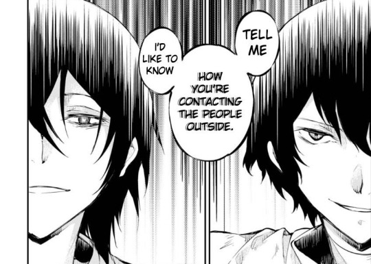
4. The rest of their conversation is likely filling in other gaps/conversations with their Terrible Advice CornerTM, until they've encoded/mapped out all their conversations, or at least the ones that they need to use. When they're both ready, they decide to ask a question simultaneously. They both know what the other is going to ask, so that’s the final check that they're in sync before they start getting into their actual discussion.
Extra brilliance: Their code is probably even more difficult to break (as if it's necessary...) because they can likely use different encodings for common words, as many words likely repeat in the same conversation, and across conversations, and using something like "every Xth word" will almost certainly pick up common words while they try to distribute them to cover a wider vocabulary. So even if their observers try to guess single words and short phrases, or perform some sort of word frequency analysis, they can easily use multiple different ones in longer contexts to prevent their observers from getting a starting point to figure out the main substance of their little chat.
(Source for images: Bungo Stray Dogs, Chapter 64)
#bungo stray dogs#bungou stray dogs#bsd#bungo stray dogs manga#bsd manga#fyodor dostoevsky#fyodor#osamu dazai#dazai osamu#dazai#crypography#encryption#cipher#code#fridge brilliance#mine
134 notes
·
View notes
Text
Kald’ve, Would’ve, Should’ve (and Finally Did) Commentary

No no, of course I didn’t forget, you forgot. And I couldn’t blame you if you did, it’s been some time coming. Commentary may be a special action, but it obviously still uses the stack - and as it gets stacked under more and more things, it can take a while to see it resolved. While I can’t promise the next one is going to have split second timing, I’m definitely going to be adjusting my schedule to make getting things out on time more manageable.
This challenge revisited what I started with the release of Zendikar Rising, albeit with a slightly looser approach, and I definitely enjoyed the increased diversity that I saw in submissions because of it. I think it’ll take a couple more of these before I'm able to mould my prompt to hit exactly the kind of results I’m looking for, so I doubly appreciate everyone participating in my little mad science design experiments in the meantime.
That said, let’s not keep you waiting...
@bread-into-toast - Halvar, God of Battle // Sword of the Realms
Flavour: This was a direct cleanup of a card that was already in the set, so there wasn’t a lot of flavour to credit you with specifically. There is new flavour text on the front face (which wasn’t an option on the printed version thanks to the MDFC frame treatment) that I suppose gives us slightly more insight into Halvar’s personality.
Mechanics: The front face has one minor change to the timing of the combat ability that does succeed in making it objectively more powerful, but probably does not make for more interesting gameplay overall - it pushes more of the combat math onto your opponents, essentially reducing the decisions you make to “what punishes these blocks the most.” The back face has a more significant change, trading out the original’s recursion ability for an ability that I assume is supposed to better represent the Omenpaths flavourfully, since it’s certainly not a core white effect. In practice I have to imagine the recursion ability plays more nicely with the equipment theme than a ramp effect does.
Nitpicks/Templating: The front face trigger would read “At the beginning of the declare blockers step each combat,” which is admittedly confusing because “beginning” implies that it’s before blockers even though it wouldn’t be - the awkwardness of the template is probably a reason we don’t see it more often. The ability on the rear face would want to specify where you’re casting the spell from like Sram’s Expertise does, otherwise you’re leaving it up to players to guess which spells it’s allowing them to play, and they’ll often guess wrong.
Overall: Shop the art all you want, I still think he’s as handsome as ever.
--
Charmera - Imyir, God of Tracking // Bow of Freedom
Flavour: I feel like I might be a little sketchy on the flavour for this one, but I believe the idea is that Imyir was fated to track “the Wolf” but never catch it, and had to break free of that fate in order to finally succeed. That definitely sounds like a neat concept, and I think you could’ve been even a little more explicit in delivering on it to really drive that story home - though I suppose this does already have more space devoted to flavour text than any of the Gods that did see print.
Mechanics: The ability on the front face is very powerful, I suspect the fact that the draws are temporary is a relatively small downside compared to the ability to chain card draw by hitting creatures one after another. The back face is... Well, I’ll be honest that I don’t know what you intended it to do. Indeed, both sides are exiling cards from your library face down, meaning you have no idea what they are, but allowing you to cast them. Is it supposed to be casting one at random? Did you forget to include the part where you look at the cards? That confusion aside, the 7-mana legendary artifact that mills you for 10 every turn (but explicitly hoses any graveyard synergies) doesn’t sound particularly exciting, though I guess if the effect isn’t intended to be random the free cast would be quite powerful. But just imagine casting this in multiplayer and milling yourself for 50 cards just to get to cast one for free - the ratio doesn’t seem appealing.
Nitpicks/Templating: If you want players to know what’s under their face down exiled cards, you’ve got to include a “look at” line. If a player was able to look at it once they’ll be able to look at it as often as they like for as long as it remains exiled, but that first look has to happen explicitly. Also: 8 lines of text does not have room for flavour text.
Overall: I just hope the Wolf made it out okay.
--
@col-seaker-of-the-memiest-legion - Scythed Whirlwind
Flavour: Embittered with time is definitely right up Egon’s alley, though the card name and the other aspects of the flavour don’t feel like they resonate particularly strongly with me. If there’s a way the flavour is supposed to lend itself to the mechanics, I’m not immediately seeing it.
Mechanics: You mentioned in your submission that you intended this to be a “skill-testing” board wipe, but I’m struggling to imagine what skill this would be testing. This is obviously just a board wipe in the vast majority of board states, though obviously it does - somewhat - encourage you to play creatures with equipments, but in practice this is still just going into (near-)creatureless decks.
Nitpicks/Templating: Targets are chosen as part of casting a spell, so they can’t be conditional like this. You’d want the spell to be modal, as you won’t be obligated to select targets for the mode you didn’t choose.
Overall: Maybe it’s just me, but the name conjures images of kamaitachi more than anything out of Norse mythology. But I’m also not an expert.
--
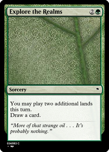
@corporalotherbear - Explore the Realms
Flavour: You acknowledged that flavour was your focus with this one, with the flavour text here hinting at an upcoming Phyrexian corruption of the ten realms. That makes some sense in the context of Vorinclex’s unexplained appearance, and indeed may wind up being something Kaldheim has to deal with in the future.
Mechanics: An Explore variant that lets you drop two lands instead of one, albeit for one extra mana. Ramping by two is a lot more powerful than ramping by one, but the requirement of having two lands available makes this a little less consistent. Generally speaking, cards with high power level and high variance tend to lead to unsatisfying play patterns, so I’d be nervous about the games where this does succeed in ramping from 3 to 6, even if it does so unreliably.
Nitpicks/Templating: Most quotations in flavour text are credited to someone, and while it’s not strictly necessary in a case like this, I think it would go a ways to helping deliver on the flavour.
Overall: Ten realms is an upgrade over nine hells, I guess.
---

@deg99 - Nith, Root Gnawer
Flavour: Your goal was to deliver on more dragons, and this kinda does that. I’ll admit that I’m lost on why it’s also a Troll, as those are completely separate species and it doesn’t appear to be an obvious crossbreed of the two. It’s not immediately obvious what the lands in graveyard clause is supposed to represent flavourfully, but if Gadrak is any indication that isn’t really necessary.
Mechanics: What stands out most here is - obviously - the repeatable land destruction. Against anything but the rampiest of decks, if you have this on the battlefield by turn six it is very unlikely for any opponent to recover from blowing up a land and creating a large token every turn. The fact that it’s unable to attack early really doesn’t feel relevant, because it’ll rarely be attacking late either - the upside of denying your opponent resources while expanding your board is almost always just much better than 5 damage.
Nitpicks/Templating: Templating favours common contractions, so it’s “can’t attack,” and (for whatever reason) only subtypes are ever capitalised: “4/4 green Troll Warrior creature token with trample.”
Overall: Repeatable land destruction is certainly a trollish thing to do, I’ll give you that.
--

@demimonde-semigoddess - Huatli, Guiding Hand
Flavour: Huatli on Kaldheim is a curious inclusion, feeling even more out-of-place than the existing non-native planeswalkers - of course this isn’t exactly a bad thing, as planeswalkers aren’t really supposed to blend in anyway.
Mechanics: The interplay between the three abilities here seems reasonable enough, the downtick creating tokens that trigger the first ability, and the uptick allowing them to trigger it on both attacks and blocks. It’s a little unexpected that both ways of triggering the ability are inherently aggressive (the block trigger only succeeds in tapping down blockers for the next turn), and cute that the otherwise unique tribal effect works with changelings in the set. It’s a little hard to gauge the overall power of three-mana planeswalkers as there’s often a thin line between unimpressive and broken so I won’t pretend to know how powerful this is just by looking, though I imagine the difficulty of blocking against it would give creature decks lots of trouble.
Nitpicks/Templating: You likely know the creature type in the first ability should be capitalised, and abilities with multiple targets read “each get” for the sake of clarity.
Overall: Is it the dinos that her hand is guiding, or something else?
--
@dimestoretajic - Calix, the Hidden
Flavour: This is an unexpected take on Calix, taking on a rather different appearance presumably as a disguise. It’s not immediately clear to me what he’d be hiding from, but the reference to Kratos is cute even if it’s ultimately confusing.
Mechanics: Always hard to evaluate planeswalkers without the benefit of iteration, but the abilities seem roughly in Calix’s wheelhouse. The first ability is a scry that upgrades to a draw if it hits an enchantment, probably reasonable enough at three mana; the downtick lets you trade him in immediately for a Stasis Snare effect; and the ultimate gives you a bunch of free Sagas. I think the idea of Calix interacting with Sagas is a little cute, though he definitely had that opportunity on Theros and didn’t so it might have been best to do it a little more subtly.
Nitpicks/Templating: The first ability feels like it has a lot of decision points for digital; I’d consider just revealing in the first place to save some clicks. The second ability is probably much wordier than it should be; I don’t think you gain much by naming the token (or by making it green), and the exile effect should probably just look closer to original Calix’s downtick. Be careful with so many wordy abilities on one planeswalker; I understand the desire to be clever, but ironically being elegant is even cleverer than being clever.
Overall: I’m down for Calix with a beard.
--
@driftingthruthecosmos - Immortal Triumph
Flavour: This appears to be playing into the trope space of Valhalla, letting your permanents ascend to the beyond only to return for a prophetic final battle. I think the art is an actual depiction of Valhalla, and the name generally signals toward the same concepts without actually embracing Kaldheim’s application of the same trope space, “the Worthy.”
Mechanics: This card definitely doesn’t work as written, but I prefer to judge design on the design’s merit’s, so I’ll do my best to work out how you expected it to work. The fact that this hits any nonland permanent makes it quite versatile, allowing it to return the same permanent turn after turn which can be difficult to overcome - even something as innocuous as Omen of the Sun can be pretty overbearing being recurred turn after turn with relatively little room for counterplay.
Nitpicks/Templating: The first ability leaves a few unintuitive holes where permanents can be lost despite the replacement effect. The second one appears to grant foretell (and a foretell cost) to a card it just put in your hand, which isn’t logistically feasible since your hand is a hidden zone. I’m not sure why the ability didn’t just turn the chosen card face down and make it foretold a la Ethereal Valkyrie.
Overall: I think my biggest wish for this one would be that the ‘glory’ was actually something you had to earn, rather than being totally universal.
--
@evscfa1 - Mistlebranche, Cosmic Prank
Flavour: The core idea of a weapon based on mistletoe deriving from the story of Baldr is really sweet, though some of the aspects of this design seem to stray a bit from that core concept. Most significantly the decision to make it a snow permanent with a snow equip cost seems rather unexpected.
Mechanics: Not to sound like a broken record, but the snow equip cost is what catches my eye the most: it makes the design very narrow, being completely useless without two snow sources plus a creature to put it on. Once it’s equipped, deathtouch and menace means that any creature this goes on will immediately be trading 2-for-1, making it really difficult to keep up with in any deck that’s able to produce tokens. Exiling planeswalkers too is a cute addition, and particularly powerful alongside making your creatures highly unprofitable to block.
Nitpicks/Templating: If you’re gonna make a weapon based explicitly on a plant, how did it end up anything but green? I imagine you designed the abilities first and chose the color to fit, but in this case I think the color was probably an important aspect of delivering on the concept and wasn’t a good place for compromise.
Overall: The name Mistlebranche sounds so elegant, though.
--
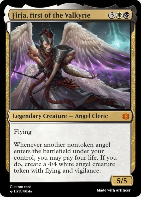
@fractured-infinity - Firja, First of the Valkyrie
Flavour: Reusing the Firja character with a new title. There’s enough about Firja elsewhere in the set to inform her character a bit, but that also means the title change can only do so much to change my perception of her.
Mechanics: The four life as a cost is pretty close to free here, but it does at least force you to adjust your play patterns to preserve your life total as you work up to it. In practice this is the kind of card you generally hold onto until you can guarantee some value from, and since we don’t see many Angels below three mana, this would often be waiting until eight to get played. That’s probably reasonable though, as once it does get going it tends to end games very, very quickly. This has the interesting upside of being less bad in multiples than most legendary creatures, as the second copy of this can still be cast to generate a token off the first.
Nitpicks/Templating: “First” in the name and each instance of “Angel” in the text ought to be capitalised, and life is always expressed with numerals: “4 life.”
Overall: Nice to see her growing out of that awkward Judge of Valor phase.
--

@hypexion - Kaya’s Gambit
Flavour: A play on the existing Divine Gambit design, with a couple minor tweaks. Interestingly, the flavour text comes very close to standing on its own - I didn’t remember the original’s, and yet it made some sense on its own (though perhaps it would’ve made less if I wasn’t aware of Divine Gambit already). The biggest miss is that the “gambit” part of the name makes virtually no sense with this design, as there’s no risk involved in using it.
Mechanics: Flexible if conditional removal. At worst it’s Disperse, at its best it’s just an exile effect. The biggest differences between this and the original are the open information and the (virtual) lack of a failure rate: with open information you’ll never be surprised by what your opponent gets back from this, and only returning the card to hand means that it’s rarely just not worth doing at all. This is clearly a more powerful version of the effect, but I’m not convinced it’s either more interesting nor a more appropriate power level.
Nitpicks/Templating: You probably want to use “with that permanent” instead of “with it”, as the text refers to multiple objects and they like to be as unambiguous as possible. I looked for examples that used “it,” but I didn’t immediately find any.
Overall: There are white cards, and then there are good cards.
--

@i-am-the-one-who-wololoes - Winter Travels
Flavour: The name definitely conveys both the concept and the mechanics reasonably well, and the flavour text itself is really evocative and has great imagery to it.
Mechanics: A mistake designers tend to make when designing for a known format is throwing multiple elements of that format onto the same card: when not done carefully, the result is a card that only works in a narrow intersection rather than being interesting in each archetype it makes use of. In this case, Snow archetypes make much better use of this than foretell archetypes, meaning this probably should’ve just accepted it was a Snow card and dropped foretell altogether.
Nitpicks/Templating: The template is unclear about whether the second condition - all snow mana - applies only when the spell is foretold or not, which is always going to be a problem with double-conditional cards. Also: this card had 9 lines of text before you put flavour text, it’s important to know when to make cuts.
Overall: Maybe I’ve read too much Robert Frost, but I really appreciate how poetic the concept here feels.
--

@ignorantturtlegaming - Elendriel, Twisted Prophet
Flavour: It’s not super clear to me who or what this is supposed to represent. The name and typing is enough to hint at a broad identity, but there’s a lot going on and not enough string to really tie it all together.
Mechanics: Like I mentioned for the submission above, throwing lots of a sets themes/mechanics onto a single card generally makes that card narrower and less exciting, rather than more exciting. In this case you’ve got a card relying heavily on foretell outside of the foretell archetype colors, unable to meaningfully contribute to its own colors’ archetype (Elves) without foretell, plus a boast ability that feels out of place both mechanically and conceptually...and also depends entirely on foretell.
Nitpicks/Templating: Flavour text was pretty important for the boast cards. While there were a couple rares that didn’t have room for it, notably the legendary ones both did because the flavour text was instrumental in selling the mechanic.
Overall: Elves > Foretell > Boast > ??? > Prophet!
--
@kavinika - Tjalfi, the Godly Messenger // Fjara, Doomskar Lookout
Flavour: Your submission took some time to explain the top-down basis for these two - a servant of Thor (Tjalfi) and one of the roosters of Ragnarok (Gullinkambi) - though obviously you’ve taken some slight liberties. The biggest issue with the flavour here is that it diverges from what the set establishes the Gods to look like - double-faced creatures with elements closely related to their divine duties on the reverse. With the set having only limited space to create and deliver on expectations, there probably just isn’t space to also subvert those expectations.
Mechanics: Mechanically, it’s awkward to have a red card that generates longterm card advantage, even if the condition for doing so is essentially a red thing. The two sides sort of push you in the same direction - lots of nontoken creatures - and the trigger on Fjara theoretically helps to reclaim Boast creatures that were lost trying to trigger the opposite side. The mana costs seem hard to pull off in the same deck, but I can at least see the play pattern it’s trying to encourage - though I can’t help but wish Fjara’s ability was a Boast ability, just to really help the card enable itself as most of the Gods do.
Nitpicks/Templating: Tjalfi’s triggered ability runs on a bit, it probably wants to be separated into two sentences: “ [...] of your library. You may reveal [...]” I’ll also a nitpick that if you’re going to base a character on something as unique as a rooster that crows at the end of the world, you probably want to make the connection as clear as possible - I don’t think anyone is going to make that connection here.
Overall: Maybe I’m just salty that I didn’t get the chicken version.
--
@kytheon4-4 - Gunnar the Breathless
Flavour: You made sure to include flavour text, which I think was really important to selling the Boast ability as it appeared on cards in the set. The specific flavour text you chose comes off as wordy, the story it tells is hard for me to parse (one can only imagine where they’d tucked the troll’s club away whilst hitching a ride), and doesn’t feel like it connects in any obvious way to the ability on the card. One of the fun aspects of Boast was how well they focused on creating stories to explain the specific ability on the card, but apart from maybe interpreting the troll’s lunch as life gain, I’m just not seeing that on this one.
Mechanics: You’re right that it would’ve been nice to have one of the Boast enablers show up at a lower rarity, though I’m suspecting that it probably didn’t for power level reasons - Boast is actually pretty powerful, and I wouldn’t be surprised if one of the rare enablers had started out at uncommon and gotten pushed to rare for being too impactful. I think it’s nice of you to try to make the ability broad enough to work outside of just Boast - there are a few things this breaks in older formats, but in Standard the scariest thing it can do is enable Kargan Intimidator or Subira, both of which are probably safe enough even with free abilities.
Nitpicks/Templating: All the templating stuff looks fine.
Overall: The irony of “the Breathless” holding a horn is not lost on me.
--

@masternexeon - Aggravated Berserker
Flavour: This card is a little light on flavour, which I’m normally just fine with, but in the context of Boast the flavour does a lot to bring the mechanic to life. It’s clever that the name is a throwback to Aggravated Assault, but I think a little more attention to detail could’ve helped it really pop.
Mechanics: Obviously this was really close to one of the winners, with the big difference being the Dwarf tribal element. Obviously I favoured the version that had a slightly broader appeal, but since Dwarf tribal was one of the themes of the set, there’s probably a version of this design that does both (extra combat for everyone plus a bonus for Dwarves) that I would’ve liked better than either.
Nitpicks/Templating: You’ll want to make sure to capitalise “Dwarves” in your rules text.
Overall: No spoilers, but this one almost seems designed with my next challenge in mind.
--

@misterstingyjack - Toralf and Valki Deceive the Giant King
Flavour: Boy howdy, that’s a name - I’m impressed that your renderer got it to fit. This is a top-down story about Thor disguising himself as his own mother in order to trick a giant that wishes to marry her into returning his hammer. The chapters of the Saga follow that pattern pretty precisely, letting you disguise one of your creatures and - over a couple turns - steal an artifact from an opponent. You might have considered swapping chapters 1 and 2, so that the destruction effect could represent the hammer going missing which prompted the whole endeavour. Indeed, then you could even move the mill effect into that ability, to represent the hammer being buried after it’s stolen.
Mechanics: Similarly, I think putting the destruction effect up front would’ve done this card some good. The copy effect is cute, but it’s not the most powerful effect on the card, and as written this is pretty easy to blank with a removal spell. I do really like the way the abilities intersect the colors - destroying an artifact or creature requires both colors, temporary copy effects from a graveyard feels both red and black, and recurring an artifact is something red can do that still feels pretty black.
Nitpicks/Templating: As much as I respect how ambitious the name was, I’m confident you had shorter options available.
Overall: It’s always lovely to see a top-down story that you enjoy getting represented as a card, nice choice.
--

@mtg-ds - Koll, Breath of the Bellows
Flavour: I definitely understand your frustration that there aren’t more smiths that do actual smithing in Magic, instead just encouraging you to build a deck that simulates their doing so. This correction for that is pretty straightforward, making axes and shields to equip to your army.
Mechanics: The low costs on this are going to lead to a lot of Equipment tokens on the battlefield at any given time - any time you have unspent mana you’re going to pour it into making tokens, especially since you can do so at instant speed. Combining that with the first ability reducing the Equip cost to zero, you’re going to have a mass of equipments shifting constantly from creature to creature, which just seems logistically difficult to keep track of.
Nitpicks/Templating: Everything looks right to me.
Overall: I have to assume stumpy Dwarven limbs are to blame for why they’re wearing shields on their shoulders rather than strapping them to their arms like the rest of us.
--
@naban-dean-of-irritation - Niko, the Defiant
Flavour: Niko was immediately a beloved character for a lot of us, so I can definitely understand wanting to reimagine that character more in line with your perception of them. It’s hard replacing the first iteration of a planeswalker because all the lore we have available is the card that exists and stories based on that card - so it’s just inherently difficult for me to see how these abilities relate to the character, since it’s essentially establishing a different character with the same name.
Mechanics: The most glaring issue is the fact that the first ability essentially gives haste on a WU card, which qualifies as either a very strange design choice or a pretty significant oversight. The third ability also feels like it’s skirting the color pie, presumably attempting an Omniscience impression that just feels out of place for this pair. The uptick and downtick feel like they’re designed to do pretty similar things, both primarily saving creatures from unfortunate blocks. I suspect the reason is that the ‘instant speed on your turn’ effect pushed the design into rather narrow space, where two abilities came out very similar while the third simply doesn’t really benefit from the instant speed.
Nitpicks/Templating: No obvious templating woes.
Overall: As much as I respect their defiance, defying the color pie is where I draw the line.
--
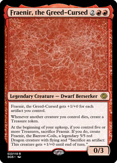
@nine-effing-hells - Fraenir, the Greed-Cursed
Flavour: I always enjoy top-down designs especially, and this story of a Dwarf hoarding treasures until they transform into a Dragon is such an excellent place to mine for those designs - and really, what set wouldn’t want more Dragons? The abilities themselves tell a story of murser and greed, even without needing flavour text to help it along.
Mechanics: I think my biggest issue with this design is that rather than the transformation being something you work towards or work to avoid, it is awkwardly positioned between the two - there are times the Dwarf Berserker will be larger by virtue of controlling lots of non-Treasure artifacts, making it unclear what the play pattern of the card actually is. It does have the benefit of being easy to avoid transforming when you don’t want to, but I think it would suit the design better to arrange the abilities to make the comparisons between the two states clearer (for example, giving the Dwarf non-combat abilities and saving the combat abilities for the Dragon half).
Nitpicks/Templating: Easy mistake, you missed the word “token” in the sacrifice trigger.
Overall: I’m really curious what the art for a card like this would look like.
--
@partlycloudy-partlyfuckoff - Pagan Chamberlain
Flavour: I have to assume the whole design was for a chance to use that flavour text, as the other aspects of the card don’t seem to align with Kaldheim as a setting - the world has no actual vampires, and the concept of a non-believer makes a lot less sense in a world where gods are as tangible as this one.
Mechanics: Similarly, this isn’t playing into any of the mechanical themes of the set; there isn’t even a strong monocolor theme to run counter to. I suspect the rationale is that each of the gods in the set are monocolor creatures, but seeing as there’s already a card in the set with protection from Gods, it seems strange to try to be subtler about it than that one.
Nitpicks/Templating: Nothing much to nitpick over.
Overall: In this set, the answer to that question is usually “an artifact.”
--

@real-aspen-hours - Ill Omen
Flavour: The name aligns well with the foretell mechanic, and the flavour text helps connect an important story beat to a broader narrative and to the flavour of the card itself. I’d be a little reticent about including such a significant spoiler in flavour text, but perhaps there’s a way to phrase it so that it reads like a prophecy until you find out it’s already happened.
Mechanics: This is effectively three-for-one removal, which is a lot of value for a single uncommon. Locking it to sorcery speed gives at least some incentive not to foretell it, as that delays it for a full turn - it won’t be often you cast it straight, but that I can at least imagine the situations is a plus. It’s especially powerful in that when it isn’t useful as a removal spell, it allows you redraws for something more useful.
Nitpicks/Templating: Foretell shows up after the spell effect, even for those cards that care whether they were foretold. While we’re here, good catch on including a target in the card draw effect - while it would be easy to exclude one, ensuring that the spell has two targets keeps the whole thing from fizzling if the targeted creature disappears before it resolves.
Overall: This feels like it’s only a slight push away from being constructed playable, and I’d be interested to explore what more it takes to get it there.
--

@snugz - Surtland Rimereader
Flavour: I rather like the flavour here, a Giant that’s able to see the future with the help of the snow allowing you a Future Sight effect specifically for snow cards is pretty satisfying. It’s not immediately obvious what the last ability represents, but the rest of the card feels like it sells it well enough anyway.
Mechanics: I’m not entirely sure that blue is still able to play lands off of this type of effect; the original obviously did, but none of the blue variations since then have, and I’m not sure ‘snow’ is a blue identity to bend for it. The triggered ability feels a little bit awkward with the overall design since you specifically don’t have much control over the first spell you cast when you’re doing so from the top of your deck.
Nitpicks/Templating: Good catch on the updated template for Future Sight, as I don’t think they’ve actually printed any cards with that wording yet. It was updated some time after Bolas’s Citadel was printed, and we’ve yet to have another card in that style see print.
Overall: Would’ve loved a rime-rhyme pun somewhere in the set, and this feels like an opportune place for it.
--

@stormtide-leviathan - Kvasha, God of Magic // Kvasha’s Birth
Flavour: In this setting, the connection between enchantments and Spirits and flash doesn’t feel immediately obvious. Now naturally this is trying to create a connection where one didn’t exist previously, but it does feel like it muddles the flavour slightly to do so.
Mechanics: This is large and evasive enough to serve as a finisher even without making extra tokens, though the tokens can serve as some resiliency against removal. I’m not entirely sure how the flash ability relates to the rest of the card, except to change the template of the Saga’s first ability. If that were so important I’d have looked for a first chapter ability that could take advantage of being cast at instant speed, but then more likely I would’ve just cut the flash bit entirely.
Nitpicks/Templating: I’m not sure what it was intending, but there’s no way for a chapter ability to see the object it’s on entering the battlefield - that ability won’t resolve until well after the permanent has entered, and if it somehow re-entered the battlefield it would do so as an entirely new object. The last chapter ability will want to specify whose controller the object returns under (usually its owner’s), and you’ll want to move the ‘face-up’ bit into reminder text - you don’t need rules text to make it work that way, but it’s definitely worth clarifying for players who might not realise.
Overall: My favourite god designs in this set were the ones that let you use both sides with just one copy.
--

@thedirtside - Ragnarock
Flavour: The setting for Kaldheim reworked the concept of Ragnarok into what they called a Doomskar, leaving the original name feeling out of place within the setting. The color combinations used for the spell also aren’t represented in the setting, making it difficult to imagine what part of the world this is supposed to be representing in practice.
Mechanics: The most obvious point here is that the foretell cost and the casting cost don’t overlap, making it almost impossible that any given deck will actually have the option of casting it both ways - since the options it provides are the only thing that makes foretell interesting, intentionally designing to hamper that doesn’t seem like a good use of the mechanic. The foretell cost is also much easier to pay than the casting cost, making the added bonus for foretelling the spell feel really counterintuitive.
Nitpicks/Templating: It’ll take a slightly wordier template to achieve the second part of this effect, something like: “For each permanent destroyed this way, CARDNAME deals damage to that permanent’s controller equal to that permanent’s mana value.”
Overall: That must be a really big rock.
--
@theobligatorysql - The Sagas of Worlds
Flavour: One of the fascinating things about Sagas is the way they use art to represent the stories for them - this set uses carvings, reliefs, even tattoos as a form of storytelling. So while the idea of compiling them all into a single tome is cute, it feels to me like it isn’t exactly fitting for the world itself. I could definitely see it as the work of an outsider - Tamiyo, for example - but it feels like it makes less sense as something native to the plane.
Mechanics: I’m a sucker for designs in the vein of Treasure Map and Mazemind Tome, so an artifact with a cheap scry effect is right up my alley - though admittedly, I’m not sure why this inventivises scrying to the bottom as that complicates the calculus and will cause players to make bad scrying decisions for perceived value a nonzero amount of the time. I’m never a big fan of tutoring as it tends to lead to repetitive gameplay, and the fact that it takes at least 4 full turns to set this up to draw even a second card means that it’s nearly always going to be fetching up a cheap Saga instead of a random draw.
Nitpicks/Templating: I’d probably just use “scried” in the first ability, though admittedly that templated hasn’t been used yet.
Overall: This would be a great opportunity to finally get the word “edda” on a Magic card.
--
@wolkemesser - Bard of the Fallen Meek
Flavour: This was actually far and away my favourite submission to this challenge in terms of flavour, as I love the way it draws attention to the difference between Istfell and Starnheim, and shows regular individuals within the setting reacting to the concept of the Worthy. The flavour text itself could probably stand to be pared down to be a little punchier about the point it’s making, but I absolutely love what it’s trying to do.
Mechanics: That said, the implementation is a little messier. The skulk mechanic was used in one block five years ago, so certainly doesn’t qualify as evergreen. I like that the creature itself has stats that make it easy to safely get its Boast ability going, though the ability itself feels rather unexciting. I’m not sure what about the card demands the double white in the mana cost, or even what makes this a rare over an uncommon.
Nitpicks/Templating: You missed capitalising “Spirit” in the Boast ability.
Overall: I would’ve loved to pick this as a winner, next time try an extra pass or two to make sure you’re hitting all the aspects of the challenge.
14 notes
·
View notes
Text
All of Armitage’s Looks: Rated
Well, this was inevitable, wasn’t it? Being someone who very readily admits to having Armitage’s entire wardrobe memorized (and who will not apologize for how weird that is), I feel that I’m the perfect person to make this post, although perhaps not the most objective...
So, without further ado, allow me to present to you: every single one of Armitage’s Looks in chronological order: Rated.
#1 - Enjoying The Birthday -- 11/10

Unlike most named characters, Armitage does not appear until episode 4 but oh what an entrance it is... Look at that smile!!!! Actually, take an extra good look because you’ll never see it again.
Outfit-wise, this is just his normal steward uniform but I like those boots. Probably not unique to him but they’re very nice and remind me of a pair I own.
Bonus points for being the second person on the tackle-pile, following Tozer.
(You could accuse me of rating too high right off the bat, but look at his smiling face again and tell me I’m wrong.)
#2 - “Mr. Armitage, what do you report?” -- 8/10
And thus we are introduced to Armitage by name. Appropriately, he is partaking in his most consistent character-defining activity: protecting Tozer from harm (which, in this case, is the Not-Bear which has just come out of nowhere and ripped part of Heather’s skull off).
I’m gonna be honest: I don’t like how this style of coat looks when it’s fully buttoned-up. I think it’s awkward and boxy (see Gibson’s coat in the mutiny-planning scene at the beginning of ep 7 for a better idea of what I mean) and this is before Armitage figured out the belt trick that corrects the problem so I’m deducting points for the coat.
Luckily for him though, his hat is of my favorite variety in the show so I’m delighted to see it despite it just being his uniform. Also loving our first look at his blue sweater (peeking out beyond his coat-sleeves) and his gray gloves.
Further points added for this being the first of many scenes where he carries a gun, endlessly confusing the fandom at large about what the hell his job is.
#3 - tfw You’re Responsible For This -- 5/10
So I’m just gonna come right out and say that this is one of my favorite images of him in the entire show but, just as Look #1 was rated higher due to the context of the scene despite the outfit itself being average, this one’s rating, in turn, must suffer.
Things I love about this: the hat (obviously), the fact that the coat looks worlds better just because it’s slightly unbuttoned, the delicate dusting of snow, the way his face looks at this angle.
Things I don’t love about this: literally Everything Else.
Aiding in the racist kidnapping of an innocent woman and then not owning up to it twenty minutes after your introduction is not a good look, no matter how emotionally conflicted about it you are.
#4 - Who the Fuck is This Guy? -- 6/10
October 20th, 2019 was not the day that my obsession with Armitage began, but it was the day that I took a screenshot of this exact moment because I had no idea who this man was or why we were getting a close-up of him. It would take me two more months to figure his identity out.
But, to the point, not much to say here since it’s just his normal uniform again except that this is our first proper look at his hair which I absolutely adore. Also loving the little anchor buttons on his jacket - very cute!
Once again, points deducted for the unfortunate context.
#5 - Slops! -- 7/10
This look is noteworthy for a few reasons. First of all, we see his tan slops for the first time! Slops just sort of look horrible by default unfortunately but I’m enjoying the hat + slops combo here... it works for him. Secondly, Armitage disappears for the entirety of episode 5 so this is the first time we’ve seen the man since the lashing scene. I guess it was so traumatic to witness that he had to take a break.
He has a gun again though, so things can’t be all bad.
#6 - Big Carnivale Hours -- 8/10
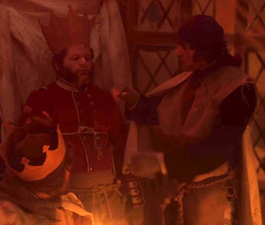
I have given up on trying to figure out what the hell is going on with the marines and their costume theme. Are they knights.... with crowns? That’s all I’ve been able to figure. Who’s idea was this? (Despite having no evidence, I blame Pilkington.) So what does that make Armitage? Is he a squire? Or a knight that just doesn’t have a crown like the others because they ran out of them? Whatever the case, he’s clearly a part of their theme despite not being a marine himself which I think is adorable regardless.
Speaking of adorable, let’s just forget everything that happens for the rest of this episode and appreciate how he’s hanging out with Tozer and Heather. Isn’t that nice? God I’m distressed.
Taking a look at the costume itself, you’ll see that it’s essentially a cut-up burlap sack and a sheet over his regular uniform but realism is not the goal here and the DIY vibe is actually quite nice imo.
#7 - Enter: The Belt -- 10/10
The belt has arrived on the scene! Note its success in not only making the coat itself more appealing but making the coat + slops combo work against all odds.
We really get it all here: belt, (unbuttoned) coat, hat, welsh wig, gloves, and slops! What more could I possibly ask for in an outfit? It’s both stylish and practical.
And plus, I like his attitude in this scene - optimistic-leaning realism about the dangers ahead. I can get behind that.
Overall, no complaints from me - this is a perfect look.
#8 - tfw You Allowed This -- 7/10
This is a Significant Look mostly because we see his hair again, for the first time since episode 4! It’s a bit longer and more unkempt but still maintains a pleasing shape overall. Honestly, I think it looks good this way and its a pity we didn’t get to see it more in the transition stages (assuming it was steadily growing out since ep 4 like most people’s). Additionally, there’s a bit of stubble going on here which I respect.
Rated lower than it might be simply because, as has been established, slops on their own are just kinda ugly. I don’t have a lot to work with here outfit-wise. His face is lovely but this screenshot is a sepia-toned nightmare.
A bonus point for his desperate “please explain this clearly illegal thing we’re doing in a way that makes sense to Little” glance at Tozer, who is already on it.
#9 - Agony -- 8/10
It took me awhile, even after becoming aware of who Armitage was, to appreciate how truly miserable he looks in this scene. And I mean, why wouldn’t he be miserable? Tozer, a man who Armitage risked his own life to drag to safety at Carnivale, is about to be executed for something that’s arguably just as much Armitage’s fault and there’s not a thing he can do about it.
So... that’s depressing.
But, looking at the outfit itself, we see that it’s pretty similar to some past Looks. In fact, it’s identical to what he was wearing when the Tuunbaq attacked Heather with the exception of the belt which is, of course, a new addition since then! And look at the difference a belt can make... You almost don’t notice that the coat is buttoned up all the way.
#10 - The Same Outfit But Now He’s Saving Tozer So Its Cooler -- 9/10
Y’all ever think about the fact that, when things went to shit, Armitage’s first instinct was to grab a gun, find Tozer, and rescue him? I mean you probably don’t but I do. Constantly.
Obviously I love this part and the outfit is still solid (note how well the belt shows off his figure!) but it loses out on being a perfect 10/10 because he must have dropped his hat while picking up the gun so we never see it again. A necessary sacrifice but one that I mourn nonetheless.
RIP Armitage’s cool hat, ??-1848.
#11 - The Blue Sweater -- 8/10

It’s warming up so that means we finally get a look at the lovely layers that have been hiding under Armitage’s coat. It’s important to me to bring special attention to the sweater because, although (as I’ve mentioned) he has it on all the way back in ep 4, this is one of only two scenes in the entire show where we get a proper look at it.
Further, not only is he wearing the blue sweater, but he also has a blue vest on over it! Now, I’ll admit, these aren’t exactly complimentary shades of blue but it still works for me.
Note also that the belt he had around his coat has been repurposed to aid in holding up his slops-pants over his normal pants (which are held up by the suspenders). Does this man’s resourcefulness ever cease?
As much as I’d love to give a higher rating for the blue sweater, I can’t ignore the new beard which is... it isn’t... it’s Not Great. I don’t have as much animosity towards it as I used to but I can’t pretend that I love it.
#12 - Let Us Fly These Deadly Waters! -- 9/10
I’m not sure why but I’ve always found this outfit very appealing. The tan slops-pants go nicely with the white shirt and blue vest. It’s a solid look - I’d wear this irl honestly.
And bonus points for his trying to convince Tozer to leave Hickey, even though he was ultimately unsuccessful.
(P.S. - yes, the title for this one is a Moby-Dick reference... Did you really think I would make it through this entire post without one?)
...and now, last but not least, I present to you my absolute favorite Armitage Look™... all the other times I said some other outfit was my favorite, I was lying because what I am about to show you is truly the cream of the crop. Without further ado:
#13 - Kidnapping is Bad So At Least Look Good Doing It -- 12/10
Are y’all seeing this? Are you SEEING this????? It is episode fucking 10!! Everyone is dying!!! And yet here’s Armitage waltzing up in his best outfit of the entire show. What the fuck!!!!!!!
Do I even need to explain why this is exceptional? Just look at it! Look at how the vest is buttoned up and tucked into his slops-pants! Look at the suspenders over top which match the slops-pants in color! Look at the gun and keyring that look like they were made to accessorize this outfit specifically! Heck, even his hair and beard look much better from this angle.
Now, I’m not trying to discount the fact that Armitage was absolutely miserable throughout this entire episode, and understandably so, but, even with that in mind, I can’t bring myself to rate this look any lower. It’s just That Perfect.
If one must inevitably die horribly in the arctic, this is an excellent outfit to die in.
__
Well, that’s that! Thank you all so much for reading and I hope you enjoyed this! I’m glad that my ridiculous opinions about Armitage’s wardrobe finally came in handy for something other than my own amusement.
#the terror amc#the terror#thomas armitage#hell yeah let's tag this nonsense!#tbh i'm very proud of this post tho#it literally did take me all day#12 hours from conception to completion (with many breaks of course!)#and worth every second!#I love this man and his exceptional fashion sense#and i need you all to appreciate it as well#like i said - i hope y'all enjoy and thanks to those who read through my rambling!#love y'all!
74 notes
·
View notes
Text
An Animation-Term and Keyword List For People Who Haven’t Studied Animation
I’ve decided it’s time to put my BFA in animation to use and share with you all about 40 terms I could get off the top of my head that I’ve seen confusion and misconceptions about.
If you know a term that was missed here, feel free to add a definition or ask for one!
Animation (in this context) -- The act of taking a series of images and putting them in a sequence next to each other which is then viewed in rapid succession, thus giving the images the illusion of movement.
Anime -- The Japanese word for “animation”. This term is often used to refer to the style of drawing in the west, but it literally ONLY means “animation”.
Animatic -- Unfinished visuals and audio cut together into a watchable video format. This is NOT another word for short animation. An animatic would use visuals from a storyboard rather than rough or finished animation
Anticipation -- A slower movement made by a character to lead into action. This is used to great effect in comedy animation and in games like Dark Souls. The posing and buildup makes you expect something is going to happen.
Cel -- A tool for animating. Traditionally, this is a sheet of clear plastic that a frame of animation is drawn on and painted color is applied to. These are set on top of background images and photographed so they can be used in the final animation. The term can also be applied to hand-drawn digital animation. Pre-digital nearly everything was animated in this fashion, like Bugs Bunny cartoons or classic Disney movies. Some Japanese animation is still done like this, but the move to digital has only recently begun there.
Claymation -- A branch of stop motion animation, it is when moldable clay is shaped, photographed, and reshaped in a manner that gives it the illusion of movement.
CGI -- Stands for Computer Graphics Imagery. Any image that is generated by a computer. This applies to all digital artwork, even 2D, but is most commonly used to refer to 3D images created by a computer.
2D -- Flat images such as those you would draw on paper. They have height and width but no depth.
3D -- Images with height, width, and depth. Computer generated images and physical sculptures fall under this category. 3D computer animation and stop-motion animation are 3D.
3D Computer Animation / 3D Animation -- Animation done on a computer specifically using 3D software to either give the image more depth or to make it look more lifelike. It is made by creating digital sculptures of characters which a “rig” is attached to which gives the animator the ability to move the sculpture like a puppet. If you say 3D animation, people will know you are referring to computer animation. Most American movies in the past decade are or include 3D animation.
Digital -- Any animation done on a computer. This applies to 3D animation, 2D graphic animation, and hand drawn animation done on a computer. Most animation has moved to digital formats because of computers ability to automatically in-between--thus saving large amounts of work. Computers also eliminate the need to physically store easily lost or damaged piles of paper and film, and they eliminate the need to manually photograph individual animation frames.
Flash -- Refers to the now mostly defunct Adobe Flash program which gave animators the ability to turn 2D drawings into puppets that could be animated. The similar Adobe equivalent is now called animate. It popularized a style of puppeted animation similar to paper cutouts in a digital format, but while it is known for that, it can be used for hand drawn animation as well. This puppet style of animation has improved dramatically since it’s beginning in Flash, and the same (or similar) technique is used by people who animate with programs like Toon Boom. Shows animated in flash include Johnny Test and My Little Pony: Friendship Is Magic.
Frames -- A single image as part of the whole animation. A picture of a cel on a background would be one frame.
Frame rate/ Frames per second -- How quickly the frames are played back for the viewer. Film standard is 24 FPS, or 24 frames played in rapid succession for the duration of 1 second. Games often play at 30-60 FPS to aid reaction time.
1′s and 2′s -- To animate something on “1′s” means to create 24 distinct frames to play for a full second. 24:24, or, just 1. 2′s--also known as 12FPS--similarly means you do half that amount of work. 24:12. Most things are animated at 12FPS because it is less work and accomplishes approximately the same thing as animating on a full 24 frames. Animations at these rates are still played at 24FPS. Contrary to popular belief, classic Disney movies are mostly animated on 2′s.
3′s and 4′s and so on -- Like 1′s and 2′s, but less. 8 and 6 FPS respectively. These rates are used more commonly in television than movies, but even then rarely. 3′s and 4′s most often exist in conjunction with 1′s and 2′s to both save work and give the animation more expression. These are also always played at 24FPS. Studio Trigger most notably animates like this.
Hand-Drawn -- Animation that is fully drawn by hand and does not involve manipulating a puppet character. Traditional 2D animation is hand drawn, Flash animation isn’t.
Hold -- When a frame or pose lasts longer than normal. A hold can be completely still or have slight movement. They are used to break up action and very often used to create anticipation of an action.
In-between -- Frames that connect the action happening between keyframes. They change something from a set of poses to actual animation.
Keyframe -- Important frames in the animation, often major poses in an action. These are sometimes taken from storyboards but not always.
Meaningful animation -- Or animation with intent. Parts of an animation that were specifically made to do a certain thing. This comes up in discussions about higher frame rates and whether or not they matter to a work. An action that could be expressed in 8 frames played at 24 FPS does not necessarily need 24 frames, because the additional frames provide too much visual input, could be drawn more poorly, or are a waste of time to do. A computer generated tween is not always meaningful because it was not always intended to exist by the animator. The frames generated when you take an animation at 24FPS and modify it to be 60FPS are not meaningful.
Mocap/ Motion Capture -- When a person wears a silly suit with little balls or other markings on it and acts around a stage, that is for motion capture and animation reference. Motion capture tracks a persons movement and can apply it to a 3D rig, but it is not perfect so animators are still needed to correct the movements and make it work in the final product. This is used in many live action movies that feature CGI and notoriously in The Polar Express.
Mograph/ Motion Graphics -- This is the animation style used in many commercials, how-to explainer videos, and animated company logos. This is the lovechild of graphic design and animation. It is most often 2D, sleek, and heavily design focused as opposed to character focused. Most often made in Adobe After Effects.
Paper cutout -- A form of stop motion animation where pieces of paper are placed on a flat surface and photographed from above. This can be done with light from the front to see the full detail of the paper, or back lighting to give it the effect of shadow-puppetry. The first animated film was done in this style.
Pre-production -- Work that is done before something is animated. Includes character designs, environment designs and layouts, scripting, storyboards, audio recording, and anything else necessary to have done before you begin the arduous process of animation.
Post-production -- Anything that needs to be added after all pre-production and animation is finished. It includes editing everything together, adding effects, and whatever else must be done before you can call something “finished”.
Procedurally Generated Animation -- This is animation made entirely in a computer through use of algorithms. Used more often in games than anything else. Animations are generated in real time to create more variety in the movement. It allows for things that can’t be done with pre-made animations like making characters feet land and/or slip on rocks or track their head and eyes to look at something.
Puppet Rig/ Rig -- A skeleton applied to any type of puppet you want to animate. 3D and puppeted stop motion animations both use this, though in stop motion it is more likely called an armature. 2D animations like Flash animations also use these
Onion Skin -- A 2D animation term. In traditional animation, a person works on paper over a light table which shines light through the paper and lets them see the frames they’re animating between. In digital animation, you press a button and the onion skin will display in either a lighter color or different hue the frames in front of or behind where you’re working to a point you can set and adjust. It’s called onion skin because peeled onions are transparent.
Reference -- Looking at something from life to base your work on. If you are animating a flying bird, you need to know how their wings move, so you need to watch birds or maybe film them and play it back slowly so you can see the small details. Animation since Snow White has used life action reference heavily, many old animated movies were fully acted out and recorded before they were animated. Movies today don’t do that much, but animators will record themselves acting out scenes they’re working on to capture body language and lip sync. Reference is not tracing or rotoscoping, but it can be.
Rotoscope -- Animation drawn directly over life action footage. This is reference to it’s extreme, because the drawings do not take inspiration from the movements so much as they are an exact recreation. It is often easily noticed for the higher framerate it often has and for having movement unnatural to animation. Unless the character is heavily stylized, rotoscoped animation often looks strongly like real people. 2D animation traced over 3D animation is not rotoscope. Motion capture is also not rotoscope. Many classic Fleischer films had rotoscoped sequences and Anastasia is known for it’s heavy use of the technique.
Rough Animation -- Animation in it’s early stages, it may not be fully in betweened, but even if it is, it isn’t cleaned up or finished. Drawings in the rough stage are often messy and incomplete so it is easier to throw out frames and replace them.
Rough Cut -- The next step from an animatic. A rough cut contains all finished and unfinished work as a preview of what the final product can be. They can have any combination of animatic materials, rough animation, and finished work.
Stop motion -- Animation of physical objects on a set, photographed one frame at a time. Covers everything from claymation, to paper cut outs, to puppets, and more. More prominent in early film as visual effects before that became what it is known as today. The most popular form is puppet animations like those done by Laika studios.
Storyboard -- A sequence of rough drawings paired with script that dictate what will happen in an animation. These are not keyframes for animation, nor should they themselves be animated.
Timeline -- In digital animation, this is the bar that holds the individual frames in sequence so they can be played and viewed as you work. You can also stretch the frame length to last longer or shorter, hence “time”.
Traditional (Cel animation) -- Earliest form of 2D animation, the same as hand drawn animation only it’s done on physical paper. The terms are blurred together however, so when talking about traditional animation you may need to specify whether it’s on paper or digital.
Tweens -- Computer generated in-between frames. Applies to 3D animation, but most often refers to puppet rig 2D animation like flash animations. Often used as a derogatory phrase, as computer generated frames can lack the visual appeal of hand made ones. Tweens move extremely smoothly and evenly from pose to pose, which is the tell of a puppet rigged animation.
VFX -- Stands for visual effects. They are effects applied to a film in post-production that can be CGI or not, but are very often CGI. Includes aspects such as explosions, weather effects, background details, cleanup, etc.
696 notes
·
View notes
Text
Elements of anthropology
Part One: Elements of Anthropology
Explain the elements of anthropology to be considered in cross-cultural ministry to the particular
Anthropology comprises of the fundamental concept including the study of God and study of humanity basing on different aspects of life being evidenced in day-to-day life of people in their respective societies. The creator who is God is being considered to be the divine cultural source in which everything which is good comes from him. This has impacted the religious beliefs of many people who have increased their belief in God. Everything created by God is being considered to be for his own glory and revealing accurately and truly the person in himself. The global culture has been impacted by the anthropological beliefs since it is believed that the first culture was created with Eve and Adam in the reflection of who truly God is as a super natural being (McDowell, 2016).
1-Kinship, marriage, and family
Anthropology comprises of various forms of kinship, family which is very crucial in the study of humanity. This deals with humanity and discovering how the people in the society express their humane acts to each other in the society. The aspects of the people in several languages and cultures are denoted b the systematic anthropology. Several facets of family and kinship systems are characterised with a variation of practices of divorce and marriage and how the social organization of the culture is being determined by the structure of the family. This also determines and shapes the way relationships and roles are taught to the new generations and this would be of great impact to such generations. The process, structure and the reason behind the family relations is crucial in the analysis. For instance, the theology of the bible and the design norms of the family is clearly taught for the scripture on different topics which it authoritatively speaks for the Christians who believe in the Bible (Act of libraries, 2017).
2-Age, race, ethnicity, gender, and class
The people in the society of different age and race have the tendence of interpreting the scripture giving the standards for different cultures which they belong to. This is because the individuals tend to divert away from the culture due to their social class. It can also be seen clearly when God created the world, he only created two genders female and male to live together on earth. Collectively, they would be able to control and rule earth since they were created in God's image. God directly created Adam who was the male gender. This the reason why in the societal and religious settings it is considered that men are superior over the women and that the women were created out of the man's rib. The social values of men and women in the society clearly depicts on the time and how they were created by God. It was one in such a way one gender is superior over the other in terms of cultural and social values (Hudson et al, 2021).
3-Economics and social organization
The economic and social values in the society are usually different and ranges from one person to another. The society is always characterised by individuals who are superior to others and this sometimes can be based on politics. In many societies, the justice is equal to all people and normally refer themselves to be socialists, fascists and sometimes democratic nations. The demands of the people are always powerful with the centralized government dedicated enough to provide the people with the necessary resources to ensure that there is economic and social development. In different parts of the world, the private property owned by the people is usually protected by the consensus in the society so that the economy is stabilized and protected. People believe that the good news preached by Jesus led to social, economic, and political freedom which happened first in the western countries (Lumen, 2021).
4-Belief systems and religious practice
All the people in the society in all parts of the world have faith due to the fact that they were made from God's image and this has been widely preached by Christianity. This has made people believe that they can not rely on themselves in along run while facing their challenges. Believing in God and accepting that with him everything is possible is common today among the Christians. For example, in genesis of the human race by Eve and Adam, there was creation of the community of worship in which people would come together and pray while asking for what they want from God. The church in the society would have a religious leader who would act as the messenger of the Bible just like how Adam was the head of the first family. For the people who are wicked, there is a punishment put for those individuals due to deviation from the covenant. For example, in noahs ark the wicked people were punished by the floods which eliminated them (Kreitzer, 2016).
Part two: Culture Change within the Context of Missiology
Based on your analysis of the various components of culture, which components will most impact best practices for cross-cultural ministry for the particular culture
The religious practice and belief systems will greatly affect the cultural settings of different societies. Different cultural or traditions have been stopped due to the religious values which are against them and are considered to be evil in the face of God. Everything in the societal traditions have been left for only the Creator to do (Kreitzer, 2016).
Discuss both positive and negative influences, and summarize the next steps/call to action.
It has demonstrated that all people must be dependent from God who made them to live. This has dynamically changed the people's views on their traditions and this has resulted into extinction of some traditions. The religion has changed all the nature how men treat their wives and respect them since in the Bible it is said that we are all equal to God. Therefore, there should not be any form of injustice in the society and this is very important in creating peace and security in the society. It is being illustrated that individual believers will not significantly impose their own culture on other people with different cultures. Culture has adversely changed and everything has become religious and left in control of God (National park service, 2021).
References
Kreitzer, M. R. (2016). A new dawn for Africa: What does the Bible really say about rebuilding Africa with God's spirit and biblical social ethics? Cape Town, South Africa: Christian Liberty
McDowell, P. (2016). Political Anthropology: A Cross-Cultural Comparison. Retrieved from, https://courses.lumenlearning.com/suny-culturalanthropology/chapter/political_anthropology/
Lumen. (2021). Explain the elements of anthropology to be considered in cross-cultural ministry to the particular. retrieved from, https://courses.lumenlearning.com/culturalanthropology/chapter/anthropological-culture-concept/
National park service. (2021). What Is Cultural Anthropology? retrieved from, https://www.nps.gov/orgs/1209/what-is-cultural-anthropology.htm
Hudson, S. Smith, C., Michael, L., and Scott, H. (2018). Symbolic and Interpretive Anthropologies. retrieved from, https://anthropology.ua.edu/theory/symbolic-and-interpretive-anthropologies/
Act for libraries. (2017). The Anthropological Perspective What Makes It Unique. retrieved from, http://www.actforlibraries.org/the-anthropological-perspective-what-makes-it-unique/
1 note
·
View note
Text
Seungcheol Full Natal Chart Reading
for the few member’s we have vague birth times for i’ll be doing FULL natal chart readings. PLEASE keep in mind that the birth times given were rather vague, and so i took some liberty on my end to decide on exact times in order to pinpoint likely risings and so forth. not only that, but with a full chart there is a lot more we can delve into but the concepts discussed also get more vast and more abstract. There is a lot more interpretation being done in these readings as opposed to my past readings which are more observation based. so please take everything i say in these readings with a grain of salt!
so cheol answered in a fan sign slot for @/scoups_bf on twitter and said that he was born around 9am
and the reason i’m not taking 9 o’clock literally and inputting 9:00 am EXACTY when looking up his chart is cuz ALL of the members we have birth times for have just given us approximations
and i don’t think cheol is much different.
and honestly, i wouldn’t make such a hoopla about it if 9 o’clock wasn’t putting him just at the cusp between being a virgo rising and a libra rising.
and so i’ve personally taken the liberty and decided to read his chart as though he was born any time after 9:25 am which would make him a libra rising.
for more specific reasoning, check out an ask i answered addressing my thoughts on the matter.
with that being said, there is still A LOT we can take away just knowing that he was born generally around 9am
and so even though we can dispute whether or not he is a virgo or a libra rising as much as we want
a majority of this reading is actually going to rely more so on the placements of his planets within the houses.
and regardless of if he was born at 9am on the dot, or 9:59am — his planets and their respective houses do not change much.
the only planets that are affected are his moon and jupiter which i do not focus on a whole bunch in this reading!
SO WITH THAT HUGE DISCLAIMER OUT OF THE WAY
you can trust that this reading is still going to apply to him and his chart REGARDLESS of his rising
(tho, again, i’m reading his chart as though he’s a libra rising).
so first off, we can take a look at his chart shape.
all of his planets are distributed within a pretty confined space in his chart, leaving around 4 houses empty (7th-10th houses)
you then have the rest of the planets taking up around two thirds of the chart and are forming an orderly line.
this is called a locomotive shape (ehehe thank you anon for helping me figure out his chart shape).
and what’s really cool is that once you start getting into chart shapes, the nature of the distribution of the planets within someone’s chart can actually give the native influences that manifest in ways that are very similar to signs unlike the ones in their chart.
for example, a locomotive is a very ambitious and relentless placement that can have a very aries-like feel.
and so although seungcheol’s only aries influence is his libra mars in the 1st (aries’ house), he’s going to actually have a very aries-like nature in how he goes about his goals and ambitions where he’s very unapologetic and attention-grabbing.
there is a lot of energy, passion, and strength-of-will about him because of this chart shape.
but what’s also interesting about this chart shape, is the added emphasis it places on the leading planet of the locomotive.
the leading planet is the front of the locomotive as if the planets are traveling in a clockwise direction just like (you guessed it) a train!!! 🚂🤯
for cheol, that means that venus in the 11th house is the leading planet.
this can make his libra influence a lot more prominent than initially expected, as well as the impact of the 11th house a lot grander.
and so there are three things that a locomotive shape can indicate.
one of them being a “goal” or a direction in life as indicated by the leading planet and the house it lands in.
seungcheol has the planet of harmony, romance, art, and comfort in the 11th house which is the house that rules friendship, community, greater call-to-action, and humanitarianism.
this truly adds a huge emphasis on people for cheol.
you can trust that his goals center around rallying people, working towards a greater cause, and building community
and he’s going to go about this in a very venus-like fashion.
so having that environment where he’s creating, playing, and communicating with others is very important to him.
having that excitement in creation and collaboration is something that drives him and how he hopes to encourage others
and with this 11th house association, this hints towards a desire to reach wider audiences, make bold statements, and enact positive, maybe even revolutionary change.
another thing a locomotive shape can indicate is the struggles one may have, as well as “necessary evils” they need to take into account in order to achieve said goals
and that’s indicated by the final planet in the locomotive.
that’d make it cheol’s saturn in the 6th house.
and so you’re taking the planet of discipline, restriction, and ambition and putting it in the house associated with work, health, and lifestyle.
this placement is both very positive and potentially difficult in a few different ways.
you’re taking saturn’s sense of discipline and applying it to work
and this is what makes seungcheol not just such a hard worker but also re-emphasizes the responsibility he already feels thanks to his capricorn moon.
within the context of his locomotive, on the other hand, it can potentially be a very difficult placement.
his sense of purpose and responsibility runs the risk of being all consuming.
especially when considering that the 6th house deals with lifestyle and the day-to-day.
it’s a mundane area of our lives, but it’s routine and constant which can make this weight of responsibility rather omnipresent and relentless.
and with the association of health, this placement can often times mean that his focus in work can potentially be at the expense of his health.
he may struggle to find a balance between meeting expectations and taking care of himself as he’s prone to getting so absorbed in work he forgets to do personal check-ins.
not to mention, wherever saturn lands will bring a very hypercritical mindset where he may struggle to ever feel satisfied with himself and his work.
what’s also of note with having saturn at the end of his locomotive, is the fact that venus is at the very front of it.
the planet of art and play is being weighed down by the planet of responsibility and structure.
his desire to do as his heart pleases is at odds with his sense of obligation.
this further adds to this mindset he may already have with his cap moon where he struggles to give himself some slack, even though the trajectory of his life is very much aimed at being that free and creatively-minded person.
and this adds to this sense of “necessary evil” that i mentioned before.
in order to play, he must work.
but also, it can create a mindset that in order to deserve the company he keeps, he must be successful.
then the final thing to take into account with a locomotive is the empty houses.
the empty houses emphasize the “missing” truth that he is attempting to address in terms of the rest of his locomotive.
i always find this part of interpreting a locomotive the hardest as it’s pretty vague and can manifest in so many different ways.
it can serve as a form of motivation may that be through fears or past experiences.
or maybe a sense of fascination or desire to discover/uncover what remains ambiguous in his life
but we can break it down in a few different ways.
these planets reference adulthood in terms of life stages, and so it’s more than likely that whatever this is referencing to in his life hasn’t happened yet or he’s simply working towards it.
they also hint towards added value put towards partnership, marriage, travel, philosophy, career, and public image.
there is also the quadrants to take into account, and it’s primarily his 3rd quadrant that remains empty.
the 3rd quadrant deals with his sense of social harmony and identity.
it deals with the way he approaches lifelong commitments, the people he spends time with, the people he attracts, and the places he travels.
it’s a social section of the chart, but one thats associated with great commitment and contract.
and there are a bunch of different ways of interpreting the empty section of his chart
but considering how socially inclined his chart is from his libra rising, his leo placements, to his entire 11th house — i think the interpretation that makes the most sense is in addressing the social aspect of the 3rd quadrant
and i do not want to brush aside his empty 10th house even though it is technically not a part of the 3rd quadrant.
this house is especially important to consider when taking into account the fact that the 10th house is capricorn/saturn’s house, along with the knowledge of the prominence of saturn in his locomotive.
the empty 10th house can indicate he has a strong desire to make a name for himself
and with the 10th house also being in cancer, it can mean he wants to establish himself as someone people can rely on and someone who can take care of others.
someone who can be a source of safety and comfort
and then you have the 3rd quadrant which deals with marriage and interpersonal style/commitment
and so that can mean that what’s driving his locomotive is his desire for stability and lifelong partnership.
these influences can also point towards a potential fear of being lonely, and of not having someone he can share his life with
maybe a fear of missing out on those experiences, or of not having this area of his life to settle into.
it’s kind of like his chart is nesting, and so obviously he wants to share that nest
but moving on
we can now take everything i’ve just mapped out and deduce and observe a few things about him.
i think that career is certainly a huge pillar for him and something he does not take lightly
but in the big picture of his chart, his career is simply a supporting figure.
having saturn in the 6th house at the end of his locomotive gives this false impression that career and work are INCREDIBLY important to him.
and this is because of that nervousness that exists inside of him where saturn insists on constantly questioning, reassessing, and attending to his work.
it can even feel as though there is something there that needs to be proven, or earned for him
and that is further emphasized because that speaks directly to his leo and capricorn placements that place such a huge emphasis on success and ambition.
these placements want and need something to work towards, and they both crave accolade and status.
it is easy for him to focus on work, to focus on achievements, and to use said achievements as a point of reference for his own self-worth
it may even feel like a part of his identity.
and all of these influences are so loud and imposing that they kind of tune out his more softer venus that’s seeking this much less tangible goal through art, expression, and companionship.
his chart gives me a sense that his work is certainly there and it’s an important factor to consider, but it’s not the focal point.
his direction is clearly pointing towards community, relationships, and social influence.
at the end of the day, what’s of value to him is his own ability to bring people together and serve a greater purpose towards the people he cares about.
and with venus at the helm of this, he’s going to achieve this through his ability to communicate and care for others and will do so in a very sincere, charming, and authentic manner.
whats interesting too is that you have venus which is a rather gently expressed planet, but at the front of a locomotive and in the 11th house which is a pretty bold and broadly applied house — this kind of creates a very interesting duality in how he goes about his ambitions.
he wants to bring about change, do things his own way, maybe even attempt to entirely change the game.
but it’ll be within the extent his art and his ability to make personal connections can go.
he doesn’t have an enterprising, the “ends justify the means” attitude.
instead, he wants to accomplish what he can with the most integrity and meaning possible
but after considering all of this, everything he’s said about his own personal goals to be able to stay with svt together forever take on a more significant meaning.
i think when he was younger, he may have put a stronger emphasis on proving himself and leading his group towards success.
but overtime, i think his goals have molded into being something that’s much more along the lines of seeing his career as a means of ensuring he can remain with his members as long as possible.
not only that, but a tool that allows him to provide and support them.
the added bonus that comes with his career as it is now, is that he’s able to stay near the people he cares about while also connecting with people on a greater scale and encouraging good will.
this is one of the reasons he’s so sincere in how he communicates with fans, and i think it comes from a very earnest place because he genuinely wants to connect and soothe others.
if he can be someone they can rely on, he’s more than happy to take on that responsibility.
but beyond his work as an idol — with these empty houses dealing with marriage, partnership, and even parenthood through his cancer midheaven which is an EXTREMELY parental influence.
it wouldn’t be a surprise to me that, as he gets older, he realizes his main goal is to settle down, start a family, and to be a father.
again, this is another interpretation where his energies through saturn and the 6th house have told him he wants to make a name for himself, he wants to be successful, and he wants to be the best of the best.
but at the end of the day, that’s not really where his chart is planning on landing him.
rather, it’s in being able to establish a home and share his life with someone.
achieving that sense of belonging through friends and family is the moment his chart is pointing towards being when he can finally put his feet up and be like “this is what i was doing this for”
especially with that libra rising that’s reaching out for that companionship and commitment.
and not to mention a moon in the 4th house that really emphasizes the importance of home and roots.
this is actually the first time i’ve even attempted to do a full chart reading for these guys, and i’m definitely still processing everything i’m noticing.
i definitely think it’s interesting to consider these placements knowing what we know about him
although that knowledge is not personally, not intimately, and only what we’re given permission to see out of respect for him and his privacy.
but we can obviously pin point at least a few ways these placements have manifested so far for him.
such as his career (obviously lol)
his own experience with his health (known vaguely by us, and referenced as a new personal goal of his to maintain)
and his own statement in valuing the members over the company.
i think this is where i reiterate again that everything i say in my readings and with astrology MUST be taken with a grain of salt.
at the end of the day, the details we actually have with regard to the members are merely breadcrumbs compared to how vast and detailed charts can go.
and so everything i’ve said is up for interpretation
and with readings like these i always encourage the person i’m doing a reading for to exercise their right to agree or disagree with anything i say.
and so i offer that to you guys as well
i’m really just reading what’s in his chart, putting things out there, and hopefully creating a cohesive story/interpretation that can be applied to him and reflected upon — hopefully giving either perspective, validation, or ease (lol hypothetically if he were to ever see this reading).
but if i had to wrap things up, when i do readings of this type, i do tend to leave with maybe words of encouragement or feedback that i feel may be helpful.
and so if i were doing this reading personally for cheol, i’d really reiterate to him that his energy is always going to be directed and validated by his community and loved ones.
career is great and it’s definitely important as it gives his chart direction and allows him to put that antsy “i need to do SOMETHING” energy somewhere.
but at the end of the day, he’s going to find more traction and purpose by focusing his attention towards his relationships as his success is only as good as the company he keeps.
i wouldn’t be surprised if he’s had really rough moments where his saturn, cap, leo & 6th house placements have all lead him down this very tiring work path with the promise of feeling some kind of “aha” moment at some point.
when in reality, his chart is seeking out something of a much different nature.
his vision shouldn’t be on the end goal, but rather his sense of togetherness.
making his focus “be with svt forever” was the right move in spirit, and will result in much more long term happiness.
his hard work is important and will pay off, but it wont be through awards and it wont be through titles.
it’ll be in feeling like he’s provided, and being able to look at the people around him and know they’ve been taken care of and that he’s made a difference to them.
and also in knowing that he plays an important role to them.
at the end of the day, his chart is meant to play just as much as he’s driven to work.
but ultimately, his sense of play is what is leading him.
i’d implore on him to never make a career decision that compromises his ability to feel free, and to be creatively and socially enriched
and i do think this is something he knows.
with all the complications and confusion in his chart i’ve outlined thanks to his locomotive, we can’t forget the “aries” nature of this chart shape.
with all of that conflict comes clarity.
once he understands and focuses on his ultimate goal and what gives him that satisfaction and purpose — he’s going to barrel towards it with no hesitation, remorse, or caution.
he knows what he wants, he know who he ultimately answers to, and it’s equally “how do i get there” as it is “how do i cut off all distractions”
which is certainly the right mindset for him, at least in terms of his chart and the “path” it’s leading him towards as well as overcoming his charts own struggle in finding said clarity.
it’s definitely “i know what i want and fuck all the rest” with him, and i’d encourage that thinking in terms of maintaining and protecting what is important to him.
#seungcheol#scoups#s.coups#choi seungcheol#seventeen#svt#this one TOOK SO MUCH OUT OF ME#my brain hurts#that this is the most interpretative reading i've done on svt thus far#so please don't read this as fact#as even the things i've pointed out here#can be interpreted very differently#i also excluded any interpretation that would appear too presumptuous#or too invasive to consider#things that i would ask first if it was okay to consider#before addressing it in my reading#and since i can't ask him#i did not include those#okay#OVER AND OUT
55 notes
·
View notes
Text
The Clashing Storm of Shields - Fighting in the Shield Wall (Part 1: Background)
I think I promised @warsofasoiaf a write up on shield wall combat nearly two years ago now but, after several different versions that each took a slightly different approach, I’ve finally nailed down something that works for me.
As my small introduction has become a rather large post, I’ve decided to split the subject into two sections: a section on the background (introduction, recruitment and organisation, equipment) and a section on how the battle actually took place. I’m posting the first section now, and will post the second in a couple of weeks.
Introduction
I.P. Stephenson once wrote that “the single most defining ideological event in Anglo-Saxon warfare came at Marathon in 490 B.C.”. This comment, and all the assumptions that go with it, highlights the single biggest problem people have in understanding combat in the Early Middle Ages. The uncritical application of Classical scholarship to the medieval world, and a failure to up with the current academic consensus, has significantly distorted how many historians think about shield wall combat.
For example, Gareth William suggests in Weapons of the Viking Warrior that the sax was especially useful in a close order, rim-to-boss formation and compares it to the gladius:
Roman legionaries fighting at close quarters were armed not with a long sword, but with a gladius, or short-sword, which was primarily a thrusting weapon, requiring a minimum of space between the individual soldiers in a line.
The problem with this assumption, leaving aside the fact that weapon sized saxes were rare to the point of non-existence in 9th-11th century Scandinavia and that gladius length saxes weren’t particularly common in Anglo-Saxon England either1, is that the famous Roman short sword wasn’t used for thrusting in a close order formation. Instead, it was used for both cutting and thrusting in open order, with each man taking up 4.5-6 feet of space2. It’s not until open order fighting was abandoned completely and the long spatha was universally adopted by the infantry that we hear of the thrust being the preferred method of combat by the Romans3. An assumption, almost certainly based on scholarship from before 2000, has been made about how the Romans fought and how it might be applied to Anglo-Saxon warfare, but no examination of the different context or more recent scholarship has been performed, leading to the wrong conclusion.

(The Bayeux Tapestry)
Similarly, it’s common in historical fiction set in the Early Middle Ages to feature battles that rely very heavily on Victor Davis Hanson’s The Western Way of War4. For example:
We in the front rank had time to thrust once, then we crouched behind our shields and simply shoved at the enemy line while the men in our second rank fought across our heads. The ring of sword blades and clatter of shield-bosses and clashing of spear-shafts was deafening, but remarkably few men died for it is hard to kill in the crush as two locked shield-walls grind against each other. Instead it you cannot pull it back, there is hardly room to draw a sword, and all the time the enemy’s second rank are raining sword, axe and spear blows on helmets and shield-edges. The worst injuries are caused by men thrusting blades beneath the shields and gradually a barrier of crippled men builds at the front to make the slaughter even more difficult. Only when one side pulls back can the other then kill the crippled enemies stranded at the battle’s tide line.
Bernard Cornwell, The Winter King
Other works, such as Giles Kristian’s Blood Eye and Edward Rutherfurd’s The Princes of Ireland, follow the same pattern of a physical collision between the two formations and a shoving match where weapons are almost secondary. This is a core concept of the traditional model of hoplite combat - the literal othismos (”push”) - that has been likened to a rugby scrum since the early 20th century. Ironically enough, VDH is a great pains to emphasize the unique nature of the Greek phalanx due to the hoplite shield, so even without the doubts of A.D. Fraser, Peter Krentz and all the other “Heretics” it would be questionable to apply this method of warfare to the Early Middle Ages5.
When you examine the differences between the two periods, for example the early Anglo-Saxon shields are often no more than 40cm in diameter and featuring spiked or “sugar loaf” bosses6, it becomes clear that the use of Greek warfare to represent 5th and 6th century warfare is incorrect. Similarly, the difference in construction between the aspis and Scandinavian shields of the 9th and 10th centuries, the aspis having thickly reinforced rims while the Scandinavian shields either taper towards the edges or remain very thin (<10mm), should offer a similar caution7.
In spite of the litany of criticisms I’ve just provided, it’s still necessary to refer back to our understanding of Greek and Roman warfare when examining combat in the Early Middle Ages, for two main reasons. Firstly, and most importantly, the sources are much more detailed about how fighting was carried out and were very often written by men who had themselves fought. While authors of the Early Middle Ages were not necessarily unfamiliar with warfare, they were remarkably uninterested in recording much in the way of details and there’s frequently little useful information to be extracted from accounts of battles.
Secondly, a far larger body of work exists on the how of Ancient hand-to-hand combat. While re-enactors of the medieval period are certainly numerous, perhaps even the most numerous of the pre-modern re-enactor, the sheer output of Greek and Roman re-enactors and the scholars who mine them for insights dwarfs that of medieval re-enactors and, on the whole, is more likely to be up to date with the scholarship of the field in general.
My goal here is to make the best possible use of sources on both Ancient and Medieval warfare in order to present a picture that is as close to a plausible reconstruction as I can manage. I don’t mean for this to be authoritative, and my views do in some cases differ from those of some re-enactors or academics, but I do hope you find this post a useful resource in your writing.

(This? This is what not to do.)
Trees of the Spear-Assembly: Who Were the Warriors?
One of the most important things in understanding combat in the Early Middle Ages is knowing who was doing the fighting and why, since this has a big impact on the way in which they fight, and with how much enthusiasm. In particular, the question of whether they were just poor farmers levied en masse or wealthier members of society who had both military obligations and the culture of carrying them out is an important one, as quite often this is used to demonstrate the difference between two sides.
The answer to the question is that, by and large, men who fought were freemen of some standing, if not always considerable landowners, and wealthy by the standards of their people. I emphasize the concept of relative wealth for good reason, and I’ll get into that as we have a look at the basic structure of the “armies” of the period.
Generally speaking, armies of the Early Middle Ages, across almost all of Europe, consisted of two elements: the Household (hirð, hird, comitatus, etc) and the Levy (fyrd, lið, exercitus, etc). I use “levy” here as a shorthand for any force composed of freemen who are not regularly attached to the household of a major landholder, as they were not usually assembled into a single coherent force with 100% unified command, but I do want to note that there would be a significant difference in the unity of an army made up of regional levies and one made up of lið (individual warbands)8.
The status of those serving in the household of a powerful landholder could vary significantly, from slaves to the sons of major landholders (although militarised slaves, it must be admitted, were rare outside of the Visigothic realm), and the more powerful the landowner the more likely the men of his household would be themselves descended from someone of considerable status. A significant portion could still be made up of poorer freemen who were sons of older warriors or whose family had some close connection to the major landowner.
For someone who maintained a large household, it was important that they present an image of being a wealthy as possible, and the best way to do this was to outfit the men of their household with every piece of military equipment that displayed status. So, whether he was descended from slaves or was the son of a family who owned a thousand acres, once a man had sworn their oath of loyalty to their new patron, they could be expect to be equipped with all the trappings of a warrior. This might only be symbolic in poorer regions (a fancier sword, a specific type of ornament, etc), especially if the landowner already had a number of armoured retainers, but it bound the different levels of freemen together into a single group.
Generally this oath swearing would occur after a youth had spent several years in the household of their future patron, where they would learn all the necessary skills of a warrior, such as riding, hunting, shooting a bow, using a sword and fighting with spear and shield. These youths probably participated in battles as auxiliaries with bows and javelins and only joined the ranks of the shield wall when they were considered full warriors, but we have only have very limited information on this point.
The status of men of the levy or warband varied to a much smaller degree. They were, in almost all cases, free and relatively wealthy by the standards of their region, although you do see a bit more of a variation in warbands, which might have members from a half dozen regions and many more backgrounds. In comparison, any army raised in defence of a region or raised from a region is going to consist entirely of free men and the majority of these will be fairly wealthy.
Simply put, even basic military equipment was sufficiently expensive that farmers who merely had enough land to sustain their family9 weren’t going to be able to afford much more than an axe, shield and spear or, depending on their region, a bow and 12-24 arrows. This is consistent across the Carolingian, Lombard and Scandinavian world during the 8th-11th centuries and, given the mostly aristocratic nature of warfare in Anglo-Saxon England, was likely true there as well10.
Basic military equipment, however, was not what rulers looked for when summoning forces for external wars or internal defence. We know from the capitularies of Charlemagne that only a man with four estates was required to arm and equip himself for service and that, with one exception, only men with one estate or more were required to pitch in to help equip one of their number for service11. Moreover, these estates weren’t even all the land the freeman held, just the lands he held which had unfree tenants, so that a “poor” freeman who merely had his own personal land was excluded from military service12.
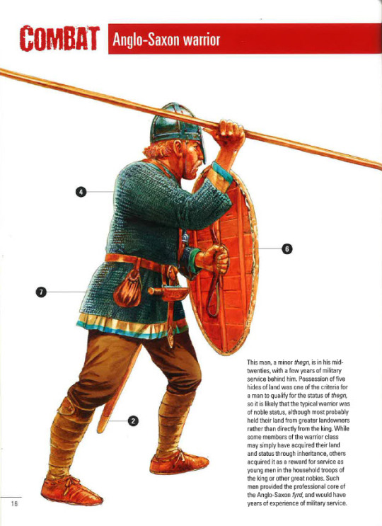
(The average Anglo-Saxon fighting man)
Much the same situation appears in mid-8th century Lombardy, where king Aistulf demanded that those who had 7 or more properties worked by unfree tenants should perform service with a horse and full equipment, while those with less than this, but who own more than 25 acres (40 iugera) of their own, were required to perform an unarmoured cavalry service. 25 acres is about half the land later Anglo-Norman evidence suggests is the minimum for unarmoured cavalry service, so possibly this was an attempt on Aistulf’s part to enfranchise the lesser freemen and get them to support his usurpation of the crown at the political assembly13. Note, however, that the minimum level for cavalry service is nearly double what a peasant family would need to subsist off and implies a man of moderate wealth in and of itself14.
England is somewhat different, as we lack any specific requirements for those being summoned to military service, but from at least 806 we can surmise that 1 man from every 5 hides of land was required for the army. By this point a “hide” wasn’t a measure of area but of value, approximately £1, in a time when 1d. was the wage of a skilled labourer15.
The implications of this aren’t immediately obvious, but when you consider that Wessex had a population of perhaps 450 000 people, across an area of 27 000 taxable hides, only 5400 men (1 man from every 20 families) were actually required for military service16. Many of these, perhaps even most, would have belonged in the retinues of major landholders as either part of their household or as landed warriors owing service to the landholder in exchange for their land. In the same vein, the one man from every hide who was required to maintain bridges and fortifications, as well as defend the burhs (not serve in the field!), was drawn on the basis of something like 1 man for every 4 families. These are heavy responsibilities, but still far from men with sickles and pitchforks making up the fyrd.
There are some exceptions, or else cases where the evidence is thin enough that it’s difficult to say one way or the other, and these typically occur in areas that a less densely populated and less wealthy. The kingdom of Dal Riada in the seventh century, for instance, raised about 3 men from every 2 households for naval duties, although it might also have called out fewer warriors from the general population of the most powerful clan for land warfare17.

(A replica of the Gokstad ship)
Scandinavia is somewhat trickier, since a lot of the sources are late and from a period where central authority existed. We know from archaeological evidence that, in Norway, large scale inland recruitment of men for naval expeditions had been occurring since the Migration Era, as the number of boathouses exceeds the best estimates of local populations18. These were initially clustered around important political and economic centers, but spread out more evenly across Norway during the middle ages as a central political authority arose. This system is likely at least one part of the origin for the leidang system of levying ships, which seems to have properly formed in Norway and Denmark during the late 10th or early 11th century as a result of royal power becoming strong enough to call out local levies across the whole kingdom19.
It seems likely, based on later law codes and other contemporary societies, that Scandinavian raiders during the 8th and 9th centuries were mostly the hird of a wealthy landowner (or their son), supplemented with sons of better off farmers from nearby holdings. Ships were comparatively small at this point, just 26-40 oars (approximately 30-44 men)20, and most had 24-32 oars per ship. This corresponds fairly well with what a prominent landholder might be able to raise from his own household, with additional crews coming from the sons of nearby farmers, although whether this was voluntary, coerced or some combination of the two is impossible to say21.
However, these farmers’ sons, while unlikely to wear mail in the majority of cases, should not be thought of as poor. The vast majority of farmers in 8th-10th century Scandinavia would have had one or two slaves and sufficient land to not only keep their slaves fed and employed, but also to potentially raise more children than later generations22. These farmers’ sons might have been “poor” by the standards of the men they faced in richer areas of the world, but they were rather well off by the standards of their society.
Later, after the end of the 10th century, the leidang was largely controlled by the king of the Scandinavian country and, particularly in the populous and relatively wealthy Denmark, poorer farmers were increasingly sidelined from any obligation to provide military service. Ships also rose in size from the end of the 9th/start of the 10th century, regularly reaching 60 oars for vessels belonging to kings or powerful lords, and even the “average” size seems to have gone from 24-32 oars to 40-50 oars23.
Slaughter Reeds and Flesh Bark: Arms and Armour of the Warrior
The equipment of the warrior consisted of, at its most basic level, a spear and a shield. For those who belonged to a poorer region, a single handed wood axe might serve as a sidearm, or perhaps even just a dagger, while in wealthier regions the sidearm would generally be a sword or a specialised fighting axe24. In an interesting twist, both the poorest and the wealthiest members of society were almost equally likely to use a bow, although I expect that the poorer men mostly used hunting bows, while the professional fighting men used heavier warbows25.
Spearheads, at least from the 7th-11th centuries, were relatively long (blades of >25cm) and heavy (>200g), but most were well tapered for penetrating armour. Some, especially the longest examples, weighed around a pound, but were probably still considered one handed weapons26. Others, however, weighed in excess of two pounds and must have been two handed weapons, possibly the “hewing spear” mentioned in some 13th century sagas27. Javelins, too, appear to have tended to feature long, narrow blades that would have made them a short range weapon, while also providing considerable penetration within their ~40 meter range.
Swords, for their part, were not quite the heavy hacking implement once attributed to them, but also aren’t quite as well balanced as later medieval swords would be. Early swords, before the 9th century, tended to be balanced about halfway down the blade, which might make for a more powerful cut, but didn’t do much for rapid recovery or shifting the blade between covers. However, from the mid-9th century, the balance shifted back towards the hilt, which made them much faster and more maneuverable28. This may indicate a shift towards a looser form of combat, where sword play was more common, or it might indicate nothing more than a stylistic choice. After all, the Celts of the 2nd-1st century BC preferred long, heavy, poorly balanced swords for fighting in spite of relying on the usual Mediterranean “open” style of combat29.
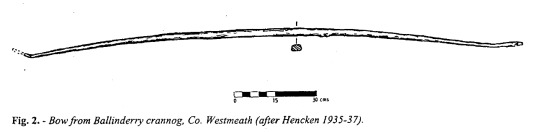
(The Ballinderry Bow)
Warbows, with a couple of exceptions, appear to have been short but powerful. Starting with the Illerup Adal bows, which most likely only had a draw length of 26-27″, we see a repeated pattern when very powerful bows are also much shorter than we expect them to be. In particular, the heavier of the two bows from Illerup Adal is very similar to the Wassenaar Bow, a 9th-10th century bow. A replica of the latter drew 106lbs @ 26″, making it quite a powerful bow, and similar bows have been found at Nydam, Leeuwarden-Heechterp and Aaslum. Only the Ballinderry and Hedeby bows break this trend, with both capable of being drawn to 28″-30″. In all cases, draw weights varied between 80lbs and 150lbs, although 80-100lbs is by far the most common30. The consequence of this is that the power of the bows is not going to be as high as later medieval bows, which were able to be drawn to 30″ and, as the arrows were also relatively light, suggests an energy of 40-60j under most circumstances. This is enough to penetrate mail at close range if using a bodkin arrowhead, but at longer ranges mail would have offered quite excellent protection.
When it comes to shields, there was evidently quite a bit of variation. Early Anglo-Saxon and Merovingian shields were quite small and light, about 40-50cm in diameter31, but later shields were generally 80-90cm in diameter. In particular, we have good evidence of viking shields generally fitting this description, although it’s less clear whether or not later Carolingian and Anglo-Saxon shields retained this diameter or reduced to 50-70cm in diameter (see f.n. 7). In all cases, however, the shield was fairly thin at the center, less than 10mm, and could be as low as 4mm thick at the edge. While thin leather or rawhide could be applied to the front and back of the shield to reinforce it, it’s equally possible that only linen was used to reinforce the shield, or even that the shields were without any reinforcement32.
Recent tests by Rolf F. Warming have shown that this style of shield is rapidly damaged by heavy attacks if used in a passive manner (as in a static shield wall) and that the shield is best used to aggressively defend yourself33. While the test was not entirely accurate to combat in a shield wall (more on this in the second part), it does highlight the relative fragility of early medieval shields compared to other, more heavily constructed shields like the Roman scutum in the Republican and early Empire or the Greek aspis. As I’ve said before, this means we have to rethink how early medieval warfare worked.
Finally, we come to the topic of armour. The dominant form of armour was the mail hauberk - usually resembling a T-shirt in form - and other forms of metal armour were far less common. Guy Halsall has suggested that poorer Merovingian and Carolingian warriors might have used lamellar armour34, and there is some evidence from cemeteries and artwork that Merovingian and Lombard warriors wore lamellar armour in the 6th and 7th centuries, but there’s little evidence to support lamellar beyond this. While it does crop up in Scandinavia twice during the 10th/11th centuries, it was almost certainly an uncommon armour that was used either by Khazar mercenaries or by prominent men who were using it as a status symbol35. Scale armour is right out, Timothy Dawson’s arguments aside, as there is no good evidence of it.
(Helmet from Valsgarde 8)
Helmets evolved throughout the Early Middle Ages, ultimately deriving from late Roman helmets that featured cheek flaps and aventails. During the 6th and 7th centuries, especially in Anglo-Saxon England and Scandinavia, masks were attached to the helmets, either for the whole face or just the eyes. The masks did not long survive the 7th century in Anglo-Saxon England, but the Gjermundbu helmet may suggest it lasted in Scandinavia through to the 10th century. Merovingian helmets of the 6th-8th century tend to be more conical and keep the cheek flaps, but do not have any mask36. Carolingian helmets of the 9th century appear to have been a unique style, more rounded but also coming down further towards the cheeks, and it’s hard to say if this eventually developed in the conical helmet of the late 10th/early 11th century or if it was just a dead end37. Regardless, by the 11th century the conical helmet was the most common form of helmet in England as well as the Continent.
And now for the controversial stuff: non-metallic armour. In short, I don’t think that textile armour was very common during the Early Middle Ages, nor do I think that hardened leather was very common either. The evidence from the High Middle Ages suggests that, unless someone who couldn’t afford to own mail was legally required to own textile armour, they generally didn’t, and we have plenty of quite reliable depictions of infantry serving without any form of body armour38. The shields in use were as much armour as most unarmoured men needed - since, as you’ll recall from the previous section, they rarely fought - and they covered a lot of the body. So far as I’m concerned, there wasn’t a need for it, and plenty of societies through history have fought in close combat without more armour than their shield.
Summing Up
This has been a very basic overview of the background to warfare in the Early Middle Ages, and I know I haven’t covered everything. Hopefully, however, I’ve provided enough background for people to follow along when I dig down into the actual experience of battle in my next post. I’ll cover the basics of scouting, choosing a site to give battle, the religious side of things and then, at long last, the grim face of battle for those standing in the shieldwall.
If you’d like to read more about society and warfare in the Early Middle Ages, then I’d recommend Guy Halsall’s Warfare and Society in the Barbarian Westand Philip Line's The Vikings and their Enemies: Warfare in Northern Europe, 750-1100, which together cover most of Western and Northern Europe from 400 AD to 1100 AD. While I have some disagreements with both authors, their works have shaped my thoughts over the years since I first acquired them. For the Vikings specifically, Kim Hjardar and Vegard Vike's Vikings at War is excellent, as much for the coverage of campaigns across the world as for the information on weapons and warfare.
Until next time!
- Hergrim
Notes
1 For the rarity of the sax in the viking world, see Vikings at War, by Kim Hjardar and Vegard Vike. For the Anglo-Saxon sax, see the list of finds here. Just 5 out of 33 (15%) had blades 44cm or more and, if you remove those longer than the Pompeii style of gladius (which is the point where some think the Romans changed to purely thrusting style), just two fit the bill.
2 Michael J. Taylor’s “Visual Evidence for Roman Infantry Tactics” is by far the best recent examination of Roman fighting styles, but Polybius has been translated in English for ages. See, however, M.C. Bishop, The Gladius, for an argument that the Romans changed to close order and preferred to rely on thrusting by the end of the 1st century AD.
3 See J. C. Coulston and M.C. Bishop, Roman Military Equipment: From the Punic Wars to the Fall of Rome, for the infantry adoption of the gladius. Any general history of the Roman military will cover the transition from open order to close order during the 3rd century AD.
4 Those of you with a copy of Victor Davis Hanson's The Western Way of War need to perform a quick exorcism. You must burn the book at midnight during the full moon and then divide the ashes into four separate containers, one of gold, one of silver, one of bronze and one of iron. You should then bury ashes from the iron container at a crossroads, scatter the ashes in the bronze container to the wind in four directions, pour the ashes from the silver container into a fast flowing river, and finally feed the ashes from the gold container to a cat, a bat and a rat.
5 A.D. Fraser “The Myth of the Phalanx-Scrimmage” is one of the earliest attacks on the idea of literal othismos. The debate reignited in the 1980s, with Peter Krentz’s “The Nature of Hoplite Battle” leading the charge of the heretics, and the conceptual othismos model is now the accepted version. Hans van Wees’ Greek Warfare: Myths and Realities is probably the best revisionist work to start with. Matthew A. Sears, as attractive as he looks, should be avoided.
6 Early Anglo-Saxon Shields by Tania Dickinson and Heinrich Harke
7 Duncan B. Campbell’s Spartan Warrior 735–331 BC has the most easily accessible information on the best preserved aspis, which is ~10mm thick at the center and 12-18mm thick at the edge, but there’s also a good cross section in Nicholas Sekunda’s Greek Hoplite 480-323 BC. For Viking shields, see this page of archaeological examples by Peter Beatson. Note the similarity to oval shields from Dura Europos in thickness and tapering (Roman Shields by Hilary and John Travis). It’s also worth considering that Carolingian and Anglo-Saxon manuscript miniatures tend to show shields that rarely cover more than should to groin, implying a typical diameter of 50-70cm.
8 See Niels Lund’s “The armies of Swein Forkbeard and Cnut: "leding or lið?”” and Ben Raffield’s “Bands of brothers: a re‐appraisal of the Viking Great Army and its implications for the Scandinavian colonization of England” for an examination of how the lið was constructed, and see Richard Abels’ ‘Alfred the Great, the Micel Hæðn Here and the Viking Threat’, in T. Reuter (ed.), Alfred the Great. Papers from the Eleventh-Centenary Conference for a discussion on the nature of viking “armies”
9 10-15 acres depending on crop rotation and how close to subsistence level you want to peg this category
10 The Scandinavian Gulathing and Frostathing laws were only composed in the late 11th/early 12th century, but it has been argued that they were essentially a codification of earlier oral laws. At least with regards to equipment and service, I see no reason to doubt this.
11 Almost all of the relevant capitularies are translated in Hans Delbruck’s History of the Art of War: The Middle Ages, with the original Latin in an appendix.
12 Walter Goffart has made this incredibly clear in his recent series of loosely related articles: “Frankish Military Duty and the Fate of Roman Taxation,” Early Medieval Europe, 16/2 (2008), 166-90, “ The Recruitment of Freemen into the Carolingian Army, or, How Far May One Argue from Silence?” In J. France, K. DeVries, & C. Rogers (Eds.), Journal of Medieval Military History: Volume XVI (pp. 17-34) and ““Defensio patriae” as a Carolingian Military Obligation”. Although I think Goffart argues too strongly against the dominance and importance of aristocratic retinues in the Carolingian military - the great landowners had the most obligation, after all - he does do a brilliant job of highlighting both the universal requirement of service from eligible freemen and the fact that even a “poor” freeman being assessed for service was, in fact, far better off than most of society. This provides some extra context for the prevalence of swords in Merovingian burials, as note by Guy Halsall: it’s not that swords were cheap, it’s that the average Merovingian warrior was rich by the standards of his society.
13 For the text of the capitulary, see Delbruck. For Aistulf’s possible political motives, see Guy Halsall’s Warfare and Society in the Barbarian West. For Anglo-Norman minimum standards for unarmoured cavalry, see Mark Hagger’s Norman Rule in Normandy, 911–1144.
14 I think it’s worth addressing here the pessimistic low crop yields of older authors and their subsequent conclusion that 25-30 acres would be bare subsistence in the Early Middle Ages. As Jonathan Jarrett has proven (”Outgrowing the Dark Ages: agrarian productivity in Carolingian Europe re-evaluated” Agricultural History Review, Volume 67, Number 1, June 2019, pp. 1-28), these low yields are not supported by the evidence, and we should expect yields to be similar to High Medieval yields. His blog contains an early version of his thoughts on the matter.
15 For a recent exploration of the debate around the Anglo-Saxon military, see Ryan Lavelle’s Alfred’s Wars
16 See Richard Abel’s Alfred the Great for this although n.b. his reliance on old crop yield estimates
17 John Bannerman, Studies in the History of Dalriada. The suggestion that the Cenél nGabráin, being the most powerful clan, might have raised fewer men from the general populace for land combat is my own. They may simply have had the largest number of men in military households and, as such, not needed to rely as much on the general populace when on land. It may also be that calling up larger numbers of the free population for land service from the less powerful clans was in and of itself a method of dominance and control - the largest number of armed men left behind for defence/to suppress revolt would be those from the dominant clan.
18 “Boathouses and naval organization” by Bjørn Myhre in Military Aspects of Scandinavian Society in a European Perspective, AD 1-1300
19 That said, the political control of the Scandinavian kings over military levies should not be overstated - it could be very patchy, even in the 13th century. c.f. Philip Line, The Vikings and their Enemies
20 As suggested by Ole Crumlin-Pedersen in Archaeology and the Sea in Scandinavia and Britain, with the estimate of ~40 oars for the Sutton Hoo ship thrown in as a maximum size. Crew estimates are based on 11th century ships in Anglo-Saxon employ where, based on rates of pay and money raised to pay for the ships, there were only 3-4 men more than the rowers on each ship.
21 c.f. Egil’s Saga and the description of Arinbjorn’s preparation for raiding.
22 The Medieval Demographic System of the Nordic Countries by Ole Jørgen Benedictow. The speculation of larger family sizes is my own, based on other medieval evidence that wealthier families tend to have more children.
23 Ian Heath reproduces the leidang obligations of High Medieval Norway in Armies of the Dark Ages, although he incorrectly applies the two men per oar guideline that only became into being during the 13th and 14th centuries. Archaeological evidence only shows ships of 60+ oars or 26 oars, but from the lengthening of the largest ships and the 40-50 oar ships of the later leidang I feel it is appropriate to assume that the number of oars stayed the same from the 10th to the 14th century, it’s just that the number of rowers doubled as ships became heavier. This is similar to the evolution of the medieval galley.
24 I’ve covered saxes earlier in the notes. For axes, see Hjardar and Vike Vikings at War. Axeheads from western Scandinavia were often over a pound in weight, which is double the weight of specialized Slavic war axes and in the same weight range as the heads of broad axes. Even into the 13th century, these wood axes apparently kept turning up at weapons musters as sidearms.
25 Bows were considered an important aristocratic weapon in Merovingian, Carolingian and Scandinavian societies and, while not a prominent aristocratic weapon, it at least wasn’t shameful for a young English nobleman to use one in battle. The division between “hunting” and “war” bows can be seen in the Nydam Bog finds, where the most powerful bows tend to be relatively short (26-28″ draw length) and the longer bows (28-30″ draw length) tend to be fairly weak. Richard Wadge has demonstrated that civilian bows in medieval England were less powerful than military bows during the 13th century, and I’m applying this to the Nydam bows.
26 Ancient Weapons in Britain, by Logan Thompson
27 See “An Early Medieval Winged/Lugged Spearhead from the Dugo Selo Vicinity in the Light of New Knowledge about this Type of Pole-Mounted Weapon” by Željko Demo, and “An Early-Mediaeval winged spearhead from Fruška Gora” by Aleksandar Sajdl
28 Ancient Weapons in Britain, by Logan Thompson
29 The Celtic Sword, by Radomir Pleiner
30 Most dimensions are from Jürgen Junkmanns’ Pfeil und Bogen: Von der Altsteinzeit bis zum Mittelalter, although the information on the Illerup Adal comes to me from Stuart Gorman. Draw weights are only estimates based on replicas of some bows and a formula found in Adam Karpowicz’s “Ottoman bows – an assessment of draw weight, performance and tactical use” Antiquity, 81(313). Draw weights for yew bows in the real world can vary by as much as 40%, so these estimates are only general guidelines.
31 See f.n. 6 for early Anglo-Saxon shields and Halsall, Warfare and Society, for the early Merovingian shields
32 The shields from Dura Europos, constructed in the same way as Scandinavian shields of the 8th-10th century, feature either very thin leather (described as “parchment”), linen or else some kind of fiber set in a glue matrix. In contrast, two twelfth century kite shields from Pola. d, although constructed only with a single layer of planks like a Viking shield, had no covering at all. See Simon James, The arms and armour from Dura-Europos, Syria : weaponry recovered from the Roman garrison town and the Sassanid siegeworks during the excavations, 1922-37 and “Two Twelfth-Century Kite Shields from Szczecin, Poland” by Keith Dowen, Lech Marek, Sławomir Słowiński, Anna Uciechowska-Gawron & Elżbieta Myśkow, Arms & Armour, 16:2
33 Round Shields and Body Techniques: Experimental Archaeology with a Viking Age Round Shield Reconstruction
34 Halsall, Warfare and Society
35 Thomas Vlasaty has a great article that summarises this subject.
36 No real source for this beyond googling pictures of the various Anglo-Saxon, Scandinavian and Merovingian helmets.
37 This Facebook post has some wonderful pictures of the original helmet, a reconstruction of the helmet and comparisons with Carolingian art.
38 eg. the Porta Romana frieze, the porch lunette at the basilica of San Zeno in Verona, the Bury Bible.
34 notes
·
View notes
Last Seen Blogs

blep-23
Yeet It All

surrealblakk-blog
SurrealBlakk

ther-blog
MYWORLDISCORRUPT

sidewalkstv
Sidewalks Entertainment
thyduskywife
Looking for Real People for Real fun.