#this is my current header / sidebar image
Photo

Ashtray-4 by Sean Biehle (x)
#photography#not my photos#sean biehle#ashtray#cigarettes#creative commons#this is my current header / sidebar image#depending on if you're looking at my blog on the app / from the dashboard#or if you're looking at the blog itself on a web browser
14 notes
·
View notes
Text
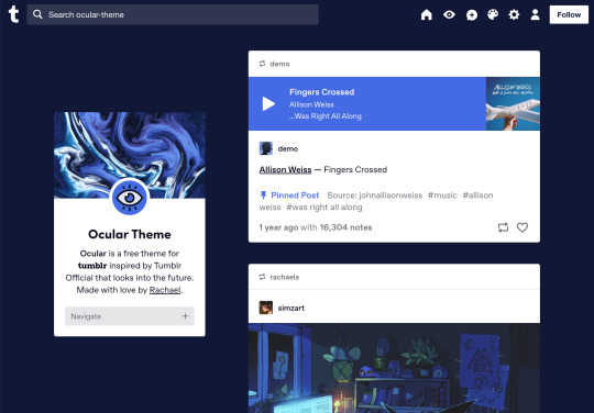


Ocular — Version 3
Preview // User Guide // More Info & Install
your favorite sidebar theme just got an upgrade, babeyyy
I went to update Ocular to make it NPF post-compliant and then my hand slipped and I redesigned the whole thing lmao. here's a brief update about Ocular 3; if you're looking for a full list of changes between versions 2 and 3, click the "Read More" below)
Ocular comes with the following features:
Colors: easily change the color scheme of your sidebar and posts using any colors you want
Post sizes: 400px, 500px, 540px, 600px, 700px
Sidebar: can be on the left, right, or above the posts. pick from a list of sidebar sizes, header image heights, and avatar shapes
Fonts: 20 different fonts, sizes 13px to 18px
Background: solid, gradient, full-size image or repeating image
Links: choose either regular navigation or drop-down navigation. unlimited custom links (visit the help desk FAQ for a tutorial) and ability to rename home, ask, submit, and archive links
Endless scroll, custom ask box text, Tumblr's full-width controls and search bar, optional header, avatar, and favicon images
if you already have Ocular installed, version 3 should be coming at you as soon as the update passes the theme garden. if you installed this theme with GitHub, you'll have to re-install manually.
now let's get to the fun stuff. what's new in version 3?
wow, do I have some updates for you!
1. goodbye color schemes, hello post background and text colors
you can now directly control the color of the posts rather than relying on color schemes to do it. want your posts to be a very specific shade of navy? all yours, buddy. go wild (make sure it's readable tho)
2. hello, color schemes! wait I thought we got rid of that guy
a lot of the color schemes I made became redundant now that the new post background/text color options exist. if you were married to the old color schemes, all of them can be recreated using those options. so the new color scheme options are as follows:
"My colors" — uses the colors you picked for post background/text
"Light preset" and "dark preset" — sets the posts to white with black text, or off-black with white text
"Translucent" — uses the colors you choose for post background/text, but makes the post backgrounds semi-transparent. there are NINE different translucent color schemes, ranging from 90% (only slightly see-through) to 10% (VERY see through)
3. navigation dropdown option
you can either use the sidebar links like they were before, or you can turn them into a cute little dropdown (helpful if you have lots of links or links with long titles!) you can enable this using the "use dropdown navigation" setting. you can also customize the label for the dropdown using the "dropdown menu label" setting. for instance, the dropdown on my blog currently says "oooh you wanna click me"
4. RIP google fonts I always hated your load times
decided to stop using Google Fonts and instead I'm providing the font files directly in the code. this will help speed up load times drastically when using custom fonts, plus I don't have to use Google. win-win! there's quite a bit of coverage overlap with the old fonts, but some of them that were too similar to each other got the ax. I also added all of the system fonts as options (hit classics like Arial, Georgia, and Comic Sans MS are now available TO YOU!)
5. more layout, sizing, and spacing options
the sidebar used to be either on the center-left, center-right, or above the posts; now it can go in the top-left or top-right! you can now control the border radius on the posts and sidebar. the header height, sidebar width, and post spacing all have additional options.
6. some options have been renamed for additional clarity
"background color 1" -> "background color"
"background color 2" -> "gradient background color"
"background" -> "background style"
"font override" -> "use body font everywhere"
"title" -> "sidebar title"
"description" -> "sidebar description"
"ask box text" -> "custom HTML above ask box"
7. removed some options
you win some, you lose some. I removed the uppercase sidebar links, theme credit, and inline media spacing options, mostly for redundancy reasons or because they produced unclear results.
8. as previously stated, now NPF-compliant
Ocular was ALMOST compliant with Tumblr's new post format, but had a few tweaks that needed to be ironed out. they're now ironed.
9: now user-friendly right out of the box
I updated the default color and content options, so new users installing this theme will have a much easier time using and customizing it immediately. no more ugly ass green background!
10. and finally, new JS
I had to rewrite some of the javascript for this theme, which turned into me rewriting ALL of the javascript. doing so meant that I could eliminate dependencies on third-party JS libraries and run the whole thing on plain JS. that should improve load times!!
bonus: custom CSS can do some nifty stuff now
want to change the size of your avatar? you can do that now! just do this to your Advanced > Add custom CSS section
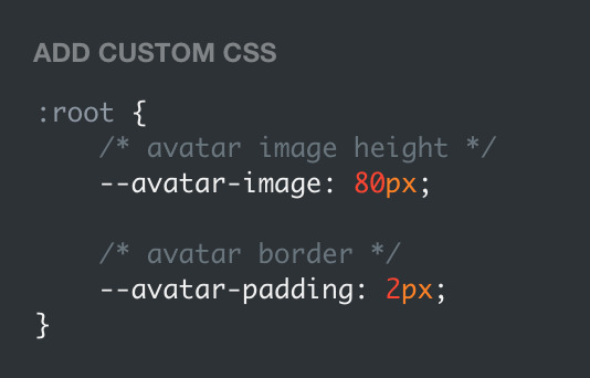

super helpful if you're using the Avatar shape: Uncropped setting and you need your image to be a specific size (like a pixelated GIF)
for more info, check out the Ocular user guide. thanks for reading my updates!! hope you all have a fantastic start to your 2024 ❤️
#tumblr theme#tumblr themes#themes by rachael#codingcabin#ocular#blog#you should've seen me writing the JS for the audio posts lmfao I was on my hands and knees begging it to work
434 notes
·
View notes
Photo
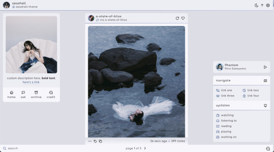

seashell | theme by sage
get the code: $3 - live preview / version 2
based on my current theme on @phantomcodes :)
features (more info below the cut):
optional: music player, extra links, updates, sticky bottom post info, tags on click, glow effect
customizable: description, colors, body & title fonts, font size, & blog title
header with blog icon, title, url and day/night, tumblr controls, & scroll to top buttons
footer with search bar & pagination
sticky top post info, sticky bottom post info with a drop down menu
responsive design, 3 border radius (corners) options, uploadable sidebar image
this theme uses tabler icons
nothing needs to be changed in the code, everything can be changed in the customize panel!
terms:
reblog if using
do not touch the credit
view all terms
credits listed in the code / credits page
please consider supporting me ♡
make sure you read through this post before asking questions!!
left sidebar
the sidebar image is about 270px x 300px (the width will adjust depending on your font size)
4 links for home, ask, archive, & my credit - do not touch this
right sidebar
the music player, extra links, & updates can all be individually toggled off
toggle all of them off if you don’t want this sidebar at all
up to 8 links each with an icon & text
up to 6 updates each with an icon & text
when your browser width gets too small the sidebars will disappear and a sidebar button will appear on the footer (bottom right)
uploading your song:
i recommend using google drive to host your mp3 files - below is a brief explanation for how to do this but you can also see the resources provided here by glenthemes and more links on my credits page
to start you need an mp3 audio file, once you have the one you want go to google drive and click: + New ➞ File upload
select your mp3 audio file and click open
open your newly uploaded audio file in google drive and click the three dots on the top right, then click Share and under General Access change it to Anyone with the link can view
copy the sharing link provided, it will look something like this: https://drive.google.com/file/d/1pBA6KdlLEzoEZPQ6hmaSr9LGLeCQGPxz/view?usp=sharing
go to the following site and paste your sharing url in the first box provided: https://www.joelgrayson.com/drive-download-link-generator
your final product should look something like this: https://docs.google.com/uc?export=download&id=1pBA6KdlLEzoEZPQ6hmaSr9LGLeCQGPxz
make sure the music player is toggled on in the theme, paste your audio link in the Song URL field
bottom post info
if you toggle the sticky footer option on, the bottom post info will stick to the footer as you scroll
#themehunter#theme hunter#seashell#themes#tumblr themes#tumblr codes#phantom code#phantom theme#completeresources#allresources#tumblr resources#codehunters#userbru#usernik#useraashna#tuserlucie#tumblr theme#responsive#music player
549 notes
·
View notes
Photo


⟢ ∘ 。 DREAM GiRL ⦂
JUNE 2023 , TUMBLR THEME .
⟡ ⟡ ⟡
∘ 。⟣ briefing .
dream girl is a cute lil theme geared toward indie users who enjoy having their muse page match their theme with it's muse tab design but it really can be used for anything u see fit ! there are many ways u can style this theme and every single feature is optional so u can create a unique design that fits ur aesthetic .
note : if u are interested in utilizing icons such as the hearts i've used as decor throughout this theme , the code is loaded to support bootstrap icons . click here to be directed to my brief tutorial on using bootstrap icons in themes ( tutorial is free to non patreons ) .
please give this post a reblog and a like and take care of urself ! keep hydrated and pet a cute animal today !
∘ 。⟣ specs .
this theme is compatible with both npf post styles ( beta ) and legacy blogs HOWEVER please be aware that both the audio posts and quote posts are not customizable with tumblr's current json structure . this is something i am looking into for future themes .
single sidebar image .
( optional ) sidebar background image .
( optional ) asterisk - style stars svg on the sidebar .
( optional ) abstract doodle svgs ( see other example ) for the sidebar .
( optional ) sidebar background decor text .
offers both 300px and 375px post styles .
offers accessible font sizing option that gets rid of the outlined font within the posts ( not in the titles / decor styling ) .
custom ask box tagline .
1 editable link for u to use for whatever .
nav tab with single icon + description and title .
6 editable links in the nav tab .
muse tab with single image + description .
muse tab must be edited in the html but is heavily annotated for ease .
various font styles for the muse tab to be utilized as headers .
complete list of credits and inspirations are detailed in the code .
click the source to view a live preview and here to become a patreon !
* i coded this theme slightly smaller to display posted images , gifs and videos without sacrificing quality .
#rp theme#indie rp theme#rph#rpt#indie rph#supportcontentcreators#mine#rec#themes#for patreons#for patrons#preview style inspired by springdoy
89 notes
·
View notes
Text
getting started with notion | a guide
are you tired of juggling multiple apps and tools to manage your work and personal life? are you storing your information all over the place and want one app to keep it all organized? notion, the all-in-one workplace can revolutionize the way you organize your life. whether your a student, developer, artist or content creator, notion can help streamline your workflow, increase productivity and stay on top of your tasks.
where to start?
in this guide, i'll take you through everything you need to know about notion from setting up your workspace to creating your first page and using templates. we'll cover all the basics so you can get started using notion right away.
let's dive in. consider checking out my free notion templates on my shop.
download the mobile app (ios & android)
download the desktop version (mac & windows)
getting started
this is what your empty workspace will look like:

blocks are the main functions of notion and are what make up the whole app. by using blocks, you can create text, headers, databases, quotes, maps, tables etc. here is a list of the blocks currently available in notion:
text
headers
images
toggle lists
to-do lists
tables
call outs
embeds
notion pages
pages are notions files or a collection of blocks listed above. as you write, you can edit, highlight, and create databases in your page. you will also you notice you can insert a new block by typing "/" command.
notion databases
database play a vital role in notion to help you manage and organize your pages. in simple terms, it monitors all the pages created by you and databases are actually pages themselves. each page in a database can be opened and viewed seperately. to help you further, you can contextualize, label and agument each individual item. you can also directly search the page you're looking for. database views also display the same content in different ways, whatever your preferences are
notion sidebar
the side bar is basically the navigation bar for all your pages. a nest that stores a page into a page without any limits, which can be rearranged by dragging and dropping. the sidebar contains several features and menu options that can be arranged and rearranged according to your needs.
notion sharing
notion is a big believer in sharing and collaborating in order to enhance user experience and give a clearer picture through feedback from friends, collegues, family and coworkers. notions permissions levels ensure that your guest viewer can have access to your content but only to what you allow. there are many ways in which you can share your database and pages with your folks in and out of workspaces.

—
my other notion posts:
notion tour 2023
notion resources masterpost
#writeblr#writers on tumblr#writerscommunity#creative writing#writers#writers and poets#author#ao3 writer#mine: guide#mine: resources#notion#notion templates#notion guide#notion guide for beginners#notion for beginners#notion.so#notion tour#notion app#notion free#mine: notion#rpnotion
8 notes
·
View notes
Text
Links, tag system, and additional info.
I try to avoid reblogging things to this account - that's what my main blog is for. If you see a reblog on here, feel free to let me know so I can delete it!
I handle all commissions through my professional email, artcommissionsbyred (at) gmail (dot) com. For the foreseeable future, my commissions are closed.
If you would like a heads-up on upcoming commission availability, please subscribe to my mailing list here! (Mailing list subscribers also get earlier or sometimes even exclusive access to things like limited-time slots, which I sometimes do when I'm hard up for quick cash.)
Outside Links:
Twitter: OozeAndGoo_Art
Ko-Fi: OozeAndGoo_Art
Bigcartel: OozeAndGooArt
Wordpress: OozeAndGooArt
FurAffinity: TheRedDragon13
Main Blog: @bitegore
Rules of Engagement:
This is a sideblog. I have a lot of people blocked from my main blog, none of which are blocked from this blog. It's okay if you've been blocked from my main for you to reblog from this sideblog - I have genuinely thousands of people blocked, for reasons that are arcane and sometimes really stupid even to me, and if you behave in a rude or unpleasant manner I'll just block you from this blog when it comes up. Go nuts.
This blog contains quite a bit of adult-oriented art, all of which is both marked "mature" using Tumblr's content settings and tagged accordingly. Please browse at your own discretion, and remember to use filtering options where necessary.
In general, off-topic commentary in the reblogs, tags, and replies is totally fine and I like seeing what you guys have to say even when it's not directly about the art. That being said, please do not talk about either how much you hate the character in the art or think the art looks bad. "If you have nothing nice to say, don't say anything" is a good rule to live by, and also it's annoying and rude. Likewise, don't put discourse on my posts. I don't want to hear about it. If you have an opinion about the characters or art that is negative, feel free to make your own post! You can even add my art to it (with a link to this page) if you really want to talk about the art in particular.
Please repost my work only with credit (a link back to this page). Use of my art for avatars, header/sidebar banner images, edits, remixes, collages, and related is entirely okay as long as credit is given. My canon character redesigns are also completely free to use and no credit is required as long as you've done the actual drawing yourself. If you're using my art for something, I'd like to hear about it, but it's not required - it's just really flattering.
Please do not remove my captions, however. Just make a repost.
If you want to print one of my pieces for personal use, feel free to reach out to me! I will happily re-color/re-balance the colors so that it will print nicely if I have the time, free of charge.
If you want one of my pieces tattooed, go for it, consider this blanket permission. I'd be surprised and I'd love to hear about it, and also I have no qualms at all. Go for it.
Everything is okay to tag as kin/id/etc or claim as muse references. Have fun with it, I don't care. This goes for my ocs too, I really couldn't care less. However, if you disagree on characterization from what I've drawn, please don't tell me about it.
Obligatory "don't be bigoted." This is a racism, sexism, homophobia, classism, xenophobia, religious discrimination, and everything else-free zone. I'm not perfect, and therefore if I've created something that comes over wrong, you are more than welcome to voice your opinion on that, but please approach me in private first*, and message me on my main blog rather than the sideblog as I actually check that account.
Feel free to ask me to tag for more than I currently tag for- either for search reasons or to be able to more easily filter things. I may refuse to use certain tags at my discretion.
-
Tags:
content warnings: all content warnings begin with the phrase "contents" to help disambiguate them from generic phrases.
#contents: a little raunchy for tumblr - not quite dirty, but still running on adult themes. Rated pg-13 instead of nc-17.
#contents: not safe for Tumblr - the Naughty stuff. All should be marked mature already.
#contents: blood - has blood
#contents: gore - has organic/meat gore
#contents: robogore - has robot gore, presented like something other than organic flesh
#contents: death - someone's dead on screen
#contents: flashing - something in the image flashes in a way that may not be safe for photosensitive viewers.
#contents: dubious or nonexistent consent - there is sex or sex acts of dubious or explicitly nonconsensual nature happening on screen.
#contents: all edge and no point - general assorted tag for finding things that are just really edgy for no good reason. suicide jokes and torture and that sort of thing.
fandom-specific tags:
#transformers - transformers art, including humanformers. At this time I don't tag continuity.
#macaddam - safe-for-work transformers art (for search discovery)
#valveplug - spike and valve NSFW transformers art
#plug and play - cable-play NSFW transformers art
#sparkplay - spark-play NSFW transformers art
#humanization - a character that isn't normally a human, depicted as one.
#rukaan and #deer - Fields of Valhalla (deviantart ARPG) art, mostly depicting fantasy deer creatures. (#deer is there for search discovery and being easy to remember; "rukaan" is the actual name of the fantasy species.)
#dragon - there is a dragon. everyone likes those
#scalie - anthro reptiles - in this case, basically all dragons.
#oc - original characters. Everyone's got em, right?
[character names] - tagged as needed for search purposes. Characters with multiple names may or may not be disambiguated at essentially random. OCs are also tagged by name.
personal navigation:
#red redesign g1 stunticons - my stunticon fan redesigns. sometimes you don't want to see fan redesigns, so now it can be filtered - without having to filter anyone else's stuff, even!
#au: androidformers - the specific humanoid-android designs for the transformers G1 "humanformers" au I have lying around.
#fursona - this character is one of my fursonas. Typically this just refers to Taz.
#mass post - if there's a bunch of pictures in one post because I don't think they can really stand on their own merits or are part of a sequence, this lets you filter that away.
#closerverse - art for a personal original universe.
art navigation:
background - art with a significant focus on the background or scenery. This may include photo overpaintings where the background is significantly relevant even if I didn't paint the background by hand.
#monochrome - art in monochrome - may include duochrome (two-color) work. This tag used to be "black and white" - older pieces may still be tagged with that instead.
#lineart - art that is just relatively clean lines
#doodle - unfinished art with a focus on round, smooth lines and cute shapes
#sketch - unfinished art with more jagged shapes and realistic proportions
#traditional media - art made in "real life", typically with some element of digital color or retouching anyway.
#3d - art that uses some element of 3d renders in it, either as part of a painting that was then painted over or as a whole 3d render without painted-on effects.
#photo overpainting - art where I saw a cool photo and painted something into it without repainting the entire photo from scratch, so large chunks were not made by me.
#animation - animated work (typically short looping gifs), stuff where the characters move
#animated effects - animated work where elements move, but the characters are static - flickering light effects, stuff like that.
#meme redraw - art made in the style of a meme. Sometimes this is entirely redrawn and sometimes it's a photo overpainting.
#gift art - art made for other people for free or with minimal direction
#commission - art made on commission with significant input from the client
*Why do this in private? There are a number of reasons:
the first, and most relevant, that it means other people aren't going to randomly jump in and change the subject, so we can have an actual conversation rather than something that comes over more like a random accusation I may not fully understand out of the blue.
Secondly, I have a solid handful of followers that I expect would probably defend me, and you don't need people jumping down your throat for "attacking" a person they like, especially if you're right but even if I think you're wrong. I also don't want to deal with that.
Finally, I don't like being stuck between trying to understand more and feeling like I have to "save face" because the latter is bad for actually learning and growing as a person. I - of course - still do my best to learn in public, but without the pressure of a significant amount of outside observers it's easier for me to form an initial response and have a normal conversation.
You can always take it public later, if you're convinced I've done something wrong and won't make amends. At that point I'm sure we're just going to be enemies so asking you not to is gonna go nowhere lmao. I take bigotry and my own biases seriously, but it's possible that after we discuss and I do some of my own research, we may come to different conclusions as to the relative problems with a certain depiction, discussion, or behavior. This is a normal part of socializing. Please give me the grace of holding a conversation with me first before jumping to getting on my case publicly.
(If you're scared of reprisal, first of all, don't be because I don't like to do that, but secondly, you can just make a throwaway account to message me with. It's easy.)
6 notes
·
View notes
Text
Get to Know Me Game!
Thank you for tagging me @fearless-too-and-stubborn 🥰
Favorite color: Green
Currently reading: Currently, I'm not reading anything, but the last book I read was 11.22.63 by Stephen King.
Last song: I Love You Always Forever by Betty Who
Last series: I just finished Derry Girls for like the 7th time.
Sweet/savory/spicy: Sweet
Currently working on: A new header, icon and sidebar image for my blog. Obviously, it has to reflect my newest obsession, so changes are coming 😊
2 notes
·
View notes
Text
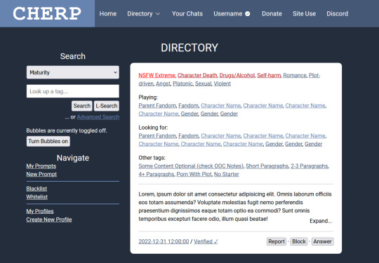
i , once again, for no good reason at all, have redesigned cherp. not posting screenshots of the last time cuz it was ugly and i was just curious what i could get up to with the existing css. this, however, is a ground-up purely design-based rebuild that i did from scratch that required me to brute-force learn javascript because i am.... insane.
heres the link if you wanna click things though 95% of the things you can click do nothing, except the directory menu and the expand/collapse buttons on the prompts. i coded the javascript myself and its only my second attempt at doing so.
notes/fun stuff i learnt while doing this under the cut, with information starting from the top of the doc to the bottom.
so when i started this project my first thought was about how to make the header look less like "cherubplay with the serial numbers ground off" and i decided to go for a single inline "logo"/nav setup. i like the two navbars and actually preserved it on smaller screens/mobile (as is necessary, frankly) but tossed it for the desktop version. i think this looks fun & modern and adds a unique touch that keeps it from looking too much like cherubplay.
the nav bar gave me some trouble. if you click the "directory" button, you get a dropdown of links accessible through the directory (which, since this happens to be a directory page, is the links under "navigation" in the sidebar as well.) this gave me so much trouble-- right now its just a onClick toggler that adds or removes the "show" class, which is just... a single class with the "display: block;" declaration. i did at one point have this as a clickable link that would take you straight from the directory, but if you HOVERED (or rather, onMouseOvered) over the directory button, it would actually bring a popup menu of these links. and when you stopped hovering over the popup link menu (or onMouseExited as the case may be) the menu would disappear. however this proved to be a huge bitch on mobile and i didnt love it so i replaced it with the current onClick menu.
im not sure this is done as best as it can be done. the onClick menu isnt in the nav element, its outside of it, which i think is probably bad for screenreaders. unfortunately i was using a flex div inside the header (which holds the "cherp logo" which is actually text (h1) as well as the navigation links) so when i tried to keep it inside the nav header it just caused the whole thing to expand, which i didnt love. i have no clue how i would go about fixing this right now, so its staying
i was thinking of coding some meta elements for this-- like, say, a toggler for if you wanted to preview the site as if you had a new unread-- but decided not to because i was getting angry. but maybe in the future. for the record, my idea for new unreads was to have a "glowing" (read: span of "(1 unread" with a text shadow of the lightest color) notification in the header. this would obviously be lost on mobile..... or maybe it wouldnt. i just realized ive never tried to apply text-shadow to bootstrap icons. maybe that would work. idk
anyway moving on toooo THE SIDEBAR!
the sidebar on cherp has always pissed me off. everything about it makes me angry. i am not joking. i "fixed it" (read: made it look the way I WANT!!!) in stylus and imported those styles here. here are the major changes i made
i made the search dropdown the full width of the div to match the search box which IS the full width of the div
i moved the dropdown links out of the dropdowns
i made the text size consistent across the buttons, inputs, and dropdowns
i moved the advanced search button beneath the other two (this one i did because i aligned the buttons to the right and i felt it looked silly otherwise.)
i used the hr element which. holld on what does hr stand for. like img srrc stands for image source but what does. okay w3schools was useless for that but i used the hr tag to separate the different sections rather than having two dropsdowns. i think this looks neater.
and now moving on to THE MAIN CONTENT!
the changes here are incredibly minor and are mostly quality of life. however i think they would be useful but even more importantly, fun!
first of all, i changed the nsfw extreme tag to a different color red. the other warning tags-- and every other warning that isnt nsfw extreme (so nsfws and nsfwv) show up as the slightly darker red that the regular extreme warning tags show up as. originally this had a little text-shadow too for a glow but i thought that was overkill becausseeeee
i was thinking that, if you were searching the directory by a tag, it would be fun to highlight the tag you were searching for as it appears in prompts. this would be kind of redundant given that every single prompt that would appear when you searched would obviously have the tag in it, but like..... i think it would be fun.
anyway, aside from that, i divvied up the fandom/character/gender tags with some colors to show where they end and begin. i think this looks neater. it looks nice with a few fandoms and is helpful if you have a LOT of fandoms because it would show where the characters start, so if youre, say, in a tag for a fandom and the prompt has 20 fandoms tagged with 5 characters each, you can see at a glance where the characters start to see if the character you want to play is one that theyre looking for.
this is a minor detail, but in the expand/collapse buttons, i tried to add enough padding that they didnt partially cover up the last word in the prompt. i care.
some final notes:
the code in this is so messy and contains a lot of redundant code or code that i started to use and then decided not to use and just left. it was also my second attempt at writing my own javascript (the first was creating a dark mode for a different webpage) so its probably............ inefficient. but i made it work and im very proud of myself. yes it took hours because i tried to brute force it
its mobile compatible! peek at it on your phone.
i would have liked to have added other features such as darkmode and a meta information toggler (preview a fake unread for instance) but i didnt do that
if you are scrolled any amount down the page, when you click on the directory button, it brings you to the top. i think i know why this happens but idk how to fix it sorry lol
i would have added keyboard prompt navigation which is like my #1 cherp 3.0 wish but unfortunately when i googled it it looked like it required jquery which i am not fighting with until i finish this stupid javascript course on vanilla javascript
........ yup. thats it bye
7 notes
·
View notes
Text
About Me and This Blog
Hi! I'm Aly, I'm an epileptic, mentally ill, queer, non-binary person!
My pronouns are he/she/they.
I am currently studying to be a paramedic (18 months to go!). I am happy to discuss medical procedures in hospitals, and what may happen if an ambulance is called for you, however please do not ask me for medical advice.
This blog is mostly dedicated to epilepsy, the experiences that come along with it, and navigating a world that was not designed for epileptic people. I will also post safety resources here for both epileptic people and non-epileptic people who either know epileptic people and want to know how to keep them safe, or just for general knowledge. I will also post content about other disabilities, chronic illness and being queer/trans!
I do not have a DNI, as I believe that these resources should be accessible to anyone, however, discourse is not welcome here, nor is bigotry or intolerance of any kind. [P.T.: discourse is not welcome here, nor is bigotry or intolerance of any kind. End P.T.]
First Aid Posts
I'm working on posts at the moment so this list will be updated as and when I've finished and released them.
Tonic-clonic seizure first aid
Boundaries:
No flirting.
Please use tonetags with me.
Please don't trauma dump; discussion of negative experiences is allowed within reason. Please tag for sensitive content.
Please do not tag me in discourse. I have no desire to be involved.
Please ask to dm if you are a minor. Bear in mind I may say no, but minors (and everyone else) are always welcome to send asks :)
Image IDs and Sources:
Header (sticker on sidebar for pc users):
Link to image here.
[IMAGE I.D.: a six striped flag. the top stripe is a purple-grey sandy tone. the second stripe is white. the third stripe is a pale chalky purple. the fourth stripe is a darker purple. the fifth stripe is a blue-purple. the final stripe is another purple, and the darkest. END I.D.]
Profile Picture:
Made by my wonderful partner :)
[Image I.D.: A photograph of a disco ball, over top of the visually safe disability pride flag. This flag has five diagonal stripes, going from the top left corner to the bottom right corner of the image, over a medium grey background. The stripes are, from top to bottom, green, blue, white, yellow and red. The colours are all light and desaturated. Over top of the disco ball, there is a dark grey general prohibition symbol, which consists of a circular outline with a line drawn through it. End I.D.]
6 notes
·
View notes
Text
Local Competition
Main Competitors:
There is definitely a heavily saturated market when it comes to tutoring. Considering my startup venture will be focused on the niche of in-person private home tutoring wih a personalized, I will consider in-person private tutoring services that come to the client's home (as opposed to virtual tutoring or a tutoring centre) as my direct competitors and all other variations that still offer tutoring service in some way to my target market as my indirect competitors.
Two direct private in-person tutoring businesses that provide custom and personalized support are The Tutoring Expert and Tutorax. I think it is important to consider the possibility of indirect competitors as main competitors in my circumstance, though, as their services may not necessarily be identical but they may provide an alternative to satisfy the same client need. Two indirect competitors I will focus on then are Beyond the Classroom and Kumon Math and Reading Centre; more specifically, as a franchised business, there are several Kumon branches throughout my target region, but I will focus on the one branch of the four who responded when I inquired, which was the Ajax-Taunton Kumon branch.
Using the information from this local competitive analysis, I can gain a better understanding of the opportunities for my businesses to fill a market gap or overcome a weakness from one of my competitors. In this way, this information is invaluable to the development of my startup venture.
Website Experience:
The Tutoring Expert’s website provides a decent user experience in that it is intuitively designed. The contact sidebar has a frozen navigation header with clearly worded subpages, contact information and logo. While their website does not feature any promotions currently, it does have an appealing graphic interface that draws attention to the key features of their business's value and model via service descriptions, such as one-on-one sessions, tutor experience, tutor match guarantee within 48 hours, and weekly dedicated sessions with a free introductory session. The images are a combination of stock still photography and cute cartoonish images that were clearly commissioned for the purpose of the website as the artistic design is consistent and not a hodge-podge of different styles. Methods of contact include an email form, phone number, and fax number. There is also a call to action button that states "request a call back" on the right side of the page that continues to loom prominently as you scroll, frozen to the scroll bar. Lastly, their website does feature a blog, but it is outdated with the most recent blog postings from late 2018. According to builtwith.com, The Tutoring Expert has on average a technological spend of $100 per month with approximately 10 brand followers of their website.
Tutorax’s website has a header, but the header is not frozen on the page. The navigation is intuitive with simple categories like "services", "apply", and "contact." There is a red exclamation point icon that draws the eye and alerts to the availability of tutoring services in-home and online; there is also a yellow call-to-action button in the header that reads, "Get Started," and also draws the eye of the user offset against the neutral white background. In addition to service descriptions, the website also features a rotating gallery of testimonials, an FAQ, and a logo wall of strategic partners. They also have a blog on their page in both English and French that discusses various mathematical concepts, as well as other topics about learning. The blog features regular posts (once every two weeks to a month) from March 30, 2020, to February 28, 2024. More slim on photography than The Tutoring Expert's website with only a single photo on the landing page, the blue, yellow, and white theme nonetheless provides a consistent visual branding across the page. There are no banners or promotions on the page. In the footer and FAQ, there is a live chat button, a phone number, an email address, an email contact form, and two physical addresses listed (one in Laval, Quebec, and one in Toronto, Ontario). I was unable to view Tutorax’s website using builtwith.com to assess their technological spend; it was inaccessible.
Beyond the Classroom’s website has a navigation header bar that is frozen no matter where you scroll. Again, it is an intuitive experience with clearly stated categories, like "Resources for Parents", "Reviews", and "Tutoring Positions''. The page has a consistent theme in terms of colours and design used uniformly throughout and with the logo displayed in the upper left corner at all times. The photography appears to be stock images with a few sections of the website focusing on the founder with a talking-head-style YouTube videoclip prominently displayed on the webpage and a link to a Reader's Digest profile of the founder. There are no banners and promotions currently on the page. There is a link in the footer to sign up for a newsletter, which I did subscribe to using the Mailchimp form. (I have yet to receive an edition, though, so I cannot comment on the newsletter content.) Just as with the other websites, there are service descriptions on the landing page with subpages devoted to online tutoring and in-home tutoring albeit for select locations (none of which are in my target region). There are also static testimonials just above the footer of the page, wherein the email address lies. There is an email contact form on a subpage when the user clicks on "Contact Us'' in the upper right corner. There is also a blog on this page, but not in the traditional sense; the content is evergreen with no dates of posting (so the user cannot discern if the content is recent or old) and is more of a collection of resources on student relationships and learning. According to builtwith.com, Beyond the Classroom has on average a technological spend of $50 per month with no brand followers of their website.
The website for Kumon Math and Learning Centre of Ajax-Taunton is sparse but clearly defined. It is important to point out that it is a barebone template compared to the other competitors’ websites. I use the word "template" because each franchise’s website looks identical to each other with only slight changes for name and contact information. It is highly likely that the franchisor dictates the web design and content, and simply adds a new subpage specific to each local centre. The photography is a single still photo. The branding is consistent with Kumon’s corporate branding, including the logo and colour scheme. There is a prominent call to action with a brightly coloured "Book Your Child's Free Assessment" text box and a button to "Schedule Today" with the contact phone number, physical address, and email address prominently displayed. The website lists the operating hours and a promotion for tablet study available at the centre; it is not a discount so much as a new service, called Kumon Connect. There is a service description of what Kumon does. There is also another action button to "Book Appointment" close to the footer. The navigational bar lists clearly worded subpages, such as "About the Centre", "About the Instructor" (which is the Kumon branded name for the franchise owner), "Success Stories", and a link to a downloadable brochure. Kumon Math and Learning Centre of Ajax-Taunton could not be assessed using builtwith.com, but it redirects to the Kumon head office information (that being Kumon North America, Inc., from Rutherford, New Jersey, in the United States). Kumon North America, Inc., as the franchisor, has on average a technological spend of $1000 per month with approximately 500 brand followers of their website. In addition, it has 1,289 referring subnets and 1,708 referring IPs, which is unsurprising considering that it is the larger parent company, but all of this helps to drive online traffic and grow Kumon’s web presence.
Since I am unlikely to receive the marketing support from which franchisees benefit, I will have to focus on my digital marketing for the benefit of my startup venture. A strong web presence strengthens a business because it generates more traffic, which leads to more sales and revenue overall, I would ensure that I reinvest some of my earnings back into the business’s website design to optimize the user experience (at least $100 a month on technological spend, once the business stablizes), ensuring I hit upon the common trends and improve my search engine optimization to drive traffic to my website.
Market Positioning:
Each competitor tries to give a different spin on what they are selling, despite the great degree of commonalities.
The Tutoring Expert touts its recommendations and high standards in terms of fast, efficient, and personalized service for grades K to 12 and beyond. They also tout their status as a Toronto-based business. However, it is difficult to trust the credibility of The Tutoring Expert's claims considering they are often blanket statements with no evidence to support them, such as "being the most highly referred tutoring services in Toronto". It has that sense of generality that is hard to pin down; think of pizzerias that claim they have "the world's best pizza" – equally difficult to disprove as it is to prove.
Tutorax focuses more on being accessible to everyone, no matter the school subject or the grade level. They also seem to be originally based in Quebec as most of their strategic partners are Quebecois organizations, so their focus is somewhat on the community they built there, despite wanting to sell themselves as a business that can support key cities in other provinces, like Vancouver, Calgary, Ottawa, and Toronto, mostly via their online tutoring options.
Beyond the Classroom sells the fact that their tutors are education professionals, including but not entirely limited to certified teachers. Beyond the Classroom focuses on a values-based education in which they have a holistic view of the child during the tutoring experience. They are focused less on academic performance and more on connection and care with the child to generate a more positive learning experience; they also seem especially family-focused. Beyond the Classroom also lists prominently that they are a proudly Canadian company; arguably, this last feature is not a distinction as both the Tutoring Expert and Tutorax also highlighted their connection to Canada or parts therein. In addition, when I received an email from Beyond the Classroom, it displayed in its e-signature that they had won a platinum reader's choice award in Oakville in 2023 and a gold reader's choice award in Burlington in 2022; while the other businesses stated they are award-winning, Beyond the Classroom is the first to distinguish what awards their business had won.
Kumon follows a distinct methodology compared to the other businesses mentioned, in that they neither provide private tutoring nor customized support. They have a specific curriculum in which they require students to come to their centre to follow their patented methodology in their math and reading programs, whereby students will receive daily homework to develop strong study habits. The focus is a one-size-fits-all model to transform children into better students overall, focused on math and reading as key skills to improve. (However, they do not offer support in other subjects, such as science or foreign languages, as they believe that building stronger students will eliminate learning struggles overall.)
As all of these competitors show, being unique is important, but raising the profile of what makes one unique is even more significant. I will try to evoke pathos, ethos, and logos in my market positioning. I will try to appeal to the emotional aspect of a positive learning experience, which speaks to a parental instinct. I will then provide the logical reasoning of the benefits of in-person personalized private tutoring over its alternatives in terms of academic improvement, citing research as needed to back my claims. Lastly, I will nod to my credibility by outlining my professional history in this field and perhaps gather favourable testimonials speaking to the customer experiences to further my position in this market.
Reviews:
All of the competitors all feature so-called reviews on their websites, which boil down to carefully curated testimonials that read like another form of advertising. I chose instead to look at a more level playing field, that being Google reviews.
Tutorax has 171 Google reviews. As someone who believes in the law of large numbers, I deem a greater number of reviews to be a more accurate sentiment in the overall ranking. The reviews are overwhelmingly positive with 4.9 stars out of 5. The one bad review I could find cited that the company was inefficient and cancelled on them, but also had some elitist comments, too, so the snobbery witnessed by the commenter makes me question the validity of the complaint without hearing Tutorax's side of things. If the reviews are anything to go by, replicating this level of service quality is an ideal state of being.
The Tutoring Expert has far fewer Google reviews with only 45, but again, they hold a 4.9 star rating. Their lowest review cited concerns about professionalism and capability as the tutor appeared unprepared and inexperienced. They ultimately stated that it was a waste of money for them and presumably they discontinued their use of the service. Therefore, this is an opportunity to blow the competition out of the water by being as prepared as humanly possible for each new client. It is important to remember that the client is ultimately the parent/guardian, not the child being tutored, in these cases, and therefore, it is essential to impress the parent/guardian as much, if not more, than the child that I am tutoring.
The Kumon Math and Reading Centre of Ajax-Taunton holds 53 reviews with an overall 4.3 stars. Students and parents alike reported positive experiences via Google reviews and, equally important, the owner responded to the reviews left via Google reviews. This engagement, which I was unable to see through social media as it is managed by the franchisor and not the franchisee, was interesting and provides more insight on how this particular Centre operates. There are a number of reviews criticizing the Kumon methodology as simply "giving homework sheets" and not actually providing improvements to the student's performance. Some complaints are more personal, citing aggravation with consistent administrative errors and a general sense of disorganization. This complaint, since it is recurring in these reviews, offers ample opportunity for my startup venture to make a good impression. I could, for one, ensure I am organized; much like the previous comment regarding lack of preparation at The Tutoring Expert, being organized and prepared to provide peace of mind to the customer is paramount. Focusing on the personal service is important, too, providing an acknowledgement wherever I can that the supports are custom to the student. Alongside this way of doing business, avoiding any administrative errors is also important; when they are made, fixing them efficiently and apologizing for the mistake in the first place could make a huge difference to the customer relationship.
Due to the fact that there were no local Beyond the Classroom locations, I could not find any Google reviews from within the target region. I did not feel it was fair to judge based on the testimonials posted on their website, while relying on potentially harsher judgments from Google reviews for the other competitors. Therefore, I can judge only based on my limited experience when I submitted an inquiry, which was favourable albeit bland. They did not stand out in particular to me, so I would rank the transaction as fairly average.
Pricing:
Each of these businesses offers a distinct service, so it is hard to compare tit for tat in these circumstances. Clearly, it is impossible to isolate all the variables. Since the offering is unequal, the pricing also fluctuates. Looking closely at the in-person tutoring services from direct competitors, the Tutoring Expert offers their basic service (with no detail as to what the basic service entails) for $45 per hour. Tutorax, meanwhile, offers their services at two price points within a similar range: $45 per hour for elementary and secondary students, as well as $47 per hour for post-secondary students.
Beyond the Classroom is an indirect competitor as they do not provide in-home tutoring in Whitby, Pickering, and Ajax. However, they do provide one-on-one customized online tutoring using their own platform, as well as providing options to use Zoom, Google Meet, and Microsoft Teams meetings. Their hourly rate is $55 (tax included), paid by Visa, Mastercard, and etransfer. They provide support for math, English, French, Spanish, and post-secondary support.
For Kumon, the cost is not an hourly rate. It is a monthly fee paid with automatic debit payment. The fee is $150 per month per subject; if the student is taking both the math and reading programs, the client would then pay a total of $300 per month. In addition, Kumon focuses on word-of-mouth marketing through recommendations and referrals. In fact, built into their pricing structure, Kumon offers a referral program in which the client giving the referral receives a $25 gift card and the referred client also receives a discount of $25 off the registration fee. (Please note that the initial registration fee for this particular branch is not publicly disclosed; presumably it exceeds the $25 discount amount.) I also asked my sister, who previously worked at a different Kumon Learning Centre, who confirmed that the initial registration fee was approximately $80, and that students can come either twice a week for 30 minutes or once a week for 60 minutes. This means, on average, that the students who use Kumon Learning Centre would receive tutoring on average 4 hours per month per subject.
Therefore, when it comes to pricing, folks are willing to pay approximately $45 to $55 per hour for tutoring. However, they are willing to pay more in a lump sum for a monthly fee than for a weekly fee; however, with sessions scheduled at an hour per week, the monthly fee actually works out cheaper to the client based on a per unit rate (i.e. $150 divided by average 4 sessions per month = $37.50 per session) – almost $10 less than the low-end of the tutoring services that charge hourly rates. However, it is important to understand the distinction again between the service offerings. This monthly fee pertains to Kumon, where the tutor is providing previously designed materials (rather than creating custom ones) and serving multiple clients simultaneously in a small group (rather than one on one). Therefore, from an efficiency perspective, one tutor can serve far more clients and thus generate far more revenue in the long run using this model. Lastly, all businesses express quality, efficiency, and speed in their services, so those are all factors to consider that the client is paying for as part of their fee, whether it be hourly or monthly. I will need to ensure that my pricing fits within this average range while also ensuring I express how my startup venture provides quality, efficiency, and speed in service delivery.
Delivery of Service:
In terms of delivery of service, I reached out to each of these companies under the pretense that I was looking as a family member for tutoring services for three children (in various grades, for French, Spanish, English, math, and post-secondary supports in writing essays and performing research). The customer experience differed massively.
First of all, my direct competitors, The Tutoring Expert and Tutorax were both contacted by email on March 9 and neither have responded to me after 5 days. This experience is very telling from a consumer’s perspective on how the delivery of service may go if the initial customer service experience fares so poorly.
However, both of my indirect competitors responded. Beyond the Classroom responded relatively quickly, in that I emailed them the evening of March 9 and received a reply by 4:30 p.m. on March 11; I also received an automatic email reply immediately that confirmed that, a) my email had been received, and b) I should expect a response within 48 hours. They met that standard and responded to all questions in my email, so I was impressed by their customer service delivery in that regard, especially when comparing to the other three competitors.
Kumon of Ajax-Taunton’s responsiveness was similar to Beyond the Classroom in that I received a response within 48 hours; considering that both the Whitby Kumon branches and the other Ajax branch did not respond, this particular centre should be deemed considerably better in their customer service standards than the other franchises of the same business. Equally, Kumon of Ajax-Taunton responded with a clear email message that answered all my queries. The only reason I would give the competitive edge to Beyond the Classroom is that their email is clearly set to automatically respond with a confirmation message to let you know of their customer service standard. Considering that Kumon is a larger company, I was surprised that their email system lacked that feature; I would arguably want to include something similar with my business venture as it can help set expectations and keep customers satisfied if they have a reasonable timeline for when to expect communications.
Social Media:
Aside from their websites, all four competitors have Facebook and Instagram profiles. The Tutoring Expert also has an X profile; Tutorax has a LinkedIn page; and Beyond the Classroom has a YouTube channel. Three out of the four competitors show these social media handles on their website using recognizable icons; oddly, Kumon Math and Reading Centre of Ajax-Taunton does not post any social media handles on their page, but arguably their lack of display is likely because they are a franchisee and the social media accounts are run by Kumon North America (the franchisor). None of the four competitors provide a mobile app.
I will examine The Tutoring Expert first. The Tutoring Expert posts once or twice a year -- and not at all since 2022 on Facebook. Their Instagram is even worse, wildly inconsistent in their posting patterns with droughts and deluges; currently, we must be in a drought as they have not posted since January 7, 2019. Their posts are visually appealing and focused on inspirational information, heavy on quotes and mantras. They also featured “tutor tips of the week” albeit not posted weekly. Of my main competitors, The Tutoring Expert posts the least about their business on their social media at approximately 20%. Their Instagram following is the lowest of all of the competitors at only 51 followers. Doing a temperature check based on their social media, The Tutoring Expert is a cold, dead fish. There are next to no reposts, shares, and mentions. For my startup venture, this business’s social media strategy is a lesson in what not to do.
Next, Tutorax posts every two to four days on Instagram and Facebook. Their posts have very professional and promotional tones in contrast to The Tutoring Expert; Tutorax is heavy on buzzwords and key phrases that speak to their performance. Their posts largely drive traffic to their blog and speak to educational activities, if not the business itself and the services they provide. Some are testimonials about their business, while others are more general in their focus on youth well-being, such as students getting enough sleep. A sparse few are centred on the significance of a particular holiday or day’s events, such as a recent post about International Women’s Day celebrating their female staff members. Arguably, 90 percent of the social media posts are about the business directly. They have a miniscule following (for example, they have only 84 followers on their Instagram; for comparison, I have 142 on my personal profile and I am not actively working on it). Using Social-Searcher.com, Tutorax garnered 18 mentions from 9 distinct users with an overall sentiment of 6.0. This indicates a far less favourable sentiment from social media users and a more diminished presence overall; this does not fare well for Tutorax’s business.
I investigated Beyond the Classroom’s social media presence third. About 60 to 70 percent of their content is focused on their business: their services, their values, their capacity to help during exams or back-to-school periods, their founder's press or inspirational quotes. They are focused on their business, but they also have some pleasantries in their posts, such as wishing a happy March break or Valentine's Day or Black History Month, to name a recent few. They post at a weekly frequency, more or less, and have a decent but not massive following (567 followers on Instagram). Their posts are slightly wordier and contain two to three hashtags each. They are professional and well written – focusing on good grammar, of course, but also focusing on kindness in their tone of voice – but they do not receive a lot of comments. I will draw more on this point with Kumon’s posts in a moment and the conclusion I drew from this weakness in the social media sphere. Something unique about Beyond the Classroom is that they have a YouTube channel, which I found intriguing; however, it is hardly ever updated and contains a lot of older content, which was disappointing. The engagement is not any stronger via YouTube than any of the other social media channels Beyond the Classroom uses. With little engagement, it is hard to assess how they would respond to inquiries via social media comments and the like. Using Social-Searcher.com, Beyond the Classroom garnered 438 mentions from 292 distinct users with an overall sentiment of 9.1. While the sentiment is the same, the reach is further for Beyond the Classroom than for The Tutoring Expert. I think it is important to note that, while not all mentions are related to the specific business called Beyond the Classroom that I am discussing, the mentions in social media could still accidentally bring a user to find this business. Whether intentional or not, a prospective client could still stumble upon Beyond the Classroom through social media amplification.
Finally, Kumon North America – the franchisor who handles all of the marketing facets for the company at large, including but certainly not limited to the Ajax-Taunton location – posts almost daily on its channels. Brevity is the focus of their posts with few words; very concise and to the point, they state what they want you to know either immediately or through the accompanying visual. Almost every post reads like an ad for their business, whether it be a testimonial, a promotional post, a “fun fact” about their patented methodology, or an appeal to the adorableness of a smart child seen at work with the Kumon logo somewhere in the background of the photo but prominent enough not to be missed. I would argue that Kumon’s social media is as close as one gets to 100% talking about their business. Their following is massive comparatively, with 27.5 thousand followers. However, there is a large disparity between the number of likes from followers opposed to the number of comments on the post, indicating a more passive than active engagement with the followers. They do not appear to respond to any inquiries via social media; perhaps the incentive is to contact your local Centre to learn more, rather than through the corporate franchisor. The hashtags seem to be more calculated and consistent, so that they actually generate a following of a specific hashtag, rather than wantonly adding them to posts. While Kumon does a lot of things right, a more active engagement in which Kumon responds directly to comments left on social media might encourage a discussion and gain more traction, an opportunity I would consider for my venture. In fact, using Social-Searcher.com, Kumon garnered 490 mentions from 315 distinct users with an overall sentiment of 4.1. From the search results netted from Kumon as a keyword, I received an ample number of tweets and posts in different languages, which leads me to suspect (from what I could discern) that “kumon” may mean something in another language. As a business owner, I would want to know if that is leading to a diminished sentiment due to bad connotations and associations with the brand due to other factors, or if it is reflective of the business itself.
In short, I believe it would be wise to imitate Kumon’s social media strategy overall as it clearly gains the best results. However, I would take Kumon’s weakness as an opportunity to focus more on responding to comments with the hope to generate conversations over social media.
Other Considerations:
There are also some key considerations beyond the information above that could sway a consumer one direction or the other.
For one, clients may look at the longevity of the business. For some, long-standing businesses are a selling point as their business practices have a sense of sustainability. Looking at the age of the business, three of the four competitors openly state some form of establishment date on their public-facing interfaces, including their website. The Kumon of Ajax-Taunton does not provide information on their specific franchise, but they do provide information on the history of the Kumon Math and Reading Centre in general, stating that it was established more than sixty years ago. Beyond the Classroom has been around the next longest, more than a quarter-century of business operations since 1998. The Tutoring Expert has also been established for a lengthy span of time: more than two decades (founded in 2001). Lastly, despite not providing a date of establishment, Tutorax declares that, in their history, they have served more than ten thousand students, which implies a longer business life cycle without explicitly stating how long that lifespan actually is.
Hiring is often indicative of business growth and expansion, so businesses that are hiring must be doing enough business to warrant the need for additional employees. The Tutoring Expert states on their website that they have ongoing recruitment of experienced teachers who are able to commit to either part-time or full-time tutoring. They do not state that they are actively recruiting, so much as passively looking at any resumes received. There is no clear indication that they are hiring. Conversely, Tutorax appears to be more actively recruiting. Tutorax claims to have more than a thousand tutors, but, nonetheless, is actively hiring tutors across Canada. Their focus is on candidates with specific educational backgrounds, such as Bachelor's degrees in psychology, linguistics, psychoeducation, and primary and/or secondary education; Master's degrees in speech therapy or in educational psychology; and, a Baccalaurate or Certificate in Special Education. They also provide a more appealing list of benefits to attract this talent, offering flexible hours and other benefits.
Beyond the Classroom also claims that they are hiring. Similar to The Tutoring Expert, they are hiring teachers who hold a Bachelor of Education, as well as students currently enrolled in teachers' college. Unlike The Tutoring Expert, it appears that they are trying to fill positions based on the active language used on their website. Beyond the educational requirements listed for job candidates, Beyond the Classroom is more focused on their core corporate values and is looking for candidates that embody these values, too. They also must be able to drive to one of the communities they serve in-person (all of which are outside my target region). One area of distinction is that Beyond the Classroom also posts testimonials from previous employees, which is a distinctive element in the experience for those seeking employment compared to the other competitors.
Lastly, Kumon Math and Reading Centre of Ajax-Taunton is actively hiring. They are looking for Centre Assistants, according to the website; the skills they require from their recruits is a strong proficiency in high school math and English, flexibility in scheduling and tasks they are willing to perform, punctuality, good collaboration and communication skills, and a love of learning. Their educational requirements are far less demanding, considering they serve students from a far-younger demographic starting at three years old. It is fair to assess that this particular centre (the Ajax-Taunton location) is particularly doing well as the website explicitly states that Kumon franchisees hire, not Kumon as the franchisor, thus implying this specific branch is experiencing business growth.
Finally, businesses that rely on other organizations for funding may be experiencing challenges. Businesses that can depend on a predictable and steady flow of revenues often do not need to seek other forms of financing. Tutorax has a number of partnering organizations in Quebec, along with companies who seem to be more aligned with sponsorship. They also appear to be actively looking for more strategic partnerships, which might indicate funding issues. Beyond the Classroom funds itself to some extent through franchises with initial franchise fees of $24 thousand plus tax, with a 6% royalty payment on gross sales each month for a decade (the term of the franchise agreement). In addition, they have a $2000 fee for their training program. As a franchise, Kumon of Ajax-Taunton must be generating enough revenue to sustain itself. (An interesting note is that Kumon's corporate website claims that franchise owners must have $70 thousand in liquid capital to start their own location.) The Tutoring Expert does not provide any information related to any potential sources of funding.
In conclusion, if my startup venture is successful long-term, I will want to showcase this longevity in some way on my website. If I am in a position of growth where I can hire others, I would certainly want to provide a means to recruit qualified candidates through my online presence, as my competitors have done so. Last but not least, if I do experience setbacks where I need to seek financing through partnerships, I would either choose not to disclose it – which may be the case with the other businesses as I have no impression that they are seeking additional financing elsewhere beyond their revenues – or frame it in a positive light ȧ la Tutorax. Overall, through the various lenses through which to examine my competitors, I have learned a lot about how to shape my own startup venture to gain an edge.
0 notes
Text

Sloppy Octopus Site Review
Sloppy Octopus Site Review
Sloppy Octopus is an online t-shirt store started by Anthony Perry in New Orleans, Louisiana, USA. Sloppy Octopus sells original and unique designs that cannot be found anywhere else. Sloppy Octopus opened its virtual doors in 2019. They specialize in designs oozing sexual innuendo but branch out into topical subjects like the current COVID-19 crisis, all the while keeping it light and humorous. Be sure to check out the Sloppy Octopus t-shirt review as well as the Sloppy Octopus site review below.
Logo
The Sloppy Octopus logo is one of my favorite things about this site. I would remove the ".com" but otherwise, I wouldn't change a thing about it. I like the colors, the name, and the cute little sloppy octopus mascot. I don't know where this character came from or what his connection is to t-shirts but it is fun, funny, and ridiculous. Maybe that's the point.
Site Design
The homepage is a bit of a mess. The logo is a little too large and while the text to the right might have some SEO benefits and tells us what the site is about, it looks cheap and dated.
Because I think the logo is cute and has impact, I would center it on the homepage and move the text to another part of the page but reduce the size by about 30%. On mobile, it is centered but far too big. You need to scroll down to see what Sloppy Octopus has to offer. Actually, this is a header area for the whole site, which means you have to scroll down to see the focus of every single page on the site. That's not ideal.
I would save the logo for the homepage only and then use the same font and colors in a simple bar across the top of the site for every other page. I think that would be enough to retain branding. Or perhaps just use a reduced size logo featuring only the mascot.
The homepage has an image slideshow which is a feature that many people think is a waste of time and space. I'm of mixed opinions about them. Probably because despite reading convincing arguments saying that they are unnecessary distractions, I am probably one of the few people who like to look at them. Still, this slideshow is wasted. It may show you the products that are on offer but it's not clear what the purpose of it is. Only one of the slides has a link. It is a button that says "Shop Now" which if you click, takes you to the shop page of the site. I think it would have been much better if the button said something like "Buy This T-Shirt" with a link to the actual product page of the t-shirt(s) in the image. All slides should link to a relevant page.
I'm going to harp on about issues I have with the homepage for another bit in this Sloppy Octopus site review so please bear with me. Check out the text in the image above, which is literally a sidebar when it should be the call to action. There is some text asking you to check out the catalog when there should be a prominent button with the words "Shop Now" or something to that effect. If it's a button people know what to do immediately and you don't need to tell them to click on it. A big button or large underlined text with the words "See all our fun products" would work too.
I'm still talking about the homepage but this problem persists in the shop pages. The lack of symmetry makes the store look like it was just thrown together and may make people question the legitimacy of the site. There is no real reason that the images can't have a consistent size. Having a consistent image style can take quite a bit more effort but I think it's less important.
I think having the featured products on the homepage is a great idea but I would move them to the top of the page and add the aforementioned call to action directly below. Basically, you will be telling the people visiting your site that if you like these products you'll probably want to see more.
Below the featured image there is some text about their "front and back joke" t-shirts. T
hat's great but there should be some images to go with that text instead of a seemingly random picture of the sea. It's a nice picture but I can't figure out why it's on the home page.
https://youtu.be/Vh0gYmC4TdE
And below that, there is a video of a "Beautiful young girl in a tight outfit holding a SloppyOctopus.com tote bag". I don't see the point of this video and what the relevance of the girl's outfit is except to get someone to view the video. I think the video could be put to better use. For example, Sloppy Octopus could offer the tote bag for free on orders over a certain amount and you could promote the video as a way to get a free tote bag, like the girl has in the video.
One last point about the homepage and it affects every other page too and that is the footer links. There is a header for two sets of links but there is only one list. I would either split the list or use the second column for something else like social media.
The product page, apart from the header and footer issues mentioned above, is well laid out and easy to understand. It might have all the information you would need to help you make the purchase on the page. It also has nice big clear images. That sidebar needs to be removed or improved, though.
Product Images
The images are a mix of mockups and actual product shots. They are all quite well done and if you can put aside the lack of standardization (which I find difficult to do), you can't complain. I would probably use the mockups as the standard thumbnails and use the photo shots for featured images, banners, header images, and social media.
Also, for the "front and back" t-shirts I would try to show both sides in the first image. You don't need to make your customers work.
The T-Shirts
Sloppy Octopus sells more than just t-shirts but as the Shirt List is a t-shirt website, I will focus on their t-shirt selection. I don't want to hurt anyone's feelings in this Sloppy Octopus site review but I think it's important to give an honest opinion. So I'll be frank here and admit that I didn't find any t-shirt that I would be interested in buying. I know I'm not the target market but despite the reasonably large selection of t-shirts in the store, I only found one funny enough to make me smile (the Corona t-shirt).
Most of the t-shirts are "front and back joke" t-shirts. The idea is that you should be shocked (or at least drawn in) by the front of the t-shirt and feel compelled to look at the back of the t-shirt. I did look at the "punchline" on the back but my reaction was either confusion or just to say "Oh" to myself. The following t-shirt is a single side t-shirt but I think it summed up the humor well for this site.
Most of the "jokes" are quite puerile. I feel they are joke ideas that a 13-year old budding comedian might think of during a brainstorming session and then discard because they are simply not that funny. I would like to reiterate that I am not the target market but I am not really sure who would be interested in most of these shirts.
Here's an example of one of the cleaner shirts on the site, that I might wear if it were given to me, even if I wouldn't purchase it myself. I like t-shirts with simple designs. I like green t-shirts. I'm Irish. You might think it was made for me. But even though I get the joke (it's an old one), and I understand why it's funny, I don't think it's funny enough to put on a t-shirt. Perhaps if my name were Patrick Fitzgerald or Gerald Fitzpatrick... The Paddy O'Furniture t-shirts are a class above.
I was going to post some more t-shirts here but as the artwork/design doesn't really contribute anything, I'll just post a sample of the "jokes", instead.
Front: Hello. My name is Tat.
Back: I believe in tit for tat.
Front: Uranus
Back: Next door to heaven
Front: I likey gurls.
Back: Sorrry for the misspelling, it should be "Licky".
Front: 1 (In very large font)
Back: Have you ever seen 1 so
big?
I don't know know what else to say about them really. Let's move on.
Oh, I don't know if all the t-shirts are American apparel but the one I received to review was indeed American Apparel so the t-shirt fabric quality is pretty good.
Shopping Cart
Sloppy Apparel uses Shopify as their storefront and on top of a clean shopping interface and shopping cart interface, there is a variety of payment options.
Navigation
The navigation on Sloppy Octopus is slapdash. The sidebar contains the most important navigation to the store but it is just plain text. There are links at the top for "Log in", "Sign up" and "Shopping Cart". I think only the shopping cart link needs to be there. I would categorize the products in the store and then have links in the top navigation. Even if it's just categories like "T-Shirts" and "Accessories", it would be helpful.
The bottom navigation contains what it should but the design needs a bit of work. As there is a search bar on the top of every page, I'm not sure that we need a link to a search page.
SEO
They have put a bit of effort into the on-page SEO. There are a lot of keywords and keyphrases on the homepage. They probably need to be refined and strengthened a bit but overall it is a good effort. Even the product pages have lengthy descriptions. Some of the product titles could be shorter. For example this title: "SEE BOTH SIDES--Acute Angina, "In-Your-Face" (sounds good) Version, Adult T-Shirt" might work better as "Acute Angina T-Shirt" or "Funny Acute Angina T-Shirt".
A blog would help drive traffic to this store. Anthony Perry has a particular sense of humor and perhaps with a blog, he could find like-minded followers who could be converted into customers. If his blog visitors commented, it might also be a source of ideas and/or a critique of existing ideas. The t-shirt market is highly competitive so SEO is a constant struggle. Sloppy Octopus needs to do something to give it an edge over the likes of Redbubble and Cafepress.
Selection and Pricing
There is a decent selection of t-shirts (about 50) all with a similar sense of humor, so if you find one t-shirt you like you will probably find more. Most t-shirts are priced at $25 including shipping so that's pretty standard.
Social Media
There is a rarely updated Facebook page. I had to Google to find it.
Conclusion
The site itself needs a lot of work regarding layout and design. I'm undecided as to whether it would be worth it because I am still trying to figure out who would buy these t-shirts. I have a Sloppy Octopus t-shirt so I know the fabric quality and the print quality is good but I have to wonder if there is an audience willing to buy this kind of joke t-shirt. Thanks for reading the Sloppy Octopus site review.
https://www.theshirtlist.com/sloppy-octopus-site-review/?_unique_id=64634fc52a896
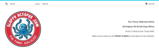
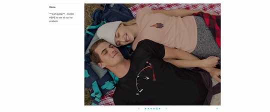
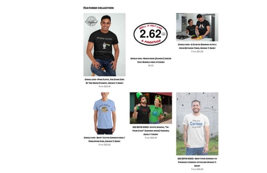

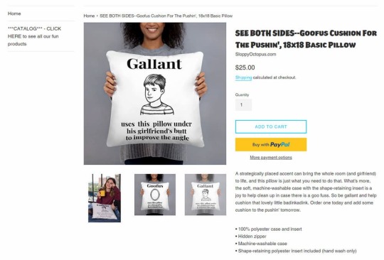
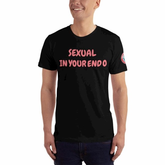
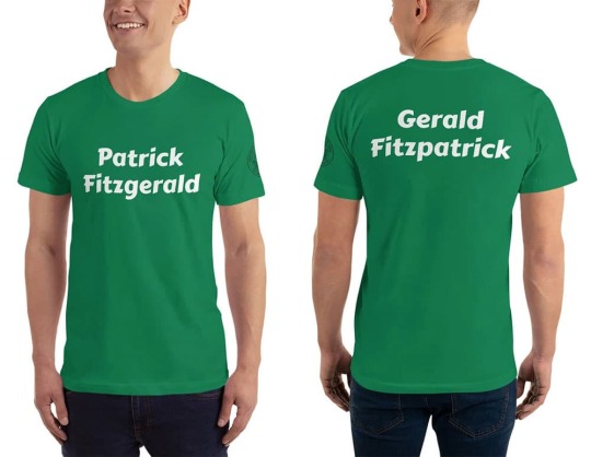
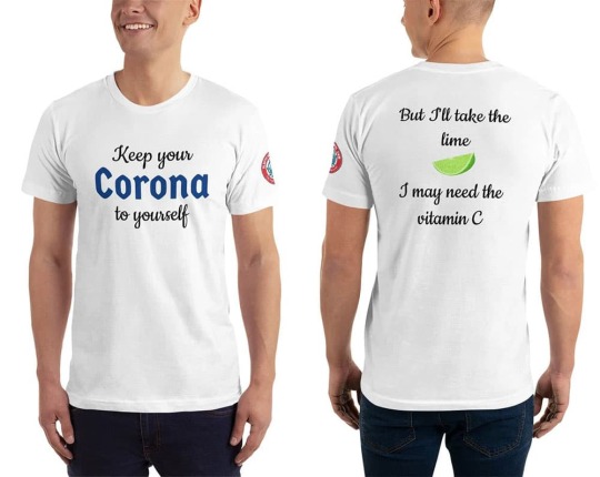
0 notes
Note
i really like your Discord theme but is it possible to customize the colors at all? i don't mind if i had to change the code on my own or if i won't be able to utilize the day/night toggle.
yeah, there's some limited color customization available through the default theme options, and if you're okay with adding some CSS, all the theme colors are editable!
by default, when you install the theme (instructions), you can edit colors for the following:
Discord logo (blue by default)
Servers (green by default)
Blog title (when you have a header image; there's also "background for title on header image", which lets you put a darker gradient over the image so your title is easier to read)
Heading text and accents (separate for dark/light modes)
Links, bold text, italic text (separate for dark/light modes)
The timestamp divider (and the "more posts from this day" link) (separate for dark/light modes)
for more in-depth color customization using custom CSS, see below the cut.
right, so! you can start by adding the following to the "Add Custom CSS" section on your customize page (instructions):
body.dark { /* Dark mode colors */
--bg-standard: #36393f;
--bg-dark: #202225;
--labels: #18191c;
--sidebar: #2f3136;
--blogname: #292b2f;
--secondary: #b9bbbe;
--text-normal: #dcddde;
--text-muted: #72767d;
--channels: #8e9297;
--channels-hover: rgba(79, 84, 92, 0.16);
--channels-active: rgba(79, 84, 92, 0.32);
--paginate: #40444b;
}
body.light { /* Light mode colors */
--bg-standard: #ffffff;
--bg-dark: #e3e5e8;
--labels: #ffffff;
--sidebar: #f2f3f5;
--blogname: #ebedef;
--secondary: #4f5660;
--text-normal: #2e3338;
--text-muted: #747f8d;
--channels: #6a7480;
--channels-hover: rgba(116, 127, 141, 0.08);
--channels-active: rgba(116, 127, 141, 0.24);
--paginate: #ebedef;
}
both sections above have the same color variables--once for the Dark theme, and once for the Light theme. if there's any you don't want to change, you can leave out those lines (just make sure not to delete the curly brackets {}, or the body.dark/body.light before those!). here's what each variable is for:
bg-standard: Standard background; post area and the server icons
bg-dark: Accent background; server sidebar and search bar
labels: Background for the popups that display when you hover over servers/buttons (make sure you set this to something you can read the "Headers and accent" color against - that's the text color for the popups)
sidebar: Background for description sidebar and tags
blogname: Background for the little blogname and #0000 Discord tag marker at the bottom of the description sidebar
secondary: Secondary text color; #0000 Discord tag, post tags, buttons, some pagination bar text
text-normal: Default text color for the full page
text-muted: Similar to secondary, used for subtler page elements; the hashtag before the header at the top of the page, the search bar's magnifying glass, the blog credit at the bottom of the page
channels: Default "channel"-link text color (when they're hovered over, they change to text-normal)
channels-hover: Background color when a channel-link is hovered over. This variable uses RGB colors instead of hex codes. By default, it's a 16%-opaque gray on dark mode and an 8%-opaque light gray on light mode. To change the color, change the first three numbers in the brackets to anything between 0 and 255; to change the opacity, change the last number to anything between 0 and 1.
channels-active: Background color when a channel-link links to the page the viewer is currently on. This variable uses RGB colors instead of hex codes. By default, it's a 32%-opaque dark gray on dark mode, and a 24%-opaque light gray on light mode. To change the color, change the first three numbers in the brackets to anything between 0 and 255; to change the opacity, change the last number to anything between 0 and 1.
paginate: Background color for the pagination bar at the bottom of the page
here's a screenshot of how the colors look by default. when you copy/paste, make sure the two hyphens at the start of each variable haven't been changed to a long dash by Tumblr's formatting, and don't forget the semicolor ; at the end of each line:
1 note
·
View note
Photo

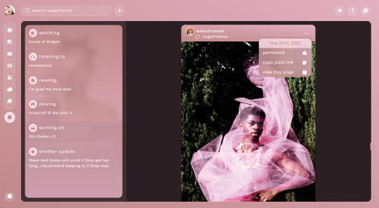
lotus | theme by sage
get the code - $3: static preview 1 / static preview 2
contained sidebar theme featuring (optional) music player, explore menu, & updates tab
this is my first contained theme and a modified version of my current theme on @phantomcodes
the song in the preview is Forgiveness by Rina Sawayama
features (more info below the cut):
optional: music player, explore menu, updates tab, tags on click, & two glow effects
customizable: description, colors, body & title fonts, font size, and post margin
gradient background, four border radius (corners) options, & uploadable sidebar image
header with icon, search bar, day/night, scroll to top, and tumblr controls
side navigation with up to 4 extra links
nothing needs to be changed in the code, everything can be changed in the customize panel!
terms:
reblog if using
do not touch the credit
view all terms
credits listed in the code / credits page
please consider supporting me ♡
make sure you read through this post and check the additional links provided before asking questions!!
uploading your song:
i recommend using google drive to host your mp3 files - below is a brief explanation for how to do this but you can also see the resources provided here by glenthemes and more links on my credits page
to start you need an mp3 audio file, once you have the one you want go to google drive and click: + New ➞ File upload
select your mp3 audio file and click open
open your newly uploaded audio file in google drive and click the three dots on the top right, then click Share and under General Access change it to Anyone with the link can view
copy the sharing link provided, it will look something like this: https://drive.google.com/file/d/1pBA6KdlLEzoEZPQ6hmaSr9LGLeCQGPxz/view?usp=sharing
go to the following site and paste your sharing url in the first box provided: https://www.joelgrayson.com/drive-download-link-generator
your final product should look something like this: https://docs.google.com/uc?export=download&id=1pBA6KdlLEzoEZPQ6hmaSr9LGLeCQGPxz
make sure the music player is toggled on in the theme, paste your audio link in the Song URL field
updates tab
up to 6 updates
each update has an icon, title, and text
i recommend keeping ur update text to two lines max, each update will scroll if it gets too long
explore menu
info stats section:
up to 6 stats each with a title and text
i recommend keeping these relatively short
description section:
this section can be as long as you want! it will scroll if it gets too long
blogs section:
up to 6 blogs
each blog has the blog icon, blog name, and a description
the blog icon will update automatically!
this section will scroll if it gets too long
socials section:
up to 5 social links
this is section will not scroll
links section:
up to 8 links
leave 'explore link 1' blank if you don't want this section
this section will scroll if it gets too long
make sure to check my faq and the theme’s tag, if you still have questions feel free to ask!
#themehunter#theme hunter#phantom code#phantom theme#lotus#codehunters#tumblr themes#tumblr theme#allresources#completeresources#tumblr codes#contained theme#sidebar theme#tumblr resources#userbru#userdre#useraashna#usernik#tuserlucie#music player
398 notes
·
View notes
Text

My Studio Ghibli-themed Notion set-up for 2022 - Part 1
Hello friends! I recently decided to reorganize my Notion pages to suit my current needs more. I've really been into Studio Ghibli movies lately so I've decided to use their cute fairytale aesthetic for Notion.
General Set-up
I use Notion via the desktop app. I also have the mobile app on my phone so I can add notes while I'm out. I find Notion great for the organization of private matters but I don't really like to use it for university since I really value simplicity when studying.
Starting Page
I used to have a lot of separate pages which really cluttered my sidebar. Now, I only use one starting page that allows me to access everything from a central spot. It includes three gadgets from Indify: a clock, weather forecast, and a calendar, as well as my to-do list.
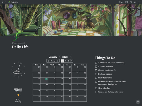
Below is my dashboard. It contains all pages I use regularly. The cover images are mostly from Studio Ghibli movies or animes.
Create your own Studio Ghibli-themed dashboard
1. Add a gallery database to your page.
2. Create or move pages to the database.
3. Pick a Studio Ghibli-themed image as the header for each page.
4. On the upper right corner of your database click ... and select 'Properties'. Now set 'Card preview' to 'Page cover'. Your header images should appear in the database now. DONE!
Thank you for reading :)
61 notes
·
View notes
Photo
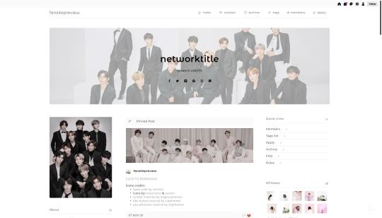

network/fansite theme by taezs
this is my first theme since retirement: a simple, clean, network/fansite theme. it is currently in use as the theme on my theme/resource blog (as at 11NOV20) if you would like to see it in action.
features:
header options include: default 1100 x 300px (but height is adjustable), just a colour, adjustable overlay for a header image or colour, text over header, hide header on permalink pages, or no header at all
sidebar image optional
admins box
information box
links box
affiliates box
schedule box
500px posts
and a bunch of other colour options
if you’re interested in this theme as a network theme (or even if you just like the style of the theme), please reach out if you’re interested in a matching tags page, faq page and members page as I’m thinking of releasing them in a pack.
base code by @sorrism. all other credits here.
please let me know if you have any issues. like i’ve said, it’s my first proper theme release in a while so if there’s something wrong shoot me a message so we can sort it out. basic customisation knowledge is assumed in order to edit the sidebar boxes but let me know if you are having any difficulty with them. otherwise, enjoy!
preview & code.
410 notes
·
View notes
Text
Okay, here's what I think you should know about my blog, and also me:
I mostly just reblog, but I occasionally make theories, fanfics, and shitposts. Currently obsessed with: Undertale/Deltarune, Mother franchise, Omori. Feel free to send me an ask about anything (especially quirky but sad pixel-art JRPGs), but keep in mind that I also reblog art from fandoms I don't consider myself part of just because I like the artist. (Basically, if we are mutuals, I'm 1000X more likely to reblog your art.)
(Also, if I like your post but don't reblog it right away, I'm either queuing it or writing an essay in your tags; I almost never like a post without reblogging it.)
I make music. Check out my sideblog, @tagohd. Of course, everything I post there gets reblogged here, but if you just want my music without wading through literally thousands of posts about Undertale, check that out. I'm also on YouTube and SoundCloud as TAGoHD, and MuseScore as sudoscience. (Oh, yeah, my music is also available on Spotify, iTunes, Deezer, etc. under the name Alan Waterford; new releases will be under the name TAGoHD.)
If your profile picture appears to be a photo of a real person and your blog is completely empty, I will immediately block and report you as spam. In the <1% chance that you're actually a real person and not a bot, sorry not sorry. You should know better.
Lastly, credits: my PFP was stolen from Toby Fox's twitter. My header image was made by @smieska-draws. If you're reading this on desktop, the portrait in the sidebar was made by @cascadiiing. The logo for my music blog was made by @lunathrix.
Putting this in my pinned post because I've been using it a lot lately: Tag Replacer.
43 notes
·
View notes
Last Seen Blogs

minifranky
glorious head fuck thing

satansbeeha
Untitled

tamagojani
Jani's secret files

noxen
Noxen

meltedchalk
>:)