#tutorial requests
Explore tagged Tumblr posts
Visit Tumblr Blog
Explore Tumblr blogs with no restrictions, modern design and the best experience.
Last Seen Tumblr Blogs


Fun Fact
Tumblr posted its first advertisements in May 2012 and subsequently earned $13M in revenue.
Note
Hello ! I hope you are well . I was wanting to ask a question if you do answer questions and are abke to help me . I am trying to import hair into blender along with the scalp base png , the hair is from DarkPink sims 4. I can get the hair in and shaded with no issue but i am having trouble figuring out how to add the png scalp base image to my sim model. You can could show me a tutorial or explain it to me that would be great
Hey! I'm doing well! I hope you are too! :) The solution to this is a super neat trick I plan to do an in-depth tutorial on at some point (my wedding is in two weeks so I've been gogogo with last minute prep and rendering as a stress reliever lmao) but basically you just have to add the texture to your sim just like you would to the object itself (hair, clothes, objects, etc)
I know that's confusing because there's already a texture on your sim, but there's a quick and easy way to do it.
I'll use my Rory as an example, because I had to add a hairline to her just like you're having to do.

Here she is without the hairline added, all normal nodes
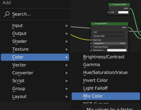
What you're going to want to do is add another texture node, like this:
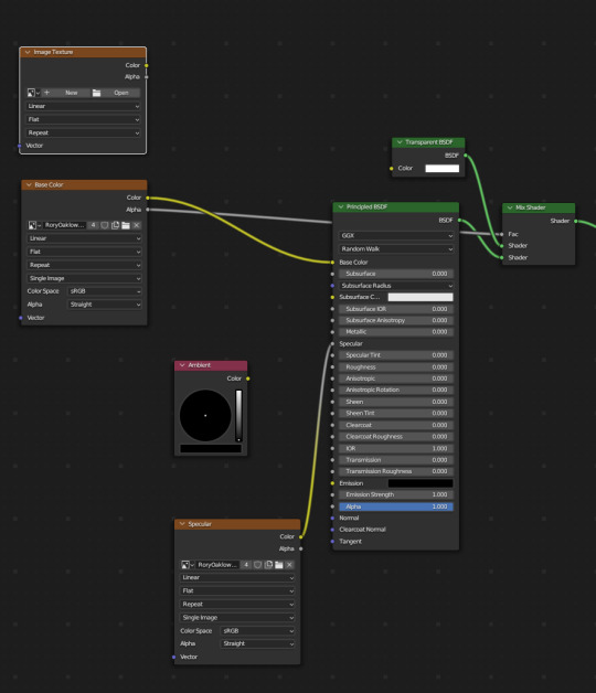
Just right on top, but to connect it to the other texture node and the principled BSDF, we'll also need to add a Mix Color node
And snug it right on that yellow line that connects to Base Color, like this:
Your sim will look a bit odd, that's okay
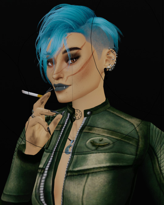
Rory looks like this at this stage:

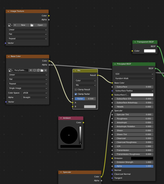
In our new texture node, add in the .png for your hair file, and connect it like so:

Connect Color from your hair texture to B and Alpha from your hair texture to Factor
Once you do this, your sim should now have the hairline! Like so:
A FEW IMPORTANT NOTES:
If you ripped your sim as all separate meshes, one texture, be sure to select and change only the head, sometimes this can make other parts of the body/clothing look wrong/wacky so only change the head/whatever part you need
Note that you can only add one additional texture node with this method, but there are other methods out there involving UV maps that I think work a bit differently (I'm not well versed in those but a google search will get you there). There's a workaround for this that I'll show in my longer, more in-depth tutorial on this method
I hope this helps! If you have any other questions please let me know!
Happy Rendering! ♥️
#replied#answered asks#tutorial requests#help#salemsims tutorial#render school tutorial#sims 4 render tutorial#render tutorial#blender tutorial#tutorial
30 notes
·
View notes
Note
Heyy!! I love your carrds so so much they're so pretty!! Can you please make a f2u non pro discord nitro themed carrd please please please
HELLO HOPE THIS IS GOOD!
non pro freindly discord nitro themed carrd
get the carrd here look at it here! here is also the image i used for the nitro badges!
REQS ARE OPEN FOR CARRDS!! only req i have is to be following me to ask for a carrd! and I DO CARRD COMMS!! so if you have a specific carrd you want made message abt my prices and what i take!! use my referral code also to help donate and get some money off on buying pro here / use the code manually HXYLIN !
#carrd commissions#carrd stuff#aesthetic#carrd templates#carrd icons#carrd inspo#carrd moodboard#carrd theme#carrd material#carrd packs#carrd req#discord chat#discord server#discord app#discord mobile#carrd template#request#carrd tutorial#free carrd template#carrd profile#strawberry#cutecore#commission#taking commisions#f2u
2K notes
·
View notes
Text


Don't Call Us Dead / Yellowjackets for @jackienatist
#i dont know WHAT yall put in your gifs that prevents text from being fuzzy i did everything all the bougie tutorials told me to do lol#i like this one! i tried like three different typography options and clicked that font by accident but ended up loving it the most#requests are still open#my gifs#lottielee#yellowjackets#laura lee#lottie matthews#usermiles#userbecca#tusercj#yellowjacketsnetwork#yellowjacketsedit#userlindsay#wlwsource#yj
688 notes
·
View notes
Note
https://www.tumblr.com/pupsec/777071487795478528/messing-around-with-layouts-and-shit?source=share HOW DID U DO THE COLORINGGGGGG I LOVE ITTT CAN U SHARE PLEASE AND TYY
[EDIT 235 GODDAMN NOTES WHAT THE SHIT.]
hi! i am happy you liked it 💗💗😭😭
unfortunately it's something i cannot share because, well, it's something i worked a lot for.
it's not that i dont encourage inspo/asking for help, it's just that with experience you find a style that's unique to you and expresses you!
however, here are some really good overlays i reccomend using for a similar style!
remember to grayscale all of them before you apply a blending mode! that's what i mostly do, no pressure.


example:

if you want a tutorial for how to use blending modes and stuff, and how to mess around with filters, do let me know!
#♡̵ ⠀⠀・ ⠀⠀pupsec ⠀⠀ᜑ⠀⠀💗꣒#♡̵ ⠀⠀・ ⠀⠀edits ⠀⠀ᜑ⠀⠀💗꣒#♡̵ ⠀⠀・ ⠀⠀requests ⠀⠀ᜑ⠀⠀💗꣒#♡̵ ⠀⠀・ ⠀⠀resources ⠀⠀ᜑ⠀⠀꣒#rentry#rentryblr#rentry resources#rentry stuff#rentry icons#rentry overlays#rentry overlay#overlay#overlays#editblr#editblr resources#editblr help#editblr stuff#editblr tutorial#tutorial#rentry tutorial#editing tutorial#hyacine#hsr#hsr hyacine
288 notes
·
View notes
Note
Idk how possible it is but if you can could we get the groupshot intro of Parallel Canon at different angles? (Like from the boss intro cutscene?)
yea thats totally possible! i wasnt sure exactly what kinds of angles you were looking for, but if i want to do this again ill need to restart the entire campaign so i just took a bunch lol

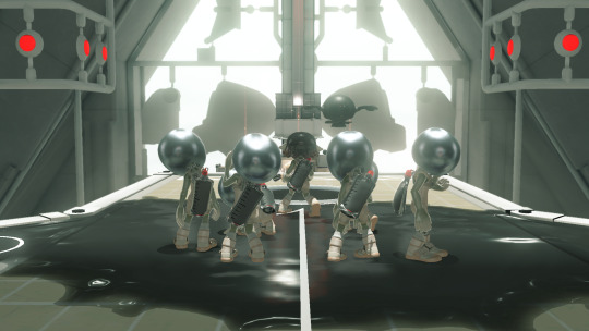
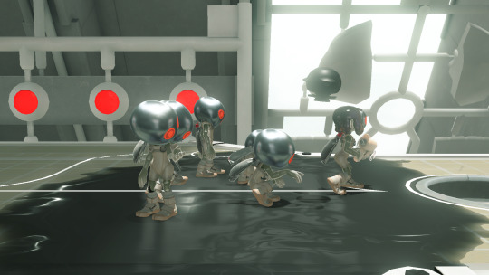
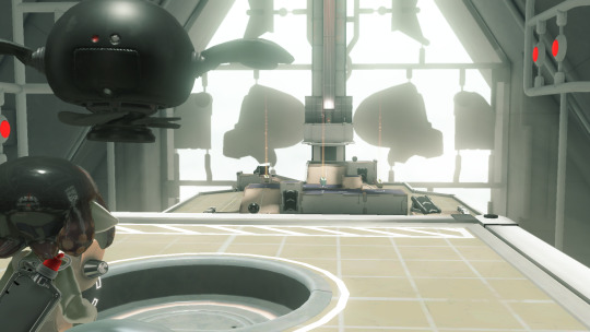
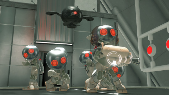


#restart the entire campaign AGAIN that is. i did restart it and play thru the entire tutorial and 10 more floors to get these LMAO#never say i dont put in the work for this blog 💪#splatoon#splatoon 3#side order#parallel canon#requests
435 notes
·
View notes
Note
how do you make your userboxes? i've gone looking for tutorials before but the only one i found didn't work for me .::(
I use ibis paint x to make them! I also use this template

I usually get my images from pinterest and/or google, depending on what the request is for.
let me show an example:
I get my subject and my 2 pictures. the left one is for the icon, and the right one is for the background (credit to this post for the pet dreaming flag!)

I then import the template as a new piece.

I use the selection tool to select the icon box, and then insert the icon picture I want.


for the smaller rectangle, I select that rectangle and then fill it in with whatever colour fits the userbox (you can also lower the opacity to 80-90% if you want)


I then insert the background WITHOUT selecting the background. you do not need to select the background, but you can if you want. IF YOU DO, you’ll end up with a thin white line around where the template is.
this is what the layers should look like once you’re done the designing part
now you just gotta insert the text! just go to the text option, select “add text” and put in the text you want for your userbox. you can also change the font and size if you want (highly recommend this because the default font kinda sucks and you want the text to be big enough to read). if you want to have that little white border around the letters, just go to style and change the stroke colour/thickness (the FIRST slider, not the second one!!)


and there you go! you now have your userbox! just save it, and bam! here’s the finished product of the example.

hope this helps! feel free to leave any questions below; I’m free to answer any questions if anything was confusing or unclear :3

#alterhuman#nonhuman#otherkin#therian#my userboxes#custom userboxes#userboxes#art tutorial#tutorial#how its made#kin stuff#kin request#open requests
194 notes
·
View notes
Text
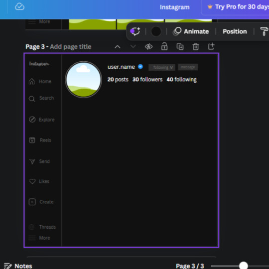
𓈒༷♪˚.✧ How to make a mockup like this for smaus, ocs, etc. (step-by-step tutorial ☆ no Photoshop, easy, free) (requested by @lovebittenbyevans) ✿
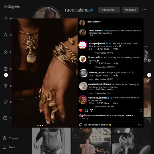
guys this took me two hours to make and you could probably get this done in like, 30 minutes :) I hope this is coherent <3 Please look back this image for comparisons, if my explanation is not well explained, etc.
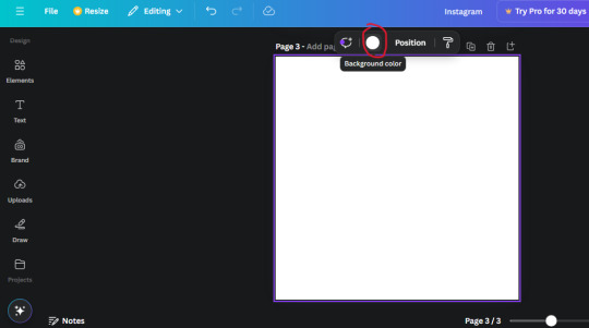
first of all, if you dont already have one, make a free canva acount. once you're signed in, hit the purple "create design" button on the sidebar. A pop-up will appear with different design template options. For this design, we want the dimentions to be 1080 x 1080, so you can either make a custom size or choose the instagram post (square) template by either searching or scrolling through the list.

2. Now you have a blank page. Zoom in with the slider at the bottom of the page if you need to (Mine is currently zoomed in 41%). Click on the page and change the color to an off black (hex code #111111).
3. Now that the color is changed, click the "elements" tab and search "line". Click the shape and it will add it to the page automatically. These line are particularly hard to navigate and hard to get it at the right angle and length so this part might take a little longer than the rest.
4. stretch it from top to button and turn in a 90 angle so its straight on the left side of the page. Change the color of this as well to a grey tone (hex code #2F2F2F).
5. Now we'll add the Instagram logo. Click the "text" tab then click the purple "add text box" button. Write "Instagram" in the box and change the font to "apricots". This is the closest font I could find that resembled the logo font but if you find a better one, feel free to use that instead. Make the font size 19.3 (you can do this manually or do it in the text options). Change the color to grey color (hex code #707070). Add it to the upper left corner of the page like this:
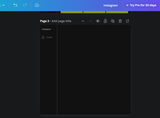
6. now we're adding icons and a menu inside the border we just made. Click the "elements" tab again and search for "instagram home icon" and add the element by sketchify to the page. Click the home icon, an options icon with pop-up above the page. Look for the "Position" button and click it. Scroll to find the advanced options and you can manually type in the width and height at 26.6 and 28.7.
Move it inside the border, under the logo (photo below). Change the color again (the hex code is #707070).
7. Open the text tab and add a text box. Change the font to Canva Sans and write "Home" in the box. Change the font size to 18.1 and align with with the house icon. It will look something like this,
8. Go into the elements tab again and search "instagram search icon". Scroll until you find the one by sketchify and add it to the page.
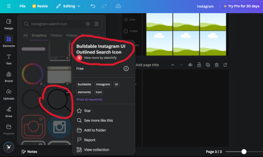
9. Shrink it so the W and H is at 36.6 and 31.3. Move it below the home icon until a purple "67" pop ups and aligns under it. Change it to the same color as the Home text and icon (#707070). Go ahead and Duplicate the the "Home" text box and clicking it and a pop-up will show up then edit the text so it says "Search" and align with the searcch icon we just added.
10. You know the drill. We are continuing to search up more icons in the "elements" tab. Search "instagram compass icon" and choose the one by sketchify (are u seeing the pattern?). Add it to the page and change the width and heigth to 33.1. align it under the search icon just like how we did before and change it to the say colors as the other icons.
11. Do the same as before and write "Explore" in a text box and align it with the icon. We're doing the same thing for all of these.
We'll be using the same search prompt for all of these icons so just change the type of icon you're looking for like we've done before hand. Next look for the Instagram reel icon and add the outlined one by sketchify and change the W and H to 31.2 x 30.9. Change the color to the ones we've used before, align it underneath the icons above and add your text ("Reels").
12. The next icon is an outlined, "sent" one. W and H is 31.1 x 27. The text will say "Send". Then an heart outline by sketchify; W and H is 34.2 x 29.1 and the text is "Likes". Next is the "create" outline icon by sketchify, W and H is 36.8.
(p.s if you are struggling to align the icons and text correctly, shoot me a message and I'll send you the X and Y positions ;D)
If you followed it through, it should look like this,
13. Now onto step 13, we'll be adding the Threads logo. You don't have to add this but to make it look more like the actual website, I will be adding it. Open the "text" tab and add a text box. Write an "@" symbol in the box and change the font to Nanum Sqaure and the size to 24.9. Add in the bottom corner below all the icons we just added to our page. We need another text box now (Color is still #707070), write "Threads" and align it to the "@" symbol.
14. We're adding another icon now. Search "Instagram menu icon" and find a wireframe menu icon by sketchify. the W and H are 42.5 x 24.6. Add a text box that says "More". It will look like this:
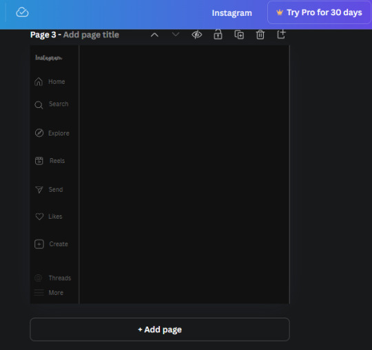
We are a quarter way done now :D
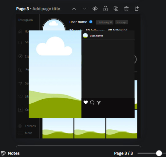
15. Search in the elements tab "circle frame" and look for the one with a little border around it.
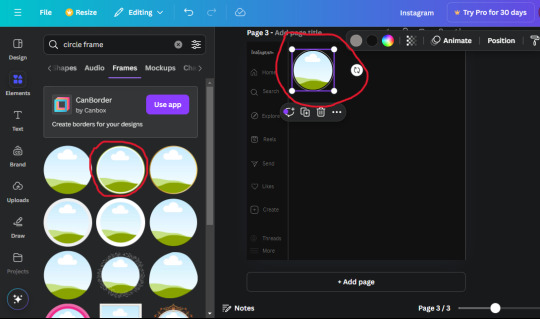
At first, the circle will be green and inside the circle will be white. Change the white to color of the background of the page (hex code #111111) then change the green to a grey color (#8D8986).
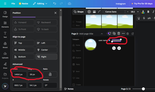
16. Add a new text box, change the font to Canva Sans and the size to 22.8 and the color is white. I just wrote "user.name" in the box. the W and H will be 153.3 x 35.7.
Enter the "elements" tab and search for a blue checkmark and find the icon by Victor Aguiar. The W and H is 28.1 by 28.
17. Search in the search box for a rectangular shape and add it to the page. Place it next to your username and checkmark icon and make the W and H to 149.6 x 38. Add another and place it next to the other rectangle shape. the W x H is 111.4 x 36.7.
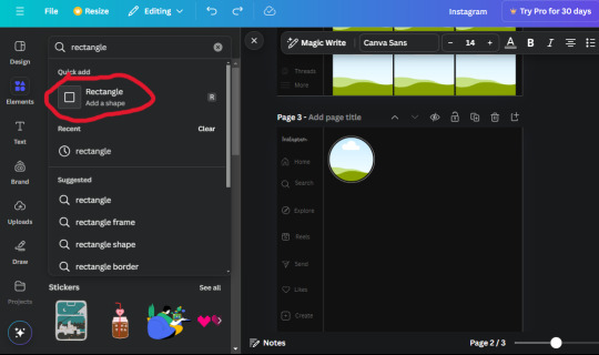
Change the color of both boxes to #2F2F2F. Add a text box and write "following" then change the W and H to 82.6 x 21.8 and fit it inside the first box. Add a second text box and write "message" in it then change the W and H to 77.8 x 21.8. Change both text colors to #7A7A7A

18. Add another text box. Write "<" and turn it upside down and place it beside the "following" text inside the rectangle. Adjust the size as you need to. I also like the round the corners to around 8 so its not so pointy and square.
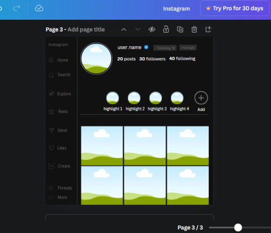
19. Add 3 new text boxes. Write the amount of posts, the amount of accounts you're following and the amount of followers your have. Write "20 posts", "30 following" "40 followers". Bold the numbers and change the text W and H to 116.4 x 32.7. These are just place holders that I use.
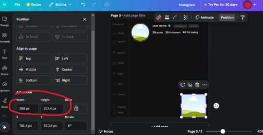
20. Open the "elements" tab again and search "frame". Choose the first one.
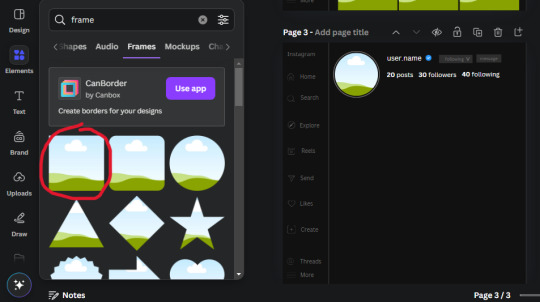
We want the height and width to be 268 x 252.4. Place it at the bottom of the page but we want some space between the frame and the page.
Now we'll duplicate the frame we just placed (the icon between the comment and trash can on the pop up above the frame). Place it next to the previous frame but we want to leave a bit of space between them like this:
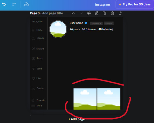
If its a little wonky, don't worry. You can always adjust it so it looks right.
Duplicate the frame again and place it next the second frame you just placed, same distance between. Make sure they're even. Now we have a row.
Select all three frames and duplicate them. Move them above our original frames but leave a little space between them.
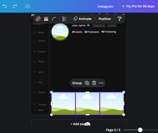
Again, if they're uneven, adjust them as you need to.
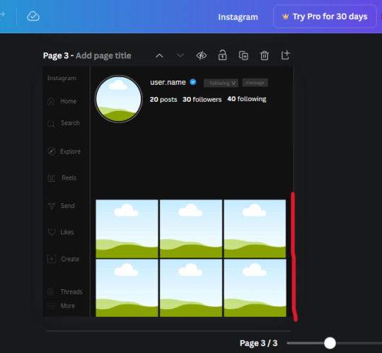
21. Select the line again from the elements tab. Stretch starting from the top frame to the last frame and make the color grey (#2F2F2F).
Because the line is stupid hard to navigate, use something like a text box to mark where you want it to end like this:


Delete the text box and the line with be where we want it.
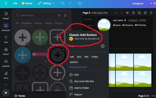
22. On to the highlight reels. Seach for "add button" and find the one by Barudak Lier.
Change the heigh and width to 81.1 and move it above the border.
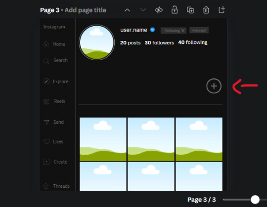
Search for circle frames now and add this one to the page (The same one we used for the pfp), change the width and height to 85.4 and move it next to the add button. Since this is a generic, blank template, I add about 4 of these highlight frames but you can do however many you want. You can change the border color to a gradient or leave it grey.
Add a text box now. The font will be Canva Sans, the size will be 18.1 and the color will be white. Change the text to "Add" and place it under our add button. Make more of these text boxes to place under the circle frames. Depending on which frame its under, write "Highlight 1", "Highlight 2", etc. etc. or you can give them different names and such.
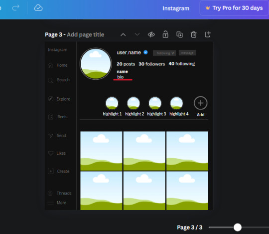
23. Add another text box, write "name" and bold it, change the size to 19.1 and the W and H to 69.2 x 28.8. The font will be Canva Sans and the color will be white. It will go under the amount of posts, followings and followers.
Add another box. The font is Canva Sans, font size to 20.1, the W and H is 40.8 x 31.3 and the color is white as well. This is our "bio". Place it under "name".
Yay!🎉🎉🎉 You're halfway done!
24. Search for a shape in the elements. Look for the rectangle again and add it. Change the width and height to 460 x 760.4 and the color to an off black/grey color (#191919), placing it like this:
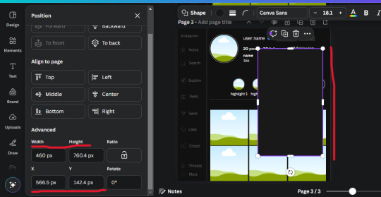
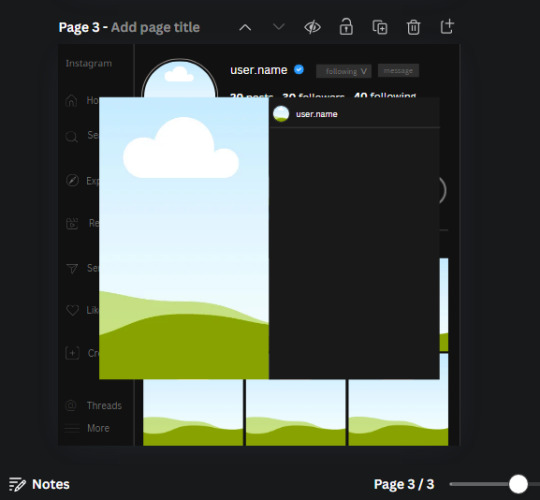
Get the same kind of square frame we used before to make the profile grid and make it the same size as the rectangle we just added. Place right up against the rectangle like it's its other half. Add another line like before and span across the upper half of the black rectangle as a border then add a circle frame inside the border.
Add a text box, "user.name" and align it with the frame. The text is white and the W and H is 111.5 x 25.9
25. Add more circle frame along the inside of the rectangle to resemble the comment section. Make sure the W and H of the frames are 46.1.
Add more text boxes that align with the frames you just made and write "username" again and bold them. Add even more text boxes that align with the usernames and write "comment". These are place holders for when you decide to use this template.
Add another rectangle on the lower part of the rectangle and make the color black. and search for "instagram heart icon", "instagram comment icon" and "instagram send icon". Make sure the lines are thick. Find the heart icon by sketchify, and the the comment and send icon are by Mirazz Creations. Make the lines white and make sure the W and H are the following:
Heart icon: 38.7 x 32.9
Comment icon: 35.2 x 35. 8
Send icon: 35 x 32
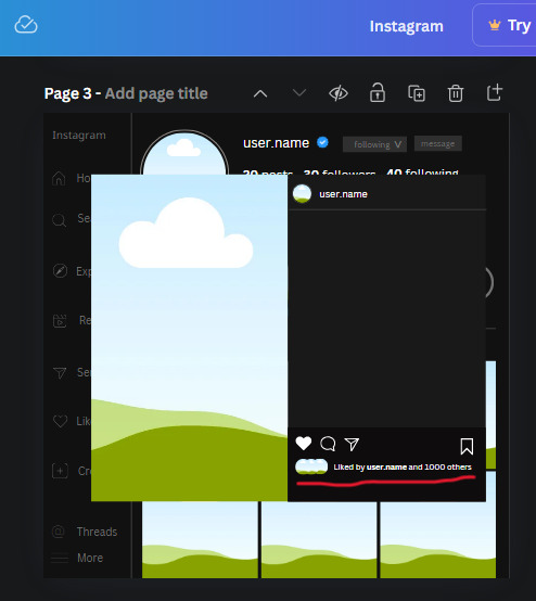
Next, look for "instagram bookmark icon" and find the one by Adricreative. Change the color to white and the W and H to 29.7 x 40.2. Move it to the other end of the rectangle.
26. Now add three circles frames and change the W and H to 37.2. Move them below the heart icon and have them overlap each other some. Then, add a text box and write "liked by username and 1000 others". Change the font size to 13.6 and change the font to Canva sans. the color will be white. Align this with the three overlapped frames.
27. Look in the elements tab for an emoji icon and choose the one by Soni Soukell from Noun Project. The W and H will be 32.8 and the color is white.
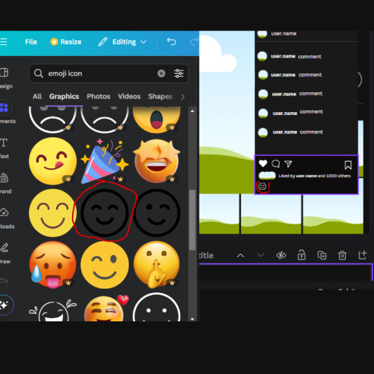
Now add a another text box and write "Write a comment". The color will be white, the font size will be 14.2 and align with the emoji icon you just placed.
Search for "next arrow button" by Pixeden and make the W and H 42.8 then add it to both sides of the post.
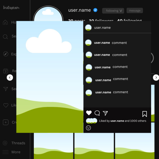
And you're all done with your template! All that is left to do is fill it but before doing that, duplicate the page so you always have an extra blank mockup if you want to use it again.
To fill the frames, upload an image (or use a Canva stock photo), drag and hover it over the frame and it will fill the frame.
Hope this was helpful and you you successfully made one :D <3
#requests#text#smau#template#mockup#moodboard#instagram#instagram moodboard#instagram mockup#graphic design#canva#psd#free tutorial#tutorial#instagram au#social media au#free psd#photoshop#resources#fanfiction resources#graphic design resources#graphic design tutorial#psd tutorial#photoshop tutorial#au#au ideas#mockups#digital design#digital design tutorial
169 notes
·
View notes
Text
Someone asked me how I created the fade transition in this gifset which I’ll try to explain in the most comprehensive way that I can. If you've never done something like this before, I suggest reading through the full tutorial before attempting it so you know what you'll need to plan for.
To follow, you should have:
basic knowledge of how to make gifs in photoshop
some familiarity with the concept of how keyframes work
patience
Difficulty level: Moderate/advanced
Prep + overview
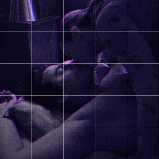
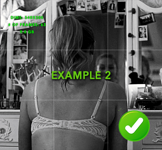
First and foremost, make the two gifs you'll be using. Both will need to have about the same amount of frames.
For ref the gif in my example is 540x540.
I recommend around 60-70 frames max total for a big gif, which can be pushing it if both are in color, then I would aim for 50-60. My gif has a total of 74 frames which I finessed using lossy and this will be explained in Part 4.
⚠️ IMPORTANT: when overlaying two or more gifs and when using key frames, you MUST set your frame delay to 0.03 fps for each gif, which can be changed to 0.05 fps or anything else that you want after converting the combined canvas back into frames. But both gifs have to be set to 0.03 before you convert them to timeline to avoid duplicated frames that don't match up, resulting in an unpleasantly choppy finish.
Part 1: Getting Started
Drag one of your gifs onto the other so they're both on the same canvas.
The gif that your canvas is fading FROM (Gif 1) should be on top of the gif it is fading INTO (Gif 2).
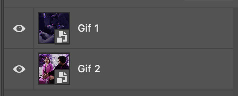
And here's a visual of the order in which your layers should appear by the end of this tutorial, so you know what you're working toward achieving:

Part 2: Creating the grid
Go to: View > Guides > New guide layout
I chose 5 columns and 5 rows to get the result of 25 squares.
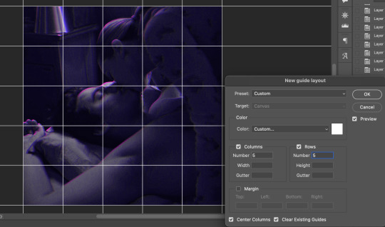
The more rows and columns you choose, the more work you'll have to do, and the faster your squares will have to fade out so keep that in mind. I wouldn't recommend any more than 25 squares for this type of transition.

To save time, duplicate the line you've created 3 more times, or as many times as needed (key shortcut: CMD +J) and move each one to align with the guides both horizontally and vertically. You won't need to recreate the lines on the edges of the canvas, only the ones that will show.
After you complete this step, you will no longer need the guides so you can go back in and clear them.

Follow the same duplicating process for the squares with the rectangle tool using the lines you've created.
Align the squares inside the grid lines. The squares should not overlap the lines but fit precisely inside them.
This might take a few tries for each because although to the eye, the squares look all exactly the same size, you'll notice that if you try to use the same duplicated square for every single one without alterations, many of them will be a few pixels off and you'll have to transform the paths to fit.
To do this go to edit > transform path and hold down the command key with the control key as you move one edge to fill the space.
Once you're done, put all the squares in their separate group, which needs to be sandwiched between Gif 1 and Gif 2.

Right click Gif 1 and choose "create clipping mask" from the drop down to mask it to the squares group. This step is super important.
After this point, I also took the opacity of the line groups down to about 40% so the lines wouldn't be so bold. Doing this revealed some squares that needed fixing so even if you aren't going dim the lines, I recommend clicking off the visibility of the lines for a moment to make sure everything is covered properly.

Part 3A: Prep For Key framing
I wanted my squares to fade out in a random-like fashion and if you want the same effect, you will have to decide which squares you want to fade out first, or reversely, which parts of Gif 2 you want to be revealed first.
In order to see what's going on underneath, I made Gif 1 invisible and turned down the opacity of the squares group.

If you want text underneath to be revealed when the squares fade away, I would add that now, and place the text group above Gif 2, but under the squares group.

Make a mental note that where your text is placed and the order in which it will be revealed is also something you will have to plan for.
With the move tool, click on the first square you want to fade out. Every time you click on a square, it will reveal itself in your layers.
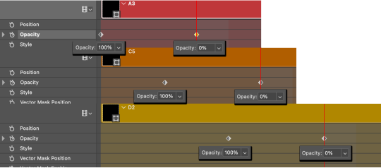
I chose A3 to be the first square to fade and I'm gonna move this one to the very top of all the other square layers.
So if I click on D2 next, that layer would need to be moved under the A3 layer and so on. You'll go back and forth between doing this and adding key frames to each one. As you go along, it's crucial that you put them in order from top to bottom and highly suggested that you rename the layers (numerically for example) which will make it easier to see where you've left off as your dragging the layers into place.

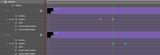
Part 3B: Adding the Keyframes
This is where we enter the gates of hell things become tedious.
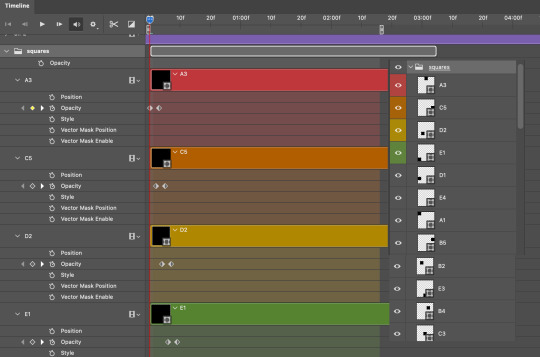
Open up the squares group in the timeline panel so you can see all the clips.
Here is my example of the general pattern that's followed and its corresponding layers of what you want to achieve when you're finished:
So let’s try it!
Expand the control time magnification all the way to the right so you can see every frame per second.

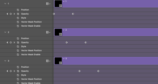
As shown in Part 3A, select your first chosen square.
Where you place the time-indicator on the panel will indicate the placement of the keyframe. Click on the clock next to opacity to place your first keyframe.

Move the time-indicator over 3 frames and place the next key frame.

Things to consider before moving forward:
Where you place your very first keyframe will be detrimental. If you're using a lot of squares like I did, you may have to start the transition sooner than preferred.
If you're doing 25 squares, the key frames will have to be more condensed which means more overlapping because more frames are required to finish the transition, verses if you're only using a 9-squared grid. See Part 4 for more detailed examples of this.
The opacity will remain at 100% for every initial key frame, and the second one will be at 0%.
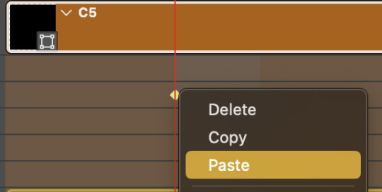
Instead of creating two keyframes like this and changing the opacities for every single clip, you can copy the keyframes and paste them onto the other clips by click-dragging your mouse over both of them and they'll both turn yellow. Then right click one of the keyframes and hit copy.
Now drop down to your next clip, move your time-indicator if necessary to the spot where the first keyframe will start and click the clock to create one. Then right click it and hit "paste".

Tip: When you have both keyframes selected, you can also move them side to side by click-dragging one of them while both are highlighted.
Your full repetitive process in steps will go as follows:
click on square of choice on the canvas
drag that square layer to the top under the last renamed
in timeline panel: drop down to next clip, move time-indicator tick to your chosen spot for the next keyframe
create new keyframe
right click new keyframe & paste copied keyframes
repeat until you've done this with every square in the group
Now you can change the opacity of your squares layer group back to 100% and turn on the visibility of Gif 1. Then hit play to see the magic happen.
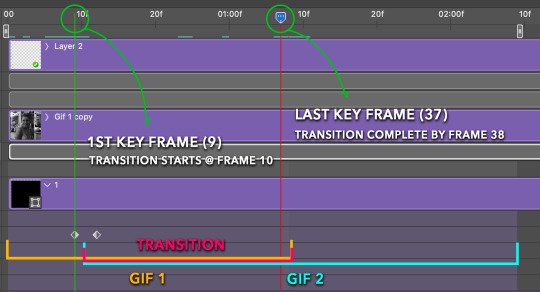
PART 4: Finished examples
Example 1
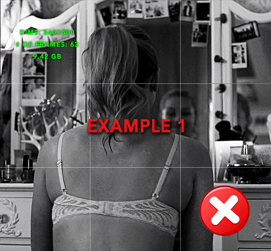
the transition starts too soon Cause: initial keyframe was placed at frame 0
the squares fade away too quickly Cause: overlapping keyframes, seen below. (this may be the ideal way to go with more squares, but for only 9, it's too fast)
Example 2
more frame time for first gif
transition wraps up at a good point Cause: in this instance, the first keyframe was placed 9 frames in, and the keyframes are not overlapping. The sequential pair starts where the last pair ended, creating a slower fade of each square.
Part 5: Final Tips and Saving
You can dl my save action here which will convert everything back into frames, change the frame rate to 0.05 and open the export window so you can see the size of the gif immediately.
If it's over 10gb, one way to finesse this is by use of lossy. By definition, lossy “compresses by removing background data” and therefore quality can be lost when pushed too far. But for most gifs, I have not noticed a deterioration in quality at all when saving with lossy until you start getting into 15-20 or higher, then it will start eating away at your gif so keep it minimal.

If you've done this and your gif is losing a noticeable amount of quality and you still haven’t gotten it below 10mb, you will have no choice but to start deleting frames.
When it comes to transitions like this one, sometimes you can't spare a single frame and if this is the case, you will have to return to the timeline state in your history and condense the key frames to fade out quicker so you can shorten the gif. You should always save a history point before converting so you have a bookmark to go back to in case this happens.
That's pretty much it, free to shoot me an ask on here or on @jugheadjones with any questions.
#gif tutorial#photoshop tutorial#transition tutorial#grid tutorial#usergif#ps help#tutorials#tutorials*#resources*#requested
454 notes
·
View notes
Note
I would love an idea for a 2014 tumblr filter through some app, VSCO maybe

2014 travel VSCO filter ♡
Feel free to check out my master list of filters here! 💗

Filter: T1: 10
Exposure: +1.5
Contrast: -1.0
Temperature: +1.0
Tint: +0.5
Skin tone: +0.5
(Optional) Fade: +2.0
* You can adjust these settings to your liking!
💋 Taglisters: @2543jj @lou007sstuff @cottoncandywhispers @bambibabydoll123
#2014 filters#2014 filter#2014 filter tutorial#2014 aesthetic#vsco#vsco filter#rosy blog#2013 aesthetic#i miss 2013#2014#2013#2014 tumblr#2013 tumblr#2015#2014core#2014 girl#i miss 2014#2014 vibes#bring back 2014#2014 nostalgia#tumblr 2014#2014 summer#2014 revival#2015 blog#2015 aesthetic#2015 tumblr#2014 instagram#lizzy grant#ask#request
169 notes
·
View notes
Note
If I may ask, how do you make characters look old? I've been trying to draw cats that are on the older side but it doesn't really work for me
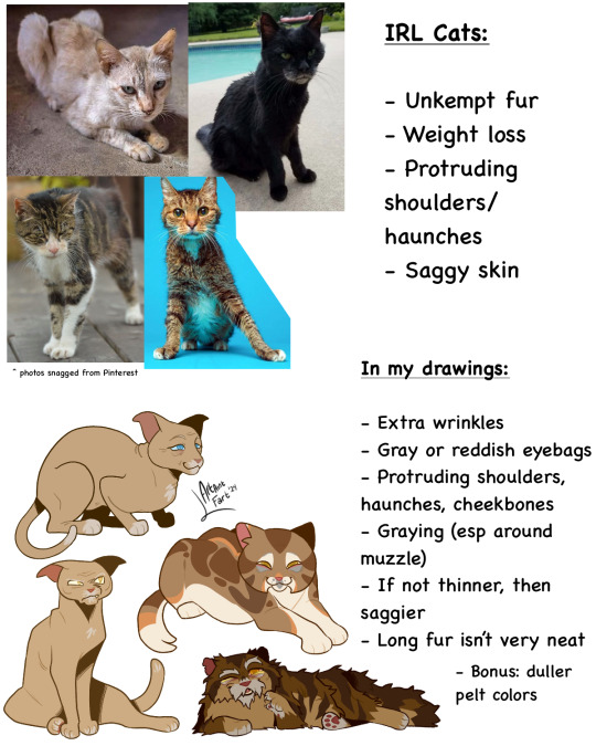


Hmmmmm ok! Now take this all with a grain of salt because I’m not like. A professional or whatever at anything to do with cats or anatomy or aging buttttt here’s some traits I noticed in older cats that I like to apply to my designs. Take note, though, that I also apply more human features of aging (eyebags, lots of graying, facial wrinkles) because my style is a lil anthro with the face and whatnot.
#mistystar#mistyfoot#tutorial#ig???#request#made a new sheet on the masterlist for alternative designs like starclan df elder versions and whatnot#also sorry for being gone so long I was rly sick lol
131 notes
·
View notes
Note
hello gorgeous! i just wanted to send a little ask and see if one day you could post a tutorial on posing sims with cas objects (stigmata accessories like coffee cups and those types of things) <3 u know i love ur tutorials
Of course I can! I'll add it onto the list!
But I'll tell you a secret... To apply cas objects/props to a posed sim in blender, you use the same process as appending accessories. (;
The only trick is that props will only append properly if you're careful in the way you move your posed sim.
If you move your sim using the directional commands (by selecting them and moving them like any other object) props won't append. But if you go into pose mode, hit A on your keyboard to select all the joints, move them and then lock it in with location & rotation, then props will append even if the sim isn't in their original position.
But yes! I will absolutely do a step by step tutorial on how it's done!
2 notes
·
View notes
Text
BASIC ACC FREINDLY LIGHT PINK MINIMAL CARRD
Hiii guys, to the comments and everyone i apologize for the inconvenience of the title and everything, the carrd was free at one point but many people kept stealing the carrd and removing creds and giving copies of the carrd and saying they made it. I had sent out posts on here and my discord server letting everyone know if it didn't stop i would start charging for the carrd or just take it away all together and it got progressively worse so i decided to change it to a paid carrd and realized after a couple comments about it on this post that i forgot to change the post and take away the parts where i said free, if you would like the carrd for free there is a tut up on my youtube channel (linked in my pinned post or comms carrd i believe) for it but i won't be giving out copies or temps of it anymore besides the paid one thank you!!
HIIII everyone here's a new carrd! obtain it here look at it here!
REQS ARE OPEN FOR CARRDS!! only req i have is to be following me to ask for a carrd! and I DO CARRD COMMS!! so if you have a specific carrd you want made message abt my prices and what i take!! Donate tips to me so im able to continue making free carrds here! use my referral code also to help donate and get some money off on buying pro here / use the code manually HXYLIN !
#carrd commissions#carrd stuff#aesthetic#carrd templates#carrd icons#carrd inspo#carrd moodboard#carrd theme#carrd material#carrd packs#carrd req#discord chat#discord server#discord app#discord mobile#carrd template#request#carrd tutorial#free carrd template#carrd profile#strawberry#cutecore#commission#taking commisions#f2u#f2ucarrd
1K notes
·
View notes
Text
🎭Ori redesign 🎭
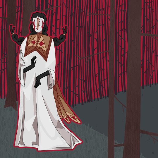
I’ll be messing around with Ori designs for a bit. It’ll probably be forever changing tbh
#I dunno anymore#was trying to go for a cool stained glass on the clothes???#honestly this was a rough doodled that I ended up just adding more details too#also wanted to redesign Marium but I might actually just like my original design#Ori#Night Out#but you know I do like the background a lot so it’s a win I suppose#artists on tumblr#art#my art#illustration#digital art#finished piece#my oc art#2025 art#Saw everyone’s inboxes and yes I will be answering them!!!#the fish request might take me a bit as it would be my first tutorial and I want it to be comprehensible
46 notes
·
View notes
Text
So. You once believed tumblr to be your safe space, your archive, your goldmine. Instead, thanks to "unforseen" circumstances (fuck you dorna), you now fear for the safety and integrity of your blog and you want to know if there's a quick way to download a lot of posts without having to do it manually (I spent half an hour yesterday doing it. Do not recommend)
Fret not my child, and welcome to
How to save the posts under a whole tag in five easy steps!
Needed preface: while this method works great for images, videos, and gifs, the same thing cannot be said for text post, which will be saved in unreadable html. I mean, you can always feed the file to a compiler, I guess. Or painstakingly copy paste everything on word. Maybe it could work on ao3 too, actually, I should check.
ANYWAYS.
Step 1: go here, and download the zip file. Once you've done it, extract it, open it, and run the program, that inside the folder will look like

this. (the one in the centre. so that we're all on the same page)
Step 2: once you've done it, you'll run to me saying "cate anitalianfrie, this graphic interface looks like a relic from the nineties!" to which I'll answer, yes, but it works and that's all that matters. Then, you'll open the settings (gear on the botton right of the page) , go to the page named "blog" and where you see the option "tags" put the tag you want to download the content from.
(it's located in the bottom right section of the page)

the space will be blank. put the tag without the "#", and with the spaces.
if you want to download from more than one tag at a time, you can! just beware that it's not an intersection of the two tags (aka: not downloading the post that have both tags) but a union (aka: WILL download posts with one, the other or both tags). if that's still fine by you, put a "," between a tag and the other (ex: "my gif, cate.txt").
SAVE BEFORE CLOSING THE SETTINGS
Step 3(optional): the program automatically saves in the folder blog inside the folder your program is in. if you wish to change this, go to the "general" page of the setting. at the top, you'll see this:

go to browse and select the floder you want to put your posts in. (ps. obviously your download location will be different than mine. i've already changed it. the standard would have been C:\User\your_username\wherever_you_extracted_the_zip\Blogs)
SAVE BEFORE CLOSING THE SETTINGS
Step 4: past the link of your blog as https://www.your_blog_name.tumblr.com or https://www.tumblr.com/your_blog_name (ex: https://www.anitalianfrie.tumblr.com, https://www.tumblr.com/anitalianfrie) in the little space down on the left,

and press "add blog" on its right
Step 5: click two times on the blog (it now should be at the top of the page) and click "download"
And voilà you're all set! Wait for the machine to finish the crawl and enjoy your newly downloaded content
58 notes
·
View notes
Note
Any tips for artist tryna improve their art? Love ur art and would love to some tips and tricks of yours! ^^
BOOHOO;; THANK YOU!! THAT'S SUCH A NICE COMPLIMENT TO ME;; Like what do you mean you like what I do enough that you want to hear some tips from me!! DON'T MAKE ME CRY FHDJKSA
I really really tried to make things short for you but I don't think I was very successful dkhkdh but I hope you find them useful!! <3
Tracing (not the stealing kind):
Tracing is not bad when it's used to study, some of my college assignments were copying renaissance artists' sketches! Hell, when I was a kid I used to trace Undertale fanart I liked and look where I'm at fhjkads
When you study other people's styles, you can actually gather a lot of information like line weight or proportions, colors, even stylization. So get your favorite artists' pieces and really look at them for a long time, draw them, then apply what you learn into your own art. Just be careful to not steal or claim something as your own!
Focus on one area at a time:
Now you have to chose one area to practice on. You could tackle on many at a time but I find it easier to pinpoint what I would like to do first and then move on to the next thing.
There's a lot of subjects you can go into like anatomy, rendering, backgrounds, but you just have to find one area in them and get a lot of references.
For anatomy you can go into: muscle movement, figure drawing, body parts in different angles.
Rendering: Shading, lighting, color theory.
Backgrounds: Point perspective, different camera angles, landscapes or detailed room scenes.
Don't overwhelm yourself either! Take one thing at a time!
Dear god get a reference board:
Pinterest really helped me find styles I wanted to study and anatomy tips to incorporate in my art. It really relates to my first point but having an actual compilation of how things look next to you really helps. It also helps keeping them organized like so:

Do The Thing™️ anyway:
I know it's repetitive but it genuinely works you have to trust me, practice does make progress. Stop letting fear hold you back on compositions you think are great or believe you don't have "enough skills yet" to work on them. You will never get enough skills if you don't try.
My college classes forced me to pick up watercolors and paint backgrounds and I learned a lot just from trying it out. Make mistakes!! Have fun! That's how you truly improve on your skills!
Be patient and loving with yourself (and your art!):
I cannot stress enough how important it is to love your art in order to grow. You NEED to learn how to be patient with your art AND your journey because it will never compare to anyone's!! Art is not a competition nor a race, it's a medium to express yourself through a process you like. That's why there's millions of art styles and why each of them cater to a different audience!
Once you do, you can actually ask important questions like "Did I like the process? What can I improve on next time? What's something I liked I want to continue incorporating into my art?", and it helps with self esteem too.
And last but not least:

Have fun!!
Art is a journey of self-discovery, it's not meant to be something that weighs you down or makes you feel bad when you're not working on it. Take constant breaks! No matter how short or how long! If you get tired or incredibly frustrated at it, then it's probably best you take a break from it!
Thank you for listening and supporting me!! I love you!!
#art tips#art advice#drawing advice#drawing tips#artists on tumblr#I DID IT MA I GOT MY FIRST ART TIPS REQUEST FHSDKJA#let me know if you want like. deeper analysis or tutorials on things and I'll try to reply faster fhdsjak#sci screams#sci sketches#siren summoning
55 notes
·
View notes
Note
Just wanted to pop by and say that I saw your Professor Anaxagoras art, and I ended up snooping through your profile
And your tutorials are SO detailed and helpful! I don't have any questions or anything, but I really appreciate it 💙
thank you + you're welcome!! i also really enjoy reading artists' "behind the scenes" or thought process/commentaries, so i think i end up doing the same and talking too much in these posts LOL but if it's helpful, i'm really glad!!
(p.s. charmed that you have addressed him properly Professor Anaxagoras HAHA)
#ask ever#i havent caught up on every tutorial request yet. im very sorry#ill do my best to catch up... eventually...........
28 notes
·
View notes