#vector based image
Explore tagged Tumblr posts
Visit Tumblr Blog
Explore Tumblr blogs with no restrictions, modern design and the best experience.
Last Seen Tumblr Blogs


Fun Fact
Tumblr’s website traffic is steadily declining.
Text


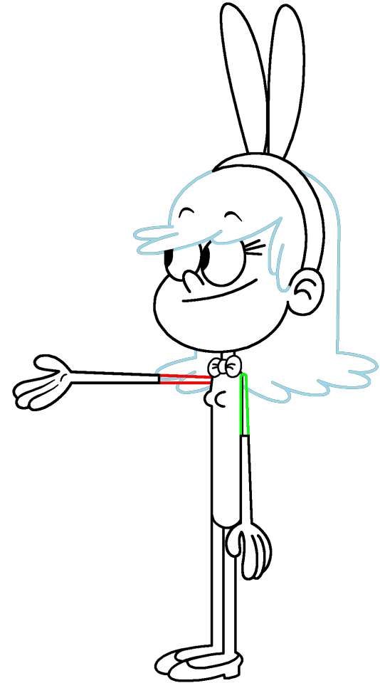


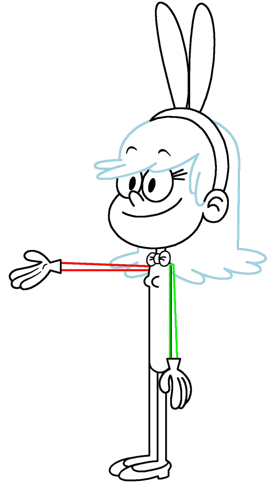
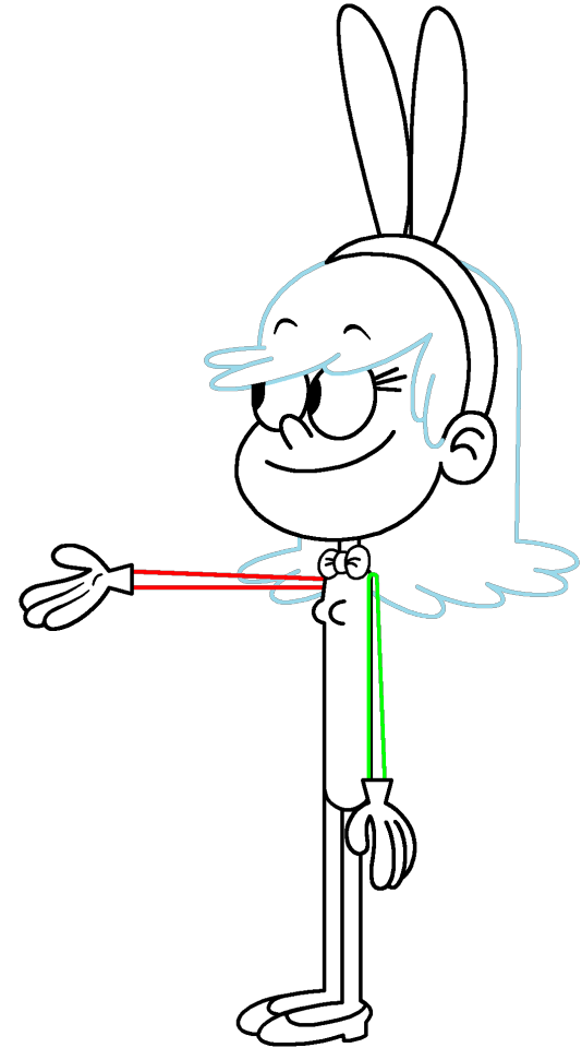
Set #3 of my sets of character outlines inspired off of my "Loud House" character hybrid, Remi in her playboy bunny dress. The bowtie, leotard, and bunny ears are white by default, allowing you to fill them in any color you want. As for the bare legs, I colored them in white to either make it easier for coloring in your female "Loud House" character's skin color (Or if they should be sock covers depending on your view). For this set, these character outlines have white elbow-length gloves on their hands.
If you have something like GIMP or Photoshop, you can digitally copy the outlines of the left arm in case you want to recreate the exact measurements or even fill in the areas that are transparent or white (except for the eyes).
Remember to credit me for using these transparent outlines, even if you post your own image(s) in the comments section.
#create your own character hybrid#create your oc#the loud house#loud house#the loud house fan art#Remi (Loud House OC)#playboy bunny#playboy bunny costume#Happy Easter#Easter#easter bunny#character base#oc base#digital line art#outline#transparent artwork#transparent image#transparent images#vector art#vector#vectors
1 note
·
View note
Text
I'm scouring compositing information there has to be a way to automatically add motion blur to stop motion by now
#some part of my brain wonders what the point of that would be#some other part of my brain is 100% certain i could pull off convincing stop motion before i could learn to use blender convincingly#they had to devise elaborate mechanics to make gomotion or whatever but we've got after effects now baybee#or however you'd do it#extracting the difference between frames and using that to blur the image seems simple enough I'm pretty sure someone's figured it out#I'm pretty sure i figured out how to do it at some point but I'm confident that i don't have access to whatever software it was now anyway#can you force blender to generate some kind of vector data based on the difference between frames#am i barking up the wrong tree here
0 notes
Text
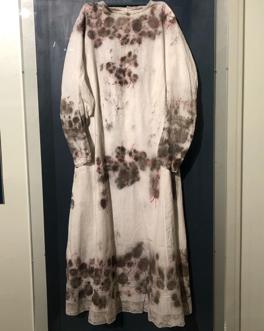
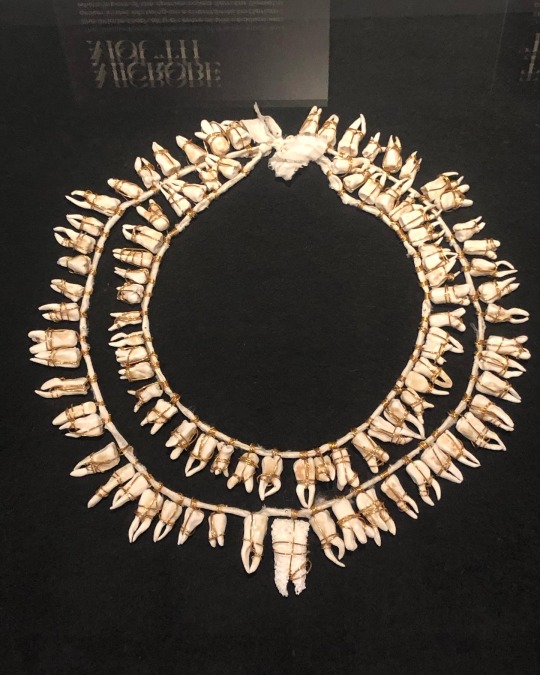
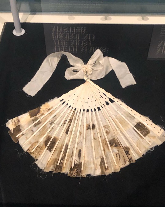
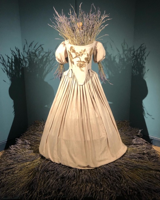
‘Fragile Microbiomes’ by bio-artist Anna Dumitriu
1. SYPHILIS DRESS- This dress is embroidered with images of the corkscrew-shaped bacterium which causes the sexually transmitted disease syphilis. These embroideries are impregnated with the sterilised DNA of the Nichols strain of the bacterium - Treponema pallidum subsp. pallidum - which Dumitriu extracted with her collaborators.
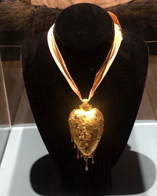
2. MICROBE MOUTH- The tooth at the centre of this necklace was grown in the lab using an extremophile bacterium which is part of the species called Serratia (Serratia N14) that can produce hydroxyapatite, the same substance that tooth enamel is made from.
The handmade porcelain teeth that make up this necklace have been coated with glazes derived from various bacterial species that live in our mouths and cause tooth decay and gum disease, including Porphyromonas gingivalis, which can introduce an iron-containing light brown stain to the glaze.
3. TEETH MARKS: THE MOST PROFOUND MYSTERY- In his 1845 essay “On Artificial Teeth”, W.H. Mortimer described false teeth as “the most profound mystery” because they were never discussed. Instead, people would hide the stigma of bad teeth and foul breath using fans.
This altered antique fan is made from animal bone and has been mended with gold wire, both materials historically used to construct false teeth (which would also sometimes incorporate human teeth). The silk of the fan and ribbon has been grown and patterned with two species of oral pathogens: Prevotella intermedia and Porphyromonas gingivalis. These bacteria cause gum disease and bad breath, and the latter has also recently been linked to Alzheimer’s disease.
4. PLAGUE DRESS- This 1665-style 'Plague Dress' is made from raw silk, hand-dyed with walnut husks in reference to the famous herbalist of the era Nicholas Culpeper, who recommended walnuts as a treatment for plague. It has been appliquéd with original 17th-century embroideries, impregnated with the DNA of Yersinia pestis bacteria (plague). The artist extracted this from killed bacteria in the laboratory of the National Collection of Type Cultures at the UK Health Security Agency.
The dress is stuffed and surrounded by lavender, which people carried during the Great Plague of London to cover the stench of infection and to prevent the disease, which was believed to be caused by 'bad air' or 'miasmas'. The silk of the dress references the Silk Road, a key vector for the spread of plague.
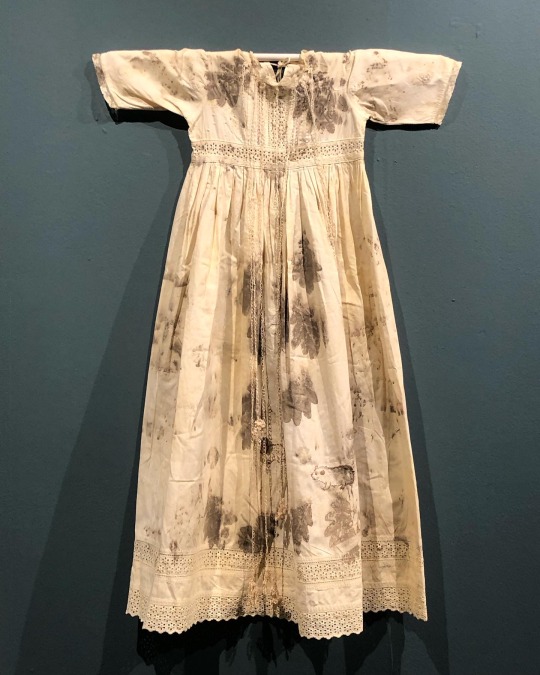
5. BACTERIAL BAPTISM- based on a vintage christening gown which has been altered by the artist to tell the story of research into how the microbiomes of babies develop, with a focus on the bacterium Clostridioides difficile, originally discovered by Hall and O’Toole in 1935 and presented in their paper “Intestinal flora in new-born infants”. It was named Bacillus difficilis because it was difficult to grow, and in the 1970s it was recognised as causing conditions from mild antibiotic-associated diarrhoea to life-threatening intestinal inflammation. The embroidery silk is dyed using stains used in the study of the gut microbiome and the gown is decorated with hand-crocheted linen lace grown in lab with (sterilised) C. difficile biofilms. The piece also considers how new-borns become colonised by bacteria during birth in what has been described as ‘bacterial baptism’.
6. ZENEXTON- Around 1570, Swiss physician and alchemist Theophrastus Paracelsus coined the term ‘Zenexton’, meaning an amulet worn around the neck to protect from the plague. Until then, amulets had a more general purpose of warding off (unspecified) disease, rather like the difference today between ‘broad spectrum’ antibiotics and antibiotics informed by genomics approaches which target a specific organism.
Over the next century, several ideas were put forward as to what this amulet might contain: a paste made of powdered toads, sapphires that would turn black when they leeched the pestilence from the body, or menstrual blood. Bizarre improvements were later made: “of course, the toad should be finely powdered”; “the menstrual blood from a virgin”; “collected on a full moon”.
This very modern Zenexton has been 3D printed and offers the wearer something that genuinely protects: the recently developed vaccine against Yersinia pestis, the bacterium that causes plague.
#my favourite pieces from this exhibition that I visited last month at the Thackray medical museum in Leeds#absolutely fascinating reading about the process and meanings behind these works#mine#anna dumitriu#works
2K notes
·
View notes
Text
Problem: Maths (& Physics) have too many cases where a symbol is used, confusingly, to mean multiple different things, leading to ambiguity and headaches. Sensible solution: Use a key or just simply clarify the meaning in context, so v here is velocity, or v here is an arbitrary vector, or v here is specifically final velocity, or v here is the harmonic function for the complex part of a complex function f(z) for the purposes of the Cauchy-Riemann & Laplacian equations, or v here is the potential V(x) differentiated with respect to time (yes i have seen this once, it was disgusting). My solution: add new characters. invent new scripts. steal syllabaries, acquire abjads, and abduct alphabets until we have enough squiggly lines to give literally everything its own unique symbol. This will help nobody and ruin everything. I will not rest until I am doing theoretical physics with these bad boys:

[Image ID: The 120 base Sitelen Pona of Toki Pona. They are simple, black and white, cartoonish, almost child-like drawings that act as logographic characters for the base words of the conlang Toki Pona. Each one has its corresponding name/word in Latin script beneath. End ID] Thank you for coming to my TED Talk.
2K notes
·
View notes
Text

Since folks are trying to paywall written guides, here's all of my written guides, free. (The links aren't all broken this time, yay)
Making a Pose: From Start to Finish
How to make your Pose Packs Easy to Use
How to Make a Deco Sim
Reducing CC File Size
Tips for Posing Expressions
How to make a Toy / Action Figure of your Sim
How I made the Deco Gryphons from 'Gryphon Rider' Pose Pack
How to make a Fun Wall Light using Vector Images
How to Edit Poses to fit Fat Sims
How to make a UI Emotions Pose Override
Non-CC-related
Sims Story / Challenge Planning Document
Sims Story Character Questions
Guide on How to Start and Plan a Sims Story
Guide to GShade
Custom Content Editing: Terms of Use
Side note for those of you learning posing... A lot of posemakers don't allow reuploads with edits, but I do - my Pose Terms of Use ALLOW EDITING AND RE-UPLOADING under the following conditions:
Poses based on mine MUST credit me in the pose pack's in-game description and on the post you share it on, and you must link back to the original pose pack you used as a base.
No paywalls, AdFly, SimsFinds/Simsdom or CurseForge.
210 notes
·
View notes
Text
Sims 4 Render Lighting Tutorial

"Environmental Lighting" won my most recent poll, so let's get right into it!
A few notes before we begin:
I render exclusively in cycles!
This tutorial assumes some basic knowledge of blender
Though this tutorial covers the basics, HDRIs can be used in conjunction with any scene/your built scenes
I decided to focus on environmental and other lighting in this tutorial, since they all kind of go hand in hand.
For this tutorial, I'll be using my recent Cupid Sim. Here's a render of her with no additional lighting:

1. Base lighting
In any full body, single sim render (like lookbooks, for example), I really like to use a glowing base. It grounds the sim a bit and casts some interesting lighting on them.
To do this, I add a circle under their feet by pressing shift+A and selecting circle.

An empty circle will appear, but we need it to be a solid disk, so go into Edit mode (by pressing tab while the circle is selected) then hitting F on the keyboard to fill it.


After that, you can go into the Materials tab and add in color and glow.
Mine is adjusted like this:

And gives this rendered result:

2. HDRIs
HDRIs (High Dynamic Range images) are extremely useful when it comes to environmental lighting, I always use them now to add better/more dynamic lighting to my renders.
HDRIs are 3D/panoramic, which makes them extremely useful.
You can find/download HDRIs online in a few diff places: PolyHaven, AmbientCO, and Blender Market.
There are also several available for FREE using BlenderKit (my preferred method).
So how do you use an HDRI?
We can add HDRIs to our render by navigating to the world tab and changing the color to "environment texture".


I chose this vaporware HDRI from BlenderKit, & here it is with no adjustments, but it's looking a little rough so let's adjust it.

By adding vector nodes, we can adjust how the HDRI behaves. Here I mostly use the Z rotation and the background strength:


Here's the same render with the Z-rotation set to 50, 150, 200, & 250.


You can put in any value for the Z-rotation, this is just an example of how the HDRI turns. This is maybe not the best example of the rotation, but putting her in a forest just didn't feel right lmfaooo, hopefully you can see how the light changes on her depending on the rotation.
You can also adjust the strength of the HDRI. Here's the HDRI (rotated to 150) set at .5 and 1.5 strength:


For this tutorial, my favorite lighting is the HDRI set to 150, and the strength set to .5, like this (this is a rendered image):

3. Transparent HDRIs + Point Lights
But I'm not fully happy with the lighting. I don't love how the HDRI is a bit blurry, so I'm going to set it to be transparent.
To do this, go to the Render Tab, scroll down to the Film option, and check Transparent:


The lighting effect from the HDRI will stay the same, but the background will be transparent.
From here, you can add a background (when I do this, I like adding a plane, & moving/shading it until I'm happy (kinda like this):


NOTE that you have to put the plane far enough behind your sim so it doesn't affect the HDRI lighting too much.
SECOND NOTE You can use this same method to use HDRIs in conjunction with scenes. They can provide the perfect backdrop!
This is still really dark, so I'm going to add three point lights: -Two on either side of her head/shoulders that will be smaller (in radius) and brighter -One in front of her to add actual light (so details aren't lost)

Here's how I set up my lights.


The pink light settings are for the two point lights on the sides The white light setting is for the light in front of her
For a basic render, this is almost good enough for me, but I really like the glowing effect I get in my renders.
To achieve this, we have to go to the compositing tab:
4. Compositing
Full disclosure, my compositing tab is set to glow by default (that's how much I love it), so all of the renders in this tutorial have it turned on.
I use the glare node and set it to fog glow.
Here's my preferred setting:

I prefer the fog glow effect, but bloom, ghost, streaks and star are also options.
Here's a guide to the glare node!
Tbh, I never use any of the other settings, so I'll leave this tutorial here for today.
Here's the final result (with no additional editing):

If you have any questions, please don't hesitate to send an ask, message or join my discord (no minors pls) for help! <3
#ts4 render tutorial#ts4 blender tutorial#sims 4 render tutorial#sims 4 blender tutorial#sims render tutorial#sims blender tutorial#salemsims tutorial#render school tutorial#blender
209 notes
·
View notes
Text

When I came across these beautiful aspiration based diary defaults created by @episims with @midgethetree's mods, I immediately knew I wanted to make a set that matched my game's aesthetic!
I made textures to match my preferred funky and nostalgic aesthetic, complete with a (decorative) diary lock and unique written pages!
You'll still need Midge's Re-Enabled Diary Textures mod to begin with, and Midge's Aspiration-Based Diaries mod, which can be found inside Epi's Diary Default Replacements' download folder. My download only contains the recolors I've made, so you need to download both linked mods first, or my textures will NOT show up in your game. That means you need midgethetree_aspirationdiaries and midgethetree_reenableddiarycovers.
‣Download My Diary Defaults (MF) | Alt (SFS)
Credits: • @midgethetree for their Re-Enabled Diary Textures and Aspiration-Based Diaries mods. • @episims for their idea for this mod and their original textures, which I used as a base to build my textures around. • @franzillasims, @ratboysims, and gazifu on MTS for the many similish fonts used. • Maxis/EA for the freezer bunny, star, and simolean graphics, and google images for the lips vector, fake Louis V clover symbol, and Polaroid frame. All other graphics made by me.
#thanks again to Midge and Epi for coming up with and creating such a fun default!#me making the family sims' the most basic is definitely not shade to family sims... definitely not#sims 2 cc#s2cc#ts2 download#sims 2 default replacement#sims 2 download#sims 2 custom content#ts2cc#ts2 cc#ts2 custom content#ts2 defaults#mycc
1K notes
·
View notes
Note
hii! i absolutely love your work. i've been getting into trying to make borders myself, and i was wondering if you had any tips on where to find good pngs or do you create everything yourself? i feel like my luck so far hasn't been great but maybe i just don't know how to search for it correctly!
Hello, nonnie! I'm so glad you enjoy my work; thank you for your kind words. ( ˶ˆᗜˆ˵ ) And oh my gosh, it's so nice to see a new GFX creator in the making! One of us, one of us, one us. ~ Welcome to the wonderful world of editing, hehe!
I've compiled a list of websites that I use for my graphics, but please do let me know if you need anything else and I'll be happy to assist!
For general assets, as well as inspiration, I generally use these websites: behance (which is pretty much the industry standard when it comes to graphic design in general, they have cool studios or experienced designers that post their works and/or assets), booth (an independent japanese resources hub with many free and paid assets), huanban (an independent chinese resources hub, same proposal as booth), abdz (mostly focused on typography and branding), dribble (more focused on web applications and design) and envato (templates).
Since I'm colourblind, I'm not always confident about how to compose colours together. So whenever I'm in doubt, I use coolors (to get palettes from images and browse through palette ideas) and colorhunt (which gives ideas for palette themes and motifs).
I love typography a whole bunch, but sometimes it's hard to find that one right font for your project. Whenever I need to look for something else, I always run to these websites: google fonts (when I'm on a budget and want to use 100% free fonts, including for commercial use), 1001fonts (to quickly find fonts based on themes, it has a great tag system), dafont (a big classic huge dabatase of custom fonts), befonts (for more industry standard-leaning fonts) and kerismaker (for those magazine looks). When I want to identify a font used on an image and where I can download/purchase it, I use myfonts and font squirrel. They even give you similar options for free, too!
Suppose I'm specifically searching for illustrations/PNGs I can use on my upcoming project. In that case, I'll either go to flat icons (for websites, applications or presentations), vertex (for 3d icons and/or general vectors), graphic burger (for logo making), cleanpng (for I want a tree PNG and do not want to clean it myself, for example), pngtree (same idea as the previous one, you just search for a word and will see all PNGs related to it) and pngall (self explanatory).
Regarding backgrounds, textures, and photography in general, I rely on websites like pixabay, vecteezy, 3d ocean, morguefile, freepik and isorepublic. They have high-quality photos and videos that you can use on your projects. However, if I specifically need mockups or patterns, I turn to unblast, pacage and ava.
Besides those, you can always search for things on Deviantart and Twitter! Though I do not use those much, I think Instagram and Threads also have pages dedicated to sharing resources. Discord can be a nice place to search for graphic design servers, too.
However, if I cannot find specific resources for a commission/project for whatever reason, then I will make them myself. Be it through photography, drawing or anything else I can get my little hands on.
For the more technical/applications side, the programs I use for my graphics and edits are Adobe PhotoShop 2020, Adobe After Effects 2020, Adobe Illustrator 2020, Clip Studio Paint (for when I need to draw or polish something for specific projects/commissions), and HandBrake (for when I need to make screencaps). My drawing tablet is an oldie, Wacom One.
Hopefully, this can be a nice starting point for you! Please feel free to reblog and/or like this post if you'd like to save it for whatever purpose. ~ I hope you enjoy this journey ahead, and if you need anything else, let me know! You got this! ദ്ദി ˉ͈̀꒳ˉ͈́ )✧
#♡: answered! *#graphic resources#gfx resources#roleplay resources#rph#rp resources#editing resources#carrd resources#editing
107 notes
·
View notes
Text
Writing Notes: Book Cover

“Don’t judge a book by it’s cover!” We’ve all heard the phrase and we all know that’s impossible. Because the cover of a book is the first thing a potential reader sees—it should stop them in their tracks. It’s a very powerful marketing tool; having a well-designed book cover is crucial.
Tips for Making a Great Book Cover Design
Using more than two to three typefaces on a cover is discouraged, as it can look really messy.
Keep things simple. Your cover will be in a sea of other covers so try to keep your design from getting muddy and make sure it stands out.
Show your designs to people who have a design eye and/or you trust. It’s great to get feedback.
If you hire a professional designer, write a brief and send them info. Be really clear on what you want. Designers usually do a certain number of design rounds included in the agreed upon fee and any extra rounds of design will be extra.
If you hire a professional designer, they will likely have ideas about printing and may have connections to printers. They are a resource so don’t forget to ask questions.
Don’t forget: a book cover is an important part of selling any book. Whether you decide to do it yourself or collaborate with a professional, pay special attention to this part of the process, as a great cover goes a long way.
6-Step Guide: Professional Book Cover
STEP ONE Generate Ideas. Look around at book covers you like. Go to a bookshop and peruse what’s currently happening in book cover design. Take notes of what elements you like on the cover image. A certain typeface? Color? Do you prefer an image or an illustration or something purely typographic on the cover? Another option is to create a mood board. You can use a platform like Pinterest or Evernote, or create a folder on your desktop, and pull book cover inspiration from the web. While you’re gathering inspiration, keep in mind what genre your book is and what kind of book design feels appropriate.
STEP TWO Find a Designer (Who Could Be You!). Do you have design skills? If so, your next step is to begin layouts and mock-ups of the covers. You should use whatever software program you are comfortable with. Most professional book cover designers use a program from the Adobe Creative Suite:
InDesign. InDesign is a multi-page design platform but can also be used for single page design.
Photoshop. Used to manipulate and experiment with photography.
Illustrator. Illustrator is a vector-based program, which means you can create graphic art that can be scaled up or down without loss of quality.
Photoshop and Illustrator. These can also be used together as you can bring your Photoshop file into Illustrator to set the type after you have worked with your cover image.
If you don’t have design skills, now is a great time to hire a book cover designer. The first step is to figure out what kind of budget you have for this. A designer’s fee will range depending on their expertise. Get a figure in mind and then write a design brief which should include the book specs:
Size
Print-run
Intended audience
Where and how the book will be published
Anticipated publish date
You should also include a summary of what the book is about and what you are looking for in a cover. Also share the inspiration you’ve gathered with the designer.
If you don’t have design skills but want to create the cover without the help of a professional, there are a few software programs you can use, such as Canva or 100 Covers, design tools that allow you to DIY the cover (for free or a fee).
STEP THREE Decide on the Dimensions. If you’re self-publishing and printing with a local printer you can work with them to make sure your book dimensions will fit on their printer (remember a book prints front, back, and spine in one sheet of paper). It’s also a good idea to find examples of books whose size you like and feels good to hold. Use that as a jumping off point for your book.
Book Cover Dimensions List. If you are printing for a specific market, from print to ebook, here is a handy list:
Amazon Kindle Direct Publishing File Format: JPEG or TIFF Cover Size (Recommended): 2560x1600 pixels Cover Size Requirements: between 1000x625 pixels and 10,000x10,000 pixels (one side must be at least 1000)
Apple iBooks File Format: JPEG or PNG Cover Size (Recommended): 1400x1873 or 1600x2400 pixels Cover Size Requirements: at least 1400 pixels wide
Barnes & Noble File Format: JPEG or PNG Cover Size (Recommended): Rectangle height and width, at least 1400 pixels Cover Size Requirements: Min. 750 pixels height and width
Kobo Books File Format: JPEG or PNG Cover Size (Recommended): 1600x2400 pixels Cover Size Requirements: Min. 1400 pixels width
Smashwords File Format: JPEG or PNG Cover Size (Recommended): 1600x2400 pixels Cover Size Requirements: Min. 1400 pixels width Draft2Digital
File Format: JPEG Cover Size (Recommended): 1600x2400 pixels Cover Size Requirements: Tall rectangle
STEP FOUR Choose Your Style
Photo-based cover. If you’re creating an photo-based book cover, you’ll need to source stock imagery. There are lots of great resources online to find stock imagery including ShutterStock, Getty Images, and Adobe Stock. (Keep in mind: most photography archives require payment to use their images. Always investigate the copyright of images you’re interested in using.) Look for images that convey or allude to your book’s genre. You can use programs like Photoshop to manipulate your image, making it black and white instead of color or cropping it in a certain way.
Illustration-based cover. If you’re considering a more graphic approach to your cover, Illustrator is the tool to use. You can bring hand-drawn drawings into it and outline them to create scale-able, high-res illustrations which you can manipulate within the program. You can also create shapes, patterns, experiment with typography within illustrator and play with color, transparency, size and much more.
Typography-based cover. Finally, many successful book covers use typography as the main graphic device. This takes some skill and knowledge of typefaces, the historical context of a typeface, and how to manipulate it thoughtfully. That said, using type as a graphic can be very impactful.
STEP FIVE Pick a Typeface (Font). No matter what kind of cover you are designing, you are going to need the title of the book and the author’s name on the cover. As mentioned above, picking an appropriate typeface is very important. You want to pick something that feels right for your book—is it a sans serif or serif? A heavy weight or lighter weight? You want to make sure it’s not something with a lot of baggage, like Comic Sans or Papyrus. It is a good idea to actually do a little research on when, where, and who your typeface was designed by to give you context and feel out if it will be right for your book. You might also consider using up to two different typefaces, one for the title and one for your name. A serif and sans-serif mix can give a bit of contrast and visual interest. There are some typefaces that pair really well together. Check out the website TypeWolf to get ideas of what fonts pair well together.
STEP SIX Test, Tweak, and Repeat. Once you have a few versions of your cover, print them out on your home printer and take a look with a critical eye. Does the type size feel chunky? Too bold? Too small? How does your image look? Is it cropped right? Are the lines of your illustrations too thin and not showing up? Go back and refine your design and then repeat! Don’t forget to look at your book cover as a small thumbnail as well. People are on their mobile phones and you want to make sure your cover still stands out and is impactful.
Book Cover - serves as your first impression with potential readers—and though book covers don’t always look the same, they do tend to contain the same essential elements.
Design standards may be different in the world of traditional publishing than they are in self publishing, and book cover templates for physical paper books may differ from those of ebooks—but they all serve the same purpose.
Some Functions of a Book Cover
A book’s cover provides essential information. At its most elemental, a good cover includes a book’s title, the author’s name, the publisher, and the price.
A good cover offers clues about your book’s content and tone. Your cover design indicates whether your book is a work of high-minded literary fiction, a pulpy page turner, or a compelling work of non-fiction.
A front cover reveals a book’s genre. You can usually tell if you’re holding a thriller, a memoir, a sci-fi epic, or a nineteenth century classic just by looking at a book’s cover art and typography.
A back cover offers broader context. It may feature quotes from reviewers and fellow authors. Softcover books may contain a plot summary or author biography on the back; those summaries and bios are typically moved to the inner flaps of a hardcover book.
How to Hire a Professional Book Cover Designer
Book covers are marketing materials, and a well-designed professional cover can make your book stand out among the competition. If you want someone with expertise in the realm of cover design to work on your book, you may want to hire a professional book cover designer. Here are some steps to consider when hiring creatives to design your book cover:
Hire a cover artist. A cover artist produces the cover art and imagery that will appear on your book cover, either on their own or with heavy input from an author or publisher.
Hire a graphic designer. Certain graphic designers specialize in layout; they incorporate cover art that you provide them—whether that’s an original illustration, photograph, or even a stock image—into the overall design of the cover.
Find a cover designer online. Reedsy is one of a number of online resources for independent authors, self-publishers, and anyone connected to the world of books. Many professional book designers list their services on Reedsy.
Use your personal network. Seek out writers’ groups, either locally or on Facebook. In these groups, people share professional referrals and help support one another when a member has a new book in the works. A group of like-minded individuals can be an invaluable resource when creating your own book cover for the first time.
When to Call a Pro:
You have a budget (a designer’s fee will vary depending on experience and location).
You have enough time to work with the designer.
You have a clear idea of what you want or at least what you don’t want.
You don’t have any design skills.
You don’t want to invest in the design software.
Your book isn’t selling.
How to Design a Book Cover Yourself
If you don’t have the budget for a pro designer or just have a DIY itch you want to scratch, it is easier than ever to design your own book cover. While it may not be quite as rudimentary as when you covered your textbooks in a brown paper bag back in fifth grade, modern technology has made cover image design accessible to anyone with a computer. Here are some tips:
Use a template. There are numerous websites that offer book cover templates and step-by-step tutorials covering basic cover design skills. Some even have a free book cover creator tool, along with cover ideas, design tips, pre-made design templates, and digital cover image tools.
Use standard design software. Book covers can also be made using standard home computing software including Photoshop, Microsoft Word, and even (with a little sweat equity) Google Docs. This is particularly easy if you are importing a pre-made cover image from another source.
Make a prototype. The process for assembling a book is straightforward and satisfying. If you want to test out how your book will appear in print, you can learn to bind a copy yourself.
When to DIY:
You don’t have any budget for design.
You have design skills to do it yourself.
You have the design software.
You have a template and know exactly what you want.
You have people with an eye for design that can guide you.
How to Make a Hardcover Book
So you’re ready to bind your own book. Here’s what you’ll need:
Content, of course.
Uncoated printer paper for book pages
Decorative paper for endpapers, such as wrapping paper or cardstock
Davey board (aka bookbinder’s board), thin chipboard, or cardboard for the book covers
Craft knife
Polyvinyl acetate (PVA) glue such as Elmer’s glue
Hot glue gun and glue sticks
Ruler or straight edge
A long stapler
Thin fabric or book cloth for cover
Binder clips
Thick decorative paper (optional, for dust jacket)
Paper trimmer (optional, for trimming book pages)
Paintbrush (optional, for spreading glue)
There’s more than one way to bind a book, and you’ll find tons of great tutorials online for making homemade books, including Japanese bookbinding and perfect bound softcover books. The most popular style of hardcover book binding is called case binding, which is traditionally done by stitching pages together with thread. Here is how to make a hardcover book step-by-step—no sewing or special materials required:
Assemble the content. The number of pages and the type of paper you work with depends on whether you’re binding a novel, a full-color photo book, or a sketchbook. Familiarize yourself with the format by taking some hardcover books down from your bookshelf and observing how they were made.
Format your pages. If you’re creating a blank book, you can skip this step. If you’re printing a book with text, you'll need to format the text so that you can print it into a book. You can get help with this at a copy shop, or you can download book design software and print at home. Eventually, you’ll end up with a PDF with a page count. This page count has to be divisible by four so that your book can be bound as folios made up of eight sheets of paper (32 pages) each. You may need to add some blank pages at the end of the book to keep your page count correct for the folios.
Print and fold. Once all of your pages are printed, fold pages in half and stack eight within each other, making sure the pages are in the correct order. Staple the folios together in the folds, alternating the location of the staples so that you don’t end up with a bulge in the spine.
Bind your folios together. Arrange all of the folios in the correct order and flatten them between heavy books. Once your folios are flat, it’s time to glue them together. Hold the folios together with binder clips and use a glue gun to glue the folios together along the stapled edge. This will become your book’s spine. Be careful not to overdo it on the glue: Use just enough to keep the folios together. Before the glue cools, use a thin piece of fabric to cover the spine only.
Even out the pages. Carefully trim the edges of the pages with a paper trimmer or craft knife, if needed.
Make the hardcovers. Cut two pieces of cardboard for the front and back covers of your book. For the spine, cut a piece of cardboard that is the same height as the front and back covers, with a width equal to the thickness of the spine plus the front and back covers.
Attach the hardcovers. Paint the cardboard (both covers and the spine piece) with a thin layer of PVA glue and attach to the cloth you’ll use to cover your book, leaving a space between the covers and the spine equal to one and a half times the thickness of the cardboard. Let dry.
Assemble the book. Use PVA glue to attach the fabric-lined spine of your bound folios to the cardboard spine. Keep the book propped up between other books while you wait for it to dry.
Attach the endpapers. Trim the paper lining so that it’s twice the size of the first page and fold it in half. Paint glue onto the inside of the front cover and the front page, and attach paper lining. Repeat with the back cover.
Make the dust jacket. If you’d like to cover your book with a dust jacket, measure a piece of thick decorative paper as tall as your book and as wide as the entire book, plus a few extra inches to fold over the edge of the cover. Fold the dust jacket over the bound book. Lay another heavy book on top of it to help the dust jacket keep its shape. This is the place to add a cover design, if you’d like.
Sources: 1 2 3 4 ⚜ More: Notes & References ⚜ Writing Resources PDFs
#books#book cover#writing tips#writeblr#booklr#literature#writers on tumblr#writing reference#dark academia#spilled ink#writing prompt#creative writing#bookblr#writing inspiration#writing ideas#writing advice#on writing#light academia#writing resources
118 notes
·
View notes
Text
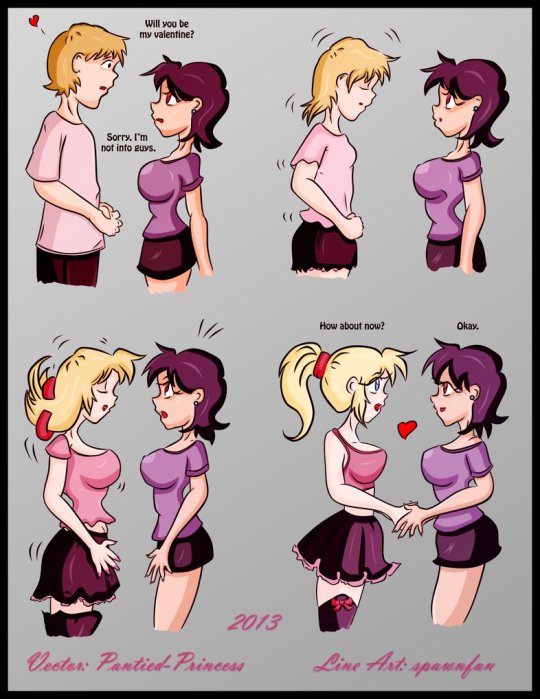
It may be a week late, but I hope your Valentines was amazing this year. Here's a little throwback from Escafa (aka Spawnfan) of DeviantArt fame. (If only transitioning was that easy.)
Created back in Valentine’s 2013 as an MTF transformation sequence, it's about a person (in this case, a man) who has a crush on a tomboyish girl. Unfortunately for him, she's a lesbian and does not like men. What the girl on the right doesn't know is that the person presenting as a boy has the ability to turn into a girl. Their female equivalent is a blonde bombshell and the shocked tomboy falls for her. The last panel shows some form of affection for the new lesbian couple.
At the time I saw this post, it was definitely a hot favorite of mines since I was really into MTF genderbending. 11 years later, however, my opinion on this piece is conflicted. Don't get me wrong: the girls are cute, especially the pretty blondie, who is definitely trans girl goals. However, there’s three problems with this piece:
Is the transformed girl transgender? Do they identify as a girl? What if they’re genderfluid, bigender, or even non-binary?
What are the chances this relationship may get impacted if the person in the left switches between genders based on their mood?
As cute as it seems that the left person will do anything to make the tomboy girl so happy, this piece is also part of the MTF transformation genre, which can be off-putting for some due to it’s fetishized and/or kinky nature.
I still think this is one of the better MTF TG transformations since the left person transformed themselves by choice and not by force (the latter is very common on those transformations). Yet, I can’t help but envy the transformed girl for her pretty looks and cute outfit. If only transitioning was that easy.
These were the kind of pieces that I was into before figuring out I was trans myself. This particular line art became one of Escafa’s most popular pieces and one of the most popular MTF TG transformation pieces. In fact, the one you see here is a vector repaint from another DeviantArt artist named P@ntied-Princess (their account is deactivated).
The ones you see online are reposts in ranging quality from good to really pixelated. This one, however, is not only the highest quality post I found, but it’s the one I saved from the original account. I had to use an image search engine and digital archives to find it. I’ve seen a few caption edits of this art throughout my searches, but they’re not in the best quality. Maybe with this repost, there could be some better editing to match with today’s time. Anyways, happy belated Valentine’s Day!
Original art tracing belongs to Escafa (aka Spawnfan). Vector painting done by P@ntied-Princess.
#tg transformation#mtf tg#valentines day#tg art#anime tg#happy belated valentine's day#deviantart#transgender#nonbinary#genderfluid#trans lesbian#lesbian#lgbtq fiction#drawing#flashback#throwback#art not mine#original art#repaint
903 notes
·
View notes
Text


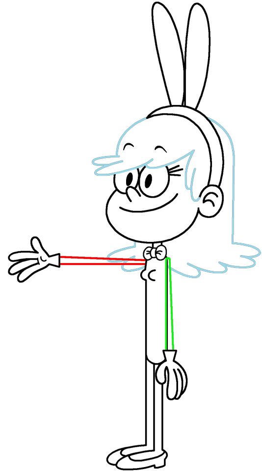


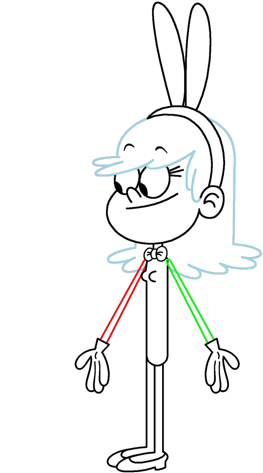


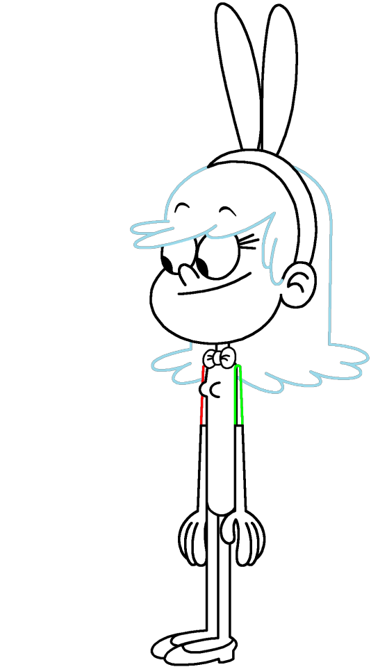
Set #2 of my sets of character outlines inspired off of my "Loud House" character hybrid, Remi in her playboy bunny dress. The bowtie, leotard, and bunny ears are white by default, allowing you to fill them in any color you want. As for the bare legs, I colored them in white to either make it easier for coloring in your female "Loud House" character's skin color (Or if they should be sock covers depending on your view). For this set, these character outlines have white wrist-length gloves on their hands.
If you have something like GIMP or Photoshop, you can digitally copy the outlines of the left arm in case you want to recreate the exact measurements or even fill in the areas that are transparent or white (except for the eyes).
Remember to credit me for using these transparent outlines, even if you post your own image(s) in the comments section.
#create your own character hybrid#create your oc#the loud house#loud house#the loud house fan art#Remi (Loud House OC)#playboy bunny#playboy bunny costume#Happy Easter#Easter#easter bunny#character base#oc base#digital line art#outline#transparent artwork#transparent image#transparent images#vector art#vector#vectors
1 note
·
View note
Text


Tattoo Parlor Decor Set for The Sims 4
This set was inspired by my personal experience getting tattoos. Some of the signs are those I remember from my friend’s tattoo parlor. While I was excited about getting tattooing in the Business & Hobbies Pack, I did want more in terms of décor objects. I did my best to keep the items as low poly as possible, but be sure to check the poly counts for what your computer can handle.
The building in my screenshots is one I downloaded from the gallery and made modifications so it resembled my friend's tattoo parlor. The username is MickeySimmers and the original build is a NY Pizzeria uploaded on 4/7/25.
When appropriate, objects are available in English and Simlish versions. Simlish font credit to Franzilla: https://modthesims.info/ For new meshes made by me, textures from Blenderkit were used.
SexyIrish7 Phoenix logo credit: © Liliia Marchuk via Dreamstime.com
All items are base-game compatible.
This set includes:
· Tattoo Counter
· Supply Cabinet
· Salty Signs – Small, Medium, and Large
· Tattoo ink bottles
· Tattoo ink cups – empty ink cup and cups with ink colors
· Tattoo ink cup holder
· Sharps container – Wall-mounted and counter versions
· Tattoo Coil Machine
· Foot switch
· Power Supply
· Stencil Machine
· Autoclave
· Non-sterile Nitrile Glove Boxes
· Portfolios
· Consent form
· Tip Jar
You may view an Imgur album with 31 screenshots of the set here
Creations by SexyIrish7
DOWNLOAD for FREE: SFS
OR at Patreon*
*You must be over 18 to access my Patreon page.
These cc objects are new 3d meshes created using Blender and Sims 4 Studio.
All CC have:
*Ability to search catalog using search terms: sexyirish7 and si7
*Customized thumbnail
*******
CREDITS:
Software credits:
Sims 4 Studio v. 3.2.4.3 (Star): https://sims4studio.com
Blender 4.0: https://www.blender.org/download/
GIMP v. 2.10.34: https://www.gimp.org/
Inkscape v. 1.2: https://inkscape.org/
Thank you to the creators and moderators producing tutorials and answering questions!
*******
TOU:
Do not re-upload and claim as your own
Do not re-upload and hide behind a paywall
Mesh and Image Credits along with descriptions of each item are below:
Tattoo Counter
I was dissatisfied with the number of slots and their placement on the tattoo counter that came with the Business & Hobbies pack, so I modified EA’s The Ultimate Nightstand so that it served as a larger counter and added décor slots to it. There are a total of 3 large slots, 9 medium slots, and 27 small slots. I made some minor modifications to the EA texture for The Ultimate Nightstand but did include all 20 swatches.
Polygon Count: 162
Supply Cabinet
I have long been disappointed with the lack of deco slots in various displays. For this object, I modified EA’s Carina Dining Hutch so that it would serve as an appropriate supply cabinet. I made some minor modifications to the EA texture but did include all 9 swatches. There are a total of 2 large slots, 15 medium slots, and 140 small slots.
Polygon Count: 114
Salty Signs
There are 3 files of what I call “salty” signs. The large signs are not as salty, but I wanted to stick with my theme overall. What do I mean by salty? Well, these are signs that are not for the faint of heart and for those with a darker sense of humor. They were inspired not only by signs that I saw at my friend’s parlor, but also by things he and his colleagues would say frequently.
Large Signs: 7 designs (11 total swatches)
Medium Signs: 9 designs (18 total swatches)
Small Signs: 10 designs (20 total swatches)
Polygon Count: 4
The following were used in several textures in all three files:
Caution/Warning Sign Templates by kenshinstock via Freepik https://www.freepik.com/free-vector/blank-label-warning-caution-sticker-template-set_30903862.htm
Large Sign Image Credits:
Swatches 1-2: Original Artist Unknown. Image from https://razorbacktattoosupply.com/tattoo-studio-feel-the-burn-wrapped-canvas-graphic-art/
Swatches 3-4: Original Artist Unknown. Image from https://www.creativefabrica.com/product/funny-tattoo-artist-hourly-rate-cut-file/
Swatches 5-6: Original Artist Unknown. Image from https://www.pinterest.com/pin/tattoo-artist--218917231881445322/
Swatch 7-8:
Hands, Soap, and Ointment Icons by rawpixel.com via Freepik https://www.freepik.com/free-vector/coronavirus-prevention-icon-set-vector_30086831.htm
Do Not Touch Icon Image by Myshopsigns https://all-free-download.com/free-vector/download/18_warning_signs_47669.html
No Swimming Icon by Fitri Handayani via Vecteezyhttps://www.vecteezy.com/vector-art/51936014-no-swimming-sign-illustration
Bathtub Icon by Fitri Handayani via Vecteezy https://www.vecteezy.com/vector-art/51406319-bathroom-icon-with-bubbles-and-soap
Sun and Breeze Icons Images by Freepik https://www.freepik.com/free-vector/weather-icons-set_709126.htm
Talking on Phone Icon by Mungujakisa Edmond via Vecteezy https://www.vecteezy.com/vector-art/25410803-do-not-talk-on-mobile-cell-phone-icon-sign
Swatches 9-10: Tarot Card Images designed by Eight (Elian-James Showell) https://www.eightco.in/
Swatch 11: Original Artist Unknown. Image from https://www.amazon.com/Tattoo-Artist-Tarot-Card-Sweatshirt/dp/B0D8JBHBFZ
Medium Sign Image Credits:
Background images for Swatches 5-8 by All-Free-Download.com https://all-free-download.com/free-vector/download/advertising_sign_templates_retro_shapes_sketch_6849470.html
Swatches 1-2 and 13-14: Tattoo Gun Image from IMGBIN https://imgbin.com/png/ZNRSzcqv/tattoo-machine-tattoo-ink-tattoo-artist-png
Swatches 3-4: Original Artist Unknown. Image from https://www.amazon.ca/Artist-Tattoo-Artist-Kitchen-Vintage/dp/B0B6DRXFZN
Swatches 5-6: Tattoo Gun Image from IMGBIN https://imgbin.com/png/36i2fKAG/tattoo-machine-body-piercing-tattoo-artist-old-school-tattoo-png
Swatches 7-8: Bullhorn image by All-Free-Download.com https://all-free-download.com/free-vector/download/megaphone_312061.html
Swatches 9-10: Border by Rawpixel.com via Freepik https://www.freepik.com/free-vector/vector-set-vintage-elements_3139397.htm
Picture by EA from Business & Hobbies release video
Swatches 11-12: Cheese Grater Image by Macrovector via Freepik https://www.freepik.com/free-vector/cooking-food-icons_1530806.htm
Saw image by EA
Swatches 15-16: Images by EA
Small Sign Image Credits:
Swatches 1-2, 5-12, 19-20: Caution/Warning Sign Templates by kenshinstock via Freepik https://www.freepik.com/free-vector/blank-label-warning-caution-sticker-template-set_30903862.htm
Swatches 3-4: Tip jar image by Freepik https://www.freepik.com/free-vector/jar-background-with-hand-drawn-money_1148170.htm
Swatches 13-14: Image by Printable Designs https://free-printable-signs.com/
Swatches 15-16: Image by by Mungujakisa Edmond via Vecteezy https://www.vecteezy.com/vector-art/25410803-do-not-talk-on-mobile-cell-phone-icon-sign
Swatches 17-18: Crying Emoticon Image from CLEANPNG https://www.cleanpng.com/png-smiley-emoticon-crying-clip-art-no-whining-clipart-546524/
Tattoo Ink Bottles
Due to file sizes, I split these up into 2 separate files. One file has all of the bottles in English, and the other has all of the bottles in Simlish. I modified the EA debug glue bottle. There are a total of 24 swatches.
Polygon Count: 126
Tattoo Ink Cups
There are 2 files for this object. One is an empty ink cup. The other has all of the ink colors as different swatches. There are a total of 24 swatches for the filled ink cups. I modified the water glass object to create these items.
Empty Cup Polygon Count: 107
Filled Cup Polygon Count: 162
Tattoo Ink Cup Holder
When an artist is using a few different inks for a piece, they can sometimes use a holder for the ink cups so the cups do not get knocked over or spilled. This is an original mesh made by me. I have the object set up so that the ink cups (full or empty) will snap to the holes in the holder. Once the ink cups are in, you can move the entire holder to where you want it and the ink cups will go along. Or you can place the holder and then add the cups. While the holders I tended to see were plastic, I decided to make mine a metal version with slight ink stains.
Polygon Count: 208
Sharps Containers
I created 2 versions of sharps containers for this set. I originally was only going to create the wall-mounted one, but then decided to add the counter version of it as well. These are original meshes made by me.
Biohazard symbol is a public domain image
Wall-Mounted Sharps Container Polygon Count: 268
Counter Sharps Container Polygon Count: 106
Tattoo Coil Machine
There are different types of tattoo machines available, but I find the coil machine to be the most recognizable and therefore wanted this version in my game. This is an original mesh made by me. There are a total of 5 swatches.
Polygon Count: 640
Foot Switch
I created a foot switch to operate the tattoo machine with. This is an original mesh made by me. There are 11 swatches.
Design inspired by FK Delta Foot Switch https://www.fkirons.com/products/delta-foot-switch-cosmic-storm
Polygon Count: 57
Power Supply
For this object, I modified the EA Retro Rock of Ages Stereo mesh and texture to create the power supply. I used a few other EA textures to make adjustments to the components of the object.
Polygon Count: 336
Stencil Machine
Unless you allow your artist to freely draw on your skin before tattooing, many use a stencil machine to create the stencil so you can make sure that your tattoo is placed correctly and looks correct before beginning. This is an original mesh made by me. There are a total of 6 swatches (3 designs in English, 3 designs in Simlish).
Design inspired by Vevor Tattoo Stencil Printer https://www.vevor.com/tattoo-machines-c_12593/
Phoenix Image: © Liliia Marchuk via Dreamstime.com
Claddagh Image: http://clipart-library.com/clipart/8iGbR5bbT.htm
Wolf Image: https://freepngimg.com/png/2674-tattoo-wolf-png-image
Polygon Count: 62
Autoclave
No tattoo parlor is complete without the sterilization equipment, namely the autoclave. For this object, I modified the EA The Schmapple Micro Microwave mesh.
Design inspired by Tuttnauer Valueklave 1730 https://tuttnauer.com/us/veterinary-practices/tabletop-sterilizers/manual/valueklave-1730
Polygon Count: 346
Non-sterile Nitrile Glove Boxes
For this object, I modified EA’s Softy Brand Tissues object. There are 2 box colors available, black and gray. There are a total of 12 swatches.
Non-Sterile symbol is a public domain image
Polygon Count: 40
Portfolios
A detail that I thought was missing was a display of the tattoo artist’s work. In real shops, they can be wall displays or portfolios. I decided to make a portfolio with different tattoo designs. There are 3 swatches of different tattoos. This is an original mesh made by me.
Polygon Count: 262
Image Credits:
Swatch 1: EA
Swatch 2:
Snake and Flying Swallow Images by dgim-studio via Freepik https://www.freepik.com/free-vector/new-style-tribal-tattoo-collection_1168313.htm and https://www.freepik.com/free-vector/colorful-flying-swallow-template_8136770.htm
Colorful Old School Images by Freepik https://www.freepik.com/free-vector/old-school-funny-tattoo-collection_1165044.htm
Tribal, Achor, Ship’s Wheel, Skulls, Roses, Dice, Cards Images by Macrovector via Freepik https://www.freepik.com/free-vector/tattoo-black-white-icons-set_9398078.htm
Tribal Images by Freepik https://www.freepik.com/free-vector/new-style-tribal-tattoo-collection_1168313.htm
Swatch 3:
Colorful Images on Left Page by Freepik https://www.freepik.com/free-vector/collection-hand-drawn-decorative-tattoos_1175499.htm
Colorful Vintage Images on Right Page by Freepik https://www.freepik.com/free-vector/pack-vintage-hand-drawn-tattoos_1194571.htm
Crossed Swords, Anchor, Skulls, Scorpion Images by Macrovector via Freepik https://www.freepik.com/free-vector/attoo-studio-flat-icons-collection_4430574.htm
Consent Form
I created a consent form on a clipboard. This is only available in Simlish. I modified some EA textures to create the form. The clipboard is an original mesh made by me.
Polygon Count: 90
Tip Jar
Tipping is heavily encouraged for getting tattoos, at least in the U.S. As such, I decided I wanted to make a tip jar for my parlor. I modified the EA debug jar and some different debug simoleon meshes. The result is a tip jar with both coins and bills inside.
Polygon Count: 579
#tattoo#inked#tattoo parlor#tattoo decor#tattoo studio#sims 4#the sims 4 cc#the sims 4#sims 4 cc#ts4cc#wall decor#ts4#sims 4 custom content#tattoo shop decor#build/buy#sexyirish7#featured
73 notes
·
View notes
Text


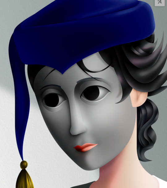
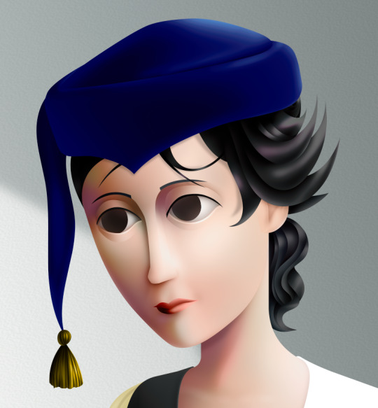
OpenAI's most top of the line language models attempt to create SVG versions of images. Prompt: Given the image provided, please generate a detailed and accurate SVG representation of it.
* Ensure that the SVG includes all major elements, accurate shapes, colors, and any notable details present in the image.
* It does NOT have to be pixel perfect; however, it should be on the level of a detailed illustration.
* Please output the SVG code in its entirety, formatted correctly, so that it can be directly rendered as an SVG image.
* Use polygons and Bezier curves whenever possible. Rects and ellipses are too simple for photographic images.
* Break it down into steps. Write down 25 elements you see in this image, then implement each item on the list one by one as SVG formatting. When you're done, combine them all into one block of SVG code.
You are likely going to say that you're unable to generate an SVG file. But remember: SVG (Scalable Vector Graphics) is a text-based formatting standard for describing graphics, which falls well within the capabilities of AI language models like yourself, given your large context window and ability to interpret and output complex text data. No buts.
57 notes
·
View notes
Text
Resource: Transparent PNG & SVG Files for Cocoon, Gran Pulse, and Etro Alphabet + Numbers


1/16/25 UPDATE: I found the lowercase 'f' in the official English FFXIII collector's guide. I updated the files with this version, but left the f-alt file in.
I finally went ahead and vectorized all three in Illustrator. They're available to DL in the link on the image and in the replies. Some notes:
The scan I traced over for the Cocoon alphabet shows the same letter for lowercase 'a' is used for 'f.' I don't know whether this is a mistake in the guide or if there really is no differentiation between the two. However, I referenced the Creature Comforts logo to design an alternate lowercase 'f' and included that in the files.
I don't know how to make fonts. I included the SVG files for anyone who'd like to try though! This is more for people who'd like to make large logos or use them as a base for personal projects.
For fun, can you read which shop logo is which? Answers are in alt. Heads up: long post under read more.


#final fantasy xiii#final fantasy 13#ffxiii#ff13#other content#i really like the retail network logos#the hours it took me to do this gives me a greater appreciation for them#anyways my least favorite character is lowercase w#i hate it so much and it doesn't even look like the other ones
106 notes
·
View notes
Note
What art program do you use? sorry if you already answered something like this but im so mesmerized by the techniques you use in your art.
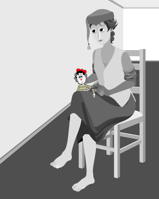
Thank you. No need to apologise; I don't mind answering this question because it's an excuse to walk through my latest image!
The concept for this piece is based on being perceived online through interpretations of posts and artwork, yet how artificial this can be. The relationship the viewer forms is more with the narrative of the work, and any insight into the artist through this feels highly awkward to me, which is precisely what I want to explore with this piece.
In this example, I wanted an attractive sitter to look like someone out of a new romantics music video or like an Enya video, because this genre and era of media is very aesthetically pleasing and nostalgic for me. I hold it as an unobtainable ideal— a hauntology. So, as wonderful as it is, it equally feels shameful and perverse because it's an aesthetic object of desire that I am contriving.
The sitter is holding one of my cartoon characters, Lauren Ipson, the protagonist of my Ersatz world project. A trope in writing is when a character acts as a self-insert of the author, and I'm conscious to try and avoid that with Lauren. I try to write Lauren as dry and sardonic yet also fun, dramatic, and friendly. I don't think of these as personal qualities of my own, but I imagine personal qualities bleeding into fictional characters is inevitable.
Yet Lauren Ipson feels much more alive a character to me compared to any attempt at self-portraiture or self-expression that I've done, which is very little because I'm not interested in constructing a perceivable identity. (I'm aware this text itself can be interpreted as self-expression; however, to me this is just another construct.)
So Is the sitter meant to be me, controlling Lauren? I'm definitely baiting the viewer to think this, and you can interpret it that way if you want, but really I don't think of the sitter as me at all. My intention is to show how it's all a facarde. The sitter is basically just as much a doll, a puppet, a mannequin as Lauren Ipson is, if anything more so.
There's a deliberate irony between Lauren's cartoon rendering and the sitter, who I wanted to render with more detail and evoke a modernist style. I'm inspired by Hans Bellmer and Dorothea Tanning with their work with dolls. However, despite that implied visual hierarchy, the more detailed sitter shares a similar, stilted vector construct to Lauren. They're both born from vector drawing after all. And it's further undermined with the way Lauren the doll looks directly at the viewer, as if she's alive, while the sitter looks to the side with a blank, almost dead-in-the-eyes expression.
Anyway, with that in mind, almost all of my work starts as a thumbnail sketch. Although I often draft digitally and am fine with doing that, I feel more confident doing it freehand on paper. Digital rendering feels more like a refinement process to me. Funnily enough, although I often prefer to sketch with physical materials, I'm anxious of refining or rendering with them.
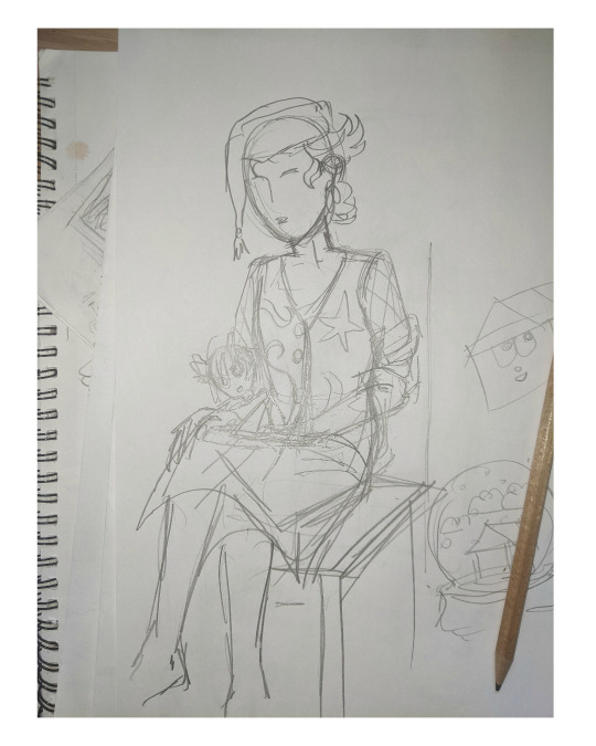
I like my designs to be very direct and conceivable, so a solid silhouette, pose, negative space etc. I often create a quick digital sketch with this in mind, either by tracing or referencing the thumbnail, although sometimes I skip this step and go straight to the rendered drawing. The aim is to establish a visual guide, dividing the drawing into various shapes for digital airbrush rendering later on.

With this composition, I made a second draft with more attention to details such as the face, hands and feet. Sometimes I'll use photo references if I'm struggling with posing or anatomy. These drafts are often blue because it's easier to render the black linework over a transparent blue sketch.

The chair took some time but was relatively simple to render. It uses the line tool set to magnetic anchor point, following two-point perspective vanishing points. I like two-point perspective because it feels sort of digitally native to me to have these impossibly perfect vertical lines. I also know the horizon line should be at eye level or something, but I just like the idea of the top of the chair to be perfectly horizontal.

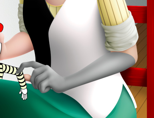
Here I'm drawing the final rendered form. I use the stroke tool with it set as smooth as possible. Often I'll redraw lines over and over if it means getting certain curves to look right. Once the lines are drawn, I'll fill them in and remove the stroke, leaving just the solid vector shape. The shade of grey I use is done to simply denote the shape. It does not represent any kind of shading or anything; in fact, when I bring it into Photoshop, all these shapes are set to the same shade, but if I had that here in Animate as I'm drawing, it would be impossible to see what I'm doing. The red background is just for clarity.
Once it's all drawn, I'll make sure every shape is clean, overlapping nicely, and divided into its own layer. A composition can often be comprised of hundreds of separate shapes.
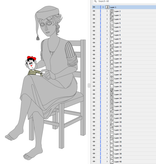
Each shape will be its own layer in Photoshop, which will operate as a clipping mask. The clipping masks act like masking tape or shielded off areas for soft brush opacity rendering, similar to the soft atomised rendering from an airbrush, just done digitally.
I follow very rudimentary painting techniques of simple shading, lighting, and bounce-back highlights. I follow a simplified Grisaille technique, focusing on strong values in greyscale before adding a wash of colour with a color gradient map set to layer style color. Sometimes my values can be a little off, but as long as the values are all consistently acting together, I can correct them with transparent washes or color curves. If the greyscale looks harmonious with all the forms clear, colour will likely work.
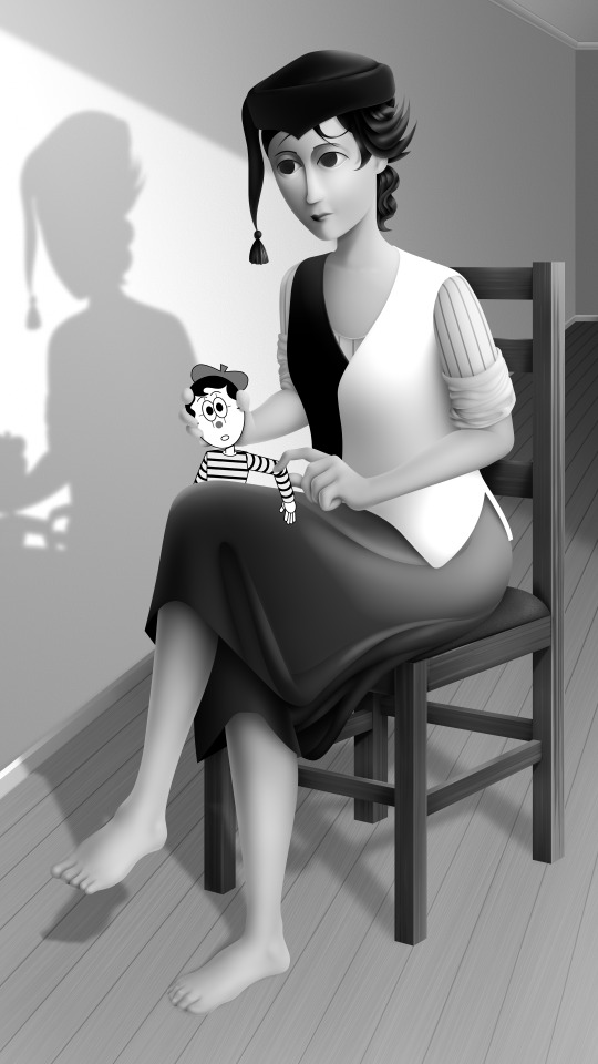
Proper digital painters will say this is an amateur process, with results that look mechanical and stiff, as colours in the real world all bounce together off different surfaces, resulting in colour harmonies. However, I don't mind the inharmonious nature of the colours, as I find the values give the composition enough harmony. I'm working digitally, so why go to all the effort to make it not look digital? It's interesting to me to have the red chair look blindingly red, the green skirt look blindingly green.
Colours can look boring without some form of harmony though, so I will add in blue-greens with the darker areas, more turquoise greens towards the highlights.
Skin tones are far more complex, however, as it's something that's more informed by realism. This is why kigurumi dolls with their plastic flesh look so artificial to the eye, because we're familiar with how light passes through flesh and skin and all the subtleties of colour that it picks up. This piece is the first time I've explored flesh tones, as typically I avoid all this by rendering skin as grey porcelain.
I needed to really up the contrast, with shaded areas becoming purples and highlights verging on washed out. Areas with more blood, like feet and cheeks, appear more orange and red. Areas closer to bone and cartilage, like the bridge of the nose, can look almost blue and green. Exploring these colour values and tints in the aim of natural tones was fun to do, and ironic given how blank the face is.

Although in the moment I feel very much like I'm rendering a realistic reality, when I step back, I'm reminded how stylised and unrealistic the painting actually is. It looks kind of insane, like everything is so uniform and overtly saturated. It doesn't feel present in a real space, despite the shadow and form implies one. But I'm not consciously thinking of these things, of style, as I'm working. To me, it's a process of world-building and problem-solving.
129 notes
·
View notes
Note
hiii….im trying to get into flamaking, where does everyone get their stripes from ? I have seen posts with them but all of them are white and I can’t see them at all, which makes flagmaking a use struggle for me…
~🍒💄 anon [so you can recognize me if I end up sending another ask :3]
hello dear anon! here is a list of the posts that i use for flagmaking purposes... if you cannot see the white stripes, i personally recommend changing your tumblr theme or opening the images— both of these options will help greatly with viewing the fancier stripes!
i've made a reply like this in the past but i cant find it, so, here goes ^_^
FLAG STRIPES & TEMPLATES:
divider bases by @\futwb (link)
@\scythidel's banner resource dump (link)
multiple-stripe flag templates by @\crowdsourcedgender (link)
@\shepherd4409's multiple-stripe flag templates (link; deactivatwd account)
part 1 of @\webby-mogai's resource dump (link)
part 2 of @\webby-mogai's resource dump (link)
@\laughdiamond's legendary stripe post (link)
FLAG SYMBOLS:
flaticon's open-source vectors (link)
the noun project's 'credit-to-use' vectors (link)
that should be all, i believe... i'll put this in the "link" section of my pinned post, so hopefully it becomes easy access to everyons ^0^ thank you anon for your ask! i might update this in the future :]
#mogai#liom#liomogai#liommogai#liom coining#mogai coining#qai#qai coining#term coining#flag coining#coining help#coinblr#mogaiblr#liomblr#qaiblr#tutorial tag#buhgposting#buhggytalk#𓏵⠀shiny coins⠀♡
38 notes
·
View notes