#yes. another one with this character and this palette.
Text

. . . . .
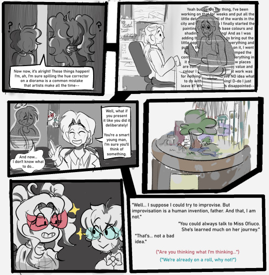
"Mmhm, I see, I see... Your father did tell us you had a bit of a mishap with your art project. We couldn't help coming to give some advice." Solaris muses, circling the diorama of the city. Currently, it's been moved to a coffee table.
"Yes, he told me I should try and spin it as if I had done such a thing on purpose. But I don't see how I could possibly..."
"Oh, we had an idea for that!"
Mimosa flutters from behind, resting her hands on Janus' shoulders. The glint of mischief hiding in her rosy glasses does not escape his notice.
"We could help you mirror it in the city proper, you know!"
"What?"
"It's an interesting theory. The structures you made still stand, but what gives them life and personality has been greyed out."
"I wouldn't say that--"
"So how do you fix it? Do you paint them with the hues and values they're supposed to be, or do you pick something new?"
"What do you do with the spots where the paint bled together? Do you paint over that, too?"
As the two bounce back and forth in this terrible game of brainstorming, Janus begins to put his hands to his cheeks in mounting horror.
"Oh, no. No no no. Absolutely not--"
"If we make someone look like an old black and white movie, what happens? Will they try to change to technicolour?"
"Would they paint themselves the colour palettes they're used to? Maybe it's something entirely different. If we make those hues correspond with their personalities..."
"I--I'll have no part in this! The last time something like this happened, everything--"
"Ah-ah, don't worry."
Mimosa leaves Janus side to twirl next to Solaris, who makes an artful pose himself, as if framing the splotchy mess of a diorama in his hands.
"We have this one completely under control. Not like last time."
"I'll make sure of it. Just a little bit of editing... ah, Mimosa, what if we..."
Janus can only move his head as the two take their leave, watching them scheme and snicker. He turns back to look at the model of the city. And in a scramble that almost makes him trip over his own feet, he rushes to his boxes of paints.
"--I have to at least put the base coat back on, or they really won't have anything at all!"
. . . . .
Welcome to another zany event for the fall season! It looks like Mimosa and Solaris aren't done causing trouble, but this time, it should be harmless. Right? (Right...?)
Taking inspiration from a creative mishap, the Stars have decided to effectively render the city in greyscale--including the people residing in it--to see what really makes everyone so colourful. Thankfully, most people will start with a base hue.
What does that mean, though? Here's a handy-dandy list of notes!
As soon as it strikes midnight that night, your muse will find that they've been completely greyscaled, save for one colour that represents who they are at their core, and only that colour!
- Think of it like those 'what colour is your soul' quizzes. If your muse was only one hue, what would it be? For example, a character that is inherently cheery might turn completely yellow or pink, while a hot-headed character may turn red or orange to reflect their personality.
Your muse cannot help but feel and act whatever hue/personality they seem to be. However! The more your muse interacts with the people around them, the more colours (and feelings/facets of their personality) will open up to them. This will also physically reflect on them.
- If your cheery yellow muse bumps into a sad, blue muse, you'll both have a new colour to express. Now you can feel happy (yellow) AND sad (blue)! And perhaps a sort of melancholy joy, like watching your best friend win that prize you wanted instead of you. Of course, you're happy for them, but sad you didn't win.
- Or maybe those two colours mix into being green with envy... And suddenly, you have a new colour ;3
Any inanimate object your muse interacts with (except their Island Issued Cell Phone) will take on your muse's hue. Every step you take will leave a colourful footprint in its wake, every hand rail will have colourful handprints. More on that later.
With enough interactions and perspectives, your muse will be back to their old selves in no time! If, that is, they want to go back to their old selves at all. Maybe another colour palette suits them better than before...?
"It can't be that easy, though."
And, you're right! The experiment did more than reduce everyone to solid (or no) colours! Some other strange things are happening, too. Such as...
The NPCs of the city have not escaped unscathed. Unlike you, though, they have no hue to them at all. However, they'll absorb colours from your muses by proximity and action.
- If your deep-green jealous muse is around, NPCs will turn deep-green too, and may want what you have--and might try to take it by force. But a calm mint-coloured muse may just leave you alone and soak up some vibes.
- This extends to creatures of the island, too, so watch out!
Sources of water in the city (the ocean, lakes, ponds, swimming pools, etc) will wash away at least one colour from you. (You can still drink and cook with it without any effect, though.) Better not get caught in a rainstorm any time soon!
To combat this, you can find paint cans with a random colour paint in them around the city. You never know what you're going to get, though!
The city itself is completely greyscale, so navigating it might be a challenge without any colourful landmarks to stand out. That being said, your muse will leave colour wherever they go, like they're a giant paint roller. And so will everyone else's muses! Figuring out populated areas will be Very Easy, but you might get disoriented in places that don't get a lot of foot traffic.
These are the major issues...... for now :)
FAQ
"Do I have to pick a hue at the beginning? I can't decide on one."
It's entirely possible that your muse can start in greyscale, and just has No Personality. In that case, they'll take on the hue of the first person they interact with.
"What do we do if a colour has multiple associations with it?"
Each association of that colour is a valid one, and there are no incorrect colour associations. Each colour is whatever you need it to be in the moment. The definition of "red" for your muse may not match the "red" of your RP partner--and that's okay!
What may be helpful is to make an event info post explaining your colour choice, how you interpret it, and how it would affect your character!
"Do we have to stick to basic colours like red, yellow, green, blue, etc?"
Nope. Maybe your muse is a mauve, emerald, beige, or aquamarine. Pick any colour you think is best for the moment!
"In theory, could we use the paint cans laying around to add hues to others by splashing them with it or something?"
PVP is enabled, if you want to be a menace! (with mun permission, of course)
"Is the comic in black and white for plot reasons?"
No, I'm just lazy :c
Have a question you don't see on here? You can message the Masterlist!
See you in a week! Make sure to get as many colour perspectives as you can, okay? :)
33 notes
·
View notes
Text
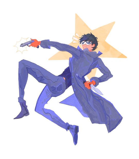
JOKER!!!!
#pleuart#pleucas#yes. another one with this character and this palette.#uhhhhhh#time to tag him multiple times#akira kurusu#ren amiyama#joker p5#p5#persona 5#p5r#persona 5 royal#back on my fucked up primary color bullshit
1K notes
·
View notes
Text
I'm reading the lord of the rings and I'm once again amazed at how... good most characters are. Like, they are genuinely good people. They are a bunch of kindhearted, gracious, caring people, coming together under adverse circumstances and trying to figure things out and find a solution and support each other through it all. Like Frodo and Sam meet Faramir and Faramir is a bit suspicious at first and kind of implies Frodo may be a spy, and then when he hears his story and he's like Frodo, I pressed you so hard at first. Forgive me! It was unwise in such an hour and place. And this blows.my.mind. He wasn't even particularly mean or threatening to him in the beginning, he's just such a kind, considerate man, recognizing the kindness and honesty of another man. And they're all like that. Even Gollum starts slowly changing (for a short while) when he encounters Frodo because that's the thing about kindness and humility and grace, they are contagious. They transform people, even a creature like Gollum cannot be immune to that. Like, you may consider all this simple and basic and I get it but, hear me out. It is quite rare to see that in modern media and it is also pretty difficult to pull off in a way that is not corny and simplistic. It is mind blowing that you actually don't have to present the entire palette of human cruelty and vice in order to tell a compelling story, contrary to popular belief. Lotr does the exact opposite, and it is just beautiful and it warms my heart. Especially taking into consideration tolkien's pretty grim growing-up experience, him being a double orphan without a home, raised between an orphanage and a priest and having no family apart from his brother and then the war and then he almost dies and then he's poor as hell and then a second war and it all makes sense somehow. He writes to his wife who is also an orphan two days before the marriage "the next few years will bring us joy and content and love and sweetness such as could not be if we hadn't first been two homeless children and had found one another after long waiting" and, yes, yes! The love and sweetness just radiate from his work, the entire lotr series is a little radiant bubble of hope and love and grace that he imagined in his head to deal with a dismal reality and then he just gave that to the world, and isn't that what imagination and art is all about after all?
#i literally wrote this because faramir said 'forgive me'#like that was the inspiration here#terminal brain damage don't mind me#BUT#i have a point#i do!#i am cringe but i am free#i love these books so much#i love this man so much#lotr#the two towers#frodo baggins#faramir#gollum#the lord of the rings#aspa rambles#tolkien#aspa reads tolkien
5K notes
·
View notes
Text
I just watched a video from the Bridgerton costume department explaining the predominance of one color or another in the main families of the series.
for example, the color palette of the Bridgerton is more classic and rich: babyblue,lilac,navyblue,pale green (old money),Featherington are more citrus: yellow,green,orange (Versace), Cowper: pink,purple,gold,wine.


And now I can't help thinking that, of course, in part the use of one color or another speaks about the financial status of the family, it also speaks about the proximity of a particular character to the family. For example, Penelope's gradual entry into the Bridgerton family can also be traced in the change of colors of her outfits.

And kill me for my delulu thoughts, but how am I supposed to survive the collapse of Creloise, when Cressida Cowper, the pink world ambassador, dared to change her usual color to the brand color of the Bridgerton family. How am I supposed to get rid of this parallel between them and the main couple of the season?? Your Honor, Eloise Bridgerton and Cressida Cowper are Endgame (and yes I am delulu).

#eloise bridgerton#cressida cowper#penelope featherington#colin bridgerton#bridgerton#bright colors#lgbtq#creloise#Ofcourseitwasbeforeeloisefuckedtheirfriendshipup#eloise x cressida#cressida x eloise
511 notes
·
View notes
Text
GET TO KNOW YOUR TWST OCs (and their relationships)
(Or how I make up excuses to blabber about my OC lol. Most of the "who" questions are aimed at the twst cast, but feel free to include other twst OCs as well!)
Name: What does your twst OC's name mean? Why does Rook/Floyd call them [insert nickname]?
Inspiration: Is your twst OC inspired by any villains? Concepts? Anything Disney-related?
Age/Birthday: How old is your twst OC? When is their birthday? Whose birthday (among the cast) is closest to your twst OC's? Does the horoscope lie or do they get along well?
Dorm: Which dorm is your twst OC in? Why? Which qualities they have make them suitable for said dorm? Do they have a roommate and how is their relationship?
Class: Who is your twst OC's classmate(s)? How would you describe their relationship? Did they have different classmates in previous year and did they get along?
Height: How tall is your twst OC? Are they conscious about their height? Are they close to someone with similar leg length?
Hair/Eye color: What are your twst OC's hair and eye colors? Who got the closest/opposite palette to them?
Homeland: Where is your twst OC from? Do they know anyone from the same hometown prior to NRC?
Club: Which club does your twst OC join and why? Is there anything memorable about the club fair day/their first day at the club? Which clubmate is their favorite?
Subject: What is your twst OC's best subject? Worst? Do they study with another whom excels at the same subject? Do they ask anyone for help with the subject they are bad at?
Hobby: What are your twst OC's hobbies? Who among the cast will they possibly ask to join in their pastime?
Pet peeves: What are your twst OC's pet peeves and which one in the cast accidentally (or not) commit the "crimes"? How will your twst OC deal with that person?
Food: What is your twst OC's favorite and least favorite food? Why (optional)? Is there anyone they can share their favorite food? Is there anyone they can count on to take over the food they dislike?
Talent: What is your twst OC's talent(s) and who can properly appreciate that?
Unique Magic/Signature spell: What is your twst OC's UM (if applicable)? What can they do? What is the incantation? Is there any weaknesses/loopholes and who can exploit those?
Quote: Give me something your twst OC will say. Either something they always say or something iconic they said. Something that helps solve the problems or something that is a catalyst to even more issues.
(Ok I'm kinda running out of ideas here) Personality: Give me 3 adjectives to describe your twst OC. Or an essay. Whichever works. Whose personality among the cast is closest to your twst OC and do they get along?
Backstory: Tell me anything about your twst OC's backstory. Their childhood, their parents, their siblings etc. Does their backstory affect how they are as a character now and how they interact with the cast?
Pick only one: Let your twst OC pick only one and explain the reasons: only one favorite from each dorm, only one favorite housewarden/vice housewarden, only one favorite first/second/third year etc.
(For my beloved yume shippers) Partner: Who do you ship your twst OC with? Are they in a relationship? If yes, how did it start/end? If no, why?
#ask game#twisted wonderland oc#twst oc#uh yeah I look around and I couldn't find any basic get-to-know ask game#so yeah hence this happened#it's just kinda an excuse for me to chitchat about Rory but feel free (read: I'd be very glad if you do) to use for your own twst OCs!#of course this is all fun and games so never feel pressured to answer ALL of the questions if you don't want to#it has never been my intention to make anyone uncomfortable#also! feel free to add more questions!#this is very very basic purely expanded from twst character profile#twst ask game#twisted wonderland ask game#oc ask game#original character ask game#twst oc ask game#twisted wonderland oc ask game#get to know#get to know my twst oc#get to know your twst oc
521 notes
·
View notes
Text
Reverse SAGAU: The Weird Door At My Café
-> Chapter 1(Here)| Chapter 2 | Chapter 3 | ...
Masterlist
Blog Navigation
____________________________________
Hello everyone, pls don't expect much from this chapter,which is going to be part of a series, will be that good. I may have grammatical errors and wrong spellings so please don't hesitate to tell me in the comments about it. English is not my main language. Also, I write some very descriptive and long scenes about what the reader does because i got used to writing descriptive essays so please bear with the long paragraphs and sentences. Thank you.
And yes, I'm back. Also the Misunderstanding series will be updated after my exams this is just in my drafts and I wanted to just upload it.
-Eli
____________________________________
Tw: Reverse!Isekai!Sagau, Normal Au, Café Au, a bit of cussing like this bit 🤏.
Reader: Gn!Reader, Adult!Reader, Café Owner!Reader
Characters: Reader
Note: Restaurant to Another World animanga inspired au. You can slide into my dms (😝 im joking bro) if you ever want to be tagged in my works just tell me what series you want to be tagged in or all of them. thank you <3.
____________________________________
You close your eyes and think back to that very fateful day — the day that entirely altered your life's course and shatter any semblance of normalcy you once knew. The memory is etched in your mind, clear and vivid. The secret your café had.
You had always dreamed of owning your very own café when you get older. It had always consumed your thoughts and fueled your ambitions. Doing everything you can to be able to make your dream come true. It was a dream that guided you through your highs and lows, the setbacks and triumphs, and now, your very own cafe is now right infront of your eyes. You stand awe, gazing upon your newly built dream café that represents your years of hard work and dedication. It almost feels surreal. The weight of such an accomplishment settles in your shoulders, filling with a sense of pride that it threatens to burst out of your chest.
The obstacles and challenges you faced along the way have not gone unnoticed. The countless hours of planning, the sacrifices made, the hurdles overcome—each scar and battle wound a testament to your unwavering determination. They have shaped you into the person you are today, a person who is standing on the precipice of their own extraordinary creation. In this moment, you can't help but reflect on how far you have come. You just want to curl up into a ball and cry for how proud you are for yourself.
As you approach the door to your café, your hand trembles with anticipation. You grasp the smooth handle, feeling the coolness of the metal against your palm, and slowly turn it. The door swung open, emitting a soft creak that pierced the silence. Above it, a small, quaint bell dangled delicately, waiting to be disturbed. The cascade of delicate notes wove together seamlessly, announcing your presence, like a whispered greeting to anyone who would listen.
You stare in awe and wonder at the interior design of your cafe , captivated by it's beauty. The space exceeds your imagination and sketches, each detail meticulously brought to life. You explore every corner, your eyes eager to take in every detail. The plants you selected with great care breathe life into the space, their vibrant green leaves adding a touch of freshness and enhancing the cozy, warm aura you envisioned. Sunlight steams through the windows, casting a golden glow that illuminates upon your carefully handpicked furniture, adding a touch of charm. Every detail, from the placement of tables and chairs to the color palette and textures and to the shelf placed at the wall behind the counter with small sized standees of genshin impact, comes together harmoniously, painting a reality that is more beautiful than it was in your imagination.
You took one last look at your own café, only to catch sight of a door that had seemingly materialized out of thin air. It wasn't in your sketches, nor was it part of the layout you had memorized. How could something so out of place suddenly appear in your beloved café? How weird. You were sure that when you went inside this café it was never there. It was on the opposite side of the front entrance door of your café. It had a very different kind of design from the doors you had. How weird . Were you perhaps hallucinating? Was your stress and sleep deprivation finally getting to you? You resort to pinching and slapping your cheeks in an attempt to jolt yourself back to reality. Nope. You can still see it. You rushed to go outside of your café. As you step out into the open, your eyes scanning the exterior, you're met with a surprising revelation—the door you saw inside your café is nowhere to be found. It's as if it had vanished into thin air, leaving you bewildered and questioning your senses.
Nonetheless, you breathed a heavy sigh of relief and once again went inside of your café, blaming your hallucination to your stress. However, as your eyes scanned the interior again, you saw the door still there.
'Oh, hell no.' You thought and quickly opened the front door again, took a look at the exterior, look at the door inside, and continued doing that action for a minute. Yup, you're officialy hallucinating.
You looked at the strange door and felt a nagging feeling of curiousity wanting to try and open that door. Maybe it was actually a big ass sticker that one of the builders placed as a prank. You never know. Steeling yourself, you went closer to the door on your tippy toes. Carefully trying to be quiet. Why? You don't know. You just knew you had to. Maybe it was an instinct of yours. You were now infront of the door and you tried reaching for the door knob still thinking it was a sticker but the coolness feeling in your hands said uno reverse. You abruptly took back your hand in shock. You stared down at the atrocity in front of you. You quickly raised your foot and took off your shoes/heel/slipper and held onto it tightly. Preparing yourself to open the door, you took in a deep breath and reached for the door knob once more. Twisting it open, a ray of sunlight shone through the small crack as you pushed the door open gently.
Your eyes widen at the sight infront of you as you had fully opened the door. The grip your hand had on your lethal weapon widened and it slipped from your hands. The sight infront of you was so surreal. 'This can't be true, right?' your head was going to so many places, unable to comprehend what was going on. You felt kinda dizzy.
You would be a fool not to recognize this place that you had seen so many times throughout your life. A few kilometers infront of you was the City of Mondstadt in view. You could even see the knights guarding the gate and Timmie with his pigeons at the bridge.
The weird door from your cafe was actually a door to the Genshin Impact world. Wow... wtf.
____________________________________
also pls take a look at my poorly drawn drawing of what your view looks like cause for the love of god I can't seem to explain it:
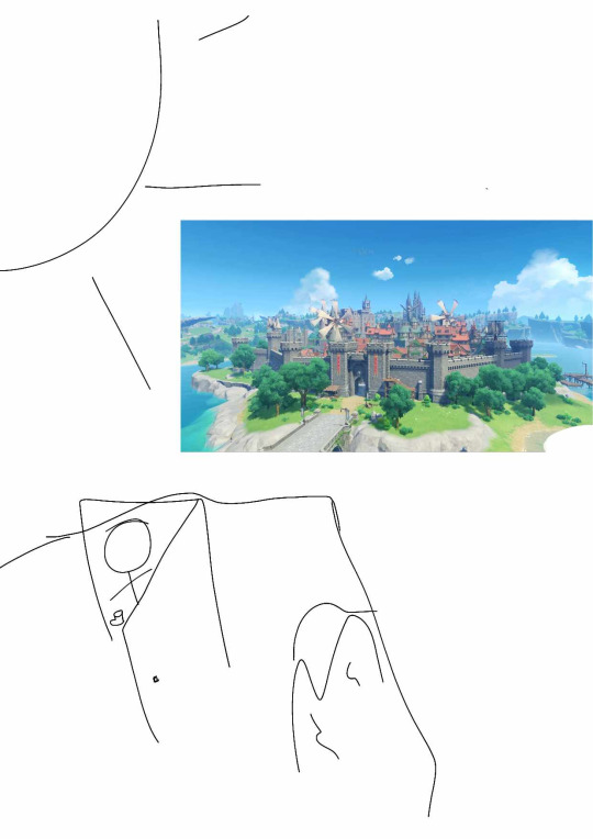
Also you're in a cliff or something. so yeah
Taglist:
None
#genshin sagau#genshin reverse sagau#genshin impact sagau#genshin reverse isekai#genshin impact#genshin fanfic#various genshin characters#gn!reader#gender neutral reader#gn!reader x various genshin character#•works[🍡]•#genshin series
274 notes
·
View notes
Note
I think two things that could help the Hellaverse designs (mainly Hazbin but even Helluva) is making the rings' colors matter, and making time periods matter.
What I mean by making the colors matter is by using them in the sinner's designs. Like, if your main sin is pride yes you are red, if it's wrath you get orange, so on so forth. Best part? Humans are complicated! You can use multiple colors for their sins, it can help the color palettes be varied, give you insight to characters (even the ones who try to hide their main colors cause some would) and help you think of things!
Now, the time period part is more obvious than the color, but I want to go into another idea for them. Let's take Angel Dust for example, he's from the 1930s, right? But would he like that time period, where he couldn't be himself and was working in a very dangerous situation with a family he mostly didn't like? I think not, and on top of that his soul is owned by a man from not the 1930s, Valentino is from the 70s. So, in my own rewrite, Angel is dressed in a very 70s outfit, not only cause I think Val would make him to fit his own tastes, but also I think Angel would rather the free love vibe of the 70s to the things he associates with the 30s.
Even with that the time periods still matter! It gets things across to the audience, even if they are misleading things to a certain extent. I feel like you could do so much with their designs if you just added these two concepts to them,
Exactly!
It would be a nice break to see the sinner designs as the colors of the sins they've committed, as you said. It'd give some break from all the red and allows the characters to stand out more.
And the idea you suggest for Angel Dust makes so much sense and I really like it!
One of my main criticisms with the character designs in general is how no one looks like they died in that Era, or what kind of thing they're based off of.
Lucifer, Alastor, Sir Pentious, and Vox all have shoulder padded suits with bow ties or ties, despite them being decades (or in Lucifer's case, millennia) apart.
Variety and diversity is important in character design, and unfortunately Hazbin Hotel and Helluva Boss didn't exactly get this.
#hazbin hotel critical#vivziepop critical#helluva boss critical#helluva boss criticism#hazbin hotel criticism#helluva boss critique#vivziepop criticism#hazbin hotel critique#ask answered#vivziepop critique
76 notes
·
View notes
Text


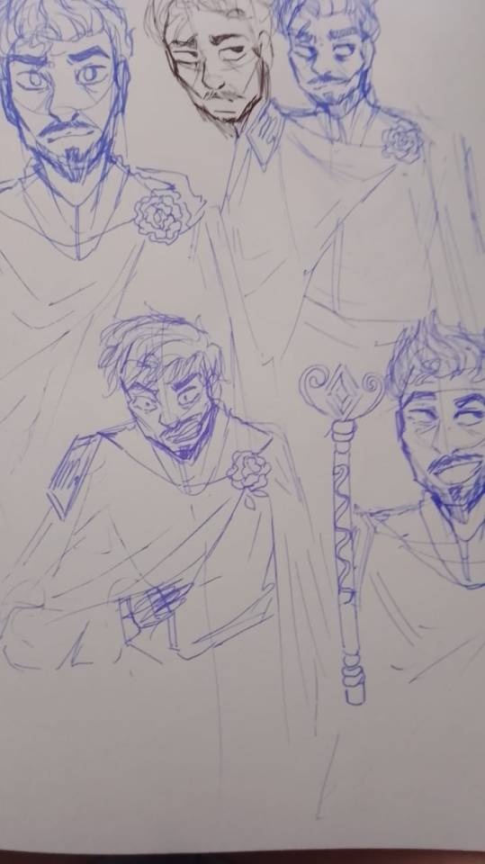
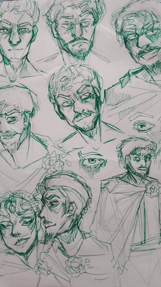
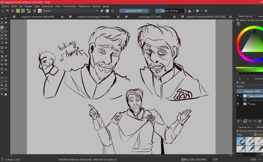
INTRODUCING THE MOST MANIPULATIVE KING IN HISTORY , MAGNIFICO!!! 🎇🎇🎇🎇(I hate him but he deserves a redesign lol).
For those who see this post for the first time, I introduce myself, Hi :D! I'm Aled and this is a collaboration with @ animación , author of the rewrite of Wish that is on her profile (read it, the story it's soooo good) and I am in charge of drawing the redesigns of her story.
Now, coming back to the main thing, I will show how we got to this result :)
FACIAL FEATURES AND HAIR:
-Honestly, I never thought that getting used to drawing Magnifico would be so difficult lmao, how in most of my procedures to make the designs, I start with sketches and studying the structure of the character's face, this was a little difficult because I'm not that I'm used to drawing people over 20, but with a few practices I was able to figure out how to draw him :D


(I also did digital internships, but I didn't save most of them because I forgot lmao)
COLOR PALETTE:
-Don't think that I chose a palette of yellow and gold colors just because I thought it was pretty (well, that's also another reason), what happened is that when I was searching through conceptual arts, I found some designs by Magnifico where They used a blue and yellow color palette
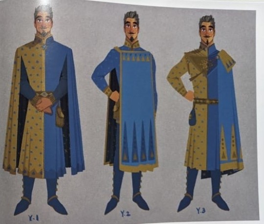
I did a quick search and found this:

-Tell me this doesn't remind you of Magnifico, then yes, that's why I chose a yellow color palette, also adding a golden tone to give it a royal vibe.
-I also applied this in the design of Queen Amaya, in the publication of her design I explained why I added details of a dark blue color in her costume and Magnifico's costumes
ATTIRE:
-From the beginning I always wanted to modify Magnifico's cape by adding a rose as a brooch, and searching through the conceptual arts I found quite a few interesting models, so it can be said that I combined everything I liked and that's how I got the cape for Magnifico, Also adding other details that occurred to me.
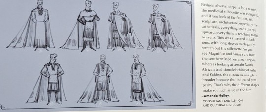
-The author sent me several ideas for Magnifico (thank you by the way :D), one of them was associating Magnifico with the sun, I really liked the idea and that is why there are so many symbols of the sun in his suit, plus these It reminded me how in so many cultures the Sun is worshiped, just as the kingdom of roses worships Magnifico, there are also other reasons why the sun fits with Magnifico but I already mentioned that in the publication of Amaya's redesign.
-The truth is, I only drew the other details improvised, this time I just got carried away, but hey! The outfit didn't look bad at all :)
-Another important part of Magnifico's costume is the "M" on his badge, but in fact it is not an M 😅, it is the sign of Scorpio ♏, this idea was from Anny Mation
-So yeah, I had to add the Scorpio symbol yes or yes, at first I thought about adding it to the back of the cape but I wasn't convinced by the idea, but then I thought: "Wait, why don't I add the sign on the gold plate ? that would look elegant."
FINAL COMMENTS:
-I'm proud of how this turned out, I feel like it does justice to a villain that commemorates 100 years of Disney :)
-Also, I think that those who have already seen the other redesigns know which character is next, right 👀✨? For Aster, I don't know how long it will take me to draw him, since the boy is literally a walking animation studio lmao.
That would be all for now, until next time :D!
#sketch#art#artists on tumblr#artwork#disney#disney wish#drawing#digital art#illustration#my art#magnifico wish#king magnifico wish#king magnifico#magnifico#wish magnifico#magnifico x amaya#wish disney#wish 2023#redesign#wish reimagined#wish rewrite#wish movie#wish#disney movies#disney animation#disney fanart#wish star#asha#queen amaya#redesing
185 notes
·
View notes
Text
Finding Your Style, Part I: Shape & Silhouette
A deep dive into deciding on your own personal fashion and tailoring your clothes to fit.
Also on Patreon / / Also on Medium / / Leave a tip.
Introduction
Before I start with the actual meat of this piece, I want to establish what this series of guides is not going to be. These guides are going to be about building and cultivating your wardrobe and accessories for you and your preferences.
I have no interest in and will not be going into how to look good (or revoltingly, how to look “slimmer” or similar), how to be fashionable or trendy, or alternatively, how to look unique or dress differently to everybody you know.
I often get frustrated when pieces about cultivating one’s personal style stumble across my dashboards and they advise the reader to pay attention to the latest trends, to make a moodboard, cultivate a capsule wardrobe, and leave it at that — a moodboard can be helpful if you’re a visual thinker, and there’s nothing wrong with a capsule wardrobe as a tool, however.
I have a particular style of dress, I like to play around with a lot of colours and fabrics, a lot of patterns, and a lot of the people around me tell me I dress well and that they enjoy my style: I have never read a style guide that is envisioning a man who dresses like me, or even a man who dresses even close to the way I dress.
When I think of someone’s personal style, I’m talking about aspects of their appearance and the mode in which they clothe and carry themselves that are distinctive to them.
Firstly, this doesn’t mean that they dress uniquely, and like no other person around them.
I know guys who basically dress themselves to match mannequins in particular stores, and they look good for it — when I see them around, even if I haven’t seen those mannequins and don’t shop in the stores they shop from, what makes them distinctive is particular colour palettes, brands, and also a clean-cut, neat style that works really well on a shop mannequin. What they’re wearing obviously isn’t unique, but it is distinctive, and it is a particular visual I associate with them when I see them.
Secondly, when we think of distinctive qualities, I might associate them with a specific style that isn’t inspired by a high street store or particular fashionable brand — people who dress in vintage clothes and are always kind of ’90s or ’70s, or people who dress in lolita or goth or emo or cottagecore or identify with another subculture that has a particular visual signature.
Apart from fashion subcultures, there might be other aspects — yes, specific high street brands, but there are all kinds of other visual signatures like particular patterns (someone who always wears stripes, for example), other brands or media (e.g. someone who wears a lot of stuff printed with anime characters), particular places or hobbies, et cetera. I’m currently fleshing out my wardrobe and trying to find a lot more pieces that are nautical or sailing themed, so there are a lot of anchors, compasses, helm’s wheels, and ships incorporated into my wardrobe.
And thirdly — this is one thing I want to impress very firmly, because far too many pieces that focus on fashion don’t take this into account at all — one of the most distinctive qualities is how much I might recognise a friend’s specific needs for comfort in their style of dress.
I, for example, have a lot of cardigans, jumpers, woollen vests and waistcoats, etc, and in winter will often appear in multiple layers of wool underneath another layer of leather because I get cold so easily; even in summer, I’m often wearing a t-shirt under a collared shirt, sporting a cardigan, or even wearing three-piece suits. I know other people who basically from spring through to late autumn will only ever be wearing one layer, particularly just a t-shirt or long-sleeved shirt, because they overheat so easily.
This is going to be a series of pieces, and I want to focus on a handful of specific points to focus on in cultivating your wardrobe and accessories:
Part I: Shape and Silhouette
Part II: Fabrics and Materials
Part III: Colours and Patterns
Part IV: Garments and their Construction
Part V: Accessories and Details
Part VI: Eras & Epochs, Subcultures & Alternative Looks
Part VII: Thematic Cohesion
Part VIII: Editing and Adding to your Wardrobe
A lot of style guides are written with people in mind who are trying to look good at work, especially at office jobs, and subsequently they assume a certain level of conformity with business casual or other “acceptable” styles in mind, where standing out to any degree is considered in poor taste, but more importantly, where things like personal comfort aren’t taken into account.
Your personal comfort in the clothes you wear, whether that’s to do with your resting temperature, if you feel most comfortable in any specific fabrics or textures, if you feel comfortable under multiple layers or only one, how many pockets you have and how accessible those pockets are, how exposed or free certain parts of your body are, etc, is far more important than virtually any other aspect in selecting your wardrobe.
There are absolutely garments or styles where you might either enjoy the discomfort or think it’s worth withstanding for the visual effect, but that’s really up to you to decide, and anyone who says that you should be uncomfortable on your day-to-day, or that it’s normal and therefore desirable to feel uncomfortable in your own clothes, is a prick.
As a species, we wear clothes to keep our bodies warm and safe from harm, and while we might enjoy looking good or projecting a particular image, our comfort, safety, and our feeling of security in the clothes we’re wearing is no less vital.
Especially if you’re used to dressing in uncomfortable clothes, it can be hard to figure out what you actually do feel comfortable in, and that’s okay, that’s a process.
A lot of us have basically had it embedded into us, after years of conditioning, that there is only one way to dress, one way to exist, and that this is in-keeping with what’s Appropriate or what’s Pretty or in line with any other expectation, and unlearning that is hard, but it’s a process, and it’s possible to work through it.
Shapes & Silhouette
The first thing we often talk about when it comes to fashion, and the first thing a lot of clothes designers sketch out and visualise, is silhouette — if you find that hard to envisage, imagine yourself in whatever outfit is a favourite of yours, that you’re behind a canvas, and you’re being backlit from behind.
Your silhouette is the shadow cast by the shape of your body and your clothes — when someone first enters into a room, when we take in their outfit, we take in the broad strokes of it and the silhouette it casts, the shape of their body.
You might want to cast an initial impression that emphasises particular bodily qualities you’re proudest of, makes you seem taller or shorter than you are, slimmer or fatter, curvier or squarer, softer or more angular.
The problem with a lot of silhouette discussion is that many clothing designers abhor and loathe clothing anyone who isn’t a white, thin cisgender woman: imagining silhouette becomes about imagining a base body that serves as a mannequin and clothes that are draped on her, rather than about imagining a range of body types and different silhouettes that might go with them, complementing or contrasting the base body on which they’re built.
Subsequently, when people talk about clothing for fat people, particularly for fat women, a great deal of emphasis is placed on a silhouette that attempts to disguise or hide the body’s natural shape, whether that means making them seem nebulously slimmer by increasing their perceived height or by some other method, or increasing or decreasing their curviness.
The problem with that, apart from the fact that it relies on a vociferous hatred of fat people, of fat people’s bodies, of body fat in general, an odious bigotry in itself, is that a lot of the time, it doesn’t fucking work.
It’s instead people writing pages upon pages of advice on how to make yourself appear smaller and lesser, capitalising on people’s taught and conditioned self-loathing, and a lot of it is just clickbait. I’m by no means saying it would be ethical or correct if a lot of this advice did work, but the fact is that it doesn’t.
Someone might take your outfit with lots of layers and rounded shapes to it and assume you’re fatter than you in fact are, because multiple layers make you look larger — it could also be that simply wearing those soft fabrics make people think that you’re rounder, which they associate with fatness. In contrast, someone might take an outfit with lots of angles to mean that you’re bigger than you are because when we drape our body with angular clothes, they often work by sticking out from our body and creating corners where they don’t exist — but, people might associate that angularity with a lack of body fat, either with bones or with muscle, and therefore think you are bigger, but less fat.
We live in a fatphobic society where people make a lot of judgements based on how fat they perceive you as being. Because of the aforementioned fatphobic society, we also live in a society where people might associate you with fatness (or some other physical trait they consider negative) because they dislike you.
If you speak loudly or “a lot”, people might perceive you as being fatter than you are — if you barely speak, they might perceive you as being thinner, because you take up less apparent space, no matter what you wear or what shape you present.
There is no way to win, is my point.
You cannot win against bigotry in a fundamentally bigoted society by trying to change subtle perceptions of angle or size or light or shadow, and the people who say that you can are lying. The point of those lies is firstly to sell newspapers and screentime, but the second of them is to make the reader think that a bigoted society’s attitude toward them is their fault, because they weren’t employing enough tricks to deter the bigotry.
When I talk about the varieties of silhouette you might want to attain or aim for in your clothing choices, or how well-fitting or loose a garment might be for you, it should be in line with your preferences and your desires, whether that’s about aesthetic, comfort, or something else.
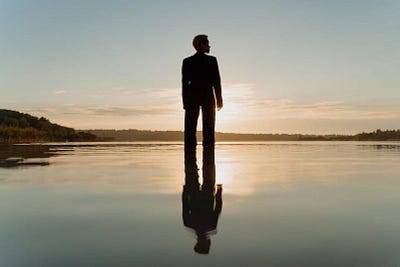


Photo by cottonbro studio via Pexels, with guide lines added by me.
When envisioning your silhouette, the key points of your body might be:
your head
your shoulders
your waist and hips
your feet
This depends on your body shape and also on the sorts of outfits you’re wearing — it might change for you depending on the clothes you’re wearing on a given day, or you might cut a drastically different silhouette in boymode versus girlmode, or in summer versus winter, etc.
Think of these as anchor points on which your clothing or accessories are draped over or mounted from, almost like you might envision armour slots in a videogame. When you envision your silhouette, it’s how your body immediately appears when lit from behind — your legs and arms aren’t irrelevant here, and the shape of sleeves, trousers, and skirts will absolutely contribute to your silhouette, but depending on your body in motion or how you stand, these won’t always be immediately distinctive, whereas your head and torso will be.
As well as being the place where your clothes drape from, these might be the points where your most important accessories might be placed — headbands or hats, shoulder clasps or shawls or collar pins and such, belt buckles or suspender clips, and your shoes or boots. These points become the focus to which the eye is drawn because they’ll be the most static parts of the body, whereas other parts in between might jiggle or flow.
These points aren’t part of some sort of rule you have to follow — it’s more of a handy shorthand to help train your eye into seeing the particular shapes each part of someone’s body cuts, and what the overall effect is, and how much you like or dislike the effect.
You might feel that some of these anchor points, when emphasised or de-emphasised, add or take away from your dysphoria or your general self-esteem, make you feel more feminine or masculine, just look really fucking cool or really hot, etc. Think about those when you start sketching out your shapes in your head and what you like best.
When you really want to imagine a silhouette, do what I did with the first three images — there’s the outfit itself, I’ve drawn the anchors at the top of the head, the top of the shoulders, the waist, and then the feet. Contrast that silhouette with this image:
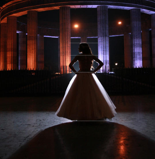

Photo by Becerra Govea Photo via Pexels, with guidelines added by me.
This person has a different hair style, but see how with the shape of the dress, the waistline is drawn in compared to their shoulders, and would be even if they weren’t posed with their elbows outward? See how their waist appears to be smaller in contrast with the wide sweep of the thickly layered, loose skirts?
A useful exercise when thinking about a silhouette you like is to draw these anchor points and then either draw in lines following the outside of the body’s / clothing’s shape, or you can separate into each section and think about the simplest shape that silhouette can be boiled down to: a circle, a square, a triangle, a straight line.
In the two images I’ve indicated, I’ve focused on the waist as an anchor point because it’s the base of the suit jacket and then where this dress is drawn in — on your body, you might find that somewhere else on your pelvis is better for you to draw the line.
Have a look at this TikTok and look at all these bodies in motion, the clothes they’re wearing, how much skin is or isn’t being revealed, how loose or fixed each piece of clothing is, how much contrast is or isn’t present in the different shapes on show. Think about each different silhouette and how different or similar they are to one another.
(A TikTok of an NYFW fashion show in September from Remi Jo on TikTok.)
Look for the motion in these garments and in these people’s bodies — the parts that jiggle, that flow, that have free motion — and contrast them with the bits of their garments or bodies that remain more static. Many of these garments bare skin or flesh, and many of them cover a lot up, depending on the garment’s design — look at shoulder pieces, busts, waists, skirts, hemlines, sleeves. If a garment stands out to you as pleasing, cut it up in your mind and look at each piece of it individually before you consider the whole again, see what stands out most to you.
Generally, for modern men’s tailoring, the focus is often on the lower-slung hips rather than on the higher waist. If you’ve got a squarer body, your waist and hips might be the same or almost the same width, to the point you have no big distinguishing angle between the two points — you might want to think of your anchor point as at the base of your hips, in line with your backside; you might want to think of it as at the absolute high point of your waist if you tend to very high-waisted trousers or skirts.
If you’re fatter and have a significant overhang to your belly, depending on whether you like to wear your waistband underneath the overhang and have your belly rest on top / over it, or if you wear looser clothes or generally keep your belly within the waistband, for example under your dress or your skirt, this might change how you think about your silhouette too.
You might still be looking from the tops of your shoulders, but then the end of that “shape” might be in line with your backside or your upper thigh instead because that’s where you can see the lowest part of your belly in your trousers or leggings, or in a maxi dress, it might be a straight (or mostly straight) line from your shoulder down to your feet. Alternatively, rather than focusing on your hips or specifically where your waist is, you might like to make sure your middle point is at the widest point of your belly — if you’re wearing a belt, you might like the belt buckle to rest in the middle point there, or have the waistband of your skirt there so that you have the maximum flow to the skirt.
And remember, as I said about how the most key points might be different depending on what sort of outfit you’re wearing or what the occasion is, consider how much you’re going to be sitting down or from what angle you’re going to be viewed by others.
If you’re generally going to be sitting down while wearing a particular outfit, your midpoints at the waist might be less important to you than your shoulders and your feet — and if you’re going to be viewed significantly from above or below (for example, if you’re on stage or performing in a theatre), or from a further distance, this might make a difference to what key points you want to focus on.
If you use a wheelchair, depending on how big your wheelchair is compared to you in terms of its back and shape, you might like to take its angles and colours in complement to your outfit — if you use a cane or crutches, or if you wear a prosthetic limb for some events but not others, you might want to consider the asymmetry or the squarer shapes cut by your mobility aids.
Similarly, if you’re in costume and you’re wearing or using a really important prop like a stave or wand, some sort of weapon in the hand or slung on the belt or worn in some sort of other holster, you might want to employ similar complementary or perpendicular angles.
For example, if you’re wearing something that’s really angular and is going to make one shoulder, side of your head, or side of your waist/belly seem much higher than the other side, you might want to match that angular shift to the side you don’t have a limb or use a cane or have a prop to continue that exaggerated angle — you might want to make it go to the opposite way to offset the imbalance.
--
I’ve talked a lot above about how to observe and identify shapes and silhouettes in outfits you’re observing, but only a little bit about how to actually construct and cast them.
For a lot of people, the shadow cast by your head is going to be the same every day depending on your haircut or hairstyle: if you have shorter hair, you’re unlikely to change it much on the day to day in a way that will be noticeable at a glance.
If you do have longer hair or you change your style regularly, you can think about the shape that your head is casting in contrast to your outfit — if you alternate, for example, between having a big ‘fro and braids or twists that are much tighter to the head or are gathered at the back of your neck, those will be pretty dramatic differences to your silhouette; ditto if you go between different ponytails or braids and different up-dos, whether that’s a bun or gathered braid or similar.
If you wear hats and/or wear headscarves, those will make a big difference too — a beanie casts a very different shadow to a Panama hat, different again to a boater, a baseball cap, or a bandana.
A more structured hat or other garment for the head — a tiara or crown, for example, or more structured hair styles that come out from the head such as bantu knots or structured wigs and up-dos, will be more static; looser hats, scarves, and loose-worn hair will have more flow and wave when you move, and will stay in motion as you walk or even as you turn your head.
How visible do you want your neck to be? The lines of your jaw, your chin, your ears (and earrings), your brow, the nape of your neck? Do you enjoy the sensation of fabric or your own longer hair touching the tops of your shoulders, or being a weight on your back? Do you need the shade from your bangs or longer fringe, or that a structured hat will give you?
From your head we can jump to the broader part of your actual outfit or the garment that covers most of your body.
Your shoulders and your hips / waist / the widest point of your belly are where the garments you wear are going to rest — shirts, jackets, vests, coats, all of these are going to sit on your shoulders and either cling closely to your body or hang over it; loose fitting trousers and any sort of kilt or skirt are going to hang off your hips or the widest point of your middle.
Depending on your outfit and how your legs are clad, your feet might not actually be particularly noticeable — if you’re wearing shorts or anything with a shorter skirt, more attention is going to be drawn to the feet in contrast to your legs, ditto any sort of skinny trouser, legging, or tights. This goes especially for bigger boots, trainers/sneakers, and various heels.
MSCHF’s newest crowd pleaser, the Big Red Boot, is distinctive because the Big Red Boots are extremely shaped like boots, but not particularly like feet.
And after this point, you might have different points entirely that you construct away from your body — big earrings can be a point of interest; the hem of a shorter skirt, for example, might stop at your mid-thigh or knee, and that might be at an angle with your shoes; if you wear flared trousers like I tend to, you might create another point of contrast at your knee or at the mid calf.
Some points to consider are:
Which parts of your body or your shape do you enjoy most, want to most emphasise, or want to draw most attention to? Are there any parts of your body or your shape you feel less comfortable showing or emphasising, and would like to draw attention from?
Are there any silhouettes, for any gender, that you feel most drawn to and interested in? For example, do you particularly like the shape cut by certain styles of suits, robes, dresses, or other garments? What points do you like most, are most drawn to? What points are the same from outfit to outfit?
Think of cartoons and other animated series you like or have enjoyed, which normally have distinct styles and place emphasis on certain body parts or shapes for each characters. Do any particularly appeal to you? Do any characters look especially fun or cool compared to others, because of the style they’re drawn in or what garments or armour they’re drawn in? Cartoons will show an extreme, but they might help you visualise something you’re particularly drawn to because the extremity makes it so visible.
Apart from the shoulders, middle, head, and feet, do you want to create any further points of interest? Draw attention to your elbow or knees, dangling earrings, shift the silhouette of your feet by elevating your heel or sole?
Do you want your garments to hang from your body and be loose, or do you want them to be more tightly tailored? A garment that “hangs” will generally rest on your shoulders or around your middle and then be looser or boxier — a more fitted garment will hug tighter to the lines and curves of your body, and the extent to which will depend on the fabric weight and the construction of the garment.
How much is your silhouette different in motion, standing, seated, or otherwise? How much does it change with different mobility aids, or in different seats, while doing different activities?
And that’s it for that piece!
I am going to go through the other parts of this bit by bit — originally I was going to do this as one huge deep dive, but it just became untenable in terms of length. Let me know what you think, which bits are most helpful, and please feel free to mention anything you’d particularly want me to cover in the other pieces as I go through them.
180 notes
·
View notes
Text
Silly goofy cross guild idea that will not leave my head, but hear me out
Buggy being the mafia wife archetype is well and good, it is one of the best, hottest takes on the PLANET and I'll die on that hill. But we also need to touch base on the blending of cultures and tastes here where I am currently FROTHING over.
Crocodile being Alabastan and taking over his once-home in a bid for control and for reasons that haven't been touched upon. Why Alabasta? Is it the 'wanis? Are fruitwani native there? If so, if Alabasta ISN'T his homeland, what made him choose there? What started his love of fruitwani? What lead to a mafia instead of a pirate and what does that mean for his character??? ((Middle Eastern and maybe smth English, German or Russian, smth about that scratches a brain itch for Croc, might be the languages-))
And Mihawk. My silly spooky little swordsman is full of mysteries and I am ROTATING him. Mach speed. Full 360 tail spin in my frontal lobe. Is he human? If he is, what was his upbringing like? What was his childhood? His parents? His homeland? Does he speak other languages? ((I love the idea of Mihawk being the One Piece equivalent of French)).
Buggy's heritage is Unknown (jazz hands), but he was raised by Roger who has Big Gaelic Energy, no I will not explain, it's RIGHT THERE. On that note though, Buggy grew up on a pirate crew, a bunch of headstrong fellas from all sorts of places, with all sorts of lives. Buggy's a little melting pot, a drifter, and while some things are poignantly Roger's in his words, actions or beliefs, he's all over the place with a wide palette.
Now the three of them learning and picking things up from each other. They wind up leaving marks on each other.
Mihawk sings quietly to himself sometimes in French, usually while gardening or cooking. Buggy and Crocodile learn the songs by osmosis.
Crocodile sometimes calls the others by certain pet names or gives orders in his own mother tongue, or he'll organize things a certain way, set up smth in a specific manner, idek, my brain is fried but the vibe, the VIBE is there.
Buggy shares dances or recipes from his childhood. Just... yes. Them bleeding into each other's spaces. Them leaving marks on one another metaphorically.
((Also them slowly incorporating bits of each other in apparel. Buggy opting for richer or darker colors or cuts. Crocodile incorporating lace and pops of red. Mihawk adding textures to his eyeliner and updating his harness with more crisscrosses.))
#one piece#cross guild#cross guild polycule#dracule mihawk#buggy the clown#sir crocodile#my head huuuurts
107 notes
·
View notes
Text
Metatron is the Murder Hornet

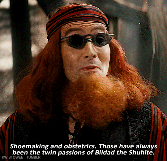
Hear me out. The Metatron is a bitch no matter what. Way back before the bookshop burned, he was a manipulative twat to Aziraphale, but we only ever saw him as a Wizard of Oz style giant floating head. So when we meet The Metatron's corporation is S2 E6, we assume that this is the man behind the curtain, yes? This is the "heavenly" authority who stands between God and the rest of the angels. Are you with me so far? So tell me, why is he wearing Hell's color palette? Black topcoat over a black (or at least very dark gray) sport jacket. Even his shirt has black stripes. His tie is black with his signature sapphire blue sigil design. You know why? Because The Metatron is a demon. Now that I've probably pissed off about half of the fandom, let's dive in.

I'm going to accept that the corporeal form of The Metatron that we meet in S2 E6 is the man behind the curtain. But I'm wondering if, in the same way that the Wizard of Oz floating head spectacle is just a projection the actual wizard (a two-penny magician from Kansas), the Floating Head Monstrosity (FHM) is a projection The Metatron has rigged up rather than The Metatron himself. Essentially, the FHM is the projected "essence" of the asshat with whom Aziraphale spoke before the bookshop fire, the same one who wanted to discipline Gabriel and strip him of his memories. And if it is merely a projection, like the Wizard of Oz floating head, the man behind the curtain is likely in a different physical space.

If The Metatron can control the FHM remotely that suggests that he (the corporeal form or spiritual essence of the Metatron) isn't necessarily stationed in Heaven. Perhaps he can't even get into Heaven, but has managed to project his presence there to manipulate the Heavenly Host throughout the course of history.
Sidestep along with me while I take a quick detour. I promise it's relevant and necessary to understand the implications of The Metatron's arrival in Soho. (But I'm a demon. I might be lying.) Good Omens relies heavily on mirroring* as a narrative technique. One of the most obvious places we see this structure is in character sets: Crowley and Aziraphale, Newt and Anathema, Shadwell and Tracy, Nina and Maggie, Gabriel and Beelzebub. The character sets function as mirrors of one another (angel and demon, witch and witchfinder), while simultaneously reflecting other character sets in the story (Nina and Maggie reflect Crowley and Aziraphale, etc.) But we also see it repeatedly through plot structure--the pair of 1941 flashbacks in S1 and S2; the way S2 begins with Azirphale moving toward Crowley and ends with him pulling away. My personal favorite reflected imagery in the whole damn show is when Aziraphale shields Crowley from the first rain in Eden and Crowley shields Aziraphale from the celestial hailstorm Before the Beginning.
Alright, let's re-route back to Soho, to The Metatron's introduction in S2 E6 and how it embodies mirrored structure. The first shot we get of The Metatron in Soho in S2 E6 is when he's buying a cup of coffee from Nina. He's not actually identified as The Metatron in this scene, and Nina just views him as a regular customer. Next, we see him enter the bookshop and approach the Archangels, none of whom seem to know who he is. In fact Michael just assumes he's a human, tries to shoo him away, and even asks him, "And who are you?" The Metatron never gives his name; instead he presses the angels, "You don't know me?" He then addresses Crowley, "What about you, demon? Do you know me?" It's at this juncture that Crowley identifies him as the big giant floating head, and Aziraphale, in a rush of comprehension shouts, "Oh, The Metatron!"
This scene's other half is the introduction of Bildad the Shuhite in the Job flashback sequence. Crowley presents himself to Job and Sitis, who do not recognize him. When questioned about who he is, he says to Sitis, "You tell me." Sitis proceeds to identify as him Bildad the Shuhite. Crowley shrugs and agrees to the suggestion. This mirroring of dialog shows us that in both scenarios, there's deception in the presented identity. Just as we can't trust that Bildad the Shuhite is who is says he is, we similarly can't trust The Metatron's identity at face value.
When it comes right down to it, The Metatron is a pretty sketchy character. During his S1 interaction with Aziraphale, our angel doesn't even know who he is. The Metatron has to introduce himself as the Voice of God, a go-between, if you will, whom Aziraphale, in all his ageless time in the universe, has never even met or heard of. Dodgy? You betcha. When we see him in the Gabriel trial sequence during S2, he's just one of the several floating heads overseeing the progress of Armageddon Round Two. We're able to gloss over the fact that he's presented as a floating head fairy, because all the angels appear as floating heads in this sequence. However, unlike Uriel, Michael, Saraquel, and Gabriel, we never see The Metatron interact with the other angels in anything resembling a corporeal form.
So with this evidence, let's return to mirroring structure as a narrative device: a Clue to point us to the crux of the deception that The Metatron is performing. But to get there, we'll need to look at the reflected plot beat for context.
At the end of S2 E5, Crowley needs to get into Heaven to access information about Gabriel. Problem is, since he's a demon, he can't just waltz into the Heaven-Hell-evator and go to the up. He needs an angel to escort him, so he tricks our beloved Inspector Constable Muriel into arresting him: "I'm a demon with knowledge of a crime against Heaven. I demand that you arrest me!" Crowley uses the art of deception to sneak his way into the Heavenly hive.
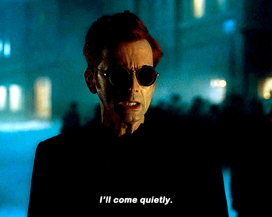
Once in Heaven, when Muriel starts to fret that she's been tricked and will get in trouble for bringing a demon into Heaven, Crowley tells her, "Angels are like bees, fiercely protective of their hive if you're trying to get inside. Once you're in....I mean....is it even faintly possible that an unauthorized demon might be just wandering around in Heaven unescorted? Bees." Muriel then worries over Crowley's outfit, telling him he looks like a murder hornet, so Crowley changes into his most wonderful and excellent angel disguise.
Still with me? Have a gold star to match Crowley's nail polish.
Crowley's gambit to get into Heaven is a clever tactic, no doubt, and necessary for the final beats of the narrative. But I believe it's also there as the first half of a mirrored plot point that we will see play out in S3. Ya see, Crowley's not a murder hornet. He doesn't infiltrate Heaven to plunder their proverbial food stores or to destroy the hive. He does his quick bit of reconnaissance and is on his way. I think Crowley's ploy ultimately functions as foreshadowing for the real murder hornet: The Metatron.
To get his full essence into Heaven, his spiritual body and not just his projection, The Metatron needs an angelic escort. That's why he's so insistent that Aziraphale joins him on his journey up to Heaven. He needs an angel--one he perceives as an easy target--to break him into the hive. And Aziraphale fits the bill. He's vulnerable, having been implicated in the business with Gabriel, which could earn both him and Crowley extreme sanctions, being struck from the Book of Life. So The Metatron coaxes and manipulates Aziraphale to accompany him to Heaven, implicitly reflecting the way in which Crowley manipulated Muriel into arresting him and accompanying him as his Heavenly escort.

Do I still believe that The Metatron manipulates Aziraphale in order to divide the angel and the demon who, when working together, can produce miracles of un-paralleled power. Oh, hell yes! But that's not something only Heaven would want to mitigate. The sheer miracle force Crowley and Aziraphale manifest when working together is a threat to any oppressive structure that wants to consolidate power, and that certainly includes Hell. The fact that The Metatron realizes he can separate the angel and the demon in the same stroke as infiltrating Heaven is icing on the cake.
So there ya go. That's all I've got for today. Is The Metatron a Demon? Honestly, I don't know. But it's too interesting a theory for me to leave it alone.
*Please note, I'm intentionally using the term mirroring rather than chiastic structure to make this analysis. I deliberated for a while, but decided that it'd be a little loosey-goosey in this situation. So, yes, I am aware of chiastic structure and it's use in Good Omens, I just don't think this quite matches up.**
210 notes
·
View notes
Text
Here we go again--
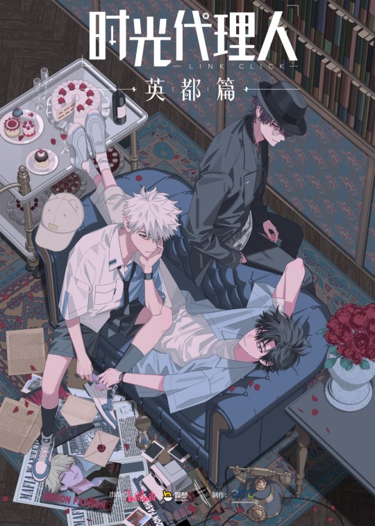
TRIP ABROAD TURNS INTO BUTTERFLY EFFECT
First thing worth mentioning is that the prime color in this artwork is pale blue. I feel like it's quite rare, most of INPLICK arts for Link Click have the same palette: burgundy red, shades of gray and black (except for the whole Surprise Beat thing which is splashed with flashy pink). All but this one:
(probably when they were 17 or sth)
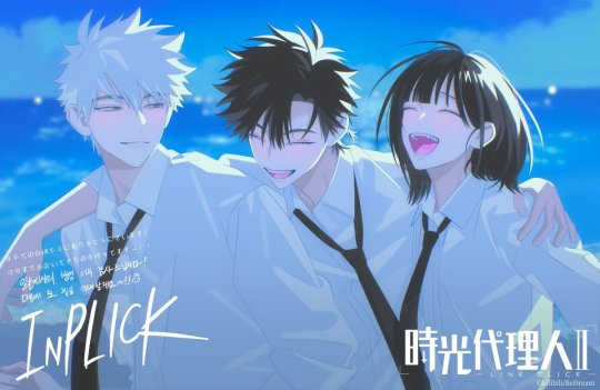
For the sake of the argument, let's say it is a significant distinction to make. The reason is simple: the teaser of the airport scene and the trailer prove that shit started three years ago, when CXS and LG made a trip after graduation. If this chronology is correct, then blue probably symbolizes Lu Guang's innocence or happiness. Blue used to paint Lu Guang but now he only sees the world in black, white and red. In the birthday official arts, blue is associated with his character. His flower is freaking Forget-Me-Not; Myosotis.
So yes, that's why I think the color palette here is relevant to the time period we're going to explore in the Yingdu Chapter.
The couch itself is blue when we're so used to the pair sitting on a brick sofa. The cakes and the flowers are the usual shade of red, though.
On the table: red roses in a vase. Petals are all over the place. Ominous.
On the trolley: 1 bottle of wine, 2 CXS's feet, 3 glasses, 4 cakes, 5 individual desserts. The glass half full is Liu Xiao's, since it isn't on the trolley in the original artwork he is absent from. I said it in another post but the plate counts 4 portions, as in 4 antagonists, while the pudding might be Lu Guang's. The cakes are probably metaphors for timelines/curves, clocks dressed as desserts with a red fruit representing a dead Cheng Xiaoshi. V and VI are the only missing parts, just like Qiao Ling's one. CXS put his feet on the trail and I think it's both funny and tragic. I believe the correct saying is "put his foot in his mouth" but in french we say "mettre les pieds dans le plat", which literally translates "to put his feet in the plate" (to say something brutal with no tact or to do something stupid without thinking it through). He has both feet nearing timeline cakes and his head is five inches away from doomed flowers.
On the floor: 1 vintage phone. 1 camera. 2 envelopes, 3 pages of letters. 4 polaroids. Probably: 2 magazines and 3 pages of newspapers. The vintage phone could be relevant to THE TIDES, era-wise. The camera is taking polaroids and two of them are still dark, meaning they just took a shot and are yet to be revealed. The rest must be related to this chapter's plot. So much for holidays, guys (are they investigating CXS' missing parents?)
If you look closely, you'll see four different mentions of time:
Lu Guang's watch (hold this thought)
The polaroid: Big Ben
What looks like newspapers
The hourglass
We also have four mentions of information/communication
Letters
The polaroid: a public telephone box
Newspapers/magazines
Vintage phone (I was wondering why the phone had twelve numbers but after some research, I realized that some of them had # and *)
On another note, I don't know if their hands--
I mean, there's something definitely happening here but let's say for the sake of my sanity that what is supposed to be noticed are the sunglasses. If I'm being honest, this is the real oddity here and the teaser weirdly showed them off?? They're standing out because everything else is so blue for one thing.

They're pink-ish, which is close enough to magenta, so one of Lu Guang's colors (cf. Dive Back In Time). The color itself is weird for sunglasses. Lu Guang doesn't care about fashion, he wants practical. As a girl who loves pink sunglasses, I'll tell you: pink is shit at doing sunglasses' job. CXS told him to wear a cat hat, okay, but did he choose every other accessory?? My guess is that the pink served a purpose in connection with light.
And why is Lu Guang's watch on the other wrist in the artwork? I checked and LG wears it on his right wrist in the donghua and manhua. It can be the opposite for some artworks though... Or blocked from view for some reasons. It's almost as if we're not supposed to know which side is the actual reflection. 👀

Something else is reversed here, actually: the colors AND the pocket of Lu Guang's shirt. It could be a mistake, though.
>>>>> Basically, I think the artwork is telling us that the Yingdu Chapter is going to hurt and make us cry. If we're indeed about to see Lu Guang lose his humanity to try and save Cheng Xiaoshi for the first time therefore destroying worlds, I have no doubt it would be after Infinite Sadness™.
The real question this teaser isn't answering is either we'll go through the original timeline or a rewind. The last episode of season 2 makes me frown. How to be sure that the Lu Guang who dives exists before and not after the events we see unfold for two seasons? Is Yingdu Chapter a flash black or an actual dive itself? Lu Guang seems to be determinate and in a bad mood in the PV after all, could directly happen after one of CXS's deaths.
EDIT: someone mentioned that LG wears his watch on the left wrist when we get images of CXS getting stabbed. (It hurts right here in my meow meow)

86 notes
·
View notes
Text
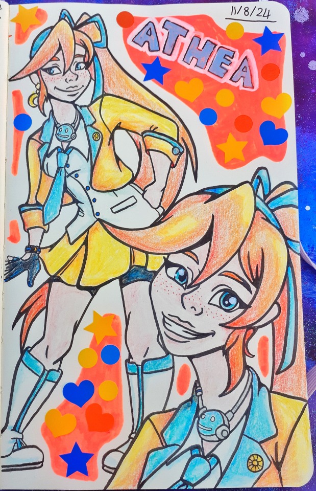
✭ Athena Cykes ✭
(another sketch and spoilers for case 6-4 below)
Today I felt like drawing Athena because I really like her colour palette and, have grown to enjoy her character more. Plus I have wanted to do a minor re-design of her outfit for a while as there were small things I wanted to change. Main one being her jacket cuz, why tf do we have a gold button on yellow!? Maybe I'm just too obsessed with having contrasting colours in art, but given the jacket already has blue accents, why not add more? Also made her boots taller (not the biggest fan of her boots but I didn't want to change too much cuz they suit her cuz they look like moon boots imo) and gave her black bike shorts instead of the black tights cuz, the black tights just looked weird to me :/ so it was purely a personal preference thing :P
I enjoyed drawing this a lot and kinda want to do more pages like this of AA characters, but no promises! If I do more characters I'll probably start with more Wright anything agency members and branch out from there if I still feel motivated to :3
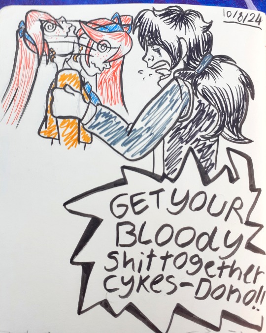
Yesterday I did the sketch above because I was in the mood to draw comics but, only did this cuz drawing comics traditionally is a lot harder than digitally (and I've yet to get my drawing tablet out of storage) so I did something simple to scratch that itch. It's of course based off that moment in case 6-4 when Simon fucken jump scares the player and shakes Athena!?
Truly iconic moment, than again Simon is so iconic for the whole case, that man is now my favourite co-counsel which I kinda feel bad about cuz all the "weird girls" are super iconic characters and I like their characters overall more than Simon (yes all of them) but, if we're talking just as a co-counsel, he's my favourite. His dialogue alone made 6-4 go from meh to good for me.
#ace attorney#ace attorney art#ace attorney fanart#athena cykes#simon blackquill#aa5#aa6#aa#artists on tumblr#traditional art#sketchbook art#sketchbook page#cyanaa#cyansketchbook#cyanart#cyanfanart
52 notes
·
View notes
Note
I really love what you do with the colors pallets. I was wondering if you had any tips on how todo them? I over complicate things, and I feel like I can’t do the pallets right, like is there a certain rule on color placement? Like the darker colour goes in the background, lighter further front?
… sorry 😭, other artists just make pallets look so easy, would you recommend using 3 or 2 colors to start with?
Sorry for babbling and thanks again 😂, honestly love seeing your art 😙, also, if someone wanted to gives your art/fic would you mind if they tagged you or would sending it in an ask be better?
I’m still very new to choosing my own pallets. As for order, often I find the “pop”, or most saturated color works good for the background. Then for the characters, a less saturated version of the compliment color….or one that just looks nice. Then I do a light color for the eyes and any other elements I wanna emphasize. Lineart is done in black and then just alpha lock->fill layer with a color and slide around the adjustments until I’m happy. There’s not really a particular number of colors I think looks best, but I’m starting to like five color pallets. You can do three or even two, but five gives you some breathing room for variety.
A lot of it really is just what looks nice. I hate to say that, but there’s not an exact science behind it. Yes, you have to have knowledge of color theory, but also…It is just training your eye. Studying other people’s palettes, figuring out what rules they’re following, and how to play with and bend those rules.
This is why I will often go into the “color palett” tag for a starting point. But as a way to make them my own…I’ll do each color on its own layer. This way, I can change the hue/saturation/brightness and change, change, change, change, change until I’m satisfied. So much of the process is just playing. Play with one color, hop to another layer, play with that color, hop back to the other and adjust it slightly. And so forth. It sounds like a lot of time, but you get faster the more you practice.
This most recent color pallet actually started off as the THIRD row of colors, and then I just adjusted it until it was different, but still satisfying to me.
Finally I added one solid color (for this one I believe it ended up being a dark blue) above all the layers, and then just cycled through each of the adjustment layer types, until I found the one that looked the best. This last step is the clincher for tying all the colors together, and making them look cohesive.
Then colors are picked and saved. New pallet to use in the future!
138 notes
·
View notes
Text
✨ EDMON RAMPART (Amalthia's Version) ✨ You know I once swore to never draw him, well that was of course before he got the James Norrington treatment so it's the Alexsandr Kallus Effect for me again. Talk about from fuck this man to I wanna fuck this man.
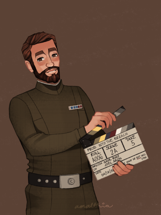
Teeny weeny fandom salt and salt in general coming up so if you don't like that, you can go scroll down. There used to be a cut here but I removed it. I will always be polite, but I know WHEN to talk.
From now on, I will be calling my fanart "Amalthia's version". I hope I don't come across as tone deaf or insensitive about this, but I wish I was good at art.
I've seen posts that say "I wish artists would stop drawing [character name] with [this] or [that]" or "stop drawing [character] with [this]". While it's great to hear about your preferences, please bear in mind that at the end of the day, fanart CAN BE an artist's take on a character. For me, THIS is how I draw Edmon Rampart. This is with regard to the art style I developed and the color palette that I constantly use to keep up with my blog's theme.
Another ick is an ongoing issue in the TBB fandom. In my Hunter and Omega art, I did something I don't usually do, which is add a secondary light source. A few minutes after posting, I got an anon telling me to unwhitewash the characters. I immediately messaged one of my friends for their honest opinion and they said I don't whitewash the characters. I went on to the drawing file and tried to study my own drawing and see if I really did whitewashed the characters. Edit: There really are some artists who whitewash the characters and I was trying to do a SELF-CHECK bec maybe I'm one of them.
I found out that the thing that made the difference is the secondary light source that I added. This secondary light source is lighter in color than their skin, and it created the Contrast Effect. Due to the nature of the human eye and visual processing by the brain, there's an optical illusion that the same color will look different depending on the color beside it and/or the background. It's in psychology class, paying attention would help.
In addition to the secondary light, it could also be the brown background color that caused this effect. And before anyone goes, "are you sure?" Yes, I am. I sat with a Psychology major to discuss about this whole Contract Effect thing.
This does not only apply in colors, it could also be to objects, that why they say all things are relative. One thing could appear bigger or smaller depending upon the object beside it. One of the things they 'check' to see if a certain artist whitewashed a character is the size of the nose. Once again, please do apply Contrast Effect. Some artist really draw their characters stick-like so try to compare all the noses they had drawn in their entire lifetimes and maybe, just maybe they did draw the noses wide in comparison to their other artworks, it just looks like that because it's part of their art style.
Edit: Please do try to analyze things first before casting down your judgement.
It's so difficult to be an artist AND IN THIS FANDOM. We never seem to be enough. If we do the character with artistic freedom, you'll say "stop drawing them like that bec they don't have that in the show" and when we try to draw them as close to the show, you'll say "unwhitewash the characters". We are never good enough for you.
So yeah, I wish I was good at this.
Link to the rest of this series:
1 || 2 || 3 || 4 || 5 || 6 || 7 || 8 || 9 || 10 || 11 || 12 || 13 || 14 || 15
#i'm gonna add this tag: AMALTHIA IS ANGRY#the bad batch#the bad batch season 3#the bad batch s3#tbb s3 spoilers#tbb rampart#edmon rampart#yeah i'm not tagging vice admiral rampart#HE'S BEEN DEMOTED#tbb#star wars#small artist#artists on tumblr#amalthiaph#the bad batch actors au
122 notes
·
View notes
Note
I heard thoe like Hypersomnia? Could that be true?
*quietly slides a yapping card across the table
takes your yapping card and adds it to my probably not all that legal collection of yapping cards. pleasure doing business
that it IS!!!!!!!!! (for those who don’t know, hypersomnia is ink x error x dream poly). anyway I LOVE HYPERSOMNIA. so much so that i was the one to coin the ship name hypersomnia and then became incredibly obnoxious about it ever since.
i think theyre perfect in every way. to me the initial appeal came from loving drink and errorink equally and being a fan of insomnia so why not smash em together? and then i looked deeper into it and Yes i love them.
my biggest propaganda for them is the fact that with hypersomnia, palette, pj, and gradient can exist as siblings without ink being divorced or a shitty dad, both of which im not a fan of. but then we go outside of ship kid territory and think about them and they work SO WELL THERE TOO.
the dynamic feels equal. dream and ink provide physical touch for each other so error doesn’t feel pressured, dream and error provide the romantic feelings for each other while ink is aro, and ink and error both can’t be read feelings-wise because ink has no soul and while not canon I like to think error’s soul is to corrupted for Dream to get a read on, so he feels that they’re not dating him for his aura and rather for him as a person.
and they’re FUN. and lowkey domestic in a sense too like. dream and error bond over spanish tv while ink draws them both so he keeps quiet during the show and doesn’t ramble on. dream listening to both his partners rant on about things they like while he just sits and listens with a genuine smile. movie nights? all the time. they share a big bed, but error’s part is sectioned off with pillows so he feels comfortable, though on days it feels too suffocating he sleeps in a hammock in the room. dream is injured in battle? don’t worry his husbands are the protector of universes and destroyer of worlds. ink is canonically a pretty lonely character—and while he doesn’t mind it per se, nobody ever sees his art. but now he’s got not one but TWO partners to look at his drawings!!!
AND INKS DADS!!!!!!! ASTER AND TOP HAVE TWO SONS IN LAWS!!!!!!!!! and they are SO supportive and they love dream and error and are very happy ink found people that love him for his weirdness and not ‘in spite of it’.
truce or modern au? nightmare does Not Like Them, on the contrary. and it’s funny. hijinks ensue. passive/uncorrupted or otherwise, he does not like them for one reason or another. thinks they have bad intentions, just doesn’t think they’re right, bad influences, or maybe he’s just scared he’ll lose dream and be alone. NIGHTMARE ANGST. YOU GUYS LIKE THAT RIGHT???????
need more appeal? just take whatever you like about drink, errorink, and insomnia and mash it together CAUSE THATS WHAT THEY ARE!!!!!! they are SOULMATES. TRUST ME they said so themselves.
literally any au version or interpretation only furthers the appeal. dream has wings? error uses his feathers in his dolls to make doll-dream’s wings ‘accurate’, and ink uses them in art (plus group preening, and error likes touching Dream’s fallen feathers bc he sorta knows how Dream feels now even if they’ve never/hardly touched).
fgod error/fgoc ink? dream is supportive of both of them and sympathizes with their roles (iirc dreamtale operates in a world where error’s job is necessary and not out of insanity so this is accurate too).
shattered dream and emotionless ink? great they can be 3 evil fucked up boyfriends because error is flexible like that and i like a bit of evil every so often.
it’s all great. they’re perfect. and they’re SO sweet to each other and they absolutely garden together. and every day past 6pm they sit down in the living area and error crochets/sews while ink draws and dream. aw fuck i forgot what dream does but he does some creative thing. whatever. and they take care of their kids together and they’re the BEST dads to EVER EXIST!!!!!!!! and they’re perfect and they love each other and they have rings with gems that they picked out cause they’re married. ok i know you wanted me to yap but this is too long SORRY!!!!!!!!HOPE U ENJOYED IG??
#hypersomnia ship#dream sans#ink sans#error sans#REMINDER TO NOT JUST TAG IT AS HYPERSOMNIA!!!!! add -ship to clarify as hypersomnia is a symptom like insomnia and itll be improperly tagged#sanshipping#sanscest#utmv#undertale#drink ship#insomnia ship#errorink
55 notes
·
View notes
Last Seen Blogs

dybrach
阿尼卡

angryclampursebanana
Untitled

munimunawrites
munimunawrites

celestial-astrology
Starry Eyes and Galaxy Minds
modellistamagazine
ModeillistaMAG