#after effect bounce effect tutorial
Text
Hats

For the sake of this blog I'm going to assume that people know about gameplay mechanics, such as hats and weapons, from A Hat in Time. But in case they don't, I will restate them as they function the same in this au.
Hats are a gameplay mechanic that allows Hat Kid to interact with her environments in unique and fashionable ways. In AHF specificly, Hats are made by collecting yarn and finding blueprints. Once a blueprint for a new Hat is acquired, Hat Kid can use yarn she is able to find around the different chapter locations to make said hat.
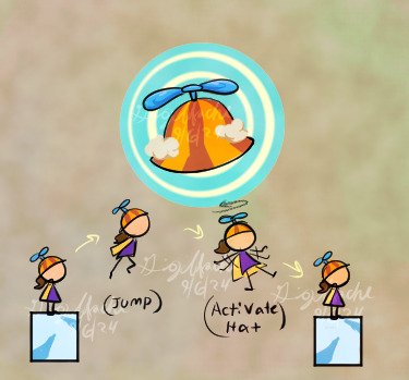
Hats are activated by pressing a button or key on the player's choice of controller. Some hats may have a cooldown effect after being used, which can vary in length. This was present in A Hat in Time.
Types of hats
Kid's Hat: This hat is the only hat not earned from a blueprint, but is instead acquired during the tutorial phase. This hat is able to locate goal-related objects, such as timepieces, plot related items, or boss locations.
Sprint Hat: This hat allows the player to run faster, which is useful in boss fights or time-based challenges like those in Death Wish missions. When paired with some badges, the Hat will gain a cosmetic change where instead of running, Hat Kid will instead ride on a scooter.
Brewing Hat: This hat allows Hat Kid to throw an explosive ranged attack. This is good for bossfights or enemies you don't want to get close to.
Ice Hat: This hat turns Hat Kid into an ice sculpture, how cool! If activated over a spring or launch pad, hat Kid will be able to bounce incredibly high. If activated near enemies, an icy shockwave will slip them up and make them tumble to the floor.
Dweller Mask: This mask allows Hat Kid to manipulate solid blue and transparent green platforms so that she may cross them.
Timestop Hat: This hat allows Hat Kid to freeze time for a few seconds. This can give her a leg up in speed-centered platforming areas, races, or can help her bypass fast moving objects.
Hover Hat(New to AHF): Based on the cut concept from A Hat in Time, this hat allows Hat Kid to glide for a few seconds after activation. Once the hat activates, Hat Kid will slowly drift downwards, and can move in any direction. The length of this glide can help her reach far-away platforms. This hat functions like a tanuki leaf power up in the Mario 3D land/world games.
Gravity Hat(New to AHF): This hat allows Hat Kid to reach high vertical platforms when activated. In this brief state, Hat Kid's movement is slowed, and she will be unable to attack.

Yarn and Blueprints


Unlike in the original Hat in Time game, Hats are not obtained by collecting certain types if yarn and having a certain amount of yarn required to stitch the hat.
In the au, Hat Kid can obtain blueprints, which are instructions on how to make new hats. These can be obtained in treasure chests, secret rooms, or are given to hat Kid as a means of plot progression.
Hat Kid can't just make a new hat by collecting a blueprints though, as the instructions on the blueprints require yarn. Yarn is a collectable item and consumable resource placed around the different chapters of the game. Once Hat Kid collects enough yarn, she can use said yarn to make the hats blueprints allow her to make.
30 notes
·
View notes
Text
easy rain tutorial (ft a wip scene redraw)


detailed description beneath cut
fill the canvas white and use the glitch effect on it.
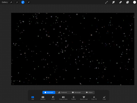
after this, select the white space between and either drag it off your screen or just flat out delete it. This should leave the little glitchy bits.
alpha lock your layer, and fill the layer white.
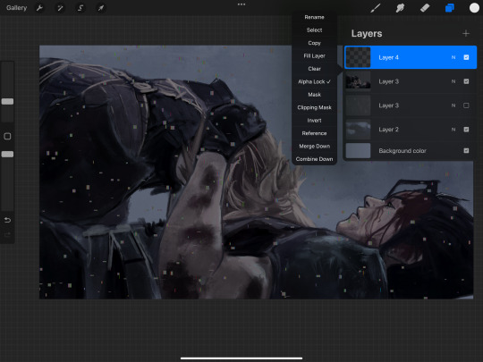
then all you gotta do is motion blur it to what you like and erase rain drops you don't like and add some bouncing droplets.
I'm still working on this wip. happy birthday or something
#roadstostray#art tutorial#rain tutorial#final fantasy vii#zack fair#cloud strife#I'm still working on this piece but hey#a taste for you
19 notes
·
View notes
Note
Your VTM comic book covers are simply GORGEOUS, I'm totally in awe! How did you get the super cool halftone/coloured dots effect? It looks super cool and realistic, I love it! Have a lovely day! :)
Thank you so much!
So to get the halftones, I use an old-ass tutorial I got off deviantArt literally....more than a decade ago? (Rosalarian's Golden Age Tutorial). The account appears to be deactivated, but I'll go through the steps here:
For reference, I bounce between Clip Studio Paint and a very old-ass copy of Photoshop, but if you're using other programs that have fun pixelate filters and you can change the color mode, you should be ok.
NOW...
Ink your drawing in straight black on its own layer
Block your colors on another layer (I hunted up some old comic color palettes thanks to madformidcentury dot com/2013/10/mid-century-color-palette-in-comics dot html)
Turn off any and all blackwork (this is INCREDIBLY important), and take your colorwork into Photoshop. (if there are any gaps in your color work, fill a separate layer with white and then merge the layers so it's all solid)
Set the mode to CMYK
Go to Artistic Filters >> Pixelate >> Color Halftone (the only thing I mess around with is the size of the dots; the default for my era of Photoshop is 8 and that's a lil big for my taste--all the VTM covers are between 4-6. It's up to your own best judgement, but I go by how "readable" things look--does the face still look like a face at a reasonable distance or is it just a smudge? If it's not readable, undo and change your dot size)
Add 3 new layers to your document and LABEL THEM: Cyan, Magenta, and Yellow
Then go to your channels panel and click on the Cyan layer to make a selection of it
Back to your Layers panel, make sure you're on your Cyan layer, and SELECT INVERSE
Then FILL the selection with the CMYK cyan that you've picked out
Deselect your selection, move to the next layer (and make sure you've got CMYK magenta in your bucket) and repeat steps 6-8 selecting Magenta and Yellow respectively
NOW you've got the beginnings of retro-feeling halftone. At this point, I import the halftone manipulation back into CSP and turn my blackwork back on.
For the ✨ grunge ✨ effect, I grab an old paper texture (after reducing its saturation and upping the contrast until it's mostly black and white splotchy) and set it to OVERLAY at anywhere from 50-20% (this is a 'let your soul decide' moment) over the whole thing
Then I grab another old paper texture and put underneath the Overlay Texture Layer, on MULTIPLY, at anywhere from 65-25% (again, let your soul decide). Both layers will give you a nice level of funk to go with your halftone shenanigans
A lot of the colorwork is going back and forth and back and forth because what looked ok in flats didn't translate after toning, but it works out eventually!
Some important things to remember:
Cool tones tend to fade back and warm tones tend to move forward if you're gonna use this method on any kind of scene
Keep your shapes SIMPLE; don't get bogged down in tones of gradients and fades and all of that because most of it WILL NOT come across once you start toning! Think of it this way: mass-production doesn't have time for fine detail, that's why comics are a lot of heavy black inks and flat color contrast
Experiment with the colors! You're working in a limited palette (if you're using any of the old Marvel/DC print books especially), and it doesn't have to be photorealistic/absolute. For instance, my Nos isn't actually green, but the tone suited the funky retro vibe so I went with it!
Let yourself fall down the research rabbit hole of pulp covers because they're both hilarious and informative. Same dot energy is an interesting collection website to go through, you can also go through your search engine (remember to add -pinterest -youtube to your search term to filter out that crapola)
HAVE FUN!
💖
24 notes
·
View notes
Note
Favorite hair brushes for heat styling and for everyday use?


This is my full collection of hairbrushes! It’s quite a lot, but I use each one for different purposes and I like the curation of tools I’ve made for myself. Some of them aren’t really necessary, but I’ve collected them over the years and I really like having them in my toolkit.
Bondi Boost Infrared Thermal Bounce Brush: this is the heated brush that I use most often. It’s really easy to use, it gives me a lot of control over the curl, and the infrared technology makes my hair feel less damaged and more moisturised than other heated brush options out there. I can run this through my hair quickly, pin up the curls or roll them into velcro rollers, and be left with bouncy hair and minimal heat damage. Tutorial here.
Shark Smooth Style Hot Brush: this brush is the best on the market for blow-dry brushes, it’s much better than the Revlon brush and I’d recommend it to anyone looking to buy a blow-dry brush. I use this brush to dry my hair quickly after washing because it has a ‘drying’ setting that takes my hair from wet to dry without any damage, and I like that it has other heat settings and a ‘smoothing’ mode for when I need to style my hair in a hurry or with limited resources. Tutorial here.
Pro Blo CurlME Brush Set: I love these brushes and I really recommend them to anyone who hasn’t mastered the art of an old-fashioned blowout just yet. The brush heads can be released after styling and rolling to become rollers, and be clipped up in exactly the same way as traditional velcro rollers. They come in various sizes, and they just really help with navigating that tricky interim moment between styling your hair with a brush, and transferring the curl onto a roller. Tutorial here.
YS Park G-Series Curl Shine Round Brushes: these are the best traditional round brushes in the world, in my opinion, and they’re 100% worth the investment. They have a combination of nylon and boar bristles, and I’ve never known any other brush as amazing for creating and holding tension whilst blow-drying, or giving such an incredible shine to the hair. These are, hands-down, the best if you’re looking to give yourself a blowout worthy of the highest salons. Tutorial here.
Vodana Gorgeous Root Volume Stick Brush: I really like these impossibly tiny root brushes from Korea (I have a slightly larger one from Fillimilli as well) for detailing and creating some amazing natural volume at my roots. When used correctly, they almost mimic the effect of a root perm, and although they have a bit of a learning curve, I love to include them in my routine. Tutorial here.
Denman D79 Thermoceramic Straightening Brush: if you’re the kind of girl who likes a super-sleek, straight look, then you need to get your hands on this brush. It works with much the same mechanism as a flat-iron hot straightener, and I recommend using it by ‘following’ the pass of the hot iron down the strand of hair with the brush, but it can also be used with a blow-dryer, as shown here. The bristles clamp together to set your style, distribute products and oils, and give the hair a gorgeous shine. Tutorial here.
Mark Hill Wonder Ball Brush: I have the brush from Mark Hill, but basically any spherical brush will work in exactly the same way, the brand doesn’t matter. This is a really good brush for rough-drying your hair on days when you want a lot of volume, or you’ve applied a lot of mousse or other products at your roots in particular. It’s also great for creating and defining curls, as shown here. It’s not an essential brush, and I honestly only use it for rough-drying (it somehow works especially well when blowing-dry your hair upside-down), but it makes my life a bit easier and my hair look a lot better. Tutorial here.
That Girl That Did Your Hair Can You Knot Brush: this is maybe the most unnecessary brush that I own, but it was a gift from a friend so I feel I’m sort of justified in owning it. All I use it for is applying and distributing styling products. It’s actually a good detangler, too, and I’d recommend it to girls who have especially fragile hair or sensitive scalps, but I prefer other brushes for that purpose. Where it shines, for me, is in that I can spray a big dollop of mousse all over the brush, and brush it through my hair, and it distributes everything perfectly evenly, and is very easy to wash afterwards. Tutorial here.
Fillimilli Root Volume Brush: another little Korean brush I bought with the intention of boosting my roots, and this one works so well without the learning curve of the tiny round brushes. It’s just the right size to cover a decent area whilst still allowing you a lot of control, and I use it to give height and lift at the crown of my head and around my parting, by brushing through, pushing the hair back ‘up’ on the brush, spraying with hairspray, and then blasting with hot and cold air. It sounds complicated but is actually really easy and beginner-friendly; a video will explain the technique much better than my words can. Tutorial here.
Ibiza Hair AirWave Shower Brush: I used to use a WetBrush, but it broke on me frequently, so I did some research and came up with the AirWave instead, which is much better, in my opinion. I use my AirWave when washing my hair to distribute treatments/masks/conditioners, and it works absolutely perfectly for this purpose, and really helps to lather up and properly apply my products. It’s also amazing for detangling even very knotted hair—it works similarly to, but better than, the new viral UnBrush. Tutorial here.
Michael van Clarke №1 Brush: this brush is my favourite all-purpose brush and the one that I travel with, but for everyday use, I like using this brush to brush out curls, detangle my hair at the end of the day, and brush out styling products. It’s extremely gentle, and the bristles are designed to be extra-long, so they’re able to properly get into the depths of the hair and remove excess product, especially dry shampoo, and my scalp is reasonably clear of the day’s debris and I can apply my nighttime treatments. Tutorial here (focus on removing dry shampoo here).
Mason Pearson Large Extra Boar Bristle Hairbrush B1: this is the brush I would save from a burning building, and not only because it’s so insanely expensive! I have no idea whether it’s a placebo effect, or whether Mason Pearson do genuinely put some magic into their brushes, but this brush works wonders for my hair that other 100% boar bristle brushes have never been able to meet. It gives my hair the most incredible shine, and my hair is so much softer and healthier for its regular use. I try to brush my hair with this brush for 100 strokes, from root to end, every night before I braid it or put it into heatless curls and put on my silk bonnet, and it really does do something for my hair. Tutorial here.
3 notes
·
View notes
Note
Would you do a shading tutorial? How do you set the light and that wonderful white glow? What brushes are good and what program do you prefer? It would be nice if you could teach us how to do it so nicely 🥺 (btw Have a nice day!)
You too!
And sure! I love talking about art! Gonna put a keep reading on this one, though, it's gonna get a little long:
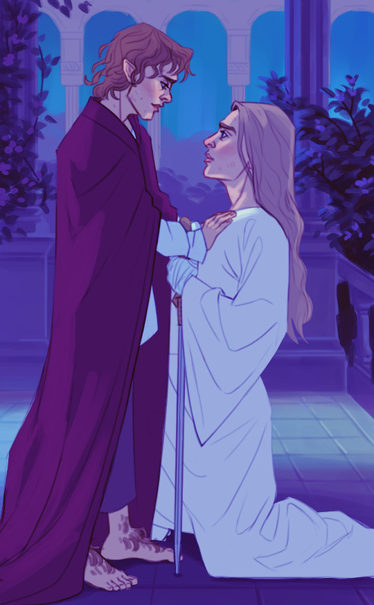
So, before I do any kind of shading or lighting I build up the illustration to this point, where I've settled on what the base shapes look like and what kind of colors I want to use as a base:

Once I have those local flat colors down, I do a pass of initial light and shadow before I start painting for real. This usually consists of multiple layers layered on top of each other, set to the multiply blending mode (that I totally always name and didn't do so after the fact for educational purposes). What multiply tends to do is darken and blend your colors with whatever color you put on the multiply layer. In this case it makes the color darker with a blueish tint.
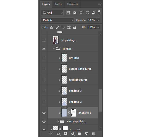
Not sure how to explain this process if you've never used an editing software before, but I think it's fairly similar no matter what program you use. I lock the layers to the grouped flats so the shadows and light only appear on the figures and not on the whole canvas.
When painting it's usually a good idea to go from big shapes to small. I tend to flood the object(s) with whatever is my shadow color and then "carve out" the lights using a mask. You can just erase away if you want, but I recommend learning about how masks work because then you can more easily play around with the shapes.
I've noticed that doing it this way creates bigger and more consistent shapes rather than doing it the other way around. It also shortcuts you right into dramatic lighting territory lol, which was the goal here.
After that it's simply a matter of creating more layers with the same multiply setting to deepen shadows wherever it's needed. I also might add something like bounce light, subsurface scattering, ambient or secondary light sources to give some more life to the colors.

Final stage is render and clean-up, where I merge all of the shadow/lighting layers with the flats and lineart to have the entire object on one layer. I was terrified of doing this for the longest time, but it really makes the process so much easier. I always leave a copy of the original setup layers should I need to go back to it.
At this point most of your colors, shadows and lights have been sorted out so you can simply color pick from the source as you paint.

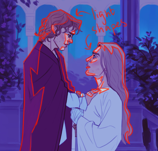
This is also where I add the rim light! Super effective way to make your object pop and add some drama! It's a fairly straight-forward process where you sort of outline the object with what is usually a pretty stark contrasting color. Don't forget that rim lights are *not* outlines, though! It's a light source, so it affects the object just like any other light. It doesn't only hug the outline of the object, but seeps into it at points where the light can reach:

You can play around with different blending modes for lighting, sometimes you get a really cool effect!
Lastly, that faint glow? Just a layer of using a soft airbrush in the same color as the light and paint it on top. Don't lock this layer to the object so that you can have the brush spill out a bit around the edges to create that soft glow effect.
And then you're pretty much done! There's a lot more to it, but I'd say that's a simple breakdown of how I usually approach paintings in the shading/lighting stage.
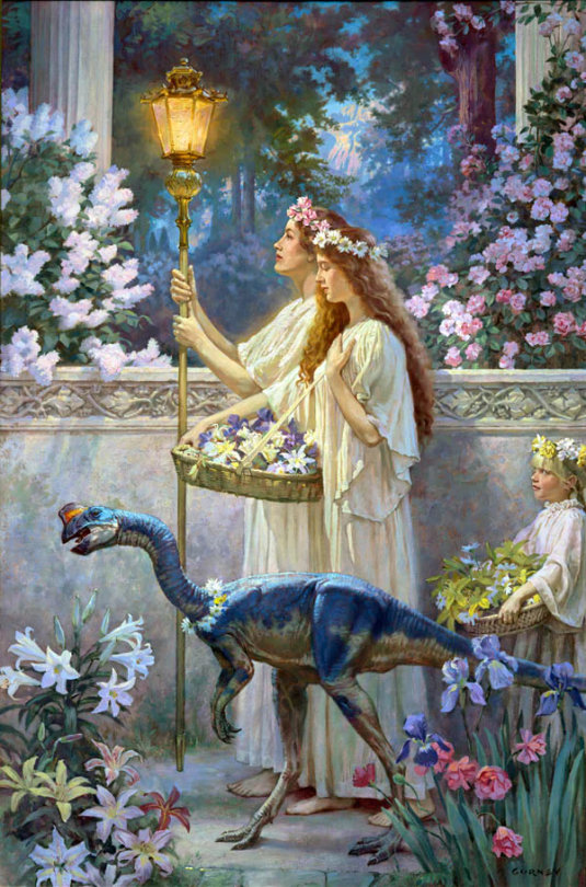
I don't make things out of thin air, though. One of the most important aspects of painting and drawing is reference! Go look at nature! Look at tons of paintings, drawings, photographs, illustrations and anything else that inspires you. For this particular piece I was very inspired by "The Garden of Hope" by James Gurney.
As for brushes and program it doesn't matter too much honestly, I'd say use whatever you're comfortable with. I still use Photoshop against my better judgement out of habit, but there's a bunch of alternatives out there like Procreate or Clip Studio Paint. You could also use something like Krita if you don't want to pay for it.
In my case I almost exclusively use the hard round brush (and airbrush as needed) that's default in Photoshop because it works fine for the kind of style I tend to go for, but there's....thousands of brushes out there. Just google it, you'll find free packs. Kyle T Webster has a pack that's pretty well-known, and that I also use occasionally. I'd say start with what's in the program of your choice by default, just to get a feel for it. It's easy to become overwhelmed by all the textures and shapes of custom brushes, but it can also be a lot of fun to play with so go ham if you want!
Hope that was somewhat helpful!
3 notes
·
View notes
Note
HEY HEY HI Ive been entranced with your animation of the death row animation meme!! how did you do that kind of animation in blender? is there a tutorial you found or something like that? I havent been able 2 find anything yet...
HIIII HIIII!!! MAN that's an oldie but goodie, I still dig it after 1.5 years
Here's the video for those who haven't seen it
youtube
stuff abt how I do it is under the read more :3
SO, the animation is done as a combination of both shapekeys and rigging! I won't go in depth with shortcut keys n shit as it would make this post ALOT longer so bare with me as I try not to sound like I lost my mind.
Much like how one would do a tween animation, I make each part of the character. Earlier work of this tech like death row, I spread it around on one file, but you can save each part separately.
The next part is that I cut out the peice from the empty space with the knife tool. While it may be easier to just save the limb as it is, I usually work with a 1920x1080 canvas for composition planning AND helps me make good topology for the limb if I need to bend it a certain way.
Here's a diagram of what I mean. Each face/polygon has 4 points so I work it out by making a tube first before adding additional cuts.
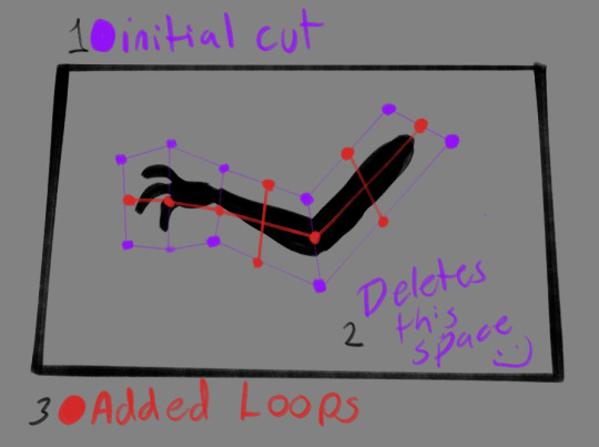
From there I'll use the sub devision modifier and Amp it up to like 2-3 depending on how much you want it to bend/deform. YOU MAY NEED TO ADD MORE LOOP CUTS as the modifier WILL deform the textures. You can adjust to whatever till the textures aren't deformed and it's dense enough to your desires :]
FROM THERE I have two shapekeys, one where it deform her enough to look to the left and one where she's looking up. I just used the sculpt tools to get the desired effect-- that's why it looks like it's done in 3d but isn't! I also have a bone that rigs part of the mesh to give her an additional bounce. From there you can aniamte the value of the shapekeys as well as the bones itself!
From there you just need to layer them as if they're paper and rig em up! You can learn rigging on your own as I am SHIT at explaining that process- but know you don't need alot of bones! The spaces i have between the layers are REAAAALLY close. Not close that its ALL flat but enough so that it doesn't distort the sizing on camera (though you can change the mode to not show perspective lol)
While I don't have a demonstration of the keys, I do have the BTS look of the animation to prove its all layers
You could easily do this shit with Adobe after effects but that shit is HEAVYY and if you have QuickTime, its easy to render out transparent videos with blender :3
I do wanna make a video abt this if I ever make another animation with these methods-- hope this helps!
8 notes
·
View notes
Text
Daydream Skies Devlog #3
WELL WELLL WELLLLL I have been hard at work during the PIGSquad Finish Your Game Jam with the hopes of spending the jam time to polish up and finish my combat system! While I didn't get absolutely everything done (turns out RPGs are like, a lot of systems and numbers who could have guessed) I sure did make a lot of progress and got probably 80% of the way to having the combat system in a place where it only requires content from me rather than systems design.
So what did I get done? Glad you asked!
First, here's where we started at the beginning of the jam:
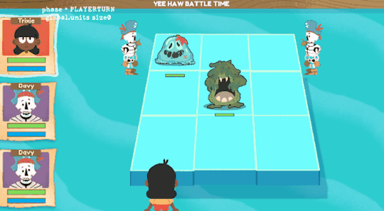
I had basic attacks (attacking in 1 line) and attacking in different shapes (the x shape) as well as 1 enemy type that did just a basic attack itself. Players and enemies all took turns based on their speed values and all executed at the same time.
First, I came to the quick realization that just throwing every unit into a pool and taking their turn based on their speed would not work design-wise for this game. With placement on the grid being an important mechanic, I couldn't make sense of having an enemy potentially move where they are located before the player had a chance to proc their attack on that tile. So this meant separating player turns and enemy turns entirely.

What I thought would be a very grueling re-architecture task ended up taking me 15 minutes. (Turns out, all the tutorials that showed me how to more modularly construct my code were RIGHT??? :O) So now we had enemies taking their turns squarely after the player.
After thise, I wanted to create animations for the seaslime, my "complete" enemy to communicate better to the player what they were doing. This meant making them an attack and hitstun animation in addition to their idle. I also made a little script to squash and stretch their sprite when they move to a new tile to give them some bounce.

What was next was making a new "type" of enemy. I didn't want to use the same type of enemy only doing a regular attack but with slightly differing stats for the whole game. I knew it was time to make "special" attacks. So to start I got our new enemy in. His name is Kelponzo:


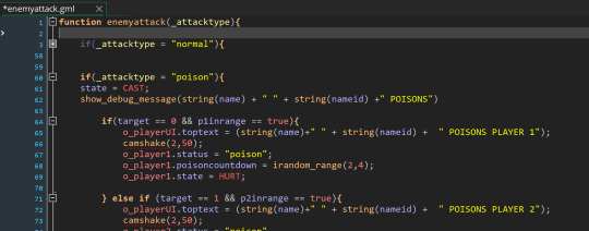
My intentions were to have another common encounter enemy that would teach players about status effects by applying Poison to a player if none of them were already poisoned. This resulted in the much needed "enemyattack" script where I could store information about any different type of attack I came up with now or in the future.
Setting up the poison counter and damage taken to the player was pretty simple. Once I had the enemy AI and attack figured out, it was smooth sailing and we officially had 2 different types of enemies with the structure in place to make any different AI or attack types that I wanted.
Being poisoned of course meant that I needed to make edits to the player's portraits during combat to better communicate status effects. So I give you:
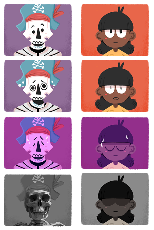
I couldn't think of a better way to make a skeleton look *more* dead.
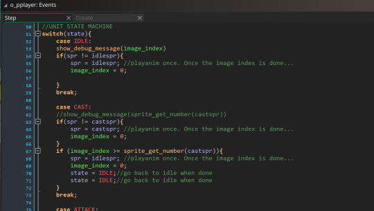
After this, it was really about getting as much polish done as possible. I wanted to animate both trixie and davy next to the grid during combat. I didn't quite get all these animations done but I got them *at least* penciled out with idle, attack, cast, and hit stun animations and a fancy new state machine to take care of all of them.
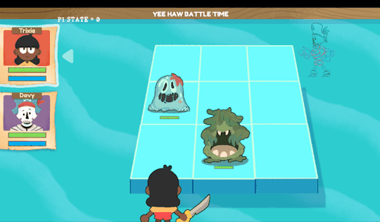
look at them all wiggling.
What other things did I do? I made a lightning attack animation and added attack "types" and type weaknesses for enemies. I did a little (but not enough) work in timing out actions and adding pauses between things so someone who isn't me can understand what's going on during a turn. I am quickly realizing that, at least for myself, the most challenging part of programming is telling the computer to "wait a second" and give a little breathing room to digest what is happening.
My next steps are to clean up animations and do another more earnest timing pass on things so that it doesn't feel like enemy and player actions are happening on top of one another too quickly to internalize. Once those steps are taken I can finally play the combat all the way through as intended and do a balance pass on these first to enemies to make sure they're fun. (oh, and I also have to fix the bug where battles just don't end anymore? Truly a problem for a future Marlowe.) Here's a little video of roughly where I left off:
Overall I'm really happy with the progress I made during the jam. Big shoutout to the PIGSquad community for keeping me company during the jam while they all shared progress on their own projects! It was very motivating. It's been almost exactly 1 year since I started working on this game in earnest and I have to say I'm really happy with what I've learned from basically nothing just chipping away at this in my free time. I am so close to just being able to make a demo of this game I can almost taste it and that's the ultimate goal in front of me right now!
Till next time!
-Marlowe
6 notes
·
View notes
Text
Mark Darrah's Memories and Lessons from Dragon Age: Origins
youtube
Former BioWare developer and Executive Producer Mark Darrah talks about the development of Dragon Age: Origins.
Summary below the cut!
Dragon Age: Origins was always conceived as the spiritual successor to Baldur's Gate.
It changed engines several times, starting out on the Neverwinter Nights engine before being merged with Tag. It bounced back and forth between having and not having multiplayer.
The franchise was without a name for a long time while the first game was in development. The name was chosen essentially by compiling lists of fantasy words and smashing them together until "Dragon Age" was chosen. Darrah feels that Dragon Age isn't a perfect name, but it gets the job done.
There weren't actually dragons in the game before the name "Dragon Age" was chosen. The game was effectively "retrofitted" to the name. The archdemon was originally conceived as more of an angel kind of figure (and there's some early concept art in the video that looks more like how Corypheus and the Architect ended being designed).
"Origins are an interesting and troublesome feature," says Darrah, because they "allow you to establish a view upon the world depending on which origin you choose," and they add replay value to the game. From a development perspective though, they are "a bit of a nightmare" because you have to build six different tutorial levels. Tutorials have to be done very late in the process and have a big job of onboarding the player, so they're very labor-intensive. From a perspective of efficiency, multiple origins are not a great idea, but sometimes a "bad idea" ends up being the thing that sets your game apart.
Darrah came over to Origins mid-development after Revolver was canceled.
There was originally an Avvar origin that began in the Korcari Wilds, which was cut from the game before Darrah came to it. Two origins for each playable race was the original plan.
Darrah talks about how when a cut is made, it doesn't necessarily cut the same amount of development resources as it cuts content for the player. The more resources different parts of the game share, the less impact cuts have on development time. By the time he came to Origins, there was very little left that could be cut.
He feels that Orzammar has the most distinctly "Dragon Age" art direction, whereas the rest of the game have a very generic fantasy aesthetic.
Darrah prefers to think of "dark fantasy" as fantasy that deals with darker themes, not simply fantasy that has sex and blood. He thinks that the Dragon Age games have been moving gradually from low dark fantasy to more high epic fantasy.
He cites "Broken Circle" and "Lost in Dreams" as a part of the game that got unintentionally stretched out because the original concept was just the idea of arriving at the tower, and then entering the Fade, without considering what would be in the tower itself. "Luke" [Kristjanson?] then wrote the content that would actually fill the tower, but that additional length to the quest hadn't been considered when it was first considered, so the quest became a lot longer. He also points out that as the mage origin expanded to use more of the tower, "Broken Circle" was affected as well as that was more tower space that needed to be filled.
He cites the Fade as an example of how you need to be careful, when you're building a party-based game, when you decide to take the party away and make the player character fight alone, and some players won't be equipped for them. Expectations may need to be set early if some things are going to be taken away from the player later.
By the time Darrah took over, the story had been written and re-written, and the content mostly just needed to be finished.
He thinks that the job of porting the game to consoles in the late stages of development allowed them an opportunity to get one last good look and re-evaluate things. A longer post-production could probably benefit a lot of games, but he doesn't think that's likely to happen broadly in the industry.
One of the things he's proud of on Origins is how well the project controlled its bugs along the way rather than having a ballooning bug list at the end
He talks about Warden's Quest, a 24-hour play session they ran during Alpha in London, which the player who made it the furthest in 24 hours won a cash prize. There was also a very intense press tour in Europe.
The marketing for Origins really played up the Wardens as the coolest thing ever, and this caused some apparent confusion or disappointment with Dragon Age II when the protagonist was not a Warden. He says that "People market well," meaning that centering the marketing around some kind of image of the playable character tends to be effective, but it can also have its own problems, like giving people the mistaken impression that the player character is more static than they actually are.
EA was used to using up-and-coming pop music artists in their properties when Dragon Age: Origins was coming out, hence the Marilyn Manson trailer and the 30 Seconds to Mars end credits song.
The Shale add-on "The Stone Prisoner" was originally part of something called "Project Ten Dollars," in which an otherwise $10 DLC would come free as a download with a one-time code included with a new copy of the game. This would effectively devalue a used copy of the game by that $10. There was a lot of PR backlash to this tactic, with people believing that the add-on content had been cut from the game purely so that it could be additionally monetized. This wasn't actually true, as Shale had been cut for time limitations by the time the game was completed, but was able to be finished as an add-on before the game shipped. Project Ten Dollars ultimately generated such negative PR that EA discontinued it. Darrah says it was a clever idea, but "if the audience rejects your clever idea, it's not such a clever idea, is it?"
Awakening was in development while the base game was being ported to consoles. It sold well because it had a strong retail presence as an expansion pack and came out not too long after the base game. Expansion packs with a retail presence marketed like a full game (asAwakeningwas) have mostly disappeared.
With the success of the Mass Effect Trilogy remaster, a lot of people have wondered about a remaster of the Dragon Age games. Darrah distinguishes between a remake, which actually affects content, and a remaster, which updates aesthetic aspects of the game like graphics. He thinks a remake is unlikely forDragon Age: Origins,which might require a lot of changes to make it more palatable to present sensibilities; a remaster, on the other hand, could conceivably happen, and any such project would probably end up bringing DA2 along with it. A remaster of Inquisition would be pretty minimal work, since as Darrah points out, it still looks pretty good if you turn all the settings up.
Darrah also talks about his tendency to want to bring balance to a situation, and how he's learned that this can actually polarize a disagreement further by making people feel that they're not being heard. He hopes he's grown out of this habit by now and learned to listen first and let people know they're being heard. In game development, it's important to be able to communicate with people who express things in different ways.
Regarding the next Dragon Age game: Darrah says he sees a lot of similarities to Origins. The project has been in development for a long time and has seen several changes in direction and in leadership. He says he's confident in the team, that no game is the product of one individual's vision but about the collective creativity of a team, and that there is still a team with experience in the IP and a continuity of vision. He also feels that EA learned certain lessons from projects like Mass Effect: Andromeda and Anthem. He encourages fans not to be worried about the game just because any one specific person isn't on it.
#mark darrah#mark darrah on games#dragon age#dragon age origins#dragon age awakening#game dev#bioware#ea#Youtube
19 notes
·
View notes
Text
YouTube can be a powerful tool for enhancing your online business in several ways:

Massive Reach: YouTube is the second-largest search engine in the world (after Google) and has over 2 billion logged-in monthly users. This vast audience gives you the potential to reach a global market and attract a wide range of potential customers.
Visual Engagement: Video content is highly engaging and can convey your brand message more effectively than text or images alone. Videos allow you to showcase your products, services, and their benefits in a dynamic and visually appealing manner.
Building Brand Identity: YouTube helps you establish and reinforce your brand identity. Through videos, you can showcase your company culture, values, and the people behind the business. This creates a personal connection with your audience and fosters trust.
Educational Content: You can create educational videos that provide value to your target audience. Sharing knowledge related to your industry, demonstrating product usage, or addressing common problems can position your business as an authority and build trust with potential customers.
Search Engine Visibility: YouTube videos often appear in Google search results. By optimizing your video titles, descriptions, and tags with relevant keywords, you can improve your online visibility and draw organic traffic to your videos and subsequently to your website.
Storytelling: Videos allow you to tell stories that resonate with your audience. Sharing stories about your brand's journey, customer success stories, or behind-the-scenes content can create an emotional connection and make your business more relatable.
Social Sharing and Virality: Engaging and shareable content has the potential to go viral on platforms like YouTube. Viral videos can lead to a sudden surge in visibility, subscribers, and ultimately, potential customers.
Monetization: If your business model allows for it, you can monetize your YouTube channel through ads, sponsored content, or by promoting your products and services directly within your videos.
Analytics and Insights: YouTube provides detailed analytics that help you understand your audience's behavior. You can see which videos are most popular, where viewers drop off, and other metrics that can guide your content strategy.
Diversified Content: YouTube accommodates various types of content, such as tutorials, reviews, vlogs, webinars, and more. This diversity allows you to experiment with different formats to find what resonates best with your audience.
Enhanced SEO for Your Website: Embedding your YouTube videos on your website can enhance its SEO. Engaging multimedia content can increase the time visitors spend on your site, lower bounce rates, and improve your overall search engine rankings.
Customer Interaction: YouTube's comment section allows you to engage directly with viewers. Responding to comments and fostering discussions can help build a community around your brand.
3 notes
·
View notes
Photo

Burger On The Grill
Part 19: Setting the Table--Final Touches
After completing the donut tutorial by Blender Guru, I was challenged to create something similar by myself, so I made a burger. I will make that burger into a meal with a soda and fries.
In the last part, I added a pile of fries. Now, I'll add the final touches to our scene with some background textures, stage lighting and camera effects.
Near the end of a project, there is always a tendency to fiddle around with details that seem to be craving further improvement. In my case, the bun, tomato and lettuce were calling out to me from uncanny valley.
The tomato still looked a bit like rubber or plastic, the lettuce looked like it was made of printer paper and the bun seemed like it might break your teeth if you bit into it. It turns out all of this can be fixed with a few adjustments to the textures.
Understanding Subsurface Scattering
The biggest adjustment needed to be to the Subsurface Scattering. An organic, porous surface will allow light to diffuse beneath the surface leading to a softer appearance.
There are 3 values of concern when it comes to Subsurface Scattering: amount, radius and color. This can lead to a lot of miscombinations when you are testing out values.
How do we choose values that give us the look we want?
Subsurface Color is visible on opaque parts and in shadows. The Subsurface Color can be fed the same value as the Base Color. Doing this avoids color mixing which can lead to unintuitive results.
That subtle tint of color that seems to bounce out of an object with subsurface scattering, which you probably thought was set with the Subsurface Color, is instead determined by the Subsurface Radius. The Subsurface Radius (aka Scatter Color) is visible on edges and translucent parts.
Add a RGB input node and choose your color. For bread, there is a mostly white but slightly yellow color. For lettuce, this color is slightly green. For a tomato, it is a bright, highly saturated red.
Plug this RGB input into the Subsurface Radius. The RGB values represent how deep each color frequency of light penetrates in meters.
The Subsurface amount is used to scale the radius down to realistic values. Values of around 0.01 are normal, since you're scaling from meters to millimeters. A good resource for choosing these values can be found here, where there is a chart of values for 11 different materials.
Fixing Black Articles
As with all things, fixing one problem often creates another. After adjusting subsurface values, the metaballs dew drops on the tomatoes deserted, refusing to appear in renders anymore, and black articles took their place around the edges of the lettuce.
I got rid of the metaballs and recreated the dew drops with the method I described in Part 16.
My dew drops had returned to the field, but what could be done about these jagged intruders?
There were two types of black articles. The first type looked like this:

When your transparency becomes black, you probably have more transparent layers on top of each other than your Cycles render settings currently allow. To fix it, go to Render Properties > Light Paths > Max Bounces and increase the number of Transparent max bounces. For me, increasing this value to 16 eliminated the black articles.
The second type of black article looked like this:

It can be frustrating to see these dark edges after you cleaned up an image in Photoshop and saved it as a PNG with transparency enabled. I learned a good deal more than I probably needed to know about image format and unassociated alpha while researching this problem.
There is an easy fix for this in Eevee, which I mentioned in Part 7. To clip off these unsightly edges, go to Materials > Viewport Display > Settings > Blender Mod > Alpha Clip.
In Cycles, the fix requires a little more math. The dark edges can be clipped by adding a Math node between the connection of the Alpha socket of the Image Texture and the Alpha socket of the Principled BSDF Shader. Set this Math node to Greater Than and let the Threshold be 0.5.
To further spruce up the lettuce, I fed the Image Texture into a Bump node with Strength of 0.2 and fed this into the Normal input. I also set Transmission to 0.275, Specular to 0.317 and Roughness to 0.4.

Now that the calls from uncanny valley have subsided, it is time to dress up the textures for the table and wall.
Texturing the Background
For the table, I downloaded a free texture from Poliigon for wood flooring. Since the table is mostly covered up but still in the foreground, I decided on a 2K quality.
I connected COL to Base Color, GLOSS to Specular and REFL to Roughness. I fed DISP through an inverted Bump node and into Normal. On the Mapping node, I Rotated Y 90deg and Scaled Y and Z by 50.

For the wall, I downloaded another free texture for bricks. Since the wall is in the background and will be later by blurred by the depth of field, I decided on a 1K quality.
Again, I connected COL to Base Color, GLOSS to Specular and REFL to Roughness. I fed NRM through a Normal Map node into Normal. Last, I fed DISP through a Displacement Node and into the Displacement socket of the Material Output.

Because I am using real Displacement this time instead of faking it with Bump, I actually have to add geometry for it to show up on the wall.
Add a Subdivision Modifier. Set it to Simple and check Adaptive Subdivision. If this option does not show up, go to Render Properties and set Feature Set to Experimental.
Understanding Adaptive Subdivision
Adaptive Subdivision is a great tool for adding microdisplacements, but it can get you in trouble when it comes time to render if you don't quite understand the numbers you are choosing for the Dicing Scale and Levels Viewport. I encountered 17 hour renders and even some that failed before I figured out what I was doing wrong.
It can help to visualize the subdivisions you are making before you press that render button.
Select the offending material and add the following node setup:

Add a Wireframe input node and connect it to an Emission shader. Use a Mix Shader to mix the Emission shader with the Principled BSDF shader you already made. Now white lines should should up over your material in the preview menu showing you just how many subdivisions you are set up for. You may want to check Pixel Size and adjust the Size to make the lines thinner and more sharp.
Make sure Levels Viewport is set to 0. I read that this value does not affect render, but this is not what my experimentation showed. When set to something other than 0, it seems to override the adaptive nature of the subdivision.
So that you aren't biting off more than your computer can chew with the Dicing Scale, head over to Render Properties > Subdivision and set the Viewport to match the Dicing Rate Render at 1px. Now, what you see is what you get.
Unless the microdetail is focused in the foreground of the image, you probably don't want a Dicing Scale less than 1px. Study the white wireframe overlay and trust your gut.
For the wall, I chose a Dicing Scale of 16px, for the serving paper, I chose a value of 8px, and for the fries, I chose a value of 1px.
Optimizing Memory for Render
The simplest way to save memory is by the use of linked duplicates. This is when several objects share the same mesh data. I only modeled 3 variations of fries, so I really only needed 3 meshes.
To convert the fries into linked duplicates, select a Small fry near the foreground of the image and rename the mesh to Fry_S. Select all of the Small fries, and make sure that the one with the renamed mesh is the active object. In Object Mode, hit Ctrl+L and select Object Data.
Now, all of the selected fries share the same mesh data. Do the same for the Medium and Long fries.
Since the fries were such a memory hog even after linking them, I sorted them into 3 groups: those hidden by occlusion from the camera, those mostly hidden from the camera, and those clearly visible.
The occluded fries could be disabled without any visible change to the render. For the fries mostly hidden from the camera, I removed the Adaptive Subdivision modifier, which removed the microdisplacement. I left the visible fries as they were.
The bubbles on the bottom of the soda could also be disabled since the bottom of the glass was occluded by the pile of french fries and would not be visible in the render.

All of these adjustments reduced the render time from 17 hours down to 1 hour! This shocked me but really drove home how much optimizing can save you in time and money; I was worried I'd have to buy more VRAM.
Improving the Lighting
So far, my scene has been rendered with pretty basic lighting: one point light and an HDRI.
I downloaded the HDRI of a small studio for the soda render in Part 15. I found it helped to define the glass against the background by highlighting the sides.
Under World Properties, click on the field next to Color and select Environment Texture. Open the Shader Editor, set the type to World and set up the nodes as in the image below. You can adjust the rotation and strength to your liking. I set the strength to 0.25.

Using the principle of 3 Point Lighting, I set up an area light as the key light with a power of 1250W and positioned it front-left of the scene. I chose a color with a red hue, low saturation and high brightness. This light casts a bright highlight on the glass.
For the secondary light, I set up a point light with a power of 5000W and positioned it front-right of the scene. I chose a color with an orange hue, high saturation and high brightness. This light adds a warm glow to the scene.
For the back light, I set up a spot light with a power of 100W and positioned it over the scene to cast its light down the brick wall. I chose a color with a red-orange hue, high saturation and high brightness. This light brightens the brick wall, increasing contrast between the wall and the dark soda glass in front of it. It also adds an interesting gradient to the background which serves to frame the scene.

Adding Depth of Field
In the renders so far, everything in the scene has been in sharp focus and filled with detail. It is a lot to take in, and most people won't have the patience to sit and stare at your image like you did while you were making it. They want to know the story in a glance, skim the cliff notes rather than read the novel. The artist can help with this.
To emphasize the focal area of the image, the camera can be set to blur other areas. The viewer's eye will be drawn to the area with the most crisp detail. This is called Depth of Field.
Select your camera. Under Object Data Properties, check Depth of Field. You can choose a Focus Object or set a Distance like I did. I set a Distance of 0.48m, which is about where the burger starts.
Most of the image becomes blurred, but what if you want to show off more of the detail you slaved over on the glass?
To enlarge your focal area and control how much of your image is blurred, go to Aperture and adjust the F-Stop. Higher values increase the area of focus. I set F-Stop to 11. The image at the top of this post shows the final effect.
This marks the end of this tutorial series. I am so glad to finally be done!
Follow me to keep watch for the final part. I will add a guide with links for fast access to all of the tutorial parts.
Review the previous part.
See overview for links to all parts of this tutorial series!
See more of my work: Check out my archive.
Join me on my journey: Follow me on tumblr.
Support my creative profession: Buy me a coffee on KoFi.
#blender#tutorial#burger#meal#subsurface scattering#microdisplacement#lighting#texturing#3d art#art process#food art#3d artist#art#blenderguru#digital art#3d render#blender3d#blendercommunity#blendertutorial
3 notes
·
View notes
Text
NOT BLOGTOBER 10/20/2022: ZO IN EXILE
When I read the description of Dylan O’Keefe’s compact, low budget indie project ZO IN EXILE, I developed a certain image of it in my mind:
“Zo and friends venture off for a weekend getaway to a cabin in the quiet town of Exile, New York. But a bucolic vacation turns grim when Zo's friends, fueled by debauchery and excess, plunge her into a fantasy world of frenzy where her only escape is to come to terms with her own destructive nature. Or else face the music of eternal madness.”
Between this summary and the movie’s poster, featuring lead actress Shiho Matsuoka’s pained expression as she gazes into the void, I came to expect a grim, agonal psychodrama about the sadomasochism inherent in human nature. I had set myself up for a big surprise. ZO IN EXILE defied my expectations several times from being to end, the experience of which is so pleasing that I hesitate to describe what happens in it to others. It would be better to go in knowing as little as I did. But, if you insist on coming prepared, I’ll do my best to explain it.

The first seed of ZO IN EXILE was sown when filmmaker Dylan O’Keefe and his fiancee and producer Jennifir Nicholich started joking about the prodigious mop Dylan had grown during the pandemic, aping the end of THE WIZARD OF OZ: “And you were there, and you were there, and you were there, and you were—HAIR?!’” The gag eventually evolved into one of ZO’s central villains, a sentient, man-sized, blade-wielding wig that pursues Zo through her own version of Oz. In saying this much, I’ve already given you a taste of how bonkers ZO IN EXILE is, but like THE WIZARD OF OZ, it begins in a very familiar place.
Zo (Shiho Matsuoka) joins her friend Jack (Adrián Burke) and horny couple Jacob (John DiMino) and Judy (Madeleine Ours) for a getaway at a cabin in the woods. The shy, sensitive protagonist’s unease with her companions’ hard partying seems to forecast an EVIL DEAD-like fate for them all—and let’s face it, EVIL DEAD is a popular thing to imitate for young filmmakers on a microbudget. So, if you’ve seen any amount of homemade horror movies, you might feel like you know what you’re in for. O’Keefe is counting on it: “It’s been done a hundred thousand times, it’s very easy to shoot… So I kind of wanted to follow that cliché, and then trail off into Alice In Wonderland.” Initially, Zo is more threatened by her so-called friends than the cosmic horror that haunts the cabin, as “nice guy” Jack joins the group effort to get her hammered so she’ll be more vulnerable to him, and Jacob physically isolates her, knocking her out. Zo doesn’t consciously experience what so obviously happens next, as she plunges into a dream state that at first resembles a karaoke video.
This “follow the bouncing ball” musical sequence is the first hint we have that the world of Exile is collaged out of various forms of popular media that make up our collective subconscious; some viewers have noted similarities to HAUSU, TOO MANY COOKS, and Wonder Showzen, but O'Keefe's influences are more mundane. In her dream state, Zo meets the otherworldly Landlord (Tee Sudderth), a deceptively maternal woman with a malicious wig, who sends our heroine winking in and out of parallel universes resembling early silent films, TV commercials, sitcoms, and YouTube tutorials as she tries to find her way home. After inducing a false sense of familiarity with its EVIL DEAD pastiche, the insanity of EXILE escalates rapidly, and against all expectations, it becomes extremely funny. In its most startling episode, a Tiktok influencer has her phone stolen mid-video, and we join the phone on a breakneck race through the subway system where it meets a grim fate. The best special effect in the movie is really O’Keefe’s editing, which creates a rhythm that suits both horror and comedy.
“I want to do something I didn’t have to really care about, that I could try to not be such a perfectionist with,” the filmmaker says of a film that he is careful to insist was made just for fun. ZO IN EXILE was shot and assembled over two years of the pandemic more or less as a diversion, but as zany as it is, there remains something personal and quietly intense simmering beneath its surface. A particularly hilarious scene involves a predatory telemarketer (Noam Harary) from Great Northern Wellness and Insurance, Innovative Products, Brokers & Adjusters who tries to scam an isolated old lady named Helen, but she’s seen so much shit in her time that there is no beating her. The scene goes from comical to oddly sobering, before transitioning to a scene of Zo wandering through a seemingly endless graveyard that blends perfectly into the Manhattan skyline, giving the impression that the city and the cemetery are part of the same continuum. O’Keefe explains this sequence: “The whole idea was, my mother is a hospice worker, and unfortunately the elderly are very disposable (in our society). The telemarketer is trying to grift this person at the end of her life; if there’s a dollar to be made, it will be.”

Dylan O’Keefe credits his bright, hardworking mother as a major influence on him, which makes it unsurprising that ZO IN EXILE is dotted with potent female characters. The Landlord finds a parallel in the caretaker Biandbi (Debra Toscano), an amusingly passive-aggressive Italian-American lady who ropes Zo into the film’s most dreamlike scenario. She entices Zo to help her tend to a beehive inside an antique trunk, explaining, “If the hive has a violent queen, the hive is violent. If the hive has a gentle queen, the hive is gentle. I have a violent queen…you must be the gentle queen.” Besides being excitingly weird, the scene also puns on Zo’s longed-for home in Queens, and also the multiple queen-like figures in the story. As our heroine, Shiho Matsuoka plays it deadly straight, which has the effect of making the funny scenes even funnier, and the moving moments more affecting. If there were even a whiff of sarcasm or irony about her, ZO IN EXILE wouldn’t work the way it does, with its strange undercurrent of sincerity.

The strong, independent women aren’t the only abstractly autobiographical element in the movie; perhaps its most striking image is of a burning piano (with incredible live sound), which happens to be the exact instrument on which the filmmaker learned to play as a youth. O’Keefe laughs off this strangely poignant inclusion by noting, “During the pandemic when work was slow, I became a volunteer firefighter. I’m a bit of a pyro, I like to light shit on fire—sorry, Chief! But I’m lapsed now, I haven’t volunteered for six months.” The real thing to learn from this beat is that you don’t need to be spoiled for resources in order to make a really surreal and visually striking movie; you just need an open mind and a little gumption. OK, maybe a lot of gumption, especially if you’re trying to make something unusual that people don’t yet know they'll want to see.
What I’m trying to say is, you DO want to see it, because there’s no other way you’ll believe it. Check it out tonight (10/27) at 10pm, and this Saturday (10/29) at midnight at the Film Noir Cinema in Greenpoint. If your friends are foolish enough to miss it but you don’t know how to describe it, point them to this review and maybe that’ll help. Maybe.

#blogtober#not blogtober#zo in exile#video art#surrealism#horror#comedy#fantasy#meta movie#dylan o'keefe#shiho matsuoka#noam harary#tee sudderth#debra toscano#jennifir nicholich#Adrián Burke#john dimino
5 notes
·
View notes
Text
Initial Persona 5 (Royal) Thoughts
I got Persona 5 Royal for Switch on launch day and started it immediately.

NOW, five fucking years after its release, I finally have Persona 5 in a format where I can experience it. It’s taken long enough that even the updated release (Royal) is three years old! And given how long these games are, there’s a good chance I’ll be playing it ‘til Christmas or something.
Game Status: I just completed the second of the “Palaces” and am working towards identifying my next target, with my Phantom Thief team now numbering five.
Quick info on my Persona background: I’ve explained this before, but so far I’ve played P3P and P4G already as well as P4DAN and the “Arena” spinoffs. I tried to play P2 Innocent Sin, but I bounced off it pretty hard, so I didn’t get too far. That pretty much scared me away from trying the first game or Eternal Punishment; I guess I understand now why everyone (including Atlus) seems to treat the third game as though it’s where the series began. :P
Initial thoughts on P5R from a newcomer:
When I started out, I strongly suspected that this whole “in media res” opening and the interrogation framing story weren’t present in the original P5. After all, they’re spoiling a bunch of stuff that is otherwise only implied or not yet known at all - showing you the characters that’ll make up your team (implied by the box art but not confirmed), spoiling every single target you’re going after WEEKS before the characters in the game even meet that person, etc. I was surprised to learn that they’ve always been there! I really feel it’d be much better if I wasn’t constantly being spoiled on what my next target’s gonna be all about and sometimes even shown pictures of them. I’m also a simple person who likes seeing narratives gradually escalate in intensity, but now we start out doing a RL heist in the rafters and then we have to step back to invading “mind palaces” where we can expose our identities willy-nilly and it will have zero effect in reality. So I’m like “Wow, this feels REALLY unimportant compared compared to where I need to catch up to.”
“You’re not wrong, Sae. You’re just an asshole.”
Why must every one of these games include a Good Boy who most of the squad treats like utter shit for no fucking reason?! Out of 3, 4, and 5, the guy who came the closest to maybe, kinda-sorta deserving his treatment as “the bitch” of the group was Junpei. But you better back the fuck off Ryuji right now, squad.
Speaking of those two... I both appreciate and resent Morgana in equal measure. He doesn’t seem like a bad person (cat?), and he’s obviously very helpful. He’s even kind of fun/cute at times. He’s the main resource of information for everybody, all the time. He’s also bossy and controlling in a way that made sense for like, Mitsuru in P3, but like... why must we dance to his every whim constantly? Why must our every action feel like it’s dictated by him? I understand that the answer is most likely “because somebody has to be an exposition dump and provide tutorials,” but you could do the tutorials JUST via the pop-up windows. Morgana feels like the the puppet master and true leader of the group. Protag/Ren is a figurehead who is dancing to his tune. They should’ve done like P3 and just said “Protag/Ren is the field leader for combat and exploration, but MORGANA is the actual leader who makes decisions and oversees plans.” But no, they had to put it all on Ren despite any evidence for that at this point. Which is irksome to me. ................ But hey, at least Morgana isn’t a repeat of Teddy or something, which I admit was my initial fear when I saw the “odd-looking mascot character who we first encounter in the other world and is somehow warped by it.”

He means Morgana, right?
Ann just... doesn’t really stand out to me. I guess this series already has a habit of repeating character traits and personalities, and there’s only so many tropes you can smoosh together (plus there are undoubtedly characters that I never even met), but Ann still feels like she’s not much of a unique person yet. There are elements of Yukiko (P4) and Lisa (P2) and Rise (P4) in there, but I’m still not feeling like I know her as herself yet, if that makes sense? This is the kind of thing where the individual bonding levels will probably fill in the gaps. At least she’s likable enough for the person she is right now. And hey, I found her efforts to deceive/avoid Yusuke during the second arc to be legit hilarious.
Yusuke? Him, I like. He seems distinctive from any characters I’ve met before in this series. Of course, I might just be ignorant of someone similar from P2EP or P1, but my limited experience finds him to be unique and generally likable.
The fact that it took MONTHS for anyone to ask Ren why he has a criminal record and what his side of the story is feels pretty insensitive to him. But the way Sojiro never cares ONCE to hear what happened, just shits all over you constantly and treats you like a little piece of crap and distrusts you non-stop and only softens at all when you start working for him for free? Yeah, FUCK Sojiro. I said it.
6 notes
·
View notes
Text
How to Fix "WordPress JQuery is Not Defined" Error?

Today, approximately 80% of websites run on jQuery, if your wordpress website is one of them, you might encounter the “Uncaught ReferenceError: jQuery is not defined” error at some point. This error message indicates that your website can’t call a function from the jQuery JavaScript library. This may cause one or multiple website elements to stop running. Luckily there are multiple methods to fix this common issue.
In this comprehensive tutorial, we will go through the methods to do so for WordPress users.
What Is the “jQuery Is Not Defined” Error in Wordpress?
“jQuery is not defined” error in wordpress is a common error that occurs when a website calls for a jQuery function before the library loads properly but the jQuery.com JavaScript library is unavailable or isn’t functioning correctly. It is caused possibly due to conflicting plugins, a corrupted jQuery file, a blocked CDN, or your JavaScript code loads incorrectly.”
It can crash your wordpress website because of corrupted WordPress’s plugins or jQuery files, hosting issues, or CDN problems. Simply, your website can’t communicate with its library because of broken or conflicting code.
Key Reasons of the “jQuery Is Not Defined Error”
This error in WordPress is pretty common. Here are some key reasons of this issue:
Corrupted WP Themes or Plugins
Errors with JavaScript or jQuery file
JavaScript Running Incorrectly
Blocked CDN-hosted jQuery
Poor Performing Host
What are Negative Impacts of this Error on Website?
A "jQuery is Not Defined" error in WordPress can impose some negative effects on your website's functionality and user experience:
Broken Functionality of Site
Affects User Experience
Increased Bounce Rate
Negative Impact on SEO
Loss of Revenue
Loss of Brand Value
Damage Site Authority
How To Fix the “Uncaught Reference Error: jQuery Is Not Defined” WordPress Error
Before starting fixing the error, create a site backup if something goes wrong. Setting automated backups is recommended. Beyond this, we also recommend running any changes you make to your site through a staging environment. Don’t make any changes to your live website while troubleshooting. Finally, ensure you have access to an FTP or File Transfer Protocol client. This program helps you edit code behind the scenes, and you can get login details from your host.
Remember, if you don’t have the time to fix this error yourself or if you should just prefer expert support, you can skip ahead and contact Supportfly.
1. Check jQuery is Included
Firstly, check that your website code includes a jQuery library. WordPress typically installs this for you. Right-click anywhere on your web page and select “View Page Source” to open the source code.
Now find the code that makes up your page. From here, press CTRL+F on Windows or CMD+F keys on Mac to open a search bar.
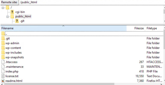
Search for “jquery.min.js.” The phrase should appear in the code if your website has a library installed. If it doesn’t appear, check the Network tab of your browser’s dev tools to see if you notice any jQuery takes being loaded. In your root folder, typically in “public_html,” look for a folder called “wp-includes”.
Open “wp-includes” and then open the file named “script-loader.php.” Now in the source code, search for a line that starts with “wp_enqueue_script.” and after the word “script” in this phrase paste the below given bold lines-
wp_enqueue_script( ‘tt-mobile-menu’, get_template_directory_uri() .
‘/js/mobile-menu.js’, array(‘jquery’), ‘1.0’, true );
In WordPress you can do this all using Plugin. You can add code to your site using this plugin without editing text files.
Go back to your website and see if the problem is resolved.
2. Check jQuery is loading correctly
Now, we need to check, jQuery file is loading as expected. To start, right-click anywhere on your web page and select “View Page Source.” and search for queries in the code that start with “<script src=” and include “jquery” in the same lines.
If you see lines in the code matching this description, it’s likely loading correctly. Now move to the next step if you can’t see any matches.

3. Add a snippet to wp-config.php File
Still, if the above given ways don't work, you need to edit your website’s configurations. Look for the wp-config.php file in your root folder.
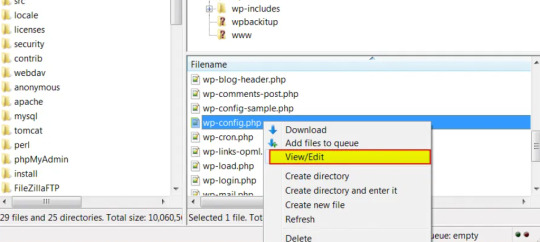
Right-click on the webpage anywhere and download the file to your preferred drive so you have a manual backup, and open the file in your root folder to begin editing.
Now, find the following line:
/* That’s all, stop editing! Happy blogging. */
Paste the following above that line:
/** Absolute path to the WordPress directory. */
if ( !defined(‘ABSPATH’) )
define(‘ABSPATH’, dirname(__FILE__) . ‘/’);
define(‘CONCATENATE_SCRIPTS’, false);
You just defined the ABSPATH, which will help your website to recognize that jQuery is cavailable. Save the file and try to reload your website.
4. Set up Google-hosted jQuery with an alternate fallback
A CDN, or Content Delivery Network, might be to blame for your jQuery woes. This is a series of networked servers that speed up WordPress but can sometimes cause functionality issues if it goes down unexpectedly. So, it’s worth setting up a Google-based jQuery you can fall back on now and in the future. To do this, you add the following code:
// Fall back to a local copy of jQuery if the CDN fails
<script>
window.jQuery||document.write(‘<script src=”mysite.com/wp-content/themes/my_theme/js/query.min.js”><\script>’))
</script>
Save, and check your site once again.
5. Manually add the jQuery Library to header.php
If step four didn’t resolve the error, try adding the jQuery library manually. Head to Google Hosted Libraries. Here, copy the code snippet for the latest version of jQuery from the link above, for example, the snippet listed under “3.x snippet.”:
<script src=”https://ajax.googleapis.com/ajax/libs/jquery/3.7.1/jquery.min.js”></script>
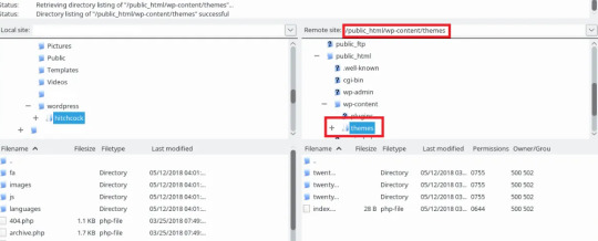
Now, find the marked folder “wp-content” in your root folder “public_html”, then go to the “Themes”, then the folder marked with the name of the theme you’re using.
In this theme folder, you should see the header.php file. Right-click and save this to your usual drive, and open the version in FTP. Then, paste the snippet below the tag marked, save, and try to re-access your site.
Conclusion
In conclusion, jQuery is one of the most common errors occurring in wordpress sites. In this tutorial we have explained about what “jQuery is not defined” is, some of the key reasons for this error and some methods of fixing this error that will definitely help you to fix this error. Nevertheless you are not able to resolve the "jQuery is Not Defined" error in WordPress. It can extend the time your visitors have to wait for your WordPress page to load. Fortunately, with some code editing, fixing the WordPress admin jQuery error is simpler than you might expect.
Muddling around with code may be a bit daunting, especially if you need to make changes to your theme’s functions.php file. So if you’re unsure about making potentially harmful changes to your site, it’s best to contact a wordpress expert.
Contact Supportfly and hire an expert team for WordPress Management services to boost your website performance. We provide Premier Wordpress Management services to run your website on WordPress successfully.
0 notes
Text
Title: Ten Strategies to Boost Your Home Contractor Service’s Online Presence
In today's digital era, increasing your home contractor service's online visibility is now more crucial than ever. The competition among home contractors is cutthroat, with numerous businesses vying for the same client base. However, fear not - with robust strategies, a deep understanding of SEO best practices, and a commitment to quality content, you can carvemeans to an active online engagement strategy. This article outlines ten pivotal strategies that can transform your online presence and help you stand out in the contracting industry.
1. **Leverage SEO Best Practices:** SEO, or Search Engine Optimization, is a game changer. Incorporating relevant keywords, meta tags, and quality backlinks enhances your site's ranking on search engines, leading to more online visibility.
2. **Create Quality Content:** Dwell on the power of quality content – tutorials, blog posts, infographics, videos. Content that solves problems, educates or informs will organically draw contractors, construction workers and clients to your site.
3. **Local SEO: Be Local, Be Visible:** Utilize local SEO strategies; claim your business on Google My Business and other local directories. Optimize your website for local searches to connect with clients in your location.
4. **Responsive and User-friendly Website:** A user-friendly, mobile responsive website keeps visitors longer on your site, lowering bounce rates and increasing the chances of conversion.
5. **Engage on Social Media:** Active engagement on social platforms builds relationships with your audience, helps to gain feedback, and boosts your site’s visibility. Supplement your posts with high-quality images of your projects, or share tips and tricks for home improvement.
6. **Online Reviews and Testimonials:** Encourage satisfied clients to leave reviews on popular platforms like Google, Yelp, or directly on your site. Positive testimonials enhance your online reputation and boost client trust.
7. **Leverage Email Marketing:** Create an email list and engage your subscribers with weekly newsletters, updates on your services, or useful tips. This can boost traffic and, over time, turn subscribers into loyal customers.
8. **Paid Advertising:** Consider investing in pay-per-click (PPC) advertising to gain immediate visibility and attract relevant traffic to your website.
9. **Video Marketing:** Online users consume video content more than ever, thanks to platforms like YouTube. Share project 'before and after' videos, or how-to guides to engage with your audience effectively.
10. **Analytics:** Regularly monitor your site's performance. Google Analytics can provide in-depth insights, helping you understand your audience, optimize your site, and ultimately, deliver better results.
Conclusively, boosting your home contractor service's online presence significantly impacts your business reach, transforms your customer engagement, and increases brand recognition within the contracting industry. Start implementing these strategies today, and you will surely reap success in the ever-evolving digital landscape. Remember, the journey to a strong online presence is continuous; always learn, adapt, and optimize.
By integrating these insights into your digital marketing strategy, you'll not only boost your visibility but also meaningfully connect with those at the heart of your business – your customers.
Case Study: J&R Contractors – Optimizing Online Presence for Success
J&R Contractors, a budding home contractor service provider in Chicago, was struggling to attract customers online and had a very low physical reach due to high regional competition and lack of effective marketing strategies. The firm's website wasn't SEO-optimized, and their social media presence was minimal.
Upon evaluating their issues, J&R Contractors decided to implement the following ten strategies to boost their online presence.
1. Understanding
Their Audience: J&R Contractors hired a business analyst to give them insights about their target population, including their needs, preferences, and demographic information such as age and location.
2. Optimizing Their Website: Recognizing the importance of SEO, they optimized their website content, making use of relevant keywords such as "Home Contractor Services in Chicago", "House Repairs", and "Commercial Construction Company."
3. Organic and Paid SEO: While organic SEO strategies helped them get recognized, they also invested in Google Ads to drive more traffic to their website.
4. Utilizing Social Media: J&R Contractors revamped their social media profiles and started posting regular updates on projects, testimonials and DIY tips and started engaging with their audience more frequently.
5. Building a Blog: They started sharing blog posts revolving around home improvement tips, latest construction trends, and ideas for home design. This boosted their website’s visibility and positioned them as industry experts.
6. Encouraging Online Reviews: Satisfied customers were asked to leave Google reviews about their experience, which significantly improved their online reputation.
7. Mobile Compatibility: They ensured their website was mobile-friendly, as a majority of their potential clients were found to access the web through mobile devices.
8. Participating in Online Forums: J&R Contractors became active in online forums such as Quora and Reddit, sharing insights and connecting them with potential customers.
9. Local Listings: Registering their business in Google My Business and other local directories helped them show up in local searches.
10. Utilizing Analytics: They used tools like Google Analytics to track their progress, modify strategies, and to better understand their clients.
After implementing these practices over six months, it led to a 70% increase in website traffic, a 35% increase in client inquiries, and a 50% increase in conversion rates.
The takeaway from this example for our readers is that having an online presence is not just about having a functional website but rather about using SEO wisely, being active on social media, sharing useful content, engaging with customers, and monitoring progress. You can tailor these strategies to suit your specific business needs for optimal results.
"Ready to supercharge your online visibility and skyrocket your business growth? Let's start implementing these proven strategies today! Click here to schedule your free consultation with our expert team!"
Start Your Digital Transformation Now!
"According to the National Association of Home Builders, over 90% of home builders and contractor services are using online platforms for marketing. Hence, having a strong online presence in the home contractor industry is no longer an optional aspect, it has become a necessity."
0 notes
Text
Level Up Your Online Business with Internet Millionaire Digital
I've always been fascinated by the potential of the internet to create financial freedom. But honestly, the sheer amount of information out there can be overwhelming. That's where Internet Millionaire Digital comes in. It's not just another online course; it's a comprehensive membership area designed to be your one-stop shop for everything you need to thrive in the online business world.

Unveiling a Treasure Trove of Resources
Having used Internet Millionaire Digital for a few months now, I can confidently say it's been a game-changer for my online ventures. The membership area boasts a wealth of resources, from in-depth training modules to downloadable templates and guides. Whether you're a complete beginner or a seasoned marketer, there's something valuable for everyone.
The training modules are particularly impressive. Taught by industry experts and successful entrepreneurs, they cover a wide range of topics, from building a captivating online presence to mastering effective marketing strategies. The content is clear, concise, and, most importantly, actionable. I especially appreciated the step-by-step tutorials that guided me through the process of setting up my own online store.
Learning from the Best: Expert Guidance at Your Fingertips
One of the things that truly sets Internet Millionaire Digital apart is the access it provides to expert insights and mentorship. Unlike many online courses that leave you hanging after the purchase, Internet Millionaire offers ongoing support and guidance.
Regular live webinars and Q&A sessions with industry leaders have been invaluable. Not only do you gain valuable knowledge from their experiences, but you also have the opportunity to ask questions and get personalized advice. The platform also features exclusive interviews with successful entrepreneurs, offering a unique glimpse into their thought processes and strategies.
Building a Supportive Community: Networking and Collaboration
The journey to online success doesn't have to be a solitary one. Internet Millionaire Digital fosters a vibrant community of like-minded individuals through its interactive forums and discussion boards. Here, you can connect with other members, share your experiences, and collaborate on projects.
The sense of camaraderie and support within the community is truly inspiring. I've found it incredibly helpful to be able to bounce ideas off other members, seek advice when I hit a roadblock, and celebrate each other's wins. This collaborative environment keeps me motivated and focused on achieving my goals.
Investing in Your Future: Is Internet Millionaire Digital Worth It?
In my experience, Internet Millionaire Digital has been an investment that's more than paid off. The combination of high-quality resources, expert guidance, and a supportive community has equipped me with the knowledge and tools I need to take my online business to the next level.
If you're serious about building a successful online venture and achieving financial freedom, then I highly recommend Internet Millionaire Digital. It's a comprehensive platform that empowers you to learn from the best, connect with a supportive community, and ultimately, turn your online dreams into reality.
See more
1 note
·
View note
Text

Top SEO Practices for 2024: Boost Your Website's Ranking with These Proven Technique
Amidst the ever-evolving digital terrain of 2024, achieving and maintaining a high ranking on search engine results pages (SERPs) is more crucial than ever. With ever-evolving algorithms and user behaviors, mastering SEO (Search Engine Optimization) techniques is essential for the success of any website. Here are some proven SEO practices to boost your website's ranking in 2024:
Visualize Data with Interactive Content: Move beyond traditional content formats and embrace interactive content to captivate your audience. Infographics, interactive maps, and quizzes not only convey information effectively but also encourage user engagement, ultimately boosting your website's dwell time and lowering bounce rates.
Implement Semantic SEO: With advancements in natural language processing, semantic SEO emerges as a powerful strategy in 2024. Rather than solely focusing on individual keywords, optimize your content to understand the context and intent behind user queries. By incorporating related terms and concepts, you can enhance the relevance and comprehensiveness of your content, leading to improved search visibility.
Explore Video SEO: Video content continues to dominate online platforms, presenting a golden opportunity for SEO in 2024. Create compelling video content optimized for search engines by incorporating relevant keywords in titles, descriptions, and tags. Additionally, transcribe your videos to make them accessible to search engine crawlers, further enhancing their discoverability.
Harness the Potential of Social Signals: In the interconnected digital landscape, social signals play a significant role in influencing search engine rankings. Cultivate a strong presence on social media platforms and encourage social sharing of your content. Engage with your audience authentically, fostering community interaction and signaling to search engines the value and relevance of your website.
Embrace Augmented Reality (AR) for Local SEO: As AR technology gains momentum, leverage its potential to enhance local SEO efforts. Implement AR features that provide immersive experiences for users searching for local businesses or attractions. By integrating AR elements into your website and mobile apps, you can create memorable interactions that drive foot traffic and increase online visibility.
Optimize for Zero-Click Searches: With the rise of featured snippets and knowledge panels, zero-click searches have become increasingly prevalent in 2024. Optimize your content to appear in these prominent SERP features by providing concise answers to common queries. Structured data markup and FAQ sections can also enhance your chances of securing coveted position zero.
Invest in Long-Form Evergreen Content: Long-form evergreen content remains a cornerstone of effective SEO strategies in 2024. Produce comprehensive guides, tutorials, and in-depth analyses that stand the test of time and continue to attract organic traffic long after their initial publication. By addressing complex topics thoroughly, you establish authority in your niche and earn valuable backlinks over time.
Prioritize Website Security and Performance: In an era of heightened cybersecurity concerns, website security and performance are paramount for both user experience and SEO. Secure your website with HTTPS encryption, implement robust firewalls, and regularly update software to mitigate security risks. Additionally, optimize your website's performance by minimizing loading times and optimizing images and other media assets.
Collaborate with Micro-Influencers: Influencer marketing evolves in 2024, with a shift towards micro-influencers who boast niche audiences and high engagement rates. Partner with micro-influencers relevant to your industry or target demographic to amplify your brand's visibility and attract quality traffic to your website. Encourage influencer-generated content that resonates with their followers and aligns with your SEO objectives.
Conclusion:
By implementing these top SEO practices in 2024, you can elevate your website's ranking, attract more organic traffic, and achieve your business goals. Remember, SEO is not a one-time task but an ongoing journey of optimization and refinement. Embrace innovation, stay informed, and continuously refine your strategies to maintain your competitive edge in the digital marketplace. As the digital landscape evolves, partnering with Info Hub Digital emerges as the definitive choice for businesses seeking unparalleled SEO expertise. As the best SEO service provider in India and US, Info Hub Digital offers tailored solutions that propel brands towards digital success. With a commitment to innovation and excellence, Info Hub Digital empowers businesses to thrive in the dynamic realm of AI-driven search
INFO HUB DIGITAL
105-B, Space-31,
Khadi Machine Chowk, Kondhwa, Pune, Maharashtra 411048
Visit Us : www.infohubdigital.com
Email Us : [email protected]
Our Social Presence :
Linkedin - https://www.linkedin.com/company/info-hub-digital/?viewAsMember=true
Facebook - https://www.facebook.com/infohubdigital
Instagram - https://www.instagram.com/infohubdigital/
Twitter - https://twitter.com/InfoHub_Digital
#2024 SEO techniques#interactive content SEO#semantic SEO strategies#video SEO best practices#social signals SEO#SEO trends 2024#SEO best practices#SEO for high SERP ranking#best seo service in india and usa#best digital marketing company in india and usa#social media marketing company in india and usa#best digital marketing service in inida and usa#best digital marketing agency in inida and usa
0 notes
Last Seen Blogs

awful-little-goose-but-for-rp
Yet Another Awful Little Goose

chunk-your-guts
My Name Is CHUNK-YOUR-GUTS

awesome-baba-love
Sans titre

humhummel-blog
oliver

methoduncertain
Method Uncertain