#and also i think the colors in the anime look UGLY but that’s something else. Lol
Text
i need to catch up with the dunmeshi anime i’ve only seen like the first episode but man it sure is an adaptation that makes you think “wow! i wish i was reading the original manga instead” i think it just fails at getting across all the lore and more vitally all the details about the food preparation and the small diagrams of the monsters and stuff. like yeah that shit’ll flash on screen for a second or two but that doesn’t give it the same time of day as the manga does and the whole commixing of episodes really loses the whole one meal per chapter narrative gimmick that gives the manga its really tight pacing even if the whole chapter’s slower or more character focused. like idk. i think dunmeshi’s skeuomorphism to a proper cookbook and the way it sanctions its timing is very special and uh. good. and the anime missed out on that so it’s not very uh. good
#and also i think the colors in the anime look UGLY but that’s something else. Lol#.mid#+ also not to say it’s a failure on The Anime specifically i think it just so happens that dunmeshi is not a good series to adapt into the#moving picture. but also there are smarter ways to reconstruct said framing and they’re not doing it lol#like before it dropped i wanted to presume they’d lean into the whole combat action and parallel it with the way food’s prepared because#those are both like. very visual important things. even if it strays from the importance of the food its like#at least something different. at least utilising its medium cleverly#and then i had the much more plausible thought of like. ooooh what if they add a few new monster encounters that can only really be gotten#across in animation! that’d make the anime worth watching! but Nah its so by the book it just feels like a skimmed down copy of it
11 notes
·
View notes
Text
What animal do you most resemble and why?
So just so yall know before you go to your piles. The animals in the pictures might not be the creature that you most resemble. I am using the Untamed Spirit Animal Oracle in this reading. Please take what resonates and leave the rest behind but always be open to new perspectives about yourself.
_________
PILE ONE
Astrology: Pisces, Sagittarius, Aries
Song: all i ever wanted by Mazie
Vibes: 🖤💙🔭✈️🕷🦋🕶🎓🐾🌏🌊🫐🍙🧊🎧♟🦽💎⛏🛋📘✒️💤♿️🔊♠️🏁
Cards: Lion, 5 of Cups, 7 of Wands, The Void, Karmic Relationships
Hi, pile 1! Welcome. These cards tell me you look most like a lion. I can see some of you have prominent noses that make your face very lion-like. All of you have the most piercing fierce eyes. I also see you have soft hands and nice nails that you probably get done regularly. You are legit gorgeous and you have this extensive hair routine you do almost every day. You might wear a bonnet to sleep or you have a silk pillow case to protect it. I can also see you are surprised by these compliments. You have some self-esteem issues that frustrate you a lot. These beliefs you have about your physical appearance are built around the opinions of others. First off, they only shit on you cus they are jealous. These cards have a weird undertone of relationships so I think maybe you had a partner at one point who was SUUUUPER jealous of how beautiful you are. Wow, they are pressed about it. They probably said some extremely mean things to you about your appearance that stick with you even though it doesn't look like they are around you anymore. I hear them saying you have RBF or something. You have literally nothing to feel insecure about my dear.. Like you complimented yourself in the mirror around this person and they like immediately tried to knock you down a peg. Dude, that person is SO ENVIOUUS. Don't listen to their words. You need to see through their words to the true emotions behind them. Don't let these jealous people dim you light, girl!!! Their words are not based on reality. It is distorted by their emotions. Just know when they look in the mirror all they hear is their momma tellin them they're ugly as fuck. They were just projecting their insecurities, baby.
PILE TWO
Astrology: Taurus, Leo, Aquarius
Song: Body Talks by The Struts, Kesha
Vibes: 💛🧡❤️💙🎁🧿💰🌅🏖🚦🚚🚎🎯🎭🏅🍹🫐🍂🌊🌈🌏🍁🐠🫂🤖🥶😰
Cards: Badger, 7 of Pentacles, 5 of Wands, The Seven Star Sisters, Jump In
Hey there, pile 2!! You have such an interesting energy. The animal you most resemble is the Badger. So from what I'm reading from the other cards this is less of a physical resemblance and more of an attitude resemblance. The way you hold yourself is like you do not give a fuck what anyone thinks about you. You had many people around you growing up who were considered "conventionally attractive" and for a long time, this bothered you. I think sometimes it does still bother you but you have grown your self-esteem a lot since you were little. You got tired of fighting for attention real quick. You realized how dumb the competition of appearance is and began to explore your expression more for fun rather than to fit in. You have a unique way of expressing yourself, especially with your make-up. Dark eye shadow is your signature look. It makes your already really unique eye color pop like nothing else. You dress very alternatively compared to your siblings and/or friends. The style does have a touch of whimsicalness to it too. I see some of the people who picked this pile have a curvy body type. You keep your hair short for the most part because it's easier to manage while short. You truly have such a fantastic head-turning style. I really do love your energy, my dear. Like, wow you are fucking awesome. I would have looked at you as a kid and wanted to look like you so bad.
PILE THREE
Astrology: Scorpio, Libra, Gemini
Song: The Middle by Jimmy Eats World
Vibes: 🤍🖤🔎🖋🧷📓🩺🔬🔌📷📼🎥🎹🎼🎤🎧🎬🌪🐚🪨🐇🕊🦢🐈⬛🕸🐰👟
Cards: Toad, Fox, 8 of Swords, 2 of Wands, Double Mission, Deep Cellular Healing
Oh, pile 3. This is gonna be a kind of shadow work-y kind of reading so just be prepared to be called out okay? Trigger warning for SA. You make yourself ugly on purpose. You hid your beauty from yourself. I dunno exactly what you do to hide it from others but I see you wearing clothes that keep your shape a secret. You do your make-up in a way that accentuates the dark cycles under your eyes. You make yourself look sick and dying. You force yourself to believe you resemble a Toad. I don't blame you, my friend. You went through something truly terrible that made you feel ugly so you express it outwardly constantly. You believe you are ugly because of what happened. What they did to you didn't taint your beauty, homie. You aren't dirty. You aren't hideous or unattractive naturally. You are so scared of what happened, happening again. It makes you put up these defenses in-order to feel safe. My friend you are already safe without these defenses. You might be doing way more harm than good, my friend. If you stopped hiding your true beauty from yourself, you would more resemble a Fox. These cards are encouraging you to heal from what happened to you mentally. Your reaction to what happened isn't wrong but you shouldn't destroy yourself because of how others treated you. You are stunning and so naturally gorgeous. I hear you saying that your feelings about what happened don't matter. That is a lie you tell yourself. That is a lie someone else told you. What happened to you was truly awful. What they did to you was disgusting but it doesn't make you disgusting. It makes THEM disgusting. What THEY did is disgusting. You are beautiful. You are so drop-dead, star-struck glamorous! You aren't a toad. You are a fox. Please embrace your authenticity because you deserve to feel good. You deserve to see your body for what it truly is.
PILE FOUR
Astrology: Cancer, Capricorn, Virgo
Song: Honey And The Bee by Owl City
Vibes: 🤍💖💛🦦😜👄☀️👟🐁👙👑🎂🐱🐻❄️🌙🦭🌸🌼🍣🍰⚾️🎗🎟🎲📿
Cards: Otter, Queen of Cups, The Well, A New Earth, Called
Pile 4. You are so fucking cute. Like so cute. Like I feel your energy and all I feel and think is "Awwww~ What a cuuutie!". You most resemble an Otter. Which in my opinion, ARE SO FUCKING CUTE!!! I see you like to color your hair in pastel colors and it's SUUUPER long. Like you have been growing out your hair for a while now. You have this cute little button nose and these super pretty dark eyes. Ohmygods you have no idea how much I think brown eyes are the prettiest eyes. You put a lot of creativity in your outfits so you always look so snatched and dolled up. You like the long flowy dresses and shirts that billow in the wind. They make you look like a fairy. You always smell like incense and sea salt. You probably love swimming or surfing or some kind of sport you play in the water so you are very lean. I see you might be pursuing some kind of profession in the beauty industry. Either that or you just look like a model and people think you are one. You wear these pretty flowers in your hair that give you this gorgeous halo of lavender. You have been absolutely blessed by Lady Aphrodite. She loves you like her child. She blesses you with fashion sense and soft features.
#tarot#tarot reading#astrology#pick a pile#spirituality#spiritual growth#animal oracle#animals#tarot pick a card#pick a picture#divination#divine#song divination#hellenic polytheism#pagan#oracle cards#tarotblr#pick a card
366 notes
·
View notes
Text
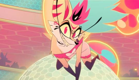
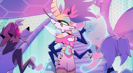
Asha's Animal Side Kick
Now presenting...
the one...
the only...
BONSAI !!!!!!!!!

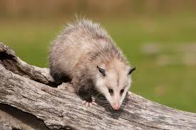
It was either between a possum, ferret, or a great eared nightjar/type of bird, but either way, I had to go with the possum.

I liked the light brown possum a lot personally since I thought it was really cute yk??
It was also based off of this possum:
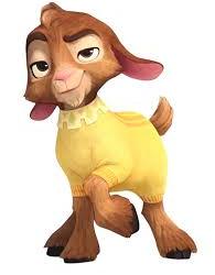
OKOK, you may be wondering why I changed Valentino, or Bonsai into a possum.
There are 2 reasons:
Numero Uno:
VALENTINO IS FUCKING UGLY
I think my friend @sewerpalette said it best here:

Nothing can convince me otherwise. His design is just SO ugly to look at. It is not pleasing.
And it doesn't help that I wanna punch his stupid fucking face like it is so punch-able
OKAY SURE, the concept versions of Valentino is cute...but ever but I didn't like how I drew goats in my style. It could be just that I'm not good at drawing them, but I also didn't like my color pallet I did for him, which was a lot like what Bonsai has color pallet wise, and it fitted Bonsai more than Valentino.
Numero Dos:
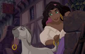
ESMERALDA HAS A GOAT SIDE KICK.
OR BETTER YET, WE HAVE ALREADY SEEN IT.
It is basically a repeat of what we have already seen, which I didn't like.
Just because you aged down a goat does not make it ORIGINAL.
Its okay to have Asha have a pet goat in the other rewrites though I don't MIND AT ALL. ITS YOUR AU U DO WHAT EVER, IM JUST MAINLY TALKING ABOUT MY ICK WITH THE MAIN FILM. IT JUST REMINDS ME OF SOMETHING ELSE.
What I'm trying to say is that Valentino feels like a refrence to Huntch Back of Notre Dom, which this movie has a thing with adding stuck out refrences instead of making it subtle. I mean I know it was a 100 year aniversary, just make it more subtle though so people can rewatch it and find refrences they didn't notice first time watching.
Anyways....
Some fun Facts about Bonsai:
Bonsai is actually a little dwarf, and the runt of his family. Asha adopted him when she found out Amaya told Charo (Charo is a lynx btw) to get rid of them all since she thought they were rats (even though they are fucking HUGE) (PLUS IT IS TO EMPATHESE ON THE FACT THAT THEY ARE MISTAKEN FOR RODENTS WHEN THEY AREN'T, THEY ARE APART OF THE MARSUPIALS FAMILY AND THEY GET RID OF RODENTS/EAT THEM)😭
(I might actually make him slightly bigger than how I drew Bonsai, but who knows yk?)
So Asha took the responsibility of taking care of the little Possum, since she didn't want the possum to grow up alone, and so that she can have some company.
IT TOOK A LONG WHILE for Bonsai to warm up and trust Asha, but in the end, he saw her good nature and swore to protect Asha like how Asha protected him from getting eaten from Charo. Which is why he dislikes Star Boy A LOT (mainly because he doesn't trust how this creature can literally transform into anything and doesn't want him to end up being something like Charo 😭)
He is just a little guy that wants to make sure his friend doesn't get hurt by a celestial force.
This is basically how I imagine how they both would meet:

(Just wait till he finds out Asha likes him. He is going to be so judgemental)
To get this part out of the way, if I end up having Bonsai speak, it would sound like a child, since I DREADED when the goat started...TALKING LIKE A GROWN ASS MAN LIKE NO PLEASE NO. And it would be more adorable yk?? :3
Lastly, here is the first doodle I did of him.

(JUST IMAGINE HIM TALKING LIKE A CRAZY 7 YEAR OLD LIKE THAT WOULD BE SO FUNNY)
@oh-shtars @annymation @signed-sapphire @chillwildwave @spectator-zee @uva124 @rascalentertainments @tumblingdownthefoxden
I might also go with a different color pallet for Bonsai but idk yet
#bonsai is my heart and soul#bonsai is my pookie bear#bonsai needs more screentime#bonsai would totally drop kick star boy in self defense#bonsai would be so memable#bonsai is so cute#I never knew I needed a possum like possums are now my life source#disney wish#wish 2023#art#art tag#artwork#artists on tumblr#animal art#animal sidekick#wish asha#princess asha#the kingdom of roses and thorns
36 notes
·
View notes
Text
“The hellhounds originated from Gluttony and Beelzebub created them that’s why she looks like that. She’s suppose to be like the animal tamer of Lucifer’s circus.”
Okay but like Viv, none of that is made clear in your actual show. People had to actively ask if she was suppose to be the one and only Beelzebub and now your relying on Twitter fans to make theories on why your characters look certain ways or are allowed to do certain things, people who don’t follow you on social media aren’t gonna know shit about how this world works. I like subtle world building and hints, and I think the ideas of Beelzebub representing an animal tamer is fun (even if wrath makes more sense to me), but when the rules of how the hierarchy system and rings work is already so confusing and relies entirely on you looking it up online it just looks like you wanted to make another random furry design. Why are hellhounds represented by gluttony? We were never shown an instance of this before and the episode doesn’t even say that they’re in the gluttony ring at the start (which is just another Earth with a yellow sky this time how creative).
I’m not saying I want the show to spoon feed us everything, but just a little context and set up in the actual show instead of random things just happening all the time with no explanation would be nice? Like yeah it might get explained more later on in Hazbin, but why then did you make this entire spin-off show come out first taking place in these other locations and with these demon lords if you weren’t gonna set the ground rules of your universe for the audience? That’s exactly what’s causing people online to scramble to come up with explanations for you about why you have discrepancies like Tex and Beelzebub not being a big deal but Stolas and Blitz are, your relying entirely on diehard fans to wave away your shitty writing and world-building cause you never take even a single moment in your show to have a character say anything that would clew us in on how it all works. There’s too much exposition in writing, and then there’s never giving any so you just have to make guesses or listen in on streams to figure out what society your characters are even suppose to be navigating.
Also for the “A bee/fly would have been unoriginal and ugly, she doesn’t have to follow the Bible lore” people, have you considered the fact it’s just a messy design? Like I don’t even hate it on it’s own, she looks really pretty in the fanart I’ve been seeing. But putting aside the fact she’s just a wolf/fox girl, she has so many unnecessary markings, her actual hair combined with the honey hair looks so unnatural and awkward, the bug traits don’t stand out, her outfit is basically only a slight redesign of Loona’s and as people have pointed out makes no sense on her chest with the supposed undershirt. You just can’t tell what your suppose to be looking at when you first see her, it’s just noise, which is fine for an oc, but this is an actual animated show where your suppose to be communicating something. The problem isn’t she’s not fat, I’m glad they didn’t do that for her in a show with everyone else skinny it would’ve read bad, it’s that she only stands out because they slapped bright colors neon colors onto her, nothing about this design is clever. It’s just pretty aesthetics, no substance.
Also I’m sorry, they could’ve made her entirely a bug and still have been hot, why are people assuming we are saying she should’ve been ugly when we say we wanted a more insect-like design? I’ve seen loads of gorgeous bug designs for Beelzebub, people aren’t disappointed cause she’s hot they’re disappointed cause it makes no sense.
334 notes
·
View notes
Text
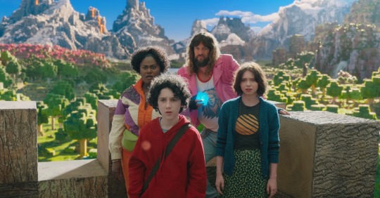
Why the Minecraft Movie looks so bad
Okay, let’s see if I can make this work
Hi, I’m Watercolor, currently a student learning animation and visual effects. I’ve got some more technical explanations for why exactly the trailer looks god awful
I’m gonna do my best to explain this in simple terms, but if I don’t explain something very good, let me know and I’ll explain more. Alright, this is gonna be a long post
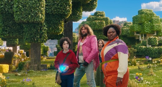
Starting off with the obsession with backlighting. See how it doesn’t really match the environmental lighting? That’s one of the major things that makes it look so weird to a lot of people. It could have been done to better distinguish the actors from the background, but it does that a little too well and makes them look way too out of place. The environment has a very nice constant (most likely singular) light source, which is most likely an HDRI.
An HDRI (or high dynamic range image) informs the animation software on how the scene should be lit, and is often a weird panoramic image of whatever physical area you want to replicate.
In a reverse case, adding a CG character into a real set, you could take an HDRI of the physical set, and use it to apply similar lighting. Adjustment will most likely have to be hand adjusted by the lighting team (and tbh they add a lot of extra lights in anyway. It just needs to look right) but it’s a fantastic starting point for the compositing and lighting teams.
However, the McM’s live set has way different lights set up then what is seen in the environment.
Here, for example, the live set is most likely being lit by standard 3 point lighting, which are not only the wrong color (the lighting on the environment is much more yellow) but also washes out any shadows that would help define the actors. If this movie wasn’t obsessed with backlighting, you could fix that by lighting the actors and environment from the front, but because the sun is in the back, they have to make the front of the actors unnaturally brighter to see them more properly. I have a slight idea on why the kid in red looks especially “photoshopped” in, and it’s mostly because his hoodie doesn’t have a similar reflectiveness to everyone else’s outfit, and his hair is a more neutral color, causing the highlight to be even more washed out. Also, while we’re here, the cube is a physical prop, but it was not lit up during filming, and all the light output was tossed on after. And it’s really inconsistent and honestly, lazy. For the most part they just hit it with a blue blur effect in post, it doesn’t actually cast any light.
Another major issue is the color difference between the actors and the environment. The color balancing on the actors is particularly garbage, they’re somehow desaturated while also being too saturated, I don’t know how they managed that. But the technical issue on why it looks odd, is because the physical camera cannot physically pick up the same vibrancy as the “camera” in the CG world. You might have seen an example of this when trying to take a photo with your phone, especially of a very colorful event like the sunset. It’s also why “ugly sonic” looked particularly out of place, he was 10x more saturated than anything else around him.
Having the actors on a very low effort green screen stage also completely ruins any chance of getting the proper ambient light or ambient occlusion.
Ambient occlusion is basically the bounce light from other objects in your scene, gamers might know this as a form of ray tracing (ray tracing is live changes in ambient occlusion, games without ray tracing bake in ambient occlusion to get a similar result)
When everything is CG, (again art style aside) looks pretty darn good actually!
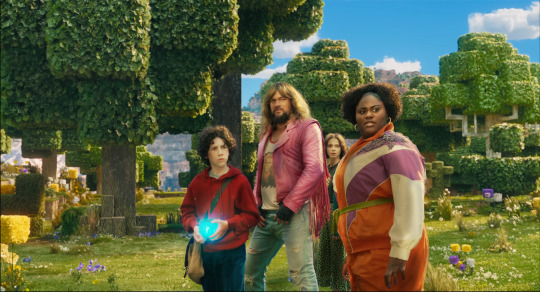
I attempted some edits to see if anything could make it look better (left is original, right is mine), and I don’t think proper lighting or anything could actually fix what this movie has wrong with it. They should have made the whole thing animated, I don’t think any amount of bullying would fix this, the studio basically has to scrap the actors, and make new CG characters from scratch in the same style as the rest of the world.
All of this is not the fault f the animators, or any of the vfx team, they did their absolute best with what they had, this is 100% the fault of the higher ups on this project. I have no idea how this good this far into production without ANYONE saying that it was a bad idea (Either that, or a lot of people got fired, which is unfortunately a likely possibility)
17 notes
·
View notes
Text
im thinking a lot about "what i want to do with my art" lately and i also have many years of figuring shit out already as an adult so i will post some general advice stuff that might help ppl
art should be fun. if you hate doing lineart then stop doing lineart. if you hate rendering and shading then stop doing it. if you hate anatomy then stop doing it and just draw funky shapes. if you love one color then use that color. if you love doing complicated detailed patterns then start doing those more. if you love drawing circles then make art with lots of circles. do what is fun to you, with the only exception being someone giving you good money to do something not fun, if you need the money.
u dont have to have 1 art style, consistent art is only relevant for commissions/jobs where u are supposed to deliver a specific style/quality/etc that u were paid for. if ur not getting paid or making a portfolio for a specific type of job, then draw however the fuck you want and dont care about anything. have 500 different styles and techniques, or just have 1 if thats how you work. it doesnt matter and everyone is different
the way to develop and evolve quickly is to draw as crazy as possible. push yourself as far as possible and dont care about anything dont worry about anything. fear holds you back. actively choose to draw crazy and push things far. no cringe no limit no rules no anatomy no perspective no color theory fuck everything and go crazy.
dont think "i dont know how to draw a ball room full of dancing people with fancy clothes" "i dont know how to draw a gallopping horse" just start drawing it and see what happens. when you get stuck you look up reference and tutorials. this is how you find out what parts you struggle with so you can then get specific help.
try to draw as bad as possible half the time. think, im going to draw this really fucking bad and ugly. im going to make the worst fucking horrible drawing. do it on purpose. fuck the concept of beauty and quality and perfectionism. draw bad on purpose. draw crazy on purpose. it will help you find freedom.
when looking at other ppls art for inspiration, separate between "i like this thing" vs "i want to draw more like this thing". all art that you like doesnt have to be relevant to how you draw stuff yourself, you can appreciate x type of art without your art being anything like that at all. this is especially important about things like clean lineart, rendering, amount of detail, """correct""" anatomy or perspective or shading, etc. just bc you like some art with beautiful shading doesnt mean you have to want to do beautiful shading. or maybe you do want that! thats why you figure out which ones are aspirational to you and which ones are just amazing and cool but not what you enjoy doing with your art.
the "2 cakes" concept - it doesnt matter whatsoever if someone else drew the same thing as you "but better" (in your eyes). your thing is still unique and has value existing because only you are you and your art is your art. ppl are happy theres now 2 cakes instead of just 1.
i already said this but Just Try. Just Go For It. some of my favourite comics are actually "badly drawn" from a generic perspective. but theyre unique and interesting bc every human is unique and interesting. you can draw stick figure drawings, comics or animations. you can draw simple or complex, good or bad, or go back and forth between styles and techniques, draw good one day and bad the other, make a comic where every page is a surprise in quality and style, nothing matters, do whatever you want forever.
the things you think are "bad" or "boring" or "cringe" or whatever other negative word might not be that to other people. someone might see your "ugly doodle" and love it so much they want it printed out on their wall. and even if some ppl dont like something, other people will like it. the ppl who like it are the ones that matter. not everyone has the same taste and thats how it should be.
draw for yourself. or draw for other people if that makes you happy, but do things that make you happy. draw your favourite things and your obsessions and express your feelings and draw your favourite characters and use your favourite colours or brushes. draw things that your friends like and send it to them. do things that make you smile. draw things that youre thirsty about for that matter. happy pride month. cringe is dead
if you have a hard time picking up the pen dont start thinking "i cant draw". youre probably suffering from some stress, mental illness or ND symptoms or something. try to find out how to solve problems in your life that are making you stressed and overwhelmed and not able to have fun making art. get help, talk to a counsellor, talk to a doc. and make sure you aren't pushing yourself to make art that isnt fun for you, bc that in itself will make you unhappy.
if you feel stuck, aside from looking up references and tutorials, try different techniques and materials. try a new software. try drawing on paper or on a tablet or paint on a canvas or try new pens and papers. make a collage. do papercrafts. sculpt. do something different than what you usually do
CLEAN YOUR ART AREA whether its a desk for your tablet or a table for your paper or stand for a canvas. make it EASY to pick up the pen / brush / whatever and start drawing. dont put objects on top of your tablet / papers / easel / whatever. make space for your art and keep it organised. it should take 1 second to start drawing without having to clean anything first.
if you feel like youre just bad at drawing, like i said, draw bad on purpose. draw crazy on purpose. fuck all the rules and perfectionisms and what you "should do". dont worry about anything just draw the worst and craziest you can. you can do this. i love your art. you exist. youre unique. you are you
30 notes
·
View notes
Text
To sweet
honestly just a fluff of Denji trying to be a boyfriend for the first time to a kind of overly 'sweet' reader.
warnings: none really, female reader, swearing, like... once?
word count: 1113

Denji really was a great boyfriend. He always shared his food and snacks with you, He was caring and sweet and was always nice to you. However, that doesn't mean he’s perfect. Other than his hunt for the gun devil and most of your ‘together’ time being spent at Aki’s apartment with Power, you were also his first girlfriend. He’s never done the dating thing before but he wanted to show you that he could do things boyfriends normally do. He wanted to show you he knew how to really be your boyfriend. So he decided today he was taking you out. Whatever it takes to show you what a great and loving boyfriend he is.
To start the day Denji had brought you flowers that he clearly picked from houses along the way. You didnt live that far from Aki’s apartment so the journey didn’t really give him time to make a whole bouquet but it had one of every flower he must have passed so it really was a cute little bouquet of different flowers.
With a small smile Denji held the gift out for you. “Ready?” he asked.
You took the flowers and smiled at how cute he was. “Yep! Where too?” you asked after setting the flowers down inside.
A wide grin spread across Denji’s face. “An amusement park!” he says with excitement.
Denji’s plan was to go on a few rides, win you a big ass stuffed animal then get one of your sweet kisses, The plan was perfect. That was until he actually entered the amusement park. As soon as his eyes saw the roller coasters he grabbed your hand and pulled right to the biggest one. “C’mon Y/N! Let’s ride that one!” You couldn't help but laugh at how excited he was, he was like a little kid.
It was Denji on the ferris wheel that had gotten you both kicked out of the park. Instead of doing something normal like kissing you he was busy looking over the edge and trying to see if he could spit on some poor soul's head. After a few good shots and the rest of the way down you were asked to leave the park and After Denji tried basically fighting a guard you ended up banned.
“Well i fucked that up big time.” Denji pouted. He was thinking of something else, how can he make up for that mess? “Hey, do you like fish?” he asks, looking at you with a blank face.
You tilted your head to the side with one raised brow. “Fish?” you questioned.
That bright smile was back on Denji’s face. “Fish.” He nods.
The aquarium was what he ment. All the fun colored fish swimming around and so many different sea creatures. Sea horses? Denji thinks they are ugly as hell but super cool. He was so immersed in the fish passing by and wanting to follow them that he often knocked over kids without noticing. You had a hard time keeping up with him as he ran from one tank to the other.
It didn't take long for the staff to ask you two to leave, this time Denji took it better and you weren't banned but he was still super bummed that he got you kicked out of another place. He just wasn't used to all of these new things. He didn’t have the money to go to an amusement park or an aquarium growing up after all.
Denji let out a defeated sigh. “I'm sorry, I ruined the aquarium too.” He gave you a sad smile.
You shook your head. “It’s okay! Really Denji, you just don’t always have great spatial awareness when you're in public.” you reason with him, taking his hand in yours you learn head on his shoulder.
He didn’t want to leave the day on like that though, with being kicked out two places? Hell no, some place where he can’t make any problems.
A movie was the simplest answer. You sit in one spot for an hour or so and don't get up. You could share snacks and a drink, he would throw his arm over your shoulders and your head would lay on his.
With some cheesy romance, a large popcorn and a drink with two bendy straws you sat right in the middle of a pretty packed theater. Everything was going perfectly fine, Denji was mostly just giggling at some of the things the leads would say or do. When the cheesy romance got worse so did Denji’s laugh, then he started straight out trashing the movie, causing everyone around you to shush him. With a half hour still left, you were asked to leave the theater.
That was it Denji thought, you would never talk to him again. There was no way you didn’t think he was a total loser now. He walked you home in silence, unable to even apologize out of embarrassment by now. Once you reached your front door he hung his head down and stared at his shoes, waiting for you to go inside and shut the door on him. He wouldn't even blame you.
After a moment he noticed you haven't even moved from your spot in front of him. He slowly raised his eyes to meet yours. You had a gentle smile on your face and soft eyes looked into his sad ones. “Don't I get a kiss goodnight? ” you asked with a light tease.
Denji stared at you in disbelief, you didn't hate him? “You mean you don’t hate me? After everything today you'd still want to kiss me?” he asked, still not fully believing you.
You took a small step closer, causing Denji to straighten up a bit and look down at you. “Denji i'm just so happy you tried today. I had fun even though we got kicked out because I got to see you happy.” you confessed, a blush creeping its way onto your cheeks.
“Y/N” Denji didn’t know what to say. His heart was pounding, you were just too sweet, too perfect. One moment he was staring at you with pure affection and the next you were getting closer, leaning up on your toes and kissing him. Your soft lips were a dream and you tasted like cherries too. Yeah you’ve done plenty before but being near you always makes him feel so warm and happy.
When you pulled away Denji had a dopey smile. “Thank you for today, Denji.” you say and pull him into a hug. Arms around his middle as he slid his around your shoulders, holding you tight and kissed the top of your head.
256 notes
·
View notes
Text
Ugly Christmas Sweater Party Headcanons

Lucifer
• He will only go out in an intentionally ugly sweater if it’s for a specific purpose like an ugly sweater party or ugly Christmas sweater day at RAD (of course Diavolo made it a thing)
• He considers bright colors and tacky lights to be ugly so he wears something along those lines and it even drives him insane
• He will make himself as hidden as possible throughout the day unless there’s an award option in which case his pride wouldn’t let him lose
Mammon
• He thinks it’s funny so although he usually prides himself of “cool fashion” he jumps on board the ugly Christmas sweater train
• His is a green fluffy sweater with Christmas lights and a squirrel stuffie attached to the shoulder
• Naturally he names the squirrel and to cure boredom he’ll talk to the squirrel “did ya hear that Nutty? Guys full of crap.”
Leviathan
• He doesn’t consider it ugly but just wears an anime sweater
• Will probably get offended if someone says he did a good job because he feels it’s an insult to the anime character who is “a goddess”
• Don’t vote for his sweater as an ugly Christmas sweater he will either cry or get really mad and summon Lotan there is no third option
Satan
• He wears a personalized Christmas sweater that says “Cat Dad” and he attached a bunch of cat stuffed animals to it
• They all have names (after the cats he knows and one after you “the cutest one”)
• He finds the sweater adorable and not at all ugly but there’s no way he’d leave the house wearing it otherwise
Asmodeus
• He can make anything beautiful and every is ugly in comparison to him so he dies the only natural thing he can think of
• He buys a knitted sweater and attached a small mirror to it therefor making whoever appears in the mirror the reason it’s an ugly Christmas sweater
• He keeps asking Mammon to look into the mirror and it’s pissing Mammon off
Beelzebub
• The first rule was not to wear anything with patterns relating to food
• He and Belphie wanted to match and decided to buy a two person pull-over sweat shirt
• Now Belphie can sleep with his head on beel’s shoulder and Beel can use his hidden arm to carry Belphie around
Belphegor
• Belphegor didn’t want to compete in the ugly sweater contest so decided to wear whatever Beel was going to wear
• Beel couldn’t decide either so they chose to buy a two person sweater leaving each with just one functional arm
• Belphegor loved this because it meant he could fall asleep on Beel but he ends up with a lot of crumbs on his face
Solomon
• Solomon thinks the human trend of ugly Christmas sweater is hilarious and knows exactly what he’s going to wear
• He wears a sweater with a pocket the shape of a stocking that feet’s one wine bottle inside it so he can sip it through a straw at the party
• Lucifer wishes he’d done that and keeps eyeing solomon which solomon mistakes as a sign he wants to talk and annoys Lucifer throughout the party
Thirteen
• She didn’t want to leave her cave in anything ugly but decided to when she saw everyone else was doing the same thing
• She wants to be fun and funny so her sweater has Solomon on it that lights up like it’s being electrocuted whenever she presses the hidden button
• She’s angry Solomon thinks it’s a cool idea
Simeon
• Simeon thinks it’s a hilarious idea but also feels he’s being mean to call someone’s sewing job ugly so it takes him a while
• He wears a sweatshirt based of the ELF movie with a narwhal saying “I hope you find your dad buddy” he does this intentionally knowing everyone is either not in the same realm as their dad, doesn’t have a dad, or is estranged from their dad
• He asks everyone to read it, Lucifer especially and his sweet smile isn’t fooling anyone
Raphael
• He decides to make his own but doesn’t know what people consider ugly so asks Asmodeus who only made things more complicated
• He decides to buy a sweater instead with a reindeer with antlers sticking out that you can toss rings onto (he didn’t know this and was confused and defensive when people threw bands and rings at him)
• No one successfully lands a ring on the antlers as he instinctively catches everything
Luke
• Luke loves the idea and asks you for help picking it out
• He decides to embrace the Chihuahua joke for one night hoping it’ll pay off and wears a sweater with a chihuahua on the front. When you press its nose it starts yapping loudly
• He gets more head pats than he bargained for and “yaps” louder than the sweater
Mephistopheles
• Normally would not be caught dead in anything considered ugly but you and Diavolo are there so he goes along with it
• His sweater has the grinch on it asking if it’s jolly enough
• Everyone seems to think it’s the perfect sweater for him but he doesn’t realize this and just thinks they’re complimenting his fashion sense
Barbatos
• This man will do anything Diavolo asks so when Diavolo wanted to throw an ugly Christmas sweater party, he naturally agreed
• His sweater just has rats depicted on it, he will not look at his own sweater but he wanted to prove his dedication to the meaning of the party
• He suddenly finds that this sweater seems to frighten the rats and used it to his advantage later on
Diavolo
• Diavolo was so amused by the idea an ugly Christmas sweater party that he decided to throw one and invited everyone he could think of
• He decides to wear a sweater that says “Get Lit” and has a reindeer that lights up and emits jingle bells music
• He’s so entertained by his own sweater that he keeps pressing the music button to hear the song jingle bells blare over and over again
#obey me shall we date#obey me headcanons#obey me 25 days of christmas#25 days of obey me christmas#obey me lucifer#obey me diavolo#obey me mammon#obey me simeon#obey me satan#obey me solomon#obey me asmodeus#obey me leviathan#obey me belphegor#obey me beelzebub#obey me barbatos#obey me luke#obey me raphael#obey me mephistopheles#obey me thirteen#funny obey me
251 notes
·
View notes
Note
I just lost one of my allays and life feels shitty now..
...could you create the craziest and most nonsense fnaf theory so I can forget about my lost baby?

l-look how p-pretty she was...
*ugly cries*
Ugh, I don’t play Minecraft but that sucks and she was gorgeous <3
Have three absurd theories!
Alright, you know how everyone thinks that Charlie is possessing the Puppet? WRONG! Unless she's possessing two things at once. Which might be possible? But also, maybe the Puppet is the Mimic and just thinks it's her but that's really a whole different argument that I've brought up before. Anyway.
Let's start with the ✨aesthetic✨ reason. Charlie's sprite is grey and black, we see black present on the classic Phone Guy phone. BUT! Even more importantly, we see blue as the main color. Blue happens to be right next to green on the color wheel. The transition from green to blue signifies how Charlie was forced to change. Green is a color of tranquility, nature, hope, and even lack of experience. Blue is mercy, trust, and mourning. Phone Guy shows the player mercy by helping keep them safe despite the fact that they look similar to William, the player has to trust Phone Guy, and of course there's reason for Charlie to mourn after her death.
There's also the fact that the animatronics only come to life once the Puppet helps. So how would the Puppet come to life on its on? It didn't, it had Charlie possess the phone in hopes she'd be able to spread the word of what happened, but her memories ended up all messed up and Puppet painted blue tears on themself in honor of Charlie. Funky death stuff also messed up her voice. Also, Puppet put Charlie in the phone because she was apparently the last to die and even Golden Freddy was taken as far as animatronics go.
It is also mentioned how Charlie cares for others and protects them, like Phone Guy protects the night guards. She also reassures the player because she knows Mike can't die. There's also the fact that even after the "death" of Phone Guy on night 4 he can still talk on night 5. This is because it was just Charlie watching someone else die.
FNaF 4 phone is another toy used by William Afton. Purple eyes and it watches Evan, the eyes follow him. The same way Fredbear is meant to transmit sound, the toy phone transmits visuals.
And this is one I’ve posted before, but it was before I met you. Why exactly are The Puppet and Baby (possibly also Ballora but that’s not today’s can of worms) more intelligent than everyone else? The Puppet quite literally says “the others are like animals, but I am very aware.” It’s always been an interesting line to me since I heard it. Because it doesn’t make sense.
What makes Puppet and Baby so much more intelligent? Why are they capable of logical reasoning most of the others probably wouldn’t know how to use a doorknob? Maybe there’s some explanation having to do with their emotional state or something, but may I propose that it’s because both were AI?
We know that Circus Baby was an AI, as well as the fact that she most likely had some form of sentience before being possessed by Elizabeth. If William was capable of creating sentient AI, we have no reason to believe Henry wasn’t either.
Not to mention Puppet never acted like a normal animatronic. Yes, they were programmed to protect Charlie, but actually leaving the building and lying down with her after she was murdered? That seems like it goes beyond the realm of programming into sentience.
If both robots already had some sentience, it would make sense why they act more ‘alive’ after possession.
There’s a decent chance I’ve been able to convince you that Puppet is an AI by now, even if I don’t have rock solid evidence. But that’s still pretty different from flat out being the Mimic.
You know how it’s likely at least a few scrap pieces of metal survived the Pizzeria Sim fire to make Glitchtrap? You know how the pizzeria still exists under the PizzaPlex? You know how there’s a ton of symbolism of not necessarily the Puppet, but of Nightmarionne? You know how Nightmarionne is a version of the Puppet that seems a lot more sinister? You know how the only STAFF bots that can kill you are Nightmarionne designed? You know how we never actually see any version of the Puppet beyond plushies? You know how some believe Edwin and is a Henry parallel? You know how Puppet and Mimic were both made to take care of a child and would inevitably be hated when they failed to protect them?
Look, all I’m saying is that maybe after Charlie moved on (or her soul got corrupted if you want to add some more flavor) the Puppet’s AI either went a bit kooky or got Glitchtrapped.
#fnaf#five nights at freddy's#william afton#puppet fnaf#fnaf puppet#the mimic#fnaf mimic#fnaf theory#answered asks#ask#ask box#answered#fnaf 4#security breach#fnaf security breach#fnaf sb#phone guy#charlie emily
12 notes
·
View notes
Text
The hypocrisy of the theoretical bear
Dobson was a bully.
I kinda wanted to make that statement only later in regard of another comic I am already writing about, but when you really boil it down, that is what Dobson genuinely was towards other nerds. Under all the pretense of just trying to talk about feminism and hoping that nerd culture can do better and become more progressive, he was just trying to shame people for enjoying different stuff than him, not sharing his opinions, or being overzealous in ways that were different to him.
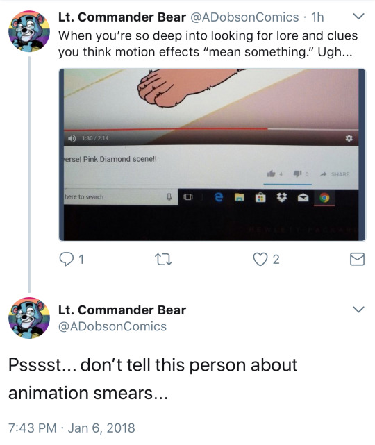
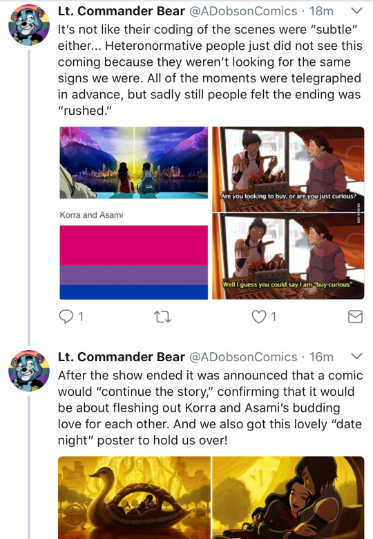
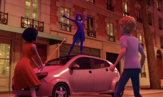
Among other things, he would e.g. post this picture in regard of a certain fantheory when it reared its ugly head in season 3 of Miraculous Ladybug…
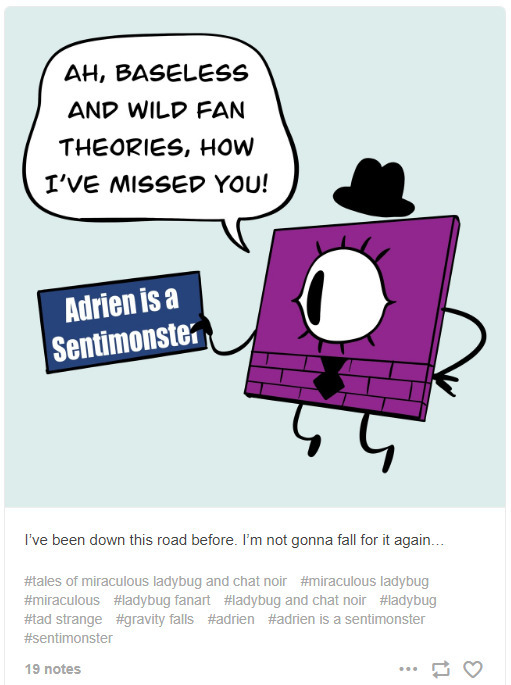
mocking a specific person for misinterpreting an animation smear for a genuine clue and instead of trying to politely explain it to them, instead shame then on twitter…
And eventually make THIS shitty SYAC strip, shaming the person even more, by making them specifically the butt of a non existing “joke”.

I kinda want to talk about these two instances now, why I think the comics are not funny as well hypocritical and rather dumb in hindsight. But first, the obligatory digression
I unfortunately agree with Dobson partly, that fan theorizing can at times go WAY too far. I myself have no issues with theorizing a little or playing with ideas of how a certain story could play out in the end. But I think there is a difference between looking at some little things, trends and recurring themes in a story and making a throwaway assumption like “oh yeah, that could happen down the line” and making a 40+ minute rant video on perhaps one little background thing blown out of proportion.
I also genuinely despise “review” channels such as The Roundtable or Film Theory for making clickbait videos based on dumb fan theories that they try to exploit for views, while actually not contributing anything of substance or of their own to the debate or elaborate on the craft of animation and storytelling. Being more of trend chasers than anything else.
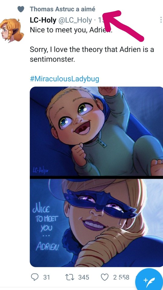
That said, I think fans theorizing about stuff is an integral part of fan culture and can be fun. It can e.g. inspire people to create their own stories/fanwork based on such theories. Such as this actually pretty decent piece of Miraculous Ladybug fanart, that Thomas Astruc even liked and shared on twitter and blows everything Dobson did for the show out of the water.
Plus, even as Dobson kinda admits, some shows and stories are deliberately made to “reward” fans for their theories.
However, already in the way Dobson formulates that, he is making a mistake.
See, these shows aren’t “rewarding” people per se for their theories. They simply confirm that the fans may have successfully cracked completely (or at least partly) an aspect of the story’s integral mystery/plot, at times left intentionally by the show creators themselves.
Just to give an example: Hunter’s nature as a Grimwalker in the Owl House.

Hunter aka “The golden Guard” was first introduced in the last episode of the first season of the Owl House, face still completely covered. Then later episodes not only revealed his face, but also his name and that he was supposedly Belos nephew. Something that already raised a few eyebrows for people, cause Belos was not only confirmed in the show to be at least over 50 years old, but some couldn’t image that a character falling into the classical evil overlord archetype, could really have a “nephew” as young as Hunter. And then in the episode Eclipse Lake, which starts off in Belos secret lab with a shot of some items on the ground, people saw this:

A page of a book, indicating to be an instruction on how to create an artificial human, with mentioning of a creature introduced and seen earlier in the season (in the proper debut episode of the Golden Guard nonetheless) and with the human creatures eyes in the book implied to have the same color as Hunters.
As such, the theory of Hunter being an artificial human was born and later on, got properly confirmed through dialogue and other visual revelations in the story.
Sometimes, storytellers (particularly once who want to craft a decent mystery or overarching narrative) will just leave little clues in their creation, for people to theorize about and to assure they are getting further invested in the story. The reason for that ranging from the author trying to tell a decent mystery without having to pull the revelations completely out of their ass (unlike Dobson in the story with Sam and his dead sister!) or revealing too much all at once, to just having fun with fans and sometimes also simply because they want to add something to the story, even if by that point in time they may not have yet entirely in mind what that something is going to be.
Such as Rebecca Sugar actually throwing the term “Cluster” around in Steven Universe, before even having an idea what it was supposed to mean in context of the story.
So in that regard, fan theories are just attempts to explain stuff the show runners may already have in mind to be important anyway and therefore different from lets say someone obsessing over background colours being symbolic of gay relationships for example
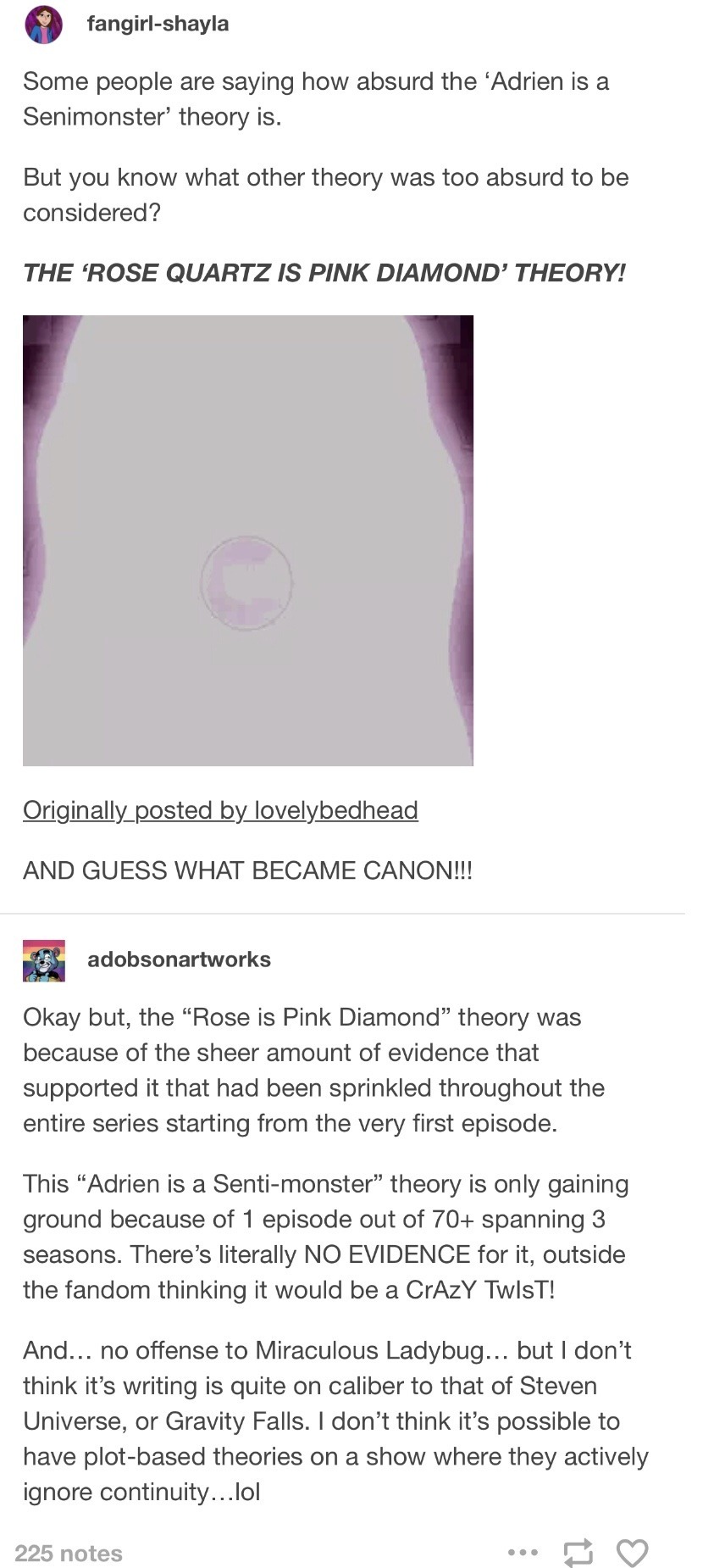
But now back to the two comics.
The first one, showing us a weird expy of Bill Cipher with a card exclaiming “Adrien is a Sentimonster”, may be kinda confusing, so here is a bit of context: Dobson tries to poke fun at the “Adrien is a Sentimonster” theory of the Ladybug fandom, by having the “subject” of another, extremely niche fan theory claim it is baseless and wild. That “subject” is Tad Strange. Now if you are only familiar with the show Gravity Falls, you would know that Tad Strange is that guy…

the most average, boring person in all of Gravity Falls, part of an almost Family Guy level cutaway gag in one episode of Gravity Falls. But supposedly (I at least never saw it), when the name was first mentioned somewhere by Hirsch long before the episode introducing Tad properly aired, people came up with the theory that “Tad Strange” may be a secondary villain akin to Bill Cipher, if not even a relative to him. And that is what Dobson tries to mock here. I say “try” cause honestly, who would even get the idea of what sort of joke Dobson tries to tell, if they aren’t familiar with the theory. A theory that was so niche, Dobson would have to explain the intention of the comic somewhere down the line even.
And to quote the Joker…
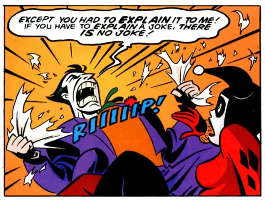
Furthermore, while the theory of “Adrien is a sentimonster” was kinda wild after only introducing the fact that even humanoid, sentient creatures could be created by the power of the Peacock Miraculous (in the episode simply called “Ladybug”) recently to that comic being made, it wasn’t really that wild when people thought about it.
After all, Ladybug at its core was still a magical girl show. And them doing twists like that (such as Chibiusa being Sailor Moon’s daughter from the future, Galaxia being the original first Sailor Senshi, Witches being corrupted Magical Girls etc) was not necessarily unheard off.
Though Dobson, when told it could still be a possibility, not only would act rather condescending, but furthermore went on to also piss against Ladybug’s leg, by stating “the show’s writing is not good enough to pull that off”. Which okay, he is right, the show is one of the dumbest written magical girl shows I have ever seen, the man behind it is essentially Dobson with a career.
But, two seasons and a few years later….
YOU ARE A SENTIMONSTER

YOU ARE SENTIMONSTERS
WE ALL ARE SENTIMONSTERS!!!!!
At least Adrien is not alone?
Yeah, Dobson can eat a dick in that regard. I mean, I think the reveal and how they played out the mystery wasn’t all that good (in my opinion, Astruc and his team winged it in) but not only was his dismissive behavior insulting to begin with, it also shows that he has very little understanding of how to utilize common tropes in fiction and cartoons in particular, despite consuming them en masse. Plus you know, kinda insulting to Thomas Astruc, who by that token proved to still be at least more succesful than Dobby-dumb-dumb bear
Also, as much as I like Gravity Falls, neither it or Steven Universe had in my opinion quite from the get go an idea where to head with their mysteries. Alex Hirsch having confirmed, that Bill Cipher becoming a character and not just a symbol, was something he came up with only halfway working through the concept phase of season 1. And the Rose is Pink reveal? My memories regarding that show are a bit rusty, but when was that actually hinted on in the show? There were massive hints that Pink Diamond didn’t get killed by the rebellion or that things were more complicated. Not that Pink pulled essentially a Darth Sidious on everyone just to live on earth and have sex with humans. Especially in season 1 to 3.
But really, the picture is just something that to me has just aged poorly.
The comic on the other hand I genuinely want to smack Dobson over the head for.
Again, I myself think that yes, people can go too far at times with looking for clues or making up their theories. But personally, I think there is a difference between making a general statement about it and giving a specific example, like Dobson does here. Sure, he may not show the username of the person who made the video or the comment, but it is still pretty condescending and a dick move, made by a guy who may be 10+ years older than whoever made the video referenced here.
Dobson essentially punches down, instead of punching up. A at the time at least 35/36 year old man acting like a mean school girl online to mock some random person, who just made a dumb theory and then moved on with its life.
Though it isn’t just that one user specifically he is essentially punching down. Here is the text by the author coming with the comic
“You guys should all take a chill pill for getting angry and upset at the creator”
No. No they kinda don’t. I mean, yeah some people can take it way too far with how invested they are in the stuff, but people have every right to also call certain plot twists hack writing, if it is so. Like how the reveal of Rose having been Pink had essentially ruined Rose Quartz and as such also put in question any of the “morals” she supposedly lived by. And considering she was something of the “moral center” for the show and many characters as well as fans, that just immediately made fans feel betrayed about having believed in her in the first place. Don’t get me even started how it essentially confirmed that Pearl is the worst gem of them all, for having always been in love with a version of Space Hitler. Furthermore, Dobson is not really someone to talk about that sort of shit like he has a higher ground, considering how he at times demands of other creators to fall in line with his ideas
If anything, it just feels similar to other comcis he made in his last years about cartoons: Him trying to defend the shitty writing and work put into stuff he likes, because a) how dare people insult something he likes and b) he thinks he and Rebecca Sugar, Thomas Astruc and Alex Hirsch are kinda brothers in arms. Meaning if you insult them, you insult him and the great art he has created and is an expression of his “talents”.

But most importantly about the comic, it is just not funny.
It is simply Dobson “lecturing” in the green void and with emerging shit in the background for which he could be copyright striked into oblivion, how he thinks “x is bad”. And you know, personally I prefer being entertained over being lectured. Or try to do both, which you know, certain people can, cause they have one thing Dobson does not: Talent.
The sad thing about it being, Dobson could have actually managed to make the subject of “overanalyzing via fan theory” funny quite easily. All he had to do was just tell a small “story” about “fan theories” as a plot element, rather than a subject for a lecture.
Here is my idea for a small comic, and if you have input to give or want to adapt it, I would be glad:
Dobson watches some show only to pause when he sees something in the background.
Next thing we know, we have Pam visit Dobson one week later to see if he is doing okay, only to find him unhinged and covering over a bill board with strings regarding his fan theory why these characters are a couple. Insert him either going completely or partly into a “Pepe Silvia” like rant
youtube
And yeha, I know the “Charlie’s string board” thing is an overused meme by now in itself, but hot dang is it still funny…

Only for Pam to say “Andy, the next episode dropped yesterday and they are not a couple”
Ending the comic with her showing him the episode and Dobson be like “oh… well, at least the resolution was decent”
A comic of that kind would also have the advantage of Dobson actually doing one thing, he certainly haven’t done in years by that point: Make fun of himself too.
See, that is likely another problem with Dobson: He was so preoccupied in using SYAC as a soap box for his opinion, he was completely blind to the fact that he could avoid being conceived as one of the internets biggest douchebags, if he poked genuine fun at himself via his work once in a while. Make the Dobbear the one living by example about what Dobson talks, instead of just ranting about it, you know?
But hey, I am not Dobson.
A guy who tells people to not overanalyze everything via fantheories…

But has absolutely no problem to fawn over some dumb Zelda theory -as long as it is by him- or whine about people not liking HIS theories on Steven Universe, without actually bothering to even explain what his theory is about.


Then again, I take Dobson making dumb theories about shitty cartoons and calart lesbians over him genuinely falling for real world related conspiracy theories, like how 9/11 was staged.

Yeah, that was a thing.
#so you are a cartoonist#andrew dobson#syac#tom preston#adobsonartwork#webcomic#review#youtube#pepe silvia#miraculous ladybug#Youtube
16 notes
·
View notes
Text
No. 11 - Japan Airlines(’s logos)
Last time on Runway Runway, @vultureworth asked me to cover the fictional little plane from cartoon animal doing cute things game Animal Crossing. The airline featured in the game, Dodo Airlines, has a logo which is a nod to JAL’s iconic Tsurumaru crane logo.

...can we talk about the JAL logo? And the liveries which came with it, I guess, but I’m really here to talk about JAL’s old logos.
(but someone did request JAL, and the logos and liveries are absolutely not independent from each other, so we will also discuss the liveries.)

The Tsurumaru, designed by Jerry Huff at Botsford, Constantine and Gardner of San Francisco, has been a mainstay of the airline since its 1959 introduction, but it hasn’t always been the main logo. In that sense there’s been a real on-off relationship with it, and they’ve had some pretty weird stuff in the interim. Like, does anyone else remember this? This...thing?

From 2002 to 2011 this was the JAL logo. Am I alone in hating this so so so so much? The shaded three-dimensional curve overlaid on the entirely flat black text is, frankly, the stuff of nightmares. I cannot believe anyone would willingly replace the Tsurumaru with this monstrosity, even if you try to jazz it up with a fancy name like 'arc of the sun'. I have an even harder time believing this was designed by Landor Associates. Did something terrible happen to them in 2002? How does something like this get created and approved?
Okay, okay. Fine, it’s ugly. How does the plane look overall?

Sure. Sweet and simple. Okay. I like the metallic color framing in the slice of red on the winglets, I like the shade of red used on the plane itself. The fully matte circular cutout is striking. My issue here is that this feels like three liveries hastily stapled together - the logo, the red winglets and fin, and then the full JAPAN AIRLINES text. Nothing is stringing them together at all. Why is the red so matte if the logo is reflective and shiny?! Why are the tail and winglets the only elements that tie into each other in any way?!

This is straight up blue. This color doesn’t appear anywhere on the rest of the livery. It’s just blue.
I thought for a minute I was inventing the concept of this and that it was just the same metal color used for accents elsewhere but...no...I got out CSP and did some eyedropping in a bunch of different places just to make sure it wasn’t an artifact of the lighting and
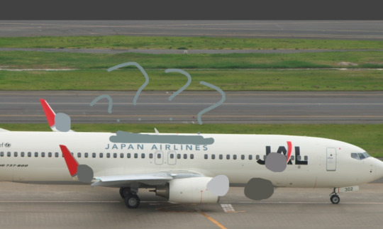
Yeah, I’m pretty sure that’s blue. I feel like this is definitely blue. Am I insane or is this blue. What in the world. I hate it when a livery has features I like at first glance but then you look closer and it starts falling apart.
D+. This weird 2002 livery and logo gets a D+. I don’t like this.
Moving on. Moving on promptly.
From 1989 to 2002 they also had this wordmark, another Landor design, which I actually don’t hate. For one, they kept the Tsurumaru on the tail throughout instead of canning it entirely - already a huge plus. Also, the typeface is better (darker, better contrasting, DELIGHTFULLY spikey), the red used is a lot nicer, and the uniform flatness makes the text actually pop somewhat, versus the 2002-2011 logo which kind of obscures it. This is fine. I don’t dislike this at all. But okay. Okay. Enough about wordmarks. How does it look on the plane?

This is very messed up. Last time I hated the logo but thought the high concept of the livery itself was fine. This time I like the logo but I think this livery is sort of nonsense. It’s almost all white, and then it has a bunch of features stapled on - the Tsurumaru, the ‘J Bird’, and the picture of a bird that’s just there? And it has a tiny illegible little ‘Japan Airlines’ written on it, as if people don’t know what JAL stands for. As if they’re not one of the biggest and most recognizable airlines on this planet. And as if this text for ants would help them if they didn’t.
I really, really like the logo and how it’s integrated here. The grey wrapping around the nose is really fantastic. I like that part. I like that part a lot.
I still have to give this a D+ because the rest of it is so incoherent.
At this point I’ve sort of come to a conclusion about JAL - oh, I should probably mention their modern livery while I’m going into this dramatic mental spiral, shouldn’t I?

Font choice is good. Tsurumaru looks nice as always. Really a shame they realized this and went “awesome, we don’t need to design the rest of the plane then”.
D+. Try harder. Apply yourself. Meet me after class. This is making me sad.
It somehow just feels like all of JAL’s liveries were an afterthought that nobody thought to put any creativity or real consideration into. It sucks because Japan is obviously full of incredible graphic designers and rich artistic traditions to pull on for iconography. (Bafflingly, in the 50s they used an American advertising agency, so the Tsurumaru was actually designed by a Westerner, which feels so wrong, doesn’t it?) Look, I lived in Japan as a child, so even if just having eyes and seeing photographs and accounts wasn’t enough to know this - Japan has way more to offer than a plain white fuselage with elements that feel like they were picked at random to just get the design process over with. The white doesn’t feel clean and intentional and meaningful like it does on some of the nearly-all-white liveries that I actually like (yes, they exist, I have two queued right now!), it just feels like nobody bothered to design the plane! It makes me very sad.
One of the reasons it’s making me sad is that I have a vision of what this could be. Keep the red and grey logo and the little line that goes around the nose. Keep the red winglets and fins. Maybe make the red circle on the fin larger so it envelops more of the rear fuselage. Put the Tsurumaru silhouette over it, so the bits of the logo which are white are painted over it and you clearly see its head. Does that make sense? Am I conjuring an image in your head?
Well, JAL certainly doesn’t see my vision. And I don’t currently have a graphics tablet so I can’t do anything to make anyone see it. You’ll just have to use your imagination, I’m afraid.
And I also have to mark all of these down for not also having the airline’s name in kanji. Especially when JAL’s nickname in Japanese, ‘Nikkō’, is literally written in two characters - “日航” - which would take up next to no space at all and be pretty easy to integrate. I know it’s like three letters, a fairly large portion of Japanese people read at least some English, and even those that don’t can probably recognize the text for ‘JAPAN AIRLINES’, but it kind of goes beyond an accessibility thing. I don’t think Japanese people actually have any meaningful issue with planes only having English text on them, or at least I hope not, because I can’t find a single airline in the country that does feature kanji (or any other form of Japanese text) on its livery, but I actually still think that JAL should do it anyway. A flag carrier is meant to represent the country it flies for. Latin is not the official or most commonly used script in Japan, and it feels very wrong for what is basically the country’s brand to exclusively use it.
But we’re not here to talk about their liveries anymore, even though they make me sad.. That verdict has been passed. No...what brought me here is their logo.
JAL first adopted the Tsurumaru in 1959, like I said. The airline, however, has existed since 1951.
So...what is this mystery logo from the dark ages of JAL’s branding?

This Star Wars situation.
I don’t know what I think about this. I don’t know how to feel. This just isn’t a JAL logo. My mind refuses to comprehend this fact. This is sincerely bizarre.
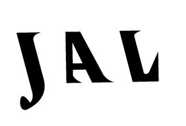
...this typeface is so weird that I almost think I like it.
I can’t find any properly sourced images of planes from this era, but they seem to only have the logo very small and lack anything except the airline’s name written in plain black kanji on a blank metal fuselage, which is...typical for that period. This is barely about the livery at this point anyway. This post was all an excuse to expose you all to the 1951 JAL logo.
Well. You’re welcome.
A D+ for Japan Airlines, shockingly consistent in their shocking incoherence since at least 1989.
#tarmac fashion week#grade: d+#region: japan#region: east asia#region: asia#era: 1980s#era: 1990s#era: 2000s#era: 2010s#era: 2020s#japan airlines#flag carriers#retired liveries#landor portfolio#double sunrise#long haul#requests
34 notes
·
View notes
Text
BUCCHIGIRI?! Rant
This show could have been so great. It could have been my everything. It was so cute when I first discovered it. The character designs are PHENOMENAL, the setting in fantastic, the colors are so vibrant and gorgeous—it is a visual masterpiece. Every character is so interesting, the story is actually engaging and cute. IT IS ALSO SO GAY OMG I LOVE IT! The men are all over each other and Ara-chan every episode, I’m not even making this shit up. It could have been so amazing.
But they ruined it.
They failed me and my love because of one character.
Mahoro Jin.
This girl…when you first see her is so adorable, so sweet. It’s unassuming. She’s got the whole heart aesthetic going on, lots of pink—instantly I was thinking about all the cute figures that were going to come out for her and how she was going to become a fav character of mine! She’s a nice soft character who you’re like “Oh! She’s a very cute love interest for this anime. I can’t wait to see where their love goes!” And all is well. For the first half of episode one. Then…all hell breaks loose when we meet Marito, her brother.
Don’t get me wrong, I ADORE Marito!!! Marito is a stunning character and I love him to death, I am obsessed. He’s so handsome and I love his vibes. However…I am not the only one who is obsessed with him.
THIS 👏🏻 CHICK 👏🏻 ROMANTICALLY 👏🏻 LOVES 👏🏻 HER 👏🏻 BROTHER 👏🏻
🥲
I haven’t been this disappointed in such a long time. Why? Why does anime do this to us? Why does it hurt me in such a violent and awful way? Why does it take so much from me? Literally cried after it was revelaved that she wants on her brother to LOVE and fight for her. Nearly threw up.
She was a great character and then we saw the truth, and it’s all inc*st with her now. GROSS. Every sentence that comes out of her goddamn mouth is about this man that I love(d, depending if I can stomach more of this God forsaken relationship) and it’s weirding me tf out. She appears in every other scene and quite literally ONLY talks about him. It’s so fucking disappointing. I think she’s only had one or two sentences that had nothing to do with her brother after we were introduced to him, and that’s fucking sad.
If I were to revamp this series, I would immediately change her character. Don’t get me wrong, I would keep her as a character because she has a great design, but make her want/talk about something ANYTHING else. If she had any other interests to share and, ya know, wasn’t looking to bang her sibling, it would have been fine! It’s vile that the author literally only uses her to remind everyone that she’s obsessed with her brother and wants to ROMANTICALLY be involved with him.
The ONLY redeeming thing is that Marito doesn’t return her feelings AT ALL. But it’s not helping my cringing at all. It makes the experience so fucking awful. Every time I try to enjoy it again, she’s rears her ugly head around and starts yapping.
I wanted to like this show so fucking bad…but her behavior ruins it so much that I can’t watch it.
It breaks my heart to see such promising new animes rely so heavily on these overused DISGUSTING themes when there is LITERALLY NO GODDAMN NEED FOR THEM!!! They weird everyone out, and you shit on a perfectly wonderful story by adding it. I wish they’d stop to let this go.
Sorry that was a long rant, but I had to let the people know my thoughts and violent feelings on this. I want to smack this author so bad, my hand is ITCHING for the opportunity one day.
Rest in piss, Bucchigiri.
#anime#new anime#bucchigiri?!#rant#discussion#disappointed#upset#it mmmmmmm#you guys dont understand#this show would have been my salvation#my sanctuary#my home#IT COULD HAVE BEEN MY EVERYTHING#and it was RUINED#ruined by that bitch
8 notes
·
View notes
Note
After seeing your post about the new ugly helluva design I looked it up and felt like I was reenacting "what, it's just its just an ordinary desiOH MY GOODNESS"
There is. So much to talk about when it comes to Beelzebub's design.
(Strap in cause this is a long one)
Let me start off with one thing I actually LIKE about the design. The colors are good. They're appealing and I'll admit that. But generally speaking the cons outweigh the pros. (pun intended considering she's supposed to be the princess of gluttony).
SO LET'S GET TO THOSE CONS SHALL WE?
First off let's get this addressed. Her design is a cluttered NIGHTMARE. It feels like there were a lot of things that people "liked" as little details and instead of picking and choosing they just. MASHED them together to make this character. Like while looking at her face I noticed a few things. A lot of things. From her freckles to her second eyebrows to her- you get it. There is WAY too much going on.

I genuinely cannot tell what's going on with her hair. Why does she have two different types of hair. SPEAKING OF HAIR her jelly hair is so fucking complex. There are ways this can be done WELL but this ain't it. Like for example look at Luna and Celestia from MLP.

The reason why these design work is because both the hair and character are not super complex. The hair is the HIGHLIGHT of both of the designs.
Did Vivzie really just decide "I'm going to make a character that's soooo hard to animate."?
We haven't even touched on the motifs yet good GOD.
So Beelzebub is meant to have bee motifs/be a bee (not sure on which yet). So yeah we have a Vaggie situation all over again where the character is VAUGELY using bug motifs. As in you have to grandma meme squint to see those bits. Like i'll admit the antenna ear is pretty cool. But good god everything else just looks like such a mess.
Also did I mention she's meant to be the ruler of the GLUTTONY ring?
Yeah she's meant to be Gluttony given form. But look at her. What about her design says "Food" or "Gluttony"????
Like food based outfits can be super fun to design. I have no idea what their deal was with this. The ONLY thing they did was give her the lava lamp stomach which only manages to clutter her design even MORE. If they really wanted to give her a lava lamp stomach they could've done it in a way that didn't have like. 3 colors in it, complicating the design even more.
She looks like she'd flit more with lust than she does gluttony not going to lie. Like the heart on her chest is a really DEFINED subject. If they really wanted to make her look "tempting" they could've done it and made it fit with the theming.
Simply put: when I see her I don't think "Gluttony" or "Bee" I think "Yellow wolf lady." and that doesn't make for a good design. A design needs to have reason. Like for example if you have a character that fights a lot you'd add things like scars or something. Things that show damage. It shows "Wow! This character has been in a fight or two before!". Another example: if you have a character that lives in a cold area they'll typical wear thicker clothing. You see what I mean? Typically a design is meant to show one of two things.
1. What the character is.
or 2. What they're like.
Let me use foxy as an example. (Jumpscare for people scrolling/j)
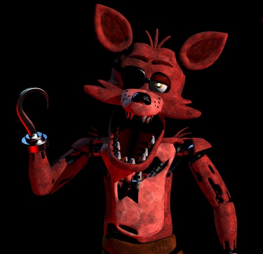
Foxy right? He's a pirate. How can you tell that? Through his eyepatch and his hook! Classic pirate stuff! You can ALSO tell he's out of order from the damage on his body. The tears in him and his visible endo legs. He's pretty busted up and you can tell why he's out of order. You can ALSO tell he's a fox! He's got the cheek fluff, he's red, he's got them sharp ears! 10/10 fox. Can comprehend he's a fox.
The problem with Bee's design is that you can't really.. get a grasp on the what she is.
We've basically covered the basics of character design so we've swam in pretty deep so I think I'll cut this post here. AS A TREAT since you've made it thus far, weary traveler, I've made my own design of Beelzebub!

24 notes
·
View notes
Text
Alrighty I’ve finally finished season 5
I hate how obvious it is they’re trying to tone the show down completely to even lower audience demographic. The first 3 seasons were for kids but there was actual peril and darker concepts and stuff that were much more interesting damn you Nickelodeon and your desperate attempt to keep the most squeaky clean image ever not only does it not work it’s costing stories and plot
I REFUSE to believe Stella would be a bad fashion designer with how much she loves fashion (I know it was a joke in s1 too but I still refuse). Plus, avant-garde is a thing and she would serve
That boat that was sent from Andros was def made exclusively for the winx there is NO WAY that style exists anywhere else on that planet for land related peoples with all of its hard lines and industrial style architecture with its limited color palettes
The nautical themed outfits are cute but Bloom’s looks SO overdone to me and Stella,, my sweet babygorl,, wtf did you do to your own fit?? Aisha’s poodle puff braid ftw also
Harmonix was totally useless BUT I still like the flower petal aesthetic vibe (even tho only Flora is a nature floral lady) and some of the color combos. Bloom in pink is still a no tho, which is something I mainly hate because of how obvious it is they started integrating it into her more to make her more marketable for toy lines and shit
Where did the gems that were already on the starfish thing for sirenix come from?
The amount of times the girls all gasp or ooo or ahh and go like “wow!” “so cool!” “amazing!”,, I will kill I feel like I’m watching a 1990s or early 2000s anime dub I hate it I hate it I hate it
Icy would NOT simp like this (shoutout to her leaving Valtor when he got ugly and telling him that’s why she’s leaving him)
The relationship drama was just as stupid and hamfisted as I thought it was from an outside skim of the season based off of secondhand knowledge ie posts and gifs. Also, Krystal did nothing wrong, she’s just autistic and Helia would NOT introduce Flora as anything other than the love of his life.
Timmy and Tecna also have one of the healthiest relationships why tf is everyone trying to give them advice like this they’ve all been dating for YEARS why are all of y’all so insecure like this? The writers really said fuck everyone’s character development even more than they already had
I continue to not give a shit about skoom also this was just exhausting I can’t do it
Also that is NOT Luna and Radius. That “he wouldn’t say that!” meme is ME SOOOO MUCH during this season at so many people but I actually started YELLING about Luna being some sort of soft gorl while Radius is this prideful ignoramus
Sirenix giving Aisha that blonde hair while knowing about the insane white washing to come in the future is something I Think About
The sirenix song does bop also, although I’m so sorry to say I don’t think I’m as big of a fan of it as a lot of people are but maybe that’ll change as I hear it more please forgive me
Also, Musa’s little coffee grinder move during her sirenix transformation? So cute, wish we actually got to see it more than like 2 times. Damn you shortened sirenix transformarion sequence
Im convinced Tecna doesn’t actually know karate, she just thinks it looks cool so she mimics it. Same with Flora and her ballet/lyrical looking poses she does during her sirenix transformation sequence. She doesn’t actually know those styles of dance, she just thinks they looks neat and tries to copy it.
Dark sirenix, you’re slaying thank you for your service
Bloom, you can’t insult Diaspro and remind her you’re a princess in that fucking dress while she’s serving cunt like that
The combat is soooo slow compared to previous seasons I hate it
The rigging throughout this season was a MESS
They should go after the handful of companies that are actually responsible for the majority of pollution and destroy them and their ceos a la Flora season 1 core
Where did they put all of that trash they got out of the ocean? They went to the pacific trash island and cleaned it up. Where did it go? I’m so curious
All of the kings are so STUPID too the whole meetup thing was so dumb like just fucking,, help each other you know it makes more sense
AND PUT SOME MF RESPECT ON THE WINX’S NAMES, ALL OF THEM. They are GUARDIAN FARIES who have saved the magical world HOW MANY TIMES NOW??? Bites the writers bites the writers bites the writers
Their little dance workout outfits? Hatred. I miss the old ones so much. All of these outfits from this season,, it’s so clear cishet people were the main ones designing the clothes I hate it so much it’s not the same kind of tacky and camp that the first 3 seasons had. The only good things I can say about the dance outfits is that Flora’s purple leg warmers were cute, Aisha’s color palette was nice, and Bloom’s was very Bloom core
Icy: you guys are helping me??
Darcy and Stormy: I mean, yeah, we aren’t talking to you rn, but you’re still out sister
Me: OUGH🥺🥺🥺😭😭😭
I forgot Roy existed🥲
Daphne being brought back like this still seems so bleh to me knowing how they don’t really do shit with it and about how it was done only because they retconned all the og stuff from canon and to continue to milk the franchise until it’s teats are dry and chapped BUT I’m glad she does a little spinny at the end of the season with Bloom so at least I got that
that’s all I got for now
Shout out to @charmixpower for suffering through this all with me.
We watched the first half of the series in like 2 or 3 sittings that took place months apart, and then did the last half in one 8 hour sitting
I couldn’t have gotten through it without yelling at each other and making shitty jokes.
The psychic damage you inflicted on me throughout this was awful but I would do it all again in a heartbeat (but not really because good lird this was EXCRUCIATING sorry bestie💕💕💕)
Anyway onto season 6 now I GUESS
#Winx club#winx#winx club rewatch#rewatch#winx rewatch#snarky ramblings#which is a new tag I’ll make I GUESS#Winx club season 5#winx season 5#Winx s5#Winx club s5
48 notes
·
View notes
Text
Speedrunning My Thoughts on the Boruto: Two Blue Vortex Designs Before I Make a Long Post on Sarada's
Boruto's design is the definition of unnecessary visual noise. He has three layers, two necklaces, one fingerless glove, two belts, a sword strapped to his hip, and a bunch of pins all to tell us very little about his character. It tells us he got really into pins and still admires Sasuke. Maybe this will change as we learn more about how he's changed, but only time will tell. I like how his color palette has stayed the same and how the purple around his sword is a subtle nod to Sasuke. While it doesn't look like something a ninja from Naruto/Shippuden would wear, it's pretty consistent with what shinobi wear in Boruto. Out of all of the designs, I think I like how this one looks visually the best, but I am bothered by just how much it reminds me of Sasuke. There's a difference between inspiration and copying.
Why does Mitsuki's design look so different? At first I thought it was to change to better match Kawaki since Mitsuki thinks he's his "sun," but Mitsuki never looked all that much like Boruto before and there were other ways for him to resemble Kawaki without upturning his entire design. I can't say much in regards to his color palette without an official one out, but I really hope they didn't trade out all of his blues for black. His outfit overall is pretty weak visually, but I don't exactly hate it. I just hate that it's on Mitsuki. At least the belts on someone's design are finally doing something.
Finally a design that looks like the natural progression of his last design. It's mostly fine and the only real complaint I have is how baggy it is, but it's not like it looks out of character for Kawaki. Plus, Kawaki doesn't see himself as a ninja so what does he care about dressing like one.
Same problem with Mitsuki, it looks nothing like her old design and I can't begin to explain why. I think that the look itself is growing on me, but it should've stayed a civilian design because it doesn't really look protective. Also, her hair looks really awkward, especially in the image here. I hope that as Ikemoto gets more used to drawing her, it improves.
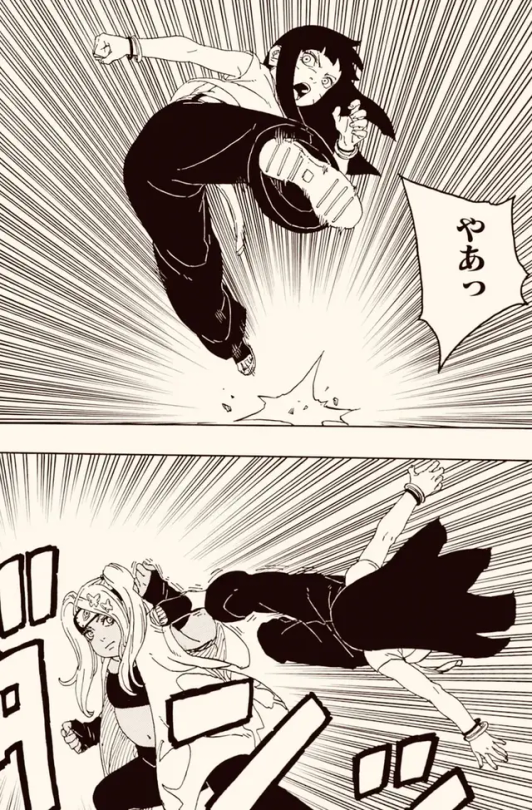
ChouChou's design is in character and looks cute, but it also looks god-awful for battle, especially considering her combat style. I wish it was more balanced in that regard. I wish Ikemoto was better at drawing spiked hair, but the hairstyle itself is cute.
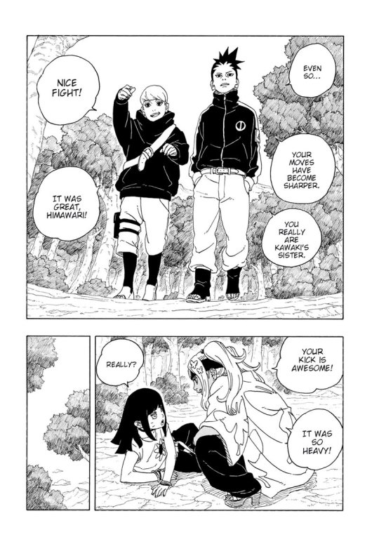
I'm just gonna do Shikadai and Inojin together. Shikadai's design is boring and doesn't resemble his old one, but I'm fine with it otherwise. Inojin's design is the worst(among the ones listed here). It doesn't resemble his old design, I'm upset they got rid of his ponytail, it's incredibly boring to look at, it's butt-ugly, and the only thing it tells me about his character is that he shouldn't be allowed to dress himself(really? the child of Ino can't dress?).
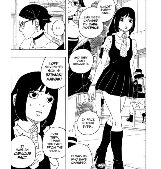
This is the only design I'm okay with being impractical because Sumire isn't a combative ninja. It's another design that continues the last and it looks nice. I just wish that her skirt was longer and her hair was less awkward, but I have very little faith considering it's Ikemoto who's drawing the manga(I do have faith the anime will solve these problems though).
As for everyone else, I don't really care. Eida still looks good, Shikamaru's design looks better than his last but it still doesn't work with his Naruto/Shippuden designs, and both Code and Konohamaru look dumber than ever.
#Sorry for the weird and inconsistent images#boruto naruto next generations#boruto next generation#boruto two blue vortex#character design#boruto uzumaki#mitsuki#kawaki#himawari uzumaki#chouchou akimichi#chocho akimichi#inojin yamanaka#shikadai nara#sumire kakei#boruto spoilers#my stooff
17 notes
·
View notes
Note
why do you like nnoitra so much he’s fucking ugly
[ I SPOT A CHANCE TO TALK ABOUT MY LOVE FOR NNOITRA IMMA TAKE IT !! First of all, my liking for a character is usually not based on how "good looking" said character ( I mean, some of my favorite One Piece characters are Perospero and Spandam ) is. In my portrayal of Nnoitra, he shares your opinion that he is fucking ugly fjfjfjjf, but he just doesn't mind. BUT IN MY UNBIASED OPINION --- ! Nnoitra is SUPER PRETTY !!!! Like OH MY GOD have you seen this man ?? ( Also, when I talk about Nnoitra's appearance, I do so from a completely platonic pov, I find it quite uncomfortable when people express physical attraction towards my muses ). ANYWAYS, yes, Nnoitra is incredibly pretty. I guess I just have a liking for "unconventional" beauty.
Nnoitra's build. Even though he hates it himself, I find it SO pretty. His build has influenced my drawing style, where I draw a dorito shaped torso fjfjfj. I mean his super broad shoulders and wide chest, and then that tiny tiny tiny waist... And his loooong skinny arms and looong legs?? He's got these odd exaggerated proportions that give him such a striking, recognisable silhouette. I also love being able to see his ribs and spine because I love drawing those things! I love that Nnoitra doesn't have the copy-paste "anime build". Makes him more unique. I just love how long he is? And also that he's so incredibly strong even though he looks so skinny. It's the "don't judge a book by its cover" vibe. And, of course, can't mention his build without mentioning his height. Nnoitra is amazingly tall, but not so tall that it can't be adapted to real life, which I'm SO happy about. It means I can write him in his main (human) verse without changing his height (like I have to do for my One Piece muses who are over 3 meters tall ). I just love how he's so tall and skinny. It gives him such a threatening vibe? I think he'd be less scary looking if he had a large build. There is something unnerving about an incredibly tall skinny dude?? I don't know how to explain it but I just love the vibe!
Nnoitra's face. Hello YES once again I'm so happy he doesn't have a copy+paste face. I feel like a lot of the Bleach characters have really similar faces, but with Nnoitra, he's unique. He's got his own design that doesn't resemble anyone else's. His face is quite long, but doesn't appear long, because it just fits perfectly with his body. His sharp jawline and pointy chin and his single squinty eye... Holy HECK he's so pretty?? Though my favorite part of his face is for sure his mouth. I love that he basically has no bottom lip, because his lips are so thin. It makes him really easy to draw. And, of course, the absolute best part! His HUGE piano teeth! This is where he absolutely goes way out of proportions and I LOVE IT SO MUCH !!!!! His teeth give him the most sinister, evil look. Like, he's supposed to be a monster and he's got the teeth to match. I love the manga panels of him where he's drawn with a HUGE mouth. Those panels are so effective and intense and portray emotion that normal "pretty looking panels" just don't. With such an amazing design that Nnoitra has, which is not SUPPOSED to look "pretty", he can be drawn much more dramatically, and that's amazing. Also just... Piano teeth are generally the best. Like they're so square. So perfect. Also gotta mention Nnoitra only having a single eye. When it comes to drawing him, this is a blessing. I love the angle of his eye, and the color. Storm grey, like that colour the sky has right before it starts raining like hell. Also... Have you seen his eyelashes? Stunning. I really like how his eyepatch compliments his face. If it was smaller it would look sort of odd imo, so the size is perfect. AND!! Another important thing about his design is that he doesn't have eyebrows in canon. I don't know why but I have a huge deal for characters without eyebrows fjfjfj I tend to not give my OCs eyebrows in their designs I don't know why. I feel like it just leaves the face so much more open and not as "cluttered" when you draw it IDK! Tho I do give Nnoitra eyebrows in his human!au.
HAIR!!!!! Can we talk about how Nnoitra has the prettiest hair you'll ever see? It's drawn SO shiny and smoooth in the manga. It always frames his face perfectly, and almost never looks messy, despite all the things Nnoitra goes through. Clearly it's really thick and heavy. And ink black which contrasts so perfectly to the really pale skintone they gave him in the anime ( which I use for my portrayal ). I think Nnoitra looks really good with his shorter hair as well, but yeah something about his long hair is just so majestic. And I also think it helps portray his depressive vibes. Like the panels where he's sitting... The way his hair falls just seems heavy.
HANDS!!!!! Who doesn't like pretty hands? IDK. And Nnoitra's got THE prettiest hands. Because they're unconventional. They're HUGE. Like really goddamn enormous? I think he's got the biggest hands in bleach fjfjfjf. His fingers are SO sharp and skinny. And bony. And also somehow he's got pretty nails. Hands are my favorite thing to draw and drawing Nnoitra's hands?? - chef's kiss - I just love the details.
And his outfit! People always say Nnoitra's outfit looks silly. That he looks like a spoon. And, yeah, he does look like a spoon. I affectionately refer to him as "my spoon" when I talk about him. He's got an outfit design you actually remember. It's unique, it's characteristic. You can see his silhouette and immediately identify him. I just imagine how terrifying it is for the other Arrancar when they suddenly see his shadow. They'll know exactly who is standing behind them. His tight fitting jacket really brings his build out in a way a fluffy jacket just wouldn't. And his neck looks so long and thin thanks to the way his collar is?? Also the fact that he wears bracelets that would make it harder to fight... It's such a good addition. Like why did Kubo bother giving a minor character like that SIX bracelets that he'd have to draw?? I love it. And Nnoitra's wide pants which are stuffed into his boots to reveal his incredibly thin ankles... Holy heck. 5/5. I think he'd look less threatening if his pants were tight-fitting ( and also would be impractical for fighting ), so this is such a nice move. AND ALSO HIS TINY FEET!! The fact that he wears high heels and that his boots have that curved tip... And his feet STILL look small for such a tall man... I love it. It's endearing somehow. And, guys, high heels were worn by men long before they became fashion for women, so this has nothing to do with Nnoitra being "feminine", because he just isn't.
SANTA TERESA !!!!!!!!!!!!!!! Cannot talk about his design without mentioning ( my unbiast ) favorite Zanpakuto. Everyone in Bleach has sort of a small Zanpakuto, at least when it's not released. But Nnoitra? Nope. It's HUGE. It's freaking enormous. It's like a battle axe, but times two. The crescent shape, one pointed at his enemy, one pointed at himself, is so symbolic. And how skinny the handle is, which would mean it's super uncomfortable to wield... And how black the blade is. Like death. The chain always attached to him, like an anchor. That incredibly eerie sound it makes when he moves... GOOSEBUMPS !!
So yeah, I absolutely do not think Nnoitra is ugly. He's got that awkward, strange beauty about him. The reason why I started loving him in the first place, was because I randomly drew him one day. I was just sketching some Bleach characters, and I drew him, and something happened. It's quite hard to explain, but I got the urge to draw him again. And again. And again. Something about him inspired me. Something about how it felt to draw him. Honestly, when I started drawing him, I didn't even care that much about his character. I hadn't really "noticed" him when I watched Bleach. But as I started drawing him more, I went back and re-watched, and - I was completely sold on him. I started drawing A LOT more than I ever had before, and it gave me a different sort of joy. I felt happy drawing him. I think it's hard to explain if you've never had a muse before.
( muse - a person or personified force who is the source of inspiration for a creative artist. )
For me, that was, and is and always will be - Nnoitra. After drawing him for nearly a year, I started to write him on tumblr. My portrayal in the beginning was... Quite questionable ( I was very young, don't judge me ), but OH MY GOD !!!!! How much fun I had !!!! The very first month of writing him I wrote almost 50k words for him. I had never had this much fun with anything. Never felt so inspired. And it's been like that ever since 2014.
WHY do I love Nnoitra so much?
He is my inspiration. No matter how I'm feeling ( I have a chronic illness so I'm often in a lot of pain ), writing Nnoitra can make me feel better. Little things in my everyday life that remind me of him makes me happy. Like getting a milkshake because in his opinion you can't go on a roadtrip without it, or going for a walk because Nnoitra loves being outdoors. I always, ALWAYS want to write for him ( even though I often physically can't ). Having something to always return to, always want to do is a blessing.
I've met amazing people and had amazing experiences because of him. All the friends I've made online, some who I've been friends with for almost a decade, are friends I met because of Nnoitra. I used to be REALLY shy and insecure, but after I started writing Nnoitra, that just went away. I forever felt confident and comfortable. I've had no trouble reaching out and chatting with people. I've gotten to write incredible plots and had so much fun. All thanks to the confidence Nnoitra has given me.
Nnoitra's character overall to me is so interesting. He's so complex. Yes, he's an absolutely horrible person, and I find writing about that to be incredibly intriguing. There is pretty much no "limit" to Nnoitra's story, because he's NOT the good guy, he doesn't GET a "happily ever after". I've been writing his main-verse story for almost 10 years now, and there is still so much left to write. I love all the contradicting aspects of Nnoitra. How he's fiercely loyal, but that turns into possessiveness. How he wants to be cared for, but is selfish as hell. How he hurts others knowingly. How he knows he's a bad person. I love the small tiny glimpses of his humanity when it shines through. I love his bravery because no matter how heavy life feels to him, he always gets back up. He feels very REAL to me. He's got many sides to him. Most of them ugly, but all of them real. I always know how he's going to react in situations, because of how good a character he is. ( I don't mean good as in morally good, I mean good as in well thought out ). I love putting him in different situations ( aus ) to see how things go for him. The fact that he stays the same character regardless of scenario is amazing to me. You can change his whole life story, and somehow he's still there. Recognisable.
I guess it's not easy for people to understand why I love him so much. Definitely people in my real life don't understand why I dedicate so much time to an obscure ( they also think he's ugly ) character. But to me it's like ?? Nnoitra is my light? My inspiration? I love him. ]
#[ HELLO ANON 8))))) ]#[ i saw this first thing in the morning and ]#[ IT WAS THE PERFECT OPPORTUNITY !! ]#[ never underestimate my ability to talk about him ]#[ HIM HIM HIM HIM HIM ALL DAY EVERY DAY ]#[ thank you for sending the ask 8)))) i enjoyed replying to it ]#longpost //#toby post. ╱ out of character.
10 notes
·
View notes
Last Seen Blogs

libra-aesthetic
~My Happy Place~
camoleite
Camoleite
lucky-katebishop
heavy is the head that eats the crayons

herapotter
herapotter

dani-h
Daniela