#and the contrast and character designs were not my favorite
Text
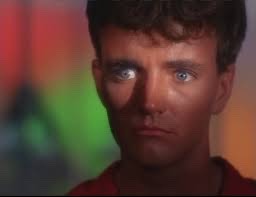
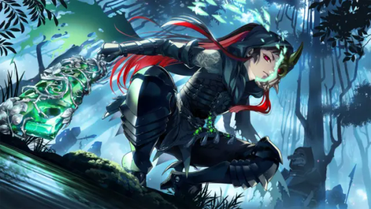
How did you guys feel about the live action little mermaid movie?
#just curious#i#did not like it#the casting is all good and the actor for Ariel did an amazing job and her singing is awesome#but wow#it was lacking#idk maybe im just a hater#it was so unexpressionate#and the contrast and character designs were not my favorite#idk i feel like they could how really blown us away and they didn't#but again maybe im just being over critical#im not trying to start anything i just think it was lacking a little#ren won't shut up
34 notes
·
View notes
Text
fred / evelyn / richard / lily as a new group for me to focus on?? hmm... i am thinking...
#ooc#fred and evelyn are a given#the other two... well mike is my next favorite guy survivor but i'd rather have him as a separate group w/ the hullabaloo cast#i REALLY like richard's design so far... (mostly the knight thing tbf lol) but there are other survs i could put here too. like matthias??#but i kind of like the idea of giving evelyn-richard a connection SOLELY because they were introduced together#and then contrasting that with lily-frederick (connected via the racecourse!)#but i'm torn between lily and emma or anne tbh.#actually anne-matthias could pair together nicely as a separate duo...#so where to put emma........ ALSO THERE'S DOLORES + TANG SI TOO HELP#as for why i'm sorting them into groups. it's mostly for like coming up with verse concepts centering specific characters or fic ideas#but obviously they can work outside the groups + in other dynamics too!!#idk what i'm doing tbh i'm losing my mind a little. lmao
0 notes
Text

Edit 2/12/2024: I wanted to add a disclaimer to my redesigns! I really appreciate all of the likes and comments that these have garnered, but I just want to add that these aren't intended to be "improvements" or "fixes" of the original designs in any way and were done as a character design exercise for my own entertainment. Looking back on them there's a lot I'd like to change about them and I'd never claim to be anything more than an amateur/hobbyist character design messing around with these character concepts.
------------------------------------------------------------------------------
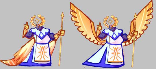
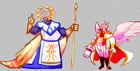
Another redesign for fun, this time of Adam. Elaboration below.
(edit: This redesign was made before the show aired, and after seeing Adam's canon design in action I think his design fits his character well and is actually one of my favorite in the series! This redesign was just done as an exercise.)
More of him here!
The most confusing thing to me about the Exorcist's designs is how un-angelic they look. While working on this redesign I had the thought that maybe they're supposed to be fallen angels and thus it'd make sense for them to have a more demonic appearance, but this isn't confirmed. I think the design will grow on me, but I wanted my redesign of Adam to have a "holier" looking design to contrast with the rest of the cast.
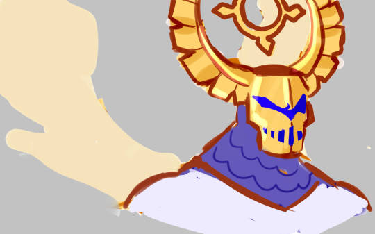
I definitely wanted to remove the horns, but I thought they gave him an interesting silhouette, so I tried to think of a compromise. Eventually I remembered the existence of these really interesting helmets worn by medieval Teutonic knights.

With this helmet it makes it look like he has both horns and wings on his head and gives him an interesting silhouette. The helmet would be fully emotable like his current one.
Edit: I further modified the helmet so it almost forms a full circle and the halo is placed in the center so it resembles a giant eye.
The rest of his outfit is similarly inspired by both a crusader's uniform and a priest's cassock. The emblem on his uniform is based on the canon symbol he has and the Eye of Providence.
Unmasked, I wanted to stick with the whole "rockstar" thing and give him a wild look that suggests he might not be as holy as he presents himself to be, opening the door for a nuanced interpretation of the angels like the show seems to intend.

His blue palette makes him a nice visual foil for the rest of the cast, especially Lucifer.

In terms of physique he has a stocky build with broad arms. I imagine him as on the taller side.
Thank you for reading!
I'm not 100% on this design, I feel like it should be a bit more stylized, so I may redo it eventually.
The rest of my redesigns are here.
#hazbin hotel adam#hazbin hotel redesign#hazbin hotel#hazbin hotel au#i want to clarify that these redesigns aren't made out of any ill will#these are just my own reinterpretations of the characters
579 notes
·
View notes
Text
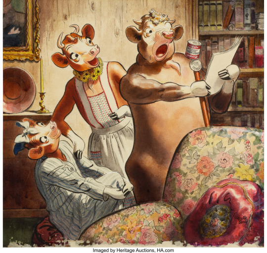
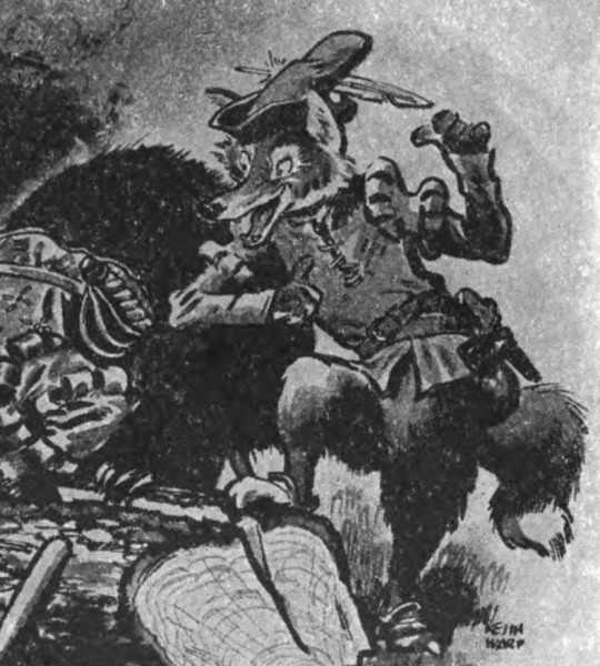
One of my favorite fun historical through lines is that the original co-illustrator for Dick and Jane who also co-created the branding for Elmers Glue is also very likely the indirect but influential progenitor of a great majority of furry art and culture. and he doesn't even have a wikipedia page. The story is as follows:
A team of designers create Elsie the cow as the mascot of the Borden dairy company, later giving her a husband named Elmer in branding. Elsie was extraordinarily popular and was portrayed in tons of print advertising and even licensed media. The most well-remembered and beloved of these advertisements were done by a popularly unknown and uncredited illustrator named Keith Ward together with a great deal of other commercial illustrations
(Ward's early work in commercial illustration: children's books and advertising)
The scale of ward's contribution to Elsie and Elmer is somewhat murky, particularly since most credits go to the contributors with greater status at Borden. Personally, I see it as largely a collaboration between Ward and several unknown others under art director David William Reid.
(Ward's work vs Reid's work)
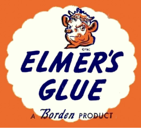
Elsie eventually fell out of popular consciousness after rebranding, but Elmer lives on as the mascot of Elmer's glue, originally a subsidiary of Borden as glue could be produced as a byproduct of industrial dairy. Modern Elmer's glue is synthetic, but retains the iconic mascot and design.
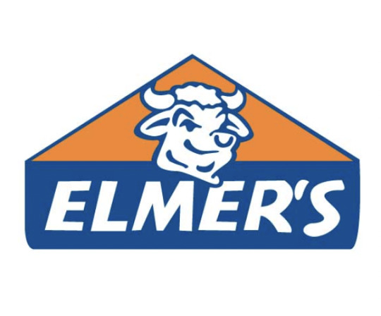
(Elmer's evolution from a more Ward-like design its current iteration)
Ward would later go on to illustrate for an American adaptation of Reynard the Fox by Harry J. Owens, again, miraculously uncredited on the cover. His name appears once, on the title page, and the lavish biography on the back of my copy fails to even mention the illustrations.
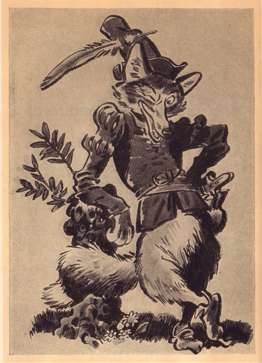
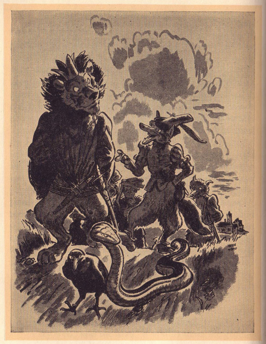
(Ward's work for the Scandalous Adventures of Reynard the Fox)
These works are particularly notable as much later, Ken Anderson of Disney was working on conceptualizing a Disney adaptation of Reynard, which is a very interesting and messy story for another time. In short, he and his team drew many inspirations from many many places, but with Ward being relatively more known and respected in the industry and having worked on a Reynard book in a similar style to what Disney wanted, his work was one of the most influential on the development of the film. The Reynard part was eventually scrapped (those who are familiar with the story and character will not be surprised), but a lot of the designs and even layouts were reused for Robin Hood. If you've ever wondered why they made him a fox, that's why.
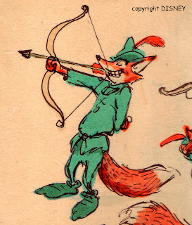
(Bill Peet's and Ken Anderson's Reynards bear a striking resemblance to Ward's)
There's a lot more to the inspiration than just the designs, many plot points and layouts from Reynard, and their depictions by Ward, remain in Robin Hood (they unfortunately do not fit in this post). Its likely that finding such a clear starting point for their film in Ward's book had a hand in salvaging the Disney Reynard project and leading to the complete, although troubled, completion and release of Robin Hood.
And the rest is furstory! While there are certainly many other Disney animal features that have made their mark on the fandom, Robin Hood's influence is particularly notable for being the most popular of the most anthropomorphic animal-focused animations in contrast to the commercial underdogs of the Great Mouse Detective and many of Don Bluth's films, and more conventionally presented talking animals like those of the Aristocats and the Jungle Book. Isn't that interesting!
453 notes
·
View notes
Text
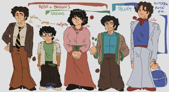
hi so i posted a drawing just now and heres a long post under the cut on my design choices If you were curious . or you can just look at this image for the basic color motifs
Ok. hi. waves
overall its 100% obc + motf oobc based etcetera If you know me you know this is Always basis for everything marvin trilogy i draw
detailed descriptions + other things linking characters together that arent covered by the Image:
marvin dresses like shit but there's Some cohesion there keeping it together. his family shares his warm colors; mendel uses his browns a little differently, and whizzer doesn't share his pallete at all
trina's favorite color is pink :) there are literal articles of clothing that are tied on her, one is red for marvin and the other is green for mendel. as the story goes on she would probably swap this and have a green tichel instead
trinamarvin have similar shades of pants/skirt, and jason has the mix of their yellow and red as an orange on his arms. travel travel travel from side to side!!!
^ on this note jason has things from his 4 parents and theyre all strangely layered all together
ie both him and whizzer have white over the rest of their clothes
whizdel and whizzvin are the only combinations which don't share at least one color, but:
whizdel have light/dark blue contrast and complementing red-green
whizzvin blue yellow contrast babyyyyyyy yeaaaahh boyyyyy!!!!!!!!! they wont agree
whizzer's got the most unique color palette also the least direct connections to everyone else: only trina, who wears a tichel paralleling his ascot and ties them back to marvin, and jason
trinamarvin's shoes are the same, each their corresponding hair color; mendel wears something most similar to marvin's shoes but he gets silly with it; whizzer gets to have shoes that stand more. he's cool; jason's got sneakers! and theyre whizzer colored because whizzer has his own whole deal with running
^ jason trina and whizzer all have red around their necks; mendel also very specifically doesnt have it
mendel and jason Dont have belts or anything resembling ones. this was deliberate but honestly theres not meaning to it
so yes. marvins setting the base the others generally interact with; trina tries to be plain; mendel is goofiest; jason is still figuring things out; and whizzer outsider themes Save me. whizzer outsider themes. save me whizzer outsider themes
ok That is all thank you. small bow
104 notes
·
View notes
Text
MXTX Interview with Risa Wataya for Subaru Magazine P.5
Character's Allure
Risa: Among the cast, my favorites are the Nie brothers. Nie Huaissang and Nie Mingjue. As I read, I constantly prayed that Nie Shi (House Nie) would not fall.
Mo Xiang: Shocking! I have yet to see this kind of attitude toward the Nie brothers. In the place of Nie brothers, I deeply thank Risa! Nie Mingjue was created as a foil and reversed mirror image of the 'extremely socially adept' Jin Guangyao. Nie Mingjue is someone who would rather break but never bend. Jin Guangyao is someone who would rather bend but never break. One embodies unbendable justice. One is a cunning smooth operator. I thought about these two contrasting and contradicting kinds of characters and then created them (Nie Mingjue and Jin Guangyao). A cunning faker (*) like Jin Guangyao, once he meets a 'violent god' (**) Nie Mingjue would become absolutely powerless and can only flee. Their situation would be quite interesting should I continue to write it. Although for them, it definitely would not be a fun time.
(*: 狡猾 jiaohua: someone who is pretty/righteous on the outside but rotten inside, a faker, a pretty snake masquerading as a saint)
(**: 凶神恶煞 xioengshen esha: a powerful, brutal, violent god that is consumed by the slaying of evil so much he starts to do evil himself. Someone who should be good but is consumed by rage and violence and becomes no better than the evil he seeks to destroy)
Risa: Nie Huaissang is extremely smart. Nie Mingjue still acts even though his body has been split into multiple pieces. I absolutely love these brothers' opposing approaches to life.
Moxiang: The more the character personalities contrast with each other, the clearer their conflict and transformation is portrayed. It also makes the story even more compelling and exciting. Nie Huaissang was built on the foundation of Nie Mingjue as a character. They both use sabers as their weapons. Nie Mingjue is more or less straightforward inside and out. Nie Huaissang, on the other hand, looks weak and cowardly on the outside but is actually immensely insightful, patient, and crafty on the inside. The characters of Qinghe Nie Shi were actually complete quite early into the writing.
Risa: The characters of "Mo Dao Zu Shi" mature into different kinds of people depending on their relationship with their parents. In terms of lineage and family ties, what were your thoughts while writing?
Moxiang: I think the environment a person grows up in is a very important factor. The parent generation's joy and sorrow will create an increasingly greater impact on their children. Furthermore, children will inherit specific things from their parents. Only when you look at the profound yet incidental similarities between parents and children, you will see that family ties are something very real.
Risa: Some characters in the book had a very difficult childhood. Jin Guangyao, Xue Yang, and Wei Wuxian. One type of character experiences misfortune in their childhood and then grow to become bad people. One character, on the other hand, steadfastly holds onto his good heart no matter what. Both types exist in the same book.
Moxiang: To be honest, the character's childhood was the last thing I considered. My creative method starts with imagining the zenith of a character's life when they are shining brightly at the summit. Then I think about narrative developments leading to and from that moment, and then the character's childhood as the finishing touch. After that, I fill out details on their parent generation. The parents mostly act as supporting characters. Their designs are based on the main cast, to contrast or to complete.
For example, first, I think of what kind of person Wei Wuxian is. Then, I think of what kind of parents could have such a child. I base his parent's characters on his character.
Looking at it from within the story, it's that parents will inevitably influence their children. But from a structural writing standpoint, it's the children that influence the parents.
To be continued (We are about... half-way through the interview transcript)
Translator: Sythe / NPD Khanh
407 notes
·
View notes
Note
Tediore actually was the villain of the new Tales from the Borderlands iirc
Yeah and they look boring. The Borderlands series is my favorite type of media to consume because it's so almost good. I love any Strong B+ type shit that could have been cool if you changed like two things. It inspires a man!
Borderlands 1: Nothing writing. Solid base of mechanics for a fun series.
Borderlands 2: Mechanically fun. Some pretty dope environments. Flashes of genuinely good writing contrasted with actively awful writing.
Pirate DLC: Forgettable writing, but had some dope set piece fights. Carried by the strength of it's setting alone. Fun mechanically. Forgettable writing.
Torgue DLC: Grating and annoying.
Hammerlocks Hunt: "I'm sure gearbox will handle the African big game hunt themed DLC well. What could possibly go wrong."
Tiny Tina DLC: Honestly more enjoyable than the base game. A genuinely fun concept that manages to hold back the annoying quips long enough to flesh out Tiny Fucking Tina of all characters??? What's wild is it WORKS. Imo it successfully walks the line of madcap humor and commentary on its own uberviolence, exploring how Tina's LMAO random XD persona is a safety blanket. At her core she is a traumatized child who has lost another father figure. It's Tina using the player as an instrument of uberviolent fantasy justice to process her grief and against all odds it works PERFECTLY with the tone of Borderlands.
Pre-Sequel: Literally everything interesting in this game happens in like, flavor text. Expanding on the villains of 2 is a cool idea. Seeing Jack become Jack is neat, but honestly didn't do much for me. Forgettable environments. Mid gameplay. Felt like a test run for 3. The Dahl mercenaries were a missed opportunity. I remember a single quest that got a real laugh out of me: the one where it's revealed that the respawn station voice isn't pre-recorded, it's a live lady who has now been captured by bandits, who are making her say cringe shit on the intercom.
Borderlands 3: A master class in environmental and level design. Every character is extremely fun to play. I love the Eden-6 Louisiana Dinosaur Jungle. I love the Maliwan Corporate City. I fucking LOVED Nekrotefayo. "Evil twitch streamers" was a brilliant choice that the writers legendarily fumbled. Main Villain should have been the Maliwan twerp. The Danny Devito Indiana Jones character fits in the world but needed way more time in the oven. Making him the Calypsos dad was a bizarre choice.
340 notes
·
View notes
Text
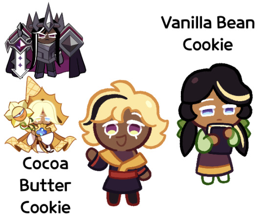
Hm, apparently this wasn’t a request. But whatever, I finished them and want to show it off
But yay, I finally got purecacao done!
So first off, I just want to say that these two are post-canon, and Dark Choco’s their older half-brother. I just felt like mentioning that because I made up this whole thing for the purecacao love story
My idea for how Dark Cacao and Pure Vanilla’s relationship went is that at some point, Dark Cacao got feelings for Pure Vanilla, but wasn’t sure how to tell him. But he thought he’d have all the time in the world to say because they were immortal. But then the Dark Flour War happened and Pure Vanilla “died”. When he came back, Dark Cacao realized that he couldn’t just wait anymore, and so sometime during the current story, he confessed his love for him, and after the main story they ended up getting together
Anyways, back to the twins. So Vanilla Bean is a girl, while Cocoa Butter is a boy. Though I’m considering making Cocoa Butter a girl as well. I’m not sure
So Cocoa Butter is a very friendly kid, and very outgoing. He wants to be a warrior like his father (Dark Cacao) and brother, though he prefers the Vanilla Kingdom over the Dark Cacao Kingdom. He also tends to get himself into messy situations, which result in his outfits getting messed up and having to constantly be fixed. In the future, I see him being a Vanillian soldier, if not a commander. Also, despite his want to be like Dark Cacao, his favorite parent is Pure Vanilla since he’s not nearly as serious
Vanilla Bean on the other hand is very shy and quiet. She prefers to read giant tomes and watch from afar. She prefers Dark Cacao since he’s quiet and feels safe with him due to how strong he is. I’m not as certain what she ends up doing, maybe she becomes a healer, but I know she’ll end up living in the Dark Cacao Kingdom
I feel like you can tell which description I did better. I mean, with Cocoa Butter I was haphazardly putting all my thoughts, but by Vanilla Bean I knew how to articulate them better
Despite their differences, they get along very well, and include the other in their games. Also, they both really like their brother Dark Choco. He’s like their main babysitter, and he enjoys their company too
Alright, I think that’s about it for their characters. Now on to designs
So I think I’ve mentioned using the name Cocoa Butter before, but I also decided to use Vanilla Bean a few days ago. My brain thoughts were that cocoa butter is cacao but light colored, while vanilla beans are vanilla but dark colored. It’s contrast (which admittedly I may be doing too much of with these two)
Cocoa butter and vanilla beans:


So one of the first things I wanted to do was give Vanilla Bean those pigtails, with the idea that they’d look like vanilla beans. Admittedly they aren’t actually in the shape of the beans, but whatever
I was struggling with their eye colors, since I wasn’t really sure what to do. I knew I didn’t want to do heterochromia though. Eventually I tried mixing the purple and I think blue to get this bluish grey color, and I decided to give them purple eyes but with one of Pure Vanilla’s eye colors as the highlights. And also I decided to change the purples to fit more with each highlight, Cocoa Butter’s being more warm while Vanilla Bean’s is more cool
Admittedly I was kind of just making stuff up with their outfits, all I could think of was vaguely mixing Vanillian and Dark Cacaoian clothing, which mostly just resulted in purple + yellow. I know I’ve seen someone do it, but I don’t have refs. I think what I came up with was alright though
In addition to their purples and yellows, I experimented with adding an additional green color to Vanilla Bean to spice things up, and I liked it. But I didn’t want to leave Cocoa Butter out, so I gave him the red accents
Their streaks were a very last minute inclusion, and I really only added them because I remembered that Dark Cacao had those. I feel like you can really tell on Cocoa Butter
Overall I think they’re good. Maybe not my best, but they’re still fine. Maybe I can make them some adult designs that look even better
But yeah, I think that’s about it for them. I hope you enjoy them!
#I made them instead of studying for my Physics exam#granted I wasn’t going to study anyways just agonize over it#so might as well do something productive#anyways#cookie run#cookie run kingdom#cookie run oc#dark cacao cookie#pure vanilla cookie#purecacao#fankid#fanchild#cocoa butter cookie#vanilla bean cookie#my ocs#my art
65 notes
·
View notes
Text
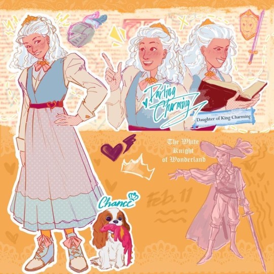
EAH was one of my very favorite cartoons as a kid, and I've been enjoying it's renaissance very much, so REDESIGNS!!! (I've done a bunch over a couple months and put them on Instagram, but I figured I'd move them here cause Instagram sucks, so if you've seen them before over there that's why)
I think the original designs are aesthetically pleasing, but they're not super practical for the characters- case in point! Gay icon Darling Charming
I'm gonna put all my design notes under the cut so if you don't care about that carry on, have a nice day
Darlings original design is fun, but it doesn't serve an obvious purpose, at least not that I can see. She clearly wears armor on the outside of her outfit, the Marie Antoinette poof is a bit strange to me, and she has very little visually tying her to Dexter and Daring. I wanted to emphasize her secrecy, but also her passion for puzzle solving, riddles, combat tactics, ect. when she's around the people she trusts (as if the queer metaphor wasn't obvious enough)
Here are some details that just make me happy
-First, the hair. I knew I wanted to give the White Knight a more unique look, and I wanted to simplify it overall. I LOVE the original armor, but it would be a huge pain to animate, and I don't have the patience for that, so I went for a masquerade-ball-three-musketeers-vibe. The braided bun is still a fancy, regal style, but it's a lot easier for her to manage in her uniform
-I tried to synthesize the color schemes of the Charming siblings. They all have a pit of yellow, a bit of pinkish red, a bit of blue. The twins lean heavy into yellow and blue, with splashes of red where thematically appropriate. Darling doesn't really communicate with Daring much, so she has the least amount of red. I think having more muted colors in comparison to her brothers also emphasizes the fact that she's hiding herself. She is very much defying her family with her ambitions, and she has to work hard to keep it under wraps. Sort of related, I gave her a tooth gap, because it's a cute design detail, but also to act as a "flaw" to contrast with Daring. Daring's primary physical trait is his ungodly perfect teeth, so I thought it'd be fun to give her an "imperfect" trait, like Dexter and his glasses. There's nothing actually wrong with them, but it's a failure to reach the insane expectations that the Charming family has cultivated over the generations. Basically the Charmings are petty and I feel bad for the youngest generation.
-Speaking of concealment! There are a couple bits that I thought would be fun to hide throughout her outfit. First, the skirt is flowy enough and the shirt is positioned just right so that you can't tell, but she has pieces of leather armor on at all times. She saves the plates for wonderland. She also wears gloves to hide the callouses on her fingers from swordfighting! She also probably keeps knives in her hair somewhere. Pulling a small switchblade out of the base of her bun just seems like something she would do
-Final thing, I gave her a scar! From what I can tell, she's always been very rough-and-tumble, so I gave her a scar over her brow. She likes to pretend it's from a Mysterious Incident to mess with her friends, but really she was wrestling Daring when they were like, 4 and 6, and she bonked her face into a table. She got over it real fast, but Daring got a long lecture about it, and that's when he started getting over-protective about her
#eah headcanons#eah#ever after high#ever after high art#eah fanart#darling charming#eah redesign#coffeepaintart#yes I have thought about this cartoon for children designed to sell dolls from almost a decade ago for far too long why do you ask
810 notes
·
View notes
Text
finally delivering on the princess tutu headshots i promised... love these dysfunctional teens 🩰💖💕
LOTS of notes about headcanons/design choices under the cut! like. a lot. dont say i didnt warn you
starting with my specialest guy fakir:
i had a suuuper clear vision for fakir, and i couldnt be happier with how he turned out, he looks exactly how i imagine him! trying to translate his Bird-Shaped Hair into my style gave me SERIOUS homestuck flashbacks. my affinity for knights with Problems knows no bounds...
adding the hyperpigmentation around his eyes and his acne scars is what really solidified this for me-- i put those in and was like oh!!! there you are!!! my boy!!! and you can tell because i gave him acne scars + thick eyebrows that he IS my boy... there are very clear trends among my headcanons for my faves lol. big noses, thick eyebrows, skin imperfections, heavy eyebags, long dark hair... and fakir truly has it all 😤 he is so Ideal Character Design to me
i think fakir is actually pretty self-conscious about his appearance tho! we see characters like pike and lilie say hes handsome to ahiru, but i dont know how often he actually hears that? and im sure its hard not to compare himself to mytho, who is straight out of a fairy tale; being a regular teenager dealing with regular teen body stuff is hard enough without your roommate being a magically beautiful eternally youthful storybook hero. i think he probably internalises more that people see him as scary and angry, and that the girls who do have crushes on him always frame it in contrast to mytho, who is Good and Kind and Handsome, implying (or sometimes outright stating!) that fakir is Bad and Mean and... Well...
fakir is very sensitive but quiet about it, so i think its a very private point of self-consciousness. i think he puts a lot of semi-secret effort into his appearance; canonically he has a lot of very funny and clearly customised clothing, and he chooses to keep his hair long and in a very particular style (i have a whole breakdown in my mind of how he achieves that style and it involves a surprising amount of pins and an unsurprising fuckton of teasing. i think his hair is a little fried from heat damage!), and i think that probably extends to other things, too, like manicuring his eyebrows and doing a lot of very Teenage Skincare that doesnt actually help his acne much lol. i think he probably has a lot of self-injurious habits and BFRBs like skin picking and chewing, mostly at his acne and around his nails (both of which he hates, because he knows he shouldnt but does it anyway). i think if he does it enough that theres noticeable evidence it feels, like, world-ending for him, ESPECIALLY if anyone asks what happened lol. do not perceive him except in the very specific ways and contexts he approves of THANKS
on to the narratives favorite princess, mytho:
again, i had a pretty clear idea of the vibe i wanted mytho to have going into this-- i want him to have, like, extreme prince charming vibes, very Classically Handsome without necessarily being 'conventional.' i thought a lot about 'the happy prince' story while i was working on this, and really wanted him to look like a cross between how the prince statue looks in my head and a porcelain doll. and also a cross between jonny brown and brigitte bardot? lots of very direct influences for him lol. so! lots of gold tones, gemmy eye color, cute little tooth gap, quivering wide-eyed thousand-yard-stare doe eyes and big ol dolly anime lashes, which were the very last thing i added because i was NERVOUS about pulling those off lol. they turned out cute tho! ive only done a handful of pieces for this series and i can already tell princess tutu is gonna make me up my lash drawing game considerably, these kids all look like they blink and cause a hurricane from the gale force wind of their falsies
also wait i lied the very last thing i did was add his freckles/beauty marks because he needed that little extra oomph and those were It. i think he probably has some on his hands/wrists too 💕
i was a little unsure if my idea for his hair would translate with this flat-color approach but im pretty happy with it! its supposed to be afrotextured hair (somewhere between 3b and 4c i think? wide range of potential i knowww but im still kind of hammering out my headcanons okay, this is exploratory lol) thats been rolled and finger-styled into his little feather shapes. i think loose, chunky twists would be another fun way to interpret his hair and twists are one of my fave styles to draw do i might draw him like that at some point too...
i guess fakir is the one who styles his hair for him before mytho gets his heart back? i imagine fakir is pretty meticulous about maintaining mythos health and appearance, even at the worst stages of their relationship. i think itd be hard for fakir to frame the way he treats mytho as For Mythos Sake if he wasnt doing some level of actually beneficial care for him, so being really fastidious about things like mythos diet and sleep hygiene and hair care and such gives fakir an outlet for his 'you just have to do what i tell you' thing that helps him convince himself it really is helping, no really, hes doing this for mythos benefit and he just has to be strict with him because mytho doesnt UNDERSTAND he needs PROTECTING and fakir is the ONLY ONE who can do it so mytho HAS to let him because if he doesnt then why does fakir even EXIST, if he cant manage this then what is he good for, and--
yknow. the usual complexes. and their relationship is so complex!!! but also so simple, but like. in a good way. fakirs behavior is complicated but his motivation regarding mytho is SO straightforward which makes that downward spiral into harm really easy to map out... i wont go much into that in this post since this is about visual/appearance-related headcanons but just. augh. i love this show and i love these characters!!! and i hope its apparent in my work that i do love them so <3
im hoping to do a set of these for the girls next!!! i have some other stuff to finish first but hopefully... Soon... Some Birds...
#princess tutu#fakir#mytho#prince siegfried#my art#i had sooo much fun playing around with style in these... the super strong white highlights + underpainting combo looks SO lovely#i should take this approach more often i almost never do!!! it rules and is fun to do#i was listening to my fakir playlist nonstop for DAYS while working on this and still intermittently since...#it feels like ive been sitting on these for a month but its only been 5 days omg. crazy... good to know tho#anyway i love themmm theyre everything. SO fun to draw i really hope i can do more art of them. i Want To... i have Ideas >:o)#btw is putting notes on my thoughts under a cut like this interesting for yall? its fun for me but idk if yall wanna read all that#i will probably continue regardless bc i love to hear myself talk esp abt my design choices but#im curious if my notes on my thought process are interesting to anyone else#if not oh well! thats what the cut is for 😤 nobodys gotta read it if they dont wanna im doing this for Me#full color
59 notes
·
View notes
Text
Embroidery inspired by the ladies of RDR2
Unfortunately I wasn't able to go to Tombstone Redemption this year 💔 but I still wanted to make gifts for each of the actresses on the panel! I picked a quote and an item that I felt represented each of their characters and then created design around it (the abundance of flowers is simply because I enjoy making them lol)
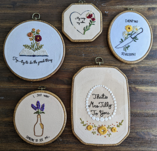
(counterclockwise starting at the bottom right- Tilly, Sadie, Grimshaw, Mary-Beth and Karen)
I know I'm missing a few! I still have ideas for Abigail, Molly & Mary (technically the set isn't complete yet). However, I decided to focus on these characters first, since their actresses were part of the Tombstone lineup. And thank you SO MUCH to @arthur-kilgore for taking everything with them & gifting it on my behalf ♥️
Details & close ups under the cut!
Tilly Jackson: "That's Mrs. Tilly to you"
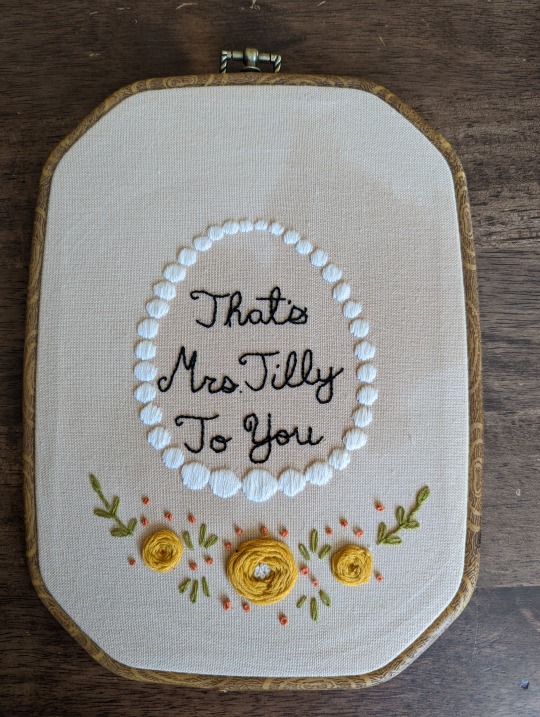
(please ignore the water patch - it was still drying)
The necklace was her item request in the game, and I loved the contrast her quote showed (& thank you @big-boah for helping me decide ♥️). There was such a great difference between the last time we saw her in chapter 6 and when John finds her again in the epilogue. Her obvious joy is amazing and exactly what Arthur wanted for her.
Karen Jones: "I just want someone to see me"
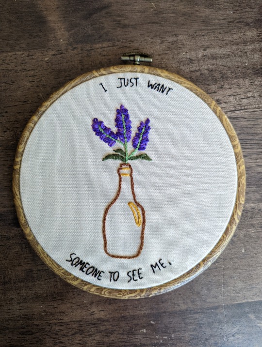
The bottle represents her struggle with loss & drink, and the quote was spoken in a moment of vulnerability with Sean. This is one of my favorite quotes to come from the entire game, actually. Karen is normally viewed as a determined and tough character, as one of the only women to actively do guard duty, but we briefly saw behind that mask. The reality of her inner struggles, even before Sean's death, was heartbreaking.
Mary-Beth: "Try... try to do the good thing"
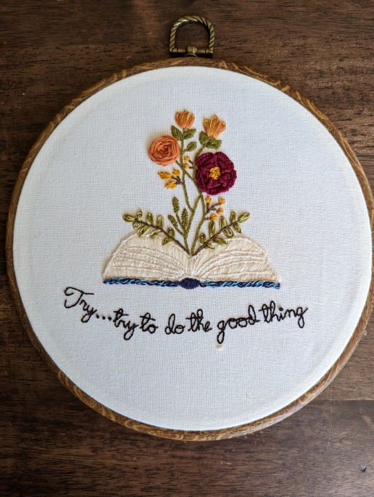
The book is obviously to show Mary-Beth's ambitions and eventual career as a novelist. Her optimism always seemed genuine in the face of the gang's terrible circumstances, but not blindly so. Her words to Arthur during the gang's final stages felt like a great representation of her character.
Susan Grimshaw: "My camp, my rules"
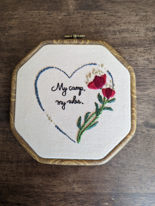
The heart is supposed to show how much love she held for the gang, even behind a mask of anger. The entire scene where she forces Arthur to wash is both hilarious and insightful. You can tell it's her form of care - rules equal safety. When she says "my camp" she really means "my family"
Sadie Adler: "I ain't no scullion!"
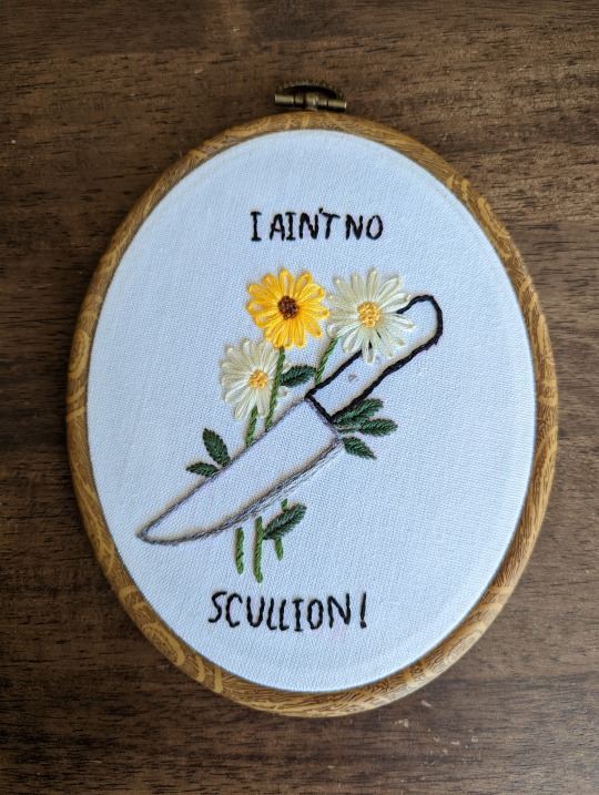
I wanted something that represented the first spark of fight we saw in her, which, for me, was during her fight with Pearson in chapter 3. She asserts her role in the gang, wielding both experience and determination. The passion, anger and pain in the face of her grief is one of the reasons I love her character so much.
#red dead redemption 2#the van der lind ladies#sadie adler#tilly jackson#mary beth gaskill#karen jones#susan grimshaw#rdr2#hand embroidery#my embroidery#altogether it took about 35 hours#you can really tell i'm not a professional lol
192 notes
·
View notes
Text
i love star trek bc it's actually a high school theater production most of the time. We focus a lot on the over-acting, theatricality of the actors and the directors, and that's all well and amazing, but /I/ want to focus on the /TECH/ bc ASHAijnjsdnbhgaARREghghhuuagjkshdmhbAHJBSSHJHIEJBnkjsdjhbsdhjBmahbsjshsbHkjnswkjshsn yea.
FIRST THE SETS?!? they're so silly and stupid? i know they get a lot of shit but the amount of work (not to mention styrofoam) that went into building individual sets for each planet they went to? like sure about 50% of the away missions take place in the california desert (the arena, *cough cough*, etc) but the rest of them have individually made sets that look PRETTY GOOD MAN. they get the point across, they're FUN, and innovative, and they really don't reuse planet sets all that often as well.
PLUS they used traditionally /theatrical/ cycloramas with painted backgrounds and classical cyc lighting (reminiscent of mariano fortuny's domed cyc! i WILL talk more about lighting) which look really cool and once again get shit for being unrealistic.
it's not supposed to look realistic it's supposed to look cool as shit. and it does. shut up. <3
if you view the sets as being modern TV sets then yeah, they're weird, and they look sorta bad, but THEYRE NOT modern TV sets: they're THEATRICAL SETS FROM THE 60-70S. AND I LOVE THEM.
SECONDLY, THE
lighting
while it's true that some shows in the 60s were developing new lighting styles specifically for TV, remember that in the year 1950 less that 10 percent of US homes had a television. this shit was new. COLOR tv was ESPECIALLY new. nobody knew how to light these things! and actually why would you need a new lighting style, we already KNEW how to light dramatic productions, why would we ever need to reinvent the wheel Stanley Mccandles, Mariano Fortuny, and Gene Rosenthall already invented says Gene Roddenberry and Jerry Finnerman (the head lighting designer). and oh my god i am so ridiculously glad. because the lighting. is so good.
i HAVE seen others talking about how good it is in the super early episodes (Charlie X and the conscious of the King, etc.) and i do agree! but i disagree that the quality goes down. i think it just got a tad bit more subtle as the show went on and it gets less in your face, harder to notice. but i noticed. because I'M the WORST (and also a lighting tech)
the impossibility of listing every example of amazing theater lighting choice they made is absolutely horrific and nasty so i'll just lost some my my favorites:
the cyc! i mentioned before but the cyc they used on away missions was only painted when they needed a specific scene in the background, otherwise? that bitch was LIT. and i LOVE IT.
any of the scenes where they light spock's face have green and half pink? or even just washing the walls behind him? i eat that shit UP. the METAPHOR. the CONFLICT. i will acquiesce that green and pink are (and were) pretty goddamn industry standard gels (color-films) to add to lights, for subtle contrast, but this is not subtle. it is LOUD. was it purposefully done from a storytelling perspective? no idea. is it cool as shit and interpret-able as hell? absolutely. also sometimes they do it with just green when they want to emphasize his vulcan-ness and other him a bit. like they do it a lot when he's in his room in amok time. anyway.

whenever they shutter a light so they can emphasize a character's (kirk, we're talking abt kirk here. and *sometimes* spock, and also Charlie in Charlie X but yeah mostly kirk) eyes when they say something #Deep, or just pre-commercial break closure worthy line. it's so SHJSDJBFEJNKN. to add onto this, they'll do a striking half-wash over half of their face sometimes in conjunction and it looks So Good


The GOBOS. sometimes, they'll just throw light through a gobo, or wall screen, or something, for /visual interest/ and it looks so silly i love it sm. does it make sense from a realism pov? nO. but star trek is a theater production actually and they lit everything using mainly naturalistic techniques! amazing!
honorable mentions: the glowing time donut, and the entirely random colors in the hallway.
there are so many other examples but this post is long enough lmao. notice the lights next time you watch tos!!,! please!!! <3
#star trek tos#james t kirk#tos spock#enterprise#star trek#set design#lighting#lighting design#theater tech#techies#leonard mccoy#iatse would love this i think#theater lighting
273 notes
·
View notes
Note
What's ur fav piece of trivia for every* character?
(*or at least as much as you can recall off the top of ur head)
my favorite trivia for characters is usually just whatever i think is funniest so just keep that in mind. that's not always the case but you might see it become a pattern. oh the other thing is whatever is most soul-crushing so yeah.
Ichika - either the fact her name comes from how her parents met (because i think it's really sweet) or that she accidentally discovered miku when she was watching videos on her dad's tablet and opened a recording of a miku concert
Saki - she used to listen to the song Time Machine when she was in hospital (at Ichika's recommendation) to remind her of family and friends. It's the in-universe reason why she is featured on the cover. This is actually one of my favorite facts in the game overall.
Honami - she is surprisingly good at flirting
Shiho - not one I've posted before, but in Run! Sports Festival! she couldn't bring herself to throw any of the balls in the ball toss because they had cute animal designs on them
Minori - she once passed out because Haruka wished her happy birthday.
Haruka - she likes penguins because she thinks the way they waddle is cute and she likes how round a lot of penguin merch is
Airi - she followed all of Shizuku's campaigns and bought all the magazines she was featured in when she was still a member of Cheerful*Days. She insists it was just research.
Shizuku - either that she usually has a thermos of miso soup on her to eat after practice or archery club or that she isn't good at texting. i haven't posted either of these before
Kohane - again one I haven't posted yet, but her favorite photo she's taken of Count Pearl is one of Pearl eating mice. the rest of VBS are surprised that she isn't squeamish about that sort of thing (i dunno what they're talking about that sounds like a very cool photo).
An - the possible symbolism of the black stripe on her new school cardigan. hello to the person who submitted that i am still not over it.
Akito - in Cinema he's the only person to sing solo during the first two choruses, the others don't get solo parts in the chorus until the end of the song. i think about this one a lot actually
Toya - he can't swim
Tsukasa - he's the comedic relief and there's a lot of really random shit i know about him because of that, so my favorite fact about him is whatever will have the most impact in the moment if i were to mention it out of nowhere. for a less vague answer, this one although i consider it to be one of my worst posts
Emu - she's very good at replicating cartoon faces. i like this one because it raises a few questions about whether the L2Ds are still exaggerated or if she just looks like that and no one questions that she actually has a cartoon face. what if project sekai ends with them all becoming self-aware.
Nene - either the fact that she thinks the forest has good graphics or that she called rui's mom "auntie" when she was younger because i think it's cute.
Rui - i like a good reference and i appreciate that he sometimes references famous people and media.
Kanade - she's left handed. i also like that her family name was made up specifically to contrast with the rest of N25.
Mafuyu - either that it's shown one time that she can see ghosts and then it's never brought up or referenced again, or that the "mom's cooking" listed as her favorite food might refer to the bunny-shaped apple slices her mother would make for her when she was a kid. i also like the detail that her eyes being two-tone is because she inherited the eye colors of both her parents.
Ena - twitter user. also despite loving cheesecake, she doesn't like cheese. girl what the hell.
Mizuki - they started out editing by making AMVs for a magical girl anime they liked. Amia comes from the name of a character from that anime. also did you know they put ice cubes in noodles because of their sensitive tongue. ice cubes.
Bonus - some side character stuff I like
Kotaro's favorite food is strawberries but he doesn't like strawberry flavored things for whatever reason
Asahi and Sakurako's family names are Chinese mythology references
Tatsuya's hobbies are motorbiking and fishing. these are not things you expect to go together
Nagi hated tomatoes but she would eat them in front of An
Iori hates spicy food, whilst Mio's favorite food is super spicy ramen. Meanwhile Mio doesn't like cream, but Iori likes crepes (which usually have cream on them).
Souma started listening to foreign music after Arata left for America
gbr i forgot about the vocaloids for a second but before i call it a day i think it's incredibly funny that Len cannot reach the stools in crase cafe.
142 notes
·
View notes
Text
I have risen from the dead to tell you that there’s this guy who I went to school with who is just now watching Stranger Things for the first time ever, and I know this because I still follow him on instagram and he’s posting reviews on there. He recently posted his review of the first season and I started a conversation. I don’t think Stranger Things is really his cup of tea though so our chat was pretty shallow. He was nice though and seemed like he was genuinely interested in what I was telling him. However, he’s posted his review of the second season today and amongst other things he said that El’s story with Kali was unnecessary, and that Mike’s attitude towards Max didn’t make sense “given his characterization in season one”. So, I started another conversation, kindly telling him that “hey, I can explain to you why Mike’s attitude towards Max makes sense if you want me to” to which he then replied: “Yeah sure. Tell me why it makes sense and then I’ll explain to you why it doesn’t 😂” … ?!?!?!?
I then asked him to tell me why exactly he doesn’t think it makes sense, and I’m still waiting for a reply, but this entire conversation made me think of a friend I have (one of the few that actually watch stranger things) who has only watched every ST season once (maybe twice) and doesn’t engage with the show/characters outside of watching, who had a similar attitude towards me when we were discussing s4 a few months after it was released. Who could’ve guessed, we were talking about Mike, and she’s an avid Mike hater (because of course she is) and tried to convince me that she knows him way better than I do and that he’s definitely homophobic.
And I honestly just love how those two provide such a stark contrast to this guy who’s a friend of one my friends, who considers himself a Stranger Things fan and was able to talk to me about the show on a deeper level than the surface. He actually started the deepening of the conversation by expressing that “Mike isn’t one of my favorites, I just can’t really wrap my head around him. I know there’s this theory that he’s gay but I honestly don’t believe it”, and you know that was my cue! I told him that I was a strong supporter of that theory and I pulled out some of the evidence and he was immediately hooked! Maybe not directly convinced (to this day I’m not sure if he is) but the way he was still mind blown by the evidence I provided showed that he knows and has a lot of appreciation for the weight of dialogue and character wardrobe and set design. Not once was he unaware of what I was referring to when I talked about certain scenes etc. while my friend who thinks Mike is homophobic has zero to no recollection of what scenes there were in the first to third season and that guy who’s posting reviews on his story is missing two entire seasons of valuable information in making these judgements.
Anyway, I’ll post an update later on what insta-guy replies to why he thinks Mike’s attitude towards Max in s2 doesn’t make sense 🫡
51 notes
·
View notes
Note
What are your all-time favorite outfits from Twisted Wonderland?
Hello @letterstoear, thank you for ask! I've had a lot of fun making this post, and I'm so sorry that it took forever to answer!
Every time I was certain I had my list narrowed down, I remembered another outfit I really liked. (Also, I'm a little bit biased, as you will see...haha). This time, I focused on event outfits to make it easier for myself. Maybe in the future I'll post my "reviews" on dorm uniforms or Halloween costumes.
I am always blown away by the the little details that Yana Toboso and the rest of the design team have added to each of characters' outfits, because they give some interesting insight to their personalities and backgrounds.
Without further ado, let's discuss some outfits! (Please note that there are spoilers for upcoming events from the JP server, as well as some groovy arts!)
My Favorite Twisted Wonderland Outfits
10. Floyd's Outdoor Wear (Vargas Camp)
Most of the outfits on my list are on the extravagant side. I recently bought a volume of Black Butler, where there was a note about how Yana Toboso loves to draw clothing, and it truly shows.
But in contrast to seeing our beloved characters in over-the-top costumes, it's refreshing to see them wearing casual outfits once in a while as well and see their individual, everyday styles.
I'll admit that I haven't played any of the Vargas Camp events, and have a grand total of zero (0) cards from this series. I'm not sure why; I always miss the event's runtime for some reason.
Still, I've always loved Floyd's little sling bag with the eel keychain, as well as the teal visor. The bright colors stand out and are appealing.
The whole outfit looks like something you could get from a store like Uniqlo, and sometimes it is nice to have that sort of realism in a magical game. He looks like an ordinary teenager I could find on the street. Except...if I did find Floyd on the street, I'd be running in the other direction. But that's not the main idea here.
9. Azul's Glorious Masquerade Outfit
At first, I sort of forgot that this SSR existed. When the PV for Glorious Masquerade came out, I was more focused on Malleus.
However, eventually, many people began to cosplay as GloMas Azul, and they all looked so amazing. I began to appreciate the outfit more after seeing people pose and dance in it. Azul also tends to have some of the best fanart, and fans have spared no expense when drawing him wearing this.
My favorite part of the outfit is his coat. I like the silhouette it creates with a high-waist belt, and the long coattails that resemble tentacles. The ruffles on his trousers are cute, too. I would buy a pair if I could. Unfortunately, it's hard to see these details on his in-game sprite.
As for his accessories, the pearls are so dramatic (and so very Azul). His round glasses are also cute, I hope he wears them again!
8. Idia's Suitor Suit
One look at Idia's Ghost Marriage outfit, and you can really tell that it was designed by Yana Toboso. His gloves, coat, and cravat make him look like he's in the Victorian Era. Also, doesn't he look sort of like Grelle from Black Butler?
Speaking of Grelle, Idia's outfit is meant to look more like funeral attire, between the long, black coat and the lilies pinned to his shoulder. There are also skulls hidden throughout his outfit, such as on his jacket chain and cufflinks. I was still new to TWST at the time, so I just thought that Idia liked gothic clothing. I didn't realize he was (at least in his mind) attending his own funeral!
Let's not forget his new hairstyle! This is one of Idia's first SSRs if I remember correctly, so it was exciting to see him with a ponytail.
My love for this outfit also comes from my love for the story associated with it. Fans have pointed out that Idia's "arranged marriage" with Eliza parallels the myth of Hades and Persephone. The design team and Yana were so clever for this.
I don't have this card, either, but I hope to pick him up one day!
7. Ortho's Fairy Gear
The Shroud brothers are luckyーthey are probably two of the characters with the most SSRs in the game.
That being said, we all have to agree that Ortho's fairy gear is one of the most unique and avant-garde cards in the game.
I really enjoy the white and gold color scheme in this event. His color-changing wings are stunning, and the piece covering his eyes makes him look very mysterious.
I thought this card was cool when I first saw it, but then I learned that Ortho's outfit and hair can turn pink, which is even better.
Every time I see his "pointe shoes," it makes me imagine Ortho and Idia trying to learn how to dance together in Idia's room, and Idia obsessively studying ballet costumes for his younger brother.
Yet again, I don't have this card, but my best friend does! At least I can admire him from her phone...
6. Silver's Rabbit Wear
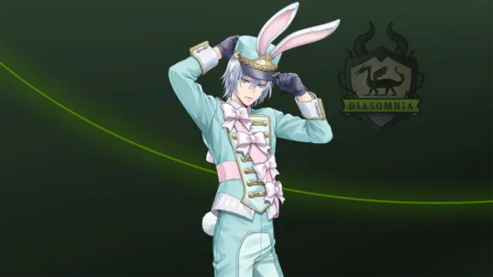
There is no way that this outfit is just an R card! When this card was first advertised in one of the JR rail train stations, the pictures showed this card with Deuce's hometown in the background instead of the standard Diasomnia R background, so I thought that this card would at least be an SR. (Although I can't complain so much, because that means it's free!)
Silver is so princely. I am convinced that he can look good in anything. I am fond of pastel colors, and the pink/blue color scheme suits him, as the TWST version of Aurora. The bows may be silly, but I find them adorable.
Compared to the other boys in this event, Silver's outfit looks a little more like a soldier's (albeit a toy soldier's or a nutcracker's), which is a cool touch.
5. Deuce's Rabbit Wear
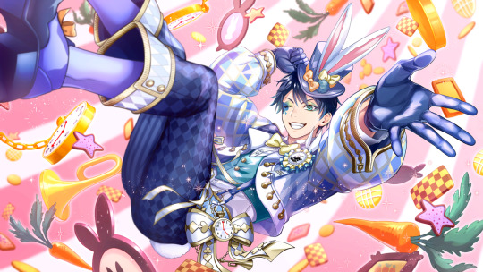
Deuce's hometown event was truly one of my favorite events that came out in the JP sever last year. Not only were some of my most favorite characters there, but they were dressed up in the most whimsical outfits possible. (And we got to meet Deuce's motherーshe's the coolest!)
Since Deuce is the main character of this event, his outfit bears the most resemblance to the white rabbit's in most classic illustrations, complete with a bow tie, top hat, and, of course, his pocket watch. His outfit has a blue color scheme. Like Azul in GloMas, Deuce also wears round glasses in his groovy art. Overall, it looks like the sweet ouji style, although I'm not very familiar with this sub-fashion. If anyone who is reading this has studied/worn this style of fashion, please let me know!
I used to play Love Nikki and Shining Nikki (two fashion-themed gacha games), which also featured lolita dresses inspired by Alice in Wonderland characters. For this reason, Deuce's outfit in particular feels very nostalgic to me.
4. Lilia's Right General Armor
Here's another departure from the cute pastel outfits...
Sleeping Beauty was one of my favorite Disney movies as a child. I always remembered Maleficent's "goons" as short, silly little creatures wearing simple green tunics.
So how on earth did we get to Right General Lilia Vanrouge?!
Seriously, I'm just stunned by how the artists looked at the source material and created something so radically, yet wonderfully, different.
I'm curious about the green stones (jades?) on his outfit--around his waist, there are several pieces attached to tassels, and he has two strapped to his right leg. The material matches the stone used for his weapon. Maybe it represents his status in Briar Valley. If you check his (unposed) sprite, you can also see that he is wearing something around his waist that looks like folded bat wings.
Like everyone else, I'm obsessed with his long hairーit makes him look so formidable, especially with that hood. My friends and I like to joke that his ponytail makes him look like a character in a Chinese martial arts drama.
Again, the story associated with this card made me love it even more. Few books have made me cry as much as Book 7 of TWST.
3. Malleus' Glorious Masquerade Outfit
While Sleeping Beauty was my favorite movie as a young child, when I got older, I began to love The Hunchback of Notre Dame. It was only natural for this outfit to be among my favorites for this reason.
There are so many details here. The feathered hat. The sheer sleeves. The golden embroidery. The split cape. It's honestly overwhelming to take in at once.
I can say that my favorite detail is his green earrings. They really bring out his eye color, and the PV made them so sparkly.
In addition, everyone I've ever seen who has cosplayed as GloMas Malleus or has drawn fanart of him has increased my appreciation of this outfit.
[Now for some very spoiler-y stuff] The fact that this event came just before the release of Chapter 7 is worth noting. Doesn't it feel a bit tragic that just before Malleus' overblot, we have a chance to see him wearing an outfit that makes him look especially like his mother, having fun and being the star at the masquerade? And what about the feathers on his shouldersーdo they hint at another side of his family? There's so much foreshadowing and mystery going on, and nothing is more suitable for the occasion than masquerade attire.
2. Kalim's New Year Attire
I've already rambled about how sentimental this outfit is to me in a previous post, but in summary: New Year is my favorite holiday, and the New Year's Sale event was the first event I "seriously" participated in. Kalim looks excessively cute and festive in his kimono, and every time I see this card, I feel nostalgic and in the holiday mood.
1. (Tied) Epel's Applepom Outfit and Riddle's Beach Outfit
I'm really sorry, Epel and Riddle are my favorite characters, and in the end, I refuse to chose between them. They're like my younger brothers! I try to collect all of their cards, so I pay attention to their outfits the most, and picking only one outfit for each character was a challenge in itself.
My favorite part of Epel's Applepom outfit is his cloak. It looks so fluffy and warm. When you set him as your home screen character, you also have the option to "swap looks" and see his outfit without the cloak--the apple embroidery on the rest of his outfit is very detailed. Many fans have mentioned that the outfits people wear in Harveston resemble traditional Scandinavian clothing, which is really cool!
The little apple slices on his cap are everything.
And I'm always happy to see characters in different hairstyles, such as Epel's little ponytail.
One of my headcanons is that you're allowed to call Epel cute, but only when he wears this specific outfit, because he takes it as a complement to his culture.
As for Riddle, we're all so used to seeing him wearing formal suits. It's so nice to see him loosening up for once. He looks so happy, now that he has the chance to see the ocean for the first time!
I also happened to be on vacation at the beach around the time this event came out, so it felt like a gift.
I have to laugh a little, because there are so many flowers on his outfit. Even Jack pointed it out in the story. But he looks so cute!
I suppose we have to discuss the elephant in the room. My friend saw it before me, so she spammed me with messages along the lines of "RIDDLE IS WEARING A CROP TOP!!! THIS IS NOT A DRILL!!!" and I naturally thought she was pranking me. But lo and behold, it's the truth. I like to headcanon that among the rest of the cast in this event, everyone has made an unspoken mutual agreement not to mention it. This Victorian child has already been through enough, and not a word must reach Mrs. Rosehearts.
Thank you once again for the ask! For anyone who read all of this, what do you think about these outfits, and which ones in the game are your favorite?
#The words “short” and “brief” are not in my vocabulary apparently#But it's alright#I just really love the work and details that the artists have put into the game#As well as the fan content! I'm so happy I joined the TWST fandom at this time#disney twisted wonderland#twst#twisted wonderland#floyd leech#azul ashengrotto#idia shroud#ortho shroud#twst silver#silver vanrouge#deuce spade#lilia vanrouge#malleus draconia#kalim al asim#epel felmier#riddle rosehearts
56 notes
·
View notes
Text
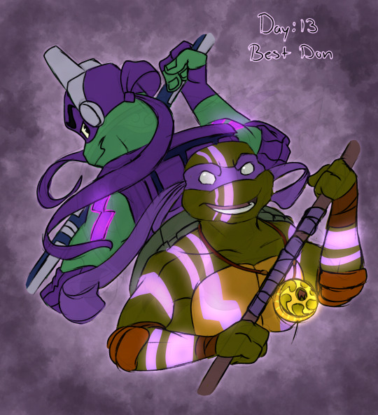
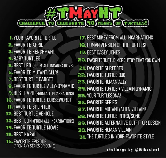
TMayNT Day 13: Best Don
Day 13 of @tmaynt Prompt: Best Don!
Oh my sweet, how I've waited for this day! It should probably come as no surprise to anyone who fallows me or anyone who saw my Day 1 entry that Donnie is my favorite turtle! Hands down, no contest!
But here comes the hard part. Choosing my favorite! Gunna be honest, it's a very hard decision. Each Donnie has a quality to them that I just adore! Intelligence! I don't like to think of myself as that smart, at least not in the way Donnie is! And I love me some soft nerdy types! And when it comes to personality, it gets even harder to pick, because literally ALL of them are just precious.
87 is smart but a bit of a dork! 2003 is...goals. Sweet, kind, has a tiny bit of spice to him, and still has the skills to pay the bills! 2007, while not having much screen time, is a reliable man.
IDW, tbh, I've yet to read the comics in full, but from what I can see, he seems a lot like a mix of both 2003, 2007, and 87 Don. As in, while he's a little more softspoken then the others, he can still hold his own in a fight! And despite having been through some clearly otherworldly shit, he's a skeptic when it comes to magic. But I love the way they wrote him! (And his death scene still makes me cry! And seeing him still deal with pain from that incident is just *Chef's kiss*!)
2012....well...I don't have much to say about him. Frankly he's my least favorite out of the bunch, and all because the writers really wanted to play fanfic writer and they leaned whyyyyy too hard into the nerd stereotype. Resulting in making him borderline creepy to April. (Not that she's perfect either because goddess on a stick I'm not getting into that today.) The one thing I'll give him is that his sarcasm in this one made his very funny to hear in banter, and I apricate that they were trying to do more then just change the skin colors to make the boys stand out from one another. (But guys...really....the gap in the teeth was just not necessary..)
The Bayverse Donnie was one that had to grow on me a little, cause I'm part of the crowed that thought they looked a bit rough. But I agree that that's kinda the point, they're mutants. They more then likely would be a little rough looking irl. But after aa bit, he does start looking pretty cute anyway! And his voice is on par with 2003, in that he just sounds so sweet! I wanna hug him! (PLUS, THE FUCKER IS 6'8"! I'M 5'3"! And I do have a weakness for taller dudes. Bonus if they wear glasses! :3)
Now, for Rise. I was once part of the Cowaboomer crowed that thought that since RISE was so different from the other versions, it was there for ruined. I've since watched it, and the movie, and if anything, I've proven that I no longer think this way! RISE Donnie tho...he had to grow on me. At first I really didn't like him. His personality was such a stark contrast from all the other versions that it was almost like he was a whole new character! And with the art style of RISE being so different, his design was quite a jolt too. (The eyebrows are...a choice.) But after a while, that smug fucking smile had me feeling a type of way. The way he'd make me laugh was starting to become infectious! And the next thing I knew, I fell for this version too! Pretty hard I might say. And while 2003 Donnie is the sweetest bean to ever grace my screen, RISE became the living definition of the meme "I'm a luxury few can afford!"! And I love him!
After that, we had the batman cross over that brought us another Donnie! Once that I'm happy didn't lean too heavy on the other versions. He looked a little like 2012, but was like a gentle mix or 2003 and Bayverse! He also got a lot more lines and personality in that movie! (As well as a broken arm! RIP)
Then Mutant Mayhem showed up, and oh my god if he isn't the same insufferable anime fan I was when I was a teen! He made me laugh, and was still an adorable little dork!
And then we have Fortnite Donnie, who...i gotta be honest, I don't play Fortnite. So I'm not sure if he or the others get much of a personality or story outside of the same story of the turtles that we all know by now. So i can't judge him based on personality. But...I do like his design. Tho I will continue to say Fortnite had NO RIGHT to make him THAT damn fine!
In the end, I love all Donnies! Some more then others, but they all mean something to me! And it was hard to choose! but in the end, I chose the two that had the most influence on me!
#tmnt#my art#fan art#sketch#tmnt 2003#donnie 2003#2003 donnie#2003 tmnt#tmaynt#tmaynt challenge#tmnt donnie#donnie tmnt#tmnt 2k3#2k3 donatello#2k3 donnie#donnie 2k3#tmnt donatello#rise tmnt#tmnt rise#rise donnie#donnie rise#rottmnt donnie#rottmnt#donnie rottmnt#purple will always be my favorite color#thanks to you donnie
34 notes
·
View notes
Last Seen Blogs

mirukicosplay
MirukiCosplay
doll-orosa
Dolly's Dolls
let-state-reveal
Untitled

balatonibojlisverseny
Nemzetközi Balatoni Bojlis Horgászverseny
sewer-druid-blog
fox rain