#because im adding these for fun at this point
Explore tagged Tumblr posts
Text
i like the idea of more games after 2 but i don’t like the games we got.
me and @dreamsy990 have discussed days at length and my opinion is that if i had to pick a set of existing kh material to keep and the rest to discard, i’d pick 1-com-2 and the days manga.
aside from minor things like the days game retconning one of roxas and riku’s fights, i feel that days weakens roxas by having us see every moment of his life from birth to death. there’s no room left for speculation of his past after days like there was in 2—questions like ‘how long was he in the digital twilight town’, ‘did he ever know the real hayner pence and olette’, ‘what happened between him and axel’, and ‘what was his relationship like w the other org members’ are all told to us in days and its just—sometimes you need to keep a couple of cards close to your chest. if you’ll pardon my brainrot for a minute, id like to briefly compare roxas in kh2 to azem in ff14. i feel like this is a fair comparison, as both characters are part of an on-going series that recently wrapped up a major story arc and is beginning a new one. both are characters related to the protagonist via soul shenanigans. both worked with the main villain organization at some point. both were best friends of a major antagonist in the organization. both had a falling out with said antagonist when they left the organization and then died. both of these antagonists then proceed to do some messed up stuff in a vain attempt to bring back their best friend, and i could go on but then id be comparing axel and emet-selch and not roxas and azem. now, there are obviously differences in the details, but the point is theyre mechanically similar characters who both have plenty of mystery in their backstories. the difference tho is that azem has been allowed to keep some of their mysteries. as of dawntrail, we know roughly why azem left their organization, but not the details of what they were doing before their death. we know roughly how they joined their organization, and we’ve learned about their relationship to several other characters that knew them in life. now, roxas is paralleling the concrete character of sora instead of the vaguer character of the wol, so i’d expect roxas to have more concrete information revealed. but i think kingdom hearts’s second biggest writing flaw is that it feels the need to share every nitty gritty detail, which limits canon-compliant speculation for both the fans and the writers. for example: 14 at any time could introduce Bingus, who met azem during azem’s time in the organization, without contradicting any existing lore. kh cant, because we know that roxas never met Bingus before, we know everything roxas ever did in his life, and meeting Bingus isnt one of them.
birth by sleep, meanwhile, exemplifies kh’s biggest writing flaw: trying to tie everything together in ways more complicated and unnecessary than how i weave in my ends when i crochet. answer me honestly: what value is added by having xehanort posses terra and lose his memory in order to look just like his younger self before working for ansem tw? ‘oh bc hes eldery in bbs and young in 2’—why is he elderly in bbs? heck, why is he the villain of bbs—or rather, why is the villain of bbs the same character as the villain of 1/com/2? im not saying there has to be no connection: the story could easily have been tweaked such that instead of the two xehanorts being the same character, the villain of bbs inspires/passes down his power/mission of opening kingdom hearts to xehanort in a parallel to how the wayfinder trio inspires/passes down the ability to use the keyblade to the destiny trio. im not knocking bbs’s story for not being my headcanon, just highlighting a way in which the writing prioritizes interconnecting things at the cost of being straightforward. (i’m also knocking it for not being fun to play)
ill leave the mobile games with the opinion that imo gatcha games should never be plot-relevant. plot-supplementing or lore-supplementing, fine, alright, but not plot-relevant.
ddd and 3 are… theyre alright from a gameplay perspective but the story as you play it isnt great. say what you want about how 3 ‘tied things together’ or w/e, but sora stating at the start of 3 that his mission is to help restore roxas, only to not contribute at all to that part of the plot isn’t good writing. we can debate the power of waking and the relevancy of the disney worlds until the cows come home (personally, i feel that space paranoids in 2 shows that the games can have plot-important disney worlds), but sora not even attempting to contribute to his stated mission is frustrating. birth by sleep did this right: aqua’s stated mission was to watch terra for signs of corruption and bring ventus home, and yes, she failed, but she tried. ddd technically did this right (‘technically’ bc sora and riku’s mission was ‘pass the mark of mastery exam’ and short of actively giving up they cant really fail to try to do that).
in summary: while i feel like 2 neatly wrapped up the destiny trio’s story, i can see the potential for more games in the franchise. however, i didnt really enjoy the later games from either a story or a gameplay perspective, so i think i’d rather sora’s story have ended completely with 2.
Question for Kingdom Hearts players!
121 notes
·
View notes
Text
Day 3 on the godot dungeon crawler:
Not much was done today.
What I said yesterday was mostly true and the majority of the day was spent working on Zenith. I did get a sweet and simple map working, though. I started laying out the skeleton for combat but not much was done.
#nikki and the screaming box#godot dungeon crawler devlog#guess im doing a devlog series on this.#probably won't be a daily thing for long. usually the first little bit is interesting because a lot of new things are being added#but probably eventually it'll get to a point where it's a lot of basic not really worth sharing stuff.#anyway i really like grid dungeon crawlers and getting to work on it again in a different engine is fun.#like looking at a thing im very familiar with from a different perspective
47 notes
·
View notes
Text
.
#okay random story time i don't know why im narrating this or how i even stumbled upon this memory rn#but i generally do sad vents in the tags and for a change this is a funny one#so back in highschool (i say highschool but i mean junior college) i used to visit this park near my house a lot#i was an sg kid back then and the thing about parks there is that they're kinda beach-parks and they have the best cycling/running tracks#they're also really massive parks so i used to go often. sometimes bicycling. other times walking. yeah. the park was like my sanctuary#anyway. there are quite a few bike rental areas in the park and there was a cute lil shop next to this one particular rental place#and they sold like biscuits and water and icecreams and stuff and i went there a lot#and on one particular day i went there and there was this guy around my age part timing at that shop#now again this might be culture specific bc i dont see it in india but part timing in uni/pre-uni is pretty common is sg#a lot of shops and restaurants employ teenagers to twenty something ppl for part time jobs... anyway im just adding context#point is that i had walked to the park with my mum that day and she told me to go buy a couple icecreams so i went to the shop#and i saw this guy around my age and like. not to be a simp but this dude was so pretty?#like he saw someone had come to the counter so he looked up and shot a smile and i thought i got slapped by sunlight#i could spend the next several lines going on about his pretty tan skin and his glowing raven eyes but this is pathetic enough so ill stop#anyway he saw me and smiled really wide (customer service smile- i thought to myself) and i smiled back and asked for icecreams or whatever#and then this guy started getting chatty right. so he was all 'you come here (to the park) often right? ive seen you with your bike a lot'#see now. the problem with me is that i always think im bothering people. this poor dude was attempting to make conversation#and i was replying with one word answers#and i wasn't even realizing that he didnt want that. bc he kept asking more questions and i. kept. shutting them down.#then when he gave me the icecream he was all 'are you here alone? icecream alone is no fun... i could keep you company if you want..?'#which. he was being really cute about right. but because im so fucking dense i was all 'oh no i came with my mom actually'#and he went 'aw man' in this really cute but faux sad way which i didnt understand at the time and i left and then#after three full fucking days. i realized this man was tryna hit on me?#and then i went to the park like a week later and he was gone. poof. i even thought of asking the uncle in charge of that place#then i got too embarrassed and chickened out#yeah so turns out my neurodivergence neutralizes any sort of rizz that comes my way#i could've been chilling with a cute boyf rn but no😩 this is my destiny#megumi in the tags
26 notes
·
View notes
Text
Okay, i didn’t write more of Barf and Belch psychologically torturing the dragon training initiates, BUT, i did roughly outline the first four seasons of RTTE. Like, episode layout and which canon episodes are gonna be in those four seasons. Actual episode layout and all the original episodes and arcs and tying all the episodes to one another and to all the plots and arcs that happen later down the line will be done on another day, but i got the seasons roughly planned! Only problem is that RTTE got bumped up from my original nine to ten seasons, because i wanted to extend the plot i was building
#TEN SEASONS#RTTE in canon has six seasons#and then i went and added FOUR WHOLE EXTRA SEASONS#though to be fair#to me at least#I’m adding game arcs and plots from School of Dragons#and then stuff from the deep#(which may end up being a few seasons on its own instead of my intended one)#(i haven’t gotten aroudn to actually outlining that part of the show yet we’ll see what happens)#and I’m also cramming the second movie in as a season itself#soooo….of course RTTE ended up being extended#its just that the more i dive into the overall story itself and its prolonged arcs and stuff#the LONGER it gets#so im just gonna refer to RTTE as-#CURRENTLY ten seasons#instead of plain old ‘ten seasons long straight up’#because WHO KNOWS what else might happen at this point :D#httyd/the deep crossover#outlining is both fun and painful#I’ll get to properly outlining those four seasons when i get more progress on the chapter im currently working on#and when i get more corkboards
5 notes
·
View notes
Text
tbh le sserafims choreo played a big role in me not stanning them 😭 i remember listening to their debut ep and i was “omgosh this is so good” then i watched the mv and checked the members ages and was “oh well i’ll keep up with the music but that’s it” and every comeback it seem the choreo got more inappropriate for her to be doing. like i remember the shit show smart caused for tweet and the dumb takes back then, i genuinely remember seeing someone saying “well there are people teenagers getting pregnant so why is eunchae doing the choreo a problem” like- do you not hear how you sound 🧍🏽♀️
oh the difference in how hybe treats their girl groups vs boy groups is SO obvious (like im pretty sure le sserafim only trained together as a team for less than a year 😀 of course they’re gonna have obvious gaps and people also like to forget they lost a member who was 3rd in terms of overall line distribution it’s like if ateez lost seonghwa sure they’d still survive as a group but they’d be losing everything he added as a performer/vocalist) that i sometimes feel crazy when i want to call it out because people make it seem like we��d just be making shit up and tho hybe doesn’t have any control over their sub labels (as least legally it’s stated that they are separate from hybe) it’s interesting they don’t step in to say anything about ESPECIALLY since a lot of the issues people have been having with hybe girls are things that could’ve been avoided cause what do you mean you didn’t do a basic background check on your own trainees 😭 and i honestly look newjeans music they’re so good, i find it interesting that with everything going on with them (the court cases) that people want to pretend as if they didn’t add anything to the industry like the way they shifted what’s considered mainstream in k-pop is HUGE
and i honestly kinda forgot about how certain staff members are specific to one company. i do think how often we’ll see idols give up reward money they’ll win to give back to the staff should honestly show people how little those people must be getting paid (it’s literally to the point that those staff members have to insist or make rules that the groups in question keep the money for themselves instead 😭) like it reminded me of a post i saw where it was basically said “if you think idols are putting in a lot of work imagine how hard their staff is doing who have to set all these things up are working”
no but same, they i used to just observe and maybe occasionally engaged with people now im over her dissecting the k-pop industry with you 😭😭 this is honestly so fun tho 🤸🏽♀️
I was having a bad day and decided to watch some hongjoong tiktoks until I stumbled upon this shit ass account and I'm actually so pissed
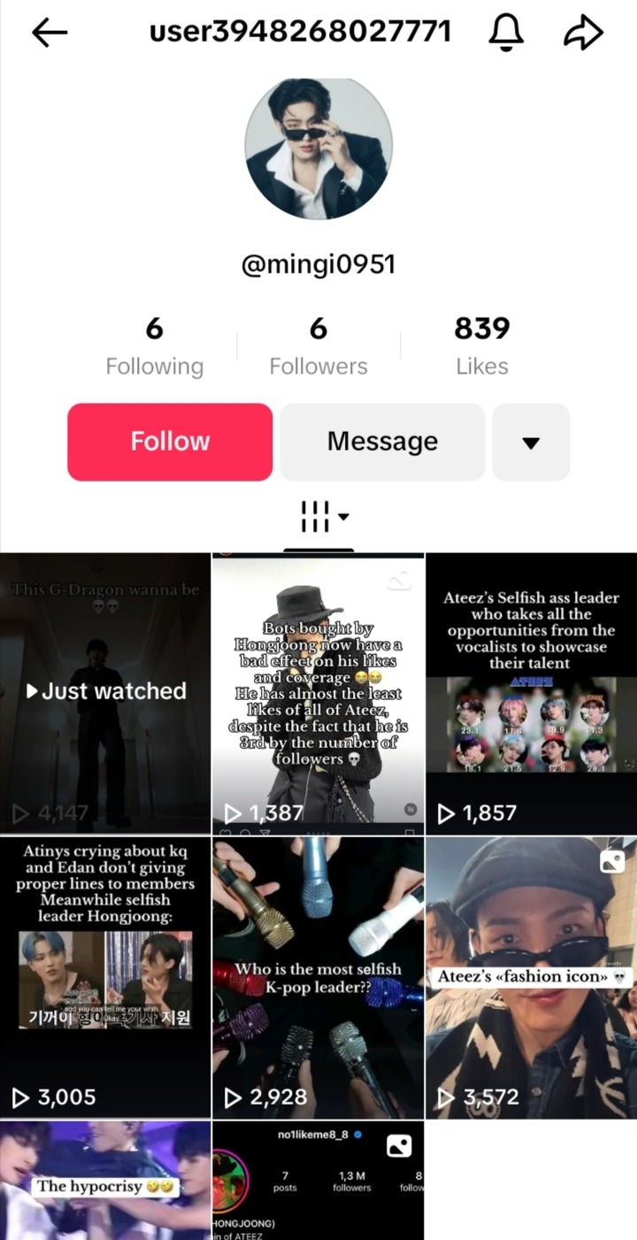
Like girl called hongjoong a gdragon wannabe, said that he's selfish, taking "opportunities" from the vocalists of the group, and that he's the one not giving lines to his members
How can people be so stupid, I mean he's still making money and doesn't care about whatever these dumb haters are saying
43 notes
·
View notes
Note
No because Zhao speculating felt like such a
Looks into the camera
"I bet you're wondering why that happened. ;) heres maybe a reason ebina was deep..."
moment
no literally- like other antags' endgame Deep Moment scenes worked because there was SOME build up throughout the game to key us in on them from a deeper level but it just doesnt work with ebina
#iw spoilers#spoilers#snap chats#a big part To Me really is because hes just an aoki clone like its really not something to look over when its so half-assed#they did have his flashback and backstory but like .. i repeat it just feels like such a lame plot twist ...#a plot twist that could have been really interchangeable ... before i get into the orphan-under-kazama rant again..#YK1 nishiki got his build up from watching his added backstory scenes and even the scenes with yumi in the beginning#yk where its clear yumi gives more attention to kiryu#ryuji .. ok i mean tbf he was majorly there to fuck around he wasnt trying to be overly deep but even he still has his issues#HE STILL AT LEAST HAD A PRESENCE and even so his moment with kaoru was real sweet .. big bro ryuji my beloved im cryin ...#like a character doesnt have to be OVERLY deep to be fun/enjoyable i love ryuji ... hi king ... im getting off topic ....#MINE-- //is pulled off stage before i get into it//#and aoki is built up from the arakawa's accounts of him coupled with his Dog Eats Dog mentality and esp that NYE flashback#that shot of the No Dumping sign lives in my mind forever .... so good im going to kill myself thinking bout aoki bye ...#im rambling point is Do Better RGG what happened. the stories and characters had been bangers from 0 to 7 to gaiden and then. ???
6 notes
·
View notes
Text
btw. toronto is fucking HYPE for rogers cup. we love tennis! and they are running an ad campaign on the subways featuring exactly five players for some reason. it is so lovely commuting to work or whatever and seeing my girls along the way
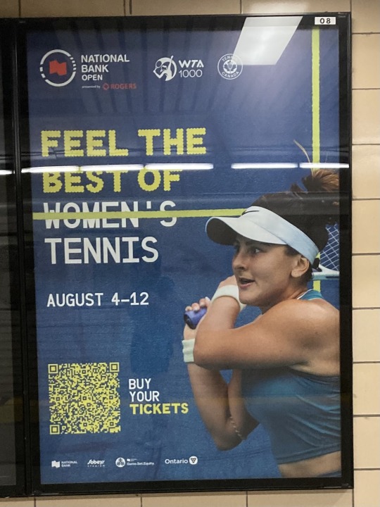
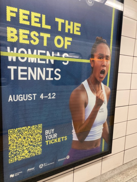
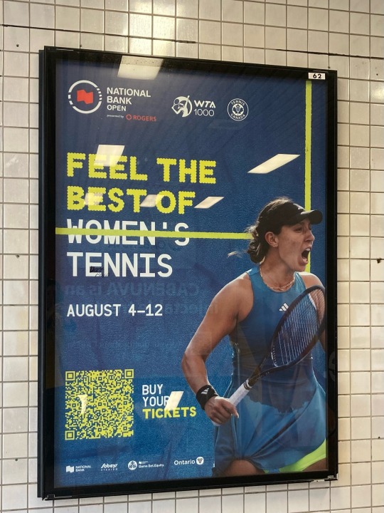
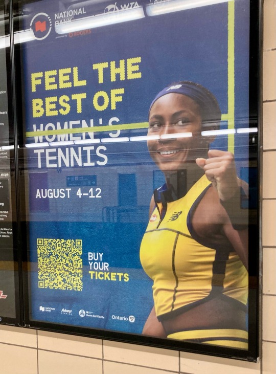
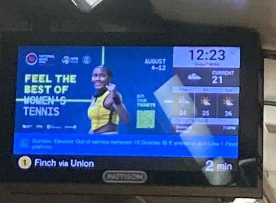
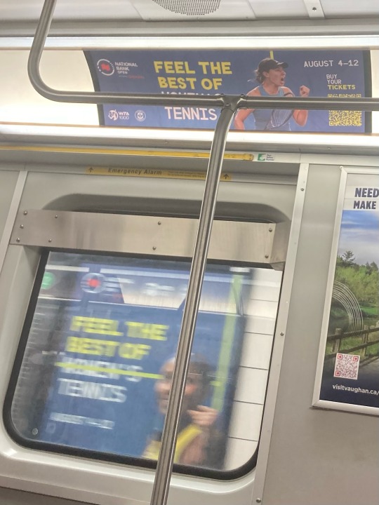
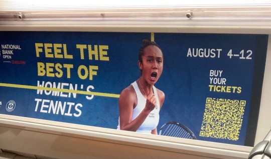

#i was just trying to get a picture of the leylah poster but then in the background coco was there. how wonderful#for some reason aryna is relegated only to the posters inside the trains and not in the stations and i cant tell why#its sooo fun tho because now when im riding the subway with my friends i get to point at posters and say thats coco shes so epic#personally i think this slogan is fun but the graphic design is lacklustre#because the tv ads they run every single time i turn on my tv sya#‘its not the best of womens tennis its the best of tennis’ which i think gets at the point better#but my non tennis friend understood the subway ads so i think its just me lol#tennis#to#idk what theyre doing for the atp im not in montreal#anyways. thought id share these with everyone because it makes meee happy and i want you all to experience cdn tennis with me
6 notes
·
View notes
Text
i don’t think i could survive a serious conversation about my own elden ring build the last time i played i spent like thirty minutes at my favorite rune grinding spots until i got enough for two more levels somewhere in the level ~210 range and put them both into endurance for a whopping 72 endurance now
#‘whats ur build’ bad. i like having way too much endurance. i know about the caps i like having light equip load#i showed my friend my stats and his first question was about how my damage output was#its fine my weapons are maxed and their damage stats are kinda evenly leveled (arcane is left behind but that got added on late)#but i only recently reached 40 str. and then put two points into endurance#for some kind of context the higher you go in the stats the less returns you get n for endurance once you hit 60 you start getting crumbs#i think in general 60 is a cap across the board? idk. idc. im overleveled enough at 210 something i can fuck around#salty talks#delete later#maybe? im scared to tag this as elden ring im just talkin#my build is ‘fuck the meta im having fun’#im doing a bleed build (or w/e) specifically because i got bloody slash early on and thought it was fucking sick and got used to it#and then made my broadsword a blood broadsword later bc the bleed buildup and eventual b in str looked good and i had an excuse to level ar
2 notes
·
View notes
Note
Is the Wip game finished? Can I still ask for stuff? If I still can, can I get a snippet from the one that give me the most rot (meet the parts)? If no, then I'm just swinging by to say hi how are you doing? <3
HI RED!! thank you for swinging by, im doing better than earlier!! my ear is getting better and im eating pizza :]!
okay so TECHNICALLY it's no longer wednesday, but i LOVE spoiling my fics so of COURSE you can have a snippet from Meet the Parts hkjh <33 you are always free to ask anytime, i will always be happy to share bits of my stories <3 AND SINCE THERE'S NO RULES I CAN SHARE MORE THAN THREE LINES!! here's like, a whole React Speed thing i just wrote :]
LOGIC – Along with Coach and Sparks – Flighty and Fingers too, I suppose – they're why you have trouble sitting still for long periods of time. The attention deficiency disorder... Or are they exacerbated by it? I still haven't figured out which is the cause and which is the effect...
REACTION SPEED – Point is, we got zoomies! Can't sit still. Always more to do, more to see, more to say.
YOU – "Are you why my leg is always-"
REACTION SPEED – Bouncing, yep! Fingers tapping, hands flapping, feet moving, words flying- hey, if you had wings like me, we'd never be touching ground.
YOU – "You have wings?"
KIM KITSURAGI – He jots this down with an interested hum.
REACTION SPEED – Yes! Books, what- which animal–
ENCYCLOPEDIA [Medium: Success] – You have the hovering wing type of trochilidae – hummingbirds, colloquially – with their ability to rotate their wingspan at the shoulder and elbow joints to create maximum lift. However, though you exhibit some iridescent feathers associated with the birds, your wings also connect to membranes, which share the Voronoi tessellation of the species anisoptera, the common dragonfly.
REACTION SPEED - Yeah, exactly! I'm a hummingbird and a dragonfly. Both of 'em. :)
#task: meet the parts#inland drabbles#volta transmissions#the :) is not in the original but i added it here for fun <3 :)!!! ALSO YAY my reaction speed has wings :]#im glad you like meet the parts :'] its hard for me to work on it but i just wrote this scene thinking ''oh but red loves these guys'' hkjg#like! i LOVE the premise of meet the parts as much as the next guy but i dont like how im writing it hkjgh? i dont know what im doing :']!!#i need to finish my character analysis for all the skills first because i feel like im writing them too shallowly... ough im trying#how am i introducing kim to the skills when even i dont know the skills!! im building a house with a foundation made of peanuts hkjh#like hm. ency wouldn't touch on so many subjects so briefly? he'd zero in on one topic and talk.... or not? idk!! im not an int guy!!#reaction speed does use a LOT of exclamation marks though i love this for him. his sentences are often short and cut into phrases.#''Blam! Straight in the eye. Straight in the old eye-orb. In *the lookin' ball*!'' short pointed sentences. also oh my god he's silly <3#restless and energetic. coach wants you to move; echem needs the dopamine; but react speed puts the Hyperactive in ADHD!#sidenote: canon in reaction speed's description ''working in tandem with your Intellect skills'' GUY WHO GETS ALONG WITH THE INTs :D <3#anyway this is also the one of the few skill-centric fics im writing that don't have my usual skill actions :0#''REACTION SPEED flutters excitedly; twisting to try and catch a glimpse of his own wings - Yes!'' vs just ''REACTION SPEED - Yes!''#which means a lot of what the skills are doing or thinking as characters are cut out unless i have them mention it in dialogue#which SUCKKSSS for me because i LOVE focusing on the skills but i often leave it out when the outside world is involved (harry and kim)#it presents a unique challenge to just write characters with only dialogue. ough... curse my current lack of interest in the humans hkfjh..#ANYWAY im running out of tag space so im done rambling hkjhg thank you for asking red! :D#esprit: Red
6 notes
·
View notes
Text
ok yall some of you are a bit out of your mind i think like. yeah, barbie is a fun, enjoyable movie about womanhood that is pretty well done and really funny. however nothing this movie said at any point is even remotely revolutionary or very new or super bold and daring and i am not saying it has to be but some of you are kind of pretending like this movie reinvented feminism
#myposts#barbie#like sorry but that speech america ferrera gives thats like#'you have to be skinny but not too skinny you have to be a boss but not bossy' etc#was so chewn out i was kinda staring in awe of how they really put that in the movie as a hugely emotional point in the story#because like. this is such an overdone thing every even remotely liberal female comedian has done a bit about#and that was in every teenie girl show about growing up and thats overdone for even commercials at this point lmao#like i really liked this movie u guys but just because a movie is fun and for girls and about some girl power stuff#doesnt mean its like... groundbreaking in literally any way?#saw one person that was like 'im so mad at one of my friends who said its just corporate bullshit'#ok like idk how to tell u this but this is still also a huge ad for buying barbies idk how to tell u this#if you are defending the barbie ip and its legacy and whatever. the ad worked on u! congrats!#like you can enjoy a movie AND aknowledge that its made with profit in mind lmao
8 notes
·
View notes
Text
sexuality is so dumb. relationships are dumb. romance is dumb and sex is dumb and it's all too fucking complicated and weird
#sorry. im just having a lot of thoughts and it's making me frustrated.#ive been thinking a lot about polyamory? which sounds strange ig but. i don't know.#it sounds very appealing at this point in my life#i don't always feel romantic attraction like other folks do and it feels like i wouldn't be understood in a monogamous relationship bc of it#i don't think people could handle the fact that sometimes my romantic attraction just Disappears for a day or two before it comes back#or the fact that my ideal romantic relationship is just. we're best friends but with all the extra relationship shit added on.#i want someone to be my best friend that i also kiss and take out on dates and bang sometimes. or something.#part of me feels like id be better understood in a polycule bc it's already a slightly unconventional relationship situation#also because i have a lot of love in my heart and im scared ill have to cut that part of myself off from others if i have a partner that -#- gets possessive over me in a weird way. maybe i just have poor experiences but idk.#there's sexy possessiveness (fun when done right) and then there's just. Gross possessiveness. which is what im worried about.#i don't fucking know!!! it's weird and complicated and the longer i type the more i realize i don't wanna think about it#im cutting this post off now. that whole rant probably made no sense but whatever
3 notes
·
View notes
Text
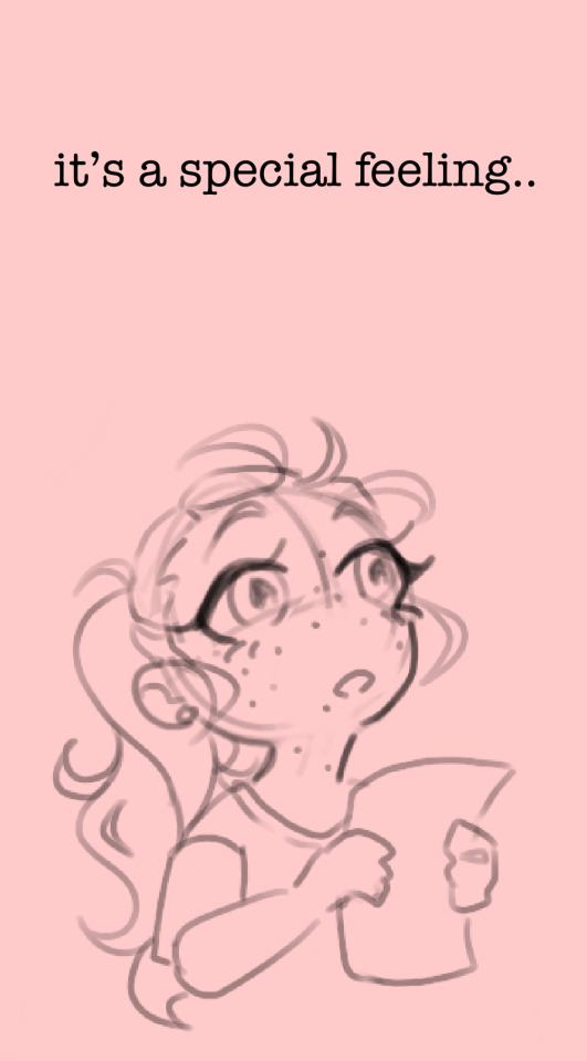
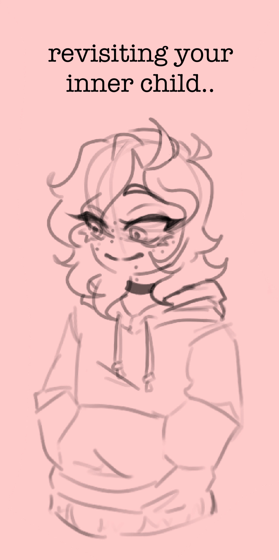
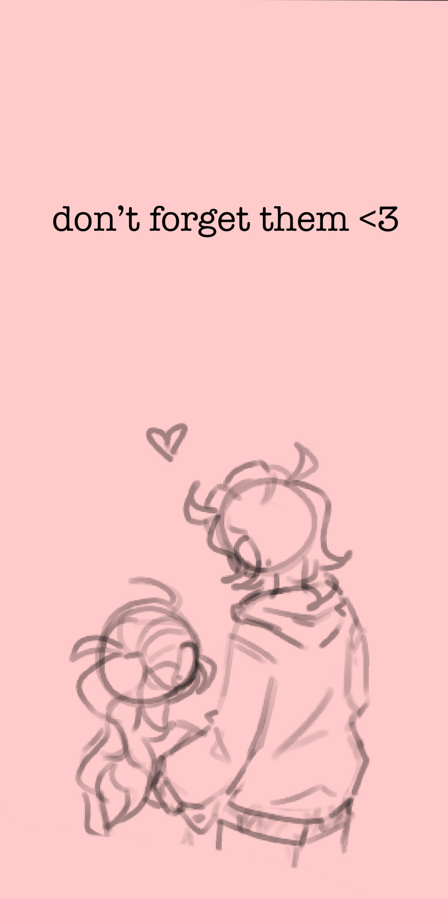
it’s almost empowering in a way; looking back from where you are now to where you started. the journey has been far from easy, but you couldn’t be happier with the outcome, no?
so don’t forget who you were when you began, regardless of how you feel towards them. they’re who started who you are today <3
#im feeling sentimental#my art#im in a bit of a slump regarding my art lately#so i turned back to my roots#my old art#and i tried to analyze what my thought process was back then#i realized i simply did what i wanted#i did it for myself and for fun solely because i enjoyed it#i still enjoy what i do now#but there is a distinct difference in my art now vs then in terms of how i feel about it#back then i knew it looked like “trash” and i simply didnt care#because that wasnt the point of my art#i think i need to retrain my brain back into that mentality#back to when art was fun for me and that was enough#but of course now i have the added benefit of sharing with you all#so thank you#sorry for the rambling omg-#like i said im feeling sentimental TvT
1 note
·
View note
Text
More Doki Doki Battle Academy OP AU
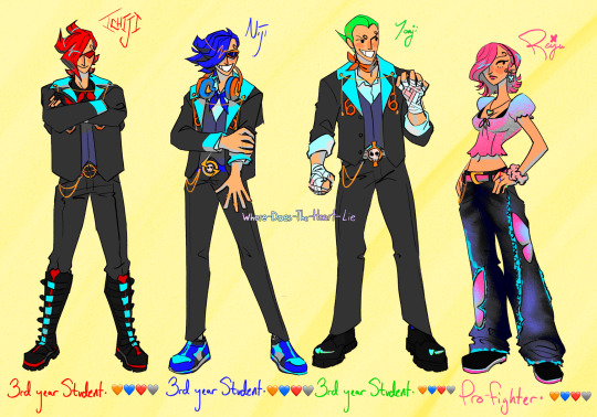


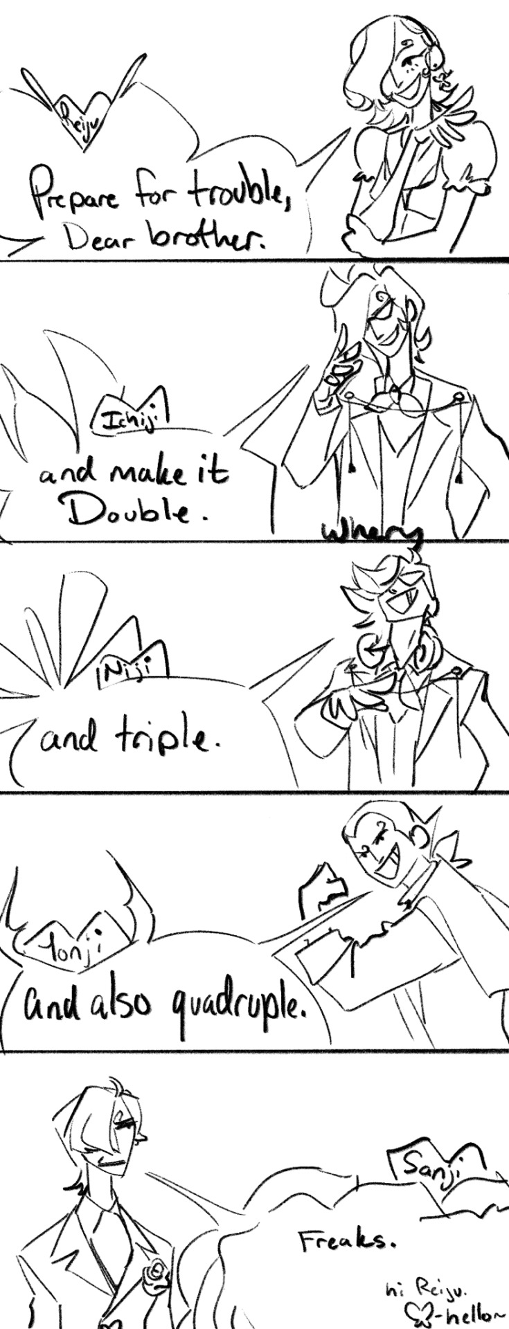
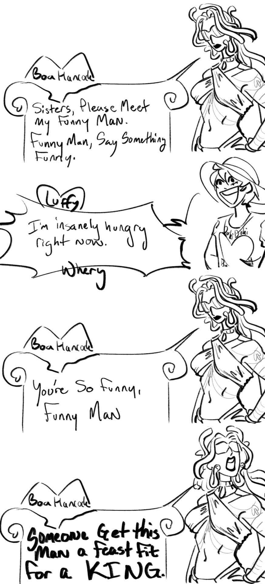


even MOOROEEE of themmmmmahhhhhhh babyeyyy i even added some dialogues fir some extra flavourrrrr (kuma and bonney's gif there would be a sprite he would have in his dialogue scenes. i dont think it would be a gif like this, more like everytime you look back at him, bonney would be in a different spot)
original DDBA designs post (has more lore there, go look at it plese :3
ASL dialogue video
imagining the vinsmoke/strawhat beef going like this video
design stuffs and more lore:
preface: sorry this is so much writing and im not going to grammar check it cuz aint no body got time for that.
The world of this au is like pokemon with different gyms you can fight through and beat, there's a big league of pro fighters, and there are schools for teaching you to be a better fighter.
One of the schools is called the Germa 66 Private Battle Academy, it goes from grades 1-12 and its where the Vinsmoke siblings all went too (at least until sanji broke off from the family at some point) and its run by Judge Vinsmoke, their father.
i am thinking that the Vinsmoke kids would still be genetically modified and Kuma would be a cyborg in this too.
design stuffs:
Ichiji: i tried to make him as punk as he would feasably get away with living under his father's rule. Big "combat" boots, fingerless gloves, black undershirt. He likes his style and would probably go all out if he didnt have to conform to his school uniform, thus i put a little heart on his boots.
Niji: i also made him like his style. The rings on his fingers, his nikes shoes, his big headphones. Like a gamer who thinks this is what fashion is. I think he would love listening to music too so i put his heart on his headphones.
Yonji: big stakly guy. Hes a lot more hands-on than his brothers so i put lots of emphasis on that area. i put his heart on his hand wraps because i think he would really love fighting. I think that Yonji is most like his father in that enjoyment, but i think Judge wouldnt like how casual Yonji's style is.
Reiju: y2k queen. I love this design on her so much im so bummed that she would have already graduated from the academy and i cant put her in a Hit Me Baby One More Time-esque uniform outfit, shed fucking KILL THAT SHITTT. Anyway though, reiju's heart is subtle yet in plain view, the locket around her neck. i dont think she would let anyone look at the contents but i do think that absolutly it would be her mother on one side and her brothers on the other. She wouldnt like people looking at it because that would mean someone could see that her dad isnt in there and she would get it a lot of trouble with her father about it.
Power ranger fits: i made them full on power rangers. its what they deserve. Since reiju has a butterfly motif in canon, i thought it would be fun to also give her brothers a bug motif of their own. ichiji is a wasp, niji is a dragonfly, yonji is a stag beetle. If sanji stuck around, hed probably be a lady bug lol. Also the masks they wear, the eye window part, it’s like tear tracks coming out but in a way that doesnt look like thats what they are. But it’s meant to show how judge forcing his children to be these people is causing them pain.
thank you @zethsdumpster for being my Vinsmoke specialist and helping me come up with a lot of their design stuff!
Doflamingo: i tried to make him a Nasty Nasty man. Like if a used car salesman made it big. Like if Macklemore was MackleMORE. i love the idea that he likes to tan himself, but he doesnt take any of his clothes off to do so, so he just has the absolute craziest tan lines ever. i put his hearts on the gold chain around his neck, he loves his wealth but not much else. i love the idea of him having two very expensive watches on each wrist. there may be more watches up his sleeve too. i also gave him fluffy dice around his neck, like he's one of the cars that he's selling.
Rosinante: i couldnt get away much longer without putting the heart man into the heart 'game'. i couldve went off more with the hearts of his design but i didnt want him to become nearly as flashy as his brother. i wanted him to be understated and fade into the background when doflamingo is around. he is dead in this au btw sorry :/ this is his design when he passed, but doffy's design is present day him. anyway, Rosi's hearts are everywhere, its in the outline of his big huggable fluffy coat, its on his hat thats pulling him down, it would be on his shirt too if it wasnt covered by his coat in this image.
Bonney: SHEEES SO CUUTEEEE AAAAAAAA i love her. I based her design off of Avril Lavigne with her iconic necktie/tanktop/baggy pants looks. i tried to make her outfit look like she could feasibly fit in it when she ages herself up, especially her big ol shoes. the heart in her design is in her neck tie. The stereotypical visage of a dad is a man in a tie who goes to work, and she loves her dad, so her heart is in her dad tie.
Kuma: I didn't change much of him from his design in canon, but since bonney would be more in his life in this version, i wanted to give him more visual indicators of her being there. like the height chart on his leg, or the fuzzy hat she crocheted for him (she also made her own hat for herself). Also, the pattern on his shirt is one that looks like a paw, but if you took off that outer layer, if the pattern continued, the design would be a sun, and i just think that was really clever ehe ehe.
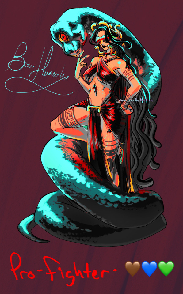
Hancock: Basically i tried to make her the baddest bitch in the universe. My program crashed like 3 times making her which is so funny. Procreate couldnt handle her. I based her design off of Medusa. at first i had her snake be made out of marble, but it eventually wound up at Obsidian. She has no visible hearts on her design and thats because it would be the scar on her back, which she tries to hide. i like the idea that this very visibly revealing outfit would be perfectly tailored and reinforced to never move a single inch to let anyone see what theyre not supposed to. I dont know how i would justify her being able to turn people into stone in this AU, so im just not going to make a decision on whether or not she can do that.
ive been working on these designs off and on ever since i made the first post on this au and im real happy i can finally put more out.
if you got to the end of this, thank you so much for reading~ i hope you enjoyed :)
#my art#one piece#monkey d. luffy#one piece fan art#vinsmoke ichiji#vinsmoke reiju#vinsmoke yonji#vinsmoke niji#germa 66#donquixote doflamingo#donquixote rosinante#donquixote brothers#donquixote family#jewelry bonney#bartholomew kuma#boa hancock#DDBA AU#doki doki battle academy#op battle academy au#black leg sanji#op sanji
1K notes
·
View notes
Text
Till the day that I die | OP81 x Reader

pairing . . . oscar piastri x dyslexic!youtuber!reader
summary . . . Being dyslexic on social media may be hard, but your knight in shining armour is always there to defend you
request . . . yes!! based on this request
word count . . . N/A
warnings . . . none!
faceclaim . . . blanca soler MY WIFE and lily zneimer for couple posts!
alexavia yaps . . . havent written a smau in a while im afraid ive forgotten how </3 ANYHOW im saur happy ydek bc i dont have to edit this?? i dont have to read it 75 times for mistakes?? MY DYSLEXIC ASS CAN BE FREE!!!!! ps this is LITTERED with refrences! also ignore how i kind off didnt follow the request I DIDNT KNOW HOW TO DO IT. dechipher the captions yallselves im too lazy to do it

y/n l/n posted a new video !
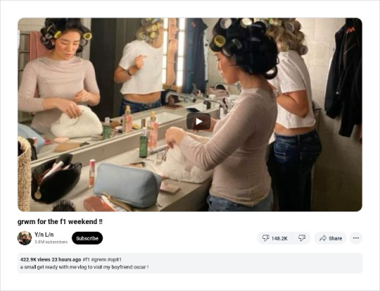
comments !


yourusername

liked by oscarpiastri, yourbsf, lando_norris and 2.2M others
yourusername grmw vlog is out!!! had so fun filsming it and we had an ella feaure included!!! (ella is y/n's dog!)
click to view all comments
y/nfan5 WOOHOO!!!!!
oscarpiastri Can't wait to have you in my arms
yourusername aww osc youre too sweet <3
oscarpiastri Only for you <3
f1_girly are those typos in the caption or am i tweaking
y/nswifeyy. They are! Y/n is dyslexic so every once in a while we get a typo or two
username1 im looking DISRESPECTFULLY
username2 how did she misspell two very easy words? girl go back to school
oscarpiastri She's dyslexic, you're not, so go fuck yourself
username3 OSCAR???
oscarloverr. I DIDNT KNOW OSCAR HAD IT IN HIM
y/nsno1fan guys IGNORE OSCAR AND LOOK AT Y/N

oscarpiastri

liked by yourusername, lando_norris, nicole.piastri and 2.9M others
oscarpiastri With the love of my life once again tagged: yourusername
click to view all comments
username4 I CAN DO ANYTHING PLS JUST LET ME HIT
charlesleclerc Don't bully my daughter-in-law
yourusername CHARLS ILYSM
yourusername BEST FATHER IN LAW I'VE EVR HAD
charlesleclerc I'm the only one you have?
yourusername doesn't mayyer
oscarpiastri Thank you Charles
lando_norris photo credits?
yourusername up mya ss
lando_norris wow y/n i thouht we were frinds
yourusername i ony like you because we're both dyslexic don't flatter yourslef mr norris
hater2 How do you mess up the word 'yourself' so bad?
yourusername magic
oscarpiastri Do you not have a life? Or is it hating on my girlfriend?
yourusername ate
oscarpiastri Thank you 😊
username5 HELP OSCAR IS WHIPPED FOR Y/N
username6 who ISNT
username5 good point
plmvia Y/n i love you pls don't die
f1_3112 y/n ate, left no crumbs, wiped the plate clean and oscar is meh ig
yourusername i love you
oscarpiastri me more
yourusername till the day that i die i love you more
oscarpiastri MY HEART


y/n l/n posted a new video !
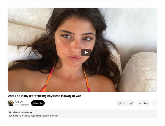
comments !
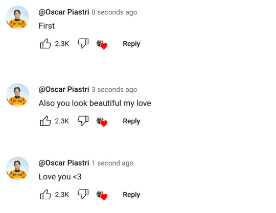

yourusername

liked by oscarpiastri, lando_norris, nicole.piastri and 3.7M others
yourusername small phtotdup since my boyafriend is away at war ad is begging for pcitures </3 also a new vlog is out!
click to view all comments
username7 OH. MY. GOD. how hard is it for you to spell properly?
oscarpiastri As hard as it is for you to get a life and stop hating
yourusername gnawing at the bars of my enclisure that was hit
oscarpiastri Hit?
lando_norris she meant hot, oscar. hot
yourusername H-O-T-T-O-G-O you cna tae me hot to go!!!!!!!!!
oscarpiastri Stunning as always
oscarpiastri Zak better strap me down to the car because I am so close to booking a flight back home
oscarpiastri I've watched all your vlogs thrice
username8 my wife guys back off
oscarpiastri Uhm no?
username8 OMG OSCAR REPLIED SOS
oscarpiastri Text me please
yourusername will do
lando_norris this would've been a normal post if oscar wasn't a sappy muppet
yourusername oi leave my boyfriend alone
oscarpiastri When she defends you from haters <3
lando_norris you bring out a side in him that no one wants to see
yourusername sorry?
lando_norris you better be
username9 MOTHER MOTHER MOTHER MOTHER MOTHER
y/nplsmarryme gorgeous gorgeous gorgeous omg
verchstappan we're so back
oscah.pastry SHES MY IDOL

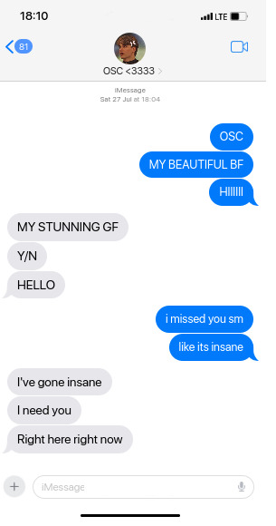
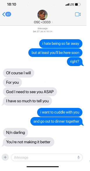


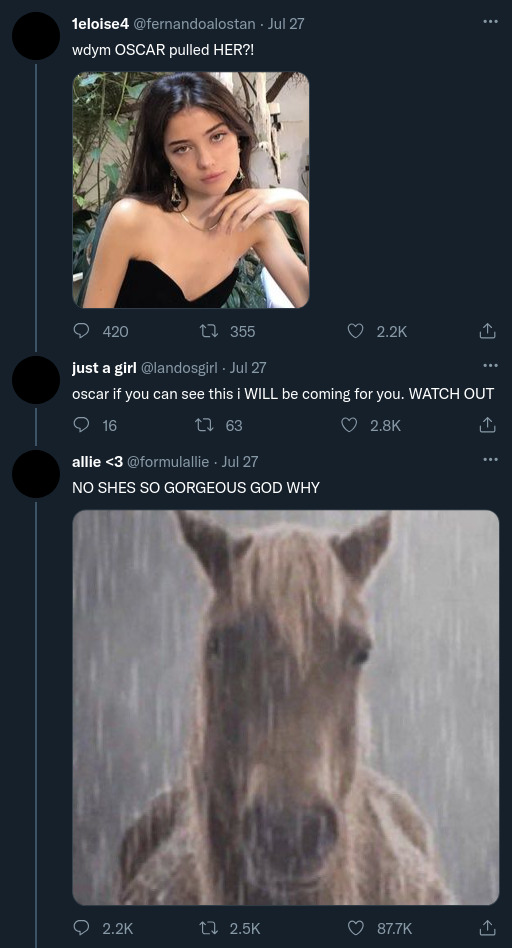
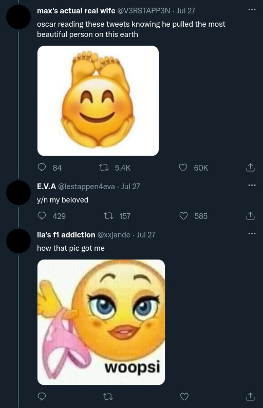


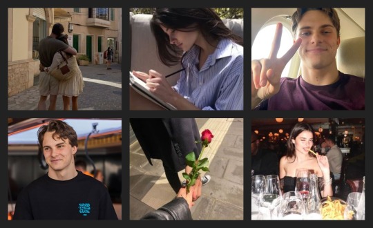
yourusername
liked by oscarpiastri, lando_norris, yourbsf and 3.2M others
yourusername finally reunited with my beuatufil biyfriend and the love of my life <33 love you till the die that iday tagged: oscarpiastri
click to view all comments
oscarpiastri I swear to god if someone comments about the typos in the caption I will personally run you over with my F1 car
yourusername so romantic 😍
oscarpiastri All for you ❤
lando_norris till the die that i day?
yourusername FUCK
oscarpiastri It's alright I got the meaning
yourusername i hare this dysexia
yourusername LANDO I SWEAR TO GOD
lando_norris I DIDN'T EVEN SAY ANYTHING
yourusername you were about to
lando_norris sigh
superyuki22 i need this in my life
username10 mother y/n feed us some ynoscar crumbs
username11 if i was oscar id have a meltdown everyday out of stress of losing this goddess
username12 this is the best love story in the history of love stories
username13 im calling it theyre romeo and juliet
ynshoee_ this is so goals what
lawsons.lawyer parasocial relationship
charlesleclerc You two are very cute
yourusername so are you and alex!!
charlesleclerc You have my permission to propose
yourusername who said i alrwady didn?
charlesleclerc Okay.....

oscarpiastri
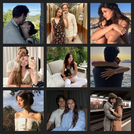
liked by yourusername, nicole.piastri, charlesleclerc and 3M others
oscarpiastri Happy anniversary, my love. From sneaking glances in the school hallways to cheering me on from the paddock, you’ve been my constant through it all. No matter how fast life moves, you’ll always be my greatest win. I love you forever, always. tagged: yourusername
click to view all comments
redbullb1tch max can keep his championships this is the REAL win
ynfann18 PREACH.
nicole.piastri The greatest prize Osc has ever won! Here's to many more!!
yourusername thank you mama piastri 🥹 🫶
oscarpiastri Thank you mum <3
lando_norris nothing more iconic than this relationship
yourusername not even your win?
lando_norris let's not get ahead of ourselves
oscarpiastri You said it yourself?
lando_norris well don't take it so seriously
h4m1lt0ns44 if racing is all i need to pull someone like y/n i'd be a world champion
yourbsf from delievering your notes to each other in high school to seeing you celebrate half a decade of this relationship, you two have the best relationship ever 🫶
yourusername thank you sm ml <33 hope to see you in the paddock with your f1 bf!
oscarpiastri Thank you, bsf/name!! I'll try my best to matchmake you with a driver so N/n can see you in the paddock more often
yourusername OSC
oscarpiastri Anything to make you happy ❤
lando_norris hey yourbsf
oscarpiastri Oh?
username14 THE NO.1 COUPLE ON THIS EARTH FRRRR
username15 i'm so sick i want this RIGHT NOW
username16 my fav thing about them is oscar defending y/n's dyslexia
username17 If your man isn't like Oscar then dump him
yourusername you always make me feel like the most special girl in the world, even when your life is driving 300 kilometres per hour 🥹 im so proud of you, not just for what you’ve acheived on the track but for who you are off it too 🫶 ill love you till the day that I die, my favorit boy forever 🥰
oscarpiastri You’ll always be my greatest achievement, on or off the track. I love you more than words, forever and always. ❤️
yourusername till the day that i die
fin.

taglist . . . @barcapix ,, @f1lover55 ,, @ilovebarcaaa ,, @httpsdana ,, @paucubarsisimp ,, @justaf1girl (lmk if you want to join the taglist!)

#alexavia writes 🍒#alexavia yaps 🍒#f1#formula 1#formula one#f1 x reader#f1 x y/n#f1 x you#x reader#oscar piastri#op81#oscar piastri fic#smau#fic#fanfic#f1 smau#oscar piastri x reader#oscar piastri smau#f1 social media#f1 fanfic#racing driver#racing#f1 racing#oscar piastri x y/n#social media#social media fic#dyslexia#dyslexic#blanca soler#youtube
1K notes
·
View notes
Text
CREEPED VISUAL NOVEL Link, tutorial, extra art, Q&A, some chatter


The CREEPED Prologue is completely free and browser-ready. Gameplay is about 10 minutes. Please read the "tutorial" and notes before playing!
Follow Y/N and their dog, Max, through their grandparents' farm and a mysterious forest filled with...less than fortunate people!
PLAY HERE; works best on PC
This visual novel is powered by GOOGLE SLIDES! It has 0 programming and was created by one person in a little over a month, so please bear with any "bugs" and clunkiness!
TUTORIAL
>Click using mouse/trackpad >Go slowly to not break game >Do not use arrow or space keys
EXTRA NOTES:
>Works best on PC/Browser, I haven't tested the full game on mobile yet >In general, clicking the PNGs on the textbox (Apple, Teddy Bear, Hatchet, etc) will lead you to the right page >If you land on a page that tells you to "go back," that's when you should click the back-arrow key. If your cursor disappears, it doesn't register the click correctly >I recommend moving your cursor periodically to avoid it disappearing and sending you to the wrong page
EXTRA ART
some WIPS and the original sprite-style i was gonna choose LOOOOOOOL


Q&A
Q: Is this an x reader? A: This is a reader-insert, but it's not romantic and I try to keep it as neutral and unidentifiable as possible! Q: What's the plot? A: GENERALLY AND WITHOUT SPOILERS, your dog gets you into trouble and you're just looking to help him!
Q: Who is in the prologue? A: Tim, Brian, Toby, and Kate! More will be added in future chapters.
Q: When will future chapters be posted? A: Not sure! This took me about a month to do, and half was spent over winter break. I will try to get chapter 1 posted before summer, but I am a full-time student, employed, have extracurriculars, etc etc
ok thats all i only remember 4 questions feel free to ask more LMAO
CHATTER(because you know i can talk forever)
ok i just wanted to be able to talk about how the process was with this and how i feel about the results and whatnot...
ive been wanting to make a google slides visual novel since i was like 13 LOL it hit the point where i was repeatedly told i should just learn to code but i was like NOOOOO ITS GOTTA BE GOOGLE SLIDESSSS which is totally stupid but hey. i think that gives it some sort of simple charm that reminds me of being 16 and doing little projects in my room LOL i like working with the easiest tools . my bad
anyway. im just very happy LOL. it's not perfect but i feel like i came full circle in a sense?!?! i've been into creepypasta since i was 9 and it comforted me when things were really hard, and when i was 18 i was going through a really hard time and got back into creepypasta as a way to distract myself. i've always had a habit of throwing myself into fiction for escapism when things suuucked.
i'm 20 now but i've met SO many amazing people, had so many fun awesome exciting projects with friends, created tons of stuff im proud of, felt more motivated to create since i was like 13, have been inspired by so many amazing artists/authors on here, etc. just so so so lucky to find community in such a tight-knit cute fandom that thrives off of creativity and playing around! i hope i can keep the momentum and make a couple more chapters this year, but im kinda busy with school and work...LOL . i'm just excited to have this posted so i can have more discussion about it T_T
anyway thank you if you read this far and thank you if you played etc etc yaahhhhhh omg ok BYE THIS IS SO EMBARRASSING im just so grateful to be in this fandom
#creepypasta#creepypasta fandom#crp fandom#creepypasta AU#crp Au#creepypasta game#creepypasta visual novel#creepypasta vn#ticci toby#toby rogers#kate the chaser#kate milens#tim wright#masky#masky marble hornets#hoody marble hornets#hoodie marble hornets#marble hornets#brian thomas#slenderman#creepypasta x reader#slenderverse#fandom#fanart#sweetart#CRPED VN
1K notes
·
View notes
Text
Little Snippets #6
(A/N: Vote winner so I did my best to finish this)
"Screw it, i am done..." Danny grumbled as he stepped onto the watchtower through a portal, ignoring the startled heroes around him, or his own rather disheveled state. His green glowing eyes surveyed the room he was in for a brief moment before his eyes zeroed in on the one hero that caused to much work for him.
"YOU!" He pointed an accusing finger at the red clad hero before floating over and grabbing the hero by the front of his hero suit. "Do you have any idea how much work you cause me!"
Danny got one confused blink before he launched into a rather thorough explanation of what he just went through fixing 20 different timelines that got created because of one flashpoint while shaking the Flash like he was a ragdoll, ignoring the other heroes around him.
Clark, who arrived a little late to the meeting, looked around the meeting room confused. He glanced to the side to one of his hero colleagues. "Is there....?"
"A white haired floating teen boy giving Barry the lecture of a lifetime?" Oliver cut in arms crossed as he watched on. "Yes, there is."
Clark blinked, looking back at the scene and then back at Oliver. "And..."
"And Bruce is actually taking notes and enjoying Barry getting lectured to an inch of his speedster life while also getting information on time itself? Yes he is." Oliver added an, his tone slightly frustrated but also happy that he wasn't at the receiving end of the teen boy's rant. The kid had been going on about different time lines and the multiverse theory as well as how Barry apparently created several different timelines any time a new flashpoint happened or the past gets seemingly changed. Oliver wasn't even sure the kid was breathing with the way he had been talking non stop.
"And for the record! Changing the past does not automatically fix your present! You just created an entirely new timeline! Do you know how many times I had to fix these? You left so many unattended timelines! I would be rich now if I had gotten a dollar for every time I or my siblings had to fix the stuff you did! Did you ever hear about the multiverse theory?! Hell you are heroes! Didn't you deal with other universes already!?"
The kid rambled on and Clark was pretty sure he wasn't hearing the kid breath in once, which was worrying in so many different levels. But a little traitor part of his mind was actually finding the situation quiet funny.
"Oh and don't get me started on your spawns!" Clark winced a little as he heard the floating boy breath in for the first time in his entire rant before launching into another rant about how it wasn't just Barry but his entire family. Next to him Oliver chucked finding the moment simply funny end enjoying the show of Barry, aka the Flash getting lectured by a floating teen boy.
Though they partially wondered why Bruce wasn't stepping in but then again, the kids rant was... rather informative if he wasn't cursing at Barry's entire family.
A little earlier that day...
Danny groaned as a green note fluttered onto his desk in the middle of his English exam. His head hit the desk and he was sure he was creating some sort of misunderstanding and appearing like he didn't study enough for this exam. Which for once he did, he actually had managed to get time to study for this exam for once. And that despite all the work that had been piling up lately.
The fun fact was that work didn't pile up because of some ghost king title or something, or his rogues dogpiling on him. No it piled up because of a hero organisation outside of Amity. Now don't get him wrong, he admires these heroes. The ones from outer space are his favorites even. But unknown to them they caused im a lot of work ever since clockwork started to mentor him.
Danny glanced at his English exam and then at the note before his head hit the desk again.
Just one day... was one day to much to ask?
He blames whatever hero was at fault this time as he couldn't concentrate on is exam anymore. He barely remembers finishing it as he hurried out of the classroom, forgetting to give Sam and Tucker an explanation as he went ghost and hurried of to the ghost zone. Danny's eye twitch a little when he noticed Clockworks amused expression.
"What is it this time?" Danny groaned already knowing he wouldn't like what he was going to hear.
"Another flashpoint was created. You know what this means." Clockwork chucked handing him a time medallion and Danny groaned even more.
"Can't Dan or Dani..." He started but Clockwork cut him off with an amused headshake. "No, they are currently busy with another job I gave them."
Reluctantly Danny nodded and stepped through the time portal. While he knew, he would actually only be gone for a minute at most in the present, it still annoyed him that he had to constantly fix time. And most of the time it was because of one specific hero at that. He was not looking forward on how many different timelines he had to fix right now now. this was going to take a while too. Even if only maybe a minute will pass in his timeline.
He still had bruises from the last 20 timelines he fixed. And in all honesty he was getting tired of this kid of work, he was partially sure Clockwork was him now, so he wouldn't have to do this himself. Or the ancient of time was getting a kick out of watching Danny fumble while fixing other timelines.
He yelped as he dodged velocraptors right after coming out of the time portal. "SERIOUSLY?! THE MESOZOIC ERA THIS TIME TOO?! WHAT AM I EVEN SUPOSED TO FIX HERE?!" He yelled at nothing in particular. That was it, this time, this time he decided he would finally go and pay these heroes a visit and make them aware how much work they had been causing him...
#little snippets#danny phantom#danny fenton#dp x dc#dpxdc#dcxdp#crossover#the flash#barry allen#justice league#clockwork the ghost#Danny is done#He's been cleaning up after the Flash#Barry is in trouble#Clockwork finds this amusing#Barry created a lot of timelines with his time shenanigans#And Danny is the one that had to fix them#Barry is now getting lectured on the concept of time by a very done Danny
1K notes
·
View notes