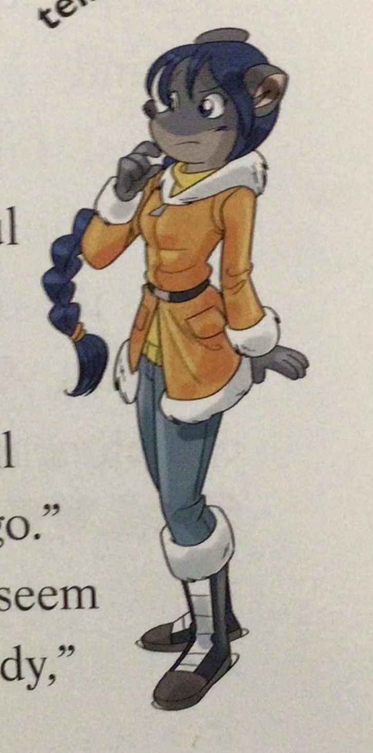
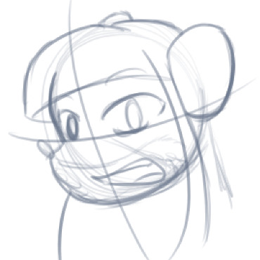
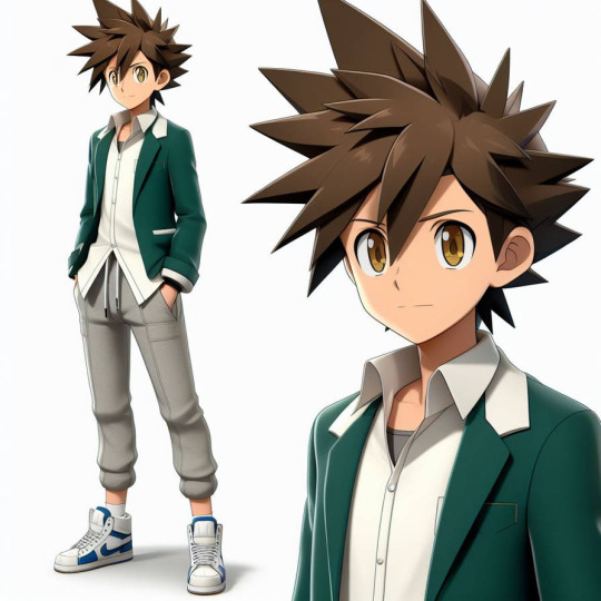
#believe it or not but I used to draw even more cartoony and that just didn’t fit the vibes I wanted to hit
Note
I want to say your style is soft and whimsical? If that's the word. Its a nice variation to a lot of the others I've seen. Sorry if my words are not wording. I love your style is just so fluffy and sweet between Ghost and Soap.
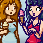
daww thank you! That's so sweet!! Drawing big buff military men has been a challenge for me, it's very different from my usual stuff - but it's fun to love a piece of media so much that it forces you to leave your creative comfort zone.
I used to only draw animals when I started out, so that's definitely shaped my style into what it is. But Ghost and Soap deserve a little softness, as a treat, so it’s ok that my style is sorta mismatched with the source material
#ask#xpaintedladyx#warning: rambling in the tags#whimsical is such a sweet word thank uu#like i know making them soft and sweet is ooc but my mental illness demands it#they get to be macho and dudebros in canon#my art style has also changed since getting into cod#believe it or not but I used to draw even more cartoony and that just didn’t fit the vibes I wanted to hit#I didn’t want to make them too dainty so I’ve rly pushed myself to learn how to draw muscles and angular shapes#which probably surprises u considering how soft it still looks XD#it’s also why my art tends to fluctuate a lot bc I’m trying out a bunch of stuff to find a style I’m happy with#going thru my page is just ‘different brushes for lineart’ and ‘different ways of colouring and shading’#I’m getting somewhere slowly tho
21 notes
·
View notes
Text
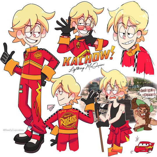

I watched the Cars trilogy recently and with that came a wave of nostalgia and a strange desire to make my own designs for the cars as humans. Aka taking all the charm out of Cars but scratching the brain itch.
So, no need to drag out the intro any longer, I have some notes written out about em for those who might be interested or just bored.
Lightning McQueen:
I tried to make his suit look as professional as possible, with references pulled straight from McQueen's paint job/stickers, while also keeping in mind that I do intend to draw him more so I didn't want to go too crazy with the design. In a perfect world I would've let my maximalist cravings win, but alas let's keep it digestible for my sanity.
I feel like everyone's kinda on this unspoken agreement that McQueen as a human would pretty much look just like Owen Wilson, and that's the big picture here. I used Wilson as inspiration while tweaking and exaggerating a few things to my preference. (Okay, well not everyone, lmao.)
The chevron markings on the front cut off at the side seams not wrapping around the entire suit as to not clash with the sponsor logo on the back.
Also, he's wearing special gloves to help him grip & have control over the steering wheel. I think sometimes that looks a little weird when his sleeves are down & cuffed, but I just feel like he needs to have the gloves there— especially when he comes out of the top half of the suit. (It's also lowkey supposed to mirror his 4 tires when you consider his shoes are also black.)
So yeah, that's basically all I have to to say regarding Lightning McQueen's page. I feel like a lot of my design choices are self explanatory and, honestly probably shared universally... I mean, he's really cut & dry. (But I love him ⚡︎)
▀▄▀▄▀▄▀▄▀▄▀▄▀▄▀▄▀▄▀▄▀▄
Mater:
I'm not gonna lie, Mater was a bit challenging for me. I definitely had to step out of my comfort zone but I wanted to stay true to the character and not butcher anything.
My first thought was to give him a fishing pole to substitute for the tow hook— but then the more I was thinking about it, the more that felt so... out of place? Radiator Springs is in Arizona, which is (not entirely, but mostly depicted in the movie as) a desert. And even though there are beautiful bodies of water in Arizona, in the movie I don't recall seeing any prominent ones, at least in relation to Mater. So, scratch that, instead I gave him a lasso, which isn't supposed to entirely substitute for the tow truck— no, he still drives a tow truck, but the lasso is so he can grab people/things similarly to Tow Truck Mater (very cartoony). My explanation for this is the cattle ranch. Yeah, Mater is a tow truck driver but perhaps he has a side hustle, or hobby, if you will.
Also, I didn't want to make him... dirty(??) Like, yeah, of course, Mater would obviously get a bit filthy from time to time, it's just in his nature, but that is NOT going to be the core of my design. In regards to the rust happening on him, I felt like instead I would substitute this with being very tan. Again, Arizona is a desert. Because of this, he would take off his shirt often, and this would substitute for the missing hood like on Tow Truck Mater. The removal of the shirt also reveals just how tan Mater actually is.
It's his uniformed overalls that have his original aqua color, but from years of wear & tear they've been patched up with brown patches, this would also reference the rusting. The one strap is supposed to mimic the one headlight being broken, and I know that's a stretch, believe me, I wanted to do something with his eyes but eyes are not the headlights in the Cars universe..... think about this. Think about it really hard... if you know what the headlights are in the Cars universe then this actually makes perfect sense.
He is taller and wider than McQueen, which is a reference to the literal frame of their vehicle counterparts. (A little hard to picture with these images, but eventually I'll draw them together!)
▀▄▀▄▀▄▀▄▀▄▀▄▀▄▀▄▀▄▀▄▀▄
That's all I have to say really, but do let me know what you guys think! Gas it up and it might encourage me to make a part 2 with some of the other characters! Who would you like to see next? ♡ Thank you so much for reading & have a great day, Kachow!!
#pixar cars#lightning mcqueen#tow mater#cars movie#cars fandom#cars fanart#pixar#beefycupcakes#rambles n shambles#gijinka#humanization#disney#im kinda embarrassed but oh well ig
177 notes
·
View notes
Text
ᗩᒪᗩᔕTOᖇ ᖇEᗪEᔕIGᑎ

I finally got to the design I hate the most, Alastor.
I'm not a fan of my design simplified to meet the cast's more cartoony style. I tried my best but might draw him some other time with my actual style.
Anyway, my thoughts are under the cut:
My issues with their Original designs:
What can I say that hasn't been already said by so many others?
Red overpowers his entire design and he barely stands out of the background, sometimes he blends with it at times.
Supposedly a mixed person yet the average audience member who watches the show with no context can't tell that he is. I don't want to hear about how mixed people can be pale-skinned because he was never written as a white-passing poc in mind. His Creole background was an excuse to use voodoo in the show and merchandising.
Another Vivzie character that dons a shoulder-padded suit. I believe he's one of the 5 others that has this repeating design trait (Angel Dust, Charlie, Pentious, Lucifer, Valentino, Vox)
His hair bothers me a lot. A 1930s man having a scene kid's haircut? I have a hard time believing that for the sake of the show. Also, not to mention he has that awkward undercut that ends up making him a scuffed Willy Wonka cosplayer.
Twink...
Personal tidbit, but I'm not sure what his staff's design even is? an egg with a microphone in it?
The thought process:
First of all, gave him a darker skin tone, that light grey doesn't cut it for me, unfortunately.
Also heard that his inspiration was Dr. Facilier and with that in mind, I wanted to make him look like him a bit more like him.
The mostly grey and black color palette was inspired by 99monchrome's take on Alastor. Teddy's take is pretty amazing.
If I remember, there was something about him being hunted and shot at like a deer while escaping the authorities. The headshot manifests as a small red X on his forehead.
Gave him a pencil moustache since I wanted him to look like a grown man in the 1930s. Plus, there is a seemingly noticeable lack of facial hair on every male character in this show. (If you're showing me an example of the opposite, please do not give me some background character or any Helluva boss character.)
An extra set of teeth will appear within the slits on his mouth, forming to prevent Alastor from being ever able to frown.
His mouth is also constantly bleeding.
A small detail that would be easy to miss but his eyes are radio dials.
He has a tail and fur on his body because I think it's cute.
Sort of like Velvette in the series, I do want to have Alastor drastically change hairstyles from time to time. Dreads, Twists, Straightened, Buzzed, etc.
A little detail just important to me is that his eyebrows go from thin to thick at its ends.
He does have fur all over his body.
#vivziepop critical#deadbeat motel rewrite#deadbeat motel redesign#hazbin hotel critical#hazbin hotel criticism#hazbin hotel redesign#deadbeat motel alastor
353 notes
·
View notes
Note
The art style of Cloud Castle is absolute ass bro why are their eyes so big
Idk man it just looks.... off
I wish they brought back the og art style like Blue Scarab Hunt because that was gorgeous
Well if you’re referring to the book's artstyle as a whole, then calm down buddy the illustrations as a whole are pretty good all things considered (believe me some of the illustrations in the later books are waaaaayyyyy iffier)
But if you are referring to Danilo Barozzi’s illustrations in the book then uhhhhh… yeah I don’t blame you, I didn’t like the big anime irises either, she didn’t cook with this one,,,
The interesting thing is Barozzi also did pieces for Secret of the Snow and those looked fine (she did well enough that I have to squint to determine which ones were done by her). My guess is either she did a lot of the illustrations for the latter half of SotS and we just got used to it, or it’s because the artstyle of special editions 2 and 3 were more… experimental? Books 4 onwards developed a very specific… look for the artstyle that adhered very closely to the main book illustrations of Spanish Dance Mission onwards, thus the illustrators had to follow suit, resulting in whatever looks off to look especially off.
(Even with this set of pictures, I’m only about 70% sure these are Barozzi’s because of how alike yet different the styles are from each other in the book. The first one could be Barozzi’s, but it could also be Giuseppe Facciotto’s, since he also did illustrations for SotS and his stylization means he sometimes puts the eyes really close to each other in a way that’s weird but still makes sense somehow.)
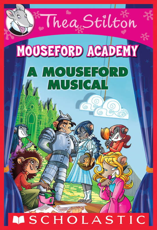
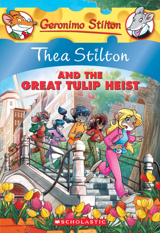
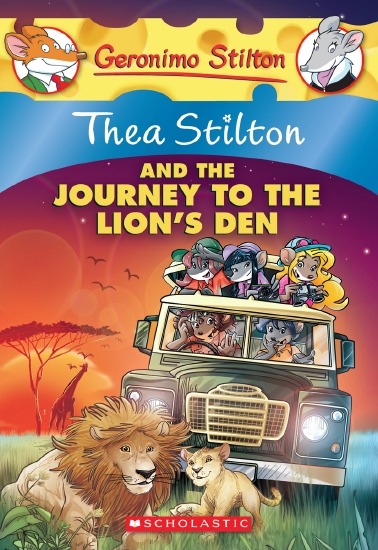
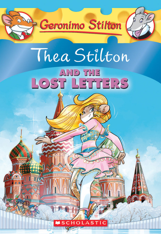
On the contrary, books 2 and 3 (and I would probably even include book 1 there) had a more experimental look to the illustrations, which seems to be based more on (and this is just a theory of mine) Giuseppe Facciotto’s iconic work for the covers of Mouseford Academy books 2-12, 14, 15 and 17 in the English books (he did waaayyy more covers for the Italian Mouseford books— he was basically the cover guy for the Mouseford books for a WHILE) as well as the books from Spanish Dance Mission to Lost Letters. If you’re wondering why those covers go as hard as they do, then now you know why.
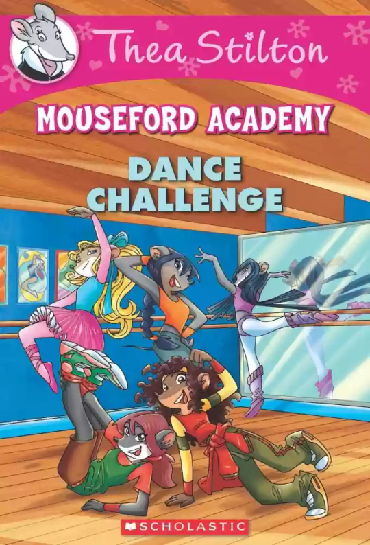
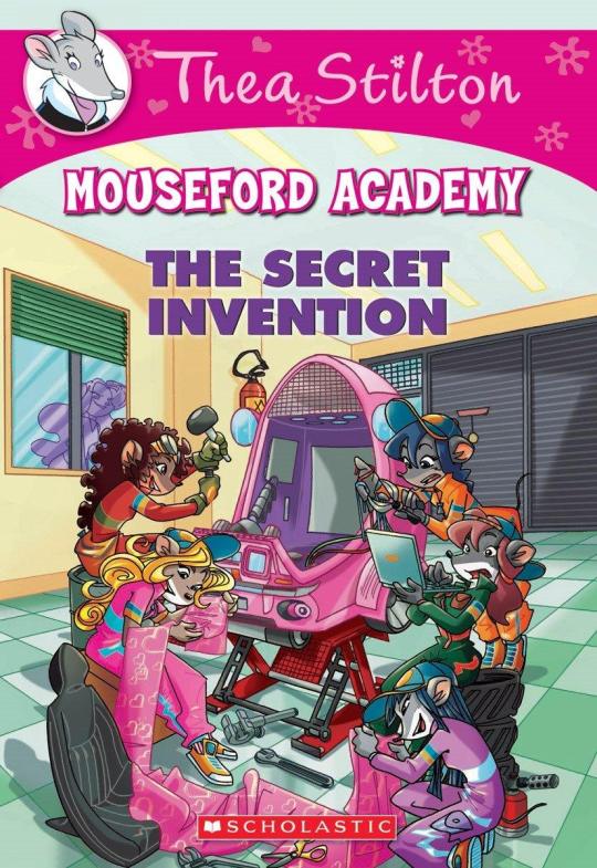
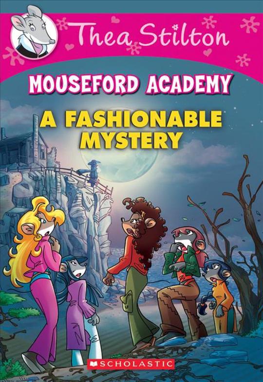
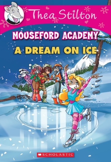
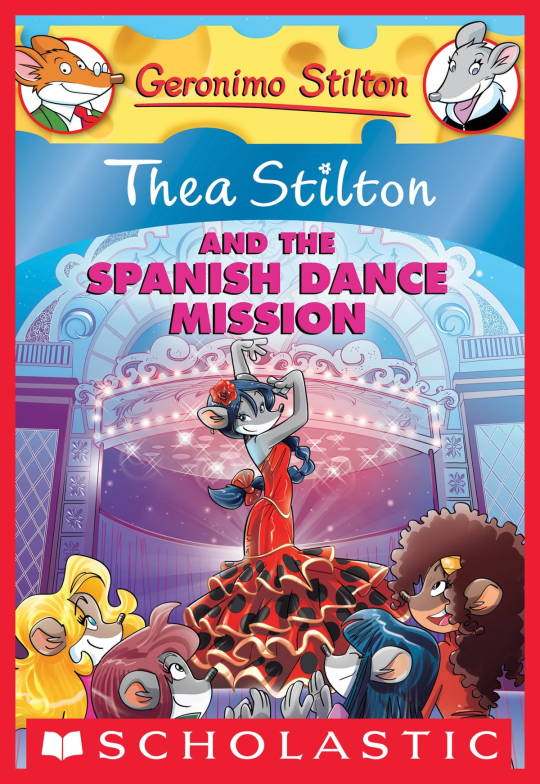
(These aren’t all of Facciotto’s works for the covers we know in English but you can see that he popped off <3)
But yeah as you can see with special editions 2 and 3, the art direction seems to be heavily inspired by Facciotto’s artstyle.
However, when Barbara Pellizzari’s works became the aesthetic poster child of the books’ brand, that was reflected in the illustrations and how their aesthetic changed, as seen in the main books and how they look currently, special editions 4-9, and the Treasure Seekers trilogy.
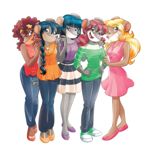
This new profile thing of the girls? This was done by Pellizzari (coloring was done by Flavio Ferron), and thus it became the main reference for how the girls look in the book’s illustrations.
And it’s not just in the general direction to the artists for how to draw the Thea Sisters, but also in the direction given to the colorists. Alessandro Muscillo was the colorist for the special edition books since book 1 and the Treasure Seekers trilogy, and you can see that the direction for the style varied through books 1-3, like maybe direction was experimenting with the mood the illustrations were to convey, beginning with the cartoony and bright colors of book 1, easing into the more grounded and layered palettes of books 2 and 3
Then book 4 was when they transitioned to using digital art /j
I jest, but seriously book 4 was the debut of the coloring style we end up keeping for the rest of the special editions and for all of Treasure Seekers, which is very… bright :D
(I would show more picture examples but I manually took pictures of my physical copies for the Cloud Castle and SotS illustrations and gwuh I’m too lazy to grab my entire collection just to take pictures,,)
Bright as in like… the colors are very defined and saturated. I dunno how to describe it, but when you see it, you get what I mean. It’s very bright and pretty and colorful and it stands out. There are still variations that happen on occasion (Star Fairies in particular uses a good dose of airbrush for the lighting and shadow effects, and Crystal Fairies looks like someone had a bit of fun using sparkle brushes), but other than that, it’s very bright. I don’t hate it, but I do acknowledge that yeah, if I was introduced to the series when it had fully transitioned to the new style, I never would’ve gotten into the series in the first place, because the older books had something that didn’t make it feel specifically catered to girls. The colors were bright, but not too bright. Colorful, but unified. They weren’t that complicated, and they didn’t have to be because the colorists (plural, there were at least 3 per book once upon a time) were popping the hell off with the colors they were given. But y’know, the newer books’ consistent style did give me a good spot to practice drawing mouse furries so I’m not complaining too much about the newer style, haha.
(Tiny baby E’s (it’s literally from 2020 what’re you on about mate) her first mouse Violet drawing using Barbara Pellizzari’s artstyle in Treasure Seekers 1 as an anatomy guide!!)
With that said tho, yeah I miss the old books -m- dunno if it’d fit the aesthetic of the special editions but m a n we could’ve had it and it probably would’ve looked cool
Also the illustrations go way harder in the older books, like Prince's Emerald? I've talked about Prince's Emerald and how it goes hard before, and I still stand by it and say that it does in fact still go hard
Maybe it won't fit the uh splash of color they gave the hardcovers, but imagine they grabbed Giulia Basile's coloring work for the graphic novels and used that as sort've a basis for the coloring style of the hardcovers. Not exactly the same-- would probably still add a touch of whimsical watercolor and/or paint to the very cel-shaded style, but we could've had something pretty dope -m-
Anyway that's my ramble simultaneously defending the hardcovers' artstyle and reminiscing on what could've been haha
#geronimo stilton#thea stilton#thea sisters#questions with e#rambles#the style of the older books is gorgeous but the main thing I'm wondering is can it pull off fantastical whimsy#that's the main thing i dunno if it can do (i would love to be proven wrong tho)#the style is so grounded that i'm wondering if it can pull off what the hardcovers needed it to do#which is convey the otherworldly fantastical thrill of exploring the fantasy worlds (which uh the newer books were able to do but#my main gripe is that fantasy and reality are near indistinguishable in vibes coloring-wise#sure there are sparkles and stuff is more saturated but the girls' dorm in book 4 still has the same-ish feel of the land of clouds#i dunno what it is. the bright colors just feel mundane somehow and don't take a shift when returning to reality)#looked at my books again and i think it might be the fact that the later books have no grounding color?#compare book 3 to book 5 and you'll see it the most distinctly methinks#the newer coloring style doesn't have a color that grounds the illustrations' palettes and thus everything's always bright 100% of the time#the girls' colors are always at their most saturated#like they're always under broad daylight in terms of lighting#it's not eyebleeding or anything but they don't look affected by the lighting in the setting they're currently in#and the result is it looks.... meh?#we get so used to the bright colors that they end up looking meh somehow#i'm not an art expert by any means this is just my observations as someone with a little too much brainrot
39 notes
·
View notes
Text
It's her. The Enemy.

Here she is!!! My yugisona Enemy (Emmy)!
She's more of a deck builder than a dueler, but she tries her best.
Some background on her:
Enemy is believed to be an all powerful cat goddess from another dimension that was sent to this one as punishment for an attempted overthrow. Her time in this dimension has greatly weakened her to the point where there is little hope of returning to her old home. She decided to instead take over this universe! Not just for power, but so she and her beloved cat, Pompom, can live out the rest of their lives without working at all!
It's important to say that all of this is just what she believes. None of that is true, except for the desire for cartoony world domination, Emmy is just a chuunibyou.
She was born on Earth just like everyone else in the yugiverse was, but that won't stop her from believing in her delusions! She wants to be the world's greatest duelist because she knows that that's the only way for her to have even a chance at a life of laziness!
This leads her to building many decks! Some are good, some are terrible, most are alright. She prefers decks that revolve around beasts, plants, or insects because those are cuter in her eyes.
She isn't the best at dueling. Her response time isn't good, she's bad at thinking ahead, and forgets to read her cards properly most of the time, but she always tries her best. Her wins and losses are forever at a permanent tie.

Enemy wears a variety of masks and glasses to appear "mysterious". She buys blank masks and then decorates them to suit her many, many outfits. The glasses she just buys as is and wears cat ear headbands with them.
I like the idea of the masks and glasses being expressive like they are in cartoons, so Enemy's do that.
Her favorite color is pink, but because that isn't a scary color unless combined with black, she usually wears blue and purple when enacting her diabolical plans. Sometimes she wears yellow, but not all the time.
I'm still working on her full story, just know that I'm planning on shipping her with Zorc/Yami Bakura because she's based off me and I'm infatuated with those two specifically.
I wanted her to use the decks I run IRL, but since she lives in DM world, I can't let her have Melffy or Naturia.
There were supposed to be more drawings, but I got hit with not wanting to draw for awhile.
18 notes
·
View notes
Text
How to Spot an AI-Generated Tai in the Wild!
Because I am insanely obsessed with the blorbo and AI art is a hot-button topic right now, here's a silly thing. I'm sure most artists can tell the difference between real and AI art. But my autistic brain wants to pick apart Tai's character design a bit so here you go. This applies to all seasons, touching on basic traits Tai has between them. So I won't go too much into clothing here (people like to dress him up in different cool outfits anyway- keep doing that).
Note that this isn't true to all models, but works 90% of the time. AI art is advancing so quickly that this may be obsolete by tomorrow. Also, real art might "fail" these little tests simply due to lack of experience drawing the character. If you suspect someone is posting AI art, just block and move on. Report if you want, but you know how Tumblr feels about AI. Most importantly? Don't use this post to be a dick.
WARNING: This post uses AI-generative images found from around the Internet for demonstrative purposes. No credit is given because if the "creators" wanted credit, they should've learned how to actually draw. :)
SKIN TONE
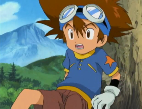
Tai has this nice, tanned skin tone that the rest of the Adventure DigiDestined do not have. While he keeps it in 02 and tri, he loses his color in Kizuna. A real fanart piece is most likely to reflect this, or even add color to his paler designs.
Most AI models have a generic pasty white skin tone for anime characters. This applies to any anime character, not just Tai. I believe this model might have gobbled up his Kizuna skin tone. But I've seen fake Tais even paler than this.

There are some AI models that combat this. But the standard AI identification tricks apply. Here, the tongue is mushy, and the highlights on his goggles make no sense.
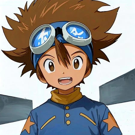
HAIR OF FLOOF FLOOF
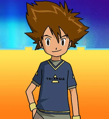
Ah yes- my point of expertise. Tai's hair is a difficult thing to draw. I don't blame anyone for dropping the ball here. But AI does have some notable, repetitive failings.
A "legit" Tai tends to have fluff, rather than spikes. The bangs consist of one stripe over the forehead. The few spikes present designate messiness, but the general shape is actually curvy (look at the top right side of the head for the most wavy lines). The size of the floof ranges between adaptions and even storyboard artists.
AI-generators are convinced that all "anime hair" is spiky. Notice this AI Tai has more spikes and less curved lines.
Then, there's this one, which drops the ball on Tai and Matt so bad that both characters resemble Bakugou from My Hero Academia.

WHO'S THAT DIGIDESTINED?
Eye shape and color has some leeway depending on the artist's style. Adventure/02, tri., and Kizuna supply three different eye styles. However, there are still some dead giveaways.
Revisiting this AI-generated image, the eyes look...familiar. No?
How about now? The modern Pokemon anime style has been completely absorbed by AI models. Sometimes, Digimon and Pokemon will be confused for each other, resulting in similar eye shapes and other traits (look at the noses, too).
HUMAN TOUCH
There's some times you can look at an art and know with confidence it was human-made, such as-
MS Paint blobs/sketches on lined paper/anything showing layers/etc. They're too unrefined for an AI image creator to want to profit off of, so why would they make them?
Some fetish art. A lot of kinksters are using AI, which is why deviantArt made good ammunition for this post. But many have distinct art styles that AI has not copied yet.
Western-cartoony art with hard or thick lines. AI is allergic to these traits atm. Notice the softer, thinner outlines on all three fakes.
Clearly attempting to master Tai's unique traits, even if they don't translate well (e.g.- a dome vaguely shaped like his hair is more credible than a "perfect" hairdo with too many spikes).
FINAL NOTES
All of this could change tomorrow, at the rate at which AI advances. I'm fairly good at deducing AI art from human-made art. But a recent piece almost tricked me (interestingly, it was Davis- not Tai- who looked off). These things are constantly evolving. But in addition to the usual tricks, knowing your blorbos can help identify AI images so you can freely block (or, when applicable, report) the idiots who made them.
#tai kamiya#digimon#taichi yagami#taiposting#fuck ai art#all of this will change in three days#character design#ai art#ai art identification#might go into tai's hair more one day there's a lot i want to say about drawing it
32 notes
·
View notes
Note
Hello sorry to be a bother but I was wondering if you have drawing recommendations? Because Art block has captured me -_- and Body poses are so hard to draw in my opinion so any recommendations?
Again sorry to bother you Have a lovely day Melissa ! ❤
Annie .
Hello, Annie!!!
Oh heavens- you aren’t a bother at all!! I’m so very happy to help other artists in any way I can!! :)
OOoOooOoO Art Block takes another victim~ Dude, I get it- it feels horrible as an artist or any kind of creative when you just feel- STUCK. Stagnant. Dain Bread. I have been there, and I will do my best to help you out of it. :)
So, first off- and I’ll use my own art to help you visualize this- I would go straight to trying to draw two characters interacting with each other.
They can be chatting, arguing, or just sitting in silence.
If you want to try something a bit more difficult, but still pretty fun, you can take things a step further and have the two characters physically touching and interacting with each other like this.
Physical contact between characters is far more difficult to make it look natural, but with a lot of practice, (and ESPECIALLY looking at references), you’ll learn to figure out how to draw the poses. :)
Next would be trying to draw different things and in different styles.
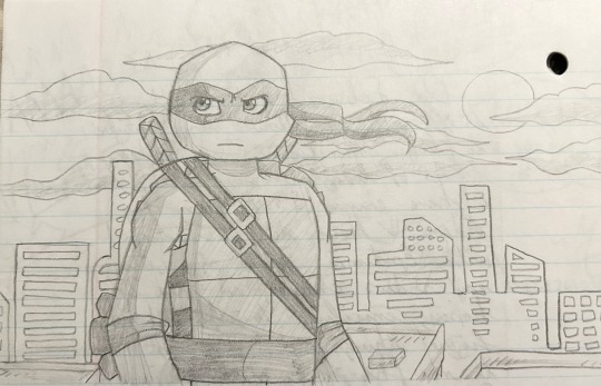
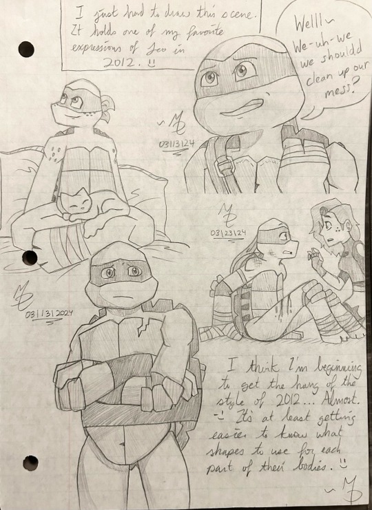
I NEVER draw the 2012 series style. EVER. And believe me, it was ROUGH learning how to draw all the funky shapes and sharp but rounded edges, and the PLASTRONS- GEEZ THE PLASTRONS STILL GIVE ME A HEADACHE
But getting out of my comfort zone and trying to visualize and draw something new was really good for me in growing as an artist. So I encourage you to draw things you don’t normally. :) A character or style from a tv show; cartoony, anime, sharp, rounded, chibi or whatever!
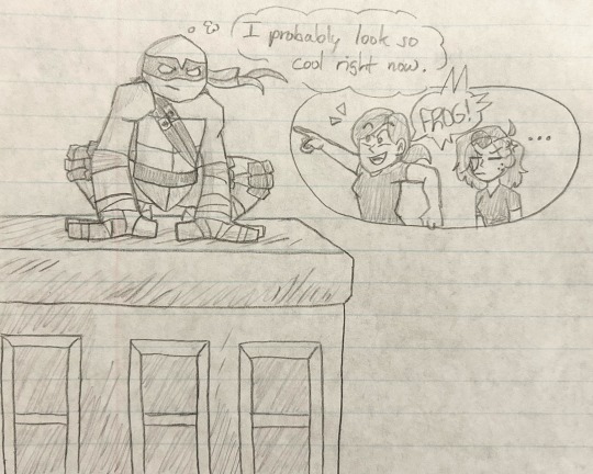
Also never underestimate what drawing silly things will do for your spirit ;) MY OLDER SISTER ALWAYS CALLS THEM FROGS- WHAT THE HECK, MEL?!?!??
And finally. Draw something that goes deep. Draw something that has left an impact on your heart. Something that can make you feel loved, sad, happy, or even mournful.
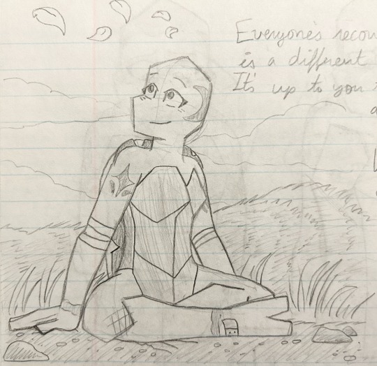
For me, this was this little sketch of Lotus finally learning to find contentment and joy during her long recovery. This sketch symbolizes my own battle for joy and hope when I’ve spent thousands on doctor’s visits, and return home with empty hands and zero answers. My recovery is still happening, but every day God guides me through. Every day He teaches me to be content and hopeful.
I hope all this helps! :) The best thing to fight art block is to KEEP DRAWING ANYWAY. To keep creating ANYWAY. So don’t give up- don’t give in- keep on going. :)
~ Melissa
#C2G asks#art block DUH DUH DUHHHH#sketches#the strength in weakness#the strength in weakness sketches#notebook sketches#Seriously the key is to just KEEP DRAWING#Hope this helps Annie! :)
17 notes
·
View notes
Text
TOONTOWN HEADCANON/LORE POSTING
This post is based around TTCC, and is entirely about headcanons I have about Suits/Cogs, mostly about their physiology, how they're created, etc. I might write more at some point. (Also I am sorry if this is extremely long and incoherent, I tried to at least break it up into sections with big titles and colored text)
What are Suits?
Suits are a “race” or “species” of robotic beings within the world of Toontown.
The ones seen within the game are Cogs, which is simply what employees of C.O.G.S. Inc. are called. Other businesses may have a similar naming formula, a different one, or none at all. (e.g: S.C.R.E.W. Ltd calling their employees Screws)
Considering that the world that Toontown is in, is in fact a cartoon/cartoonish world, this would by technicality make Suits a type of Toon. (I believe the term "Toon" to just be the characters that exist within that cartoony world or whatever)
Therefore. they are still bound to the same wacky physics that Toons are, though they do not always interact with it in the same way. Think of it as two different kinds of cartoons interacting and living in the same world.
Toons would be more akin to rubberhose ish/Mickey Mouse/Ducktales style compared to whatever the Suits would be like, though that doesn’t mean the Suits don’t have some of those properties as well.
Most Suits probably wouldn’t even know what a Toon is, since they are scarce throughout the world, and the ones seen in the game are isolated within the area they live in.
Life Details (Organs, Sustenance, Etc)
Suits are very much like humans (which do not exist in this world). They have distinct lives, personalities, traits, desires, etc.
Unlike humans, they do not typically die of old age, though they can begin to weaken and die because of SIDE EFFECTS of ageing without maintenance that is usually easily attainable. Because of this, many Suits live for a long, long time. There is still a bit of a limit though.
Suits cannot catch viral or bacterial illnesses, (I mean obviously they're robots) but can get sick from overexertion, overexposure to temperatures they aren’t built to withstand, or physical damage. In very rare cases, malware can be an issue.
They have “organs” within their bodies, and require sustenance to survive. They CAN eat “normal” food, though more often than not their food would be stuff like coal, oil, paper, metal, etc. Stuff that vaguely resembles human food but is made of stuff like what I mentioned.
Their “blood” (if they have any) would likely be some form of fluid, or pure electricity in some cases. Nearly all would not cry or sweat the same fluid as their “blood”, as the human parallel would be crying or sweating blood, and that's just no. (Think how people sometimes draw robots as having oil blood, yet also crying that same oil) Much like how the human body has more fluids within it rather than just blood.
Some Suits may use “alternative” sustenance, such as plugging themselves into outlets or using other means to absorb pure electricity, though not every Suit can do this. Suits who can do this are rare, and a special kind of physiology is needed for this to be done without short circuiting themselves/otherwise hurting themselves.
Suits do not produce waste in the way humans do, other than sweat and tears.
Their brains are like processor chips. Though most Suits have to learn information like how humans do, some Suits have the special ability to simply upload and download data like a traditional computer. Suits who can do this are also rare, for similar reasons as the chargeable ones.
Despite this, all Suits can have everything stored in their chips stored in real time to databases in the event that they perish or are irreparably destroyed, to be transferred into a new body. Despite this, it may not be the most common technology, and may be costly, so Suits still try to preserve their lives and bodies. The Cogs have this technology. How they're able to keep it up for so many Suits is a bit of a mystery. Something fishy's going on, probably...
Sleep/Rest
Most Suits have to sleep in a way similar to how humans do. They must get a healthy amount of rest. Stuff like insomnia and restlessness still exists for most Suits. It is necessary in order to preserve energy, prevent exhaustion, the wearing down of their parts, as well as being a quick way to cool off.
Just like humans, it is not necessary to have a bed to sleep, but it has the same benefits for Suits as it does for humans, though it's a bit more likely to see Suits falling asleep on the floor/standing up than it would be for humans.
While asleep, a Suit is merely unconscious, but they still function, much like humans. Same thing with comas and being unconscious.
If their processes are completely stopped, they will die. However, Suits can last a lot longer with their processes completely stopped, compared to humans, as they aren’t biological, and won’t rot or whatever if that happens to them. If they can be reactivated, and their vitals weren’t excessively damaged, they can be resuscitated.
Suits that can absorb electricity do not NEED to sleep, as they can merely be charged back to full power. These Suits may or may not choose to sleep anyways, and may gain the other benefit from it, aside from energy regeneration.
Injuries
Suits have to be maintained to keep themselves functional and clean. Especially when they get injured. They are unable to naturally heal in the way humans can. (Maybe some can with nanotech or whatever but that's getting into extremely sci-fi ish territory which isnt bad but I don't wanna go too in depth/thoughtful about that kind of thing, especially since a lot of things are possible in a cartoon world like this one)
Minor injuries like small cuts, scratches and dents are easy to repair, to the point where it can be done manually.
Sort of like how first aid kits/bandages/etc are sold at pharmacies. Literally just patch yourself up with polishing kits/anti dent/spare parts or whatever
They can't go through healing processes like how humans do, but they're lucky since if a bone is broken or whatever, all they have to do is get it repaired and then they’re fine. (I wish it was like that for US!!!)
More severe injuries may require healthcare and/or more surgical reparations. Severe injuries are able to debilitate or even kill Suits if they’re bad enough. Injuries like gashes are still easy to fix, but stuff like loss of limbs is harder. In the case of limb loss, a replacement can be made to fit that Suit, typically within a few days.
Internal injuries and extreme damage to inside circuitry and vitals may take longer to fix, but are still way easier to fix than with humans, for obvious reasons. Too much will kill the Suit, though :/
Life Details (Physique)
They are more often than not humanoid in appearance, though some Suits may have extra limbs or proportions less akin to those of humans. Some may not even be humanoid at all, like being centaurs or whatever, though said Suits are extremely rare. Some may be semi-humanoid, like the Cog Bosses. Suits may receive surgery of sorts to change body type, though it would be difficult to change a 10 cm tall Suit into a 20 ft tall Suit, for instance. There are limits, and crossing them adds extra risk of dying/ending up with psychological damage.
While most Suits have a discernible face, mouth, eyes, and have the usual set of limbs, some may not have a face, or have a face that does not vaguely resemble that of a human’s. (Like how Cogs in-game range from having human-like faces, to object heads, to animal heads, etc) Some may have entirely different limbs, other than just arms and legs.
A Suit can have their face/entire head modified/changed, as well as the rest of their bodies. Some may want to get entirely new heads, though many tend to get attached to the one they already have. Think of it sort of like plastic surgery and actual surgery, except to a more extreme degree. Despite this, there are still limits, and extensive surgery may damage a Suit physically and/or mentally.
The most common type of Suits tend to range from anywhere as short as a few centimetres, to as tall as nearly 20 ft tall, though most fall within the range of 4-9 ft tall. Obviously there's height diversity among all Suits
Some Suits may be built to be specially resistant towards things compared to others. One Suit may be built to resist extremely high temperatures, while another might legitimately just start to melt in those same temperatures.
Life Details (Psyche)
Suits are not evil by nature. The reason why such a high number of them are very pro-industrialism, pollutive, toxic towards fun, etc, is because they were conditioned to be that way because of the way their society is structured, and the needs that they need to survive.
Despite this, there are still Suits that may enjoy fun or even be Toony in nature. Some may enjoy nature, and dislike the pollutive, industrial nature their world is so full of. Toons tend to be very ignorant to Suit culture and the personality differences between Suits, and understandably so considering what it must be like from their perspective, being invaded and all. Still ain't great to be that way for obvious reasons, though. Many assume all Suits are evil and the same.
There would still be entertainment within Suitopia and other Suit cities/society, much like the many kinds that humans are familiar with.
How are Suits created?
Suits are created, most commonly within factories, though some Suits may be skilled enough, either through innate knowledge or through learned skill, to create another Suit on their own, making them the “parent”.
When a Suit is created, they awaken already having some base level knowledge of themselves and the world around them, under most circumstances. As a byproduct, “child” Suits are not really a thing. They can exist, they just typically don't. (Being born into the world as an adult must suck)
Suits can be made without a specific purpose, and that is how many are created. They will find one on their own.
Those that are made for a specific purpose will usually already know how to fulfil said purpose. For instance, being built for a specific type of job will generally cause you to be naturally skilled at it. Meanwhile, Suits who are hired for that same job without being created for it may have to learn it. They typically have a form of fondness for fulfilling said job, but may lose it over time, or not have it to begin with, which may result in wishing to pursue something else.
What are these factories like?
It depends. There are many kinds. Some factories may build the base model of the Suit, some may build only the skeleton, some may even build the entire individual, appearance and all. Some Suits are built with the purpose of serving the owner of the factory. Big variety in purpose for these factories and whatnot.
Many factories are automated, run without owners, with the sole purpose of creating new Suit life. Other factories may be owned by a company or force, such as those run by C.O.G.S. Inc.
What about all the clones of Cogs we see?
All the “Standard” Cogs (e.g: Pencil Pusher, Flunky, Cold Caller, Money Bags) are clones created with the sole purpose of serving C.O.G.S. Inc. Despite this, they are all created with their own individuality and personalities, and are all different.
They mostly identical while working for C.O.G.S. Inc. as it is a “dress code” of sorts within the company to dress and appear that way.
Their facial and body appearances may have slight/moderate differences between one another, whether it be a quirk with how they were built, or a change they chose to make. The Cogs seen in the game are all 1:1 identical because of limitations. Same goes for Skelecog skulls. (For skelecogs, an example I think of a lot is how I wish Two-Face skelecog heads were two faced as well) They typically fit the face.
They are allowed to change their appearances so long as it does not violate the “dress code”. (Still have to be able to tell what Cog they are. A Big Cheese can't get a head that is not in fact a big cheese. A Glad Hander can't make themselves look TOO much like a Hollywood, etc.)
(Speaking of Hollywoods, they're referred to as “Mr. Hollywood(s)” ingame, though they can go by Mr, Ms, Mrs, Mx, and more if they choose, or forgo having that title at all.)
Standard Cog models that appear very feminine/masculine (e.g: Mingler, Glad Hander, Corporate Raider, Name Dropper) can be the opposite gender of ““what their model would suggest””. Yes, we can have Minglers that are men, enbies, etc. They may or may not choose to slightly alter their appearance to match this.
It is possible for these creations to stop serving their creators and direct their own life. It would be inhumane (or whatever Suits call it) to create mindless drones, and not give them these opportunities.
A Cog like this could end up changing their appearance or getting an entirely new head/body to compensate for the lack of restrictions to conform to.
If you made it this far and actually read the entire thing (without scrolling by to get to the bottom instantly) I profusely apologize for putting you through this. If this catches on and you're interested, I'm open to hear your thoughts on the lore, and suggestions, whether it also be for the lore, or for a better way to format this.
#toontown corporate clash#toontown#ttcc#toonblr#toontown cogs#corporate clash#toontown lore#headcanon#lore#ramblings#ramblings of the deranged#text wall#long post
61 notes
·
View notes
Note
Hello Stiff,
I have been a long time fan of your art. I followed you a while back when I first saw your art pop up on my dashboard. Your art was always wonderful to me, and you had such interesting and new ideas for your Scar designs. I mean, four ears? That was so cool! And who doesn't love a good trans Scar?
Recently, there's been a change in your art that I (along with several others) have noticed. It's something you often point out as a "good" thing, but frankly, it's quite hurtful. You've been drawing Scar with a very large nose, and good on you! You're very right in saying that the hermit and traffic communities have a tendency to not draw more marginalized or "uncommon" body types. We love seeing more diverse bodies and features in art! I myself have a bigger nose and have longed for people with my features to be shown in media.
I say this with the utmost kindness and respect for your art, as a longtime fan: The way you draw Scar's nose is like a caricature. I don't understand, whenever I see your art pop up onto my dashboard, how you cannot see it. As an artist, I assume you know more about correct proportions and such than I, but this just feels (and I hate to use such strong language here) absurd. Drawing large noses is a great thing, but this feels like something I would see in an old, racist cartoon.
And it's just Scar, as well! You draw everyone else wonderfully, but you give Scar such a disproportionately large nose! At this point, it feels like you're patting yourself on the back for drawing racist caricatures. I have never seen people be drawn like this otherwise. Please, look at images of people with larger noses. Look at their proportions. Compare this to your art. You will see the difference!
I say this not as someone who wants to bring you down, but as a fan who is concerned about the way your art has been going. I'm a little surprised you haven't had people point this out to you before, frankly. I hope you take this not as something meant to insult you, but as something meant to educate and bring to light something that you may have overlooked in the name of doing something good.
Please take time to think on this and reflect. While I'd appreciate a response, one isn't necessary, as long as you do something to change. Apologies for sending this on anonymous, but I don't wish to possibly put myself under attack for saying something I truly believe in.
I hope you have a wonderful day.
I feel like some of the art I drew could come off as a caricature but the most recent one with pizza genuinely just looks like a cartoony drawing to me? Like this just looks like a character I'd see in a cartoon? I can see why some of my other pieces may have come off as a caricature even tho that was not my intention.
Obviously I don't want to make something hurtful or racist in nature so I'm genuinely sorry if anything I drew came off that way.
I'm not gonna be drawing his nose this way anymore and I'll probably lay off from posting art for now
#asks#i dont know what to tag this#its 3 am i dont have a better response rn maybe in the morning idk#genuinely sorry if i hurt anyone by my art
19 notes
·
View notes
Text
I posted about this, vaguely, on my main blog... but, since it involves Desiderium, wanted to post more about it here.
Someone random stole two pictures of Flopsie and my self-insert, Flora, to use them as ammo against somebody else in a PSA. This person has never contacted me. I had to be informed by a third party a few days after my art was stolen.
They decided to steal the art because they wanted to accuse somebody else who had made an Art Fight for me last year (what the PSA creator called "a commission," oddly) of supporting CP, and without asking me, decided that my self-insert was "a child" and "a baby."
I've always known that depicting my own body proportions- and sometimes depicting them even a little more chibified- would be "iffy" for some audiences. But there is a difference between feeling uncomfortable with it and calling somebody you haven't made contact with, point-blank, "CP," "pedo," "little girl," and saying I wear "children's dresses," since I do wear frilled nightgowns irl to bed.
If I had been spoken to I could have let them know she was a self-insert, and indeed follows my own body type and mannerisms, but based on how this person speaks down on others I doubt they would have cared. And, I personally believe they did not contact me first because they knew if I had told them the character is of-age, then they would not have had extra ammo against the person their PSA was actually about.
I draw cartoony porn of a fantastical version of myself with my own plushies. I do not draw NSFW of children. Whether one is uncomfortable by it or not, you cannot slander them like that. You are not "more moral" by being mean to somebody over something you don't even understand, because you didn't even speak to them about it.
I get that people are very wary online, but I do not feel that these accusations were made in good faith, especially given the incorrect details of the PSA (that I commissioned that person) and the commentary (OP blackmailing someone, saying opposition was 'going over their head,' and claiming the one questioning them was somehow my friend when I'd never seen them before).
I have half a mind to give out this person's usernames- after all, if they are making PSAs like this they want to be seen, and do want attention on it. But I don't feel like it would be worth it, given everything. But, I have taken screenshots of the most heinous parts of their commentary.
If you must involve yourselves in PSAs, just please do not be like this person (hell, you shouldn't speak to anyone like that at all.) "Assumptions make an Ass out of You and Me," and all that.

#I just noticed that one of the pics they stole was drawn after the persona’s gift art too#one of the argument in the post was ‘they should have looked at the profile of the person they made art for’#but the gift was given in July and one of the stolen art pieces used as ‘proof’ was from August#😣😓
9 notes
·
View notes
Text
Why you absolutely should bother with watching One Piece in 2022:
Alright I'm going to get straight to the point.
Usually when you ask people “what’s so great about One Piece” the most popular answers will be about the loveable characters, good world building and great foreshadowing.
Which is all very true and I’m here to delve into why, starting with the main character :
Monkey D. Luffy:
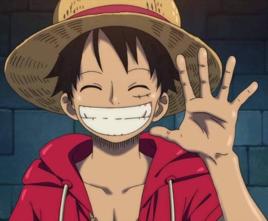
I once saw someone describe Luffy as a "pretty simple character that is done right". And I must say that’s the best way to describe him. His straightforward, curious, extroverted nature is the is the perfect window to explore such a vast interesting world.
Luffy does his own thing, he’s selfish in many ways, his main goal of becoming the king of pirates itself is rooted in selfishness and greed. But he’s still a chill and kind-hearted dude. It just so happens that the selfish things he wants in life are fairly tame things like eating lots of meat and punching those who hurt his friends or innocent people in the face.
And in truth, he’s quite the emotionally intelligent character which is such a charming quality that has landed him allies and friends all over the world.

In short: He’s just goofy and loveable and I like the fact that Oda ditched trying to force a "relatable" protagonist (him not having any internal monologues is a nice touch that fits his character well imo).
And before we move on, I’d like to give an honorable mention to Tanaka Mayumi who is such a wonderful voice actress<3
Next up : World Building and character design
This anime undoubtedly has some of the best world-building that I’ve ever seen.
Which is great because at its core, One Piece is an adventure manga not a battle manga. Sure fights and matchups are important and epic and Haki is one of the coolest power systems out there.
But also watching the heart wrenching relations and back stories of the characters and seeing everything connect and having characters from 400 episodes ago make a comeback and be relevant to the plot in ways you never expected is WHERE IT’S AT.

Oda plays a lot with foreshadowing and he’s very good with continuity and revisiting small details which makes the story a lot more cohesive as a whole.
Watching this show feels like an adventure which is what Oda was going for. It’s so immersive and really plunges you into this fictional world that is so well built and versatile that you will never find yourself bored because each island is a new story. A new adventure.
The character design is also top-notch.
Oda has opened many possibilities for himself with the art style as the cartoony style helps in creating a fantasy world, you get more design freedom when you're not limited to proper proportions and things like that.
And he uses that freedom to create memorable characters but also to integrate parts of their personalities into their designs. Some of my favorite character designs include Sir crocodile, Franky, Kuzan, Doflamingo, Boa Hancock and Baby 5 just to name a few.

Last but not least, The humor :
Okay so humor is subjective. However I can confidently say that no anime has ever made me laugh my guts out the way OP did, the humor is elite and the jokes (especially pre-time skip) hold up even 20+ years later which says a lot.
And I think what plays a big role in that isn’t so much the joke itself but the (often) deadpan and downright hilarious delivery from the talented voice actors.

SO TO RECAP:
Cool mc, watching him punch bad guys is satisfying af.
Great worldbuilding.
Lots of heartwarming moments.
Characters be silly and loveable.
Lots of tiddies. Male AND female.
It has Trafalgar Law in it.
But yeah real talk this show has been a source of comfort for me lately and I believe it has something for everyone (especially if you're a sucker for the found family trope, it does it really well.)
Plus with the manga drawing to an end now would be the perfect time to catch up~
#All i'm saying is trafalgar law deserves more bitches#This was shorter than i intended it to be but it's also all my short attention span has to offer so#one piece#one piece crocodile#monkey d. luffy#trafalgar d water law#trafalgar law#one piece luffy#nami#sanji#zoro#franky#chopper#nico robin#brook#one piece jinbe#sir crocodile#one piece anime#anime rant#aokiji kuzan#baby 5 one piece#vivi nefertari#anime
89 notes
·
View notes
Note
I think even Japanese manga know when to draw the line between serious and comedy. Like having Persephone threating a nymph while entering her house like she owns it and the nymph is like drawn in "funny face and limps" is supposed to light the mood??
That the protagonist of the series is acting like a narcissist? Also in other moments when a serious topic is brought up and the faces are drawn all goofy and i am wondering the choices they made for this
If you can't balance it then better make it all the seious or comedic.
I’m so sorry for being so late with these damn questions but I completely agree with you on your opinion. That’s one of the things that irk me when I see the more serious moments in Lore Olympus since they don’t know when to stop being fucking funny, like a character can be discussing some trauma or something life threatening could happen and the moods always “cartoony hehe funny faces haha” which is annoying. I don’t mind meme faces in comics but first you need to know how to use them correctly so it’s not insufferable to look at. I personally believe Lore Olympus should’ve just been a comedy since it’s clear that jokes>> trauma and I feel like it’s disrespectful at this point.
8 notes
·
View notes
Text
Brennus’ personal thoughts on the FNAF Movie
For those going into the movie for the first time: don't expect it to all be super serious
⚠️SPOILERS AHEAD⚠️
Overall, I think it's a fun movie. It's what I expected from a 15+ fnaf movie. Did I wish it could have been more brutal? Yeah, but I'm ok with the product as it currently stands.
Visually wise this movie is incredible from the animatronics themselves to the set. Absolutely great. Jim Henson’s Creature Shop, my beloved, you have brought the robots to life perfectly <3
My smallest visual gripe was for one of the kid jump scares in Mike’s dream where the kid’s eyes turn and cry black. You could tell it was like a face paint. It's a real child actor so maybe they couldn't get them to wear ‘better’ makeup but then again special effects could have been used the improve it, idk. I'm not a filmmaker I'm just a silly skeleton that draws.
One of the least believable kills was the one where Freddy bit a woman in two. That was really cartoony to me, I did giggle.
My biggest criticism of the movie is probably the story. But the more I think about possible “improvements” I think to myself… what else could they have done for a script for a fnaf movie? They need to balance a combo of digestible info to new viewers but also satisfy fans. I personally think they managed to cater more to the fans as seen with rotten tomato ratings. But I did watch this with my mother who only knows the story based on what my brother rambles about and she managed the understand the movie alright. However I don't know any opinion on the film from an individual who knows nothing of the franchise.
I personally really enjoyed the atmosphere in the first part of the movie. It was depressing and oppressive to watch Mike struggle through life. But that seems to change as the movie seems to shifts in tone when we discover the animatronics are nice to his sister Abby. I at first really didn't like this but seconds later I got swooped up by the wholesomeness. I was scared that doing this would remove the intimidation factor the animatronic built up during the run time. It did. But I think I understand the purpose of doing this. I still don't think it was a good idea but I think I know what the movie makers were trying to do.
They were trying to shift the villainy focus from the robots to Afton. Trying to say “Hey look they are on the good guy's side” even though they shift on a dime when they decide to kidnap Abby. We also see them brutally hunt down a group of thieves so the whole “look how cute they are being <3” is somewhat unbelievable. I see what they likely tried to do but I don't think it worked super wonderfully.
I like the foxy arcade machine reference. I don't remember if this is a scene in a Fazbear Frights or the Silver Eyes book. But in a book foxy in hunting an AFAB character through an arcade area, in the book he breaks the machines as he gets closer to his victim to build tension. I think that's what that scene with Foxy and Abby in the arcade was in reference to. Though he didn't break the arcade machines in the movie, I thought that added a lot to the original scene. However it's understandable because the robots in this depiction seem to like to keep the pizzeria intact.
Also I saw that theif who got killed by Chica was wearing a midnight motorist shirt, I see you.
Everyone expected the William Afton reveal. What I didn't expect was for VANNESSA to be AFTON’S DAUGHTER. It felt like a very less serious “I am your father” moment, except it's a “he is my father” moment. I did giggle when the reveal happened. For me, this was a signifier that the movie wasn't trying to be serious. The movie is trying to be fun.
Though with that twist it made me wonder what it was like for Vannessa to live with a father like Afton. That's when I wished they did more with her, that's when she got interesting to me. As the movie makes it seem Afton holds a lot of emotional power over her. She knows he is a killer, she is a cop, yet she doesn't report him or arrest him herself. Her standing up to Afton at the end really feels like an abuse victim standing up against their abuser and I kinda wish they made that so much more impactful.
#fnaf movie#fnaf#fnaf movie spoilers#these are my own thoughts on the movie#you can disagree but I'm not here to have an argument
3 notes
·
View notes
Photo


"I'm so proud of you, honey!"
Many of you may not know it, but today marks one exact year since I drew the first concept sketches of my first Sing oc, Bia.
One year ago today, I began working on what would have ended up becoming my widest fan project ever (one that features several original characters and a story arc that spans over three generations), and surely the one I’ve felt the most passionate about.
These past few days, while I kept working on the upcoming posts for this Tumblr blog, I took a moment to look back at what this year brought me, and I couldn't be prouder of myself for what I was able to accomplish; I re-adapted my style to a new one, growing more and more proud of what people might have dismissed as ‘a cartoony style’. I got the chance to practice drawing anthropomorphic animals. I was able to maintain a somewhat consistent posting schedule and, judging by the numbers, 2022 was my most productive year so far!
There were hardships, of course, and on more than a few occasions I was tempted to give up. I got discouraged by the lack of feedback I was receiving on my posts, and by the physical stress of having to work on my personal stuff after a 9 to 6 shift of a job that already requires me to spend all day drawing (I’m a cleanup artist for an animation studio). But in spite of everything that might have happened in this long, sometimes stressful but always amazing year… I didn't give up.
This project of mine has been a great load of pressure, but an even greater load of fun too, and (just like I made Buster and Bia say in my Happy New Year post) I’m really looking towards ‘another year of us’.
So, thank you very much, my dear Bia, for giving me something I could believe so much in and that I could be so proud of! And a huge thank you to those of you who took their time to stick by my side. I can't wait to share the rest of the stories I planned with you guys!
#sing movie#sing 2#buster moon#sing oc#original character#bia springs#bia and buster#the second time we first met#tstwfm
12 notes
·
View notes
Text
Man, i really don't know about theories from now on.
The new series for me is a sort of enigma with "What was the point? What was the message?" questions. Although it seems like this, I really doubt that there is no point at all. Even from the early interviews it's been said "We also get a lot of people just asking ‘why have you made this? and what is this for?’ which is probably the worst response for us."
But, reading more and more interviews, I kinda get a feeling, that what's going on it's so weird and inconcrete, that even creators themselves can't describe this. That's why their descriptions feel so vague.
And, as a person who enjoys making abstract art herself, for me at least, I can relate to that. Usually I just come up with theme or idea, some cool looking things and metaphors, and organize it into something that feels coherent. Than, just interpret it how you feel.
Yeah, the reason is very subjective. But with all interviews, that is why I personally don't buy theories that suggest that dhmis has some complex lore, and all of this can be explained logically via simulation or something similar. No offence for those who enjoy that reading, btw. The whole point with dhmis is that nobody is really sure what is going on, and you can fill the gaps by your own liking, making it into something special specifically for you, and it will not be wrong.
But if we're going for an intent... Than we need to find a theme of the series. All art is created with some message. Even if it's something as simple as "look how pretty this tree looks".
That's why i find a simulation theory about web series sounding really boring (no pun intended). Especially if it adds a villain with a cartoony motivation such as "more money" or "i hate my son so fucking much, but i still make sure that he wouldn't be socially isolated". It makes the conflict just really simple, and requires a story being taken by a face value. And the message, i guess, don't let some weird puppet produce your show? Cause it's not like creators going for "situation sucks but we still have each other", looking at how cynical the show is, and how creators describe the characters themselves. They are straight up calling them: "pathetic", "moron", "asshole" c'mon. And also there isn't such scene in the series where they try to comfort or even understand each other to be that kind of message. It's much likely to be intended as a metaphor for something far more simple. Something that's also relatable for the creators themselves.
If I understood it correctly, of course. I know, there must be the reason that theory is so beloved, but I, for the love of god, can't get it. (And it's kinda about the whole categorie that goes under the description of: characters are in distressing situation by the direct fault of roy and also leslie all along).
And I also personally don't want to believe in "characters have a souls of a real dead people from mullhoven in them" I know, it has some basis, but it's basically a plot of most analog horror, or games with creepy hidden lore out there. It's done to death, and I'm not really sure if it adds anything to the story, besides Yellow being Leslie's dead son. But still, eh? Why does it's "you're not my real son", then? (Maybe Yellow is just based on him? Or, if Leslie didn't create the characters, just one that looks the most alike, who knows. That was really what my "you will never be a real boy" drawing was all about)
But, the things I set with, honestly, not better. Now, besides the "Desperately trying to tie two series together", after reading the interviews, I can only say they that here might be something TAWOG-esque going on, like, with the TV in the teaser playing the show, and the sitcom logic being incorporated into the story.
It's kinda because the show doesn't even feel like a finished story. And the words "I don't think this is the end" only support this. Even if it's kind of jarring that after 6 years we got only a part of the story, that we are not even sure when or will it ever be finished, I'm really glad, that at least now theories have more variety to them, and people willing to let go of the original series as its own independent story if it's true or not. Now, it's almost feels like real science.
I think, only time will tell which was the closest one. But, It doesn't mean that I won't continue to study this thing from all the different angles. I know, they want to say something to us. And I really want to know what it might be. Besides, it turns out as something boring (what is unlikely), I always can create an interpretation myself.
This was mainly discussion about the show, not an attack on theories or headcanons. Remember this, ok? I don't want this post to discourage anyone to be wild and creative. I mainly wrote it as a frustration about how seeing the show from a perspective of only one theory makes discussion about what show might mean really stifle.
17 notes
·
View notes
Text
Chamomile Comic Trivia #23
#118 - Quiet

I suffer from hayfever and as such, the ettiquette of saying “bless you” has sort of run dry on me over the years. I’m already annoyed enough that whatever I’m doing is being interrupted by sneezing 15 times in a row, there’s no need to draw attention to it. Whatever soul or demon you think you’re driving back inside me with your words left several decades ago! So yeah, that’s what inspired this one - it is interesting to see how many times it takes before people stop saying it (usually two or three).
I had fun drawing Bri as dishelved by the experience as possible.
#119 - Fresh

Mimi’s first appearance, apart from a brief early cameo on Brianna’s work schedule in comic #60:
(As mentioned in a previous trivia, the doodle in that comic was designed to be distinct enough to base a character on later, but otherwise I hadn’t designed her until now). Mimi has always been a name I liked - funnily enough I actually came to know someone with the name only a month or two after this comic (via the series even, they were the significant other of a friend/mutual who followed me after discovering the Chamomile randomly on tapas). I don’t tend to use the names of people I know for OCs, so Cammie’s Mimi came to be just in time to not be called something else lol.
If it isn’t clear, the goal with Mimi is that beyond being ever-present in Cammie and Bri’s life, she’s a super memorable person in terms of charisma and appearance too, and yet, mirroring the fact that she’s always been off-camera up to this point, Cammie has no memory of her. One of my cartoonier gags but it’s one I’m weirdly fond of even if it means Mimi has been fairly one-note over the years in her few appearances. Her appearance here and now was just a decision to just flesh out the world a little - clarify that Brianna does actually have a few other members of staff, she doesn’t run the The Cubby all by herself like some sort of cartoon character. So... yeah, it’s ironic that I used such a cartooney joke to illustrate this, lol.

Barely trivia for my long-time followers, but she is wearing earrings of my childhood character Frogy, who has cameo’d a couple other times in Cammie so far.
#120 - Sea
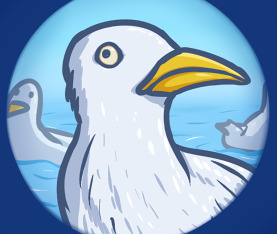
I don’t THINK I planned out this whole beach arc from the start - I just figured I’d think of beach stuff to make jokes about as I went. In addition, considering they live in a seaside town, I felt a need to address why the beach hadn’t shown up as a location more often now that we were 100 comics strong. I remember thinking how incredibly dumb I was for forgetting what happened to Cammie in the only other comic set at the beach to date at this point.
Getting the realistic seagull close-up’s vacant expression JUST right took a while, I remember. I was literally adjusting at the pixel-level to find what I thought was the exact funniest middleground between an intimidating piercing stare in Cammie’s direction and an utterly threatless vacant expression.
#121 - Nostalgic
Bri gets nostalgic of younger days. Boy I sure hope she doesn’t ruin anyone’s summer trip with this nonsense in about 200 comics time!
The last three panels deliberately mirror the earlier flashback comic of young Bri and Cam:

#122 - Kind
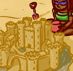
Another case where I was showing sentiments of Vienna being into history without wanting to draw too much attention to it either - just let it be a subtle character thing. Can you believe that giving your OCs interests other than your own means you have to RESEARCH stuff? I had to find out some details about medieval castles to make sure Vi’s was close to historically accurate, but the more interesting thing to research would be how on earth she made all that detail with a children’s beach bucket and spade.
#123 - Evening
Nothing too much to say about this one! I just wanted to draw this as a scene, and came up with the joke in the process. It’s funny how establishing a running gag makes a comic like this feel like a gimme in retrospect, but this was actually the comic that made the gag running - prior to this, Cammie had only had one unfortunate fire encounter in #53.
#124 - September

And the “Cammie and friends go to the beach” arc ends with a little “Webcomic Time” trope joke. It’s been done bunch of times before, my spin on it was tying it into the fact that time really does fly like that when you’re an adult, actually! And of course I bookend with another Mimi joke - beyond just being a memorable character, this incredibly memorable unseen storyline centered around her apparently happened during the part of the year the comic didn’t cover and Cammie can’t remember that either.
I did always plan to keep the story of that day as a potential bonus content type dealie if I ever reach a time where I can afford to make bonus content as well as the main comic! It’d spoil the joke of everything Mimi-related being so off-camera of course but... I haven’t written off ever covering it just for the sake of preserving the joke in this one comic. Maybe one day we’ll find out what happened, but don’t worry too much about it if not, I think Mimi came out of it just fine. Well, maybe.
[More Chamomile Comic Trivia]
(Above link may not work correctly on tumblr app)
7 notes
·
View notes
Last Seen Blogs
lulayme
FUCK YOU BAEKHYUN

gabeezzdiary
𝐠𝐚𝐛𝐞𝐞 🪩🍒🎀


gabbypenhowe
Lady Gabby!

cheapdogspathankot
Cheap Dogs Shop Pathankot