#css long text shadow
Explore tagged Tumblr posts
Visit Tumblr Blog
Explore Tumblr blogs with no restrictions, modern design and the best experience.
Last Seen Tumblr Blogs


Fun Fact
In February 2021, Tumblr had 518.6 million blog accounts.
Text

CSS Long Text Shadow Effect
#css text shadow#css text effects#text effects#css tricks#css effects#html css#codenewbies#css#code#html5 css3#html5#css long text shadow#frontenddevelopment#frontend
0 notes
Text

CSS Long Shadow Effect
#html css#divinector#html#css#css3#learn to code#frontenddevelopment#css long shadow effects#code#css text shadow#css tricks#css effects
1 note
·
View note
Text

ao3 skin that i made!! (copy code under "keep reading")
it's a messy combination of pieces of code from other people's skins and my own changes
the header image is NOT MINE! it is "Pattern Galaxy Space Planets Vibrant Linear Universe" by Arncil on Redbubble, which i just used as an example for an image you could use!
here are some of the skins that i can remember using as part of this, but i've been building it for years so forgive me if i forget some:
Shortening long tag fields by Xparrot (on ao3)
Slim Shaded by AO3 (on ao3)
Lily Garden by tealtiam (on Tumblr)
AO3 Tag category coloring! by ao3css (on Tumblr)
come back here to my tips or leave a comment if you need some help customizing the code!
Background color: #26303C
Text color: #CBC6C3
Header color: #46626D
Accent color: #993F33
steps to create a new skin using this code:
log into ao3 account
go to dashboard >> skins
click "create site skin"
make sure TYPE is "site skin"
add a unique title
copy all code below
paste into field 'CSS'
click on "use wizard" at the top
copy and paste the four colors written above into their corresponding boxes
click SUBMIT
click USE
how to customize this skin:
FONT SIZE: at the very top of the code, change the "90%" to be bigger or smaller to change the font size within a fic
MAIN COLORS: to change the main colors, select "use wizard" when editing the skin and replace any of the four hex codes under "Background color:", "Text color:", "Header color:", and "Accent color:"
SECONDARY COLORS: find all hex codes within the code and change those numbers as you like! i changed all colors to match with the color palette of the header photo that i chose to make it feel cohesive
TAG COLORS: towards the end, the "relationship", "character", and "freeform" tags alternate three colors to make them easy to separate. in this skin they are all very similar, so you can change those to be whatever colors you like!
HEADER PHOTO: find the link towards the end of the code right before the warning tags and replace it with a link to any photo you like! it loops, so you don't have to worry about sizing or anything
FONT: i'm unsure how exactly to do this, but the in-fic font is currently set to Georgia Serif, so i suppose just go find that and replace it with your preferred font!
BORDER STYLES: wherever you see the code "border-style:", replace the word that comes after it with one of these options: none, solid, dashed, dotted, double, groove, ridge, inset, outset, or hidden
WARNING TAGS: at the very end of the code is a list of words or phrases that, when they appear in the tags of a fic, are highlighted in a contrasting color so that they are easy to avoid if necessary. you can add or remove those tags however you like, or change the warning color!
COPY AND PASTE ALL CODE BELOW
#workskin { font-size: 90%; } li.blurb .tags { max-height: 7.5em; overflow-y: auto; } #header { min-height: 0; } #header a, #header fieldset, #header ul.primary, #header ul.primary .current { border: 0; background: 0; } h1 a img { height: 50px; border: 0; } #header .landmark { clear: none; } #header ul.primary { background: rgba(0,0,0,0.65); border-bottom: 1px solid rgba(0,0,0,0.75); } #header ul.primary, #header ul.primary .current, ul.primary.actions a, #header ul.primary .current { color: #CBC6C3; } #header ul.primary .current, #header #search input, #header #search input:focus { background: rgba(0,0,0,0.25); color: #CBC6C3; box-shadow: inset 0 0 3px #131A2A; border-color: #131A2A; } .actions, .actions input { text-transform: lowercase; } blockquote.userstuff { font-family: "Mido", "AUdimat", "Ostrich Sans Rounded","Lucida Grande", sans-serif !important; position: relative; background: rgba(0,0,0,0.1); padding: 2%; border: 1px solid rgba(0,0,0,0.15); box-shadow: 0 0 2px rgba(0,0,0,0.4); } blockquote.userstuff:after { content: "\201D"; right: 0; top: auto; left: auto; } body, .userstuff { font-family: Mido, Georgia, serif; } .heading, .userstuff h3, .userstuff h4 { font-family: "CabinSketch", Georgia,serif; } #main .heading { color: #CBC6C3; } #inner .group, #inner .heading, fieldset, .verbose legend, table, table th, col.name, span.unread, span.replied { outline: none; background: transparent; border-color: #131A2A; border-style: double; box-shadow: none; border-radius: 2em; border-bottom-right-radius: 0; border-top-left-radius: 0; } #inner .group .group .group, col.name { border-style: double; border-color: #CBC6C3; box-shadow: 0 0 2px #000; } #inner .bookmark .user.module, #inner .wrapper { border: 0; border-radius: 0; border-top: 3px double #bbb; box-shadow: none; } .filters { font-size: 90%; } .toggled form, .dynamic form, .secondary, .dropdown { background: #fff url("/images/skins/textures/tiles/white-handmade-paper.jpg"); } a.tag, a.tag:visited, a.tag:link { display: inline-block; padding: 1px 3px; margin: 2px 0px; border: 2px solid #46626D; border-radius: 5px; } .commas li:after { content: ""; } h5.fandoms.heading { color: transparent; } .favorite a.tag { border: none; } .tags li.relationships:nth-of-type(3n+1) a.tag { background-color: #1d3954; } .tags li.relationships:nth-of-type(3n+2) a.tag { background-color: #264663; } .tags li.relationships:nth-of-type(3n+3) a.tag { background-color: #305475; } .tags li.characters:nth-of-type(3n+1) a.tag { background-color: #214154; } .tags li.characters:nth-of-type(3n+2) a.tag { background-color: #294c61; } .tags li.characters:nth-of-type(3n+3) a.tag { background-color: #31576e; } .tags li.freeforms:nth-of-type(3n+1) a.tag { background-color: #234e54; } .tags li.freeforms:nth-of-type(3n+2) a.tag { background-color: #2a585e; } .tags li.freeforms:nth-of-type(3n+3) a.tag { background-color: #316269; } .tags li.freeforms a.tag:hover, .tags li.characters a.tag:hover, .tags li.relationships a.tag:hover { background-color: #26303C; color: white; } #header .logo { display: none; } #header ul.primary { box-shadow: none; padding-top: 30px; padding-bottom: 30px; background: #FCC191 url(https://i.pinimg.com/564x/8c/bc/ae/8cbcae1760dc88ae8730566337a5d2eb.jpg); background-attachment: fixed; } li.blurb a.tag[href*="suicid"], [href*="suicide"], [href*="Suicide"], [href*="rape"], [href*="Rape"], [href*="consentual"], [href*="Consentual"], [href*="non-con"], [href*="consent issues"], [href*="Kidnapping"], [href*="kidnapping"], [href*="Canibalism"], [href*="cannibalism"], [href*="Cannibalism"], [href*="Dove"], [href*="dead dove do not eat"], [href*="murder"], [href*="Murder"], [href*="harm"], [href*="self harm"], [href*="Harm"], [href*="Torture"], [href*="abduction"], [href*="asphyxiation"], [href*="blood"], [href*="Blood"], [href*="death"], [href*="Death"], [href*="gore"], [href*="Gore"], [href*="incest"], [href*="Incest"], [href*="trauma"], [href*="Trauma"], [href*="torture"] { color: #000000; font-weight: bold; background-color: #993F33; }
1K notes
·
View notes
Text
How to Create Multi-Step Forms With Vanilla JavaScript and CSS
New Post has been published on https://thedigitalinsider.com/how-to-create-multi-step-forms-with-vanilla-javascript-and-css/
How to Create Multi-Step Forms With Vanilla JavaScript and CSS
Multi-step forms are a good choice when your form is large and has many controls. No one wants to scroll through a super-long form on a mobile device. By grouping controls on a screen-by-screen basis, we can improve the experience of filling out long, complex forms.
But when was the last time you developed a multi-step form? Does that even sound fun to you? There’s so much to think about and so many moving pieces that need to be managed that I wouldn’t blame you for resorting to a form library or even some type of form widget that handles it all for you.
But doing it by hand can be a good exercise and a great way to polish the basics. I’ll show you how I built my first multi-step form, and I hope you’ll not only see how approachable it can be but maybe even spot areas to make my work even better.
We’ll walk through the structure together. We’ll build a job application, which I think many of us can relate to these recent days. I’ll scaffold the baseline HTML, CSS, and JavaScript first, and then we’ll look at considerations for accessibility and validation.
I’ve created a GitHub repo for the final code if you want to refer to it along the way.
The structure of a multi-step form
Our job application form has four sections, the last of which is a summary view, where we show the user all their answers before they submit them. To achieve this, we divide the HTML into four sections, each identified with an ID, and add navigation at the bottom of the page. I’ll give you that baseline HTML in the next section.
Navigating the user to move through sections means we’ll also include a visual indicator for what step they are at and how many steps are left. This indicator can be a simple dynamic text that updates according to the active step or a fancier progress bar type of indicator. We’ll do the former to keep things simple and focused on the multi-step nature of the form.,
The structure and basic styles
We’ll focus more on the logic, but I will provide the code snippets and a link to the complete code at the end.
Let’s start by creating a folder to hold our pages. Then, create an index.html file and paste the following into it:
Open HTML
<form id="myForm"> <section class="group-one" id="one"> <div class="form-group"> <div class="form-control"> <label for="name">Name <span style="color: red;">*</span></label> <input type="text" id="name" name="name" placeholder="Enter your name"> </div> <div class="form-control"> <label for="idNum">ID number <span style="color: red;">*</span></label> <input type="number" id="idNum" name="idNum" placeholder="Enter your ID number"> </div> </div> <div class="form-group"> <div class="form-control"> <label for="email">Email <span style="color: red;">*</span></label> <input type="email" id="email" name="email" placeholder="Enter your email"> </div> <div class="form-control"> <label for="birthdate">Date of Birth <span style="color: red;">*</span></label> <input type="date" id="birthdate" name="birthdate" max="2006-10-01" min="1924-01-01"> </div> </div> </section> <section class="group-two" id="two"> <div class="form-control"> <label for="document">Upload CV <span style="color: red;">*</span></label> <input type="file" name="document" id="document"> </div> <div class="form-control"> <label for="department">Department <span style="color: red;">*</span></label> <select id="department" name="department"> <option value="">Select a department</option> <option value="hr">Human Resources</option> <option value="it">Information Technology</option> <option value="finance">Finance</option> </select> </div> </section> <section class="group-three" id="three"> <div class="form-control"> <label for="skills">Skills (Optional)</label> <textarea id="skills" name="skills" rows="4" placeholder="Enter your skills"></textarea> </div> <div class="form-control"> <input type="checkbox" name="terms" id="terms"> <label for="terms">I agree to the terms and conditions <span style="color: red;">*</span></label> </div> <button id="btn" type="submit">Confirm and Submit</button> </section> <div class="arrows"> <button type="button" id="navLeft">Previous</button> <span id="stepInfo"></span> <button type="button" id="navRight">Next</button> </div> </form> <script src="script.js"></script>
Looking at the code, you can see three sections and the navigation group. The sections contain form inputs and no native form validation. This is to give us better control of displaying the error messages because native form validation is only triggered when you click the submit button.
Next, create a styles.css file and paste this into it:
Open base styles
:root --primary-color: #8c852a; --secondary-color: #858034; body font-family: sans-serif; line-height: 1.4; margin: 0 auto; padding: 20px; background-color: #f4f4f4; max-width: 600px; h1 text-align: center; form background: #fff; padding: 40px; border-radius: 5px; box-shadow: 0 0 10px rgba(0, 0, 0, 0.1); display: flex; flex-direction: column; .form-group display: flex; gap: 7%; .form-group > div width: 100%; input:not([type="checkbox"]), select, textarea width: 100%; padding: 8px; border: 1px solid #ddd; border-radius: 4px; .form-control margin-bottom: 15px; button display: block; width: 100%; padding: 10px; color: white; background-color: var(--primary-color); border: none; border-radius: 4px; cursor: pointer; font-size: 16px; button:hover background-color: var(--secondary-color); .group-two, .group-three display: none; .arrows display: flex; justify-content: space-between align-items: center; margin-top: 10px; #navLeft, #navRight width: fit-content; @media screen and (max-width: 600px) .form-group flex-direction: column;
Open up the HTML file in the browser, and you should get something like the two-column layout in the following screenshot, complete with the current page indicator and navigation.
Adding functionality with vanilla JavaScript
Now, create a script.js file in the same directory as the HTML and CSS files and paste the following JavaScript into it:
Open base scripts
const stepInfo = document.getElementById("stepInfo"); const navLeft = document.getElementById("navLeft"); const navRight = document.getElementById("navRight"); const form = document.getElementById("myForm"); const formSteps = ["one", "two", "three"]; let currentStep = 0; function updateStepVisibility() formSteps.forEach((step) => document.getElementById(step).style.display = "none"; ); document.getElementById(formSteps[currentStep]).style.display = "block"; stepInfo.textContent = `Step $currentStep + 1 of $formSteps.length`; navLeft.style.display = currentStep === 0 ? "none" : "block"; navRight.style.display = currentStep === formSteps.length - 1 ? "none" : "block"; document.addEventListener("DOMContentLoaded", () => navLeft.style.display = "none"; updateStepVisibility(); navRight.addEventListener("click", () => if (currentStep < formSteps.length - 1) currentStep++; updateStepVisibility(); ); navLeft.addEventListener("click", () => if (currentStep > 0) currentStep--; updateStepVisibility(); ); );
This script defines a method that shows and hides the section depending on the formStep values that correspond to the IDs of the form sections. It updates stepInfo with the current active section of the form. This dynamic text acts as a progress indicator to the user.
It then adds logic that waits for the page to load and click events to the navigation buttons to enable cycling through the different form sections. If you refresh your page, you will see that the multi-step form works as expected.
Multi-step form navigation
Let’s dive deeper into what the Javascript code above is doing. In the updateStepVisibility() function, we first hide all the sections to have a clean slate:
formSteps.forEach((step) => document.getElementById(step).style.display = "none"; );
Then, we show the currently active section:
document.getElementById(formSteps[currentStep]).style.display = "block";`
Next, we update the text that indicators progress through the form:
stepInfo.textContent = `Step $currentStep + 1 of $formSteps.length`;
Finally, we hide the Previous button if we are at the first step and hide the Next button if we are at the last section:
navLeft.style.display = currentStep === 0 ? "none" : "block"; navRight.style.display = currentStep === formSteps.length - 1 ? "none" : "block";
Let’s look at what happens when the page loads. We first hide the Previous button as the form loads on the first section:
document.addEventListener("DOMContentLoaded", () => navLeft.style.display = "none"; updateStepVisibility();
Then we grab the Next button and add a click event that conditionally increments the current step count and then calls the updateStepVisibility() function, which then updates the new section to be displayed:
navRight.addEventListener("click", () => if (currentStep < formSteps.length - 1) currentStep++; updateStepVisibility(); );
Finally, we grab the Previous button and do the same thing but in reverse. Here, we are conditionally decrementing the step count and calling the updateStepVisibility():
navLeft.addEventListener("click", () => if (currentStep > 0) currentStep--; updateStepVisibility(); );
Handling errors
Have you ever spent a good 10+ minutes filling out a form only to submit it and get vague errors telling you to correct this and that? I prefer it when a form tells me right away that something’s amiss so that I can correct it before I ever get to the Submit button. That’s what we’ll do in our form.
Our principle is to clearly indicate which controls have errors and give meaningful error messages. Clear errors as the user takes necessary actions. Let’s add some validation to our form. First, let’s grab the necessary input elements and add this to the existing ones:
const nameInput = document.getElementById("name"); const idNumInput = document.getElementById("idNum"); const emailInput = document.getElementById("email"); const birthdateInput = document.getElementById("birthdate") const documentInput = document.getElementById("document"); const departmentInput = document.getElementById("department"); const termsCheckbox = document.getElementById("terms"); const skillsInput = document.getElementById("skills");
Then, add a function to validate the steps:
Open validation script
function validateStep(step)
Here, we check if each required input has some value and if the email input has a valid input. Then, we set the isValid boolean accordingly. We also call a showError() function, which we haven’t defined yet.
Paste this code above the validateStep() function:
function showError(input, message) const formControl = input.parentElement; const errorSpan = formControl.querySelector(".error-message"); input.classList.add("error"); errorSpan.textContent = message;
Now, add the following styles to the stylesheet:
Open validation styles
input:focus, select:focus, textarea:focus outline: .5px solid var(--primary-color); input.error, select.error, textarea.error outline: .5px solid red; .error-message font-size: x-small; color: red; display: block; margin-top: 2px; .arrows color: var(--primary-color); font-size: 18px; font-weight: 900; #navLeft, #navRight display: flex; align-items: center; gap: 10px; #stepInfo color: var(--primary-color);
If you refresh the form, you will see that the buttons do not take you to the next section till the inputs are considered valid:
Finally, we want to add real-time error handling so that the errors go away when the user starts inputting the correct information. Add this function below the validateStep() function:
Open real-time validation script
function setupRealtimeValidation() nameInput.addEventListener("input", () => if (nameInput.value.trim() !== "") clearError(nameInput); ); idNumInput.addEventListener("input", () => if (idNumInput.value.trim() !== "") clearError(idNumInput); ); emailInput.addEventListener("input", () => if (emailInput.validity.valid) clearError(emailInput); ); birthdateInput.addEventListener("change", () => if (birthdateInput.value !== "") clearError(birthdateInput); ); documentInput.addEventListener("change", () => if (documentInput.files[0]) clearError(documentInput); ); departmentInput.addEventListener("change", () => if (departmentInput.value !== "") clearError(departmentInput); ); termsCheckbox.addEventListener("change", () => if (termsCheckbox.checked) clearError(termsCheckbox); );
This function clears the errors if the input is no longer invalid by listening to input and change events then calling a function to clear the errors. Paste the clearError() function below the showError() one:
function clearError(input) const formControl = input.parentElement; const errorSpan = formControl.querySelector(".error-message"); input.classList.remove("error"); errorSpan.textContent = "";
And now the errors clear when the user types in the correct value:
The multi-step form now handles errors gracefully. If you do decide to keep the errors till the end of the form, then at the very least, jump the user back to the erroring form control and show some indication of how many errors they need to fix.
Handling form submission
In a multi-step form, it is valuable to show the user a summary of all their answers at the end before they submit and to offer them an option to edit their answers if necessary. The person can’t see the previous steps without navigating backward, so showing a summary at the last step gives assurance and a chance to correct any mistakes.
Let’s add a fourth section to the markup to hold this summary view and move the submit button within it. Paste this just below the third section in index.html:
Open HTML
<section class="group-four" id="four"> <div class="summary-section"> <p>Name: </p> <p id="name-val"></p> <button type="button" class="edit-btn" id="name-edit"> <span>✎</span> <span>Edit</span> </button> </div> <div class="summary-section"> <p>ID Number: </p> <p id="id-val"></p> <button type="button" class="edit-btn" id="id-edit"> <span>✎</span> <span>Edit</span> </button> </div> <div class="summary-section"> <p>Email: </p> <p id="email-val"></p> <button type="button" class="edit-btn" id="email-edit"> <span>✎</span> <span>Edit</span> </button> </div> <div class="summary-section"> <p>Date of Birth: </p> <p id="bd-val"></p> <button type="button" class="edit-btn" id="bd-edit"> <span>✎</span> <span>Edit</span> </button> </div> <div class="summary-section"> <p>CV/Resume: </p> <p id="cv-val"></p> <button type="button" class="edit-btn" id="cv-edit"> <span>✎</span> <span>Edit</span> </button> </div> <div class="summary-section"> <p>Department: </p> <p id="dept-val"></p> <button type="button" class="edit-btn" id="dept-edit"> <span>✎</span> <span>Edit</span> </button> </div> <div class="summary-section"> <p>Skills: </p> <p id="skills-val"></p> <button type="button" class="edit-btn" id="skills-edit"> <span>✎</span> <span>Edit</span> </button> </div> <button id="btn" type="submit">Confirm and Submit</button> </section>
Then update the formStep in your Javascript to read:
const formSteps = ["one", "two", "three", "four"];
Finally, add the following classes to styles.css:
.summary-section display: flex; align-items: center; gap: 10px; .summary-section p:first-child width: 30%; flex-shrink: 0; border-right: 1px solid var(--secondary-color); .summary-section p:nth-child(2) width: 45%; flex-shrink: 0; padding-left: 10px; .edit-btn width: 25%; margin-left: auto; background-color: transparent; color: var(--primary-color); border: .7px solid var(--primary-color); border-radius: 5px; padding: 5px; .edit-btn:hover border: 2px solid var(--primary-color); font-weight: bolder; background-color: transparent;
Now, add the following to the top of the script.js file where the other consts are:
const nameVal = document.getElementById("name-val"); const idVal = document.getElementById("id-val"); const emailVal = document.getElementById("email-val"); const bdVal = document.getElementById("bd-val") const cvVal = document.getElementById("cv-val"); const deptVal = document.getElementById("dept-val"); const skillsVal = document.getElementById("skills-val"); const editButtons = "name-edit": 0, "id-edit": 0, "email-edit": 0, "bd-edit": 0, "cv-edit": 1, "dept-edit": 1, "skills-edit": 2 ;
Then add this function in scripts.js:
function updateSummaryValues() nameVal.textContent = nameInput.value; idVal.textContent = idNumInput.value; emailVal.textContent = emailInput.value; bdVal.textContent = birthdateInput.value; const fileName = documentInput.files[0]?.name; if (fileName) const extension = fileName.split(".").pop(); const baseName = fileName.split(".")[0]; const truncatedName = baseName.length > 10 ? baseName.substring(0, 10) + "..." : baseName; cvVal.textContent = `$truncatedName.$extension`; else cvVal.textContent = "No file selected"; deptVal.textContent = departmentInput.value; skillsVal.textContent = skillsInput.value || "No skills submitted"; }
This dynamically inserts the input values into the summary section of the form, truncates the file names, and offers a fallback text for the input that was not required.
Then update the updateStepVisibility() function to call the new function:
function updateStepVisibility() formSteps.forEach((step) => document.getElementById(step).style.display = "none"; ); document.getElementById(formSteps[currentStep]).style.display = "block"; stepInfo.textContent = `Step $currentStep + 1 of $formSteps.length`; if (currentStep === 3) updateSummaryValues(); navLeft.style.display = currentStep === 0 ? "none" : "block"; navRight.style.display = currentStep === formSteps.length - 1 ? "none" : "block";
Finally, add this to the DOMContentLoaded event listener:
Object.keys(editButtons).forEach((buttonId) => const button = document.getElementById(buttonId); button.addEventListener("click", (e) => currentStep = editButtons[buttonId]; updateStepVisibility(); ); );
Running the form, you should see that the summary section shows all the inputted values and allows the user to edit any before submitting the information:
And now, we can submit our form:
form.addEventListener("submit", (e) => e.preventDefault(); if (validateStep(2)) alert("Form submitted successfully!"); form.reset(); currentFormStep = 0; updateStepVisibility(); );
Our multi-step form now allows the user to edit and see all the information they provide before submitting it.
Accessibility tips
Making multi-step forms accessible starts with the basics: using semantic HTML. This is half the battle. It is closely followed by using appropriate form labels.
Other ways to make forms more accessible include giving enough room to elements that must be clicked on small screens and giving meaningful descriptions to the form navigation and progress indicators.
Offering feedback to the user is an important part of it; it’s not great to auto-dismiss user feedback after a certain amount of time but to allow the user to dismiss it themselves. Paying attention to contrast and font choice is important, too, as they both affect how readable your form is.
Let’s make the following adjustments to the markup for more technical accessibility:
Add aria-required="true" to all inputs except the skills one. This lets screen readers know the fields are required without relying on native validation.
Add role="alert" to the error spans. This helps screen readers know to give it importance when the input is in an error state.
Add role="status" aria-live="polite" to the .stepInfo. This will help screen readers understand that the step info keeps tabs on a state, and the aria-live being set to polite indicates that should the value change, it does not need to immediately announce it.
In the script file, replace the showError() and clearError() functions with the following:
function showError(input, message) const formControl = input.parentElement; const errorSpan = formControl.querySelector(".error-message"); input.classList.add("error"); input.setAttribute("aria-invalid", "true"); input.setAttribute("aria-describedby", errorSpan.id); errorSpan.textContent = message; function clearError(input) const formControl = input.parentElement; const errorSpan = formControl.querySelector(".error-message"); input.classList.remove("error"); input.removeAttribute("aria-invalid"); input.removeAttribute("aria-describedby"); errorSpan.textContent = "";
Here, we programmatically add and remove attributes that explicitly tie the input with its error span and show that it is in an invalid state.
Finally, let’s add focus on the first input of every section; add the following code to the end of the updateStepVisibility() function:
const currentStepElement = document.getElementById(formSteps[currentStep]); const firstInput = currentStepElement.querySelector( "input, select, textarea" ); if (firstInput) firstInput.focus();
And with that, the multi-step form is much more accessible.
Conclusion
There we go, a four-part multi-step form for a job application! As I said at the top of this article, there’s a lot to juggle — so much so that I wouldn’t fault you for looking for an out-of-the-box solution.
But if you have to hand-roll a multi-step form, hopefully now you see it’s not a death sentence. There’s a happy path that gets you there, complete with navigation and validation, without turning away from good, accessible practices.
And this is just how I approached it! Again, I took this on as a personal challenge to see how far I could get, and I’m pretty happy with it. But I’d love to know if you see additional opportunities to make this even more mindful of the user experience and considerate of accessibility.
References
Here are some relevant links I referred to when writing this article:
How to Structure a Web Form (MDN)
Multi-page Forms (W3C.org)
Create accessible forms (A11y Project)
#:not#Accessibility#ADD#aria#Article#Articles#attention#attributes#background#border-radius#box#box-shadow#browser#buttons#challenge#change#classes#code#Color#content#CSS#CV#dept#direction#display#email#error handling#event#Events#Exercise
3 notes
·
View notes
Text
/ramb


the tab title for the blank version reads "Where could this be?", and the lit up version reads "Welcome to the Green Room!" the three doors in this room can be clicked on and lead to various other pages, which i won't describe here in detail as they were already accessible in the original version of the site.
the addition for this version of the site is that the bar in the center is now clickable. it leads to /romb, which is one of the strangest pages in this addition.
more under the cut again!
/romb

this page begins with an image of a pair of double doors. for those unfamiliar, every dark room seen so far in the game is entered through a pair of double doors. i don't believe we've seen this specific doorway anywhere in the game though as of yet. the tab title reads "No one will shed a tear for him."

the mention of a Crystal seems to heavily imply the Shadow Crystals, indicating this may be text seen before or after fighting a secret boss in chapter 3 or 4. clicking on the black text plays a warbly sound effect.
so this seems to be a dead end, right?

during the time in between the page loading, a 96x96 black square floats in the shape of an infinity symbol around the center of the screen. clicking on this square briefly changes the tab title to the text "You can never defeat us!!! Let's rumble." before redirecting to the next page.
/chapter3

this page simply reads "Not applicable." the tab title is an ellipsis "..." however, we can find more on this page by checking the page's css.

this "But..." is being rendered at 120% left, meaning it's pushed off the screen. by changing this to a value like 80%, we can see it on the page.
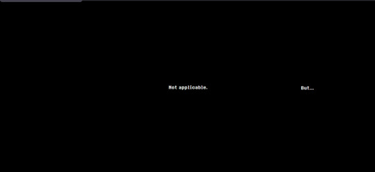
this text seems to indicate that other content can be found on other chapter pages.
/chapter1
this page simply reads "Not applicable." the tab title is once again an ellipsis "..." there is no hidden "but" in the code this time.
/chapter2

this page reads "Applicable." the tab title is once again an ellipsis "..."
/chapter4

this page starts as a black screen. after waiting on it for a minute, a tiny red square will fade in in the middle. this square is clickable. the tab title is the same. clicking on this square leads to /chapter4/message.
/chapter5

this page contains the numbers "2" "4" and "5" in various sizes.

highlighting the text reveals a "1" at an even smaller font than the 4, and a "3" as big as the "2". both of these are in black text when not highlighted. the tab title reads "back"
clicking on the 2 leads to assets/audio/d.mp3. the 3 leads to assets/audio/ma.mp3, and the 5 leads to assets/audio/h.mp3. the 4 redirects back to the /chapter4 page.
(unfortunate note: tumblr is being stupid and won't let me add the audio files now, because while editing this post i exceeded my daily audio upload limit. it also won't let me add back the uploads i already made which got deleted when i edited a draft. tomorrow i will edit this with mp3s, for now just click on the above links to hear!)
d.mp3 is a clip of crashing drums, with 2 synthesized chords playing under them. apparently this plays on the snowgrave route with berdly, lending some significant evidence to the idea that the size of these numbers may relate to how much players choices matter/how much "weird route" potential is in each chapter
ma.mp3 is the warbling effect that plays when clicking on the black sections in the text on /romb.
h.mp3 is a melody played on a synthetic harpsichord(?). none of these audio files are more than 5 or 6 seconds long.
/chapter4/message
this page seems to contain the same graphic as /chapter4, starting completely black and fading in a small red square. this time, however, clicking on the square reloads the page with slightly different content.

highlighting the text with ctrl+a reveals a few black squares below the red dot. these link to either assets/audio/e.mp3 or assets/audio/m.mp3.
e.mp3 is a rumbling sound that cuts off halfway through the file. m.mp3 begins halfway through, and seems to be the second half of the sound effect.
these 3 rows of black squares form the shape of a qwerty keyboard. by noting only the letters that link to m instead of e, you can find the text
these letters, when unscrambled, read "thank you".
T Y U O
A H K
N
/chapter4/thankyou
NOTE: at the time of writing, this page has already been changed! you can view the original version on web archive.

this page contains two rectangles which, upon investigation, are text entry fields. the tab title reads "How long did it take her to smile?"
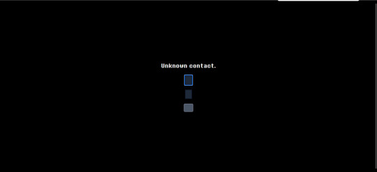
entering anything in the first field causes the text "Unknown contact." to appear. this seemingly implies that this field is used for entering contact information. putting a valid email address causes this text to disappear.

the bottom rectangle is a submit button. entering an email address and leaving the second text field empty causes the text "She never smiled?" to appear. this implies that the field can be filled in with a number answering the question in the tab title ("How long did it take her to smile?")

entering a number and submitting causes the text entry boxes to disappear, replaced only with the text "Thank you."
this seems to imply that the next step may be emailed to those who completed this part of the puzzle, possibly relating to the number entered. i will update if that happens! as of this morning, the text entry box is gone, and the site reads "Thank you" for all visitors.
GOOD MORNING! here is my attempt to recap everything we've found so far on deltarune.com
for those unaware, last night toby released a new newsletter giving information about deltarune's release date. he also released a clip of an alternate ending for the sweepstakes for if silence would've been chosen instead of freedom. (for those even MORE unaware, the spamton sweepstakes were a 2022 2-day event raising money for a charity where all sorts of hidden pages were shown on the DR website.
now, my (and many other people's) immediate reaction to seeing this, as well as this passage in the newsletter,
was that surely the site had been updated with some new content. and it has, a lot of it! and so this is my attempt to document everything so far.
/sweepstakes/silence/
youtube
this page features this short video revealing the alternate ending for the sweepstakes. in it, spamton a. spamton is simply wiped out of existence. not that exciting, but fun to see!

the page also includes a barren version of the main /sweepstakes website, with all the text deleted.
HOWEVER! at the bottom of this page, we can see two links. both of these lead to pages already found in the ORIGINAL run of the sweepstakes.
the rest of this will be under the cut, to avoid spoilers for those interested in exploring the site themselves.
/code

this page is accessible by clicking on the purple square. it was originally found from the main sweepstakes page, on the listing for noelles "fur-thentic cardboard box" from chapter 2. this link leads to the /catpetterz page of noelle's blog, which explains how the Cat Petterz 2 breeding system works. it ends in "Until one day..." which leads to /egg, continuing the story on the previous page. the link at end of /egg brings you to /code, which links back to /egg.
nothing seems to be actually changed on this version of the site, and it only serves as a way to get you back onto /egg.
/egg
this page has all the same text as the 2022 version of the site did, with one exception: the text "secret cats" is now a link! this link leads to /rain.
/rain
this page is an as of yet unseen post from noelle's blog. she describes the experience of staying home from school because of the rain, and a friend coming over to play cat petters. this friend is called "she," making it unlikely to be kris, and as this story takes place in her childhood, it's unlikely to be susie. the postscript says that her friend came over because "she thought that means that I was going to pet HER," which makes me think it might've been catti? if anyone else has any theories, let me know.
the rest of the page discovers another one of noelle's strange cat petters glitches. her "guide to the rarities of different cats" includes "blue ora (aura?)," "rock & roll," and "angle wing" and "super holy angle wing" are listed at 0% and 00000% respectively. another addition to the pile of mysterious connections between noelle and angel symbolism....
she also describes finding a cat that "lowered the amounts of point she had," making her die immediately. the MOST significant thing on this page by far though is a link to "try it yourself," which leads to a simulation of the cat petters minigame she described.
/rarecats

this page links to a cat collecting minigame. one of these green dancing cats will bounce around the screen like the DVD logo, and clicking on it gives an amount of points. the tab title simply displays the number of points so far.
cat-001.gif
this cat gives 10 points. it's probably the "normal" cat that noelle describes.
cat-002.gif

this cat gives 50 points. it's probably the "blue ora" cat that noelle describes.
cat-005.gif

this cat gives 250 points, and plays a guitar chord instead of the sparkling sounds that clicking the other 2 does. it's probably the "rock & roll" cat that noelle describes.
cat-006.gif

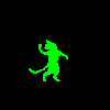
this cat gives 1000 points, and plays a very dramatic musical flourish. it also causes a window sprite to briefly appear before disappearing, as seen below.

this sprite links to the /windows page when clicked on. this cat is probably the "ANGLE WING!!!!" cat that noelle describes.
cat-007.gif

this cat gives 3000, and also generates a window sprite linking to the /windows page. it plays a more extended musical flourish as well. it is probably the "SUPER HOLY ANGlE WING!!!!" cat that noelle describes.
other cats
cat-003.gif
this cat looks like a yellow version of the "blue ora" cat. i don't think there's a way to get this cat in the game.
cat-004.gif
this cat looks like the "rock & roll" cat without the flame effect. i don't think there's a way to get this cat in the game.
cat-008.gif
this cat seems to be an even more powered version of the other two angel cats. it may be possible to get in game with even smaller odds, but since noelle's page only lists 2 "angle cats" i think it's unlikely.
cat-009.gif

this is a png of the yellow and pink smile that appears in spamton's basement. the inclusion of it here suggests to me that it is in fact some kind of "cheshire cat" character/allusion, like people have theorized before!
/windows

this page is simply the stained glass window sprite from /rarecats looped over and over. the tab title reads "Are you forgetting something?" each of these links to a page with the words "forest" "grow" "lost" "the" "where" and "would," in seemingly random order. an example of a few of these are
/wherewouldforestlostgrowthe /thegrowlostwouldforestwhere /thewheregrowwouldforestlost /growwherethelostforestwould
only one of these actually leads anywhere, the rest all lead to the "dogcheck" page which is the default for broken links on deltarune.com.
/lostwheretheforestwouldgrow

this page contains an image of a tree, overlayed with an edited version of the water image that seems to be a recurring motif in deltarune, used most recently in "jockington grows the beard". clicking on it plays a solemn piano chord. after clicking a few times, it instead links to /window. the tab title reads "ROOTS."
/window

this page contains the same repeating stained glass windows as /window did. the tab title once again reads "Are you forgetting something?" this time, each links to page with the letters "cdeehhilnooprrt", in seemingly random order. an example of a few of these are
/lonpecrrohedhit /pdolhehrnriceto /ecrorltipendhoh /creohnptredilho
once again, only one of them leads anywhere.
/thepoorchildren

this page is another black screen. this time, you have the ability to draw with the mouse. clicking creates a trail of white squares. the tab title reads "Therapy".

drawing in the middle of the image for around a minute causes a sprite of the "egg room" tree to slowly fade in.

after drawing for a bit, the tree will move to the front and become clickable. clicking on this just returns you to the /egg page mentioned earlier.
as far as i can see, this is everything to be found on the "noelle's blog" side of updates, the ones accessible from the purple square. unfortunately, tumblr has a limit for how many images i can include in a post, so the stuff from the other link i will include in a reblog! be sure to check it out, it's where stuff gets REALLY crazy!
857 notes
·
View notes
Text
So I heard about a site called bearblog.dev and decided to make an account. What's interesting about it, is that it's not connected to anything like most social media sites are. So really, the only way for people to find you is through word of mouth, or by paying (which tbh I prefer not being on a discover page tbh).
I liked their mission statement, about never wanting to sell, that it's run on donations and no ads, etc. But the biggest plus for me, was how you can customize things!
I haven't remotely worked on my own theme yet, but I poked around the code a bit, and it seems pretty straight forward; so I think I should be okay! Though, I can only play around the css, and not html without being a paid member.
Buuut I have experience though the sheer torture of having to customize everything through just css, so I think I'll manage.xD
I can't work on it rn, as I am finishing up on my Dreamwidth theme, as well as a drawing I need to get done soon.T.T But apparently, you can customize your dashboard!!! And, well, I couldn't resist.xD

This is, again, just the dashboard; so essentially, only I can see this lol. But I needed a break from my other 2 projects, and it seemed easy enough.xD
I definitely didn't go all out; as this is just my writing page. But I still wanted it to be calm yet exciting for me to work in! I chose colours similar to the Tumblr Classic (low contrast) theme, as I use that as my base on AO3 as well.xD (But I did shift the hue lol)
Initially, it was just gonna be solid plain colours but then...whoops! I had fun, and I did learn a few new things~
I had found a few codes a few months ago, and decided to play around with them, and made something new from them aha!
Which, if you would have asked me months ago, I would not have been able to figure out, but I managed to make something work.xD You can't see it here, but the headers have a subtle rainbow animation.:-P And when you hover over the boxes, they pop up, and have an animated rainbow shadow! Oh, and all links appear white, but when hovered, have animated rainbow on the text.:-) Yes, lots of rainbow!xD
Which like, technically these have been done in the past; but required Java Script back then. Now, they can be done through css only!:-D (Which was super helpful, since I can only play around with the css lol)
I could not install custom fonts, so went with a browser standard. I think for journal themes, it should work? But dashboard seems like a no go! (Idk tho, I'd have to test!)
Also, not very noticeable in the screenshot, but the body has a blur effect, so anything behind it will make it blur.:-)
And yes, couldn't resist adding Ranka.xD She makes me happy!
Also, yes, this is very busy for most. But I made it for me. The spacey background makes me feel calm and a bit nostalgic over some themes I had made in the past, or of other sites I enjoyed browsing. The rainbow is subtle, not too annoying; but still sparks something fun for me! The colours for the body do well for my eyes as I type/edit stuff, which is what I wanted. And having a character I love in the bg/cursor (which you can't see here either) is just a nice bonus aha~
There are still some very minor bugs I need to fix, but that will be for another time. I would like to make this code public eventually, but not sure how or where, or if anyone would actually want to use it.xD I'm thinking once I have an ACTUAL site one day, I'll post it there?
So uh yea, I'm working on a Dreamwidth, I have a Tumblr already; so why the fuck would I want another blogging platform?xD
A few reasons, which I feel like I've already kind of mentioned here lol. But another big reason, is I do enjoy having multiple spaces for different purposes if that makes sense? I like the idea of having Tumblr for whatever the fuck I do here.xD And Dreamwidth for more art and fandom related stuff (and maybe a few other stuff; but definitely long form posts; idk yet, I still haven't tested the waters. But think art/fandom blogging, mainly). And maybe a bearblog for more mmm...personal or intimate entries. Stuff I don't want too many eyes or engagement on.
Like, yea sure I could keep certain thoughts to myself. But I find myself always afraid of sharing thoughts, feelings, or ideas in my own spaces (I have soooo many drafts). Perhaps of fear of being "too much" or making someone mad; but I feel like I should learn to being okay being me, having opinions or thoughts on stuff, to be able to even change over time, and not worry about an algorithm showing it to the wrong person, ya feel?
And yea, I just want another site to test out coding/design without committing to having my own site again JUST YET lol. (I SWEAR I'll make one eventually...I'm just intimidated + unsure of which host to choose lol)
So yup! Uhhh idk when I'll be done all of this lol. I'll definitely finish my Dreamwidth first, which I will announce~! Once that's done, might work on my bearblog, and let you guys know of that.xD
0 notes
Text
The Most Powerful Enhancements in Selenium That Improve Web Testing Automation
Selenium has long been a leading tool for web automation, and its latest versions introduce groundbreaking enhancements that elevate test automation to new heights. These powerful features make Selenium faster, more flexible, and more reliable, allowing testers to build robust automation frameworks with ease. If you want to advance your career at the Selenium Training in chennai, you need to take a systematic approach and join up for a course that best suits your interests and will greatly expand your learning path. In this blog, we’ll explore the most impactful improvements in Selenium that are transforming web testing automation.

1. BiDi (Bidirectional) Communication for Real-Time Browser Interaction
One of the most significant upgrades in Selenium is Bidirectional (BiDi) communication, which enables real-time interaction with browser events. Testers can now monitor network requests, console logs, and JavaScript errors directly within Selenium, enhancing debugging and performance tracking.
Seamlessly capture and inspect network activity.
Monitor browser console logs for errors and warnings.
Gain greater control over browser behavior during test execution.
Example Use Case: When testing a dynamic web application, BiDi communication allows you to track API responses and validate data in real-time, improving test accuracy.
2. Enhanced Support for Shadow DOM Elements
Modern web applications frequently use Shadow DOM to encapsulate components, making them challenging to interact with. Selenium now provides better support for automating interactions with Shadow DOM elements, eliminating the need for complex workarounds.
Example Use Case: If a website features custom-designed UI elements inside a Shadow DOM, Selenium can now directly access and interact with these components, improving test reliability.
3. Advanced Window and Tab Management for Seamless Multitasking
Switching between multiple browser windows and tabs has been simplified in the latest Selenium versions. The improved handling mechanism ensures more seamless navigation and interaction across different tabs.
Effortlessly switch between multiple browser tabs and windows.
Open and manage new tabs without additional scripting.
Example Use Case: If a web application opens a payment gateway in a new tab, Selenium can smoothly transition between the main application and the payment process without breaking the test flow.
4. Chrome DevTools Protocol (CDP) Integration for Deeper Insights
Selenium now integrates with Chrome DevTools Protocol (CDP), enabling deeper browser insights and test optimizations.
Capture detailed performance metrics.
Monitor network requests and responses.
Block unnecessary elements like ads and trackers to create a clean test environment.
Example Use Case: Selenium can be used to measure page load speed, analyze rendering performance, and optimize test execution for efficiency. Professionals in Selenium are in greater demand, and numerous organizations are now providing the Best Online Training & Placement Programs.

5. Relative Locators for Smarter Element Selection
Selenium’s introduction of relative locators makes identifying web elements easier and more intuitive. Instead of relying solely on complex XPath or CSS selectors, testers can now locate elements based on their visual position relative to other elements.
Example Use Case: If a button’s ID changes dynamically but is always positioned near a text field, you can use relative locators to find and interact with it reliably.
6. Selenium Grid Enhancements for Scalable Test Execution
Selenium Grid has been optimized for improved test distribution and scalability, making large-scale automation projects more manageable.
Simplified setup and configuration.
Enhanced Docker support for seamless parallel testing.
Automatic distribution of test cases for better resource utilization.
Example Use Case: Running cross-browser tests on different platforms simultaneously has become more efficient with the latest Selenium Grid enhancements.
7. W3C WebDriver Standard Compliance for Greater Cross-Browser Compatibility
Selenium now fully adheres to W3C WebDriver standards, ensuring consistent test execution across all major browsers without requiring browser-specific modifications.
Example Use Case: Switching test execution between Chrome, Firefox, and Edge no longer requires changes to your test scripts, making automation more reliable.
Final Thoughts
The latest Selenium updates bring a wave of powerful enhancements that make web testing automation more efficient and user-friendly. From real-time browser interactions and improved Shadow DOM handling to advanced tab management and CDP integration, Selenium continues to evolve into an indispensable tool for testers.
With better scalability through Selenium Grid and full compliance with W3C standards, automation frameworks can now be more flexible and robust than ever before. As web applications become more complex, leveraging these enhancements will ensure your test scripts remain effective and future-proof.
By adopting these new features, you can streamline your testing workflows, boost efficiency, and elevate the quality of your automation efforts.
0 notes
Text
and we're back!
sarah here. i am SO happy to finally be releasing 3.2A Bridge 1. we originally wanted this thing out for 4/13, but in grand Homestuck tradition the scope of it crept out a little farther than we anticipated once the ball started rolling. below the break i'm going to talk through some of the motivations behind this Bridge-- its structure, its release schedule, what the goal is --so if that's of interest to you then please read on!
3.2 is a heavily structured story, with each "track" composed of verses and choruses in a manner analogous to a flashback-heavy TV show. there are specific limitations to this structure meant to keep them (relatively) focused, but as a result it means that many characters and events are only mentioned or appear off screen. that's where bridges come in.
from the beginning of double // album, i knew that between each track there would be a bridge. these sections, unbound by the verse/chorus structure and uncommitted to any single perspective character, allow us to flesh out less central events or interactions that might otherwise distract from the main action. think of them like the many Intermissions in Act 6 of Homestuck. in the case of Bridge A1, we're going to spend some time with the remaining Earth C crew on the night before their departure. you might remember in the A1 Solo multiple characters mentioning this event in a hungover daze. A1 was focused primarily on Jade's perspective, so all of this was just a footnote for her. now we're concerned with everyone else's perspective.
initially, this was meant to be a relatively brief palette cleanser before jumping back into the deep end, serving a similar role as the B1 Solo in decompressing from the big dramatic plot beats. but as the story developed, we realized something. throughout godfeels, going back almost to the start, there have been numerous offhanded references to the personal lives of Roxy, Callie, Jane, Jake, and Jasprose, very little of which we actually see on screen because our attention was funneled exclusively through June's narrow (and, let's face it, kind of selfish) perspective. but now, with neither Jade nor June around to soak up all the pathos, we finally get to see these characters in their own context, on their own terms. the more we wrote, the more we realized how essential this was for establishing these characters' motivations going forward. and since this is, structurally, the last organic opportunity we'll have to explore most of these dynamics on screen, it felt like the fulfillment of a promise we hadn't realized we made.
the end result is massive, very nearly doubling the wordcount of 3.2A in a single go. haha, oops! can't help being an ares i guess.
of course, this is hardly the first time a godfeels update has approached damn near novel length. in the past, my commitment to The Complete Narrative Unit has led to me releasing a truly unconscionable quantity of text all at once (i'm looking at you chapter 8 act 3 [1/2]: the shadows left behind). i've always liked the idea of smaller updates, but didn't want to balloon the chapter count and ruin the at-a-glance-ness of the double // album structure. yet ever since bringing QueerOnFire on board as a collaborator last year, it's become increasingly clear that we have a lot more options than my css-ignorant ass realized. SO, we'll be updating this chapter twice a week on mondays and thursdays using anchor points to make them easily navigable. you'll see how that works in a few days. we've portioned it into 14 chunks for a number of reasons: the writing in this section is some of the best we've done so far, and releasing it all at once would do it a disservice; stretching it out like this gives people more time to digest what we've written and the impatience might encourage them to go back and reread sections they've long forgotten; the Bridge's focus on popular members of the extended cast might be enticing for new/lapsed readers, if we're lucky; and of course, this schedule gives us plenty of lead time to put the finishing touches on track A2, which i'm very happy to report is already pretty far along in the drafting process. the HOPE is (and don't you dare take this as a promise) that we can start publishing A2 fairly soon after the Bridge has concluded. perhaps an ambitious hope given my track record so far, but ambition is the spice of life as they probably say.
in short, this is an experiment. thank you for volunteering to be our subjects. no, there's no compensation.
there's a lot more to be said about the writing process, but i'll save the specifics for when the relevant chunks are released. i wrote the bulk of today's update in april of 2024, but struggled to come up with more material and almost gave up on the conceit until in december i turned my at best 3000 word scrap doc over to QueerOnFire essentially as a challenge to see what they could come up with. in late february of 2025, they sent me back a 19k word first draft that had a lot of great stuff in it but was simply too long and too self-indulgent. so i sat down with my red pen and ruthlessly excised every bit of fat until only a mere 33k words remained. i know, i'm a real tyrant.
the upshot is that while i put the finishing touches on the entire Bridge, a hell of a lot of this particular story is more QueerOnFire than me and I'm sure they'll want to share some of their own thoughts when the time comes. but we both agree that this is some of our favorite work we've ever done. godfeels has transformed a lot in 3.2, to the point where the space opera it's become barely resembles the slice of life drama it once was. Bridge A1: The Party is something of a celebration of the old godfeels, serving as a reminder that those roots aren't actually very far away at all while setting up some of the dynamics that will define this story going forward.
i hope you will join us for this party and enjoy it as much as we enjoyed writing it. as a note, because we're going to be updating one chapter listing over and over instead of creating a new chapter for each update, you probably won't receive alerts directly from Ao3 on future updates. please follow here, on mastodon or on bluesky to keep informed (or just put the dates in your calendar app). we'll also finally be opening the discord server up to new users in the very near future. if you have questions, the new place to ask is right here.
thanks for your patience, everyone. now kick back and have a drink. but pace yourself, we're gonna be here a while.
let the party begin!

tomorrow morning, Roxy and friends will be leaving Earth C for what might be a very long time… but tonight, they're getting the gang together for one last round of drinks at the bonfire.
nothing bad ever happens at a party, right?
49 notes
·
View notes
Photo

Long Text shadow Effect using CSS
#text shadow css#long text shadow#CSS Tricks#text shadow effect#css3#html css#html5#css text effect#css text effects#text effect#text effect html css#codingflicks
0 notes
Text
website update blog #12 (May 22nd, 2022)
hello! i'm back with some actual changes to the site now!
i apologize if the last website update blog was like...
hold on lemme check my tumblr-
wait a minute...
ALMOST 1 MONTH???
damn. well, i got some changes to show yall anyway sooo lets start!
last time i discussed my website, i told yall that i will remake the whole thing over, and THAT, is going to be my main focus.
so i moved the old files to a new folder called /legacy and made a new html file and css file.
i then thought of how im going to go about organizing this thing. i thought about it for an absurdly long time, and then i had an idea.
what if we organized it as such where the style of an html element can be changed just by using the "class" attribute?
its hard to explain so ill just show you what im talking about: (if you dont want to read this part just scroll down until you see the word SKIP HERE!)
ill give you a div element:
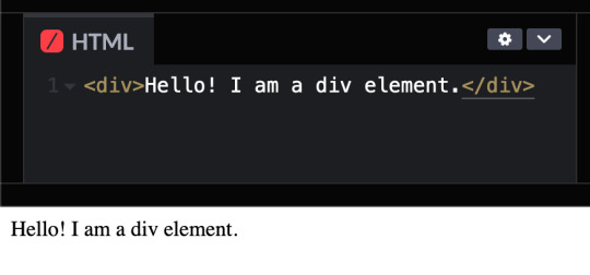
but i want to change how it looks, since its just bland text on the preview shown.
that's where these classes come in!

these classes are basically just there to change how any html's look! (with the help of the class attribute)
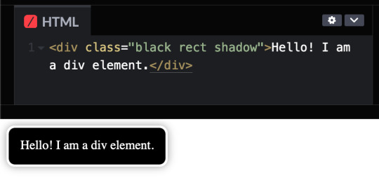
turning the div into a black rectangle with a shadow
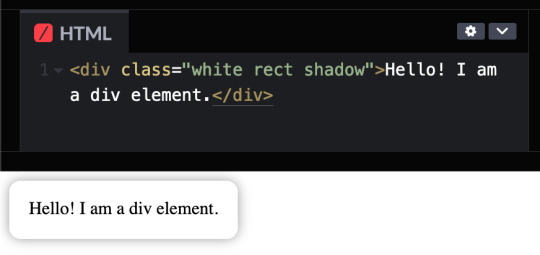
turning the div into a white rectangle with shadow
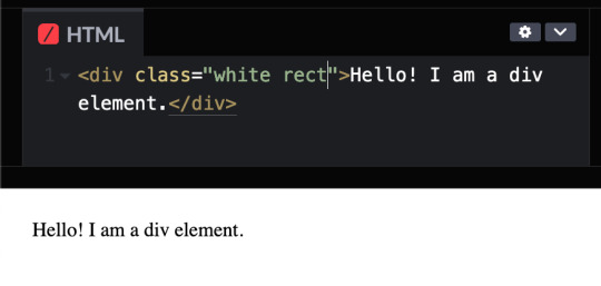
turning a div into a white rectangle (no shadow needed (although it looks like the rectangle isnt there anymore, but trust me, it still does)
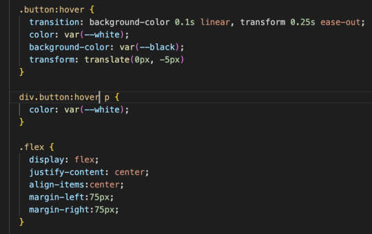
and more! you can do a whole lot with these combinations, and theres even more classes i havent told you yet, like the button and flex classes, but to put it simply, button adds a transition where the rectangle changes color from white to black and and animation that makes the rectangle slightly go up and flex is to arrange the rectangles in rows and columns.
SKIP HERE!
anyway back to the website...
this was the breakthrough idea that made recreating the website SO MUCH EASIER.
aaand after only 10 days, i finally finished!


i will now explain the changes i have made with the website (compared to my website before i recreated it)! it should be obvious but i will do it anyway.
- i added a github button!
this button serves two purposes:
its a button to redirect you to the github repository of the website!
its to get the /section buttons to actually look like they are centered. the main problem of the old navbar was that it did not look centered AT ALL, so i couldnt really center the thing without looking off and weird...

and now, with the github button, everything looks decent!

- changed the footer to look like a simple (rounded) rectangle at the bottom of the page.

this was to "solve" the problem which i had with the footer thingy which was that:
if i wanted the footer to fix on the bottom of the textbox,
but when i zoom out theres so much visibe dead space at the bottom.

and another thing, if i want the footer to stay at the bottom of the screen, it doesnt look like theres dead space, buttttt

the damn footer takes up 10% of the total screen space

so i had an idea...
what if we just contain it in a small rectangle instead of looking like the navbar?
it clearly does not solve the dead space at the bottom problem, but atleast it looks nicer than before and it doesnt look like the navbar anymore :D

oh and also
- I FINALLY FINISHED THE SLOOSHI PHOTO IN THE SIDE OF THE TEXTBOX AFTER LIKE 1 MONTH
YOU CAN SEE THE CHARACTER ON THE IMAGE I JUST SHOWED YOU IF YOU HAVENT NOTICED YET
THIS SHIT TOOK ME SO LONG TO ADD ARMATURES AND POSES AND I FINALLY FINISHED ITHBHRDJ FNJKCKXLM<
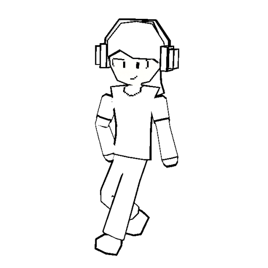
i just hope yall like it :>
aaaaaaand thats all that i have changed while recreating the thingy!!!
now the new stuff (theres only one):
- I added a new section on my website called sushiwt/lite!
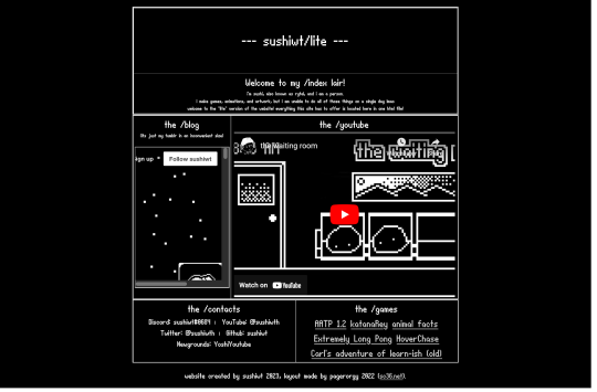
based on @pagerorgy's sc36.net (and by based i mean i downloaded the html file of the website and edited it), this WAS a temporary home while i was remaking it, but now its just a place where you can see EVERYTHING the site has to offer (in only 1 table)!
i apologize of the fact that this blog is so long, so heres a tl;dr
i remade the website with a convenient way to change the look of an element
i changed the footer's look, added big slooshi, and
added sushiwt/lite, everything in my site in one table
ok goobai :D
- sushiwt <3
7 notes
·
View notes
Text
@rinkatherinni
sorry I promptly forgot about this notif after seeing it and only got reminded just now. but in order to edit stuff in the theme to begin with

you have to enable custom theme in settings, then hit "edit theme"
the simple part is the font colour itself which I just used markup for:
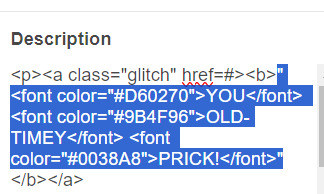
(ignore the a class="glitch" that uses stuff I edited in the code itself)
with the other stuff like the glow/text-shadow, the font, the gradient outline, that requires editing the css/html code itself

which is a bit harder to explain, I've referenced a lot of guides online to edit my css but it'd probably take too long to explain each one, I assume you were just asking about the colour though sjdfgkhl
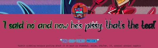
edited theme, bi coloured "you old-timey prick" to match with vox glitching into the bi flag while saying prick in canon
91 notes
·
View notes
Text
Tutorial: Simple Carousel without using <input>
Hello everyone!
I always wanted to create a Carousel-based theme, upon researching, I found yeoli-thm‘s tutorial (link is at the demo) but I had a difficulty in understanding it as I am not a huge fan of <input>. Luckily, I managed to create a simpler version of the carousel without using <input>.
Here's the result:
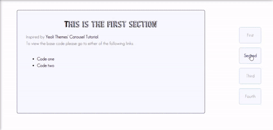
Preview
By having this result, you can create your very own pages and all-in-one themes! The base code will be provided in the demo but if you want to learn how to create this from scratch, please do read this till the end!
IMPORTANT!:
Please like and/or reblog this post if you like this tutorial. If you intend of using this code as a based code, you are required to mention me in your theme post.
This tutorial consists of four aspects:
General styling
Basic Container
Navigation
Carousel
The concept of creating a carousel derives from my smooth scrolling tutorial. If you haven’t check that out, I highly recommend for you check it out.
General Styling
1. Firstly, you need to add the basic code for your carousel. You can retrieve it from this site.
2. Add the universal selector at the style/CSS area:
/*GENERAL STYLING*/ *{ margin:0; box-sizing: border-box; scroll-behavior: smooth; }
It is pertinent to add scroll-behavior:smooth. This is to create a smooth scrolling effect.
3. Once you're done with it, you can create a basic styling for the body, fonts, etc at the style/css area. In my demo, I made a basic styling of the body, paragraph, title, and scrollbar. Example can be seen as follow:
/*BODY AND FONTS*/ body{ background: rgb(248,248,255); background-image: linear-gradient(180deg, rgba(248,248,255,1) 0%, rgba(223,223,255,1) 50%); font-family:geo sans light; text-align:justify; line-height:150%; } @font-face { font-family: geo sans light; src: url(https://static.tumblr.com/v6akjgz/MQbqf9ocl/geosanslight.ttf); } p{ margin-bottom:2rem; } h1{ font-family:vintage fair; text-align:center; color:#1f1b1b; text-shadow:-1px 0 black; font-weight:300; margin-bottom:1rem; line-height:1.15; } @font-face { font-family:vintage fair; src: url(https://static.tumblr.com/v6akjgz/SNhqfaujo/vintage_fair.ttf); } /*SCROLLBAR*/ ::-webkit-scrollbar { width: 18px; height: 18px; } ::-webkit-scrollbar-track { border: 8px solid #fff; background-color: rgba(0,0,0,.05); } ::-webkit-scrollbar-thumb { background-color: #acacff; border: 8px solid #fff; }
NOTE!: There's no need for you to copy and paste the above code. You can always edit it or create other designs that you like to add.
Basic Container
A basic container is a place where you'll be adding the carousel. You can design it however you want in the style/CSS area but at the most basic, you can style it this way:
/*BASIC CONTAINER*/ .content{ /*Basic*/ width: 50%; height: 60%; /*Position*/ position: fixed; top: 50%; left: 50%; transform: translate(-50%, -50%); /*Important*/ overflow: hidden; /*Design*/ background-color:lightblue; border-radius: 5px; border: 1px solid rgb(58, 2, 58); }
Please do take note that this is one of the many ways of creating the basic container. If you know your ways in CSS, you can style it however you want!
IMPORTANT: It is very important for you to add overflow:hidden;. Without this, it will cause the scrollbar to appear and make it less pleasing to see.
For the HTML area, add the following code:
<!--CONTENT--> <div class="content"> <!---THIS IS WHERE THE CODE FOR CAROUSEL WOULD BE SITUATED AT--> </div>
By now, if you click [Update Preview] and [Save], you will now see the container on your page.
Navigation
Navigation is the place where all the links to the section will be wrapped in.
1. Add the code below /body.
<!--NAVIGATION--> <div class="contentlink"> <ul> <li><a href="#partone">First</a> <li><a href="#parttwo">Second</a></li> <li><a href="#partthree">Third</a></li> <li><a href="#partfour">Fourth</a></li> </ul> </div>
2. After that, you are required to style it at the CSS/style are (preferably below the content). The most basic ways to do it is by doing it this way:
/*NAVIGATION*/ .contentlink{ width:5rem; height:10rem; position:fixed; top:30%; right:10%; } .contentlink ul{ list-style-type: none; padding:0; } .contentlink li{ background-color:ghostwhite; border:1px solid lightblue; border-radius: 5px; display: block; margin-bottom: 1rem; padding:1rem; text-align: center; } .contentlink li a{ text-decoration: none; color:rgb(24, 91, 136); transition: 0.25s ease-in; } .contentlink li a:hover{ color: midnightblue; font-weight: 600; transition: 0.25s ease-out; }
So let me explain one-by-one what's the function of each selector:
.contentlink: This is the wrapper for all the navigation links for the carousel.
.contentlink ul: This is the wrapper for the list. Since we don't want any bullets nor padding/indents, it is essential for us to set the list-style-type and padding to none and 0 respectively.
.contentlink li a & .contentlink li a:hover: These are essential to customize the link.
Take Note!
If you are the kind of person who focuses on accessibility, this type of code may not suit your needs. So, you may need to modify both the HTML and CSS code.
Again, this is one of the many ways of styling the navigation section. If you know your ways in CSS and HTML, you can always modify it however you like.
The number of navigation sections does not necessarily be four. It can be two or even six if you like! So, add/remove the link that suits your need.
If you intend to create an effect where whenever you click the section, it will show an indication to it, I would say that it may not be possible to do so as it requires input.
By now, you will see that everything is starting to come up to life. But if you click the button, you'll see that it won't move to another section. This is because we have yet to create the content section.
Carousel
This is where the content of each section lies. Firstly, you need to add the code inside the the div class="content" :
<!--CAROUSEL--> <div class="default" id="partone"> <!-- YOUR CONTENT--> </div> <div class="default" id="parttwo"> <!-- YOUR CONTENT--> </div> <div class="default" id="partthree"> <!-- YOUR CONTENT--> </div> <div class="default" id="partfour"> <!-- YOUR CONTENT--> </div>
Take note!:
class="default" is where you uniformize all the settings to be the same instead of rewriting the same setting in each id
partone,parttwo, etc represents the 'section for the link'. If you refer back tp the navigation above, you'll see that the link/href name is the same as this section. You may change the name to whatever you want to. However, you need to ensure that you also do the same with the link in the navigation area.
Now that you done with this, you can customize default and/or the sections at the css/style area. This is what I did for it:
.default{ width: 100%; height: 100%; overflow: auto; padding:2rem; } .default a{ color:rgb(58, 2, 58); text-decoration:none; font-weight:bold; } .default a:hover{ text-decoration:underline; font-weight:normal; } .default img{ width:100%; margin-bottom:1rem; margin-top:0.5rem; } #partone{ background: rgb(248,248,255); background: linear-gradient(180deg, rgba(248,248,255,1) 0%, rgba(223,223,255,1) 50%); } #parttwo{ background: rgb(223,223,255); background: linear-gradient(180deg, rgba(223,223,255,1) 0%, rgba(197,197,255,1) 50%); } #partthree{ background: rgb(197,197,255); background: linear-gradient(180deg, rgba(197,197,255,1) 0%, rgba(172,172,255,1) 50%); } #partfour{ background: rgb(172,172,255); background: linear-gradient(180deg, rgba(172,172,255,1) 0%, rgba(134,134,254,1) 50%); }
Take note!
If you want to uniformize everything (ie not wanting each section to have a different background-color/image), you can simply remove #partone all down to #partfour.
It is important to set the width and height to 100%. This is to ensure that your section will have its own section.
Set the overflow to auto. This is to allow the carousel to scroll in case if the contents overflow.
With that, you’re done! Please take note that what I’m sharing with you is just an idea of how to create a carousel effect using CSS and HTML. There are myriads of ways of creating this design as long as you follow the said concept:
Set your scroll behavior to smooth.
For the basic container, make sure that overflow is set to hidden.
For the navigation, make sure that the link is set to #THE NAME OF THE SELECTOR.
For the carousel, make sure that height and width are set to 100% + overflow is set to auto.
For each carousel, make sure its id is the same as the navigation.
All the best!
18 notes
·
View notes
Text
225 CSS PROPERTIES IN ALPHABETICAL ORDER
When it comes to CSS, it’s all about selector, properties and value. Here is the list of all CSS properties you need to take control of the front-end appearance.
A
align-content: Specifies the alignment between the lines inside a flexible container when the items do not use all available space
align-items: Specifies the alignment for items inside a flexible container
align-self: Specifies the alignment for selected items inside a flexible container
all: Resets all properties (except unicode-bidi and direction)
animation: A shorthand property for all the animation-* properties
animation-delay: Specifies a delay for the start of an animation
animation-direction: Specifies whether an animation should be played forwards, backwards or in alternate cycles
animation-duration: Specifies how long an animation should take to complete one cycle
animation-fill-mode: Specifies a style for the element when the animation is not playing (before it starts, after it ends, or both)
animation-iteration-count: Specifies the number of times an animation should be played
animation-name: Specifies a name for the @keyframes animation
animation-play-state: Specifies whether the animation is running or paused
animation-timing-function: Specifies the speed curve of an animation
B
backface-visibility: Defines whether or not the back face of an element should be visible when facing the user
background: A shorthand property for all the background-* properties
background-attachment: Sets whether a background image scrolls with the rest of the page, or is fixed
background-blend-mode: Specifies the blending mode of each background layer (color/image)
background-clip: Defines how far the background (color or image) should extend within an element
background-color: Specifies the background color of an element
background-image: Specifies one or more background images for an element
background-origin: Specifies the origin position of a background image
background-position: Specifies the position of a background image
background-repeat: Sets if/how a background image will be repeated
background-size: Specifies the size of the background images
border: A shorthand property for border-width, border-style and border-color
border-bottom: A shorthand property for border-bottom-width, border-bottom-style and border-bottom-color
border-bottom-color: Sets the color of the bottom border
border-bottom-left-radius: Defines the radius of the border of the bottom-left corner
border-bottom-right-radius: Defines the radius of the border of the bottom-right corner
border-bottom-style: Sets the style of the bottom border
border-bottom-width: Sets the width of the bottom border
border-collapse: Sets whether table borders should collapse into a single border or be separated
border-color: Sets the color of the four borders
border-image: A shorthand property for all the border-image-* properties
border-image-outset: Specifies the amount by which the border image area extends beyond the border box
border-image-repeat: Specifies whether the border image should be repeated, rounded or stretched
border-image-slice: Specifies how to slice the border image
border-image-source: Specifies the path to the image to be used as a border
border-image-width: Specifies the width of the border image
border-left: A shorthand property for all the border-left-* properties
border-left-color: Sets the color of the left border
border-left-style: Sets the style of the left border
border-left-width: Sets the width of the left border
border-radius: A shorthand property for the four border-*-radius properties
border-right: A shorthand property for all the border-right-* properties
border-right-color: Sets the color of the right border
border-right-style: Sets the style of the right border
border-right-width: Sets the width of the right border
border-spacing: Sets the distance between the borders of adjacent cells
border-style: Sets the style of the four borders
border-top: A shorthand property for border-top-width, border-top-style and border-top-color
border-top-color: Sets the color of the top border
border-top-left-radius: Defines the radius of the border of the top-left corner
border-top-right-radius: Defines the radius of the border of the top-right corner
border-top-style: Sets the style of the top border
border-top-width: Sets the width of the top border
border-width: Sets the width of the four borders
bottom: Sets the elements position, from the bottom of its parent element
box-decoration-break: Sets the behavior of the background and border of an element at page-break, or, for in-line elements, at line-break.
box-shadow: Attaches one or more shadows to an element
box-sizing: Defines how the width and height of an element are calculated: should they include padding and borders, or not
break-after: Specifies whether or not a page-, column-, or region-break should occur after the specified element
break-before: Specifies whether or not a page-, column-, or region-break should occur before the specified element
break-inside: Specifies whether or not a page-, column-, or region-break should occur inside the specified element
C
caption-side: Specifies the placement of a table caption
caret-color: Specifies the color of the cursor (caret) in inputs, text areas, or any element that is editable
@charset: Specifies the character encoding used in the style sheet
clear: Specifies on which sides of an element floating elements are not allowed to float
clip: Clips an absolutely positioned element
color: Sets the color of text
column-count: Specifies the number of columns an element should be divided into
column-fill: Specifies how to fill columns, balanced or not
column-gap: Specifies the gap between the columns
column-rule: A shorthand property for all the column-rule-* properties
column-rule-color: Specifies the color of the rule between columns
column-rule-style: Specifies the style of the rule between columns
column-rule-width: Specifies the width of the rule between columns
column-span: Specifies how many columns an element should span across
column-width: Specifies the column width
columns: A shorthand property for column-width and column-count
content: Used with the :before and :after pseudo-elements, to insert generated content
counter-increment: Increases or decreases the value of one or more CSS counters
counter-reset: Creates or resets one or more CSS counters
cursor: Specifies the mouse cursor to be displayed when pointing over an element
D
direction: Specifies the text direction/writing direction
display: Specifies how a certain HTML element should be displayed
E
empty-cells: Specifies whether or not to display borders and background on empty cells in a table
F
filter: Defines effects (e.g. blurring or color shifting) on an element before the element is displayed
flex: A shorthand property for the flex-grow, flex-shrink, and the flex-basis properties
flex-basis: Specifies the initial length of a flexible item
flex-direction: Specifies the direction of the flexible items
flex-flow: A shorthand property for the flex-direction and the flex-wrap properties
flex-grow: Specifies how much the item will grow relative to the rest
flex-shrink: Specifies how the item will shrink relative to the rest
flex-wrap: Specifies whether the flexible items should wrap or not
float: Specifies whether or not a box should float
font: A shorthand property for the font-style, font-variant, font-weight, font-size/line-height, and the font-family properties
@font-face: A rule that allows websites to download and use fonts other than the "web-safe" fonts
font-family: Specifies the font family for text
font-feature-settings: Allows control over advanced typographic features in OpenType fonts
@font-feature-values: Allows authors to use a common name in font-variant-alternate for feature activated differently in OpenType
font-kerning: Controls the usage of the kerning information (how letters are spaced)
font-language-override: Controls the usage of language-specific glyphs in a typeface
font-size: Specifies the font size of text
font-size-adjust: Preserves the readability of text when font fallback occurs
font-stretch: Selects a normal, condensed, or expanded face from a font family
font-style: Specifies the font style for text
font-synthesis: Controls which missing typefaces (bold or italic) may be synthesized by the browser
font-variant: Specifies whether or not a text should be displayed in a small-caps font
font-variant-alternates: Controls the usage of alternate glyphs associated to alternative names defined in @font-feature-values
font-variant-caps: Controls the usage of alternate glyphs for capital letters
font-variant-east-asian: Controls the usage of alternate glyphs for East Asian scripts (e.g Japanese and Chinese)
font-variant-ligatures: Controls which ligatures and contextual forms are used in textual content of the elements it applies to
font-variant-numeric: Controls the usage of alternate glyphs for numbers, fractions, and ordinal markers
font-variant-position: Controls the usage of alternate glyphs of smaller size positioned as superscript or subscript regarding the baseline of the font
font-weight: Specifies the weight of a font
G
grid: A shorthand property for the grid-template-rows, grid-template-columns, grid-template-areas, grid-auto-rows, grid-auto-columns, and the grid-auto-flow properties
grid-area: Either specifies a name for the grid item, or this property is a shorthand property for the grid-row-start, grid-column-start, grid-row-end, and grid-column-end properties
grid-auto-columns: Specifies a default column size
grid-auto-flow: Specifies how auto-placed items are inserted in the grid
grid-auto-rows: Specifies a default row size
grid-column: A shorthand property for the grid-column-start and the grid-column-end properties
grid-column-end: Specifies where to end the grid item
grid-column-gap: Specifies the size of the gap between columns
grid-column-start: Specifies where to start the grid item
grid-gap: A shorthand property for the grid-row-gap and grid-column-gap properties
grid-row: A shorthand property for the grid-row-start and the grid-row-end properties
grid-row-end: Specifies where to end the grid item
grid-row-gap: Specifies the size of the gap between rows
grid-row-start: Specifies where to start the grid item
grid-template: A shorthand property for the grid-template-rows, grid-template-columns and grid-areas properties
grid-template-areas: Specifies how to display columns and rows, using named grid items
grid-template-columns: Specifies the size of the columns, and how many columns in a grid layout
grid-template-rows: Specifies the size of the rows in a grid layout
H
hanging-punctuation: Specifies whether a punctuation character may be placed outside the line box
height: Sets the height of an element
hyphens: Sets how to split words to improve the layout of paragraphs
I
image-rendering: Gives a hint to the browser about what aspects of an image are most important to preserve when the image is scaled
@import: Allows you to import a style sheet into another style sheet
isolation: Defines whether an element must create a new stacking content
J
justify-content: Specifies the alignment between the items inside a flexible container when the items do not use all available space
K
@keyframes: Specifies the animation code
L
left: Specifies the left position of a positioned element
letter-spacing: Increases or decreases the space between characters in a text
line-breakSpecifies how/if to break lines
line-height: Sets the line height
list-style: Sets all the properties for a list in one declaration
list-style-image: Specifies an image as the list-item marker
list-style-position: Specifies the position of the list-item markers (bullet points)
list-style-type: Specifies the type of list-item marker
M
margin: Sets all the margin properties in one declaration
margin-bottom: Sets the bottom margin of an element
margin-left: Sets the left margin of an element
margin-right: Sets the right margin of an element
margin-top: Sets the top margin of an element
mask: Hides an element by masking or clipping the image at specific places
mask-type: Specifies whether a mask element is used as a luminance or an alpha mask
max-height: Sets the maximum height of an element
max-width: Sets the maximum width of an element
@media: Sets the style rules for different media types/devices/sizes
min-height: Sets the minimum height of an element
min-width: Sets the minimum width of an element
mix-blend-mode: Specifies how an element's content should blend with its direct parent background
O
object-fit: Specifies how the contents of a replaced element should be fitted to the box established by its used height and width
object-position: Specifies the alignment of the replaced element inside its box
opacity: Sets the opacity level for an element
order: Sets the order of the flexible item, relative to the rest
orphans: Sets the minimum number of lines that must be left at the bottom of a page when a page break occurs inside an element
outline: A shorthand property for the outline-width, outline-style, and the outline-color properties
outline-color: Sets the color of an outline
outline-offset: Offsets an outline, and draws it beyond the border edge
outline-style: Sets the style of an outline
outline-width: Sets the width of an outline
overflow: Specifies what happens if content overflows an element's box
overflow-wrap: Specifies whether or not the browser may break lines within words in order to prevent overflow (when a string is too long to fit its containing box)
overflow-x: Specifies whether or not to clip the left/right edges of the content, if it overflows the element's content area
overflow-y: Specifies whether or not to clip the top/bottom edges of the content, if it overflows the element's content area
P
padding: A shorthand property for all the padding-* properties
padding-bottom: Sets the bottom padding of an element
padding-left: Sets the left padding of an element
padding-right: Sets the right padding of an element
padding-top: Sets the top padding of an element
page-break-after: Sets the page-break behavior after an element
page-break-before: Sets the page-break behavior before an element
page-break-inside: Sets the page-break behavior inside an element
perspective: Gives a 3D-positioned element some perspective
perspective-origin: Defines at which position the user is looking at the 3D-positioned element
pointer-events: Defines whether or not an element reacts to pointer events
position: Specifies the type of positioning method used for an element (static, relative, absolute or fixed)
Q
quotes: Sets the type of quotation marks for embedded quotations
R
resize: Defines if (and how) an element is resizable by the user
right: Specifies the right position of a positioned element
S
scroll-behavior: Specifies whether to smoothly animate the scroll position in a scrollable box, instead of a straight jump
T
tab-size: Specifies the width of a tab character
table-layout: Defines the algorithm used to lay out table cells, rows, and columns
text-align: Specifies the horizontal alignment of text
text-align-last: Describes how the last line of a block or a line right before a forced line break is aligned when text-align is "justify"
text-combine-upright: Specifies the combination of multiple characters into the space of a single character
text-decoration: Specifies the decoration added to text
text-decoration-color: Specifies the color of the text-decoration
text-decoration-line: Specifies the type of line in a text-decoration
text-decoration-style: Specifies the style of the line in a text decoration
text-indent: Specifies the indentation of the first line in a text-block
text-justify: Specifies the justification method used when text-align is "justify"
text-orientation: Defines the orientation of the text in a line
text-overflow: Specifies what should happen when text overflows the containing element
text-shadow: Adds shadow to text
text-transform: Controls the capitalization of text
text-underline-position: Specifies the position of the underline which is set using the text-decoration property
top: Specifies the top position of a positioned element
transform: Applies a 2D or 3D transformation to an element
transform-origin: Allows you to change the position on transformed elements
transform-style: Specifies how nested elements are rendered in 3D space
transition: A shorthand property for all the transition-* properties
transition-delay: Specifies when the transition effect will start
transition-duration: Specifies how many seconds or milliseconds a transition effect takes to complete
transition-property: Specifies the name of the CSS property the transition effect is for
transition-timing-function: Specifies the speed curve of the transition effect
U
unicode-bidi: Used together with the
direction: property to set or return whether the text should be overridden to support multiple languages in the same document
user-select: Specifies whether the text of an element can be selected
V
vertical-align: Sets the vertical alignment of an element
visibility: Specifies whether or not an element is visible
W
white-space: Specifies how white-space inside an element is handled
widows: Sets the minimum number of lines that must be left at the top of a page when a page break occurs inside an element
width: Sets the width of an element
word-break: Specifies how words should break when reaching the end of a line
word-spacing: Increases or decreases the space between words in a text
word-wrap: Allows long, unbreakable words to be broken and wrap to the next line
writing-mode: Specifies whether lines of text are laid out horizontally or vertically
Z
z-index: Sets the stack order of a positioned element
Reference: https://www.w3schools.com/cssref/
#web developing dublin#web developers#web development#web design#website#css properties#css#dublin#ireland
36 notes
·
View notes
Photo

A
align-content
Specifies the alignment between the lines inside a flexible container when the items do not use all available space
align-items
Specifies the alignment for items inside a flexible container
align-self
Specifies the alignment for selected items inside a flexible container
all
Resets all properties (except unicode-bidi and direction)
animation
A shorthand property for all the animation-* properties
animation-delay
Specifies a delay for the start of an animation
animation-direction
Specifies whether an animation should be played forwards, backwards or in alternate cycles
animation-duration
Specifies how long an animation should take to complete one cycle
animation-fill-mode
Specifies a style for the element when the animation is not playing (before it starts, after it ends, or both)
animation-iteration-count
Specifies the number of times an animation should be played
animation-name
Specifies a name for the @keyframes animation
animation-play-state
Specifies whether the animation is running or paused
animation-timing-function
Specifies the speed curve of an animation
B
backface-visibility
Defines whether or not the back face of an element should be visible when facing the user
background
A shorthand property for all the background-* properties
background-attachment
Sets whether a background image scrolls with the rest of the page, or is fixed
background-blend-mode
Specifies the blending mode of each background layer (color/image)
background-clip
Defines how far the background (color or image) should extend within an element
background-color
Specifies the background color of an element
background-image
Specifies one or more background images for an element
background-origin
Specifies the origin position of a background image
background-position
Specifies the position of a background image
background-repeat
Sets if/how a background image will be repeated
background-size
Specifies the size of the background images
border
A shorthand property for border-width, border-style and border-color
border-bottom
A shorthand property for border-bottom-width, border-bottom-style and border-bottom-color
border-bottom-color
Sets the color of the bottom border
border-bottom-left-radius
Defines the radius of the border of the bottom-left corner
border-bottom-right-radius
Defines the radius of the border of the bottom-right corner
border-bottom-style
Sets the style of the bottom border
border-bottom-width
Sets the width of the bottom border
border-collapse
Sets whether table borders should collapse into a single border or be separated
border-color
Sets the color of the four borders
border-image
A shorthand property for all the border-image-* properties
border-image-outset
Specifies the amount by which the border image area extends beyond the border box
border-image-repeat
Specifies whether the border image should be repeated, rounded or stretched
border-image-slice
Specifies how to slice the border image
border-image-source
Specifies the path to the image to be used as a border
border-image-width
Specifies the width of the border image
border-left
A shorthand property for all the border-left-* properties
border-left-color
Sets the color of the left border
border-left-style
Sets the style of the left border
border-left-width
Sets the width of the left border
border-radius
A shorthand property for the four border-*-radius properties
border-right
A shorthand property for all the border-right-* properties
border-right-color
Sets the color of the right border
border-right-style
Sets the style of the right border
border-right-width
Sets the width of the right border
border-spacing
Sets the distance between the borders of adjacent cells
border-style
Sets the style of the four borders
border-top
A shorthand property for border-top-width, border-top-style and border-top-color
border-top-color
Sets the color of the top border
border-top-left-radius
Defines the radius of the border of the top-left corner
border-top-right-radius
Defines the radius of the border of the top-right corner
border-top-style
Sets the style of the top border
border-top-width
Sets the width of the top border
border-width
Sets the width of the four borders
bottom
Sets the elements position, from the bottom of its parent element
box-decoration-break
Sets the behavior of the background and border of an element at page-break, or, for in-line elements, at line-break.
box-shadow
Attaches one or more shadows to an element
box-sizing
Defines how the width and height of an element are calculated: should they include padding and borders, or not
break-after
Specifies whether or not a page-, column-, or region-break should occur after the specified element
break-before
Specifies whether or not a page-, column-, or region-break should occur before the specified element
break-inside
Specifies whether or not a page-, column-, or region-break should occur inside the specified element
C
caption-side
Specifies the placement of a table caption
caret-color
Specifies the color of the cursor (caret) in inputs, textareas, or any element that is editable
@charset
Specifies the character encoding used in the style sheet
clear
Specifies on which sides of an element floating elements are not allowed to float
clip
Clips an absolutely positioned element
color
Sets the color of text
column-count
Specifies the number of columns an element should be divided into
column-fill
Specifies how to fill columns, balanced or not
column-gap
Specifies the gap between the columns
column-rule
A shorthand property for all the column-rule-* properties
column-rule-color
Specifies the color of the rule between columns
column-rule-style
Specifies the style of the rule between columns
column-rule-width
Specifies the width of the rule between columns
column-span
Specifies how many columns an element should span across
column-width
Specifies the column width
columns
A shorthand property for column-width and column-count
content
Used with the :before and :after pseudo-elements, to insert generated content
counter-increment
Increases or decreases the value of one or more CSS counters
counter-reset
Creates or resets one or more CSS counters
cursor
Specifies the mouse cursor to be displayed when pointing over an element
D
direction
Specifies the text direction/writing direction
display
Specifies how a certain HTML element should be displayed
E
empty-cells
Specifies whether or not to display borders and background on empty cells in a table
F
filter
Defines effects (e.g. blurring or color shifting) on an element before the element is displayed
flex
A shorthand property for the flex-grow, flex-shrink, and the flex-basis properties
flex-basis
Specifies the initial length of a flexible item
flex-direction
Specifies the direction of the flexible items
flex-flow
A shorthand property for the flex-direction and the flex-wrap properties
flex-grow
Specifies how much the item will grow relative to the rest
flex-shrink
Specifies how the item will shrink relative to the rest
flex-wrap
Specifies whether the flexible items should wrap or not
float
Specifies whether or not a box should float
font
A shorthand property for the font-style, font-variant, font-weight, font-size/line-height, and the font-family properties
@font-face
A rule that allows websites to download and use fonts other than the "web-safe" fonts
font-family
Specifies the font family for text
font-feature-settings
Allows control over advanced typographic features in OpenType fonts
@font-feature-valuesAllows authors to use a common name in font-variant-alternate for feature activated differently in OpenType
font-kerning
Controls the usage of the kerning information (how letters are spaced)
font-language-overrideControls the usage of language-specific glyphs in a typeface
font-size
Specifies the font size of text
font-size-adjust
Preserves the readability of text when font fallback occurs
font-stretch
Selects a normal, condensed, or expanded face from a font family
font-style
Specifies the font style for text
font-synthesisControls which missing typefaces (bold or italic) may be synthesized by the browser
font-variant
Specifies whether or not a text should be displayed in a small-caps font
font-variant-alternatesControls the usage of alternate glyphs associated to alternative names defined in @font-feature-values
font-variant-caps
Controls the usage of alternate glyphs for capital letters
font-variant-east-asianControls the usage of alternate glyphs for East Asian scripts (e.g Japanese and Chinese)
font-variant-ligaturesControls which ligatures and contextual forms are used in textual content of the elements it applies to
font-variant-numericControls the usage of alternate glyphs for numbers, fractions, and ordinal markers
font-variant-positionControls the usage of alternate glyphs of smaller size positioned as superscript or subscript regarding the baseline of the font
font-weight
Specifies the weight of a font
G
grid
A shorthand property for the grid-template-rows, grid-template-columns, grid-template-areas, grid-auto-rows, grid-auto-columns, and the grid-auto-flow properties
grid-area
Either specifies a name for the grid item, or this property is a shorthand property for the grid-row-start, grid-column-start, grid-row-end, and grid-column-end properties
grid-auto-columns
Specifies a default column size
grid-auto-flow
Specifies how auto-placed items are inserted in the grid
grid-auto-rows
Specifies a default row size
grid-column
A shorthand property for the grid-column-start and the grid-column-end properties
grid-column-end
Specifies where to end the grid item
grid-column-gap
Specifies the size of the gap between columns
grid-column-start
Specifies where to start the grid item
grid-gap
A shorthand property for the grid-row-gap and grid-column-gap properties
grid-row
A shorthand property for the grid-row-start and the grid-row-end properties
grid-row-end
Specifies where to end the grid item
grid-row-gap
Specifies the size of the gap between rows
grid-row-start
Specifies where to start the grid item
grid-template
A shorthand property for the grid-template-rows, grid-template-columns and grid-areas properties
grid-template-areas
Specifies how to display columns and rows, using named grid items
grid-template-columns
Specifies the size of the columns, and how many columns in a grid layout
grid-template-rows
Specifies the size of the rows in a grid layout
H
hanging-punctuation
Specifies whether a punctuation character may be placed outside the line box
height
Sets the height of an element
hyphens
Sets how to split words to improve the layout of paragraphs
I
image-renderingGives a hint to the browser about what aspects of an image are most important to preserve when the image is scaled
@import
Allows you to import a style sheet into another style sheet
isolation
Defines whether an element must create a new stacking content
J
justify-content
Specifies the alignment between the items inside a flexible container when the items do not use all available space
K
@keyframes
Specifies the animation code
L
left
Specifies the left position of a positioned element
letter-spacing
Increases or decreases the space between characters in a text
line-breakSpecifies how/if to break lines
line-height
Sets the line height
list-style
Sets all the properties for a list in one declaration
list-style-image
Specifies an image as the list-item marker
list-style-position
Specifies the position of the list-item markers (bullet points)
list-style-type
Specifies the type of list-item marker
M
margin
Sets all the margin properties in one declaration
margin-bottom
Sets the bottom margin of an element
margin-left
Sets the left margin of an element
margin-right
Sets the right margin of an element
margin-top
Sets the top margin of an element
maskHides an element by masking or clipping the image at specific places
mask-typeSpecifies whether a mask element is used as a luminance or an alpha mask
max-height
Sets the maximum height of an element
max-width
Sets the maximum width of an element
@media
Sets the style rules for different media types/devices/sizes
min-height
Sets the minimum height of an element
min-width
Sets the minimum width of an element
mix-blend-mode
Specifies how an element's content should blend with its direct parent background
O
object-fit
Specifies how the contents of a replaced element should be fitted to the box established by its used height and width
object-position
Specifies the alignment of the replaced element inside its box
opacity
Sets the opacity level for an element
order
Sets the order of the flexible item, relative to the rest
orphansSets the minimum number of lines that must be left at the bottom of a page when a page break occurs inside an element
outline
A shorthand property for the outline-width, outline-style, and the outline-color properties
outline-color
Sets the color of an outline
outline-offset
Offsets an outline, and draws it beyond the border edge
outline-style
Sets the style of an outline
outline-width
Sets the width of an outline
overflow
Specifies what happens if content overflows an element's box
overflow-wrapSpecifies whether or not the browser may break lines within words in order to prevent overflow (when a string is too long to fit its containing box)
overflow-x
Specifies whether or not to clip the left/right edges of the content, if it overflows the element's content area
overflow-y
Specifies whether or not to clip the top/bottom edges of the content, if it overflows the element's content area
P
padding
A shorthand property for all the padding-* properties
padding-bottom
Sets the bottom padding of an element
padding-left
Sets the left padding of an element
padding-right
Sets the right padding of an element
padding-top
Sets the top padding of an element
page-break-after
Sets the page-break behavior after an element
page-break-before
Sets the page-break behavior before an element
page-break-inside
Sets the page-break behavior inside an element
perspective
Gives a 3D-positioned element some perspective
perspective-origin
Defines at which position the user is looking at the 3D-positioned element
pointer-events
Defines whether or not an element reacts to pointer events
position
Specifies the type of positioning method used for an element (static, relative, absolute or fixed)
Q
quotes
Sets the type of quotation marks for embedded quotations
R
resize
Defines if (and how) an element is resizable by the user
right
Specifies the right position of a positioned element
S
scroll-behavior
Specifies whether to smoothly animate the scroll position in a scrollable box, instead of a straight jump
T
tab-size
Specifies the width of a tab character
table-layout
Defines the algorithm used to lay out table cells, rows, and columns
text-align
Specifies the horizontal alignment of text
text-align-last
Describes how the last line of a block or a line right before a forced line break is aligned when text-align is "justify"
text-combine-uprightSpecifies the combination of multiple characters into the space of a single character
text-decoration
Specifies the decoration added to text
text-decoration-color
Specifies the color of the text-decoration
text-decoration-line
Specifies the type of line in a text-decoration
text-decoration-style
Specifies the style of the line in a text decoration
text-indent
Specifies the indentation of the first line in a text-block
text-justify
Specifies the justification method used when text-align is "justify"
text-orientationDefines the orientation of the text in a line
text-overflow
Specifies what should happen when text overflows the containing element
text-shadow
Adds shadow to text
text-transform
Controls the capitalization of text
text-underline-positionSpecifies the position of the underline which is set using the text-decoration property
top
Specifies the top position of a positioned element
transform
Applies a 2D or 3D transformation to an element
transform-origin
Allows you to change the position on transformed elements
transform-style
Specifies how nested elements are rendered in 3D space
transition
A shorthand property for all the transition-* properties
transition-delay
Specifies when the transition effect will start
transition-duration
Specifies how many seconds or milliseconds a transition effect takes to complete
transition-property
Specifies the name of the CSS property the transition effect is for
transition-timing-function
Specifies the speed curve of the transition effect
U
unicode-bidi
Used together with the
direction
property to set or return whether the text should be overridden to support multiple languages in the same document
user-select
Specifies whether the text of an element can be selected
V
vertical-align
Sets the vertical alignment of an element
visibility
Specifies whether or not an element is visible
W
white-space
Specifies how white-space inside an element is handled
widowsSets the minimum number of lines that must be left at the top of a page when a page break occurs inside an element
width
Sets the width of an element
word-break
Specifies how words should break when reaching the end of a line
word-spacing
Increases or decreases the space between words in a text
word-wrap
Allows long, unbreakable words to be broken and wrap to the next line
writing-mode
Specifies whether lines of text are laid out horizontally or vertically
Z
z-index
Sets the stack order of a positioned element
5 notes
·
View notes
Text

(sees this tag) well let me unleash the Skin of Springtide upon ye! Mostly greens, pinks, and yellows, with a whole host of quality-of-life changes, I’ll highlight editable parameters in bold so that you can change them. I’ll also try to explain what the code does after each paragraph in brackets, but most of this was just me copy-pasting random skins I found, so I warned you where I could find no notable difference.
also @raceispunk, here you go.
Firstly, you're going to want to create a site skin. Now, every site skin has to have a unique name - title it something like [username]'s Site Skin or something with your username in it to make it unique. The page will open on a tab called 'Use Custom CSS'. Switch over to the tab called 'Use Wizard' and copy in the corresponding boxes:
Wizard Settings:
Font: EB Garamond
Percent of browser font size: 110
(The expansion of font size is pretty much just because Garamond is small; if you choose another font, you can adjust size accordingly.)
Background Color: #d8fcd2
Header Color: #C71585
Accent Color: #90EE90
Now switch back over to the 'use Custom CSS' tab and copy this in the box as you please.
div.css.module {
max-height: 20em;
overflow-y: auto;
overflow-x: hidden;
border: 2px solid lightgreen;
padding: .4em .75em .75em .75em;
}
(This creates a scrollbox around the skin edit page that is light green. You can change how long the skin can go for before it creates the scroll box by changing the '20'; you can enter any plain color name in place of 'light green' (such as lightpink, purple, or gray, but you might have to experiment with whether different colors show up), and you can change how thick the border is by changing the '2'.)
#header .primary {
box-shadow: none;
}
(This removes the shadow on the header.)
#header .heading sup {
display: none;
}
(I could not find out what this does.)
button,
.actions a,
.actions a:link,
.action,
input[type="submit"],
.actions a:visited {
color: #2f1b6e;
background-color: #ebb9f0;
}
(The color is the color of the text, which is dark blue; the background color will not be immediately noticeable, but is a light pink.)
.commas li:after {
content: "";
}
(This gets rid of the commas in tags; I suppose if you want something else to be there in the place of the comma, you could put something in the quotation marks.)
h5.fandoms.heading {
color: transparent;
}
(I could not find out what this one does.)
.favorite a.tag {
border: none;
}
(
.tags li.relationships:nth-of-type(3n+1) a.tag {
background-color: #f299d6;
}
.tags li.relationships:nth-of-type(3n+2) a.tag {
background-color: #f299cb;
}
.tags li.relationships:nth-of-type(3n+3) a.tag {
background-color: #f299ea;
}
(The above change the colors of the backgrounds of the relationship tags.)
.tags li.characters:nth-of-type(3n+1) a.tag {
background-color: #f8b920;
}
.tags li.characters:nth-of-type(3n+2) a.tag {
background-color: #f9c443;
}
.tags li.characters:nth-of-type(3n+3) a.tag {
background-color: #facf66;
}
(The above change the colors of the backgrounds of the character tags.)
.tags li.freeforms:nth-of-type(3n+1) a.tag {
background-color: #57fa11;
}
.tags li.freeforms:nth-of-type(3n+2) a.tag {
background-color: #11fa47;
}
.tags li.freeforms:nth-of-type(3n+3) a.tag {
background-color: #0fd651;
}
(This changes the colors of the backgrounds of the freeform tags.)
.tags li.freeforms a.tag:hover,
.tags li.characters a.tag:hover,
.tags li.relationships a.tag:hover {
background-color: #FF7F50;
color: black;
}
(This changes the color of the tags when you hover. The color changes the text color, while the background color changes the background color of the tag when hovered over with your cursor.)
.region.filtered.works-index .notes,
.region.works-search .notes {
display: none;
}
(I could not find out what this one was for.)
p.muted.notice {
display: none;
}
(This gets rid of the notice that displays when you've muted users in the Archive.)
.blurb .module,
.listbox .blurb,
.icon a {
border: 0;
}
(I could not find out what this one was for.)
li.blurb,
fieldset,
.flash,
.listbox,
li.comment,
.meta {
border: 4px solid #FFB6C1;
: none
outline: 0;
border-radius: 2em;
}
(This creates a rounded pink border around work blurbs, around comments, and around the filtering lists on the right of the screen.)
.blurb blockquote,
.blurb ul.tags {
padding: 0.5em;
}
(This adds a little more space in a work's blurb box.)
#header .menu,
#small_login,
#header .dropdown:hover .current+.menu {
box-shadow: none;
background-image: none;
filter: none;
}
(This flattens the colors of the dropdown menus.)
.blurb ul.required-tags li span,
.bookmark .status span,
.actions a,
.actions a:visited,
.action,
.actions input,
input[type="submit"],
button,
.current,
.actions label,
legend,
textarea,
input,
#header ul.main a,
.icon {
border: 1px solid #FFD700;
border-radius: 1.5em;
box-shadow: 0 0 2px #DAA520;
}
(This adds a yellow border around most buttons and icons.)
.icon {
border-radius: 5em;
}
(I could not find out what this one does.)
.wrapper {
box-shadow: none;
border: 0;
}
(I could not find out what this one does.)
#feedback .group .heading {
border-top-left-radius: 5em;
border-top-right-radius: 5em;
background: rgba(222, 184, 135, 1);
}
(I could not find out what this one does.)
#feedback {
padding: 1em 2.5em;
}
(I could not find out what this one does.)
li.blurb .tags {
max-height: 11em;
overflow-y: auto;
}
(This creates a scrollbox around long fields of tags.)
input {
width: 96%;
border: 1px solid;
background-image: none;
box-shadow: none;
}
(This creates a thin black border around input fields (uch as Additional Tag Filter on a tag page). I might find a way to change the color, but for now it's straight black.)
.actions input[type="checkbox"] {
-webkit-appearance: checkbox;
-moz-appearance: checkbox;
}
(I could not find out what this one does.)
form.search input[type="text"] {
border-top-color: initial;
}
(I could not find out what this one does.)
.blurb .header,
.blurb ul.tags,
.blurb blockquote {
background: #90EE90;
border: 3px solid #FFFACD;
border-radius: 1.5em;
}
(This creates a pale green background around a work blurb, with a thin pale yellow border.)
a.tag,
a.tag:visited,
a.tag:link {
display: inline-block;
padding: 3px 6px;
margin: 4px 0px;
border: 2px solid #8A2BE2;
border-radius: 5px;
}
(This creates a dark purple, rounded border around tags.)
.actions a:hover,
a:hover,
.actions input:hover,
#dashboard a:hover,
.actions a:focus,
.actions input:focus,
#dashboard a:focus,
.actions a:active,
.current,
a.current,
.current a:visited,
.actions a:hover,
.actions input:hover,
#dashboard a:hover,
.actions a:focus,
.actions input:focus,
#dashboard a:focus,
.actions a:active,
.current,
a.current,
.current a:visited,
#dashboard .current,
.actions a:active,
#outer .current,
#header .current,
a.current,
.current a:visited,
span.unread,
span.claimed,
.child,
.unwrangled,
.unreviewed,
.ui-sortable li:hover,
#header .primary .menu .current {
border-color: initial;
box-shadow: none !important;
background: #fc49c9;
}
(This creates a hot pink highlight over most hovered links.)
.replied {
border-color: initial;
box-shadow: none !important;
background: #e2f372;
}
(I could not figure out what this one was for.)
#header .primary,
.group.listbox,
fieldset fieldset.listbox,
#main li.blurb,
.wrapper,
#dashboard .secondary,
.secondary,
form blockquote.userstuff,
.thread .comment,
.toggled form,
#header .primary,
.listbox .index,
form .notice,
form ul.notes,
form.verbose legend,
.verbose form legend,
span.question,
fieldset,
form dl,
fieldset dl dl,
fieldset fieldset fieldset,
fieldset fieldset dl dl,
dd.hideme,
form blockquote.userstuff,
.delete a,
span.delete,
#header ul.primary {
box-shadow: none;
}
(I'm pretty sure this flattens some buttons, but I'm not entirely sure.)
.notice,
.comment_notice,
ul.notes,
.caution,
.error,
.comment_error,
.alert.flash,
.actions a:hover,
.actions input:hover,
.actions a:focus,
.actions input:focus,
label.action:hover,
.action:hover,
.action:focus,
.notice,
.comment_notice,
ul.notes,
.caution,
.error,
.comment_error,
.alert.flash,
.actions a:hover,
.actions input:hover,
.actions a:focus,
.actions input:focus,
label.action:hover,
.action:hover,
.action:focus {
border: none;
box-shadow: none;
background: #facf66;
}
(This changes the background of some warnings (such as the muted notice, probably, if that wasn't hidden already) to be bright yellow.)
.listbox .index,
.dashboard .listbox .index,
form .notice,
form ul.notes,
form.verbose legend,
.verbose form legend,
.actions a,
.actions a:link,
.action,
.action:link,
input[type="submit"],
button,
.current,
.actions label {
border: none;
border-bottom: none;
background-image: none;
box-shadow: none;
}
(This flattens some more buttons.)
.actions a,
.actions a:link,
.action,
.action:link,
button,
.current,
.actions label {
border: none;
background-image: none;
box-shadow: none;
-webkit-appearance: none;
}
(Flattens buttons.)
.actions input,
input[type="submit"],
textarea {
border: 1px solid;
background-image: none;
box-shadow: none;
-webkit-appearance: none;
}
(I could not figure out what this one was for.)
.thread .even {
border-color: none;
background: #befab4;
}
(This changes the color of every other comment.)
div.header.module p.datetime {
font-weight: bold;
font-size: 120%;
top: auto;
bottom: 1em;
right: .9em;
}
(This enlarges and bolds the date and moves it to the top right (I think? Or is it just like that?).)
ul div.header.module,
ol div.header.module {
position: static;
}
(This moves the icons on a work blurb and the date to the very edges of the blurb box.)
ul.index.group > li {
position: relative;
}
(I could not find out what this one does.)
ul.index.group > li,
li.own.series dl.stats,
div.own.user.module,
div.user.module,
li.skins > ul.actions,
li.own.user > ul.actions,
li.user > ul.actions,
li.bookmark.blurb > ul.actions,
li.showme > a:not([href*="/bookmarks"]),
div.works-drafts li.own.work.blurb ul.actions {
margin-bottom: 2.5em;
}
(I could not find out what this one was for.)
h3.title {
line-height: 1.5;
}
(I could not figure out what this one does.)
.own {
border-color: initial;
box-shadow: none !important;
background: #EFF1AD;
}
(This changes the color of your own works, which will display when visiting a tag (but not on your own works page).)
.blurb ul.series {
text-align: center;
border: 2px dashed pink;
padding: .5em 0em .75em 0em;
}
(This centers the series text and adds a dashed pink border around it. You can replaced the dashed with solid, I suppose.)
.blurb dd.chapters,
.blurb dd.bookmarks,
.blurb dd.collections {
padding-right: .75em;
}
(I could not find out what this one does.)
.blurb dd.chapters + dt.comments:before,
.blurb dd.chapters + dt.kudos:before,
.blurb dd.chapters + dt.hits:before,
.blurb dd.collections + dt.comments:before,
.blurb dd.collections + dt.kudos:before,
.blurb dd.collections + dt.hits:before {
content: "\A";
white-space: pre;
}
(I could not find out what this one does.)
.blurb li.warnings,
.blurb li.relationships,
.blurb li.characters,
.blurb li.freeforms {
line-height: 1.8;
}
(This adds a little white space around each line of tags.)
.stats-index .chart {
display: none;
}
(This gets rid of the graph chart on the Stats page, because its coloring can NOT be changed and it clashes with the skin's color scheme.)
dl.stats:not(li.series dl.stats):not(dl.series.meta.group dl.stats) dt {
display: none;
}
(This gets rid of the stats labels (such as Chapters: or Bookmarks:) in order to make way for the next few bit of code; except for series stats (supposedly; if you have a series bookmarked, it will not show the labels until you click on the series page. I could not find a workaround to fix this, so it's something you'll have to deal with. Sorry).)
dl.stats dd.hits::after {
content: " View(s)";
}
(This renames the Hits stat to show something like '678 View(s)'.)
dl.stats dd.kudos::after {
content: "Like(s),";
}
(This renames the Kudos stat to show something like '23 Like(s)'.)
dl.stats dd.bookmarks::after {
content: " Save(s),";
}
(This renames the Bookmarks stat to show something like '12 Save(s)'.)
dl.stats dd.subscriptions::after {
content: " Sub(s,)";
}
dl.stats dd.words::after {
content: " Words,";
}
(This renames the Words stat to show after the wordcount.)
dl.stats dd.collections::after {
content: " Collection(s),";
}
(This renames the Collections stat to show after the collections count.)
dl.stats dd.comments::after {
content: " Comment(s),";
}
(This renames the Comments stat to show after the comments count.)
dl.stats dd.chapters::after {
content: " Chapter(s),";
}
(This renames the Chapters stat to show after the chapters count.)
dl.stats dd.language::before {
content: "Written in ";
}
(This renames the Language stat to show something like 'Written in English'.)
dl.stats dd.language::after {
content: ",";
}
(This adds a comma after the Languages stat.)
dl.work.meta.group dd.published:before {
content: "Published: ";
}
(This renamed the Published stat to show before the published date.)
That should be it. Wow this took me a day. I hope the two (two!) people who asked can enjoy it.
the funniest thing about ao3 is that i forget no one else uses site skins. i mean not like reversi but like i have a skin that is pretty much completely different from the default. and then i see screenshots of the archive without my custom skin. anyways if you guys want i can reblog this with my full site skin because it is light mode but if you mess with the hex colors you can get it to something darker. and it is so cute
57 notes
·
View notes
Text
Animated Scroll to Top Button
This is a pretty simple lil drag and drop bit of code, and you can stick the button itself pretty much anywhere. It creates a nice, smooth scrolling animation that can take as long as you like, and you can customize it to scroll the whole page, your post container element, or even just a random little box that holds your likes or something.
Full disclosure; I pulled the original JS code used here from this StackOverflow answer and modified it slightly to be a little easier to drop in place. It comes in two parts; one for the button itself, and one for the styles to make it all pretty however you like!
Button Code
First, you’ll want to figure out where you want to put your scroll to top button in your theme. I’d recommend putting it just inside your sidebar for most themes, but it’s really up to you. If you want to stick it in the corner of your page directly in the element that’s entirely up to you!
<script type="text/javascript" src="https://static.tumblr.com/au4xbaf/Pn3qdtfva/animated-scroll-to-top.js"></script> <!-- scrollToTop function arguments are: - the element you need to scroll - the duration of the animation. Some examples: - scroll whole window: scrollToTop(document.scrollingElement, 500); - scroll a container (select by ID): scrollToTop(document.getElementById('containerIdName'), 500); - scroll a container (select first thing with a class name): scrollToTop(document.getElementsByClassName('containerClass')[0], 500); --> <button role="Scroll to Top" id="scroll-top-button" onclick="scrollToTop(document.scrollingElement, 500)" >︽</button>
If you look at the <button> lines near the bottom, you'll see an onclick line. This is what you need to edit. You need to provide the scrollToTop() function with two bits of information:
What exactly it's supposed to scroll for you. (Page, container element, etc.)
How long (in milliseconds) you want it to take to reach the top.
Non-Container Themes
If your theme is not a container theme, you can usually just tell it to scroll the whole page (this is the first example in the code comments) by giving it document.scrollingElement as the thing in the to scroll.
Container Themes
If your theme is a container theme, you need to know some information about the container. Oftentimes you'll see the container element in your theme labelled class="container" or id="posts-container" or something along those lines, but not all theme creators play fair and name it something easy to find!
I'd recommend looking for {block:Posts} in your theme. The container element will generally be just above / before this token. You need something with an id or a class that you can reference (id is easier).
Locate container by ID
if you have an id on your container, awesome, that's the easiest way to go. You should see id="value", take that value and replace document.scrollingElement in the onclick line with document.getElementById('INSERT ID VALUE HERE'). When you're done that line should look something like this:
onclick="scrollToTop(document.getElementById('YOUR_ID')", 500)
Locate container by Class
If you have only a class="some classes" value on your container (each class is separated by a space), see if you can find the most unique one. Ctrl+F each class name if you must and try to find one that no other elements are using in their class="...". Then, add that class name into the onclick line as follows:
onclick="scrollToTop(document.getElementsByClassName('YOUR_CLASS')[0], 500)
Styles
Once you have your button element added in where you want it, you can look at adding some styles! This is the basic set of CSS blocks you'll need:
#scroll-top-button { background: transparent; color: rgb(200, 180, 50); text-shadow: 2px 2px rgb(125, 100, 20); transition: color 0.2s; font-size: 2em; font-family: 'Segoe UI', Consolas, sans-serif; border: none; padding: 0; } #scroll-top-button:hover { color: rgb(255, 255, 255); }
You can adjust the CSS here to fit your theme however you'd like. Insert it as a new set of blocks between your <style scoped="scoped"> and </style> tags in your theme's code. If you're not sure where you want it, just stick it immediately before `` and you should be set. You could also put it in the Custom CSS part of your blog's theme customisation settings (under Advanced from the screen where you edit your description etc.)
6 notes
·
View notes