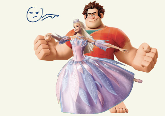
#design journey
Photo
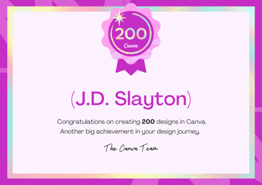
#canva#congrats#congratulations#200#200 designs#design journey#jdslayton#jd slayton#art#design#designs#canva designs#creating
2 notes
·
View notes
Text
9 Steps to Designing a Website
This is a great article and gives a very easy to follow list of considerations in how to begin designing your website...
Every little helps!
0 notes
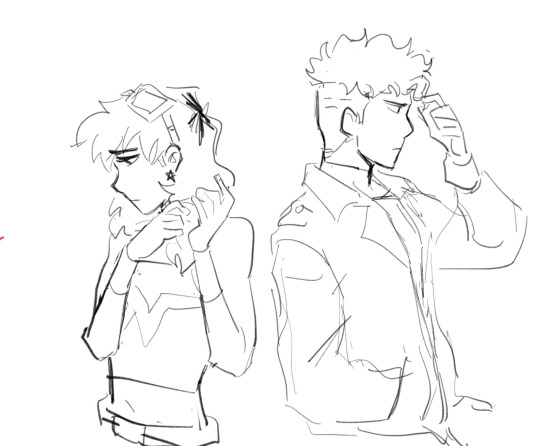
Text
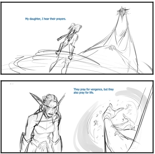
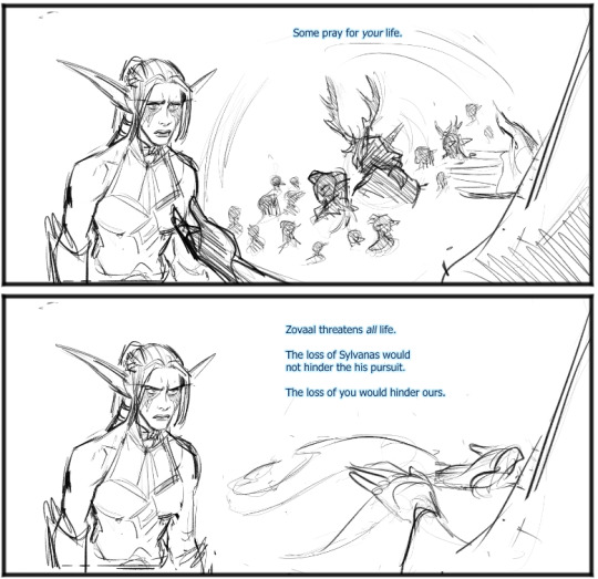
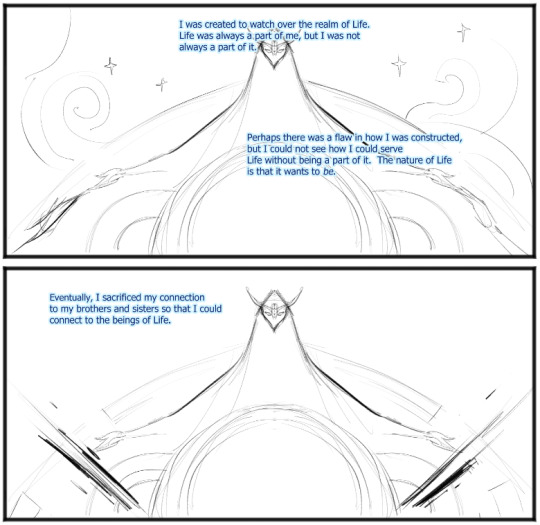
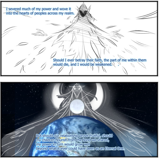
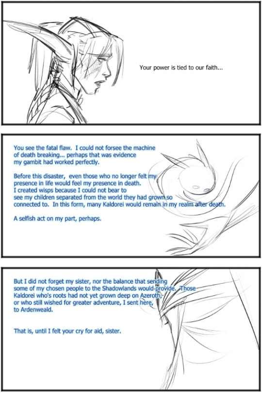
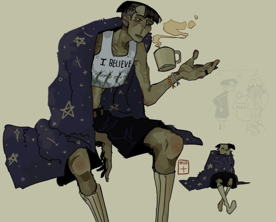
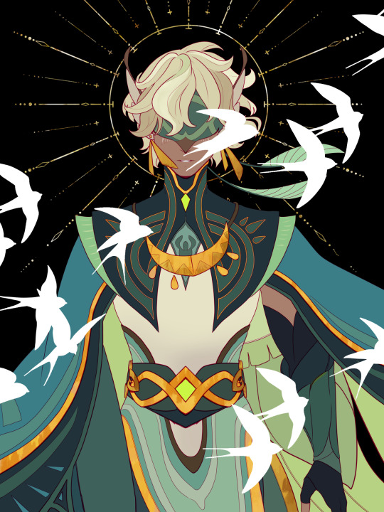
ELUNE CONVO FIX IT part 1
i did it i finished!! finished enough anyway
How about instead of Tyrande getting possessed by Elune, we actually got to see them have a conversation about why tf she won't let her kill sylvanas!!! And get some real payoff for all the "hmm something's off about Elune"!! And more!!
Warning this one is long and boring. part 2 is way better lol

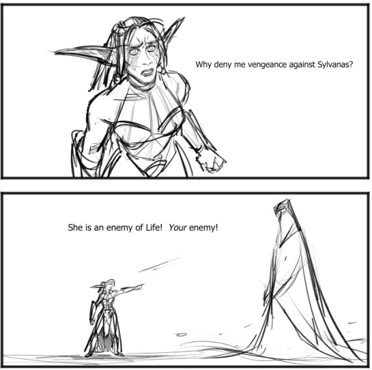

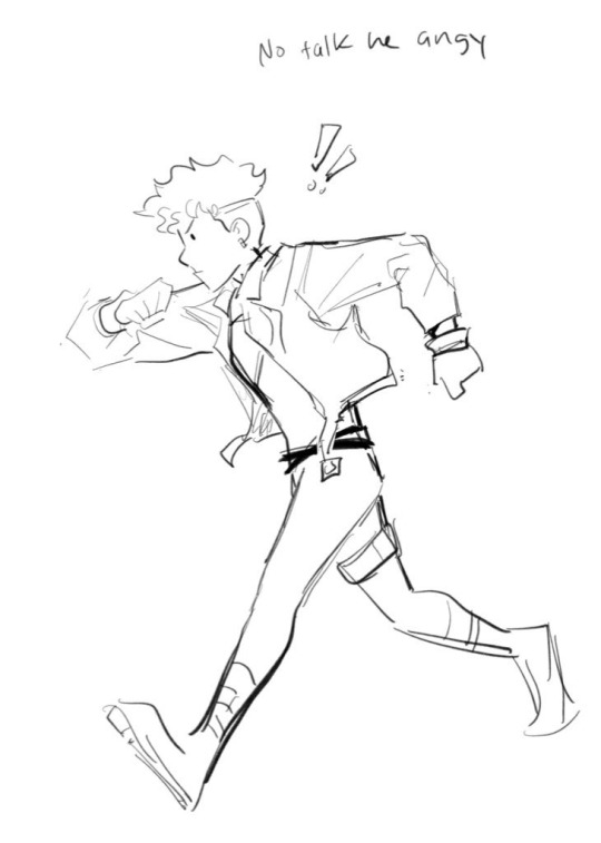
sry she should more serious here but w/e we're just going with 'angy' lol

i think i drew these same poses in the sylvanas one lol oop sry my brain library is not vast


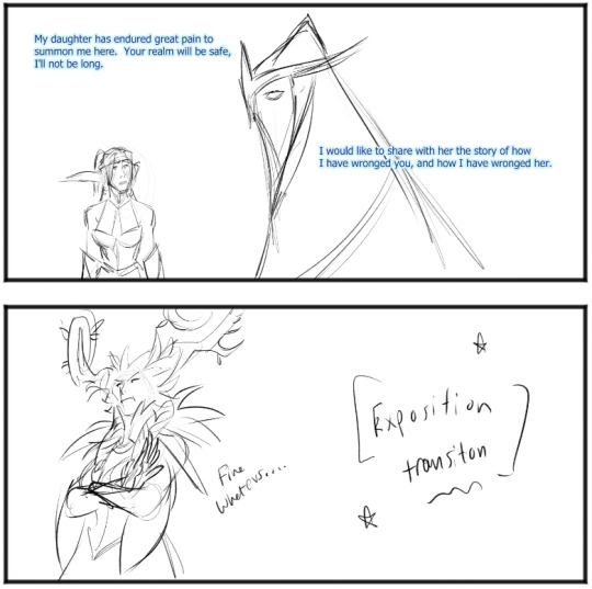


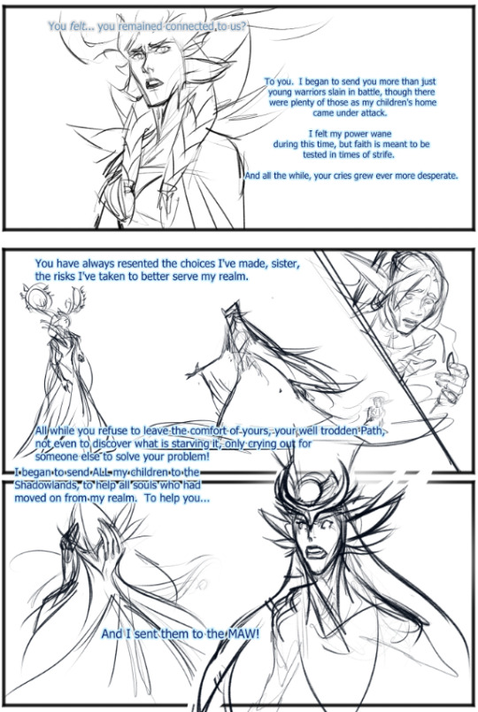
ok one thing i added at the last second was elune is like pulling from tyrande's personal elune power to get her real form back to properly tell winter queen to fuck off. and that's why tyrande looks like she has spider webs on her it's just glowy elune magic
and then winter queen does go fuck off bc i didn't want to draw her anymore
End of part 1!! Also when tyrande is watching elune and WQ yell at each other I imagine it like a kid watching their mom get in a fight at the grocery store or smt lol
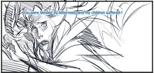
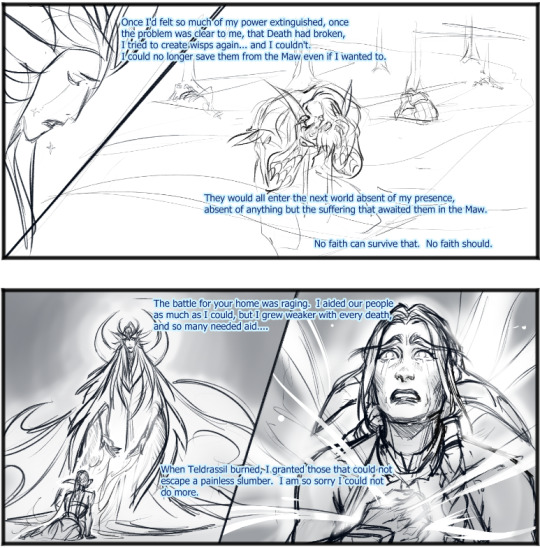
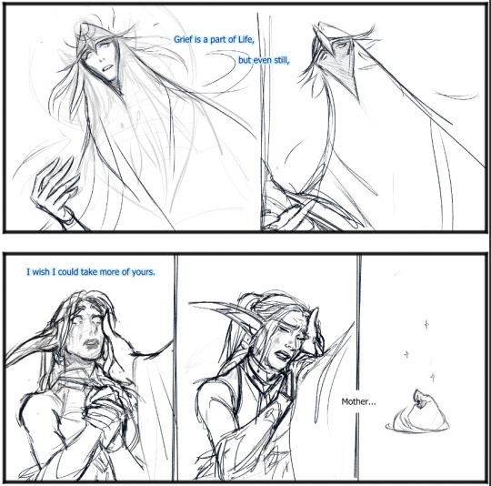
#if you haven't seen my elune design#its literally just tyto the swift / journey#and the god power logic she uses is just discworld god logic#and a little bit summer fairy vs. winter fairy vibes from dresden files#part 2 coming sometime!! also really got not-that-far from done like 2 years ago just have a couple panels to fill#anyway dude this in game moment was so crazy#it was literally just like watching those rage bait videos where people dump fresh good food ingredients on their disgusting dusty#ass kitchen island and make like cheeto dust spaghetti nachos instead of making something edible#elisa gabrielli spitting absolutely gut wrenching#warcraft#elune#tyrande
1K notes
·
View notes
Text
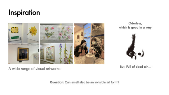
Hospital Project #020
I opened the final presentation by talking about our inspiration, the methodological reasons, the audience for the project and the design direction we had identified.
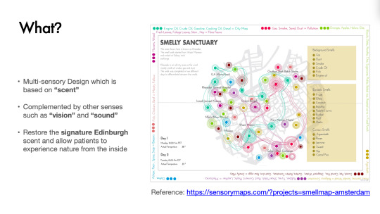
This is my speech:
"Hello, we are Margin, and we focus on the ignored marginal things. This design philosophy continues in this project, which is called the “Edinbreath”.
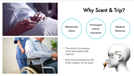
Back to DAY1, a site visit to the hospital was undertaken for inspiration. Surprisingly, the hospital is not as dead as the stereotype - we can find many creative visual art projects and various artworks. What remains the same, however, is that the atmosphere remains full of dead air. This is the starting point for our project - we want to offer patients a variety of fresh smells, because smell can also be an invisible art form.
Many long-term patients in hospitals may not be able to travel for medical reasons. Could the scent dimension be designed to offer them a magical journey? The smell is the sense most associated with memory, and we hope to evoke the private memories of participants who are stuck in the hospital in order to produce a unique alternative sensory journey.
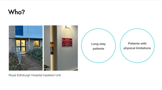
Thus, our target audience is: Long-stay patients & Patients with physical limitations.
In summary, the multi-sensory design is based on 'scent', complemented by other senses such as 'vision' and 'sound', to restore the signature Edinburgh scent and allow patients to experience nature from the inside."
0 notes
Text
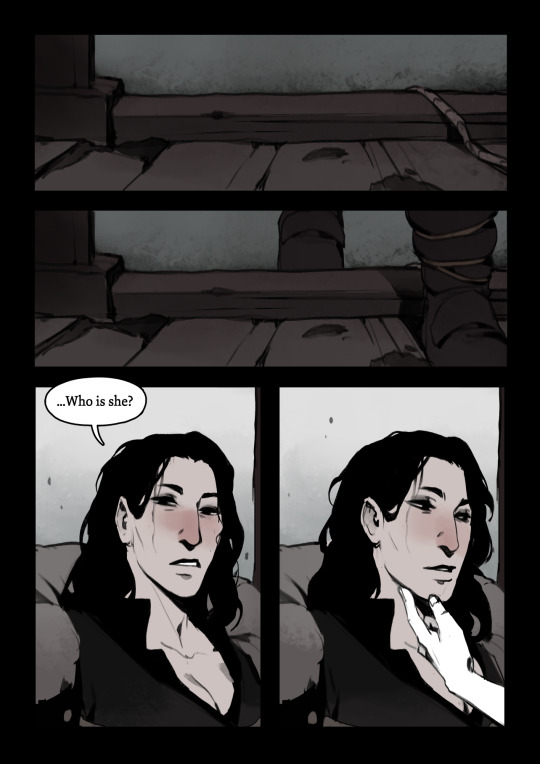
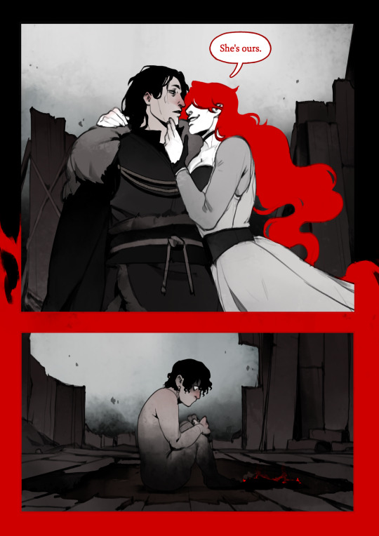
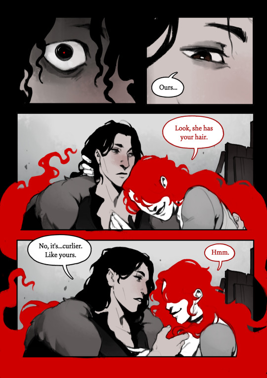
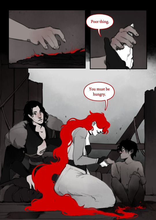
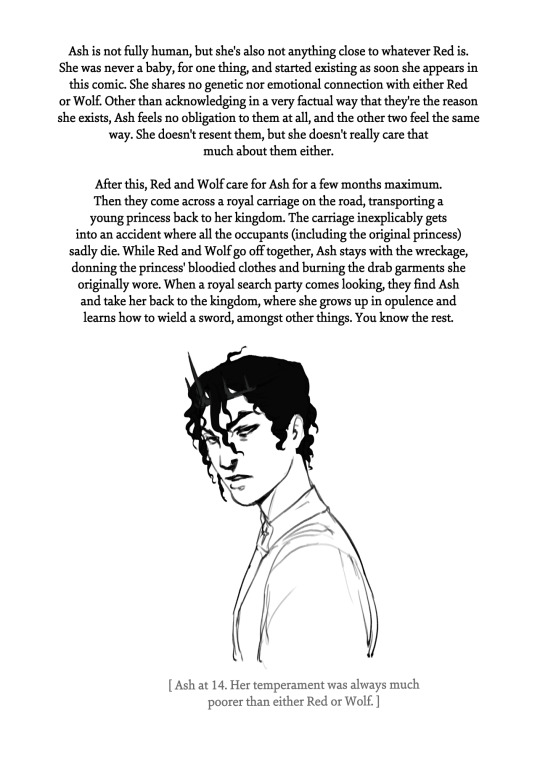
ashes to ashes.
a short comic about the day Ash was born.
Ash's story
Red and Wolf's story
notes:

--
all my other comics
store
#we love a family with a storied history of loving women and committing mass murder#wolf is a couple years older than she was in her original comic but still just as smitten with red#i dont intend on making it a habit to connect my comics together into a shared universe#but i did make ash with the internal headcanon that she was the kid of red and wolf#if only to justify elements of her design#the gravity defying hair - the control over fire - the commitment to a black/white/red colour scheme#i wont be doing a backstory for snow btw since she's kind of just. a human being who grew up very entitled and spoiled#although maybe during her undead journey she unknowingly comes across her mothers-in-law in the mountains#(they like to live in remote snowy areas)#red would like her#thats all!#thank you for reading#sapphic art#comic art#stillindigo art#hearteaters#stillindigo comics
3K notes
·
View notes
Text
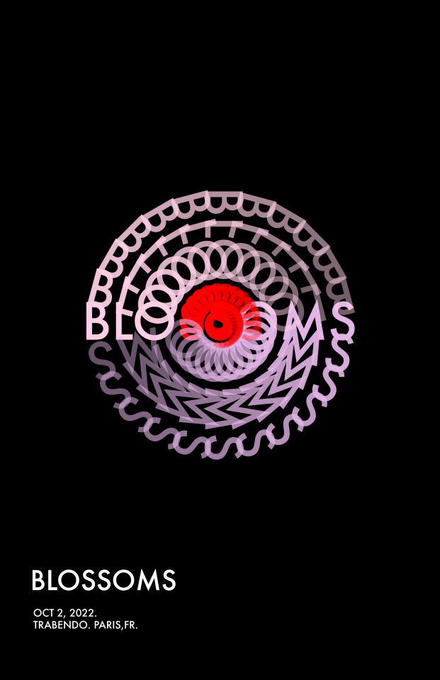
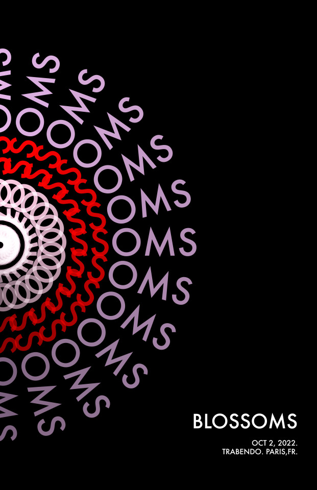
Poster for BLOSSOMS. Swiss style inspired.
[Pls be nice, im still learning]
1 note
·
View note
Text
the sickness is winning sorry .. more doodles. oohhh i can feel my artstyle shifting ever so slightly


i like rendering mundane doodles its fun and good practice for me 🫣
#psychonauts#sasha nein#uhhhhhhh…#g-men#ou know. from the. The. Tttt#fuck would you even tag vision as#erghh#god his design fucks severely tho#you go silly eyeball ford#sasha allowed to be comfy. u go girlboss#psychics using tk in mundane manners is my comfort. its silly.#smiling smiling heheheheheheh saaashhaaa#🥹🥹🥹🥹🥹#hey sasha. heyy. heyyy#oh. milla is there too but. very small and transparent srry#and some fords in the corner sorry grandpa#when the government agents are silly 🫀🫀🫀#my art journey ft. psychonauts BEHSHSHHSHSGSGSGSi#its okay. i can draw as much fanart as i like. Im havign fun. That is what is important#trainofthought
2K notes
·
View notes
Text
Head Advice #1: Everybody’s head is the same size.
Okay, not really, but basically. There’s a reason you don’t have to know your head circumference to find a sunhat. We all have pretty similar head sizes, especially from the visual distance we usually draw characters.
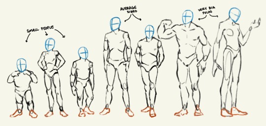
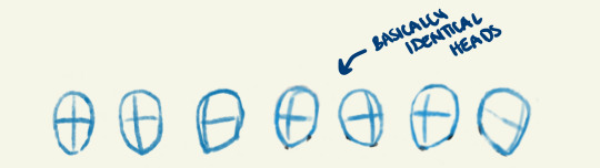
The only exception to this is babies or children under 10. Those guys definitely have smaller heads! (But did you know our skulls are already over 90% their full adult size by the age of 5?)
Different style choices demand different proportions, but in general, it’s good advice to pick a head size, and stick with it!
Head Advice #2: You can use head size to indicate a character’s size.
Big characters don’t look like average sized people scaled up. And you can’t just scale down to get a small person!
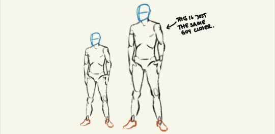
You can make a character look very big and tall or very very small — even if they are standing alone in a vast white nothingness — just by how how they are proportioned! The most important proportion (in my humble opinion) is their head size. Look me in the eyes and tell me you can’t tell which of these characters are big and which are small.
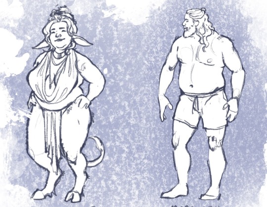
Head Advice #3: Don’t go shrinking anyone’s head.
The most common head sins I see happen when an artist is trying to indicate (body) size difference in a couple, and use their heads to do it. The result is an image that looks something like this:
If you don’t want your lovers to look like they belong in different animated tv shows, don’t go shrinking anyone’s head! Use their bodies (hands and feet and bellies and muscles) to show off their size differences.
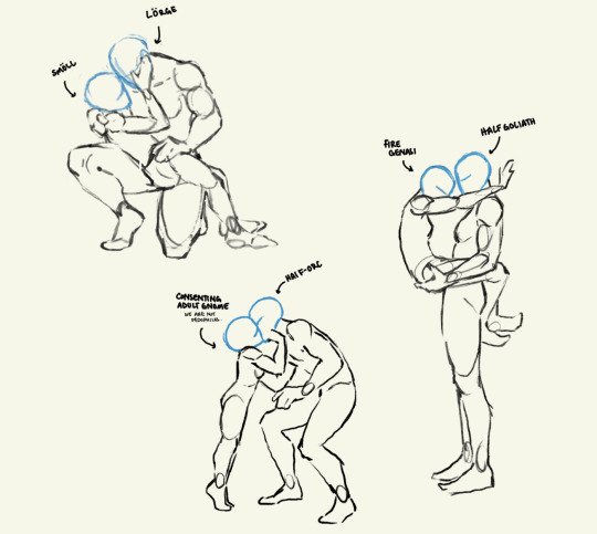
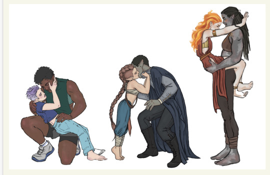
Anyway, that’s all. Having fun giving head. I mean doing head. I mean drawing heads.
#art#artists on tumblr#fantasy#character art#digital art#art advice#art resources#art ref#character design#I just haven’t seen anyone explain this#art is a journey#we all start somewhere#dnd characters#‘cause that’s what I draw#long post
7K notes
·
View notes
Text


Continuing the trend of salivating over characters I don't have yet _(:」∠)_
#our art#afk journey#afk bryon#art process#ilustration#artists on tumblr#afk journey has no right going so hard on character designs
429 notes
·
View notes
Text
Femme Fatale Guide: Mindset Shifts To Improve Your Life
Think "Practical vs. Pleasure" not "Right vs. Wrong" when evaluating your thoughts, desires, actions, and decisions. Stop moralizing your emotions, inclinations, and goals when curating your life and inner world. Shaming leads to stagnation, not self-reflection.
Design your days based on 3s. Consider the 3 most important tasks of your day that, if completed, will leave you feeling satisfied with your progress/productivity at the end of the day. Plan how and what 3 meals to incorporate into your day. Divide your day 3 parts into morning/priming, afternoon/productivity, and evening & nighttime/unwinding. Consider the 3 activities you can do/complete during these 8-hour blocks that will leave you feeling fulfilled and a step closer to your longer-time goals/overall well-being.
Consider your various needs as different buckets that require regular nourishment (physical, emotional, social, sexual, financial, and personal growth). Look beyond certain inclinations and behaviors to understand why a certain decision, action, or relationship is a value-add to your life. Many actions, goals, and relationships fall into more than one of these buckets simultaneously. If you don't sense that some practice, routine, or relationship serves any of these purposes, it's time to reevaluate why and whether it's worthwhile to keep this time & energy consumer in your life.
Perceive your life as a hub & spoke model with you as the hub and all your responsibilities, self-care activities, and relationships as the nodes. This roadmap allows you to reclaim ownership over your life and act in your own best interest. Seeing yourself as the center of a web (your personhood) helps you to organize your life while simultaneously seeing how all your interdependent relationships, responsibilities, and valued activities influence your day-to-day.
#femme fatale#life design#high value mindset#growth mindset#dark femininity#it girl#dark feminine energy#queen energy#dream girl#female excellence#female power#high value woman#the feminine urge#higher self#glow up era#life lessons#life advice#girl advice#level up journey#glow up#healthy habits#self love#self worth#self concept#self confidence#femmefatalevibe
2K notes
·
View notes
Text
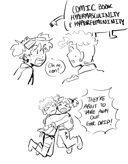

[DC] doodled these two a lot this week
#clam draws#dc#kon el#kontent#Conner kent#superboy#cassie sandsmark#wonder girl#this started bc I was thinking about how they have similar outfits and parallel journeys to like masculinity and femininity I think#and part of it is due to the differences in 2000s and 90s culture but also I think this is geoffs fault#like perhaps Cassie does get euphoria from presenting more femme but it’s written by men who just didn’t find her appealing before#and kon well he already lost the jacket and had designs changes before tt03 but there’s still a noticeable difference I think in the way#he presents himself demeanor wise after johns#and ofc johns meant none of this but I like a silly spider am crawling over it and just making my own narrative threads p#as in like oh they’re in a new stage in their life and they have to wrestle w their identities as one does#but like eventually find a new middle ground?#like yeah I can make a narrative#but if I haddd to choose what they’d do instead like if I were in charge of tt03 and told to make them fit 2000s culture I would have at lea#at least made them grunge or smth idk .#what am I even saying#dc clamics
2K notes
·
View notes
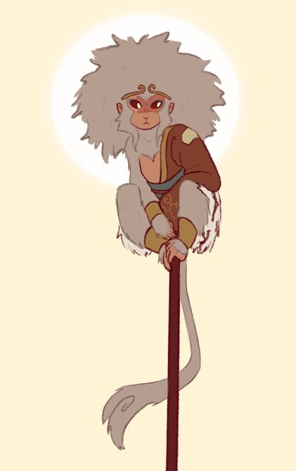
Text


Had some fun with the Adobe InDesign program :D
#sun wukong#my art#jttw sun wukong#journey to the west au#journey to the west#jttw tag#graphic design#magazine cover#my teachers better be proud
427 notes
·
View notes
Text
Hospital Project #019
In addition to the production of the documentary, I am responsible for being one of several members responsible for the main visuals of the project.
About the project title.
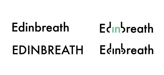
As the tentative name 'Indoor Scent Tour' was too straightforward and lacked poetic meaning, I came up with the synthetic word 'Edinbreath'. The reason for this is that our focus is on scent and the act of 'breathing' has the impression of 'relaxation', 'relief' and 'tranquillity'. "Edin stands for the abbreviation Edinburgh. Interestingly, this composite word is also pronounced like 'Edinburgh', creating a bizarre sense of humor.
Regarding the visual logo iteration.
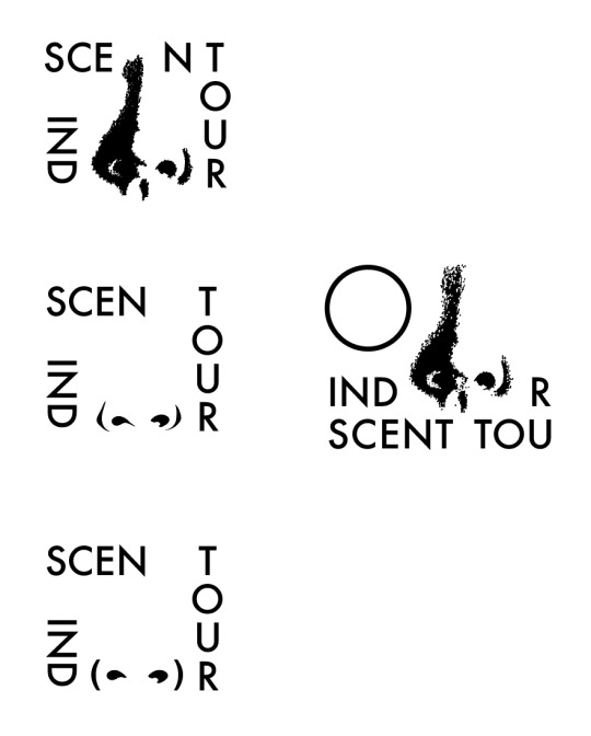
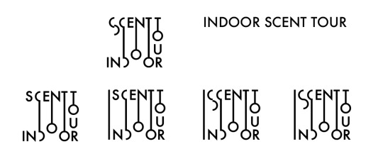
The first two were inspired by the 'nostrils', the intermediary for smelling, and the 'blob', the representative object of the project, and were typography and images to form the logo.
The third one takes "Edinbreath" as a starting point, where I distorted the "d" and "b" to simulate the shape of a nose and coloured the inside "The 'in' is coloured in to emphasise the concept of 'Breathe in'.
Jenni thought the visual logic of the third logo was clever, except for the choice of font. We then chose a font that better suited the project's ethos, 'Domaine Display', and finalized it.

0 notes
Text

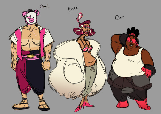
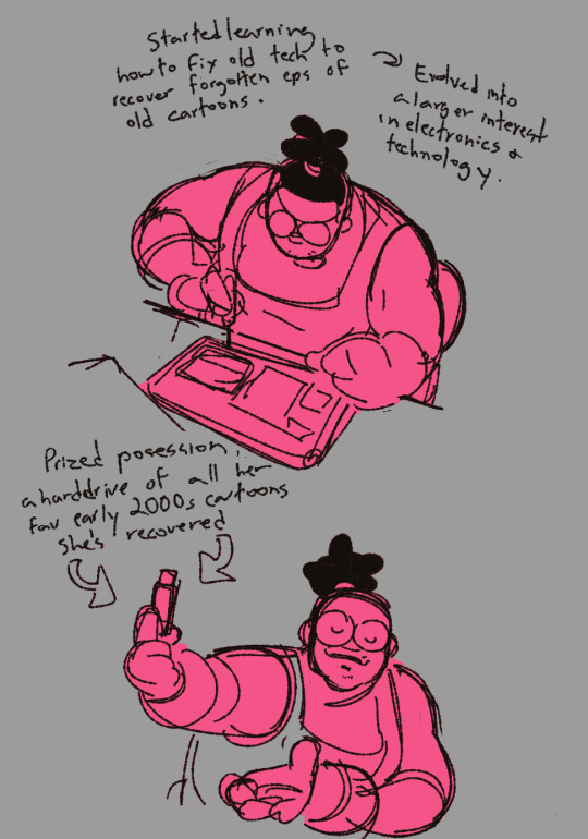
Attempting to make an active attempt to care about my ocs some more, so I’ve been putting some effort into revamping some old guys I made with my friend!! They’re technically a part of a group w their ocs as well, but I’ve been thinking of the three of them on their own lately :]

They live in a post-apocalyptic badlands type setting and cart themselves around in a busted up bus and get into schenanigans.


They don’t reaaally have any sort of story to them just yet but I’m learning to have fun and play in the space and not worry about that yk. Look at my funny women
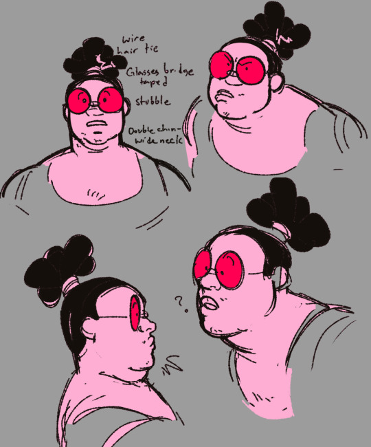
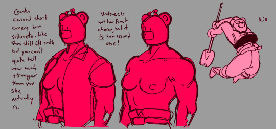
#art :0]#Ottos ocs :0]#I’m so sorry if my writing is incomprehensible I’m too tired to write down transcripts rn.#i can never tell if I’m saying too much or too little with ocs.. hm…#oh now i have to try and tag an oc post ok.#character design#Ger#Crank#Rosie#idk they’re on their own journey
259 notes
·
View notes
Text
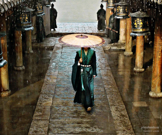

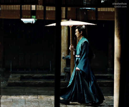

In Blossom 花间令 (2024)
Dir. Zhong Qing – Ep. 22
#in blossom#liu xue yi#cdrama#cdramaedit#userdramas#asiandramanet#asiandramasource#cdramasource#dramasource#my gifs#*#lextag#tuserjade#period drama#periodedit#perioddramaedit#tvedit#period costume#costume design#some will recognize this filming set from my journey to you <3
363 notes
·
View notes
Last Seen Blogs
shemeiart
Shemei's tentacle place

cheerytype
Stitching Letters
mottemort
Motte Mort
jimehimep
Jimechi
alineisanalien
💫💫💫