#design visual
Text

tokyo google maps
edit I’m going to try to find the exact location somehow since everyone likes this picture haha
edit: i actually found it— it’s 5-chōme-4 Higashiōi in Shinagawa City, Tokyo
#tokyo#japan#photography#visual archive#design#art#mine#google maps#geoguessr#places#aesthetic#flower lamp
34K notes
·
View notes
Text
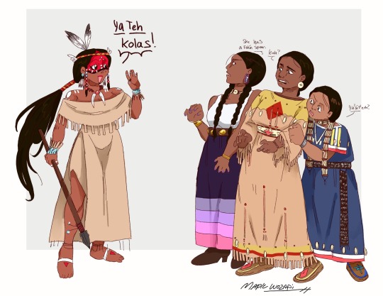
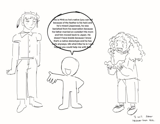
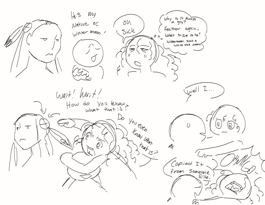
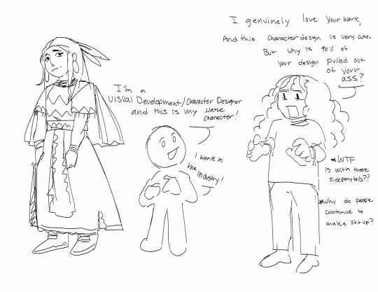
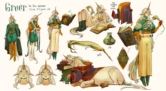
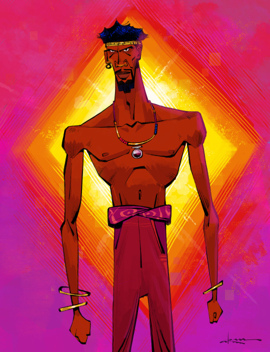
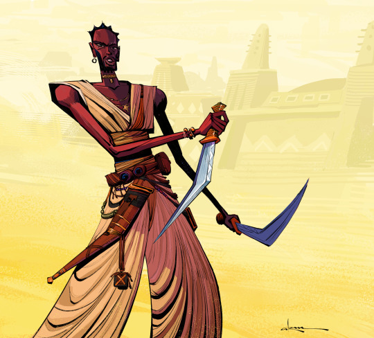
I genuinely feel like I’m going insane sometimes
#native artist#character design#digital art#indigenous artist#visual development#character art#oringinal character
59K notes
·
View notes
Text

Arrow Poem
#詩#現代詩#poem#poetry#文学#japanese#visual poetry#実験詩#視覚詩#concrete poetry#typography#visual poem#poésie visuelle#poesia visiva#vispo#text#text art#textmode#concrete poem#poesía concreta#art#artists on tumblr#typo art#poets on tumblr#タイポグラフィ#具体詩#コンクリート・ポエトリー#typographic art#design#design ideas
12K notes
·
View notes
Text


#fashion#aesthetic#explorepage#photography#tumblr fyp#queue#fashion photography#high fashion#visual#this is so cunty#expensive taste#cunty#hypebae#hypebeast#style inspo#chic#grunge#grungy aesthetic#photoshoot#grungy style#accessories#fashion details#style#inspo#designer
3K notes
·
View notes
Text
"Oh, great, another game falls prey to Yellow Paint Syndrome" well, gee, my guy, maybe if we didn't demand hyper-photorealism in every game regardless of context, modern platformers might be able to develop a visual language that doesn't require painting a sign on every single interactable feature to render it distinguishable from the clutter.
8K notes
·
View notes
Text
as a bi person, the bisexual flag brings me infinite joy and always puts a smile on my face, however as a person who has a Passion for Graphic Design, that undersaturated shade of purple infuriates me when it's used digitally
like, on an actual flag - which was its original purpose - it looks great!

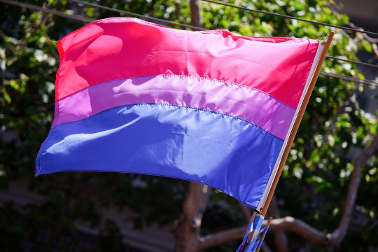
those look fine! lovely, even! with the semi-transparent fabric, the way it catches the sunlight, it looks beautiful!
but now look at how it looks digitally

the pink and blue are so vibrant compared to the sad, lonely lavender!
and let's look at this statement from Michael Page, the creator of the bi flag:

(sidenote: he created this flag in 1998, so if his takes on bisexuality is different from yours, it's okay to notice that! a lot has changed since the 90s when it comes to lived experiences and the way we describe them. but, it's also important to respect his thoughts about this and the way he presented them, even if today, we'd probably not say that bi people "blend unnoticeably into both the gay/lesbian and straight communities.")
so in pantone colors, the pink is 226 C, the blue is 286 C, and the purple of the flag is 258 C.
but...here's the deal
Michael talks here about how the key to understanding the symbolism is to know that the purple blends into both the pink and blue. and on a physical flag, I think you can see that!
but digitally, it absolutely does not blend. it clashes badly, and looks oddly separate from the other two colors.
which got me wondering...what purple do you get if you actually blend 226 C and 286 C?
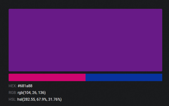
oh! oh, my god.
look at that! look at how nicely it fits between those colors!
look at it next to the original color scheme! look at how much more vibrant the purple is!
and friends. this is just blending through rgb! you get even more purple variations when you use other color spaces!
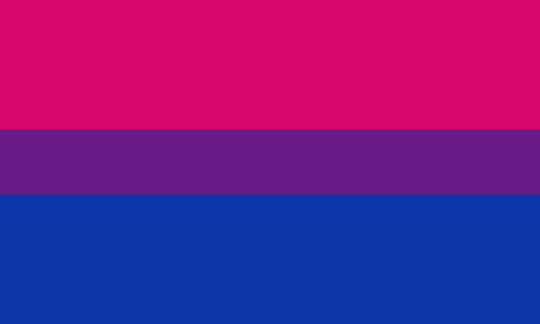
let's compare all of them:
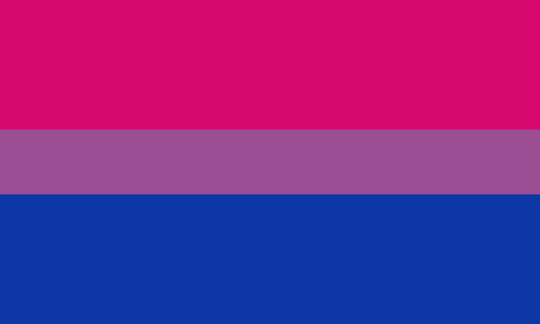


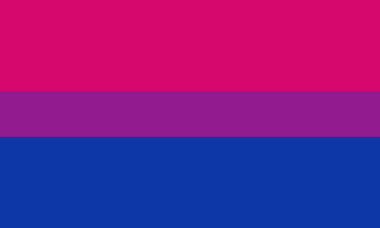
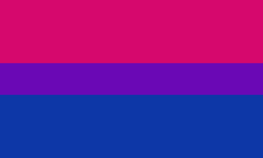
(top: original, lab. middle: lrgb, lch. bottom: rgb, hsl)
look at all of the different purple options you can get just by combining these two colors!
if you want almost too-vibrant saturation, you can go hsl, if you want something more relaxed that's closer to the original, you can go lab or lrgb. and if you want to split the difference, lch is bright and violet, while rgb is there with its saturated but darker purple.
anyway, I guess I don't really have a point here? this isn't so much an informational post as it is Me Getting Weird About Colors, but I think it is a useful lesson about how colors look very different on screens compared to how they look on objects in real life.
and sometimes, I think it's okay to compensate for that.
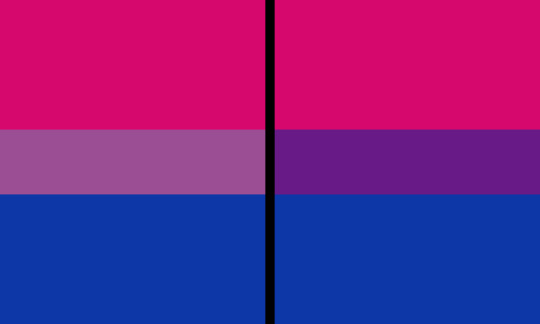
out of all of these, this is my favorite bi flag:

it's the one where the colors were blended in lab color space. for me, the lighter, softer purple is close enough to the original bi flag purple, while also feeling like a smoother blend of the blue and pink
but that's just me! and it might not even look the same to you, since every screen is different, because technology is a nightmare!
anyway, thank you for coming with me on this colorful journey! I will now retreat back to inkscape and make pained sounds about inkstitch gradients until something tangible pulls me back into reality
#bi#bisexual#bisexuality#bi flag#bisexual flag#sbs rambles#graphic design is my passion#id in alt text#but#the ids are probably deeply unhelpful for the different variations of flags#in the alt text of the six flags all grouped together#I just put what method the purples were blended with#and then tried to describe them more in the paragraph below#but this is an inherently visual post#so if you're reading it with a screen reader I am sorry :(
19K notes
·
View notes
Text
starting another project bc i have no self control :9 but also bc i wanted to try out a different aesthetic
#character design#character art#character sheet#visual development#fantasy art#my art#the bestiary#vickychendraws art
3K notes
·
View notes
Photo
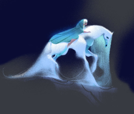
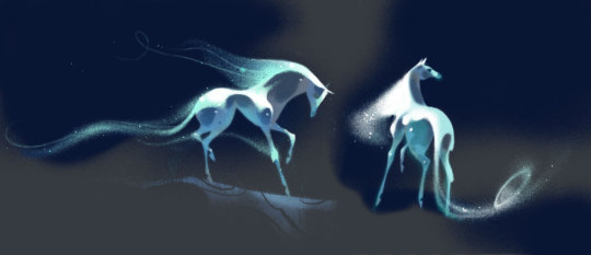
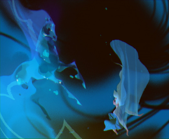
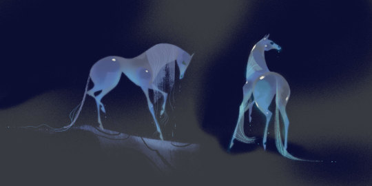
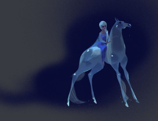
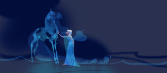
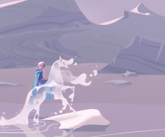
Visual development for Frozen II by Annette Marnat
#disney#frozen 2#elsa#visual development#disney concept art#annette marnat#the nokk#Character Design#disney animation#animation art#concept art#art#artwork#illustration
8K notes
·
View notes
Text
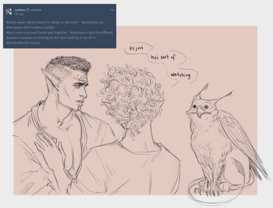

🗣️ pay ‼️🗣️ attention ‼️🗣️ to ‼️🗣️ him ‼️
#davrin#my ocs#dav#datv#dragon age#my art#i dont have to wait for dav to come out to make stupid posts#dav? datv? is there a consensus on that yet#gonna feel a little silly if the game is bad but it must be said: i love a beast#oh and ofc extremely tentative rook thoughts the only visual design concept rn is ‘curly’ and MAYBE ‘blonde’
2K notes
·
View notes
Text


Toshihiko Takamizawa's custom ESP angel guitars
2K notes
·
View notes
Text
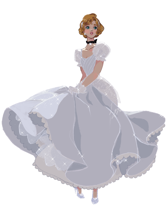
Cinderella in her original colour palette and pose but in my style
Merch can now be purchased on Threadless - thank you everyone ♥
#disney#cinderella#art#artists on tumblr#illustration#digital art#traditional art#drawing#painting#sketch#fan art#artwork#original art#creative#design#visual art#artoftheday
7K notes
·
View notes
Text
4K notes
·
View notes
Text
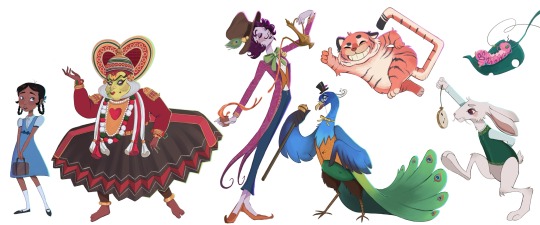
Desi inspired Alice in Wonderland ✨🪷
#digital art#art#artwork#digital illustration#character art#animation#animator#character designer#alice in wonderland#desi#looking for work#character sheet#character design#visdev#visual development#concept art#artists on tumblr
2K notes
·
View notes
Text

beach day 🏖️
#the golden trio#golden trio#harry potter#ron weasley#hermione granger#golden trio era#harry potter fanart#harry potter art#hp fanart#my art#illustration#photoshop#artists on tumblr#character design#vis dev#visual development
2K notes
·
View notes
Photo
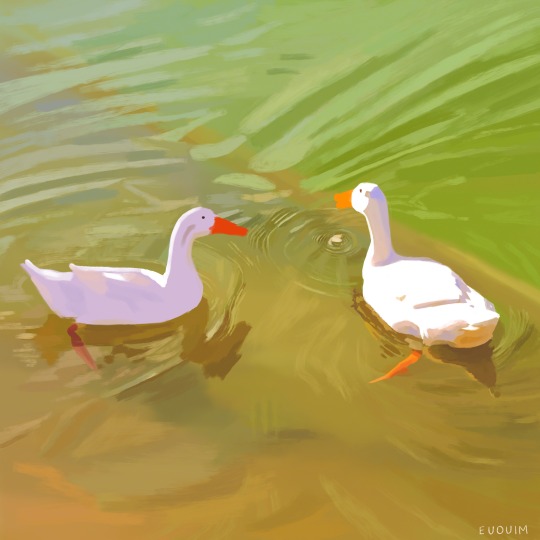
tumblr is alive, grunge is back, the earth is healing
#coming back to the ruins of tumblr since twitter is on fire#geese#digital painting#digital art#procreate#visdev#illustration#nature#painting#art#background painting#cottagecore#goose#visual development#animation#color design#euouim
34K notes
·
View notes
Text

@cirilee made me realise this was essentially their dynamic, and now I’m going insane I love them!😂❤️
This poor old cat getting dragged around Hell by a weird psychopath.👌
#grey art#fan art#hazbin hotel#hazbin hotel fanart#hazbin alastor#hazbin husker#obviously I’m not shipping them tough I love my aroace Alastor#crazy power dynamics are just SO delicious to me#old men in hell being weird#yes I toned town Husker’s design a little#I find him a bit busy visually#but also fuck yeah crazy character designs love it!
4K notes
·
View notes
Last Seen Blogs

jimdr27
Dxd

jimcorbettnational
Untitled

jasper-cillessen
Jasper&Daley

severefunpizza
Untitled
severefunpizza
Untitled