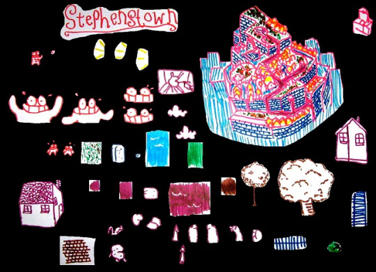
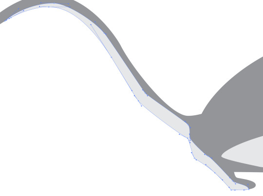
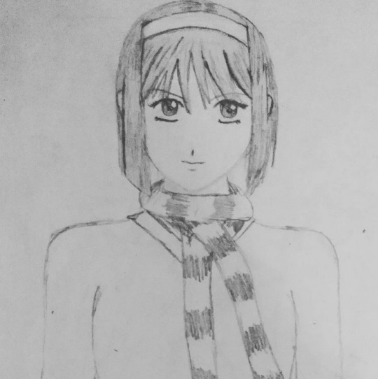
#first image i actually did using a mouse and shape/line tools
Explore tagged Tumblr posts
Visit Tumblr Blog
Explore Tumblr blogs with no restrictions, modern design and the best experience.
Last Seen Tumblr Blogs


Fun Fact
In February 2021, Tumblr had 518.6 million blog accounts.
Text


lets hog Fan's puter
#osc#ii#inanimate insanity#bot ii#paintbrush ii#fan ii#first image i actually did using a mouse and shape/line tools#ii polylights#bot gets 4 whole entire parents#lightbulb ii#test tube ii
186 notes
·
View notes
Text
I realized I'd never made a process breakdown for my pixel art (at least, not one in a long time), so here's one for a test asset for a project I'm working on.
My current software of choice is Aseprite, and I almost exclusively use the pencil brush at 1px and the bucket tool. I use my mouse for everything but the sketch; tablet strokes are too unruly.
Images enlarged x4 for visibility; actual size is in the top right.
Sketch
I tend to start it like any other digital drawing, then scale the sketch down to the size I want the sprite. These aren't usually coloured, but this one wasn't originally intended for pixel art.
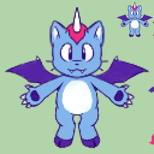
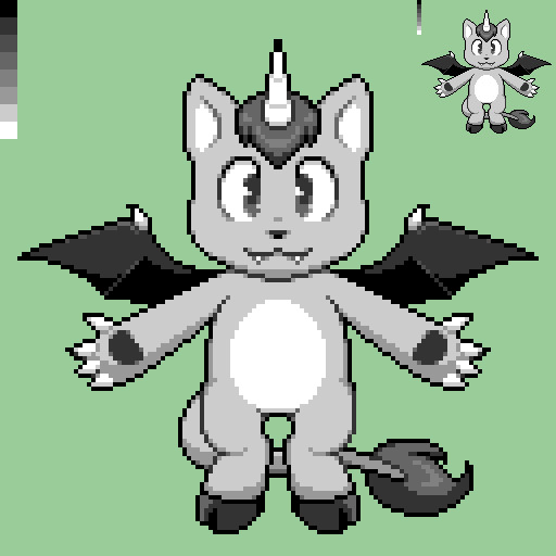
Lines & Greyscale blocking
Depending on the sprite, I'll do one or the other of these first, or do them at the same time. This is where I define the basic shapes and values (which parts are light and dark). In this case, I did the lines first and then blocked in the values.
I sometimes work with colour right away, but not usually.


Shading & Anti-aliasing
These are also things I work on simultaneously, usually moving from one area of the sprite to the next. I start by "softening" the internal linework by making it lighter greys depending on how much its meant to blend with the adjacent shape. Next, I block in the shadows and highlights, and add anti-aliasing pixels where I want it to look smoother.
During this step, I often end up making small changes to the shapes and linework as I refine the sprite. Readability is key to a good sprite, and precision is key to readability.


Colours
While on sprites like this I'm not keeping to a super restrictive palette, I do try to use as few colours as possible. I like to use "websafe" colours for the bulk of the sprite, but sometimes I use shades halfway between them for anti-aliasing.
I start by mapping the main gradient I want to use over the grey values. I use the bucket tool with "contiguous" disabled so that every pixel of the same colour is affected. My colour-picking philosophy could get it's own post, so I'm not going to go into detail about that here.
Next, I go over any areas that are meant to be different colours with their own gradients, trying to have at least some overlap with main palette. Finally, I tweak the anti-aliasing where necessary.

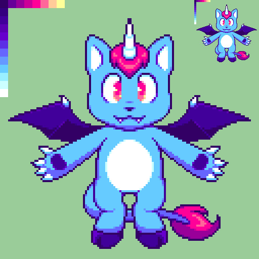
And there you have it. Here's the finished sprite at actual size:


Hope you found this helpful!
(Also disclaimer that the project this sprite is for is super early in development and all design elements here are subject to change lol)
#pixel art#art process#art reference#artists on tumblr#pixel art tutorial#Salem's clever art tag#long post
47 notes
·
View notes
Text
Problem One: The Screen(s) and Digital Workspace
Part one of my multi-part doc about what I learned from doing online college at a non-online institution. This chapter: my Desktop as a Desk
Highlighted points: learning styles, work type/function in relation to the computer
My biggest problem with being pushed online after being at an in-person institution was, and still is, my forced reliance on the computer. I have to sit in front of it for hours: attending classes on Zoom; checking email every three hours; accessing Moodle pages for class and out-of-class work (Moodle is what my institution uses, other web management/e-learning software platforms include PowerLearning, Blackboard, and OU Campus, among others). And the work itself can be watching documentaries, watching seminars, accessing ebook/PDF documents, annotating documents in online portals… it's a lot. People have talked at length about "zoom fatigue," as well as the eyestrain headaches that can come with staring at said screens for hours at a time. I'll talk about my own lessons learned about that later.
The assumption among the administrators and (some) people of older generations than those currently in school seems to be that working online with computers and smartphones is more efficient. That isn't necessarily true; it all depends on the type of task and the person being expected to complete it. In my case, I cannot, for the life of me, focus on dense sections of text presented on a backlit screen. Thus, reading and answering emails is okay, but downloading scanned textbook pages to be read on a laptop screen (along with trying to highlight and annotate them) is hell on earth.
Why is this? Different reasons for different people, but in my case it's because reading/"writing" on a screen interferes with my learning style(s), which are visual/spatial, audio, and kinetic. Audio doesn't come into play for reading on a screen, but seeing words physically in a certain location relative to other words on a page is very important to my memory of the material. Computer screens can display pretty much anything at any given time; book pages can only display whatever was permanently printed onto them. That is, the content of a book page in physical space will always be the same unless you, the reader, manipulate it; a computer screen can have any type of content displayed as long as its pixels can light up and process the information. And for me, that's a problem because I don't have any physical space to relate the information to, plus I don't get a sense of how long the document is. Recalling a passage in a printout, for me, goes like this: "I remember it was on the top-left of a page towards the beginning, the shape of the paragraph was funny too… ah, there it is." Recalling a passage on a digital scan of the same document is much harder for me by contrast: literally any of the paragraphs could have made its way to the top-left of my computer screen, if I moved the window around or zoomed in to better read the text; documents are an endless scroll upward or downwards, with (maybe) a sidebar to tell me what page I've landed on. All of my "landmarks" are functions of the program I am using to access the document. They're static and contained to a window... that can show up anywhere on my computer screen. Not conducive to the way I learn at all.
My kinetic learning style comes into play with the computer, too. Annotating a document? In the physical world, a pen on the document itself does the trick; going through the physical movement of circling a word or making a note are things that solidify the information in my mind. Annotating a PDF document? First of all, it's difficult to do with a mouse (and God help you if you have a trackpad), and it's highly dependent on the program that the user selects to open the PDF. I could connect a drawing tablet, if I have one, but they're very expensive and their use is, again, dependent on the compatibility with whatever reader program the user selects. All this to say: annotating on the computer doesn't work for me, either. My kinetic and visual learning styles come together with note-taking. My memory is highly dependent on seeing words as they are formed by my own hand, processing them, and connecting meaning to them as they sit in a specific place on the page (am I over-explaining this? Basically, writing notes by hand and seeing where those notes are on a piece of paper help me remember them). Typing notes isn't a replacement for hand-writing notes for me; while I'm busy fixing my typos (on words I would never misspell on paper, usually, since my fingers are just moving weirdly over the keys), the professor moves on, and I'm not listening well enough to catch the fact that I've missed new information.
The takeaway here is figure out your individual types of work relate to being on the computer. As I said, the computer hinders many aspects of my learning when it comes to memory and efficiency. As a creative tool, however, it has almost the opposite effect; writing assignments for fiction, poetry, and screenwriting classes are much more efficient on the computer. From creative thought to keystroke, I have less time to second-guess or forget my ideas, and both the immediacy and changeability of word processing programs actually works in my favor for those sorts of things.
What I did differently from first online semester to second:
1) I figured out which materials helped me remember my notes the best. Honestly, I wasn't even doing this when I was at in-person college, and to my detriment, but I couldn't get away with it at all once I went fully remote. Think back to when you were in lower levels of school: were there certain types of materials you gravitated towards in the classroom? Did you like basic composition notebooks with faint blue lines? Wide-ruled or college-ruled paper? Did you discover that graph paper just worked really nicely with all notes besides math, or that blank pages were less busy for your eyes? When you used pens, did you prefer blue or black ink, or did colored ink help certain things stick? If you can control what materials you use to take notes with, consider using ones akin to those from a class you either a) remembered the most fondly or b) remembered the most information from. Scour your memories of class experiences for anything, no matter how small, that may have made your life easier. Equally, take note of what tasks actually worked well digitally. Adjust accordingly.
(Personally, I found my magic formula was a 1-subject memorandum notebook — marginless, with very narrow line rulings; while I hesitate to direct you to Amazon, they are hard to find at a decent price otherwise, and you can get a 12 pack for just over $40 from them — with black ink from a 0.38-size gel pen (I used a basic Pilot G2 pen until it ran out, then bought ink refills in the smaller size). To "highlight" my notes, I circled or underlined information with a blue gel pen of the same variety. Keep in mind again that I'm learning to be a translator; this is just what works for me.)
2) If I needed to print something out, I printed it out. Environmental guilt is something I struggled with a lot, and there was always something about staying on the computer that convinced me I was being "less wasteful" by staying digital. But with how much time and energy I ultimately saved reading a printed document that can be recycled vs the electricity I ate up spinning my wheels in front of the ebook… to me, it was worth it. If you find that helps you, too, don't be ashamed to print certain things out.
(If conserving ink and paper is a concern to you, it is possible in some viewing/editing apps to remove or cover images, either with white squares or by taking the images out completely. I have an old MacBook Pro and on current versions of Preview, one can draw shapes and fill them in white to cover parts of the scan that would eat up ink, such as blurred black borders and scanned images. For documents in a word processing program like Microsoft Word or Pages, it may also be possible to print the documents out at a smaller size, allowing more text or even multiple pages to show up on a single sheet of paper.)
| In the coming days/weeks I hope to be posting more content about how I tried to adapt to fully remote learning and the things I’ve learned along the way! Follow for updates ♥︎ |
#college#university#online#online learning#school#online school#online university#online college#covid#covid 19#studyblr#student#students#blog#writing#my writing#narrative nonfiction#nonfiction#narrative#advice#language#language major#liberal arts#liberal arts college#creative writing#computer#computers#screen#screens#screentime
58 notes
·
View notes
Photo
mobile header tutorial
hello! I’m here to share how to create a header similar to these that i’ve done in the past. here are the tools i’m using:
photoshop cc 2018 (from @birdysources)
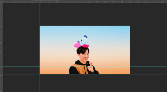
some picture of hoseok probably from either twitter or weverse i don’t remember lol
i included pictures and tried to make it VERY beginner friendly, but please, send me an ask or dm if i’m unclear at any point. it’s 2:38 am as i’m making this tutorial and i just downed my cold brew so i’m sorry if it’s messy
1: open your picture in photoshop (here’s the picture of hobi if u wanna follow along)

2: find the quick selection tool
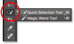
you’ll find it in the left sidebar, fourth from the top. i’ll often use this and the tool above it (polygonal lasso tool) depending on the photo. the quick selection tool is faster but more tedious, in my opinion, but hoseok was easy enough to cut out just using the quick select. use both! whatever u are comfortable with.
here are my settings for the tool:
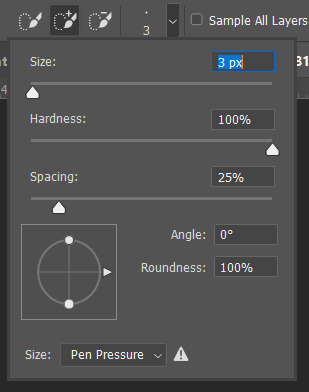
i almost always keep it at 3px. unless the image is huge, then i’ll go up to 5px, but never really above that.
3: trace over your subject(s) (aka hobi) by dragging the tool along the edges, until you’re happy with the accuracy:

4: find Select and Mask (directly above the image):

and here are the settings i’m using:
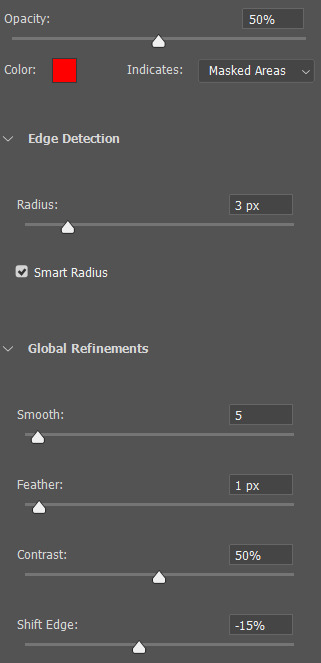
then press ‘Ok’ !
5: Select Inverse (right click inside subject)
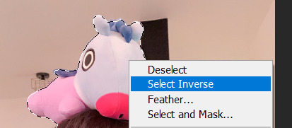
now we’re going to press ‘backspace’ on your keyboard, and the background will be gone~
make sure your file isn’t locked! it should be labeled ‘Layer 0′ and not ‘Background’ (if it’s locked, just double click it and press ‘Ok’ on the window that pops up)
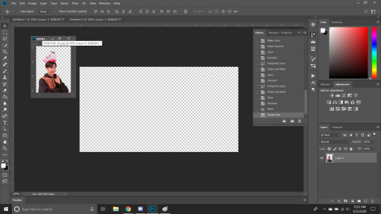
after pressing backspace to delete the background, it should look like this:

then deselect it all. now is the time to look closer at your newly made render and see if there’s any cleaning up to do. i’m good to go, so i’m gonna continue on with making my header.
tip: drag the subject (hobi) with the move tool (very top tool on your left sidebar) to the center so he’s in the very middle. it should click to the center (you’ll see the pink line)

it’s not necessary for the tutorial but if you plan on saving this render as a .png and dispersing the renders you make-- it’s just cleaner looking to have them centered!
6: File > New

i always use 800 x 430 for mobile headers. for gifs, i size it down to 650 x 349.
7: resize and drag hobi into the new canvas (Image > Image Resize)

for single subjects like this i usually resize them to ~300 to ~400. whatever you think looks best tbh
now drag the file from its place up top:
then the file from where it’s labeled ‘Layer 0′

8: now hobi is inside the canvas where the actual header is going to be made~ you can get rid of the render, or save it as a .png, whatever u plan on doing w it
i’m gonna center my hobi for the header i plan on making! from this point it’s just gonna be coloring, sharpening, etc. if you’re interested in using any textures like flowers or bring in other renders of objects, DeviantArt is a great place to search for texture packs. @beapanda on DeviantArt makes beautiful resources (kpop and non kpop related) be sure to credit them or whoever u save ur textures from!
for this header i’m not going to be using any outside resources, i just want my hobi to be the focus~
for the background, i’m gonna use a gradient from this site (this pack is 200 images. phew)
i’m using no. 200 from that pack.
9: optional- i’m gonna make some extra layers and start coloring hobi using clipping masks.
make a new layer > right click the new layer and find ‘create clippink mask’ > set the layer to either color, overlay, or multiply (whatever you think looks best and does what u are trying to achieve)
here i’ve just make layers to color things like his hair, his hoodie, and baby mang
here’s with vs without:


and when you’re done, go ahead and right click your primary layer (subject layer) and click ‘merge clipping mask’.
10: coloring~
find a psd you like or being to color the header yourself. for this header i’m gonna be using a homemade psd. i’m not gonna go into detail bc there are sooo many places to find psds on tumblr and deviantart. just like you brought hobi into the header canvas, drag your psd there, and that’s how u apply a psd.
when u are happy with the coloring, right click the bottom layer and flatten the image.
11: topaz clean + unmask sharpen
topaz clean is an addition u have to manually add to your photoshop program. u can google how to do it, but if anyone’s struggling i can show u how i did if i remember (but i’m pretty sure i do)
topaz settings:
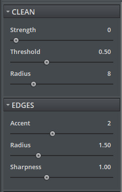
unsharp mask settings (go to filter > sharpen > unsharp mask):
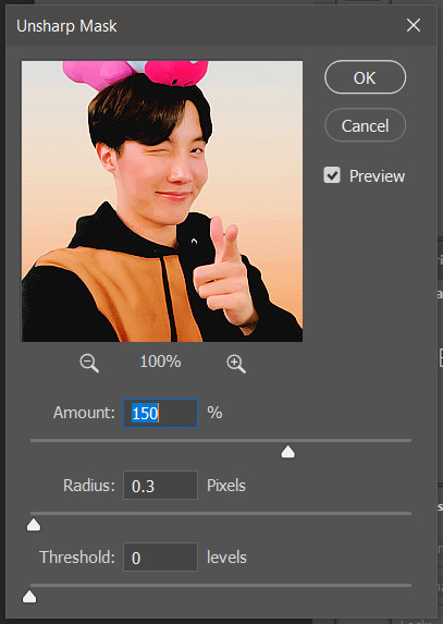
honestly, topaz is completely unnecessary, but i like the way it looks so i’m gonna go with it anyway. sharpening the header alone will still give you a great outcome
12: final step, header border time~
over on my film/tv blog @gusdapperton i’ve made a header template pack (click here if u just wanna use my premade borders) but for this tutorial i’m gonna show u how i actually made those (minus the cloud one, i was just fucking around lol) (it’s so simple)
>>> if u DO just save one of the borders i made in that pack, resize it so the width is at 800 and drag it to your header canvas. set the layer to ‘screen’ and bang there u go!
BUT with that method u can’t change the color from white. so if u want a border with any other color, keep following the tutorial >>>
go to view > rulers and select that to show the rulers (duh)
click from inside the ruler (light grey) and drag out your guides. here are where i’m placing mine:
they should ‘snap’ right into place, but if they don’t, make sure u go to view > snap and that’ll fix it. u will know what i mean once u try it lol
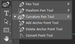
select the curvature pen tool (right click the pen tool to show more tool options):
and begin to place your dots. thanks to the guides, these dots will also snap into place
here are mine:

(i eyeballed the two in the middle, it doesn’t need to look perfect tbh)
this next step is sorta stupid but i haven’t found a better way to do it yet lol
to close the shape just make sure to closely follow the direction of the dot you last placed, then go around to make your way back to the first... it looks silly but like this:
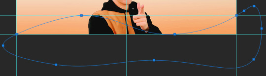
just play around with the shape and the tool... u will get the hang of it lol
now look up ^ and press Selection

then ‘Ok’ in the next window. then boom~ there’s your selection for the border we’re about to make.
make a new layer then select the rectangular marquee tool (second from the top on the left sidebar) and either drag with your mouse or use the arrow keys to move the selection we just made. here is where i’m placing mine:
then select your paint bucket tool (if you can’t find it, right click the gradient tool and it’ll be one of the sub tools, like i showed u with the pen tool)
make a new layer, then fill it in (i’m using white)
you can stop there, but to make that line like i did in my border template pack, press the down arrow on your keyboard and go down 5-10 pixels, press backspace, go down the same amount of pixels, and re-fill that area.
now unselect. there’s the border~
now go to view > clear guides to get rid of those. u don’t need em anymore :) i’m also going to move the border we’ve just made down to the bottom of the canvas since we don’t need that big gap there.
>>> tip, don’t fill in the white directly on the layer if you wanna change the color. create a new layer on top of the border layer, right click > create clipping mask > fill the layer with the color u want for the background. example:

it saves the integrity of the shape. if you color fill right over the white, look closely and you’ll see it looks sort of pixelated and not as clean or smooth. it’s subtle but noticeable enough to me where it bothers me.
since this color i chose is kinda vibrant and clashes, i’m gonna help it out some. go back to the quick select tool and select everything inside your border layer. make a new layer, fill the layer with black (any color will do, it doesn’t matter) and set the fill to 0%. double click that new layer, and a new screen will pop up. go to drop shadow, find the settings you like, and boom. here’s what i did and what it’ll look like:
now u are finished~ i didn’t do this but u can skip sharpening the header earlier in the tutorial and reflatten the image again to sharpen it at this point instead but, yknow, i didn’t do that lol
here’s the final product (save by going to file > export > save for web)

preview of how it looks on mobile:
background: 8bd4ed
the end~ please send me an ask or dm if you haven any further questions, i will try my hardest to help <3
#photoshop tutorial#header tutorial#allresources#completeresources#mine:tutorial#i probably fucked up somewhere but it's bed time so i will find out in the morning hehe
149 notes
·
View notes
Text
Updating Photobook Design (InDesign)
Here, I’m have updated my photobook design where I can present a certain part of the work I have creating from my photography lessons. These screenshots are in the order that I created them so I can show on how I decided on different decisions I made along the way.
The screenshot below was from when I first launched InDesign so I was just learning on how to use the tools. I started by creating a shape which I did by using the ‘rectangle frame tool’ where I drew the square shown below. To make sure it was a square I held down ‘shift’ which will make sure that it is an equal rectangle so all the sides are the same size. While still clicked onto the shape I just drew I went into ‘file’ and then ‘place’. I found the work that I wanted to present (which isn't a screenshot as you can’t use them as they aren't good quality). It then places that piece of work and when you hover your mouse over the top of the shape there is a circular shape that appears which you can use to adjust the image inside the shape you just created. To create a triangle, there are a couple of ways you can use. One being where you can use the ‘pen tool’ to draw the shape by hand where you just connect the dots up. Another being where you can create triangle or rectangle and then use the ‘pen tool’ again and drawing a line to half it. You would then delate one of the sides and you are left with a rectangle. I found that the second method was a lot easier to get an accurate triangle whereas when you do it by hand it might not be exactly lined up. After this practise with the tools I then got rid of this and started thinking of ideas to create some interesting designs.

At the time, I wasn't fully set on what work I was going to use as I knew I was only going to keep to a certain lot of work. I wasn't going to mix different lots of work in this design because I feel it would look more messy and unprofessional. Below, I chose to use the ‘pencil tool’ where I had to keep my hand quite still get an effective line. Although there was nothing wrong with what I drew below, I didn't want to use this as I didn't really have any ideas on how to make it look more appealing as if I had left it like this it would have been quite boring. I also hadn't fully decided on what work I was going to use.

Once, I had looked through all my previous work I decided the most successful work was the glitch work where there was lots of colours used in this. I then thought about what colour I could use with this work as I was going to use black and another colour. But I realised that as there are some many different colours within the work I produced that I don't really need a colour. I decided to just use the white from the page and add black into the piece as well.
Below, I am creating my first two pages of the book. I didn't want to create a front page at this time because I wanted to get an idea of what the actually book is gong to look like inside first so I can then work on a front cover from what the inside looks like. I also think the cover is a big part as that's what you see first so it needs to look effective. I have drawn a triangle with the ‘pen tool’ which I have placed at the side of the right page. I then added this work and arranged it like this. I placed it so there was a bit on negative space shown from the work. This then doesn't overcrowd the piece and shows another part of the work. I then added a black background using the ‘rectangle tool’. I wanted to have another rectangle on the other page.

I then found that I wanted to add something to cover the white negative background that I wasn't sure that the rectangle was going to work well there. However, at this time I tried to arrange these five squares are were exactly the same size. I tried this layout where it was mimicking the triangle on the page on the right.

Below, I then placed the squares in this pattern where I had nothing against the look but I still wanted to experiment some more layouts.
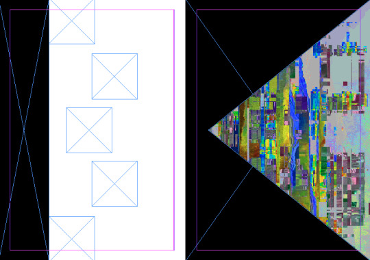
I then decided to more the rectangle to the other side where it now joins the other black section. Now, the black goes over the page to the other side. When I reached on different Zine design I found quite a few design did this so I did it too. I think it looks more interesting as it doesn't stop like a normal book would. I then moved the squares so that it was almost creating an arrow pointing back at the other triangle.

In the end, I chose this layout. However I also found that I wanted to change the work I was presenting which I think was because I had an idea for another page where I was going to use that work. I chose this work where I decided that the best option to present it was to show sections of the work in the small squares and the whole piece in the triangle. I think decided to keep this page like it is showing below. After doing this page, I decided that I wanted the theme of this book to be triangles along the colour scheme of black, white and the colour work. Before I started doing this book, I wanted there to be a theme so then the pages relate to each other a bit more.

These are now a new set of two pages. I have chose the image I was going use on the previous. I started by creating two rectangles which I placed on either side of the pages. I then created two triangles which I drew with the ‘pen tool’ and I lined them up to realise that drawing them by hand wasn't a good idea as they are different sizes.

I thought that it wouldn't matter if I arranged the layers so that the triangles went to the back. Although, I don't think looks anywhere near a effective as you can’t actual see the triangles.

I then redrew the triangles so that they line up and I drew another triangle and copied and pasted it. I made these triangles white as I thought it might enhance the look of the page but in fact it has done the opposite.

I then replaced it with another piece of glitch work. This is how I have left this page although I’m not completely happy with it because it doesn't give the same attractive effect as the other pages so I probably end up improving this page.

For the third page, I drew another triangle which I placed upside down. I then decide to draw another two triangles which I placed in the other corners. It then create this effect. I put the work in the bigger triangle and left it like this. I’m very pleased with how this came out as I didn't really think that much about what I was doing and just tried this layout. There is a good balance between the black, white and coloured work.

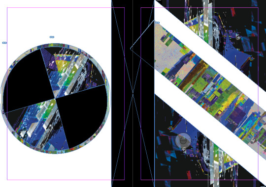
Next, I wanted to see what ideas I could come up with for the front cover where I obviously wanted to use triangles as that was the main theme through out the book. I drew one circle and duplicated it a few times. For some reason this gave me the idea of overlapping the shape and include all the the elements which I have already used I came up with the idea of doing, work, black, work, black so you can then easily see that they are triangles. Doing this also allows me to include all the work that is presented in the book. From look at the screenshot, I was going to add another triangle to the bottom of the page that would be black. I decided against this because if I did place it in, it wouldn't show that it is a triangle. I then decided to add a rectangle to the right side of the page as that's the side you would open the book.

In the next two pages, I chose to start by drawing a rectangle in the centre of pages. I then decided to wanted to include a circle in this page to which I did by using the ‘ellipse frame tool’ and holding down ‘shift’. I then used the ‘pen tool’ to mark quarters inside the circle. I held down the mouse down when drawing the curved part. I then placed the work into two of the four and then made the other two circles black so that they can contrast the white background. On the other side, I then drew two triangles in the opposite corners. I then wanted to fill some of that space with something so I decided to draw a rectangle. I think this side of the page worked well, however I’m not so sure about the other side so I might come back to this another time.

I then wanted just see if I added another aspect to the circle it might improve it but I think it has actually made it more confusing.
Here, I have taken away the circle and duplicated the rectangle. I had the idea of doing a similar effect on the left side as the right side so that it looks like the line is going across the page. The screenshot below, shows where I was trying to line the rectangles up properly but I found that I couldn't get it the exact same. When I next go back into updating this book I will relook at this page and try and make it work.

This was the last page I produced which is probably my least favourite. I tried to create a dripping effect. The problem was that I drew them dripping down the page the wrong way which I don't think creates a very effective page. I think overall this page is quite random.

Overall, I am happy with some of the pages and I don't think I will change them. Although, I will improve some of the pages next time I revisit this book.
1 note
·
View note
Text
50 Short Years!

This January makes a full 5 years since releasing 50 Short Games!
I admit, it is weird to think about.
In general I don’t have very strong feelings about anything I’ve worked on, since anything like that has usually burnt itself out somewhere in the process of making the thing.
But it feels a little startling that this particular game came out 5 years ago, because in many ways I feel like I’m still working somewhere in it’s orbit – it still feels “close” to me in terms of, I guess, setting up the way I’ve been thinking about and working on these things ever since then. I still feel like I’m working out some of the stuff that came up in its production.. compare to older games which can feel like they were made by different, mercifully forgotten, people.
The game is temporarily discounted on itch down to just $1, until valentine’s day - good for friends, good for lovers.
When this first came out, I included a big note file of the processes and ideas and etc that went into it. I have posted that to my website for free to mark this little anniversary. But since a decent bit of time has passed since those impressions, and since I don’t feel like refreshing them, I thought it might be interesting to try writing up a sort of “afterlife” of this game, specifically the ways it sort of covertly turned out to influence what I did for the 5 years after it, as well.
Here are my notes seperated by theme.
- colour - mice - pacing - work / life - gameplay - theme - writing - distribution
- COLOUR: this is a strange one. 50SG felt like the first time I was really aware of / interested in trying to add “colour” as an element I could play with within my games, trying to add it to the lego set along with “rocks” and “little guys”. More colours, interesting colours, colour combinations, games which would be colourful as images. Because I’ve never actually been a very visual person (surprise surprise ha ha ha) and even when I draw, or sculpt, I tend to focus on lines and omit colour as much as possible... When I was a kid I disliked any kind of colouring or painting, as opposed to scribbling, but just before 50SG I’d been working on an uncompleted game with painted textures, and enjoyed it enough to want to explore the effects more.
The reason I call this a strange one is that, mostly - - I failed!!! I feel very aware now of how much of this game is just scratchy line drawings, how little colours are actually used once I'd worked out which ones I preferred working with from the set. I did try to change things up over the course of the series and some games (specifically the Mogey ones) tried to use flat colour or colour patterns more. But when I think about the game now the memories I mostly have are of essentially monochrome or mostly-monochrome drawings.
In fairness, some of this was technical too - I never had any kind of consistent way to light my pictures for when I was photographing them, and a lot of the time the bright markers came out muddy, which sort of discouraged me from trying to do anything specifically with colour effects. Strong lines are also a lot easier to chop up into discrete little game-shapes.
But I think this sense of missed opportunity - having this big bag of markers in all colours, all translucent lines, and not really using them - was specifically what made me spend the next few years trying to work with colour even more. Hence stuff like Mouse Corp, and certain entries in the Hardpack 11-in-1, and Magic Wand. I think I moved more towards pixel art again because it gave me a very quick way to play with colours, and swap them in and out, without having to worry about correctly photographing them first. And in fact my current game came about directly from trying to play more with ideas of translucent outline sprites on top of flat fields of colour – trying to combine colour with line in a looser way than just colouring stuff in.
I'd like to go back to playing with markers some time.
- MICE: I think this was the first time I used mice in my games. Previously the emblematic animal was the Dog – Murder Dog, Goblet Grotto dog... The dog is a "LAWFUL" animal, one which can be aimlessly malevolent on behalf of some higher system or master. The dog stands in for the implicit malignity of the game system as a whole.
Meanwhile, mouse is the "UNLAWFUL" animal - they live in spaces they do not construct, and scavenge from what they find within, they are constrained by those spaces but also have something of an independent life within them. By this time, I had been working on a lot of games where the gameworld itself was sort of an ominous presence - Crime Zone, Goblet Grotto, Drill Killer etc - and I think the move from "dog" to "mouse" came about as a way to think about these spaces as just kind of indeterminate and abandoned instead of actively malign. Places which don't really notice your being there, which were constructed and then left for some unknowable purpose. I cannot say if this shift in thinking is good or bad.
- PACING: I forget whether I mention it in the notes - but the prototype for all the marker games was an earlier one-off called "Gold's Enigma", done with crayons and in Klik N Play. And that game felt like sort of a revelation because it was so quick to just add new areas to it, or copy and paste elements around, or switch from one game control system or mode of representation to another. So you could have an extremely short, quick game that still contained enough of a shift to make you feel like you’d gone somewhere or like the view from one side of the game was different to the view from the other. I don’t know how consistently or successfully this was ever really done (the end of Happy Bird is my personal favourite version) but it did stick in my head, as an ideal to work towards. And I think something like the more longform Magic Wand was still sort of driven by a desire to try a “fuller” take on this same idea.
- WORK / LIFE: I don't remember exactly but I think this was my first time successfully trying to start a new, slightly longform project while also having a day job. With other games either they were short enough for me to just blow through in a concentrated rush or else enough pieces had already been laid down (eg Goblet Grotto) that I could just brainlessly slam together any remaining levels in the mornings before I went to work. Making games as a hobby isn't necessarily hard but figuring out how to do it consistently over long periods took me a long adjustment period. For the short games I ended up doodling ideas at lunch, coming home, eating dinner, and then around 7 or 8 I'd start chopping up my image sheets and putting them into the game. And hope to finish by 11 so I wouldn't be too wiped the next day. These days it's more like 8-10pm. Working in the early mornings can be good if you're very determinedly getting through some pre-assigned tasks but can be harder and more frustrating if you're trying to be more exploratory about things. I guess to the extent I’d draw any lesson from this it’d be, set aside a very specific time period for working on stuff but also try to have a process where “working on stuff” can involve a certain level of constructive busywork just so you don’t come home and have to immediately face a blank page? “Placing stuff around on a screen” is ultimately what absorbs me so working in a way that let me do that as quickly and aimlessly as possible helped a lot. Well, that’s my opinion.

- GAMEPLAY: I used the default 8-directional walk system in MMF2, and the default screen-follows-the-player function, so many times in the course of these games that I just burnt myself out on them entirely. They’re fine, but using them so many times over a brief period made me more and more conscious of them to the point where it could feel like I was just filling in the same template each time... I think part of why I shifted to Unity, even though it’s more of a hassle, is just to be able to escape that sense of a singular unchangeable “point of view” and make things where moving or looking around would feel a bit looser and less set in stone. I hope this helps explain my gradual, doomed love affair with extremely idiosyncratic camera systems.
- THEME: Did any themes carry over to any of my post-50SG games? Maybe some but to me it’s less noticeable than seeing what was stripped out. Having a deadline and a very fixed scope did sort of push me more towards including “real world content” in whatever strange way – dreams, specific moments of the early morning or the night, events like work nights out, locations I knew... Compare that to the longer games I’ve done which all kind of take place in these dreamy, private fantasy dimensions. I enjoy that too, and it’s easier to do that when you’re making a game that’s just sort of endlessly adding to itself over time.. It’d be good to get back to working in a way which encouraged that material connection.
- WRITING: I think the notes file that came with 50SG was the first time I did any real writing about the process of making these things, or ideas and notes, etc. And now I can’t shut up!! Well, I did a similar writeup document for Magic Wand, and hope to do so with my current game eventually as well. I think writing that, and having people be encouraging about it, did help me become more interested in looking at and recording the state of my brain as it’s slowly rotted into goop from exposure to these terrible machines. Which is in itself not a bad reason to keep doing it.
- DISTRIBUTION: This was my first commercial game and probably the biggest impact of that was in getting me to move away from PC-only tools. I'd planned a mac version of this game at some point, or specifically to do HTML versions and then use a workaround I'd read about to convert HTML files to Mac and Linux apps... but the HTML conversion sometimes led to strange bugs, and I never had a testing computer to see whether the actual ports would work, and the multiple layers of things that could go wrong (making a html export, to be put into a mac or linux wrapper, to be loaded from a Unity scene...) eventually made me slowly give up on this. I think of getting back to it but to be honest I have such limited energy and for the five months a year I don't just want to hibernate I'd rather keep working on new projects.... I am sorry.... Well, this was a big impetus to try moving to pure Unity and HTML which had more multiplatform support from the get-go. I don't know if I took any other commercial lessons from it! It sold around 500 copies, and talking to other people making weird scrappy narrative type games it sounded like they mostly also sold 500 copies, maybe to the same people or maybe just to each other. At this level of economic activity you can just do what you like.
So in conclusion 50 Short Games is a land of contrasts. It feels distant to me, I don't have any strong feelings about it anymore, but I also feel sort of like I'm still moving around in the terrain this game originally sketched out for me, and still kind of responding to it in either positive or negative forms. Thank you to anyone who bought it. I just put it on sale again to mark the five year anniversary, you can find it on itch.io, gamejolt or kartridge. Please buy several hundred copies and salt them around through hidden disc drives buried in a desert somewhere so that some day they can inspire some form of apocalypse cult.
In the year 2525 if man is still alive if woman, still survives they will find.....
- stephen 2019
22 notes
·
View notes
Text
Booklet: Part 1
For our final assignment, we were tasked with creating a booklet. The recommended theme was children's nursery rhymes or songs. I decided to take a slightly different approach and create a book for adults featuring 5 nursery rhymes that explains the suspected meaning behind each one.
I first did some research and came up with my five nursery rhymes:
1. Three Blind Mice
2. It's Raining, It's Pouring
3. Ring Around the Rosie
4. Rock-a-Bye Baby
5. Mary Mary Quite Contrary
We also had to design a front and back cover, end papers and a contents page.
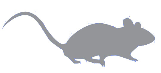
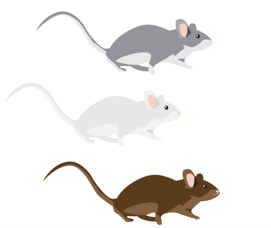
I started by creating a vector illustration for the Three Blind Mice. The Three Blind Mice is based on the blinding and execution of three protestant bishops by Queen Mary I of England.
I found an image of a mouse and made a rough outline of the mouse with the pen tool.

This used an array of anchor points but with all of the practice I have had in Illustrator and with specifically the pen tool, I was able to do this quickly.
I then moved on to adding the white under stomach to the base shape. This was a little bit difficult to map out the areas as I was using an actual photo as a reference so the fur blended in more than my vector but I'm pleased with how this turned out. I made rough shapes and then went back in with the direct selection tool to change the handle angles and lengths, and the anchor point placement.
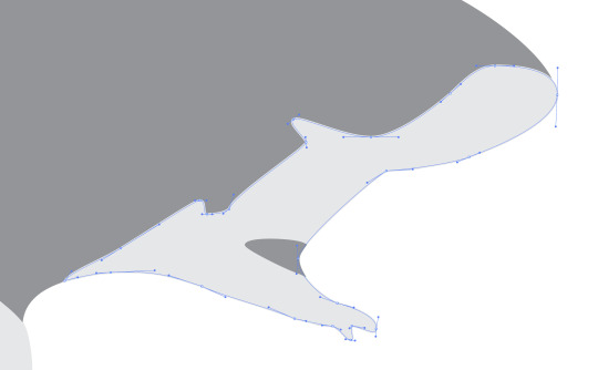

I then moved on to the ears. Since only one was showing in detail this was very easy. I made three shapes and layered them to produce depth. I kept my handles small while also trying to use an few as many.


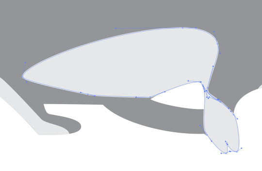
Next I made the eye of the mouse. Mice tend to have really beady eyes so I wanted to show this in my image. So I added no iris to assure the deep blackness look. I used the ellipse tool to make a large black circle, holding down shift while making it to constrain it to a perfect circle. I then made three more smaller white circles to use for highlights.

I then made the nose and mouth. The nose and mouth in the image were quite difficult to see so I most just freehanded this. I made a triangle shape for the nose and then dragged out the handles on each point to create a curved corner. I then used the pen tool to create two curved lines for the mouth. This completed my mouse vector illustration.

I then selected all of the components and then held down option and dragged across, duplicating it. I repeated this and it left me with three identical mice. I then changed the colours of two so there is a brown, gray and white mouse.
I then brought these mice from Illustrator into InDesign. I made them in Illustrator rather than InDesign as Illustrator is especially good at making vector shapes and illustrations and InDesign is better at text layout so it would ruin the quality and take too long.
I then made a knife. I started by making a base shape in illustrator. I once again used the pen tool. I've found it is by far the easiest tool for this particular job in Illustrator.
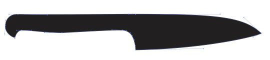
I then moved on to adding the blade colour. Rather than retracing the shape, I duplicated the shape, then deleted some anchor points and changed a few handles on the anchor points to get this.
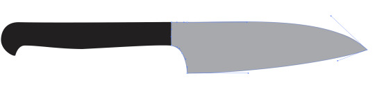
I then wanted to add a bit of a shadow on the blade so I drew a rough shadow on and made it a slightly darker shade of gray.

I then added a few more details onto the handle using the ellipse tool.
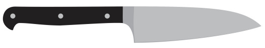
I then brought this knife into InDesign with the mice and duplicated it many times. I changed the size, layering and orientation of each knife slightly to make it look it was raining knives. I also added the lyrics of Three Blind Mice onto the page.
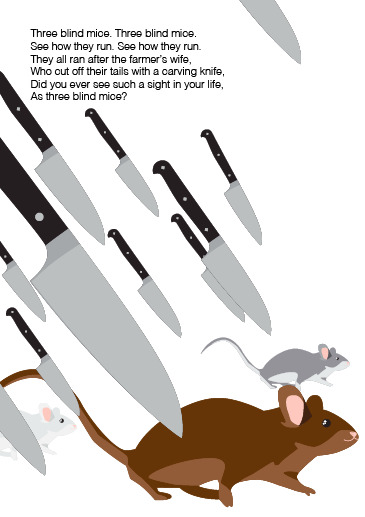
This was the final result. Overall it was pretty easy for the final product. If I have time at the end I'd like to come back and add some more details so it matches the backstory a bit more. I think giving the mice costumes or adding some blood onto the knives would work well.
I then moved on to making the illustration for It's Raining, It's Pouring. This rhyme is about an old man who knocks his head and decides to try sleep it off. He dies during his sleep and never wakes up. I started by making a basic bedroom. I started by using the rectangle tool to make a room.
I then moved on to making the bed for him to be sleeping in. I made this with the pen tool. I started with the mattress and then made the bed posts, head board and then the pillow. This was a bit difficult as I wasn't using a reference. It took a lot of trial and error and changing the shape of the shapes. I also added some rain in the window to refer to the 'pouring' rain outside.
I then added a blanket and the man lying in his bed. I tried to make it look like the blanket was falling off the bed. I used the pen tool to create the shape. I then duplicated it, deleted some points, and then changed the colour so it appeared like the blanket was falling off the bed. I then made a rough shape of the man lying face down in his bed. I used the ellipse tool to create an oval for his head and then used the pen tool to create his hair, neck and pjs.
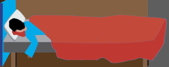
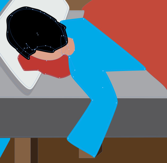
I also used the pen tool to create a blood of blood coming from his head.
I then added some more details like some wrinkles on the blanket and a cut on his head as well as some blood droplets.

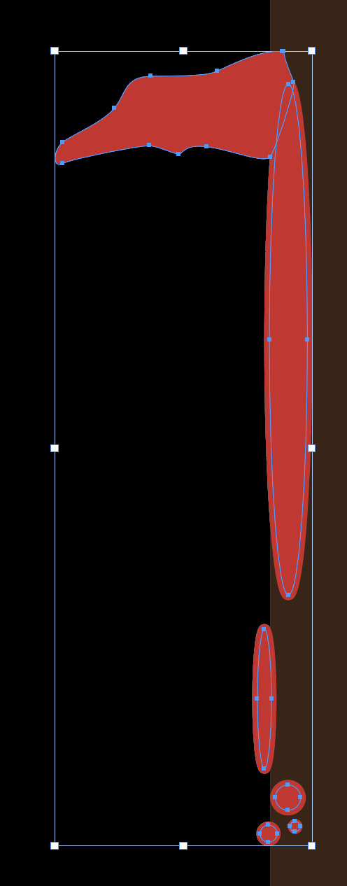
I then decided to add some blood on the wall to show where he knocked his head. I used the ellipse tool and the pen tool to create a dripping bit of blood on the door frame.
I then added some text. I added the nursery rhyme lyrics and a brief description of the story behind it.
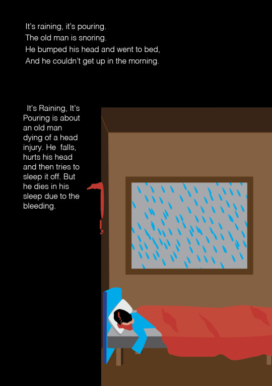
Overall this was a pretty easy page to make. It definitely took quite a while as it involved a lot of shapes but I was pleased with the outcome. I would have liked to redo the window and add some more details to it but for now this is fine. I especially like the blood on the wall.
0 notes
Text
okay this is personal but like
last time I drew something I was still in high school, it was one of these
and then I gave up for good. Back then I could even still control my hands well enough to the point of being able to make curvy lines and stop where I wanted to stop but between the shakyness, the lack of memory for images/faces, the lack of skills and feeling so disappointed in myself I gave up. Hell I was a very sensitive child too, so one of my first memories is me drawing balloons during one of my first days of school because I knew I couldn’t draw anything better than that, and they sucked, my teacher made a face when she looked over which I saw and I thought ‘yeah I’m never trying again’... and yes I did try after that, but it still sucked and I always felt just as disappointed
and then this year, almost a decade and a half later from my last attempt, after I was already messing around with photoshop for fun, one of my best friends gave me her pen tablet, which means having more control than when using a mouse, learning how to use the curve pen tool to make shapes (which I could easily fix when wrong and didn’t require me to actually make good lines), which then I’d fill and use as a base so I wouldn’t have to worry about coloring outside of the borders, and it doesn’t matter if my hands shake or if the color doesn’t end where I want it to, I can fix it. With photoshop I can fix nearly everything that my body can’t do because of lack of natural skills + health problems and it feels so good??? I actually love how my paintings looks even if I’m aware they aren’t perfect because I made them and they make sense??
I could’ve never afforded a pen tablet and now I wonder how many other tools exists that if I had money would make my life so much easier lol but I am so happy and I want to hold onto that feeling. I just wish I could celebrate more with my friends about it, but I can’t express how important it is to me without feeling like I’m begging for fake excitement. So here I am, saying it to my own blog.
0 notes
Text
Yay I finally finished 2018 inktober! If you want to just scroll through them all please go here, and if you want to see some comments on each please look under the cut.
Day 01 Flowey and Overgrown Ruins This prompt I picked as is because as far as I remember Flowey stayed behind when the monsters left. If you can’t find him, he’s near the big root on the left. All other days the second prompt got randomised by a die (except when I reached the last two).
Day 02 Grillby and Exotic Flora Grillby’s on a journey to look at all the flowers that aren’t living in a wet environment. Maybe he’ll make some wine from the non-poisonous ones.
Day 03 Chara and Cave Entrance They are still curious about morbid things and places that could be portentially dangerous, practically running at danger.
Day 04 Undyne and Astral Plains/Dreamland Welp I’d rather have had her with some other prompt, but now she has an anime showdown/faceoff with a mean monster that harasses a moldsmal.
Day 05 Asgore and Rocky Ruins Asgore had a trip down memory lane and visited the place where their castle used to be, before the war. Not much is left any more.
Day 06 Frisk and Ancient Tree They are still precariously looking for adventure. I saw this article about a 800 year-old Finnish tree, as soon as I saw that top I wanted to climb that, looks like a perfect spot to see everything around you and chill for a bit.
Day 07 Temmie and Nature Untouched I did some research in a nearby forest for this one, the sales-Temmie has made a nest in a tree that has fallen down in a storm. The soil is shallow before solid rock so trees have their roots mostly close to the surface, when they fall the roots go up as well. Temmie on the left is sitting on an ant nest lol. There are seven Temmies in total.
Day 08 Muffet and Crystal Coves Crystal Coves is either a place where crystal business is the main employer, a cove that has crystals, or a cove with crystal clear water, I think. I tried to implement them all just to make sure. Muffet has now made a business in making spider-products with glass expertise.
Day 09 Fuku Fire and Freezing Fjord Finally back to the ‘monsters travelling’ theme, Fuku is taking a longer trip and is currently on a boat by Norway.
Day 10 Gaster Blasters and Townsquare The blasters are on their own for whatever convenient reason, Pap’s one is figuring how things work by destroying them, Sans’ is... playing with local children. :D The fountain is loosely based on Havis Amanda.
Day 11 Nice Cream Guy & Shanty Town He’s travelling the world and selling nice cream! Definitely inspired by Beadle in BotW.
Day 12 Mettaton EX & Cemetery This combination took me a moment, Mettaton is a bit loud and showy for a cemetery. Then I remembered that Napstablook said they’re already dead when you try to kill them, so here Mettaton’s visiting haunted places and telling everyone about this wonderful body he got and where to get one if you’re interested in becoming physical again. I worked in a cemetery for one summer years ago, felt weird pulling those visual memories to this...
Day 13 Toriel & Hall of Deities In order to become a teacher I’d imagine she’d have to brush up her knowledge on lots of things that’ve happened on the surface, and here she’s in a secret underground place with some sacred scriptures or something, she reads them and writes down notes and then returns the scrolls.
Day 14 Annoying Dog & Volcanic Terrain Another weird combination, but eh, it’s the dog. It’s feeding bones to the vulkins and admiring danger up close.
Day 15 Monster Kid & Path Along the Water I made a huge area with different textures so I could try learn something new by scribbling around, and I’m really happy how the boulders on top of the waterfall and the water itself look like.
Day 16 Doggo & Ancient Altar Room Took a moment to come up with an idea, then I read Doggo likes squirrels. So now he’s travelling the world too, and he always has time and seeds for any squirrel population he discovers.
Day 17 Alphys & Summoning Altar I thought I’d not be drawing Mew Mew, but here was a perfect opportunity for that! Alphys isn’t travelling, but discovering new things in her home, humans have such interesting books! All of the Japanese text mean something; the bowl has the kanji for ’love’, books under it are Mew Mew manga, there’s two yury books, a reference to Free!, Digimon, Pokémon, Rose of Versailles, Natsume Book of Friends... and it’s fine if you don’t get the one that says ‘corn’.
Day 18 Photoshop Flowey & Windmills and Grasslands I think the modern wind generators look super cool. I tried to make Flowey as cute as possible so he’d be more fun to draw there, this is some dream stuff or alternate universe since Flowey did stay behind.
Day 19 Papyrus & Desserted Drylands I’m pretty sure that’s an accidental typo, but since it was Papyrus I wanted to roll with the new pun meaning. First thought was Papyrus somehow being in the drylands and dropping a huge cake, thus ’desserting’ it, but that would’ve been a bit mean. This cake is made with 100% organic sand (some of which he ground himself when grooming Rocky), the tiny cow ornaments are modified mouse skeletons. :) The chef hat would be straight but there wasn’t enough room on the page of the notebook I draw these on... I remembered he had a triangle on the battle armor, but didn’t remember what way it points so avoided it by replacing it with a heart. :D
Day 20 Sans & By the Beach Sans is getting some more sand for Papyrus with his shortcut, then he took a nap unfortunately close to the tide..? The shore felt a bit bare so I added some animals to keep him company. I h/c that animals don’t mind having monsters around unlike how they usually try to run away when a human is near.
Day 21 Shyren & Buried Statue(s) She’s doing that Disney princess thing where you sit down and start singing and all small animals within hearing range come to listen.
Day 22 Asriel & Underwater Temple Another dream thing since Flowey stayed behind, this is how he imagines the oceans look like outside.
Day 23 Lesser Dog & Market Place Some people have to learn the hard way to not trust a dog that has opposable thumbs.
Day 24 Box Mettaton & Merchant’s Store Any website run by a popular monster must get an insane amount of curious folk, which leads to ad revenue being a good way to fund the next tour. There’s some.. insider jokes there if you’re in any kind of website business.
Day 25 Rocky the pet rock & Eldritch Forest I don’t actually know what the latter means, looking at Google images it’s probably just a forest that’s very dark or something. Wanted to try a different perspective for a change. Rocky has a bowl of food there but I can’t really think of any non-sad reason for why it’s in this forest.
Day 26 Froggit & Inn in th Middle of Nowhere Had to take a break for one day, regardless I’m proud of myself on being consistent this far despite everything going on. I first only had the top Froggit and the bg in the sketch, and didn’t like how it looked. Somehow adding more Froggits made it look a lot better to me...
Day 27 Burgerpants & By the Docs Birsd with human arms and birds sitting like humans will never not be hilarious to me.
Day 28 Bratty and Catty & Deep in the Woods Tried to play with perspective with this one, it’s kind of the opposite of the Rocky drawing.
Day 29 God of Hyperdeath & Idle Portal I had a hard time coming up with anything for this, so now poor goat is somewhere in a completely white dimention and the only way out is not active, though he’s quite chill about it.
Day 30 Amalgamate & Abnormal Formations This and last one’s world I didn’t leave for the die to decide, I really wanted to do Tetris with Napstablook and out of the two still left this prompt suits Endogeny more anyway. There’s a forest in Poland where several of the trees bend to north like this.
Day 31 Napstablook & Puzzling Platforms Only one I did during morning, my hands shake more then so all the lines are more or less wobbly. Every Tetris piece has it’s own signature design except the L-shape which is just blank to keep it interesting. Napstablook is enjoying game music while inside the game, maybe ghosts can possess videogames..? This also shows the notebook I drew all of these in and the tools I used most of the time.
It’s hard to tell if I’ve improved at all when comparing these to 2017 inktober, I haven’t draw regularly through the year and the main focus point this time was on backgrounds and not so much on lines and characters. I did learn new things and that’s always exiting, I think my trees, glass and rocks look way better than before I started, and I did some progress in shading metal too. All of these took 3 hours or less to finish, some only took an hour. I didn’t need to erase pencils like last year because I used a trick where I placed the sketch under the notebook page and my tablet with 100% brightness and a white bg under them, and traced that with ink. The notebook paper is pretty thin, you can see the Amalgamate drawing’s clouds showing through in the Napstablook photo. Anyway, this was fun, and I think I’ll try do it next year too!
5 notes
·
View notes
Text
Coloring in grey scale
So, hey, this is somewhat of a tutorial for those curious about some of my coloring and blending. I made this especially for anyone younger than me and is exploring digital art, but this is also for others who are curious about what I do. I love reading other artist’s comments and looking at their WIPs, so why not.
Another reminder: if you’re looking for my artwork, please follow @rainbow-illness and not this blog. All of my finished stuff goes there; usually, my works in progress (WIPs) or Angry Doodle Corner go here. Sometimes I use this blog to repost my art, but that is my official art blog, no this one. Not unless you like nonsensical posting and metal, then have at it. If you have any questions, don’t be afraid to hit me up, I love talking about art.
So I can’t always sit down and talk about my processes and how I go about doing them, but I was able to sit down and take some screencaps while I was working on my iPad Pro. Using the iPad is actually my first choice to draw on because of the convenience of carrying it around like a sketchbook, whereas my laptop isn’t always easy to carry around--it’s a big laptop. While I use my iPad, I also like to go back and correct things, recolor, re-proportion, or spend more time privately working on a drawing. I have my iPad with me, all the time, so I’m out in places usually like Starbucks doing this. I also struggle with pretty bad PTSD and agoraphobia, so having my iPad out with my headphones on gives me an excuse to put my mind elsewhere to calm down. My family just usually looks at me and goes “oh, she’s working on her art again”; I did this as a kid, too, only with sketchbooks.
I do not have a Cintiq either, though I would absolutely love one. This laptop is capable of using a stylus, but I think I need a better one to do it with. All I’m using is a cheap Wacom Bamboo tablet that I’ve had for five years, that’s it. Everything I’ve done on this blog has been on a small surface. So if you’re just dabbling into art, don’t beat yourself up for having the small stuff, I’ve worked with small stuff and still do. The only thing I have that’s not small is, well, the space and processor on my laptop are much faster than any other laptop I’ve owned, bought especially for graphic design classes and my artwork.
So, that being said lemme just forewarn some of you guys. My artwork is all done in two to three layers! Yes, you read that right! Why? When I was 16, I didn’t have a Wacom tablet to mess with, so I had to use a mouse and learned from there. When I turned 18, I got my first Wacom tablet while working my first official job and the family computer didn’t have a good processor. So when I got my first official laptop, it was basic and not made to run anything beyond the web browser and such, it could barely handle Photoshop. It did, however, run Paint Tool SAI with no issue (which is why I still prefer it over anything I use), it just couldn’t handle more than five layers. After losing my drawings constantly and not being able to do anything in the prized software I’ve been eyeing since my Sophmore year of high school, I found a workaround with it.
And that’s what I’m going to write about here. With that in mind, no, you do not have to limit your layers! I’ve taken traditional art classes so my first instinct is to literally paint over my stuff like I would on a canvas. If you don’t want to do that, you don’t have to! Yes, I am nuts.
That being said, let's do this.
If you haven’t taken traditional art classes, that’s cool! I’m going to be using some art terms you haven’t heard of, but you definitely will when you take your first ever drawing class. These terms are foreground, value, negative space, contour, and weighted line (I’ve seen it called line weight too). For the more experienced art students who are likely groaning over that stupid contour practice from that book “Drawing on the Right Side of the Brain”, I’m sorry, guys. Newbies, you are going to know this.
And you are going to hate it. While I still hate it and, yeah, my eyes are rolling into my skull right now just even talking about it, there are some useful practices in here that I... actually use. Who would have thought? At least we’re not talking about still lives.
Anyway, here’s what I’M going to say that some art teachers will not tell you but I want anyone to read this to know:
- Do not obsess over your drawing to look exactly like your reference. Just don’t. Forget this completely, worry about it later or don’t even worry about it at all. This is your style, your interpretation.
- Digital art is hard. Art is hard! Practice makes perfect and you learn over time just by studying (looking at) other pieces of art. It took me like well over 10 years to find my own little niche and I’m still playing around with coloring styles. I have a lot.
- If you’re just starting to draw with a tablet of any kind, play around with it. My first official program was a cheaper version of Paint Shop Pro and when I first got it when I was 14, I sat around and experimented on layers to see what it would look like. Explore!
- When you start drawing figures or faces, try not to think of it as, well, face or a figure. Reduce it to basic shapes, like squares, triangles, and circles.
Greyscale can establish light source, value, scale, and negative space.
I don’t always use greyscale for my art, but when I do, I appreciate it because it makes my life easier. For example, Alphonse Mucha’s pieces here from his “Slav Epic”.
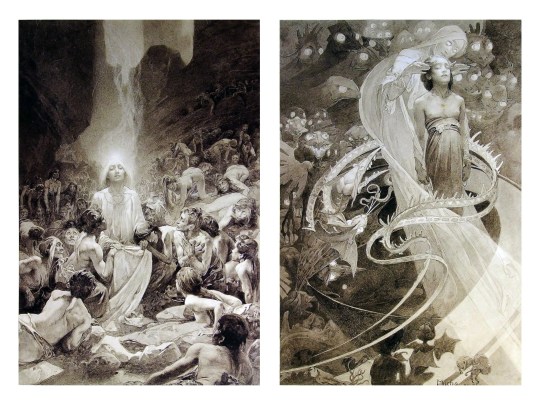
Chances are, you’ve seen Mucha’s art nouveau on prints, fanart, fabrics, and all of that. But Mucha did so much more and he is a huge influence on me for a reason. By the greyscale we see here, we can see foreground/subject with each illustration. Mucha is using value (that’s shadow) to emphasize this, in addition to negative space (background) to draw you in, just by using black and white. Notice how the other subjects don’t have such a powerful contrast and light source versus the other, especially the woman on the left. Mucha made his art pop by his understanding of contrast.
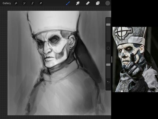
For this first part of this entry, I’m going to be using Papa Emeritus II from “Ghost”... who is a good example of how to draw faces, too. Huh. Regardless of what drawing program you’re using, keep your opacity low, at 50%.
Simplicity at its finest
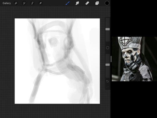
Instead of focusing a lot on Emeritus’ face, I’m going to focus on the negative space behind him. I’m using this to define his figure. This is a good picture because of the stark contrast, though, it’s a little tricky because it is really contrasted and you can’t see where the light source really is. But that is okay! I am going in and just using this negative space, the contour of his head and torso. Before I even think of a face, I want to softly go in and use black (or grey) to fill up that negative space. Keep it simple and work your way up.
After I lightly fill in the negative space around him, I can start lightly going in and establish his face by blocks of shadow. And this is why Emeritus II is such a good example for this kind of work. I don’t usually start going in and drawing eyes, I rely on the shadows of the face to see where their eyes, ears, lips, and such lie.
Here’s another example (though, it’s old):
This is in my maroon style underpaint, which is what I post most of the time. For their faces, I just used basically eye sockets to start working on their faces, like Papa Emeritus II down below. Again, this dude is a great example.
Here is where it may get a little funky. I created a new layer and set that layer to Multiply, still keeping that opacity low. Since I have no light source and I just want to create a really dramatic lighting, I made a vignette with a simple airbrush tool.
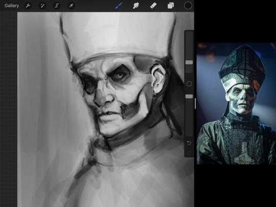
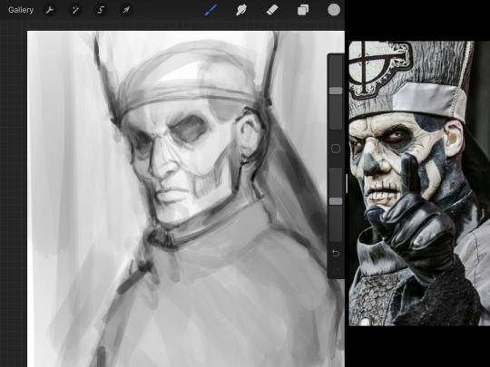
With that little vignette, you can create a new layer (unless you’re me, I just merge it down because of that constant fear of nonexistent software crashing) and I’m using the color pick tool to go back and forth to start using greys to really get into Emeritus’ face, especially his wrinkles. I’m painting over it constantly, switching back and forth between a paintbrush tool and color pick tool to blend. Again, keep your opacity low... unless you’re me and you’re feeling adventurous. You’ll also notice here that I have more than one photo reference. I use several for a lot of my art, so I encourage you to do the same. I had no idea what his jaw looked like, so I grabbed a second photo. Now that I have a better idea of where his hat ends on his forehead and how his nose looks, I start doing a weighted line.
Weighted line and Contour
Now is the dreaded talk. Of contour.

Welcome to Drawing I hell. This cursed image is from the book “How to Draw on the Right Side of the Brain” and if your teacher does not talk about this in your first drawing class, I am going to eat my hat... I have a hat lying around here somewhere. ANYWAY, the contour line exercise is basically you just using a neverending line for a drawing. I don’t know who drew this (and tbh, thanks a lot for every single boring assignment I’ve done in drawing classes), but this guy used contour lines for his drawing. I’m having war flashbacks over here, but I managed to find an art teacher’s page talking about different types of contour. My god, they are evolving.
Going back to our dear friend Papa Emeritus II, I used weighted line to start adding in little shadows to his face. Weighted line goes hand in hand with contour; it is a great technique to not only add details, but add little bits of shadows.

This is a simple example; the thicker line is adding to the shadow of the apple, giving it value!
Papa Emeritus II is such a good reference... I used him as inspiration for King Melwas here.
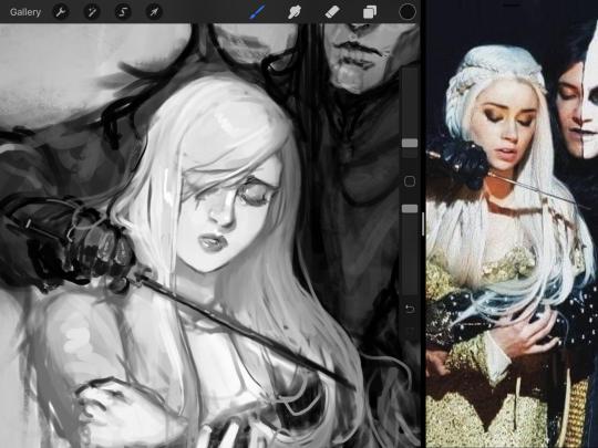
Gwenhwyfar is also a good example of weighted line. Gwen is essentially a very, very pale character. In contrast to Melwas, who is in darker clothing, Gwen is soft, she is the focal point in this drawing. For the little pieces of her hair, the corner of her lips, eyelashes, and her fingertips, I used a weighted line to establish these things, otherwise, Gwen is so pale, she’ll easily be washed out completely.
This drawing of Alice, which I’m still messing around with, is another example of how effective a weighted line can be with depth. The lines I added into her face, eyelashes, creases, hair, and fingers add those little details since everything I’ve done before like Papa Emeritus II was so soft with a low opacity on the brush settings.
Layer masks and curves
There are two ways you can color greyscale images.
You can do this by going into Layer > Adjustment Layer > Curves (this is how it looks like in Procreate).
This gives you a neat ol’ base color! I am playing around in the blues, adding soft hues of blue in their figures and the white in this picture can either turn blue, cream, or even green. You don’t have to use Blue, you can use any of the other colors. For me, I’m always drawn to blues. Another cool thing to play around with is Color Balance, which is underneath the same function as Curves.
But if you don’t have any of these, you can add a new layer, and do Multiply.
The only drawback to this, of course, is how destaturated (the lack of color) it looks. And yes, that’s an issue you will have and I did run into this while doing this. How I combat this is using additional layer masks. Believe it or not, Alice here was once at a grey scale, looking even more desaturated than Gwen.
For Alice’s face, I went in and use:
- Soft Light because she needed more peach and roses in her skin. Omri’s original drawing gave her a light rose blush so I wanted to do the same.
- Overlay to mask out the black lines from the greyscale I had.
- Lighten which I used to make her lips pinker, her apron’s shadows lighter, and parts of her hair brown.
The same went for Gwen, who is, again, very pale. But while she’s supposed to be pale, I didn’t wash her out completely. To add more saturation, I used a combination of Soft Light over my Multiply layer and Overlay to start working at the highlights on her hair, nose, and shoulder.
This little walkthrough isn’t as visual as I like, but with limited software like Fire Alpaca, GIMP, or Paint Tool SAI that don’t have the abilities of Photoshop in terms of color correction and playing around with colors, I really encourage you, readers, to play around with these tools. Using the color picker back and forth, especially after using layer masks, gives you an ability to mix and blend colors. The reason why I work with greyscale or a maroon under paint is that you can create brilliant colors and make a new palette; the trick is to constantly mess around with them. I never go in and flat out color anything, with the exception of things like “angry doodle corner” which is basically what I call my lazy drawings, drawings where I’m just honestly goofing off with.
So in summation...! Or me trying to summarize this.
Experiment and explore with layer masks and adjustments. Whoever says that using these tools isn’t real art, they’re wrong. And please don’t ever be afraid of using references of any sort! Alphonse Mucha is saved ten times over on this computer.
#my art#tutorial#i think#an attempt was made#digital art#procreate#ipad drawing#ipad pro#Alice madness returns#alice liddell#american mcgee's alice#alice asylum
8 notes
·
View notes
Text
Development of our logo
As a group it took us a while to nail down the exact name that we wanted, that would fit around our vision and purpose perfectly. Some of the names that we thought of was pod, which we wanted to use as we wanted the shop to be a 'pod' for people to enjoy and have a completely immersive experience, where people could 'create their own pods' in their wardrobes. However this has been a brand before and we felt like the name was quite cold, when we wanted out brand to be fun, warm and exciting. The second name we thought of using was Iris, as we saw this as quite a feminine name however thinking of the visual to match it was quite difficult. As we thought of having a an eye standing for iris but with an iris flower within but that felt too complicated and not many people would get to see the actual iris, on the other hand an actual iris alone is quite mature, and made us think of an older woman.
Our last and final decision was on the name Libby, we got this from the vision and purpose of our brand being centred around the liberated woman. Our first idea was Liberate, however there was other brand with this name and we still felt as thought it was slightly cold, and we wanted to humanise the brand slightly, therefore we took the name libby from this. The main idea of Libby being the liberated women but 'anyone can be libby', this opens up the brand so that everyone feels included and it felt like a good way to connect the consumers and feel at one with them. From this point I started to develop the logo.
From Will Parslow he gave us tips on which logos we could choose from;
Wordmark: A logo with just a name such as Disney Or Subway
Letterform: The letters of the brand used in an aesthetically pleasing way such as EA or McDonald's
Emblem: Like a crest where you have the logo and also a background or symbol to go along with it such as Harley Davidson or Starbucks Coffee
Pictorial mark: this is a image that is based on the logo itself, for example the shop Target uses a target as their logo and Playboy Bunny users a bunny as their logo
Abstract mark: this is an image that isn't so literal to the brand name but still represents the barn name in some way, for example The Olympic Games logo being the 5 rings that represent the five continents that are involved in the games.
To start getting used to illustrator, we received a presentation from Will, opening up our workplace in essentials classics and starting to practice with the different tools. Firstly we started off with the pen tool in making a flower, this was my result;
I did struggle to get the hang of this tool resulting in me not being able to complete my flowers, as in found it hard to use on my tack pad, however if I was to use this tool again I would definitely use a mouse instead of a track pad, as it makes it easier to manipulate the lines. However I did find the next tools easier to use, using the shape tool to make a grid and then the live pain to tool to draw a smiley face, I enjoyed they way these turned out and they made me feel like I was getting the hang of how to use illustrator properly.

We then had to get used to using the fonts and outline tools, as this could be a big part of making our logo, here we were asked to choose a font, write our name and ungroup the letters to be bale to move our names around. This is the result;

I liked arranging the letters however I didn't like the font I used for the smaller name, and even though the font choice wasn't that important for this task I learnt not to use that font again, as I find it quite boring and that one nor the bigger font would match with our brand. For the last task we learn how to use the path finder and share builder to create a stop sign and a target, two tools that would more into play while making my logo, and at this point if felt that i was ready to make my logo while the tolls were still fresh in mind.

After these tasks set by Will, I started on making the logo, however before this I looked into graphic designers who had made logos before to try to get tips. I looked into Eric Hu as a reference point, who created the branding for Nike Lab, SSENSE Montreal, Margiela's brand identity, and Mold magazines issues. He talks about his design process being all trial and error "Robofont, Figma, InDesign… I'm just drawing boxes, plotting points, and moving boxes 80% of the time. My sense of composition is what I like most about myself, and what I feel is something that is solely mine...I feel like uncertainty about my work often motivates me to work harder and take in as many different perspectives as I can. Making and editing are separate processes." This is where I decided to start drawing up some sketch ideas for out logo on procreate. My first idea was to draw up different fun shapes for the brand behind the idea that anyone can be Libby, people of all shapes and sizes, and people that fit into all different moulds, but along side this we want out brand to be fun, with exciting patterns to bring excitement to peoples everyday wardrobes, therefore having fun branding was key. I used the pen tool to draw up these shapes, and then used another colour to draw the name Libby inside of the shapes, to see the different size of lettering that would fit.

My favourite outcome were the top and bottom logos, as I felt the name was clear however the middle names felt messy, I did like the quirkiness of them and the fact I hadn't seen the letters in that shape many times before, I still feel as though they might be harder to read on quick glance, and possibly hard to translate onto illustrator. To choose between the top and bottom designs I decided it was a good time to take them to illustrator to start testing out some designs and what I could do with the tools.
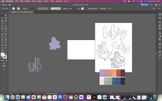
By using the paintbrush tool I started to draw around the lettering and the shapes, on top of this I used the eyedropper tool from the WJSN S/S 23 full spectrum, which was chosen trend, to create the colouring for the brand. Will also used a photo of a model to show me the best way I could precisely use the paint tool. Next I started to practice on more shapes;

I started to play with the different colours and started to mix and match the lettering from the different sketching to see the best outcomes, just as Eric Hu did, as it's all about inspires the process of my designing to make it better as I went along. However I did feel as though it still looked slightly messy and wasn't looking the same as how they did in my first sketches, this was because the paintbrush was thicker than they were on procreate, therefore I thinned out the paintbrush and carried on practicing on the lettering but also the background shapes.

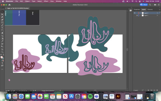
I wanted the lettering to fit perfectly inside the shoes because I felt the outline being a different colour as the shape, therefore giving the illusion of the fill of the lettering being different from the outline. I did this by testing out the colour matching and how well they went with each other. For example I really liked the green colours, as its a very trendy colour for the time as its a very contemporary colour that we see in many places in our lives and also not too girly as even though or brand is a feminine brand we didn't want it to fit into the box of really hyper feminine, as we wanted more out of the box patterns and colours, so I felt the use of the pink and red many of been too much. However I really like the green background with the pink lettering and though it could be used not only in the logo, but also in the garments and a key colour-way. This very much influenced my final decision;

Fist of all I chose this lettering as I felt it perfectly represent the brand, with all of them being different sizes you could see the first b being tall and the second being shorter, or the some of the letters being bigger and smaller that one another, however they all come together to create one Libby. I also found that the name was easy to read but not boring, whereas some of the options I toned down the fun shaping to make it easier to read even though I don't complete think that had to happen. For the background shape instead of using a pre drawn one from pro create I grouped my letter together and again used the paintbrush tool to draw around them, creating this final shape, then switched the colour from outline to fill, with the green colour I found the most effective. My final steps was bring the lettering to the front using the arrange tool and then grouping the shape and letters together using the group tool, this created the final logo we chose for the brand. From this process I was happy with the journey I went through while creating it and it showed me that it was a lot of trail and error it seeing which logo went with our vision and purpose more, in which we chose and emblem, as its not just a word it also has a background on it, which I felt was best as just the brand name didn't imitate the fun of the brand, but just having a pictorial mark or abstract mark took away from the brand being a name and anyone being able to be libby, as a photo of 'libby' would create a visual of her which we didn't want.
If I was to make a logo again I wouldn't try to be so complex in choosing the name and logo, as at the start I felt like I wasted time trying to create a logo that exactly meant the name such as the ideas for iris being an eye with an iris flower inside, which is and very name specific logo that could of ben hard for a consumer to understand if they didn't know the brand well. Sometimes it is better to go with a more simple and too the point design even if it has hidden meanings, as this is more eye catching and straight away you know what the brand is going for with it.
0 notes
Text
Don’t Panic Sticker Design (One)
Here, I’m going to produce six sticker designs so that I can use for my Don’t Panic packs. I started by going onto Pinterest so that I could so ideas on what I could draw for my fear. I started looking, but I found it hard to find anything that I could turn into stickers. The reason for this was because stickers don't have to be too detailed as they are very small meaning lots of detail isn't the key to a successful design. Below, you can see I have scanned in my drawing which I have previously drawn, and I have then cut out a certain part of it. To do this, I used the ‘magnetic lasso tool’ in Photoshop. This tool meant that I could drag my mouse around the lines that I have already creates and the tool will go round them. As you can see from below, that there are some gaps where the tool didn't quite go where I wanted it to go. This didn't really matter because I could use the ‘pen tool’ to fix the gaps. However, I wasn't sure that I liked this design as although it is an interesting shape, I don't think it looked as effective as I was hoping.
I then tried to create a circular shape as I thought it might look more professional with a neat shape. I created this sticker by, placing the whole scan onto the page where I then used the ‘elliptical marquee tool’ to create a circle in the size that I wanted. Next, I moved the circle in the exact place which I chose the be the centre where you do this while you’re still on the ‘marquee tool’. Lastly, you would then copy and paste it. I think this did improve the overall effect; however, it almost seems a little too boring now.
I then tried to use the drawings from when I was previously drawing them for the designs. I found out that because the size that I drew the stickers onto the paper, that it is now pixelated because I have tried to increase the drawing in size. I was worried this was going to happen. I now couldn't use this sticker or any of the other stickers I drew on the page from before.
I then decided to look back on Pinterest to find any other ideas that I might have missed before. An idea came to my mind that, when I researched into my fear from quite a while ago, that I listed some of the effects from this fear. I looked back on this research to which I realised that I could draw some of the effects of the fear as my stickers. This could work because my drawings won't have to be too detailed. I then generates some ideas that I could draw for the effects of this fear (https://www.pinterest.co.uk/Libbym220/crowd-ideas/).
I thought for my first sticker that I could draw someone hugging someone else because one effect is clinging onto someone. I found this image below, where I thought I could just draw the hands because that's the main part of this idea. I went onto Illustrator to use the ‘pen tool’.

This is what it ended up looking like. I didn't draw any shadows or highlights from the arms or hands because as this is sticker, it doesn't need to be that detailed. I also thought that the arms would standout more and get the message across easier if it was all just one colour. I felt this was alright but I don’t think it really captured the idea very well.

I then decided to keep this previous design but I wanted to see if there was anything that was a bit more effective. I found this image and started drawing around the main parts of the people.

This is what it ended up looking like. At first, I thought that having the hands and arms a different colour from the rest would clearly show what aspect of the drawing it is trying to show. I found that this didn't work as well as I wanted because the two bodies joined together and then looked a bit confusing on it is actually is.
I then decided to add a stroke to all the elements that I have just drawn with the colours being the colours I used for the poster and postcards. I think splitting the objects up a bit more helped to make it less confusing.
I then brought my design over to Photoshop where I added a stroke and outer glow to the design. Doing this then gives the professional look of a real sticker design. To do this, you go into, the bottom right settings and click on ‘stroke’. This will then bring up a tab where you are basically controlling how much of a stroke you want on the edge of your drawing. The only negative of this setting is that it only does the outer edges of the drawing and not anything in the centre. For this drawing, this setting would have been handy. I chose the ‘size’ to be 15px with the ‘position’ on ‘centre’. You can look at the left side of the tab and there are loads of different option but now you go onto ‘outer glow’. I then had to play around with the settings at first to understand what they actually do but I ended up having the opacity on 100% with the size around 100px.
Below, you can I have tried out different methods of presenting my design. The first design, I have made the strokes quite thick. I had to do this on Illustrator as it wasn't possible to do it on Illustrator. I felt this thickness was a bit too much as it didn't need to be that thick. I also knew that if I made this sticker thick then the rest of them had to be the same for the whole design to work. The second one, I mad the stroke around the edge thicker than the centre lines. I did this by making the thin lines like that on Illustrator and the thicker one on Photoshop. I then decided to take away the stroke completely from the middle and just have the outer edges. I wasn't too sure about this the actually drawing doesn't standout out as much.
I ended up with this as my final design for the first sticker to which I think worked the best. This is similar to the centre design above but I increased the stroke slightly. I also decided on these colours as I felt they stood out more compared to the previous colours I chose. I only changed the arm colour to green but I feel it made a massive different because the colour is darker than the red which I what made it attract your eyes.

0 notes
Text
This Computer Mouse Combined With a Telephone Once Made Sense. Kind Of.
A version of this post originally appeared on Tedium, a twice-weekly newsletter that hunts for the end of the long tail.
“An iPod. A phone. An internet communicator.”
These were the words Steve Jobs used to describe the first iPhone immediately before introducing it during a landmark keynote in January of 2007.
Of course, it was a single device, and it combined all those things—and more—into a slab of glass, metal, plastic, and silicon.
Convergence can sometimes be amazing in practice—the new Raspberry Pi 400, which shoves a whole computer in a tiny keyboard, has been getting some good notices in recent days.
But not every attempt at convergence makes much sense. Sometimes, it’s just hilariously misguided.
Let’s discuss why we combine things—even when they have no business being combined, such as the computer mouse with a built-in telephone.
That product, I promise you, exists.
Why convergence often means things get combined when they shouldn’t
In many ways, the iPhone represents the ideal pushed by a generation of techno-futurists, many of whom had an idea of what the end result might look like, if not the actual result.
The guy who came up with this idea, way back in 1978, has cast a long shadow over the technology space in general. His name was Nicholas Negroponte, and the MIT professor came up with a concept that was audacious for 1978 but seems absolutely pedestrian now. Effectively, it’s pedestrian because of how right the concept was.
Negroponte, with the use of a group of circles, posited that the major information industries of the time—film and television, printing and publishing, and computers—would eventually start to overlap more completely, to the point that their missions and goals were basically the same.
I don’t know if you’ve used Netflix recently or read The New York Times on your computer, but this 41-year-old theory proved more insanely correct than anyone might have imagined during the days of Three’s Company and “Disco Duck.” Negroponte had given voice to a trend that has basically dominated modern technology over the past four decades. And it has shaped not only Negroponte’s life, but also the university in which he works.
In 1985, a little more than five years after he started giving voice to this prediction, he helped found the MIT Media Lab, which effectively is this general concept of convergence in academic form, essentially built around the idea that divergent disciplines will essentially merge together.
“The idea was marketed to the broadcasting, publishing, and computer industries as the convergence of the sensory richness of video, the information depth of publishing, and the intrinsic interactivity of computers,” Negroponte wrote in his ’90s book Being Digital of the Media Lab’s creation. “Sounds so logical today, but at the time the idea was considered silly.”
Helping to make the sale was The Media Lab, Stewart Brand’s 1988 book that helped to explain the concepts to a broader audience.
“Negroponte’s vision: all communication technologies are suffering a joint metamorphosis, which can only be understood properly if treated as a single subject, and only advanced properly if treated as a single craft,” Brand wrote. “The way to figure out what needs to be done is through exploring the human sensory and cognitive system and the ways that humans most naturally interact. Join this and you grasp the future.”
Negroponte has made his voice known on these issues in other ways as well. Wired magazine, which he was an early investor in, gained much of its philosophical vision from Negroponte’s early columns, while his heavily hyped One Laptop Per Child (OLPC) effort is seen as something of an ambitious bust, though it remains active to this day.
(And—it must be noted, because it’s important—Negroponte faced significant controversy a year ago for his comments about the MIT Media Lab accepting money from Jeffrey Epstein, a controversy which led to the departure of the Media Lab’s director at the time, Joi Ito.)
No matter what to make of Negroponte’s legacy at this time, he is ultimately tied to this idea that has defined how we look at technology—that things that were once separate will inevitably combine and take new forms, with the goal of eventually converging into a single object.
The iPhone may be the best-known example of this, but so many examples of things that tried to merge different technological tools together, to mixed success and even failure. For every Roku, there were dozens of false starts in bringing streaming video into the living room in an efficient way. Video-editing tools once required lots of hardware and software, and a giant suite like Video Toaster was once seen as revolutionary; now it can be done, quickly, on a smartphone.
I’d like to call this kind of innovation, the type that happens before a Roku or iPhone comes along to make things easy, “messy convergence.” It’s what happens when something is clearly designed to help build upon a potentially innovative idea, but it does so awkwardly, in a way where the seams are very much showing. It’s not a slick product on a stage. It’s a jumble of wires on a workbench that barely works but shows a bigger idea is possible.

Image: Wikimedia Commons
In many ways, the original OLPC, forever tied to the guy who helped to popularize convergence, is a perfect example of the messy part of convergence in action. It was a lovely device in many ways ahead of its time, but it promised the world at a tiny price point.
Still, there were things it did that would become much more common a few years later—anyone with a 2-in-1 laptop likely has OLPC to thank for creating a mainstream example of the form factor. With wireless access, a screen that worked well even in sunlight, and a design that was both light and rugged, it stretched far beyond what most computers could do at its price point because it started by trying to solve a different problem than, say, Steve Jobs was.
And there were things that it just couldn’t do. It never got its much-ballyhooed crank, however, nor the ad-hoc networking capabilities that sounded good but were ineffective in real-world use cases.
So why all this thinking about convergence? Well, I found an incredibly weird device on the internet recently, and it made me think about how much we often “screw up” convergence before we get it right.
Let me introduce you to the Tele-Mouse, a friggin’ mouse with a built-in telephone.
NOS
A common term used on auction sites to describe items sold as “new old stock.” This term often is in reference to stock that never sold to consumers, either because of commercial failure, supply chain problems, or because an item was overproduced. (Two classic examples of tech items that frequently appear in NOS form on auction sites such as eBay include the TI 99/4a computer, which was discontinued somewhat suddenly after Texas Instruments lost a price war with Commodore; and the Aladdin Deck Enhancer, the NES add-on, affiliated with Codemasters, that was sold on home-shopping networks.) The Tele-Mouse, which we’re talking about here, is but one such example of a NOS item floating around eBay and similar sites.

For people who want to own a mouse with more buttons than an Atari Jaguar controller, here you go. Image: Ernie Smith
Why there was a time where a mouse-telephone combo seemed like it made sense … to somebody
I’ve seen a lot of weird things over the years, but never has it struck me that there might be a market for a computer mouse with a built-in telephone.
It’s not something obvious, right? After all, the image of someone putting a computer mouse up to their face seems undeniably silly. Even using one as a speakerphone feels like a bit of a stretch.
But nonetheless, there was a short period in technology history where it kind of, sort of, maybe made a little bit of sense. That period was between the years 1998 and 2000, when many computer users were getting online on a regular basis for the first time, often on phone lines in which actual telephone calls were competing with modems that were saturating the line at all hours of the day.
If you didn’t want to get up from your desk just to take a call, why not take it from the speakerphone inside of your cursor machine? That was the apparent line of thinking behind a device called the Tele-Mouse, which came out around 1998 or so.
This, my friends, is an excellent example of messy convergence. The person who first came up with this idea, whomever it is, made the realization that we would be taking calls from the same general area where we’d be using our desktop computer … but they solved the problem in the most wrongheaded way possible. The solution was not to add a speakerphone to the mouse; the solution was to put voice calling, and later videoconferencing, capabilities into the computer itself.
The issue is that there was a clear limitation to doing a conference call over the internet in 1998, because home modems spat out a minuscule amount of bandwidth, barely enough for a single voice, let alone two.
So, having done some research on this device, here’s what I can tell you—it was part of a mini-trend. This specific device was developed by a Canadian company named Curtis International, which still exists today and often sells products labeled with RCA and Sylvania brand names, among others. (Another company named Curtis that existed during the same period and also specialized in computer accessories was not involved.)
This particular device was sold at cut-rate retailers like Value City, and ultimately seems to have been sold to people who don’t usually buy gadgets. I mean, just look at the box. Does it look like something a serious gadget nerd would buy?
In many ways, the Tele-Mouse isn’t even in the same league as the OLPC on the innovation front. But Curtis International wasn’t even the only one to think of this idea. Some of the largest technology companies in the world have patent filings implying that they at least thought about releasing a device like this.

A patent drawing for the Micron version of the telephone mouse. Image: Google Patents
In 1998, Micron Technology—today one of the largest manufacturers of computer memory, but back then a PC manufacturer—filed for a patent for a computer mouse with a built in telephone handset; unlike what Curtis developed, the Micron handset literally unfolded, revealing a full-fledged telephone.
They were far from alone: Dell also filed for a patent, as did Samsung (outside of the U.S., as far as I can tell).
Fittingly, Sony has the best example of this type of device. Image: Sony Vaio press photo
A more interesting example of this comes from Sony, which released a device called the Vaio Mouse Talk, which removes the necessity of a phone line connection, and instead allows calls to happen over Skype. (It also removes a lot of cables, because it works over USB, allowing functions to be combined.) That seems to have been released a mini-generation later, and perhaps a step closer to actually being useful for regular people.
But ultimately, we don’t take phone calls using our mouse. We use video, or our headphones, because we’re not obsessed with the idea of a phone having to work like a phone, but we want a way to use our voice to communicate.
One might look at the Tele-Mouse and think that it represents the ideal of the “As Seen on TV” generation—in which convergence happens in ways so minuscule that the innovations come off less as useful and more as an excuse for novelty.
And certainly, at first glance, that’s what I thought. But then I realized that real companies with real brand names also went down this road and tried this exact same stupid idea of combining a device for calling your boss with a device adept at playing Minesweeper. The difference is that most of them played with this idea and never let it leave the R&D department.
In much the same way as an iPhone, a telephone mouse combines user input functionality with communication functionality, even if it did so in the most functionally useless way possible.
It was a bad idea, but perhaps it was an essential one, in a way—because it showed us what we shouldn’t do when it comes to innovation.
“If all you want to do is send hard-copy faxes, a fax modem system is overkill. And for many electronic files, a standard data modem may be sufficient.”
— Byte writer Don Crabb, describing the value (or lack thereof) of the fax modem, which can accept faxes in digital form and, in combination with other computer components such as a scanner and printer, handle the hard-copy form as well. This approach, which appeared on Macintosh computers around 1988 and 1989, was even natively supported by Apple, which sold a $699 AppleFax device. Despite his skepticism of the concept at first, he ultimately came around after reviewing the devices—though he found AppleFax, the most expensive of the three he reviewed, to be the least capable. “I am convinced that these products have a legitimate niche alongside standalone fax machines,” he wrote. The fax modem is one of many great examples of how convergence can often look messy and complicated in retrospect.
Five examples of “messy convergence” in action
Google Glass. This is such an obvious one! Clearly this device attempted to bring the basic concepts of wearable computing and augmented reality to the potential masses, but the problem was that nobody thought of a use case for the thing, and even the die-hards eventually took the devices off. I actually wore one of these around for a week or two a while ago, and let me tell you: It sure felt like a glorified camera to me—and at some point it makes more sense for this functionality to be inside of a smartphone.
CueCat. The idea that people would want to scan information into their computers from their printed reading materials was absolutely astute, but the problem with CueCat, a late-’90s device that was literally given away to millions of people, was that the computers we had to use with the barcode scanners were simply too big and cumbersome to actually make this a useful thing. It would take smartphones and QR codes to make this general idea functional.
Mobile ESPN. People who are really into sports want up-to-the-minute scores and news updates, yes, but do they want it enough to pay more than $60 a month for a dedicated phone plan? That was the bet ESPN made in 2005, when it created its own mobile service, complete with custom feature phones. It failed, but as Motherboard reported in 2015, it may have secretly set ESPN up for digital success, as many of its ideas were basically perfect for the smartphone age. (Side note: The promotional site for Mobile EPSN is still online.)
Palm Foleo. A few years after the iPhone came out, Steve Jobs made it up on the Apple stage once again to tell phones that there was a need for a third device between desktop computers and smartphones … a device that turned out to be the iPad. This must have felt like salt in the wound of Jeff Hawkins, the founder of Palm, as his company’s Palm Foleo, a 10-inch subnotebook, based on Linux, for checking email or surfing the web without having to carry around a larger device, was heavily criticized for not being more full-featured. (Even Jakob Nielsen took a shot at it!) It was cancelled before it first came out, but almost immediately after that happened, netbooks—the very line of device the product was trying to introduce—became popular.
Samsung Galaxy Fold (the first one): The company has since come out with a better version of this device, but the original, easy-to-break version is an excellent example of a device that feels like it’s on the cusp of something amazing—combining a large screen into something pocketable, helping potentially pave the way for the future where one fewer daily device is necessary. In a few years, it will likely stop looking like messy convergence and more like actual convergence.
The above products, some of which were released, others which likely will never see the light of day, highlight how technologies that seem seamless today sometimes emerge into the world with seams all over the place, looking awkward as all-get-out.
Some are failed experiments in which those experimenting admit that they didn’t get it right; others are ideas that just need a little bit more time in the oven.
Eventually, someone, or a group of people will come along with just the right level of polish to hide the seams away from view. So, did I write this piece just to trash on a computer mouse that has a built-in phone in it? Perhaps that’s where I started. But then I realized that it was perhaps a stepping stone. Maybe a misguided stepping stone that might cause you to twist an ankle and fall flat on your face, allowing the information superhighway to trample you before you can get back up again.
But that’s the nature of convergence; keep experimenting, and eventually the circles will overlap.
This Computer Mouse Combined With a Telephone Once Made Sense. Kind Of. syndicated from https://triviaqaweb.wordpress.com/feed/
0 notes
Text
Pacy Pacy Push
I wish I knew enough poetry to understand the significance of the line break, or whether that significance really did change over time as I imagine it did, in the transition from registering some shift of timing in a mostly oral tradition to being the more disembodied, ambiguous component of a textual one. I think especially of the gradual shift from the manual carriage-return of a typewriter into the return key, one which could sit along the keyboard with all the regular characters in a way which emphasized its interchangeability as a text-symbol with all the rest, being added to the list of combinatoric possibilities inherent in all those discrete little boxes. I don't know if poetry is now primarily a typographical convention but I think that's how most people currently grow fully aware of it for the first time - not by reading something but by playing around with the return key in some word processing tool, realising the hazy received image of "a poem" can be applied in ways which are real and surprising, realising that sometimes a couple of presses of the return key are enough to turn potentially any possible text into a new one which can be read in a different, potentially more intense way. The suddenness and arbitrariness of the break gives the sense that anything can be broken up into more or less interesting fragments, while the associations of the line break with other forms built to knit together such fragments (grocery lists, paraphrase books, newspaper columns, etc) suggests the same might be possible with all this new material. At once the sense of estrangement, of old material experienced in a new way and with new possibilities opened up, and also the sense of reconciliation, of being able to re-house all the various scraps of attention and affect thrown up by everyday life in some new and durable structure, one which could continue to highlight their specificality while at the same time allowing them to be connected to other forms of experience and of being. Of course there might well be minor issues in practice, as you find the line break alone is not wholly sufficient to connect ALL forms of material in an interesting way without further refinement, but the shape of it is there, something simple enough but with enough potential that you could keep fine-tuning it forever, deeper and deeper without ever hitting the floor....
Since this is a videogames blog I will spare you having to wait for the inevitable segue into Platform Masters but I guess the value of a hobby-horse is that it can take you wherever you want. And I DO feel like there's a similarity, for me at least, when pacing and the weird things that happen to it in a game engine have been maybe the central motor that's kept me interested in this format... I think that "interactivity" occupies the same place for videogames as a line-break does in poetry, that they have approximately the same promise and appeal, and that the precise nature and consequence of that interactivity are of less import than the way that it's positioned when breaking up two blocks of content. In another form you have "ah, who's there?" followed by "help, i've been shot!" in a more or less relentless and implacable way, regardless of what kind of metaphorical or POV movements might happen in between. In videogames it's more like "ah, who's there?" followed by the yawning, unfillable gulf of disembodied time while you wait for the player to do something -- or like a space where time ordinarily would be, nothing passing, events happening but in such a modular and indefinitely reproducible manner that it's hard to link them to any actual sense of temporal movement -- just this blank, watchful abyss, as everything seems to hover in place, until you hit the button -- and only then, if you're lucky and whoever's playing it hasn't walked away, do you get "help, i've been shot!". It doesn't matter how brief the pause for input was between them - the fact that control over pacing was, for however brief a period of time, suddenly pulled from the fiction's internal structure and ceded to some exterior presence while the fiction itself sat there doggedly idling is enough to sever all sense of causality between the two events. They both happen, but are no longer connected in time - they float vaguely in the same vicinity as one another, but the order and relation in which they occur is now just a tentative preference among many. Anything touched by the dread hand of agency becomes slightly off, slightly jumbled as a presence - like in Kleist's essay on the marionette theatre, the slightest touch of selfconsciousness is enough to throw things out of whack. Something happens in the transition between timeframes, the game's internal clockwork pacing and that of the player, some hiccup of nonmeaning, which shifts the emphasis of everything around it - like the lines are all there but the cadence is different in a way that's difficult to fully anticipate. Everything takes an extra half a beat to sink in, all the dioramas you put together in the engine become shuffled slightly out of recognition, everything's held in suspense, if only for a second, half a second, before your eyes refocus and everything becomes just what you'd expect. I think the way that different timeframes can intersect and play off each other - the internal sense of timing in a novel, say, or a pop song, versus that of lived experience - is an essential part of how they function as mind-expanding tools, as objects that refract or distort experience in ways which allow it to be grasped better as a thing in itself to examine and think about, and that the main formal pull of "interactivity" for me is the way it gives a whole new set of ways for one sense of time to fuck with and grind against another. I don't think the discrepancy itself has any great import or value to it but it's like that bit of grit inside a clam, the momentary irritation of which is enough to call forth all the snot of consciousness in the effort to contain and re-frame the invader. Dismantling recieved meanings is only part of the process - the second part is the interminable process of trying to connect them up again, in better and better ways, and the constantly expanding museum of failed prototypes that results is maybe a more accurate and interesting depiction of how the mind deals with the world than efforts at personal "soul searching" can ever truly stand to admit.
I'm interested in form in videogames but it's always form of a type that's always disavowed, which you could call the form of practice. I'm thinking about kids cracking open Game Maker or RPG Maker for the first time and discovering some basic effect that "works", that is compelling in some hazy and dubious way. It's fun to walk around the map as a little guy - great! How can I sustain that experience, how can I amplify it? Let's add more and different places where you can walk around, let's add text to give a compelling emotional arc to walking around, let's put in little setpieces to break up the walking around part so that it feels even more refreshing when you finally do get to walk around again. All recieved ideas pulled arbitrarily in from what's around you in the effort to plug some glaring void in the affective landscape, some experience you don't know how to deal with. Sometimes the indiscriminateness of the pieces thrown in can themselves lead to interesting or charming juxtapositions, but mostly it's not enough, and the question of form comes in again as a potentially infinite set of strategies not just for ordering and organizing some experience but also for trying to connect that experience to other conceptions of value, or experiences of the world, in a way which necessarily involves reconsidering those other conceptions and experiences in addition to whatever you were originally trying to draw out. I think that form is most interesting when it's most visible, and that it's most visible as a set of transitory Mouse Trap-esque attempts to outflank the unknown. Less the value of some specific form than the formal imagination in itself, as it multiplies some benign little experience into universes of alterity, block worlds, lava worlds, ice worlds, on and on... not some fundamentally illustrative attempt to use form to express some preexisting (usually banal) thesis but an approach that would make use of the material, external element of something existing as a work in itself to examine the sparks of thought that the brain throws off as it butts against a particularly recalcitrant wall, sparks which are rarely confined to the work itself but tend to seep into and mutate within other corners of the waking life. I think one of Jack King-Spooner's kickstarter updates around Dujanah was about a minigame where you battle your way to the top of a tower because "there's something satisfying about that kind of structure." I agree & think there's something about the image of this spectral tower, hovering in the plane of forms as a potential container and reshaper for anything and for for nothing in particular, which is more plaintive and more valuable than any more specific or metaphorical usage.
I guess this whole thing is an attempted answer to the famous "why is this even a game" perennial - not just to the idea that anything which doesn't revolve around "choice" (ideological buzzword of the Californian Ideology) is not sufficiently attentive to the properties of the medium in which it's working but also the idea that flatgames, visual novels, walking sims etc have to remain as mute "experiences" without any further formal or theoretical interest as structures. But I think part of it as well is that I don't feel very interested in any medium-specific criticism, or the effort to imagine some magical new feature in whatever format most interests you that has never before been seen in any of the other ones (the absence of which does not seem to have been missed particularly in the millenia of human experience before it was invented). I suspect that following computer games and VR and whatever else we'll start to see an uptick in the rate at which these new media are discovered from within the tech industry, and also an increase in the extent to which they're owned and controlled from the beginning by those interests, eager to demonstrate their total newness to the stockholders and to consequently throw under anything which doesn't stay on-brand. Maybe this is paranoid, but I'd appreciate an effort to de-value "the medium" a little bit, to undercut the idea that these magical alien formats somehow have some intrinsic property of value to mere human concerns (theatre is about... time! film is about... motion!) rather than that they're idiot, mute refractive materials which were pressganged into human usage according to both historical opportunity and the usual contradictory morass of motives within that. So I don't think the interactivity of videogames is very new or else that the dissonance provided by that interactivity is very new. Better to think of it like the carriage-return key: the sudden new emphasis on a property already latent, and the new accessibility of that property to bored and toying kids, waiting on chances to scheme.
10 notes
·
View notes
Photo


Time for another batch-answer!! Sorry if this is impersonal but I didn’t want to spam people’s dashes!!
1. Yes I like to try and avoid white backgrounds when I can! Even if it’s just a simple block of colour.
2. This is a FAQ - I use Fire Alpaca, which is amazing and free for the PC and Mac. I’m not sure if it works on a Chromebook but I assume it does? You could also try Medibang Paint which is very similar and also free!
3. Congrats!!
4. My animation professors have told me that if you’re doing it properly you actually should lose track of time - something about using the right brain. References are ESSENTIAL to creating accurate art, so yes, they are extremely helpful and I’m glad you’re using them!!! DAPGO is a treasure trove :D
5. Yes I think you should post your art!! People will give both negative AND positive feedback - I believe you have to receive constructive criticism to grow as an artist. That’s literally all that working in a studio or for clients is - creating your stuff and then getting revisions (but it has to be constructive, not just empty feedback like “that sucks” or “that’s great”). Please read these posts on self-esteem!
6. Haha I love that phanime, and I’m so grateful @arctoids let me collaborate with her for the third episode!!
7. Hello! Thanks :D There are some ideas on this art challenge list I made here: http://incaseyouart.tumblr.com/post/155100106331/31-art-challenges
8. See answer 5! And don’t focus on notes/likes/social currency so much as creating stuff for YOU and your friends - if you genuinely are happy about the stuff you share, then people will enjoy it more, seeing you’re happy.
9. Thank you!! I have had a lot of practice drawing Phil hahah~
10. My favourite thing about being an artist is creating my own content - like, not original characters because mostly I draw fanart - but seeing inspirational things (like Dan and Phil), having a vision in my head, and being able to translate that vision into something visual.
11. HAHA DID YOU JUST ASK ME FOR EDITING TIPS?! Basically just practice with timing I guess? I’ve been editing videos for like, 10 years now, with various software (Adobe Premier, iSkysoft, Windows Movie Maker, and recently iMovie which is the best ever omg) and each time I learn more about how to cut clips and time them to music, how to add in sound effects, change opacity of the clips etc.. I’ve kind of just been learning it all on my own slowly - I’m sure there are tutorials on Youtube!!
12. It’s okay to take a break! Here’s my advice about getting over art block.
13. http://incaseyouart.tumblr.com/tagged/watercolour%20tips I’ll try to make a video soon!
14. I’m glad you’re feeling better and that I could contribute to that :D Thank you! Have a good one ^_^
15. Try some of my art challenges!!
16. Can you go out to a cafe or maybe a library or some other public venue with table space?
17. Wacom Intuos Draw (Small) is what I use (see my tags about drawing tablets here)
18. Being able to critique your own work is an essentially critical skill to growing as an artist. But you have to balance self-critique with positive feedback - try to find two things good and one thing you need to work on. For example maybe the head and eyes are really well drawn, but you can work on the hands? Seeing your mistakes and then knowing how to correct them is a REALLY really good skill, NOT a bad habit. For tutorials on shading, Google has some good ones - the most important thing is figuring out your light source(s), and knowing the physics (plane changes) of whatever you’re drawing.
19. Yup pretty sure! If you scroll through all my palette challenges here you’ll see them~
20. Just drag & drop the image file directly into the software and it becomes a layer, and then lower its opacity - BUT I WOULD HIGHLY DISCOURAGE TRACING DIRECTLY FROM IMAGE. INSTEAD YOU SHOULD REALLY TRY TO REFER TO/COPY FROM AND MAKE IT YOUR OWN.
21. I would just use a mouse, personally!
22. So, with realism, it’s more difficult because there’s the expectation that all the details and proportions have to be EXACTLY accurate - as realistic as possible - and that takes a more time and patience than a caricature of a human figure/face. But, to accurate caricature something you need to be able to draw it realistically first. So in my opinion cartoon-style is both easier (you can communicate the same body language/emotions with less lines/detail) but also harder because you need to have everything be SIMPLE but also ACCURATE.
23. I often think a sketch looks better than the lineart because with a sketch you are more free as you draw - it is messy but also all the lines flow well and it just looks more organic. When you focus on making the lines perfect or cleaner you lose some of that organic flow. My suggestion would be to do an extra step in between the sketch and finished lineart - so draw your image 3 times - sketch, rough lineart, clean lineart. It might help transition your cleaned version a bit better!
24. Break down the figures into LINES OF ACTION and basic shapes before adding ANY detail at all. Check out my life drawing gestures here!
25. Aaaah sorry I hope I answered in time - regardless of medium you have to break down the face into basic shapes and guidelines before adding any details. Charcoal can blend really well to shade easily!
26. When I have time, yes!
27. Just a simple “hello” would do, I think! That way the person on the other end can greet you back, and then you’ve established a connection without the pressure of thinking of any topics of conversation - you could put the ball in their court, so to speak. Also you could just like and reblog a bunch of content you like, and leave nice comments!
28. Haha I don’t know if any of it is natural talent - it took me 14.5 years of almost constant practicing to get to where I am now!
29. Yay, more fanart!! ALL THE ART!
30. Oh my God thank you that’s so sweet (this makes me think of what people say about Phil Lester because he’s such a ray of sunshine <3)
31. It’s okay to take breaks! Step away from drawing for a while and just write a story, or read, or play outside, or do a sport, or anything else you like! Don’t force yourself to draw!
32. Watch my video on self-esteem for artists and hopefully it’ll motivate you: https://www.youtube.com/watch?v=_5AjCbYrPlk&t=95s You’ll only get better at a skill if you practice it :D
33. I would just get the better drawing tablet first if you can afford it - unless the cheaper one is a good brand like Huion or Wacom!
34. You are improving if you use references, trust me. An easy way to see improvement is looking back at your old art, and maybe redrawing it?
35. Yay! Yeah tools can be common amongst artists - it’s just the level of practice and time put in :D
36. It can take a while to gain a strong following, but keep doing what you’re doing and people will come!!! Keep creating and sharing with the world :D
Thanks for all the asks guys~
44 notes
·
View notes
Text
Photo editor for PC
When I was searching the www for a remarkable photo editor for PC, I eventually stumbled over this very great app
Check this photo editor for PC free download for starters and pros with many powerful functions and smart photo editor for PC for Computer with a lot of useful features to professional blur a photo. Crop images is simple with the awesome brand-new photo editor for PC for Computer. Free download photo editor for PC for professionals or software to edit an image to soften photos and photo printing.
It's hard to find a fantastic mobile phone photo that is taken with a flashing light. Many times, they make a photo appearance past tense, negatively changing shining as well as topics look washed out. When you've taken the image, play with the exposure tool in your preferred photo editing and enhancing software to made the photo a little shinier. Photo editor performs possess several of the functions is known for, which happens rather useful when you've determined you've like to effort your hand on one thing a lot more high end than photos solarization as well as crop photos.
Photo editor for PC can also import stills coming from video, in addition to various documents. As well as when you're really feeling a little bit idle or even it is actually just plain unconcerned concerning exactly how to use a few of the tools, a helper can easily help you adjustment the fundamentals like lights, emphasis, different colors, and sharpening of pictures. For those who like their photographs in wide scale versions, the software application supports you flawlessly put together photos to create a breathtaking image.
And if it's opportunity to reveal off your digital photography capabilities, you may choose with the photograph plan layouts to quickly publish all of them in a particular dimension. Get the photo editor free download for starters and pros with a lot of cool functions and brand new photo editor for Computer for professionals to comfortable saturate photos and practical texts in a photo. Photo editor for Computer or edit image software to rotate images. Free download photo editor for PC for experienced or software to edit a photo to invert photos or create photo collages.
Photo editor for PC download for convenient photos solarization or easy colorize images
This photo editor for PC is most effectively for eager students with a large amount of opportunity in their hands to identify the also technological functions that will terrify extremely very first time picture editing consumers. It likewise happen prepared along with a 360 scenic view plan. Likely the glossiest gem in the strategy would be actually the beautiful skin result, which evens and also eliminates bright places out your skin. Whereas there's no auto color repair work alternative very necessary to repair work the bad lighting up most electronic video clip electronic cameras squeeze, there are still the simple functions of insert objects into photos. One of the most well-known misunderstood components of digital photography is what takes place after you made the photo actually editing your picture. That's the time where you modify the images you have taken, to create the end product. Editing your photos is the equivalent of the darkroom from the time long period of time earlier. We are going to be covering some suggestions for editing your photos, from the essentials like perspective control and create photo collages, via much more challenging activities. The cut out appliance permits you to change the size of your image, and likewise to change the aspect ratio. You can chop a picture from a rectangle-shaped shape to a square form. There are several reasons you would certainly want to cropping, including for posting in various formats and aspect ratios. Compared to the original, I have actually chopped the picture with photo editor to eliminate the colored component of the middle of the pic and also reassembled utilizing the rule of thirds. That makes the darkness screw more the focus of photo shot. You may question why I did not just make up appropriately when taking the shot. So in this situation, I was arranging a long exposure shot with no a tripod, so had actually the video camera stabilized on the side of the jetty for security. That significantly restricted my capacity to perfectly mount the moment, so I simply shot larger, knowing I had to be able to chop the photo shot suitably as a result of the fact. In both situations, chopping is really simple and also it is just includes you choosing the cropping item and also after that picking the location you intend to keep with your PC mouse. You apply the modifications as well as your brand-new chopped picture is all set to go.
Among my own personal scratch nuisances in taking photos is when the perspective contour in a pic is uneven. Often when we are captured up in the moment, this standard rule is forgotten however the bright side is that editing and enhancing your photos with the photo editor to make them grade is additionally extremely basic.
Stabilizing the camera at the corner of the pier meant that the photo was uneven this is especially obvious to the eye whenever the image has a clearly defined perspective line, just like the ocean.
This degree method is element of the cut out technique, and you are able to just rotate the photograph to fit. As soon as you make use of the pointing method, a grid will show up to assist you acquire the positioning appropriate.
Leveling an image is a really basic task that will certainly take simply a few minutes, resulting in a far more visually charming photograph.
In certain cases while we take a photograph, components of the shot could wind up being darker than we want. We describe the brighter areas of the shot as darkness, as well as the colorful locations of the image as high light.
Compare is actually about accentuating the variation in between the light fixture as well as darker components of the photo. Boosting the contrast of a photo can significantly enhance the aesthetic influence that has, by making the boundaries between those dark and light areas clearer.
Coloring modification is one more essential part of the photo editor. We are able to adjust photo color or texture in all type of ways, from changing the general warmth of the image just like exactly how blue or green it appears, to separately altering the hue and interpenetration of details colors within a photo. I only wish to talk about a few really useful color variations anyone are able to utilize to create your photos simply just a bit a lot more aesthetically powerful. The simplest technique in order to adjust the color or texture of a picture is simply using the shade method from the photo editor. This alters the visual appeal of every single color or texture inside an image to make it extra or even much less condensed.
As with numerous edits, the secret is to choose a great harmony also much shading the images often tends to seem instead unusual. Color photography may be very helpful, and also of course light as well as dark is an outstanding choice for all kind of scenarios, specifically, architecture, as well as specific panorama views.
In this moment when I was searching the www for a simple to use photo editor for PC, all over sudden I stumbled over this very great program
Photo editor for PC free download and software to edit a photo to crop pictures
Try the photo editor for PC free download for trainees and experienced with a lot of powerful functions. More info about sharpen an image and image manipulation is easy to handle with the photo editor for PC for Computer or software to edit a picture. Download for free the photo editor for PC for speedy and smart blur a photo. Often times there certainly may be a thing in a photo that you really do definitely not wish to be certainly, there, like a troublesome dark spot on a loved one's face. This is simple to erase in every the main photo editor.
It is definitely no problem to clear away any type of things out of a photo but the photo editor for PC operates well on distinct, tiny things that are surrounded by uniform colorations. This is since the heal tool has to change the area you wish to remove with something else, as well as this works ideal when it has a location close by that looks similar. For example, a pimple on a face is bordered by a lot of likewise colored skin, so the heal tool can easily determine what to replace the pimple based on the bordering area. This specific is actually because the photo editor for PC has to replace the sector you desire to erase together with another thing besides, as well as this works most ideal if it gets an area close that looks similar.
Photo editor for PC has come to be extremely intricate and helpful and it is possible to adjust pictures therefore they come to be completely different out of the original. There are loads of photo editor and wide varieties of means of attaining the exact same or similar effects. My intention very most when it comes to the majority of photographs I post procedure is generally to help make them appear being normal as possible. I have no doubt this is a really good spot to make a beginning, also when you would like to continue on and create much more surreal seeming pictures. Shade variation on an image is just one of the main priorities. You can typically see a broader variety of shade than the video camera can make. The definition of photo editing is the act of reshaping a picture, put simply. Yet that is oversimplifying a subject that is extremely complicated. You can commonly perform basic image modifying strategies like resize a photo relatively conveniently as well as quickly but intricate techniques and also electronic editing and enhancing may require photo editor and even more practical experience. Photo editor is a helper that you able to use to adjust and also boost photos. Due to the fact that images come with a boosting variety of usages, increased services are finding ways to reutilize images as well as work with them on a few media. Download this photo editor or easy photo editor for amateurs to easy soften a photo. Invert images made simple with the nice latest photo editor for PC for Computer. Get this photo editor for photo editor for pc prompt and simple flip photos.
0 notes