#flow selector
Explore tagged Tumblr posts
Visit Tumblr Blog
Explore Tumblr blogs with no restrictions, modern design and the best experience.
Last Seen Tumblr Blogs


Fun Fact
Tumblr has a low social media market share in South America.
Text
multiport flow selector valve
flow control valve fluid path selector https://3d-labs.com/product/multiport-flow-selector-valve/ A multiport flow selector valve directs fluid through multiple channels, enabling controlled selection of flow paths in complex piping systems.

https://3d-labs.com/
0 notes
Text
The theory of operation for my balanced ternary "shift register" is actually pretty simple, though it might not look like it -- once you spend some time in it, so to speak, it's totally grokable.
Ready? This is gonna be looong.
Okay.
First, in case anyone reading this is unaware of what a logic gate, truth table, or the balanced ternary number system is, you'll want to read these three Wikipedia articles to get some background knowledge:
https://en.wikipedia.org/wiki/Truth_table
https://en.wikipedia.org/wiki/Logic_gate
https://en.wikipedia.org/wiki/Balanced_ternary
Second, if you're unaware of how water and lava behave in Minecraft, you'll want to read this article from the Minecraft wiki.
Thirdly, you'll want to read these excerpts (↓) from my notes (my apologies for their quality), where I list my personal conventions and definitions for what is to come.
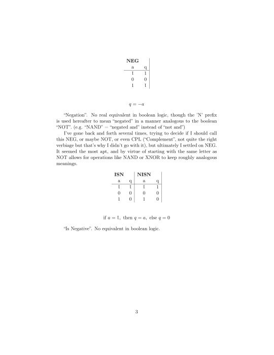

Got that all?
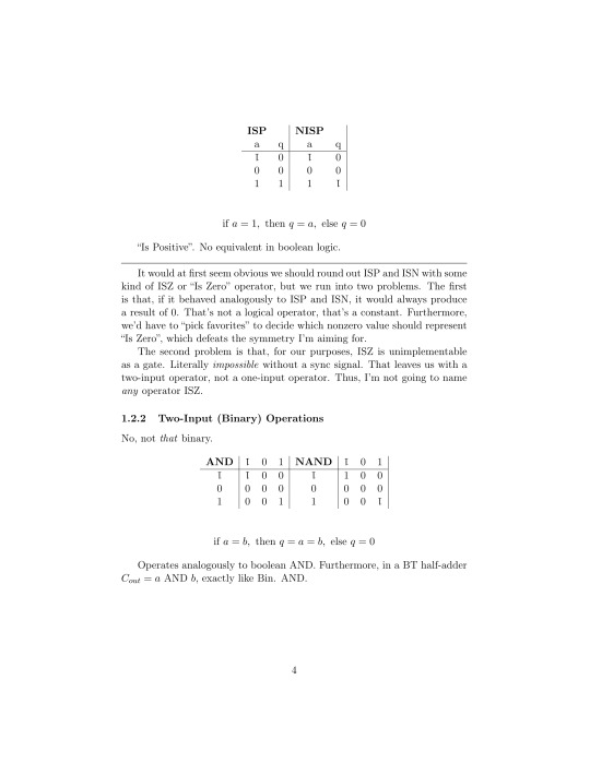
What we want to do now is try to construct some of the aforementioned logic gates with Minecraft's fluid model. Water will be used to represent 1, lava will represent T (-1), and air (neither water nor lava) will represent 0.
Believe it or not, this isn't too difficult. Most of the logic gates I describe above are rather simple to implement -- so long as we ignore the timing constraints imparted by water and lava flowing at different rates, which for the sake of brevity (brevity, lol) we will.
Two of the most fundamental of these logic gates, at least for our purposes, are MAND and OR. They are implemented like this (↓)
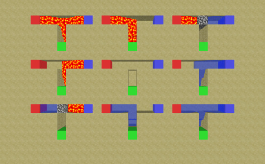
If you're having trouble grasping how these work, and have access to a copy of the game, I encourage you to play around with it yourself! After a while, the principles start to become pretty intuitive.
We can use these "fundamental" gates to construct the rest. ISN, ISP, NISN, and NISP can be made by simply hard-wiring one or the other of the inputs of a MAND gate to 1/water or T/lava. (Not that you'd always want to implement ISP in particular that way--it's actually the third fundamental logic gate and can be implemented via a different principle, but I digress)
From there we can construct NEG, as NEG a is equal to (NISN a) OR (NISP a); from NEG we can construct AND, because a AND b = a MAND (NEG b); and so on and so forth. (Exercise for the reader to derive the rest :P)
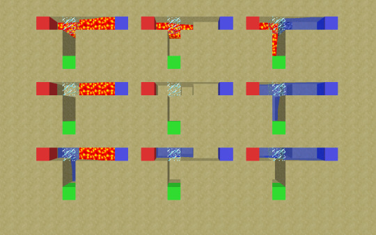
This brings us back to the shift register, which is primarily constructed of these (↓) little circuits who operate analogously to normally-closed relays.
Let the green input be a, the white input be b, and the output be q. When a is nonnegative (0 or 1), b will "pass through", so to speak, and q = b. When a is negative (T), q will always be 0.
Put more simply, q = b OR (ISN a) OR (NISN a). Run the numbers and you'll see how it works!
From there, it's pretty trivial to line a few of these up, tie their outputs together, and get a demultiplexer -- a circuit that takes in some number of inputs (here three) and "selects" one of them to output. Let's look at our demultiplexer now:
Let s1, s2 and s3 be the blue "selector" inputs; p1, p2, and p3 be the white "selectee" inputs; b1, b2 and b3 be the intermediate "blocking" signals (the green inputs from earlier); q1, q2 and q3 be the outputs from our relays; and q (no number) be the overall output.
The yellow and light blue circuitry are our relays, the black concrete is the aforementioned output tying-together (q = q1 OR q2 Or q3), and the blue and red circuitry is... complicated.
Its job, though, is simple: translate a positive "selecting" signal on one of its three inputs (s1, s2 and s3) into two negative "blocking" signals to be sent to the relays (b1, b2, b3).
This is implemented as follows:
b1 = (NISP (s1 OR s2 OR s3)) OR s1 b2 = (NISP (s1 OR s2 OR s3)) OR s2 b3 = (NISP (s1 OR s2 OR s3)) OR s3
In other words, b1 is negative iff s2 or s3 is positive, b2 is negative iff s1 or s3 is positive, and b3 is negative iff s1 or s2 is positive.
Let's work through an example. Say c1 is 1, c2 is 0 and c3 is T, and we set s3 to 1--"selecting" c3.
Since s1 and s2 are 0, and s3 is 1, s1 OR s2 OR s3 = 1 and NISP (s1 OR s2 OR s3) = T
It follows then that b1 = T OR s1 = T OR 0 = T, b2 = T OR s2 = T OR 0 = T, and b3 = T OR s3 = T OR 1 = 0.
Finally, since b1 and b2 are T, q1 and q2 are 0 (relay 1 and relay 2 "block" their inputs from flowing through) and since b3 is 0, q3 = p3 and thus q = q3 = p3 = T.
Got that? Great! Let's move on to the monster then.
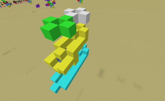
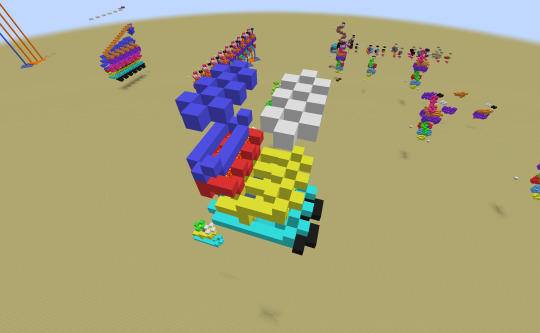
A diagram may be in order.
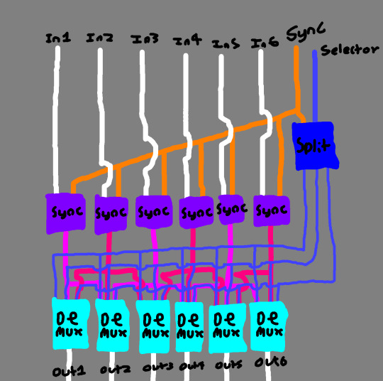
Better?
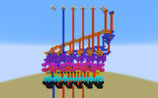
The shift register (again not the correct term because this is a one-time use circuit, but I digress -- they're roughly analogous) is constructed mainly of demultiplexers (light blue boxes), as described before.
Each demuxer is selecting between the input directly above it, the input to its left, and the input to its right. (e.g. demuxer #4 is selecting between In3, In4 and In5).
The signals telling the demuxers which inputs to select (s1, s2 and s3 from earlier) are generated by the "split" box (in blue) from the "Selector" signal. If "Selector" is T, "Split" sends a positive signal to the s1 input of the demuxers; if it is 0, s2; if it is 1, s3.
This is implemented as follows:
s1 = NISN "Selector" s2 = NISN ("Sync" OR s1 OR s3) s3 = ISP "Selector"
The "Sync" signal line (in orange) and circuits (purple boxes) work to ensure the timing constraints and invariants we've so far elided are upheld. "Sync" is always either 0 (wait for sync) or T (resume), never 1.
The purple boxes work like the opposite of the relays we described earlier: they receive an input and only output it after they receive a "Sync" signal.
They are implemented as follows:
q = (a MAND "Sync") OR (a MAND (NISN "Sync"))
Likewise, the "Split" box waits for a "Sync" signal to determine if "Selector" is 0 -- if it "jumped the gun" it wouldn't be able to go back and correct its output, all fluid-based logic gates are necessarily one time use.
What does all of this nonsense accomplish?
When "Selector" is 0, the input is simply passed through; when "Selector" is T, the input is shifted left (Out1 = In2, Out2 = In3... Out6 = 0); when "Selector" is 1, the input is shifted right (Out1 = 0, Out2 = In1... Out6 = In5). This is equivalent to either multiplying or dividing the output by 3.
And that's that!
If you have any further questions, feel free to let me know! Hell, if you managed to read this whole thing, feel free to let me know! (I hope at least someone is able to...)
48 notes
·
View notes
Text
I blogged before about this company, Orange, that is an AI-powered manga translation company. Essentially, their pitch is that most manga is still (officially) untranslated, a ton of manga gets made after all but few become mainstream enough to get ported overseas. They posit the barrier to that is the cost of translation; if they could automate that process, then they can make viable for release what previously was not. That concept rests on two questions - does the tech pan out, and does the economics add up?
Recently they went live, under the name Emaqi, so we can better explore those questions. What I notice on first glance is the pitch seems to have shifted a little bit in post:

You are not the translators of Vinland Saga, Witch Hat Atelier, or Magic Knight Rayearth, very obviously so. They have Sailor Moon in here lol. These are just the official translations being cross-listed into their "manga platform", where you buy it there and it lives, DRM-locked, in their app. Which is fair enough as a model, that is just Kindle, it works. Though Kindle and a dozen others already exist, so their value-add has to be the AI translation stuff right? That is why I would choose this over another app.
Which they do have, though it is kind of buried:
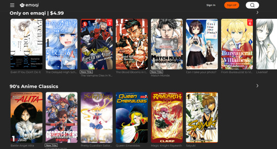
"Only on emaqi" - there is no mention of the translation approach, poor guys! Can't fault the branding decision I guess given the state of the discourse. When it comes to the products themselves, I went through ~6 or so of the sample chapters of different manga, did a few spot checks with the original Japanese, and read the reviews of some others who looked into it. They seem fine! I am cautiously impressed, I think there proofers did a good job smoothing out some edges, it has a "manga tone", and while small issues like the hyphenation the reviewer above mentioned do exist and are legit noticeable, they aren't common and not a huge deal. It has flow issues? Some dialogue should link together in how it is written, but doesn't. But it isn't crazy off or anything. You will not be wowed by these, but certainly if you are someone who reads bootleg scanlations you are gonna have no problems. A lot of manga uses pretty simple vocab and isn't breaking new ground on plot, I can see how a purpose-built tool could handle it well enough.
The economics though...here is where I don't think this case was ever going to pencil out and isn't now. Because I am pretty sure no one here has heard of any of the manga listed above as exclusives. (I saw 90's manga Geobreeders in there, but that was already partially translated in the 2000's, not sure if they did a new one? Setting it aside) Which, of course you haven't, if you had it probably would have been translated! Books are a 90:10 market, most books never get read and some books get read a ton. Anything big enough can justify a professional translation, and the other can't really sell to begin with.
On top of that, their model is mass translation; which means these obscure manga are presented to you with no context, no hype, no build-up. Wtf is The Blood Blooms In the Barrens?? See, if you were like a boutique publisher, selecting "the best of the best" in untranslated manga, you would promote your specific product. Interviews, social media, the value of the brand-itself as a quality seal. Publishing less is more, actually, your value as a publisher is as a quality selector. Or you could be say the porn market, where you max quantity so people can search "foot fetish breeding kink oshi no ko" and get results; they know what they want. But they aren't doing either! And to be blunt a lot of these are not gonna sell on their art alone:

I'm not mocking The Delayed Highschool Life of a Laborer here, that is better than I could do; but if you want to me spend money on a whim the bar is high and these don't reach it. Which of course they don't, they would be professionally translated if they did.
And finally, the price - $5 dollars, for volume 1's, like a 100-200 pages. The cross-listed manga typically sells for ~$10? That isn't much cheaper! If "translation" was this big cost barrier, and all you got is cutting the price of ebooks in half, I don't know if the analysis was so solid. This is a new product, I doubt they are overcharging to make a quick buck right now - this is the "sell at cost to scale" era.
In all of their lead up press they would say things like this:
Orange's process uses AI to read the manga through image analysis and character recognition, then to translate the words into English, Chinese and other languages. The technology is specialized for manga, meaning it is able to handle wordplay and other difficult-to-translate phrases. A human translator then makes corrections and adjustments. The process can deliver a manga translation in as little as two days. Orange will work with multiple Japanese publishers. The company looks initially to complete 500 translations monthly.
But this is missing a lot of context. For one, these manga are simple high school or battle manga that are ~200 pages long, many of those pages have only a few lines of dialogue, etc. Imagine you are a professional translator, and you are given that manga to translate, all the set-up done for you, all you gotta do is write. How long do you think that would take? Not that long! It could probably take like a week if it's actually all you did (calc'd from a 10k word count manga volume, 2k is a typical "good translator" per day count - many manga are shorter than that). And note how they said "as little as two days" - not median two days! Just, you know, aspirationally.
Translation is just not a big bottleneck. You gotta do layouts, lettering, proofs, etc, these can all take just as much time - and are being done by people, they still need wage workers doing all this. But that is small fry in comparison to publishing contracts, author approvals, distribution, all of that. And most importantly, product acquisition - you have to get authors to sign with you! That can be months of work. I am sure they are trying to get bulk agreements with publishers and such, but authors will push back on that, this is not an easy endeavor.
Which is why, in above, they say they hope to have "500 translations monthly". And after a year+ of work, on launch, they have...

...18. As best I can tell at least, their site deliberately obfuscates what they actually translated versus are just hosting for resale after all.
So yeah, as mentioned I don't think the economics pencil out. These aren't worth $5 dollars, they can't actually generate volume that makes "massive economies of scale" actually valuable, and their approach is currently antithetical to the idea of generating traction for any of their individual works. Niche publishing just doesn't work this way.
But it is early days, and hey I respect the experiment! I do think the tech is pretty good, and it is nice to see a company showcase it. It isn't quite good enough yet for prime time, but it could get there. I do want more manga to get exposure and audience; I will give a fair shake to any who try.
33 notes
·
View notes
Text

Tomb Raider IV-VI Remastered: Update #1
The teams at Aspyr and Saber Interactive rolled out the first major update to Tomb Raider IV-VI Remastered, which should already be live across all platforms worldwide. The highly anticipated patch addresses some of the community's most reported issues while introducing new graphics settings—like a brightness slider and retro filter options—and improving many aspects of the gameplay, visuals, UI, among others.
Take a look at the official patch notes below for a detailed list of changes.
General
New Outfits Unlocked: Dive into Photo Mode with iconic looks from Lara Croft's past adventures. Unlock them via the Outfit Selector in Tomb Raider IV and V.
Photo Mode Upgrades: Now includes an Animate option, sunglasses, and facial animations in classic graphics mode.
Graphics Settings Expanded: New Brightness and Retro Filter options have been added to customise your visuals.
Flyby Camera Maker Tweaks: You can now adjust individual cameras when setting up cinematic shots.
Menu Font Adjustments: TR4 and TR5's HD fonts have been resized for better consistency with the classic visuals.
Texture Fixes & Enhancements: Cleaned up textures and improved texture blending to reduce visible seams.
Lighting Fixes: Flares now properly illuminate the environment.
Animation Corrections: Lara no longer animates while unconscious or dead.
Camera Updates: Fixed cameras have been removed for Modern Controls, giving players a smoother experience.
Control Refinements: Improved interaction with jump switches, rope grabbing, and torch handling—especially with Modern Controls.
Ceiling Camera Fixes: Modern Controls camera now behaves more predictably near low ceilings.
Music Behaviour Updates: Music now pauses when you open the inventory, and secret music tracks now layer over ambient sounds instead of interrupting them.
Retractable Trap Enhancements: Items like spikes now animate properly instead of scaling.
Fall Reactions: Lara now reacts with appropriate facial expressions when falling from great heights.
Inventory Frame Rate Fix: Inventory now runs at a smooth 60 fps.
Localisation: Various text and translation fixes across multiple languages.
Tomb Raider IV: The Last Revelation
Visual Touch-Ups: Enhanced lighting, effects, and general visual fidelity across all levels.
HD Loading Screens: Brand new HD loading screens added for a more immersive transition.
Lens Flare: A classic cinematic touch is now back in TR4.
Vehicle Controls: Jeep and bike controls have been smoothed out for a better driving experience.
Geometry Fixes: Filled in gaps in the Tomb of Seth and removed a floating door in Desert Railroad.
Character Consistency: Aziza's HD face model now matches between gameplay and cutscenes.
Environmental Accuracy: Arabic signage in Cairo has been corrected for authenticity.
Music Fixes: The Temple of Horus level now plays the correct ambient music.
Tomb Raider V: Chronicles
Sky & Lighting Enhancements: Updated HD skyboxes and added lightning effects for atmosphere.
Model Updates: Winged griffins and white brick textures have been revised to better match the original game and real-life references.
Boss Fight Visuals: Missing hole textures during the hydra battle have been restored.
Environment Fixes: Corrected visual inconsistencies with doors, grates, and overly bright lighting.
Water Effects: Resolved z-fighting on blood in the Sinking Submarine level.
HD Object Revisions: Treasure, vending machines, and other set dressing have been updated to match classic aesthetics.
Logo Fixes: Mirrored VCI logos have been corrected.
Level Design Tweaks: Corridor illusions replaced with actual hallways, and metal rods restored to match the original look.
Tomb Raider VI: The Angel of Darkness
New HD Assets: Additional characters and inventory items now feature high-definition models.
Hair Physics: Lara and Kurtis now sport flowing locks with dynamic hair physics.
Texture Upgrades: Restored original texture detail and tone while improving HD fidelity.
Water Improvements: Visual updates make water more realistic and fluid.
Performance Boosts: Faster loading and smoother gameplay across all platforms.
PS5 Stability: Crashes when playing the PS4 version on PS5 have been resolved.
Classic Controls Return: An option for the original 2003 console controls has been added.
Story Detail Fixes: Corrected misspellings (like Vasiley's address) and environmental inconsistencies (like signage and texture gaps).
Model Consistency: Corrected visual bugs, including mismatched textures, incorrect lighting, and missing transparency in key scenes.
Environmental Interactions Expanded: Radios now play news segments, and you can practice hand-to-hand combat with a new tutorial in the Parisian Ghetto.
Camera Control Upgrades: Fixed camera views can now be cancelled with the "Reset Camera" button when using Modern Controls.
Achievement Fixes: The "Parkour" achievement now unlocks as intended.
Combat & Movement Fixes: Addressed animation glitches, stuck enemies, and fixed various bugs related to dual pistols, ragdoll physics, and player movement.
Audio Bug Fixes: Resolved issues with missing or looping sound effects and adjusted volume levels after reloads.
Gameplay Logic Fixes: Keypad sounds now play, puzzle sequences no longer break animations, and stats track correctly.
Outfit & Animation Fixes: Switching outfits no longer affects Lara's eye animations in cutscenes.
Enemy Behaviour Fixes: Cleaned up animation bugs for the Cleaner, Boaz, and Kurtis.
Camera & FOV Tweaks: Adjusted field of view to better match the original experience, especially with Tank Controls.
Visual Bug Fixes: Resolved issues with incorrect camera roll, respawning items, broken geometry, and lighting inconsistencies.
Chirugai Updates: Fixed several bugs affecting audio, visuals, and gameplay while using the Chirugai.
Tomb Raider IV-VI Remastered is available on Nintendo Switch, PC via Epic Games Store, GOG and Steam, PlayStation 4/5, Xbox One and Xbox Series X|S.
#News#Gaming#Game Update#Patch Notes#Lara Croft#Tomb Raider#Tomb Raider IV-VI Remastered#Tomb Raider Remastered#TR Remastered#Remasters#Tomb Raider: The Last Revelation#Tomb Raider IV#TR4#Tomb Raider: Chronicles#Tomb Raider V#TR5#Tomb Raider: The Angel of Darkness#Tomb Raider VI#TR6#Classic Lara Croft#Classic Tomb Raider#Core Design#Eidos Interactive#Aspyr#Saber Interactive#Crystal Dynamics#Embracer#Embracer Group
13 notes
·
View notes
Text
Demon Junction AC Style
Finally finished working on this. So, funnily enough, this blog was originally meant to be a fun place for randomizing A/nimal C/rossing like villages before I left you know what fandom. So, I decided to complete that idea using my OCs. I've placed them in a list, some being super rare (one instance on the wheel), some being rare (two instances on the wheel), some being somewhat common (three instances on the wheel), and others being common (four instances on the wheel). The locations, house types, trees, and animal types were created together, inspired by the sections in Heaven and Hell, along with just Heaven and Hell themselves, but put into wheels for the ultimate chaotic randomization. You can find them below.
The Wheels
Villager Selector (max six or ten)
Location Selector (one per villager set)
House Type Selector (one per villager set)
Tree Selector (one per villager set)
Animal Type Selector (one per villager set)
Feel free to share your results! I'd love to hear the funny combinations.
Personality Information
Hell
Cool - Keeps a level head in most situations.
Impish - Playful, mischievous, and loves messing with others.
Fashionable - Sticks with the trends with a bold personality.
Prickly - Guarded and slow to make friends or open up.
Hot headed - Easy to anger and notably whiny.
Mature - Knowledgeable and polite to others, if not distant.
Zealous - Hyper and always looking for new excitement.
Evil - Love watching the suffering of others with big schemes.
Heaven
Righteous - A fighter with great enthusiasm who values fairness.
Laid-back - Relaxed and tries to keep everything low pressure.
Courageous - Thrill seekers who adore new and exciting situations.
Tender - Loving sweethearts who are extremely affectionate.
Skittish - Kind individuals who need help getting out of their shells.
Driven - Focused heavily on success, sometimes too much.
Warm - Encourages everyone to have fun and be their best selves.
Adaptable - Difficult to fluster and easily go with the flow.
Note: Characters may be added to the wheel in the future.
Prompts
You all asked for it, so here it is! Prompts you can use to write with the villages you get. Please tag me in your posts!
Prompt wheel
15 notes
·
View notes
Text
Last Sprout Dev Diary - Dec 13, 2024
Hello again! It's still Upgrade Month for us on Last Sprout, so this week I've been focusing on in-run progression, leveling up, and applying upgrades to the player.
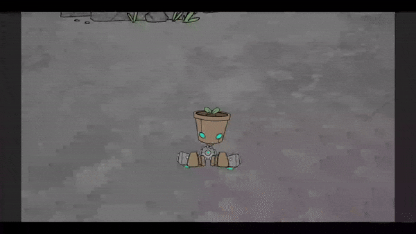
Twiggs has gained the ability to Chill
Going to be a short post this time around, the level up flow is still going through some serious growing pains, and things aren't really solid yet, so anything I say could very easily become irrelevant in a month. Last week, I talked about what a Mod is; if you want to read about that, you can do so here.
Leveling
One key pattern I've been trying to stick to is making sure that an Entity in game doesn't have to be fundamentally different if it's controlled by the player. To make sure that the entity class doesn't end up with a bunch of redundant features, I made a Leveler component, which sticks to an entity and listens for the XP variable (which is stored as a separate asset file) to cross over the level threshold. Then the leveler sends out an event to yet another object, the Upgrade Selector, which pauses the game and shows the cards.
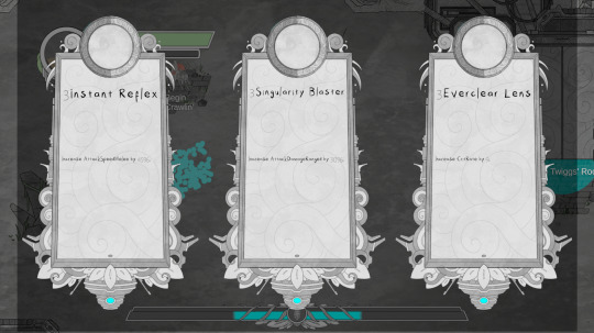
This is an extremely rough draft, but it exists!
The UpgradeSelector received a signal that contained the entity that wanted to level up, and it is also responsible for applying the mod to that entity. What this also means is that, in theory, npcs are also capable of leveling up! Will this mean anything in the long run? Unclear! But if there's one thing I like doing, it's building out systems to be way more robust than is necessary. So far I've found that it pays off the vast majority of the time!
Plus, I will definitely be occasionally playing runs as random enemies just to see what it's like. Who knows, maybe that'll make it in as a side mode or something.
I think I'll spare you from reading about the 200 tiny changes I've made, unmade, and remade trying to figure out how I want stats to work, as it turns out, absolutely nothing in game dev is simple, including the act of "tracking numbers on a character."
Thanks so much for reading this abbreviated dev diary, I very much appreciate that there are folks out there who care about this project! As per usual, if you have any questions or are interested in anything in particular, feel free to drop an ask @last-sprout or @oneominousvalbatross!
#indie game#dev diary#game dev#Last Sprout#last sprout: a seedling of hope#game development#game dev blog#game dev update#roguelite
14 notes
·
View notes
Text
Devlog #1
Ok, I've been working super hard on my game this week, and I have something to show off. Generally, I did not want to start doing Devlogs until I had what I considered a working prototype, and that's what this is. I think I'm at the point where a lot of basic things work, and I will be able to focus on building it out, which will make for more interesting regular updates.
So, what we're seeing in this clip is:
SPLASH SCREEN - just a test of animation and the flow of booting up the game, it will not be in there for long, I just threw random assets in.
SAVING & LOADING - The title screen is plain, the "Settings" option doesn't do anything yet, but the "New Game" and "Load Game" do! They currently go off of one filepath and save games are stored as JSON so I can edit them easily for testing, and they don't yet prompt "are you sure?", they just do it, and the functions work. I can save my game and all the party and player stats and values load in properly. [Not shown: there is a save button in the Pause menu, but that menu is very basic]
BATTLE UI - All is placeholder, and ugly, but I focused down on getting it to work. That means, while I was throwing buttons in there for testing early on, I spent major time reworking menus to work with controller instead. I may do KB&M support later, once the UIs are actually fully designed, but doing them in parallel while I'm changing things would not be nice. We can attack, you don't have to click "Confirm" anymore, just a controller button, we have spells/skill and items which can target either enemies or allies, and both single-target an multitarget skills exist and flash up corresponding selector arrows, after which you can confirm your target. Party members have an HP/MP display and the character whose turn it is will be highlighted on their turn
MESSAGE OVERLAY - As you can see, I've worked out the system to have messages give the player feedback in-battle which can also be used for dialogue out-of-battle. It works off of a queue containing both messages that auto-play and messages that you have to confirm before moving on, so I can mix-and-match as appropriate. I wanted to have this in place so I can soon implement NPCs and shops, and the battles make sense to both me and the player as I add more features to it.
When we load into this test dungeon, we see the old sprite for a demon, I redrew them, as you can see in the first random encounter. None of this is final though, these were also pretty quick I just wanted to discard the really lazy MS Paint-looking sprites If I'm going to be showing the game off more, I want it to be in a better light. I'm not even sure Demons and Bats will be common enemy types in the game, it's just for testing. Nothing that you're seeing is final, or even really fits the vibe in my, mind yet, but it's approaching something that looks like it has the potential to be a game.
After all all of this I haven't added any new enemy types, items, or skills yet, the assets aren't anywhere near what they will be like, no levels have been created yet, but I think what I have is a lot of the "structure" of a basic RPG. I ate my vegetables, the boring parts are functional, and it opens up a lot of doors for what I can develop next.
NEXT GOALS -
NPCs in the overworld (+Shops, need to have a way to acquire items, currently the inventory is hardcoded into a New Game)
Implement a method to recruit and dismiss new Party Members, they are also currently hardcoded for testing purposes
There are still lingering menu navigation bugs, but nothing that can't be fixed relatively quickly
Move the starting area to a safe-zone that can be built out as the main hub and create multiple dungeon rooms with different testing conditions
More visual feedback. Having enemies flash on taking damage and displaying damage numbers would be a good start, more complex animations can come later, including spell animations.
#slugdragoondevlog#slugdragoongame#gamedev#solodev#indiedev#rpg#drpg#game development#indiegamedev#indie games
21 notes
·
View notes
Note
How is progress on your Ghostbusters RPG?
Almost dead, unfortunately. I think about it from time to time but I haven't done any meaningful code work since my Mom died. At some point in the last year I decided I'd write out the entire game script, since I was coalescing around a story idea.
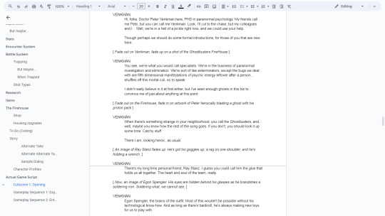
With making an RPG in Clickteam Fusion, planning ahead is your best friend, so knowing every story beat ahead of time would give me a clearer picture of what needed to be coded on the back end.
But naturally, the opening to the game is going to be the most text heavy, outside of the ending. I wrote about three chapters, encapsulating a teaser and a recap of how the original Ghostbusters ended, and have been too distracted with other things to write more.
The general gameplay flow I was gravitating towards was something like Metal Max. Not long after starting this GB fangame, I watched somebody stream all of Metal Max NES and the bounty system in that was really interesting. Basically, over the course of the story, you'll hear rumors about special creatures and bandits roaming around the overworld, and if you can kill them, you earn a big reward by turning in the bounty.
If you ignore bounties, it cuts the gameplay length in half and you lose out a lot of level ups and gear. Taking/ignoring bounties almost ends up being kind of a difficult selector. Like doing a three heart run in Zelda.
For a Ghostbusters RPG, all of this just made sense, and it'd make it easy to reuse areas. You get calls about ghosts to catch, and you can either go catch the ghost (your bounty) or you can follow the story. Maybe the bounty is along the way to the next story event, maybe it's in a previous dungeon. It's up to you where you go.
I dunno if the game will ever get finished, but I'll let you peek on what I'd decided story-wise:
So it bothers me that a lot of recent Ghostbusters movies are kind of hero worship. Ghostbusters Afterlife is all about how these four guys were total legends that saved the world, and what a tragedy it is that they've been forgotten. "omg you kids don't know who the ghostbusters were? let me, paul rudd, educate you on the coolest, strongest and most epic titans to ever dress like sweaty service industry workers."
That's dumb. The Ghostbusters are working joes. They stumbled into this job, and saved the world kind of by accident. They are barely heroes and could have ended all life on earth as we know it just as easily. They just wanted a paycheck and were looking for a niche to fill.
And in the wider view of producing the first Ghostbusters movie itself, that too was kind of an accident. The movie got rammed through production, the script was an unfinished mess so they adlibbed a lot of it, and basically nobody expected it to do as well as it did. It is the very definition of lightning in a bottle, and it hasn't really been replicated.
So I wanted to push in on that. These guys aren't looking to save the world. They aren't actually that strong or cool. They don't have a sense of duty. They're just regular people, and they can (and do) make mistakes.
When Egon says crossing the streams is like "all life as you know it stopping instantaneously and every molecule in your body exploding at the speed of light", I imagine that means it's more than just a really big explosion. Ray calls it "total protonic reversal", which makes it sound more like the creation of a black hole, or something.
When the Ghostbusters crossed the streams and directed that into the doorway to Gozer's world, in my story, they effectively collapsed an entire dimension. Erased it, and whatever it inhabited.
I wanted there to be consequences for that. It was an impulsive action they made out of desperation to save themselves, and though it worked in the short term (sealing the door, almost certainly killing Gozer) I wanted there to be much worse long term consequences. They more or less punched a hole in reality, and there's really only two things that happen with holes:
They get bigger and deeper
They get filled in with debris
Ultimately I wanted to say that when the Ghostbusters crossed the streams, it was a mistake. They didn't know any better. They were messing with forces vastly beyond their comprehension. And the thrust of the game would be them figuring out what they did wrong and trying to come up with a plan to do a better job at fixing it.
But they don't know if they can do it. What happened with Gozer was a happy accident (that turned out to be not so happy). The scale of this problem literally dwarfs them. They are so small that they are barely even specks of dust. This is a supernaturally cosmic issue.
To me, The Ghostbusters are screw-ups that were in the right place at the right time and did the wrong thing. But not maliciously, just ignorantly. And the decision to take responsibility for that mistake is the grease that turns the gears of the narrative.
7 notes
·
View notes
Text

♪ I got to go on, and throw on You know I got the flow on, selectors on ya radio play us 'cause we're friendly for ozone, but that's not all, so hold on Tight as I rock the mic right, oh, excuse me, pardon ♪ ♪ As I synchronize with the analyzed upcoming vibes The session, let there be a lesson, question You carry protection? Or will your heart go on Like Celene Dion, Karma Chameleon ♪
2 notes
·
View notes
Text
Alright, we're finally talking about Factorio for a second
First, let me show off my new and improved Train Loading Depot!

I had to double the amount of train stations to help improve the flow. Just offscreen below is where all of the storage is, though I'm thinking of moving it up closer so my cute little bots have less to travel to and from.
They come in from the top, load at the stop, and exit down and over the bridge.
But Sandra, you may ask, how do you load the trains if they're all the same stop and each train has different needs?
I'm glad you asked!

This thing!

So there's a logistic and circuit network in factorio that you can play with. So what's happening here is
The train arrives, and the train station reads the unique ID for the train. Such as 827, 794, etc. It then sends that signal to 2. Let's say that this train is picking up Green Circuits and is train 809.
The Train signal is read, which in the example is 809. The combinator (the yellow machine), reads that, and then send out a Green Circuit Signal. It is then read by a Selector or Arithmatic combinator, which do different things with signals. Arithmatic is doing math, and selector is doing things like stack size.
It then sends this signal out on the red wire to the chests, which then set their request for the bots. The bots deliver the items to the blue chest, which then get loaded. And then after one of two conditions (inactivity or full cargo), the train leaves!
I've been watching some tutorials on how the circuit network works, and have taken the lessons from there! It has been SO much fun fucking around with it.
I made this all by myself! And it works perfectly. Those two purple chests there are to take items out of the train that dont belong, because sometimes the inserters still have things in their hands. The inserters are set to take out what is NOT the requested item, to ensure that only the needed items are in the train
And then there's the counterpart, the Unloading Station, that follows the same logic but is a little more complicated I'll explain in another post
4 notes
·
View notes
Text
multiport flow selector skid
industrial flow management https://3d-labs.com/product/multiport-flow-selector-skid/ A multiport flow selector skid is a system that allows for the selection and control of multiple fluid flow paths, enabling efficient distribution and measurement in industrial processes.

https://3d-labs.com/
0 notes
Text
Revisiting CSS Multi-Column Layout
New Post has been published on https://thedigitalinsider.com/revisiting-css-multi-column-layout/
Revisiting CSS Multi-Column Layout
Honestly, it’s difficult for me to come to terms with, but almost 20 years have passed since I wrote my first book, Transcending CSS. In it, I explained how and why to use what was the then-emerging Multi-Column Layout module.
Hint: I published an updated version, Transcending CSS Revisited, which is free to read online.
Perhaps because, before the web, I’d worked in print, I was over-excited at the prospect of dividing content into columns without needing extra markup purely there for presentation. I’ve used Multi-Column Layout regularly ever since. Yet, CSS Columns remains one of the most underused CSS layout tools. I wonder why that is?
Holes in the specification
For a long time, there were, and still are, plenty of holes in Multi-Column Layout. As Rachel Andrew — now a specification editor — noted in her article five years ago:
“The column boxes created when you use one of the column properties can’t be targeted. You can’t address them with JavaScript, nor can you style an individual box to give it a background colour or adjust the padding and margins. All of the column boxes will be the same size. The only thing you can do is add a rule between columns.”
She’s right. And that’s still true. You can’t style columns, for example, by alternating background colours using some sort of :nth-column() pseudo-class selector. You can add a column-rule between columns using border-style values like dashed, dotted, and solid, and who can forget those evergreen groove and ridge styles? But you can’t apply border-image values to a column-rule, which seems odd as they were introduced at roughly the same time. The Multi-Column Layout is imperfect, and there’s plenty I wish it could do in the future, but that doesn’t explain why most people ignore what it can do today.
Patchy browser implementation for a long time
Legacy browsers simply ignored the column properties they couldn’t process. But, when Multi-Column Layout was first launched, most designers and developers had yet to accept that websites needn’t look the same in every browser.
Early on, support for Multi-Column Layout was patchy. However, browsers caught up over time, and although there are still discrepancies — especially in controlling content breaks — Multi-Column Layout has now been implemented widely. Yet, for some reason, many designers and developers I speak to feel that CSS Columns remain broken. Yes, there’s plenty that browser makers should do to improve their implementations, but that shouldn’t prevent people from using the solid parts today.
Readability and usability with scrolling
Maybe the main reason designers and developers haven’t embraced Multi-Column Layout as they have CSS Grid and Flexbox isn’t in the specification or its implementation but in its usability. Rachel pointed this out in her article:
“One reason we don’t see multicol used much on the web is that it would be very easy to end up with a reading experience which made the reader scroll in the block dimension. That would mean scrolling up and down vertically for those of us using English or another vertical writing mode. This is not a good reading experience!”
That’s true. No one would enjoy repeatedly scrolling up and down to read a long passage of content set in columns. She went on:
“Neither of these things is ideal, and using multicol on the web is something we need to think about very carefully in terms of the amount of content we might be aiming to flow into our columns.”
But, let’s face it, thinking very carefully is what designers and developers should always be doing.
Sure, if you’re dumb enough to dump a large amount of content into columns without thinking about its design, you’ll end up serving readers a poor experience. But why would you do that when headlines, images, and quotes can span columns and reset the column flow, instantly improving readability? Add to that container queries and newer unit values for text sizing, and there really isn’t a reason to avoid using Multi-Column Layout any longer.
A brief refresher on properties and values
Let’s run through a refresher. There are two ways to flow content into multiple columns; first, by defining the number of columns you need using the column-count property:
Second, and often best, is specifying the column width, leaving a browser to decide how many columns will fit along the inline axis. For example, I’m using column-width to specify that my columns are over 18rem. A browser creates as many 18rem columns as possible to fit and then shares any remaining space between them.
Then, there is the gutter (or column-gap) between columns, which you can specify using any length unit. I prefer using rem units to maintain the gutters’ relationship to the text size, but if your gutters need to be 1em, you can leave this out, as that’s a browser’s default gap.
The final column property is that divider (or column-rule) to the gutters, which adds visual separation between columns. Again, you can set a thickness and use border-style values like dashed, dotted, and solid.
These examples will be seen whenever you encounter a Multi-Column Layout tutorial, including CSS-Tricks’ own Almanac. The Multi-Column Layout syntax is one of the simplest in the suite of CSS layout tools, which is another reason why there are few reasons not to use it.
Multi-Column Layout is even more relevant today
When I wrote Transcending CSS and first explained the emerging Multi-Column Layout, there were no rem or viewport units, no :has() or other advanced selectors, no container queries, and no routine use of media queries because responsive design hadn’t been invented.
We didn’t have calc() or clamp() for adjusting text sizes, and there was no CSS Grid or Flexible Box Layout for precise control over a layout. Now we do, and all these properties help to make Multi-Column Layout even more relevant today.
Now, you can use rem or viewport units combined with calc() and clamp() to adapt the text size inside CSS Columns. You can use :has() to specify when columns are created, depending on the type of content they contain. Or you might use container queries to implement several columns only when a container is large enough to display them. Of course, you can also combine a Multi-Column Layout with CSS Grid or Flexible Box Layout for even more imaginative layout designs.
Using Multi-Column Layout today
Patty Meltt is an up-and-coming country music sensation. She’s not real, but the challenges of designing and developing websites like hers are.
My challenge was to implement a flexible article layout without media queries which adapts not only to screen size but also whether or not a <figure> is present. To improve the readability of running text in what would potentially be too-long lines, it should be set in columns to narrow the measure. And, as a final touch, the text size should adapt to the width of the container, not the viewport.
Article with no <figure> element. What would potentially be too-long lines of text are set in columns to improve readability by narrowing the measure.
Article containing a <figure> element. No column text is needed for this narrower measure.
The HTML for this layout is rudimentary. One <section>, one <main>, and one <figure> (or not:)
<section> <main> <h1>About Patty</h1> <p>…</p> </main> <figure> <img> </figure> </section>
I started by adding Multi-Column Layout styles to the <main> element using the column-width property to set the width of each column to 40ch (characters). The max-width and automatic inline margins reduce the content width and center it in the viewport:
main margin-inline: auto; max-width: 100ch; column-width: 40ch; column-gap: 3rem; column-rule: .5px solid #98838F;
Next, I applied a flexible box layout to the <section> only if it :has() a direct descendant which is a <figure>:
section:has(> figure) display: flex; flex-wrap: wrap; gap: 0 3rem;
This next min-width: min(100%, 30rem) — applied to both the <main> and <figure> — is a combination of the min-width property and the min() CSS function. The min() function allows you to specify two or more values, and a browser will choose the smallest value from them. This is incredibly useful for responsive layouts where you want to control the size of an element based on different conditions:
section:has(> figure) main flex: 1; margin-inline: 0; min-width: min(100%, 30rem); section:has(> figure) figure flex: 4; min-width: min(100%, 30rem);
What’s efficient about this implementation is that Multi-Column Layout styles are applied throughout, with no need for media queries to switch them on or off.
Adjusting text size in relation to column width helps improve readability. This has only recently become easy to implement with the introduction of container queries, their associated values including cqi, cqw, cqmin, and cqmax. And the clamp() function. Fortunately, you don’t have to work out these text sizes manually as ClearLeft’s Utopia will do the job for you.
My headlines and paragraph sizes are clamped to their minimum and maximum rem sizes and between them text is fluid depending on their container’s inline size:
h1 font-size: clamp(5.6526rem, 5.4068rem + 1.2288cqi, 6.3592rem); h2 font-size: clamp(1.9994rem, 1.9125rem + 0.4347cqi, 2.2493rem); p font-size: clamp(1rem, 0.9565rem + 0.2174cqi, 1.125rem);
So, to specify the <main> as the container on which those text sizes are based, I applied a container query for its inline size:
main container-type: inline-size;
Open the final result in a desktop browser, when you’re in front of one. It’s a flexible article layout without media queries which adapts to screen size and the presence of a <figure>. Multi-Column Layout sets text in columns to narrow the measure and the text size adapts to the width of its container, not the viewport.
Modern CSS is solving many prior problems
Structure content with spanning elements which will restart the flow of columns and prevent people from scrolling long distances.
Prevent figures from dividing their images and captions between columns.
Almost every article I’ve ever read about Multi-Column Layout focuses on its flaws, especially usability. CSS-Tricks’ own Geoff Graham even mentioned the scrolling up and down issue when he asked, “When Do You Use CSS Columns?”
“But an entire long-form article split into columns? I love it in newspapers but am hesitant to scroll down a webpage to read one column, only to scroll back up to do it again.”
Fortunately, the column-span property — which enables headlines, images, and quotes to span columns, resets the column flow, and instantly improves readability — now has solid support in browsers:
h1, h2, blockquote column-span: all;
But the solution to the scrolling up and down issue isn’t purely technical. It also requires content design. This means that content creators and designers must think carefully about the frequency and type of spanning elements, dividing a Multi-Column Layout into shallower sections, reducing the need to scroll and improving someone’s reading experience.
Another prior problem was preventing headlines from becoming detached from their content and figures, dividing their images and captions between columns. Thankfully, the break-after property now also has widespread support, so orphaned images and captions are now a thing of the past:
figure break-after: column;
Open this final example in a desktop browser:
You should take a fresh look at Multi-Column Layout
Multi-Column Layout isn’t a shiny new tool. In fact, it remains one of the most underused layout tools in CSS. It’s had, and still has, plenty of problems, but they haven’t reduced its usefulness or its ability to add an extra level of refinement to a product or website’s design. Whether you haven’t used Multi-Column Layout in a while or maybe have never tried it, now’s the time to take a fresh look at Multi-Column Layout.
#:has#ADD#almanac#Article#Articles#back up#background#book#box#browser#challenge#clamp#colours#columns#container#content#course#creators#CSS#CSS Grid#css-tricks#Design#designers#desktop#developers#digitalocean#display#easy#English#Explained
2 notes
·
View notes
Text
VA - Kampire Presents: A Dancefloor in Ndola
Strut introduces a pioneering new compilation 'A Dancefloor In Ndola,' curated by revered East African DJ, Kampire. This release marks an evolution in Strut's approach to compilations, showcasing emerging DJ talent from across the world and embracing an innovative approach to musical discovery from the next wave of selectors. Forging her reputation through memorable sets for the Nyege Nyege Festival in Uganda over the last decade, Kampire now tours worldwide and is celebrated for her brilliantly curated sets spanning the full range of African music styles from the ‘70s and ‘80s to the present day. The compilation flows through different East African and South African genres from Congolese rumba and soukous to 1980s township bubblegum and the rich guitar-led sounds of Zambian kalindula. “There are styles of music on the compilation which are often considered unsophisticated from rural areas. I and other contemporary African artists and DJs draw inspiration from them; it is part of what makes us ourselves.” Kampire also shines the spotlight on many incredible women in African music from the ‘80s, including Congolese legends like Pembey Sheiro, Feza Shamamba and Princesse Mansia M’bila to V-Mash and Di Groovy Girls from South Africa. ‘A Dancefloor In Ndola’ is released on 2LP and CD and features an exclusive new edit by Kampire alongside personal liner notes tracing her links to the music. Cover artwork montage is by Canon Rumanzi and vinyl restoration / mastering by The Carvery.
3 notes
·
View notes
Text

💪Strong & Ready🚛
Save Money with the 2023 TDC Ultramax Side Dump Tridem Trailer, Tri-Drive Compatible! This high-performance trailer has a 22 cu yd capacity, built with 1/4" 450 Brinell steel floor, sidewalls, and end walls for superior durability and wear resistance. The box can dump to either DS or PS via selectable lockarms, enhancing flexibility. Equipped with Hendrickson Intraax AAT250 air ride suspension and 77" track axles, each with a 25,000 lb capacity, it offers unmatched stability, especially with its unique center box 3rd hinge support. The hydraulic system includes two double-acting telescopic lift cylinders, an air-operated selector valve, and a hydraulic flow diverter for precise control. The frame features Ti steel main rails and fabricated cross members, including Arne's 8" pipe torque tube, ensuring exceptional strength and longevity. Designed for heavy loads and rough terrains, this trailer is built to perform under the most demanding conditions.
#heavydutyhauling#trucking#trucks#peterbiltpower#trucklife#vancouver#british columbia#truckers#side dump#tridem trailer
4 notes
·
View notes
Text
youtube

Release: October 30, 1999
Lyrics:
Freestyler
Rock the microphone
Carry on with the freestyler
I got to throw on and go on
You know I gots to flow on
Selectors on the radio play us
'Cause we're friendly for ozone
But that's not all so hold on tight
As I rock the mic right
Oh, excuse me, pardon
As I synchronise with the analysed
Upcomin' vibes, the session
Let there be a lesson, question
You carry protection
Or will your heart go on
Like Celine Dion
Karma Chameleon
Yeah, straight from the top of my dome
As I rock, rock, rock, rock, rock the microphone
Yeah, straight from the top of my dome
As I rock, rock, rock, rock, rock the microphone
Yeah, straight from the top of my dome
Styles, steelos
We bring many kilos
So you could pick yours from the various
Ambitious, nutritious, delicious, delirious or vicious
Just tell us, we deliver anything
From acappellas to propellers
Suckers get jealous but they're soft like marshmallows
You know they can't handle us like Debbie does Dallas
Yeah, we come scandalous so who the fuck is Alice
She from Buckingham Palace?
Yeah, straight from the top of my dome
As I rock, rock, rock, rock, rock the microphone
Yeah, straight from the top of my dome
As I rock, rock, rock, rock, rock the microphone
Yeah, straight from the top of my dome
As I rock, rock, rock, rock, rock the microphone
Yeah, straight from the top of my dome
As I rock, rock, rock, rock, rock the microphone
Freestyler
Rock the microphone
Carry on with the freestyler
Songwriter:
Yeah, straight from the top of my dome
As I rock, rock, rock, rock, rock the microphone
Yeah, straight from the top of my dome
As I rock, rock, rock, rock, rock the microphone
Yeah, straight from the top of my dome
As I rock, rock, rock, rock, rock the microphone
Yeah, straight from the top of my dome
As I rock, rock, rock, rock, rock the microphone
Jaakko Sakari Salovaara / Raymond Ebanks
SongFacts:
👉📖
#new#new music#my chaos radio#Bomfunk MC's#Freestyler#music#spotify#youtube#music video#youtube video#good music#hit of the day#video of the day#90s#90s music#90s style#90s video#90s charts#1999#rap#drum and bass#electronic#breakbeat#jump up#hip hop#dance trance#lyrics#songfacts#1681
4 notes
·
View notes
Text
CSS One-Liners to Improve (Almost) Every Project
CSS One-Liners to Improve (Almost) Every Project
#css#webdev#listicle
Most of these one-liners will be one declaration inside the CSS rule. In some cases, the selector will be more than just a simple element; in others, I will add extra declarations as recommendations for a better experience, thus making them more than a one-liner —my apologies in advance for those cases.
Some of these one-liners are more of a personal choice and won't apply to all websites (not everyone uses tables or forms). I will briefly describe each of them, what they do (with sample images), and why I like using them. Notice that the sample images may build on top of previous examples.
Here's a summary of what the one-liners do:
Limit the content width within the viewport
Increase the body text size
Increase the line between rows of text
Limit the width of images
Limit the width of text within the content
Wrap headings in a more balanced way
Form control colors to match page styles
Easy-to-follow table rows
Spacing in table cells and headings
Reduce animations and movement
Limit the content width in the viewport
body { max-width: clamp(320px, 90%, 1000px); /* additional recommendation */ margin: auto; }
Adding this one-liner will reduce the content size to occupy 90% of the viewport, limiting its width between 320 and 1000 pixels (feel free to update the minimum and maximum values).
This change will automatically make your content look much nicer. It will no longer be a vast text block but something that looks more structured and organized. And if you also add margin: auto; to the body, the content will be centered on the page. Two lines of code make the content look so much better.
Aligned and contained text looks better than a giant wall of text
Increase the text size
body { font-size: 1.25rem; }
Let's face reality: browsers' default 16px font size is small. Although that may be a personal opinion based on me getting old 😅
One quick solution is to increase the font size in the body. Thanks to the cascade and em units browsers use, all the text on a web page will automatically increase.
Larger text size makes things easier to read.
Increase the space among lines
body { line-height: 1.5; }
Another preference for improving readability and breaking the dreaded wall of text is increasing the space between lines in paragraphs and content. We can easily do it with the line-height property.
Spaces between lines break the wall of text and the rivers of white.
This choice (with the previous two) will considerably increase our page's vertical size, but I assure you the text will be more readable and friendlier for all users.
Limit the size of images
img { max-width: 100%; }
Images should be approximately the size of the space they will occupy, but sometimes, we end up with really long pictures that cause the content to shift and create horizontal scrolling.
One way to avoid this is by setting a maximum width of 100%. While this is not a fool-proof solution (margins and paddings may impact the width), it will work in most cases.
Prevent horizontal scrolling and make images flow better with the text
Limit the width of text within the content
p { max-width: 65ch; }
Another tactic to avoid the dreaded wall of text and rivers of space is to apply this style even in conjunction with the max width in the body. It may look unnecessary and sometimes weird, as paragraphs will be narrower than other elements. But I like the contrast and the shorter lines.
A value of 60ch or 65ch has worked for me in the past, but you can use a different value and adjust the max width to match your needs. Play and explore how it looks on your web page.
Break the bigger chunks of text into smaller blocks for readability
Wrap headings in a more balanced way
h1, h2, h3, h4, h5, h6 { text-wrap: balance; }
Headings are an essential part of the web structure, but due to their larger size and short(-er) content, they may look weird. Especially when they occupy more than one line. A solution that will help is balancing the headings with text-wrap.
Although balance seems to be the most popular value for text-wrap, it is not the only one. We could also use pretty, which moves an extra word to the last row if needed instead of balancing all the content. Unfortunately, pretty has yet to count on broad support.
Balanced wrapping can improve visibility and readability
Form control colors to match page styles
body { accent-color: #080; /* use your favorite color */ }
Another small change that does not have a significant impact but that makes things look better. Until recently, we could not style native form controls with CSS and were stuck with the browser display. But things have changed.
Developing a whole component can be a pain, but setting a color that is more similar to the rest of the site and the design system is possible and straightforward with this one-liner.
It's the small details (and colors) that bring the page together
Easy-to-follow table rows
:is(tbody, table) > tr:nth-child(odd) { background: #0001; /* or #fff1 for dark themes */ }
We must use tables to display data, not for layout. But tables are ugly by default, and we don't want data to look ugly. In particular, one thing that helps organize the data and make it more readable is having a zebra table with alternating dark/light rows.
The one-liner displayed above makes achieving that style easy. It can be simplified to be only tr without considering the tbody or table parent, but it would also apply to the table header, which we may not want. It's a matter of taste.
Easier to follow the data horizontally (by row)
Spacing in table cells and headings
td, th { padding: 0.5em; /* or 0.5em 1em... or any value different from 0 */ }
One last change to make tables more accessible and easier to read is to space the content slightly by adding padding to the table cells and headers. By default, most browsers don't have any padding, and the text of different cells touches, making it confusing to differentiate where one begins and the other ends.
We can change the padding value to adjust it to our favorite size. However, avoid overdoing it to avoid unnecessary scrolling or too much blank space.
Easier to follow data horizontally and vertically
Reduce animations and movement
@media (prefers-reduced-motion) { *, *::before, *::after { animation-duration: 0s !important; /* additional recommendation */ transition: none !important; scroll-behavior: auto !important; } }
Okay, okay. This code is way more than a one-liner. It has a one-liner version (removing animations by setting their duration to zero seconds), but other things on a web page make elements move.
By setting these declarations inside the prefers-reduced-motion media query, we will respect the person's choice to have less movement. This approach is somewhat radical because it removes all movement, which may not necessarily be the user's intent -it is "reduced motion" and not "no motion." We can still preserve movement on a case-by-case basis if appropriate.
No animations? No problem!
2 notes
·
View notes