#gradient text effect example
Explore tagged Tumblr posts
Visit Tumblr Blog
Explore Tumblr blogs with no restrictions, modern design and the best experience.
Last Seen Tumblr Blogs


Fun Fact
Mobile US users spent an average of 115.8 minutes on Tumblr app monthly.
Link
Photoshop text effect - create gradient text effect in photoshop cs6, gradient colored text tutorial, how to create gradient text
0 notes
Text

CSS Gradient Text Animation
#css gradient text animation#css animation#css text animation#css text effects#html css#frontend#css#html#css3#learn to code#code#css animation examples#css animation tutorial#css animation snippets#css tricks#frontenddevelopment
2 notes
·
View notes
Text

Gradient Text Border Animation
#gradient text border animation#neon border animation#html css#codenewbies#frontenddevelopment#html5 css3#css animation examples#pure css animation#css animation tutorial#css#html css animation#pure css effects
5 notes
·
View notes
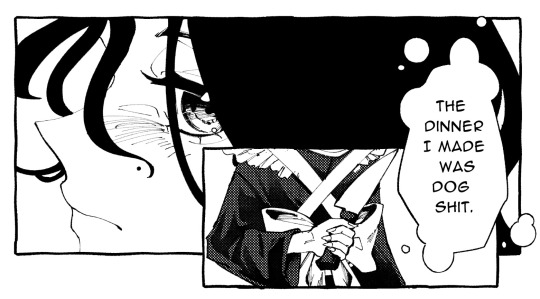
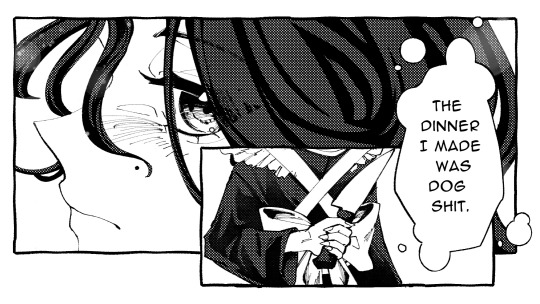
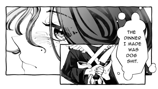
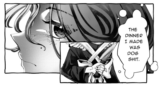
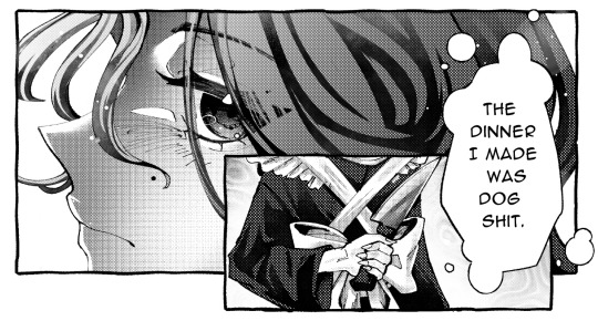
Note
Can you show us how you do the coloring on your titles I couldn’t find it when I searched your acc😭😭
YEAH YEAH. sorry for the late reply sweetheart, but i'll walk u through it !!!! 🙇♀️🙇♀️🙇♀️🙇♀️
example:
TOJI FAT C★CK NO CLICKBAIT ?!
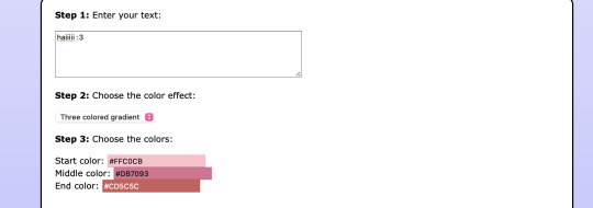
so to start, there’s multiple websites to do this but the main one i use is stuffbydavid.com
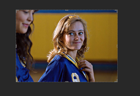
once you get there, you’ll see something like this
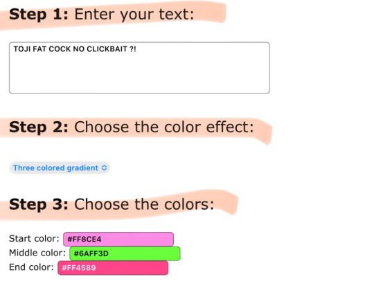

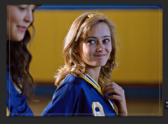
it’s simple !! just follow the steps as they go, so for step one — enter your desired text. you can see that i already did that. so for step two, you’re allowed to choose whatever color effect you want.
all of the gradient effects are: horizontal (mixture of two colors), middle (kinda like horizontal), three colored, (three colors mixed), solid (just one color), random (picks any color for you), and colors of the rainbow (basically a default rainbow color for all)
the one i’m currently using for the example is three colored gradient !! my personal go to for my fics is always middle gradient tho.
anywho, back on the site — ignore step four.
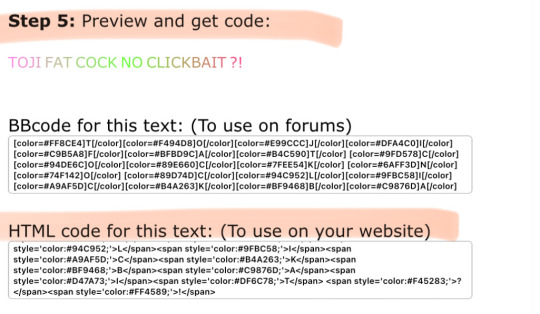
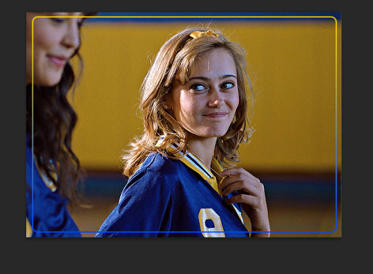
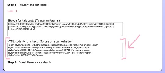
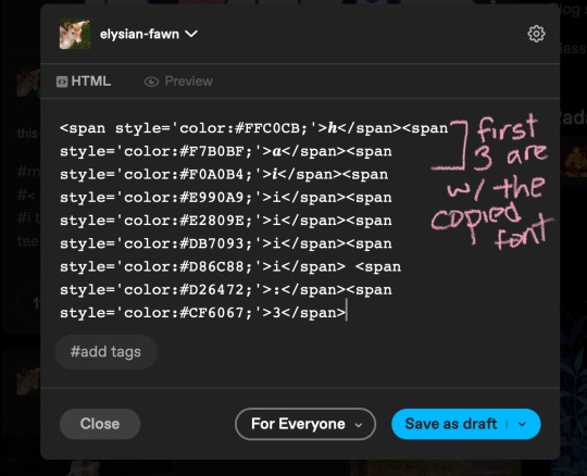
as you can see for step five and the final step, it shows you the preview of your desired colors for your text. listen to this part because if you screw up, it won’t paste onto tumblr. you’re gonna wanna copy the HTML code from top to bottom. copy the entire code that’s shown, you might have to scroll a bit bc it’s pretty long (pause)
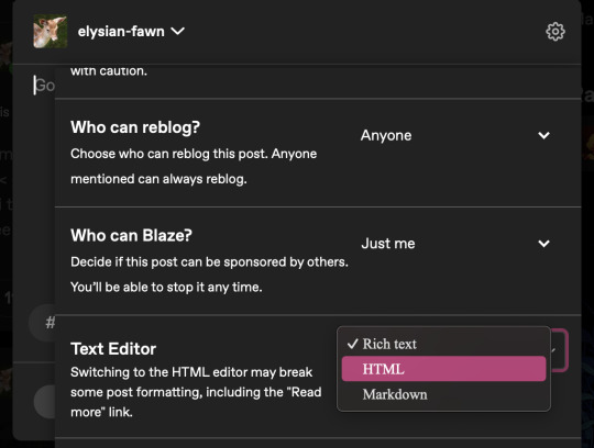
after this, you’re gonna wanna log into tumblr via the mobile browser. i forgot to mention, i’m doing this on the app version but it works for pc / laptop as well !! more complicated though but it all works the same.
so first, you’re gonna wanna make a new seperate draft — then press the little pencil icon to make edits.
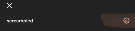
look near the top right and click the settings icon
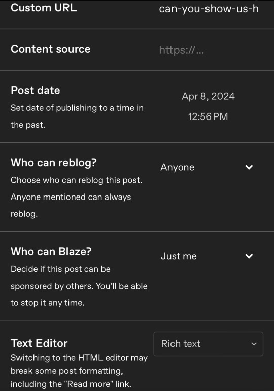
look where it says Text Editor and click near the right where it says 'Rich Text' bc ur gonna change that
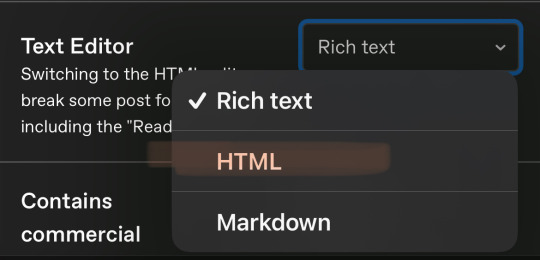
after you click it, change it to HTML
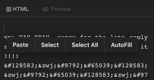
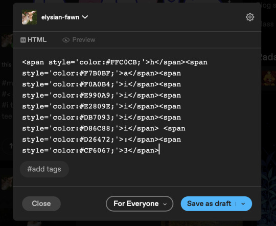
it’s gonna send you here, make you’re you’re on HTML and not Preview yet. create a space above all the text that has like <p> and so on. paste your code, then that should be all !! save it and you can press preview afterwards to see the final results.
hope this helps :3
920 notes
·
View notes
Text
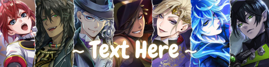
How I make my Covers and Dividers

Hi.👋 So, the idea to make these posts came about because @cat1705 asked me in private how I made my dividers and that made me wonder if other people would be interested in knowing how I made my covers and dividers. I made a poll and a lot of people were interested in knowing how I made them.
I make them in Canva, so anyone can make them, but I would like this to be more of a help for you to create your own and not for you to do exactly like me. Even though I'm always playing around with the font and the way I place the images, I have a guiding line, so to speak, and that's what I'm going to try to show you.

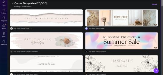
👉COVERS
Well, first things first, apparently I use the dimensions of an Etsy cover photo template. I just chose it because the dimensions looked good. Choose any one and delete all the elements in it until you have only the white background.
To make covers with several characters I use these frames that serve to drag the image inside and adjust it within the defined limits.
I always use only official images from the game so as not to steal anyone's fanart. I usually get the images from the wikis.
You can also upload the image by just dragging it.

To make sure the title won't cover the characters' faces, I put some temporary text on top to adjust the images.
After uploading the image, drag it to the correct frame and drop it.
To adjust the image, double-click, enlarge, rotate, reduce and move it as you wish. When you think it is ready, click outside the image or press the enter key.
When the image is ready, I remove the text and download the image with the characters.
To download, click the button in the top right corner that says "Share". Then click on "Download", the first button on the last line. It should already be in PNG format, so you won't need to change it.
Attention: If you have more than one page: in "Select pages" choose the option "Current page", click “Done” and only then click on "Download". Otherwise, you will download ALL the pages you have and not the specific one you want.
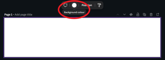
On another page I usually have a gradient background and a little frame. I make the gradient by clicking on "Background color" and in "add a new color" there is the option "Gradient". I don't remember where I got the frame I use, but you can look for some free ones in "Elements".
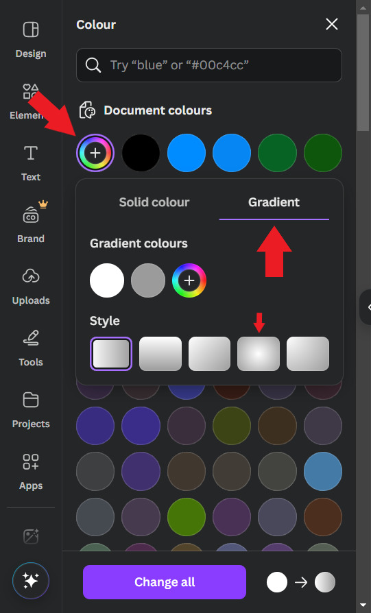
Use the colors that you think look best, I usually put the light color in the center and the dark color at the ends. For this example I will use white and a golden yellow.

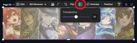
Then, I upload the previous character image and make it 50% transparent. On top of the white frame too (It's just my thing, I don't have a reason to do it, I just think it looks good)
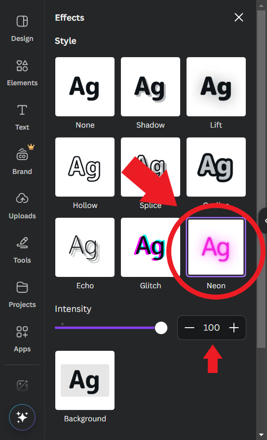
Then I'll put the title. I usually use the "Chewy" font. The font size depends on the size of the title I decided to give it, but it's usually around 80/90. And I add the Effect: "Neon"

To finish, I look for some images in "Elements" to decorate a little more. Searching for "line art" is usually a good tip.
When you're ready, download the image and you're done.
.
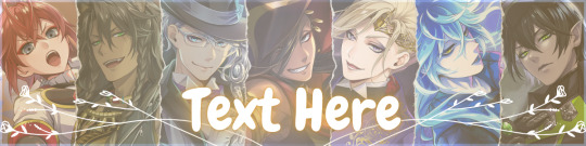
👉CHARACTER DIVIDERS
The dividers follow a similar pattern to the covers to match. Create a new page with the same background color gradient.
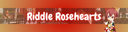
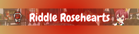
For the background, I use game backgrounds that match the theme of the fic. For this example, I'm going to make a generic Riddle divider with an image of his room with transparency at 50%.

Then I reduce the height of the image until it is half the height of the canva and place it in the center. Remembering that you can adjust the image by double clicking.

I keep the color of the ends the same, but I adjust the color of the center to the color of the dorm to which the character belongs. In this case, red from Heartslabyul. But I will leave an image with the colors I use for each room, taken from the colors of their personal icons.

For the character name, copy and paste the title, as the font and effect is the same, and adjust to the size of the divider.
And also change the color of the letters to the dorm color.

Then I upload the png image of the character's chibi that can be found on the wikis. In this case I'll use the chibi with Riddle's dorm uniform.
I crop the image to help me orient myself better, but you don't need to do that.
Then I upload the character's personal icon, also found on wikis, adjust the size and set the transparency to 60%.
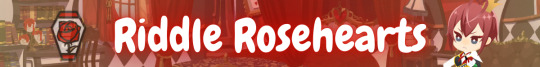
To finish, I download the image and crop the top and bottom in Paint.
Yes... in Paint... it works ok, shut up!
.
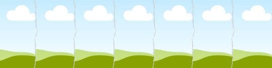
👉LINE DIVIDERS
Finally, for the line dividers, you can copy the Cover because the background colors are the same and erase everything except the image with 50% transparency.

Then I cut it in half, like in the character divider, and again in half to make it thinner, and I place it in the middle of the canvas. (These measures may not be exactly the same as the ones I use today, but the logic in the beginning was this.)

I replace the image with one that seems to fit the theme of the fic. You can do this by dragging it. I usually use game backgrounds, but when none of them seem to look good I look for images from Canva, in "Elements"
That's what I'm going to do to show you. In Elements, write what you want to search for, I'll simply write "background" and choose one of the images without the crown icon (this icon means it's a paid image).
I'll choose any one.


Then I upload the personal icons of the characters that are the focus of the fic. For this example it's the overblot students (because they're my favorite)
Drag them in, place them in a line and adjust the size to that of the line. You can do this one at a time or all at once by selecting them all.
When it's just one character I put one icon upright and the one on the side upside down.

To repeat the pattern, select all of them, copy, paste, and drag until the new set is next to the first. Repeat until the entire line is filled.

Then select all the icons again and set their transparency to 50%.

And finally, download the image and crop the top and bottom parts in Paint. Or wherever you want.
Aaand... I think that's it.
If there's anything you'd like me to explain better, you can ask in the comments. I hope you enjoyed it and that it can help you if you create your own covers and dividers.😘
83 notes
·
View notes
Note
excuse me.. do you have a tutorial on how you make the banners of your themes?
⠀⠀⠀⠀⠀• GFX TUTORIAL !

honestly a bunch of people asked me how to make banners like I do, but chat im gna be fr there's no set tutorial because if u check some of my headers, they're quite different! but ill try to explain my process heh
⠀⠀⠀⠀⠀⠀⠀⠀⠀⠀⠀𝒇 . how to make banners !
⠀⠀⠀₊˚ thank u anon for asking!! if anyone wants to make banners like these, hopefully this tutorial will help u!!


⠀⠀resources 𝑖𝑖. pinterest
i usually use pinterest for overlays and pngs like these u can check some of them out here in my pinterest or just type up gfx overlays and itll show up!


for pictures of idols when I make smau headers or navi headers, I recommend choosing photos that match!! In most cases, I use photoshoots of the idol I chose. for example if it was jake, I would use something like this!


⠀⠀inspo 𝑖𝑖. pinterest
most of my header ideas come from pinterest! they have many gfx edits on there and its very helpful if u don't have a solid image on what u want! you can check out my pinterest once again for some ideas ( here are some I found on pinterest )


another important thing is to have a matching colour scheme!!! guys im telling u thats literally what brings it together!! STICK TO THE COLOUR SCHEME like genuinely imagine ur colour scheme is like white pink and yellow and u go ahead and put like a blue png on there. executed on the spot.
take a look at the pictures above, they have a matching colour scheme that compliments the edit! pro tip if u have a concept on what u want ur header to be ( for example grunge ) use colour schemes that match the concept ( so for grunge you would use for example red black and grey )
⠀⠀software. 𝑖𝑖. photoshop, procreate, ibis paint
now this is the part where u have to actually make it. I reccomeed ibis paint ( guys have u seen soov headers ) cuz its lowk mad easy to make stuff on there plus its free, but personally for me I would choose either photoshop and procreate ( I moved on from procreate to photoshop cuz the quality on procreate was buttcheeks ) icl I got photoshop for free ( @aewon my goat thank u ) and it took me like a few tries to get the hang of it ( okay I lied I made the gigi header on the first try ) BUT Its really easy honestly its just the system that looks intimidating.
⎯⎯ anyways here are some things I like to add on my headers based on what I have already made
( shapes ) guys the rectangle shapes thing with a gradient in it always does it for me. they fill up spaces u dont know what to add in really easily. just put some text over it and align it and call it a day LMFAOOO
( pngs ) okay hear me out, pngs but only ones that FIT the concept. say ur making a game themed banner, I would put either pixel pngs or those cute game consoles yk!! I wouldn't slap a postcard onto it, that wouldn't fit the vibe
( texts ) the go to fonts I use is coolvetica, la graziela demo and retro gaming. honestly these fonts fit literally almost any concept!!! its lowk fire! something I like to do is use my cursive font ( la graziela demo ) and type one letter and zoom it in. it looks really cute trust!!


( effects ) guys pixelate effect is literally my bsf cuz why do I use it in everything!!! it literally is so perfect I use it in EVERYTHING! guys trust it brings it together so well!! especially when its like blending in to the unpixelated area! another effect I love to use is grain! chat I basically use it for everything. genuinely its like going out without any setting spray on like TF!! add ur grain, it makes it look so much more expensive ( but not that much, it just has to be really subtle )
( overlays ) okay this again! but these overlays are some I use for quite literally anything ( u can see it if u zoom hard enough ) but add them in the right places and put the blending mode on lighten and ur good to go!!


⠀⠀results 𝑖𝑖. the finished product
well, if u have enough practice and a creative mind, it should look something like this!!


guys this was lowk so fun!! hope this helped u guys I literally pulled out every header I made lmfao 💭 lmk if u want one on how to make themes heh
#enhypen imagines#enhypen reactions#enhypen#enhypen texts#enha imagines#enha crack#enhypen headcanons#niki x reader#sunoo x reader#enha fluff#jungwon x reader#enhypen x reader#heeseung scenarios#gfx#kpop gfx#jake x reader#sunghoon x reader#heeseung x reader#jay x reader#sunoo imagines#jungwon imagines#niki imagines#sunghoon imagines#heeseung imagines#park jay imagines#sim jake imagine#niki fluff#kim sunoo#jay scenarios#park jay scenarios
132 notes
·
View notes
Text
Writing Notes: Pastel Colors

Pastel Colors - pale variations of primary colors and exhibit lightness and low saturation.
To create a pastel shade, blend white into the original color, mixing the pigments until they fully combine.
The more white you add to the original color, the lighter the pastel shade becomes.
Examples of Pastel Colors
As tints of primary colors, pastel hues are not on a traditional color wheel. Their limited saturation and pale shades create a soothing and romantic atmosphere. Common shades of pastel colors include:
Baby blue: Similar to sky blue, baby blue is a light shade of azure that pairs well with pastel yellow and pink. Baby blue is also a signature color scheme for nurseries and children’s rooms.
Lilac: As a mix between mauve and light blue, lilac is a pale shade of violet that resembles the lilac flower. This pastel color creates a bright contrast alongside shades of olive green and gray.
Mauve: Like lilac, mauve is also a pastel variety of the color purple. There are different shades of mauve, with some tints containing pale pink hues and others containing light gray shades.
Mint green: A blend of blue, green, and white, mint green is often a staple shade on a pastel color palette. Different tints of mint green vary according to the proportions of white, blue, and green.
Peach: A bright summery tone, peach is a pastel color in the orange family. Its warm hues resemble a bright cream, making it an ideal color base upon which to build.
How to Use Pastel Colors
By matching the right colors, you can effectively incorporate pale tones into different design trends. Try these steps for working with pastel colors:
Create a pastel color scheme. As an arrangement of complementary color combinations, a color scheme is a foundation that balances bright and dark shades. Start by choosing a pastel color as your base. Select complementary colors by pairing this main color with tints on opposite ends on the color wheel. If your color wheel does not include pastel colors, find the primary color closest to your pastel and then note which color is across from it. The pastel version of this second primary color is your complementary color. For example, if pastel blue is your main color, use pastel oranges as your complementary colors in your color scheme.
Test your shades. Before applying any color to a new space or template, test your color scheme. Pastel colors appear differently depending on how the light hits them. Consider doing a small patch test to ensure you like how the color looks after you apply it.
Incorporate contrast. Contrasting colors enhance different aspects of your design. Pastel on pastel can result in a faded look the eye has trouble viewing. Instead, layer your pastel background with color contrast. For instance, in a pale yellow web design, consider using a saturated hue for the lettering so the text is eye-catching. Darker tones that pair with pale colors include magenta, eggplant, navy blue, and dark green.
Add an accent. For a more dramatic look, you can incorporate accent colors in your template. Soft pastels amplify the appearance of bright colors. To make a statement in your design, consider incorporating a primary color shade into your palette. For home décor, use primary color throw pillows as an accent to a pastel-colored couch.
Tips for Using Pastel Colors
Consider these styling tips for using pastel colors in graphic design or interior design:
Add intrigue with metallic shades. Since pastel colors have less saturation, shimmery colors, such as gold and silver, are attention-grabbing against pastel backgrounds. Experiment with different metallic shades to add texture to your pastel look.
Play with patterns and shapes. Pastel backgrounds are an opportunity to incorporate bold shapes and interesting textures. Consider adding a geometric pattern to a wall with a pastel color scheme. The soft gradient of the pale colors allows the unique shapes to stand out.
Use neutrals for balance. Adding a pale hue to a neutral color palette creates a fresh, eye-catching look. Neutral colors, such as white, gray, and beige, ground pastel shades and prevent an overwhelming blend of color. This technique works well for business cards and logo designs.
Graphic designers, interior decorators, and artists incorporate pastel colors into their work to blend color palettes, build texture, and balance bold patterns.
Source ⚜ More: Notes & References ⚜ Writing Resources PDFs
#pastel#colors#writeblr#writing reference#literature#dark academia#writers on tumblr#spilled ink#worldbuilding#writing prompt#colour#creative writing#light academia#colours#writing ideas#writing inspiration#writing resources
69 notes
·
View notes
Text
Gaming GIF Tutorial (2025)
Here is my current GIF making process from video game captures!

PART 1: Capturing Video
The best tip I can give you when it comes to capturing video from your games, is to invest in an injectable photomode tools - I personally use Otis_Inf's cameras because they are easy to use and run smoothly. With these tools, you can not only toggle the UI, but also pause cutscenes and manually change the camera. They are great for both screenshots and video recording!
As for the recording part, I personally prefer NVIDIA's built-in recording tools, but OBS also works well in my experience when NVIDIA is being fussy.
PART 2: Image Conversion
Do yourself a huge favour and download PotPlayer. It is superior to VLC in more ways than one in my opinion, but is especially helpful for its Consecutive Image Capturer tool.
Open the video recording in PotPlayer, and use CTRL + G to open the tool. If this is your first time, be sure to set up a folder for your image captures before anything else! Here are the settings I use, albeit the "Every # frame" I change from time to time:
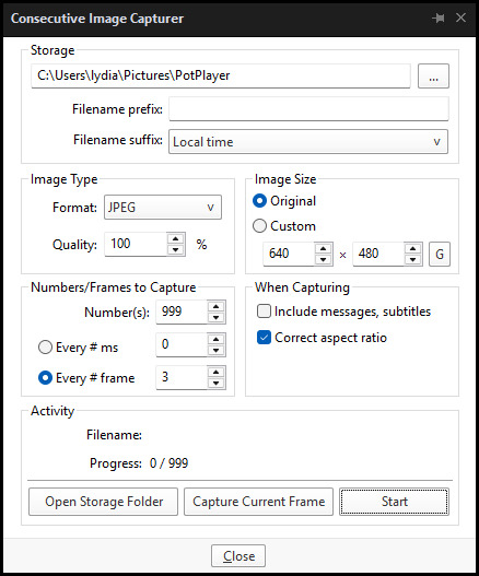
When you're ready, hit the "Start" button, then play the part of the video you want to turn into a GIF. When you're done, pause the video, and hit the "Stop" button. You can then check the images captured in your specified storage folder.
(TIP: Start the video a few seconds a head and stop a few seconds after the part you want to make into a GIF, then manually delete the extra images if necessary. This will reduce the chance of any unwanted cut-offs if there is any lagging.)
PART 3: Image Setup
Now, this part I personally always do in GIMP, because I find its "Open as Layers" and image resizing options 100% better and easier to use than Photoshop. But you don't have to use GIMP, you can do this part in Photoshop as well if you prefer.
Open the images each as an individual layer. Then, crop and/or scale to no more than 540px wide if you're uploading to Tumblr.
(TIP: This might just be a picky thing on my end, but I like to also make sure the height is a multiple of 10. I get clean results this way, so I stick to it.)
If you use GIMP for this part, export the file as .psd when done.
PART 4: Sharpening
If you use GIMP first, now it's time to open the file in Photoshop.
The very first thing I always do is sharpen the image using the "Smart Sharpen" filter. Because we downsized the image, the Smart Sharpen will help it look more crisp and naturally sized. These are the settings I mostly use, though sometimes I change the Amount to 200 if it's a little too crunchy:

Here's a comparison between before and after sharpening:


Repeat the Smart Sharpen filter for ALL the layers!
PART 5: Timeline
First, if your timeline isn't visible, turn it on by click on Windows > Timeline. Then, change the mode from video to frame:

Click "Create Frame Animation" with the very bottom layer selected. Then, click on the menu icon on the far-right of the Timeline, and click "Make Frames from Layers" to add the rest of the frames.
Make sure the delay should be 0 seconds between frames for the smoothest animation, and make sure that the looping is set to forever so that the GIF doesn't stop.
Part 5: Editing
Now that the GIF is set up, this is the part where you can add make edits to the colours, brightness/contrast, add text, etc. as overlays that will affect all the layers below it.
Click on the very top layer so that it is the one highlighted. (Not in the timeline, in the layers box; keep Frame 1 highlighted in the timeline!)
For this example, I'm just going to adjust the levels a bit, but you can experiment with all kinds of fun effects with time and patience. Try a gradient mask, for example!
To test your GIF with the applied effects, hit the Play button in the Timeline. Just remember to always stop at Frame 1 again before you make changes, because otherwise you may run into trouble where the changes are only applied to certain frames. This is also why it's important to always place your adjustment layers at the very top!
Part 6: Exporting
When exporting your GIF with plans to post to Tumblr, I strongly recommend doing all you can to keep the image size below 5mb. Otherwise, it will be compressed to hell and back. If it's over 5mb, try deleting some frames, increasing the black parts, or you can reduce to number of colours in the settings we're about to cover below. Or, you can use EZGIF's optimization tools afterwards to reduce it while keeping better quality than what Tumblr will do to it.
Click on File > Export > Save for Web (Legacy). Here are the settings I always use:

This GIF example is under 5mb, yay! So we don't need to fiddle with anything, we can just save it as is.
I hope this tutorial has offered you some insight and encouragement into making your own GIFs! If you found it helpful, please reblog!
135 notes
·
View notes
Text
How the Fansubbing Process Works for entameSubs
The delays have brought about speculation and misinformed assumptions of how our work is done.
This post explains our entire process to put this misinformation to rest, and also informs those curious of how fansubbing works.
----------------------------------
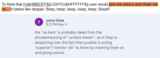
For those unaware, each subbed episode comes with a section of credits at the very end that are specific to that particular episode. For example, EP124 was translated and timed entirely by me (entame), while EP122 was translated jointly by tessa (batsugeemu) and yona (angelthinktank), while I took a proofreading role. Each episode's credits are different, and I always make sure to credit properly based on who worked on what.
Step One: Translation
The job of the translator is to just get from point A (Japanese) to point B (English). One full run-through of the script, no stops in-between. Work is not edited, proofread or checked in any way, it is simply translated and then moved onto the next phase of the assembly line, so to speak.
Leave typos in, leave mistakes in, leave phrases you cannot translate or parse alone and move on. Awkward or literal translations are fine. The goal is to finish the whole script. A couple lines missing here and there is fine - they will be caught later. The first step is just to get it done.

Translating a full script can take anywhere from 2-6 hours, depending on the episode or any extraneous circumstances. To be clear, 2-3 hours is the absolute fastest that it can possibly happen, and it is an outlier. I can count the amount of times it has taken 2-3 hours on one hand. Those are usually reserved for our dedicated "speedsub" episodes, where we have everyone on deck to work continuously, without break. This is not a norm, nor should it be assumed so.
A normal episode will usually take around 4-6 hours working time to translate. Sometimes this is done a couple hours on one day, and another couple on a separate day. Sometimes it's done all in one sitting. It varies depending on the translator's schedule.
Step Two: Proofreading
After that, the proofreader then goes through for a second or third watch to do edits and checks. The proofreader is strictly in charge of making sure the translation itself is correct as well as fixing any missed lines from the translator. Grammar, typos, various other minor corrections are not expected to be done in full here, the main job of the proofreader is to just make sure the Japanese to English translation is complete, correct, and makes sense.
Is the subject correct? Is this the right verb to use in English? Are they talking about themselves or someone else? Is the context the original translator took correct/accurate? A second/third pair of eyes is essential to making sure everything comes out properly.
The translator may mark specific lines that stumped them or they need a second opinion on for the proofreader to pay special attention to. Maybe the translator can't think of an appropriate way to make something work, or need pun ideas.
Proofreading and translation roles are entirely switchable on request, because both proofreader and translator must know Japanese.

Step Three: Timing
At the same time, the timer begins the tedious work of timing the subs to the episode itself, making sure sentences show up at the correct place, for the right amount of time.
They ensure subs cut at scene changes, that the lines shown on screen are properly broken up if a character pauses, and are instering forced line breaks where necessary so subs don't awkwardly fill the entire length of the screen and are instead always centered.

Step Four: (not) "Final Check"
"Final Check" as I'd like to call it, is always done by me. Once proofreading and timing are both done, the sub files are sent to me.
I add in the opening and ending, I do all the fancy text effects if need be (such as scrolling text, rainbow text, gradient text, translating signs or posters shown on screen and blending them into the episode, etc - this is all under "Typesetting"), and I also do a third check of the script on a watch through to further edit any lines that may feel awkward to read on screen or I have thought of a better translation for.
The state that the subs come in pre-final check are subs that only contain the very middle of the episode itself. This means the prologue, the opening, the ending, UTS Report and preview are entirely unsubbed, alongside any signs or extraneous text on screen. Subs are not done pre-final check. There is a reason they must go through me first and that is because I am the only typesetter on the team.
To be clear, timing and typesetting are two entirely different skill sets. Getting the subs timed properly is one thing, getting the subs to look nice, flow well, and not feel awkward to read is another.
Typesetting is usually known as an "invisible" job. When it's done poorly, you notice it. If it's done well, you don't.
At this point, I also go over and double check things like character voice and make sure it's following our style guide. While this is a consideration made during step one and two as well (translating and proofreading), this is the point where things are tightened up.
Extraneous TL notes may also be added here in-episode if needed.
Step Five: Quality Checks
After everything has been bundled together and ready-to-go, it gets sent to our Quality Checker for the very last and final run-through. QC checks spelling errors, typos, grammar, weird English, missed casing, missed lines, style guide errors, etc.

The QC does not need to know Japanese (though it is a nice bonus if they do!), they only need to know English so they can check for grammar and weird phrasing. At this point, all of the translation work and check has been done, it is just making sure stuff makes sense to an English audience now.
After QC sends in their changes (or lack thereof), the timer usually goes back to fix up the final file for publishing.
Step Six: Distribution & TL Notes
Finally, the person who hits publish and uploads the episode file to all relevant sites is me, since I know how to setup, run, and seed torrents.
A lot of people may not know this, but all anime pirate sites (R.I.P.) pull their content from Nyaa's feed. If it's not on Nyaa, it won't be on a pirate site. In order to actually ensure proper distribution of the episode, it needs to be uploaded through Nyaa. Once it is on there, the pirate sites will all update of their own volition.
Translation notes, if any are necessary, are also written entirely by me, even if the episode may not have been translated by me initially. These are usually only written if I have time or if there is a specific concept/idea that I really want to make sure comes across properly.
Final Words
I hope this gives you better insight into the entameSubs process and how episodes are usually worked on/made.
A lot of our team is scattered across different timezones, with one person being 9 hours ahead, and another one being 6 hours ahead. This means things are done at different times and at the leisure of whoever is in charge of their role. If someone is busy, then there is nothing else anyone can do but wait.
It may be that after waiting for someone to finish, someone else in the chain becomes busy, and the process of waiting starts all over again. Steps are done like this so that we have appropriate checks in place. This is just how it is. None of us are paid, and all of us are doing this for fun.
Most of all, I take a lot of pride in the team's work. If something is not up to snuff, or I don't feel comfortable publishing it until we've been able to correct something that's been bothering us (whether that's a line, typesetting, or etc), it doesn't get published. These subs are not just "my" translations, but the work of the whole team.
Call it arrogance, but I'd much rather put out something we're proud of than something rushed through the wringer just for the sake of getting stuff out. You may disagree with lines or certain translations, but they are our work at the end of the day.
And it is a lot of work.
Thank you.
73 notes
·
View notes
Note
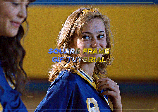
How do you get that square frame on some of your gifs? Is it a template?
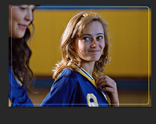
Hi I'm assuming you mean like in the first and last gifs of this set?
I don't use a template I just manually draw the rectangle/square in. It's super easy and only a few steps (see below for the cut)
Start with your gif, colour it as you'd like for your set. For this example I'm going with a blue and yellow :)

Right click on the rectangle tool and select "rounded rectangle tool" from the drop down list. (you can use the normal rectangle, but I prefer the rounded corners personally)

use the cursor to draw from the top corner to the bottom corner, you'll get an outline something like the below screencap.
When you finish drawing a rectangle will show up

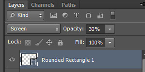
Change the settings in the above tool bar to match how you'd like your outline. Always change it so there is no fill

I have changed my stroke to be a blue and yellow gradient

This gives the below result

I think this is a little too strong, so I adjusted the stroke to 2
I also would like it to blend in a bit more with the gif so I changed the blend mode to screen. I also adjusted the angle of the gradient from 90 to 28
To make it a bit softer still, I'm also going to adjust the opacity of the rectange layer to about 30 which gets us the below result

One last step, is because I didn't draw it perfectly in center I align the layer to the center of the gif by pressing ctrl + a to select the whole canvas (should give the below selection lines)
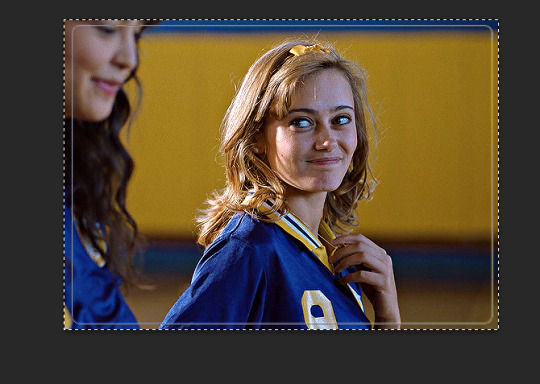
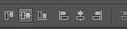
then click over to the move tool

then press the highlighted option

then press this option
this just shifts the layer to be centered
press ctrl+d to clear your selection
this gives the following result

Last step is to make sure your rectangle layer is the same length as your gif. You just either drag the layer to match the bottom gif layer (or you could also just adjust the gray gif slider instead)

and now all you need to do is add text and other effects as needed :)
#asks#ps help#usergif#allresources#resources#yeahps#completeresources#resourcemarket#dailyresources#tutorials#photoshop tutorial#*mine#i hope this is what you were after#also i wanted to take some more screencaps but computer wasn't cooperating so hope it makes sense :)
30 notes
·
View notes
Text

CSS Gradient Text Background Animation
#css gradient text animation#css text animation#css animation examples#css animation tutorial#css tricks#css effects#html css#learn to code#code#frontend#html#css3#css#frontenddevelopment
0 notes
Text

CSS Text Gradient Background Animation
#css text gradient animation#css text gradient#css text animation#css text effects#animated text effect#html5 css3#html css#codenewbies#frontenddevelopment#css#css animation examples#pure css animation#css animation tutorial#animated text#css gradient animation
2 notes
·
View notes
Note
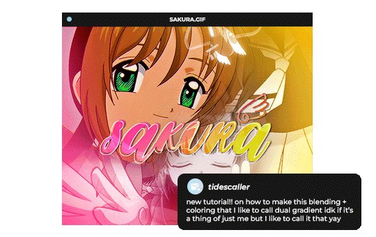
Hello, this gifset for pscentral event 37 is really pretty ✨
https://www.tumblr.com/tidescaller/779330612766081024/pscentral-event-37-trios-the-girl-the-boy-and?source=share
would you please consider posting a tutorial on how you made the blending multi gifs and colouring in the first gif?
Hi anon, so glad you liked it! I'll try my best to explain as detailed as I can. Just a small note that I'm not an expert, I'm still pretty new to blending edits in general so I'm learning as well as everyone ૮(˶˃ᆺ˂˶)
But before that real quick, and if my tutorial isn't enough, I'll leave you a list of amazing tutorials/guides that help me a lot when it comes to everything gifmaking related, so shoutout to them!
basic blending tutorial
coloring tutorial
blend gifs tips
blending, coloring and text effects guide (video)
another one similar to the previous one
gradient text
text outline
HOW TO: Blend multi - gifs / Dual Gradient coloring
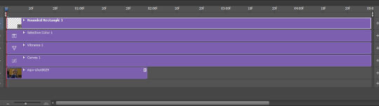
You will need any version of Photoshop (I use CC 2019) and basic knowledge on making gifs.
STEP 1: THE BASE
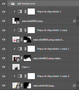
1.1 - Make sure your canvas is 540px width. Mine is 540x450. Choosing which gifs to blend is kinda tricky and no one can tell you what's perfect. Everything depends of the scenary your show, movie, anime whatever you're working on has; but a tip is to use scenes that have dark areas, since it's easier to blend then. 1.2 - Make your individual gifs: crop, color, sharpen, all that, and make sure all of them are the same amount of frames. 1.3 - Before duplicating your gifs into your empty canvas, convert them all into smart objetcs. This will help to simplify stuff, have a much more organized work space and help you load your preview faster.

STEP 2: BRING YOUR GIFS
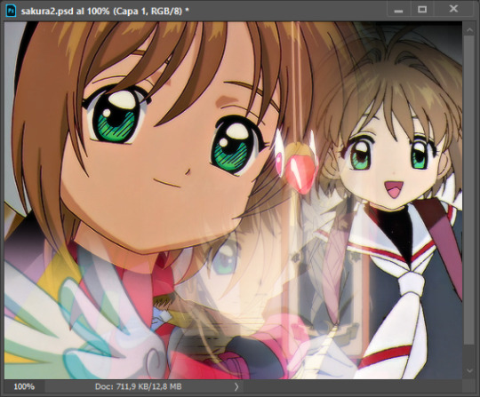
Now all you have to do is right click on every gif you made, go Duplicate layer… and sent it on your empty document. I would suggest doing one by one, so you can work better. Duplicating them all at once can be a little bit intimidating and might have you confuse how to combine your gifs. Try imagining what you want your gif to look like and where you want each element to be. As an example, I wanted the key scene when it kinda drops to be falling from the top of my gif and also as a separation of the one in color and the one Sakura is roller-skating.
STEP 3: BLENDING
3.1 - Okay, now that you more or less know what you want your gif to look like you can start by changing the blend mode of your gifs. Photoshop has mutiple options on this and it applies to all types of layers. For blending, one of the two (or more) gifs you are working is going to be on top, that's the one you're gonna have to change its blend mode in order to start this process. Generally, Screen is the one to go to.
3.2 - Some people group (selecting your layers > ctrl/cmd+g or right click > group) all the gifs so they can then change the group's blend mode into Screen but I personally like to do separately cause if I need a gif to fill some of the background I would keep it as Normal.
STEP 4: LAYER MASK
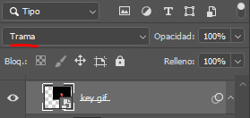
The key gif works perfect with Screen blend as it has a black background, but of course this won't be the case for most gifs you want to put in the main one. For those unwanted pixels we don't need, we use a Layer Mask. 4.1 - In order to do that, select your gif by clicking on them and next click on the layer mask button.
4.2 - Now you'll see a white square next to your gif layer. This will help by reducing the opacity of those things we don't need of your gif. What is white is 100% opacity and what is black 0%. So all you have to do is click on the layer mask, pick the brush tool and paint over what you want to "delete". Pay attention to use a soft brush, and the size of it should be around 200 and 300px. 4.3 - Repeat the process with all the gifs that need it
STEP 5: EXTRA LAYER
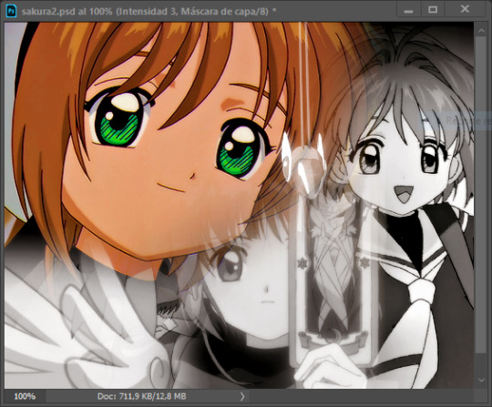
Sometimes a gif will look too bright/transparent/softened over the other ones. In order to fix this, you can create a new layer (the button right next to the trash can)
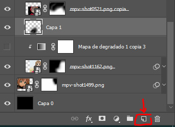
and paint with a black soft brush over the part you need to bring back. I don't know exactly how to explain it properly but I'll try with these before and after images. I'm adjusting the one with Sakura and her card:
STEP 6: COLORING
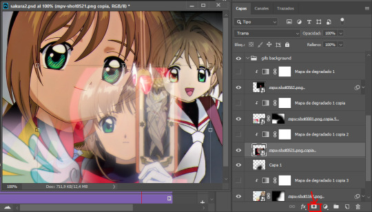
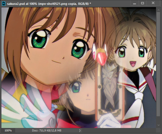
6.1 - OKAY, now that we have all that sort out and the gif has a proper structure is time to add some color. As I'm going to do a dual gradient after and leave only one of these 5 gifs with color, I'll use a black and white gradient map and add it to every individual one as a clipping mask (right click on the gradient map > create a clipping mask). Like this:
6.2 - Now that we have this I can add my own psd. I started making my own psds for every edit I make and I'm not ready in any way to explain that, but I learn how to do this with this tutorial. With that, my gif now look like this:
STEP 7: DUAL GRADIENT
Finally for this part I recommend making another group (the folder button next to new layer) and add a new layer for the different colors you add. This is all about painting and playing with the blending modes for these layers. There's no right way to do this, you just have to play around and see what works best for you and the scenes you have. You will end up with something like this:
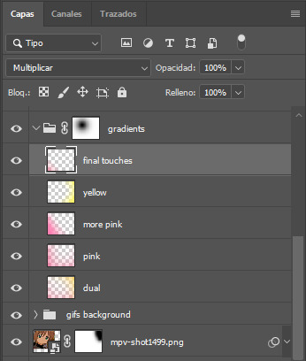
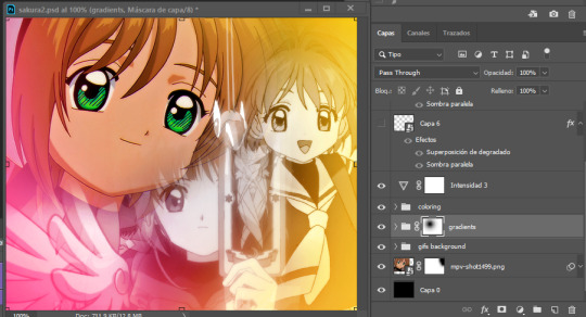
Tips for this step are: 7.1 - Use a soft brush, size it up to 1000px, zoom your gif out and start painting out of the canvas. This will help create that gradient effect we are looking for. 7.2 - Change the layer's opacity/blend mode. This is (again) about playing around with colors. I changed these settings for all my layers that are part of the gradients' group. In order: dual is Screen + 90% opacity, pink Vivid Light + 70%, more pink Lighten + 90%, yellow Hard Light + 70% and final touches Multiply at 100%. I also mixed up the colors, not only staying with certain yellow or pink. 7.3 - The gradient tool works the same way as the brush tool! Just make sure the gradient is any color you're working with + transparent. 7.4 - I also added a layer mask to my gradient's group to erase some of the extra color in Sakura's face. All this will result on this:
And that's pretty much it! For the text part, I was going to add it but the tutorials I linked at the beginning explain it perfectly so shoutout to them. As always, if you have any other doubt, send me an ask and I will answer it as fast as I can! Always happy to help ⸜(。˃ ᵕ ˂ )⸝♡
#answered#anonymous#*tutorial#photoshop help#gif tutorial#blending tutorial#photoshop tutorial#coloring tutorial
23 notes
·
View notes
Note
i feel sooo dumb asking this but how do u make the text a color gradient on ur posts / a color you actually want?? i feel like the colors we have available are soooo drab

aw no don’t feel dumb for asking,, we all start somewhere & i’m super happy to help ૮꒰ྀི⊃´ ꒳ `⊂ྀི꒱ა !! ( as i was once in your shoes as well & had to figure it out all on my own with a bunch of v v v helpful posts from like 5-6 yrs ago T^T )
this is gonna be really long bc i wanna be as transparent & as helpful as possible so be warned pfftttjsfhdjh

but yes i so agree w/ you that the very minuscule, very . . . neon . . . colours aren’t really to my tastes either T^T so for colour picking i normally find a picture to use for a general ~vibe~ ( ie. the gif in my pinned, i took a still and uploaded it to this website [https://imagecolorpicker.com] & individually picked a light to dark green gradient i was happy with ^^ )
however you could also generate a gradient you’d like from this website [https://coolors.co] & randomize it until you get a colour scheme you fw (˶˃ ᵕ ˂˶)
oooooor you could just manually go through various pinks, blues, greens and purples on this website [https://htmlcolorcodes.com/color-names/] & pick a light to dark gradient all by yourself ദ്ദി ˉ͈̀꒳ˉ͈́ )✧
as for actually colouring the text, this website has been my holy grail for like a year now [https://www.stuffbydavid.com/textcolorizer] and it’s v straightforward. just input what your text is in the textbox, pick the gradient effect ( for my post I used the three coloured gradient ) , input the hex codes of the colours you selected going from light to dark ( or vice versa if you wish )
do not bother with anything from “step 4”, look at the preview of the text and if you’re happy with it , copy the entire box from the HTML code section.
then you’re gonna open tumblr and create a new post but instead of directly pasting it on, you have to click the gear icon on the top right to toggle settings and go to text editor and click the ‘HTML’ option which will bring you to the coding ( i think ? T^T )
& that’s where you’ll want to paste what you copied earlier , and if you don’t want to change the font you can click “preview” and see if you’re happy w/ it & save the draft and add to your post as normal once you toggle back to "rich text".
& the final result should look like this : haiiiii :3
however, if you are like me, and want that extra little flourish, you can literally just search up " font copy and paste " and like go to the first site or wtv & type in your text and copy the font you wish.
however it gets a little convoluted and time consuming in regards to pasting it (if you use a gradient), because you have to individually replace each standard font letter with the desired font letter like so until the entire word is replaced w/ ur desired font ^^
& the final result should look like this : 𝒉𝒂𝒊𝒊𝒊𝒊𝒊 :3
but, if you only do a solid colour it's much easier to replace the text as in the html side it'll look like " <span style='color:#DB7093;'>haiiiii :3</span> " & you can easily replace the whole text [ in this example "haiiiii :3" ] in just one easy paste [ with "𝐡𝐚𝐢𝐢𝐢𝐢𝐢 :3" in its stead ]
ALSO ! my biggest tip would be to make two separate drafts bc it gets so confusing for me personally when i see the coding for the large text wall on the rest of my post. so what i do is just make a separate draft of the coloured text, copy the final result then paste it onto the draft i'll actually post ₍ ᐢ.ˬ.ᐢ₎
very slight disclaimer though, i majority use tumblr/format my posts on the desktop version, so i'm not entirely sure if this is applicable on mobile ( in regards to the html toggle on tumblr ). regardless i hope this was straightforward & easy to follow nonnie ,, here's to gracing tumblr w/more visually appealing posts 2025 o( > ᗜ < )o ₊˚⊹ ᰔ

#𓂃 𓈒 𓏸 𝚒𝚗𝚋𝚘𝚡 𓆟 • . ˚#this is a very imperative skill set to have when writing fanfic so you can have a visually appealing layout#. . . speaking from experience . . . don’t ask ໒꒰ྀི๑﹏๑// ꒱ྀིა
29 notes
·
View notes
Note
hiii milkyyyy! u’ve been popping out so many manga pages and i’m just so amazed?? i’ve been wanting to get back to manga drawing so can i ask for some tips? like what’s your process and how do you decide the screen tones/sfx/effects/speechbubbles to use? the latter is something i’m struggling with 😭
tyyy 💕
Hi Yudi, thanks for dropping by!
General note: One thing I’ve learned about trying to go for a more manga-esque style is that there’s really no particular way to do it, and EVERY artist does it differently. Everything I do here is a blend of my own style and things from JP artists I admire! However, the most important thing is that panels aren’t meant to be masterpieces but to convey information and get the dialogue going.
This process will be CSP oriented. I’ve made a mini screen tone tutorial (and how to turn on Layer Property) but I did not talk about my own settings ^^ You’re free to do any resolution you want, though I stick to drawing on a B4 template for fun (and imagine that one day my stuff can get published /j). I hope this helps, as I’m still trying to figure my own style and set limits on the details too.
[Process]
Script + Thumbnail
I used to wing stuff for one-pagers, but now I’ve found that scripting and thumbnailing has made my process so much faster. (Omg it’s almost like people make drafts for a reason- @ me cause I hate planning)
There’s no standards of a comic script, and each publisher has their own format. My usual scripts don’t separate pages, since I leave that to the thumbnailing once I do dialogue placement. If trying to imagine panels without seeing them overwhelming, at least get the dialogue down.
The B4 thumbnail template I use is pretty darn big, so it also doubles as the sketching stage. Once the thumbnails are done, I transfer them (screenshot) to a comic file on CSP. Once the set up is done, I do speech bubbles + dialogue first, insert the frames, then get to the line art. Since I don’t think anyone is actually gonna print their works, you’re free to trim your canvas however you want to post online 🫡
Speech Bubbles
Any speech bubble can work and will eventually blend in as the viewer is reading, but I have a vendetta against super flat/digital-looking ones. I made a custom brush for a textured speech bubble pen with line width by adjusting its taper and changing the brush shape. Published manga are a different story, but I like the more organic polygonal bubble shapes from indie artists-
For different shapes and situation… Squares - Narration, Flash/Urchin - Character thoughts/internal monologue, Hexagon - Phone call/text (not a concrete rule but a common pattern)
You can also add emanata (sparkles/symbols) on the bubbles for flairs as you see fit.
Screen tone (Please read the linked mini-tutorial above)
I split my tones into two folders. One specifically for black, and greys.
I first fill in all black areas, the duplicate them. The top layer will be the shadows (remains pure black), and the bottom layer is set to [Opacity 75%] and turned into a screen tone layer with a [frequency of 45-50] (It must always be at a lower frequency than the greys). To add texture, I use a grainy brush to erase bits of pure black on a mask. To show light on the screen tone layer, I use gradient erase on a mask.
For the greys, I split them into three tones (dark grey, medium grey, light grey) all in the same folder so they don’t overlap and it’s easier to fix. I use a [frequency of 75] or any number higher than the screen tone in the black layer. Overall, tones can be as simple and complex as you want, but it’s best to save more detailed tones for important panels. (Planning to change this as I’ve realized how big the B4 canvas actually is, and the frequency doesn’t need to be so high- The size of screen tone is a preference. This example was done on a smaller canvas, so higher frequencies still look less pixelated/small.)
Emanata/SFX
Special effects is whatever the situation calls for! It can to make a blank canvas feel more dynamic, to evoke certain emotions, hint/foreshadow. It’s best used sparingly on important panels you think would be the most important… but how do you get those effects?
THE CLIP STUDIO ASSETS STORE- Or draw/download your own depending on the program (You have no idea- ever since I downloaded too, I can’t unsee them in other works of artists I like 😭) Not used in the example but these are my essentials- You can also find a lot of gems if you straight up search “manga” and see the most popular assets.
Another good place to find comic fonts in general is blambot.com (?). They have quite a bit of free, personal use fonts if you ever need flavour text when italics or bold isn’t enough. (Current font used is Anime Ace 3 Regular BB).
Happy creating and feel free to ask if anything was unclear ^^
29 notes
·
View notes
Text
✩ ‧₊˚ ✩。FAQ — frequently asked questions by you guys! 🎤

how do you change the colors of your text gradients on your fics?
vegas: i use a website that's called stuffbydavid! there's other websites too but this one is the most easiest (in my opinion). here's a step by step tutorial i did!
where do you get your headers from?
vegas: i usually get them from twitter. you can find some too on tumblr with users like @/stepghost but i usually use twitter. most of my works have headers from the mangas “lady k & the sick man” and “infiltration! on the edge”
how do you color your banners in ómbre?
vegas: i use picsart! you can also use ibis paint i believe. i usually toy around the effects until i find a color that’s just right. here’s a step by step tutorial i did!
do you have a posting schedule?
vegas: mmm not really. i post whenever i feel like it + whenever i have the time / energy. although, i try to post fics near the weekends or close to fridays. headcanons usually around the beginning of the week and drabbles + thirsts whenever.
are your requests open?
vegas: yes aaaand no! you can always send me requests but it’s a 50/50 chance i’ll be able to get to it because i’m always super busy. suggestions are completely fine though! thirsts are also fine, and those take me quicker to write -> example.
who are your favorite characters to write for?
vegas: toji, choso, nanami and sukuna!
do you allow spam liking?
vegas: i do not! please refrain from doing that, i appreciate it though! spam liking can detect to tumblr that im a bot and shadowban / hide my entire blog. i block spamlikers. spam reblogging is entirely encouraged & a-okay! :)
did you get my request? (if they are open)
vegas: i see every request i get! if it’s been a while and i haven’t replied, i apologize. i get tons of ask every day and i try not to overwhelm myself. you can politely ask if ive seen it + remind me what it was because sometimes tumblr eats my asks.
why haven’t you answered my ask?
vegas: again, i have a bunch of asks piled up and i apologize. handling this blog can be quite overwhelming and i promise i’m not ignoring anyone <3 i try my best to answer each ask, even though that’s almost impossible. sometimes i don’t answer specific asks because a) they make be uncomfortable b) i don’t know how to reply or c) tumblr probably ate it or it got lost in my inbox. if it’s important you can ask again, but please be patient with me :’)) if it’s a request / thirst and you constantly ask me about it, don’t do that. constantly spamming me asks anon or not will result in a block.
what times are you most active?
vegas: it depends! my time zone is (GMT - 4). im usually active during the evenings, sometimes during the afternoon.
107 notes
·
View notes