#css text gradient
Explore tagged Tumblr posts
Visit Tumblr Blog
Explore Tumblr blogs with no restrictions, modern design and the best experience.
Last Seen Tumblr Blogs


Fun Fact
Tumblr was created by web developers David Karp and Marco Arment.
Text

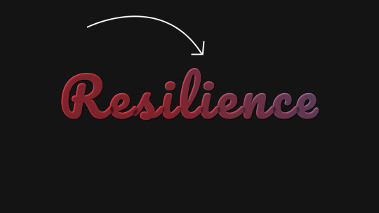
CSS Text Gradient Background Animation
#css text gradient animation#css text gradient#css text animation#css text effects#animated text effect#html5 css3#html css#codenewbies#frontenddevelopment#css#css animation examples#pure css animation#css animation tutorial#animated text#css gradient animation
2 notes
·
View notes
Text

text gradient background animation
0 notes
Text

CSS Gradient Text Generator is a CSS code generation tool that helps developers and designers create visually appealing colorful gradient text effects. It allows you to apply gradient colors to text elements effortlessly.
#CSS Gradient Text Generator#CSS Code Generator#Gradient Text Generator#free online tools#online tools#web tools#online web tools#free web tools#online tool#a.tools
2 notes
·
View notes
Text
#workskin .rainbowStroke { -webkit-text-fill-color: black; background-image: -webkit-linear-gradient(-45deg,blue,magenta,red,orange,yellow,green,cyan); -webkit-background-clip: text; -webkit-text-stroke: 2px transparent; padding-left: 5px; margin-left: -5px; padding-right: 5px; margin-right: -5px;
}
edit: added four new lines to prevent bg clipping
spokeishere text (black text with rainbow stroke) if anyone wants it
idk if theres already a workskin that works just like/similar to this but i havent checked lol
breakdown of code for anyone too intimidated to play around with it (not an expert tho this is mainly just me listing down my conclusions after playing around with it, also written in a way thats assuming the reader knows fuckall about coding):
#workskin .rainbowStroke { -webkit-text-fill-color: black; background-image: -webkit-linear-gradient(-45deg,blue,magenta,red,orange,yellow,green,cyan); -webkit-background-clip: text; -webkit-text-stroke: 2px transparent; padding-left: 5px; margin-left: -5px; padding-right: 5px; margin-right: -5px;}
code name
> can be changed
> is what you use to define the code aka attach the properties to the actual text using text
text color
> webkit is what supports the existence of stroke hence why it's there and why you cant just use {color: black;}
> fill is what thickens the text, you can delete it but it makes the text harder to read
stroke colors aka the text outline
> deg is the way the colors are rotated, feel free to change the number and to make it positive or negative
what makes the stroke not just a square
> clipping for those of you unfamiliar with it just means it follows the shape of whats underneath it
stroke properties
> the px means pixels and indicates the size of the stroke
> transparent means it'll actually show whats underneath, it can be deleted but doing so will make the text moremuddy/desaturated
background overflow
> there to prevent the colors from being cut too short since nackground normally is almost the exact size of the text
> can be changed but will affect the colors, also having it too small will cause clipping
anything in black/white is code language properties, you cannot make anything without them
#writing#spokeishere#did this cause i wanted to try colorcoding in my fics but realized that spoke has a rainbow gradient thing going on#took me like 2 hours to get through all the technobabble and irrelevant info to find what i was actually looking for#https://stackoverflow.com/questions/61825324/css-gradient-text-with-opacity-and-gradient-text-stroke-outline#<---- shoutout to the guy from this question btw couldnt have done it without ya#https://stackoverflow.com/a/17756378#<------- also shout out this guy
6 notes
·
View notes
Text
0 notes
Text

Gradient CSS Text Background Animation
#css gradient text#text animation css#pure css animation#gradient text css#css gradient animation#learn to code#html css#code#divinectorweb#frontenddevelopment#css#css3#html
0 notes
Text
peachy keen ao3 site skin
If you'd like to add this site skin to your AO3 account, the code is under the cut.
Colours Used: pale peach: #ffeae4 darker peach: #f3c6ba yellow: #ffd7a8 orange: #ff9b75 reddish orange: #f44336 darkest orange: #8E0505
CSS:
#outer { background: linear-gradient(90deg, rgba(255,155,117,.9) 0%, rgba(255,215,168,1) 100%); }
#header .primary { background: #ff9b75; background-repeat: repeat; box-shadow: none; }
#search .button, #header .logo { display: none; }
#header .heading a, #greeting img.icon { visibility: hidden; }
#header #search .text { background: #ffeae4; border: none; box-shadow: none; width: 7em; }
#header h1.heading a::before { content: " 🍑🍑🍑"; visibility: visible; }
.splash .module h3 { border-bottom: none; color: #f44336; }
#header .menu, #small_login { background: #ffeae4; box-shadow: none; width: 20em; }
#greeting .user > li a { color: #8E0505; }
#header .menu li, .splash .news li { border-bottom: none; }
#header .actions a:hover, #header .dropdown:hover a.dropdown-toggle, #header .menu li a { background: none; color: #f44336 !important; }
#footer { background: #ff9b75; }
#main { color: #8E0505; }
#main a { color: #f44336; }
.splash .favorite li:nth-of-type(2n+1) a { background: #ffeae4; border: 1px solid #ffeae4; border-radius: 5px; }
.splash .favorite li:nth-of-type(2n+1) a:hover, .splash .favorite li:nth-of-type(2n+2) a:hover { background: #f44336; border: 1px solid #f44336; border-radius: 5px; color: #fff !important; }
.resp-sharing-button--twitter, a.resp-sharing-button__link { color: #fff !important; }
.listbox, fieldset, fieldset dl dl, fieldset fieldset fieldset, fieldset fieldset dl dl, dd.hideme, form blockquote.userstuff, .dynamic form { background: url("https://image.freepik.com/free-vector/vector-seamless-pattern-with-peaches_1015-1760.jpg"); background-repeat: repeat; border: 4px solid #fff; box-shadow: none; }
form dl { background: #ffeae4; border: 2px solid #fff; box-shadow: none; }
input, textarea { border: 1px solid #f44336; box-shadow: none; }
input:focus, select:focus, textarea:focus { background: #ffeae4; }
form dt { border-bottom: 1px solid #fff; }
form dd.required { color: #8E0505; }
.LV_invalid { background: #ffd7a8; border: 1px solid #fff; color: #f44336; box-shadow: none; }
.LV_invalid_field, input.LV_invalid_field:hover, input.LV_invalid_field:active, textarea.LV_invalid_field:hover, textarea.LV_invalid_field:active { border: 1px solid #8E0505; }
.autocomplete div.dropdown ul { background: #fff; border: 1px solid #f44336; color: #f44336; box-shadow: none; }
.autocomplete .dropdown ul li:hover, .autocomplete .dropdown li.selected { background: #f44336; color: #fff; }
.required .autocomplete, .autocomplete .notice { color: #f44336; }
.ui-sortable li { background: #ffd7a8; border: 2px solid #fff; box-shadow: none; }
.ui-sortable li:hover { background: #ff9b75; border: 2px solid #fff; box-shadow: none; }
.ui-draggable form { box-shadow: none; }
.notice, .comment_notice, .kudos_notice, ul.notes, .caution, .error, .comment_error, .kudos_error, .alert.flash, muted.notice, form.verbose legend, .verbose form legend, span.question, span.symbol, select { background: #ffeae4; color: #f44336; border: 2px solid #f44336; box-shadow: none !important; }
#modal { background: #ffeae4; border: 4px solid #ff9b75; box-shadow: none; }
#modal .content { border-bottom: none; }
.actions a:visited, .action:visited, .action a:link, .action a:visited { color: #f3c6ba; }
.actions a:hover, .actions input:hover, .actions a:focus, .actions input:focus, label.action:hover, .action:hover, .action:focus { color: #f44336; border-top: none; border-left: none; box-shadow: none; background: #f3c6ba; }
.actions a:active, .current, a.current, a:link.current, .current a:visited { color: #fff; background: #ff9b75; border-color: #fff; box-shadow: none; }
.actions label.disabled { background: #ff9b75; }
.actions .disabled select { color: #fff; border-color: #fff; }
.delete a, span.delete { color: #f44336; box-shadow: none; }
.secondary { background: #fff; border: 2px solid #f44336; box-shadow: none; }
.own, .draft, .draft .wrapper, .unread, .child, .unwrangled, .unreviewed { background: #ffeae4 !important; }
.draft { border: 2px dashed #ff9b75; }
span.unread, .replied, span.claimed, .actions span.defaulted { background: #f3c6ba; color: #f44336; border: 1px solid #fff; border-bottom: none; }
.actions span.defaulted { color: #8E0505; }
.draggable, .droppable, span.requested, .nominations .rejected { color: #8E0505; }
.nominations .approved { background: #ffeae4; }
.nominations .rejected { background: #f3c6ba; }
span.offered.requested { color: #ffeae4; }
.wrapper { box-shadow: none; }
dl.index dd { background: #f3c6ba; }
p.kudos { background: url("https://64.media.tumblr.com/14dd2ee05dbcc111dab41d6206985fe8/b1eb33fb168e0088-4b/s1280x1920/8fabca965895c42bae4d746506ffc96324eb2fd5.png"); background-repeat: no-repeat; }
.statistics .index li:nth-of-type(even) { background: #f3c6ba; }
fieldset fieldset.listbox { background: #ffeae4; border: 2px solid #ff9b75; box-shadow: none; }
.listbox>.heading, .listbox .heading a:visited { color: #f44336; }
.listbox .index { background: #ffeae4; box-shadow: none; }
dl.meta { border: 2px solid #f44336; background: #ffeae4; }
.actions a, .actions a, .action, input[type="submit"], button, .actions label, .actions a, .actions a:link, .action, .action:link, .actions input, input[type=submit], button, .actions label { background: #ffeae4; border: 1px solid #f44336; text-shadow: none; color: #f44336; }
.current, #dashboard .current { background: #f44336; border: 1px solid #fff; text-shadow: none; color: #fff; }
#dashboard.own { border-top: none; border-bottom: none; }
#dashboard a { color: #f44336 !important; }
#dashboard a:hover { background: #ff9b75; }
label { color: #f44336; }
li.blurb, fieldset ul { background: #ffeae4 !important; border: 2px solid #fff; }
#header h2.collections, .reading h4.viewed, dl.index { background: #ffeae4; color: #f44336; }
.comment h4.byline { background: #f3c6ba; border-bottom: 2px solid #fff; }
.comment div.icon { border-bottom: 5px solid #ff9b75; }
li.comment { border: 2px solid #fff; background: #f3c6ba; }
li.comment ul.actions { background: transparent !important; border: none !important; }
#stat_chart g[clip-path^=url] > g:nth-of-type(2) rect, #stat_chart svg g:nth-of-type(2) > g rect:last-of-type, #stat_chart g[clip-path^=url] > g:nth-of-type(2) rect:first-of-type { opacity: 50% !important; }
h5.fandoms.heading a, .fandom .tag, .work .fandom a.tag { font-variant: small-caps; }
.warnings .tag, .work .warning a.tag { background: #8E0505; border: 1px solid #8E0505; border-radius: 5px; color: #fff !important; padding-left: .5em; padding-right: .5em; }
.relationships .tag, .work .relationships a.tag { background: #f44336; border: 1px solid #f44336; border-radius: 5px; color: #fff !important; font-weight: bold; padding-left: .5em; padding-right: .5em; }
.characters .tag, .work .characters a.tag { background: #ff9b75; border: 1px solid #ff9b75; border-radius: 5px; color: #fff !important; font-weight: bold; padding-left: .5em; padding-right: .5em; }
.freeforms .tag, .work .freeforms a.tag { color: #f44336 !important; }
.commas li:after { content: none; }
ul.tags { line-height: 190%; }
1K notes
·
View notes
Text
!!! my tag system is below all of this,,, I moved it under a cut because people reblog this post for the links :P
edit: thx for the love on this post. im going to try and continually update this!

⇩ ⠀sites FULL of web graphics ⇩
blinkie maker : make your own blinkies!
DOLLZ REVIVAL : a revival of pixel dolls where you can create and share your own. very cute!
GlowTxt : create glowing transparent text gifs that say whatever u want
HOARDER'S PILE : contains blinkies, buttons, stamps, and teddies
plasticdino.neocities.org : blinkies
Glitter Graphics : contains gifs, blinkies, dividers, and just sooo many web graphics
Cute Kawaii Resources : contains gifs, blinkies, stamps, favicons, dividers, buttons, fonts, literally everything you need. its an insane resource
Adrian's blinkie collection : collection of blinkies, stamps, and buttons
☆ (supplies.ju.mp) : blinkies, stamps, buttons, & favicons
twigbranch.carrd.co : blinkies
lallys.carrd.co : blinkies, stamps, dividers, and other resources
Bugleeblinkie.carrd.co : blinkies, and 3 very special gifs at the end ;)
unshinesblinkies.carrd.co : blinkies
The 88x31 GIF Collection : buttons. there are 5 parts! huge collection!
Bonnibel's Graphic Collection : blinkies
WELCOME TO GIFCITY : blinkies, dividers, favicons, stamps
cass-tastrophe.carrd.co : blinkies, stamps
kotatsuOS : blinkies
Cute web graphics : blinkies, stamps, dividers, and a LOT of other graphics, all very cute
⇩ some html tools! + tags below cut ⇩
MDN (mozilla.org) : if you're just starting out like me this is super helpful HTML Tutorial (w3schools.com): same here! (offers other programming languages as well!) Accessibility Checker(Free Scan) : a site you can use to check accessibility/ADA compliance when making your website! it will point out what needs to be changed. it is free, but they also offer paid services if you need more help imagecolorpicker.com : hex code picker. i use this one because you can upload an image, paste clipboard, OR type in the website and it'll grab a screenshot for you! something simple that was made really well. cssgradient.io : helps you make css gradients for backgrounds or whatever else you need them for smartgb.com : a free guestbook service FC2 Counter! : free "site visits" and "online now" counters. fully customizable Unclosed Tag Checker by Alicia Ramirez : does as it says, checks for unclosed tags (although I recommend using a program that does this as you write anyways. I use Visual Studio Code. Status Cafe : an updateable and embeddable status that you can stick anywhere on your site! it is mostly customizable with CSS but I have noticed a few small quirks with it
my tagging system :))
#graphics
#blinkies
#stamps
#buttons
#dividers
#html/css
#resources
#code
e10's web (neocities.org) <- shameless site plug. show it some love :P
#blinkies#stamps#favicons#gifs#old web graphics#old web aesthetic#old web stamps#old internet#old web#old webcore#2000s web#90s web#html#html css#html5#css#htmlcoding#web design#web resources#early web#early internet#neocities graphics#neocities#geocities#gifcities#web graphics#webcore
543 notes
·
View notes
Text
Dark Mode Work Skin for the fic To Be a Dragon Among Men
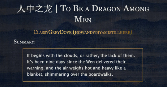
This is the code and urls for the custom dark mode work skin I made for my fic To Be a Dragon. Feel free to use it for your own works or for site skins, just remember to credit my user if you do.
[EDIT 25-03-18: Fixed padding for .frameborder class]
[EDIT 25-06-12: Added formatting rules for .poetry class and <p>]
Additional Resources
A Step-by-Step Guide to Work Skins from AO3 News - A great basic guide to what work skins are and how to make one.
How to Apply Work Skins to Others' Works by classygreydove - This is a guide I made on how to make a work skin into a site skin. You'll need to know this if you want to apply the work skin to any fic you want to read.
How to Change Work Skin Font by classygreydove - Don't like the font I use for the work skin? Don't worry, I'll show you how to change it.
Light Mode CSS - You can find the code for the Light Mode work skin here.
Light and Dark Mode Backgrounds - You can find the background images for the Light and Dark Mode work skins here.
Other Background Options - Here are a few mid-tone backgrounds that will have a lower contrast to the text.
Line Breaks (for Phone) - Do you like the custom dragon line breaks? Here's the phone-sized ones.
Line Breaks (for Wide Screens) - Do you like the custom dragon line breaks? Here's the laptop-sized ones.
[Code begins under Keep reading break]
#workskin .userstuff .hr, #workskin .hr, #workskin hr { height: 36px; width: 178px; background: url(https://64.media.tumblr.com/f19653c8c877dbe7a14e78434f1d0df6/d0f8688c32033f2d-b3/s250x400/6edcdac1e5614693d10491cff0725fd3633de77e.png); background-repeat: no-repeat; background-position: center; border: 0; }
#workskin { background: url(https://64.media.tumblr.com/f20ef324c5117a56d7dd2c8aa7e45151/4dcdf7c3c32cb0d1-68/s2048x3072/10c1120c78cd66a99c1067e6ed8b1addcd52ef57.png); background-repeat: repeat-y repeat-x; background-position: top; color: rgba(255, 255, 248, 0.85) !important; font-family: 'Georgia', 'Lucida Grande', 'Verdana'; }
#workskin a { background: linear-gradient(135deg, #b4853f 0%, #edc967 40%, #b4853f 80%, #705103 100%) !important; -webkit-background-clip: text !important; -webkit-text-fill-color: transparent !important; border-bottom: 0px; }
#workskin a:hover, #workskin a:active { background: linear-gradient(135deg, #b4853f 10%, #edc967 60%, #b4853f 80%, #705103 100%) !important; -webkit-background-clip: text !important; -webkit-text-fill-color: transparent !important; }
#workskin h2, #workskin h3 { line-height: 1.25; font-variant: small-caps; }
#workskin .userstuff blockquote { display: block; border: 2px solid #b4853f; border-image: linear-gradient(135deg, #b4853f 0%, #edc967 40%, #b4853f 80%, #705103 100%); border-image-slice: 1; padding: 15px 15px 15px 15px; margin-left: 1.5em; margin-right: 1.5em; }
#workskin .goldborder { display: block; border: 2px solid #b4853f; border-image: linear-gradient(135deg, #b4853f 0%, #edc967 40%, #b4853f 80%, #705103 100%); border-image-slice: 1; padding: 15px 15px 15px 15px; }
#workskin .frameborder { border: 2px solid #b4853f; border-image: linear-gradient(135deg, #b4853f 0%, #edc967 40%, #b4853f 80%, #705103 100%); border-image-slice: 1; padding: 0px; }
#workskin .mobilebreak { width: 178px; max-width: 100%; max-height: 100%; display: block; margin-left: auto; margin-right: auto; }
#workskin .textlink { font-variant: small-caps; }
#workskin .notesheading { font-size: 120%; font-variant: small-caps; font-family: 'Georgia', 'Lucida Grande', 'Verdana'; line-height: 2; }
#workskin .triggerwarning { color: rgba(240, 240, 240, 0.9); border-radius: 5px; background: rgba(128, 0, 0, 0.8); padding-left: 2px; padding-right: 2px; font-weight: bold; font-variant: small-caps; }
workskin .userstuff p { margin: 0; }
workskin .poetry { margin-inline-start: 1.5em; }
#ao3 skins#ao3 writer#ao3 fanfic#ao3 work skin#dark mode#the untamed#mo dao zu shi#To Be a Dragon Among Men
27 notes
·
View notes
Text
Never did I think I could be so excited to read any form of fiction that I would read it in public, much less on a treadmill, yet here I am feeling all of the earth’s emotions on said treadmill with the sounds of Ice Spice faintly emanating from the cheap headphones worn by the guy next to me. Jake English and his self loathing mixed with insane amounts of gender-based anxieties is not something I thought I’d experience today, but I’m grateful I did.
wake up babes, new chapter of What Once Was That One Fic That Was Originally Just A CSS Test But Then I Got Way Too Into It just dropped. and with even MORE positively awful CSS this time !!!!!!!!!!!!
#the CSS also rocked my fucking shit oh my lord#and the way the text formed into a gradient as it went from (DIRK) to (JAKE)#and the word choices used by said parentheses character being fitting for both Dirk Strider and Jake English so that#upon reread#it makes sense to be either#god tier
4 notes
·
View notes
Text

🧡 Tuesday Tips #3 🧡
Your website is more than just a collection of pages—it’s your digital home. It should reflect you, your interests, and your personality. But with so many sites out there, how do you make yours stand out?
Here are 25 ways to make your website feel more personal, unique, and personalized to you!
........................................................................................................
🎨 Design & Aesthetics
1. Custom Color Palette – Pick colors that resonate with your personality and aesthetic.
2. Unique Typography Choices – Use a mix of fonts that match your vibe.
3. Handwritten or Doodle Elements – Add personal sketches or notes.
4. Custom Cursor – Let visitors use a fun, themed cursor on your site.
5. Personalized Favicon – A tiny but powerful detail that makes your site feel complete.
6. Themed Layouts for Different Pages – Make each page visually distinct but cohesive.
7. Custom Backgrounds – Textures, gradients, or even a personal photograph.
8. Retro or Experimental CSS Styles – Go wild with unique styles that make your site stand out.
9. Create a Custom Hand-Drawn Logo – Instead of a standard logo, try sketching one yourself for a unique touch.
10. Add Subtle Animations – Small hover effects, background animations, or cursor trails can bring your site to life.
11. Play With Layering Elements – Overlap images, text, and shapes for a more dynamic look.
12. Design a Personalized Loading Screen – A custom loading animation or message adds a fun detail visitors will remember.
13. Add Your Own Handwriting as a Font – Convert your handwriting into a web font for a truly personal touch.
14. Design a Seasonal Theme Switcher – Let visitors toggle between different seasonal or mood-based color palettes.
........................................................................................................
📜 Content & Personality
15. Create a Behind-the-Scenes Page – Show how your website was built, share your thought process, or include fun bloopers.
16. Add a "The Making Of" Section – Share drafts, sketches, or early concepts behind your creative works.
17. Include a Personal Dictionary of Words You Love – A list of favorite words, phrases, or slang you frequently use.
18. Design a "Things That Make Me Happy" Page – A simple, uplifting page filled with personal joys.
19. Show Your Progress on a Learning Goal – Track and share your journey in learning a new skill, language, or hobby.
........................................................................................................
💾 Interactivity & Engagement
20. Add a Clickable Mood Indicator – Let visitors see your current mood with an emoji or phrase that changes over time.
21. Create a Dynamic Banner That Updates Automatically – Display different messages depending on the time of day or special occasions.
22. Add a "What I'm Listening To" Widget – A live-updating display of your current favorite song or playlist.
23. Embed a Poll or Voting Feature – Let visitors vote on fun topics or help you make creative decisions.
24. Introduce a Mini Personality Quiz – Something quirky like “Which of my favorite books/movies are you?”
25. Make an "Ask Me Anything" Page – An interactive page where visitors can submit questions for you to answer.
Closing: Make It Yours!
Your website should be you in digital form—fun, unique, and engaging. Whether you add just one or all 25 ideas, the most important thing is to have fun and make it your own.
If you try any of these ideas, let me know—I’d love to see what you create!
-----------------------------------------------------------------
Want to help the Small Web movement grow?
Join us on other platforms. ♥
FB Page & Group:
facebook.com/thesmallweb
facebook.com/groups/thesmallweb
Twitter/X:
x.com/smallweblove
Tumblr Community:
tumblr.com/communities/thesmallweb
Mastodon:
indieweb.social/@thesmallweb
#small web#indie web#web revival#old web#blog#neocities#2000s web#decentralized social media#decentralizedfuture#old internet#decentralization
17 notes
·
View notes
Text
Gradient Text Background Animation
#css text animation#css text gradient#css gradient loader#css gradient color animation#frontenddevelopment#html css#codenewbies#css animation examples#css#html5 css3#pure css animation#css animation tutorial
1 note
·
View note
Text

CSS Gradient Text Animation
#css gradient text animation#css animation#css text animation#css text effects#html css#frontend#css#html#css3#learn to code#code#css animation examples#css animation tutorial#css animation snippets#css tricks#frontenddevelopment
2 notes
·
View notes
Text

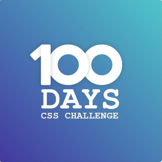
Day 1 - 100 Days CSS Challenge
Welcome to day 1 of the 100 Days CSS Challenge! In this challenge, we'll bring a design to life using only CSS. Our goal is to recreate the image we're provided with on the challenge page using HTML and CSS.
On the challenge page, we see:

A small preview of the design we need to replicate.
A starter HTML template.
A submission form to showcase our work alongside others who have taken on the same challenge.
Let's dive into the process step by step.
Step 1: Screenshot the Image
The first thing I always do is take a screenshot of the target design. Even if the design includes animation, having a static reference helps me focus on the basic structure and colors. Here’s the screenshot of the design we’re aiming for:
Step 2: Extract the Color Palette
Next, I identify the color palette that we'll need. This helps ensure that we maintain consistency with the original design. Here’s the color palette I’ve created:

Step 3: Identify and Create the Image Elements in HTML
Now that we know the colors, I break down the elements in the image:
Background: This is a linear gradient.
The 100 number: This is the main challenge, and it will require some work.
Text: “days css challenge,” which we’ll place to the left of the number.
Here’s the HTML structure for these elements:
<div class="frame"> <div class="center"> <div class="number"> <div class="one-one"></div> <div class="one-two"></div> <div class="zero-one"></div> <div class="zero-two"></div> </div> <p class="sentence1">days</p> <p class="sentence2">css challenge</p> </div> </div>
Now that the elements are in place, CSS will bring them to life.
Step 4: Bringing the Elements to Life with CSS
Linear Gradient
To create the background, we’ll use a linear gradient. Here’s a basic syntax:
background: linear-gradient(to <direction>, <color-stop1>, <color-stop2>, ...);
Parameter 1: Direction/Angle
This defines the starting point of the gradient. You can either specify a direction (e.g., to top, to bottom) or an angle (e.g., 90deg, 180deg).
Direction options:
to top
to bottom
to left
to right
If you want more precision, you can specify angles:
0deg: Gradient starts from the top.
90deg: From the right.
180deg: From the bottom.
270deg: From the left.
You can also combine two directions, specifying both horizontal and vertical movements, like to left top or to right bottom. This means:
The first keyword (left or right) controls the horizontal movement.
The second keyword (top or bottom) controls the vertical movement.
For example:
background: linear-gradient(to left top, red, blue);
This gradient starts at the bottom-right corner and transitions toward the top-left.
Parameter 2: Color Stops
Color stops define how the gradient transitions between colors. Each color stop specifies a point where a color starts or ends. Here's an example:
background: linear-gradient(to right, red 10%, blue 90%);
This means:
The element starts at 0% fully red.
By 10%, the transition from red begins.
Between 10% and 90%, there is a smooth blend from red to blue.
At 90%, the transition to blue is complete, and the remaining part is fully blue.

Once we understand the concept, we can apply the background we need. In our case, the gradient flows from the bottom left to the top right, so the code will look like this:
background: linear-gradient(to right top, #443DA1, #4EC3C9);
Bonus: Stacking Multiple Linear Gradients
You can also apply multiple gradients on top of each other:
background: linear-gradient(180deg, #f00, #0f0), linear-gradient(90deg, #ff0, #f0f);
Step 5: Making the "100" Number
Creating the Zeros
We start with the zeros. These are simply circles created using CSS. To make a full circle, we use border-radius set to 50%.
The white border gives it the appearance of the number zero.
.zero-one, .zero-two { position: absolute; height: 100px; width: 100px; border-radius: 50%; border: 24px solid #fff; box-shadow: 0 0 13px 0 rgba(0,0,0,0.2); }
This gives us a nice circular zero. We adjust their positions using properties like left and top, and manage the z-index to make sure the zeros stack correctly.
.zero-one { z-index: 8; left: 17px; } .zero-two { z-index: 6; left: 100px; }

Now both zeros are positioned, and they overlap in the way we want.
Creating the "1" Number
The number "1" is made of two div elements:
One-One: This part represents the slanted part of the "1".
One-Two: This is the straight vertical part of the "1".
What make the one-one element slightly slanted is
transform: rotate(50deg);)
the one-two is created simply with a little height and width nothing too particular then it is placed directly on top of the slanted part, giving us the full "1". Its z-index tho has to have a higher value than the slanted part of our 1 to ensure it stays above the slanted one.
Step 6: Adding the Text
For the two sentences “days” and “css challenge,” the styling is basic CSS. You can achieve the look with just a few font changes, some padding, and adjustments to font size. It’s as simple as:
.sentence1,.sentence2{ text-transform: uppercase; margin:0; padding:0; } .sentence1{ font-size:82px; font-weight:700; } .sentence2{ font-size:25px; font-weight:700; margin-top:-20px; }
And just like that, we’ve completed day 1 of the 100 Days CSS Challenge! Each part of the design is carefully crafted using CSS, giving us the final result.
Happy coding, and see you tomorrow for Day 2!
#100dayscssChallenge#codeblr#code#css#html#javascript#java development company#python#studyblr#progblr#programming#comp sci#web design#web developers#web development#website design#webdev#website#tech#html css#learn to code
16 notes
·
View notes
Text
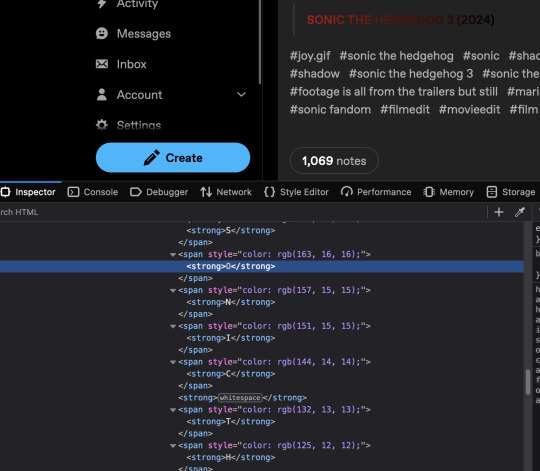
oh my god this hurts to look at
i assume it's because tumblr has to account for anything a user would want to put in their post
i'm no expert but could you not just put something like
<div class="sonic3"> <strong>SONIC THE HEDGEHOG 3 (2024)</strong></div>
in your html and
.sonic3 {
background: -webkit-linear-gradient(rgb(255, 0,0), rgb(0,0,0));
-webkit-background-clip: text;
-webkit-text-fill-color: transparent;
}
in your css if you were doing this yourself?
(Note: Firefox and its forks automatically alias these "-webkit" properties with something that works in FF environments.)
5 notes
·
View notes
Note
hiii i wanted to ask how you do the gradient on your titles, it’s really cool<33
thank you!!
HIIIIIII
well, first when I create a new post I change the text type of the post to HTML. After that, I use this site:
Then I put in the text I want, choose the colors I want and click run. Then I copy the HTML I've created and paste it into the post. Then I just switch back to rich text and that's it!
Step 1: Change the text editor to HTML (to change, just click on the post settings)

Step 2: Enter the site, enter the text you want, choose the colors and click run, then copy the generated html and paste it into the post.
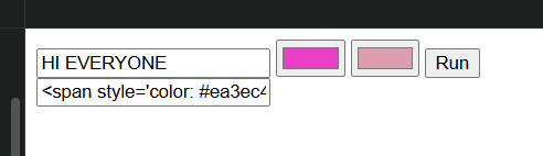
Step 3: Once you've put all the text you want in gradient, switch back to rich text and you're done!
HI EVERYONE
2 notes
·
View notes