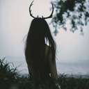
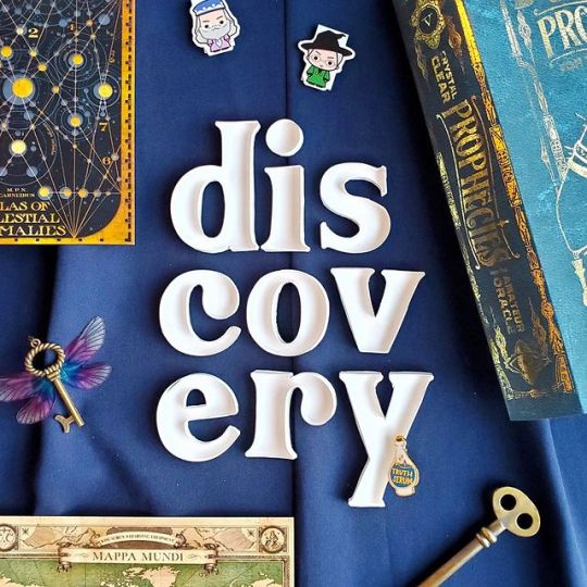
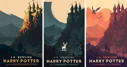
#harry potter typography
Text


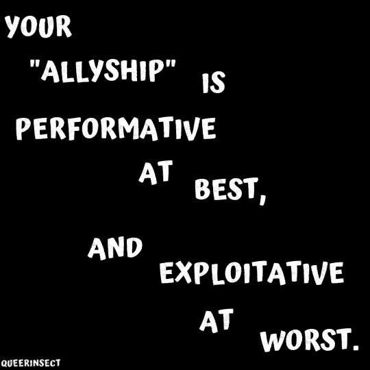

"Your 'allyship' is performative at best, and exploitative at worst."
"'Love is love' but Harry Potter is more important than trans lives."
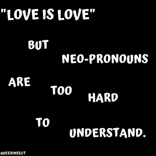
"'Love is love' but neo-pronouns are too hard to understand."
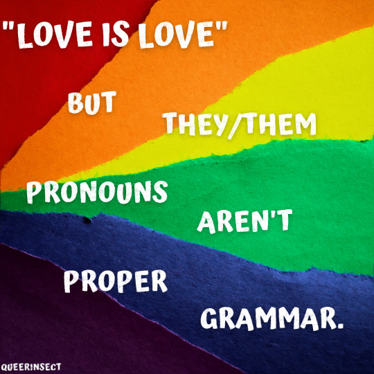
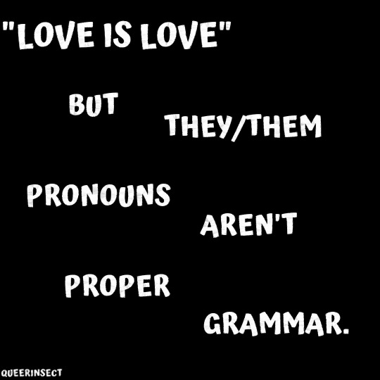
"'Love is love' but they/them pronouns aren't proper grammar."
#this one goes out to all the transphobic 'allys'#love is love#this phrase is such a joke#myart#queer#queer art#vent art#rainbow#pride#anti harry potter#anti jk rowling#anti terf#fuck terfs#edit#aesthetic#typography#art#original things#lgbt#lgbtq#trans#nonbinary#genderqueer#2023
90 notes
·
View notes
Text
#robert pattinson#twilight#actor#batman#london#london england#harry potter#edward cullen#the batman#movies#lol#fashion#art#diy#food#landscape#illustration#vintage#design#typography
15 notes
·
View notes
Text
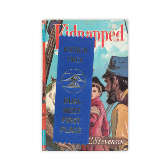
Found in "Kidnapped" by Robert Louis Stevenson. Published by The Children's Press, 1971.

Found in "The Plays of William Shakespeare" published by Bellamy and Robarts, 1791.

Elastic hairband found in "Harry Potter & the Prisoner of Azkaban" by J.K. Rowling. Published by Scholastic, 1999.
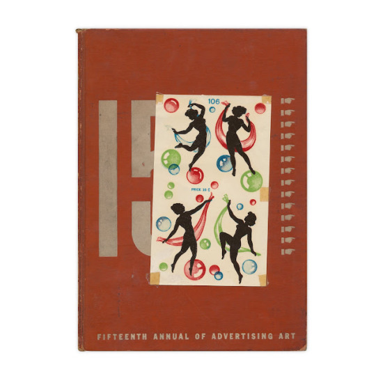
Found in "The Fifteenth Annual of Advertising Art" published by The Book Service Company, 1936

Found in "Probable Sons" by Amy LeFeuvre. Published by Revell, 1896.

Long metal spring. Found in "Most Likely to Succeed" by John Dos Passos. Published by Robert Hale, 1955.

Found in "Walks and Rambles in Dutchess and Putnam Counties" by Peggy Turco. Published by Backcountry, 1990.
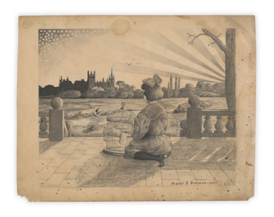
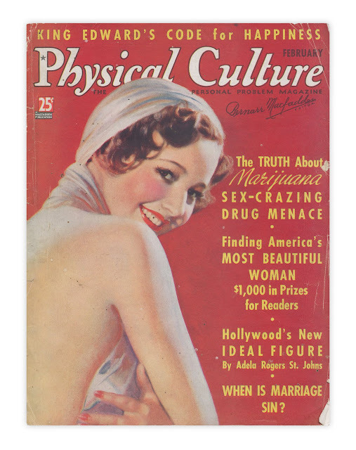
Original illustration by Albert B. Borland, dated 1907. Found in "Physical Culture Magazine" from February, 1937.
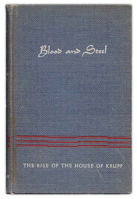
Found in "Blood and Steel" The Rise of the House of Krupp" by Bernhard Menne. Published by Lee Furman, Inc., 1938.

Found in "God Revealing His Truth Through Patriarch and Prophet" by Walter Albion Squires. Published by The Westminster Press, 1921
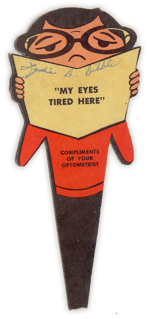
Forgotten Bookmarks found in books (x)
#graphic design#vintage#illustration#typography#antique#20's/30's#40's/50's#80's/90's#60's/70's#hp#harry potter
0 notes
Text

I’m sobbing violently look at what my girlfriend got me for Christmas alskdjskakfjf
And she got me a Harry Potter quidditch sweater and a mug about typography I’m feeling so many emotions 🥹
32 notes
·
View notes
Note
💛
OOH thank you for the ask <3!!!
I think my best skill lies within calligraphy and lettering!! I developed the interest back in design college and really fell into a love for typography and letterforms. I’ve always dreamed of working to improve myself as a type designer and hope to open up a type foundry of my own someday and pour over the intricate details of letterforms and publish my own typefaces :>
A Quick Lesson in Typography
Here’s a way to flex your design knowledge on twitter and elsewhere. Y’know that thing that people call “fonts”? Well, if you wanna get technical, designers actually categorize them with terms like type families, type faces, type weights, etc.
“What’s the difference?!” you may ask. I’m here to tell ya :D
-----
A type family refers to the style (Arial) and all of its weights (Regular, Italic, Bold, Bold Italic, Black) and sizes (12pt, 15pt, etc.).
A typeface (or font family) is similar to font, but only pertains to weight and style. → Arial Regular is a typeface. Arial Bold is a different typeface.
In the digital world, a font pertains to the software we install and use.
So when someone says they’re using the Arial font or the Times New Roman font, technically they’re actually using a typeface, not a font. It’s become such common usage though that when we hear it, we more or less know what you mean :)
-----
Another detail that can help separate you from the masses is understanding kerning and tracking. Moreso the first one as opposed to the latter.
Kerning is the spacing between each letter.
Tracking is the spacing between each word.
If you are dealing with a paragraph, you’re working with its tracking. If it’s one line, presumably a header of some sort, you’re kerning it. The best way I can explain it is essentially designers will invert the text in their brain (aka look at the negative space) and adjust the text letter by letter (or line by line) until it looks right.
For your purposes, I’d say focus on learning how to kern your headers. Most people aren’t working in book publishing so you don’t need to worry about tracking.
Here’s a fun visual way to try it out yourself!!
-----
For me, my nerdiness doesn’t stop there. Oh no. There’s a whole dictionary list of specific terms that I love to scrutinize and dig deep into.

Now THIS is my jam. This is the stuff I spend my spare time diving into, and it’s the nitty gritty of what makes up a letter. Letters are beautiful, and the people who work on them spend a lot of time perfecting them until you get timeless typefaces like Helvetica and Garamond. I won’t spend too much time on these, but this is a great place to start if you ever wanted to make your very own typeface. There’s also so many little tricks that designers have made to make a letter look just right and it’s just so cool !!!!
------------------------------------------------------
Anyhow, so little rabbithole led me into exploring calligraphy (yes, I have quite a number of fountain pens and inks) and the lettering community on instagram. Combined with paperquilling (another little hobby of mine, maybe I’ll talk about it if someone sends me another of the 💛 in my ask), the work that I’m most proud of is this one!

I think taking something made digitally and in 2D and bringing it into a 3D environment is an interesting culmination of everything we’ve learned so far. This whole thing started with calligraphy and typesetting on paper way back when, and now everything’s gone digital, it just feels right to combine the paper and typography medium and bring them to life in a new and different way!
-----
Also this too! Yes it's a Harry Potter themed series (fuck JK Rowling). Custom typeface, loosely based on Abril Fatface and Playfair Display for an elegant yet magical vibe!

-----
This one that I made for a friend a hekkin long while back and is more along the lines of the “classic” paperquilled lettering works that you see on instagram.

I’m not gonna lie, it’s been a while since I’ve made something like this but at some point I was working on an unfinished piece for Kiryu Coco when she left Hololive. Maybe I should finish that.. 😂
In any case, hope you enjoyed my little ramble! I also hope I didn’t bore you to death with my meanderings haha
Thanks again for the ask!!
15 notes
·
View notes
Text
In Fantastic Beasts, Newt’s animal antics see him called before MACUSA, the Magical Congress of the United States of America and American equivalent of Britain’s Ministry of Magic. Concealed by enchantments inside New York’s Woolworth Building, it was MinaLima’s job to give the organisation a logo and suitably magical identity. On film, that branding is visible across leaflets, maps and other pieces of official magical documentation. ‘We asked ourselves, “how visually does America show itself in an organisation?”,’ recalls Mira. ‘We looked at lots of government and ministry seals, even the seal of the country is very traditional — and kind of boring actually.’
Like many of their magical motifs, the duo riffed on a parallel Muggle concept and twisted and skewed the design for added Wizarding flavour. Miraphora took the iconic American flag (‘making sure it had the forty-eight stars correct for the period’) and then ‘exploded’ the stars. Says Mira, ‘that’s kind of a nice motif anyway in the Wizarding World … we start with that reality and then transpose that into our world.’ The American Ministry represents itself with the mythical Phoenix, and the team incorporated a flaming songbird into the organisation’s logo. Explains Mira, ‘American [logos] usually have an animal of some description … it’s got some authority.’
In Crimes of Grindelwald our heroes find themselves exploring the charming cobblestone streets of Paris. As the plot unfolds, Rowling’s story sees Newt and co. visit the Ministry of Magic’s French counterpart, Le Ministère Des Affaires Magiques De La France. For reference, MinaLima looked at ‘state kind of representations in marks, in logos’ alongside illustrations of Marianne, the powerful French revolutionary figure. Production designer Stuart Craig had incorporated statues in the French ministry set, and MinaLima played on that motif in the organisation’s logo. Recounts Mira: ‘the revolution figure is very symbolic for the French people … we looked at the statues in the actual Ministry [and] referenced that in the logo.’
Much like the Harry Potter films, Miraphora and Eduardo have the exciting opportunity to contribute significant graphic design to grandiose set pieces. In Crimes of Grindelwald, a Wizarding ‘freak show’ arrives in Paris. The team designed a wealth of incredibly imaginative promotional paraphernalia for the Circus Arcanus sequence. In a relatively short (but complex) scene, MinaLima’s graphics serve as more than just visual decoration. Collectively, they help establish tone (‘it still needed to be glitzy and kind of enchanting, but it had a dark side’), provide additional context and exposition, and help progress the plot in a way that dialogue alone can not.
For an assignment like the Circus Arcanus sequence the team tried to embody the design ethos of someone who might be promoting a real-world circus. ‘Much of our work in posters is about selling something … [as] if you were employed to be a graphic designer to sell a circus.’ When choosing a colour palette and a typographic style the team thought about the ways in which visual cues might inform the audience’s perception. ‘We knew from the beginning that it wasn’t going to be a typical circus that’s uplifting and shiny and showy … it had a dark side to it,’ explains Mira. ‘You make decisions about colours and mood and typography — whether it was soft and playful or had a bit of an edge to it. All those things feed into your decision as a designer.’
Another unique element of MinaLima’s Fantastic Beasts graphic design thus far has been the chance to revisit graphical props from the Harry Potter films. Although it’s been over a decade since much of that work occurred, these new pieces exist years before their ‘Potter’ counterparts in Rowling chronology. The team had the chance to reimagine the Daily Prophet newspapers (alongside an American equivalent in the wonderfully punned New York Ghost), this time with a suitably turn-of-the-century flavoured masthead. The duo’s Ministry of Magic branding also feels period appropriate; it’s softer with delicate ornate embellishments. Says Mira, ‘it’s about trying to identify the flavour and the personality [of the time].’
‘Sometimes the script might give us a few stage directions but we need to have more information about backstory,’ explains Mira. In places where design might stretch beyond existing Rowling canon (and fabricated names and illustrations won’t cut it), the author was able to expand her universe with exciting new pieces of ‘Potter’ lore. In Fantastic Beasts we learn briefly about Massachusetts’ Ilvermorny Castle, Hogwarts’ North American cousin. Recalls Mira, ‘I was designing the school logo. We didn’t have any information about Ilvermorny and I was kind of making up different animals for different houses.’ Fortuitously, Rowling was visiting the film set that day and unveiled a wealth of new detail. ‘She was like, “oh no no no no” and described them all … I was writing furiously with my pencil!’
#fantastic beasts#fantastic beasts and where to find them#crimes of grindelwald#coginterview#miraphora mina
2 notes
·
View notes
Text
i just want to talk about books i love
a list of my favourite childhood books. that is to say: books i read in my childhood, not necesarily children’s books. these are the books i read obsessively over and over until they were absolutely worn down and cracked. for ovbious reasons im not including harry potter into the mix
*journey to the center of the earth - jules verne
i think every amab who was interested in books and sci fi read jules verne at some point in their lives. this was one of his most outlandish premises but the dry naturalist way in which he descrives the wonders the characters encounter and the dangers of survival they come across (beautifully rendered by Édouard Riou) made me go back to it again and again.
*codex - lev grossman
turns out the guy who wrote the magicians did other things in his past as well. this book was fascinating to me because, out of all the books in this list, i think this is the one where no genre or supernatural elements occur. is about a banker who spends his first vacation in years unpacking and organizing the books of a private collection which leads him into an in depth quest to find one incredibly obscure middle age text that was lost to history. and yet lev manages to descrive all of this in such a wacky, whimsical tone than even descriptions of a guy playing a weird avant garde videogame are enthralling
*deception point - dan brown
i claimed time and again that dan brown is a sci fi writer trying to pretend he is a historical writer, this is the proof. this was the book he wrote before angels and demons, before he cemented himself with robert langdon forever. electoral drama, goberment conspiracies, cientific discoveries in the artic, weird near future sci fi tech, aaron sorkin level writing, dan brown second and last female protagonist, alien fossils trapped in meteorites. this book has everything
*amazing space - ann jeanette campbell
another thing related to space, the joke about how every kid when they reach age has to choose what they are going to bo obsessed with, dinosaurs - bugs - space. guess which one i choose. thanks to this book i passed most of my science tests with flying colors.
this is the one of three non fiction books in this list. one of those books that you dont really read sequentially but rather that you just jump all over the place, back and forth, finding weird little wonders wherever you go. this was the book that introduced me to the concept of dark matter, neutron stars, the cosmic background radiation, quasars. it showed me that reality is way weirder than i expected and that there are truly strange things out there.
*the sorcerer’s companion - allan & elizabeth kronzenk
i said i wouldnt mention harry potter but i can’t not mention this. my first earnest introduction to the world of actual historical magic and myth as it was practisced in the real world. it showed me how magic actually looked in the past, how it worked, what were the actual beliefs, myths and superstitions of people and how they were far more eccentric and peculiar and off kilter than anything rowling could come up with.
it was the book that made me unironically practisce numerology and astrology and reading tea leaves when i was a kid. it was also the perfect gateway drug to the kind of weird shit alan moore would preach at me when i was a teenager/young adult. fantastic history lesson packaged in an endearing way
*between nothing and eternity - roberto pettinato
pettinato is a stand up comic from argentina, one i am fond of. this book collects random thoughts, long digressions, short stories, stand up sets and other tangential observations that the guy made across his carrer. an incredibly eclectic book that has way too much fun playing around with typography. it replicated in an eerie way (even though at the time i couldnt possibly have known) the feeling of scrolling on tumblr and coming across the effort posts and deranged shitposts made by your mutuals. another eerie thing is how pettinato’s writing style is so incredibly good at conveying his own speech patterns, you cannot help but read this book in his voice, never before or after speech, cadence, delivery, timing, emphasis and tone was so perfectly conveyed in writing.
*the warm-up battle - marcelo figueras
i said more than enough about this book already. my favourite book of all time.
*the girl who loved tom gordon - stephen king
one of kings lesser known books, also the first book by stephen king i ever read. and much like the tip of the iceberg, much like the smallest tendril from the great eldritch beast that reaches from beyond time into my mind, i was amazed and astounded by it without even suspecting that there was so much more where that came from.
this was probably the first book i ever read with a female protagonist. whats more, a female protagonist of my age. again, as someone who was socialized as a boy, i was surprised at how relatable, how close, how immediate the conection to her was. she did things in her mind that i thought only i did. now the title may make you think this is some cute teen romance book or whatever. its actually and incredibly raw and terrifying story of survival, about a girl who got lost in the woods for days and days with nothing but her portable radio (that i would picture as the little pink walkman i had as a kid) and the prescence of something wrong, following her in the woods
*lessons in fear - diana shaw
and while on the subject of female protagonists, this is a practically completly unkown little teen novel where you follow a teenage girl who decides to become a private investigator and find out who has been pulling (potentially lethal) pranks on the most hated teacher at school. yet another book that surprised me by how much i related to the female protagonist as a kid, specially considering it was probably the only book i ever read where menstruation is not only brought up as a thing that exists but on top of that is brought up in a completly non chalante way as in yeah, whatever, it happens, its really annoying, ugh, i forgot my tampons, what a drag. which blew my 11 year old mind
the paris enigma - pablo de santis
speaking of murder mystery, this is The murder mystery novel. the one muder mystery novel that is all murder mystery novels that have ever existed. the ultimate tribute to the genre. it’s set in the late 1800′s, the eiffel tower is about to be completed for the world’s fair and the great twelve detectives, a world spanning organization composed by the best detectives of the world, are getting together. with them there are their adlateres, their assistants, their watsons. among the adlateres we follow one kid, the most recent addition to the group, someone who grew up reading detective stories his entire life and now had to prove himself as a worthy addition to the team. much like worm is the ultimate superhero story and worth the candle is the ultimate rpg isekai, this one is the ultimate crime novel
_______________________________________________________________
extra material
honorary mentions, books that i only read once as a kid and yet they still had a profound impact on my mind:
*the words - jean paul sartre.
the guy talks about his childhood, i had this idea that the guy was a dense and complex philosopher but his writing ended up being very enjoyable and relatable
*the invention of morel - adolfo bioy casares
the proof that latin america could create some amazing science fiction
*the eight - katherine neville
im honestly surprised not more people are talking about this one. dan brown done right. or more precisely the davinci code is katherine neville done wrong
*the metamorphosis - franz kafka
i was surprised at how straight forward the concept was explored, it almost felt like speculative fiction
*trafalgar - angelica gorodischer
the other proof that argentina could create some amazing science fiction, and make it but gustingly funny
*blindness - jose saramago
yet another example in this list of a writer that i expected to be dense and incomprehensible and dull and yet surprised me at how straightforwardly it explored a genuenly fascinating idea
*locked room - paul auster
and this is the one book that breaks that trend. i have no idea what the hell this book is about. i remember it was faintly disturbing to read. it was the book that started my obsession with thoroughly filing and archiving everything i create
#tbh i had to cut off so much stuff#i could go on for hours and hours talking about it all#god i couldnt even include nero corleone#or the almostdog of hunger#or the pillars of the earth#or artemis fowl#or everything borges ever wrote#etcetera etcetera etcetera#books#books!#BOOOOOOOKS!#writing
10 notes
·
View notes
Text


youtube
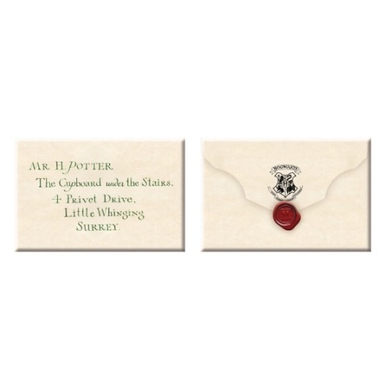
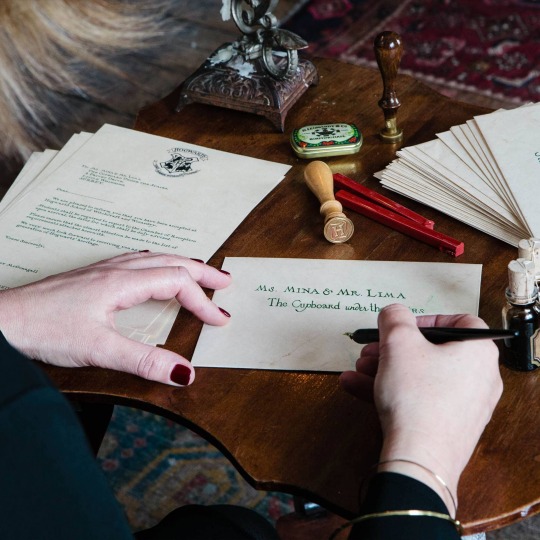
MinaLima is a design studio founded by Miraphora Mina and Eduardo Lima in 2009. Before founding MinaLima, Miraphora and Eduardo had been working together since 2001 for the Harry Potter series by JK Rowling as prop designers.
In the Harry Potter movies, Miraphora says that everything on paper was created by MinaLima. spell books, newspapers, posters, tickets, the Marauder’s map, wanted signs, food packaging and even the Hogwarts letter were created by hand by MinaLima. Miraphora elaborates on the Hogwarts letter, by saying that it is her own handwriting on the Hogwarts letter given to Harry Potter written in the notable green ink. The letter being written traditionally rather than being created digitally creates a more realistic look, and especially for movie closeups, the indents in the paper created by real tools and real processes make the letter seem more authentic.
MinaLima’s work for the Harry Potter world creates a drive for the story. The letter from Hogwarts is a key element in the transition of Harry’s character from his current life to his new life, everything started with the letter in their world. The graphic prop is an important movie artefact and plays a big role in the story.
The Marauder’s map also plays a narrative role in the storytelling, along with the newspaper clippings and posters bring the background to life and makes the world feel more populated and with more personality. The designs reference a world that is similar to ours, and Miraphora says that “It’s about the audience taking ownership of what we offered them”. The textbooks and diaries show insides of character’s minds and give them more individual personality and fleshes out the world and population. Harry Potter is reliant on visuals to drive the story, especially because during visual development nobody knew what anything looked like.
Harry Potter originating from a book series meant that they had to fill in gaps from writing and worldbuild on the information given by JK Rowling to bring the book to life creatively and describe the world through visuals. the newspaper clippings shown take inspiration from political propaganda from Russian constructivist designs, including the typography which takes inspiration from dictatorship communication. using typography they try to describe specific historical styles and portray them accurately to the time period.
When designing shops MinaLima would have to design them from a point of view of the characters they are designing them for rather than their own mind. they would have to put themselves in a character’s shoes to design them accurately to the character, this gives each character a sense of individuality. All of these things done by MinaLima for the Harry Potter movies make the world more expansive and relatable to viewers and they may find themselves putting themselves into the world because of its similarity to the real world and viewers may relate to the experiences of some characters. this makes the world more immersive to viewers and the graphic design impacts how we view the world as a whole and how we view each character.
handwritings, books, and other objects specific to characters give them all differences and creates a more diverse cast and again gives the world and population more depth. for example Miraphora says that when she was created the handwriting of the character Snape, she had to place himself in his mind and wonder what he would think to create his handwriting.
For the Harry Potter movies it is said about the first movie that many versions of props had to be created for filming. backups had to be created in case something happened on set. and for the Marauder’s map, many versions for the map had to be made in case anything happened on set. And 3 different folded versions of the had to be created as backups. there were backups for each state of the prop. designers have to come up with designs from the script and provide what is needed for the films and it can be up to hundreds. for the scene where the owl transports the Hogwarts letter, different versions of the real thing had to be created specifically for the owl, because the actual version was too heavy for the owl to carry. and different versions of the letter had to be made for the letter to be transported through the air.
personally, i’m not a fan of harry potter because i don’t really like series that have a lot of entries, and i’m not very interested in wizard and magic stories, it’s also just not really my favourite type of aesthetic. i do think it’s a very creative and well done storyline but i’ve never been interested in it myself. although i do think the artwork created for it is incredible and very inspiring.
0 notes
Text
Diving Deep Inside "Earth"
Review by Daniella

Have you ever heard of Tere Liye? Maybe you haven’t, well, you’re in the right place! Tere Liye is known for his series “Earth” a.k.a. Bumi consisting of 11 consecutive books. The book “Earth” kicks the series with its rich green and gold-adorned cover. The book itself is 14 x 20 cm wide and stands with 440 pages. And it expands the horizons of fantasy as it is intertwined with science fiction. The book shares the story of a 15-year-old Raib who finds herself in a heated war of worlds. Always the teenagers who find themselves in ominous other-worldly situations, yes?
Cover design and typography
“Don’t judge a book by its cover.” Who are we kidding with this phrase? If a book doesn’t catch my attention then it doesn’t need my attention. “Earth” has an enticing cover art, embellished with cats, bears, cityscape and the moon. These are key elements to the story and you’ll only realise they hold significance as you read. The gold adornments contrast the rich dark green of the background, making the title pop out. It would’ve been fancier if they added a picture to recap each chapter to make it less dull but text will do. The text also has an easy-to-read font, nothing too fancy but nothing too basic. It has a standard font size as well so it doesn’t tire the eyes.
Characters
There are three main characters you need to be familiar with: Raib, Seli, and Ali. They are students who find themselves bound together by an uncanny coincidence. This specific book of the series is written down from Raib’s point of view. Raib herself is a run-of-the-mill teenage girl with loving parents who are unaware of her powers. She isn’t the type to take risks–a scaredy cat even–although, she does gain confidence along the way. However, she is easily annoyed and hot-headed as you will read from her monologues. Seli, on the other hand, is her childhood best friend, who also turns out to possess powers. She mainly stays baffled throughout the journey but doesn’t keep her mouth shut to ask questions. And last, we have Ali. Ali was described as highly infuriating from Raib’s point of view. Despite that, he is surprisingly intelligent and cunning and has a niche skill at learning languages as fast as 24 hours. There are numerous other side characters, all with rather unusual names: Tamus, Ilo, Vey, Ou, etc. Most of them are crucial to the story and are the ones to re-appear in the second book.
Plot
The plot is reminiscent of other fantasy books eg. Harry Potter, The Land of Stories, etc. The classic storyline of teenagers casually finding out they belong in another world. It began with Raib slowly getting suspicious of her surroundings and trying to control her powers. After a series of uninteresting events, Raib, Seli, and Ali get trapped in a building and witness foreign creatures wrestle each other to death in search of them. This leads them to get sucked into a portal. Now, this is where it gets interesting. We see as they try their best to navigate through the foreign land which eventually brings them to an elder. Here they learn about the true strength of their powers and the history of the worlds.
The rest of the story pulls you in to watch as they use their varying strengths to help the foreign land free of jeopardy. This part of the story is full of immense suspense and tension. If you’re weak at the heart, you might want to skip through the fight since most of the characters end up getting harmed. But thankfully, it has a happy ending. They managed to win against the blood-curdling creatures and got to go back home to their original world. This isn’t where it ends for them though, they have 10 more books to go!
Landscaping
What I love about this book series is how the landscape is planned out. It is a fascinating concept that I have never seen anywhere else. The theory is that there are 4 different worlds of different advancements simultaneously living in the same physical planet body. So all natural features such as mountains, rivers, and cliffs can be found in the same spots within all 4 worlds. In addition to that, because of the different technological advancements, these worlds occupy different spaces. For example, “Earth” inhabitants reside on land, whereas “Moon” inhabitants reside hundreds of metres underground as well as above ground.
If you're looking for an easy fantasy read, "Earth" is for you. It has all the emotions you can think of. Happiness? Panic? Fear? Anger? It’s all there. The characters take you on a magnificent rollercoaster ride on a journey of their lifetime. The book displays the perfect teenage angst and bond. It was pleasant to see their growth and maturity within a week’s time. The author definitely knows how to suck you in for hours on end. And who knows you might end up reading the whole series!
1 note
·
View note
Text
What's in my orbit?
A orbit normally takes around 365.256 days each year. From an educational point of view.. what was in your orbit over the summer? We were asked this question and was given the task to complete a poster about 5 pivotal things from the summer.
These were mine:
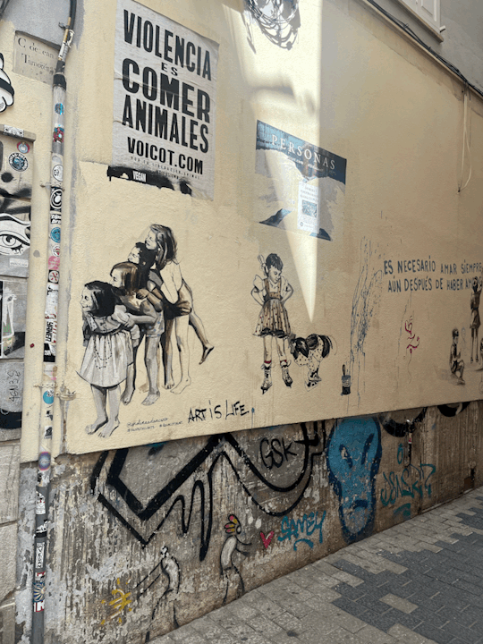
Horders who are creative; I've been drawn to clusters scraps and street art which I have come across when out in public. This has sparked my admiration for layered and super messy work which is a massive shift in work practise for me.
2. When is it socially acceptable to admit to liking Harry Potter without being seen as a 'Disney adult' ? (this was eventually scraped because I haven't got the pride to even admit this just as yet to a class)
2.0/3. EP179. We were on a break! Ft. Jordan Stephens taking about Neuroscience and the Manosphere
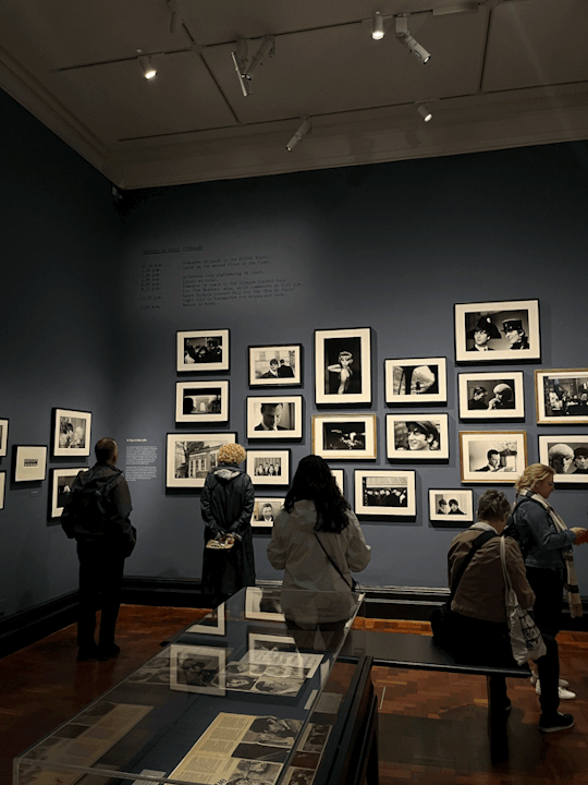
4. Eyes of the Storm- Paul Mcartney and how 60s typography was formed; I visited this exhibition in London. Not only was there really interesting photography, there was a lot of information surrounding the technicality behind cameras and how film rolls are processed which is something I am aiming to practise. There were some archives of Beatle memorabilia from the early 60s just as the band began their success. I was intrigued in how designers would lay out their advertisements and how much time and effort would have to be placed in order for a single newspaper to be produced.


5. Stormzy- This Is What I Mean
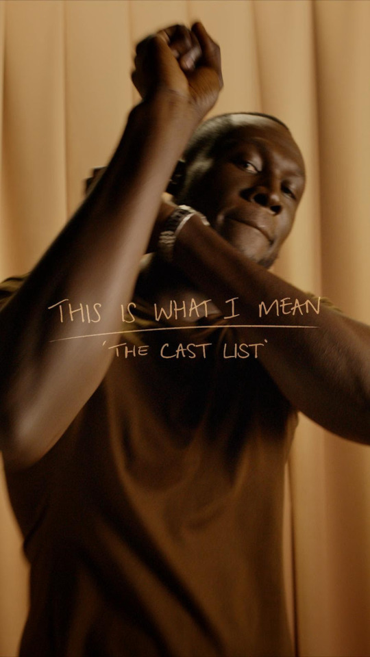

This was on rotation over the summer. Its very different to his normal genre of music.
0 notes
Text
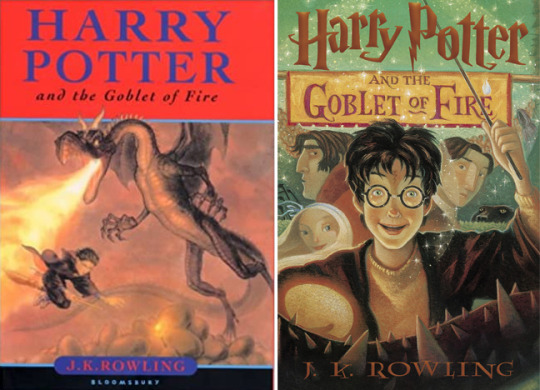

100 years difference between of book covers.
place holder
the fashions of the time
note - talk about them and there differences
Book covers are constantly changing and adapting to suit the current market trends so that the book publishers can make more money one the same book purely because the cover has a different cover/design or adaption.
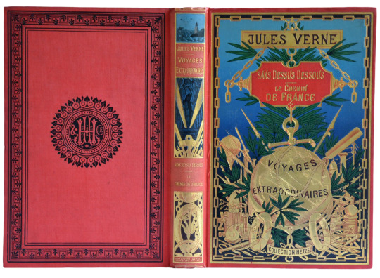
When looking at book covers from 100years ago you can clearly see the difference in them as the older books have a almost collector's piece look to them, The design of the Jules Verne books are beautiful and look incredible for the time as books needed something that is pleasing to the eye and involves a lot of eye catching colour to match the design/cover of the book.
you can clearly see in book covers the use of contrast colours like a blood red and a almost royal/deep blue. You can see that in the typography on the harry potter book on the left. The goblet of fire has a royal blue against a racing red background for the head-border and its a real eye catcher and it tells you clear and simple what it is "HARRY POTTER" With a picture of a dragon spitting out fire and targeting Harry.
0 notes
Text

Harry Potter | Hogwarts Express Typography Poster | Zazzle
1 note
·
View note
Photo
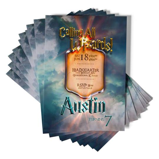
Harry Potter Birthday Invitation
Invite your wizards and kids on a fantastic journey to a magical world with our unique Harry Potter invitation! Featuring a tremendous original Hogwarts school design and headline typography straight from the movie, these invites will surely excite little ones and adults alike for your themed birthday party.
We can also create a unique baby shower invitation just for you. Customize each one and send them to your beloved friends and family!
Invitation details:
These are digital printable party invites ready to customize with your party details. In less than 24 hours, we will send you a proof of birthday party invitation to your email address. After your approval, you will get a PDF or JPG as a final print-ready digital file.
Check out our Harry Potter party supplies for more printables and party ideas. You can request a custom order if you are looking for a different design or baby shower version.
0 notes
Text
History and evolution of book cover design
The cover of a books original sole purpose was for the protection of the book itself, even referred to at times as dust jackets, over time this changed and now the cover of the book can be manipulated using typography and graphics to bring the reader into the book before ever reading the back pages or even opening the book.

Above are some previous covers that have been used for books, these are prime examples how covers could still be ornate and make the book look good but no information regarding the content of the story of even the name of the book itself is displayed. As time progressed so would the material and techniques used.
Around the 1820s the materials and machinery used to create books started to change, less expensive items like paper and book binding machinery was now a cheaper and quicker way to get books on the market. This would then progress to machine powered presses and mechanically produced paper. This would make creating book covers cheaper and with the introduction of processes such as multi colour lithography then evolving to print would help books covers to start to create and identity.

The introduction of Art Noveau and Arts and Crafts in the 20th Century began to make its ways into book production in Europe and New York.
Throughout the 1920’s artists such as Aubrey Beadsley and Alexander Rodchenko were known to create strikingly different covers. Artists from the soviet union had a massive influenece creating some of the most radical book covers of its time which would go on to shape the movement going forward and by post war the book covers had became a competitive market. I feel this was a sign of the times, not only had the techniques and materials became more widely available but also the artists themselves had developed specific niche the for some people the cover of the book could be deemed more important than the actual substance of the book. This can also be seen through the use of typography and more graphics that are used.
Publishers like Penguin had a massive factor in shaping how books would develop. Allen Lane was travelling to london when he stopped at a book stall and found the the quality of the books to be poor and expensive. He came to the realisation that what was need was good stories at affordable prices. In 1935 Penguin books, a revolution in creating paperback books was founded and by 1936 they had printed over one million books. By the 1940s they created Puffin picture books helping evacuated kinds to the country adjust to life.
During World War 2 certain restrictions and and limitations were put upon publishers, the shortage of workers as well as materials with paper shortages and not to mention now more than ever there was controls put in place on the content of publications due to the censorship of the information which was released to the public. For such a difficult time in the world and conflict in every corner of the world publishers managed to survive the period.
Many of the book covers that we see today can relaunch a book over 100 years old. The use of bright colours and bold lettering as well as the advancement in modern techniques as well as the revival of the older techniques that have been used for centuries can help sell a book. I feel right now the way people view reading has massively changed. The introduction of movies that have been created from using books has helped create and interest in books again, big titles like Lord Of The Rings and Harry Potter have created interest in people that would not usually read go back after seeing the movies and take an interest.
now more then ever people love picking up a book whether that has to factor in the popularity of books or that people are in need to switching off and getting lost in the story of a book again helps the development of book covers last and progress for years to come.
its not hard to see how far the evolution of book covers has came from a dyed leather 22 karat gold version of Frankenstein to a print and pressed copy to a student developing a book cover on their laptop for a college course I think sums up the development perfectly.

0 notes
Photo
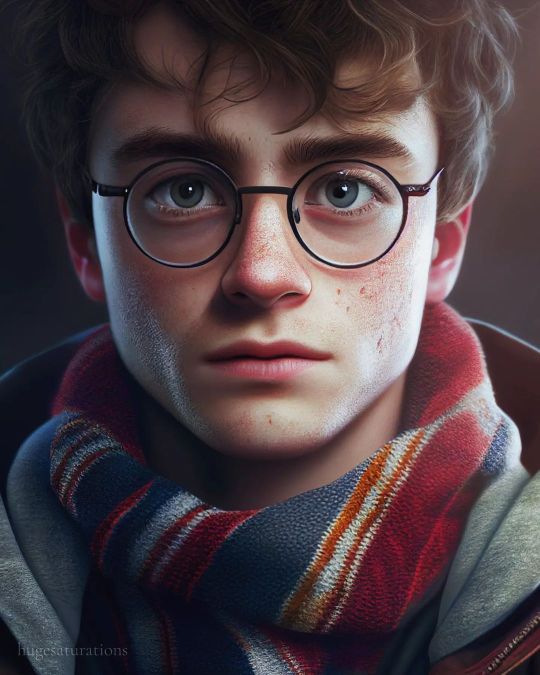
Harry Potter #hugesaturations #digitalart #art #artistsoninstagram #illustration #illustrations #instagood #instagram #instalike #instaphoto #illustrator #illustration #illustrationartists #illustragram #illusion #illuminate #aiart #ai #colour #takemeback #blue #blind #souls #fly #illusion #high #typography #offline #trance #explorepage https://www.instagram.com/p/Cnd_EtpLGyr/?igshid=NGJjMDIxMWI=
#hugesaturations#digitalart#art#artistsoninstagram#illustration#illustrations#instagood#instagram#instalike#instaphoto#illustrator#illustrationartists#illustragram#illusion#illuminate#aiart#ai#colour#takemeback#blue#blind#souls#fly#high#typography#offline#trance#explorepage
0 notes
Photo

The Harry Potter franchise definitely knows how to create a magical atmosphere, and the typography used in the movies played a big part in that. The font used for the title and chapter headings is called "Harry Potter 7", which perfectly captures the whimsy and wonder of the series. 🧙♂️🔮📜🔥🧙♀️. La franquicia de Harry Potter definitivamente sabe cómo crear una atmósfera mágica, y la tipografía utilizada en las películas jugó un papel importante en eso. La fuente utilizada para el título y los encabezados de los capítulos se llama "Harry Potter 7", que captura perfectamente la fantasía y la maravilla de la serie. #eurekastudio #typography #graphicdesign #movie
https://es.fiverr.com/eureka2022
1 note
·
View note
Last Seen Blogs