#how-to-deselect-in-photoshop-cc
Explore tagged Tumblr posts
Visit Tumblr Blog
Explore Tumblr blogs with no restrictions, modern design and the best experience.
Last Seen Tumblr Blogs


Fun Fact
Tumblr has been providing a Korean-language service since 2013.
Link
How to deselect in photoshop CC 2019. This quick and easy tutorial will show you the photoshop deselect key. Drop a LIKE and nice little COMMENT if this ...
youtube
How to deselect in photoshop CC 2019. This quick and easy tutorial will show you the photoshop deselect key. Drop a LIKE and nice little COMMENT if this helped! :) To deselect a selection in photoshop CC, simply follow the steps shown in the video. It's very easy to deselect everything with this keyboard shortcut to deselect in photoshop, Working as of 2019. ►Consider JOINING for 1 month to say thanks! Your contribution will help develop minutemanual.com - A portal with easy to follow answers to almost any online tech issue imaginable! Thanks. www.youtube... Minutemanual is an educational organisation dedicated to providing viewers with thousands of clear and concise tutorials covering many online subjects. Our mission is to answer tech troubles as succinctly as possible. Feel free to use the search bar on the channel to find the answer to any problem you may be experiencing! ►Twitter: https://twit.. ►Website: www.minutema..
best tools for Photoshop
#deselect#how-to-deselect-everything#how-to-deselect-in-photoshop#how-to-deselect-in-photoshop-cc#how-to-deselect-in-photoshop-cc-2019#photo-shop#photoshop-deselect-everything#photoshop-deselect-shortcut-key#photoshop-unselect#unselect
0 notes
Photo
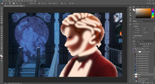
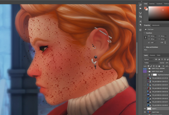
Okay - following up with my findings from the post yesterday - it’s been a long while since I fixed one of @xldsims hairs, but many have shine spots at the hairline on the forehead/temples region. Noticed this after they went on hiatis so I fixed one for myself. @babolat85 added the additional EA colors which led to a whole new audience. The question came up as to what it was an how to fix it and I tried to give instructions from memory on how I fixed it in my own game. It was only half the equation.
If it helps to follow along, I am using the City Slicker hair for this example. Not sure if it causes the shine spots like the two I needed to fix - it just has all the signature problems of the others.
To recap - export the specular/mask from S4S. I have been saving them as bad_*name-of-hair* - S4S will create two files. one with .mask at the end of the chosen file name and one without. When I fix it - I save them as fixed_*name-of-hair* and if it has .mask, make sure it remains .mask. It is this clarification that the program looks for to assign it’s proper spot - not it’s alpha information (DXT1 or DXT5 respectively) as I had pondered yesterday.
Fill in any of the white squares that litter the hairline. I use the pencil tool set to 3. You do you. Save the file as fixed.
I am only familiar with photoshop, so if you’re doing this in some other program, I cannot assist you. One more thing - because it’s (dot) .mask, it may not add the .dds after - you may need to manually add .dds - could just be a quirk of my photoshop version. I kept looking for the file and could not find it as it was not saving it with the correct extension.

Now we need to fuss with the specular. I send a copy of the fixed mask over to the specular on a new layer. Turn off this layer for the moment (you need to do this in photoshop or it will work off the newly copied mask). Select the specular layer. Go to the channels tab.
I have fixed three of these and they all are the same steps. There is possibly a much easier way to do this - I am not fancy what-so-ever. If you can automate this - please share your technique. I am old.
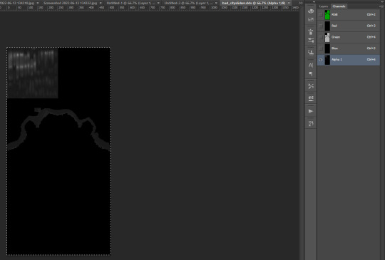
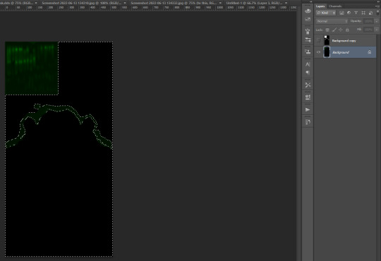
Select the Alpha layer and copy this to your green layer.

Switch back to layers and select the .mask copy. Using the magic wand with a tolerance at 32, select the black area.
*Important step* - turn off the mask layer and select the original RGB specular layer. Go to your channels.


Clean up both the green and the alpha channels of the jagged edges. Deselect the ‘dancing’ edge.


Use levels on the alpha channel to darken the alpha. This will reduce the overall shine, but allow some to still show.
*Delete the .mask layer* and save as fixed. Remember - this is DXT5 dds.
Now import each of the files and test package. I usually test in a CC free game so I can find my file very fast and the game loads quickly.
Hope this helps anyone - please offer any suggestions to reduce the steps/correct the steps - I am not a CAS creator and would benefit from learning a bit more myself. Thanks.
16 notes
·
View notes
Text
Best Remove Photo Background with Photoshop | Background Removal Service

How to Remove Photo Background with Photoshop
Imagine your photo subject with removed photo background with photoshop that you designed from scratch with your imagination. Before placing an object in an entirely new landscape, you must remove photo the background with photoshop from the original image. Removing the background is a complex art and requires more than an eraser, but you don’t have to be a graphic designer to learn the steps in Adobe Photoshop CC.
Remove Photo Background in Photoshop.
Different programs are used in the Remove photo background in Photoshop. Adobe Photoshop came first in this matrix. You may prefer it over others because of its wide range of photo editing tools and options. The best tools to remove the background are Pen Tool, Magic Wand, Lasso Tool, Layer Mask, Channel Mask, Plug-in, etc. This article will discuss the best Photoshop tools to remove background from photos, along with a guide for the process.
#1. Magic Wand Tools [remove photo background with Photoshop]
It is a great tool that can remove a photo background with Photoshop. It’s a magic wand because it works like a bit of magic. It looks like a great magical tool. Very effective on shaped images. The tool works well if the background is solid and the image’s outline is strong.
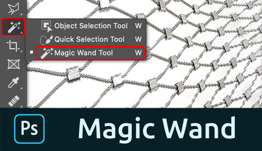
As you know, the image of this tool should have a solid outline. So we selected this image and opened it in Photoshop to remove the background.
We select the Magic Wand tool in the left pane of Photoshop. You can select this tool by clicking the tool or just pressing “W/Shift + W” on the keyboard to select it.
Click on the background you want to select. A dotted line may flash around the selected layer.
If you feel confused with options like dashes, you can move on to something else, namely tolerance, as we show in the snapshot below. We used a tolerance of 50% to select this image, with proven and continuous anti-aliasing. This part will vary with different images. You should try if the selection is imperfect.
Press Ctrl+D to deselect the main theme. Go to the layer palette, create a new layer and place the new layer below the main layer by dragging it from top to bottom.
Set the background color, and make sure it is cropped properly. By the way, after all these steps, you can remove the background with the magic wand.
# 2.Quick Selection Tool [remove photo background with Photoshop]
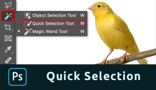
The quick selection tool will do a lot of the work for you and works best when there is good contrast between the subject and the background.
Take a photo with Photoshop. We use the same football image here. You can apply the method to any image you want to process.
Before starting work, ensure that the image’s background is locked or open. Double-click the lock icon to unlock the layer if it is locked.
Select the Lasso tool from the toolbar. Draw a line around the main object by dragging. Hover over the starting point.
After drawing the line, click the Path palette in the Layers palette and create a path by clicking the Path Trace image.
Next, click on the Selection tool from the toolbar.
We think you are still concerned because your drawing is wrong. No problem, click on the drawing line with the Pick tool, and you will get several reference points to help you resize the line.
Press Ctrl + Enter to select the rows. Return to the Layers palette.
To separate the subject from the background, click Select at the top and then Invert. You can do this from the keyboard by pressing Ctrl+Shift+I. Now press Delete to remove the background.
Take a new layer below the main layer and give it a background color. This way, you can remove unwanted background.
# 3. Pen Tool [remove photo background with Photoshop]
The pen tool works best with simple objects. It is ideal for making a selection of objects with solid, straight, or curved lines.
Select pen tool
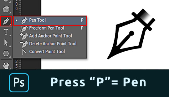
Select the Pen tool from the toolbar on the left. You can also use the key combination “P.” Make sure to set “Path” in the top menu.
Make path
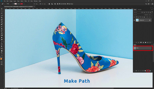
Click any edge of the object to create the first anchor point. Create another landmark. If correct, click. If you want a curved line, click and drag an arc from the line.
This allows you to work smoothly around rounded and curved edges.
Always press the Option key (Alt in Windows) on the last reference point after the curve. If you don’t, the next row will automatically appear according to the previous row.
Pressing the Option key resets the reference point, allowing you to recreate the line.
It takes some practice to master, but you will progress much faster after a while. Continue the process until you have created a path around the object.
When you reach the first character, click it. The road will be closed automatically.
Convert Path

In the Paths window, hit the “Load path as selection” icon.
Remove background with Photoshop.
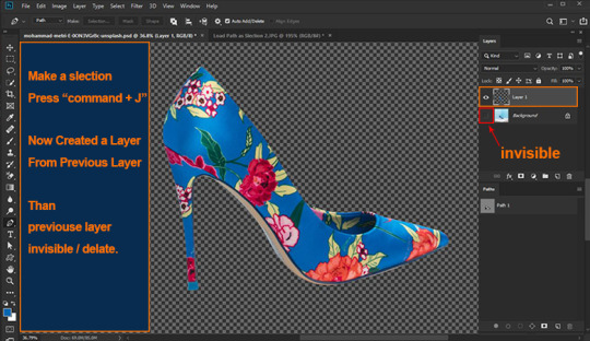
Now there are several options. To remove the background, select> Invert and press the Remove button. You can also use the keyboard shortcut Cmd + Shift + I (Ctrl + Shift + I for Windows).
Just press Cmd + J (Ctrl + J for Windows) to copy the object to a new layer. That’s it; you’ve isolated the subject and removed the background in Photoshop.
# 4. Background Eraser Tool [remove photo background with Photoshop]
Next, we have the Background Eraser tool. Again, it works best with a clean background.
Background Eraser Tool
Select the Background Eraser tool from the toolbar on the left. It is usually hidden behind the eraser tool. Hold down the eraser tool to reveal it.
Erase the Background
Start by removing the background. Automatically detects edges of objects that are not in the background. It is better to set a smaller brush size for more complex areas.
Selection edge on image
The background eraser is great but not perfect. Sometimes the subject and background have the same colors and shades. You must select these fields yourself. We recommend selecting the bottom layer and clicking the Add Mask button in the Layers panel.
Fill the layer mask with black. To do this, select the Paint Bucket tool, set it to black and click on your photo with the mask thumbnail selected. Now use the brush and set it to white or black. Black color erases parts, and white shows parts.
Make sure the mask size is selected and start painting the image. This way, you can manually adjust the areas that need more work.
FAQs about removing photo background with Photoshop
How do I remove background from hair in Photoshop?
You remove the background from hair in Photoshop using the steps in this post:
Set up your layers
Create a high-contrast layer
Remove the background around the hair and model
Replace the background
How can I change my hair background?
You can change the background of your hair by removing the background by following the steps in this guide. Then choose a background color or a new image to replace it, or leave it as transparent background.
How Do I Make a Background Transparent in Photoshop CC?
To create a transparent background, you need to open the background layer. Double click on it and click OK. Now start erasing the areas, and you will see a shiny background.
How Can I Remove a Background From a Picture?
There are two options here. First, select the background and click the Remove button. The background disappears.
You can also add a layer mask instead of removing the background. This way, you can always re-expose the background.
#Backgroundremoval#clipping path#cutoutimage#removebackground#silopath#deepetching#adobephotoshop#imageediting
8 notes
·
View notes
Text
How I think CC Clothing Creators should do to shadow map
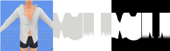
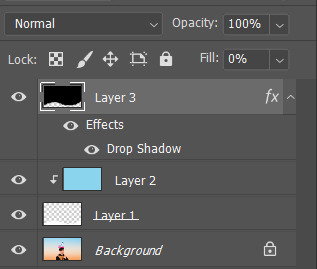
1. What is shadow map?
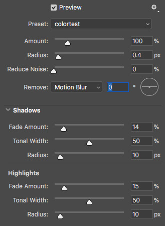
Take this shirt from Island Living for example and export shadow map in DDS format.
In game, shadow gives clothing layers, 3D-ness or enhance the 3D-ness that texture or normal map already gave. Shadow like this is easy to achieve without the need of MXAO from ReShade.
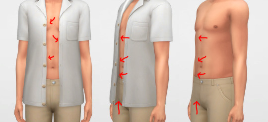
What is the problem here? Look, when I have an accessory undershirt in black on without the EA shirt, it’s looking normal, but when it is on there are some pixels breaking up, even for pants

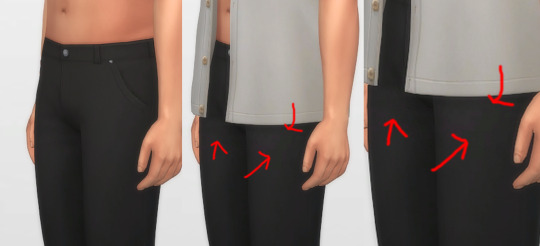
I’m a perfectionist, I don’t want my cc pant or cc undershirt to look like that when pair with other shirts. And if you don’t see it as a problem, that is fine, you can stop reading right now and go on with your days, I’m not offended by it ^^, it is your own stylistic choice at the end of the day.
2. How shadow map behaves?
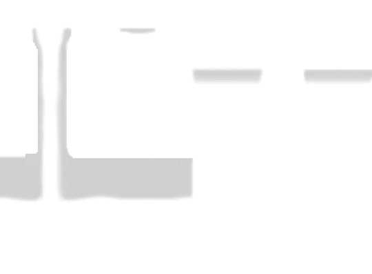
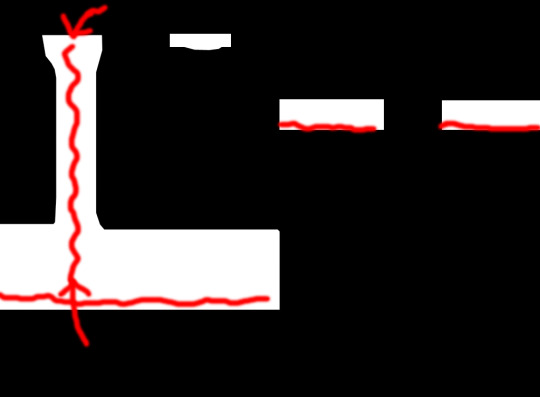
Open that shadow map we exported in DDS format into Photoshop, take a look.

The image show the grey which is the shadow where it should be on the body, the white area is NOT TRANSPARENT, it is white color where shadow does not belong.
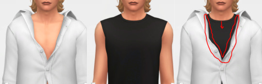
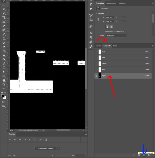
Now, click on Channels, click on Alpha 1 layer, the Alpha 1 image is the key
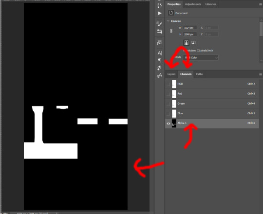
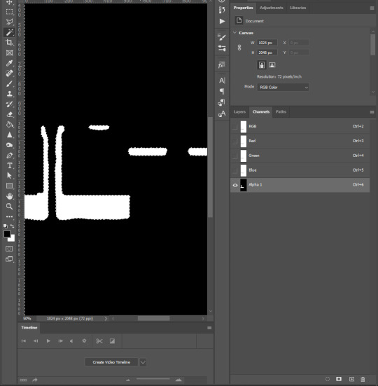
The Alpha layer is in black and white and sometimes in grey colors. Black is to hide everything of that area on RGB layer, white is to show everything of that area on RGB layer, Grey is like a slider, lighter grey will show more of that area while darker will show less.
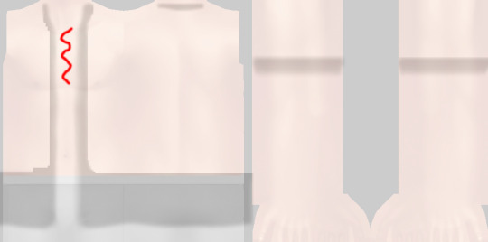
And now if I put a male template on original rgb shadow map with 40% opacity, there are area of the chest, below shirt, below arms are white on Alpha layer which I highlighted red. That means that the white on RGB layer of shadow map still visible as white!
How is that the problem you ask? Here I have a image filled deepest true black (#000000) and add noise to it with Filter -> Noise -> Add Noise..., amount is 1% with monochromatic unchecked. This represents the black undershirt above with textures (grainy). Now if I paste a white layer (#FFFFFF) on top of black layer and set the blending mode to Soft Light.

There are a lot of breaking pixels with strange colors appear, like black undershirt and white shirt above ingame!
Because of how the shadow map still keep that area between chest remaining white, how Sims4 works, in my belief is they softlight or overlay the white onto whatever underneath, skins, black undershirt, that then will happen. Remember, this effect will visible when underneath is dark and muted colors, bright and light colors are hard to see.
This is how EA do shadow map on their clothings, by blocking the shadow, the arms, the chest, and bottoms of the shirt.
3. How to solve this problem?
Now here is my opinion, we should not blocking the shadow the way EA did, but by framing it around, close to the shadow.
Here is one of my shirt, its shadow map and how I do the alpha layer.
When I frame the shadow, there will still breaking up pixels AROUND that FRAME, but in between the chest doesn’t have white so it doesn’t breaking up any pixels! That is the best I can think of and do to reduce the issue, let me know if you have better way.
4. How to do it?
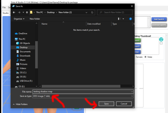
Step 1: For new blank shadow map starter, follow other shadow tutorials on how to paint grey color on image where your clothing projects shadow on the body. Merge everything so RGB image have grey shadow area and white area.
Step 2: Right-click on this icon on the left collumn, choose Magic Wand Tool
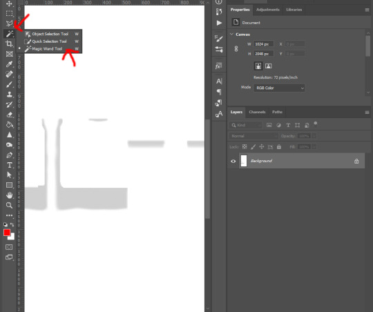
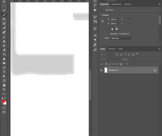
Step 3: Left-click on any white area, there will be marching ants around the grey shadow.
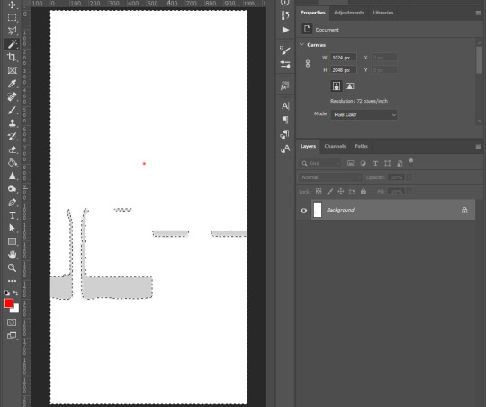
Step 4: Right-click on the same place and choose Select Inverse from list
Step 5: Go to the top tool bar of Photoshop, Select -> Modify -> Expand..., and enter from 5 to 8 pixels depend on your grey shadow blur or your desire. Hit OK
Step 6: Go to Channels tab next to Layers, click on Alpha 1, if you don’t see Alpha 1, click the icon on bottom right corner (blue arrow point to) to create Alpha layer
Step 7: Hold Shift + F5 or go to Edit -> Fill... on top tool bar of Photoshop. Then Contents -> White, hit OK

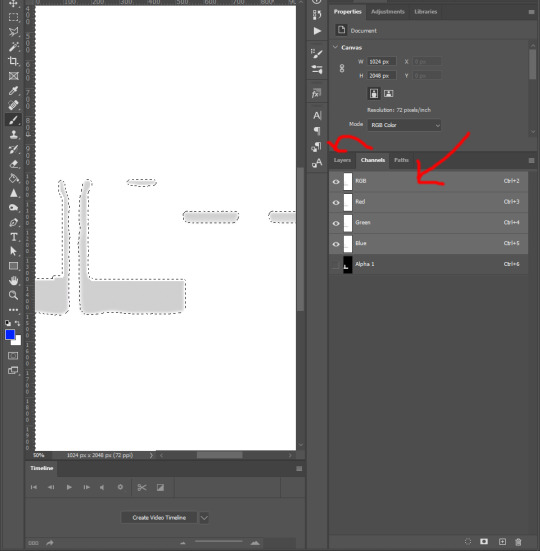
Step 8: Right click on the black area of the image, choose Select Inverse. Repeat step 7 : Hold Shift + F5 or go to Edit -> Fill... on top tool bar of Photoshop. Then Contents -> Black, hit OK
Step 9: Click on RGB layer, then Layers tab, Ctrl + D to deselect the marching ants, and save the work as DDS file
and yeah you’re done ^^.
You want to do this with every piece of cc, hairs, accessories, necklaces, bracelets, tops, bottoms, gloves, shoes, because of how sort layer work for items in CAS, lower sort layer items will get affected by higher sort layer items if shadow map was what it was.
Credit to one of Grimcookies’ old post about how shadow map should be done in Alpha Layer
#syaovu#sims#ts4#ts4 tutorial#s4 tutorial#shadow map tutorial#tutorial#resources#how cc clothing creators should do to shadow map#long post#gif
505 notes
·
View notes
Text
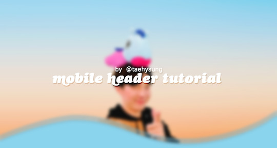
mobile header tutorial
As requested, here's a tutorial on how I usually make my mobile headers. We will be achieving this type of result:

I'll be showing some variations so you can make diverse headers and have fun while doing so! Of course, this is my way of doing it but I'm certain there are plenty different ways to proceed (I also have a tendency to over-complicate things but anyway)
You will need:
Photoshop (I use CC 2018)
The picture you want to use as your header
One brush preset (more on that later)
(optional) A gif texture/overlay (more on that later too)
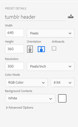
First, let's make a new document. Make sure to set the width to 640px and height to 360px (640 x 360).
Now, drag the picture you want to use as your header onto the blank document. Resize it, arrange it until it suits what you're looking for. You can also color the picture now. If you're not familiar with colorizing pictures, there are plenty of great coloring psds available online, on Tumblr, Deviantart, etc. You can also find some on my graphics blog (here).
Here's my document with the picture resized, sharpened and colorized:
Now that's very nice for sure, but how do I make this more interesting? By blending it into the background! There are a few different ways to do that, I'll only be demonstrating the following, which are the three most common ones:
The gradient effect
The brush effet
The geometrical shape
1) THE GRADIENT EFFECT
Go to Layer > New Fill Layer > Gradient.

You can decide the color you want your picture to fade into from here. I like white, so I'll keep it like this. Here's the final picture:

The gradient effect is the easiest, but the others are quite simple too. Moving on to the brush effect!
2) THE BRUSH EFFECT
Using a brush (again, you can find plenty on Deviantart, download the ones you like!) you can get a lot more creative with the shape of your header. I like the "ripped paper" look, so I'll be doing for this here, but you can do the same thing using flower brushes, water color brushes etc.
I'm using a brush I made, you can download the full pack here.
I'm making a new layer (Layer > New > Layer) that I'll set above my background picture. We will be painting on this layer, so make sure it is selected!
Selecting my brush, I'll make sure the angle is at -20, then position it on the canvas and click 3-4 times:
Good! I'm dragging the painted layer down a bit, and now we have this:
We're almost done. You'll notice the layer here is slightly transparent, which we don't want. In my case, I like to use a layer mask, because then you can easily change the color of the layer depending on your mobile blog background color.
First, go on the layer with the brush effect, press Command on Mac or Control on Windows and while pressing, click on the box of the layer:
This will automatically select the brush layer on the document:
Now, without deselecting, create a new layer. Using the Paint bucket tool, fill the selected area with the color you want. You must make sure that it is no longer transparent or semi-transparent, therefore you might have to click 2-3 times! I'm doing this with white, but you can use whatever color you like (it doesn't matter for the rest of the process). Once I'm done, it looks like this:
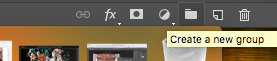
We're not done yet! If you want to be able to easily change the color in the future, it's time to make a layer mask. Let's select this new, filled layer you made using the keyboard shortcut I gave earlier (Command or Control + click on the layer box). Once you've selected the layer, create a new group by clicking on the little icon at the bottom on the right:
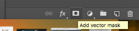
And next, click on the Add layer mask button here:
If you did this right, your layers will look like this:
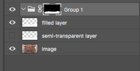
Now, select Layer > New Fill Layer > Solid Color, and select the color you like. Don't forget to drag this layer into the group, and tadaaa, you can change the color whenever you wish by double clicking on the layer! (don't forget to uncheck the visibility of the two layers marked above as "filled layer" and "semi-transparent layer" by clicking on the little eye icon)
3) THE GEOMETRICAL SHAPE
To make the bottom into a geometrical shape (round, diamond, etc), you can use the shapes available by default in Photoshop. I very rarely use geometrical shapes in my edits, so I'm certain there's a simpler way to go by but this is how I do it. I'll be using a round/elliptical shape.
Select the Ellipse tool. Next, "draw" your ellipse shape on your canvas. I drew it to look like this:
If you're not satisfied with the shape, you can change it by selecting Command + T on Mac or Control + T on Windows and resize it.
Next, we're going to use the same keyboard cut as in the Brush effect one: Command on Mac, or Control on Windows + click on the box of the ellipse layer. This will select the shape:
Now, create a new layer (Layer > New > Layer), untick the visibility of your elliptical layer by clicking on the little eye icon next to the layer and go to Select > Inverse.
Your canvas should look like this:
Next, select a brush tool set to a normal hard round tip. Set the size to something like 70 (it just has to be large enough) and paint the bottom part of your picture as shown below. The select tool is protecting you from painting in areas you want to preserve:

Use Command + D on Mac or Control + D on Windows to deselect the layer. You are left with a nice rounded header!
GIF TEXTURES/OVERLAYS
Now that you know how to make a nice bottom border for your header, you can add a gif overlay just to be extra. First, find the gif texture you like. It's better if it's a white/light motif on a black background! @octomoosey has some awesome gif overlays you can use. In my case, I'll be using this one.
I'm adding the gif overlay to this version of the header:
First, open the gif in photoshop. Using the select and crop options, resize the gif so it's the same size as your header: 640 x 360 px.
Next, select all the layers of the gif and group them into a group titled "gif" (or whatever else you like)
Back on your header canvas, if you've followed my tutorial from the beginning, here's a reminder of what your layers should look like:
Select them all and drag them onto the gif. Using Command + T (Mac) or Control + T (Windows), recenter it correctly on the canvas. Once it's done, your layers should look like this:
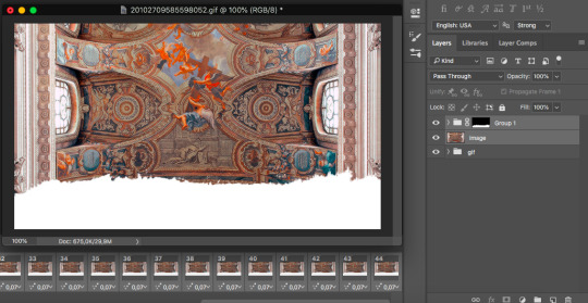
You're going to drag the "gif" file between "image" and "Group 1":
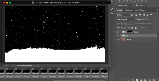
The image is gone, but don't worry! Let's set the blending mode for the "gif" group:
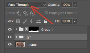
The current option is Pass Through, but I'll be selecting Lighten. And voilà! Once exported, this is the final result:
And there you go, those were the basics to making mobile headers à ma façon. If you have any questions or encounter issues, feel free to hit me up!
#i rarely do tutorials and now i remember why lol#i'll make a video next time because screen shotting is exhausting#tutorial#mobile headers#resources#i re-read this a few times to make sure i didn't make mistakes#or rush through explanations#but if you feel like a part isn't clear please tell me
36 notes
·
View notes
Note
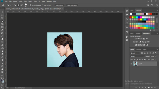
hello fer! i recently discovered your so aesthetically pleasing blog and i was curious as to how your pfp is transparent from the sides so yoongi's head can stick out of the light blue color
hi nonie! first of all, thank you sososo much :< this is my first tutorial so pls bear with me :: i’m not very good with words ksjdksjd
how to do this:

this requires: basic photoshop skills
warning: very image heavy
first upload your photo to photoshop (i use photoshop cc 2019, but whatever version will work!) and sharpen your photo (i use topaz clean + smart sharpen). then crop your photo into a square/1:1 ratio and add your psd
now you want to erase/cut the background off, i use the quick selection tool. with your brush, select the subject
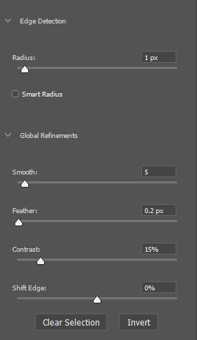
and then click on “select and mask” (located at the top bar) and enter these settings (you can adjust it to your liking but i personally just enter either 0 or 1 px for the radius) and then click “ok”
then right click on your canvas select inverse then press “backspace/delete” on your laptop and then right click > deselect

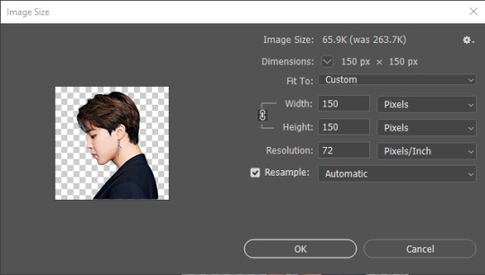
time to make your icon!
resize your image by clicking image > image size: (i eitherr use 128px or 150px it depends on you what you want hehe) then click ok
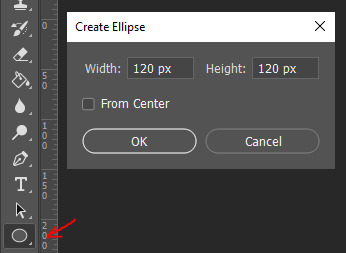
to make the circle, click on “shape tool > ellipse”. you can click and drag or just click on the canvas and input your settings:
you can change the color of your circle by double clicking your “ellipse layer” (click the part where the arrow is pointing, not the name of your layer if that makes sense kjsdsd)
drag your shape layer so that it will be behind your subject. then while staying on the shape tool, right click on your canvas, select “make a selection” and then click “ok”. selecting the “marquee tool”, right click on your canvas > select inverse. this way, what is outside the circle we selected a while ago can be erased. this is how it’s supposed to look:
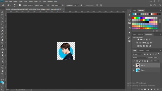
click on “layer 0″ and then select the “eraser tool”. start erasing the parts that you want to not be showing outside the circle, which in my picture, is the whole bottom part. it’ll look like this:
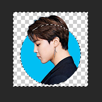
select your “marquee tool” again, right click > deselect. you have now made an icon with a cutout!
to save: click file > export > save for web, select png-24 and hit save!
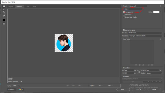
and this is how it’ll look like!

note: i didn’t add any other effects like blush, but feel free to do that too! :)
if you have any more questions, don’t hesitate to send me an ask!
189 notes
·
View notes
Photo
mobile header tutorial
hello! I’m here to share how to create a header similar to these that i’ve done in the past. here are the tools i’m using:
photoshop cc 2018 (from @birdysources)
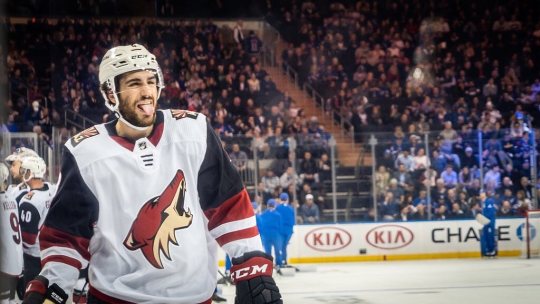
some picture of hoseok probably from either twitter or weverse i don’t remember lol
i included pictures and tried to make it VERY beginner friendly, but please, send me an ask or dm if i’m unclear at any point. it’s 2:38 am as i’m making this tutorial and i just downed my cold brew so i’m sorry if it’s messy
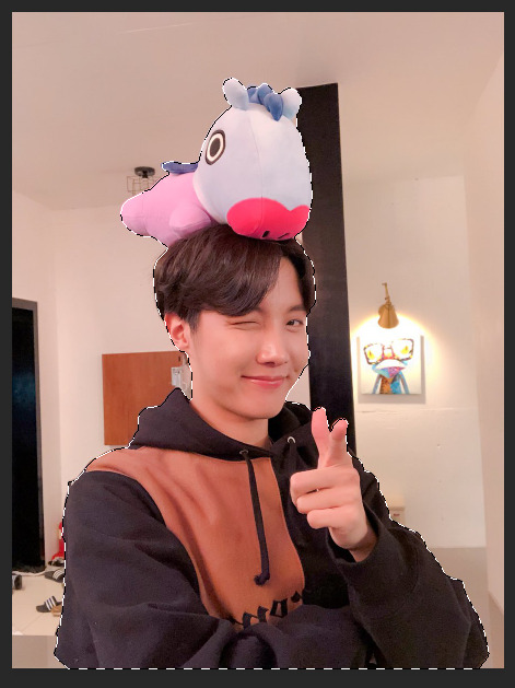
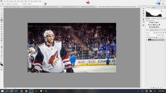
1: open your picture in photoshop (here’s the picture of hobi if u wanna follow along)

2: find the quick selection tool
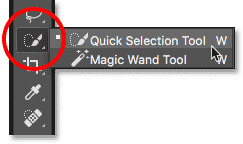
you’ll find it in the left sidebar, fourth from the top. i’ll often use this and the tool above it (polygonal lasso tool) depending on the photo. the quick selection tool is faster but more tedious, in my opinion, but hoseok was easy enough to cut out just using the quick select. use both! whatever u are comfortable with.
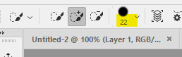
here are my settings for the tool:
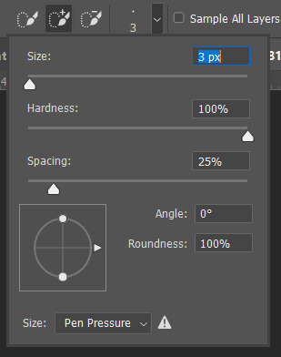
i almost always keep it at 3px. unless the image is huge, then i’ll go up to 5px, but never really above that.
3: trace over your subject(s) (aka hobi) by dragging the tool along the edges, until you’re happy with the accuracy:
4: find Select and Mask (directly above the image):
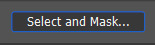
and here are the settings i’m using:
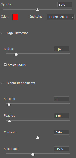
then press ‘Ok’ !
5: Select Inverse (right click inside subject)
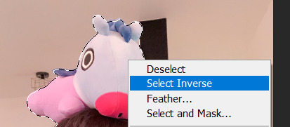
now we’re going to press ‘backspace’ on your keyboard, and the background will be gone~
make sure your file isn’t locked! it should be labeled ‘Layer 0′ and not ‘Background’ (if it’s locked, just double click it and press ‘Ok’ on the window that pops up)
after pressing backspace to delete the background, it should look like this:

then deselect it all. now is the time to look closer at your newly made render and see if there’s any cleaning up to do. i’m good to go, so i’m gonna continue on with making my header.
tip: drag the subject (hobi) with the move tool (very top tool on your left sidebar) to the center so he’s in the very middle. it should click to the center (you’ll see the pink line)

it’s not necessary for the tutorial but if you plan on saving this render as a .png and dispersing the renders you make-- it’s just cleaner looking to have them centered!
6: File > New

i always use 800 x 430 for mobile headers. for gifs, i size it down to 650 x 349.
7: resize and drag hobi into the new canvas (Image > Image Resize)

for single subjects like this i usually resize them to ~300 to ~400. whatever you think looks best tbh
now drag the file from its place up top:
then the file from where it’s labeled ‘Layer 0′

8: now hobi is inside the canvas where the actual header is going to be made~ you can get rid of the render, or save it as a .png, whatever u plan on doing w it
i’m gonna center my hobi for the header i plan on making! from this point it’s just gonna be coloring, sharpening, etc. if you’re interested in using any textures like flowers or bring in other renders of objects, DeviantArt is a great place to search for texture packs. @beapanda on DeviantArt makes beautiful resources (kpop and non kpop related) be sure to credit them or whoever u save ur textures from!
for this header i’m not going to be using any outside resources, i just want my hobi to be the focus~
for the background, i’m gonna use a gradient from this site (this pack is 200 images. phew)
i’m using no. 200 from that pack.
9: optional- i’m gonna make some extra layers and start coloring hobi using clipping masks.
make a new layer > right click the new layer and find ‘create clippink mask’ > set the layer to either color, overlay, or multiply (whatever you think looks best and does what u are trying to achieve)
here i’ve just make layers to color things like his hair, his hoodie, and baby mang
here’s with vs without:


and when you’re done, go ahead and right click your primary layer (subject layer) and click ‘merge clipping mask’.
10: coloring~
find a psd you like or being to color the header yourself. for this header i’m gonna be using a homemade psd. i’m not gonna go into detail bc there are sooo many places to find psds on tumblr and deviantart. just like you brought hobi into the header canvas, drag your psd there, and that’s how u apply a psd.
when u are happy with the coloring, right click the bottom layer and flatten the image.
11: topaz clean + unmask sharpen
topaz clean is an addition u have to manually add to your photoshop program. u can google how to do it, but if anyone’s struggling i can show u how i did if i remember (but i’m pretty sure i do)
topaz settings:
unsharp mask settings (go to filter > sharpen > unsharp mask):
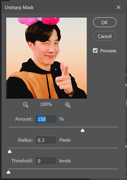
honestly, topaz is completely unnecessary, but i like the way it looks so i’m gonna go with it anyway. sharpening the header alone will still give you a great outcome
12: final step, header border time~
over on my film/tv blog @gusdapperton i’ve made a header template pack (click here if u just wanna use my premade borders) but for this tutorial i’m gonna show u how i actually made those (minus the cloud one, i was just fucking around lol) (it’s so simple)
>>> if u DO just save one of the borders i made in that pack, resize it so the width is at 800 and drag it to your header canvas. set the layer to ‘screen’ and bang there u go!
BUT with that method u can’t change the color from white. so if u want a border with any other color, keep following the tutorial >>>
go to view > rulers and select that to show the rulers (duh)
click from inside the ruler (light grey) and drag out your guides. here are where i’m placing mine:
they should ‘snap’ right into place, but if they don’t, make sure u go to view > snap and that’ll fix it. u will know what i mean once u try it lol
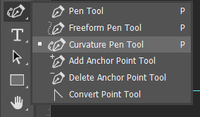
select the curvature pen tool (right click the pen tool to show more tool options):
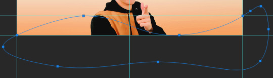
and begin to place your dots. thanks to the guides, these dots will also snap into place
here are mine:

(i eyeballed the two in the middle, it doesn’t need to look perfect tbh)
this next step is sorta stupid but i haven’t found a better way to do it yet lol
to close the shape just make sure to closely follow the direction of the dot you last placed, then go around to make your way back to the first... it looks silly but like this:
just play around with the shape and the tool... u will get the hang of it lol
now look up ^ and press Selection

then ‘Ok’ in the next window. then boom~ there’s your selection for the border we’re about to make.
make a new layer then select the rectangular marquee tool (second from the top on the left sidebar) and either drag with your mouse or use the arrow keys to move the selection we just made. here is where i’m placing mine:
then select your paint bucket tool (if you can’t find it, right click the gradient tool and it’ll be one of the sub tools, like i showed u with the pen tool)
make a new layer, then fill it in (i’m using white)
you can stop there, but to make that line like i did in my border template pack, press the down arrow on your keyboard and go down 5-10 pixels, press backspace, go down the same amount of pixels, and re-fill that area.
now unselect. there’s the border~
now go to view > clear guides to get rid of those. u don’t need em anymore :) i’m also going to move the border we’ve just made down to the bottom of the canvas since we don’t need that big gap there.
>>> tip, don’t fill in the white directly on the layer if you wanna change the color. create a new layer on top of the border layer, right click > create clipping mask > fill the layer with the color u want for the background. example:
it saves the integrity of the shape. if you color fill right over the white, look closely and you’ll see it looks sort of pixelated and not as clean or smooth. it’s subtle but noticeable enough to me where it bothers me.
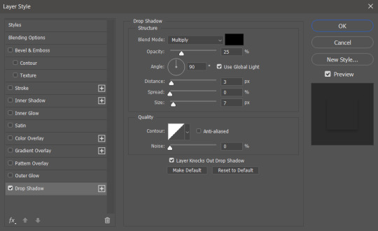
since this color i chose is kinda vibrant and clashes, i’m gonna help it out some. go back to the quick select tool and select everything inside your border layer. make a new layer, fill the layer with black (any color will do, it doesn’t matter) and set the fill to 0%. double click that new layer, and a new screen will pop up. go to drop shadow, find the settings you like, and boom. here’s what i did and what it’ll look like:
now u are finished~ i didn’t do this but u can skip sharpening the header earlier in the tutorial and reflatten the image again to sharpen it at this point instead but, yknow, i didn’t do that lol
here’s the final product (save by going to file > export > save for web)

preview of how it looks on mobile:
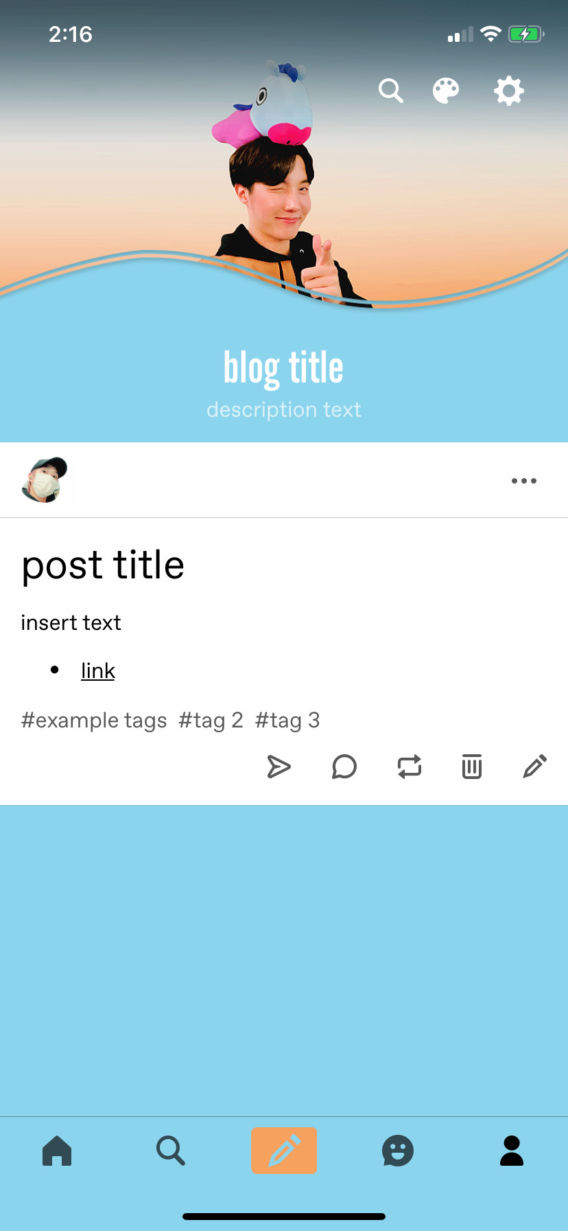
background: 8bd4ed
the end~ please send me an ask or dm if you haven any further questions, i will try my hardest to help <3
#photoshop tutorial#header tutorial#allresources#completeresources#mine:tutorial#i probably fucked up somewhere but it's bed time so i will find out in the morning hehe
149 notes
·
View notes
Text
Illusion- Post Production Research
Layer Masks and Selection tools
Layer Masks
Layer masking is a way of hiding white or black pixels in part/all of a layer. This gives you more flexibility (non destructive editing) than permanently erasing or deleting part of a layer as you won’t get them back if you delete them without using a layer mask.
Benefits of layer Masks
Making image composites
It’s non destructive editing(pixels won’t be permanently gone)
How do you use them ?
To add a layer mask to a layer, click on the layer mask icon at the bottom of the layers panel (it looks like a square with a circle inside).

You can also use the menu, go to ‘Layer – Layer Mask – Reveal All’ to make a white layer mask.
You can create a white layer mask by clicking that button or going to the menu but you can create a black layer mask by clicking and holding the option key before clicking add layer mask button
Selection Tools
A selection tool designed to select parts of an image from the active layer so you can work on them without affecting the unselected areas.
Names of selection tools
- Marquee tool

Rectangular Marquee Tool.
Makes a rectangular selection (or a square, when used with the Shift key).
Elliptical Marquee Tool.
Makes an elliptical selection (or a circle, when used with the Shift key).
Single row and column marquee
Single Row or Single Column Marquee
Defines the border as a 1‑pixel‑wide row or column.
- lasso tool

Lasso Tool.
Polygonal Selection Tool.
Magnetic Lasso Tool.
- quick selection tools
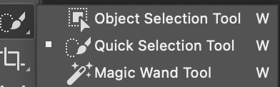
Magic Wand Tool.
Quick Selection Tool
Object selection tool
How do they work ?
Rectangular Marquee Tool
In the Tools panel, select the Rectangular Marquee tool. Drag a rectangular selection onto the image. The area inside the animated border represents your selection.
To select more, click the Add to selection icon in the options bar or press Shift and drag. To select less, click the Subtract from selection icon in the options bar or press Alt (Windows) or Option (macOS) and drag.
Select a layer you want to adjust. Then try applying some adjustments (Image > Adjustments). With a selection active, adjustments affect only the selected area of that layer. The same is true if you were to apply a filter, paint, fill, copy, or make other edits.
When you’re done, deselect by choosing Select > Deselect or pressing Control+D (Windows) or Command+D (macOS).
Elliptical Marquee Tool
The Elliptical marquee tool can be used to draw an oval selection. click at the point where you want to begin the selection, then hold your mouse button down and drag in the direction you need until you have the object or area surrounded by the selection outline. Release your mouse button to complete the selection.
Lasso Tool
You can use the lasso tool to make a freehand selection around the object or area you want to select, in a similar way to how you would outline something on a piece of paper with a pen or pencil. With the Lasso Tool selected, your mouse cursor will appear as a small lasso icon, and you simply click at the spot in the document where you want to begin the selection, then continue holding your mouse button down and drag to draw a freeform selection
Polygonal Selection Tool.
Drawing selections with the Polygonal Lasso Tool is a lot like drawing straight-sided paths with the Pen Tool. Begin by clicking somewhere along the edge of the object or area you need to select, then release your mouse button. This adds a point, commonly called an anchor or fastening point, to the document. As you move the Polygonal Lasso Tool away from the point, you'll see a straight line out from your mouse cursor with the other end of the line attached to the anchor point. Click again to add a second point, then release your mouse button. The line will become "fastened" to the new point,
Magnetic Lasso Tool.
Magnetic Lasso Tool: An edge selection tool that detects an image’s edges and automatically selects the pixels around them. Selections are freehand. This helps if you have a particular bit in the image that has some contrast between image and the background.
Magic Wand Tool.
The Magic Wand tool is a selection tool. It allows you to quickly select areas of your images and make selective edits to it. It’s most used often to select solid backgrounds and color areas. It doesn’t work as well, for example, on an image with a distinct gradient or blurry features. You can also swap out the background in a photo without moving or altering the subject of the image. This is very useful for product photography. it selects pixels based on similarities in the color and tone in an image. Instead of looking for distinct differences the Magic Wand tool searches the canvas for similar hues to make up its selection.
Quick Selection Tool
The quick selection tool allows you to select part of an image. Click and drag over an area you want to select. The tool automatically selects similar tones and stops when it finds image edges. To add to the initial selection, just click and drag over another area. The Quick Selection tool automatically changes to the Add to selection option. To subtract from the selection, press the Option key (MacOS) or Alt key (Windows) as you select an area you want to remove from the selection. When you release the Option or Alt key, the Quick Selection tool switches back to its Add to selection option.
Object selection tool
The way the Object Selection Tool works is that it draws a selection outline around the general area where the object appears. Photoshop then looks inside the boundaries of that selection to find the object, and it wraps the selection outline around it. Once the main selection is made , we can add missing areas to the selection, or subtract areas from the selection, again just by dragging around them with the Object Selection Tool.
Benefits of selection tools
Allows you to select one part of an image
Saves time
Sources
youtube
1 note
·
View note
Note
How do you make your editing so pretty???
Hey there!! First off, kjfdgbjfdbgjhdfjh thank you so much. I know this is crazy late, I’ve been working hh. I’ve put a general tutorial(??) under the cut so it’s not too long on dash!! ♥
----
First off, what I currently use:
Photoshop CC
@intramoon ‘s Patchouli Rose (primarily)
@magicbats ‘s Happy Pills PSD set (turned to 20% on both folders)
CANVAS SIZE: 1920 x 1080 (but screen size might vary?)

THE STEPS (”right-click > open image in new tab” if its too small!)
^ 1) slap your image on your canvas with all the bs listed above (or whatever you use as your editing psd!)
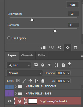
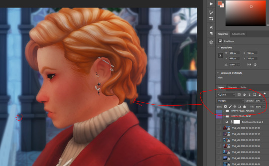
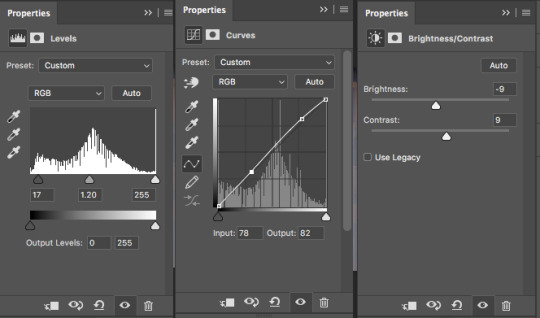
^ 2) since my current scene outside in the realm was kinda bright (for early early morning/late night of 3am in-game if i remember correctly lmfao), i had to tone down the brightness as well crank up the contrast for some Nice Touch of depth or whatever idk words. it makes a difference fam.

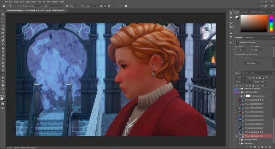
^ 3) this is what the brightness/contrast editing did btw. now, i stayed on the picture layer and used the flood select tool and grabbed morgyn; while keeping them selected, i made a new layer with that button on the side mhm. it’s time for some light editing hahah
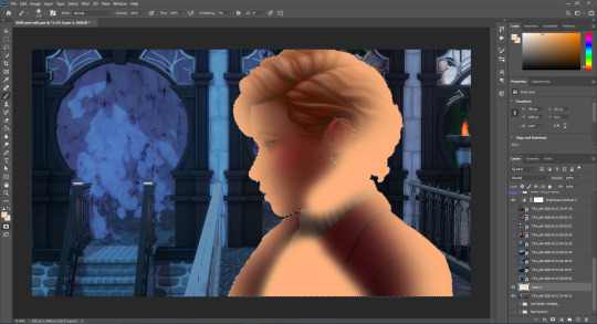
^ 4) disregard the pun, im dumb lol. anyways, i took some peachy-orange and drew on some points where the light (from the opposite doorway in which they had exited in post 3) hits them. it’s not accurate but it is what it is. I set this layer to “overlay” and the opacity to roughly 50-40%. Make a new layer!
^ 5) new layer: do the same exact thing but with finer brush lines but in white (or off-white). This is more of the highlights on the sim (or subject, whatever you’re editing). Set this layer to EITHER “overlay” or “soft light”, then play around the opacity until it looks natural. you CAN take a soft-edged eraser (set opacity to about 20%) and kinda soften up the brushing so its not too sharp and harsh. CTRL+D to deselect the subject.

^ 6) this is the outcome :3 see the shadowing and lighting? it looks like the warm lights from the hall to Morgyn’s left is hitting them ~ Now, that things look okay, click off the brightness/contrast layer (you’ll wanna save this) and everything else EXCEPT for your picture layer and the layers you just did (lighting and such). Now you want to right-click on a visible layer and click “Merge Visible;” this merges the visible layers into one (I do this so that things dont get messy and disorganized in my layers bc i mass-open 4385873246 pictures and my post-edit psd has so many layers as it is lol) (but this is also a key thing to do for later steps~)
^ 7) Now with your merged layer of the edited pic, you want to duplicate the image layer so that you have 2. On the top layer, flood-select your main focus—this can be a sim, or a few, and the front-and-center focus area of the image. Once the stuff is selected (make sure you zoom in and get all the little details ie hair, etc), you want to hit your “delete” button on the keyboard (or use the cut tool, whichever is easiest) and watch the stuff poof, as shown above.
^ 8) grab your blur tool and set it to this setting. Then what i do is i just click on the (still top layer, the one with the erased focus!) layer and go HAM with the mouse. PS does this thing where the more i waggle the mouse the more it blurs. i just blur the background for 10 seconds and release. tada all blurred tf out. then, i go to the bottom (untouched!) layer and use a smaller size of the blur tool and lightly edge around the subject, just to casually blend the subject and background so that things look smooth. when done, merge visible again!!

^ 9) I then go into Topaz Clean 3 and smooth out the image!! here are my settings ^-^
^ 10) now my morgyn is a sunkissed-freckled bby. but topaz washes them out almost all the way :c so i take my splatter brush and zOOm in on their cute face and use an eyedropper to grab the color of one of their kinda visible fweckles. then i just splash that brush aLL over their face/skin in general. then i set that layer to multiply, then opacity like 20%?? Then i take a soft edged eraser, opacity to 20%, and kinda spam click all over to not make the “freckles” so consistent but also to blend them in a bit.
^ 11) this just shows the settings and outcome of the sunshine bby ♥
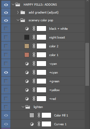

^ 12) these are just what i have set on the Happy Pills PSD Set! I have both folders set to 20% because at 100% + my reshade, shit’s bright as fuck [swEAts] lol. so I turned them down a bit and adjusted as so ~
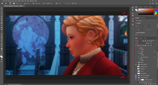
^ 13) and finally, with all visible layers merged into one, the brightness/contrast layer turned back on, the Happy Pills PSD folders turned on, and my cinematic black bars on, we get the final image :3 here’s the pic after i finished some additional editing for my story post part 4
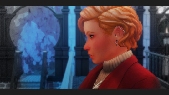
(: !!! I hope this helps lolol ^^ ♥
24 notes
·
View notes
Note
hi! how did you make you banner i love it!! :)
thank you! i’ll give a detailed rundown under the cut! i was actually in the middle of making a new header when you sent this, so good timing!
a quick explanation is that i cut out an image, paste it onto a fresh canvas, edit to my desire, and then use a gif overlay on top to give that snow effect!
so i’m going to explain this in as much detail as possible to try and make it as clear as possible, so hopefully this will be useful no matter how much PS experience one has! i used photoshop cc 2017 to make this! i’ve learned ps pretty much through just trial and error so if i do things weird, im sorry sdklfjdslk
start:
the first thing i do is open a blank document in PS sized to the tumblr header size which is 640x360 on mobile, you can size up if you want, but just keep the ratio the same!
player image:
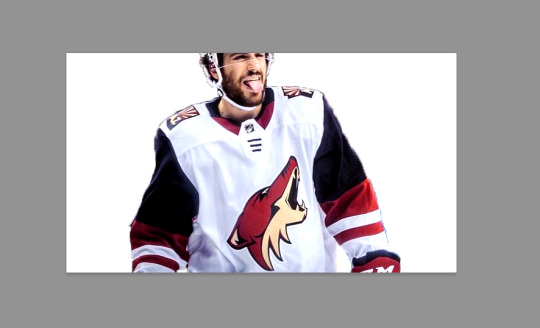
so first i grabbed a picture, and for this i prefer pictures where the player(s) is(/are) isolated, and it’s even better when there’s not much going on behind them because it makes it much easier to cut out the part you want!
the picture i used for this is from this post on the yotes instagram!
next, i open this up into PS, so i have both the photo and the blank canvas (red arrow) open. the blue arrow points to where you can change workspace presets to allow different tools onto your workspace. i’m currently using the photography preset, but will eventually switch to motion later on.
now i begin cutting out my player. there’s multiple methods to do this and each once has it’s pros and cons. the quickest way for me is not necessarily the best way, but it does what i need it to do, especially when the item to be cut out is isolated in front of a quiet background. i use the quick selection tool to quickly select the area i want with a larger brush, and then i go in with a smaller brush size to clean up the edges and details.

when the option with the plus is selected you are grabbing more area, and when the option with the minus is selected you are are deselecting area. the 22 highlighted above references the brush size, the appropriate brush size, or what is “big” or “small” will depend on the size of picture you’re working on so just play around with what you’re comfortable with!
nick is selected, as you can see below, with the line around his body. this is not quite as careful as i would be if i was actually making this for someone to use, but for demonstration purposes it works. you can zoom in further and use the smallest brush size possible and really be careful cutting things out. you can zoom in but uping the number at the bottom left handside of the screen!

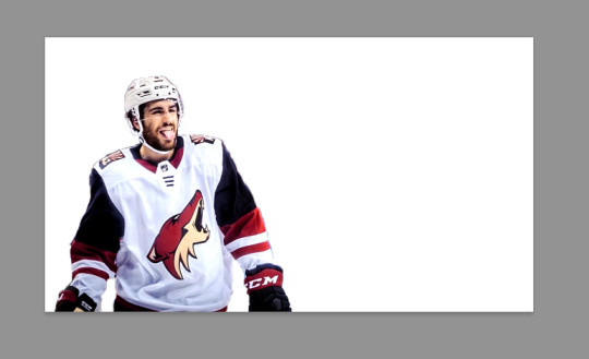
once you have everything selected, right click and choose layer from copy which will create a new layer with just the area you have selected.

now i turn off the layer with the full picture, leaving only the layer i just created. to do this, click the little eye next to the bottom layer on the right hand of the screen, as seen below.

now you’re left with a transparent player to work with! this is where i do any coloring i want to do as well, so i will quickly do that. i am not great at this part so i will just recommend looking up coloring tutorials if you want more specific help here, or just mess around with different adjustment layers which is what i do lol. once it’s colored to my liking, i merge the layers together, making them into one layer, which means the coloring won’t impact any layers below it once i move it to the canvas where we’re actually going to create the header. you do this by selecting all the layers (ctrl + click all the layers or shift + click the top and bottom layers to select them all), and then right clicking and selecting merge layers from the options.
assembling the image:
now im going to work on the base of the header, or basically the rest of it except for the moving bits! what i want to do here is move the player image over the header canvas, resize the image, decide on the color of the background, whether i’ll use any other images or textures, etc.
first i’ll think about my background color of choice. a lot of people use the color that they use for their mobile blog on here, or something complimentary or matching their accent color, etc. i really like a simple clean look so i used a white background for this header because i think it makes the image itself pop and allows the accent colors on my blog to also pop because i use white as my main color on my blog.
if i wanted to use another color, i normally pull from some part of the image i’ll be bringing over. for this i’d use the color dropper tool (see below), clicking on color on my image i want to use.

then i’ll pull up the color boxes in order to create a custom color from that color (click define custom colors), and then you can mess around with by clicking different boxes on the color scale along the right side of the panel below, or if you want an unrelated color, click on parts of the entire rainbow scale thing. once you have a color you like, selected add to custom colors and you can work with it. i create a new blank layer and then use the paint bucket tool to color it in. this is where you could also use gradients to jazz up the background a little too.
now i’ll drag my player over into the header canvas. i do this by click + dragging the layer from the right side over to the tab of the header canvas until the screen changes over to that workspace and then i drop the layer onto the canvas.

and
now nick is over on the blank canvas but as you can see, he needs to be resized. so i ctrl + t, which allows me to transform his layer (make sure you only have the layer w the image selected on the right hand side layers panel). i hold down the shift key (this keeps the ratio true) and begin to make him small by dragging the arrows. make sure you do not let go of the shift key too early or it will fuck up the image and make him too long or too wide, etc. then i hit enter, and it completes the transformation. i then drag him to wherever i want him.
now that he’s resized and where i want him, i mess with the blending options to blend him into the background more pleasingly. now this really isn’t gonna look good since i was so sloppy cutting him out earlier, but just mess around with it until you get something you like. you do this by right clicking on the layer you want to blend and then selecting blending options. i normally do a drop shadow and maybe some other stuff, but i find this changes depending on the image, background, colors, etc.

there’s a lot of stuff you can do here, with the different options and the different settings for each one!
gif overlays:
now it’s time to add a gif overlay which i how get the snow falling effect. there’s multiple posts with these kinds of gifs out there, i’ll be using one from this post (method one) and one from this post (method two). neither are the one i used when i first made this header but i cannot find the one i used then; the principles still apply. now is the time to either add the timeline to your workspace, or change it to the motion preset.
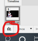
on the timeline section at the bottom of the page, there should be a create timeline animation button, click that.
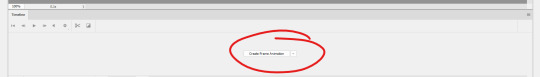
as with gifs from videos, there’s multiple ways of making these gifs. i’ll run through two here.
method 1: this is the method i used when i first made this header!
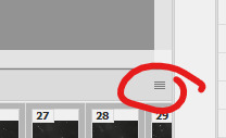
if you use a gif overlay, and it comes with frames, create as many frames as that gif comes with to then copy those frames onto. open your gif and see how many frames/layers. this one has 29 as you can see below.
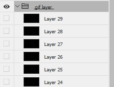
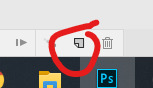
now click the little button with lines at the top right corner of the timeline. it looks like this.
next click select all frames from the menu that pops up, and then select that menu again and click copy frames. now go back to your header and create the frames i talked about earlier, you need 29 (or whatever it may be for your gif). do this by selecting the button below, located along the bottom of the timeline. do this as many times as needed until you have enough frames.
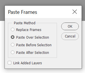
now select all the header frames once again and go back to the menu where you copied the frames and select paste frames this time. a menu will pop up, and choose paste over selection. this will match up the frames/layers so frame one of your header will match with frame one of the gif. adjust the gif size if you need to, once again using ctrl + t, and make sure you still have all the layers selected and that you are still on frame 1. also make sure you move these layers under nick in the layer order.
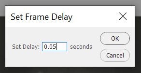
now adjust the frame rate. this will depend on your tastes entirely so test it out. my go to frame rate is 0.05 for everything i do pretty much, as a baseline, and then i adjust from there. to do this, once again select all your frames. next, click on one of these little carots, select other, and input your frame rate in the box that pops up.
method two:
this method is when your overlay comes in timeline form (idr what it’s called) instead of frames, looking like this.

drag the layer from the layer panel onto the header canvas, just like we did with nick earlier. make sure it goes under nick in the layer order. adjust the size if necessary, still using ctrl + f to keep the shape. make sure to click this button at the bottom left corner of the timeline to convert the frame into a timeline.
now, make sure to drag each layer to the same length, aka whatever length the gif layer is. make them match!
changing the color of the overlay:
this works with either method above! create a new layer and fill it with the color you want the snow to be. place it below everything except the background layer. add a gradient layer on top of the gif layer. right click on this layer and click create clipping mask. this is what my layers look like, i don’t normally label them but hopefully this is clear.
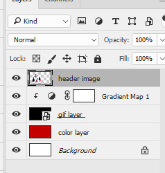
open the properties panel for the gradient map and make sure this gradient is selected and is black and white.
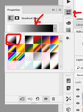
finally, change the blending to lighten on the gif layer! this should do the trick!

final touches:
i like to kind of have my header melt into my blog color, so i like to kind of transition the bottom of my header into whatever color my blog is. to do this, i use a multitude of methods. for this header in particular i used the eraser tool + a textured kind of fan brush to swipe back and forth creating the half erased look at the bottom. the setting seen below are probably similar to what i did when i originally did this header!

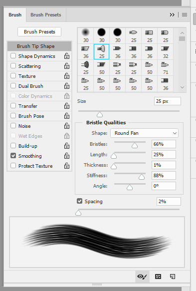
again, this is something that you can play with a lot yourself, especially by downloading brush packs and seeing what cool textures you can create.
saving:
to save, file > export > save for web
make sure you select “forever” and not “once” so that the gif loops!
original:

gif method 1:

gif method 2:

(ignore how this is also different i had to remake it once again bc i didn’t save it lmaoooooo)
5 notes
·
View notes
Text
Collage Header Tutorial
Hey all! Someone asked how I do collage headers so I figure make a visual tutorial rather than just explain with words. It’s pretty easy so I hope this helps!
What you need:
Photo editing software (I’ll be using Photoshop CC 2018)
7-10 photos of the superstar of your choice
Any PSDs you want to add
Skill Level: ★★☆☆☆

Step 1: Open a new document with the dimensions 1500x500

Step 2: Add one of your images to the document (I prefer copying (Ctrl+C) and pasting (Ctrl+V) them individually so I’m not taking space on my computer) and resize it (Ctrl+T) so the person fits in the height.

Step 3: Select the lasso tool and make a path around the person (it doesn’t need to be precise)

Step 4: Double click the image and click Select Inverse, delete/backspace on your keyboard. Then double click and click deselect.

Step 5: Repeat this with the rest of your images.

Step 6: Place and resize your images to your heart’s desire, and cut out more if need be!

Step 7: Add your PSDs and save!
If anyone uses please credit @wweresourcess on twitter if using!
16 notes
·
View notes
Photo
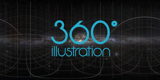
Illustrating in 360°
When I decided that a 360° illustration was going to be my first project of 2019, I never would have guessed, how much knowledge I would gain and how much enthusiasm I would develop for this topic. In the course of just a few tutorials I was able to learn everything to make it work properly. Therefore I decided to share those tutorials and links with you.
3D illustration is generally a topic that evolves these days, with VR technologies becoming more and more common. Especially if you have a look at Artstation or the portfolios of concept artists, you find a lot of really cool worlds that you can experience by moving around inside of them. We are used to see 360° photos but it’s breathtaking to see fantastic worlds and imagined stories coming to life when you explore a spherical illustration little by little.
Terminology
Before starting, I want to make sure we’re all talking about the same subject. It’s not about flat images with a perspective grid (1/2/3-point-perspective), nor about an image with a parallax effect. We mean a drawing on the inside of a sphere, where you have a fixed standpoint but can change your view by turning and also looking up and down.
Software & setup
I started by buying and testing the app Panopainter on the iPad, ending up firstly fascinated and soon frustrated because of bugs and constraints that made it hard to establish a constant workflow. For example, I searched forever for a way to deselect a selection, turned around and found half of a picture deleted that I didn’t even work on at that part of the process or I did not manage to import a png without a transparent background.
So I watched this wonderful tutorial and decided to use the good old photoshop: Pano painting tutorial by Jama Jurabaev In it, he explains the basic setup for using a spherical map in photoshop and he created a 3dimensional grid for downloading that helps so much to navigate.
Summarized, the workflow goes like this:
create a big canvas with an aspect ratio of 2:1 (e.g. 6000x3000 px)
load a grid (like the one in the tutorial) or another picture that works like a 360 photo and make sure this layer is selected
(in the current Adobe CC:) click on „3D“ – „spherical panorama“ – „new panorama layer from selected layer“
you now only see a part of the picture and can move around already and draw directly on the sphere
you can also double-click on the spherical map that works like a smart object, and work directly on the map
Workflow
For the drawing process, this tutorial was very helpful: Edit spherical panoramas by Photoshop Training Channel Although it shows and explains everything based on a photo, it contains the best tips about a non-destructive way of working.
The problem is this: when you sketch something on a new layer in the normal mode and move around, the new layer moves with you. If you want to fixate the drawing to the spherical map, the steps are:
open the spherical map and create a new (empty) layer, make sure the layer is selected
save and close the spherical map
in the normal view, draw on a layer directly above the spherical one
when ready, right-click on the drawing layer and choose „merge down“ (if you are not sure you’re ready, keep a copy of the layer)
the drawing is now part of your spherical map, but it is on the layer you created before
Preliminary 3D model
For my personal workflow in the future, the next tutorial on how to build and export a scene as a 360° panorama in Cinema 4D might come in handy as well: Panorama Rendering by Konstantin Magnus I’ve successfully tested it already. The scene that is described is random but the export of it is quite tricky. The program doesn’t offer a direct way yet so there’s a little workaround:
in render settings, choose the format „Quicktime VR panorama“
the default resolution and the output size should be the same (aspect ratio 2:1)
unclick „save“ in the render settings
render and then save the image as a picture manually. Tadaa!
I hope these tips help you getting started. Are you as excited as I am?
#jbohn#digitalpainting#digitaldrawing#drawingtutorial#howtodraw#learntodraw#360tutorial#360degrees#360drawing#360project#3ddrawing#vrart#vrartist#conceptart
6 notes
·
View notes
Note
hi! i love your gif sets, do you mind if i ask how you put the text on your gifs? like the subtitles, i wanna make a gif set but i’m not sure how to add the subtitles
hi thank you!! i don't know which software you're using, but i use photoshop cc 2021 for my gifs, so here's the way i do it
these first 2 steps are just in case you're working with frames and/or with the default timeline, so you can just skip to 3 if that's all you wanna know
1. so this is something i'm not sure you HAVE to do to add text but it's the only way i know how after i load the frames i wanna work with and invert them, set the speed etc. i always click this little icon so i can work with a video timeline
your tl should look like this:

2. then i select all my layers, right-click on them and convert them to a smart object (sorry it's all in portuguese lol)
now you have one layer, which is the rough version of the gif

3. okay now for the actual text you gotta click that little "T" icon on the left sidebar and then click once on your gif and it'll create a text layer

4. after you've typed what you want, now you can adjust the font, size, style, color and all that however you like. there's also extra features on the right sidebar
5. in order to centralize the text on the image, press ctrl+a (windows) and that'll select your gif, like this:

then click the first icon of your tool bar (1), the moving tool, and what i like to do is click the centralize icon (2) and then align with the lower edge of the image (3).

press ctrl+d (windows) to deselect. i've always liked pressing the up arrow of the keyboard 7 times so the text isn't too close to the border.
6. and finally, to add an outline and shadow to your text (or any other effect you might want), you have to double-click on the text layer and it'll open up this window:

you can mess around with this however you like. this is the final result:

#ask#spectralarrovv#i hope this was helpful lol#it's my first time doing a tutorial#i would have put a little more detail but tumblr only allows 10 images per post so
1 note
·
View note
Text
gif tutorial !!!
hello !!!! it’s me, ur resident shownu stan w a gif tutorial !!! no one really Asked but i wanted 2 make it and also it turns out ppl Are interested in one so :D !!! here i am !!!! so under the cut will b the tutorial nd it’s really picture heavy because i’ll be covering a lot,,,,
we’ll be looking at:
downloading the video :0 !!
trimming the video to get the clip you want
actually making the gif
some coloring advice :D !!! (i lov coloring Truly!!!!)
and some exporting advice too :D
and this is what i’m using:
ps cc 17
vlc
and i use a mac :D
part one. getting the clip !!
(also a quick note !! this isn’t my process for speed giffing or performance giffing as thats,,, thats an entirely Different adventure that makes me scream)
so !!! i will be giffing the dramarama music video and what you want to do is download it first :D so go to vlive, copy the url of the music video and i use two sites to download from vlive just because one of them can get a little buggy ?? but i use soshistagram and savieo !!! savieo is usually what i prefer to use but either is fine :D
once you downloaded the video, open it in vlc and go to the part you want to gif. i recommend pausing a few seconds before the actual scene because it’s always better to get a little more than you intended than a little less. currently, my screen looks like this:

and what you wanna do Next is go to playback > record and record the scene you want! when your scene is done playing, just go back to playback and click record again to make it stop.
for me, all my clips end up in my “movie” folder so it’s best to check where your clips go :D i think ?? you can change their destination but i never really played around with that so i’m not sure D:
part two. making the gif !!!
open up photoshop, then go to file > import > video frames to layers. select your clip and this window should pop up:
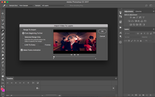
simply adjust the arrows until you get the scene you want and then press OK. a few notes about this part:
some people choose to select “limit to every 2 frames”. i personally don’t do this just because to me, it makes the gif look choppy, but use your intuition and go for whatever you think will suit the gif :D
i Would recommend not using ‘limit to every 2 frames’ if your clip is really short, as you want every frame possible
make sure ‘make frame animation’ is selected
and also the rule of having a little more than you want is important here too! the arrows aren’t very accurate so it’s better to get frames from scenes you don’t want that you can simply delete later
once you’ve hit ‘ok’, photoshop will then process the clip and give you this :D
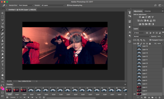
(if you don’t have the timeline, just go to window > timeline. it’s near the bottom :D!!!)
also a quick moment!!! everything in the timeline tab will be called a frame and everything in the layers tab will be called layers :D
moving on! mister kihyun is not part of the scene i want, so i select the frames (not the layers!!!) that i don’t want and hit the trash can button at the bottom. goodbye mister yoo leaving me with this:

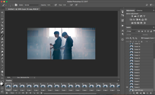
aren’t they just,,,, Beautiful :’( ...... anyways !! now we want to Crop !!!! tumblr has certain width sizes that i recommend you use for Ultra Crispness, and you can see a guide of what to use here !!
because the clip i’m giffing is so short (only 23 frames), i can crop it to 540px by 250px without worrying about file size. simply click crop in the toolbar so you get this setup here

where it says 268px by 305px, just change it to whatever your dimensions are! also, make sure ‘delete cropped pixels’ is deselected. then, go ahead and select what you want to be cropped and then press enter :D my screen at this point looks like this

press enter and then :D!! all cropped!!

now we’re going to sharpen! in the timeline tab, there’s a button made up on three lines. i circled it here :D

click that and select “convert video to timeline” so you get this

select all your layers and then convert to smart object! (you can either do this by rightclicking on all the highlighted layers and selecting ‘convert to smart object’ or by going to filters > convert for smart filters
now your gif is ready to be sharpened! i use actions to sharpen my gif and you can find a few of my favorites on this blog !! download a couple and play around with it :D once your gif has been sharpened, select all the layers again and convert it into a smart object again. then click the 3 lined button and click convert frames > flatten frames into clips. then convert back into frame animation (either by clicking the three lined button again and going convert frames > convert to frame animation or by clicking the three squares in the timeline)

you should now be back to where you started :D only this time you have one frame D: but don’t worry! what you want to do next is click the three lined button again and select make frames from layers. delete the first frame in the timeline because it’s just the smart object layer and we don’t need it. you should now have this
and we can officially move onto the best part :D coloring !!!
part three. coloring!!!!!!!!!!
let me preface this Entire Section with saying there is no right or wrong way to color. every gifmaker has their own distinct style, and you’ll develop yours too :D i really recommend looking to see if your favorite gifmakers have any coloring tips and if they don’t, there’s no harm in asking :D (just make sure ur nice abt it nd respect them if they choose not to share their coloring :D)
moving on to actually coloring, you wanna see what kind of colors are in your gif and enhance them. in the case of this gif, it’s very blue toned and blue tends to end up being very grainy in the end. i want to color correct this gif then and there’s a good tutorial that i learned from here :D (i don’t color correct all the time, only when the scene is very heavy in one color)
now we have a more neutral starting point, and you can color as you want from this point! i’d usually just Slap on my psd and adjust the settings until i get something i want, but i’ll go through some of my favorite adjustment layers and what my general coloring process looks like.
here is the Holy Grail of photoshop, the adjustments tab :D i use these adjustments the most:
brightness (i usually decrease the brightness and up the contrast just a bit)
levels (i take the black arrow down a bit and the grey arrow either increases or decreases depending on the gif)
curves (i use this sometimes!! if the gif is just a bit too dark, i usually bring this up a tiny bit)
vibrance (i usually bring this up to about +15 or +30 depending on how colorful the gif is)
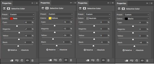
color balance (another adjustment i absolutely need in all my gifs!! it helps to change the tone of the gif (if it’s too red/too blue/etc and lets you neutralize it more) and a good tutorial that explains how to use color balance can be found here)
selective color (i usually have like,,,, So Many Layers of this but this is a Must Have adjustment!!! i always change reds/yellows/cyans/blues/neutral/black)
gradient maps (just to add some more color)
exposure (usually to darken the gif a little and decrease grain)
and just for the sake of this tutorial, i’ll go through how i would color this gif so you can get an understanding of how i color :D
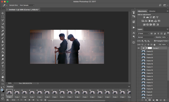
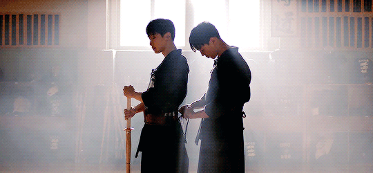
so we go from this

to this
i use the levels, curves and brightness adjustments to increase the contrast and darken/brighten the gif a little. it’s not a noticeable difference but it’s there :D
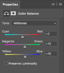
then, i use a color balance layer to make it more red-toned. i worked in the order of shadows > midtones > highlights and adjusted each slider until i got a result i wanted. i also thought it was still a bit too dark, so i threw in a curves layer too.


resulting in this
and then i added some selective color to enhance/change up some colors!
and because i thought it looked a little too red, i added another color balance layer.
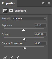
and lastly, i add in an exposure layer!
and that’s how i would color that gif :D this is just a really basic coloring but you can always build on it and play with all the adjustments !!! now we’re gonna time the gif and then save it :DDD
part four. timing and exporting :D
timing is easy :D select all the frames in the timeline and then click the number so you bring up this menu:
click other and input the timing. i follow this really rough guide of what timing to use per amount of frames:
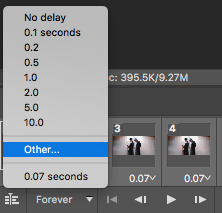
15-30 frames: 0.07s
30-60+ frames: 0.05s
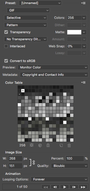
i had 23 frames for this gif so i’m using the 0.07s timing :D hit enter and your gif is timed :DDDD !!!!!!
now for exporting!!!
i used to think there was only One Way of exporting gifs but after reading a gazillion tutorials and playing around with the settings myself there’s actually a lot of different ways :D you can ask people what their save settings are and play around with it :D
so to Finally save your gif, go to file > export > save for web and devices and this window should pop up
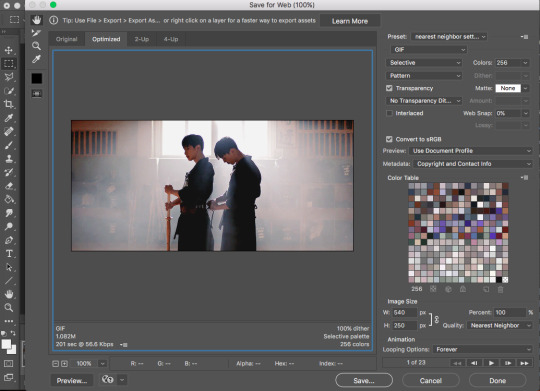
here’s a closer look at the settings i use to save gifs
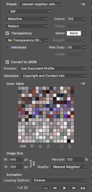
make sure the looping option is on forever otherwise it plays once and then you want to Roll into a pool after you upload it and realize you hecked it up. also, make sure the file size is under 3mb. you can check that here
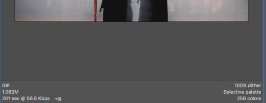
my gif is 1.08mb so it’s fine :D hit save and then name your gif and bam!!!! you made a gif :DDDDD here’s the final result, with a comparison for coloring :D


pat urself on the back and go tackle photoshop :D if you have any questions, feel free to send them my way !!!
79 notes
·
View notes
Photo


how i make my tropes gifs - a tutorial
here’s a quick tutorial on how i make my tropes gifsets! they’re pretty simple to do once you know the basics of gif-making (i have a basics tutorial here just in case you’d like to start there first), and it’s my personal favorite gif series to make. this tutorial is mostly about how to combine gifs onto one canvas, if that’s what you’d like to know how to do!
program: adobe photoshop (i have cc 2018) note: i’m on a Mac, specifically macOS High Sierra, so it may look/function slightly different if you’re on an older version of macOS or on a PC requested by: @the-singing-dove
instructions with screenshots under the cut! feel free to send me an ask if anything is unclear :)
to prepare (aka the non-tutorial section of this tutorial)
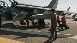
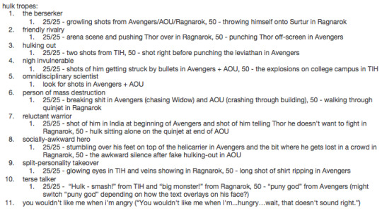
obviously, the first thing i do when making my tropes gifsets is open tvtropes. it helps if whatever it is you’re giffing has its own tropes page, because they basically do the work for you! i make a list of tropes that i want to use in alphabetical order, and then do a breakdown of what scenes go with what trope. this helps cut down on time spent in photoshop trying to find a good bit. for example, here’s me planning out my set for the hulk. in this tutorial, i’ll be making #8.
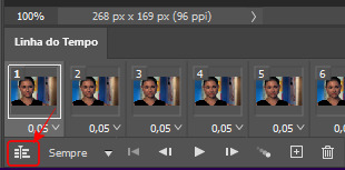
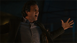
for each “set”, i pick two scenes for the colour gif which is split into 25 frames each (for a gif of 50 frames total), and a third scene for the black and white gif that is 50 frames total and has the trope text on top of it. i tend to adjust the cropping of the latter in a way so the text hopefully doesn’t block too much of what’s going on. since tumblr has a ten photo per photoset limit, i combine these two gifs so that i can fit up to ten tropes per character (as i will explain later!).
quick overview of my settings
if you haven’t seen my basic gif tutorial, all you need to know is that i limit my 268px gifs to 50 frames each and that i use a frame delay of 0.05. below are my respective settings for smart sharpening and exporting!
step 1 - making the black and white gif with text
the black and white gif is pretty simple - make a 268px-wide gif as you normally would, and apply and adjust a black-and-white filter as needed by going to the fill and adjustment layer menu.
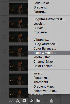
then, create your text layer. make sure it’s positioned where you want by selecting the layer and using the adjustment options (circled).

use the “match layers across frames” option in the timeline menu to keep it consistent.


these are the font settings i use for the tropes gifs specifically.
to make the text pop a little more, either double-click the text layer or right-click and go to "blending options”.

check off “stroke” and “drop shadow”.
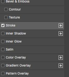
click on them to open up their individual settings. these are the settings that i use for both. note that the stroke colour i use is dark grey (4e4e50) instead of black, since i personally feel it blends better on top of a black and white gif.

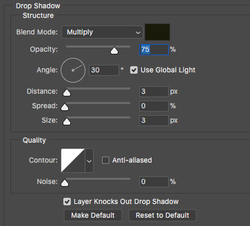
sharpen and export the gif as you would, and you’re finished with the first gif!

step 2 - making the colour gif
as mentioned previously, i want the colour gif to have two scenes of 25 frames each. often, these come from completely different files (different episodes, movies, etc.). go through the normal gif-making process as you would for both files - change the frame delay, size (268px wide), and adjust frames as needed. remember to keep the image size the same on both, or else you end up with gaps and/or scaling issues.
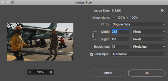
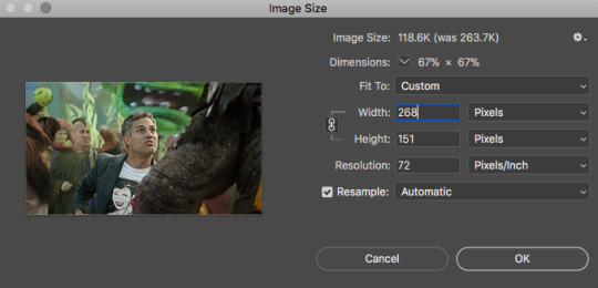
once both your scenes are ready to go, figure out which one you want to play “first”, as in, what will be seen during the first half of the black and white gif. click on the very last/top layer of this file (it will save you the headache of dragging your frames around later).
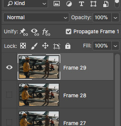
select all the layers of the other scene, and drag it into your first file.
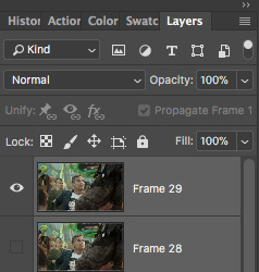
now all your frames should be stacked together in the layers panel. if necessary, delete frames from the timeline and “make frames from layers” again.
the rest of it is pretty simple - apply your psd, sharpen and export as you usually would. however, if your two scenes are vastly different in coloring, lighting, etc., you may need to alter your psd between the two scenes. here’s how i do it:
start by putting it your psd layers in a folder they aren’t already. then, you can either hold and drag the folder to duplicate, or right-click and select “duplicate group”.
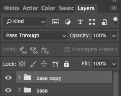
in the timeline panel, select all the frames of the first “scene”. click the eye next to the duplicate psd to deselect it. repeat this for the other “scene”, but with the original psd instead. this way, your first “scene” only has the original psd appplied, and the second “scene” has only the duplicate psd applied. edit these individually as you wish, and they’ll be completely separate from each other.

sharpen and export once you’re done. almost there!
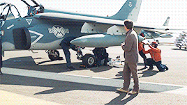
step 3 - combining the two gifs
now, you should have two gifs. one black and white gif with 50 frames and text, and one colour gif with two scenes of 25 frames for a total of 50 frames. to get around tumblr’s ten photo per photoset limit, it’s now time to combine them onto one canvas. first, open them both back up in photoshop, now as gifs instead of psds.
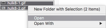
next, choose one of the files and go to image -> canvas size.
decide whether you want it on the left or the right. for the tropes series, i number mine off in alphabetical order of the trope names from 1 to 10. anything odd-numbered puts the text gif on the left, and anything even-numbered puts it on the right, since we tend to read from left to right. again, completely personal preference. then, change the width to 540px, and click the arrow that directs which side your gif will go (circled).
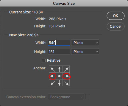
it should look something like this!
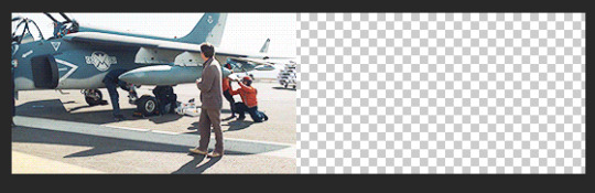
repeat for the other gif, placing it on the other side.
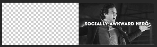
for one of the gifs, select all frames, then “copy frames”.

go to the other gif. select all frames, and then click “paste frames...”.
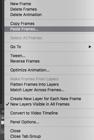
at the prompt window, select “paste over selection”.
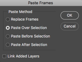
you should now have two gifs running together at the same time, side by side, with a gutter in between to emulate the spacing that tumblr has for photosets. you may need to readjust the frame delay.
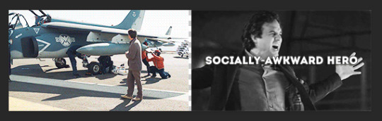
do NOT sharpen it again, just go straight to export and you should have one gif that looks like two!
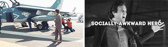
so that’s it! if you have any questions about anything that was unclear or maybe i skipped over it too fast, feel free to send me an ask :) good luck!
#photoshop tutorial#gif tutorial#edit tutorial#photoshop#gif#mytutorials#please like and reblog if this was helpful in any way! i'd love to know if this was of any assistance to anyone haha
17 notes
·
View notes
Note
Do you use Photoshop for your edits? If so, HOW DO YOU DROP SHADOW. I can't for the life of me find a sims ps drop shadow tutorial. Also, how do you always get them to look so crisp! ❤
I do use photoshop! The crispness is due to Topaz Clean & running my game on Ultra…. My computer hates me! Haha. I’m sorry, Oberon.
This is a pretty basic tutorial, because I am a very basic photoshop user (beginner level).
What you need, for your pictures to look EXACTLY like mine:
Photoshop (I use Photoshop CC 2015)
Topaz Clean (for the crispness)
This action by @kaleekalo (just the Topaz Clean tho)
Step 1 - Your Sim

After selecting your entire sim, run the Topaz Clean from the action. I usually zoom in at this point and check to see if there are any “cracks” in my sim’s face (it’s a graphical glitch common with NVIDIA video cards, I think). If there are any, I use the blur tool & buff them out.

But luckily this time there aren’t any! Either way, once your sim’s been cleaned up, copy them (and then make sure to deselect).
This step is technically extra–I run Topaz Clean for the sharpness, but it’s not totally necessary, you know? This is the same picture, no Topaz..

and this is with a sharpen filter on at…. 125%? You can always play around with it.

Step 2 - Your Background
I usually just do a quick fill layer here, but sometimes I search google for a background. As seen here–I just did a quick gradient layer.

After that, create a new layer and PASTE YOUR SIM ON.

Wow Maddy Moon, you look great so far! But you know, I think you do need a shadow.
Step 3 - Dat Drop Shadow
You should have the layer with your sim alone selected.
Go to layer, then layer style, and then… select drop shadow!

After that, I just play around for a bit. I like using “color burn” for the blending option, which is why the shadows I use are usually so colorful–but sometimes I use other options. Depends on my mood.
The End!

24 notes
·
View notes