#html table header row
Explore tagged Tumblr posts
Visit Tumblr Blog
Explore Tumblr blogs with no restrictions, modern design and the best experience.
Last Seen Tumblr Blogs


Fun Fact
The Tumblr office adopted Tommy, an 11-year-old Pomeranian.
Text
Day 3 [Table In HTML]
Day 1 [Introduction To HTML]
Day 2 [Multimedia Elements In HTML]

Line by line explanation:
Defines a table,
border : This attribute adds a simple border to the table.
style : Used to add some styling to the webpage. Can be used with any tag.
Border spacing: Adds space between table cells.
Text-align : Aligns the text in the table.
Contains the header section of the table.
Represents a table row
Represents a table column
Holds the body of the table → main data (menu items).
Used for individual data cells in the table.
<table> <thead> <tr> <th> Column Head 1 </th> <th> Column Head 2 </th> </tr> </thead> <tbody> <tr> <td> Row 1 Data = Column 1 </td> <td> Row 1 Data = Column 2 </td> </tr> </tbody> </table>
Final Output

------------------------------
Hope it helps :)
#code#codeblr#css#html#javascript#python#studyblr#progblr#programming#comp sci#web design#web developers#web development#website design#webdev#website#tech#html css#learn to code#school#study motivation#study aesthetic#study blog#student#high school#studying#study tips#studyspo#website development#coding
9 notes
·
View notes
Text
Responsive Sortable Table for HTML Websites
People watch website both from Laptop and Mobile. So, when a web developer creates Table, he or she should make it as responsive. Sometimes it is important to set different color for odd and even row that reader can read the table easily. This Code can make your Table Header sortable too.
#HTML#HTML website#CSS#CSS3#Different Color for Odd and Even Row#Even Row#Filter Table#Filterable Table#Hover on Table Row#Odd Row#Responsive#Responsive CSS Table#Responsive Table#Sortable Table#Table
2 notes
·
View notes
Text
Let's understand HTML

Cover these topics to complete your HTML journey.
HTML (HyperText Markup Language) is the standard language used to create web pages. Here's a comprehensive list of key topics in HTML:
1. Basics of HTML
Introduction to HTML
HTML Document Structure
HTML Tags and Elements
HTML Attributes
HTML Comments
HTML Doctype
2. HTML Text Formatting
Headings (<h1> to <h6>)
Paragraphs (<p>)
Line Breaks (<br>)
Horizontal Lines (<hr>)
Bold Text (<b>, <strong>)
Italic Text (<i>, <em>)
Underlined Text (<u>)
Superscript (<sup>) and Subscript (<sub>)
3. HTML Links
Hyperlinks (<a>)
Target Attribute
Creating Email Links
4. HTML Lists
Ordered Lists (<ol>)
Unordered Lists (<ul>)
Description Lists (<dl>)
Nesting Lists
5. HTML Tables
Table (<table>)
Table Rows (<tr>)
Table Data (<td>)
Table Headings (<th>)
Table Caption (<caption>)
Merging Cells (rowspan, colspan)
Table Borders and Styling
6. HTML Forms
Form (<form>)
Input Types (<input>)
Text Fields (<input type="text">)
Password Fields (<input type="password">)
Radio Buttons (<input type="radio">)
Checkboxes (<input type="checkbox">)
Drop-down Lists (<select>)
Textarea (<textarea>)
Buttons (<button>, <input type="submit">)
Labels (<label>)
Form Action and Method Attributes
7. HTML Media
Images (<img>)
Image Maps
Audio (<audio>)
Video (<video>)
Embedding Media (<embed>)
Object Element (<object>)
Iframes (<iframe>)
8. HTML Semantic Elements
Header (<header>)
Footer (<footer>)
Article (<article>)
Section (<section>)
Aside (<aside>)
Nav (<nav>)
Main (<main>)
Figure (<figure>), Figcaption (<figcaption>)
9. HTML5 New Elements
Canvas (<canvas>)
SVG (<svg>)
Data Attributes
Output Element (<output>)
Progress (<progress>)
Meter (<meter>)
Details (<details>)
Summary (<summary>)
10. HTML Graphics
Scalable Vector Graphics (SVG)
Canvas
Inline SVG
Path Element
11. HTML APIs
Geolocation API
Drag and Drop API
Web Storage API (localStorage and sessionStorage)
Web Workers
History API
12. HTML Entities
Character Entities
Symbol Entities
13. HTML Meta Information
Meta Tags (<meta>)
Setting Character Set (<meta charset="UTF-8">)
Responsive Web Design Meta Tag
SEO-related Meta Tags
14. HTML Best Practices
Accessibility (ARIA roles and attributes)
Semantic HTML
SEO (Search Engine Optimization) Basics
Mobile-Friendly HTML
15. HTML Integration with CSS and JavaScript
Linking CSS (<link>, <style>)
Adding JavaScript (<script>)
Inline CSS and JavaScript
External CSS and JavaScript Files
16. Advanced HTML Concepts
HTML Templates (<template>)
Custom Data Attributes (data-*)
HTML Imports (Deprecated in favor of JavaScript modules)
Web Components
These topics cover the breadth of HTML and will give you a strong foundation for web development.
Full course link for free: https://shorturl.at/igVyr
2 notes
·
View notes
Text
HTML 💻 30 Cheatsheet
New Post has been published on https://tuts.kandz.me/html-%f0%9f%92%bb-30-cheatsheet/
HTML 💻 30 Cheatsheet

youtube
Basic Structure ```html <!DOCTYPE html> <html lang="en"> <head> <meta charset="UTF-8"> <meta name="viewport" content="width=device-width, initial-scale=1.0"> <title>Page Title</title> <style> /* CSS styles */ </style> </head> <body> <!-- Content goes here --> </body> </html> ``` Headings ```html <h1>This is Heading 1</h1> <h2>This is Heading 2</h2> <h3>This is Heading 3</h3> <h4>This is Heading 4</h4> <h5>This is Heading 5</h5> <h6>This is Heading 6</h6> ``` Paragraphs and Text Formatting ```html <p>This is a <strong>bold</strong> paragraph.</p> <p>This is an <em>italic</em> paragraph.</p> <p>This is a <u>underlined</u> paragraph.</p> <p>This is a <mark>highlighted</mark> paragraph.</p> <p>This is a <ins>inserted</ins> paragraph.</p> <p>This is a <del>deleted</del> paragraph.</p> ``` Links ```html <a href="https://www.example.com" target="_blank">Visit Example.com</a> <a href="mailto:[email protected]">Contact Us</a> ``` Images ```html <img src="image.jpg" alt="Description of image"> <img src="image.jpg" alt="Image not found" width="300" height="200"> ``` Lists #### Unordered List (Bullet Points) ```html <ul> <li>Item 1</li> <li>Item 2</li> <li>Item 3</li> </ul> ``` #### Ordered List (Numbered) ```html <ol> <li>First item</li> <li>Second item</li> <li>Third item</li> </ol> ``` #### Description List ```html <dl> <dt>Term 1</dt> <dd>Description of term 1.</dd> <dt>Term 2</dt> <dd>Description of term 2.</dd> </dl> ``` Division and Span ```html <div>This is a division.</div> <p>This is a span within a paragraph <span style="color: red;">highlighted text</span>.</p> ``` Tables ```html <table border="1"> <tr> <th>Header 1</th> <th>Header 2</th> </tr> <tr> <td>Data 1</td> <td>Data 2</td> </tr> </table> ``` Forms ```html <form action="/submit" method="post"> <label for="name">Name:</label> <input type="text" id="name" name="name"><br><br> <label for="email">Email:</label> <input type="email" id="email" name="email"><br><br> <label for="password">Password:</label> <input type="password" id="password" name="password"><br><br> <textarea rows="4" cols="50" name="comment"></textarea><br><br> <label for="gender">Gender:</label> <input type="radio" id="male" name="gender" value="male"> <label for="male">Male</label> <input type="radio" id="female" name="gender" value="female"> <label for="female">Female</label><br><br> <label for="cars">Choose a car:</label> <select id="cars" name="cars"> <option value="volvo">Volvo</option> <option value="saab">Saab</option> <option value="mercedes">Mercedes</option> <option value="audi">Audi</option> </select><br><br> <input type="submit" value="Submit"> </form> ``` not enough space for the whole cheatsheet
0 notes
Text
8 CSS & JavaScript Snippets for Creating Sticky Elements — Speckyboy
New Post has been published on https://thedigitalinsider.com/8-css-javascript-snippets-for-creating-sticky-elements-speckyboy/
8 CSS & JavaScript Snippets for Creating Sticky Elements — Speckyboy
Modern websites often feature extensive scrolling. Long pages are common on desktop devices, but are even more frequent on mobile screens. The practice creates usability challenges for tasks like navigation and referencing important information.
That’s where “sticky” design elements come in handy. They allow users to scroll without losing access to your site’s menu. You can also use them to keep ads in view, attach social media sharing buttons to the viewport, or create fun special effects.
Implementing a sticky element can be simple, as CSS has a dedicated position property for this function. JavaScript can be used for building more robust features. As usual, there are several methods to achieve your goals.
We searched the CodePen archives to find interesting examples of sticky elements in use. Below, you’ll find various options that enhance the user experience. So, get stuck in your easy chair and be inspired by these code snippets!
Pure CSS Header Animation to Sticky Navigation
Created by Amit
Sticky headers are among the most popular use cases. On Chromium browsers, this snippet uses CSS to transform a tall and narrow header into a full-screen bar upon scrolling. Unsupported browsers receive a narrower, taller, sticky header. Keyframe animation is used to create smooth transitions. The feature is useful, lightweight, and attractive.
See the Pen Pure CSS header animation to sticky nav by Amit
Sticky Responsive Sidebar Navigation
Created by Areal Alien
Sidebar navigation can also take advantage of staying put during scrolling. Hovering over the sidebar expands the navigation to include text labels – it works on mobile too. However, you might also reserve this concept for large screens and use the traditional “hamburger” menu for mobile.
See the Pen Sticky responsive sidenav by Areal Alien
CSS Sticky Table Header & Column
Created by Mike Golus
Long HTML tables can be a pain to read. You have to memorize the column headers to understand the context. Sticky headers make even the busiest tables easier to read. Using position:sticky (and a few other tricks) on the first row and column enables scrolling without losing sight of key information. The examples in this Pen demonstrate how it’s done.
See the Pen CSS Sticky Table Header and Column by Mike Golus
Long Scroll Sticky Sections
Created by Burmese Potato
Here’s a unique way to denote the various sections of a long page. Scroll down the page, and the episode number (displayed in the left column) sticks until you reach the end of the section. The snippet combines sticky positioning with the calc() property on the container’s height to keep the number in view. This little bit of CSS adds a nice touch to the user experience.
See the Pen Pretty Sticky by Burmese Potato
Just Another Sticky Section Layout
Created by Misala
Sticky design elements can also be used to show off product features. Scroll down this page and watch as featured text and videos change. The layout occupies the entire screen viewport and is responsive for mobile devices. It’s a high-end feature sure to capture a user’s attention.
See the Pen just another sticky section layout by misala
Multi-Navigation Sticky Bars & Layout
Created by Den
This snippet asks the question: What if you have more than one navigation bar? The first bar is sticky by default. Scroll past a few sections, and a second sub-navigation bar lines up underneath. That second bar also features a neat frosted glass look as content scrolls underneath.
See the Pen Sticky layout + filters #2024 by Den
Sticky Video with CSS @container scroll-state()
Created by Jhey
We’re seeing more websites implement sticky videos, where the presentation sticks to the bottom corner upon scrolling. It allows users to view the rest of your content without losing sight of the video. Here, CSS container queries are used to reposition the video player. Use the included config panel to see how different settings impact the animation effects.
See the Pen CSS @container scroll-state() faux PiP video by Jhey
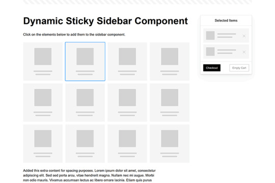
Dynamic Sticky Sidebar Component
Created by Ryan Mulligan
Features like shopping carts are a perfect fit for sticky sidebars. The UI makes it easier for shoppers to keep track of their cart and, most importantly, finish their purchase. This sidebar widget keeps track of cart contents and sticks to the screen while you scroll in the page content area.
See the Pen Dynamic Sticky Sidebar Component by Ryan Mulligan
Stick With What Works in Your Designs
We may think of sticky elements as being used for site headers and navigation. However, the examples above show that they can do much more. There are so many creative possibilities for informing and entertaining users.
What’s more, CSS can do a lot of the heavy lifting for you. Several snippets in this collection don’t require a single line of JavaScript. Still, it’s nice to know you can add some DOM manipulation when needed.
We hope this collection sparked your imagination! Check out our CodePen collection for even more sticky snippets.
Related Topics
Written by Eric Karkovack
Eric Karkovack is a web designer and WordPress expert with over two decades of experience. You can visit his business site here. He recently started a writing service for WordPress products: WP Product Writeup. He also has an opinion on just about every subject. You can follow his rants on Bluesky @karks.com.
Read more articles by Eric Karkovack
#2024#ADD#alien#amp#animation#Articles#attention#Building#Business#buttons#Capture#change#chromium#code#container#content#CSS#CSS Layout Snippets#CSS Snippets#Design#desktop#devices#easy#effects#Featured#Features#Filters#Full#glass#hamburger
0 notes
Text
Listenansichten in FileMaker optimieren/ PHP und FileMaker
Listenansichten in FileMaker optimieren Nach einigen Jahren und vielen 1000 Datensätzen die neu ins FileMaker-System gekommen sind, war es soweit. Eine spürbare Verschlechterung der Performance beim Aufbau einer extrem komplexen Listenansicht. Diese Ansicht enthält sehr viele Sortierungen, diverse bedingte Formatierungen zum Ein und Ausblenden von Symbolen, Farbgebung etc. Wenn jetzt noch jemand per VPN auf die Datenbank zugreifen wollte, so konnte es einige Zeit dauern bis die Arbeitsfähigkeit hergestellt war. Dabei wurde die Struktur schon ohne Formeln entwickelt. Die schnellste und effektivste Lösung. Alles wird über ein WebViewer abgewickelt. Betritt der User das Listen-Layout wird ein Serverscript gestartet, sammelt alle FileMaker Daten und überträgt diese dann an ein PHP-Script. Bruchteile später, steht die Liste schon zum arbeiten bereit. Da die Liste nur mit Java-Script arbeitet, sind alle Aktionen sehr schnell. Die Daten werden mithilfe eines FileMaker-Skripts vorbereitet und mit Insert from URL an eine PHP-Datei auf dem Server geschickt. Der Request erfolgt als klassischer application/x-www-form-urlencoded-POST-Aufruf. Der Server nimmt die Daten entgegen, bereinigt sie, zerlegt ggf. Pipe-getrennte Listen, und speichert sie in einem assoziativen Array zur weiteren Verarbeitung.
<?php // Daten säubern function cleanData($value) { return trim($value); } // Pipe-Werte aufspalten (z. B. '4711|4712|4713') function processPipeSeparatedValues($value) { return array_map('trim', explode('|', $value)); } // POST-Verarbeitung starten if ($_SERVER['REQUEST_METHOD'] === 'POST') { $postData = array_map('cleanData', $_POST); // Weiterverarbeitung folgt... } ?>
Auf der FileMaker-Seite wird der Post so aufbereitet Das PHP-Skript erzeugt eine strukturierte HTML-Tabelle, die über CSS und JavaScript erweitert wird. Sticky-Header, Hover-Effekte, Icons, Kartenintegration, alles dabei. Dank JavaScript lassen sich die Einträge mit einem Klick sortieren. Nach PLZ, Straße oder Kategorie. Auch Gruppierungen sind möglich, z. B. nach Stadtvierteln oder Bezirken, die dynamisch über Google Maps Geocoding ermittelt werden.
function sortByPLZ() { const table = document.querySelector("table"); const tbody = table.querySelector("tbody"); const rows = Array.from(tbody.querySelectorAll("tr")); // Entferne alte Gruppenköpfe document.querySelectorAll(".plz-header").forEach(row => row.remove()); // Sortiere Zeilen nach PLZ (Spalte 12, also index 12) rows.sort((a, b) => { const plzA = a.cells[12].textContent.trim(); const plzB = b.cells[12].textContent.trim(); return plzA.localeCompare(plzB, "de", { numeric: true }); }); // Neue Gruppierung einfügen let currentPLZ = ""; rows.forEach(row => { const plz = row.cells[12].textContent.trim(); if (plz !== currentPLZ) { currentPLZ = plz; const headerRow = document.createElement("tr"); headerRow.className = "plz-header"; const headerCell = document.createElement("td"); headerCell.colSpan = row.cells.length; headerCell.textContent = "PLZ: " + plz; headerRow.appendChild(headerCell); tbody.appendChild(headerRow); } tbody.appendChild(row); }); }
In dieser Ansicht wird unter anderem die Entfernung zu den nächsten Standorten ermittelt. Nach erfolgter Sortierung ist es sehr schnell möglich Aufträge zu verketten bei minimierter Fahrzeit. In dieser Ansicht aber nur berechnet über die Haversinsche Formel. Aber es ist ein extrem schneller Anhaltspunkt um Aufträge in Gruppen zusammenzufassen. Besonders charmant: Das ganze geht auch über die Google Maps API. Die Ansicht dann über Google Maps. Über das InfoWindows-Fenster lassen sich unendlich viele Informationen einblenden. In meinem Fall kann aus dieser Perspektive schon die Tourenzusammenstellung erfolgen. Es wird die Arbeitszeit ermittelt und kenntlich gemacht. Eine implementierte Fahrzeiten-Anzeige hat sich für Berliner-Verhältnisse als Unsinnig herausgestellt. Zu viele Verkehrsänderungen, zu viel Stau, in diesem Fall bedarf es der Erfahrung von Mitarbeitern und Disponenten. Wichtig, ist natürlich auch die Sequentielle-Suche. Diese kann natürlich wie schon einmal berichtet, auch in normalen FileMaker-Listen, Anwendung finden. Eine klassische FileMaker angelehnte Suche fehlt natürlich auch nicht. Hier lassen sich verschieden Kriterien verbinden und ermöglichen eine flexible Suche, ähnlich der klassischen FileMaker-Suche. Das ich im Regelfall innerhalb von FileMaker immer Arbeitslayouts nutze, die im Hintergrund bei -30000 Pixel arbeiten, kann ich aus dem WebViewer heraus, alle FileMaker Script nutzen, die im Vorfeld genutzt wurden. Sie bekommen die Parameter in einer etwas anderen Form, meist als Liste. Somit ist der Aufwand auf der FileMaker-Seite überschaubar. Fehlerbehandlung und Fallbacks Natürlich kann nicht immer alles glattlaufen, etwa wenn der Server nicht erreichbar ist oder die Daten aus FileMaker unvollständig übertragen werden. Für diesen Fall habe ich einen einfachen Mechanismus eingebaut. Wenn keine oder fehlerhafte Daten ankommen, zeigt das Skript entweder eine Hinweisbox oder einen minimalen Fallback-Inhalt an. Dabei ist es wichtig, am Anfang der Datei gleich zu prüfen, ob zentrale POST-Werte gesetzt wurden. Gerade bei VPN-Nutzern oder instabilen Mobilverbindungen ist das hilfreich, der Nutzer bekommt sofort Rückmeldung, statt auf eine leere Seite zu starren.
if (!isset($_POST['touren']) || empty($_POST['touren'])) { die("<div class='error'>Keine Daten empfangen. Bitte erneut versuchen.</div>"); }
Unterschied zwischen FileMaker-Client und Server Eine kleine, aber entscheidende Stolperfalle hat mich bei diesem Projekt einige Nerven gekostet. Während der gesamte Aufbau der Liste über den FileMaker Pro Client reibungslos funktionierte, lief das gleiche Script nicht mehr, wenn es über ein Server-Script (FileMaker Server) angestoßen wurde. Die WebViewer-Seite blieb leer. Kein Fehler, kein Hinweis, einfach nichts. Nach längerer Analyse stellte sich heraus, die Anzahl und Verschachtelungen der DOM-Elemente war der Grund. Im Client lief das Rendering noch sauber durch, aber der FileMaker Server scheint bei der Generierung und Übergabe des WebViewers, speziell in Kombination mit „Insert from URL“ -> WebViewer -> HTML-Rendering, empfindlicher zu reagieren. Besonders bei vielen verschachtelten div-Containern, Tabellen-Inlays und Icon-Ebenen war Schluss. Die Lösung war eher pragmatisch als elegant, ich habe den DOM deutlich verschlankt, viele dekorative Elemente entfernt oder durch schlankere Varianten ersetzt. Statt
mit drei Ebenen für Rahmen, Schatten und Hover, verwende ich jetzt.
<tr class="hover"> <td>4711</td> <td>Berlin</td> <td>…</td> </tr>
Und auch bei Zusatzinfos im InfoWindow der Google Maps Ansicht wurde auf alles Überflüssige verzichtet. Das Resultat, die Darstellung läuft jetzt reibungslos auch bei serverseitiger Übergabe, ohne dass der WebViewer hängen bleibt oder gar leer bleibt. Was bleibt nach dieser Umstellung? Ganz klar, die WebViewer-Lösung ist ein echter Gamechanger für große, komplexe Listenansichten in FileMaker. Die Performance ist kaum vergleichbar mit der klassischen Layoutdarstellung, besonders dann, wenn Sortierungen, Gruppierungen und visuelle Hilfsmittel wie Karten gebraucht werden. Eine HTML-Tabelle mit JavaScript schlägt hier jedes FileMaker-Layout um Längen.
0 notes
Text

HTML
HTML Course Content
HTML, or *HyperText Markup Language*, is the standard language used for creating and structuring content on the web. It defines the structure of web pages through the use of elements and tags, which dictate how text, images, links, and other multimedia are displayed in a web browser. HTML provides the foundation for web documents, allowing developers to format content, organize sections, and create interactive features. It consists of a series of elements enclosed in angle brackets, such as <p> for paragraphs, <a> for links, and <img> for images, which together build the content and layout of a webpage.
HTML Contents
HTML (HyperText Markup Language) is the foundation of web pages and web applications. It structures content on the web, defining elements like headings, paragraphs, links, images, and other multimedia. Here’s a breakdown of key HTML contents:
1. *Basic Structure*:
*<!DOCTYPE html>*: Declares the document type and version of HTML.
*<html>*: The root element that encompasses the entire HTML document.
*<head>*: Contains meta-information about the document, such as title, character set, and links to CSS or JavaScript files.
*<body>*: Contains the content that is visible on the web page, including text, images, and interactive elements.
2. *Text Elements*:
*<h1> to <h6>*: Heading tags, with <h1> being the most important.
*<p>*: Paragraph tag for regular text.
*<a>*: Anchor tag for creating hyperlinks.
*<span>* and *<div>*: Generic containers for grouping inline and block content, respectively.
3. *Lists*:
*<ul>*: Unordered list.
*<ol>*: Ordered list.
*<li>*: List item, used within <ul> or <ol>.
4. *Images and Media*:
*<img>*: Embeds images.
*<video>* and *<audio>*: Embeds video and audio files.
*<figure>* and *<figcaption>*: For adding images or media with captions.
5. *Forms*:
*<form>*: Contains form elements for user input.
*<input>*: Various input fields (text, password, checkbox, radio, etc.).
*<textarea>*: For multi-line text input.
*<button>* and *<select>*: Buttons and dropdown menus.
6. *Tables*:
*<table>*: Defines a table.
*<tr>*: Table row.
*<th>*: Table header cell.
*<td>*: Table data cell.
7.*Semantic Elements*:
*<header>, *<footer>**: Defines the header and footer sections.
*<nav>*: Navigation section.
*<article>*: Independent content item.
*<section>*: Thematic grouping of content.
*<aside>*: Sidebar or additional content.
*<main>*: Main content of the document.
8. *Metadata and Links*:
*<meta>*: Provides metadata such as descriptions, keywords, and viewport settings.
*<link>*: Links external resources like CSS files.
*<script>*: Embeds or links JavaScript files.
Importance of HTML
HTML is critically important for several reasons:
1. *Foundation of Web Pages*:
HTML is the core language that structures content on the web. Without HTML, web pages wouldn’t exist as we know them. It organizes text, images, links, and other media into a cohesive and navigable format.
2. *Accessibility*:
Proper use of HTML ensures that web content is accessible to all users, including those with disabilities. Semantic HTML elements provide context to assistive technologies, making it easier for screen readers to interpret the content.
3. *SEO (Search Engine Optimization)*:
Search engines rely on HTML to understand the content of web pages. Properly structured HTML with relevant tags and attributes improves a website’s visibility in search engine results, driving more traffic to the site.
4. *Interoperability*:
HTML is universally supported by all web browsers, ensuring that content can be displayed consistently across different devices and platforms. This cross-compatibility makes HTML the most reliable way to share content on the web.
5. *Foundation for CSS and JavaScript*:
HTML is the backbone that supports styling and interactivity through CSS and JavaScript. It provides the structure that CSS styles and JavaScript enhances, creating dynamic, interactive, and visually appealing web experiences.
6. *Web Standards Compliance*:
HTML is maintained by the World Wide Web Consortium (W3C), which sets standards to ensure the web remains open, accessible, and usable. Following these standards helps developers create web content that is robust and future-proof.
7. *Ease of Learning and Use*:
HTML is relatively simple to learn, making it accessible to beginners and non-programmers. Its simplicity also allows for rapid development and prototyping of web pages.
In summary, HTML is essential because it structures and defines web content, ensuring it is accessible, searchable, and interoperable across various platforms. It is the foundation upon which modern web design and development are built.
1 note
·
View note
Text
HTML Tables

HTML tables are used to display data in a structured format, using rows and columns. Tables are a great way to organize information, such as data, schedules, or any other content that requires a tabular layout.
Basic Structure of an HTML Table
An HTML table is created using the <table> element, and it consists of rows (<tr>), headers (<th>), and data cells (<td>).<table> <tr> <th>Header 1</th> <th>Header 2</th> <th>Header 3</th> </tr> <tr> <td>Data 1</td> <td>Data 2</td> <td>Data 3</td> </tr> <tr> <td>Data 4</td> <td>Data 5</td> <td>Data 6</td> </tr> </table>
Key Table Elements
<table>: The container element for the table.
<tr>: Defines a row within the table.
<th>: Defines a header cell in the table. Text in a <th> is bold and centered by default.
<td>: Defines a standard data cell in the table.
Example of a Simple HTML Table
<!DOCTYPE html> <html> <head> <title>HTML Table Example</title> </head> <body> <h1>Sample HTML Table</h1> <table border="1"> <tr> <th>Name</th> <th>Age</th> <th>Occupation</th> </tr> <tr> <td>John Doe</td> <td>30</td> <td>Software Engineer</td> </tr> <tr> <td>Jane Smith</td> <td>25</td> <td>Graphic Designer</td> </tr> <tr> <td>Emily Johnson</td> <td>40</td> <td>Project Manager</td> </tr> </table></body> </html>
Adding Table Borders
The border attribute adds borders around table cells. Although it's now better to use CSS for styling, you can still use the border attribute in the <table> tag for quick border application.<table border="1"> <!-- table content --> </table>
Table Caption
A table caption is a brief description of the table and is added using the <caption> tag. It usually appears above the table.<table border="1"> <caption>Employee Information</caption> <tr> <th>Name</th> <th>Age</th> <th>Occupation</th> </tr> <!-- more rows --> </table>
Table Headers
Headers are often used to define the labels for columns or rows. They help in identifying the type of data contained in the corresponding rows or columns.<table border="1"> <tr> <th>Name</th> <th>Age</th> <th>Occupation</th> </tr> </table>
Table Spanning
Colspan: Allows a cell to span multiple columns.
Rowspan: Allows a cell to span multiple rows.
<table border="1"> <tr> <th colspan="2">Header spanning two columns</th> <th>Header 3</th> </tr> <tr> <td rowspan="2">Cell spanning two rows</td> <td>Data 2</td> <td>Data 3</td> </tr> <tr> <td>Data 4</td> <td>Data 5</td> </tr> </table>
Grouping Table Elements
<thead>: Groups the header content.
<tbody>: Groups the body content.
<tfoot>: Groups the footer content.
This grouping helps with styling and managing large tables more efficiently.<table border="1"> <thead> <tr> <th>Name</th> <th>Age</th> <th>Occupation</th> </tr> </thead> <tbody> <tr> <td>John Doe</td> <td>30</td> <td>Software Engineer</td> </tr> <tr> <td>Jane Smith</td> <td>25</td> <td>Graphic Designer</td> </tr> </tbody> <tfoot> <tr> <td colspan="3">Footer Content</td> </tr> </tfoot> </table>
Styling Tables with CSS
CSS provides powerful ways to style tables beyond the basic border attribute. You can customize padding, background colors, border styles, and more.<style> table { width: 100%; border-collapse: collapse; } th, td { padding: 10px; text-align: left; border-bottom: 1px solid #ddd; } tr:hover { background-color: #f5f5f5; } th { background-color: #f2f2f2; } </style><table> <!-- table content --> </table>
Key Points
Tables are structured using rows (<tr>), headers (<th>), and cells (<td>).
Use attributes like colspan and rowspan to merge cells.
Group elements using <thead>, <tbody>, and <tfoot> for better structure and styling.
CSS can greatly enhance the appearance of your tables, making them more user-friendly and visually appealing.
Understanding how to create and style tables in HTML is essential for organizing and displaying data on your web pages.
Read More…
0 notes
Text
Web Development and Design Foundations with HTML5

In the digital age, web development and design are essential skills for creating engaging, functional, and aesthetically pleasing websites. At the heart of this process is HTML5, the latest version of the Hypertext Markup Language. HTML5 serves as the foundation for building web pages, offering new elements, attributes, and behaviors that allow for more dynamic and interactive web content.
Understanding HTML5
HTML5 is the fifth iteration of HTML, introduced to enhance the capabilities of web development and design. It is designed to be both backward-compatible and forward-looking, ensuring that it works with older browsers while also providing new functionalities for modern web applications. The primary goal of HTML5 is to improve the web's ability to handle multimedia, graphics, and interactive content without relying on external plugins.
Key Features of HTML5
One of the most significant enhancements in HTML5 is the introduction of semantic elements. These elements, such as header, footer, article, and section, provide meaning to the structure of a web page, enhancing accessibility and improving code readability. This not only benefits developers but also aids search engines in understanding the content of a web page better.
HTML5 includes native support for audio and video through the audio and video elements, which eliminates the need for external plugins like Flash. This makes it easier to embed and control multimedia content directly within the HTML code, improving the user experience and enhancing web page performance.
Another critical feature of HTML5 is the canvas element, which allows for drawing graphics on the fly using JavaScript. This capability, along with Scalable Vector Graphics (SVG), enables the creation of complex visual content and interactive graphics. These tools are essential for modern web applications that require dynamic and responsive visual elements.
HTML5 also offers new input types and attributes for forms, such as date, email, range, and number. These enhancements improve user experience by providing better validation and more interactive form elements. Additionally, the new elements reduce the need for JavaScript to validate user input, streamlining the development process.
Local storage options like localStorage and sessionStorage are introduced in HTML5, allowing web applications to store data on the client side. This feature enhances performance by reducing the need for server requests, enabling faster access to stored data and improving the overall user experience.
Building Blocks of HTML5
To create a web page with HTML5, understanding its basic building blocks is essential. Every HTML5 document begins with the DOCTYPE declaration, followed by the html, head, and body tags. The html element is the root of the document, the head element contains meta-information, and the body element includes the content of the web page.
Text elements in HTML5 include headings, paragraphs, lists, and emphasis elements, which structure the text content of a web page. Headings range from h1 to h6, providing different levels of importance, while paragraphs group related sentences together. Lists, both ordered and unordered, organize items, and emphasis elements like em and strong highlight important text.
Links and images are integral parts of web development. The anchor element creates hyperlinks, allowing users to navigate between different web pages, while the image element embeds images into the web page. Both elements support various attributes to enhance functionality and improve user interaction.
HTML5 allows for the creation of tables to display tabular data. Tables consist of rows and columns, with the table, tr, th, and td elements defining the structure. Tables are useful for presenting data in an organized manner, making it easier for users to understand and interpret the information.
Designing with HTML5 and CSS3
While HTML5 provides the structure, CSS3 (Cascading Style Sheets) is used to style and layout web pages. CSS3 introduces new features like rounded corners, gradients, shadows, and animations, which enhance the visual appeal of web pages. CSS3 rules consist of selectors and declarations. Selectors target HTML elements, and declarations specify the style properties and values.
Responsive design is enabled through media queries, which apply different styles based on the device's screen size. This ensures that web pages look good on all devices, from desktops to smartphones. Flexbox and Grid are CSS3 layout modules that provide powerful tools for creating complex, responsive layouts, allowing developers to align, distribute, and size elements efficiently.
Best Practices for Web Development with HTML5
Using semantic HTML improves code readability and accessibility. Elements like nav, article, and aside provide context and meaning to the content, making it easier for search engines and assistive technologies to understand the structure of a web page. Ensuring your web pages are accessible to all users, including those with disabilities, is crucial. Use attributes like aria-label and role to provide additional information to assistive technologies.
Performance optimization is essential for a good user experience. Optimize your web pages by minimizing file sizes, using efficient coding practices, and leveraging browser caching. Testing your web pages across different browsers and devices ensures consistent behavior and appearance, addressing cross-browser compatibility issues.
Writing clean, well-documented code that is easy to maintain and update is a best practice in web development. Use external stylesheets and scripts to keep your HTML files concise, improving code organization and maintainability.
Conclusion
HTML5 forms the backbone of modern web development, providing the structure and functionality needed to create dynamic and interactive web pages. Coupled with CSS3 for styling and responsive design, HTML5 allows developers to build websites that are both visually appealing and highly functional. By understanding the foundations of HTML5 and adhering to best practices, you can create robust and accessible web applications that meet the demands of today's digital landscape. Whether you're a beginner or an experienced developer, mastering HTML5 is a crucial step in your web development journey.
0 notes
Text
Responsive Sortable Table for HTML Websites
People watch website both from Laptop and Mobile. So, when a web developer creates Table, he or she should make it as responsive. Sometimes it is important to set different color for odd and even row that reader can read the table easily. This Code can make your Table Header sortable too.
#css#css3#different color for odd and even row#even row#filter table#filterable table#hover on table row#odd row#responsive#responsive css table#responsive table#sortable table#table
0 notes
Text
Module 5: Tables with syntax and examples
In Module 5 of our HTML course, we'll explore the world of tables. Tables are a powerful tool for displaying data in a structured format, making it easier for users to read and understand. Table Basics A table is defined by the <table> element, which contains various table elements such as table rows, table headers, and table…
0 notes
Text
Creating Table Headers in HTML
This topic focuses on the use of table headers in HTML, which are crucial for defining and organizing the headings of table columns and rows. The <th> tag is used to create table headers, providing context and improving the accessibility of tabular data. This topic covers the syntax and proper usage of the <th> tag, along with attributes like scope and colspan to specify the header's relationship to the rest of the table. Practical examples demonstrate how to create effective table headers, style them using CSS, and ensure they enhance the readability and usability of your HTML tables.
0 notes
Text
Table Talk: Creating Beautiful Tables with CSS
Introduction
Welcome to the fascinating world of table design in web development! Tables play a crucial role in organizing and presenting data on websites, and with the power of CSS, we can transform them into visually stunning elements that enhance the overall user experience. In this blog post, we will embark on a journey to explore the art of creating beautiful tables with CSS. Whether you're a beginner seeking to understand the basics or an experienced developer looking to refine your skills, this guide will cover everything from the fundamentals to advanced styling techniques, responsive design considerations, accessibility best practices, and tips for optimizing performance. Join us as we delve into the realm of table talk, where we unravel the secrets of crafting tables that not only convey information effectively but also captivate and engage your website visitors. Let's bring life to your tables and make them an integral part of your website's visual appeal!
Understanding Table Structure
Before we embark on the exciting journey of styling tables with CSS, it's essential to have a solid understanding of the underlying structure of HTML tables. Tables are constructed using a combination of various HTML elements, each serving a specific purpose in organizing and presenting data. The primary elements involved in table structure include: - : The fundamental container for the entire table. - : Stands for "table row" and is used to define a row within the table. - : Represents a table header cell, typically used to label columns or rows. - : Signifies a standard table cell containing data. Let's break down the structure further: ElementDescriptionThe outermost element, encapsulating the entire table.Contained within the element, representing a row in the table.Used for header cells, providing labels for columns or rows. It is placed within the element.Represents a standard data cell within the table, residing within the element. Understanding this basic structure lays the foundation for effective table styling. As we proceed, we'll explore how CSS can be applied to these elements to create visually appealing and well-organized tables on your website.
Basic CSS Styling for Tables
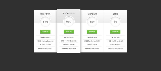
See the Pen CSS3 pricing table by Arkev (@arkev) on CodePen. Now that we have a grasp of the fundamental structure of HTML tables, let's dive into the exciting realm of CSS styling to enhance their visual appeal. Basic CSS properties can be employed to customize the appearance of tables, making them more aesthetically pleasing and aligned with your website's design. Here are some key CSS properties you can use for basic table styling: - border: Defines the border of table cells, allowing you to control the thickness, style, and color. - padding: Adds space within table cells, enhancing the overall spacing and readability of your table. - margin: Sets the margin outside the table, influencing its positioning within the surrounding elements. Let's explore a simple example of applying these properties: PropertyDescriptionborderDefine the border of table cells using properties like border-width, border-style, and border-color.paddingEnhance cell spacing by applying padding using the padding property.marginControl the table's positioning with the margin property, setting the space outside the table. For instance, to add a solid border to all table cells, you can use: CSStable { border-collapse: collapse; } td, th { border: 1px solid #dddddd; padding: 8px; text-align: left; }
Advanced Styling Techniques
As we continue our exploration of CSS table styling, it's time to elevate our design game with advanced techniques that go beyond the basics. These techniques allow you to unleash your creativity and transform your tables into visually stunning elements that capture the attention of your website visitors. Here are some advanced CSS styling techniques for tables: - Customization of Table Headers: Tailor the appearance of table headers by using CSS properties like background-color, color, and font-weight. This helps in creating a distinct visual hierarchy within the table. - Row and Cell Customization: Apply different styles to specific rows or cells using pseudo-classes such as :nth-child. This is particularly useful for highlighting important data or creating alternating row colors. - Background Colors, Gradients, and Shadows: Infuse life into your tables by incorporating background colors, gradients, and box shadows. These elements add depth and dimension to the table, enhancing its overall aesthetic appeal. Let's delve into an example to illustrate these concepts: TechniqueDescriptionCustomization of Table HeadersStyle headers with properties like background-color, color, and font-weight to make them visually distinct.Row and Cell CustomizationUse pseudo-classes like :nth-child to apply different styles to specific rows or cells, enhancing readability and organization.Background Colors, Gradients, and ShadowsIntegrate background colors, gradients, and shadows to add a touch of sophistication and depth to your table design. For example, to create alternating row colors, you can use the following CSS: CSStr:nth-child(even) { background-color: #f2f2f2; }
Responsive Tables
In the ever-evolving landscape of web design, responsiveness is key to ensuring a seamless user experience across various devices and screen sizes. Responsive tables adapt to different viewport dimensions, allowing your tables to remain functional and visually appealing on both desktops and mobile devices. Here are some essential considerations and techniques for creating responsive tables: - Importance of Responsive Design: Understand why responsive design is crucial for tables and how it enhances accessibility and usability on smaller screens. - Media Queries: Implement media queries in your CSS to apply different styles based on the device's screen size. This allows you to tailor the table's appearance for specific breakpoints. - Stacking and Hiding: Explore techniques like stacking and hiding table elements to optimize the layout for smaller screens. This involves rearranging and prioritizing content to maintain clarity. Let's delve into an example of using media queries to create a responsive table: TechniqueDescriptionImportance of Responsive DesignExplain why responsive design is essential for tables, emphasizing the diverse range of devices and screen sizes used by website visitors.Media QueriesIntroduce media queries in CSS to conditionally apply styles based on the device's screen size. This allows for a tailored and optimized table layout for each breakpoint.Stacking and HidingDiscuss techniques like stacking and hiding elements to rearrange and prioritize content, ensuring a user-friendly experience on smaller screens without sacrificing information. For instance, the following media query adjusts the font size for better readability on smaller screens: CSS@media only screen and (max-width: 600px) { td { font-size: 14px; } }
Accessibility Considerations
Ensuring that your tables are accessible is not just a best practice but a fundamental aspect of web development. Accessibility ensures that all users, including those with disabilities, can perceive, navigate, and interact with your tables. Let's delve into key considerations and best practices for creating accessible tables with CSS: - Importance of Accessibility: Understand the significance of accessibility and its impact on providing an inclusive user experience. Emphasize the diversity of users, including those with visual or cognitive impairments. - Semantic HTML: Utilize semantic HTML elements to enhance the structure and meaning of your tables. Use for headers, for table captions, and ensure proper attributes. - Contrast and Color: Pay attention to contrast ratios and avoid relying solely on color to convey information. Ensure that text and background colors provide sufficient contrast for users with visual impairments. - Keyboard Navigation: Test and optimize your table for keyboard navigation. Users who rely on keyboard input should be able to navigate and interact with the table efficiently. - Use of ARIA Attributes: Leverage Accessible Rich Internet Applications (ARIA) attributes to enhance the accessibility of dynamic content and interactions within your tables. Include attributes like aria-describedby and aria-labelledby. Let's illustrate the importance of semantic HTML and ARIA attributes with an example: ConsiderationDescriptionImportance of AccessibilityHighlight the significance of creating tables that are accessible to users with diverse abilities, fostering inclusivity and a positive user experience.Semantic HTMLEmphasize the use of semantic HTML elements, such as and , to provide meaningful structure and context to assistive technologies.Use of ARIA AttributesIntroduce ARIA attributes like aria-describedby and aria-labelledby to enhance the accessibility of dynamic content within tables, ensuring proper information relay for screen readers. By prioritizing accessibility considerations, you contribute to a web environment that is welcoming and usable for everyone, regardless of their abilities or disabilities.
Optimizing Performance
Efficient table styling not only contributes to a visually appealing website but also plays a crucial role in optimizing performance. Ensuring that your tables load quickly and smoothly is essential for providing a seamless user experience. Let's explore key tips and techniques for optimizing the performance of your CSS-styled tables: - Minimization of Styles: Strive for minimalism in your CSS styles. Avoid overloading your tables with unnecessary styles and prioritize only the essential design elements. This reduces the overall file size and improves loading times. - Consolidation of Stylesheets: If your website uses multiple stylesheets, consider consolidating them. Combining stylesheets into a single file reduces the number of HTTP requests, resulting in faster loading times. - Utilization of Browser Cache: Leverage browser caching to store frequently used styles and assets locally on the user's device. This reduces the need for repeated downloads, enhancing the overall performance of your tables. - Optimized Image Usage: If your tables include images, ensure they are optimized for the web. Compress images without sacrificing quality to reduce file sizes and accelerate loading times. - Browser Compatibility: Test your table styles across different browsers to ensure compatibility. Address any issues that may arise, preventing performance bottlenecks on specific browsers. Let's delve into an example that emphasizes the importance of minimizing styles for optimal performance: Optimization TechniqueDescriptionMinimization of StylesHighlight the significance of streamlining CSS styles to include only essential design elements. Avoid unnecessary styles to reduce file size and enhance loading speed.Consolidation of StylesheetsEncourage the consolidation of multiple stylesheets into a single file. This reduces HTTP requests and contributes to a more efficient loading process.Utilization of Browser CacheExplain the benefits of browser caching in storing frequently used styles and assets locally, reducing the need for repeated downloads and improving overall performance. By implementing these optimization techniques, you not only enhance the performance of your CSS-styled tables but also contribute to a faster and more enjoyable user experience on your website.
FAQ
Explore common questions and solutions related to CSS table styling in this Frequently Asked Questions section. Whether you're a beginner or an experienced developer, find answers to queries that may arise during your journey of creating beautiful tables with CSS. Q: How can I center-align text within table cells? A: To center-align text in table cells, you can use the CSS property text-align: center;. Apply this property to the or elements within your table. Q: What is the significance of the border-collapse property? A: The border-collapse property is crucial for controlling the spacing and appearance of borders between table cells. Setting it to collapse ensures a single border is shared between adjacent cells, creating a cleaner and more cohesive table layout. Q: How can I create alternating row colors for better readability? A: You can use the :nth-child(even) and :nth-child(odd) pseudo-classes in CSS to apply different background colors to alternating rows. This enhances readability and adds a visually appealing touch to your tables. Q: What role do media queries play in creating responsive tables? A: Media queries are instrumental in responsive design. They allow you to apply different styles based on the device's screen size. By using media queries, you can optimize your tables for various breakpoints, ensuring they remain user-friendly on both desktop and mobile devices. Q: How can I ensure my tables are accessible to all users? A: Prioritize semantic HTML, use ARIA attributes, and pay attention to contrast and color choices. Implementing these practices ensures that your tables are accessible to users with disabilities, providing an inclusive experience for all. Feel free to explore these FAQs to troubleshoot common issues and enhance your understanding of CSS table styling. If you have additional questions, don't hesitate to reach out for further assistance.
Conclusion
Congratulations on completing your journey into the world of creating beautiful tables with CSS! Throughout this comprehensive guide, we've covered essential concepts, techniques, and best practices to empower you in enhancing the visual appeal and functionality of your tables. As a quick recap, we started by understanding the basic structure of HTML tables, delving into the roles of elements such as , , , and . From there, we explored basic CSS styling to customize the appearance of tables, incorporating properties like border, padding, and margin. We then ventured into advanced styling techniques, learning how to customize headers, rows, and cells, as well as integrating background colors, gradients, and shadows to create visually captivating tables. The importance of responsive design was highlighted, with insights into media queries and techniques for optimizing tables on various devices. Accessibility considerations played a crucial role, emphasizing semantic HTML, contrast and color choices, keyboard navigation, and the use of ARIA attributes to ensure an inclusive experience for all users. We also explored performance optimization tips, focusing on minimizing styles, consolidating stylesheets, and leveraging browser cache. In the FAQ section, common queries were addressed, providing solutions to challenges you may encounter in your table styling endeavors. Whether you're a novice or an experienced developer, these FAQs serve as a valuable resource for troubleshooting and expanding your knowledge. As you continue refining your skills in CSS table styling, remember that practice and experimentation are key. Feel free to explore, test, and implement these techniques to create tables that not only convey information effectively but also contribute to the overall aesthetics and usability of your website. Thank you for joining us on this journey. May your tables be both functional and visually stunning, enhancing the user experience on your website! Read the full article
0 notes
Text
How to Convert HTML to PDF with Google Script? - ITMlab
The Google Script is a powerful tool that allows you to automate repetitive tasks in Google. It allows you to create JavaScript-based applications that use Google services. The following code can be used to convert HTML files into PDF:
For more information: How to Convert HTML to PDF with Google Script? - ITMlab
Convert HTML to PDF
Converting HTML to PDF is easy. You can do it yourself, or you can use Google Script to do it for you.
To convert HTML to PDF using Google Script:
Create a new script in Google Drive and name it “ConvertHTML.”
In the “Code” section at the bottom of your script editor window, copy and paste this code:
var docs = SpreadsheetApp.openByUrl( ‘https://docs.google.com/spreadsheets/d/YOUR_SPREADSHEET_ID_HERE’ ); var sheets = docs.getSheets(); var sheet = sheets[0]; var rows= sheet .getRange( ‘A1’).getValues();
1. Create an HTML file that has a table of contents, headers and footers
Before you can convert HTML to PDF, you’ll need to create an HTML file that has a table of contents, headers and footers. Here’s how:
Open Notepad or another text editor on your computer (if you’re using Google Chrome, then we recommend using the built-in Developer Tools).
Type out some basic text like this:
Create a table of contents by adding tags around each major heading in your document; if there are no major headings in your document yet (you haven’t started writing), then type out some more text until there are multiple levels of headings so that we know where our table should begin! For example:
This is my first Heading, This is my second Heading. Make sure these tags are indented with two spaces from each side so that we can tell them apart from regular paragraphs later when we convert them into actual tables!
2. Save the file as an HTML file with a .html extension
Save the file as an HTML file with a .html extension
Make sure you have the right extension. If you don’t, Google will not be able to open it and convert it into a PDF file. You can also save it as a text file and then open it in a browser to see if it works.
3. Open your Google Drive account in your browser and log in if you haven’t done so already.
You need a Google account. If you don’t already have one, go to https://accounts.google.com/signup and follow the instructions to create one.
You’ll need to be signed in to your Google Drive account. If you haven’t done so yet, sign in using your email address or phone number associated with the account (the same credentials used for Gmail).
Sign out of Google Docs if it’s currently open: Click on “File” at top left corner of screen then select “Account settings” from dropdown menu under My Drive section at right side of page; next click on “Sign out” link at bottom left corner of window that appears when hovering cursor over ‘My Drive’ heading before signing back into new window where we will begin creating our script file below this paragraph!
4. Click on the “Script” option in the left-hand sidebar menu at the top of the screen (or click here)
The next step is to click on the “Script” option in the left-hand sidebar menu at the top of the screen (or click here). This will open up a window with some code that looks something like this:
var doc = DocumentApp.openById(‘myDocumentId’);
doc.setHtmlContent(‘Hello World!’);
For more information: How to Convert HTML to PDF with Google Script? - ITMlab
0 notes
Text
How Useful is HTML?
HTML, or HyperText Markup Language, is the foundation of the web. It is a markup language that is used to create and structure web pages. HTML is used to define the content of a web page, such as text, images, and links. It is also used to control the layout and formatting of a web page.
HTML is a very useful language for anyone who wants to create or maintain web pages. It is a relatively easy language to learn, and there are many resources available online to help you get started. HTML is also a versatile language that can be used to create a wide variety of web pages.
Here are some of the benefits of learning HTML:
It is a basic skill that is essential for anyone who wants to work in web development. HTML is the foundation of web development, so it is a necessary skill for anyone who wants to create or maintain web pages.
It is a relatively easy language to learn, even for beginners. HTML is a simple language that uses a limited set of tags to define the content and structure of a web page. There are many tutorials and resources available online that can help you learn HTML.
There are many resources available online to help you learn HTML. There are many websites, tutorials, and books that can help you learn HTML. You can also find many online communities where you can ask questions and get help from other HTML learners.
HTML is used by all major web browsers, so your web pages will be accessible to everyone. HTML is a standard language that is supported by all major web browsers. This means that your web pages will be accessible to everyone, regardless of the browser they are using.
HTML is a versatile language that can be used to create a variety of different web pages. HTML can be used to create a wide variety of web pages, from simple static pages to complex interactive applications.
If you are interested in creating your own web pages, or if you want to learn more about web development, then learning HTML is a great place to start. HTML is a powerful language that can be used to create a wide variety of web pages. With a little practice, you can learn how to create your own beautiful and functional web pages.
Here are some specific examples of how HTML is used:
To create the structure of a web page, such as the header, body, and footer. The <html> tag defines the beginning and end of an HTML document. The <head> tag contains information about the document, such as the title and the character encoding. The <body> tag contains the visible content of the document.
To add text, images, and other content to a web page. The <p> tag creates a paragraph. The <img> tag inserts an image into a web page. The <a> tag creates a link to another web page.
To create links to other web pages. The <a> tag creates a link to another web page. The href attribute of the <a> tag specifies the URL of the linked page.
To format the appearance of a web page, such as the font, size, and color of text. The <font> tag specifies the font, size, and color of text. The <style> tag is used to define custom CSS styles for a web page.
To create forms that users can fill out. The <form> tag creates a form. The input tag is used to create different types of form controls, such as text boxes, radio buttons, and check boxes.
To create tables that display data. The <table> tag creates a table. The <tr> tag creates a row in a table. The <td> tag creates a cell in a table.
These are just a few examples of how HTML is used. With a little practice, you can learn how to use HTML to create your own beautiful and functional web pages.
If You Wanna Learn HTML from scratch you can visit these site that i prefer:
e-Tuition
w3school
vedantu
coding ninjas
0 notes
Text
HTML TAGS AND THEIR FUNCTIONS
Here are some common HTML tags and their functions:<html>: Defines the root of an HTML document.<head>: Contains meta-information about the document.<title>: Sets the title of the document, displayed in the browser's title bar or tab.<meta>: Provides metadata about the document, such as character encoding and viewport settings.<link>: Links external resources like stylesheets to the document.<script>: Embeds or links to JavaScript code.<body>: Contains the visible content of the document.<h1>, <h2>, ..., <h6>: Headings of different levels.<p>: Defines a paragraph.<a>: Creates a hyperlink to another web page or resource.<img>: Embeds an image.<ul>: Creates an unordered (bulleted) list.<ol>: Creates an ordered (numbered) list.<li>: Represents a list item within <ul> or <ol>.<div>: Defines a division or section of the document for styling or layout purposes.<span>: Inline element used for styling or targeting specific content.<table>: Creates a table.<tr>: Defines a table row.<td>: Represents a table cell within a row.<th>: Represents a table header cell.<form>: Defines an HTML form for user input.<input>: Creates an input field, like text, checkbox, radio, etc.<textarea>: Creates a multi-line text input field.<button>: Defines a clickable button.<select>: Creates a dropdown list.<option>: Defines an option within a <select>.<label>: Labels an <input> element.<br>: Creates a line break.<hr>: Represents a thematic break or horizontal rule.<iframe>: Embeds an inline frame to display another web page within the current page.This is not an exhaustive list, but it covers some of the most
1 note
·
View note