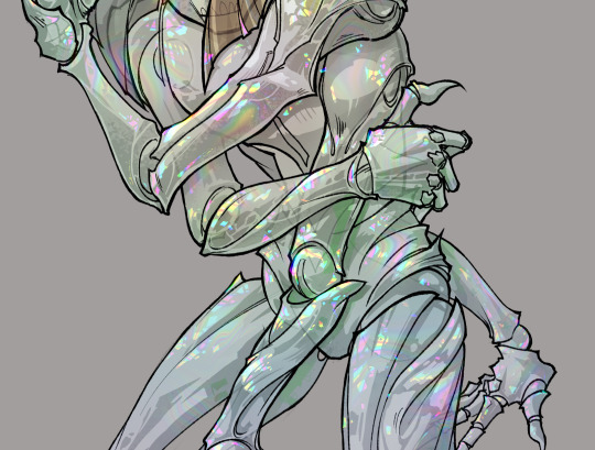
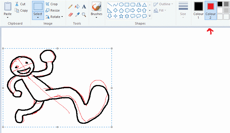
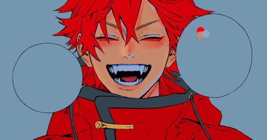
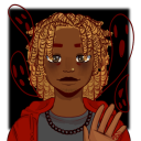
#i used a different lineart method for this
Text
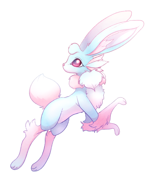
I have a billion different styles i want to draw Bunvee in
#dorf's art#aesthetic#digital art#bunnies#bunny#thedorfmirrin#oc#pokemon#fakemon#bunvee#cotton candy bunvee#cotton candy#fake eeveelution#blue and pink#pastel#i used a different lineart method for this#i think it turned out pretty 💙#my characters
37 notes
·
View notes
Text
hey everyone i cannot stop drawing my oc. look at my oc boy. this is your problem now
#mayor doidles#mayors ocs#asc xane#digital art#misc style#i wanted to try using my watercolor brushes again since theyre real neat but apart of me wants to try coloring this again with a slightly\#different method. luckily i preserved the lineart so i pretty much have an eternal coloring page at my disposal#man i should get in a habit of saving my lineart instead of merging it during the process…#would anyone be interested in me releasing transparent lineart as coloring pages? i think those are cool and wonder if theres an audience#for that. would probably just be my fanart tho :’)#that reminds me i have a very big ambitious project for a certain anniversary coming up that i have not started yet#but im excited to give it a go since i think it’ll be a fun lineart job#and i def wanna release the colorless version of that for folks to color#hehehehehe >:3
7 notes
·
View notes
Text
starting to notice that my art style changes slifhtly depending on what brush i use does this happen to anyone else
#art#not even in a 'oh im gonna try a different method of lineart/coloring/rendering' and i use a different brush#like the brush itself is subtly influencing the way i draw#am i going crazy#ignore me#max's misadventures
2 notes
·
View notes
Text
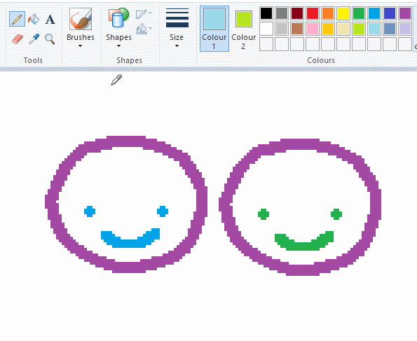
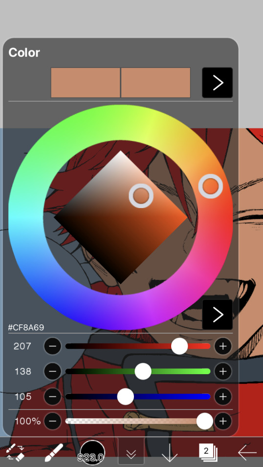
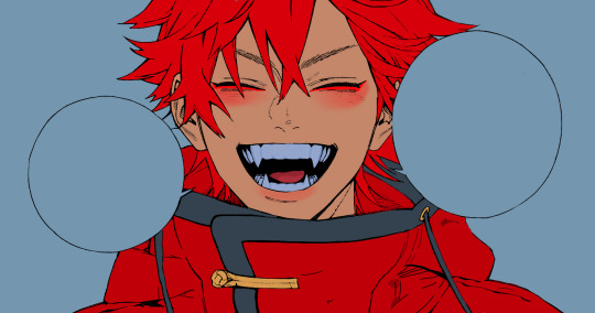
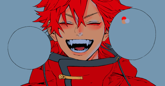
gonna show u guys a little opalescent highlight hack i threw together today
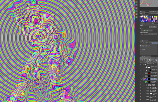
rainbow gradient above your main figure (i usually have all my main figure folders/layers in one big folder, so i can clip gradient maps + adjustments to it!). liquify tool to push the colors around a bit. STAY WITH ME I KNOW IT LOOKS STUPID RN I'M GOING SOMEWHERE WITH THIS
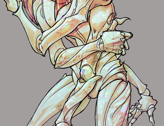
THEN: set it to add/glow (or the equivalent in ur drawing program), lower the opacity a bit, and apply a layer mask. then u can edit the mask with whatever tools you like to create rainbow highlights!!
in this case i'm mostly using the lasso fill tool to chip out little facets, but i've also done some soft airbrushing to bring in larger rainbow swirls in some areas. it's pretty subtle here, but you can see it better when i remove the gradient map that's above everything, since below i'm working in greyscale:
more granular rambling beneath the cut!
u could also just do this with a brush that has color jitter, but what i like about using layer masks for highlight/shading layers is how simple and reversible it makes everything. i can use whatever brushes i want, and erasing/redoing things is super low stakes, which is great when i often approach this stuff with a super trial-and-error approach.
example: have u ever thrown a gradient w multiple colors over an entire piece, set it to multiply etc, and then tried to erase it away to carve out shadows/highlights? it's super frustrating, bc it looks really good, but if u erase something and then change ur mind later, u basically would have to like. recreate the gradient in the area u want to cover up again. that's how i used to do things before figuring out layer masks!! but masking basically creates a version of this with INFINITE undo bc u can erase/re-place the base layer whenever u want.
anyway, back to rambling about this specific method:
i actually have TWO of these layers on this piece (one with the liquified swirls shown above, and another that's just a normal concentric circle gradient with much broader stripes) so i can vary the highlights easily as needed.
since i've basically hidden the rainbow pattern from myself, the colors in each brushstroke i make will kind of be a surprise, which isn't always great -- but easily fixable! for example, if i carve out a highlight and it turns out the rainbow pattern in that area is way too stripey, i can just switch from editing the mask to editing the main layer and blur that spot a bit.
also, this isn't a full explanation of the overall transparency effect in these screencaps! there's other layer stuff happening below the rainbow highlights, but the short version is i have all this character's body parts in different folders, each with their own lineart and background fill, and then the fill opacity is lowered and there's multiply layers clipped to that -- blah blah it's a whole thing. maybe i'll have a whole rundown on this on patreon later. uhhh i think that's it tho! i hope u get something useful out of this extremely specific thing i did lmao
12K notes
·
View notes
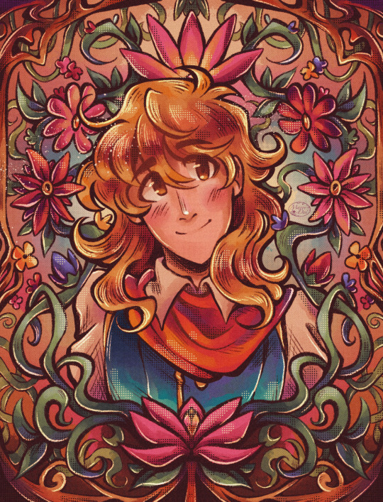
Text
Ok i’m scheduling some art I’ve done in the past while I work on new things and I remembered that Queen Bee (from h/lluva b/ss) redesign I did a year ago when a lot of ppl were doing it and it’s probably time to post it before it gets too old…
man, I am NOT excited for all the harassment I’m gonna endure from the unhinged HB fans, but hopefully I’m too small of an artist to get noticed so maybe i’ll be fine
#rambling#my posts#helluva boss critical#tagging it as such so ya won’t be able to complain that I „didn’t properly tag the hate” or sth#I had also a wip of ALMOST FINISHED 2nd redesign where I was basically just making my own take on the Beelzebub#that I can use outside of H//B f/nart (like I can easily put it in my game project)#but for some reason I never sat down to properly finish it bc the lineart was killing me#bc you see I used to do this very annoying thing where instead of drawing lineart on a seperate layer#I was just erasing and „sculpting” the messy sketch layer until it looked good#Which maybe would look good in a different brush but nah it was the default smooth brush#I thought this method would be faster bc „well at least i’m not drawing the lines from scratch”#but when you have messy sketches the cleaning up process gets very tedious very fast#so at some point I was just fed up and had a break that turned too long and by that point my artstyle#changed too much and I didn’t want to touch my old work; bc I like to preserve my progress#(which means no messing with works and wips that are older than a month)#anyway i’m getting off topic#so uh; i guess if you like redesigns you’re in for a treat#if not then well i hope we can resolve this diplomatically#and to anyone asking if i’m actually a fan of the show - no i’m not; it was a guilty pleasure to a certain point until it was unbearable#I really hate both h///b and h/////h so don’t ask me any opinions on them bc i’m gonna be very mean 😭😭😭#all i’m gonna say is my opinions aren’t groundbreaking or anything; i can’t really say what hasn’t already been said
1 note
·
View note
Text


part 06!! and the end of Act 1
01 02 03 04 05 06
OK SO THAT'S THAT
I don't have anything else storyboarded right now, I have the dialogues for Act 3 written down, but for the 2nd Act I'm gonna have to rewatch parts of WCI. I'm also thinking of a different approach, more like a series of illustrations not a comic, but idk yet, I'll have to rewatch and see!
It's not like I'm actually using a 3 Act structure as in 'a method of writing a story', I don't know how to and I haven't tried learning that (YET). I just think its neat and reflects how I divided my artistic process. I've always seen this story in my head as 3 parts.
And before I delve into part 06, I can't stop myself from saying that....... part 05 really needed another closeup on Sanji's face. If I ever try and repost it to another site then maybe I'll add it (between the panels of Ichiji & Zoro and the closeup on the spear, it would help the rythym but also strengthen the emotional connection, before Sanji shuts himself off)
Anyhow part 06
Most panels were a breeze, but the last two, my god, I just couldn't get them right for the longest time. In the end my favourite panels are the closeups of Luffy and Nami, I should really draw them more.
Here's how this panel in particular went:


I did like how the pose was looking in my first rough pass, the face is scrunched, the shoulders are high with tension, the direction is consistent
Couldn't execute it though... I think in the first rough sketch the camera is looking at Luffy slightly from above? Like he's leaning into it. That's why the shoulders can be so high up, but I didn't realize what it was when trying to clean it. So when cleaning the sketch I drew the head on the same level as the camera which made the whole pose look flat, also in this weird angle, like it's not fully 3/4, but it's not facing forwards either.
I didn't know what wasn't working, so I doubled down and tried with the lineart, but it didn't magically help. It just looks like he's slouching.


4. so I tried to rethink the pose and commit to a 3/4 view. I like that more of the neck is visible now, you can feel that he's leaning forward with the scream, but I think I could have pushed it a bit more still
5. with linework I made some small changes, like a bit shorter hair, smaller nose and the eyes pushed back a bit. I also added the scratches and filled in the black parts
6. added flat colors & shading!
Last panel with Sanji was even harder to draw hehe


so I thought this would be easy bcs I wanted to basically redraw the panel from the anime
that's why my rough sketch was extremely rough, I didn't think about it much
and then I had so much trouble with it lmao You'd think that it would be easier when you're covering the character's face, but I was in this undecided space of on one hand wanting to show the pain on Sanji's face and staying truthful to the anime scene on the other. I also found it super diffucult to show the emotions without the eyes


4. The pose in 3. also wasn't working so I tried to make him more slouched, like he's curling in on himself more, it was definitely a better direction. I tried going into lineart from here but I didn't like how the fingers were turning out
5. So I decided to get a new ref and took a picture of how I'd make this gesture myself. With this pose I also changed the position and angle of the face slightly, bcs it would have created a very small space between the hand and the nose and I wanted the two shapes to connect
6. I really liked the hand, but was having trouble with the hair, it felt too short, still couldn't get the face right either


7. so I elongated the hair and worked on the face some more and was finally happy with what I had!
8. added colors! At first I had it colored like the other panels, color just on Sanji then gradient on the bottom helping it fade to black, but it wasn't sitting well with me. Maybe because the space above his head was too big and I didn't want to have a background here and also wasn't adding the little floating pieces to the carriage scene (these were reserved for the grass battlefield)
9. SO! I made Sanji's figure darker and also added a darker shade to the whole scene and I think it ended up working really nice. Like he's drowning in the darkness, the only element piercing through it are Luffy's words. It also just fills up the space better lmao, feels less empty visually
Its gonna be A WHILE, before I have updates for this, I'm gonna have to start with the rewatch anyway. Right now I'm gonna have to focus on finishing my extra pieces for the @rdtriozine !! If any of you read this far you may as well check it out lmao I have a full illustration spread there and gonna have spots for a fic too ❤️ I just need to draw them!!! AGHHHH
#zosan#zoro#sanji#roronoa zoro#blackleg sanji#sanzo#zoro x sanji#one piece#one piece fanart#wci#whole cake island#nami#cat burglar nami#luffy#monkey d. luffy#monkey d luffy#wci zoro au#my art#comic#idk what else to say what a journey
4K notes
·
View notes
Text

ms paint. you know her. u used her age 8 to make loads of rainbow ovals all over the canvas and then scramble it with selection tool. now u will know her true powers with my handyrandy tips under the readmore. some will be pretty basic and others are very special.
this post has 8 cool trix to learn for you. enjoy and i may do another in the future if i remember/learn more stuff
some of it might be common knowledge. but its got some deep cuts. all tips have gifs to show process easily.
🙂 enjoy and i hope this encourages you to fuck around in mspaint more
soundtrack for this post (loop it while you learn for advanced learning experience)
TIP 1) the right click trick
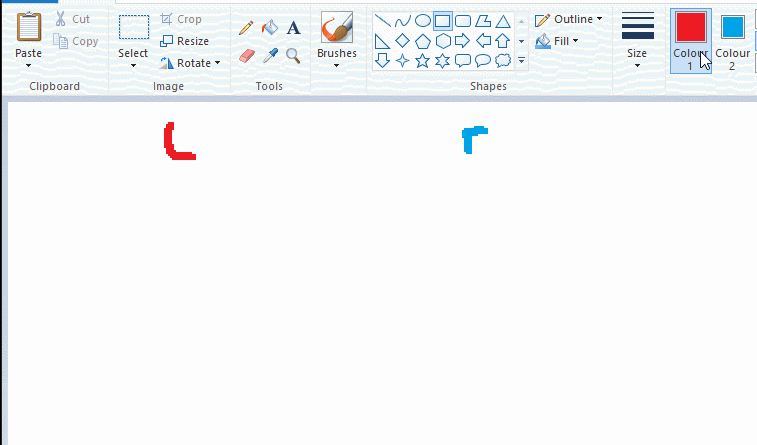
left and right mouse click correspond to col1 and col2 respectively, which u can see in the top bar. this applies to all brushes and the fill tool like above. when using shapes col2 will be the fill colour (if you have solid fill selected). right clicking with shape maker will reverse the colours use on the shape.
TIP 2) right click eraser
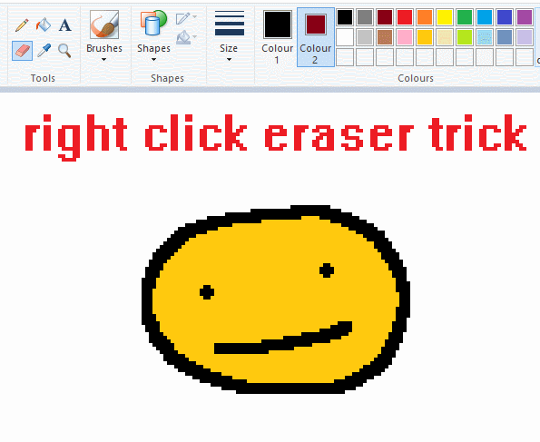
this one is extremely helpful for lineart or add shading. the eraser always uses col2. so your eraser can technically be any colour. but here's where you get powers: right clicking with eraser will only erase onto col1, with col2.
TIP 3) transparent selection change a guy destination
the beloved transparent selection tool works based on what is selected as col2. so long as you have the correct colour as col2 you can make any image transparent and put it on top of anything else. and yes this works with photo bg as you can see.
TIP 4) the gradience
this one is a little more complex. you want to start off with any canvas size, and make as many diagonal coloured bands as you want. (protip: holding down shift makes a perfectly diagonal line with line tool)
then you need to resize the canvas to a width of 1px (make sure you resize by pixels, and do not maintain aspect ratio). then resize again back to its original width (or a different width i cant stop you). you will have your lovely gradience.
TIP 5) superimposter

so. you got a cool gradient and wanna put a guy on it. heres what i do:
i open a 2nd mspaint with same canvas size and draw whatever i want on there. i then pick a completely unrelated colour to my entire piece, and set that as the bg. you could use white, pink, geen, whatever you want as long as it doesnt appear somewhere else in ur drawing. copy the guy.
go back to your gradient tab. ensure that col2 is set as that bg colour you picked (lilac for me). have "transparent selection" enabled. paste your guy in. cue fanfare
TIP 6) advanced superimposter
the great thing about this method is u can put multiple gradients in multiple areas of the image. this is where it gets all japanese printmaking type of shit. ukiyo-esque
all you need to do is make another canvas with a new gradient, ensure col2 is set as the colour you want to replace, then paste your original piece onto the new gradient. now my guy has a soft fade. you can do this as much as you want. (you could even make a canvas with a texture or photo and paste your drawing onto there)
TIP 7) "sketch layer"
so as you now know, col2 is what is removed when you click "transparent selection". which means you can also remove any instance of a colour from ur drawing. which means you can have a unique colour for sketch layer and remove it from the drawing later. i admittedly dont do this but it is a great trick to have.
now combine this with lowering your dpi for smoother lines. may seem obvious but it helps. its like a free stabiliser whenever u want.
TIP 8) rainbow art
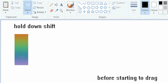
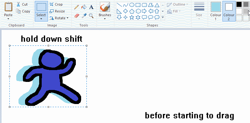
now this is where you can get dizzee rascal "bonkers". check out my small and shitty rainbow trick. you can select anything and hold down shift, then drag with left mouse, to turn that selection into its own brush. i even did it with a guy. and you can of course do this with a photo as well.
🙂well that it for now. hope you liked it thanks for reading now back to your regularly scheduled tgcg programming
2K notes
·
View notes
Note
May be a stupid question, but why do you paint things in different colors before starting to paint? Like, in the crowley plant timelapse you painted crowleys body pink and the plant blue, why didnt you use a green base color for the plant already? And in the angels piece if I'm not mistaken you also changed those colors to different tones multiple times before starting to actually color it properly. Is it just a way of "separating" different areas of the piece before painting or is it something that actually helps with the coloring for some reason? If its the later, can you explain?
Not a stupid question at all, I get asked this a ton! I'll try to explain it as best as I can:
(I work with Clip Studio Paint btw, I'm not sure if this works in other programs)
So when I'm done with my lineart
I use the bright colors to seperate each important object and character. Each of these colors is on a different layer below the lineart.

It helps me keep everything organized!
After that, I add a folder on top of the layer with each bright color and add a clipping mask to that folder. Now, the folder is clipped to the layer with the bright color. That way, everything I now add into that folder will not go outside of the bright color area.
Which looks like this:

(the clipping mask icon is in the left corner highlighted blue)
My next step is to now add all the actual colors to the character. Each part (skin, hair, jacket, pants etc.) gets a seperate layer. Which looks like this:


And when I'm done with that I can yet again go back to my beloved clipping mask and add a layer on top of every part and add clipping masks to add details (like shadows and highlights)! That way you don't have to worry about drawing outside of the area.
It looks like this:


I just like using this method cos everything's more organized. I used to not do it for the longest time and coloring was always a bit of a pain, but ever since I do it like this it's been way more fun!
And why do I use bright colors? Using bright colors in different shades just helps me get a clear picture of all the different parts of my illustration before I start getting into details. It also helps me see if I accidentally missed a part later on since bright colors shine through quite easily! I also choose the colors randomly since they don't really matter, that's why I didn't use green for the plant.
I hope this explanation helped you out and didn't confuse you even more! I'm always happy to explain my process!
Have a wonderful day, anon!
701 notes
·
View notes
Text

So I had this one year old draft of sherliam comic that I abandoned because in the end I didn't like how idea I had turned out, but this panel was "inked", I looked at it today and thought it would be waste for it to rot on my PC so I tried another coloring method and here we are...
I think I finally found coloring style that I wanted, because in past all my tries ended too heavy.
I sat so long on those past art pieces, and in the end I kinda hated them because I wanted them to look lighter. I used this paint brush, that paint brush... CSP, Photoshop... beside anime shading style and that sketch one I couldn't do the delicate coloring style.
So today I tried to color with CSP pencil "brushes", setup lineart different and I think it finally worked.
PS. I'm also working on next Sherliam NY comic, just made break to color this picture, but it's going fine, it will be 3 pages, I'm in middle of doing advanced sketches for 2nd page :), so prepare for more silly domestic Sherliam.
#moriarty the patriot#yuumori#william james moriarty#yuukoku no moriarty#fanart#sherliam#sherlock holmes
161 notes
·
View notes
Text
…Okay, you may end up seeing these drawings yet again on a later date
I finished the page, which was small at 500x500 px, but I wanted to make the page bigger. I did that, and I drew one new thing, but now I don’t know what else to draw on there. So for now, I figured I might as well post the original full page right now
Yeah, sorry for the laziness
This is the other sketch I finished on there, for those curious
Anyways, so yeah, this new style practice I’m trying
The original page I tried these out on is this, which also isn’t full, but I thought trying it out with actual characters instead of just random poses and shapes would be better, so I switched over to Cookie Run characters
The method is still a work in progress when it comes to all the shapes and the red sketch layer
I suppose what I should do now is try drawing a bunch of different Cookies that have different body shapes, so that I have practice with that. As well as maybe attempt some full body ones
I suppose you can suggest some if you want, considering I don’t know who to draw other than like, Hollyberry or Avocado, since I should try drawing large but not buff characters here. But I should also probably draw more skinny, and also chubby
But on to what I actually drew
So I already talked about Peach Blossom and the top Dark Choco drawing prior, so no real need to elaborate
The Dark Choco and Dark Cacao one was me drawing them in their younger forms to see how they compare. Not for any sort of study thing, but just in a symbolic sort of way. Since they’re so similar looking
I think I had a lot more fun with Choco, especially his hair. I remember Cacao being mostly annoying for his weird cloak thing that I don’t understand
The hand pose was ass though. I knew the general idea of what I wanted, that being them with their hands over their swords, but I was struggling to figure out how to draw the hands. Not to mention I had to change the pose from the red sketch because the swords were further down than I put them. I still don’t think I did the pose exactly correct, but screw it, it’s good enough
I’m also noticing that Choco looks way lighter in skin tone compared to Cacao. Like yeah, I know he’s normally slightly lighter, but it’s far more noticeable here. I’m pretty sure it’s because I used Dark Choco’s ToA colors here (bc they work better with my black lineart), which are slightly lighter, as well as just that Dark Choco is wearing much lighter colors while Dark Cacao’s are relatively darker. So maybe it just makes them contrast more
I liked drawing them, but I also did basically do the same body type 3 in a row, so I should probably draw different characters
Anyways, let’s talk about that extra sketch
So for those who likely don’t remember, that there is an OC of mine called Prickly Pear Cookie
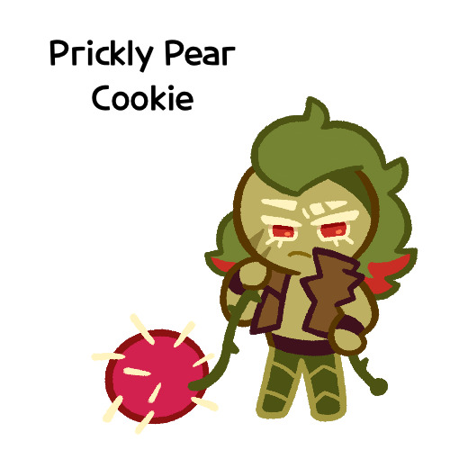
I made her entirely on a whim one day, and she doesn’t really have any character or story, just vibes, but I really like her design and wanted to draw it again
I probably should give her some sort of bra though. The shirtless chest looks cool but in my opinion sounds really uncomfortable without at least that
I did originally draw her with the green skin, but it looked weird so I shifted it to more of a yellow so it looks more human
Honestly I really like how she turned out
But yeah, I think that’s about it for now. Just wanted to show this
#I need to tweak and perfect it more#but it’s turning out relatively nice#I just need to stop falling back on old drawing habits#I need to relearn hands a new way#I have a reference that I found later on so I might use that#anyways#cookie run#dark choco cookie#dark cacao cookie#peach blossom cookie#art stuff#art style#cookie run oc#prickly pear cookie#my art
153 notes
·
View notes
Text
Road to 3D- Sam Manson (Part 2):
Character Modeling


Part 1: Model Sheet
Welcome to the second and final part of this project. Since people have asked how I do my models, I decided to make a write-up on how I approach these things using the example of a model of Sam Manson. The first part focused on how I make a model sheet fo a 3d model the second part focus just on the modeling. There are many more things about how to create a fully realized 3d character that I could make whole other chapters for, like UV unwrapping, texturing, shading and rigging, but I don't have enough knowledge past the fundamentals on these topics that could warrant their own seperate posts.
Additional stuff before I continue:
I use Blender for all my model
This not a beginners guide or something similar, it would be helpful to already know the general workflow of a modeling, how to use Blender and know different terminology like edgeflow, retopology etc.
If you are a beginner and want to learn more about character modeling I recommend the videoseries "Modeling for Animation" by Dikko on Youtube
Maybe I make some reference some tricks from this videoseries
That's it, let's go!


My first step is always the block-out phase. The block-out phase is what the construction lines and the first sketch in a drawing are. I align the frontview and sideview from the model sheet I made in part 1 with the z-axis (the blue line in the images above) and roughly shape out the forms with primitive forms. For this I mostly use a cube with a subdivide modifier.
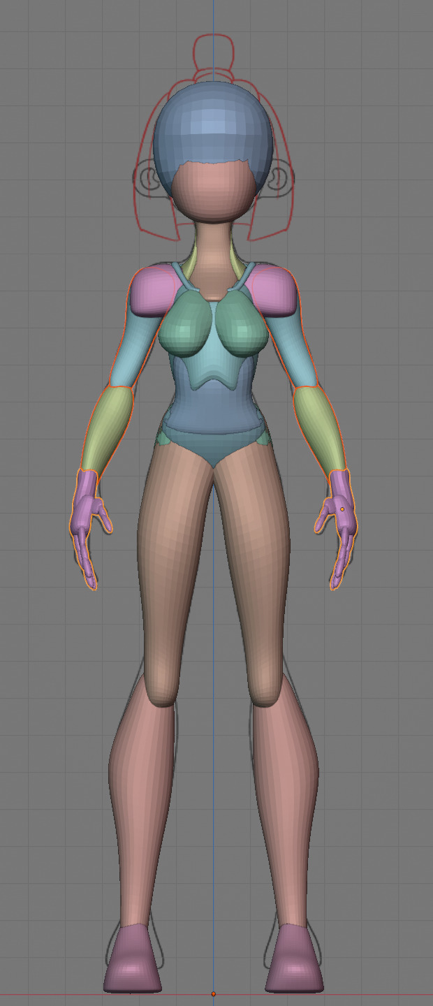


Having a modelsheet without the clothes obscuring the body makes it much easier the get the form right. The block-out phase is one of the most important steps, if it looks good than I have practically half the work done. This is also a good opportunity to practice anatomy.
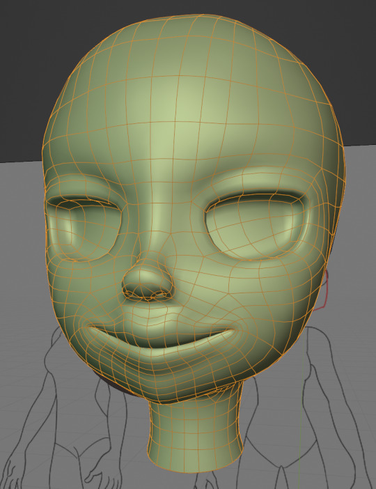

After this stage I continue with the head. First of all, don't forget to add the mirror modifier so I just need to model half of the model. There are different methods to approach modeling the head, like sculpt the head first, retopologize and than bake all the deatails onto the retopologized head. I actually prefer to polymodel the head especially when I have a good model sheet. I practially trace the lineart from the model sheet by extruding vertices, once from the frontview and once from the sideview. The most important points are the form of the eyes, the mouth, the form of the face and the jawline. The head block-out is used as an anchor point for the shrinkwrap modifier so that the traced forms actually look like they belong to a 3d form and not 2d lines floating space. From this point on it's just connecting everything, pull and push vertices so it looks like a 3d head and make sure the edgeflow is good. (It's also helpful to know how the planes of the head look like) After that I add the eyelashes, eyebrow, eyes and the ears, now it looks like something!
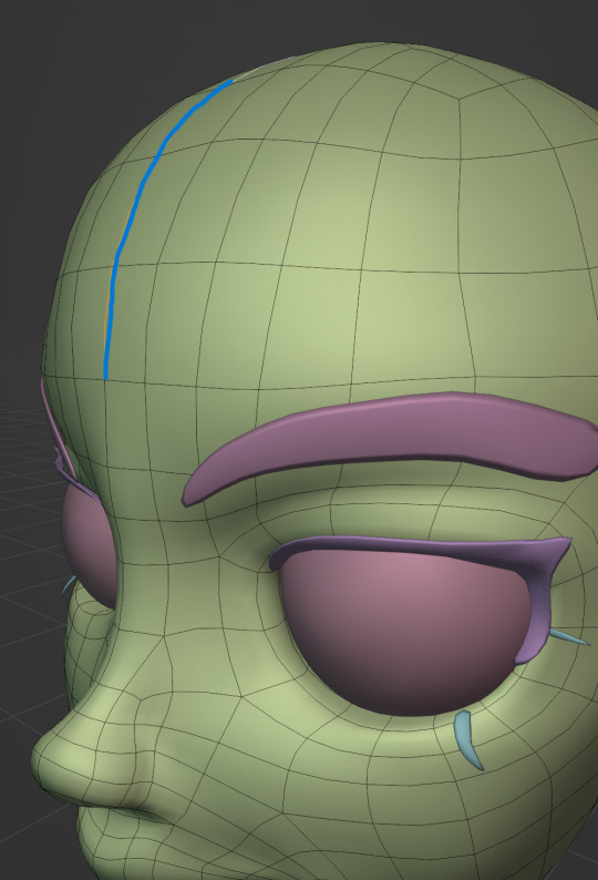
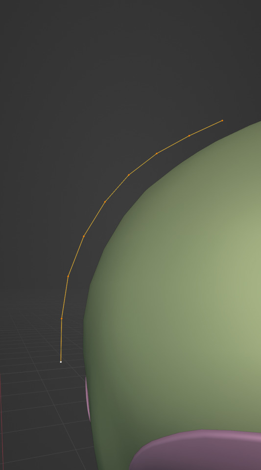
Now comes the hair. For the hair I used the "curve trick" like mentioned in the video series I recommended. Here is a tip to save time: I choose some edges from the head, duplicate and seperate it from the mesh. I convert this seperated line into a curve and choose a beziercircle as a bevel geometry. This is now the perfect foundation to model the hair further. One thing I needed a long time to notice: To get the beziercircle to a perfect square or in this case a triangle lower the Resolution U to 1 in the shape options. Now I just convert the curves into a mesh and add details and the head is done!
With the head finished I continue with the body. Remember how I wrote with a good block-out half of the work ist finished? Well, for this step I practically just use the smooth brush in sculpt mode and smooth everything out so everything looks connected. Then I retopologize the body and that's it. Well, ok there is a little bit more to it: Before smoothing things out I join the block-out part to a single mesh and remesh it with the remash modifier expept for the hands. I prefer to polymodel the hands seperatly without worrying about the rest of the body because they are difficult to model. I reattach them later. Speaking of reattaching, I make sure that the connection points have the same number of vertices while I retopologize/polymodel. To ensure that, I often use the following trick visualized with a simple example ( which is also described in the video series):

I want to reduce the amount of edges at the bottom of this plane, for this I merge 3 vertices from the middle into 1 vertice seen in the left image. After that I can select the blue marked edges from the center image and dissolve them. The result, which you can see on the right, is a nice clean edgeflow with a reduction in the number of edges.

After modeling every part I attach them together and I have a finished bodymesh the work with.

Now onto the clothes, for this I use the model sheet with clothes as reference. Having a retopologized body makes it easier to model simple stuff like e.g. Sam's shirt. On the left image the marked faces of the the bodymesh already looks like a shirt. I just need to duplicate and seperate this area, clean it up a little and the shirt is basically finished. The more complex stuff like the boots I need to polymodel around the bodymesh.

With that the modeling part is done! Now comes the things I said above: uv unwrapping, texture painting, rigging and shading. These are whole other topics I cannot go deeper because I'm still learning how to do these things but I hope my little write-up about how I appoach character modeling was enough to learn one thing or two.
Thank you for your time and thank for reading!
#3d modeling process#3d model#blender#danny phantom#sam manson#long post#my animation#my art#art resources
236 notes
·
View notes
Text
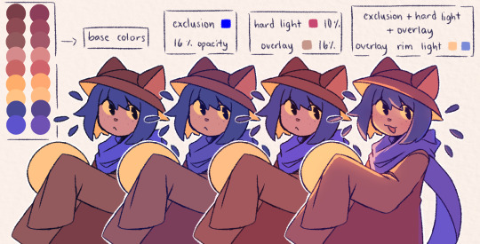
hansooyung's coloring tutorial & ctiys: alma time! 🍒
hello everyone! though i've been meaning to for a while, i've finally gotten around to making my first manga coloring tutorial! i'll be going over cleaning panels and screentones, choosing base colors, and finally shading and lighting.
this will also be a color this in your style challenge, so if you're willing, feel free to post your colored panel and tag me in it!! i'd love to see all the results :)
find details under the cut! 🦋
DISCLAIMERS:
this is just how i personally color! i know for a fact that some of my other friends follow other methods and have such beautiful colorings <33
for colors specifically, i play around a LOT. if you don't like your color scheme for the time being, mess around with it! i don't use psds since i like to mess around by hand with color palettes, but maybe i'll look into it for the future.
i explain a lot just bear with me gang 🙏
TECHNICAL STUFF:
software: ibis paint x (on iphone). i use ibis since it is FREE for all phones and it worked on my chromebook as well.
while this tutorial is made for ibis paint x, everything works on other softwares except the brushes, which i've provided alternatives for below.
brushes: i will be using dip pen (hard) which is automatically included with ibis, and two other brushes i made myself which you can find here and here. for more brushes, @/bkdkdh was incredibly helpful and posted her awesome set here!
for other softwares, you can use similar brushes. dip pen (hard) can just be the default brush, while wet edges is just the default brush on lowered opacity (and more of a rectangle/marker shape?). watercolor pencil is a watercolor brush in the rectangle/marker shape as well. if you can't get the shape, you can always smudge your lines into shape as well, so don't fret too much! a bunch of people only use one brush for coloring everything (which is insane to me, personally, they are so talented!)
fun fact: the first brush listed that i made was originally called "aki tao watercolor smooth" 👍
ok here we go guys!!
STEP ONE: CLEANING THE PANEL
i think of this part as setting up the panel for coloring! usually it's pretty exhausting cuz it's all b&w but it's all worth it i swear. the panel i'll be coloring is this beautiful one of alma from chapter 2:
imgur link here (x)
a lot of people redraw their lines to avoid screentones, which is extremely helpful. however, i work on a phone and my fingers are not steady even with the stabilizer turned all the way up T~T. i do it this way, but a different (possibly easier) way may work for you!!!
your first step will be to remove all the white, giving us a transparent background to work with. THIS IS THE NUMBER ONE REASON WHY I USE IBIS PAINT X.
when you upload the image to ibis, a popup comes asking if you would like to "extract line drawing". this creates a lineart of your image. click yes, and your work is like 90% done.
if you're not on ibis, you can redraw your panel, put lineart layer on screen, etc. or you can just extract line drawing from ibis and upload to software of your choice
for those of you not on ibis, i've included the line drawing here (x) if it looks black, don't worry and set your background to white.
omg i was not kidding when i said i explained a lot. ok now onto the three main steps of cleaning the panel:
cleaning background
removing screentones
repainting black lines
for cleaning the background, we're going to clear off all the extraneous stuff. this includes the text in the speech bubble, the gradient screentones behind alma, and the panel line on the left side. just use your eraser tool and go crazy! (i forgot to save the panel at this point of the coloring OTL)
for removing screentones, we're going to remove all those "dots" that mangakas use for shading. these are used to show value for b&w art, but since we're coloring we don't need them—a lot of people have really cool ways of incorporating screentones in their colorings though, and it looks amazing! i used it on nana's hand in my bnha coloring.
remove the screentones from alma's hair and jacket with your eraser tool. this will take time, but it's worth it in the end!
for portions with a bunch of lines, you can create A NEW LAYER and redraw some of the lines. that way, you can erase indiscriminately from the original layer but the lines you drew are still there. again, like i said, my hand is really shaky so i don't do it a lot, but it's extremely helpful for smaller parts where i have control! i used this on alma's jacket, and here's a screenshot of the process:

(i made his jacket purple so i could distinguish between layers easily).
it should look like this when you're done:
for the final step of cleaning, i like to erase all the things colored black (the collar and strings of the jacket, along with the back part of his hair). that way, i can color them in with dark colors and it adds to the whole look of the coloring.
i've circled the parts i'm going to erase below:

and it should look like this when you're done!
ok everyone cheer we're ready to color now!!!!
STEP TWO: BASE COLORS
CROWD CHEERS ok lets go!
this part is the most important to me, because it sets the tone for the whole coloring. i like to use three-four main colors in my colorings, and it's usually background, skintone, hair, and the secret fourth color. the secret fourth color is usually whatever color fits the character's vibe, or if the character's color is the bg, it'll be an accent color.
for example, with my nagi coloring, i used white for the hair, i had my skintone, i had blue as the main coloring vibe (as nagi's color), and black as the accent color.
for alma, i chose his main color to be red! it's the color of his hair and his jacket, so i wanted it to be vibrant and stand out. since blue contrasts red, i went for a greyish-blue shade for the background. (i went for grey rather than solely blue because then it would clash rather than complement).
disclaimer please please please take your device off night mode warm mode f.lux whatever you have. this has screwed me over more times than you may think :(
i like to make my vibrant colors closer to the right end of the color square. for alma's hair, i chose this color:

i dragged it down from the corner a bit but kept the saturation since his hair is kind of dark. we can use vibrant colors to shade it though, so don't worry!
here's his hair and the background together:
now from here, play around with skintones until you find one that matches the hair!
i usually drag around the wheel to the orange-red intersection, and have it on the lighter, more saturated side. here's the color i chose for alma's skintone.
i thought his original skintone looked a bit too orange, so i pulled the saturation back a little bit (moved closer to the left side of the square).
after that, color in his jacket with a bit darker red than hair, choose a gold color for the accents on his jacket, and color in the black parts with a grey-ish color (we will change that later).
here's the base colors!
if it looks a bit bright, don't worry! we can change that with shading. or you might just have to. accept the light.
STEP THREE: SHADING AND LIGHTING
wooo we made it!!!!!!! ok now i lied, we have a bit more of base colors to go. on a layer above the skin, color in your teeth and tongue. for pieces that have a more red feel (like this one), i like to make the teeth and the shading a more vibrant blue color. (for blue pieces, i make it a purple!).
IMPORTANT NOTE: ALL SHADING AND ALL COLORS SHOULD BE DONE ON NEW, CLIPPED LAYER.

i'll then go in and do some light shading with my wet edges brush. i'll use a darker color for hard shadows and then a lighter, more vibrant color to accentuate it.
next up we have blush! a lot of people do this in very different ways but i like to do it directly under the eyes, in a vibrant red shade. make a new layer above the skin and clip it on. color pick alma's hair and drag it to the most saturated shade (red corner). then using the watercolor pencil brush, lower the opacity of the brush and drag a line under the eyes on both sides.
make sure to erase the portion of blush that goes above the eyeline. i also added some lips for alma as you can see, and then added a red line under the eyes! this was back to the regular dip pen (hard) brush on 100% opacity. it may take a few tries to get your blush to the way you want it, so don't worry too much.
now we can start our actual shading!
i break this part up into three steps: skin shading, blue shading, and light shading (highlights?)
for all of them, think about where the light is falling and how it will look on alma.
quick interlude about brushes: i use the watercolor pencil brush for softer, bouncy looks (like blush and noses) and i use the wet edges brush for more hard lines in shading.
again, make a new layer above the skin and clip it on. (i like to have it below the blush, so it doesn't cover it). for skin shading, i take the vibrant red and lower the opacity of the wet edges brush by a significant amount (specifics don't really matter, as long as you're happy with it). i'll trace his neck, from the shadow of his face, shadows of his hair falling on his face, ears, and nose. (for the nose i used the watercolor pencil brush for a softer look).

this is what i have once i'm done!
next we have skin shading part two, where we basically make a new layer on top of our first shading, lower the opacity further, and trace outside whatever we just did to blend it in more.

i used the watercolor pencil brush since it's more softer shading meant for blending! i also added it around the eyebrows for depth.
next up we have our blue shading! this is a technique that i learned from @/bkdkdh's colorings, but adding blue as a shadow really adds to the whole coloring. using the watercolor pencil brush, select a light-ish blue shade (a bit more saturated than background color) and use it to shadow a few more areas than your skin shading. i always make sure to hit the underside of the nose, cuz i think it adds depth!
finally, to wrap up our skin shading we have our lights. i use an orange-ish yellow color, which i set pretty light to not blend into the skin. using the watercolor pencil brush, i'll basically highlight any areas opposite to where the blue was, and highlight different parts. i always highlight one side of the nose as well.
i erased the line around the nose since we now have shading there, and added a darker shade to the teeth since i felt it wasn't shaded enough.
now onto the hair!!! (guys we're almost done bear with me, skin and hair are the two main things and then you can half-ass the clothes)
color pick alma's hair color, then drag the red a bit further down to get a darker yet still saturated color. here's mine:

then, using the wet edges brush, draw lines of shadow wherever clumps of his hair fall or overlap with each other. you can have the opacity set to whatever level you want, i just went with around 90. just try to follow the natural lines and patterns of the original line drawing, and everything should work out fine.

here's how mine looks! then, just like we did for skin shading, place a layer on top and lower the opacity to around 50%. place some more shading to blend it in. you can also shade more parts with this shade for some softer shading. i actually forgot to take a screenshot of this step but you'll see it in the next one!
for our (almost) last part of hair shading, take a layer and place it below both of your shading layers. this is going to be our highlight layer! you can see it below, labeled 49%.

remember how we set alma's hair a bit darker from the corner color? now select that corner color and draw highlights in the center of each hair clump.

lightly visible but it's there!
now here i skipped around a bit bc i was having fun and forgot i was doing a tutorial, but repeat the shading (not highlighting) steps with darker colors for alma's jacket. you should have your base layer, a dark shading, and a softer shading for blending.
we're almost there guys!!!
for the pretty much final step of shading, select a light blue color and do some blue shading with the watercolor pencil brush opposite to wherever your darker shading falls (just like we did on the face). make sure to do it to both your hair and your jacket! here's mine:
now for the black portions, we're going to color the whole thing in a dark blue color. just alpha lock your layer and make a big stroke of dark blue, almost black. for our black shading, we're actually going to go lighter.
select a lighter (but still dark) color and place highlights on the base layer, then take an even more vibrant, lighter blue and place it on the very outside for highlights. a better example of this would be nagi's legs in his blue lock uniform here. then, choose a shade to apply shading to the gold accents on alma's jacket and we're done!
CROWD CHEERS!!!!!
STEP FOUR: FINISHING TOUCHES
we made it guys!!!! for finishing touches, i'll usually do background effects or text or that kind of stuff.
step one is coloring your lines. you can add a new layer and clip it to your lineart, or simply alpha lock your lineart and color directly on top. for hair i like to add vibrant blue/purple lines, along with a few red ones. for skin lines i try to do dark brownish purples, but leaving some black is good too bc it adds flavor!
i colored in the text boxes and added shadows using the wet edge feature, then added some text. for the glitch effect, i duplicated the lineart, dragged the layer below all of my colors (including speech bubbles) and then used the glitch effect with height full from ibis. if you don't have ibis, you can look into features on your software, or you can also just drag your lineart layer a bit to either side and color it in. i also applied just the tiniest bit of noise on top of everything
and there we go!!!!! we made it to the end :)
if you've read all the way til here, thank you so much! if you decide to color this panel of alma (or any other panels!) don't be afraid to post them and tag me for a color this in your style type of thing! (you can also put it in my tracked tag, #user.roy) i'd love to see everyone's works :)
here's the full timelapse: (it stalls for a bit at some times but hey we can't have everything)
#roy colors#tutorials#manga coloring tutorial#useraki#usergojoana#usermica#usernikiforova#tagging some friends <3#alma#gokurakugai
77 notes
·
View notes
Text
follow up to this ask! this time im just gonna be talking about my coloring process (i also want to let you all know that im not an expert in color theory since im still learning, im quite literally just going random bullshit go on the blending modes 💀 lots of explanation under the cut)
the three blending modes i mainly use are exclusion, hard light, and overlay. from the guide above you could see how the blending modes work on their own, and how they look like combined altogether. the cool thing about blending mode layers is that it really is all about experimentation and finding the best combination for a piece (also to any fellow inabakumori enjoyers GRAHH lagtrain pose jumpscare)
i went through a bunch of blending mode phases before i ended up with those main three, though it's funny how ive been using the same overlay color for about 4 years now (multiply used to be one of them, and i still use it from time to time, just not as much). im gonna be honest the whole reason why i know about blending modes being helpful was because one time i accidentally had the fill bucket on and had a certified eureka moment 😭
the best way i could explain these three modes is:
exclusion - honestly i still dont understand how it works either 💀 when i use a really saturated blue color and lower the opacity, it gives a cooler feeling to the palette. feels like a mix of multiply and overlay with how it adjusts the colors without making it darker
hard light - gives more saturation and color
overlay - gives off a glowy effect, especially if the lineart isnt completely solid (this is why it isnt clipped on the folder as shown in the example below, keeping it above the layers gets that glowy effect)
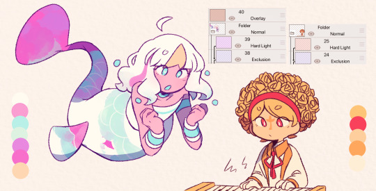
i still use the same colors for exclusion and overlay (while i do alter them with hue saturation brightness from time to time, i just use the same blue and brown for most of my works) though hard light is what i use to make drawings lean towards a temperature
i tend to use warm colors a lot because i think theyre neat and also im biased sorry <3. as a warm palette example, i drew yinu and used this orange color on hard light and lowered the opacity
cold colors have a similar process, it's just the matter of adjusting the hard light layer. i wouldnt really say it's completely cold since i still add warm colors because im still biased </3. as a cold palette example, i drew sayu and used this purple-pink (??) color with the same settings
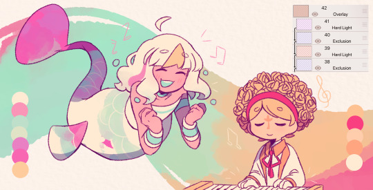
when it comes to drawings that have characters with contrasting palettes, it does take a bit of trial and error but i most of the time i mix both warm and cold methods like the example above. this also helps for art with several characters in general, since the blending modes help make the colors go well together despite the variety
theres also instances where i dont always use the warm + cold combo, since sometimes drawings lean towards a specific temperature instead (like environments with set lighting/shading, so usually i follow that even with characters with different palettes)
tldr; there are lots of palette combos you could make, not necessarily with just the three blending modes i mention. random bullshit go genuinely helps with experimenting with colors!!
#chiimo art shenanigans#uhhhh should i tag the fandoms these characters are from#fanart is fanart ig???#oneshot#oneshot niko#no straight roads#nsr#chiimo ask shenanigans
139 notes
·
View notes
Text
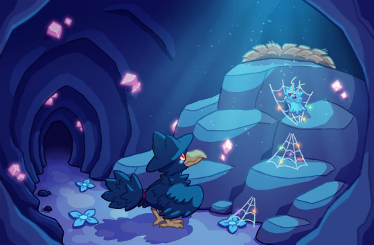
art for a patrol scenario :] basically, while in moonlit cave Shockpaw encounters a fledgeling murkrow who had fallen out of their nest. Shockpaw helps the murkrow find a safe path back to their nest :]
uhhhhh. alternate versions and progress shots and stuff under the cut as usual

rough sketch for figuring out the composition n stuff! the text below the murkrow reads "guide eye;" i planned on having a light-colored floor combine with shockpaw's webs and the rays of light to guide the viewer's eye up to the nest.
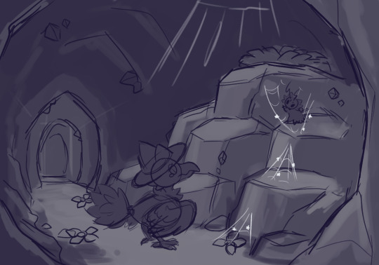
the final sketch. once again, doing rough shading to figure out the shape of rocks and stuff is a method i highly recommend using!

lineart and stuff :] i put different color segments (ex. murkrow's eyes and tail band, the tops of the rock pile, etc) on different layers to make coloring significantly easier

the final color! murkrow has slightly different colors from the ken sugimori art for the species. most noticeably, their eyes are more pinkish. also, murkrow is pretty scruffy - that's because they're a fledgeling and fledgeling crows just look like that hehe

version with shading but without effects! the final version has glowing crystals/stars, blurred foreground, and light rays. shading was one of the most time-consuming stages since there were so many objects that needed it. i ended up splitting shading layers into multiple folders so it would take less effort to clean up.
#raintailed's art#pokemon#pokemon oc#my ocs#shockpaw (oc)#long post#queue#i usually do character design art but it's fun to do full pieces every once in a while#enzo (oc)
63 notes
·
View notes
Text
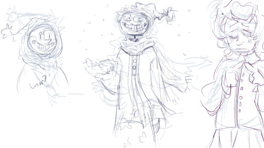
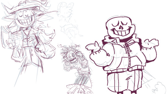
BEHOOLLD! Blorbos as promised.

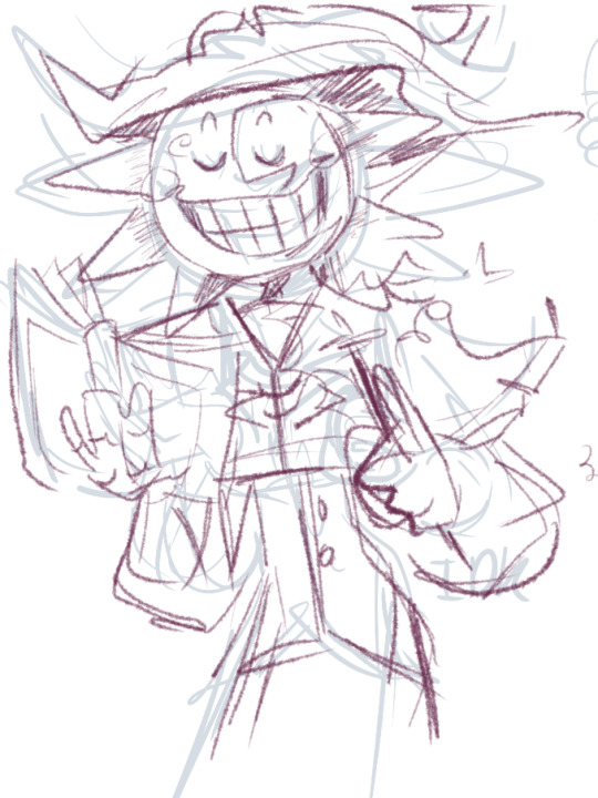

Sun witch from my secret santa and Moon experiencing snow for the first time. They are sketches but they made me happy :]
Maybe I will finish them. Full pictures with extra stuff under the cut.
Woah- is that lunar?
Maybe.
I cut the bottom half of moon out the picture because I wasn't too proud of it. I was focused on the top and went down which is what caused it to look so wonky. Still love his face. Bro so gnarp gnap frfr ong. Had me tapping my feet. I drew something random off to the right. Just some person.
SAAANNNNSS!! I thought that type of lineart would suit him more. To the left is another random thing. Just some weird bug guy freaking out about something.
Sun witch is very passionate about his work. He used to be a spooky, powerful, active witch full-time but now he teaches other kids how to witch alongside moon. Both their teaching methods are different, but when combined they are very effective! Some kids don't want to admit it, but they enjoy their time at witch school/camp with Sun and Moon.
My sona's just floatin around in the back. Don't mind them.
#finally got use my drawing tablet and all this is me testing it out#I am very happy :]#dca fandom#the daycare attendant#daycare attendant#dca fanart#fnaf sb#fnaf security breach#moondrop#sundrop#dca au#sun fnaf#moon fnaf#fnaf#my art#sans#sans undertale#sona#sams#sun and moon show#the sun and moon show#sams lunar#lunar sams#pointyfanart
81 notes
·
View notes
Note
Hello!!! I love your art so much, especially the way you render!! Do you have any tips, tutorials, etc on rendering?? Be as detailed or curt as you like, I'm just hoping to improve my skills -- and I hope to see more art from you, in any form!!! You're a fantastic artist !!!! Have a good day :)
Sorry for the delay in answering this, I wanted to answer it well!!!
Here's my typical 5-step process:
flats
he has been flatted. You'll notice I also colored the lineart at this stage as well! Also, I do work with the background at the same time, but I have hidden it here for simplicity.
2. Cell shade shadows

I used to skip cell shading and just ball with my rendering, but I have found starting out like this is much faster!!
3. Airbrush shadows and colors
I did two things here, one is just a touch of airbrushing the colors into eachother, to help make everything more harmonious. The other is to airbrush colors onto my shadows! I set that layer to multiply, and mess around until something looks a little like I want.

4. Painting

This is the time sink - there's no getting around it, it just takes forever!!
It's a lot about making the dark areas darker, and artifically injecting some color diversity - I like to diversify shades, and just slap on slight hue shifts as i go, and if it sucks I just paint over it some more. I draw different colors into eachother (look at the black shirt above, see how i bring in the tan and whites into the grey?) and add detail and texture.
It's a little hard to explain beyond that, hmm... Do let me know if you have specific questions about it!
5. bedazzle and effects
I add extra highlights to the highlights, maybe a sparkle or two on a hard edge, hash lines for texture, and occasionally I also do screentones in shadows. Also, importantly, i blur things that shgould be out of focus! See on the arms and legs here - the bottom image has them blurred more intensely the further they are from the focal point. It's a small thing, but this effect goes a long way!
Annd done!

It's the little things that make a rendered piece sing! A balance between detailing and speed is a tricky one to figure out - I'm still working on that myself!
Also, there's two different ways I render at the moment, one is the quick-messy for sketches, which is what I've done for most of my fanart lately, but I assumed that you were asking about my full process so I went into detail on that.
Tho if you're curious about my sketch rendering, anyone is welcome to ask me about that as well!
(there is little method to this madness though, haha)
Omg wait I had forgotten, a few months ago i was making a mini art guide about some tips and tricks
I lost motivation but if anyone is actually interested do let me know and maybe i'll finish it hjsdhjfghjs
Anyway, thank you so much anon!!!!! wah!!!!!!! Your kind words mean the world to me ;w; They fill me with strength and joy1!!!!!! thank you so much!!!!!!!!
53 notes
·
View notes
Last Seen Blogs

engineofficia
Engine Official

sproutuncle8
The Journaling of Bishop 672
cryptid-roads-0905
Cryptid Roads

kirkflorida
Kirk Francis
