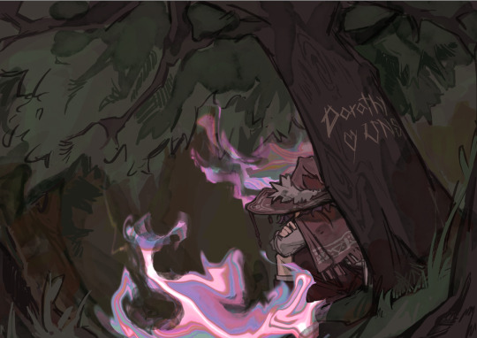
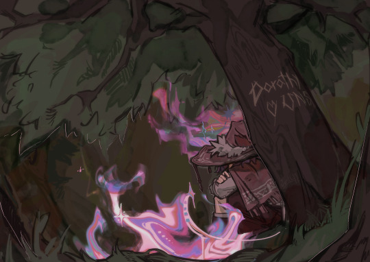
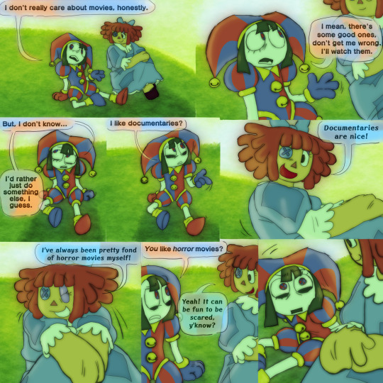
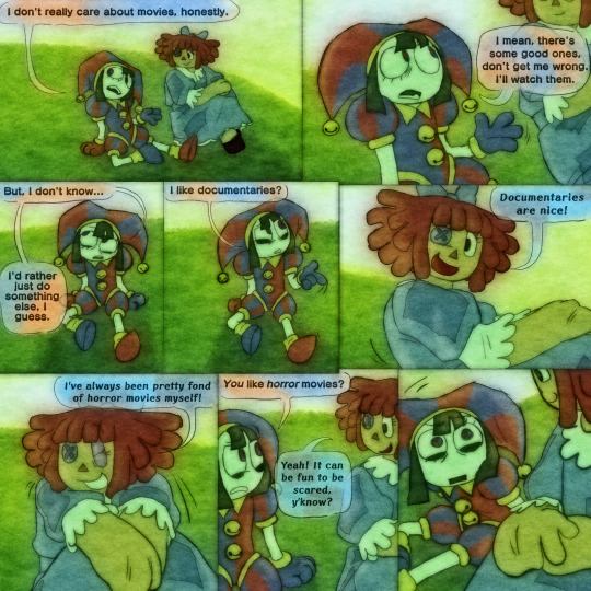
#i was messing around with foregrounds and blurring
Explore tagged Tumblr posts
Visit Tumblr Blog
Explore Tumblr blogs with no restrictions, modern design and the best experience.
Last Seen Tumblr Blogs


Fun Fact
Tumblr was named as a finalist in Lead411’s New York City Hot 125 in Aug 2010.
Text

i really like haley’s design
#sdv#stardew valley#sdv haley#haley sdv#i was messing around with foregrounds and blurring#kinda fun to do
2K notes
·
View notes
Text
I have a very specific set of images in my head so I present this on a platter to the room. If anyone wants to take it and run with it, PLEAAAAAASE do so!
It's this line that Snow says to Haymitch
“Bet I know a thing or two about your dove.”
“Like what?”
“Like she’s delightful to look at, swishes around in bright colors, and sings like a mockingjay. You love her. And oh, how she seems to love you. Except sometimes you wonder, because her plans don’t include you at all.”
"she's delightful to look at"
An image of a tiny Peeta, peering around his dad's legs (you only see his dad's legs - the focus is on Peeta's face) and he's looking over at a little girl up ahead who is giving her father a great big hug as they're being called into class. You can only see the girl profile, but she just EXUDES joy, looking up at her father - everyone else around is kind of blurred - but she's in perfect focus. Like color is emanating out from her smile.
"swishes around in bright colors"
young Peeta is sitting at his desk, gazing intently at the front of the classroom, where a young girl is being helped up onto a stool by a teacher.
she's wearing a clearly lovingly stitched plaid red dress. the red is the brightest color in the image.
her hair is tied in red ribbon braids. The ribbon is woven into the braids. The red of the ribbon is older, faded, more sedate than the dress - but it brings out the deep rich red.
the girl is looking up at her teacher, waiting for her cue to start.
"and sings like a mockingjay"
Young Peeta is leaning forward in his chair, eyes wide open, mouth slightly open - not a lot, only a little parted, almost as if he's forgotten to use the energy to keep his lips pressed together. outside of the window next to Peeta's desk, there is a bird and it's cocking it's head to the side, curiously.
"you love her"
young teen Peeta (15 or so) is once again peering past his father, who is at the backdoor of the shop making a trade with two young hunters. he's being as subtle as possible as he watches the transaction happen, from over his father's back.
(Katniss and Gale are in the foreground, you can only see their backs/side-profiles, Otho is leaning over to the counter on the side of the door to grab a couple of loaves of bread, Peeta is the camera focus of the picture, determinedly kneading on the center counter but flitting his gaze up to look over at the empty space his father has created)
"and, oh, how she seems to love you"
Peeta, waking up in the cave to find a needle in his leg. Katniss is laying next to him with blood flowing from her face.
his face is stricken, angry, shocked, awed, determined - a complicated, confusing mess
"except, sometimes you wonder"
Peeta is offering a bouquet of wildflowers to a shell-shocked Katniss along the train tracks.
Haymitch is in the background, approaching the two from the train. He hasn't quite reached them yet so the focus is on Peeta and Katniss, and Peeta's outstretched hand. you can see Haymitch approaching from over Peeta's forearm.
"because her plans don't include you at all"
Peeta is walking away from Katniss, his hands in his pockets and looking down.
from behind him you can see Katniss, holding tightly to the wildflowers in one hand. she is crestfallen and is almost slightly raising her other hand as if she's trying to reach out for him
#peeta mellark#katniss everdeen#everlark#burdock everdeen#mr everdeen#otho mellark#mr mellark#gale hawthorne#haymitch abernathy#thg#the hunger games#thg series#sotr#sunrise on the reaping#coriolanus snow#president snow#lenore dove#lenore dove baird#lucy gray#lucy gray baird
96 notes
·
View notes
Note
Art process and rendering tutorials pls 🙏🙏🙏🙏
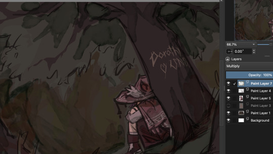
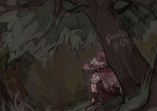
okay please bear with me as I try explain the incomprehensible mess that is my art process (I tried to take screenshots thr the entire process). Im gonna use this post while explaining (btw i use krita). Most of my 'process' is me fucking around and finding out im sorry
First I start by filling in the background colour and basic elements with the lasso fill tool and the fill block brush (a square brush). I dont know how much of a tutorial you want but I tilted the whole thing to make the composition more interesting. Id say try to have some foreground and background elements to the drawing makes it more dynamic (even if its just a shadowy shape in the front it adds alot). Also i always start with the background colours first so i can set the mood for the rest of it yknow
Then I add some line art on to it (on a diff layer) and actually draw the details of the character (which is the focus) using the fill block brush again (thats my main brush just assume i use it for almost everything) Oh and also i delete the orange shape of the character i used, and also messed with the brightness settings for the background to fit the vibe more

Then on a layer beneath the lines i do the base colouring (both background and character and try to seperate the figures a bit and figure out the colours.
Next is shading. I add a new later set it to multiply and choose a colour which fits (in this case green and orange i think) I use the waterpaint hard edges brush for this. This is normally where i wing the lighting situation but uh this piece didnt really have a complicated one? so its just in the obvious places (ie. underneath the tree, underneath the hat etc). make sure your shadows kinda dont remove the focus from the character by either making it too dark or too light around there? Idk if that makes sense im trying to give advice
Okay now rendering which i will try give a tutorial: I merge all my layers and make a new one on top and just go in with the fill block brush. I use the colour picker alot during this. This is where i smooth out the lines by colouring over them or thickening them depending on what looks nice (I think line variation is pretty important, id say thicker=darker and thiner=lighter) I also add hatching to my shadows and outline them with a darker colour (makes it look better ithink), just in general i fix up the shapes, add shadows for contrast/form/perspective and also a few textures (the treebark). Im sorry this isnt really helpful i just countinue to go over my lines and proportions using a basic brush and the colour picker till its nice
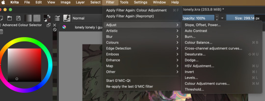
okay for this drawing i added effects (normally not there in my art) so ill explain what i normally do: I take one of my old art pieces (preferably with at least some interesting vibes) and liquify and warp it to resemble the effect i want
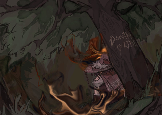
Then I mess with all the colour adjustment curves till it looks liek the colours i want
Then i blur it slightly to get a softer look and add some details (stars and all).
After that i use some multiply and add layers to make the colours more interesting (with an airbrush and using matching colours to the piece). Then is my favourite trick which is to merge ALL the layers and duplicate it and gaussian blur it (around like 20-50 percent idk) and set it to a lower opacity. Then i erase the parts in focus (the character) it just gives a softer look as well as bring more focus to the character. I just outline couple things with a light colour and im done :)
Hopefully there was SOMETHING in there but i dont thinkk any of that was useful
#ask#my art#im pretty sure you taught me that gaussian blur trick#this was so bad im so sorry i just mess around till something works😭
19 notes
·
View notes
Note
do you have any tips on drawing backgrounds. I struggle with them so much and can’t always make them cohesive with the drawing yk
Oh man, yeah. I do indeed know, all too well U_U Backgrounds are a STRUGGLE
Here are some things I’ve picked up, that have helped make them a little less difficult (feel free to take what you think might be helpful and then scrap the rest!):
1. Map out your Composition, Tones and Colors in a Rough Thumbnail
-I think the main thing that helps me, is planning. If you’re gonna do a background, don’t think of it as an after thought. I find it’s helpful to plan out the background at the same time you’re planning the character pose, rather that just slapping in a background, once the character is already finished. It’s like a little dance, making the environment work to accommodate the character while simultaneously making the character work to accommodate the BG.
-I usually do a small thumbnail and color key before I actually go into the drawing itself
-I like to think of the thumbnail like a little roadmap that I can always refer back to when I’m stuck. It's something that is easy to experiment with and will help me keep the big picture in mind, while working, rather than fussing over all of the small details.
-you can plan how you might want to use light and other elements of the bg to frame important things, or point and lead your eye to the focal point, or divide up the frame.

When I’m working on the actual drawing, I’ll always keep my thumbnail visible off in the corner of my workspace, just as a reminder of where I want to go with the piece, and to keep it available to color pick from, when I want to.
2. Try Sticking to 1 or 2 Dominant Colors and try not to stray too far, unless it’s an intentional accent
I usually choose 1-2 main colors and then paint bucket fill the canvas with those colors as a base, before I even start on the "cleaned up" linework. Then when I start painting, for real, I choose my colors based off how warm or cold they are, compared to the main color(s).
So say, for example, I want the dominating color of the illustration to be red, if I’m coloring an apple (that is naturally red) I would keep it the same hue, but might change the tone or saturation. However, if I’m painting a carrot (that would naturally be orange) I might just shift the hue to be a warmer red, rather than a full blown orange. Conversely, if I wanted to paint a naturally blue sky, I would shift the hue from red to be a bit colder, maybe more of a purple, but not necessarily a true blue.
*sometimes the saturation can mess around with a perceived color as well, (like how a desaturated yellow, will often look green), so I find there’s a lot of trial and error and messing around to be done with color, which I guess is half of the fun :P
(obviously this isn’t the only way to approach color, but I find it helpful for reigning myself in and keeping things a little more cohesive)
3. Add Depth
-Think of your environment as a 3D space with overlapping elements. Consider what your foreground, midground and background elements might be, to give depth to the drawing.
The further away something is, the less details the human eye can make out, and atmosphere will create a sort of hazy look to things that are set far away. So to mimic this effect for things that you want to recede into the distance, you can use less saturated colors, less contrast, do less detail, less line work (maybe even go lineless) and use slightly cooler colors. Maybe even add a little gaussian blur if it looks good. Conversely, for things you want push forward, just do the opposite (higher contrast, higher saturation, heavier line, more detail ect.)
4a. Study and Play with Lighting
I think lighting can be a big factor in helping make a character feel like they fit and belong in their environment. Study how light works and interacts with the world and think about how it might effect every element of your environment. How does it break apart when it’s going through something translucent? Is it going to cast harsh or soft shadows? Are there multiple light sources? Are they different colors? different intensities? Is the light source visible or not? Is it a controlled beam of light, like a laser, or more open, like the sun?
4b. Make use of Reflected Light and Color
So, when light hits an object, that is near another object, some of it’s color can be reflected onto the nearby object, if the angle is right. So for reflected light, I usually add a clipping mask layer to the affected object and add a gradient coming from the first object, using a color that has be color picked from the first object. Then I’ll turn down the opacity to my liking.

^(Ok, this first example of reflected light is super subtle on Sirius’s jacket, but it’s a little clearer to see the reflected light from the tub reflecting onto Sirius’s face and Remus’s arms, in the second example)
5. Add a Little Bit of *Spice*
If by the end of my coloring, I still want to do some tweaking, these are my general go to’s:
-Edit with filters and/or gradients. If you’re working digitally, play around with blending modes. You can make a new layer, fill it with a color or a gradient, then see what different blending modes and levels of opacities will do to it.
-Color your lines so that the black isn’t so harsh against the other colors in the scene. Sometimes I like to go completely lineless in some areas, if it's an area blown out by light, or is maybe pulling your attention away from the focal point
-You could add a little bit of grain and noise (to do this in photoshop, make a new layer, fill it with a grey colour (or experiment with other colours) then go to filter>noise>add noise>ok and turndown the fill and maybe change the blending mode)
-Adjust the levels, if you’re still not fully satisfied with the contrast, you can adjust the levels (ctrl +L in photoshop)
-Adjust the Color balance if you're not fully satisfied with the saturation and colors (ctrl+ B in photoshop)
Ok, gosh, there’s so much, but I think I’ve rambled on long enough… hope this helps and wasn't too obvious or convoluted!
Good luck!!
125 notes
·
View notes
Note
hiii !!! love ur art lots, so i've been wondering, what program/app and brushes you use? i love the paper effect you give to your drawings, makes me want to eat em /pos
thank you so much!!!! i appreciate that a lot :D!!!!
(accidentally rambled a lot abt this HAHA)
i use medibang!! ive been using it forrrr maybe like 7ish years now... ive been meaning to one day get clip studio or something but i havent had the chance to buy it and im also a little intimidated at the idea of having to readjust to a new program HAHA
i use a few different brushes!! it depends on what im drawing and what i feel like using at the time (i should probably plan them out more often, actually)

oil paint, g pen, fluffy watercolor, and round brush (wet) are all brushes that come with medibang!!! i know i made Another Marker myself, and im pretttttty sure i made the first marker one too? my favorites are round brush and g pen though!!! i tend to use fluffy watercolor more for colors rather than lineart
(i also keep correction at around 12, i would use it more since my hands arent the steadiest but i find high correction to be kinda confusing so i just keep it low)
the paper effect is smth i learned liiiike maybe two years ago ish? and i have simply KEPT doing it ever since HAHA i do wanna mess around with more textures cus i dont want to be too reliant on just one texture for my art but it IS very fun and i like it...
medibang has a feature that makes it REALLY easy to do!!
custom noise is my BEST friend. the sand, watercolor paper (specifically 2), and marker paper (specifically 2) are the ones i use most often!!!
i also will copy n paste color layers and lineart layer, add gaussian blur and do like 200 layer effects (i most often do this to lineart, then set it to hard light and somewhere between 30-60% opacity to mimic bleeding from ink!!). i DO often experiment w messing w colors wo layer effects cus its fun but sometimes its just more fun to use layer effects instead!!
medibang also has materials!!
i dont use them as often but i like this one :D ive used it on a handful of things
and just for fun!!! things look suuuper different without this stuff. like the thing i just posted used a LOT of this (to be honest its cus i really really didnt wanna do shading for it LOL but it still felt too flat and i feel like these effects are a nice middle ground- but i will still often use this stuff when i AM shading things)

sometimes i will also use similar custom noise textures but for different parts of the image!!! like in this one i had a waatercolor texture for the bg but a seperate one for the foreground

i DIIID a while back post a pic of kinger (its an older post on this acc- not old by most standards but it was during the first little while after i made this blog while i was still finding my footing w the characters) that used a bunch of different textures which i got from freestocktextures.com!! but i havent used them since. i keep thinking i should again
ANYWAY thats basically it!!!! i looove medibang theres a bunch of little things ive figured out abt using it over the yrs that im so fond of it. and THANK U again!!!!!! :']
#ask#i mentioned it but i DO wanna experiment more so i dont just do this and never anything else#but at the same time i DO genuinely rly enjoy imitating watercolor!!!#i try not to be too strict abt it and can and will add details that are not watercolor-y though#i just follow my heart <3#i have a screencap redraw i started the other day w the express purpose of maybe making it look a little like an illustration#i should return to that...#ALSO. oil paint brush is fun. but Be Careful....#THATS the one ive been using for the butch gangle image and its made it a bit unreasonably hard...#bc the brush is sorta like a lot of parallel lines theres like. a dip in the center of the brush with lower transparency#meaning when youre doing shading or lighting or even just coloring smth in youll end up w weird empty spots and its ANNOYING#otherwise a very fun brush though!!!#anyway!!! i love to ramble abt art HAHA this is all way longer than intended#dont even get me started on like. panel layouts or when i add small symbols or allusions or framing etc etc#i looove art. its so painful but i enjoy it so much#<- person who spent most of its life wanting to pursue an art degree then got scared midway thru hs and shifted gears to a bio field#but still sometimes laments what thing left behind...... i think about making comics like Properly sometimes....#gestures at a post i made a while back out of nowhere abt connecting w gangle. this was related HAHA#anyway i need to stop rambling i have another ask to answer!!!! i will be here forever if i tlak about art
9 notes
·
View notes
Note
Heyy, I want to ask if you have any tips on the ”DOF” setting in reshade. I find myself struggling to edit the setting and want to find a good balance, right now it makes everything blurry and it’s a total mess! I love how in your photos it’s perfect and not crazy like i have it now. Not sure when you are gonna see this but Happy new year! <3
Hello nonny, I always go for a subtle bokeh versus the super blown out look. Ideally, I'm trying to emulate the focal lengths of an actual camera. I also use 4 different DOF shaders that can be layered on top of one another depending on the scene. Two of them are mouse driven auto focus, and the other two are static blur for items in the distance.
In general you want to focus on adjusting the following areas to control which parts of your image are subject to blur:
Near Blur Curve (amount of blur in foreground, i.e. objects closer to the camera)
Far Blur Curve (amount of blur in the distance, i.e. everything far away from the camera)
Generally, 0 = no blur, and 1 = blur. DOF shaders are quite sensitive. I do not like any blur in the foreground therefore, I usually have this set to 0 for my non mouse driven DOF shaders.
Then for the actual blur strength effect, I leave this very low too, usually around 5-10 at maximum.
Hope that helps!
35 notes
·
View notes
Text
Spoilers for weak hero webtoon ch 267 but...
SHOOK that the author actually had stephen wake up AND have stephen and gray reunite. I mean i suspected stephen would wake up at one point bc why put him in a coma instead of killing him off then, and i also suspected he would wake up/they would reunite at the very end bc it makes sense narratively for gray to "finish" all his eunjang shit before meeting stephen again... but still. Having all that actually happen fr still surprised me.
I wonder how much the drama adaption influenced the webtoon or vice versa bc they had stephen working at a cafe (food place) where gray meets him again... either the author liked suho working his odd jobs or it was in the author's plan all along and the drama writer just low key "spoiled" it when adapting.
Anyway, i did go and read that last ch, and reading it made me kind of have a better idea of what the drama will look like... based on the fact they could p much summarize the main points of the entire story in 1/3 of that ch means they could reasonably adapt the entire webtoon in the 2nd season (w some story adjustments/cuts obvi) and end w suho and sieun's reunion in the very last scene. Yes it would be kind of rushed or they would have to remove a ton of stuff to have the pacing feel more natural but they could feasibly do it... otherwise if they follow the pacing of s1 then i can definitely see them adequately adapting in 2 more seasons (so a total of 3 seasons). Also the story summary had a shot of gray driving a motorcycle... i can totally see them bringing that to the drama since suho's key character trait was him biking around everywhere... drama!ben being like woah you know how to work a bike? And sieun being like yeah... i learned from my friend
Anyway while we're imagining drama scenes... i can totally see a way they could do the reunion scene in my head.
Sieun enters a korean grilling place similar to the place featured in s1 (i'm p sure there's a korean term for this kind of restaurant but i'm too lazy to look it up rn). Sieun looks out over the restaurant, a voice calls out "welcome!" camera pan or cut to suho's back (or a shot of sieun at the door w a blurred suho in the foreground), he's clearing a table and not looking at the entrance. He tells sieun over his shoulder to sit down and he'll get to him. Sieun stays rooted, silent and comprehending that suho is awake and moving around like he had never been in a coma. Suho finally turns around, wonders why the customer is just standing there, then has whiplash when he realizes who he's looking at. The scene could finish either 1 of 2 ways - 1. hyunwook and jihoon's comments abt their reunion could be used, w sieun hesitatingly (or sarcastically) asking "do you remember me?" and suho cheekily is like "ya i'm not stupid, weirdo. how have you been?" While sieun smiles at him and the scene cuts to an aerial view of the restaurant w the eunjang bros milling abt (similar to webtoon) OR my original thought of 2. suho looks at him in silent shock, sieun smiles at him as the camera zooms in closer to him and he says "hey, it's been a while" cooly and then hard cut to credits.
Anyway so if the author goes w realism, then that means stephen must have woken from his coma p soon afterwards? Bc technically the longer someone is in a coma, then the more messed up they are upon waking up... he's working fine (assumingly) and also seems to remember gray or at least the feeling of gray... technically we know it's likely been over a year since stephen went into the coma since i think gray transferred to eunjang abt the same timeline sieun did and the ending ep had someone talk abt how the school yr had finished... the webtoon has the benefit of stephen getting transferred away so gray couldn't keep up w him, but as i said in my prev post, the drama will likely also similarly transfer him away in s2 to get him out of the picture for sieun's further development... or maybe not? There's a couple ways they could go about it i guess. But anyway yeah this confirms choi hyunwook will be coming back at one point lol. Idk i convinced myself they wouldn't bring him back, that they would effectively write suho off but i mean as i said. He's in a coma, not dead so.
Also that webtoon ending scene is gonna adapt so well in the drama if they choose to use it as the ending... it will truly be a full circle w the drama starting w suho and sieun's story and then ending w suho and sieun's reunion. However it does kind of make the vibe different bw the drama and webtoon... w the webtoon focusing more on gray's character and his impact on a larger social network while the drama focuses on that first friendship sieun has and how it shapes him to face his later struggles (and then he is able to return to that friendship in the end, changed for the better (?)). Maybe i'm talking out of my ass since i've barely read the webtoon but again it's interesting to see the changes bw source and the adaption.
#reading#technically bc this stemmed from me learning abt the webtoon update and i went and read it too#watching#Also technically bc i'm commenting on where they could take the drama in light of this ending#weak hero class 1#Yeah i'll tag this time despite my great hesitation to#I only have 1 other wh post on my blog and it's hella long so don't check me out
10 notes
·
View notes
Text
Smoke & Lights - Marcus (swarm)

CH02 🎶 Sugar - Robin Schulz, Francesco Yates 🎶
The next morning, soft beams of sunlight filter through my blinds as I sit cross-legged at the kitchen table. A half-empty mug of coffee sits beside a scattered mess of textbooks and notebooks, my pen scribbling furiously as I try to keep my focus.
Rusty is snoozing contentedly on the floor nearby, his legs occasionally twitching as if he’s chasing something in his dreams.
I’m deep into a dense section of my notes when my phone vibrates, pulling me out of my concentration. I sigh, initially intending to ignore it, but curiosity quickly gets the better of me. Picking it up, I see an Instagram notification. Marcus has followed my personal account.
Huh. I frown slightly, brows knitting in thought. It isn’t unusual for people I met at gigs to follow my DJ account—fans, casual acquaintances—but it is rare for someone to track down my personal profile—not that it’s hard. Does it mean something? Or is it just a coincidence?
Shaking my head, I dismiss the thought. It doesn’t matter. I put the phone down and return to my studies, the concepts pulling my focus back in—at least for a little while.
A couple of hours later, I lean back in my chair with a sigh, deciding it’s time for a break. Rusty is now sprawled in a patch of sunlight, his golden fur glowing warmly.
Smiling, I grab my phone and snap a quick picture, his fluffy frame in the foreground and my chaotic pile of textbooks in the back. I caption it, Study buddy, and post it to my story.
It doesn’t take long for the notification sound to pull my focus back to my phone. Marcus replied to my story.
Marcus: Cute dog—what’re you studying?
I hesitate for only a second before typing back: Music Production.
His reply is almost instant.
Marcus: That’s cool. Always wanted to learn about that. Do you do original stuff, or just DJ?
I find myself smiling a little.
Me: Mostly DJing, but I’ve started making my own tracks.
The conversation is far from groundbreaking, but it is enough to make me pause. There’s something refreshing about his tone—genuine, unassuming. It’s a nice change from the usual overly flirty or dismissive messages I tend to receive from strangers online.
Just as I’m about to put the phone down and get back to work, another notification pops up: Marcus added to his story.
Curiously, I click on it.
The post is simple. A coffee cup and a flaky-looking pastry sitting on a small table, the caption reading, Starting the day off right.
My heart skips a beat as you recognise the backdrop—a cozy café with unmistakable green-tiled walls. It’s the same one I pass every morning when I walk Rusty.
“Small world,” I mutter under my breath, glancing at Rusty, who is now stretching lazily, his paws brushing against the chair leg.
The coincidence lingers in the back of my mind as I go back to my notes. But every so often, I find myself thinking about the café, the coffee, and the guy in the perfectly tailored suit from the night before.
🎶 This is What You Came For - Rhianna 🎶
The week blurs by in a haze of deadlines and routines, but by the time Saturday night rolls around, I am more than ready to step back into the world of flashing lights and pounding bass.
The moment I walk into Prism, the familiar hum of energy in the club washes over me, grounding and exhilarating all at once.
The dance floor is already alive, early arrivals swaying to the beat as the opening DJ works the crowd into a slow build. I adjust the strap of my bag over my shoulder and scan the room.
Deanna’s unmistakable figure catches my eye behind the bar. Her high ponytail swings like a metronome as she pours a neat line of tequila shots, laughing with a group of rowdy patrons. When she spots me, her grin widens, and she waves me over.
“Hey there, superstar,” she teases, sliding a glass of water across the bar toward me. “Ready to show them how it’s done?”
I smirk, setting my bag down on the counter. “Always. How’s it looking tonight?”
“Wild already,” she says, nodding toward a group of women loudly toasting near the end of the bar. “Bachelorette party and the usual weekend warriors. You’ve got a crowd tonight.”
Her easy confidence has a way of settling my nerves, and I find myself leaning into the conversation, soaking up her playful energy. Deanna always has a way of making me feel like I own the room before I’ve even stepped into the booth.
“Alright, I’m off,” I say, picking up my bag. “Catch you later?”
“You bet,” she says, already turning back to her customers with a wink.
As I weave through the thrumming crowd toward the DJ booth, adjusting my headphones around my neck, a flicker of movement catches my eye.
Marcus.
He’s leaning against one of the sleek black pillars near the back, his posture relaxed yet commanding attention in the most understated way. This time, he isn’t wearing a suit. Instead, he’s opted for a crisp, dark button-up tucked into tailored black pants, the simple outfit accentuating his quiet confidence.
My pulse skips when our eyes lock. He isn’t doing anything particularly remarkable—just standing there with a drink in hand, observing the room. Yet his presence feels oddly magnetic. When he smiles, it’s subtle, almost shy, like it’s meant just for me.
I smile back reflexively before turning away, telling myself not to overthink it. He’s probably just here to unwind, nothing more. Still, as I’m setting up in the booth, I can’t quite shake the weight of his gaze.
The moment I hit play on the first track, the room transforms. The crowd surges forward, the music pulling them like a tide, and I let myself dissolve into the rhythm. My hands move instinctively over the controls, each transition seamless, every beat intentional.
And yet, my attention continues to drift back to Marcus.
He isn’t dancing, but he doesn’t feel out of place. He stands rooted near the pillar, his head nodding ever so slightly to the beat, his focus locked on me—or maybe the music. I can’t quite tell.
What is he doing here again? The question lingers in my mind as I lean into the next drop, the bass reverberating through the room. I shake your head, forcing myself to focus.
For now, I let the music speak, pouring everything into the sound, knowing that if he is here for me, he’ll have to wait.
🎶 What’s My Name? - Rihanna 🎶
The music throbs faintly in the background as my set wraps up, leaving me with a familiar post-performance buzz.
I step down from the booth, weaving through the crowd as cheers follow in my wake. Prism’s energy is electric tonight, the air thick with sweat, spilled drinks, and the kind of reckless abandon only a Saturday night can bring.
Unsurprisingly, Deanna is at the bar, effortlessly juggling orders, her movements quick and precise. She throws me a quick smile when she spots me heading her way. I’m reaching for the glass of water when a stranger steps into my space.
He’s tall, with an air of overconfidence that matches his too-expensive cologne. His grin is wide and cocky as he leans in, his voice loud to cut through the bassline.
“DJ Nova, right?” He asks, his words slurring slightly. “You killed it up there. Let me buy you a drink.”
I offer a tight smile, keeping my tone polite but firm. “Thanks, but I’m good.”
He doesn’t take the hint. “Aw, come on. Just one drink. What’s your poison? Tequila? Vodka?”
“I don’t drink when I’m working,” I explain, stepping back slightly, patience thinning.
Undeterred, he presses closer. “Okay, okay. Then how about I get your number instead?”
“I’m not interested,” I reply, sharper this time.
“Don’t be like that—”
Before I can finish shutting him down, a warm hand slides around your waist. I stiffen in surprise, but the gesture is gentle, protective, and the voice that follows is achingly familiar.
“There you are, babe,” Marcus says smoothly, his tone calm but carrying enough weight to make the guy hesitate. “Thought I lost you for a second.”
The stranger’s grin falters, annoyance flickering across his face before he shrugs and mutters, “Whatever,” before slinking back into the crowd.
I turn toward Marcus, heart racing—partly from irritation at the stranger, partly from the warmth of Marcus’s arm that lingered a moment too long before he stepped back, hands raised in apology.
“I hope that wasn’t too much,” he says, his voice soft and sincere. “You looked like you had it handled, but I figured maybe he needed an extra push to leave you alone.”
I stare at him for a moment, torn. I’m not the kind of person who needs saving, but it is hard to deny the ease with which Marcus defused the situation.
I sigh, the tension easing from my shoulders. “Thanks for the assist,” I said, my tone lighter. “Let me buy you a drink as a thank-you.”
He hesitates, that boyish smile I’m starting to recognise tugging at his lips. “You really don’t have to—”
“Too late,” I interrupt, motioning to Deanna. She raises a curious eyebrow but strolls over, her emerald eyes flicking between the two of us with barely concealed intrigue.
“What’ll it be?” She asks Marcus, a faint smirk playing on her lips.
“Gin and tonic,” he says, glancing at me like he’s asking permission.
I smile and nod as Deanna turns to mix the drink, her hands moving with practiced precision. She slides the glass in front of Marcus, leaning on the counter as her gaze lingers on him.
“Didn’t think I’d see you here again,” she says casually, though her tone holds an edge of curiosity. “Didn’t you show up last night? Didn’t stick around long, though.”
Marcus freezes, his fingers tightening on the glass as a faint blush creeps up his neck. He stammers for a second before clearing his throat. “Yeah, uh… just wanted to check the vibe again.”
Deanna’s smirk widens, her eyes twinkling with mischief. “Funny. Pretty sure I saw you here last weekend, too.” She winks at me.
My stomach flips at the implication, and my gaze flickers to Marcus. He’s staring into his drink like it holds the secrets of the universe.
“Huh,” I say lightly, playing it off. But the thought settles in my mind, unshakable. Is he here for me?
It doesn’t seem like Marcus’s usual scene, and yet, here he is—again. Twice now, he’s shown up, quiet but unmistakable.
And I can’t help but wonder what that means.
🎶 Closer - The Chainsmokers, Halsey 🎶
The cool night air brushes against my skin as I step out of the club, the contrast sharp between the heavy heat inside and the crisp stillness outside. The low hum of the bass lingering in my ears, the energy of the crowd gradually fading into the background. Normally, I’d wait for Deanna to finish up behind the bar, but tonight feels different—quieter, as if the universe is offering a moment just for myself.
So, I decided to head toward the bus stop, thinking the walk might clear my head before facing another long night of studying.
“Alora.”
The sound of my name, soft and deliberate, makes me pause mid-step. I turn to see Marcus jogging toward me, his easy smile catching the glow of the streetlights. There is something about the way he says my name that sends a shiver down my spine, and I hate how easily it stirs something inside of me.
“Let me walk you to your car,” he offers, his tone casual, yet genuine.
I arch a brow, a faint smile tugging at my lips. “I don’t have my car tonight. Just the bus for me.”
His grin widens briefly before he catches himself, a flicker of amusement dancing in his eyes. “I could drive you home if you’re up for it,” he says smoothly, his voice light, no pressure behind the offer. It feels less like a favor and more like a considerate gesture—something simple and kind, without strings attached.
I hesitate for a moment, weighing my options: a crowded bus full of strangers or a thoughtful brunette with eyes that seemed to glow in the dim light. The choice is a no brainer.
“Alright,” I agree, tilting my head playfully. “But you have to promise not to kidnap me.”
He laughs softly, his voice low and warm, as he motions toward his car. “Tempting,” he teases, his grin widening, “but I’ll stick to keeping my record clean.”
The car engine hums quietly as I slid into the passenger seat, its warmth wrapping around me like a cozy blanket. Marcus adjusts his seatbelt, glancing at me briefly before turning his focus to the road.
“So,” I break the silence, a smirk playing on my lips, “big partier, huh?” I can’t help but think of what Deanna said earlier.
He shifts in his seat, his hands resting casually on the wheel. “Not really,” he admits. “But I’m trying to get out more. I tend to be a bit of a homebody.”
I nod thoughtfully, sensing the truth behind his words. “I get that. There’s nothing I love more than lying on my couch with Rusty and watching trash reality TV.”
The admission makes him smile, his lips curving upward as he glances my way. “Can’t say I watch much reality TV,” he says, his voice a little deeper in the quiet of the car, “but cuddling sounds like a great time.”
My cheeks warm instantly at his comment, but I’m unsure if he means it in a joking way or something more. He realises the slip, his eyes widening slightly as he hastily clarifies. “I meant with Rusty!” He says quickly.
I bite my lip to suppress a laugh. “Smooth,” I tease, smirk widening as I watch his ears turn a faint shade of red under the dim glow of the dashboard lights.
He groans softly, shaking his head as he focuses back on the road. “Yeah, real smooth,” he mutters.
The banter flows effortlessly between us, light and natural, like I’ve known Marcus forever. I find myself glancing at him more often than I intend, but the way the streetlights cast soft shadows over his features makes him look impossibly handsome.
It’s not until we reached my street that I realise just how much I don’t want the drive to end. The easy silence, the comfort of his company—it’s unexpected, almost therapeutic. But as the familiar outline of Vince’s car comes into view on the other side of the street, a knot forms deep in my stomach.
Marcus notices the subtle shift in my mood. His brow furrowed slightly, his hand lingering on the gearshift before he speaks. “You okay?” His voice is soft, laced with genuine concern.
I straighten in the seat, slipping back into the calm I always wear when Vince reappears. “Yeah. Just… my ex,” I reply smoothly, brushing it off as if it’s nothing.
Marcus’s expression tightens, though he doesn’t press further. “I could come in with you,” he offers, his tone steady but protective. “Make sure he doesn’t do anything stupid.”
The sincerity in his voice gives me pause, but I quickly shake my head, offering a small smile. “Thanks, but I’ve got this,” I assure him. I’ve learned long ago how to handle Vince on my own. No one needs to fight my battles anymore. “Besides,” I add with a teasing smirk, “you’ve already handled enough unwanted company for me tonight.”
Marcus chuckles, the sound easy and genuine, though his gaze stays on me for a moment longer, as if he’s still assessing the situation.
I can tell he wants to push further, but he relents, leaning back into his seat with a small grin. “Fair enough. But next time,” he says playfully, “I’d kind of like to see how it plays out. Bet that fiery redhead temper is really something.”
I laugh softly, the tension easing just a bit. “Oh, it’s a great show,” I meet his teasing gaze. “As long as you’re not on the receiving end.” I give him a wink.
“Noted,” Marcus grins, settling further into the seat. For a moment, the silence between us feels easy, comfortable.
The glow of the dashboard lights his features softly, highlighting the sharp lines of his jaw, the way his cheekbones seem to catch just the right amount of light. When his eyes meet mine again, I feel caught, like he could see right through me.
“I should go deal with him,” I sigh finally, breaking the moment as I glance toward the house. My lips pressed into a thin line as I exhale slowly.
Marcus nods, though he doesn’t move to start the car. “Just reach out if you need anything,” he says casually, though the weight of the words hangs heavily in the air. “I don’t live far from here.”
I give him a genuine smile, eyes softening. “Thanks,” I say quietly, before stepping out of the car. The cool night air hits me once more as the door shut. I straighten my shoulders, holding my head high as I walk toward the house.
I don’t turn back, but I feel Marcus’s steady gaze on me, a quiet reassurance as I face what lay ahead with Vince.
🎶 No Promises - Cheat Codes, Demi Lovato 🎶
I sighed heavily the moment I stepped inside. Vince sat, slouched on my couch, an empty beer bottle dangling from his fingers. Rusty let out a low, annoyed whine and at the sight of him scratching at the back door fills me with a quiet rage. The poor dog looks just as irritated as I currently feel, and it isn’t hard to guess why.
“How the hell did you get in, Vince?” I ask sharply, dropping my bag by the door.
Vince grins lazily, clearly drunk. “Key,” he says simply with a shrug, holding it up between his fingers like it’s a damn trophy.
Of course. I mentally curse myself for forgetting about the spare, vowing to hide it somewhere new. I take a deep breath, fighting the urge to snap. “Vince, I told you, you’re not welcome here anymore. You’re supposed to be out by now. Why the hell are you here?”
He pushes himself up from the couch, swaying slightly as he takes a step toward me. Instantly, my skin crawls as I anticipate his touch. “Come on, babe, don’t be like this. We can work it out. I mean, who else is gonna put up with you, huh?” His words are slurring, and his attempt at a smug grin only makes your stomach churn.
“I don’t need anyone to ‘put up with me,’ least of all you,” I snap, keeping my voice firm. “You cheated on me. You don’t get to act like I owe you anything. Now get the hell out.”
Rusty growls from his spot near the back door, backing me up, and I can’t help but smirk a little. Even my dog has better judgment than to tolerate Vince’s bullshit.
Vince scoffs, staggering toward the door. “You’ll regret this. You’ll never find another guy like me.”
“Again—that’s the point, asshole” I shoot back viciously crossing my arms as I hold the door open for him.
He mutters something under his breath as he stumbles out, but I don’t care enough to catch it. The moment he’s outside, I slam the door shut and lock it. Rusty barks in approval, his tail wagging furiously as I let him back inside.
“Good boy,” I mutter, ruffling his fur as I lean against the door, letting out a shaky breath. The anger is already starting to fade, replaced by exhaustion.
Then, my phone buzzes in my pocket, and I pull it out to find a message from Marcus:
Marcus: Hey, everything okay?
I stare at the screen for a moment, surprised by how much those three words soothed me in just a matter of seconds. Without overthinking it, I begin typing back:
Me: Yeah, just my ex being a pain in the ass again. He’s gone now. Thanks again for the ride, though. Really appreciate it.
The response came almost immediately:
Marcus: Anytime. Let me know if you need anything, okay?
I catch myself smiling faintly, the earlier frustration softening at his thoughtfulness. After a moment’s hesitation, I type back:
Me: Will do. Night. :)
I toss the phone onto the counter and give Rusty another pat before heading to my room. As I change into my pajamas, I can’t help but replay the night in my mind—Marcus’s easy smile, the way he seemed genuinely concerned.
Maybe tonight hadn’t been all that bad after all.
1 note
·
View note
Text
Process
(Finally, quite late)
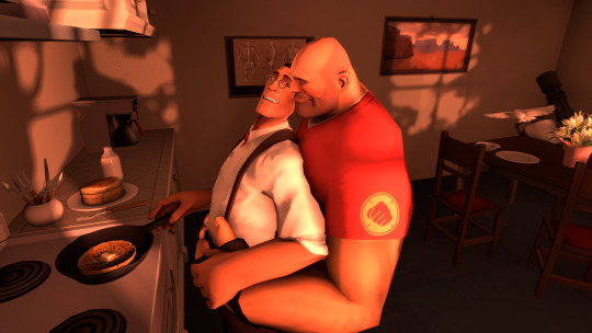
I'm happy to see this piece come to fruition, I saw the food stuffs and just wanted something with Heavy and Medic in red morning light.
Alternative Shots
I threw together some neutral lighting just to get an idea of the effect of the red lighting, and for my amusement

And some alt angles because they're cute at any angle, honestly


Big fan of this corner specifically

Lighting Breakdown
We've got 17 lights at work here, with 2 "suns," 13 fill lights, and 1 rim light.
Key

(I always love seeing these. They're so scary look at Heavy's face)
Fill

As expected, the fill lighting is pulling most of the weight here. While maybe not the most realistic, I wanted lots and lots of ambient light bouncing all over the place for an idyllic red-sun morning scene

Rim

The rim light was very simple this time, since there's no light source coming from behind the characters other than what's bouncing off the walls. But yet again it's what really ties together the characters looking defined and nice:

Scene Dressing
I arranged everything in this scene from scratch! The map I used was the default, empty dark room. There's not much to it other than four walls and what you can see, but — it was a new and honestly challenging experience for me. Playing around with all of the different parts, their lighting, their arrangement, etc was definitely more painstaking than the very simple scene in Evening Dust and really brought out the worst of my perfectionist tendencies. I'm not gunning to make a prop-heavy scene again any time soon.

One element that I decided I wanted early on was that dappled effect you get from sunlight shining through trees; it's pretty and without it, it seemed like the outside was bare and empty.
It looks nice on the inside but from the outside, it's a bit surreal combined with the infinite darkness, ha


Archimedes actually has a tiny bit of motion blur on him, which is only possible in SFM through animation. This was a pain in the ass to get right (also note those wonky dark polygons I had to fix in post)

Now my favorite part—

I love seeing progress. I even made a fancy little gif cause I'm normal. There were 73 total renders, though granted dozens of these were near-identical as I tested subtle changes

Room for Improvement
There seems to be some disparity between the background and foreground blurriness that bothers my eyes, which I’m also not sure how where/how to fix. Volumetric lighting? Messing with the aperture more? Messing with the depth of field in subsequent pieces, it seems that there might be a benefit to not having the subjects perfectly focused but rather also slightly out of focus — maybe to cover up the '3D model'ness of it all. Also the FOV is kinda whack, and if I wanted to change it I'd have to rearrange all of the set pieces.
I don’t think the vase thing of lillies particularly fits here but of all things I was too lazy to go find something better lol
Heavy’s face could be lighted better if I wanted it to be. With the angles it’s a bit polygon-y here. His expression isn't great either but I'm alright with it. Meanwhile Medic's expression literally never changed from the first render lol
Coming off a rough couple of work weeks so sorry for being so brief with everything🤧
Steam Workshop Sources
Meet the Medic - Official Model Revamp
Casual Heavy
Kitchen Props Counters, Cabinets, Misc
Restaurant Chairs
Dining Set
Cutlery
Lillies
Frühstücken
HeavyMedic breakfast? HeavyMedic breakfast.
363 notes
·
View notes
Note
hii! this is the mac/vanilla anon. may i know how did you make your build/gameplay screenies looks so pretty, vibrant and looks like they have dof? your screenies straight up look like you have reshade on and im so. WOAH<333 sorry if this ask sounds so weird but i play on mac too and my game looks so atrocious HSJFKEJFJ
oh my gOD thank u so much that is the nicest compliment i could ever receive 😭<3 i totally understand the game looking like pure garbage it's tough out there for mac players 💔 here's my
~editing process of a sad mac user~

i use Photopea to edit everything. free and online, what's not to love!
oil paint filter with a radius of 0.8 to 1, lighting off
smart sharpen with a radius of 1.4 (these first two steps don't often do too much but can smooth out the edges of the pixels without having to play with edge smoothing on)
i like a bit of chromatic aberration so i go into channels, select red, and apply a lens correction filter of 3 (go back to regular channel afterwards)
to fake DOF - i use the quick selection tool and mess around with it until the foreground or preferred focus of the image is selected (doesn't have to be totally perfect, often times people won't be looking that close). then inverse the selection and apply lens blur, typically with a radius of 12 to 15 ----- (the selection part can be a real bitch - sometimes there just isn't enough contrast between the foreground and the background for Photopea to understand which specific section ur trying to select. in cases where it rlly refuses to work i've had to go in and use the polygonal lasso select tool and manually trace what i want to be in focus akjsdhfj)
apply photoshop actions to adjust colours - lately pretty much the only one i've been using is wooldawn's warmerfalls sometimes combined with intramoon's bright and saturated
sometimes i will apply a gradient fill layer (often the purple to orange one) and set the blending mode to luminosity, opacity 12 if there's a light source that i want to emphasise a little more. it also just adds a nice softening effect
for funky rainbow effects - look up "rainbow light leak overlay" and download any u like the look of. open and place them on top of ur image, fit them to size, change the blending option to exclusion, lower the opacity to desired outcome. to make the colours of the rainbow *pop* a lil more i like to duplicate the layer and change the blending option to overlay, though u may have to lower the opacity of this layer even more as it darkens the image quite a bit
i add a film dust texture over a lot of my posts! i downloaded a set a while back but i don't remember where from, sorry :( there are a bunch out there if u look it up i'm sure!
and that's about it! it seems like a lot written out but i'm self taught and technologically inept so it's all actually pretty basic when u know where all the buttons are in Photopea heh ;D thanks again for liking my posts!! it means the world u have no idea <3
#sORRY this is so long i had no idea how else to format it otherwise it would just be a mess of a paragraph jfhkjsdfh#answered
30 notes
·
View notes
Text
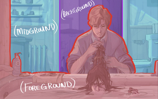
shooting your sims story like an a24 movie: Creating a Split Diopter Effect with GShade/ReShade and GIMP

YOU NEED: GShade or ReShade, a preset with a depth of focus shader, photo-editing software (I use GIMP, which is free and open source), familiarity with the rule of thirds.
YOU WILL BE ABLE TO: use layer masks to edit together two screenshots to create a split-diopter effect.
WHAT IS A SPLIT DIOPTER / DUAL-FOCUS?
A split diopter is a special kind of lens that can be used to produce a dual-focus effect. A dual-focus effect means a shot with multiple planes of focus.

Like this. Both characters are in focus, despite being on opposite ends of the frame. The empty space between them is out of focus.
The human eye can only focus on one thing at a time. To demonstrate this, hold your hand up in front of your face. Focus first on your hand, and then on the wall behind it. While you’re focusing on your hand, the wall behind it is blurred. When you’re focused on the wall, your hand becomes blurred. In this example, your hand and the wall represent two different planes of focus: the near plan (your hand) and the far plane (the wall).
Like your eyes, a camera lens can usually only focus on one thing at a time. A split diopter shot allows you to keep both the near and far planes in focus simultaneously, with an out-of-focus band in between.
WHY USE A SPLIT DIOPTER/DUAL-FOCUS EFFECT?
Because your puny human eyes can only maintain one plane of focus at a time, a frame with two planes of focus produces an unsettling effect akin to the uncanny valley. You can tell something is wrong even if you can’t put your finger on why. A split diopter shot messes with the viewers’ ability to parse what’s going on in frame or where things are in relation to one another. For this reason, these kinds of shots show up most often in thrillers and horror movies, where the disorienting effect contributes to the overall mood and tone.
Split diopter shots essentially combine the strengths of the close-up and the long shot. It lets us see the emotions on an actor’s face and the chaos going down behind them. In a horror movie, we can see the injured protagonist frantically tending their injuries while their boyfriend is mauled by a werewolf in the background.
One of the most famous split diopter shots of all time is in Jaws (1975) where a conversation between our protagonists is interrupted when the swimmer in the background is attacked by the eponymous man-eating shark.

Pics taken moments before disaster.
Use a split diopter effect to create tension and unease. They’re useful for fitting a lot of visual information into a single frame or compressing the space between two distant characters.
A split diopter will undermine the mood of a happy or straight-forwardly romantic scene, but it can add drama and tension to an argument or betrayal. If you want to subtly signal to your readers that someone is lying or something is not quite as it seems, you can use a split diopter to contribute to that feeling of unease.
HOW TO CREATE A SPLIT DIOPTER EFFECT
You can create a split diopter effect by layering two screenshots with different planes of focus.
Step 1: Set up your shot. Our split diopter effect depends on being able to take two pictures of the same scene with different focal distances. Arrange your sims and objects, one in the foreground and one in the background. In my experience your foreground and background objects need to be at least 2 - 2.5 tiles apart. The further apart your near and far subjects, the easier it’ll be to compose your shot and create the effect.

I’ve decided that my near subject will be the sim and the canvas, and the still life will be the far subject. The canvas and the still life are approximately 2 tiles apart diagonally.
Step 2: Position your camera in tab mode. Enter tab mode. Zoom the camera around with the WASD keys and move it up and down with the Q and E keys. You want to find an angle where your near and far subjects are both positioned comfortably in frame with no overlap. Use the rule of thirds to help compose your shots: your near and far subjects should be centered in the first and third vertical thirds with an empty middle third. If you’re having trouble composing your shot, try zooming in and out with the Z and X keys. Zooming out a few clicks creates a fish-eye effect that will exaggerate the distance between your subjects and make it easier to get the screenshots you’ll need.
Step 3: Choose your preset. Open your GShade/ReShade control panel and choose a preset with a depth of field (DOF) shader. Make sure the shader has options for mouse-driven autofocus.
Step 4: Take 2 screenshots with different planes of focus. Once you’re satisfied with the position of your camera, click once so you can move your cursor without moving the game’s camera. Hover over the near subject, allow your DOF shader to bring the near field into focus, and take a screenshot. Then, without moving the camera, move your mouse to the far subject, wait for your DOF shader to focus, and take a second screenshot with the far plane in focus. Your two shots should be identical, except for the plane of focus.

Screenshot 1. The near plane is in focus. We can clearly see the canvas and brush, but the bottle is blurred.

Screenshot 2. The far plane is in focus. We can clearly see the bottle, but the canvas and brush are blurred.
Step 5: Open your screenshots in GIMP. Open your first screenshot GIMP, and then click ‘Open as Layer…’ and open the second image as a layer in the same file. I like to have my near subject on the top layer, but it doesn’t change the process or the end result.
Step 6: Add a layer mask to your top layer. In GIMP, I do this by right-clicking the top layer and selecting ‘Add Layer Mask…’ You want to select the second option, “Black (full transparency. Layer Masks allow us to make parts of our canvas transparent, and we’re going to use this function to create our split diopter effect.

Step 7: Add a gradient to your top layer. Find your software’s gradient tool. (In GIMP, you can bring it up by hitting the G key.) Use the color picker to set your main color to solid black (#000000). Then, with the layer mask selected, draw a broad gradient all the way across your screen, from the near subject to the far subject (make sure your main color is solid black). This will turn the layer partially transparent, fading from solid to see-through.

Move the cross-hairs around to see if you can create the effect.

Here's the end product of a fade-to-transparency gradient produced with a layer mask. You could also do this to recreate the nuclear annihilation montage from T2.
The end product. Both the canvas and the bottle are in focus, but the entire middle plane is out of focus (look at the light stand and the carpet pattern in the middle of the frame). As a result, the image feels somehow like an optical illusion. Your eyes move back and forth between the near and far subjects; you're not sure where you're meant to look. The overall result is just a little spooky, a little unsettling. It looks like a still from a David Lynch film.
43 notes
·
View notes
Photo


omg i love kennie jd!! and i need to make a mock youtube channel for elaine, she would absolutely have one! i feel like she would post whatever the hell she wants with no regard for the algorithm, so you’ll get like a makeup tutorial, a true crime video, a boring vlog, a video essay about a random cartoon from the 70s, in no particular order lol

this one?

that’s all thanks to reshade!! i have two different dof’s set up - one for distance blur, one for foreground blur, which i toggle on/off depending on the look i’m going for. i think cinematic dof is the one i use for foreground blur but you’ll have to mess around with the settings.
but if you have some extra time, you can do it in photoshop too: use the lasso tool to outline the tree branches, delete everything outside of that, and shape blur :)

lmao of course!!! and thank you 🥺💖

fjksdjs that’s her daily breakfast tbh

i’ve been hearing lots of people feeling the same type of way as you lately and it makes me so sad because i genuinely wish i could just impart a feeling of confidence and peace into all of you 😭 so many good stories that have made huge impacts on me would never exist if the creator had been too nervous to share them – and that’s not me trying to guilt trip you, that’s me commiserating that writing is hard and every writer would agree!! you’re sharing a piece of yourself in everything you write, and you’re opening yourself up to criticism, and it’s scary as hell. but ultimately it IS worth it, it really is. i hope you find the courage to post your story anon, i would really love to read it 💖

hey!! you're not annoying at all! i make all the lots myself, and for poses i'd say it's about 3/4 mine and 1/4 other people's poses these days. but i started doing this VERY gradually. i started out almost entirely using preexisting lots, poses, cc, etc. but as time went on, i wanted more control and more customization, so i learned how to make cc and poses, which opened up a world of possibilities. this actually made me MORE motivated to work on story posts, because i have so many fewer limitations than i did when i was reliant on other people. so if this doesn't apply to you, i don't think i have too much advice for staying motivated honestly :( different strategies work for different people, so you may just not be the type of person who wants to do everything yourself, and that's 100% okay!! there's still a lot you can do! (also if you need any specific pose, i would be more than happy to make it for you because it took me forever to learn how to make poses and i remember how frustrating it was to have a great idea but be unable to make it come to life!) 💖
10 notes
·
View notes
Photo

so i do a lot of shading like this in my art (or try to) and i asked if anyone in my discord server wanted a tutorial.... and they said yes!
so im gonna do my best to explain how i shade things under the cut....
(i use clip studio paint but honestly this should work in any art program i think)

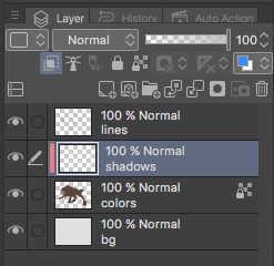
1. FIRST- have your drawing. have Layer. I usually have three layers at LEAST when im doing this- and i keep them stacked in this order: top is lineart, middle is flat colors, and bottom is the background.
the purple circle shows the icon for making a layer into a clipping layer- IMPORTANT
the pink circle shows the icon for locking transparent pixels- helpful! it makes sure you don’t “go outside the lines”

(in case you’re curious this is my csp layout)
2. create a new layer above your flat colors, and press the two little squares. this makes a clipping layer! it basically makes a mask of the layer below it, and you can draw whatever (in this case shadows) and it only follows the filled in areas of the layer below it. so if i drew a bunch of yellow stripes on the clipping/shadow layer, it would only follow the form of the werewolf flat colors and not anything else. i hope that makes sense!
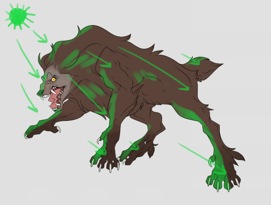
3. decide where your light source is coming from! ngl i totally draw a little sun to remind myself where the light is coming from in a piece.... in this case the green shows where i think the light would be hitting the werewolf, and therefore i would draw shadows opposite/adjacent to that. im not the best at explaining lighting though, so heres a good reference.
heres another.

4. SHADING TIME..... so for my shading i just use the default pen tool in clip studio. g-pen, i believe. Stabilisation!!! between the two pink stars!!! use it. its so good for lineart, and for drawing smooth, non trash lines and shapes. it has Saved my life. the higher the number, the ‘slower’ your brush moves, and the smoother your lines become. i tend to keep mine around 60-70 but play around with it....
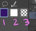
i usually shade with a bright annoying color so i can tell what im doing. (purple usually), as shown in box one. thats your foreground color. 2 is your secondary (background) color, i dont usually mess with it and leave it white. hitting box three turns your current pen into an eraser version of itself... i use it a lot! dont forget about this box

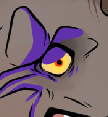
i usually tend to think of shadows as shapes.... in the werewolf’s eyebrow/spot/thing you can see where ive drawn a line.....
and then filled it in! i dont normally use the paint bucket to fill in areas... just the pen. it gets too hard
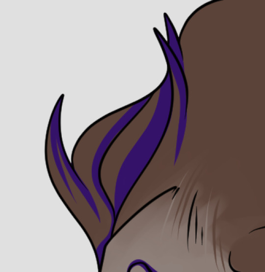
hair/tufts are the fun part!!! you can see that ive drawn solid chunks of shadow in the werewolf’s mane....

...then i click square three to turn my brush into an eraser and carve out little details


here are some more examples of that... i use it a lot. A LOT.
go wild. go crazy. sometimes i dont think my shading follows like TRADITIONAL physical rules of the laws of light but just. dewit

5. SO YOURE DONE SHADING..... if you refer back to your Layers window, you’ll see a drop down box that usually says normal and a slider.... knock that slider down to like. 50, or 30 (what i usually do). this lowers the opacity on the shadows layer so you can see through it kinda. the drop down box is the layer styles... play around with it!! you can do some really cool stuff with overlay/multiply/etc and make your shading layer super funky.....
if you hit the lock transparent pixels button, you can color your shadows differently if you want! sometimes ill duplicate the shadow layer and color it differently and run it through the gaussian blur filter... it can make it look a little softer and less hard.
usually in my art, when im done i merge all the layers together so you just have one layer left. i duplicate that layer, run it through the gaussian blur filter and drop the opacity down to like.... 20 maybe so everything looks soft. on this picture, i duplicated the werewolf layer (without the bg) and did a motion blur on it to make it look like he was moving....

.... and here he is after dropping the shadow opacity/adding other little details and running it through 5000 filters
i really hope that gave you some kind of idea on how cel shading works!! i am by no means the master, but if you have questions or tips please don’t hesitate to ask me ;a; im really not good at explaining things lol
thank you for reading!!! <3
31 notes
·
View notes
Text
Making Normal Channels in GIMP (with njob)
Hello everyone! I was explaining how to do this in the Sims of History discord server and realized how much of this process I learned through trial and error. There isn’t really a good step-by-step tutorial about how to do this in GIMP, only in Photoshop (at least no text-based tutorials). While I use both Photoshop and GIMP for various things, I prefer to make my normal channels in GIMP. This tutorial will walk you through the process and hopefully demystify normal channels in GIMP.
Normal channels (bump maps) add additional depth beyond your mesh, which is useful for things like folds, painted on pockets, and buttons.
This tutorial is particularly for how to make Create-a-Sim items, not objects, but a lot of steps should be transferable.
You will need (all free programs):
GIMP
njob
Sims4Studio and/or CAS Tools

First, open your diffuse texture in GIMP. I often try to use the light/base texture rather than one I have colored already, but if you have already colored it and didn’t save a base, don’t worry, it doesn’t make much of a difference. Don’t use an image which has a pattern applied to it, as that will create a bump on the pattern and appear like applique or something along those lines (unless that is your goal).
I recommend doing this step after you have tested your diffuse texture image and mesh (if applicable) in the game. If you have any last minute changes to either of these, you will probably need to re-do your normal from scratch.
If your image is in layers for recoloring, or not, choose to flatten the image. Transparency isn’t helpful in making normal channels, so get rid of it so you won’t have to worry about it later.
Once you have flattened it, the background usually turns either black or white. It doesn’t really matter which one, it won’t make much of a difference in njob.
Now, select the crop tool. You can see the current dimensions of the image in the “aspect ratio” box. For a CAS items, the original will be 1024:2048, which is 1 x 2. We will need to crop the image into a 1 x 1, or perfect square.
To have your normal channel as high quality as possible, you should use 1024:1024. This will work for clothing items like full body outfits, tops, bottoms, gloves, socks, and tights (basically anything mapped in this bottom portion of the UV map). For all of these items, you must use a square and cannot crop it to be smaller. For shoes, this means a very large blank area.
For accessory items like jewelry and hats, the cropping is different. For instance, a hat would be 512:256. If you are unsure of the dimensions to use, export the normal channel on the maxis item and copy its dimensions. The following instructions will assume you are making a clothing item and not an accessory item.
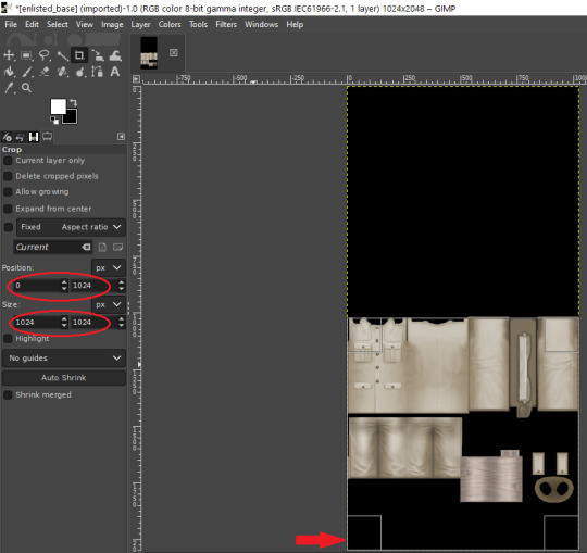
Click anywhere on the image while you have the crop tool active, then adjust your dimensions in the box to the left. You can manually type it in or drag the box and follow the size in the box as you drag.
The box should be perfectly aligned with the bottom and have no space below. If you have space below, just drag it as far to the bottom as you can. GIMP will stop you from dragging it outside of your current dimensions. If a little is sticking out at the top, that is okay. Nothing can be mapped outside of the 1024:1024 dimensions, so it is probably just bleed over or space filler that you are cropping off.
Press “Enter” on your keyboard to complete the crop.
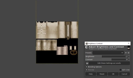
Optional Step: If you desire, you may want to decrease the brightness and increase the contrast on your image so there will be more for njob to pick up. If you already have a lot of contrast, you may not need to do this.
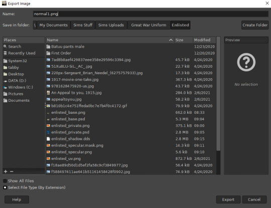
Next, export your image as a PNG or BMP. Be sure to not overwrite your original diffuse texture.
You can now close GIMP, though you will need to open it again later.
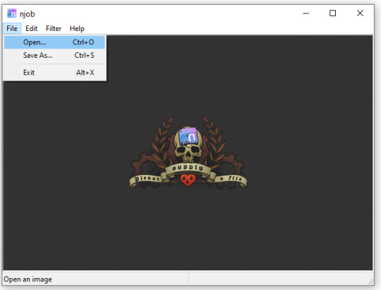
Open njob, then your saved, cropped image.
Maximize your screen so you can see what you’re doing.

Go to Filter > Diffusemap > Heightmap and select that option.
The screen will pause to load for a bit before opening up a new box.

Your image will convert to black and white and may look a bit strange. The first step is to change your “Course Detail” setting to the lowest (or close to the lowest) setting and your “Fine Detail” to the highest setting. I generally play around with the “Mid Detail” and “Scale” until I get what I want. Try to have what you want to be visible stand out, while folds should be soft and fuzzy but still somewhat distinguishable.
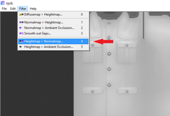
Once you have what you need, click OK and go to Filter > Heightmap > Normalmap

There are two settings, “Scale” and “Blur Radius.” Neither of them have “ideal” settings, so you will need to adjust as you need. “Scale” controls the depth of the contrast and “Blur Radius” impacts the softness of the image. If your edges are too harsh, your normal map may look odd in game.
You will probably also have lines in areas in no texture. This is normal, and I will go over how to remove those later.
Once you are satisfied with how things look, save the image as a bitmap.
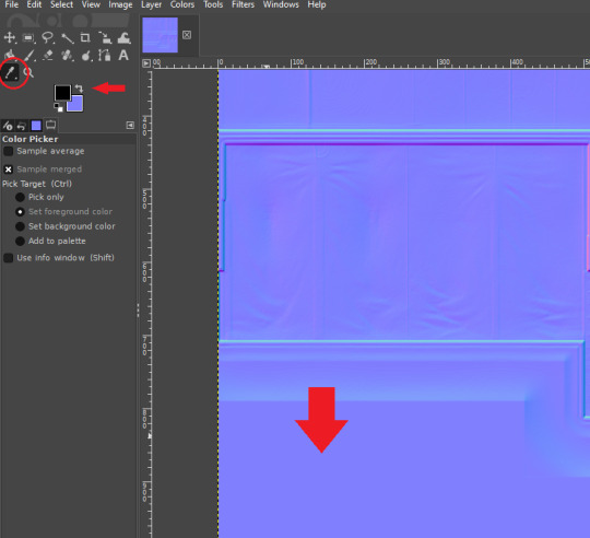
Now, open your bitmap image in GIMP. It is time to clean up the image and get rid of the artifacts. Unfortunately, unlike a specular, a normal map doesn’t have a mask to prevent bleed over onto skin or other textures. The unused areas need to be a midrange, solid grey. It is easier to edit at this step before you create your transparency.
Select a midrange blue color from one of the blank areas with your color selector and make it your background color by using the arrow button between the foreground and background colors.
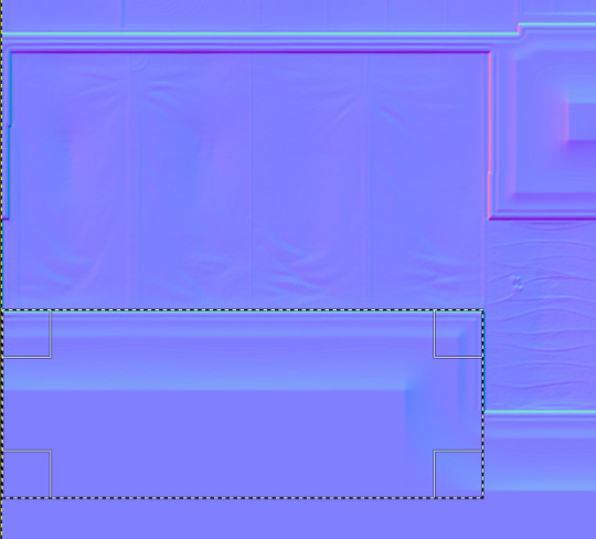
Select the areas that should be blank and delete them, which will replace the lines with a solid blue color. This would be areas around the neck, wrists and ankles, and also places like the filler beneath skirts and tops that doesn’t need texturing. Be sure to select the odd lines around the image, which are usually a bright teal or hot pink color. Those can be very visible.
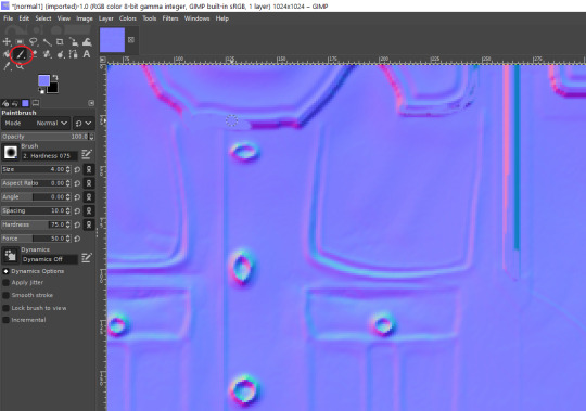
Sometimes, you may need to take your paintbrush and clean up the artifacts if they are in curved or very small areas. If anything looks too sharp, you can also use the smudge brush to smooth it out (very lightly). But don’t move anything around too much.
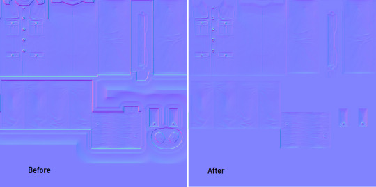
Once you have cleaned up your image, export it again as a bitmap. This is just so you can go back to it if you make a mistake later or need to modify it. Usually I save it as a new image, but you can overwrite the old one if you are feeling confident.
I have to point out that sometimes you can get away with not cleaning the artifacts from your image. But I have had too many issues with it in the past to skip this step.
Now it is time to make the normal map. Finally!

In the layers area, right click on your single layer and add an alpha channel to it. There is also a small button at the bottom you can use to add an alpha channel. You will need this transparency for the next step.
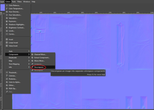
Next, go to Colors > Components > Decompose.

A small box will open up. Change your color model from RGB to RGBA to enable the alpha channel as a separate channel (layer).

Now, a new image will open that is your bitmap but greyscale. You will see four layers on the side called red, green, blue and alpha.
Select the red layer and click CTRL + A on your keyboard to select the entire layer. Then, click CTRL + C to copy the layer. (If you don’t have a keyboard, you can do “Select all” and “Copy” but this takes longer).
Now, go to your layer named alpha and press CTRL + V (paste) and CTRL + H (to anchor the layer). Now, you have replaced the alpha channel with the red channel.
Next, go to the green layer and select and copy it. Paste and anchor it into the red and blue layers, just as you did before with the red layer and alpha layer.

Your image won’t look too much different right now, it will just look like the green alpha channel rather than the visible red alpha channel when you opened it. Go back to the top bar and choose Colors > Components > Recompose. This will alter your original image, so the one you have open in layers will stay open. Go back up to the top and select the original image to go back to it, or close your layered image.

Now, your image should have changed from mostly blue to a transparent, mid-range gray with only a few elements visible. This is how it is supposed to look. If you don’t have transparency or it looks very different, then you probably messed up somewhere. Generally, I find it easier to go back to the original cleaned up bitmap (that you saved for future use) and start from scratch rather than trying to figure out where I messed up. That is usually faster.
Next, export your single-layer image as a PNG or DDS file (your preference). You will need a DDS plugin to save DDS files.
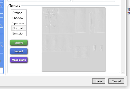
Open your item in Sims4Studio and import your new image file in the normal texture category. You will see a small preview in the box, which will probably show more details than you were able to see in GIMP. If it looks correct, save it and go to check it in game or in CASTools (which has a feature for previewing bumpmaps that can help you check for alignment problems). CASTools can be particularly useful if your computer doesn’t open the Sims quickly and you want to preview multiple bumpmaps. The only issue with CASTools is that it doesn’t really look much like it will look in game.
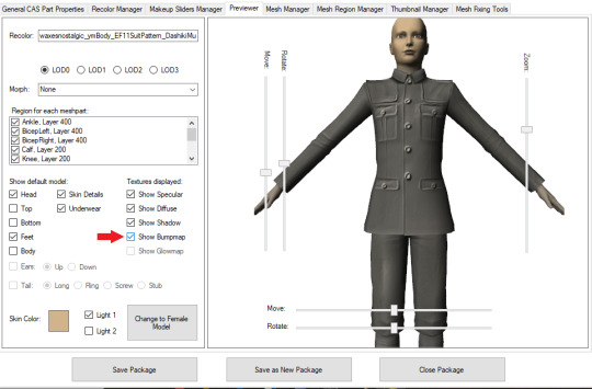
In CASTools. You have to select to see the bumpmap in the Previewer tab.
In game.
As I have only been making normal channels for a few months now, it’s possible I have missed some things, so if you know an easier or better way let me know and I can update the tutorial. I hope this is useful to you!
98 notes
·
View notes
Note
okay i love that lineart trick, but now i've gotta ask how you do your colouring, it looks so cool especially how you do your shading and how you blur your colours !!
OOoh I'm so glad you liked it!! :D Here is how I do my colors(sorry it turned out rly long lol):
Step 1: First, I think it's important to never color on a white background. Personally I think that really limits the range of colors and nuance that looks good, so I always change the background to gray or another color just to make my flats more vibrant. Then, I just pick colors I like and fill in the flats. I try to tint my blacks and whites with blues because I think straight blacks and whites look bad. Here is what it looks like at this stage:

Step 2: Shading! I like to shade with warm colors, I think cool colors can wash out a piece too much. It does vary, but usually I will pick a bright maroon for shadows and a pale pink for highlights. I create a multiply layer to put the shadows on and an add layer to put the highlights on, then use selections to limit where I’m placing the shadows and highlights. For this step I use a hard round brush with pressure transparency control. Sometimes, I will make another add layer for additional highlights in another color, because I think painting lights is fun. Here’s what it looks like at this stage:

Step 3: Once I’ve filled in the shading, I’ll add a simple background if I haven’t already sketched one in(If I have, I’ll just color that). This next trick I learned from @phinniasart (if you dont know their art please check it out!!) and basically what you do is copy the figure(I only copy the figure or foreground of the piece, essentially only the things I want to stand out), blur the copy, and set the layer to hard light mode. Depending on how it looks I’ll make this layer somewhat transparent. This effectively saturates the colors and softens up the lines. Here’s what it looks like:

Step 4: Lastly, filters! I learned everything in this section from Marc Brunet on Youtube. First, I copy the whole canvas and paste it on top of everything. Then, I mess around with the curves/levels to back off any colors that are too strong, or emphasize any colors that are too weak. In this example, I backed off the reds and blues and emphasized the greens. I also used the alpha channel to brighten the entire image. Next, I add a very slight chromatic aberration effect to the entire canvas; I keep it slight so it’s barely visible, just enough to add a little depth to my colors. Lastly, I add a noise filter on top of everything, at around 5-10% just to make everything a little bit crunchier and more cohesive. I think the filters someone uses are a huge part of their overarching style so I’d mess around with random filters until you find something you like!

That’s how I color! I hope this helps n I love sharing tips and tricks, so I’m happy to answer any questions. Also love learning about other people’s tricks, so please feel free to share yours with me!
18 notes
·
View notes
Text
Process Breakdown: Starfall
Since I got some positive responses to my question on process stuff I’m gonna do a behind the scenes breakdown for my most recent piece to help people see the process I use and how I problem solve. I didn’t plan to do this initially so I won’t have a ton of process shots but I did save a handful. There’s a few scattered hyperlinks to other pieces I reference too. Just a warning this is mostly train of thought so it’s super verbose.
So base sketches were mostly focused around me defining the shape of the girl since she was the focal point and building the environment around her. Going in the things I knew I wanted were a girl precariously balanced on top of a massive capybara catching a falling star, while surrounded by smaller sleeping capybaras on rocks. I layered out a general forest scene surrounding it but didn’t really commit to much in the sketches. Messed with the angles of the large capybara a few times to make it feel less flat and more 3D in the space, used a lot of reference photos of capybaras and sorta simplified them to what I thought was cute/ what stood out to me as their defining features.

Skipping ahead a solid amount is midway through the initial lineart, with some areas just colored in to define them as separate. Initially this piece was supposed to be in a similar style as my “Stratosphere Dreaming” art, with a single uniform line thickness, bright colors, and no gradient shading at all, but I realized pretty soon after I finished the lineart and started coloring that I had done what I tend to do a lot and made it too complex to pull off successfully in that style so I had to pivot to using gradient shading and other non-cell style techniques (though you can see a lot of those methods still in the coloring of the girl). This caused an even bigger challenge as I was drawing on a large canvas with high DPI in Procreate which resulted in me having a cumulative 50 layers to work with at any given time (hell).
Now once I made that rendering style pivot is when the really hard part began, and why on top of my persistent arm injuries this took me about two months to finally finish.
1.) I had an extremely difficult time trying to figure out the color pallet for the piece. I had an idea of the values and general colors I wanted (you can see some pallets and random base color tests in the image above) but I just couldn’t get them to look right and I became extremely more aggravated as I kept trying new and different things. My biggest mental block was feeling like I was stuck trying to make the initial pallet idea work, but eventually I was able to bump it to a slightly adjacent pallet and it worked far better. Essentially a lot of angry experimenting and testing.
2.) I made the piece too complex for its own good when it came to the foliage and scene. After finding success with a very specific way to render foliage in one of my favorite pieces I started to use it as my standard, but that standard started to show cracks when I had foliage heavy scenes like in my Hollow Knight piece from last year. The rendering style became insanely too time consuming, and incredibly distracting when used in abundance, taking away from the focal point. I knew this but I still attempted to use the same style to render the foreground foliage MULTIPLE times in increasing states of frustration until I stepped back, evaluated it wasn’t working, and tested out a very similar style with the same effect but that I could throw together twice as fast without the aggressive distraction and minuscule details that were irrelevant in the scheme of the art. This frustration in the rendering not working was only exacerbated by the color pallet indecision making a lot of the attempts just look bad both color and style wise.

Due to the limited layers I had to finish rendering out the girl very early and merge her together to free up layer space, and couldn’t keep my lineart layers as separate as I would have liked to allow for quick line color swaps. She ended up being a key point in defining the rest of the color pallet of the piece. The dress shape was indeed inspired by the Lirika Matoshi strawberry dress, but with my own twist.
Once I got a more solid color pallet down the rest started to come a lot easier and I was able to begin filling stuff in and doing general color adjustments to make the backgrounds darker and give it more depth. I don’t have any more process shots beyond the initial color pallet exploration unfortunately, but the last hurdle I hit was at the very end once I was doing final touch ups. I found that with the only light source/ lighter color being the falling star that it washed out a lot of the rest of the pieces and made the details I spend so much time on feel unnoticed. I found though that adding the bright orange stardust specks into the trees, the girls hair, and falling from the star itself gave the last bit of color I think it needed without completely destroying the atmosphere. Originally (you may see it in some of the process shots) there were going to be jars with stars already in them illuminating the bottom of the piece, but after multiple trial and error iterations it just didn’t work out and ended up taking the focal point away from the girl and the star too much so I scrapped it.
Finally once I got everything done I made a copy of the entire art file to save as a backup, then with one of the copies merged all the layers together. Once all merged I made a copy of the fully merged layer, and went and adjusted the entire layer copy using a Gaussian Blur, reduced the opacity of the blurred layer to a super low percent, and put it on top of the original merged layer. This gave it that ethereal sort of feel that is difficult to notice unless you zoom in but really helps soften the piece and make it more dreamlike overall. Then I merged that blur layer down, and turned on about a 3% noise layer on it all to give it a bit of texture.

But that’s enough rambling from me, hope this helps give a bit of background to my process and decision making and it wasn’t just a wall of random musings.
My last piece of advice is if you’re looking to do art professionally, do commissions, or make a lot of pieces in a short period of time I would highly advise against directly copying techniques I use. Because while I’m always working to improve I do only do this as a hobby rn so I have the luxury of being able to invest a lot of time, energy, and details into higher complexity pieces that would take way too long in a professional environment. I can put a lot of time into making a single piece exactly as I want it since I’m not reliant on art as my sole income. As I improve I can make things faster, but it’s still an overall slow process and I just end up moving my quality standards up with any level of improvement anyway. Use stuff I do as inspiration but I cannot stress enough to learn as many shortcuts as possible (I’m still struggling with this myself).
If y’all have any questions about bits feel free to dm, if I do something like this again I’ll try to get better screenshots during the process n try to be less verbose.
52 notes
·
View notes