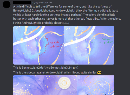
#i've spent a lot of time on the UI as well
Note
Hello there! I was wondering, what media inspired cookie clicker to be what it is today? I was thinking of plague inc's "newsboard" which really got me thinking. What sort of games or media do you take inspiration from? Thanks!
Cookie Clicker was initially made for laughs, the whole gameplay loop mostly expanding on the lollipop farm feature in Candy Box:

(as a sidenote, the reason i've promised a dungeons minigame for about 10 years now is entirely because Candy Box had them)
the game's current presentation and design logic stem from the years i spent as a kid playing old macintosh shareware as well as my interest in skeuomorphic UI. if you browse through Macintosh Garden long enough you're bound to find some of the stuff i obsessed over between 7 and 17 and i'm sure a lot of it has subconsciously found its way into the way i make my games.
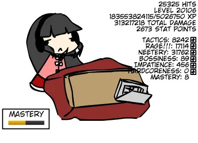
some of Cookie Clicker's major features originate from early player suggestions and from reading discussions about the budding idle game genre, ie. the prestige/ascend system was added after i read people discussing a flash game named Kaguya Table (which involves a feature called "mastery"):
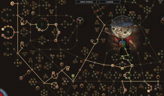
the ascend screen itself takes after Path of Exile's passive skill tree:
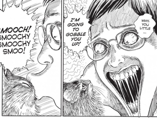
i've been asked before where the creepy grandmapocalypse body horror idea comes from and for the most part the answer is i'm just kind of a little freak like that. Cookie Clicker's initial "made-in-4-hours" version ended with the grandma building going bonkers and replacing the whole background. i'd been into Junji Ito and similar things for some time at that point so turning it into a whole thing for the "i'm making this game seriously actually" version felt like a logical step. pretend the Junji Ito image i'm including is from his gorier stuff
finally, the kitten upgrades and possibly the whole "achievements grant milk" thing were added at the insistent request of a tumblr user who really really wanted me to add cats to the game somehow.
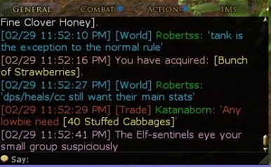
if you were specifically curious about the news ticker at the top of the game, i more or less directly lifted that from the one in SimCity!
1K notes
·
View notes
Note
do u have any advice for someone downloading lotro for the first time??? u make it look so cool!!! 🌸
Well, I am not very sure I am playing right. I can't speak to people nor offline nor online somehow, so I am missing a lot.
• First, you will have to type password everytime you go to play.
• Then, choosing a server to play on. Each one has their own purpose, there are American and European, some are RP oriented, some are for raids, etc. Although I've heard people there are insufferable with particular rules. (I play on Landroval and I like it so far).
• There are lots of setup to prepare. For graphic options there are videos and articles.
In Options you will find UI settings, where you will be able to change size of various elements (map radar, quest tracker, etc.)
• For a good time I didn't know how to change size of a text in quest dialogue.
• You can look up how to set up chat as well, and text there can be colored for you to notice stuff easier.
• And once you set everything for your use, you can save it by typing /ui layout save [name] in chat. If you change something accidentely, you can make it look like before with /ui layout load [name] command.
• Then there are useful plugins to help with better game experience:
I have Deed Tracker, Emotes Helper (to have all emotes automatically in a separate window) and Lotropad (very useful for saving commands so you can just copy/paste them, other game details; and you can upload images (maps with specific locations for example, but I put funny backgrounds for my text xD)
I also have Opaque Quest Tracker and MoorMap.
And SongBook for those who want to be musicians. But I only play My Little Pony and TF2 Soldier Theme xD
• Another things I was unaware for a good time are cosmetic outfits (I don't remember why but I couldn't slot anything there so I assumed it's a pay-for-thing, there happened this funny screenshot though) and one bag instead of 3 separate ones (opening one bag is more comfortable for me, and to make one you just need to drag slots from other bags to the first one while in edit mode).

• There is also a Filter Panel, to filter out some loot, quests and sounds. For items you need to drag it into a panel (I put lootboxes there).
• There are things like LOTRO points you can get through doing deeds in game rather than transfering your money (I spent my first good bunch on making steeds faster for the whole account, but you can also save some for buying a game content expansion).
• Folks in chat also remind of codes sometimes that give you useful stuff (to redeem a code you will need to go to the LOTRO store).

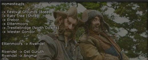
• Yeah, since I am a f2p player, I have to write down destinations to navigate easier in Middle Earth. I am writting them down to not forget:
• Finally, there is also https://lotro-wiki.com/, quite useful. And if something is unclear for me, I go to search for answers in websearch or on YouTube.
• And, I see people do play the game differently, you can skip quests and do whatever, but I am personally here for going through LOTR story and watching the stories of LOTRO characters too (even if I am mostly interested in dwarves and hobbits, but oh well). There are also seasonal Festivals in game, they are fun! You will be able to get a good looking outfit and a beautiful steed.
I think I wrote down most of what brought confusion to me first time. For sure I forgot something important, but I hope you will be able to find answers. Good luck.

21 notes
·
View notes
Text


J(a)SON Post #3
Stealing Money For Fun & Profit:
Most of my week was spent playing dark souls 2 again, but aside from that I spent most of my time working on the ATM's functionality. The ATM is heavily inspired by the ATMs in Deus Ex, and just like in that game you can input an account's information and then drain it. In the gif above you can see an example of me sneaking into the nefarious Doctor Spider's evil bank account and stealing 200 bucks. You can also blow up the ATM to get 75 bucks worth of wads of money to come out of it, or you can try to hack the ATM and get it to lock up like a dummy. Pretty simple stuff, but it always feels amazing to sneak into someone's bank account and steal all their money, and in the game as well! For those interested, I used jwildfire for the background fractal textures on the ATM UI. That program is amazing and I'd highly recommended checking it out (especially if you have an affinity for y2k visuals).
Building a Gas Station:
After a while spent purely implementing devices and mechanics, I was really itchin' to make an environment. I decided to start putting together a gas station since it's the smallest environment segment I have planned for the main map. In the images above you can probably get a good feel for my process on an environment like this. I haven't ever really done whiteboxing before this project, but I've found it to be very helpful when having to make more detailed environments. I actually hate having to litter an environment with smaller details and objects, which is the main reason why most of the environments in my previous games feel pretty sparse. I can't just get away with broad strokes this time around though, so I started to employ "words" that dictate where a planned object should go. Texturing all of the products in the gas station is easily the most tedious part, and it burns me out pretty quickly. So far, I've only textured 4 chip bag variants and 4 cereal box variants, and most of the products are yet untextured. These environments always look pretty terrible before I get them in engine and all lit up, so I have to trust that it's gonna look and feel a lot better once that is done.
Conclusion:
It's new years eve the day I'm posting this, so I hope ya'll have a good 2023, and I hope that I can actually maybe release something next year lol. There is a big collaboration project that I have a game in that is supposed to come out early next year, so I'll be posting about that when it's out. Next week I'll be back on Basidia, but until then I'm gonna keep playing Dark Souls 2. See ya.
#screenshotsaturday#lowpoly#gamedev#indiedev#indiegamedev#indiegames#indie game#game development#J(a)SON#jason#J(a)SON: The Dog Living Inside a Mistake#the dog living inside a mistake#immersivesim#immersive sim#immersive simulation#imsim#y2k#y2k aesthetic#psx#early pc#pc games#haunted ps1#hauntedps1
180 notes
·
View notes
Note
Please please share some coding/designing wisdom. Your game is so damn pretty 😭😭😭 Could you tell us what template you used and how hard it was to make it look like it is today? I imagine so much work must have gone into it
😭😭 I am no expert, but these are just my rationale/methods behind the visual choices I made!
For the template I used—I used Vahnya's Template! However, this post by @/manonamora-if has a whole section for templates that I wish I saw or checked out before making my IF! In another lifetime, I might've just used nyehilism's template to achieve the bottom sidebar instead of torturing myself learning how to do it... ;;
Below, I go into detail the timeline of designing Uroboros, as well as advice through the process I went!
Design Timeline
I started designing the UI late October 2022, and kept fixing, changing, editing it well into February and maybe a little bit of March 2023.
October 2022 - Early iterations of the design. Looked for stock images and began implementing it to add a background to the sidebar and the actual passages. Swatched some color palettes and began implementing them into the IF. Later decided to make the sidebar on the bottom instead of on the side. Also, added a title screen.
November - Testing different backgrounds for the IF's sidebar. Added a textbox to the passages, also worked on the black fade transitions.
December - Finished working on the sidebar background for both light and dark theme, began work on the background of the IF instead.
January 2023 - Finished working on the dark and light theme backgrounds! Started work on drawing the skill icons for light and dark theme, and finished!
February - Changed the title screen to look better on mobile, created a circle logo, added a border to the textbox. Also, made further edits for light theme.
March - Just remade the "Uroboros" logo.
If you're wondering why it took approximately 5 months to get to the final version—don't worry! I wasn't working only on the design for 5 months. My partner helped make the edits for the design, while I worked on coding them in and writing.
I spent a lot of time trying to get a grasp on Javascript, SugarCube, and HTML all throughout this time as well, to know how to fluidly add these things. Meaning, while I was working on these visual elements, I was also figuring out how to do the "looking" mechanic, black and white transitions, figuring out how Tweego worked, radio buttons, and so on.
Do note I've been busy the entire time throughout, so perhaps you can do this much quicker than I can!
The "Secrets"
1. Please—look at IFs you love! What are some visual aspects of other IFs that you love and want to include in your story? I started by analyzing parts of other IFs that I love. I liked Wayfarer's textbox; I liked how the choices looked in When Twilight Strikes. I liked the textboxes in the beginning of Zorlok. Find the things that amaze you about other IFs, and implement it your own way!
This seems like super basic advice—but trust me, once you think, "How can I put this in my game?" you will not only be able to have it, but most likely, you'll also learn a LOT.
While seeing how I could make the radio buttons, for example, I started researching. I googled "How to live change text?" and then I found out about jQuery, how to use the replace macro, etc. etc. JUST from researching how to do exactly one (1) feature.
2. What is missing in other IFs? Think about your own reading experience. I didn't like the clunkiness of some, how the sidebar is on the side when space on a mobile-screen is severely limited length-wise. So, I put the sidebar on the bottom.
I didn't like how other choices look in IFs, so I wanted a way to do mine that's nice and elegant(though it's still a little hard to read, admittedly).
Again, researching how to do the things you want opens many doors for you. I learned how to style <li> and change how bullets look, learned how to style links in Twine in general, etc. etc. again with just this ONE thing I wanted to change/add.
3. Don't do the work all by yourself. I struggled so hard because I hate asking for help. I was happy to Google other people's problems, but I never thought to open up my own thread or ask anybody in the community for help. Please, not only ask, but also—your work doesn't have to be completely original.
Use templates. Look at manon's amazing masterlist of things you can implement. I also have a few macro's that you can use, like multipronouns for MC, that does the work for you, for free.
Rip people's codes—respectfully. I'm not saying from other IFs, but online in other places. If they appear on help forums or are publicly available through places like CodePen, chances are that they're open-source or licensed in such a way that anyone can use it (e.g. MIT license).
Again, here is Manon's masterlist, which includes custom macros you can use in your game (Chapel, HiEv and Cycy are my high recommendations)! Additionally, here's my code for multipronouns here and my code for setting RO genders here.
4. MAKE IT READABLE!! Even if you want your game to look pretty... please, I'm begging you, make it easy to read. This is the most important thing ever.
I have a short attention span, and so does my partner. We reviewed the game to make sure we are NOT compromising the reading experience with our design. As much as we want fantastical backgrounds, we wanted to make sure it was at least not distracting. As much as we want gaudy styles, we want the actual passage to be suited for the long haul.
The most, most important part is to enhance the reading experience--not by adding things on, but by making it simple and intuitive. As someone in the computer science field, the user experience is CRITICAL. Put yourself in their shoes, think about them first and foremost.
Twine is amazingly customizable, and its powers can be wielded for good and evil. Plenty of amazing writers but inexperienced UI designers, especially from CoG, get into Twine. CoG almost completely takes away the design element, so Twine is a whole new ballpark.
Uroboros has a lot of pomp, but the actual textbox is uncharacteristically simple in comparison. The simplicity against an otherwise fantastical, but non-distracting background helps give it elegance. The sidebar, in contrast, is very eye-catching—but, it's also out of view most of the time, and isn't built for long reading.
To add on, make sure it's readable on mobile. I guarantee 80% of your readers are going to be reading your IF on their phone, and probably at 3 AM, so you will want the mobile to look as good as PC, or even better.
Closing Thoughts
Anyway, as basic as this advice is, this is really what guided my entire thought process behind my visual choices! -- Picking and choosing what you like from IFs, figuring out how to do them through research, and making sure your IF is built to be read for a while.
Thanks so much for asking, thinking that I have wisdom to impart!! 😭🫶💕
#uroboros-if#uroboros#asks#anon#writing reference#writing advice#if resources#twine resources#twine design#twine coding resources#gameplay design
94 notes
·
View notes
Note
apparently I shouldn’t ask you your fallout 4 opinions? Now I want to ask you your fallout 4 opinions :)
i warned you about my fo4 opinions bro. i told you dog.
most of these are like. technical and story related. bee tee dubs
ok under cut because i have a lot to say and most of it is TOXIC because i LOVE TO COMPLAIN
listen. listen. i have a lot of feelings about this game. most of them aren't very good. so lets start with the ones that are mostly positive.
i think a thing fo4 did really well was the companions. a lot of their arcs are more realized than the other fo games (despite the fact that 2 of them don't even have full names, but i digress), they have more unique voicelines... and being able to romance them doesn't hurt either. honestly, half the reason i found myself willing to continue playing the game was getting all of the companion questlines and such. i also like how connected it was to fo3 character (like with li, maccready, maxson) and storywise (the institute, railroad, synths), made me feel Smart for getting the references. the way weapons... work? i guess is the best term? is also pretty decent- though the more advanced display hurts my eyes whenever i use energy weapons (which is always because they are the only guns worth using in any fo game)
i'll probably add more positives as i go, but- now time for parts of the game that i don't particularly enjoy... i don't like how many gameplay changes they made. like with the perks and special system (why would they change it. why remove skills?? why start all special stats at 1? the removal of skills really gets me; like, they were a more tangible and easier way to recognize what, well, SKILLS you had and just removing them entirely makes no sense) and the pip boy ui (WHY did they make holotapes go into general "misc" as opposed to having their own "notes" section??? you use holotapes like 40x more often in this game why. what the hell todd) the weapons and armor system irks me too, somewhat- the fact that once you progress to a point in the game in which you are like, unable to see if an armor/weapon is better than what you have because of all of the goddamn superfluous adjectival modifiers. i wish single piece armors were more practical- the mix-and-match nature of the new armor system is... i don't mean to be like, petty, but its Fugly. i know it's the wasteland but, DAMN, my guy's fit is trash! there are too many modifiers to armor, too, i feel. like, ballistic v energy v whatever damage resistance... all i want to know is if this thing is better than this thing, and you're tellin me it is SOMETIMES but not all the times? my iddy biddy pea brain came here to have FUN and SHOOT not to think about strategy in armor. tldr for my technical qualms with this game: they shouldn't have changed allat. it was great and fun as was.
storywise i don't... to put it succinctly, i don't like this game's story. it's boring to me. i don't necessarily care about my son, or my spouse, with the 5 minutes i spent with them during the tutorial and the "hey honey!" holotape you gave me is doing nothing to change that in any way. also, while on the subject of spouses, the game tries SO HARD to railroad (heh heh) you into being the male sole survivor- he NARRATES the damn intro ffs (and replacing the legend ron perlman is a crime which can never be forgiven) AND is a veteran (combat+power armor experience) and nora... is a lawyer? a job in which it would make no sense for her to already have power armor training or experience with weapons. (oatus the power armor ui is fucking ugly and gross too and i've literally never used it outside its introduction with the minutemen because of this) i think the fact that i don't give 2 shits about my son is why the institute is soooooo dry to me. like, why am i supposed to side with these assholes? because my son who is an old man is, what, their dad? or something? (also shaun being the gen 3 synths "father" and you being able to romance a whole slew of gen 3 synths is... weird, plainly put) also the factions are just boring to me. like no flavor at all. i don't want to bring up Beautiful Golden Child New Vegas (but i do) but like... obsidian did the "choose a faction" thing a whole helluva lot better. like i don't really give a shit at all about any of the stakes or factions within fo4 like even a little bit all i care about is my Guys who are my Friends and we Kill People Together.
also this is like very petty and opiniony but i don't like how good the graphics are i feel like fallout is a game franchise meant to look a little shitty
tldr; fallout 4 would be such a good game if it was a good game
7 notes
·
View notes
Text
Tangling the web: an upcoming post series (?)
Hey all! Amari here. I'll be starting a post series about web design traits and trends that have become inescapable across the internet, and whether we can internet without them—as users, developers, and designers.
Petri Dish - a weird web experience thing I made.
So, I'm a web developer who's had brief stints in graphic design, and my current PhD research orbits around the theme of virtual spaces and places. I've made websites, I've taught people how to make websites, and I'm something of an avid user of websites myself.
And…well…I'm bored! I'm bored of SEO-driven design. I'm bored of single-flow webpages that start with a giant hero image and end in a shiny call to action button—all designed to channel you as quickly as possible to the part where you subscribe or enter your card details.
(Even this post is formatted like one of them! It wasn't even intentional! It's become ingrained in the way I structure and present my ideas, and that's just a little disturbing.)
These templates are sweeping the landscape like invasive trees. And at the heart of this scourge is the vaunted axiom of "Predictability," which gets peddled in every UI/UX class that is "future-oriented" enough to use that acronym. Predictability lets users learn a new site quickly so they spend money sooner, fosters comfort and familiarity with the idea of spending money, and allows for the development of usage patterns where money is spent.
I get the merits of that axiom; I get that it has a time and place. But when game and webcomic sites look and feel and interact like that, I think we have to ask: Can we imagine something different? Can we slow the takeover of the smooth corpo aesthetic? Can we avert a future where the effective geography of the web, with all its varied terrain and endemic textures, is bulldozed into featureless oblivion?
I think it would be presumptuous to suggest that they're some mythic species of the past that slowly died out, too. A lot of the web experiences we loved well as kids are still right there, or have successors that are! They've just gotten so crowded out, by the combination of corporate sites and corporate-driven search algorithms, that one wonders if they will someday become impossible to stumble upon.
Anyway, the intended post series is born out of these provocations. I'd like to tackle elements of the current schema of "good web design" and contemplate a web without them (hopefully with examples if I can find them):
Predictable layouts, the "F" scan pattern, and calls to action
Discoverability / SEO
Well-formed HTML and well-maintained linkage
Responsive web design
Identity and device tracking
Socially engineering higher engagement through design
Statefulness and timelines
Visually communicating functionality
And I know, all of these things sound like good traits for a site to have. And yes, in most contexts, they are! But I think imagining the web without them is a highly worthwhile exercise anyway.
Anyway, stay tuned if that interests you—I will be posting them to this blog and tagging them with #tangling the web. Alas, my Call to Action reflex could not be denied, and I had to give you an easily actionable instruction at the end of the post.
6 notes
·
View notes
Text
First Impression of Reverse: 1999 from a Long Time Gacha Games Player
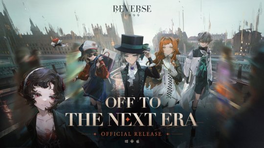
Hello! Today I'll tell you my first impression about a new gacha game that just release it's global version not too long ago, "Reverse:1999". I preregistered this game and mind you, I actually had zero intention to add more gacha games into my sleeves especially the turn-based ones, but the art... The ART man!! It caught my attention soo let's dig in!
Before we start I'd like the readers (you) to know that I've been playing gacha games daily for a considered long time, since 2017 and still going on today. Although not a lot of them so here are some that I've played for over 3 months (pretty much understand the overall system):
Fate/Grand Order, Arknights, Genshin Impact, Honkai/Star Rail
Bold are my main daily games. And then here are some that I've tried, well at least I know their UI & prologue lol:
SAO MD (discontinued), Food Fantasy, Granblue Fantasy, Punishing/Gray Raven, Tower of Fantasy
I might bring up some titles to compare and most likely from between the "over 3 months" ones. Then, let's start!
What's the big deal of "gacha game" and why I play them?
I like to draw and gacha games have one of the best community for art clout. No this is serious, and one of my top reason of why I'm playing this borderline gambling type of game.
Gacha games are living from their banner rotation. The second ones are new characters and story reveal that updated regularly... Don't you think these are real good timings for posting?? They also got those art gods that somehow helped the promotion and attract the peasants (me included) to get to know the story and make fanarts too. I'm not kidding. This is why I've been here since I started digital art. Lol.
But every actions need consequences. Gacha games are very high maintenance to stay relevant, from the player's side. You missing one update, you'll feel like an old man. This is the most FOMO (fear of missing out) type of game. The main sacrifice is TIME. So many things need to tend in one game, and if you play multiple it means you have to spare some hours in a day. If you can't, get ready to lose something. Why I don't say money? Because I'm pretty much f2p, I never really spent my money for gacha. But time, time bro. Time also money! This is also why I write this post.
The Premise of Reverse: 1999
The early story kind of reminds me to Persona 3 where there are some special times (Dark Hours in P3) where an ordinary human can't survive and there are some special creatures than survived.
In R:1999 the special time is called "storm" which will turn back time further from your original time. For example, MC is from 1999 but she's sent to 1920s thanks to the storm. So they made a foundation or something to get back to the original time. Well in a sense this is kinda similar to FGO (Fate/Grand Order)'s Chaldea, maybe that's why I'm so driven to try this game lol. The name of those "special creatures" are arcanists.
Actually I don't really understand everything yet, but at least that's the glimpse I got. Also they tried to fix the history or something whenever they're getting sent back so, basically a fancier FGO right?? I have no problem though.
Setting
The game's mainly set in the west in 20th century. I think this is the main perks of the game, because the entire design and aesthetic revolves around this so it can differ greatly from most gacha games that either have fantasy RPG setting or urban post/apocalyptic ones. Personally I really like this.
The Main Character
The MC is such a breath of fresh air!! It's a woman, and people called her "Vertin". So no, not your typical self-insert anime degenerate persona like most gacha games. Here is a very beautiful EP of her:
youtube
The Characters
The characters are pretty unique imo, you can play as inanimate object (visually) like apple and satellites. The arcanists are the playable (and summonable) characters. So expect to see various 20th century-themed designs.
Also the designs are dope!! They're unlike most gacha games' characters designs where they wore something weird that will awaken your darkest corner of brain but here they're just dressed NORMALLY LIKE A NORMAL FANCY PERSON I'm so glad. Normal doesn't mean boring, this is a compliment. Even the "fanserviced" ones are still pretty tasteful than just put random windows everywhere.
Summoning
This game has a carry-over pity on 70th roll, soft pity started like in the 60th. They use the same gacha currency on both permanent and limited banners. There's 50/50 like in Mihoyo games. You need 180 clear drops (?) to turn them into one rabbit statue (?) for a summon. I think this one is very similar with Arknights. Personally in my opinion this is very generous and reasonable, but I'm a FGO player so yeah my "generous" standard may differ greatly with a lot of people lol.
Oh you also can get guaranteed *6 from beginner's summoning banner.
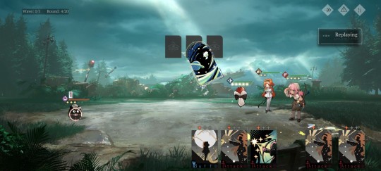
(Early) Gameplay & Progression
The gameplay is like FGO with extra steps. Or FGO with fewer steps... Anyway, it's a card game. Each character has cards you can choose per turn. Once the "stars" are filled you can unleash the ultimate. Honestly? A little boring lol, but things may change once I get out early-game phase. People said this is very similar to 7 Deadly Sins game but I never get close to the IP so idk.
You can set which enemy to hit per card unlike FGO where it's done per turn. Personally I think this is neat. Although among the games I've tried I think Honkai/Star Rail still superior for turn-based system since they can control the speed and whatsoever. However this kind of "fixed" system also nice since you don't need to farm artifacts/relics to be playable.
The early stages are so easy. Well, most games have very easy early stages though, unless a certain popular furry tower defense game (*cough* Arknights *cough*).
For character progression pretty much just level up, no need for artifacts/relics like Mihoyo games so it's fast and easy.
You can set a "replay" for autofarming once you get 2 stars achievement on the node. You can also choose the "amount" of drop rate for just one battle. This is very neat!
Dailies, Weeklies, etc
R:1999 has similar progression with Arknights and Mihoyo games with this one. The daily and weekly tasks literally like Arknight's.
Tbh their dailies are quite a hassle lol, you need at least spend 5-15 minutes to clear all.
And their "battlepass", looks like Genshin's battlepass or HSR's Nameless Honor
Gotta admit between ALL the games I've played, nothing beats the simple daily of LOGIN in FGO (in exchange with disastrous gacha and tremendous farming🙏).
UI & Visual
Maybe I should've put this a little earlier lol.
The UI is AMAZING!! One of the best. Really (once again) reminds me of Arknights, since I like their UI too, and even better I think especially their retro aesthetic.
The visual is GORGEOUS. The game is presented in common gacha game storytelling method: visual novel, however they tried to incorporate like L2D animation in the STORY'S VISUAL.
The characters have different art styles, I think done by different artists like most gacha games (the only one who didn't do this are Mihoyo games, please explain). And the sprites are full body non-chibi 2d animations! This one's like FGO, although still like 10% chibified so in terms of sprite style, FGO still has the crown.
Music & other sounds
Music is BANGER!
I rate it 4.5/5. Maybe the 2nd music of gacha games that I like after Genshin. It doesn't sound like basic visual novel ost (looking at you FGO and HSR) in most part, tho since this is basically *still* visual novel, so in some part still sounds pretty stale after you heard it so many times.
The voice over is dope! They used various accents, so it's pretty interesting!
Housing/Dorm
The name of housing/dorm in R:1999 is "Wilderness", something like islands. This is once again reminds me to Arknight's "Base" but outdoor.
End game
Honestly I haven't found the endgame content for this one, if you're looking for challenges maybe games like Arknights and HSR still better choice.
Conclusion
Based on every gacha games I've played, I can say progression, UI, and summoning from Reverse:1999 is similar to Arknights, but turn-based and A LOT easier at the start. If you've played Arknights before I think understanding the system will like walk in the park.
For the story it's somewhat like FGO, of course not the same, but still both are "correcting the history and go back to our time" kind of story.
The game doesn't ask much, so I think if you're a gacha game player and barely have any time for more games, this one's still enjoyable with very minimal investment. Suitable as your 2nd, 3rd, or even 5th gacha games. Especially when you're just want to vibe with the art and setting like me.
If you're new in gacha game, there's no problem with trying out this, but I think the game is made with thought that the target market are people that familiar with gacha games. Still, enjoy your time!
Tl;dr if you still want to play your main games daily while join the Reverse:1999 bandwagon, it's totally possible without sacrificing much of your time.
17 notes
·
View notes
Note
hey steph! i hope you’re doing well!! i know you have all the fics you’ve read in a masterlist doc you made yourself, and i was wondering if it was worth the time it took to make that? if so, do you have any tips on how to go about doing that? thank you :]
Hey Lovely!!
I am SO sorry for the delay in a reply to this... I saw it and then it just got buried LOL. I'm SO SO SORRY, wasn't intentional!!!
I do indeed have all my fics listed on an offline RTF Text Document (not even a word doc, it's Apple TextPad lol) and OOOF when I first decided to start filing it, UGH it was A CHORE. I'm talking a LONG time because I went through, at the time, all 500 of my bookmarks and just spent DAYS AND DAYS of holiday time just copy pasting them all into a tumblr post, and then copying those over to the lists. I chose to use the Tumblr formatting since that's where it would inevitably be posted to.
"Why not use a spreadsheet??" I've been asked before. It's literally because I hate spreadsheets, I don't like using them, and by using an RTF formatted document I can keep the formatting consistent between Tumblr and the lists offline. I wanted to make it as PAINLESS and easy as possible to copy-paste between Tumblr's ever-changing UI and my offline lists. I literally just have to double click a block of text and I highlight the whole rec :)
Now, at the time I thought I was wasting time doing it, thought it was all for naught re-reading EVERYTHING so I could properly add tags to fics that didn't have them or so I could sort them better. But it's now 500 more fics later, and I'm SO glad I streamlined a process to do it. Having the posts this way, WITH my own tags makes it MUCH easier for me to call up the fics you guys are needing, or if I need to make a quick-list in-a-pinch. It was well-worth the time to initially sort the bookmarks. It's worth the time to format not-read fics on a separate list so I can quickly find them again and add them to my Bookmarks list already-done. And I keep going back to my bookmarks every couple months to add those new fics to my offline lists.
That said... it's a lot of work, and it's REALLY fortunate that my OCPD actually functions well for this kind of website. I like digital organization, and I'm meticulous about how things are organized, because it feeds that need for control in my brain. So I can say it's ALSO not for everyone, but if you're just looking to do it for yourself, just add tags to all your bookmarks on AO3 (make sure all your bookmarks are private, otherwise the authors can see what you're tagging or noting them as. All my bookmarks are private because my tags are all spoilerific and I don't know if those would show up for other people).
BUT if you want to run your own blog, check out this post here for some past things I've written on the organization and time management tips for your own :)
Finally though, Yes, it's worth it. While not getting the traction I used to, I know that my recs bring joy to people, and honestly being someone who people can come to to find what they're looking for is heady and humbling. I love being able to leave my mark on the fandom in some way. :)
Sorry again for the delay, but I hope this helps answer your question. Please don't hesitate to ask something else if I missed anything or misunderstood <3
18 notes
·
View notes
Note
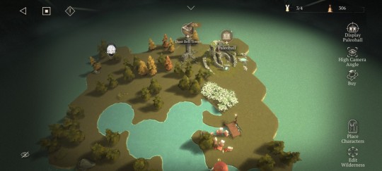
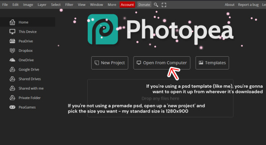
Hiii love! I like how you edit your screenshots with pictures of traits, moodlets etc. I was just wondering if you know any tutorials for Photopea? I'd love to use it too but I'm a total noob with photoshop/photopea and psds in general😭
Thank you, love!!
I'm honoured that you've asked this, but I wouldn't consider myself an expert or even really proficient with photoshop by any means 😭😭 i just kind of shove stuff together and hope it works, I'll try my best to explain how I edit below, but I apologise if it's not very clear / efficient! this is just the method that works for me
This ended up being quite a long post but I've tried to condense it where I can! ⬇️
I really recommend these bepixeled tutorials, specifically the ones linked on this post - doing photoshoot pictures & banners got me familiar with the tools of photopea when I first started out, so I'd suggest following those if you want somewhere to start :)
And I'd also recommend the tutorials by erasabledinosaur which is how I learned to do the UI elements, I also rely heavily on this icon pack from MTS as well as random pages from the sims wiki here and there - I also reblog other people's tutorials & presets sometimes under the 'resources' & 'tutorial' tag on my blog
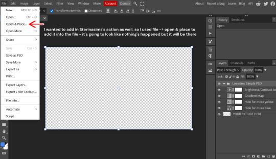
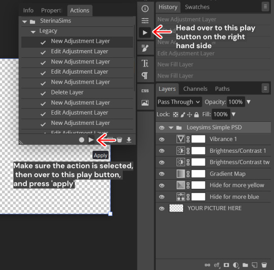
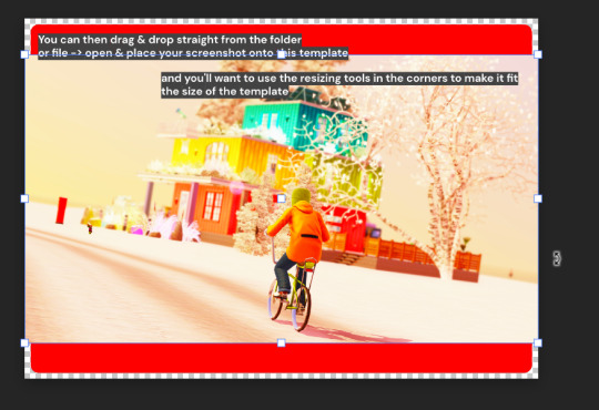
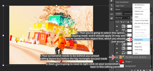
I make heavy use of presets, so I don't really do that much of the editing myself - a while ago I answered something where I showed my main preset, but basically, I've combined this one by Strangecowplant and this action by Sterinasims, along with following this tutorial to create a curved outline - I shoved them all into one PSD together
Here's a little tutorial of how I built my franken-preset from the ground up (click through them to read):
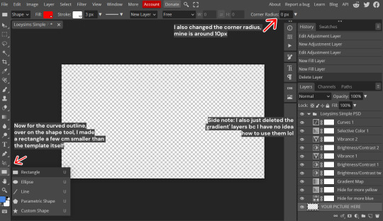
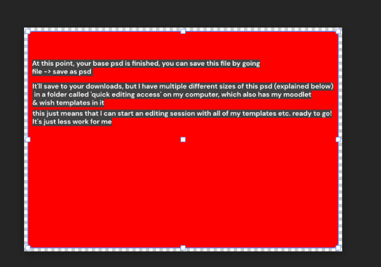
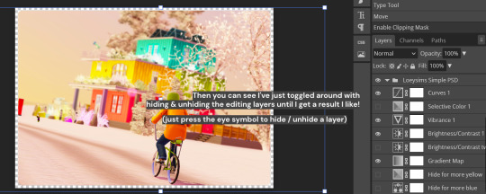
I have 3 sizes of screenshot template to choose from when I'm editing (all use the same tutorial above) I've just resized the base template under the 'crop' setting on the left sidebar & resized the rectangle as necessary to fit the size too
Here's what my screenshot sizes look like:
1280x900:
1280x450:
980x980: (these are good for stacking in a post as multiple tiles)
Generally, I think learning how to photoshop requires a lot of trial & error, I spent a long time just cautiously following tutorials like a snail until I got the hang of the tools and was able to start improvising with stuff, there's a tutorial out there for almost anything you could think of! just stick with it and you'll get there with practice :)
Wishing you the best of luck, I hope this was helpful 💞💞
12 notes
·
View notes
Text
Devlog 1 (technically)
Hi there! I just started this blog to detail my adventures of gave development, partially to try it out and partially to try and motivate myself, I hope you enjoy my suffering. Today was the second day I've worked on... er... '2D Test' (That's the file name lol), I have no plan! I'm just implementing things! Maybe it'll become something. I just really wanted to start developing again.
So, yesterday I had the day off (I'm ill) so I had lots of time. First, I implemented movement, it's a top-down 2D game so that was easy! Then I spent like 2 hours trying to understand timers, but eventually I got a sprint function in with a cool-down, and even some terribly duck-taped in UI to display it. Yesterday I also drew grass and path tiles (+added a tile map) As well as a temporary character sprite which is, hopefully, my profile picture.
Today I was super tired after school (thanks illness) so I did some more chilled-out tasks... kinda. I started making (maybe) a soundtrack (see below) with a software called 'musagi', it's very cool, makes great 8-bit music but it was last updated in 2008, so it's really just trial and error. I made pick-up-able pick-ups, and started on an inventory system as well today.
That's it for today, I doubt I'll post every day (or every day I work on it) but I'll try to keep these short and frequent, unlike this one lol!
I guess I need a cool sign-off?
May your code never have unseen issues,
a-snail-dev / Snailcheeserulz
5 notes
·
View notes
Text
Awake at the end of 2023 + Updates + Artbomb Incoming
Long time no see guys! And I hope you all doing well too. Firstly, I want to say thanks for all the support since 2015 (especially for the IG friends I met back there when I was new) till this day which a lot of you enjoyed my art! Almost a wonderful decade full of Lonks heh.
Maybe it's really a thing that I should separate hobby and work, since I'm working at a more professional creative work (illustrations, branding, UI UX and side stuff like working as video editor) which I'm currently passionate about, and I need to put aside fandom stuff for a while since I needed lots of time and space for managing my IRL stuff.
I felt bad too that I made some of my online + IRL friends worried, heh. I'm actually doing fine, better actually. Also trying to touch grass too, like actually going for a healthier lifestyle :D I've been investing my time for gym and morning walks.
However I'm planning a comeback again just to post some fresh art too, along side with a collab which I spent a long time to finish. Also including the ones that been sitting as an unfinished eternal WIP on my files! Here are some spoilers :
Collab Pieces (full color + random alt sketches of it)
Some old art + WIPs
New art that I recently made in mid 2023
As for future art (both LoZ / other fandom / personal art), I can't guarantee that I will upload often due to my limited time to do fandom stuff, but I can guarantee it'll to be more of polished quality rather than quantity. Hope you all have a nice day, and see you on the flipside :)
8 notes
·
View notes
Text
Development on an update of Earthsong continues slowly. We've had a heat wave here in Australia and our aircon broke, so staying in the house at all, much less using the computer, has been hellish.
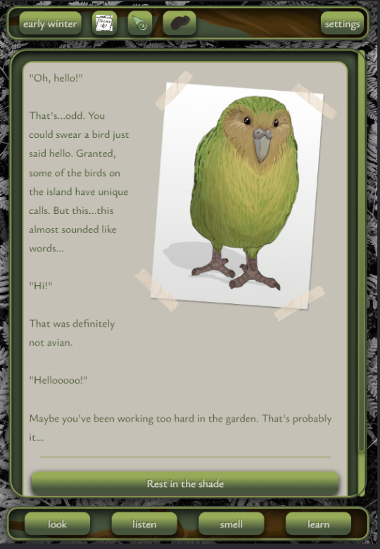
I'm sitting outside writing this - the heat broke this afternoon with a sudden brief bout of rain - and the creature I've heard on my roof for the past few months finally hopped out to say hi. It's a quenda (bandicoot)!
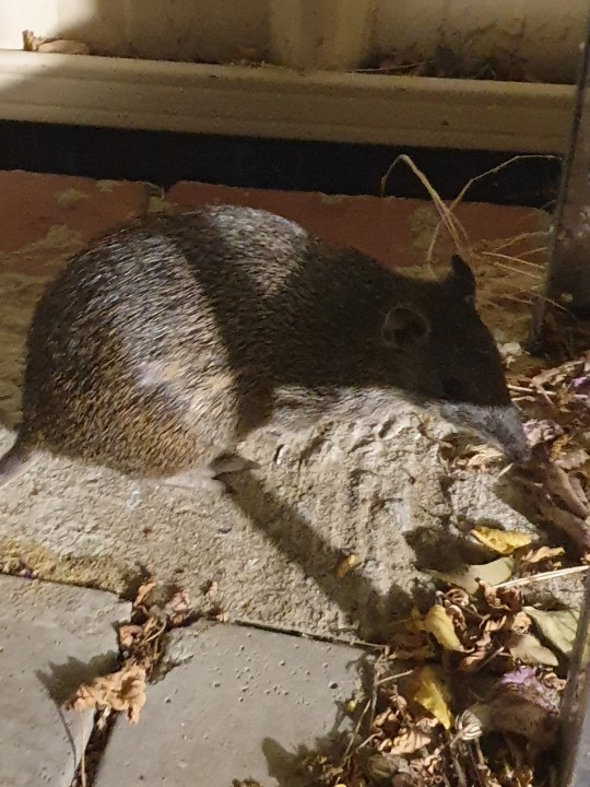
I take it as a good omen - I spent a lot of time today on Earthsong, but I really do need to write about what I know... And that's Australia. The setting is shifting to a pretend village or island in Western Australia with a quokka as the guide. Quokkas are not only adorable and known world-wide, they are also a vulnerable species, with their mainland numbers and spread diminished greatly in recent years, so it will still serve the same role as the kākāpō did in the original jam game!
https://www.dcceew.gov.au/environment/biodiversity/threatened/action-plan/priority-mammals/quokka
Visiting creatures will still include birds such as cockatoos, magpies and ibis, but also creatures like my backyard's quenda helping keep pests out of crops or an echidna serving as a bioturbator.
The game has shifted to more of a simulation game as a way to work through grief/depression, with hobbies you can choose, changing room descriptions based on things you do as well as time of day/seasons, a village to participate in and nature to explore.
I've been updating the UI. The background images feel too busy and the icons are placeholders so I'm not done with it yet, plus I will be swapping this all for Aussie creatures!
Today I added this unskinned (it will look nicer when done!) journal system - the eventual goal is to give players a way to work through feelings as they experience them, to help process grief. Take a look in the video below!
Check out the original jam version, set in New Zealand, bugs and all (please read the itch.io page for details on how to bypass those bugs):
Follow me here for updates!
#game dev#earth song#Earthsong#simulation games#therapy games#grief#healing games#introspective games#introspection#australia#quokka#quokkas#cathartic games#twine games#text games#intfic#twine interactive fiction#interactive fiction#western australia#bioturbation
2 notes
·
View notes
Text
Limited Life mechanics breakdown: session lengths and timer desync
I don't think I've seen anyone mention these things yet, but by looking at the final timers at the end of everyone's Limited Life episodes, they all end near a :30 minute marker, not an hour, meaning that during the first session only 2.5 hours passed in-game. The creators have mentioned 3 hour sessions recording this series, but looking at the end of everyone's episodes, the timers indicate that not all of that is spent in-game.
Additionally, the visuals and function of the time mechanic struck me as very reminiscent of Grian (and Scar and Joel's) 100 Hours Hardcore series mechanics from last year, and if that's the case, there are some slight ramifications for how the timers work in-game.
(a lot of) Thoughts on how I arrived at those conclusions and what they might mean for the series are under the cut, but the summary is this:
If this week's 2.5 hr game time isn't a one-off, the 24 hour timer would be spread out to last 1.6 additional sessions compared to if there was 3 hours in-game time, meaning the series will likely last a bit longer than the estimates I've seen on my dash. Additionally, player countdown clocks have started to and will likely continue to experience slight desynchronization from one another because the timer mechanic is stored per-player, only counting between their login/logout times.
To the first point, what does it mean that we had only 2.5 hours pass in game in the first session, and what's the impact of that?
We can't discount the possibility that 2.5 hours was a session one exclusive (i.e. all future sessions will spend 3 hours in-game). There's a benefits for this: mainly to allow for troubleshooting the new mechanic, but possibly also to offset the player timer by a half hour to add tension and time for people who are about to drop from one color to the next (ex. Skizz has 30 mins at the top of next session to prep before he turns yellow)
But it might be a simpler conclusion to adjust the 3-hour figure that the creators have mentioned. Sessions are 3 hours, but 30 mins of that time could be spent out of game. The ccs have mentioned they take a break during their sessions, and they might chat after? During someone's outro there was a chat message in game saying to hop in Discord. Either way, its reasonable to guess that 2.5 hours in-game may remain constant for this series, and may have been the case for previous series as well. I feel very weird speculating about the actual recording processes of the real people making this series, so assuming this is true I'm moving on to what it would mean for what content we will get.
If having 2.5 hours of in game time remains constant for the season instead of 3, the theoretical max # of sessions that we could have increases. A player could last 8 weeks max with draining only 3 hours per week. But with the same 24 hours divided into 2.5 hour in-game sessions, a player could survive an extra 1.6 sessions, or a total of 9 full weeks and an extra 1.5 hour session/extension.
I'm sure we won't get to ten weeks, and I don't even think we'll get to nine, but it's not impossible and it depends on how players end up using the mechanics available to them. Strong or aggressive players who take time from others and protect their own could theoretically live for longer than 24 hours total in game time, but knowing this group of clowns, (three boogieman rerolls in session 1? 9 deaths?) we've got 7-8 sessions max. I've gotten off track to game theorizing, but basically, we can slightly increase our estimates for how long this series will last if they continue to only spend 2.5 hours in game per week.
Okay, but what am I talking about with timer desync?
When Grian first posted his teaser on Instagram, I noticed that the red color and clock ticking appeared to use the same UI as the 100 Hours in Hardcore series he started last year, and the similarity was much more clear with the Limited Life ep 1 release. But because of the way the clocks worked in the hardcore series (counting only when the player was online), I was curious about timer synchronicity on limlife.
My prediction was this: the timer mechanic from 100 hours is the basis of limlife's timers, meaning that time is stored per-player, and different login/logout times are going to offset people's times from one another
I figured the best way to check would be to find a moment from late in different players' episodes where two players meet, presumably after the session break (logging out would desync timers if applicable). So I lined Pearl and Cleo's videos next to each other to find this:

:13:29 and :13:37. These screenshots are synced within a second of the same audio cue (Pearl exclaiming "Cleo!") but their timers are 8 seconds apart.
What's going on? Presumably, Grian did grab the same base mechanics that made the code tick in the 100 hours in Hardcore world from last year (similar time mechanic, he even says in that series that they used the same server). With that in mind, the way timers are currently handled in the limlife series appears to be the following:
At the top of session 1, a command was executed to start a timer on every player for 24 hours. That timer becomes that player's timer, and will continue to run as long as they are on the server. When players log out, they are not present, and their time will not be updated. All timers would have been in sync from the start until the first break, from which we start to see the discrepancies above. This is still a reasonable way to handle the mechanic, considering that the 100 hours code which is already written is tied to the player, and is likely easier to modify than rewrite. When a player dies, is killed, or gets a kill, the code can change the time attached to that player directly and give them the update.
While this shouldn't cause major changes, it also means that unless something gets built into the server to equalize player timers, or unless the code is rewritten to hold a main timer in the server which is modified per-player, we're likely gonna start to see people's timers drifting and desynchronizing much futher than a few seconds as they log at different times. We can already see it beginning with Pearl and Cleo's videos above. This system might run into issues if a player has to miss a session, as they would have to be manually lowered to balance their time, or else they'd be 2.5 hours ahead of the rest. Though maybe they won't adjust if sessions are missed, because a player with extra hours is very tempting bait for a boogeyman or a desperate red.
In proposing a change, I would suggest the server keep general time, and players store a "modifier" on their personal time. Example: Imagine 4 hours of in game time have passed and Impulse has died once. His modifier is -1 hour, so the code would call the server time (20 hours left) and his modifier to produce his time remaining (19 hours). This would solve the issues of desync from differing login/logout times, needing to skip a session or internet issues forcing a disconnect.
It's possible that an adjustment is made in the future weeks, but that would require the time discrepancies being noticed, and it actually being deemed a thing worth adjusting. I say this with fondness, but I'm not sure Grian, who's forgotten to change the server difficulty for multiple (every?) series will notice this, and quite honestly the code they have should work just fine for this group. They are all incentivized to be on the server with their clocks ticking to make content, so no one's going to cheat by logging out to save time. And considering the end of Etho's video showing the game chat, it seems like no one even logged out until at least :29 so player times are going to be close enough to in-sync, even if the numbers aren't exactly aligned.
The above analysis kind of assumes that timer desync is a problem, not a feature or a tolerable side-effect, which it very well could be. I only really see this becoming a point of contention if any players, but especially the last players standing should have their timers expire at the same time, but end up being displaced by a few minutes because one of them had logged out faster the days before. I'm personally holding out hope that the last people standing are allies who can lay down their weapons and run out of time together, but with the desync they don't have the option to go out at the same time unless they realign by coincidence.
At the end of the day though, while these guys are making content for us as an audience, they're also just having fun playing a game, and it doesn't really matter if it's perfect or not. I am gonna be delighted watching this series unfold in the hands of these talented folks over the next 6-8 weeks!
---
If you made it this far, thanks for reading! I meant to finish editing this a few days ago so if this has been mentioned by someone else in the meantime and I missed it, ah well, but hope the breakdown was of interest to someone aside from myself anyway!
15 notes
·
View notes
Note
I feel down about lack of artistic skill. So many IF authors are knocking it out of the park with their UI designs and promo images, and I'm here getting stressed out on canva struggling to even make a nice looking simple "game updated" banner with text on a background. are there guides anywhere on how to make these banners? are they really needed to get people's attention? (they feel like they are... the most popular blogs seem to have loads of shiny visuals that are really pretty but I just don't have the skills right now...)
Hey Anon!
Don't feel down...
This is really not something that happens overnight. Sure, some artistic talent will help start you off, but it is still a skill. One you can learn. But like all skills, it takes time to nourish and make it flourish.
(and that amount of time needed will depend on the person.)
Also, Graphic Design is a very broad field. In the IF community, it will often embrace two different things: the UI, which requires learning a programming language (CSS) and the assets (including promo images), which requires learning about aesthetics, a graphic program, etc... These are very different skills to learn.
So you will make mistakes along the way, everyone does. It takes quite a lot of trial and error (with a lot of error) to get it right, then to get it right and quick. That's part of the learning process.
And, I can't lie and pretend innate artistic talent won't take a big part of making this process easier. Knowing how things should look, nicely or easy on the eye, is very helpful to make the whole process faster. As well as having studied those skills before starting making IF content (like in school/uni, or having learned by spending decades in a fandom making those weird little edits and banners for your forum signature that you spent hours making sparkle....). Or, in some cases, the author was able to get assets directly from someone with those skills (as paid content).
I don't know where you are on your IF journey, but don't despair. I know it's hard not to compare yourself to other authors and their skills (I know I do that, and have to remind myself not to do it), but you don't know how far they are on their graphic design journey. Maybe they struggled like you, once.
I know I did...
... and I still do!
This post is getting quite long, so I'll share my lil bit of experience below.
I've been on the internet for a while (when Forums were the thing), and learned a lot of those graphic stuff through graphic design-help forums (some where full on forums, others were just sub-channels, but you got to learn from someone with knowledge, that was cool).
Also didn't realise then the use of images. I def used copyrighted images when I shouldn't have... the early naughties were a different times (and so was I, being 12 and all...)
But, before starting IF, I hadn't touched Photoshop or other Graphic Design program for about... 15 years? I had lost a lot of skills in that time. I had to relearn a lot of things (as well as learn some new ones, CSS had never been in my wheelhouse).
It used to take me hours to make banners and the such. I fawned over other creators' ability to make gif (which is doable on Canva), or have the perfect aesthetics to match their project (and their drawing skills...). For CRWL, I spent days on Canvas editing the main banner, because it didn't look right enough. I've re-done that one a couple of times, and I am still not happy with it.
Even after almost two years of doing this regularly, I still struggle. I can spend days/weeks on a UI to make it look nice and have the right palette, only to realise when it's published that the sizing messes up for some people. And I still spend hours on those Coming Soon posters (and then forget I have night light on my devices, so it messes with the colours). And have we talked about the time spent trying to find the perfect picture to use (on copyright free websites)?
Though for smaller projects, I might slap two things together and call it a day. You can't go wrong with a simple colour background and a special font.
#confession time#creator#design#graphic design#sorry anon I don't know any guides#I go by my feelings :grimace:#if-confessions
12 notes
·
View notes
Note
Hi! I'm out of the loop but are you also part of the team in "deluge sermon of the dead"? If not, then I'm 99.9% sure that someone is using your CGs of Castoria and Castor in it without permission
No worries! I'm pretty much out of the loop with everything myself xD I'm gonna be super duper lazy here since my arm is still broken, so apologies for that, but basically, I've had a couple of emails in the past asking the same question, so rather than type out something similar, I might as well just be lazy and copy/paste what I said before in an email reply to someone x3
And it's really nice of you to take the time to get in touch to let me know, btw! I appreciate it :3
The short(ish) answer is, I'm not part of the team who worked on that project, nor do I know any of the people involved in it, but it's okay because they haven't done anything wrong, we just both happen to be using the same sprite asset packs from an artist who sells assets. The main difference is that they're using them as they come, and I edited them in GIMP to avoid using the default versions.
I'll put the longer version below :3 Thanks again and I hope April is going amazingly for you!
(copy/paste begins here)
In this instance, it's all good. Basically, I can't draw to save my life, so any art that's in my games is either stuff that I've purchased in sprite and background asset packs (and then edited myself), or collaborations with awesome artists.
All the sprites in Darling Duality are from a Japanese artist who sells their work in asset packs. But the trouble with asset packs is that if other people use the same sprites, then you'll have what looks like the same character in different games >.< That's one of the reasons why I always take the time to recolour my sprites in GIMP :3
So that blonde version of the sprite I used for Castor/ia that's on that page is basically the default way that the sprite comes when you buy the pack (and the outfits they've used are from a bonus wardrobe pack that I also own and plan to use in the future!) Even some of the other sprites in their screenshots are ones I own too from a different asset pack by the same artist.
Most people seem to use them as they come. So even if I can't draw, I can at least make my versions of the sprites look more unique by recolouring them ^-^ It took a while with Castor/ia, but I feel like it's worth it. If you ever see the exact version I've used anywhere else, then it probably means it's stolen from my games because I spent ages making that particular mix of colours for the hair and clothes. It would be quite suspicious if someone managed to copy the exact colours I've used.
I also own pretty much all of the background art assets they've used in their game too, haha. Background art assets are almost all by the same few artists, so a lot of indie games end up having the same backgrounds, especially from the Japanese artist known as Minikle.
I've learned a lot about image editing over the years, so recolouring is quite fun + I can make my own UI assets nowadays too, but I still can't draw very well T_T haha. I always prefer to collaborate with artists when I can, like I did with my most recent release (Bitter/Sweet Blythe) where I got to work with my artist friend Lazy Polar Bear again :3 Cos it's always more fun to team up with people than working alone + it's always nice to have sprites that are 100% original.
Anyways, thanks so much for reaching out :3 I hope you're having a great 2023 so far!
(copy/paste ends here)
9 notes
·
View notes
Text
Devlog: ECTOCOMP & Bare-Bones Game Jam(s)
Final devlog!! Late night, brain-empty thoughts comin' atcha.
This has been a wild month, but I'm glad to say I have finished 2 games within it. I haven't really parsed how I feel about it--probably because I've spent about 25hrs in the last two days starting and finishing game #2. Proud? Probably proud.
But Laurie, no one asks, what about that game you talked about ages ago? You had cover art for it and everything. You invented (and purchased) merch for it because the idea cracked you up so much. Well, dear player, what happened was I fell really in love with a story that kept growing. I realized if I was going to get it done before the end of October, I'd have to cut a lot of things out of it. I decided it was worth it to do it right. Never fear! The project has been moved to Nano and will (fingers crossed) be published by the end of November. I got about a third of it written, I love the characters so so much and I didn't want to rush them.
I decided that with about two weeks left before the end of the jams. Plenty of time to do another small game and I thought it'd be really neat to get 2 games finished. And I had a ton of ideas--teens break into a Spirit Halloween to do a seance and shenanigans happen; you've been set up on a first date for Halloween and the order in which you, well, order your food determines the ending you get; it's the far-flung future and your a teen on a space ship feeling disconnected from the life you know and a friend found some old Halloween party guides from earth and is throwing a Halloween party--and as much as I liked them, I never found the spark that makes a story catch fire for me. I was ready to be content with the game I had made.
Until 3 days ago. When the opening line "Honey! I've got some hair wrapped around my toes." popped into my head out of nowhere. Suddenly, this horror story develops whole cloth in my mind. And it's...a kind of horror I don't usually engage with. It's uncomfortable to write. I feel a little conflicted about publishing it. It's not about Halloween and I really wanted to make a game about Halloween! But it's done so I am. There are enough narrative things I find interesting that it seems worthwhile to share. And it's pretty good horror.
I still have to finish some backend stuff--write copy for the game page, finish some placeholder text in the game itself. I ended up going with Twine (Harlowe), even though the UI makes me want to cry. I knew I wouldn't be able to figure out pathing and variables well enough to make Ink work (not without something even more clunky than what I've got). And I really needed italics and base Ink doesn't do italics
Anyway, that's all. It's late and I should sleep but I've spent so much brain writing the last couple days I'm enjoying vegging out with youtube. I'll do a post mortem for both games because I have Feelings about them. And I get a whole 2 days without writing nonstop before nano starts! 😂😭 Thanks for reading!
3 notes
·
View notes
Last Seen Blogs

seraphmeraph
sera

mothdebt
mothdebt

gauss182
Stuffs

margot-shop
margot

jeanyveschasle
½ mile of paper