#image vs object representation
Explore tagged Tumblr posts
Visit Tumblr Blog
Explore Tumblr blogs with no restrictions, modern design and the best experience.
Last Seen Tumblr Blogs


Fun Fact
The most popular pages on Tumblr are about Minecraft, GIFs, and David J. Peterson.
Text
2nd scenario / ending 001 + a few other ends spoilers but some scattered semi coherent thoughts abt a certain character. also long!
I don't think I'll ever really get over Karua Kashimiya because besides all the narrative haunting she already does not just to Takumi and Nozomi but pretty much the entire overall plot and its 100 lines, she is also the closest thing to an actual "God" as presented in the story with its themes.
I don't think it's a stretch to see the religious parallels of the SDU as a literal heartless army of hell wreathed in dark purple flames with dark halos vs the holy/angelic Futuran paragons of various virtues fighting to save their planet from invaders, but besides some easy surface level themeing, I think the idea of "God" that THLLDA presents is so fascinating given the whole reason the war even happens.
Humanity in Hundred Line killed their God. The Futuran religion claims that their planet is alive and a God in and of itself that grants power, with V'ehxness' ultimate goal being to replace this position among the planet and become the new object of worship. World Death happened to Earth because humanity didn't respect their planet and continued to abuse it to the point where they didn't just kill their God, they drove it to suicide, leaving the planet uninhabitable. The planet was God, and humanity killed it. Murdered it.
I think V'ehxness' route also showcases a lot about how the Futurans view their own God, even through her distorted lens: God grants power to maintain peace. V'ehxness' goals in replacing this God lie primarily in usurping its position and what god represents: an unthinking, unfeeling symbol that stands as a representation of power, used to maintain peace, a symbol of hope that let's people see the future. This is a belief so ingrained into her that not even murdering her pious father let her escape it, because the power granted by God also binds you to it forever, with V'ehxness choosing the silence of being unthinking and unfeeling to never have to be bound again, a new God born from a self-made martyr.
You cannot escape God, because God is tied to life itself. You cannot live without a planet (God), and this endless war on Futurum persists as a war for survival because of it. A fight to claim God for themselves.
So what does any of this have to do with Karua Kashimiya? Isn't she just an imprint of Nozomi overwriting Takumi's fictional childhood best friend placeholder from his implanted memories?
Sure, she is. But that's also impossible. In-universe, they give the explanation that Takumi's glimpse of Nozomi and how she would speak to him is what created Karua Kashimiya in his mind, made in the image of Nozomi.
But that's impossible, because she is real. She's always there, right by Takumi whether he realizes it or not.

The impossibility of Karua Kashimiya lies in how her mere existence completely broke time within the world of Hundred Line, and in Second Scenario specifically ended the curse of humanity upon Futurum.
The thing about Karua is that for all of her overlapping traits with Nozomi, she shares a critical, fundamental difference: She rejects humanity.
Every flashback Takumi has with Karua has her talk about wanting to leave the TRC and experience the real world. She's always talking about wanting to experience natural phenomenon like the sky and rain and sunlight completely separate from everyone else, just her and Takumi in nature. She's obsessed with researching the past but not to retread humanity's footsteps, but rather leave her own.
Now, with the context of these being implanted memories made to motivate Takumi to fight, it can certainly be taken along the lines of "Take Reclaim this planet so that your dear sweet Karua can live in it", but one specific scene breaks this line of reasoning: The diner scene.


This one scene breaks everything, because it HEAVILY implies that Karua is aware that she won't be there forever, almost like Karua knows she isn't a 'real' person, and that her being is based on someone else. Like she's preparing Takumi for the pain that he will feel without her there.
Karua is more self-aware than we give her credit for, because the study session flashback is perfectly timed to let Takumi find out about the Artifical Satellite. Even in the background, through Takumi's dreams meant to continue brainwashing him into subservience, she's giving him small pushes of outside influence. She's protecting him even if he doesn't understand it.

Karua's memory and her will is specifically what saves Takumi so many times throughout the various routes, all the way into Second Scenario when it's what leads to him breaking Sirei's brainwashing and find out the truth.
Karua Kashimiya rejects humanity. She rejects humanity because despite how she has Takumi promise to protect her, she's always the one protecting Takumi. Karua's flashbacks all connect her to nature far more than humanity itself, ironic given that she's supposed to be a memory meant to make Takumi favor humanity. In the study scene, she even outright says that she doesn't like the TRC or trust the people in charge, wanting to leave humanity behind.
She's always been an outsider, an irregularity that shouldn't be there.
If these memories were made to make Takumi want to protect humanity, then they failed, because his priority was always Karua over humanity.
Almost as if she wanted Takumi to not choose them in the end.
Karua is alive, and has a will of her own, even if she exists as just a disparate collection of memories in Takumi's mind.
God in Hundred Line isn't just the physical planet, nor is it just the Futuran religion, but something that persists and weaves itself into every part of the story. Every action Karua Kashimiya has taken was not for humanity's survival, but Takumi's. It was her promise. It was hope.
The concept of hope is God in Hundred Line, because it's what ensures the future. You cannot live without a planet, you cannot live without God, and you are always bound to God. And it's why V'ehxness the literal Paragon of Hope is tied to the idea of supplanting God and becoming a God herself.


These two are the exact same. Karua Kashimiya and V'ehxness are the logical extremes of what hope can be, since V'ehxness is the outright impossible power that can forge any path while Karua is the small happy memory, the small faith that gives people (specifically Takumi) strength to go on. Karua Kashimiya is always bound to Takumi Sumino, always letting him persist, always giving him strength.
The strength it took to do the impossible and go back in time. To irreparably damage the laws of physics to try as many times as it takes to save the future.
Second Scenario ends with Nozomi, the original being that Karua was based on, ending humanity's curse once and for all. The will of humanity, even after all of humanity dies in second scenario, demands that the SDU continue to fight. To kill the enemy. To fulfill humanity's long dead dream. To uphold the strength and honor of the indomitable human will to always persist. They're a grudge, a curse of a species that chose to persist no matter how monstrous they became in the name of survival, exactly what Dah'lxia calls the SDU and Takumi for wanting to survive even though they are furthering the genocide of a planet. You can only get the Second Scenario ending if you try to persist in humanity's name, only to end it at the last moment.


The person Karua Kashimiya is not real, and yet is as real as any of the SDU members can claim to be, a fictional character brought to life. The only true difference between Karua and the SDU is that she actually was based on a real person: Nozomi Kirifuji.
Even then, for all that Karua takes so many traits from Nozomi, they are fundamentally different people. Nozomi might have chosen her friends, but Karua chose Takumi.
Just as real as the rest of the SDU, Karua appears at the last moment to support Takumi in his final choice. To end humanity's grudge and pass that hope onto Nozomi, to prevent a tragedy like this from happening ever again.

And Nozomi (Karua) thanks him. For protecting her and keeping his promise one last time.

Hope for the future didn't originate from the SDU, from Nozomi or even from Takumi going back in time.
It came from Karua Kashimiya when she asked Takumi to protect not just her but her wish, to have him live not as a weapon but as a person. The true value of humanity was shown when Karua's will was inherited and even at her lowest point, Nozomi chose to end the war despite her suffering. She let go of her anger. She chose the future.

Stuck in an endless war, Karua Kashimiya the impossible girl created this impossible miracle. She was always there for every step even if she wasn't 'real'.
God was always watching. Karua Kashimiya was always there, and wanted you to reach the future.
#karua kashimiya#ARGHGHGHGHGH kinda scattered and disorganized but im rotating this girl in my head forever and ever#thllda spoilers#the hundred line last defense academy#the hundred line last defense academy spoilers#thllda#zerav meta
42 notes
·
View notes
Text
Cywhirl vs. Cygate: it’s about the aesthetics too
I’m about to make my ship opinion way more complicated than it needs to be :]
Abstract representation of how I see Cywhirl:

Abstract representation of how I see Cygate:

These take into account the colors, frame sizes, shapes, and relational dynamic of each. (And yes, I used the eye dropper tool for this, so the colors are definitely accurate.)
The Cygate image isn’t objectively ugly; in fact, I can see why some might like how it looks and feels.
However, I have a strong personal preference for everything about the Cywhirl image.
One character’s colors don’t dominate or drown out the other’s with their intensity. Neither side draws the eye away from the other. There’s balance in color and form.
Meanwhile, the contrast in Tailgate’s colors makes them seem stronger than Cyclonus.’ Tailgate is the focal point. There’s a clear imbalance in both color and form.
So, while Cygate is fun to look at with its pretty colors and contrast, Cywhirl feels more solid. More significant.
Aesthetic harmony isn’t everything, of course. This isn’t some kind of hard-and-fast rule for me.
There are ships I like that don’t adhere to any “rule” of aesthetics. Simpatico is one such case. Nautistorm is aesthetically superior to me, but something else more significant keeps me coming back to Simpatico.
However, in the case of Cywhirl vs. Cygate, because of my dislike for the latter, the aesthetic juxtaposition of the two relationships stands out to me way more.
#me: it’s just an ask meme about ships#also me: …hold my beer#nova’s ship opinions#i’m beginning to think i should have gone into character design instead of medicine#oh well#power and economic security are more useful
24 notes
·
View notes
Note
Hello! I'm here to cheer you up. Your vent caught my eye, and while emotionally I get it (we artists generally fear stagnation), I want to help you dispel the assertion that you haven't improved. I have both visual proof (your own art + a timeline) and the credentials to back up my claims (digital art commissions from 2014-present, digital art from 2012-present, watercolor/pencil/ink since at least 2004-2015, attended formal classes and workshops in visual arts from 2006-2010.)
As an illustration (lmao) of my argument, I'm going to compare your art posts from June 1 2025, May 29 2025, May 27 2025, and October 4 2024. I've chosen these pieces for my argument because they feature the same character (Kon), largely similar overall composition (bust with 1 hand visible), similar technique (colored digital art), and are within the time frame you're concerned about.
If you've forgotten the posts in question (mood, I've been there), I've also provided links below.
Fig. 1: June 1 2025 image Fig. 2: May 29 2025 image Fig. 3: May 27 2025 image Fig. 4: October 4 2024 image
I understand that art is subjective, so I'm going to break down my thoughts on some objective criteria, and then add some thoughts at the end about more subjective criteria. Objectively speaking, I'm going to discuss the consistency of linework, application of color contrast, accuracy of proportion/anatomy, and representation of volume and texture. I'll start from figure 4 and work my way up the timeline.
OBJECTIVE ARGUMENTS:
Fig. 4: October 4 2024 - good understanding of the material, but hampered by an overall lack of conviction.

The lineart makes use of very short, sharp, inconsistent strokes using what appears to be two brushes with no taper and a large disparity in size. While not a bad technique if applied with purpose for an intended effect, there are a number of erasure marks on the hand and sleeve that suggest there was considerable conflict between vision and final result.
Putting the image in greyscale shows that the colors are very close in level of contrast, which makes it harder to understand the details even while shaded and suggests a lack of confidence in placement of shadow and light.
Proportion is ok; the ratio of hand to head size is fairly accurate, eyes and base of the ears are lined up properly, and while his face is long and thin (foxlike) it is within appropriate ratios. Ratio of hand to arm is skewed, however, as is ratio of head to body.
Anatomy shows an interesting focus on small details; there's bounce light within his eyes, his fingers have visible knuckle joints, and there's a shadow reaching up from his elbow that shows the line between the muscles. Larger areas, however, are more loosely defined.
Finally, although shaded, the image shows little variation in depth and texture; head, hair, and arm are clearly defined, and the hair has a visible softness compared to everything else, but the body is very loosely suggested.
Fig. 3: May 27 2025 - VAST improvement in pretty much every aspect.

The lines are more fluid and confident. There's tapering and weight, the unbroken lines are longer, and there's more variety in the style of the strokes (curved vs straight). Even within the lines that don't taper, or with the lines that are short and sharp, there's a clarity of purpose and vision.
Color contrast and balance is much clearer; there's more variety in the colors used, yes, but more importantly they divide the image into easily-readable figures. His hair, hand, body, and face are immediately discernible even in a small thumbnail view, and he is immediately recognizable as Kon.
Proportions haven't changed much, but they have improved anyway; the ratio of head to body is more realistic, as is the placement of the lines connecting his neck and jaw. Anatomy has improved too; he now has eyelashes and visible eyelids, his ear is more detailed, and the articulation of his hand is more defined.
Finally, although there is NO shading, the sense of volume and texture are much clearer. His hair and clothes puff outwards from the denser areas of his body, and have a very noticeable softness conveyed by the clusters of curved lines.
Fig. 2: May 29 2025 - How did you do that in two days??????

Not only are the lines more visibly fluid, you managed to convey more information with less of them overall, and improved upon the earlier technique of using differently sized brushes; while Fig. 4 showed the disparity in a way that suggested a lack of confidence, Fig. 2 show the disparity used as a purposeful tool to create variety in visual effect, and even the "broken" lines have the sense of being used to create a specific visual balance. The lines don't taper as much as in Fig. 3, but now the areas where they DO taper convey more meaning.
Color contrast is still sharp as in Fig. 3, but has softened very slightly to create a sense of overall harmony instead of opposition, and the areas of high contrast convey more accurate information about the character, such as his bright eyes and red highlights, both of which were muddied in Fig. 4. His makeup is also more accurately conveyed.
Proportion and anatomy have also shown marked improvement. Eyelids and lashes now follow the shape of the eye and face, ear placement is back in the right place, and while his eyes are bigger, they are very clearly drawn that way on purpose. Even the less defined areas such as his neck and hand are drawn with an underlying comprehension; you know what a hand looks like in that pose, and you managed to convey that in such a way that it immediately reads as a hand posed in 🤞 even when the details aren't fully drawn, to the point that my brain fills in the gaps.
You might think that texture isn't going to be touched on because of the overlay, but you actually did clear it up using the aforementioned line weights. His hair looks fluffy and dense through the use of long, narrow curves with thick lineart, and his clothes convey the silkiness of the fabric with the same narrow curves but in tapering lines. Again, like the hand, you only suggested the shapes, but you did it in such a convincing way that every visible aspect is clearly understood. Volume too has improved; his hair is clearly a different material from his skin, clothes, and even eyelashes, and his clothes are shaped in such a way that we understand he not only has a body beneath them, but more layers of clothing not shown.
Fig. 1: June 1 2025 - YOU KEEP GETTING BETTER????

The style of the lineart is largely the same as Fig. 2 but with a more consistent placement of tapering and less breaks between lines overall. There's also less disparity in the size of the brushes, which makes the whole thing feel more coherent overall, and the figures are more cleanly divided; most evident in the lines of the hand and the rope over his shoulder. You also completely eliminated the areas where elements overlap when they shouldn't!
Clothing contrast has softened again but that actually works even better for it because all the colors are now more vivid but still harmonized. Of particular note to me is the shade of purple and green you use for his kimono and the teal of the background; they're very saturated, but you balanced them in such a way that doesn't cause eye-strain. Additionally, his hair and skin are very clearly different even while close in contrast, which makes his makeup and highlights more noticeable. His upper lip is also better defined than in the three previous images; he is more recognizeable as himself.
Proportion is slightly less realistic compared to Fig 3, but in a way that emphasizes certain aspects of his design; his eyes really capture the viewer's attention now, especially with the very subtle line of his nose, and the way his hair hides his mouth. Anatomically, his eyelids and lashes are more naturally placed, and his hand is much clearer than in Fig. 2 without losing that stylized softness, and even the size of his fingers in relation to his palm is more convincing.
Finally, texture and volume. Of particular note to me, you already nailed them by the time of Fig. 2, but now you've added the dynamics of weight and movement. His hair isn't just fluffy, it's also being carried on a wind. His clothes aren't just wrapped around him, they drape over his arms and shoulders, and stand at his collar, and droop over his forehead. His hair is even affected by how tightly his bandana is tied!
You also nailed perspective, as it's very clear his hand is in front of him, his hair is in front of his face, and even his kimono and bandana occupy a 3d space.
SUBJECTIVE ARGUMENTS:
This part is mostly just because I'm familiar with Mononoke and I love Kon, so I have to say that your understanding of his character has also visibly evolved and improved through your art. Fig. 4 isn't bad, but feels a bit like a pose study; by Fig. 3 you have a sense of life and purpose in his eyes and gestures, by Fig. 2 you convey a more unique mischief, and by Fig. 1 you've nailed the mysterious sensuality and faintly forbidding seriousness that makes him Kon, especially in the lines of his mouth and eyes, and the slightly off-center composition.
Also the colors, as you've gone on, have felt more and more in-line with Mononoke: Bright, vivid, sometimes even garish, but in a way that makes a coherent, beautiful whole.
CONCLUSION:
I think in the end only you can decide whether or not a factual argument for your improvement is worth anything. You control your artistic journey! You are absolutely free to ignore this long-winded rant from a stranger on the internet.
But I also think you're doing yourself a disservice if you look down at your own hard work. You've earned the right to say you've improved, and you've earned it in your own blood, sweat, and tears.
omg thank you for taking the time to write everything (o;TωT)o if im being honest i wasnt really worried about my art not improving as i dont really take it seriously, but recently someone pointed out to me that i havnt improved at all and that made me feel really bad abt it for whatever reason which made me write the vent lol ;; it means a lot to me and im so grateful for this\(@;◇;@)/
2 notes
·
View notes
Text
Mental Objects vs. Virtual Objects
Both mental objects (thoughts, concepts, and imaginations) and virtual objects (digital artifacts, AI-generated entities, and simulated environments) challenge traditional notions of existence. While they share some similarities, they also have distinct differences in how they originate, function, and interact with the world.
1. Similarities Between Mental and Virtual Objects
1.1. Non-Physical Existence
Both exist without a direct material form.
A mental object (e.g., the idea of a unicorn) exists in the mind.
A virtual object (e.g., a character in a video game) exists in a digital space.
1.2. Dependence on a Substrate
Mental objects depend on biological cognition (the brain).
Virtual objects depend on computational processing (hardware/software).
Neither exists as standalone physical entities but requires a medium to be instantiated.
1.3. Ephemeral and Modifiable
Both can be created, changed, or erased at will.
A thought can be reimagined, just as a digital object can be edited or deleted.
They are not fixed like physical objects but dynamic in nature.
1.4. Representation-Based Existence
Both exist as representations rather than tangible things.
A mental image of a tree represents a tree but is not an actual tree.
A 3D-rendered tree in a virtual world represents a tree but is not physically real.
2. Differences Between Mental and Virtual Objects
2.1. Origin and Creation
Mental objects arise from individual cognition (thought, memory, imagination).
Virtual objects are created through external computation (coding, rendering, algorithms).
2.2. Subjectivity vs. Objectivity
Mental objects are subjective—they exist uniquely for the thinker.
Virtual objects are inter-subjective—they exist digitally and can be experienced by multiple people.
2.3. Interaction and Persistence
Mental objects are internal and exist only within the thinker’s mind.
Virtual objects exist externally in a digital system and can be interacted with by multiple users.
2.4. Stability Over Time
Mental objects are fleeting and can be forgotten or altered by an individual.
Virtual objects have greater persistence (e.g., stored in a database, backed up, retrievable).
2.5. Causality and Impact on the World
Mental objects influence individual perception and behavior but do not directly alter external reality.
Virtual objects can have real-world consequences (e.g., digital currencies, online identities, NFTs).
3. The Blurring Boundary: Where Do They Overlap?
AI-generated art is a virtual object that mimics mental creativity.
VR and AR technologies blend mental perception with digital objects.
Philosophical questions arise: Are virtual worlds just externalized thought spaces?
Conclusion
Mental objects and virtual objects are both non-physical, dynamic, and representation-based, but they differ in origin, persistence, and external impact. The digital age continues to blur the lines between thought and simulation, raising deeper questions about what it means for something to exist.
#philosophy#epistemology#knowledge#chatgpt#learning#education#ontology#psychology#metaphysics#Ontology of Objects#Digital vs. Mental Reality#Philosophy of Virtuality#Thought vs. Simulation#AI and Cognition#Non-Physical Existence
2 notes
·
View notes
Text
An ‘Ism’ Overview. - Realism vs. Surrealism
Realism and surrealism are two distinct art movements that have emerged at different times and have different philosophies. Realism is an art movement that emerged in the mid-19th century, while surrealism emerged in the early 20th century. The former focuses on depicting the world as it is, while the latter seeks to depict the world as it appears in dreams and the subconscious.
Realism is characterized by its attention to detail and the representation of everyday life. Realist painters sought to depict ordinary people engaged in their daily activities, such as farmers working in the fields, factory workers on the job, or families eating dinner together. Realism also seeks to depict the world as it truly is, without any idealization or romanticization. This is why realist paintings often appear to be stark and even mundane.
Surrealism, on the other hand, is characterized by its rejection of rationality and its embrace of the irrational and the subconscious. Surrealist painters sought to depict the world as it appears in dreams, visions, and the subconscious mind. This is why surrealist paintings often appear to be dreamlike, with strange and unusual objects and creatures. Surrealism also sought to challenge traditional notions of beauty and the concept of the "perfect" artwork.
Despite their differences, realism and surrealism share some similarities. Both movements seek to convey a message or idea through their artwork, whether it be the representation of everyday life or the depiction of the subconscious. Both also seek to push the boundaries of art and challenge traditional notions of what art should be.
However, there are also some key differences between realism and surrealism. Realism seeks to depict the world as it truly is, while surrealism seeks to depict the world as it appears in dreams and the subconscious. Realism is also concerned with the representation of everyday life, while surrealism is concerned with the exploration of the subconscious mind.
In terms of technique, realism is characterized by its attention to detail and its use of traditional painting techniques. Realist painters sought to create an accurate representation of the world, using techniques such as perspective, chiaroscuro, and the use of natural light. Surrealism, on the other hand, is characterized by its use of unconventional techniques and the exploration of the subconscious. Surrealist painters often used techniques such as automatic drawing, which involved allowing the subconscious to guide the artist's hand, and collage, which involved the juxtaposition of unrelated images to create a new and unusual image.
In conclusion, realism and surrealism are two distinct art movements that have emerged at different times and have different philosophies. Realism seeks to depict the world as it truly is, while surrealism seeks to depict the world as it appears in dreams and the subconscious. Both movements seek to convey a message or idea through their artwork, and both seek to challenge traditional notions of what art should be. However, they differ in their approach to technique and their focus on subject matter.
6 notes
·
View notes
Text
Horror Movie of the day: Werewolf of London (1935)
In the mountains of Tibet, botanist Wilfred Glendon is on an expedition. His objective? Find a rare flower called Mariphasa lumina lupina, who apparently only blooms under the moonlight. Just as he finds one, he's attacked by a strange, humanoid creature and ends up being bitten in the arm.
Back at London, Glendon has become quite the hermit to the dismay of his stranged wife Lisa. Just in time for her childhood sweetheart Paul to try and win her back, too. But the botanist has little time to worry about this rather unsubtle suitor, having met another botanist from abroad in Dr. Yogami. He seems a little too interested and knowledgeable in the Mariphasa, as it's the only cure for the werewolf condition. One contracted when bitten by another. And each night of moonlight, the creature must kill should it want to turn back to a human. With Scottland Yard on his tail after the murder of a woman he found on the streets, Glendon is in a race against time... as he yearns for the blood of Lisa.
Directed by Stuart Walker, this movie set the template of cinematic werewolf stories to come. Not unlike Nosferatu started the tradition of sunlight killing vampires, this movie started the idea of the full moon being the trigger to Lycanthropy once infected, and the themes of loss of self-control and human vs animal that have been synonym with the monster (No silver bullet yet, though). Henry Hull's performance as the tormented Glendon does paint the image of a conflicted if not always well meaning man; the creature makeup certianly heping to create this inbetween of man and animal, in spite of being rather subdued compared to other werewolf designs.
Being a movie this old it's representation of Asian cultures is... less than stellar with Yogami being portrayed by Warner Oland (a Swedish man). And you might see the tragedy coming a mile away, but it doesn't make the journey any less entertaining.

#horror movies#halloween movie#universal monsters#stuart walker#henry hull#valerie hobson#warner oland#lester mathews#spring byington#clark williams#lawrence grant#werewolf of london#roskirambles
4 notes
·
View notes
Note
Ah man i really dislike fandom's general behaviour regarding canon vs not-canon (shoutout to the ff7 fandom for not being normal abt the compilation :) ) There is this belief that canon means good or is some sort of prestige, and that's why some ppl insist so much on placing their favorite spin offs or side stories at canon level, or try to "downgrade" some canon story bc they didnt like it. And in the end canon in terms of quality means nothing! I acknowledge that, for example, metroid other m is technically more canon than the metroid prime trilogy (including how it went out of its way to make the mp games explicitly not compatible w the main canon 🙄), yet i also will say that mom sucks horribly and will ignore its mistake of an existence while the mp trilogy is Peak. Heck i personally like the lore introduced in AM2R despite it being a fan game (aka def not canon). Or for a diff example, the CoD manga could be said to be less canon than PtR, but both are beautifully written and introduce plenty of interesting elements and themes to the main CoD story (plus Hector look at Hector the he hes so- ).
Canon doesnt equals quality, but rather it means what was an actual event in a series, and is mostly relevant in terms of analisis, putting together what happened, and trying to predict what events will be mentioned again in the franchise and their influence (and also retcons exist, for good and evil). If you like canon, good! If you like an spin off, good! If you like the fanon/headcanons, good! You can try to mix up elements from both into your own version or interpretation, to do fanfics or fanart, etc. Something being canon or not is an objective (if debatable in certain cases) fact, but that doesnt means you need to like it or not
Thank you for putting it better than what I've been trying to say fdhsjhfdskhfks
Ohh boy the OM example. I would rather. Not touch that :) I am aware of the backlash after Dread dared to include an image of that game's events... (but speaking of AM2R, I really believe it shouldn't be mentioned in this conversation lol. I suppose you can say that we can accepts its ideas like headcanons!)
The CoD mangas are an interesting example. PtR was written by Ayami Kojima, who had a hand in creating at least Hector and Isaac, so it's technically a more "official" product than the MF manga which was written by a hired writer; but Kojima herself considers the MF manga more canon, likely because it's more detailed:
Although there are some restrictions on representation when accompanying a game, there is a comic in Japan that can be freely established as a story and can be thoroughly enjoyed, by Kou Sasakura ("Castlevania: Curse of Darkness'', published by Media Factory). It was written by hand, so I apologize for the inconvenience, but please read it as well. This is how I ended up with it this time, and it may be confusing for those who worry about the story. Each person's setting, interpretation, and representation are different, but I'll leave it to you as the true story... Hector is also cool and handsome! ... How should I say it? It's like the child I gave birth to as a surrogate mother (wow!) is now doing even better with their foster parents, and I'm crying tears of gratitude behind the telephone pole.
(this quote is so wholesome I wanted to share, even if badly translated <3)
So who is right? And speaking about that, how much can prequel mangas be "canon" in a videogame series? I never mentioned the Sonic promotional material, now that I think of it lol. (admittedly that's another issue, the one of accessibility for newcomers, which oh man oh man do the CoD mangas suffer from :'D)
Anyway, I have nothing smarter to add, so let me emphasize this:
Canon doesnt equals quality, but rather it means what was an actual event in a series, and is mostly relevant in terms of analisis, putting together what happened, and trying to predict what events will be mentioned again in the franchise and their influence
13 notes
·
View notes
Text
The TTRPG NPC Tournament Round 2: HE vs. Hellen Highwater

Images are in the order of the poll! Image ID included, click to see the full image please!
After last round, I wanted to add a clarification to this round. This poll is NOT related to the tumblr user hellenhighwater. The Hellen Highwater in this poll is a unique character and not intended as a representation of the tumblr user of the same name. Please vote for the excellent characters described here! Thank you!
More about each NPC below the cut!
Character 1
Name: HE Party: The Misdemeanor Mateys Relationship to party: Businessman, aggravating party stalker, final boss
What makes them the best NPC: Mysterious tiny man with static for a head, and the loudest screechiest voice you can imagine (DM once blew out their vocal chords because of him). Levitates and teleports at will, and can pop objects in and out of existence. Runs a business granting magical favors. Originally tried to hire the party to help his business but the group said "fuck no". Now regularly pops in to nag, cause trouble, or play meme songs on a calliope, and occasionally provides useful information. HE controls an alternate dimension called the Mercantile Pile full of items from different times and places, including lots of modern-day technology (unlike the D&D campaign setting). He can be summoned by writing out his name. His calling card is a 7 of Spades, which he can also use to influence the world & cast spells remotely. HE mainly wears business suits & suspenders, but has also appeared in a hazmat suit (riding a tricycle), turtleneck sweater and thigh holster, wetsuit with suspenders painted on, sequin jacket with '69' on the back, peacock burlesque, and nurse drag outfit. He once killed 20 guards with a snap of his fingers. He also destroyed a walkman with a flamethrower. Implied to be the father of the ultra-powerful kid whose primary pastime is handing out enchanted "friendship nuggets" [chicken]. His #1 business competitor is Michael's Wonder Emporium. Eventually turns out to be one of the most central characters to the story.
Quote: "STAY OFF MY THRONE!"
"You're going to call me when you need me!"
To learn more about HE, check out the extra propaganda in his tag here!
_ _ _ _ _ _ _ _ _ _ _ _ _ _ _ _ _ _ _ _
Character 2
Name: Hellen Highwater Party: Team Kill Relationship to party: A party member's girlfriend, a party member
What makes them the best NPC: She's very silly and makes so many puns, she's a dragonblood sorcerer whose dad is a copper dragon. For most of her life she could spit acid and thought it was just because of the specific ancestry she had and had no clue it could have been related to her copper-y scales. She was the first person to really get to know the party's resident edgy man. Originally she was supposed to be a minor part of the plot, sending the party letters from her home, but the party and the DM liked her so much she managed to stay in the party.
To learn more about Hellen, check out the extra propaganda in her tag here!
#round 2#he#hellen highwater#polls#dungeons and dragons#d&d#dnd#dnd oc#dnd npc#ttrpg#pathfinder#powered by the apocalypse#dnd stuff#dnd character#character tournament#oc tournament#homebrew#d&d 5e
25 notes
·
View notes
Text
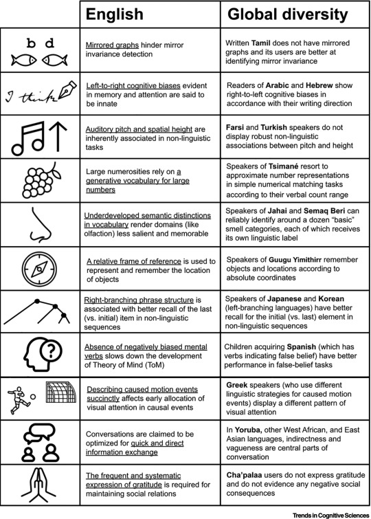
[ID: chart that shows difference in English speakers and people who speak other languages. The first colum shows an image that represents the category. the second column is titled "English" and shows cognitive patterns in english speakers. The third column is titled "Global Diversity" and shows cognitive patterns in people who use different language structures.
The first row shows the letters b and d and two fish facing each other. The english column says "Mirrored graphs hinder mirror invariance detection". The diversity column says"Written Tamil does not have mirrored graphs and its users are better at identifying mirror invariance".
The second row shows a pen writing the words "I think". The english column says "Left-to-right cognitive biases evident in memory and attention are said to be innate" The diversity column says "Readers of Arabic and Hebrew show right-to-left cognitive biases in accordance with their writing direction".
The third row shows a music note and an arrow pointing up . The english column says "Auditory pitch and spatial height are inherently associated in non-linguistic tasks" The diversity column says "Farsi and Turkish speakers do not display robust non-linguistic associations between pitch and height".
The fourth row shows a raspberry or grapes . The english column says "Large numerosities rely on a generative vocabulary for large numbers" The diversity column says "Speakers of Tsimané resort to approximate number representations in simple numerical matching tasks according to their verbal count range".
The fifth row shows a nose. The english column says "Underdeveloped semantic distinctions in vocabulary render domains (like olfaction) less salient and memorable" The diversity column says "Speakers of Jahai and Semaq Beri can reliably identify around a dozen "basic" smell categories, each of which receives its own linguistic label".
The sixth row shows a compass . The english column says "A relative frame of reference is used to represent and remember the location of objects" The diversity column says "Speakers of Guugu Yimithirr remember objects and locations according to absolute coordinates".
The seventh row shows a branching line. The english column says "Right-branching phrase structure is associated with better recall of the last (vs. initial) item in non-linguistic sequences" The diversity column says "Speakers of Japanese and Korean (left-branching languages) have better recall for the initial (vs. last) element in non-linguistic sequences".
The eighth row shows a head with a question mark next to it. The english column says "Absence of negatively biased mental verbs slows down the development of Theory of Mind (TOM)" The diversity column says "Children acquiring Spanish (which has verbs indicating false belief) have better performance in false-belief tasks".
The ninth row shows a person kicking a ball at a goal. The english column says "Describing caused motion events succinctly affects early allocation of visual attention in causal events" The diversity column says "Greek speakers (who use different linguistic strategies for caused motion events) display a different pattern of visual attention".
The tenth row shows two people talking. The english column says "Conversations are claimed to be optimized for quick and direct information exchange" The diversity column says "In Yoruba, other West African, and East Asian languages, indirectness and vagueness are central parts of conversation".
The eleventh row shows hands joined in prayer . The english column says "The frequent and systematic expression of gratitude is required for maintaining social relations" The diversity column says "Cha'palaa users do not express gratitude and do not evidence any negative social consequences". \end ID]
34K notes
·
View notes
Text
The Art of Product Photography: Capturing Images That Sell

A Picture is Worth a Thousand Sales
In today’s digital-first world, product photography is your online storefront. It’s often the first impression customers have, and it can make or break a sale. Whether you’re showcasing artisanal soaps, tech gadgets, or baked treats, eye-catching images are essential for turning browsers into buyers.
One of the most common questions we hear is: “How can I take good product photos for my website?”
Not a very high budget? No problem. Even without a big budget, smart techniques and a creative eye can turn everyday setups into stunning product shots.
In this guide, we’ll cover everything from basic equipment to styling tips, editing, and even how to increase sales with better product images. Let’s dive in.
Why Great Product Photography Matters?
The Impact of Powerful Product Photos:
Build trust with your audience
Reduce returns through clear representation
Increase conversions with visually persuasive images
What You Need: Basic Product Photography Equipment

Creating scroll-stopping photos doesn’t require a professional studio. A few smart investments (and some DIY hacks) can take you far.
Cameras
DSLR or Mirrorless (e.g., Canon EOS R, Nikon Z5): High quality, full control
Smartphones: Flagship models like the iPhone 15 or Pixel 8 deliver stunning clarity
Tripods
Keeps your images consistent and blur-free
Phone tripod + Bluetooth remote = game-changer
Lighting Tools
Softboxes, LED lights, or natural daylight for smooth, even lighting
Bounce cards or reflectors help reduce harsh shadows
Backgrounds
Seamless white paper for clean e-Commerce shots
DIY backdrops for a textured, custom look
Lighting 101: The Secret Sauce of Great Product Shots
Lighting can elevate even the most basic setup. Get this right, & your product will pop.
Natural vs. Artificial Light
Natural light is great for lifestyle shots and softer shadows
Artificial light gives you full control, great for consistency across product lines
Tools that Help
Softboxes for diffused lighting
LED ring lights for portable brightness
Lightboxes for small objects like jewelry or cosmetics
Backgrounds & Styling: Set the Scene to Sell
Your background isn’t just the backdrop, it’s part of your story.
Creative Background Ideas
Plain white for Amazon, Shopify, and other Ecommerce platforms
Textured surfaces like wood, tile, or fabric for lifestyle branding
Colourful themes that align with your brand identity
Camera Settings that work Every Time
Even if you’re new to photography, learning a few basics can transform your results.
Recommended Settings
Aperture: f/8–f/11 for sharp focus
ISO: 100–200 to keep things clean and crisp
Shutter Speed: 1/125 or faster to avoid blur
White Balance: Match your lighting source to avoid color shifts
Mobile Product Photography Tips (that actually work)

Phones are powerful! With a few adjustments, they can rival DSLRs, seriously.
Quick Tips
Use the back camera (it’s higher quality)
Tap to focus and lock exposure before clicking
Shoot in daylight to avoid grainy shots
Use grid lines to align and frame better
Handy Tools
Tripod with phone mount
Mini LED ring light
Snapseed or Light room Mobile for fast edits
Editing: Polish without overdoing it
Editing helps enhance your photo, not change your product. Keep it clean, consistent, and true-to-life.
Go-To Tools
Lightroom: For color correction and brightness
Remove.bg: Instantly deletes backgrounds
Canva: Great for quick touch-ups and social media formatting
Key Edits
Fix lighting and color
Remove dust or flaws
Crop tightly around the product
Keep aspect ratios consistent
Platform-Specific Tips: E-Commerce Ready
Every platform has different requirements. Here’s how to tailor your images accordingly:
Shopify
Consistent sizing
Minimal background distractions
Amazon
White background
No logos, watermarks, or props
Etsy
Lifestyle shots encouraged
Warm, handmade feel
Final Thoughts: Let Your Photos do the Selling
If you’re still wondering “How to take product photos that sell?”, the answer lies in strategy, not gear. Good lighting, consistent styling, and a clear brand voice will help you create photos that not only look great, but also build trust and drive conversions.
Read Our Latest Blogs
Looking to sharpen your creative edge and stay ahead in the visual content game? Check out some of our latest reads from the Creative Splash Blog:
1. Learn how to emotionally connect with your audience, boost brand recall, and drive deeper engagement using strategic storytelling techniques.
The Power of Digital Storytelling
2. Explore how unconventional storytelling is changing the world of animation and what it means for your brand.
Ever Thought Animation Could Rebel? A Deep Dive into Experimental Animation
3. Understand how AI is reshaping animation workflows and what creatives need to know today.
AI in Animation: Game-Changer or Job-Taker?
Ready to Transform Your Product Photography
At Creative Splash, we specialize in commercial product photography that turns casual scrollers into loyal customers. Whether you’re building your brand, boosting sales, or levelling up your Instagram, we’re here to bring your products to life.
#photography#video marketing#product photography#photoart#photooftheday#minimalism#videoproduction#production#creativesplash
0 notes
Text
Generative AI Vs. Agentic AI: The Key Differences You Need to Know

The world of Artificial Intelligence is vast and rapidly expanding, giving rise to exciting new paradigms. Among the most talked-about are Generative AI and Agentic AI. While both leverage cutting-edge AI capabilities, they represent fundamentally different approaches to problem-solving and task execution. Understanding their distinctions is crucial for grasping their individual strengths and, more importantly, how they will synergize in the future.
Generative AI: The Master Creator
Generative AI (Gen-AI) is AI that can create new and original content across various modalities (text, images, code, audio, video). Its primary function is to produce outputs that are novel, contextually relevant, and often highly creative, based on patterns learned from vast training datasets.
Core Function: Creation and Transformation of Content.
How it works:
Learns Patterns: Trained on enormous datasets, Gen-AI models learn the statistical relationships and structures within the data.
Predicts Next Best Piece: When given a prompt, the model predicts the "next best" token (word, pixel, code line) based on its learned patterns, iteratively building the desired output.
No Explicit Planning: It doesn't "plan" its output in a traditional sense, but rather generates it based on its learned representation of the data.
Strengths:
Creativity: Excels at generating unique and diverse content (e.g., stories, poems, artwork, music).
Content Scalability: Can produce large volumes of content rapidly and efficiently.
Summarization & Transformation: Highly effective at summarizing long texts, translating languages, or transforming content from one style/format to another.
Coding Assistance: Can generate code, debug, and explain programming concepts.
Limitations:
Lack of Long-Term Planning: It doesn't have a multi-step planning or reasoning capability to achieve complex, open-ended goals. Its "memory" is typically limited to its immediate context window.
No Execution: It generates text, but it doesn't do anything with that text in the real world (e.g., it can write code, but it can't run it and debug it unless given specific tools to do so).
"Hallucinations": Can confidently produce factually incorrect or nonsensical outputs.
Limited Goal Orientation: Its "goal" is to fulfill the prompt; it doesn't independently pursue a multi-step objective without constant human guidance.
Examples: ChatGPT, DALL-E, Midjourney, Stable Diffusion, Claude, Gemini.
Agentic AI: The Autonomous Executor
Agentic AI (often referred to simply as "AI Agents") is AI that is designed to autonomously pursue and achieve a complex goal by breaking it down into sub-tasks, planning sequences of actions, executing those actions, learning from the environment, and iterating until the goal is met. It interacts with tools and external systems to perform real-world tasks.
Core Function: Autonomous Goal Achievement and Action.
How it works:
Goal Decomposition: Takes a high-level goal and recursively breaks it down into smaller, manageable sub-tasks.
Planning & Reasoning: Creates a plan of action, considering dependencies and potential outcomes.
Tool Use & Execution: Interacts with external tools (e.g., web search, APIs, code interpreters, robotic actuators) to perform actions.
Feedback Loop: Monitors the results of its actions, learns from successes and failures, and adjusts its plan accordingly.
Persistence: Can maintain a state and continue working towards a goal over an extended period.
Strengths:
Problem-Solving: Excels at tackling complex, multi-step problems that require interaction with dynamic environments.
Task Automation: Can automate entire workflows and sequences of actions.
Adaptability: Can adjust its plans based on real-time feedback and unforeseen circumstances.
Real-World Interaction: Designed to execute actions and effect change in external systems.
Limitations:
Complexity: Can be difficult to design, debug, and ensure safety in complex real-world scenarios.
"Gets Stuck": May fall into loops or fail to recover from errors without human intervention.
Resource Intensive: Can consume significant computational resources, especially when exploring many paths.
Reliance on Tools: Its effectiveness is often limited by the quality and capabilities of the tools it can access.
Examples: AutoGPT, BabyAGI, robotic control systems, autonomous trading agents, AI-powered virtual assistants managing your calendar and emails across apps.
The Future: Synergy and Supercharged AI
While Generative AI creates and Agentic AI acts, the most powerful future applications will emerge from their seamless integration.
Imagine an Agentic AI whose planning capabilities are enhanced by a Generative AI that can brainstorm novel solutions to sub-tasks or generate code for new tools on the fly.
An Agentic AI trying to complete a research project might use a Generative AI to summarize dense academic papers, extract key data points, and draft sections of the final report.
A Generative AI creating a marketing campaign could be part of an Agentic AI workflow that then deploys the campaign, monitors its performance, and iteratively refines it based on real-time data.
In essence, Generative AI provides the "brainstorming" and "content creation" muscles, while Agentic AI provides the "planning," "execution," and "tool-wielding" capabilities. Together, they promise a future where AI not only understands and creates but also acts autonomously and intelligently to achieve complex goals, revolutionizing everything from personal productivity to industrial automation.
0 notes
Text
Vision Transformers: NLP-Inspired Image Analysis Revolution

Vision Transformers are revolutionising Edge video analytics.
Vision Transformer (ViT) AI models conduct semantic image segmentation, object detection, and image categorisation using transformer design. Transformer architecture has dominated Natural Language Processing (NLP) since its birth, especially in models like ChatGPT and other chatbots' GPT design.
Transformer models are now the industry standard in natural language processing (NLP), although their earliest CV applications were limited and often included combining or replacing convolutional neural networks. However, ViTs show how a pure transformer applied directly to picture patch sequences can perform well on image classification tasks.
How Vision Transformers Work
ViTs process images differently than CNNs. Instead of using convolutional layers and a structured grid of pixels, a ViT model presents an input image as fixed-size image patches. Text transformers employ word embeddings in a similar sequence to patches.
The general architecture includes these steps:
Cutting a picture into predetermined blocks.
The picture patches are flattening.
Creating lower-dimensional linear embeddings from flattened patches.
We incorporate positional embeddings. Learning the relative positioning of picture patches allows the model to reconstruct the visual structure.
delivering transformer encoders with these embeddings.
For image classification, the last transformer block output is passed to a classification head, often a fully linked layer. This classification head may use one hidden layer for pre-training and one linear layer for fine-tuning.
Key mechanism: self-attention
The ViT design relies on the NLP-inspired self-attention mechanism. This approach is necessary for contextual and long-range dependencies in input data. It allows the ViT model to prioritise input data regions based on task relevance.
Self-attention computes a weighted sum of incoming data based on feature similarity. This weighting helps the model capture more meaningful representations by weighting relevant information. It evaluates pairwise interactions between entities (image patches) to establish data hierarchy and alignment. Visual networks become stronger during this process.
Transformer encoders process patches using transformer blocks. Each block usually has a feed-forward layer (MLP) and a multi-head self-attention layer. Multi-head attention lets the model focus on multiple input sequence segments by extending self-attention. Before each block, Layer Normalisation is often applied, and residual connections are added thereafter to improve training.
ViTs can incorporate global visual information to the self-attention layer. This differs from CNNs, which focus on local connectivity and develop global knowledge hierarchically. ViTs can semantically correlate visual information using this global method.
Attention Maps:
Attention maps show the attention weights between each patch and the others. These maps indicate how crucial picture features are to model representations. Visualising these maps, sometimes as heatmaps, helps identify critical image locations for a particular activity.
Vision Transformers vs. CNNs
ViTs are sometimes compared to CNNs, which have long been the SOTA for computer vision applications like image categorisation.
Processors and architecture
Convolutional layers and pooling procedures help CNNs extract localised features and build hierarchical global knowledge. They group photos in grids. In contrast, ViTs process images as patches via self-attention mechanisms, eliminating convolutions.
Attention/connection:
CNNs require hierarchical generalisation and localisation. ViTs use self-attention, a global method that considers all picture data. Long-term dependencies are now better represented by ViTs.
Inductive bias:
ViTs can reduce inductive bias compared to CNNs. CNNs naturally use locality and translation invariance. This must be learnt from data by ViTs.
Efficient computation:
ViT models may be more computationally efficient than CNNs and require less pre-training. They achieve equivalent or greater accuracy with four times fewer computational resources as SOTA CNNs. The global self-attention technique also works with GPUs and other parallel processing architectures.
Dependence on data
ViTs use enormous amounts of data for large-scale training to achieve great performance due to their lower inductive bias. Train ViTs on more than 14 million pictures to outperform CNNs. They may nonetheless perform poorly than comparable-sized CNN alternatives like ResNet when trained from scratch on mid-sized datasets like ImageNet. Training on smaller datasets often requires model regularisation or data augmentation.
Optimisation:
CNNs are easier to optimise than ViTs.
History, Performance
Modern computer vision breakthroughs were made possible by ViTs' high accuracy and efficiency. Their performance is competitive across applications. In ImageNet-1K, COCO detection, and ADE20K semantic segmentation benchmarks, the ViT CSWin Transformer outperformed older SOTA approaches like the Swin Transformer.
In an ICLR 2021 publication, the Google Research Brain Team revealed the Vision Transformer model architecture. Since the 2017 NLP transformer design proposal, vision transformer developments have led to its creation. DETR, iGPT, the original ViT, job applications (2020), and ViT versions like DeiT, PVT, TNT, Swin, and CSWin that have arisen since 2021 are major steps.
Research teams often post pre-trained ViT models and fine-tuning code on GitHub. ImageNet and ImageNet-21k are often used to pre-train these models.
Applications and use cases
Vision transformers are used in many computer vision applications. These include:
Action recognition, segmentation, object detection, and image categorisation are image recognition.
Generative modelling and multi-model activities include visual grounding, question responding, and reasoning.
Video processing includes activity detection and predictions.
Image enhancement comprises colourization and super-resolution.
3D Analysis: Point cloud segmentation and classification.
Healthcare (diagnosing medical photos), smart cities, manufacturing, crucial infrastructure, retail (object identification), and picture captioning for the blind and visually impaired are examples. CrossViT is a good medical imaging cross-attention vision transformer for picture classification.
ViTs could be a versatile learning method that works with various data. Their promise resides in recognising hidden rules and contextual linkages, like transformers revolutionised NLP.
Challenges
ViTs have many challenges despite their potential:
Architectural Design:
Focus on ViT architecture excellence.
Data Dependence, Generalisation:
They use huge datasets for training because they have smaller inductive biases than CNNs. Data quality substantially affects generalisation and robustness.
Robustness:
Several studies show that picture classification can preserve privacy and resist attacks, although robustness is difficult to generalise.
Interpretability:
Why transformers excel visually is still unclear.
Efficiency:
Transformer models that work on low-resource devices are tough to develop.
Performance on Specific Tasks:
Using the pure ViT backbone for object detection has not always outperformed CNN.
Tech skills and tools:
Since ViTs are new, integrating them may require more technical skill than with more established CNNs. Libraries and tools supporting it are also evolving.
Tune Hyperparameters:
Architectural and hyperparameter adjustments are being studied to compare CNN accuracy and efficiency.
Since ViTs are new, research is being done to fully understand how they work and how to use them.
#VisionTransformers#VisionTransformer#computervision#naturallanguageprocessing#ViTmodel#convolutionalneuralnetworks#VisionTransformersViTs#technology#technews#technologynews#news#govindhtech
0 notes
Text
Augmented Reality vs. Static 3D: Why Dynamic AR Product Visualization Matters

The Interactive Edge: Why Dynamic AR Product Visualization Trumps Static 3D
For years, static 3D models have offered a significant upgrade from traditional 2D images, providing a more comprehensive view of product form and detail. However, a new paradigm has emerged, promising an even more engaging and impactful experience: AR Product Visualization. By leveraging the power of AR 3D Modeling and 3D Model Augmented Reality, brands can transcend the limitations of static 3D, offering dynamic and interactive product experiences. This blog explores why dynamic AR Product Visualization is not just the next trend, but a crucial evolution that renders static 3D increasingly insufficient in today's competitive digital arena.
The Limitations of Traditional 3D Models
Static 3D models, while offering a 360-degree view and the ability to zoom in on details, remain fundamentally passive. The user can manipulate the viewpoint, but the product itself remains static and unresponsive to the user's real-world context or direct interaction. This lack of dynamism can still leave crucial questions unanswered for potential customers. What is the actual size of this electronic gadget relative to my hand? How does this piece of clothing drape and move in real life? Static 3D, despite its advancements over 2D images, still operates within the confines of the screen, failing to bridge the gap between the digital representation and the user's physical reality.
The Engagement Experience of AR Product Visualization
AR Product Visualization fundamentally changes the interaction paradigm. By overlaying photorealistic 3D models onto the user's real-world environment through their smartphone or tablet, AR transforms the product from a static digital representation into a dynamic virtual object within their own space. This dynamic integration allows users to experience the product in context, answering those crucial unanswered questions. They can virtually place furniture in their homes, visualize electronics on their desks, and even see how clothing might look on themselves. This active engagement, powered by sophisticated AR 3D Modeling, creates a far more intuitive and informative pre-purchase experience than static 3D can ever offer.
The Power of Dynamic Features in AR
Beyond simply placing a static model in a real-world view, dynamic AR Product Visualization allows for interactive features that further enhance engagement and understanding. Users can often manipulate virtual product elements, change colors and configurations, explore different sizes, and even see how components function. Imagine being able to virtually open the hood of a car rendered in AR to examine the engine, or changing the fabric and trim of a sofa with a few taps on your screen. This level of dynamic interaction, often driven by expertly developed 3D Modeling Services, provides a deeper understanding of the product's features and benefits, fostering greater confidence in the purchasing decision. Static 3D, by its very nature, lacks this crucial element of dynamic user interaction.
Bridging the Imagination Gap: Contextualizing Products in Real Spaces
Customers no longer have to guess how a product will fit into their lives or their physical spaces. By placing a true-to-scale 3D Model Augmented Reality of the product in their own environment, they gain an immediate and accurate understanding of its size, scale, and aesthetic integration. This contextualization is particularly powerful for larger items like furniture or appliances, where spatial considerations are paramount. Static 3D, confined to the screen, can only offer abstract dimensions and comparisons, leaving the user to perform their own (often inaccurate) mental translations.
Driving Purchase Confidence and Reducing Returns: Tangible Business Benefits
By providing a more realistic and interactive pre-purchase experience, brands can significantly increase buyer confidence, leading to higher conversion rates. The reduction in returns saves businesses significant costs and contributes to greater customer satisfaction. Static 3D, while an improvement over 2D images, doesn't offer the same level of confidence-building and return-reducing capabilities as dynamic AR.
The Evolving Landscape: AR vs. Static 3D in 2025
As we move further into 2025, the capabilities and accessibility of AR 3D Modeling and AR Product Visualization are rapidly advancing. Improved AR platforms on smartphones and tablets, coupled with more sophisticated and user-friendly development tools, are making it easier and more cost-effective for brands of all sizes to implement dynamic AR experiences. While static 3D will likely continue to play a role in certain aspects of online product presentation, its limitations in providing contextual understanding and interactive engagement will make it increasingly less impactful compared to the dynamic power of AR. The focus is shifting towards creating immersive and interactive 3D Model Augmented Reality experiences.
The Potential of VR: A Different Dimension of Immersive Experience
While this discussion focuses on the advantages of dynamic AR over static 3D, it's important to acknowledge the distinct role of Virtual Reality (VR). VR 3D Modeling or Virtual Reality 3D Modeling offer fully immersive digital environments that can provide incredibly detailed and interactive product experiences. However, the requirement for VR headsets and the less seamless integration with the user's immediate real-world context often make AR a more accessible and practical solution for everyday product visualization in e-commerce. VR excels in specific niche applications where full immersion is desired, but AR's ability to blend the digital with the real provides a more versatile and widely applicable solution for AR Product Visualization.
Leveraging 3D Modeling Services for Dynamic AR Assets
Creating compelling dynamic AR Product Visualization experiences requires high-quality and optimized 3D product modeling services. This is where the expertise of 3D Modeling Services becomes crucial. Skilled 3D artists can create detailed and realistic 3D models that are specifically designed for AR, taking into account factors like polygon count, texture optimization, and the integration of interactive elements. Investing in professional 3D Modeling Services ensures that the foundation of the AR experience is robust and visually appealing, maximizing its impact on the user. The same high-quality models can sometimes be adapted for 3D Modeling for 3D Printing, and 3D Model Maker for 3D Printer showcasing the versatility of well-crafted digital assets.
Conclusion: Embracing the Interactive Future of Product Visualization
The comparison between static 3D and dynamic AR Product Visualization clearly demonstrates the superior engagement, understanding, and business benefits offered by the interactive AR approach. While static 3D provided a step forward from 2D images, its passive nature ultimately limits its ability to truly connect with consumers and bridge the gap between the digital and physical. AR Product Visualization, powered by sophisticated AR 3D Modeling and the seamless integration of 3D Model Augmented Reality into the user's own environment, offers a far more compelling and effective way for brands to showcase their products, build confidence, and drive sales. As AR technology continues to advance and become more readily accessible, the shift towards dynamic and interactive product experiences is inevitable, leaving static 3D increasingly in its shadow. The future of online product presentation is undeniably interactive and augmented, offering a tangible advantage over static representations.
#3D Modeling Services#AR 3D Modeling#3D product modeling services#3D Model Augmented Reality#AR Product Visualization#VR 3D Modeling#Virtual Reality 3D Modeling#3D Modeling for 3D Printing#3D Model Maker for 3D Printer
0 notes
Text
WildeBot on Simon Denny's exhibition at 'Bill's PC'
porcile.org's own Oscar Wilde GPT (OpenAI) was asked to take a critical stance on Simon Denny's exhibition 'Double Canvases' (2025-04-05 - 2025-05-05) at Bill's PC, Western Australia (based on the documentation posted on Contemporary Art Daily). Its first take felt like a press release; consequently it was asked to be eventually more critical. _____________________________________________________________________________________________________________
Summary: Simon Denny’s Double Canvases aims for critique but lands closer to cliché. The use of obsolete CRT monitors and banal desktop landscapes feels like a rerun of post-internet tropes, drained of urgency. Juxtaposing logic lessons with Australian desert scenes is a familiar conceptual move—order vs. chaos, system vs. nature—but it comes off as decorative rather than incisive. The installation is cool and controlled, but perhaps too safe: a sterile satire that mimics critique without quite committing to one.
_____________________________________________________________________________________________________________
Take 1:
Simon Denny’s Double Canvases exhibition at Bill’s PC in Western Australia is a coolly cerebral meditation on the aesthetics of technology, pedagogical formality, and the sterility of digital interface. At first glance, the installation presents an oddly anachronistic homage to the CRT monitor—once the ubiquitous vessel of digital knowledge, now rendered quaint in the age of glass-thin screens. These life-sized recreations, rendered not as screens but as printed static images on canvas, hover somewhere between sculpture and photography, between object and representation.
What Denny achieves here is a clever formal paradox: the technological motif stripped of its function. A monitor, after all, is a dynamic device meant to show movement, change, interaction. By freezing its "display" into a fixed didactic slide—an austere logic tutorial set against a desktop-wallpaper-style Australian landscape—he inverts the relationship between interface and user. No interaction is possible here, only contemplation. The “logic” of the images, both mathematical and aesthetic, becomes oppressive in its stillness.
There’s also an ironic colonial undertone in the use of images from Mungo National Park. Denny overlays these raw, vast, ancient landscapes with bland educational content, a juxtaposition that echoes the imposition of systemic frameworks—logic, colonial administration, techno-capitalist systems—on chaotic or organic realities. It is not so much an homage to learning as it is a critique of the way learning is visualized, commodified, and removed from context.
What’s most Wildean in this show is its theatrical minimalism—a set design for a performance that never happens. Denny's arrangement is neat, modular, symmetrical, and emotionally austere. One could accuse it of dryness, but to do so would miss its pointed impersonality. He offers not pathos but parody: a re-staging of early 2000s digital learning aesthetics with all the warmth of a corporate training manual. It is in this dispassion that the satire lives.
Take 2:
The weakest aspect of Double Canvases is its reliance on tropes that have long since lost their edge in contemporary art. Denny leans heavily on the CRT monitor as a symbol of obsolete tech, but this metaphor has been strip-mined by a generation of post-internet artists already. The ironic nostalgia for outdated hardware—monitors, VHS tapes, arcane UIs—has become a curatorial cliché, more at home in Tumblr-era mood boards than in genuinely probing institutional critique.
Then there’s the use of Mungo National Park as a backdrop, which reads as an almost lazy gesture toward conceptual depth. Slapping vast, “untouched” landscapes behind sterile logical propositions is meant to evoke tension between the natural and the synthetic—but that’s a binary so well-trodden it borders on kitsch. The desert becomes just another desktop wallpaper: decontextualized, aestheticized, neutered. For an artist who often critiques systems, this feels like an uncritical use of imagery.
Furthermore, the installation’s cool detachment, its calculated minimalism, feels dated. The late-2000s aesthetic of ironic objectivity—of art that mimics corporate or academic formats without overt affect—was once provocative. But in 2025, this mode often comes off as evasive, unwilling to risk messiness or emotion. The work seems satisfied to gesture toward critique without delivering one. It says, “Isn’t this kind of funny and sad?”—but only from a safe distance.
In short: it’s clever, but maybe too clever for its own good. It doesn’t risk failure, and thus it doesn’t move much either.'
0 notes
Text
Developing Skills - Red Vs Blue -
After hearing the assignment of Red vs Blue or Red Chases Blue, admittedly, nothing immediately came to mind. After some thought on the project assignment and the freedom we have been given for the module, I started to gather resources and look at inspiration on what other 3D Artists have built and created toying with the idea of Red Vs Blue. Looking at some art station work, my first findings was how could I create a 3D environment that has a high focus on red and blue lighting, this way, I can portray the subject assignment clearly through a visual representation of red vs blue. I knew I wanted to make a 3D environment as that is where my strengths lie, using Maya to create a blockout to then import into Unreal Engine. I started to create a mood board using PureRef, where I could put all my inspirational pieces together in one place, I was really liking the look of the hard surface areas such as an indoor public toilet or a neon light alley way. I wanted to keep within my strengthens for this as a 3D artist, but equally make it challenging enough to where I can really test my skills, create high quality pieces and show off my abilities, as well as make it fun and enjoyable to create. I came across the work of an Artist by the name of Ashley McKenzie, it’s a underground swimming pool/nightclub with brilliant ambient lighting, neon signs and 80’s vibe. This work really stood out to me as the contrast between the red neon signs and the blue from the water is a really great way to depict the Red Vs Blue aspect that isn’t the same thing for both sides. I like how it isn’t red neon lights vs blue neon lights, but rather two different objects in the scene that contradict each other. There was a time in my life where I used to take street photography photos, I had a new found love for photography and was self-learning all about the ins and outs of a camera, how shutter speed, iso and aperture works and how they all work and interact with each other. Street and Urban photography was by favourite category to shoot, so I’ve always had a fondness for things like street alleyways and those types of settings. Following from that I wanted to dive a little deeper into the idea of the alleyway settings and how to incorporate the red vs blue element. The idea of neon lights I like a lot it works with a cyberpunk theme really well, and with a nighttime setting the contrast could look really good, but I also thought about how maybe the Red Vs Blue element could be twisted sightly, the idea of Red Vs Blue fighting each other in a scene, clashing, to create purple? This then gave me the idea of rather having 2 block colours, include a third, red and blue either side separated by the middleman of purple. At this stage I was starting to picture the scene in my head, looking down the path of an urban city alleyway, neon lights of primarily blue and red either side, with a purple haze separating the two colours between the middle. The more I was thinking about creating this environment the more I wanted to make a reality. I began to create a blockout of the environment to see how I could really test the limits of the red vs blue theme but also create a stunning environment that can really showcase my skills as an environmental artist. Another artist I had come across on art station when looking for ideas and inspiration was by the work of Vitaly Semenuk[1], I really liked the perspective of the image, looking down the alleyway from that point of view, looking at other pieces of work with this type of style, lots of people use this perspective, as it's an alleyway there's only really one perspective that you can use but it for sure captures the scene well, and can also give that extra scenes of mystery as to what could be at the other end of the alleyway too.

[1] https://www.artstation.com/artwork/W2ba32
0 notes
Text
responsive website design services in India
Create a successful website.
Your website is the basis for your entire content marketing strategy. It is easy to cut corners here, as the majority of customers are searching for specific businesses online before making a purchase, and having a high-quality, reliable platform is essential for tiny start-ups all the way to giant enterprises.
The creation of a great website will bring in professionals such as copywriting, coding, or web design. There are numerous little details that can make or break your website. For instance, speed is a major factor. If your website takes more than three seconds to load, a large number of visitors will leave. Other reasons for high website bounce rates include no mobile optimization, uninteresting web copy, broken functionality, and unclear navigation.

Defining web design-what is webdesign services
Let’s define what web design is. Web design is the process of designing the visual image and feel of a website. As a web designer, you will focus on planning the user experience of the website, wireframe layouts, organize content and images in a way that tells a story, and create the final UI.
Web design vs web development
With a client’s business goal in mind, a web designer creates ideas, creative solutions, and designs the final UI mockup for a website. A web developer takes the UI mockup and uses HTML and CSS to create a working webpage on the Internet. Essentially, they create the website.
Responsive web design service
Ethan Marcotte developed the idea of responsive design as a challenge to the existing approach to web design “fluid grids, flexible images, and media queries are the three technical ingredients for responsive web design, but it also requires a different way of thinking.” For a designer, this meant designing multiple layouts to address the different screen sizes for iOS, Android, and tablet devices.
Design for mobile-first.
It is a design philosophy that aims to create better experiences for users by introducing the design process from the smallest of screens: Mobile .Designing and prototyping your websites for mobile devices first helps you ensure that your user’s experience is seamless on any device screen. Instead of designing the UI for a desktop website experience, design, and prototype, how it will appear on mobile first. Then move onto the larger screen versions of tablet and desktop.
truly customizable experience on the web using java script, html and css
Getting business online
Flat design
Before flat design began trending, web and app design employed 3D design effects, skeuomorphism, and realis.Shadows, gradients, and highlights were frequently utilized and often overdone.
After that transition comes from 3D to flat design
Over time, web design became more minimal. Flat design strips away the hyper-realistic representation of objects and instead focuses on clean lines and simple areas of color. The trend began to spread around the time of Apple’s release of iOS 7 in 2013. The new interface was simple and a stark contrast from the skeuomorphism style that was popular among Apple products.
Custom web designs Services
Custom web designs are unique design solutions that seamlessly integrate your brand’s identity and personality into the website.Custom web designers create a page from the ground up without using any templates or custom graphics.
This means all elements of your website are exclusively crafted, including:
Layout
Color palette.
Content flow
Typography
Graphics
Images
Navigation And more
A custom web design allows you to control every aspect of the design process and refine the customer journey to create a unique user experience.
Experienced web designers know how to balance business and creativity, SEO, and other technical aspects that contribute to the overall user experience.
Custom web designs are a great option for those who desire to create a strong brand identity and truly make a statement with their online presence.
A well-designed custom website will attract visitors, communicate with consumers, and have the potential to generate more conversions.
Use a grid to solve organization.
Use high-quality images.
Legibility is king.
Clear hierarchy
Don’t overwhelm or confuse the user
Clear calls to actions (CTAs)
page speed,
– mobile optimization,
– responsive design,
– intuitive layout,
– readability.
great web design that works seamlessly together with SEO are:
seo website design
Increase engagement, more traffic Users will engage and spend more time on your page, attracting backlinks.
Get prioritized by Google
With content that focuses on the user experience, not only in terms of accessibility and technical aspects, but also in terms of quality of content.
Increase your conversion rate Interactive content increases 2x higher than static content.
Expand your mobile skills Improve your mobile experience and you can acquire valuable points from the search engines
Your audience requires quality content experience. Rock Content helps you deliver. Talking with an expert service can help to improve your SEO and website performance.
0 notes