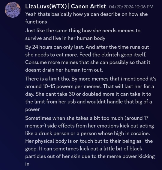
#its also supposed to include the color red for
Text
Thanks to my datemate I was able to find a bunch of valentines day frogs at goodwill yesterday and one pink beanie baby 🥺
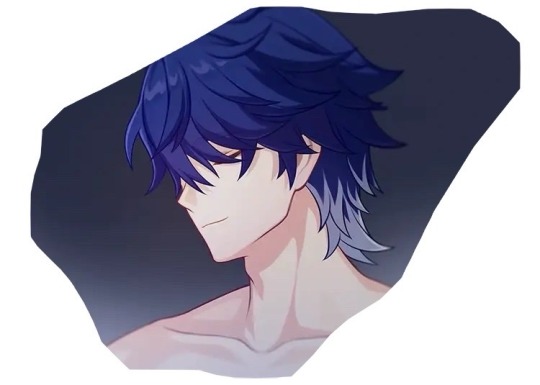
#as you guys may know my datemate works for goodwill#he technically isn't supposed to tell me about things to shop for#but he does it anyways#he doesn't always show everything tho! most stuff I find on my own#in faft only one of the frogs I bought were shown to me. the others I discovered mixed in!#I also found a limited edition spring bear from 2007 STILL WITH the pin in its hang tag#bit I didn't get her (yet) because I only had a small bag and was going to work after thrifting#I shoved her to the very bottom of the bin which is packed full of plushies rn#including a lot of massive sized ones. so I don't think anyone's gonna dig her up yet#I might be able to snag her tomorrow if Im right about people not digging#if not then it wasn't meant to be. Im not as in love with her coloring as I am Maple's#who is the autumn bear from the same limited edition collection#They're Build a bears btw#the spring one was in perfect condition just like Maple but even more new because she has all attachments#no outfit tho but most of the time I don't like clothes on my bears#but I thought it was a super cool fibd so hopefully I can get her#but anyways!! the frogs!!#one is pink with magenta polkadots#another is pale green holding a pink heart#the last one is a paler green with a red ribbon around his neck#and he's holding a red heart that says ''I got You Babe“#he has a sound box in him but its thankfully broken#I mostly hate plushies that make sounds#the only exceptions would be Momo (a plush lemur I used to have made by Yoohoo toys that I want to buy again)#and a plush that would be made with a personalized sound (like if my datemate made me a BAB and put a voice message in it)#anything else no ty. the sound box makes the plush uncomfortable to hug#aaanyways#viti shoosh
1 note
·
View note
Note
You're more amazing than ALL THE THINGS
Here's some cards inspired by my love of counting in rhythm to myself in daily life
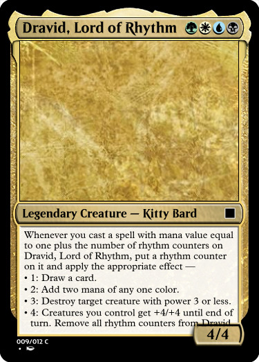
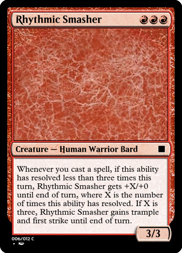
With these I have an excuse to count "one, two, three" and "one, two, three, four" out loud in the middle of games!
#asks#custom cards#i knew i wanted the 4-count one to be legendary but i had no idea what to name it#the green and black made it feel wrong to be an elian card#then i realized i could just make it a dravid#dravids can be any color#i name i also considered was Dravid Lord of Counting#with count counters#but it's really about rhythm#also i love the amount of 3s i got into rhythmic smasher#it's a 3-drop 3/3 with 3 red mana symbols and 3 subtypes#i think i'll rename it drum beat basher to give it 3 words in the name#AND its max power is 9 which is 3x3#i also realized halfway through writing lord of rhythm's ability that i could make each of the abilities include their number#also if you somehow manage to get 5 rhythm counters on lord of rhythm its effect just stops working#oops lol#but that's only possible with proliferate i think#also i think the templating of this ability is super illegal#you're supposed to write out “if it has one rhythm counter do this. if it has two” etc#but that would be WAY too much text#also i didn't even specify where the number comes from for the effects#is it from the number of rhythm counters or the spell's mana value?#a card like Solemnity could really make that confusing#or instant-speed proliferate#but the general way it's supposed to work is clear so it's okay#it's not like this is gonna get played in tournaments#$5000 on the line coming down to how the kitty bard interacts with Experimental Augury#at least the templating on Rhythmic Smasher is unambiguous as far as i can tell#it's maybe not technically correct because most abilities like that say “if this is the third time this ability has resolved this turn”#but that's too much text
1 note
·
View note
Text

Human heads eaten by crows, unidentified and decomposing body parts, and hundreds of corpses piled up and buried in mass graves are all that remained of the victims of the massacre at al-Shifa Hospital. The grim scene was something out of a dystopian movie, the product of the two-week siege of Gaza’s largest hospital that ended in its total destruction.
Following the completion of al-Shifa’s decimation, the Israeli army announced that it had been one of the most successful operations since the start of the war, claiming that it had arrested hundreds of Hamas and Palestinian Islamic Jihad members in the medical compound. But the question that no one seemed to ask is how such a massive number of so-called “operatives” from Hamas and PIJ had gathered at al-Shifa with the full knowledge that the place had already been combed by the army once before and that Gaza City had been occupied by the army ever since.
One young man who managed to escape the hospital mere moments before the army invasion began said that there had indeed been hundreds of Hamas and Palestinian Islamic Jihad-affiliated employees in the hospital, but none of them were military operatives. They were workers in the Gaza government’s civil branch, including Civil Defense crews, the police force, the internal security services, interior ministry employees, and employees of other branches of the local government. All of them had gathered to receive their governmental salaries at al-Shifa, given that it was one of the few remaining places that was supposed to be relatively safe from the fighting
When everyone left the buildings, the army began to separate the crowds of people into groups, making each group wear differently-colored plastic bracelets. The soldiers told them that these bracelets were connected to a system that alerts snipers to their movements. They were divided into two colors: yellow, which was attached to hospital staff and whoever the army considered civilians, and red, which was given to people who could not move on their own, such as patients, the injured, amputees, or people with broken limbs.
The army also gathered people who were suspected of belonging to Hamas or the PIJ. They were not given bracelets but were separated from the injured and hospital staff, who were sent to a different building.
A third much larger group was ordered to leave the hospital entirely — thousands of displaced persons who had been sheltering in the compound, in addition to some members of the hospital staff. Some of the staff members, including doctors, refused to leave. When they refused the army’s orders, they were executed immediately and without argument.
The army then brought out a huge number of men from the group of suspected Hamas and PIJ members and employees, gathering them in the center of the courtyard. It then proceeded to execute them, one after the other. When the slaughter was done, army bulldozers piled up their corpses in the dozens, dragging them through the sand and burying them.
As this was ongoing, other soldiers stormed various buildings in the compound in search of people who had refused to evacuate when the initial order was given. They killed anyone they found, regarding them as suspects.
This is a long article but I suggest you read the whole thing.
#yemen#jerusalem#tel aviv#current events#palestine#free palestine#gaza#free gaza#news on gaza#palestine news#news update#war news#war on gaza#al shifa hospital#war crimes#gaza genocide#genocide#long post
1K notes
·
View notes
Text
dungeon meshi characters, but as flight rising dragons
𝟣. laios touden: beige/antique/antique


2. marcille donato: caribbean/flaxen/ruby


3. chilchuck tims: auburn/camo/beige


4. senshi of izganda: coal/oilslick/latte

5. izutsumi: obsidian/obsidian/white


6. falin touden: iris/antique/antique


spoiler scry + design notes under the read-more:
7. falin (chimera): vermillion/antique/antique
———————
i had been meaning to scry/post the dungeon meshi main cast for a while. i figured in honor of the manga's final chapter would be a good occasion
design notes:
𝟣. laios touden:
outfit inspired by fr user Rafale's laios fandragon
ravenskull broadsword bc it has wings like his sword
tundra + antique secondary/tert, like falin (siblings)
2. marcille donato:
ruby runes to represent: her magic, her red hair bow, bloody hands when she was resurrecting falin
will o' the ember for her explosion spells
iridescent primary for her elven heritage + penchant of fancy things
3. chilchuck tims:
veined tert to represent his greying hairs
i debated between the gambeson (closer texture) VS tanned rogue vest (overall closer colors) for him, but ended up going for the gambeson as it feels more distinct
camo secondary for a "camo = stealthy" joke
[edit: 1 feb 2024] i think my screen had the Flux settings too high before and i thought his shirt was beige. its actually white, so i changed his shirt from a shabby to classy dress shirt.
4. senshi of izganda:
bamboo dried tea to represent his cooking supplies
unfortunately none of the helm apparel had the right colors for his helmet, so i opted for tan okapi to represent his helm's horn colors
i wanted to include the iron shield apparel for his adamantine shield/pot, but it wouldve covered up his kilt, so i left it out
[edit: 1 feb 2024] changed primary from ribbon to chrysocolla, an earthy gene to match his past as a miner. changed tert color slightly to match better. also gave him carrots
5. izutsumi:
initially i tried nocturne and spiral, but the armour pieces looked too short on them, so i ended up going for mirror instead
i also tried the tanned rogue apparels, but they covered up too much of the torso
wooly antennae for her ears
6. falin touden:
marshlurker's drape to represent her coat, bc there wasnt a lot of suitable coats, and the more purple-y hue (and hat) also references her debut outfit
sparkle tert to represent her magic
tundra + antique secondary/tert, like laios (siblings)
[edit: 1 feb 2024] edited her primary to be more purplish, since the animes confirmed her coat is supposed to be more indigo colored, and gave her browner boots. also edited her reference photo coat color to match it too
7. falin (chimera):
i chose to make the touden siblings both tundras, so that chimera falin could be a gaoler (based on the joke gaolers are just tundra 2.0)
spirit secondary bc she haunts the narrative
if youve made it to here, feel free to comment which fandragon scry is your fav! :)
#dungeon meshi#flight rising#laios touden#marcille donato#chilchuck#senshi of izganda#izutsumi#falin touden#scrying workshop#dressing room#fandom scries
718 notes
·
View notes
Text
I'm really partial to the idea of visual storytelling through clothing, and I really like the concept of the whole Immigrant Trio experiencing it
When Molly first comes to America, through the 1850s she was constantly wearing black. Like to the extent that people on the street frequently mistook her for a widow. By the 1860s she started to get into more of a half mourning stage, not quite out of it, but incorporating colors like dark purple and blue into her clothing again. Then it's the late 1860s, the war is over, and she and Alfred go on their railroad adventure. She's in rough, mismatched clothing that helps her masquerade as a gender she isn't, but behind it she's still herself. She's trying to find and understand herself, but is coming to terms with the only way she is able to do that is in a new place where she can break down and build up again. It's after this point, and as she's joined by new friends and a lover that she starts taking on her old habits- lighter, warmer greens, lilacs, teals and blues.
Tolys first comes to America layered up and his clothing is tight. His waistcoat is always buttoned, his tie looks like it's choking him, his sleeves are always rolled down. He's almost too formal at points. Over time his clothing gradually starts to loosen around the house- his waistcoat is unbuttoned, his bow is looser, he lets his hair down when he's not working. He's living in a place where he's afforded the time to do this, and more importantly he can trust in the people around him to allow him that.
Lovino is almost the opposite. He comes to America with few possessions on him, including articles of clothing. He's plain, partially to do with his financial state and partially because he's trying to avoid home baggage. The exception of course is his cap, which is emblematic of his identity and acts as a bit of a connection with Molly (for whom the style is also culturally significant). As he's there and builds relationships he didn't anticipate, he accumulates more (items Molly knit or embroidered for him, clothing he's borrowed from Tolys, knick knacks he found for himself, etc.) Rather than layering per se, he gains more detail because he allows himself to form those bonds and he treasures them and his experience in spite of its rough beginnings. In a similar manner to Molly, he also starts to take on hints of color in his clothing again, especially reds and yellows.
Alfred is a special case because he's relatively consistent except for his breakdowns. He tries to be fashionable and trendy, but he's always got one thing out of place like a mismatched tie. He always looks really put together and professional, because it's what he's supposed to be masquerading around is. Then when he goes on his western breakdown adventures his clothing becomes even more mismatched, simple, and at times oddly fitted on him like a child trying to put on a shirt too big for them. Even though it peeks out under normal circumstances, it shows fully he is a bit of a child under the fresh and put together veneer.
#hetalia#my thoughts#hetalia headcanons#hws america#hws lithuania#hws romano#hws ireland#nyo!ireland#immigrant squad#immigrant trio#this isn't even getting into little trademarks of their clothing#like molly wears a lot of lace/crochet#tolys tends to wear stripes and geometric patterns#things like that
45 notes
·
View notes
Text
29 asks! Thank you!! :}} 🦀
I use FireAlpaca! And occasionally MS Paint in specific situations or for fun XDD
FireAlpaca is free and I'd say its good for beginner digital artists, but also has a lot of tools for pros! But keep in mind it's got some quirks and weird bugs sometimes- use it at your own risk! <XD
Tassels is a much nicer word than "ribbonlike feelers", which is what the pokedex entry's say they are <XDD
And thank you! I'm glad you like that detail!! :))
Thank you! I'm doing my best not to overdo it <XDD

@minnesotamedic186
*The bottle sinks into my head and disappears*
Thanks you :}} 👍
@samcat2
Oh, no no- they are not a couple/gay. They are like the bestest-best brothers :}

@realmerks6969
:0 .... do I like what-
@milk-powrit
Yes! Birdos in my AU are decedents from the original Yoshi's. They live on the coast by Daisy's kingdom and have been domesticated by the Delfino people.
While Yoshi's come in all different colors.. Birdos are mostly Pink, Red or shades of purple due to red Cheep-Cheeps being the corner stone of their diet.
Now, the specific/individual Birdo that we know? The one with the bow and everything? That Birdo is supposed to be Daisy's personal pet Birdo. She's very spoiled XDD
@antisocial-bird
Thank you!! And welcome back! :))
I'm sorry to hear you've got some personal battles and school weighing you down.. <:(( I hope you can salvage some of those connections and make some new ones soon! :}}

(Refencing this post)
SKJNJ I N G O T S XDDD
(Refencing this post)
Honestly? That's rather fitting for Emmet- XDD
I'm glad to hear it! But hey! Don't call it ugly >:(( Its wonderful!! :}}
@artblock200322022
I'm glad to hear it! :DD And ooo! Whisper?? That's such a cool name!! :}}}

@illogically-austere
<XD You don't seem happy about it, I'm guessing it was more of a nightmare?
If you mean which game ending my AU follows..
Its supposed to be a modified version of the 6AM ending. Where Gregory escapes when the front doors open but he doesn't get caught by Vanessa later. He ends up coming back to the Pizzaplex 2 weeks later on his own.
If you mean an ending to the entire AU itself? I have some ideas in mind and just need to take the time to pick one of them--

@glitchhayden418
:DDD ROSES AND ORANGES!! THANK YOU!! :)))))
XDD Don't worry, I assumed it was my POV-
@yourtypicalfoxobserver
:DD Thank you! I'm glad you like what I make! :)))
Just trying something new! This new lineless pixel style is a change of pace and is helping to keep me out of art block :) 👍👍
@pinkiexneomorph277
Thank you so much!! :DD And I'll take the thumbs up XDD 👍✨
(Refencing this post)
.....Well he's got that Papyrus energy tbh-- <XDD
(Refencing this post)
NOOOO <XDDDD
(Refencing this post)
AWWWWW 😭😭 THATS SO SAD YET ADORABLEEEE
🥺Flowers........ 💖🌹💖
(Referencing the comments of this post)
XDD Don't worry, I'll track em down! >XDD
@shiocreator (Referencing this post)
WAAAHGH THANK YOU SO MUCH!!! :DDDD

@kirozil
I'm hanging in there, thank you for asking! :}
My FNAF AU/Recap/Repair project thingy has kind'a been put on the shelf for a while. But that's mostly due to my poor health and being unable to sit at my desk and draw on my PC..
(All my resent posts- this one included- and drawings have been made on a laptop while laying on a couch. All of my FNAF stuff is on my desktop PC :((( )
As for your second question, sorry, I don't take requests! 😅
Thanks for the ask! I hope you have a great day/afternoon/night as well! :}}}
@empowtisblog
That sounds like me! XD Thank you! I'm glad you liked my Octonauts stuff! :))
@captain-skyler1987
:DD Thank you! :))) 🍪💖

@soulful-rodent
I'm hanging in there as best I can 🫠
58 notes
·
View notes
Text

Still obsessed with the Atreides Desert Power (TM) flag. Because in-world I think this is supposed to represent the union of Fremen and Atreides power. But the actual design is the Atreides hawk crest (in blood red) stamped over the Fremen fabric patterns.
It feels particularly discordant because, as far as we can see, the Fremen do not have battle flags. In fact they don't seem to have any flags, or any kind of easily-recognizable-to-us symbols of allegiance to sietch, clan or family. In the place where we would most expect to see those kind of demarcations--the war council in the south where all the tribes should be represented--there is really nothing to distinguish one Fremen from another, except for the tribe leaders who sit in the middle of the circle and get to wear a special hat. As far as we can tell, there is no such thing as a Fremen flag.
But then, why would there be? Flags are for claiming things. A flag is a symbol you raise over a place to let other people know you've conquered it. (Insert Suzy Eddie Izzard voice: "Do you have a flag?") From a practical standpoint, having someone who could be holding a weapon use both hands to hold a flag in the middle of a battle is kind of silly. In a war of position you could argue that there is some limited use in marking out who controls what territory, but the Fremen aren't fighting that kind of war, and a guerrilla insurgency fighting on its home turf generally goes out of its way not to advertise its position.
Also like. In the middle of preparing for battle someone decided to make these. Whose idea was that? The Fremen fundamentalists' loyalty is to the Lisan al-Gaib. The Atreides symbols are only important to the Atreides and to the other Great Houses. But someone made sure they were present on the flags carried into battle to attack Arrakeen. This was designed to communicate a message to other imperialists, including the Emperor, in language they would understand. And of course, by the end of the film, the Desert Power flag does become a flag of conquest.
The flag is such a great production design/art direction detail, because it looks like something that could be conceivably be made in this environment (the Atreides deep green isn't a color that seems to really exist in the palette of dyes available to the Fremen). But it also feels like something deeply alien that's being imposed on this culture from the outside.
85 notes
·
View notes
Text

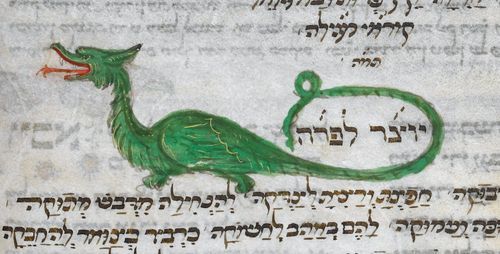
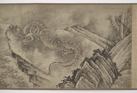
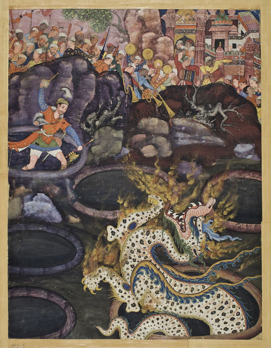
The Dragon Drags On
Though seldom seen today, dragons, of the genus Draconis, are some of the most famous creatures in the world, known for their size, ferocity, elegance, and supposed love for treasure. Though the exact number of dragon species is unknown, there are at least a dozen that are officially recognized; the real number is likely much higher. Once widespread, the range of this group has declined dramatically in the past centuries and populations are now believed to reside in only the most remote parts of the world. Most of what we know of dragons comes from historical records, and study of live specimens has proved impossible due to their rarity.
Because of their global distribution, dragons display a wide variety of morphological traits, including coloration, features, and even the number of limbs. However, some traits are common to nearly all species. Most dragons are thought to be brightly colored, often red, green, or blue; many species also have gold patterns in some form. As reptiles, dragons are covered in scales, though some also posses feathers or manes. Dragons also have extremely long, flexible tails which in some species may act as a supplementary limb. The body is generally long and serpant like, with the exception of the European Dragon and the mushhushshu, or Babylonian dragon. Though all species share an ability to fly, only the European dragon has a functional set of wings. The mechanics of flight for other species are unknown. The European dragon is also noted for its ability to breathe fire; other species such as the Chinese Dragon, or lóng, are more often associated with water.
All dragon species are believed to be carnivorous, though the content of their diet varies from region to region. Due to their large size, it is believed that they predate upon larger mammals such as cattle, sheep, camels, llama, deer, and even megafauna like elephants. Though they lack natural predators, their consistent targeting of livestock and game animals has in the past led dragons into conflict with humans; centuries of dragon hunting for sport and to protect agricultural interest has pushed the dragon to the brink of extinction.
Very little is known about the breeding habits of dragons. Like most large reptiles, they are believed to be solitary and fiercely territorial. It is also likely that they lay eggs, but whether parents provide any kind of care for their clutch or hatchlings is unknown. To date, no record of juvenile dragons has been found, indicating that the rate of survival to adulthood is extremely low. This may be due to predation on hatchlings by opportunistic animals, or adult dragons may attack and kill juveniles to defend their territory, or a combination of the two.
Although they are extremely rare today, dragons have been and continue to be important part of cultures around the world. Ancient civilizations such as the Aztec, Egyptians, and Mesopotamians all revered dragons as dieties. Many other cultures incorporated dragons into their folklore and mythologies, and in many parts of the world the dragon has come to symbolize power, changes in the seasons, or natural disasters, among other things. In more modern times, dragons have come to be associated with wealth, though there is no biological evidence for treasure-hoarding behavior.
Conservation status: Because no dragon species has been sighted for several centuries, they are largely believed to be extinct; however, the IUCN has yet to make a formal declaration. A few hopeful biologists believe that some species still survive in remote locations such as the deep Amazon rainforest or the mountains of Central Asia.
April Fools! I hope you enjoyed this departure from the usual content. I will be on hiatus until April 9th, as I'll be helping a friend with his field research. In the meantime, feel free to send in questions, commons, requests for a particular animal, or proof-of-donation submissions to help the people of Palestine; I'll respond to them all if I have spare time or when I get back!
Photos
A mosaic of a mushhushshu (Draconis babylonia) on the Ishtar Gate, constructed in the 6th century in Babylon; photo by Jan van der Crabben
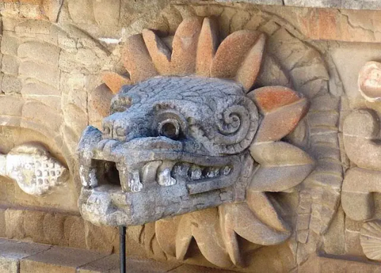
A bust of an Amazonian dragon (Draconis quetzalcoatl) carved in 150-200 CE in Teotihuacan; photo via Wikimedia Commons
An illustration of a European Dragon (Draconis europa) from 15th century Italy, by the British Library
A Chinese dragon (Draconis qin) depicted as one of the eleven dragons in a Ming dynasty scroll, via the Smithsonian National Museum of Asian Art
A page from an illuminated manuscript of the Hamzanama, dated to the 16th century, showing a Persian dragon (Draconis mughal) via the Museum of Applied Arts in Vienna
108 notes
·
View notes
Text
My Top 3 Least Favorite Female Leads
This is going to be my ranking on my Top 3 Least Favorite Female Leads.
#3. Meilin "Mei" Lee

When I watched Turning Red back in 2022 (since I was the target audience for the movie), I did not like Mei because she comes off as annoying, unrelatable, and unlikable to me. This is just my opinion on Mei.
Now, what makes her annoying? She is narcissistic, dishonest, bad-tempered, selfish, and she has no sense of self-control in her emotions. I know she is a teenage girl going through puberty, but I genuinely find her annoying.
What makes her unrelatable? Her shallow friendship with her friends and all of her friends including herself are BOY CRAZY. I know they have some good moments, but I find their friendship kind of shallow to me.
And what makes her so unlikable? She disobeys her parents, lies to her parents, sneaks out of the house, threatens Tyler twice, runs away from her family, and twerks at her mom. And what is the worst part? She completely gets away with it SCOT-FREE. At the end, She just becomes more of a narcissistic brat who never learns to grow up. I know she grew up with a strict Chinese mother, but I just can't see her as a likable character.
Again, why is she so annoying, unrelatable, and unlikable? Because she is literally the OPPOSITE version of me.

I know there are people who genuinely like Mei and relate to her, but I just couldn't because of how she acted.
The only thing I like about her is her bedroom. It has my favorite colors pink and green and its cozy.

Now onto the next one!
#2. Princess Ariana De Sacramise

I hate Princess Ariana De Sacramise so much. She's a shallow Mary Sue who collects men like their Pokemon (yes I watched BlackLightJack's two videos yesterday), treats them like animals, manipulates them, and only cares about their looks. Yes I said it, she is WAY MORE shallow than Mei and her friends! I'm not even joking right now, she is a grown woman who is more shallow than four teenage girls who like 4*Town. Like, she ONLY cares about physical attractiveness of MEN.


The creators depicted her as some "hero" you're supposed to root for, but in reality, she is a villainess.


Also, she is a MASSIVE hypocrite.


BRUH, SHE IS LITERALLY DOING THE SAME THING TO MEN AND DOESN'T SUFFER THE CONSEQUENCES BECAUSE SHE IS A WOMAN! I CAN'T WITH THE DOUBLE STANDARDS THAT THE CREATORS HAVE SINCE THEY'RE ALSO WOMEN AND THE ARTIST IS A PEDOPHILE!

Finally, we have the one and only least favorite female lead!
#1. Charlotte "Charlie" Morningstar

I didn't loathe Charlie in the first three episodes, but after episode 4, It just made me LOATHE her so much. I couldn't stand her anymore. She is a delusional friend who doesn't care about her friends, inconsiderate to their feelings and needs, more annoying than Mei because she acts very happy ALL THE TIME on certain situations, doesn't kill Valentino to rescue Angel Dust, and acts like a SPINELESS CRYBABY AS A GROWN WOMAN! I REPEAT, SHE IS A GROWN WOMAN WHO IS A SPINELESS CRYBABY! NO GROWN ADULT SHOULD BE ACTING LIKE HER BECAUSE THAT MAKES THEM MORE IMMATURE AND SELFISH! ESPECIALLY WOMEN BECAUSE THAT JUST REINFORCES THE STEREOTYPE OF WOMEN BEING USELESS! I HATE SEEING WOMEN BEING SPINELESS CRYBABIES!
She is the absolute worst female lead in animation history! She is everything wrong about what a female lead should NOT be! A SELFISH. INCONSIDERATE. DELUSIONAL. SPINELESS. BRATTY. CRYBABY. That's why I LOATHE Charlie Morningstar!
The reason she acts like this is because she is Vivienne Medrano's horrible self insert.

How can anybody stand her bratty behavior? I cannot stand her anymore...

I LITERALLY CANNOT STAND HER ANYMORE FOR BEING SUCH A SPINELESS WOMAN SHE IS!

SHE IS AN ABSOLUTE DISGRACE TO HUMANITY! HOW CAN ANYONE STAND HER WHEN SHE IS A SPINELESS GROWN WOMAN?! NOBODY SHOULD BE LOOKING UP TO HER AS SOME ROLE MODEL, ESPECIALLY KIDS WHO ARE IN THE FANDOM WHEN THEY SHOULD NOT BE THERE!

STANS WHO BLINDLY WORSHIP HER SHOULD GROW A SPINE AND STOP BEING SELFISH INCONSIDERATE SPINELESS BRATTY CRYBABIES LIKE SHE IS!

Some people call her a Mary Sue, but for me, I call her a SPINELESS CRYBABY. I have to say all those things because I just can't stand her anymore.

EDIT 7/23/24:
I changed and expanded my reasons why I loathe Charlie Morningstar so much.
EDIT 7/24/2024:
I expanded more reasons why I loathe Charlie so much since I rushed it last night.
EDIT 7/26/2024:
I explained why I hate seeing women being spineless crybabies.
EDIT 8/06/2024:
I crossed out "narcissistic" because I was pretty harsh on Mei. She's only a teenager who still has a lot to learn after all.
#hazbin hotel critical#hazbin hotel criticism#hazbin hotel critique#anti hazbin hotel#anti charlie morningstar#turning red#meilin lee#mei lee#the princess's jewels#the princess's jewels webtoon#ariana de secramise
45 notes
·
View notes
Text
☆━━━━━ ⋆⁺。˚⋆˙‧₊☾ ◯ ☽₊‧˙⋆˚。⁺⋆ ━━━━━━☆
✩ ‧₊˚ ⌞ AHA SPLASH ART ANALYSIS ⌝
sampo analysis m.list
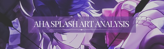
— what the stars reveal: honkai: star rail, interpretative analysis, mainly aha!sampo, emanator!sampo sprinkled in for funsies
— word count: 1.4k
— overview: (as of 2.2) a look at aha’s splash art, what it might mean, and the potential clues it leaves for the identity of a physical avatar.
note: this is my own interpretative opinion — it’s fine if you don’t agree! i know a lot of people don’t subscribe to elation!sampo theories, just as a lot of people do. this is an analysis i’m doing for fun and i understand there are many different & valid interpretations people can have about this. thanks! 🪐
☆━━━━━ ⋆⁺。˚⋆˙‧₊☾ ◯ ☽₊‧˙⋆˚。⁺⋆ ━━━━━━☆
First, let’s look at the splash art itself:
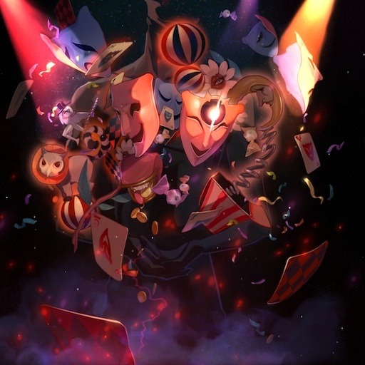
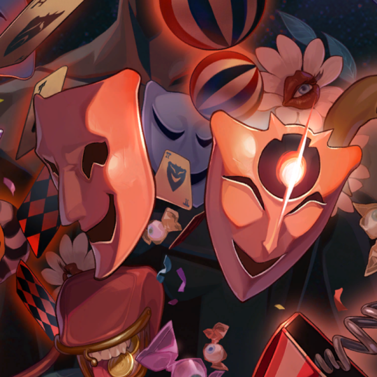
Our eyes are immediately drawn front-and-center to two masks reminiscent of the comedy and tragedy masks from greek theater — however, instead of one smiling and one frowning, both appear to be laughing.
The other masks, which lay in the shadowed background, are the ones frowning. Note how the spotlights and coloring draw our attention to not just the laughing masks, but the masks themselves (more on this later).
A popular image of this splash art is one cropped down to only the laughing masks, showing that most people’s idea of Aha’s “face” is, in fact, centered around the front-facing masks:
However, upon closer look, we can see a variety of other objects at play, including the frowning masks:
The one on the right is specifically interesting because it also seems to have a spotlight on it. Despite not being front-and-center, its frown is still illuminated, perhaps suggesting a “multi-faceted” appearance or personality (even performative sadness or pain).
Other notable objects include: confetti, flowers with eyes, a coin purse in the shape of a mouth, eyeball-shaped candy, a toybox moon with a face, an owl-cat perched on a circus ball, a strange white bird with human legs and a top hat, the aforementioned frowning masks in the background, and, most notably, several playing cards.
The playing cards indicate a red 5 with an upside-down laughing face, a red heart with a frowning face, a black H with a frowning face, a potentially black 7, and a black pi (which might be a roman numeral 2, but since the 5 was not in roman numerals, my bet is on pi) with a smiling face.
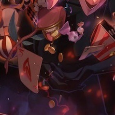
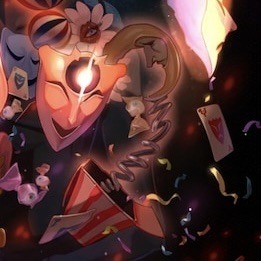
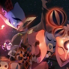
While I do think most of these objects are supposed to be fun little trinkets for the sake of being fun little trinkets — like the circus balls and confetti — the playing cards, coin purse, and shadowed masks stand out to me as potential links between Aha and a physical avatar.
The playing cards have connotations to gambling, money, and deceit, with their unconventional markings tying into Aha’s multiple “masks” and ever-changing persona.
The coin purse signals further associations with gambling and money, with the mouth adding a layer of consumptive desire.
The shadowed masks, as somewhat mentioned before, heavily imply the existence of contradictory emotion behind Aha’s “facade” — a pain or sadness hidden by the flashy lights and faces.
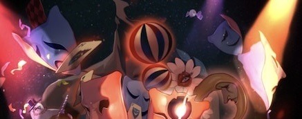
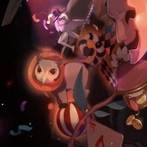
Additionally, and perhaps most importantly, behind all of this gaudy glamor is a silhouette, easily missed for the bright colors of the smiling masks’ spotlight:
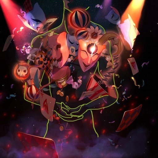
This silhouette is the most widely-circulated clue I’ve seen as to Aha having a physical, humanoid form.
While it may be difficult to make out at first glance, the shape of a human is undoubtedly there, complete with a jawline, neck muscles, biceps, and hands with the palms facing up.
To bring back the detail mentioned earlier, something important to note is that the spotlights draw our focus to the masks rather than the silhouette, manipulating us into only seeing the front-facing objects rather than the person beneath.
This diversion could very well speak to a more literal diversion in Aha’s form — a misdirection where They don’t want others to know Their true identity, so They throw the spotlight on others while They operate under the radar, away from prying eyes.
So, how does Sampo factor into all of this? Beyond the fact that a shady, somewhat pathetic underworld merchant on a remote snow planet is a great alias for “operating under the radar” in terms of the wider universe, let’s start with the silhouette itself, which bears a striking resemblance to Sampo’s E6:
As you can see, they seem to have similar jawlines, collarbones, and shoulder lengths. To me, it very much looks like an inverted version of the E6.
Additionally, the silhouette proper seems to have a broad upper body that tapers near the hips, which fits Sampo’s build. However, this connection alone isn’t enough to make a solid theory, so let’s continue.
I mentioned several key objects earlier, like the coin purse, masks, and playing cards. While these individual marks could apply to other characters (i.e. Aventurine & coins, Sparkle & masks), Sampo is the one that checks every box combined.
Who has an obsession with money (cash ➜ coins)? Sampo. Who is always smiling and hiding his true feelings (putting on a mask)? Sampo. Who is always playing a master game of disguise and manipulation to get what he wants, even if it seems he is “losing” at times (cards)? Sampo.
While I do admit Aventurine could also fit most of this criteria, it is important to note that Sampo is the only one to check these boxes while also being directly affiliated with the Masked Fools, a faction that worships Aha the Elation.
Additionally, we have already received a pretty intensive exploration of Aventurine’s backstory in canon, so I think it’s safe to say he walks the path of Preservation and is mostly affiliated with the IPC.
Sampo, however, walks the Path of Nihility, which in my mind has a lot of overlap with Elation. (I tend to see “Nihility” and “Elation” as existing on two separate ends of the “presentation of meaninglessness” spectrum, with Nihility as pure existential stagnation and Elation as pure existential chaos. As such, it’s easy for me to think of someone potentially going back and forth between Nihility and Elation since both Paths can place heavy emphasis on similar ideas.) Nihility is also the Path often associated with those who have something to obfuscate about their identity (ex. Welt & his past, Acheron & her memory, Kafka & “destiny”).
Overall, I think Sampo checks the most boxes if we are operating under the assumption that Aha has a physical avatar.
This isn’t even touching on the conversation between Sampo and Sparkle during the 2.0 Trailblaze Mission where he refers to himself as an “old timer,” or any other clues like his voicelines (looking at you, “everyone has a colorful past, wouldn’t you say?”) and fourth-wall breaking.
However, it is also possible that all these pieces of evidence can be used for the Emanator!Sampo theory — the different masks and coins in this case could resemble Aha’s Emanators, or a kind of shared or split consciousness that uses parts to make the whole. If we’re going based on that, my money is on this mask in the background being the one to represent Sampo, since the eyes/eyebrows are an expression he often makes:
This could break into several other theories, but the two that first come to mind are A. Sampo & the other Emanators are Aha’s “collection” of what They consider to be practical jokes or props, or B. These separate objects represent different parts of Aha’s consciousness or being — i.e. the parts that make the whole.
(Side Note: In this case, I would attribute Doll!Sampo to the coin purse, as it lines up with the Aha Stuffed Toy occurrence and Sampo’s name as a reference to Finnish mythology! Who knows, maybe he’s both?)
Additionally, there is always the chance of a divide between the silhouette and masks, with the potential of a silhouetted Sampo being a “background” entity occupying a different form than the “full” masks of Aeon Aha. (There can even be places of overlap between Aha! and Emanator!Sampo, so the two are not mutually exclusive!)
Whatever the case, I think there are many strong leads in the Elation!Sampo theory, especially including the ones in the splash art described here. Even though so many possibilities are open at this point, I think Sampo’s identity being closely intertwined with the Elation is a plausible interpretation of canon. However, these are still unconfirmed theories, so that doesn’t mean they’re 100% guaranteed (though I think they have a good chance!).
☆━━━━━ ⋆⁺。˚⋆˙‧₊☾ ◯ ☽₊‧˙⋆˚。⁺⋆ ━━━━━━☆
𖥔 ݁ ˖ જ⁀➴ anyways, that’s the end of my analysis. let me know if there’s anything else you want me to talk about, since there’s a lot of stuff i didn’t touch on here!
also, thanks for reading this far if you did, i’m a bit of a nerd about this theory and i hope all of this made sense! if you want to add anything else to the splash art theory, please let me know, i’d love to hear any details i may have missed! thanks 🪐
☆━━━━━ ⋆⁺。˚⋆˙‧₊☾ ◯ ☽₊‧˙⋆˚。⁺⋆ ━━━━━━☆
© analysis by sunderingstars. do not copy, repost, translate, modify, or claim my work as your own.
#⌞ ✎ sunder.writes ⌝#⌞ ✧ super.nova ⌝#⌞ 🎭 ⌝#aha!sampo#sampo#sampo koski#aha the elation#hsr theory#honkai star rail theory#hsr#honkai star rail#honkai: star rail#sampo hsr#sampo honkai#hsr sampo#honkai star rail sampo
55 notes
·
View notes
Text
Here we go fanfic #2 😼
Acrylics
Summery: doing your nails in the company of dad!Matt <3
Tw: dad!Matt, reader calls him “daddy” platonically of course, adopted teen reader, reader is referred to as “she” and “daughter” and “his girl,” reader is me coded so subtle autism/ocd/and my general thought process is included 😔☝️
“What color should I paint them?” Is the question that breaks the comfortable silence between the two of you. It’s been over a month since you’ve last done your nails, so after some consideration you decided to do them again! Even though it’s a pain to do, you missed the clicky-clacky aspect of having them.
Matt’s attention is momentarily directed towards you at the question, his fingers pausing on the file in his hand.
“Hmm?”
He’s been so busy lately that it’s driving you nuts. Case after case, patrol after patrol, he barely has any time for you! He told you it’s temporary, and that may be so, but you’re having to resort to following him around like a wounded puppy in order to see him for more than a minute in passing! So when you noticed him sitting on the couch going over some notes from the case he’s on currently, you jumped at the opportunity to be near him; grabbing your box of supplies and parking yourself on the floor in front of the couch. Now he’s a mere few inches away from you. Genius, right?
“Ugh, my nails! What color should I paint them?”
It takes a second for the situation to register in Matt’s head. You’re doing your nails.
“Well, what are your options?”
Despite how busy he is he knows what he got himself into when he took you in. He’s a father now, you’re his biggest responsibility. And though he’s tempted to give an absentminded answer, he knows how much little moments like this mean to you. You value his opinion. You flourish under his care. He shouldn’t half ass anything with you, even picking a nail polish color.
You grin now that you finally have his attention, moving to sit on your knees as your heart excitedly pumps in your chest, the rhythmic *thud-thud-thud* making its way to his ears.
“Uh-! I have light blue, red, brownish-red, black, white, navy blue, pink, and purple. Oh! And glittery silver.”
He listens as you list off the different colors, doing his best to remember each one.
“Hmm, that sounds like quite the selection!” He laughs softly, finding your eagerness endearing. “Which ones are you leaning towards?”
Your eyes quickly scan the arrangement of bottles lined up in front of you, ordered based off of which colors are supposed to go next to each other. Black, glittery silver, white, navy blue, light blue, brownish red, red, pink, then purple.
“…Well, black is my favorite color but I’ve been wanting to feel cutesy lately so I was thinking pink, but the navy blue is also so pretty and it would look great with the silver!”
Matt nods along, the gears in his mind turning as he tries to think of a combination his daughter would likely enjoy the most. Giving her his advice often proves pointless because in the end she knows what she wants, and she always wants things a certain way.
“Well… why don’t you do Eenie Meenie Miny Moe?”
You take second to think about his suggestion. That’s what you tend to do most of the time given how indecisive you are, but today feels different. You can’t leave things up to chance.
“…no.”
He doesn’t say anything in response, knowing you need the space to think on your own. He gave you his idea and you rejected it, now he can get back to work while you stew on it.
Except… he doesn’t quite want to get back to work yet. You’re his biggest weakness, oftentimes the only thing that can tear him away from said work. But he reminds himself that he has a deadline. He has to get this done.
He goes back to reading the papers in hand, expertly tracing every bump and lack thereof. Though Matt quickly grows frustrated with himself. He can’t focus. He’s not picking up on anything he’s “reading” and he knows exactly why. You. His senses are focused on you; the way your eyes bounce around as you brainstorm, going back and forth between the nail polish and your hands. How your foot bounces repeatedly despite you sitting with your legs crossed. The way you mumble to yourself as you count off of each finger, likely trying to come up with different combinations.
“Blue, silver, blue, silver, blue… no. Silver, blue, silver, blue, silver… no. Black, silver, blue, pink… purple? Ugh, no.”
It brings a soft smile to his face. You’re so cute and you don’t even know it. Before he can get too lost in his thoughts he’s startled by a gasped “oh!” escaping you.
“I know! I can do black and pink alternating on my left hand, and navy blue and silver alternating on my right!”
…oh? Definitely not what he was expecting you to decide on, but he’s learned to expect the unexpected when it comes to you.
“Yeah? That sounds like a good idea angel, very smart.”
You can’t help but grin shyly in response, looking over your shoulder in order to see if his words are genuine. Judging by his gentle expression, they are. His praise always pulls a flustered reaction from you. He’s just so nice.
“Thanks…” You mumble, grin refusing to leave your face even as you turn back to your supplies and begin to prep the press-ons.
45 minutes of drilling, filing, cursing, glueing, and painting later, you’re finally finished.
“M’kay m’done!” You declare proudly, turning around and holding your hands out to your father. He tilts his head curiously, forming in his mind what he believes your nails look like as his attention is diverted from his papers once more. He might be blind, but he’s told you about his senses. He can see in his own way.
“Good job sweetheart! I’m sure they look amazing.”
“Thank you daddy! I’ll let you touch em once the paint dries!” You did do good! They’re correctly sized, glued on, and painted. Though the paint job is… messy, as you often tell him. It’s just so tedious having to not get paint on your skin when it’ll wash off a day or two later!
“Alright hun, I’m looking forward to it…”
The constant fidgeting you’ll do in the next week or so is going to drive him nuts. The constant clicking of the nails, the sound of you picking at the sloppy glue job, the lingering smell of paint, etc. But he’s gotten used to your other fidgeting habits, having drowned them out just like he does with the rest of the city. You’re his girl, he just wants you to be comfortable and happy.
Once you begin packing up all your belongings, taking care not to smudge the paint, Matt decides to do the same. He’s neglected you long enough. Even if you say it’s fine, he knows it isn’t.
As you stand up with your box in hand he’s quick to catch your attention.
“Sweetheart?”
Turning to face him your posture subconsciously straightens, a curious “huh?” leaving your lips.
His tongue slips out for a split second to run over his lips, a subconscious habit you both share. He’s suddenly nervous. You’re a teenager, you don’t want to spend time with him, especially after he’s hurt you by not being here. You’re petty by nature. But at the same time… he knows you love him. You wouldn’t have sat by him if you didn’t.
“Uh… well, do you wanna… watch a movie?” His hands gesture weakly as he asks, yet another habit you both share.
“Uh…” Do you wanna watch a movie? Maybe, depends on what it is. “…what movie?
“Any! You pick.”
When he gives a jerky shrug you suddenly catch on to how he’s feeling. He must want to spend time with you, he seems kinda desperate. No not desperate. Nervous? Ugh, emotions are hard. While doing your nails exhausted you to some degree, you can’t deny him quality time when that’s exactly what you’ve been craving as well.
“Uh… I mean yeah, sure.” You shrug back, glancing down at the box in hand before looking back at him. “I just gotta put this back and change my clothes. Gimme a sec.” Choosing not to wait for a response, you head back to your room with the intention of doing just as you said.
“Alright, take your time, there’s no rush.”
#daredevil#matt murdock#matt murdock x reader#fanfic#daredevil fanfiction#matt murdock fanfic#fluff#teen!reader#daughter!reader#dad!matt#sfw daddy!matt#daddy!matt#i write :3#writing#😼
36 notes
·
View notes
Note
Well since you reviewed Pinsir, how about Haracross too?

Heracross is the counterpoint to Pinsir, though ironically the two couldn't be more different design-wise. Pinsir is very much a monster that looks vaguely like a stag beetle, while Heracross is pretty straightforwardly a rhinoceros beetle (stag beetles and rhinoceros beetles being some of the most popular pairings in Japanese bug fights, which is what Pokemon is based off of). Sure, Heracross is bipedal and there are some anatomical differences here and there, but it's not quite as wildly different from the IRL insect compared to Pinsir.

Visually, Heracross is a fairly rare example of an almost completely monotone Pokemon, being a nice shade of blue with only its white claws and yellow eyes to break things up. The body has a plated look to match actual beetle exoskeletons, and includes details like the spikes on the forelegs that actual beetles have. I like Heracross' face in particular—the face is divided into its own section that looks around and under the eyes, creating a short of :3 mouth shape. It's both cute and a unique way to handle the tricky subject of how to stylize bug mouthparts for Pokemon in a way that isn't just humanoid. Overall, a very straightfoward design, but a pretty decent one.

The degree to which Heracross' design is straightforward is a bit of its time, so Mega Heracross adds a ton of detail, some of which works and some of which I think just clutters things. It also progresses the rhinoceros beetle idea by making it into a Hercules beetle specifically, one of the biggest beetles out there, as emphasized by the particular double horn shape.

I do really like the addition of the red bands around the body, which is now a slightly darker blue for higher contrast. I don't mind Heracross being monocolor, but the red bands add just the right pop of color without being too much. The progression of the theme and the overall changes to the body shape make it very distinct and give it a good sense of progression. There's also a few neat mechanical things in there, like the way it can pop open its arms to fire things like seeds

However, there's also some parts of the design that feel a bit overworked. For example, I don't get what that giant red splotch across the forehead is supposed to be; it's pretty distracting and really doesn't add anything to the design. (I also miss the :3 expression, but that's not the point.) Likewise, it has yellow on its back, which feels like too much color—yes, it looks like a Hercules beetle, but I feel like it gets that across perfectly well without the unnecessary color.

White it's less of a problem, I also don't love the vents on the stomach. It's probably supposed to look a bit mech-like because bugs are a big superhero thing in Japan, but I feel like this pushes it too much into looking mechanical instead of insect-like. I think if the vents were just changed to straight line divisions and the yellow elytra and red on the forehead were removed, you'd have a much more cohesive and less busy design.

As a whole, Heracross is a pretty straightforward but nicely designed rhinoceros beetle. Mega Heracross has the right idea, but has just a few too many things going on with it that bog down the design a bit.
42 notes
·
View notes
Note
what would members of the solosis line with drifblim fathers look like?
Pokemon Crossbreeds: Respiration
Respiration is the name for members of the Solosis line whose fathers were Driffloon/Drifblim. The breed got its name from the process or cellular respiration, which is when Oxygen in cells is used to make sugar. The breed is known for their melancholic personalities and their quietness. They were bred for their higher HP and their ability to learn Acid Armor.


Solosis
Respirative Solosis have a rounder shape and an X on their mouth instead of a diamond shape. The thing on their head becomes cloud shaped instead. These Solosis are quiet, and because of their nature, they've been nicknamed drifters. While they aren't ghost types, there are legends of this breed having spirits trapped in their jelly, waiting for them to get out.
Duosion
Respirative Duosion gain the traits if Drifblim, including sharper limbs, lighter colored underbellies, and lines on their bodies. There is also a 50% chance they can be born with red eyes instead of black, but I'm sticking with showing the black-eyed ones here. They have more oxygen inside of them than standard Duosion, and releasing it is how they are able to move around faster (sometimes it can sound like a fart and it gets old when you're supposed to teach about these things to first graders for a project). They're more active at evening.
Reuniclus
Respirative Reuniclus keep the X and markings of Drifblim, but the air that would float above them is now atop their head. Instead of the usual circles inside of Reuniclus, they gain little hearts that match the ones of Driffloon. The most notable change is their second pair of arms that resemble Drifblim's tentacles. These Solosis use their extra pair of tentacles to aid them in battle and help them with other simple tasks, making them useful service pokemon for paralyzed people. Like they're fathers, they're crepescular and travel in groups.
//My designs can be used by anyone if you credit me! Talking about designs under the cut
Solosis was super easy to draw, but I was confused about coloring. I kept wondering whether purple would be too much or if green wasn't enough. Eventually, I just settled on keeping it green.
Duosion was fun. I already like Drifblim a lot so it was fun making a pokemon crossed with it. Got inspiration from a basketball with the lines, lol. Had mixed opinions on the red eyes but I decided to stick to black when showing drawings though. I have what it looks like with red eyes though if anyone wants it

Reuniclus was the hardest, and I'm using thst lightly bcuz I didn't struggle much. It was more just sitting there and wondering if I should draw the arms downwards or keep them up. Wondered about the ears, but I just decided to move them so the air could fit. Wasn't going to give it hearts, but Driffloon has hearts, and I thought they looked cute, so I left them.
Thanks for reading this far if you did!
#solosis#duosion#rotomblr#pokemon irl#pokeblogging#pokeblog#irl pokemon#pokemon#pokeblr#rotumblr#pkmn irl#pokemon roleplay#irl pkmn#pokemon crossbreeds#crossbreed pokemon#reuniclus#reuniclus crossbreeds
52 notes
·
View notes
Text
Differences of the WoY visual style between the pilot and the final show (Along some other stuff) (Part 1)
So a crap-ton of cartoon show bibles and pilots surfaced recently, which is kind of fucking cool, and it included stuff from Wander over Yonder, which is way fucking cooler.
First thing I did was over-analyze the show's visual style and I figure I should put my findings somewhere, so here you go! In a chronological order, it's easier that way (and builds suspense for the real good stuff, ooohooooh (in a spooky ghost voice)).

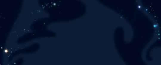
The first shot alone already brings forth some differences. As far as I know, the show never illustrates space like this, entirely black with just a couple of stars to break the void. There's usually some blue star dust or something, kinda like this:
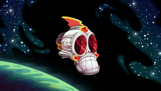
The skullship was planned to be 3D-animated apparently, instead of being drawn in the same style as the backgrounds. This allows for WAY more complex movements, since it's easier to pull off.

We then get to take a looksie inside of the ship... this isn't like ANYTHING in the show.
We do see control rooms on occasion, but not one like this. It's a circular room with rows of watchdogs on the wall, watching monitors, circulating the middle where Hater sits on his throne. The railings on its support carry Peepers and his cockpit. Two watchdogs control the ship (I think) at the front. That blue goop at the top might be the ship's brain (you can also already see some animation errors in the front, peep their grabbers).
There ain't ever been a color palette inside the ship like this, they usually opt for red and black rather than red and white. This might have been their solution to making the characters native to Hater pop out against the background before deciding to just substitute black for purple.
There's still bright locations within the skullship, but they're non-threatening ones, like the food court.
Commander Peepers and the watchdogs have designs that, while closer to their final versions than the pitch bible (or whatever that cover of that graphic novel was supposed to be), carry some traits still worth pointing out (well, so does everything here, but pshhhshshhhshh).
SHINY
COLLARS
Puffy collars around necks, wrists and ankles.
Detailed irises.
Detailed soles on shoes.
Those lines on their gloves that you see in your grandpa's toons.
(bugs bunny pictured flipping the bird)
This is specific to Peepers; the jagged thunder-spike on his helmet has dimension to it, as opposed to the implied dimension in his final design. Spikes on the side are also way longer here.

His eye/face emotes differently by just utilizing a black eyelid, rather than turning the hat into a pseudo-eyebrow, kinda like Double D from Ed, Edd n' Eddy.


We then get a glimpse at Hater's design...
Despite his face missing, you can already see some differences, like his arms resembling more those of an actual skeleton and packing a lot less mass. His hood is also a bit more tout and the folds surrounding it have more empathis.
Another space shot with some shapes to break up the infinite black; it's not always you see a warm color palette for space in the actual show.
Maybe here, when Wander and Sylvia stop the sun from blowing up in "The Good Deed".


When entering the city that's about to get its shit stirred by Hater, we notice that there aren't ANY other locations illustrated like this. We usually have smooth, airbrushy looking stuff, when this is more reminiscent of a comic strip, with clear lines and some hatching to indicate weight here and there. Same goes for the townsfolk, they remind me of... Krazy Kat or something. Craig McCracken has gone on record saying he drew a lot of inspiration from old comic strips, but I don't know if Krazy Kat is one of them. I just thought of it :)


The inside of the skullship looked different so this place might have had an unique artstyle to other locations we would've seen in this version of the show, but that would also be a big difference since the actual show keeps the background style consistent throughout the whole run (as far as I know).

Goes in hand with the skullship; the watchdogs are 3D-animated here, although subtly.
Different gun designs... they look more like water guns here. Big ol' TUBES. Their guns in the show are more sci-fi-esque.

Hater's logo is different, in-line with his design. Way flatter design too. Might as well take a look at his actual face now.
Well, more like next time. Just found out you can only use up to 30 images in one post. Oopsies. I'll continue this when I have the energy! I'll continue my chronological analysis/rambling and perhaps talk about the general art-style and animation at the end. Might take me a couple of more posts.
#wander over yonder#WoY#animation#this is by far the longest post on here up until now#i was fascinated with the pilot when i saw it so y'know i had to put everything i was doing aside and write this out#rambly#long post
46 notes
·
View notes
Text
Since Fatal Lavenders will be discontinued / wont have another chapter for this year- I'm dropping off notes-
OLD CONCEPT REF SHEET

CURRENT CONCEPT

These were all part lore dumps that I never gave more details for her character I just want people to know that she aint dead. Yet.
INCOMING LORE:
HEATHER'S LORE:
Lets just say her Human body became permanent right after PV created it just for her. In order for the body to deform and revert back to goop- the USB had to be broken.
The USB is supposedly attached INSIDE of her right hand- (I didn't included that because it mightve been a bit too gore-ish black-)
She had those clear milk skin, more of a brownish color hair, and also heterochromia eyes.
And ofcourse, Four's favorite color. Blue. The thought of matching colors with your partner would've been a thing by now for her.
In the end of the plot- she was different than that- she considered to be one of those good people who change for the better. (This was her second option)
SMG3 is just jealous when she's around with him but doesn't say a word, remains to be silent all the time.
The clear skin is supposed to be vitiligo and such as her eyes are like bright blue ones. She wears casual clothes than the overalls.
Heather uses She/Her pronouns. Her sexuality is undefined.
SHORTER THAN SMG4! She is genuinely a nice person (even at the end) but since I didn't like the plot of soft- I erased her full character and made a new one for TAG6 as a replacement.
Heather died happily and accepted her fate.
The flowers symbolize as the main characters:
Orange - Meggy
Red - Mario
Purple - SMG3
Blue - SMG4
Light blue - P E A C H
TAG6's LORE:
She had tanned skin and a curly brunette hair. Just by looking at her eyes you KNOW there's something up with it.
Unlike anyones white eyes, they have one more of a yellow-ish detail of color. The overalls are part of what the usb could copy just like Three and Four's main one.
For TAG6, their Human Body is temporary. By what Puzzles made for her has a limit due to the USB's capacity. With that said- the USB is right inside of her. To function it must be there.
Tag6 is shown to have a mean trait- tho she never loved SMG4 at all and to anyone else she doesn't like anyone that they encounter.
The lilac filled on their eyes have somekind of hypnotism when people stare at it. (It may work for some but it doesn't work all of the time)
I thought of making her whole appearance give out the lilac theme due to the mixture of RED and BLUE.
(Which is aka SMG3 and SMG4's eye color and since they helped each other out to finish the usb I think they shared some of their links)
Tho TAG6 does have a yellow appearance in its Combat mode.
Tag6 uses she/they/it pronouns. Its orientation is Aromantic.
THEY'RE SLIGHTLY TALLER THAN SMG4! (Suprisingly this doesn't bother him at all since any woman/men is what he'd prefer-)
And since SMG3 is different to act here when with TAG, he starts up an arguement calling her as weak/selfish than she already is. Causing them to piss off and smash his face with its hammer to the air.
Tag6 can be a bit more impatient, they may look like they're a nice person in general but literally they do it for attention and to get what they're willing to succeed.
But in reality behind their mask they turn out to be the cold hearted, uncaring, hateful, disgusted, and a negative being out of all existance.
At the end of the plot they didn't give a damn when it came to SMG4 she just wanted to finish the mission for its master. But since it failed, she never cared anymore less rather than punching insults at Four.
She gives out the color of Lavender which also is close to main purple (because Purple is SMG3's color signature as well-) TAG6 is basically a copy of that color as well.
I think those are all of it- thank you so much for reading everyone I hope I made some of yall inrerested about this lore because not any other people can create such an amazing idea like this one-
Also for those who are waiting for the new chapter it wont come out this year so you'll have to expect it for the early 2025th
32 notes
·
View notes
Text
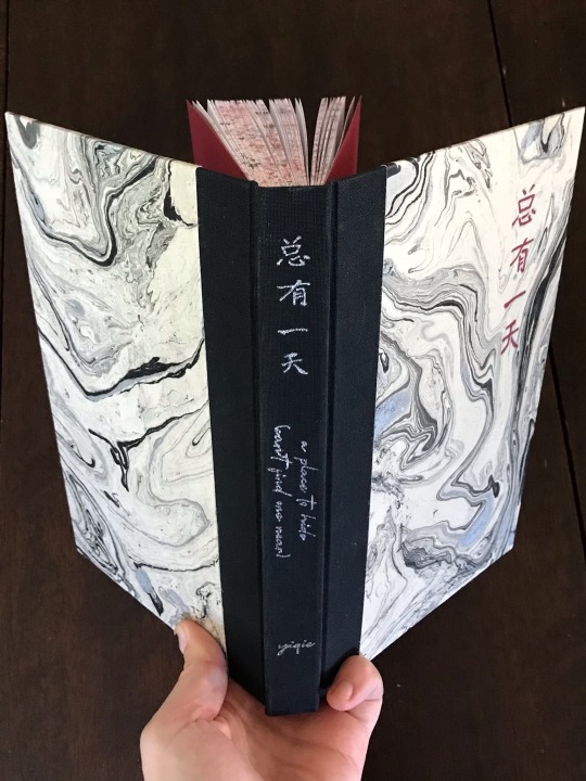
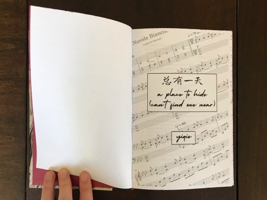
总有一天 a place to hide (can't find one near) - yiqie
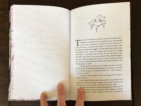
That’s just the thing, isn’t it? Wei Ying feels nothing. He doesn’t feel anything, and this emptiness should scare him. He knows he should be scared. He wants to be scared. He isn’t. Fear itself is never scary; fear is just a response. It means that your body wants you alive. It’s the absence of terror that scares him.
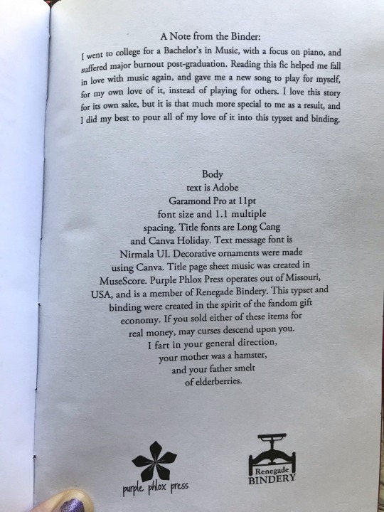
I had SO MUCH FUN with this bind! This one had a lot of firsts for me, and is one that I really poured my heart into due to its particular emotional impact on me (tl;dr - I was a piano major in college, burned out, this fic helped me fall in love with music again). It's an Untamed WangXian Pianists AU (TW for anyone interested that it deals with attempted suicide and life following that) and I tried to tie that into the design details literally everywhere I could think of. Black and white cover paper, music note scene breaks, and my absolute favorite part to create: sheet music title pages. The particular song used for that is a recurring motif in the fic and one that means a lot to me personally, and I knew I wanted to include it somehow. Unfortunately I couldn't find an existing image of the sheet music that was high enough quality to use how I wanted, so I used a sheet music program to input it myself!
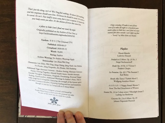
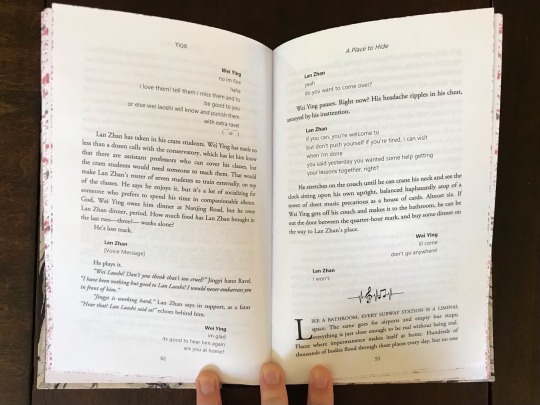
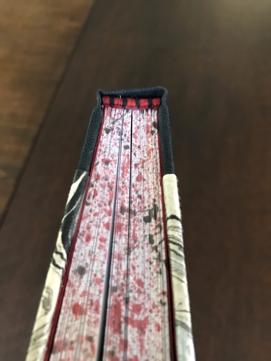
This book was my first time doing any sort of edge decoration, and I had fun figuring out how to splatter paint with a toothbrush (Spouse: is that supposed to be blood? Me: no but also... kind of?) and it was also my first time doing endbands! (Shout out to the friends who walked me through it over voice chat one evening, and then rolled their eyes when I announced that I'd torn them out and done them over again. Twice.) I went with red and black for both of those parts to match the main characters canonical color scheme, and also because I liked the dramatic pop of color against the black and white cover.
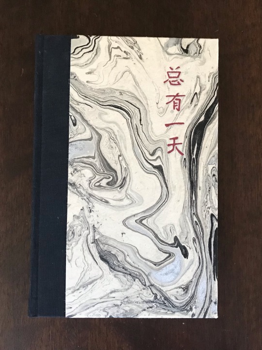
Spine titling was done once again with a foil quill, and I decided to paint the Chinese title of the fic on the cover. I couldn't find a paintbrush that let me get as fine tipped and detailed as I wanted so I may or may not have used a toothpick to paint it on.
I prevailed over: somehow deleted half of my page numbers and had to reprint the WHOLE THING! Forgot to measure the boards as part of my spine width and had to do surgery with 2mm strips of paper! (Thankfully had allowed plenty of hinge because I didn't realize until I'd finished ALL of the titling and I would have cried if I couldn't salvage it) Truly this is my child and I adore how it turned out. Is it perfect? No. Are there things I would change? Sure. But I learned and I did and I'm so goddamn proud of it!
(See below the cut if you want specific details on the binding)
What pieces went into making it:
Fandom: The Untamed
Pairing: Wei Wuxian/Lan Wangji
Pairing: Wei Wuxian/Lan Wangji
Bookcloth: black Brillianta
Cover paper: black and silver marbled lokta
Endpapers: red cardstock
Titling: foil quill, acrylic paint, acrylic paint pen
Endbands: leather cording for the core, DMC embroidery thread for the bands
Body font: Adobe Garamond Pro
Title fonts: Long Cang and Canva Holiday
Text message font: Nirmala UI
Scene breaks created in Canva
Title page sheet music created using MuseScore
#purplephloxpress#ficbinding#wangxian#the untamed#pianists au#yiqie#fanbinding#renegade bindery#adventures in bookbinding
264 notes
·
View notes
Last Seen Blogs
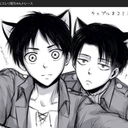
tori-jaeger
Keep calm and... love anime ♥

luatnqhvn
Luật NQH Việt Nam
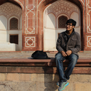
akshayguptaa
Akshay Gupta

lunalma
Tired™

ireu-education
IREU