#low level photoshopping
Photo
Messing around in photoshop
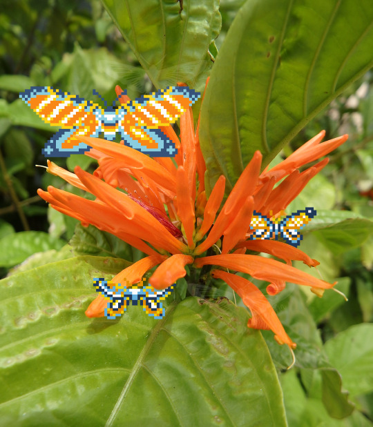
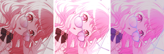
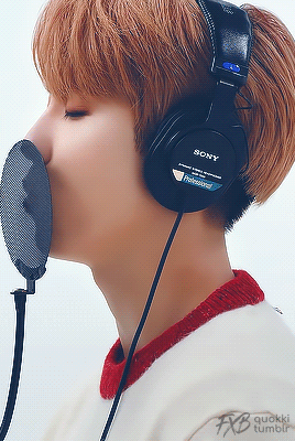
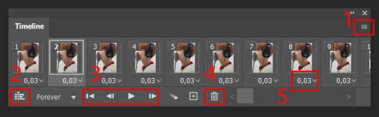
#been doing some bare minimum photoshopping with the moths#I think it's a fun way to show them without all the grid lines#plus I'm finally doing something with all these flower photos I have sitting around#I sometimes physically draw pixel art and always think it's fun seeing it in the real world#lgbtqia+#aroace#moth#I guess i'll tag moth and butterfly for everything again#butterfly#insects#bugs#pixel art#pride#pride month#photography#flowers#I don't know what most of the flowers are in these photos so don't take any meaning from them#low level photoshopping
27 notes
·
View notes
Note
May I ask what scanners / equipment / software you're using in the utena art book project? I'm an artist and half the reason I rarely do traditional art is because I'm never happy with the artwork after it's scanned in. But the level of detail even in the blacks of Utena's uniform were all captured so beautifully! And even the very light colors are showing up so well! I'd love to know how you manage!
You know what's really fun? This used to be something you put in your site information section, the software and tools used! Not something that's as normal anymore, but let's give it a go, sorry it's long because I don't know what's new information and what's not! Herein: VANNA'S 'THIS IS AS SPECIFIC AS MY BREAK IS LONG' GUIDE/AIMLESS UNEDITED RAMBLE ABOUT SCANNING IMAGES
Scanning:
Modern scanners, by and large, are shit for this. The audience for scanning has narrowed to business and work from home applications that favor text OCR, speed, and efficiency over archiving and scanning of photos and other such visual media. It makes sense--there was a time when scanning your family photographs and such was a popular expected use of a scanner, but these days, the presumption is anything like that is already digital--what would you need the scanner to do that for?
The scanner I used for this project is the same one I have been using for *checks notes* a decade now. I use an Epson Perfection V500. Because it is explicitly intended to be a photo scanner, it does threebthings that at this point, you will pay a niche user premium for in a scanner: extremely high DPI (dots per inch), extremely wide color range, and true lossless raws (BMP/TIFF.) I scan low quality print media at 600dpi, high quality print media at 1200 dpi, and this artbook I scanned at 2400 dpi. This is obscene and results in files that are entire GB in size, but for my purposes and my approach, the largest, clearest, rawest copy of whatever I'm scanning is my goal. I don't rely on the scanner to do any post-processing. (At these sizes, the post-processing capacity of the scanner is rendered moot, anyway.) I will replace this scanner when it breaks by buying another identical one if I can find it. I have dropped, disassembled to clean, and abused this thing for a decade and I can't believe it still tolerates my shit. The trade off? Only a couple of my computers will run the ancient capture software right. LMAO. I spent a good week investigating scanners because of the insane Newtype project on my backburner, and the quality available to me now in a scanner is so depleted without spending over a thousand on one, that I'd probably just spin up a computer with Windows 7 on it just to use this one. That's how much of a difference the decade has made in what scanners do and why. (Enshittification attacks! Yes, there are multiple consumer computer products that have actually declined in quality over the last decade.)
Post-processing:
Photoshop. Sorry. I have been using Photoshop for literally decades now, it's the demon I know. While CSP is absolutely probably the better piece of software for most uses (art,) Photoshop is...well it's in the name. In all likelihood though, CSP can do all these things, and is a better product to give money to. I just don't know how.
NOTENOTENOTE: Anywhere I discuss descreening and print moire I am specifically talking about how to clean up *printed media.* If you are scanning your own painting, this will not be a problem, but everything else about this advice will stand!
The first thing you do with a 2400 dpi scan of Utena and Anthy hugging? Well, you open it in Photoshop, which you may or may not have paid for. Then you use a third party developer's plug-in to Descreen the image. I use Sattva. Now this may or may not be what you want in archiving!!! If fidelity to the original scan is the point, you may pass on this part--you are trying to preserve the print screen, moire, half-tones, and other ways print media tricks the eye. If you're me, this tool helps translate the raw scan of the printed dots on the page into the smooth color image you see in person.
From there, the vast majority of your efforts will boil down to the following Photoshop tools: Levels/Curves, Color Balance, and Selective Color. Dust and Scratches, Median, Blur, and Remove Noise will also be close friends of the printed page to digital format archiver. Once you're happy with the broad strokes, you can start cropping and sizing it down to something reasonable. If you are dealing with lots of images with the same needs, like when I've scanned doujinshi pages, you can often streamline a lot of this using Photoshop Actions.
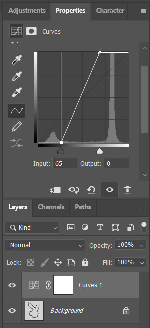
My blacks and whites are coming out so vivid this time because I do all color post-processing in Photoshop after the fact, after a descreen tool has been used to translate the dot matrix colors to solids they're intended to portray--in my experience trying to color correct for dark and light colors is a hot mess until that process is done, because Photoshop sees the full range of the dots on the image and the colors they comprise, instead of actually blending them into their intended shades. I don't correct the levels until I've descreened to some extent.
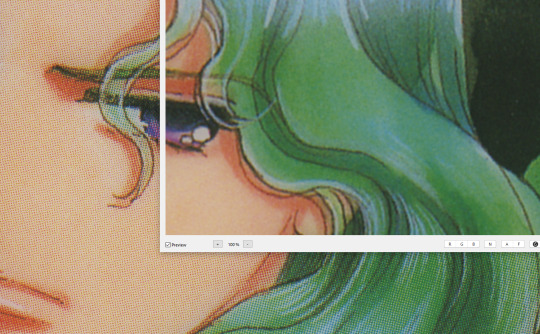
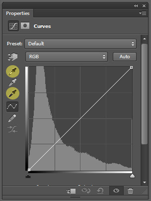
As you can see, the print pattern contains the information of the original painting, but if you try to correct the blacks and whites, you'll get a janky mess. *Then* you change the Levels:
If you've ever edited audio, then dealing with photo Levels and Curves will be familiar to you! A well cut and cleaned piece of audio will not cut off the highs and lows, but also will make sure it uses the full range available to it. Modern scanners are trying to do this all for you, so they blow out the colors and increase the brightness and contrast significantly, because solid blacks and solid whites are often the entire thing you're aiming for--document scanning, basically. This is like when audio is made so loud details at the high and low get cut off. Boo.
What I get instead is as much detail as possible, but also at a volume that needs correcting:
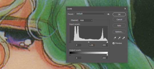
Cutting off the unused color ranges (in this case it's all dark), you get the best chance of capturing the original black and white range:
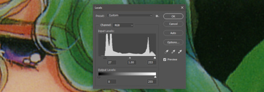
In some cases, I edit beyond this--for doujinshi scans, I aim for solid blacks and whites, because I need the file sizes to be normal and can't spend gigs of space on dust. For accuracy though, this is where I'd generally stop.
For scanning artwork, the major factor here that may be fucking up your game? Yep. The scanner. Modern scanners are like cheap microphones that blow out the audio, when what you want is the ancient microphone that captures your cat farting in the next room over. While you can compensate A LOT in Photoshop and bring out blacks and whites that scanners fuck up, at the end of the day, what's probably stopping you up is that you want to use your scanner for something scanners are no longer designed to do well. If you aren't crazy like me and likely to get a vintage scanner for this purpose, keep in mind that what you are looking for is specifically *a photo scanner.* These are the ones designed to capture the most range, and at the highest DPI. It will be a flatbed. Don't waste your time with anything else.
Hot tip: if you aren't scanning often, look into your local library or photo processing store. They will have access to modern scanners that specialize in the same priorities I've listed here, and many will scan to your specifications (high dpi, lossless.)
Ahem. I hope that helps, and or was interesting to someone!!!
#utena#image archiving#scanning#archiving#revolutionary girl utena#digitizing#photo scanner#art scanning
239 notes
·
View notes
Text
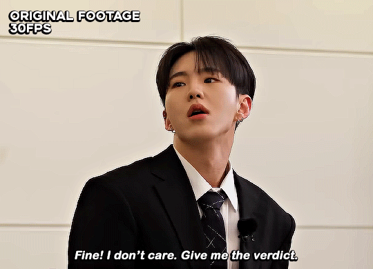
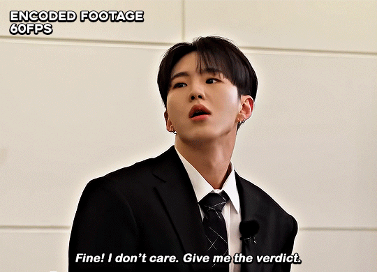
☆ UPSCALING LOW QUALITY FOOTAGE
what i used:
• 2021 macbook pro with m1 chip (390/500gb storage used she's hanging in there)
• photoshop 2020
• mpv (for screencaps but this isn't needed!)
• handbrake (available for linux, mac and windows here)
• video source to gif
what is handbrake?
basically its a software that helps you change the format of videos, such as for certain devices or screens, or in the case that we're going to utilise, quality and frame rate!
disclaimer:
handbrake is super easy to use and very beginner friendly for this procedure and it can make a video go from 30fps to 60fps however it does not replace the quality of true 4k/blue/master-pro res files. in the gif below, this is the level of detail in a master pro-res file.

getting started
it's easiest first to note the timestamps of the video you want to encode, and keep in mind that unless your computer is incredibly powerful, i wouldn't try to encode an hour worth of footage in one run! my laptop could handle about 30 seconds in one go before she started toasting.
using handbrake:
once you've downloaded the software, open the software and it will come up with a pop up window asking you to open the video source (that is presumably saved within your folders) and go ahead and do so!
in the range section, use the drop down button to navigate to seconds and enter your timestamp. the duration on the side will show how long of the footage you're gonna encode is!

then go down to the save as, and give your footage 'to be snipped' a name. this isn't necessary but useful because if you're planning to say, encode 3 or 4 small parts of footage in one sitting, each encoding instance will overwrite the previous one. so i just call mine 'cut 1', 'cut 2' and so on.

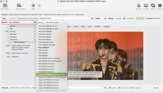
next go to preset, and there you'll see such a wide variety of options that you can play around with, with differing qualities, frame rates, sound options, and so on. for the sake of this tutorial, i'm using 'superhq 2160p60 4k av1 surround' and i've used the drop down menu to select it! then go ahead and press start! the time taken to complete depends on the duration of footage that you sent to encode! you'll find your encoded video as an .mp4 file in your designated folder (which you can change via browse at the bottom)
what next?
• if you prefer to open footage directly into photoshop (my ps can't handle it), then go for it!
• if you screencap as i do, then just use mpv or whatever screencapping program you prefer to make the screencaps and open in ps in your usual manner.
• you can use the timestamps to further process the video through vapoursynth to denoise, but i've yet to try that!
the results
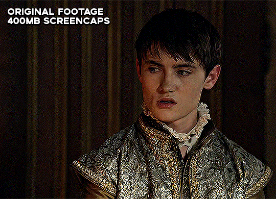
for this first set of example footage, i used footage from the be the sun concert file, which is almost 2 hours in length and 4gb in file size.

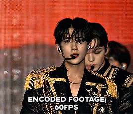

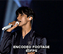
you can see the difference in the smooth frame rate of the footage, as well as the quality of the sharpening!
and to utilise the bane of gifmaking, a gose episode, notorious for dodgy pixelated frames and less hd quality in 1080p on youtube, i ran it through the same settings!
these are the exact same files, downloaded using 4k video downloader and with the same sharpening, but see how on the original file, the sharpening looks a bit more harsh and 'outlined' while it seems to sit softer on the encoded 4k version!
so i mainly use handbrake for dvd files, or not-so-hd 1080p youtube videos or videos that seem a bit clunkier but i had never tried them on a tv/film file so take a look below! i used a 1gb (so not very good quality) of a show (as compared to its 4gb files).
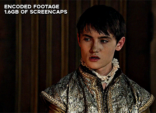
as i said at the start in the disclaimer, handbrake can't replicate true file quality, as you'd expect to see in a proper hd bluray/t*rrent file of a show but there's an interesting difference in the frame rate. personally it's not something i would utilise much there but its all up to individual preference on how someone prefers to have their gifs <3
this is a very basic run-through of how i used handbrake, as i haven't really explored all its features and i use this as a quick process when i'm running through seventeen dvd/dl files but i feel like it would work well on general youtube videos (such as interviews, episodes, behind the scenes) and feel free to send an ask/message for any help/clarification! <33
#ps help#usergif#gif tutorial#kpop gif tutorial#seventeen#completeresources#2605#userace#niniblr#emification#usershreyu#heymax#arieslofi#tusermlee#userbloomingwarrior#uservivaldi#userzil#userfanni#userrozza#usermoonchild#userraffa#tuserjen#usernik
318 notes
·
View notes
Text
Mia Winters and the Connections
There are a lot of bad takes on Mia Winters out there, a lot of really irritating shallow misconceptions. But for now, I’m just going to tackle one of the big ones that annoys me the most.
Mia Winters is not a scientist, and it's debatable whether she had any long-term association with the project that created Eveline. She may not have even met Eveline before being assigned to transport her to South America.
Mia’s not any kind of researcher. Her job when she worked at the Connections is laid out clearly in the first document you find within moments of starting the flashback ("Orders"): she’s a member of the Special Operations Division in the English version, or a 'special agent' in the Japanese (特殊工作員, tokushu kousaku-in). The English version also gives Mia the role of 'caretaker', implicitly of Eveline, but there's not much to suggest this is a role extending beyond the bounds of this particular mission (for comparison, the Japanese doesn't mention caretaking at all).
Mia's job is exactly what we see her doing in the game: transporting important assets under cover identities, and running around doing damage control with a machine gun if things go south. She echoes the same in her letter to the Bakers, stating she 'was assigned to transport some important cargo.' Even the 'imprinting protocol' she refers to seems to be mostly part of a transport protocol (going by the very little we ever learn about it), and may not even have been implemented until shortly before they left.
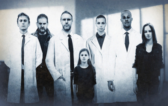
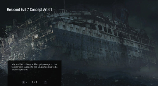
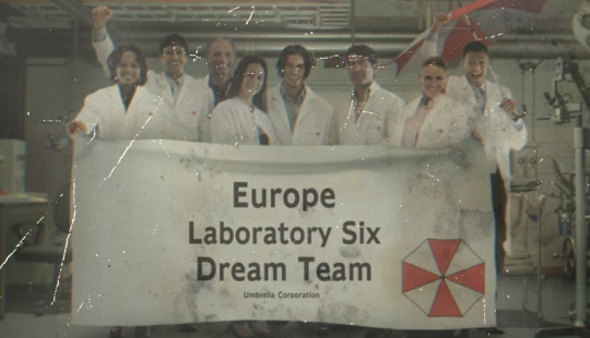
Even in the one photo of her standing with the research team, you might note that Mia and her partner Alan are the only people present not wearing lab coats (and believe me, with how much other photoshopping there is in this photo, Mia would have been wearing a lab coat if they'd wanted her in one). The photo itself is far more of an easter egg than a real plot point anyway, and probably isn't worth reading too much into ‒ I mean, Alan is apparently the director of the Special Operations division, so it makes no sense to assume he's part of this one science team. But if you really want a 'canonical' explanation for this photo, considering Mia and Alan are wearing the same clothes as in the ship flashback, you could reasonably assume it was taken right before Eveline was shipped off to America ‒ a kind of "Let's get one last snapshot of the team together with the transport crew before Eveline goes to South America" deal. It's completely plausible Mia may not even have met Eveline until the same day this was taken.
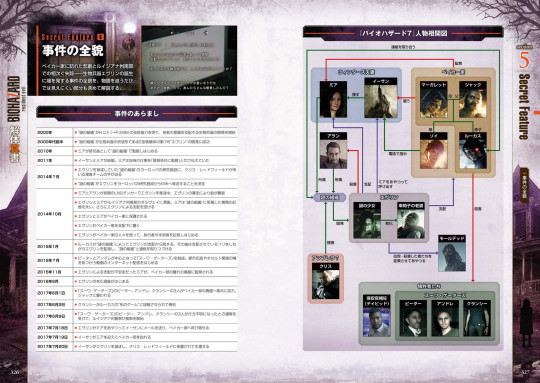
So where does this 'scientist' nonsense come from? The only source which does call Mia a 'researcher' is a timeline entry in this one RE7 strategy guide which has never been published in English – and it's a good example of why sources like this are usually better treated as pseudo-canon at best. You can find various translations of it online – but you can also buy the whole ebook (which I did), so here's the page where it originally comes up.
And yes, inasmuch as I’m qualified to translate, the line does state that Mia joined the company as a ‘researcher’ (研究員, kenkyuu-in) in 2010. But the same guidebook also refers to her as an operative (工作員) just a couple of pages later, so even the guidebook is hardly consistent.
Charitably, perhaps we could read that Mia was initially hired as some kind of generic, low-level research assistant before being transferred to the special operations division after showing aptitude in that area. But it's more likely that Mia was simply going to be a researcher at some point in the game’s development history, before Capcom changed their minds, and the timeline that made it into the guidebook is just very out of date ‒ it happens. Either way, one line in an inconsistent guide book hardly trumps what actually made it into the games.
I do realise that asking people to pay attention to what's actually in the games over what's repeated in some wiki somewhere (or a gazillion different fanfic) is a big ask for any fandom, but Mia was clearly never a scientist in the game we all played. She still knowingly worked for some really evil people – she doesn’t get to claim innocence here – but the idea she's personally responsible for every bad thing ever done to Eveline is absurd.
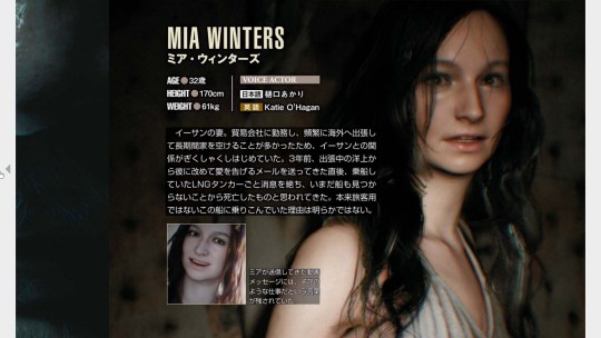
FWIW, other details from the guidebook also back up the idea that transporting assets was a major part of Mia’s job. Her bio (above) mentions that she was away from home a lot, something that strained the Winters’ marriage, and that she told people she worked for a ‘trading company’ – a solid cover for a job focused on travel and logistics.
A very little is said about Mia’s relationship with Eveline. The guidebook does mention that the reason Eveline’s so attached to Mia is because Eveline had known her since she was ‘confined to the “mysterious organisation” that created her’, which could be taken to imply she knew Mia well before their trip began, but it's not much to go on. Mia's own feelings on Eveline are described briefly in a caption: “Although Mia found Eveline creepy, she also felt compassion for her lonely situation,” which tracks with how Mia interacts with her in-game. It doesn't track so well with the idea Mia had any real authority over how Eveline was raised or treated, however, and would be perfectly consistent with the idea Mia might not have known her long at all.
The guidebook timeline also tells us that the E-series project begain in 2000, and that Eveline herself was created in "the early 2000s." This doesn't make a whole lot of sense for reasons I've talked about already, but does put Eveline's creation well before 2010, the year the same timeline gives us for when Mia started working at the Connections. Since the guidebook also tells us Mia was 32 in 2017, back in 2000, she would have been all of 15 years old. Whatever Mia's involvement, the project long predates her joining the company.
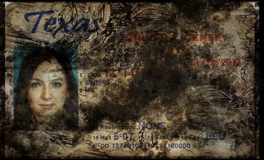
But the real issue with trying to given Mia any major responsibility for the E-series project is that the lab that created Eveline was located in Europe. Mia, meanwhile, has a driver's license telling us she's from Texas.
The European location for the lab is another detail that gets barely mentioned in the games, though it's mentioned repeatedly in the guidebook, and the Baker Incident Report even puts it specifically in Munich, Germany. Given all we learn in RE8, that location does make a lot of sense, when the mould was found in Eastern Europe, and that Miranda herself was part of the research team (she gets multiple photos and a lab coat, you may note). And even if the lab wasn’t right on Miranda’s doorstep, Munich is a heckuva commute from Texas, or anywhere else in the US. Even if Mia was often away from Ethan for long periods, as her bio implies, how involved could she realistically have been?
I don't want to overstress the idea that it "doesn't make sense" for a special agent from Texas to have been intimately involved in a European research project ‒ making sense has never held back RE lore before. But the idea that Mia was brought in only as a handler for Eveline when she was being moved to America still makes a lot more sense than to suggest the Connections were fine with their star asset’s primary handler going home to the US every other weekend.
There are possibilities between the two extremes, of course: Mia may have had sporadic contact with Eveline before the trip, either regularly or just once or twice. It's easy to assume the 'imprinting protocol' must mean that Mia's been Eveline's primary handler for some time, but heck, maybe it's better read as the opposite ‒ something that can be quickly applied to a new handler or caretaker in a hurry, to explain how Eveline got so attached to someone she'd only just met.
Given everything we actually see of her, you could even speculate that Mia was chosen as Eveline's 'caretaker' specifically because she was someone nice and motherly enough for Eveline to bond with. Eveline was pretty clearly fucked up long before Mia ever got involved, and not actually wanting to adopt a walking bioweapon whose idea of a happy family involves mould-powered mind control really does not reflect badly on Mia's character.

Whether Mia was already working for the Connections before she met Ethan also isn't clear. The guidebook tells us she began working for them in 2010, and married Ethan in May of 2011 (later confirmed by the date on Mia's ring in RE8) – though it doesn't specify when she and Ethan met. Even by Texas standards, marrying someone you’d known less than a year would be pretty unusual, so it’s likely Ethan knew her before she took the job. But even that 2010 statement comes along with the bit about Mia being hired as ‘a researcher’, so you can always take it with a grain of salt if you'd prefer.
And that's pretty much it for what the complete RE canon ever tells us about Mia and her former employers.
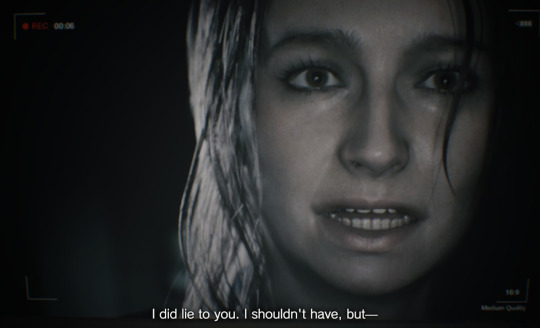
So here’s where I’m left with Mia’s role at the Connections. Even if she wasn’t aware of exactly what she was signing up for when she joined the company, and even if she considered all that lying to her husband about it to be a simple matter of confidentiality around sensitive research, she’s fully aware by the disaster in 2014, and plainly has a guilty conscience when she admits to lying to Ethan in her video message. However responsible she may or may not have been, she's still complicit. Her hands are hardly clean.
But they’re still a whole lot cleaner than, say, Luis’, considering that he was a key member of the science teams at both Umbrella Europe and in Saddler’s cult, and I don’t see him getting a fraction of the same hate as Mia. They both regret what they’ve done, and they’re both willing to give their own lives to make up for it. No, Luis never lied to a spouse about it (that we know of), but he's every bit as shifty and secretive. And frankly, most of the other shit that gets dumped on Mia’s doorstep is just as much bullshit (like, people do realise the “Mia” we see having “marital problems” with Ethan at the start of RE8 isn’t Mia, right?) But that’s material for other posts.
We don’t know how Mia got involved with the Connections, or how she felt about working for them, because the games never give us this information, and that’s a real shame. But in the capitalist hellscape we’re all living in, she’d hardly be the first to find herself stuck working for truly terrible people, one way or another.
Meanwhile, everything we see her doing during the outbreak on the tanker speaks to a basically good person, desperately trying to run damage control in a fucked-up situation. She tells Alan she’s not going to let him die, even though what’s going down is his fault. She tries so hard to talk Eveline down. After she’s rescued by the Bakers in the Daughter's DLC, she insists on staying in the trailer, meaning to leave at her first opportunity – pretty significant, considering she knows she’s infected already. She also leaves them a message warning them to stay away from Eveline, even sharing information on how to make a serum if they are infected. If you pick her over Zoe on the dock, the first thing she does is try to convince Zoe to come with them anyway. Even under Eveline's mind control, you'll catch her ranting about needing to contain the outbreak, blaming herself, and telling Ethan she loves him with her last breath.
And after being infected herself, the first thing on her mind is to try and protect Ethan, recording that message admitting she’s lied to him, and warning him to stay away (Ethan never gets that message, but you can’t say Mia didn’t try). Mia loves Ethan enough to die to save him – and she will, if you choose the Zoe path, and she’ll do it without a second thought.
Mia is fascinating to me as a character because she’s so full of contradictions: a woman who leaves syrupy video messages sending ‘tons of kisses’ to her husband, but who is completely comfortable running around with a machine gun killing mould-monsters, and who shrugs off an Eveline jump-scare with 'fucking hallucinations!' Someone who’s done bad things and knows it, and is trying so hard to make up for it, but whose background and motivations are left frustratingly undeveloped. But if you haven’t caught that Ethan and Rose mean more to her than anything, you really haven’t been paying attention.
Whatever you assume about Mia’s full story, she’s complicated in a way that makes her so much more interesting to me than most of the franchise’s more popular playable characters. I am very serious in saying I want RE9 to be just the full Mia-Winters-story, because to me that’s the only remotely satisfying justification for keeping her such a mystery for so long. I know that's not at all likely, but fuck it, I can dream.
Mia’s made her share of mistakes, but holding her responsible for everything the Connections has ever done is no kind of fair.
#Mia Winters#Resident Evil Village#Resident Evil 7#Mia Winters week#The Connections#RE lore#Mia is THE BEST character I WILL FIGHT YOU ALL
113 notes
·
View notes
Text
a little something fun about the transition from reddit to tumblr
i worldbuild. that’s me hobby. my notes app is all a load of random bullshit. i think of a world idea and then i do notes on it. i think of a fiction idea and i do notes on it. i think of any fun thing and i write nonsense notes on it
on reddit, whenever you shared that shit, it had to be presentable. you needed to be good at worldbuilding AND adept at photoshop. if it looks ugly, gtfo amateur. so i never bothered sharing, i mean, i shared a few things but at my low-medium skill level with graphic design n shit it always took me a lot of effort to do it up, and i never could be bothered to give the amount of effort it took me
so i kept it all to myself and my notes app turned into an unreadable apocrypha that made sense only to me. who gives a shit. nobody’s gonna read it
then spez spezzed everywhere and r/196 became #196. i can share anything i want here! the community is far more personal and personable, and text posts are okay here. it’s not that the bar is lower, but that the bar is more accessible. you don’t need to create a massive .psd every time you want to share some creativity, just share it! and i do, i write stuff for tumbr and put it out there and love doing it, and i’ll fucking do it again
but, my biggest projects, my most proud worlds, were all created when i was closed off, for me only. i’d love to share them to tumbr. but they’re fucking unreadable. even though it’s far more accessible i’d have to edit it into a readable, presentable format and guide people through it better, which it very much was not built to do. it’s like ancient manuscripts. you’d need a rosetta stone. it is not for human consumption. the FSA classes it as toxic waste
so yeah. i have some good shit waiting for you. maybe one day you’ll get to see it when i actually edit it and type it up, but don’t count on anything, because, ykno, severe chronic depressive
125 notes
·
View notes
Text
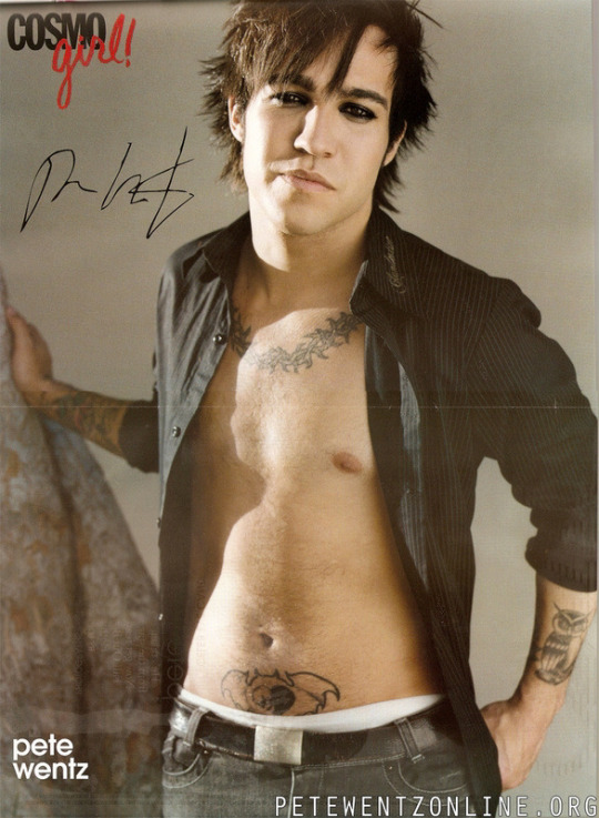
Saw this photo floating around and it is…SENDING ME. In multiple ways. So I’m going to ramble.
Ok first off - this is like, quintessential mid-00s teen heart throb photo shoot. Literally erase Pete’s tattoos and photoshop on a head of any popular male celebrity at the time and it would honestly work. This was The Template.
I think it’s easy to either forget (or just not realize) how TRULY big the FOB/“emo” hype train was back then. Cosmo Girl, Tiger Beat, and countless other magazines that solely focused on HUGE celebrities like Beyonce and Justin Timberlake and Lindsay Lohan were suddenly putting FOB, MCR, and Panic on their covers (although, let’s be real, usually just one or two members - i.e. Pete, Gerard, Brendon, Ryan).
There are…slightly less boundaries now with stuff like this because of the saturation of social media making “normal people” famous, but, back then, that was almost unheard of. You’d only see pictures of these bands in like, ALT Press or Kerrang. For them to get lumped into the same category as these A listers was absolutely bonkers.
So to see this picture of Pete…it kinda makes me laugh tbh, but it also makes me sad. Because that didn’t…FIT him. It looks ridiculous. It’s not an authentic picture of him- it’s him being placed into a mold. Him accepting “The Template” because that’s where he was expected to go. Which makes it…not at all surprising that he was only able to keep that up for so long before it fell apart.
It reminds me of that part in the Zane Lowe interview where they’re talking about this time of their career. Like, just go watch from min 35-42 because it’s fantastic but some highlights:
Zane acknowledging how easy it is to fall down the rabbit hole, especially when you’re thrust into it so quickly - it’s not really a choice. Patrick seconds this later by saying that once that fame light is on, it’s on, and you don’t really have a way to turn it off
Pete acknowledging how it kept him from being a “real person,” how little he liked it, and how much he had to grow during the hiatus to get away from that
Patrick saying how you really can’t win - you either accept the attention and you’re hated for it or you reject the attention and you’re hated for it. And this was ESPECIALLY true then. The media is still brutal but it was absolutely HORRENDOUS at that time. You really had to be “on” 24/7 and that’s…impossible.
Talking about how that level of fame creates a wall around you that is not only difficult for others to penetrate, but also yourself. And if Pete can’t access himself, he can’t access what he can give Patrick to create around, which then makes everything crumble like a house of cards.
I give FOB so much credit for realizing that, if they didn’t take a break, they would’ve ended VERY poorly and likely forever. Look how a lot of careers ended from that time. Either not well or a fade into irrelevance because of just trying to “keep up” and failing. Because, at that point, you’ve lost a lot of your “real person-ness” and, if you’ve lost that, what authenticity can you bring to your work? And if you’re BUILT on authenticity (which FOB is), then what is there to put out that is meaningful and relevant to your art?
Part of FOB’s magic has always been their authenticity and that they really are just “some guys.” That is what has allowed them to be so innovative and grow as artists and as people because there is a constant striving to push themselves and still remain grounded in who they are at their core. Pre-h, they didn’t know how to do that yet, and it was hell.
Pictures like this honestly just remind me of how deep in the hole the pressures of fame at that time did to not only them as a band, but Pete himself. Like, look at this picture. Does he look…genuine? Happy? Does this look like the Pete Wentz you know and love? Of course it may on the surface, but if you really look at it…to me it looks more like a caricature. The clothes, the pose, the styled hair and eyeliner…it just looks off. It’s Pete Wentz through a lens meant to appeal to the masses.
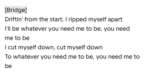
These lyrics from So Good Right Now feel extremely relevant to this time:
I am endlessly grateful that…regardless of the other reasons and intense drama around it…they recognized that need to step back from…all of this. That they didn’t let themselves just get covered by the weeds. Chewed up and spit back out like so many others. And so many years later we are still getting incredible, meaningful music from them. Like, it truly just keeps getting better. You can’t say that about…A LOT of people/bands who have been making music for this long.
I think I’ll end this here for now. LOL at a thirst pic of Pete Wentz making me wax poetic….
#I am aware none of these are super original thoughts#just yelling into the void over here#fall out boy#fob#pete wentz#patrick stump#joe trohman#andy hurley#mid-00s fame bullshit#band of all time#growing up with them has been a blessing#truly
89 notes
·
View notes
Text
well hi :3 welcome to deja’s skinblending guide. this is my first full written tutorial so excuse me if its not very good LAWL
before we get started, here's the tools i'll be using
sims4studio
tray importer
photoshop 2022 (theres cracked version everywhere on tumblr)
blender 4.1
sims 4 ripper
blender + the ripper aren't required to make skins, plenty of people don't go that extra step, but i love using it for placement help
okay lets fuckin go gamers heres my very in depth process for making my ocs skins
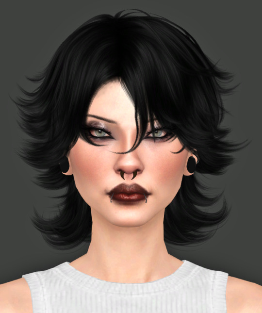
miss dolly is gonna be our model today. she already has a skin but im gonna add some little details for the sake of example + some tats cause ive been meaning to anyway.
so when i first get started on making someone a skin, ill find a good base to use and then add details from other categories like nosemasks, eyebags, contours, etc.
my fav skin creators are @sims3melancholic and @thisisthem. my bases are usually thisisthem, and then i'll pick through a couple s3m skins and make notes on my phone about what parts i wanna take off of them (like, say, i like how a certain s3m skin's nose looks. i'll use that instead of a nosemask)
my goal when im gathering things i wanna add is to free up as many slots as i can. id rather add cheshire's freckles onto her skin than use up the freckle slot in skin details that i could use for something else, yknow?
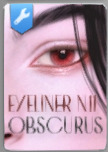
ill repeat this process for makeup next. obviously im not giving my ocs permanent full glam, but some lipsticks can add better texture, you can get highlights/blush from........the blush section LOL and i love using this obscurus eyeliner at a low-ish opacity
just adds an extra level of detail i love. i think what keeps my sims looking consistent next to each other is that i tend to use some of the same details all across the board
make sure for all makeup/skin detail/tattoo category swatches you use, you make note of what swatch it exactly is. when you go into s4s to export the file, you're gonna have to manually select it and if u cant remember what skintone u chose out it can be annoying :/
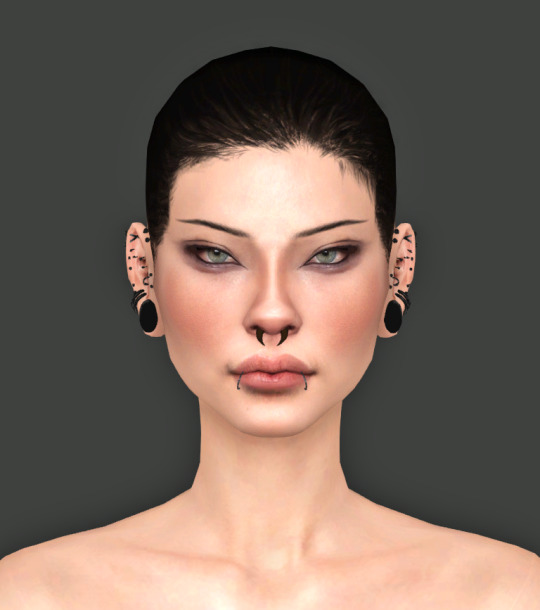
note that she is completely nakey aside from her piercings while i pick what im gonna use for her skin! no clothing but u can keep on their hair. this is so we have a clear view of everything (and i mean EVERYTHING) for blender.
after you make sure u save the sim/household to ur gallery, you can close out of cas and save ur game! i forgot to do this bc im a fucking idiot but its okay bc you will not. its not REALLY necessary to do this as long as you know exactly what packages you need to locate for texture exporting
step one is done!!!! close out ur game
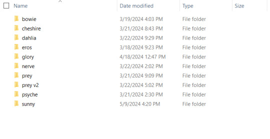
i have a million fucking characters so i made a deja senti skinblending folder to keep it all organized :-)
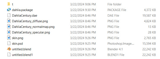
this is what it looks like inside. gives u a pretty good overview of what ur gonna be doing tbh. the 't' folder is all the textures we're about to export
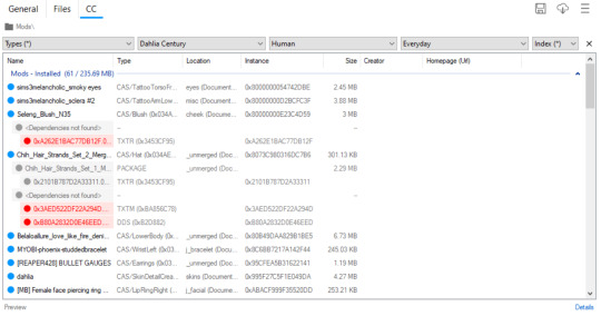
thankfully i do have a version of dahlia saved in my gallery so even tho i didnt go it before i closed my game i can still show u what to do in tray importer lol. i have multiple sims in one household, so i narrowed it down by going up top and selecting dahlia / human / and her everyday outfit.
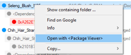
since im gonna give her this blush, i right click and hit open w package viewer so itll find it and open s4s for me
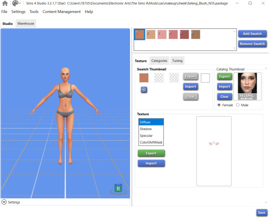
anime wow sound. im gonna change the color manually in photoshop so it doesnt matter to me what swatch i export. hit that green export button under the list of diffuse/shadow/etc (u dont need to worry about all those options, just diffuse) and save it to ur folder!
once ur done gathering ur textures ur good to close out of tray importer and s4s(we'll come back to s4s later tho)
thats step two! the quickest step lawl
this is where i start being a little extra. u dont have to rip ur sim and use blender if u dont want to, but i think it can rly help bc the default sim in s4s doesn't have ur sims facial features and can make ur skins look wonky/wont give an accurate representation of how itll look in game. this cuts out having to go in game/out of game over and over to check
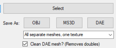
so in simripper once u load up ur sim, the important part is to make sure u have it set to export the dae with separate meshes. once thats done u can import it into blender and there's plenty of other tutorials out there how to use simripper n all that.
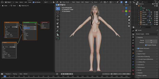
so once u get the dae loaded into blender im gonna send u on a little side quest over to this ask i answered where i explain how i separate eyes from the head mesh. next thing ur gonna open is photoshop! or whatever u have thats similar
say hi to flat dahlia. u should have ur own guy but flat open now too :-) along with everything else ur gonna combine. in my case its blush and a titty mask. im gonna start w the blush so i zoomed into her face in blender. i went into the blush file and copied, then back into my base skin file and pasted into place with crtl+shift+v
please do not be like me. make sure u rename ur layers as you copy and paste them into the main skin file. do this because it DOES matter what order ur layers are in. u dont want to put ur highlight under ur nose mask cause the nose mask will just cover the highlight etc etc. i already lost what layer the new blush i added is. what is wrong w me
so when u have ur first detail pasted on and in place, ur gonna save the base skin file as a psd. then go into blender, and in the little textures window ur gonna replace the diffuse file ur dae came loaded with with ur new psd file
u should see the change u made but mine was super subtle so im gonna show it to u when i put on the cleavage overlay
when it comes to stuff like this, ur obviously gonna want to pick the closest to ur skintone swatch as u can. i did not do this, because again, im an idiot
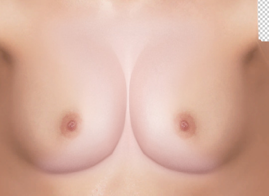
mine is way too pale LAWL whoops. we can fix this tho
i add a hue/saturation adjustment and make it a clipping mask using that square w the arrow so the adjustment will ONLY affect the mask
from there i just make little adjustments until the color match up is as perfect as i can make it. for example for this, ik that it needs to be a little warmer and a little more saturated, so im gonna bump the hue and saturation sliders to the right and it was pretty much perfect
tiddies with no mask > with mask no adjustments > with mask and adjustments
and ur gonna go ahead and repeat that process with every single thing u wanna add to ur skin.
so as for tattoos! this is another thing ur gonna wanna rename the layers for because depending on how heavily ur sims can be tatted it can get A LOT
here's psyche's neat little tattoo folder. its separated into where the tattoo is and then
what it is
i find all my tattoo inspo on pinterest using flash sheets/keywords in the search. my ocs usually have sub-boards that i hoard inspo in for them specifically. dahlia doesnt have one bc ive never seen her as the most tattooed person, but i think she'd have some at least
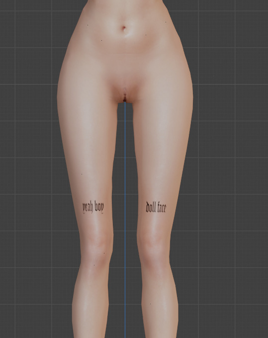
this process is pretty much the same as putting on skin details! its all about adjusting to what u like. for example, i like when my sims tattoos are a little faded and a bit blurred at the edges cause it looks a little more real
when it comes to images i find on pinterest, ill save the image and first try to make it as clean as i can
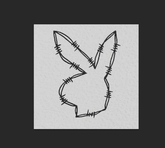
for example, this lil guy
a curve mask made the whites brighter and the blacks darker as u can see. then ill go into filter > reduce noise to soften the harsh edges
then i flatten it, copy and paste to the skin file, n place it wherever i want it to go :-)
louder anime wow!!!
okay so now ur gonna want to make sure u .psd file is saved (it should be bc we've been checking our progress w blender) and then merge the visible layers (NOT flatten, merge visible. we need the transparency around the skin to be in tact)
ur done in photoshop and blender!!! good job :-)
step whatever number we're on. back into s4s!
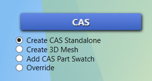
ur focus is over here. make sure the option filled is the top one, and then hit the cas button
this menu will open, ur gonna go up to part type and find the option skin details, forehead. pick the first forehead wrinkle option that appears and hit 'next.' itll prompt you to save ur new file n give it a name, i usually just make it my sim's name cause i have a folder in my mods folder for specifically my cc
remember wayyyy back when we were exporting the skin details? ur gonna go back to that same section and hit 'import' instead of export. select ur skin's .png file, and poof !
ur skin :DD it looks great man good job
this part is EXTREMELY important. go up to the warehouse tab
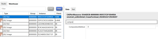
in the 'data' section ur gonna see a box at the top labeled 'filter.' thats where i typed in 'compos' just so it would show me JUST the compositionmethod section since theres a lot of shit in there lawl. yours is initially gonna say '3,' but we're gonna change it to '0' mind you, this is because MY skins are all alpha. maxis match overlays do not show up on my skins because my comp method is set to 0, meaning it has top priority essentially.
after you do that, you can hit save and place that .package file you created into your mods folder!!! and GUESS WHAT BESTIE UR DONE!!!!! U DID IT :DDDD
of course, as always, you can always dm me if youre stuck on anything or need any more clarification. i am always open to help as much as i can. i rly hope this helped :-)
46 notes
·
View notes
Text
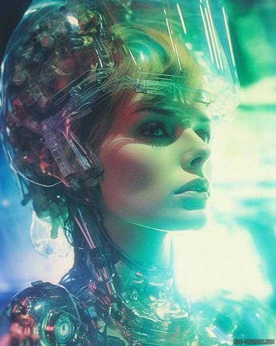


“Neon Demons: Genesis” Part II (continued from Part I here). Holoroid photographs from the Laboratories of the Seventh Spire of Hell, circa 1980s earth time, during Satan’s grand experiment to fuse human, demon, and machine.
The architect of the Neon Demons project was an old Fallen Angel known as Malachor, whose bitter rage at his former kingdom fueled a centuries-long obsession with finding a dimensional pathway between the realms of Hell and Heaven. He walked amongst mortals, studying their technologies and ensnaring the souls of brilliant scientists who would serve their eternity in Hell working on Malachor’s legacy: The Seventh Spire.
Although The Seventh Spire achieved heights of cosmic elevation far beyond any previous structure in Hell, it could only manage to graze the very outer spectrum of radiation from Heaven’s Light. Malachor felt he had failed, but Satan saw it as a different type of success, and assigned Malachor a new, even more impossible task: Bioengineer a new breed of demon, transfused with Heaven’s Light: the first demon with the power beauty, the ultimate manipulator of men.
The years (centuries? eons? Time in Hell does not flow so much as it squirms and stretches like the skin of a writhing worm) spent in the laboratory were a strange atmosphere, even for the underworld. The low levels of Heavenly radiation wore at the demons, depleting them gradually. Meanwhile, it nourished and uplifted the otherwise dead souls of the beautiful earth creatures whose bodies would become an essential ingredient of the Neon Demons. Even as their physical forms were dismantled and augmented, they moved through the halls of the Spire with a grace and lightness never before witnessed by Hell’s denizens. For most of the already tired demons, the presence of these glistening nymphs in this unholy realm of infernal misery made them uncomfortable and irritable. But a few demons, in their weakened state, let their guard down and allowed themselves some comfort in the beautiful mortals. But that is another story…
-----------
NOTE: This alternate reality horror story is part of my NightmAIres narrative art series (visit that link for a lot more). NightmAIres are windows into other worlds and alternate histories, conceived/written by me and visualized with synthography and Photoshop.
If you enjoy my work, consider supporting me on Patreon for frequent exclusive hi-res wallpaper packs, behind-the-scenes features, downloads, events, contests, and an awesome fan community. Direct fan support is what keeps me going as an independent creator, and it means the world to me.
#rob sheridan#nightmAIres#ai horror#synthography#ai art#synthography horror#sci-fi#ai sci-fi#synthography sci-fi#alternate history#neon demons#horror stories#demons#satanic#demonic#cyber-hell#cyber-demons#writing
149 notes
·
View notes
Note
I look at your art and i cannot even comprehend how you do it. Do you use procreate? what brushes do you use? I’m deeply in love with your work
Hi anon
Thank you so much for your message and for taking the time to contact me. 💗 Sorry about the late reply, I was quite busy in the past two weeks. 😳
Ok! So, to answer your question, I very rarely use Procreate. I used it a bit when I installed it on my iPad one-two years ago: it was exciting and new but I must admit that now, I work mainly on Photoshop. Don't get me wrong, Procreate is an amazing app, you can create tons of effects but I'm much more confortable with Photoshop. However, this artwork and this one were created using mainly Procreate.
More recently (= about 10 days ago 🤓), I bought an app called Rebelle 6 that emulates oil painting and watercolors. I used it on this Sherlock portrait but also on this one on Twitter. If you see this kind of textures in my art from now on, it's thanks to this app.
These were the exceptions, though. As far as the rest is concerned, I use Photoshop CS6 with an Xp-pen tablet. I tried all kind of brushes but the ones I always come back to give my artworks an "old painting" effect are the Mar-ka brushes and the Deharme brushes. (look at this artist's DA page, you have several sets of brushes available). However, sometimes, I change the settings: I add more texture, change the spacing, the brush dynamic, etc…(everything can be found in the PS brush settings). You have to see what works best for you.
On some artworks, I also add a paper texture a bit like the one below, at a low opacity (layer: soft light). Make sure it's a bit grainy and don't hesitate to adjust it using the "brightness/contrast" or "levels" tools.

However, the opacity and the paper vary according to the artwork. What can work for one artwork is not going to work for another one because of the lighting, the exposure, the effects you want to give. You'll have to try different textures and opacities to reach the effect you want.
The rest is…my style. 🤓 I did a post HERE about how I draw realistic portraits and HERE about a step by step (it was several years ago though so I don't talk about textures, just how I block colors and how I draw realistically).
I hope I managed to answer your question. Thank you for enjoying my work so much and see you at the end of the week with a Stede Bonnet portrait (and then, I'll go on a break to rest a bit ^^)
80 notes
·
View notes
Text

gradient maps - literally just my thoughts
if you've been on editblr at all you're bound to know em. in this post i aim to share my personal thoughts and critiques on gradient maps, as well as possible ways to utilize them in your works
disclaimer that this post is *not* targeted towards anyone in any way, shape, or form! i'm simply stating my opinion. if this is how you like to edit that's perfectly okay, and you don't have to change that
i'll begin by explaining some issues i personally see with them.
i find that a lot of edits seem to just use the gradient map itself without any other changes. this becomes an issue when people are creating gradient map edits that have very low contrast as it prevents people who are visually impaired from being able to see your edits.

something as simple as changing the blending mode you use can easily help you use a gradient map much differently. in each blending mode variation i used only *one* layer and simply just changed the mode and level of opacity.
gradient maps can be *very* useful in edits, and using different blending modes with those gradient maps opens up opportunity to more interesting colorings. below i have examples of psd colorings ive made all using gradient maps in different ways
while it is undoubtedly true that not every editor uses photoshop or photopea or a program that has the kind of adjustment layers those programs use, most do have gradient maps. so it makes sense why a lot of editors would rely a lot on them.
some of the blending modes i personally find the most useful (and used myself in the above colorings) would be: divide, soft light, multiply, luminosity, and color.

with divide you have to make some... kind of ugly gradient maps. but when you switch the blending mode to divide and set down the opacity a bit it turns out looking really nice! with divide its important to note that your gradient map will be using the *inverted* colors of the color scheme you're going for. that is why the gradient maps will look strange
soft light is much more subtle in the way it colors your image, therefor the gradient map you use may want to be very dramatic in the colors it uses. the soft change in color is perfect for when you want a more subtle change to more closely bring the different colors of the edit together. if you want a more dramatic light, its sibling hard light can do that job for you.

i find multiply works better with darker colorings, i usually lower the opacity while using it as well. i tend to use a broader range of dark to light colors in the gradient map i'm using with multiply
luminosity can either have a very dramatic, or very subtle effect depending on the colors you use. i encourage you to play with this mode a lot! it can create some interesting effects that i don't really know how to describe
color does as it says it does! it changes the colors of the image to the colors on the layer. it doesn't change the saturation of the colors, however. it's essentially like if you hue-shifted them. you can use this to create very drastic changes in color, or to establish what colors you primarily want to be in your coloring
i don't really have much else to say other than to have fun with it! i just pointed out different ways to use gradient maps as a tool for your editing, if you decide to follow my advice or not is totally up to you. if you have any questions or comments feel free to shoot me an ask or throw it in the reblogs and i'll answer to the best of my ability. happy editing!
36 notes
·
View notes
Text
Full giffing process - tutorial (*≧ω≦*)
Due to little demand, i will be going thru my complete process for making gifs. so this will cover all the basics i hope! keep in mind this is just the way I personally do things! please feel free to send me asks or dms if you have any doubts or questions!
☆☆☆☆☆☆☆☆
DISCLAIMER: Everything I know about giffing, I've learned from other tutorials, including the VapourSynth Resources I'll be using in this tutorial so I'll leave links to those tutorials I've used here as well!
In Depth Giffing Tutorial (link here)
How to use VapourSynth (link here)
☆☆☆☆☆☆☆☆
(o´▽`o) I'm a windows user so idk if this works exactly the same on mac!
First things first, you will need:
☆ 4k video downloader (download it here!)
☆ Vapoursynth (32bit download / 64bit download)
☆ Photoshop (download it here! -64bit version only)
Okay! The first thing you need to do is make sure you're working with the highest quality material possible to ensure a decent looking gif!
I'd say the minimum quality needed for decent gifs is 1080px. But if you really want to gif that low quality 2 frame milisecond of your fave, i respect that
☆ lives / streams and tiktoks are typically not very high quality
☆ for stage performances such as music shows, ts/tp files are preferred but those can be really hard to get a hold of (this is a whole deeper level of giffing hell and more of an advanced class topic so nevermind this for now!)
☆ those occasional 4k facecams on youtube work fine tho!
☆ for mvs, variety shows etc, you can download the video with good quality from youtube using 4k video downloader
_(:3 」∠)_
Now let's talk about tumblr and it's pre-requisites for a good looking gif post :D
Tumblr can be sooooo annoying about gifs okay.... I find it's best to plan my whole set before I actually start doing anything but hey that's just me. Some things to keep in mind are: dimensions, file size, number of frames and post layout!
☆ Dimensions
You have 3 main options here and it's all about the width!
☆ 1 collumn: single gifs! these should be 540px wide
☆ 2 collumns: split that in half! 268px wide so there's a lil breathing space between the gifs!
☆ 3 collumns: 3's a party! 177px for each gif please
You can go crazy on the height but the width should mostly stick to one of those 3 unless you want tumblr to pull and squeeze your gif around like a piece of gum.
☆ File Size
This is really important because tumblr has a single image size limit of 10mb. Which means that every single gif you make has to be under that size or you won't be able to post it. The other thing about this is that the dimensions, number of frames and ammount of varying colors throughtout your gif will greatly impact on the final file size. Basically, the larger the dimensions and the more frames it has, the bigger the final file will be. Later on I will show you how to check your gif's final size before exporting it!
☆ Number of frames
This has more to do with the length of your gif, the longer it is, the bigger the final file will be. Typically gifs should be under 3 seconds long. So if you are making a set, try to break the moments you want to include in your set by increments of up to 2 - 3 seconds each, otherwise it might not fit all into one single gif. The number of frames is also extremely important when making combined gifs but that's for another tutorial.
☆ Post layout
If you want to make a cool looking gifset (where some gifs are larger in dimension than others, or when you want to have a single gif followed by a line of 2 gifs next to each other), then it might be worth it to plan out the layout before you start making the gifs. This way you ensure you won't have to remake gifs down the line because they don't fit together the way you wanted to.
☆ミ(o*・ω・)ノ
Timestamping
For this step, you will go through the video you want to gif from and you will just write down all the sections you want to use, down to the exact seconds. Example: 02:30 - 02:32.
(^◕ᴥ◕^)
VapourSynth (VS) - Clipping the video
I know VS can look pretty intimidating with it's bare coding and all but I promise it can be your friend. You just have to set it up correctly and pay close attention whenever you're using it. This software is a must for giffing, it will do all your cropping, resizing, sharpening and denoising for you, making sure your gifs look good. It is also indispensable when giffing ts/tp files because it deinterlaces those files so you can clip them.
First, let's set it up. This is the most annoying and difficult part of this tutorial so make sure you pay full attention to every single step!
☆ step 1) download a version of VS here (link).
☆ step 2) unzip the file on your desktop area.
☆ step 3) open the folder and find the file named "vapourscript (drop video file on me)" - make a shortcut of that file and move it to the desktop.
☆ step 4) find the folder named "gifs" - make a shortcut of that file and move it to the desktop.
☆ step 5) drag your video file you want to gif from and drop it on top of the "vapourscript (drop video file on me)" shortcut on your desktop.
☆ step 6) enter the timestamp input, in the first line it will be the starting of your timestamp, in hours format, then hit enter. in the second line enter how long your timestamps lasts, in seconds, also in hours format. then hit enter and let the code run.
☆ step 7) the resizer tab should now load on a web browser, then you will set the dimensions of your gif on the top left corner. you can also adjust the position of your gif within the video screen and zoom in if wanted.
☆ step 8) choose the preprocessor, denoise and sharpening options on the left and tick the boxes on. I usually just stick to the settings i'm using in my video down below.
☆ step 9) now in the VS box, go to file > load, choose the script saved in the gifs folder.
☆ step 10) copy the code from the resizer into the code in the vs screen, under the designated line.
☆ step 11) alter the code exactly like I did in my video down below. save it. this is now your default vs script for clipping your gifs. what you are doing by adding the hastag and the quotation marks is you're disabling those sections of the code. the reason you do that is in case you want to run the preview before exporting. this is because those lines involve some heavy graphic processing which can make the computer slow. I will talk about the script in more detail later on.
☆ step 12) i don't usually use this option but you can also preview your gif and set specific frames to start and end your gif. This is around the 4:30 mark in the video.
☆ step 13) time to export your clip! now you will temporarily remove the marks you added to disable the code and then go to script > encode video. in the popup box, you will select the option "export to MOV", then start so that you can use that video file in photoshop later.
☆ step 14) after you are done exporting, close the encoding box and then close vapoursynth, never agree to save the script when closing it, or that will override your default script.
☆ step 15) now you need to rename the encoded file for your gif. go to the gifs shortcut folder you created on your desktop, then go to output. this is the folder where VS will save all your encoded files. but everytime it saves the file with the same name so you need to come to this folder and change the name for every gif file you encode before you clip a new one, otherwise VS will just replace the previous clip with the new one you just finished.
Here's a detailed walk through of each step in this video tutorial:
youtube
IMPORTANT
After you are done processing your first clipped file, now you have your default script already built in VS, so whenever you run it to clip more videos, this script will already be in your VS screen. So now all you need to do whenever you want to clip more files (to make more gifs) is to adjust the dimensions, positioning and zoom of the video in the resizer screen and then change a few numbers in your script! then run encode to save the clipped file.
☆ To make new clips: go thru steps 5- 7, also do 8 if you want to mess with the denoise and sharpening filters again, but I don't really know much about how those work so I can't help you with this.
Now what you need to alter in the code, each time you are making a new gif:
after you run VS and change the settings in the resizer to what you want, you need to change the zoom numbers and the video positioning in the code.
you need to replace the numbers in the VS script on the left so they match the numbers in the resizer on the right.
Do step 12 if you want to set specific frames to clip. Then steps 13 - 15 and you are done! You need to do all this every single time you want to make a new gif.
Now let me talk a bit more about some of the lines in this script:
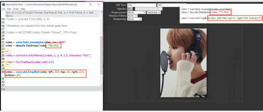
☆ line 14: #video = core.std.Trim(video, a, b)
this line is to set specific frames to trim your video section, your final encoded file will be only the frames inbetween the numbers you input here. a = first frame, b = last frame. you will need to run the preview option in VS in order to see every single frame of your clip and select your first and last frame. I usually do this in photoshop later instead so I don't bother with it on VS unless i'm making combined gifs, in which you need all the clips to have the exact same number of frames. the hashtag at the beginning of this line means that the script won't follow this command when executed. so if you want to include it, you need to remove the hashtag before encoding your file.
☆ line 18: #video = haf.QTGMC(video, Preset="Slower", TFF=True)
this line is for the preprocessor option in VS, that tool is mainly only used when giffing ts/tp files because you need to deinterlace them before you can use them on photoshop. so you will only need to remove the hashtag and enable it when giffing those types of files. when im giffing those files, i usually always keep it with this setting:

I don't really understand much about this so I never mess with it. If you want to know more, I believe there's more info about it in the tutuorials I linked at the beginning of my post.
☆ line 22: video = descale.Debilinear(video, 786,442)
this line is for the zoom of the video screen. you just need to match what you have in your VS script to what you end up with in your resizer.
☆ line 25: video = core.knlm.KNLMeansCL(video, 1, 2, 4, 2.5, channels="YUV")
this line is for the denoising filters, in my case I always use KNLM and this is what it's line looks like. I know you can change those numbers to change the filtering settings but I never messed with it so I'd usually just have it like that.
☆ line 27: video = fun.FineSharp(video, sstr=2.5)
this line is for the sharpening, in my case I always use FineSharp and this is what it's line looks like. I know you can change the number to change it's settings but I never messed with it so I'd usually just have it like that.
note: lines 25 and 27 (which have to do with denoise and sharpening) are the ones within quotation marks in your default script. I believe the quotations work in a similar way as the hashtag, in which the script only executes the lines when the quotations are removed. Which is what you do everytime you are about to encode your clip, otherwise they stay on. I think you should also remove them if you want to test how they affect your gif in the preview screen but i think these filters also require heavier graphic processing which my computer can't handle well so I never do that.
☆ line 30: video = core.std.CropRel(video, left=303, top=16, right=215, bottom=26)
this line is for the positioning of your video screen within the gif dimensions. you just need to match what you have in your VS script to what you end up with in your resizer.
ʕ •̀ o •́ ʔ
Photoshop (PS) - let's make a gif!
Now that we have clipped and preprocessed our video file, it's ready to go to photoshop!
☆ step 1) after you have opened PS, go to File > Import > Video Frames to Layers. Then choose the clipped file you created through VS.
PS should open a box like this:
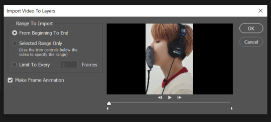
Keep those options ticked and hit OK
☆ step 2) now you need to go to Window > Timeline to bring up the timeline tool box. This window will always be necessary when making gifs. Let's take a look at it, I've marked down all the important buttons you will need:
timeline menu: there are several commands in here, you will need to use some of them later on.
convert to video / frame timeline
play controls to watch your gif
trash can to delete selected frames. (when deleting frames, first delete them here and then delete it's matching layers which are still there after deleting the frames)
frame delay time: this is where you set the time for how long that frame will be visible in your gif
☆ step 3) remember how I mentioned the preview option in VS and how i don't usually use it to trim the frames of my clip? That's because I usually do that at this step of the process, in PS. Notice how each frame is also a layer, and when a frame is selected, the matching layer has the eye symbol next to it turned on. So now you should play your gif and see if there are any frames you don't want to keep, then delete the frames and it's matching layers.
Since we applied sharpening filters back when we were clipping the video on VS, your clip should probably already look pretty decent even before the next steps, so steps 4 - 9 are optional. The coloring part of my video has been sped up.
☆ step 4) click on the timeline menu and select "Select all frames", then go to the select menu at the top of the PS screen and select "All layers". Now click on button 2 of the timeline at the bottom left, switching from the frame timeline to the video timeline.
☆ step 5) before you do anything else, make sure the blue holder is at the beginning of the track before you do anything else. Then go to Filter (at the top of PS) and select "Convert for smart filters". This will convert all the layers into one single layer.
☆ step 6) now make sure the layer is selected, then go to Filter > Sharpen > Smart Sharpen. A box will open with several options:
I usually keep the amount to around 30, I don't touch on radius and you can also mess with reduce noise if you think your gif is looking too sharp. Hit OK when you're done.
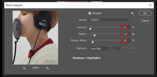
Since this is a filter applied to a smart object (the converted layer that contains all our layer - frames), this means you can turn this filter on or off as long as the layers are in the form of a smart object. You can also go back to it and alter it's settings (like I've done in my video down below)
☆ step 7) now while making sure the blue holder is still at the beginning of the track and the layer is selected, click on the timeline menu that i mentioned above. Then go to Convert Frames, then select Flatten frames into clips.
☆ step 8) again go to the timeline menu, Convert Frames, but now select Make Frames from Clips. Now click on the button at the bottom left of the timeline box, to convert the video timeline back into a frame animation. Then hit continue in the pop up box.
☆ step 9) now you are back to the frame timeline screen from before, but now the first frame is empty. You need to delete that first frame and then check the final frame because sometimes PS also creates another empty frame at the end at this point.
☆ step 10) PS also created a new layer under the layer 0, where the filter is still applied, you can delete this new layer as well. Now for organizational purposes, select all remaining layers (that contain your frames) and group them (you can see how in the video).
☆ step 11) This step is also optional, now I like to add the coloring to the gif. I have a separate tutorial exclusively on this topic. You can check it here:
☆ step 12) This is the time when I also add my signature. This is optional. You need to have the signature layer(s) on top of all the other layers. I usually have it in all black or all white, with lowered opacity of around 40%.
NOTE:
When adding elements (such as a signature) to a gif, it's important to always make sure you have the first frame selected, otherwise PS can move your newly added elements around the canvas on different and random frames. This also applies to anything in the layers pannel that has specific opacities. It's best to already add the elements with the final wanted opacity with the first frame selected.
Exporting + Delay time
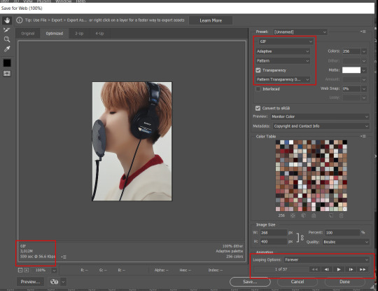
☆ step 13) To export: go to File > Export > Save for web (Legacy). PS will open this box:
First I just use the exporting screen to test the delay time of my gif, and to check the gif's final size.
About the size:
The final size is displayed at the bottom left. Remember it needs to be under 10mb. If it's above that, then you will have to go back and delete frames and test again until the size is within the limit.
About the delay time:
To test the delay time, hit that play button and the gif will play at it's default delay time. If it's too fast or too slow, you will hit cancel and change the delay time (at the next step).
For actual exporting:
The highlighted box at the top right of the screen is very relevant now. Make sure the first box has the GIF option selected. At the next box, you can select either perceptual, selective or adaptive. I usually like to use adaptive. At the next box you need to choose either diffusion or pattern. I like to use pattern. Tick the transparency box and then select either pattern or diffusion transparency dither.
Once you are satisfied with all aspects of your gif, hit save to export your final gif.
To fix the delay time:
After you have exited the export box, go back to your timeline, click on the menu button at the top right and select "Select all frames". Then, on any random frame, click at the small arrow next to the numbers under the frame. Select the option "Other". That will open a pop up box to alter the delay time. To test it again, use the export box explained above. Once you are satisfied, save your gif! I've also altered the delay time in my video to show you the process.
☆ step 14) After your gif is done and saved, I'd suggest to save your psd file if you added any coloring to it. This is so you can reuse the coloring later in other gifs without having to redo it all. This is useful if mking a set of gifs from the same moment / video.
Here's a detailed walk through of each PS step in this video tutorial:
youtube
I hope this tutorial is helpful! Feel free to send me any asks if you have doubts or need extra help! (つ≧▽≦)つ
183 notes
·
View notes
Photo

#bi#bisexual#pride#pride month#butterfly#moth#insects#bugs#pixel art#photography#low level photoshopping#lgbtqia+#my computer has been a bit nuts lately#so not sure how many of these I'll make/post
26 notes
·
View notes
Note
hii i love ur gifs so i have been wondering if u know how to low down the size of a gif without losing its quality?? i hate when i want to post a certain gif and it being 13MB but if i cut it it's ugly 😔😔😔 sorry for my english 😔
hi, thank you 💕 i think i have answered similar questions before in my gif help tag, but i can offer some more (hopefully) helpful tips and things you should consider to help keep your gif under 10mb.
1. crop size & amount of frames
the two go hand-in-hand. big cropped gifs with a large number of frames will result in a big file size. if you're making a 540px wide gif, you're either gonna wanna make the gif shorter in height or use fewer frames. for a square gif, i try to keep it between 50-70 frames, but sometimes i still have to trim it down depending on how bright or colorful the gif is (i'll get to that in the next points).
however, making the gif a shorter height like 350px or 400px might give you a little more room for more frames without having to delete any. i like big gifs if i have a great quality file. 600px tall is as far as i'll go (though it's rare) and in that case, i try to keep it limited to 40-50 frames.
basically:
540px wide gifs = fewer frames or shorter height
268px wide gifs = more frames, more potential
tip: for the sake of convenience, i really recommend making presets of all your go-to crop sizes by selecting "save preset" in the drop down menu next to your chosen dimensions. note that mine are all set two pixels more than i need because some photoshop versions leave a transparent border around gifs. when i use my convert to frames action, it deletes those two extra pixels for me and my gif will have the proper tumblr dimensions before i export.
more tips to get rid of extra frames:
delete frames with camera flashes, you will rarely notice a difference.
always check for duplicate frames.
original footage is slow motion? it's got duplicated frames. delete them.
2. sharpening
your sharpen settings can also increase the file size. here is a great post with examples of when to know when your sharpening is crossing into unchartered territory and how to avoid it. manually adding noise effects can also increase file size, so keep that in mind when you're doing it for aesthetics (i personally love noisy gifs too!).
3. brightening
adjustment layers that handle the "light" in a gif such as curves, levels, and exposure can all affect the file size in different ways. darkening the black points using these tools in your gif helps reduce grain as well as the amount of colors in the final product.
curves: use the white and black eye droppers to find the lightest and darkest points in the gif, thus adjusting the white balance of the footage if needed.
levels: move the left and right sliders inward to balance them out even more and bring back more details.
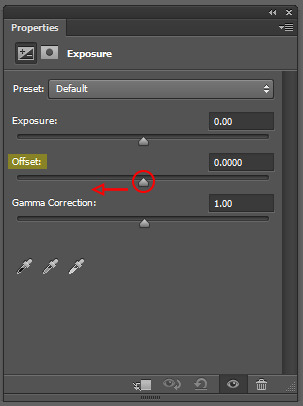
exposure: my favorite trick EVER to lowering the file size if it's over 10mb when i go to save for web is moving the "offset" slider of an exposure layer slightly to the left. it will darken the black points even more and add some contrast to your gif and it can minimize the file size by quite a lot.
3. coloring
you want to be able to save your gif with 256 colors without reducing the number manually in order to get it under 10mb (we've all been there). sometimes you can get away with doing that without losing much of your quality, but it's always ideal to NOT have to do this. selective coloring and color balance are your friends when it comes to enhancing and/or getting rid of tones you don't want. i can't give you a whole course on coloring alone, but i can say that ONCE AGAIN, darkening the blacks under the black tab in selective coloring will help. i usually go up to about +5 or more if i need to. neutralize your reds and yellows for skintones, especially when giffing idols. don't go too overboard with the vibrance if you use it. be conscious of colorwashing. experiment with photo filters or gradient maps if you're aiming for a cooler or warmer look.
i hope this helps, i am not a magician but i do think a lot of these key details help me a lot when my final gif is over 10mb and i need to go back and make adjustments.
18 notes
·
View notes
Note
I really want to start my own legacy challenge and post it here! But idk how to make it look as pretty and as good as you, do you have any tips?
Nonny, first and foremost, thank you! 🥰
While I am usually very happy with the way my posts look now, it wasn’t always that way, and I think the biggest part of this is the process. If you go back and look at my early story posts (and even before that, to my first builds that I posted here) you’ll see that the style and techniques I used then are very different than what I do now.
All too often I find simblrs (and creators in general) will delete or redo their early work. As a perfectionist myself I totally get and share that instinct, but simultaneously I think that looking back helps remind me that it takes practice and discovery that’s still ongoing. I’ll try to help with a few tips I’ve learned along the way, but I truly don’t think there’s any better answer than trial and error!
1. Camera tips and tricks:
First and foremost, always take your photos in tab mode. Even if it’s just gameplay shots, this allows you to get creative with angles and go closer/further away for those detail shots or sweeping landscape ones. On that note, don’t be afraid to take the same photo from multiple angles so that you can look back at them and choose the best one.
Something I read very early on that helped me was to zoom in as close as possible to the shot that you want, and then back away using the S key rather than zoom out. Likewise, avoid zooming in and out and then in again in tab mode, as it can cause distortion in the background. However, there are also times when that distant background looks great, so this is just a good place to start that you can play around with over time. And have fun! Get those detail shots and low angles and things that might not seem like the most obvious shot but somehow work really well.
2. Take time on the details:
Now this is an overarching one because I mean all the details, from the world, to the builds, to interior decorating, to sim details, to their outfits. Now you may only enjoy a handful of these, and by no means do you have to jump in with all of them at once. For me, I really enjoy interior decorating so I put a lot of energy into my sets, that way when I go to take photos the backdrop work is already done. I really try to ensure that the backgrounds of photos are never empty (which is sometimes just clever angles) so this goes a long way to making a post look good and gives the viewer lots of little cues about the sims in the scene.
Likewise, I spend a lot of time on sims outfits. Usually this is in tangent with their personality and where they are in their story, but you’ll also notice small things like characters will not always be wearing shoes at home or an apron/hat will be taken off at an appropriate point in the scene. Small details like this ground a character in their setting and help relate your writing and/or unwritten details to the viewer.
3. Editing:
This is one that I think is really mutable to your personal tastes and goals. I’ve seen some simmers really go above and beyond with unique templates or text while others (ahem, me) will just brighten up or increase the contrast of a shot. I know others will often use photoshop for more detailed editing, but I stick with an online service just to make the brightness and colors pop. Even still, those few extra steps can really balance out the in-game lighting or make a photo even more pleasing to look at, so I really recommend finding something you like if aesthetics are important to you.
4. All the extra things:
Simmers, I think you already know where I’m going with this. Sometimes this game isn’t exactly the most pleasing to look at, so things like lighting mods, swre, or reshade really help you as a creator and can take your screens to the next level. As I’m sure y’all know by now I fought the reshade train for a long time, and even still I can see how this process can be over involved or overwhelming; however I won’t deny that the addition of it to my game is by far the biggest step I’ve taken to making my photos look as good as they currently do, and it has saved me a lot of time on manually editing. But I do not think it’s by any means necessary, and lighting mods are a good place to start for these in-game enhancers.
5. Trust the process
Yes, I’m ending this ramble by reiterating the point I stated at the beginning. I cannot stress enough that it takes time and practice to find your style and the techniques that work for you. I would really encourage you to go back to this post compared to recent ones and look at how different the camera angles and ideas behind the shots are. Changing is okay! Find what you’re really excited about in your images (which for me, y’all may be able to tell from the beginning, was the outfits and set design) and really enjoy that process. It comes through in the images, I promise!
Most of all, don’t feel like you have to perfect your visuals before you start posting here. Community feedback and just the joy of engaging can be such a motivator to continue, and quite honestly, if there is a place to grow your style and content as you go it’s here. People are so willing to help and answer questions as you encounter new roadblocks or ideas, and so starting that network and gathering that inspiration is pivotal to making your content look the way you want it to.
I know that I for one hope you post your legacy, Nonny! I always love seeing new people come aboard and I hope this could be helpful to you 💕
35 notes
·
View notes
Text
I’m slowly inching my way forward in Rebirth, and I have to say I am actually really delighted with Cait Sith so far. It’s not like I know yet how he works in this canon, but still… lol I see you Reeve. “It feels good to do good”? Hanging his head in shame at the sight of the Avalanche wanted poster? Giving an impromptu lecture on the history of Corel Prison and lamenting that it’s not living up to its potential? I see you Reeve.
Also, Cait Sith is friggin adorable, singing a meow song to guests with his little Scottish voice and having to jump to reach elevator buttons.
Progressed a little further and OMG they showed us Reeve doing his thing. He appears to indeed be doing both genuinely joining Avalanche and spying for Shinra at the same time, if enjoying himself too much and showing too much of himself is anything to go by. Plus, Tseng is clearly aware of what he’s doing and went from him to Rufus to report on Aerith’s position… although it’s not clear yet whether anybody but Tseng knows this, and we DO know the Turks have some mixed feelings about lots of things, so it’ll be interesting to see where this goes. I’m pleased they managed to keep “Cait Sith invites himself to join the party” while also making it more plausible, ie he joined up by being aggressively helpful.
Also, everybody knows that Cait Sith is being controlled by somebody and is something resembling a robot, like without even questioning it. L O L. Of course, they lightly questioned him and he immediately jumped to I AM NOBODY IMPORTANT JUST A LOW LEVEL SHINRA EMPLOYEE WORKING A JOB DON’T WORRY ABOUT IT, so maybe they assumed he was an autonomous robot not unlike Chadley until that moment, who knows. The excess of magic and whimsy in Rebirth has made me realize that these people do indeed live in a world of magic that is sometimes very silly, they’re not gonna question the existence of a sentient magic cat robot person, it’ll only be a shock when they realize one of the Shinra directors was expressing himself by helping them and singing a silly meow song. And also reporting on their movement to Tseng, because if he doesn’t prove his loyalty to Rufus his job could be in danger. So what if he helps them a little too enthusiastically and has an absolute blast doing it?
(Hahahaaaaa my fanfic Reeve is much better at and more concerned with hiding this than canon Reeve, I can’t even tell if he’s actually hiding it from people who aren’t Tseng or not. He’s at least hiding it from his assistant, probably. Oh dear I knew I should have finished my fanfics before Rebirth, even though they aren’t supposed to be fully based on the remake trilogy I am definitely gonna feel obliged to do some rewrites.)
(It does please me to note that there is so far zero reason to see Cait Sith as a separate person from Reeve, very clearly he just basically is Reeve, and we were also shown that he was using his computer to photoshop the wanted posters at a time he also should be actively controlling Cait Sith. Yayyyyy headcanon accurate so far!)
It really does delight me that Reeve is having way too much fun doing this. Of course he is, the man’s horribly repressed.
And Cait Sith is indeed fun to play!
Look, there has been so much else incredibly good and fun and interesting about Rebirth, but Reeve is, still, my favorite, and he’s undoubtedly not as common to talk about as, say, Zack, so I am just gonna commit to being a person who just rambles about Reeve on tumblr periodically because I love him.
I’m just at the desert sidequests section after completing all the Good Saucer/Corel Prison plot—fantastic job with Barret’s character development, by the way—and I am so psyched for the 1000% more Reeve content this game is bestowing upon me. I’m just gonna state for the record real quick that as of right now, I think:
-he controls Cait Sith with his mind, with a magic ability, and Cait Sith is also largely a robot
-he is playing both sides, attempting to mitigate his guilt and the evil things Shinra does by helping Avalanche, while also passing information on them to Tseng (who passes it on to Rufus) probably to prove his loyalty and keep his position
-I haven’t totally decided whether this was all his own idea or if somebody told him to go spy on them, but he is clearly way too into the Join Avalanche part of the plan and is going above and beyond on his own initiative
-because we were directly shown Tseng’s involvement, if the Marlene kidnapping happens, I think it will 100% be something Tseng sets up as insurance. It wouldn’t be Reeve’s idea, not with how sympathetic he is towards Avalanche, and Tseng has some history there and knows where Marlene is and how much she means to them.
Okay, I suspect I started repeating myself at a few points in there so I’m gonna stop. Prepare yourselves for me to just lose my mind and ramble every time Cait Sith and/or Reeve do anything remotely important.
#ff7 rebirth#final fantasy vii rebirth#ff7 rebirth spoilers#ff7 spoilers#I could put a read more tag on it but really#rebirth isn’t even trying to hide cait Sith’s identity#Cait Sith#reeve tuesti
26 notes
·
View notes
Text
Seasonal Color Analysis: David Duchovny, Gillian Anderson, and Their Colors
If anyone wants to see more in-depth about David and Gillian and their colors, click to read more; but if you're okay without the extra details, no worries! We'll catch up on the next X-Files meta post.
Quick Summary of my first post: GA and DD both have red undertones (as seen in the above picture); but the red does not overtake the yellow in DD's skin (giving him a Warm Hue undertone) while the red tips over the scale into pink for GA (giving her a Cool Hue undertone.) GA is a Clear Winter, meaning her chroma (High) is first consideration when it comes to colors compared to their Hues (warm or cool); David is a Soft Autumn, meaning his chroma (Low) is also first consideration when it comes to Hues (again, warm or cool.) Because undertone does not change or fade with age, the same application for their younger selves applies still in their 50s and 60s.
TLDR: Explaining myself a little further with DD and GA's colors photoshopped near their face-- providing receipts, if you will~.
Saw a few posts (reblogged on my timeline if you're curious) and wanted to clarify some points I made on my color analysis post here:
David, Gillian, and Jewellry
David still has his warm and red undertone-- which doesn't change with age-- and can pull off cool colors as well as his predominant warm ones because he is Soft Autumn (meaning: if the chroma of whatever color remains muted, he can pretty much swing it.) He is encouraged to wear bronze, silver, pewter, rose gold, and other metals that err on the muted side.
Gillian is encouraged to wear White and Platinum jewelry over silver because of those metal's bright, cool undertone because she is a Bright/Clear Winter (if she were a Summer instead of a winter, silver would be advised for its muted, cool undertone.) She can also pull off gold because of her Bright Chroma (present in the warm yellows of her Bright Winter Palette, shown below.) Gillian is going to look great in some Springs instead of some Winters because of the Chroma consideration of her skin: if the color, cool or warm, is muted, she doesn't look as fantastic as she would with brighter colors, cool or warm. It's hard to tell with her modern appearances because of the frequent use of body tan, but her skin is naturally quite pale and cool and porcelain. If her outfits verge too warm, then her hair becomes brassier, and her skin takes on an orange tinge.
DAVID IN HIS COLORS
Here is the Soft Autumn palette below:

And here are my (bad) editing attempts of David in said colors:

The greens below even bring out more olive in his skin (compared to the very warm red usually present):

Comparing Soft Autumn (A) and Soft Summer (S), the two muted seasons of the system: the Summer swatches are vastly cooler than his skin, giving it a muddied, grayed out appearance; the Autumns, however, inject a level of warmth back into it, complimenting his undertone no matter what lighting he's in.

Lastly, here's David in a Winter muted Hue (left) and a Autumn muted Hue (right) to demonstrate the swatches a bit better.
Although he likely had very little sleep when filming either scene, David looks washed out, drained, and tired in the black; and significantly less tired and washed out in the brown.
GILLIAN IN HER COLORS
Here is the Bright/Clear Winter Palette below:

When GA is swatched with Bright Spring and Clear Winter colors, the difference becomes more pronounced, I think:
As you can see, Spring colors aren't bad; but Winter colors bring out a delicate, healthy pink to her skin (and hair.) Specifically: the nude shade on the left is warmer peach compared to her skin, whereas the nude shade on the right blends into her cool pink undertone quite naturally.
And lastly, here's Gillian in a Spring bright Hue (left) and a Winter bright Hue (right) to demonstrate the swatches a bit better.
There's a "GA vs. the shirt" quality the blue Spring has that the white Winter does not.
Masculine v. Feminine Aesthetic Footnote
I think I covered everything in my beautiful first post here and the follow-up response here. Have at!
CONCLUSION
I hope my facts are all in order, and that I haven't forgotten to present anything that might lead to more confusion, etc.
If we don't agree, all well and good.
Thanks for reading~
Enjoy!
**Disclaimers**: All resources taken from dear peachie, The Concept Wardrobe, The Dream Wardrobe, and other free source sites.
#Seasonal Color Analysis#Part III#David Duchovny Gillian Anderson and Their Colors#dear peachie#randomfashiontiger#fashion#DD#GA#Soft Autumn#Clear Winter#Spring#Winter#Autumn#Summer#analysis#mine#thoughts#meta
23 notes
·
View notes
Last Seen Blogs

conni72-blog
für Individualisten

itsthisgirlfanfic
It’s This Girl...

itsssammmherrreee
New York
darkmimka
DarkMimka

dailyjamiebower
Daily Jamie Bower