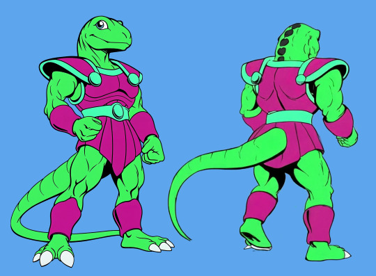
#main style (cel)
Explore tagged Tumblr posts
Visit Tumblr Blog
Explore Tumblr blogs with no restrictions, modern design and the best experience.
Last Seen Tumblr Blogs


Fun Fact
The average Tumblr user visits about 67 pages every month.
Text
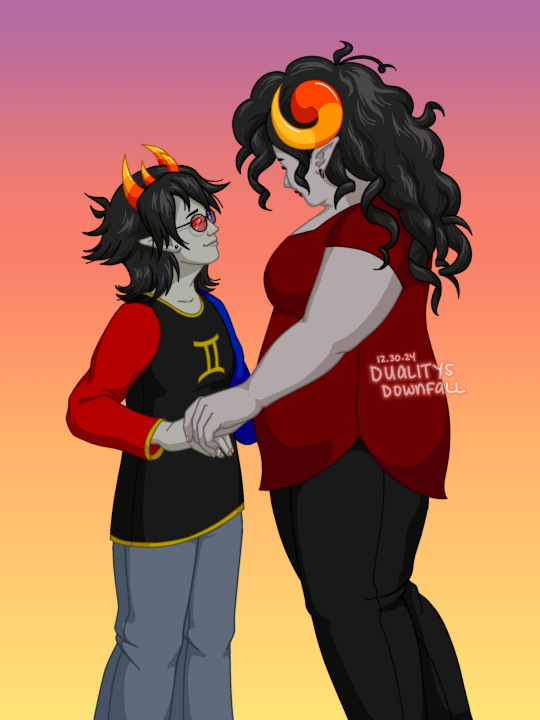

return of smallux because i went off with that one doodle and needed to make a full piece of it
completed dec 30 2024
original below
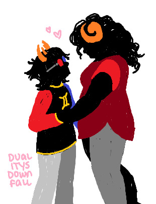
#homestuck#sollux captor#aradia megido#arasol#smallux#digital art#my art#main style#main style (cel)
61 notes
·
View notes
Note
you look like you were influenced by trigger(luluko, little witch academia, promare, klk). space patrol luluko especially
correct !! watching space patrol luluco and promare changed my brain chemistry
#promare is defo my main inspiration for color palletes#i really love how they used cel shading and contrast in certain scenes like at the end and when lio was in that cave iirc#and i love space patrol luluco's style and humor overall!!#the opening is literally my pinned tweet on twt lol#ask zeno#i could gush about trigger for ages esp yoh yoshinari and sushio's works
24 notes
·
View notes
Text
Lotus
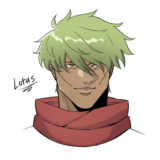
I revamped his character design hehe. He’s the main protagonist for the story I’m working on ^^
#oc#character#character art#original character#my character#character design#cel shaded#anime style#main protagonist#protagonist#illustration#digital art#digital artist#artist on tumblr#support human artists#oc art#ibispaintx
2 notes
·
View notes
Text

Original cel of a Disney-style Mario design, from the production of a 1989 World of Nintendo merchandise commercial.
Main Blog | Twitter | Patreon | Small Findings | Source: twitter.com user "MarioDS64"
2K notes
·
View notes
Text
Everyone talks about the tragedy of animated media getting reboots that replace their excellent art direction with uncanny realism —like the Lion King and its “live action” reboot—- but there’s one series that embodies that tragedy better than anything else. And I need to share it with you all because I can’t be the only one Haunted by it day and night. Please let me tell you the Sad, sad story behind this image:

There was an early 2000s video game trilogy called Sly Cooper, whose main appeal was its super unique art direction, style, and atmosphere. The trilogy had a unique tone focused on a cartoon Phantom Thief who did Moody Atmospheric Heists in a comic-book-inspired world.


The trilogy integrated 2D animation into the game for cutscenes, and the characters-- while low-poly-- were designed to look as much like those flat 2D cartoons with cel-shaded outlines as they could within the limitations of the Ps2.


It took heavy influence from comic books and anime, especially Lupin III. The first game even had alternate anime versions of its 2D cutscenes that you could unlock!

Nearly all the levels took place at night, but the designers talked often about how their goal was to create the illusion of night time through vivid color palettes rather than darkness, taking inspiration from the vivid nighttime cityscapes in Baz Luhrman's Moulin Rouge.

As a result of their stylized art direction, the visuals-- primarily in the second one, which is the one that focuses the most tightly on Thieving & Moody Atmospheric Heists-- still hold up today.
And then Sly Cooper started appearing in “brand crossover games” and “reboots” and Oh god. Oh no. so that's why no one talks about it anymore.


I am haunted by this. People talk about their favorite cartoon character getting hit with the Uncanny Hyper-Detailed Beam and I instantly think of the sad fate of poor, poor sly cooper, who I am very nostalgic for, and his now-dead franchise that hasn't had a new installment in over a decade.
But to me this really emphasizes how strong art direction is far more important than polygon count, realism, or level of detail. Because there have been similar franchises rebooted in ways that manage to elevate the old 2D-inspired art styles with more modern graphics. Toys for Bob's new takes on Spyro and Crash Bandicoot both had stellar art direction!


But that kind of thoughtful art direction can be difficult to achieve. It's not even the fault of the artists or developers; these things are often beyond their control. But I am glad we're in an era where stylized 3D animation is becoming more popular. I hope more creators continue to realize that there is actually a big demand for media with interesting, unique art styles! also you should play sly 2: band of thieves
#video games#art#sly cooper#but yes. please weep with me as you read this#im having a mild hyperfixation moment#because being an adult means I can be a Gamer it turns out#the perils of having Cash#you really should play sly 2 band of thieves though.#okay: the first Sly game is a basic platformer game format elevated by stellar art direction and strong storytelling#the second game is focused on Doing Jobs to Prepare for Heists and more about exploring and sneaking around rather than platforming#and even improves on both the art style/storytelling with more explorable parts of the world and a more complex plot#and then the third one is the one they had to throw together in a couple months before the release of the ps3 made ps2 franchises obsolete#and is kind of a hot mess but has a couple cute moments
235 notes
·
View notes
Text
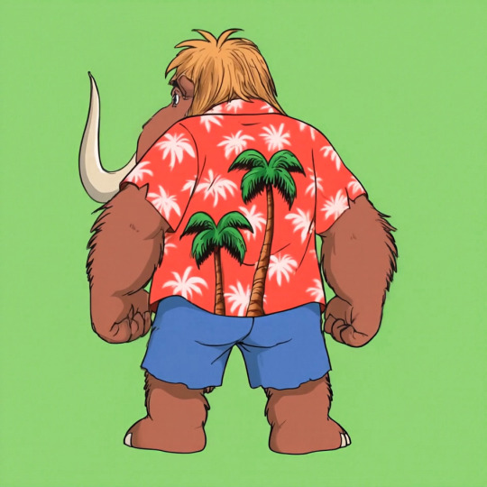
Using Vidu to Make Character Turnarounds
Disclosure: I am in the Vidu Artist Program.
Having (at the very least) front and back reference greatly improves the quality of character image prompting. And very often, one finds that they were lazy and only got a couple of bits of character reference. Or they have tons of it in the wrong art style.

A character like Wally Manmoth requires some good reference to work right.
Now, it's not that hard to prompt up something that matches close enough and then modifying the stuff manually until it works, such as I did with TriceraBruce and DeinoSteve:


You can tell Steve's the bad boy because he's got a cool rip in the back of his jacket.
But for Wally, I decided to try out Vidu as a means of getting turnaround frames.
So I loaded Wally's front-view pic (above) into the image-to-video feature, and prompted with:
vintage traditional animation scene (1985) humanoid mammoth/furry elephant wearing a red hawaiian shirt and blue shorts, by filmation and sunbow productions, 90s colors, friendly on green background, streamlined black line art with cel shaded vintage cartoon color, official media, character design fullbody shot on green background. The mammoth-anthro starts facing the camera, turning around to face away from the viewer, providing a view of his back.
I gave it two shots at the 720x quality setting (12 points per, total of 24), and got:


Huh. Weird it happened twice, etc.
This demonstrates both that the tech is viable for this use, and the reason you'd want to have that multi-view reference. The robot clearly assumes that a luau shirt would have a large print on the back, whereas wally's is a more basic print. That's ultra easy to fix, though.
I started by exporting the last frame of each (or close to it, picking the one that looks cleanest)

While its image editing features and often touch-and-go, one thing the Midjourney edit feature has going for it is it's utility as an upscaler. You load the image in, make your tweaks (just a little bit of background if you're just upscaling) and then upscale and at the very least you have 2048x2048 worth of resolution.
I used the midjourney edit process, that got those two images to the following state, as a test.


The results are good, but getting the large trees to erase-and-replace out took several attempts, and just doing it in photoshop then using the editor to upscale would have been faster.
This is why we do tests.
I went with the slightly-at-an-angle one for the main reference sheet. I'll be keeping the straight-on-back-shot in case it winds up being useful for specific scenes down the line.

In photoshop, I touched up the shirt print, made sure the colors where consistent, and simplified the hair coloration to something more period-plausible.


No more giant trees on the back! On the other hand, I think the feet sprouting toes on the heel is going to be something I'll be fixing frame-by-frame until there's another revision.
Human characters will induce these issues less often. I just stick with my genre of choice.

Midjourney was not cooperating with TyrannoMax (it really doesn't like giving him the proportions I like, preferring to make him a weird big-head salamander), so I went the same direction, resulting in this stage 1 front/back:

Only Midjourney refused to work with it, at all. Declaring everything that came out of it too lewd for its internal censor. Apparently, this hunky relative of cheesasaurus rex is too sexy for general consumption. Nevermind that it's a cartoon lizard in a shade tangello orange.
The workaround is too dumb for words.
Slam the hue slider until it's off anything that could be perceived as a human skintone.

Then make the modifications. Here I had to rework the leg several times, and do a lot of tweaking to remove-overinking. Then I popped it back out, droped it back into lineart, re-colored it, and and composited it back together:

And voila, a front and back for Max. I shortened his tail, as the longer tails have been causing problems with confusing the image prompting systems. The armor skirt has scallops to accommodate the tail, which looked better more consistently than the flaps folding around the tail.


The results are, thus far, encouraging.
Of course, if the back of your character has any unexpected details, you're going to have to add those in after the fact or include them in the prompting, and you're going to be making a lot of edits regardless (as you should).
Oh, and Max has a sword now.

A blade of amber crystal with a fossilized femur grip and a faceted dino-eye that should be far enough away from the Eye of Thundera for safety. A roleplay-toy friendly trademark weapon, usually a sword, was a must-have for 80s action-adventure lines despite the fact that you'd never see it used on anything that wasn't a robot, living statue, or skeleton.
Thus the sword's gimmick is it cleaves through non-living matter with ease but anything BS&P doesn't want subjected to a stabbin's is encased in amber crystal: locked in place if partially encased, put into suspended animation if fully encased. A nice, nonlethal use for a magic sword.


It's proportioned like a gladius, but is generally interpreted as larger, approaching a broadsword, in keeping with the generally ridiculous blade sizes of kidvid fantasy. They're just more fun when they're stupidly huge.
Is "Sword of Eons" too on the nose?
#tyrannomax#tyrannomax and the warriors of the core#vidu ai#midjourney v6#niji journey#animation#cartoons#retro#fauxstalgia#unreality#ai tutorial#vidu tutorial#vidu speed
73 notes
·
View notes
Note
Hii first of all, I FUCKIN LOVE YOUR ART! ITS GORGEOUS AND IM SURE EVERYONE CAN UNDERSTAND YOU REALLY GIVE YOUR SOUL INTO THAT🤧 Your color palette looks so good, What do you pay attention to when painting? (Like when do you think its better to use multiply or something like that and etc.)
first off, I'M HAPPY YOU CAN TELL THAT I PUT MY SOUL INTO MY ART!!! im genuinely in love with drawing and am always finding ways to make creating art enjoyable and impress myself with what i can achieve and learn :D
second, thanks for asking your question!! i dont mind answering it, but my response is quite long. here's my thinking process:
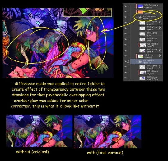
(you specified layer modes like multiply, so im gonna gear my answer towards that a bit) 1. REFERENCE SEARCHING IS KING. color is actually extremely hard for me, so i search around for artworks with palettes i'd like to use and study how an artist uses it. some situations i have a clear idea of what i want, but usually the images in my head are extremely vague, so i borrow palettes from various other artworks that fit the vibe of what i want. an example is this one. my main palette reference were from these artworks. im looking at this artist's use of high saturates and how drawings are overlayed on top of each other. while looking at references, im asking myself how is this artist using warm/cools, where are these warm/cools placed, if their illustration used any form of texturing (like halftones, hatching), how do they use their palette to render form/shape/gradient, when/where do they saturate/desaturate their colors. those questions inform my decisions when using colors too.
2. USING LAYER MODES WHEN NECESSARY. i used to be reliant on multiply for everything, which atp i dont do since i can definitely push colors more first before using layer modes. only when i feel like my current colors are lacking do i start tinkering with tone curves and/or brightness/contrast/hue/saturation/luminosity settings. and if that doesn't work, then i start using layer modes. using layer modes do help with achieving certain effects, color corrections, or when i want to fuck around and find out. i think having a better understanding of what these modes can do makes you more decisive on how you can properly utilize them and to achieve a particular look (like using multiply for a cel shaded style). here's an example:
this leads into my next point:
3. BALANCING OUT VALUES. big thing that makes an illustration hard to read is if values blend together which affects the hues and contrast. i check for what elements need to be distinguished from one another and if it can be read clearly. using layer modes can either help with this or not help at all. it's very dependent on the type of layer mode. here's this example where i applied pin light:

back to #2, there are various instances where i'm using layer modes for quick color corrections and/or to help with readability:


other times, i start off having my entire subject in gray and to figure out main shadow/lights (similar to the multiply cel shaded process i linked ealier). im thinking about what this should look like if i only used 2 value tones:


when in doubt though, i check my artwork in grayscale to ensure values aren't overly blended into each other, especially if i didnt start with grayscale like this one:

painting for me takes into consideration a lot of different aspects. im thinking about how colors should interact, where/when to give contrast, checking/balancing out values, etc, but im also making it a time to study off of how other artists use their colors through the references i collected.
hope this answered your question! lmk if there's more :]
#answered art process questions#answered asks#this one took me a couple of hours to form out my thoughts while editing in examples ngl
151 notes
·
View notes
Text
wedding events

July 24, 2024
Hayden stepped onto the dock as she got off the boat with Ryan right behind her grabbing their bags.
They had headed to Ontario together and took the boat to the island that Connor and Lauren’s wedding is on.
Hayden was part of the wedding party and Ryan was invited for everything so they would be staying at the main house. Her family and Matt would be getting in later than her as they don’t have to be at all the events.
Ryan carried Hayden’s bags for her as they headed up the stairs to the house.
Hayden was fully cleared on her ribs and they healed up extremely well and she just got her sling off completely yesterday and would be wearing a brace for a bit for her elbow.
Lauren and Celeste both rushed out of the house hearing the boat and both squealed seeing Hayden.
They both rushed over and stopped in front of her, “Can we hug you?” Lauren looked worried.
“Ribs are healed!” Hayden beamed making both girls beam and quickly hug her back.
“I’m sorry i couldn’t come.” Hayden apologized again to Lauren for not coming to her bridal shower.
“Hayden darling you couldn’t come and i totally understand.” Lauren gave her one more squeezed and pulled back giving her a look as Hayden was literally recovering from two surgeries.
Lauren and Celeste both said hi to Ryan before turning to Hayden.
“Now we have very important things to talk about! Like Miss Hayden have a boyfriend!” Celeste beamed giggling excitedly.
“We do not need to talk about that.” Leon deadpanned but was grinning as he saw Hayden as Connor and him walked outside to them, “But we will give him a talk.”
Hayden sighed happily seeing them, “Hey Cap, Leo.”
“Rook.” Connor smiled gently back and walked right to her gently pulling her into a hug and sighed in relief finally being able to actually see that she is okay.
Hayden sighed back hugging him and closing her eyes as she hide her face on his shoulder.
“Move i want to hug our rookie too.” Leon grumbled making Connor smile but move out of the way, “Hi Mäuschen.” Leon breathed out hugging her gentler than usally.
Connor was giving Ryan a longer hug than usally after the trade.
“Leo.” Hayden mumbled back sighing in relief as she could actually hug them back a bit now with a brace.
“Hurry up we have gossip to catch up on.” Celeste teased her Leon.
“I want to see the ring!” Hayden grinned and gently took Celeste hand, “Oh it’s even prettier in person or they could just be because it on Cel.”
Celeste beamed at her words.
“You’ve seen in person already.” Leon deadpanned with a fond look.
Celeste looked shocked, “She has?”
“Connor and her aren’t bad helpers.” Leon grinned at the two.
“I know my jewelry.” Hayden shrugged a bit as it was simple to help Leon pick out a ring.
Celeste’s eyes softened having not knowing that and squeezed Hayden’s hand.
“Now Matt?” Lauren grinned clapping her hands, “I’ve been waiting for years!”
Hayden blushed a bit making them all shocked, “I took some time to realize.”
“That’s okay.” Lauren reassured her quickly, “Love can take time.”
“I wanna know all about the first date!” Celeste beamed gently looping an arm with Hayden’s good arm and Lauren grabbed Hayden’s other hand.
“We won’t be seeing them for a bit.” Connor said amused.
Hayden, Lauren and Celeste all got comfortable on one of the couches outside looking out on the water and began catching up.
“Oh i have to show you something Hayden!” Lauren got excited after over an hour of them sitting outside.
Hayden got up and followed Lauren inside with Celeste.
Lauren brought her up tor the large room they would all be getting ready in for the wedding weekend.
“I made a change for your dress for the wedding.” Lauren explained, “I thought you might be more comfortable.” All of her bridesmaids were wearing white with different style of dresses.
Lauren unzipped the dust bag and Hayden saw her off the shoulder white dress but it now had lace flowy sleeves but not a see through lace.
Lauren got sleeves for Hayden’s elbow and had gotten a sling and got it covered in white lace increase Hayden was still wearing a sling so Hayden wouldn’t feel bad about being injured.
“My brace will be hidden.” Hayden realized with an excited smile, “Thank you.”
“Of course.” Lauren smiled gently back, “And i got some other ribbons to match your other dresses if you would like to cover your brace but i don’t care if you don’t.” Lauren reassured.
“I think i’ll want to cover it.” Right now her injuries, the brace on her elbow was just remind her of a wound that’s still healing.
“Whatever you want.” Lauren kissed her cheek softly as Hayden happily leaned into Lauren’s side.
Hayden’s head perked up hearing the sound of a dog, “Lenny!” Hayden beamed and gently bent down as Connor let Lenny into the room, “Hi bud!” Hayden cooed.
Lauren, Celeste and Connor all smiled.
July 25, 2024
Hayden stepped onto the steamboat for the rehearsal dinner. The rehearsal dinner was mostly close family and close friends which included basically the entire team and plus ones for the wedding party, it was the smallest event of the weekend and the theme was “old money” to match the steamboat.
Hayden had on an all black dress with thin straps and was tight on her chest and flowy the rest of the dress with a pair of black converse and black lace around her brace. She let Lauren pick her hair so she had her hair blown out and a little bit makeup.
Besides Lauren and Connor the wedding party was the last on the boat. Hayden knew Matt was here as he had gotten in this afternoon. She hasn’t seen him a few weeks.
Once the cheers settled for Lauren and Connor she started looking sound for Matt and she started smiling seeing him talking to Ryan, Ryan Hopkins and Bri. Matt was wearing a new suit.
Hayden crossed the room quickly right to Matt, “Matt.” She breathed out and Matt immediately spun around getting his breath knocked out of him seeing how stunning she looks.
“Lee.” Matt breathed out stepping closer to her and letting her decide what she is comfortable in public, “You got your sling off!” Matt beamed looking so happy for her.
“Surprise.” Hayden’s smile softened and she stepped closer and finally she could hug her boyfriend with two arms, she rested her chin on his shoulder sighing so happily as he hugged her back being careful of her hair as he cupped the back of her head.
“I missed you.” Hayden whispered softly to him not caring she was hugging him in front of a room of people. She never thought she wouldn’t care about this sort of thing or even comfortable.
Matt’s smile softened and he kissed the side of her head, “Missed you too.”
“She gets a boyfriend and she doesn’t say hi to us anymore.” Ryan Hopkins pouted making his wife shake her head.
Hayden pulled back staying close to Matt as his hand slide down to her lower back, “I want Len photos.” She teased making the Hopkins laugh.
Hayden got to see almost all of her team unfortunately most of them were having kid free weekends meaning she couldn’t see her favorite kids.
Matt sat next to Hayden for dinner making Hayden laugh most of the dinner gaining even more approval from her team.
Leon and Connor still did steal Matt for a few minutes giving him a talk but truthfully they trust Matt with Hayden having already seen how Matt treats her.
July 26, 2024
Hayden walked across the tennis court that was apart of the welcome party. She had on a pastel yellow dress with yellow feathers matching the bridesmaids dresses expect she was the only one with yellow. Lauren had picked the colors for each of the girls.
She had on pastel yellow converse heels, yellow lace around her brace and her hair was curled softly and pinned behind her ears and she had a pair of dangly pearl earrings on.
She grinned seeing her family arriving, they had all gotten in early this morning and was staying on one of the one of the houses on the island.
“Hayden you look so beautiful.” Ellen gasped softly and is reminded every single time Hayden dressed up how much she looks like Maddison.
Hayden smiled and then laughed as Luke softly and carefully tackled her into a hug.
Jack quickly hugged her too not caring if Luke was still hugging her.
Quinn fondly rolled his eyes and waited patiently till he could hug his sister.
Hayden hugged Ellen and Jim last.
Hayden walked with them to one of the appetizer tables knowing Luke will want that.
She leaned in as she felt an arm wrap around her waist and knew who it was.
Jack was immediately giving her a teasing look making her shake her head grinning.
Hayden leaned her head on Matt’s shoulder smiling at how easily Matt joins conversation with her family.
The welcome party was pretty simply but very pretty with pastel colors and summer vibe. The party ended with the sun still up wanting everyone to get good rest before the wedding.
The party did end with a lot of the Oilers doing speeches which were all hilarious and a few friends as well. Hayden was laughing so hard she had to step away because her ribs hurt.
She kissed Matt saying bye as she won’t see him till after the wedding ceremony tomorrow.
#haydenblakeau#matt boldy#matt boldy x oc#luke hughes#jack hughes#quinn hughes#nhl x oc#nhl au#jack hughes x oc#nhl blurbs#luke hughes x oc#new jersey devils#quinn hughes x oc#vancouver canucks#edmonton oilers#leon draisaitl#connor mcdavid#zach hyman#ryan mcleod#ryan nugent hopkins#kailer yamamoto#connor bedard#will smith hockey#macklin celebrini#frank nazar#nhl#trevor zegras#cole caufield x oc#cole caufield#alex turcotte
29 notes
·
View notes
Text
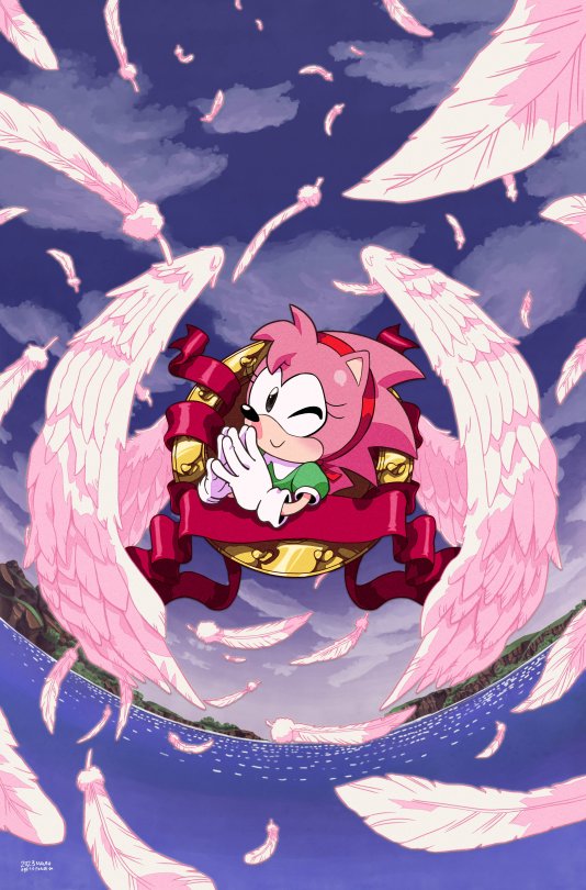
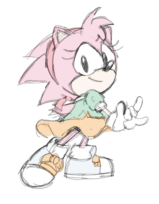
here's the logoless for Sonic The Hedgehog: Amy's 30th Anniversary, Cover B
aiming for shoujo visual cues, based a lot of this in a couple specific escaflowne promo arts
here's my thumbnails.
one's censored since it has the cast for the comic.
both aaron and me had talked before that it'd be fun to do something shoujo-based for amy. problem for me was, aaron did cover A, and already did the usual traits I'd go for, the 70s look like candy candy or attack no1 or rose of versailles- his cover already has the flowers, the watercolour, etc, all my main go-tos in what I really like on the art of shoujo manga and illustrations-
so I ended up realising I needed to switch approach- rather than manga, I had to take from anime.
Thumbnail A got picked, so off we went. For the outline inking and the shading, I looked at Cardcaptor Sakura. The eye especially was just drawn like a Sakura eye, and I'm happy it didn't get shot down.
However, Sakura while looking great has a specific stylisation that's kinda simple, and I wanted to go extra instead. Didn't want a simple cartoony wings, etc, since that was already the usual Sonic logo, right? So the BG and wings and feathers were drawn based on Escaflowne
I also looked at the highest quality transfers I could since the point wasn't to just look in the style of a 90s anime, but specifically like a cel. I failed in this aspect since I missed how the colour blocks actually look, but I'll do better next time lol happy 30th, amy rose
612 notes
·
View notes
Note
Hello! I’m another animator… Any tips on recreating the old cartoon/anime style with modern programs?
a few things:
try adding a small and subtle drop shadow under the characters your animating, like it's a cel! since the cel and background layers wouldn't be completely flat irl since they're on separate sheets there would be some space where a shadow is left.
grain filter! i like to add it and i think it adds a lot. also a slight blur filter!
play with the colors in an editing program! in shotcut i like to use the default technocolor filter to make it darker/more saturated or faded
that's my main things i like to add! hope this helps :]
112 notes
·
View notes
Text
"Hello, my friend! My name is Polites! Remember to greet the world with open arms! Or-... The information about myself with open arms!"

Age?: "Um... About in my 40's, if I were alive at the moment... Before I died, and also the age I am now, 29 or around that age...?"
Pronouns?: "He/Him! My mod is She/Her!"
Sexually attracted to?: "Females, if you don't mind ^^."
Relationships?: "Here's everyone I know at the moment ^^:"
<This is the Tag List! Ask to be added or removed!>
@not-a-player-shes-a-puppeteer "Circe, I believe her name is... Different, but, she's pretty interesting, ^^!"
@googlyeyedlucy "Luci! Poor woman... I hope her lover gets home soon."
@maggiemelodies09 "Maggie! She's pretty cool!"
@greek-sunflower "Kharmion! <3"
@hesjust-a-boy "Astyanax ^^, he's so adorable!!!"
@now-or-n3ver "Neoma! She's... Different in a good way!"
Dislikes?: "Cyclops'... Pretty obvious.
People fighting and arguing, I guess...
Hm. Anyone threatening to hurt my friends and family.
There's more, but, I'm probably not going to discuss it for now!"
Likes?: "Lotus eaters! They're so cute!
My friends, and whatever family I have ^^.
Kindness!
Once again, there's more, that I'll bring up later!"
(More under the undercut!)

Hello!!! Mod here! Let's start with ground rules, then I will go onto listing RP style, and tags. Then at the end, I'll list the rest of my OCs and accounts!:
No NSFW! I am a minor! Kissing, flirting, and SOME spicy connotations are fine.
Don't be disrespectful, please ^^.
Don't control my character, if you please wouldn't!
No godmodding!
Do not interact if you are racist, homophobic, someone who disrespects gender rights, etc. If I'm interacting with someone like this, someone please tell me!
"Polites speaking will be like this."
"Some emphasis will be either like this, this, or this."
*Actions will be like this, with this font.*
(OCC: OCCs will look like this.)
Polites Tags:
AU Tags —
" This Life was Amazing... 🎶 " – Normal/Dead AU.
" Polites at Home 💙 " – Polites At Ithaca AU (This will either be before he leaves, or if he made it home and is alive.)
" Pancake Batter 🖤 " – Polites Alive AU (Didn't die by the cyclops, or this is before the cyclops.)
Emotional Tags —
" Sad Pancakes 💔 " – Angst/Violence/Trauma.
" I've Got You With Open Arms! 🫂 " – Fluff/Comfort.
" Lean Into Me With Open Arms...~ 💓 " – Romance.
Other Tags/Ask Tags:
" There In The Distance! 📨 " – In-character Answered Asks as well as Other In-character Posts.
" Polites Talks 👋 " – Out Of Character Answered Asks as well as OCC Posts. (Doesn't include roleplays with occasional OCCs in them.)
" My World Greeting Friends! ⛵ " – Odysseus/Eurylochus/Any Crew Interactions.
" By The Gods... ⚡ " – God/Goddess Interactions.
" Ithaca's Waiting! 🏡 " – Penelope/Telemachus/Suitors/Other Interactions.
Other Roleplay Accounts, and Accounts In General!:
@s7nnydrop-flower (Main.)
@lore-and-roleplay-blog (Lore.)
@helna-the-star-of-light (Goddess EPIC OC.)
@antinous-is-alive (Antinous AU RP Blog, With Ianthe.)
@its-a-little-bit-dangerous (Hermes RP Blog.)
@lyre-player-of-the-sun (Apollo RP Blog.)
@an-ithacan-princess (Royal Child EPIC OC.)
@prophet-with-the-answers (Tiresias RP Blog)
@frieda-dear-of-aphrodite (PJO Child Of Aphrodite RP Blog.)
That should be it! Asks are always open to questions for Polites, and myself! As well as RP starters! Enjoy everyone!
@lil-cel-saku-esso-yuu-and-reza (My Zelda TotK and BotW OCs.)
@glisten-the-mirror-and-others (Dandy's World Glisten and OCs.)
@the-hamilton-war-women (Hamilton OCs.)
#This Life was Amazing... 🎶#Polites at Home 💙#Pancake Batter 🖤#Sad Pancakes 💔#Ithaca's Waiting! 🏡#I've Got You With Open Arms! 🫂#Lean Into Me With Open Arms...~ 💓#There In The Distance! 📨#Polites Talks 👋#My World Greeting Friends! ⛵#By The Gods... ⚡#polites#polites epic the musical#epic the musical#epic the musical rp#epic the musical polites
25 notes
·
View notes
Text

curl up real small, maybe they won't see you
gang i had a fucking bad day so i drew him again to cope.
completed june 10 2025
#homestuck#humanstuck#sollux captor#thirdmvmt#third movement in a symphony of teenage shenanigans#oh fun fact that hoodie is mine. i have it in real life. it's one of my favs#digital art#my art#main style#main style (cel)
29 notes
·
View notes
Text
Guys I cooked up an idea when I shoulda been packing
What if we did a 9-part collab? We all draw a hashira in a onesie 🥺
Of course there should be some guidelines:


They should be like these onesies (10000x cuter if you give them little feetsies) and the onesie should be an animal you think represents or looks like them (we're not using any pose references, just do a fun pose :D)
They should be on a 9:16 canvas (vertical)
They should be on a checkerboard background of their main color and white
The onesie should have a similar color palette to your blorbo!
Do it in your normal style, not chibi, but leaning towards the kny style
They should be full body
They should have simple cel shading
If you want to give them a stuffed animal or other sleepover things you can!!
You should aim to get them done by September 1st but if you don't it's okay!!
Please follow the guidelines so it all looks cohesive <3
Here's the list! I already tagged some people I thought would enjoy participating. If you'd rather not, just tell me!
Anyone can join btw!
Muichiro Tokito: @tinyperson00
Mitsuri Kanroji: me
Shinobu Kocho: @kimetsu-chan
Giyuu Tomioka: @night-mince10000000000000000001
Sanemi Shinazugawa: @michikatsutsugikunigirly
Tengen Uzui:
Gyomei Himejima:
Obanai Iguro: @rion-isnot-an-ai
Kyojuro Rengoku: @risingscorchingsuns
Also @larz-barz if you want to draw tanjiro you can. Or other people who want to draw another character/oc can also do that
I'll tag everyone with my sketch, progress pictures, and final results, and I encourage you to do the same!
If this works out I think this might be the cutest collab ever and I will die of cuteness
#shinobu kocho#kny shinobu#sanemi#sanemi shinazugawa#kny sanemi#kny tengen#tengen uzui#demon slayer tengen#gyomei himejima#kny gyomei#demon slayer gyomei#tagging the chatavters im missing to hopefully entice some kny artists lol#art collab#kny#demon slayer#muichiro tokito#mitsuri kanroji#giyuu tomioka#obanai iguro#rengoku#hashira onesie collab
43 notes
·
View notes
Note
I am so late to this but I had only just realised Neopets added new gray nostalgic styles with brand-new artwork for combos that don't exist pre-conversion! Do you have a favourite out of them?
(I already did the main grey review here before the new pet styles were released.)

Even as someone who enjoys customization, I think the execution of it was pretty poor. It definitely should've been that you could freely switch between the UC design and the converted design at any point, and the option would exist for pets that were painted after conversion instead of it being a thing you had to grandfather into. Likewise, I'd argue that TNT should've done new UC designs for colours that used to get special poses even after customization, so you wouldn't be losing the beautiful art.
It took the NC Mall and 17 years, but new TNT finally wised up and switched all UCs over to purchasable NC pet styles. Originally it seemed like they were only going to include pre-existing UCs; then, it seemed like they'd do pre-existing UCs plus some other pets with old art but no UCs; and then, finally, we learned that TNT would be giving pets that didn't even have old art styles. This is a great idea, as it gives the pets that didn't get a chance at unique art (Lutaris and Vandagyres being good examples) to have some. Plus the converted versions still exist, so it's just more designs for everyone.


(Pictured: Two UC/styled grey pets with pre-existing old art.)
The most interesting part about these new styles is watching new TNT trying to mimic the classic Neopets' art styles. There's no hard rule as to how old Neopet art worked (because different artists worked on different pets), but the following are what I'd consider the most consistent and important points:
Shading: Hard-lined cel-shading with only one or two layers. Generally high-contrast, especially for grey pets. Sometimes there'll be a small amount of highlights, but not always.
Lineart: Not too thick or too thin with natural weight variation.
Design: Not always present, but often times will include fun little plays on the original design like the Yurble's uncurled ears.
Pose: Easy to read with a good sense of motion. Matches the proportions of the original basic colour pet.


Of course, just because a new pet style isn't quite on point doesn't make it inherently bad (though I personally like the on point ones more, and have highlighted the best in that regard below). The new grey Xweetok style is pretty off compared to an actual UC; like, here's the old sad blue Xweetok pose, which is somewhat similar to it:

You can easily see that there's way too much detail in the shading and highlights (highlights too thin/plentiful, shading too hairline and layered too closely together), and the proportions and design details are also way off model (eyes missing the black "liner" at the back; head way too big; paws too big; ears slightly too big). But dang, it's absolutely adorable, and much much better than the converted version, which looks vaguely ill. It's a good example of how much personality a style can add.
Favorite (New) Species:


Blumaroo: BROKEN HEART FEET. BROKEN. HEART. FEET!! That's such a wonderful detail, and 100% feels like something a UC version would've had. The pose is also really good, and the shading and lineart are pretty accurate (the lines are just a smidge too thick, but obviously not actually a problem).


Bruce: Another pretty good pose with excellent lineart and shading (might be the same artist for this and the Blumaroo)? It's adorably mopey and little things like the extra chubby cheeks and bigger bow add a lot.


Hissi: The shading's not quite as accurate as the above two (one too many layers on the wings, which are also a little too fluffy relative to the non-converted Hissi's wings), but the pose on this one is perfect and really feels like something that existed back in the day. I really like the eye shape in particular and how it affects the entire upper brow, so to speak.
Least Favorite (New) Species:


Bori: Sorry, Bori, but you're not quite right. There's just a lot of things slightly off with this one, like the shading (WAY too much fur detailing that doesn't flow with the actual lineart fur; too low contrast; highlights too minimal in areas like the tail fur). Like I said above, accuracy doesn't matter if the design and pose are good, but that also feels off here. The pose is just kind of strange, like it's about to be smacked or something, and the head is like... off, like it's too far down and too far in in a way that makes it look like it has no neck. It's still got a lot more personality than the converted though, so that's good.
36 notes
·
View notes
Text

alright welp here we go @raddcards
putting a readmore cause this is probably just going to a long rant of cephalopod spite about a topic that probably will only interest a select few so let's-a go
I'm going to be honest, I really wanted to like this movie. I did.
Positives first!
This movie is not the worst thing I've seen in my life.
It's got inklings of fun concepts and good stuff here and there. I think the base concept as a whole around satirizing reboots and bootlegs is a fun concept for a Roger Rabbit type movie (though the idea of stealing characters and turning them into bootlegs seems a little roundabout? why not just have characters made in a lab, come up with a clone identity crisis dealio or-- I'm trailing off with this idea alone, stick with positives right now). Things like The Uncanny Valley, the gag with Ugly Sonic taking a new lease on life, and the claymation style cop all brought some genuine pleasure to me. There is creativity at play here.
But... it just has such a cynical center that feels like it has nothing to say outside of the surface level "haha too many reboots" without making any additional comments aside from "oh but since this is OUR reboot, it'll be good and anything bad that happens we can write it off as self-deprecating and meta!!!" Falling into a trope and acknowledging that it's a trope does not make it cool unless you do something fun or new with it. The Lonely Island crew, while talented in their own ways, were just not the right people to helm this movie because it feels to me like they don't really love the sincerity and bits of camp that truly makes this type of concept. (The Peter Pan thing really is its own can of worms, there are other articles talking about it, but whether it was intentional or not, it really does make it feel that much cheaper in its satire.)
The animation... literally on everyone else looks fine except for the cel shaded 3D. Why did we do that. What are we doing.
"Oh, 2D on the main characters is too expensive!!!" Well they sure spent SOME money on those crossovers
Honestly, unearthing the legal battles on all those characters from other studios would be interesting to research... and like that intro was entirely 2D too! That looked amazing! At least make it look properly 2D or something, like maybe 2D puppet rigs?? For a movie that's coming from Disney, it really cheapens the whole thing further. You don't have to have a bajillion recognizable characters from different studios for the clout and the youtube cameo videos.
And for that matter, this doesn't really feel like a chip and dale rescue rangers necessary movie. It really feels as if you could switch the duo with any toon duo (IP or OC) and the plot would still work.
It just feels empty and pandering. I dunno. No hate to the creative team that worked on it, I'm sure the animators and story artists worked their hardest to make this good. But it just wasn't it for me.
And now, hey, look at that, it's been pretty much forgotten outside of a quick "hey remember when ugly sonic cameoed in that one movie?"
There are a lot of cool ways to push a concept like this! I was actually reading an interview with Owen Dennis who said that when asked what IP he'd like to make a series out of, he said he'd want to do a take on GEX in which the character itself tries to grapple with his existence as a character being brought into a reboot of his own franchise, and becoming a character with more depth. That sounds really neat and I wish we got that.
And the reason that got me thinking about this movie again is that, in the year of our lord 2025, Doctor Who really nailed the energy and excitement of a toon creature concept. From the BTS, you can really feel that EVERYONE involved was buzzing with the idea and process of making this. (And hey - the episode even has a bit of a jab at those hyperrealistic ""Real"" Fictional Character in Real World CGI in a fun way without beaning the symbolism over your head.)
#in case you couldn't tell#I have a bit of a hyperfixation over the concept of toons as little creatures/entities/etc#shocking wow /lh#I am actually working on an original project of my own that plays heavily into that space#hoping to finish the script by the end of the summer#chip and dale rescue rangers#nautiltalk#the mr ringading hype is kind of a tsunami in the face#but it is fun#also also dr who is just a fun show in general im catching up and having a blast#hope to finish ninth doctor after I get through finals
9 notes
·
View notes
Note
do you recommend puzzle pop? i keep really wanting to play it but i do not want to get apple arcade just for that. but i dont know of any other way to get it... so i keep waffling back and forth. i guess im mostly wondering if you think its worth it, i know youve been posting about it but i blocked spoilers so idk what your thoughts are fully
Hi anon :) This is a very good question and gives me a chance to talk about the game
So for starters: You can technically get a free trial of Apple Arcade for a month and this is honestly enough time to just play through for the story modes. I think there are free Apple Arcade trials offered through Best Buy and stuff if you've already used a trial though. If you have an Apple device I feel like it's good to just go for it and try it out?
My short answer is: Yes if you want to play for story and collectibles! Especially if you're mostly interested in the Fever characters! But no if you are more focused on online multiplayer or the Madou characters. The suzuran group actually get a decent amount of content in this game, especially Ecolo in their main story.
I can't really say if I recommend it because everyone in the fandom has really different tastes honestly? Like, if you care mostly about the Madou Monogatari characters, I don't know if you'll like it because the story focus is heavy on Sig and Amitie…and it raises more questions than anything. So I'll just put a personal pros/cons list.
Pros:
The game looks really nice for an Apple Arcade game. Yeah the models are reused, but they use the expressions/motions to their full potential and the cel-shading is great. I also love the environment design. It also isn't live service so you can play it without an internet connection.
The main story, overall, is really good. There are a few standout side stories too IMO! My favorites are Feli, Witch's, Risukuma's, Ally's and Rafisol's.
So many collectibles. The Puyo Card feature, a customizable ID card you can unlock stuff for, is probably the most fun thing they've added to this game.
There's not a lot of new songs but the new ones are very good.
The inclusion of Nazo Puyo-style puzzles in story mode is a lot of fun, but they're skippable if you're bad at them.
Photo mode is fun. Basically you have a diorama where you can pose the characters however you want, but I haven't used it much.
Cons:
Yes the models and animations are reused, most other stuff in the game is new though!
The main story starts out really strong but does feel a bit anticlimactic in the last act. If you have already read the novel Sig's Secret you most likely won't get anything out of the story, which was the case for me. I've known a lot of people who haven't and cried at the ending though.
Some of the side stories for certain characters are really whatever to me but this is subjective.
The translation can be really weird in places -- I think Suketoudara's side story is where it was at its worst, but there are random errors scattered throughout the English translation...
The music selection is a bit weird to me. Like, Rafisol's theme isn't in the game but the Color Tower theme is? It's just a weird selection.
The challenge dungeons for unlockables can feel really tedious since you're not guaranteed to get characters' special items. If you have a grind mindset and really enjoy Puyo Puyo gameplay though, this is probably fine.
The online is terrible and nonexistent. This kind of renders the Puyo Card moot if you really care about showing it off.
You will need a controller for some of the harder stages. The touch controls are fine if you just want to get through the story, but you'll need a bluetooth controller for more precise inputs.
I basically do think it was well-constructed at the start, but most likely Yoshino (the writer) ran out of space or time for the last story in the game.
#inquiries#anonymous#Yoshino's characterization bias was also really obvious in this game lol#puyo puyo#long post
13 notes
·
View notes