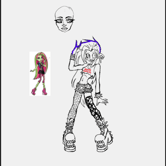
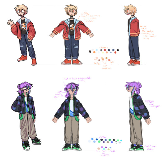
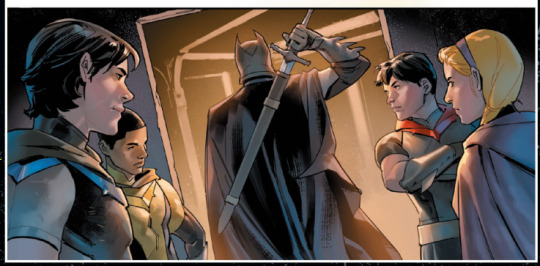
#more kind of in my own style then a redesign though
Text
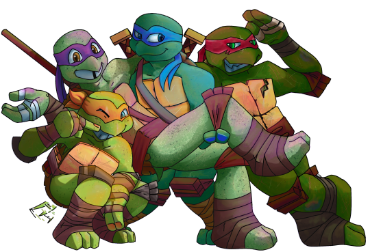
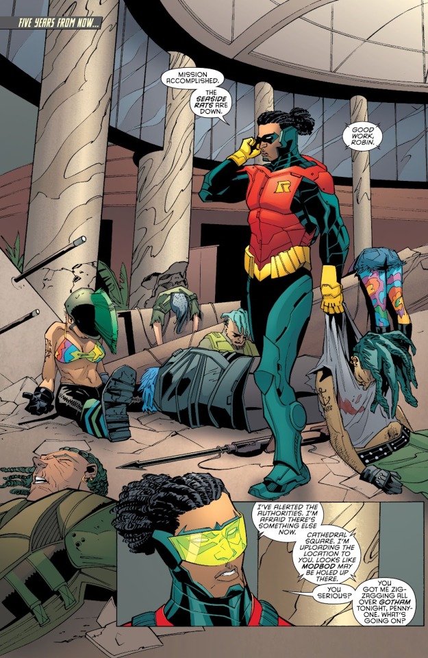
Cool teens doin’ ninja things
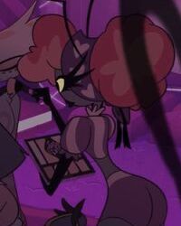
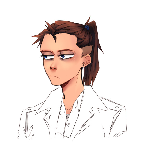
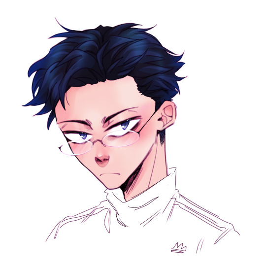
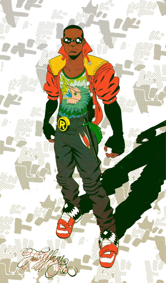
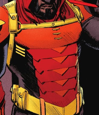
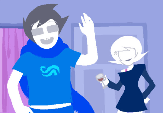
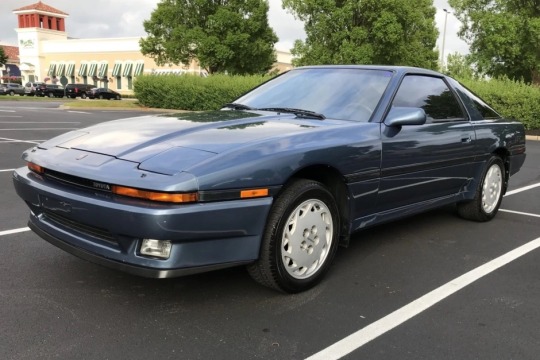
#TMNT#TMNT 2012#Michaelangelo Hamato#Donatello Hamato#Leonardo Hamato#Raphael Hamato#mikey 2012#Donnie 2012#Leo 2012#Raph 2012#very very slightly changed their designs a little bit#more kind of in my own style then a redesign though#I finished the last episode of this series last night#took me longer than the others but this was the one I have the most fond memories of#cause I know I watched 2003 on Cartoon Network when I was like 7#but we used to sit and watch this as siblings when my younger sibling was 7 and I was 15#and they thought it was super cool I was the same age as these guys#and I’d just started doing like anger management counciling#there’s more reasons then that but yeah going back to watch it as a hyperfixation felt very personal#it’s like a little time capsule#really enjoyed it but there are obviously things in it I’d change too ahaha#it sure is a TMNT tv show#but yeah here all the siblings are#Leo’s knee is fucked but he still carries his team on his shell#where as 2018 Leo isn’t even a leader#2007 Leo f*cked off#2003 Donnie’s the real leader in his show#I’m not even acknowledging bay Leo he doesn’t even deserve slander#but I like this Leo I’d hang out with her#I did have a backstory for this illustration but I’ve used up all the tags…oopsie
84 notes
·
View notes
Text
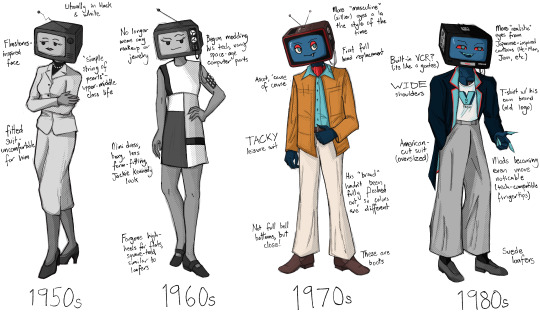
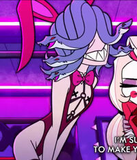
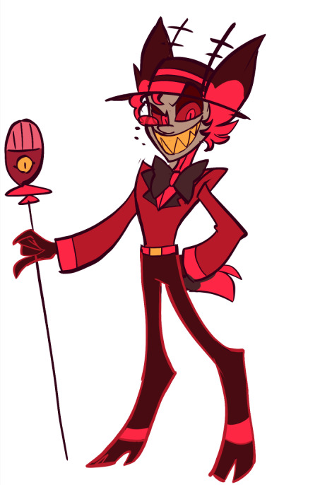
I had an idea to redesign vox because I didn't love that a character obsessed with modernization would wear a top hat and bowtie. then after a brief stint into madness where I read my partner's historic costuming textbook I drew.... all this.
(side note: the idea of vox being a trans man who transitioned AFTER death was super compelling and absolutely inspired by @prince-liest so while this is not direct fanart of their series I wanted to give a shoutout anyway!!!)
okay some TRULY unhinged rambling about historic costume below the cut YOU HAVE BEEN WARNED!
1950s: for this design I very much did not want to go to the typical a-line housewife look, because I feel that is unfitting for vox's character. instead I went for a more business look, but there is still a level of femininity that he would have been expected to perform. i wanted to express his discomfort with that through the pose and expression, though at the time he wouldn't necessarily have a framework for why he hated it
1960s: this one was very fun. i loved the idea of vox beginning to eschew some of the expected feminine presentation, and he no longer wears makeup, jewelry, or hose (though its hard to tell in black & white); however, he's kind of at war with himself in this time period. he's obsessed with seeming perfect and having a respectable image, so he would not go in for the counter-culture movements that were so big in the 60s. he's still kind of riding those coattails though, pushing those boundaries while still not acknowledging his queerness.
1970s: to me, it was very important that the gender hit as he entered the world in color. in my mind the gender euphoria is physically manifested in a wizard of oz situation - he can become who he always has been. anyway, gender aside, I think it was very important to me personally that he wore an ascot. it was for my mental health.
1980s: I wanted the 1980s to be the period where he began to gain some power and notoriety because of the de-regulation of television during this period to allow more ads, mirroring real-world history. I think if the 70s were when vox gained some real confidence, the 80s are when he got an Ego (tm). "business casual" also began to become more acceptable in this time period, and the t-shirt/suit jacket combo was very important for me to include, as to me it epitomizes the commercialism and machismo of the 80s.
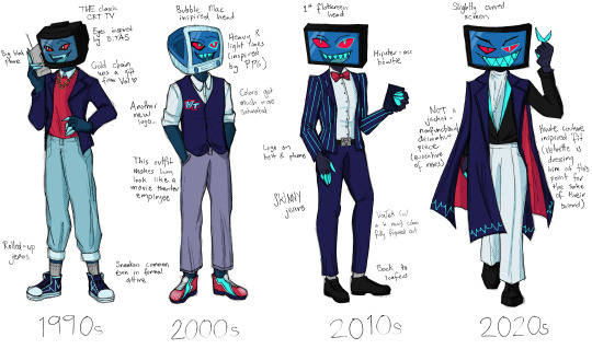
1990s: this was actually the decade I was the most nervous to design, and yet I think it turned out the best? the 90s are known for grunge, which I think is NOT vox's style at all. I decided instead to lean hard into the yuppie look, which I know is more associated with the 80s but was definitely still a thing in the 90s. I also allowed a little hip-hop influence in the form of a gold chain from val, which is not something I think vox would ever pick on his own.
2000s: if the 90s were the decade I was worried about and turned out great, the 2000s are the decade I thought I had down SO GOOD and then totally floundered in execution. I still love the bubble-mac inspired head, and I tried to make his clothes as "round" as possible. I also like that this is the time where his saturation got cranked. however, I don't know if I'm in love with the vest and super bright sneakers, because again, looking back on it, he kind of looks like he works at a movie theater or best buy or some shit lol,,,
2010s: I think it's telling that this is by far the closest to his canon design (2014 tumblr lookin ass). I really wanted to pull from that hipster tech bro era, but unfortunately that aesthetic has a veneration for "retro" which again, is not fitting for vox. I still think he would wear the bowtie during this time because, well... he sure does in the show!
2020s: this was fun because I had an excuse to pull from haute couture design rather than street fashion because of the introduction of velvette into his life. I truly do not think velvette would let vox and val walk around in the outfits that they do because it would be an actual embarrassment LMAO. for this, I wanted his decorative "robes" to be evocative of the time he depicted himself as a priest AND of a cape/robe of an emperor. he does think of himself as that bitch, after all.
320 notes
·
View notes
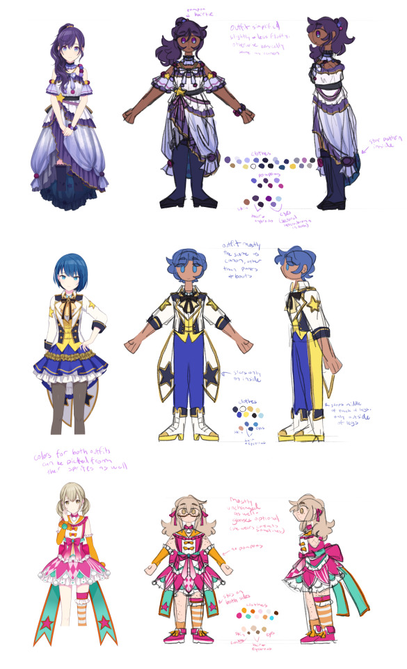
Text
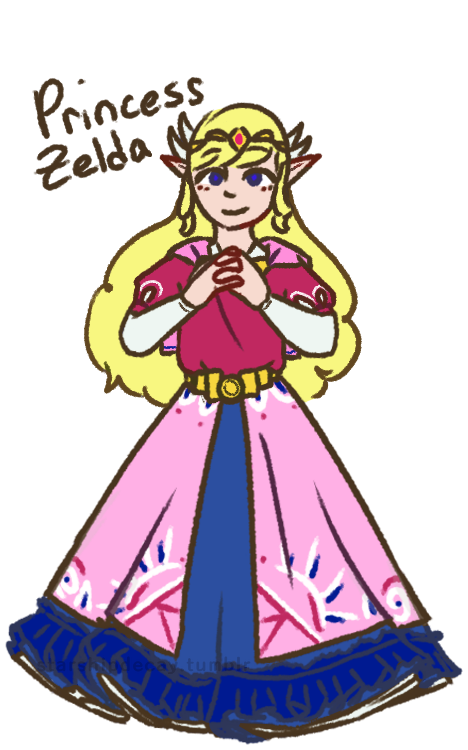

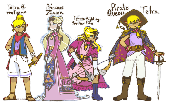
Toon Zelda redesigns! I've never been fond of the Toon Zelda design, and these girls deserve some individuality. Design notes and rambles below the cut :D
(time to turn the proper grammar off i aint capitalizing all this. warning: i am verbose)
first up, tmc zelda!
shes the one most like toon zelda, since i felt like the vibes fit the *most* (though not a lot). also, with her place on the timeline, i could justify a lot of bits, like the wings and the cape
the cape! obvs it comes from the toon zelda base design, but also it involves skyloftian fashion! i take the timeline as a challenge, and i once saw a take somewhere that the skyloftians all wear their family crests (most often birds lol) on their person. zelda here (and link too) do just that, wearing their family crests on little caplets. on the back is, of course the royal crest
i went very cutesy princess for her. tmc has such a *whimsical* vibe that i feel is very. muted? by the fact its stuck with the toon style. so i wanted to put in that vibe here. also her sprites make it look like her skirt is super poofy, so how could i not?
curly hair: i wanted something interesting, and most zeldas have straight hair. so! adds to the cuteness
i didnt draw it so well but she (and link) both have very sleepy expressions. zelda especially just has a sleepy expression in her sprite, its quite adorable.
shes not as decked out as other princesses, cuz i see tmc taking place before the royal family really starts to get *royal* as we see it. shes still of course got a tiara and some embroidery tho.
Tetra!
her base design isnt all that changed from the original. her name is a fun hc of mine tho. i think "von Hyrule" sounds better as a surname than just "hyrule". shes not zelda, but shes still a descendant.
(WW) princess z (as i call her)
I went more oot zelda vibes for her, since she would be closer, temporally, to oot. i also went very warm, since ive never seen the flood as a *warm* endeavor.
shes got the shoulder danglies, as most zeldas have shoulder armor of some kind. the danglies instead of actual armor are supposed to kind of evoke a royal sea captain kind of vibe.
shes ghostly, with a fish-eyed stare. shes been dead and gone for a long time. shes also a bit taller and a few years older than tetra (as of ww). shes just some spectre the king saw in tetra, not at all a close match
tetra, being smaller than princess z, doesnt fit into the clothes. the dress is too big for her (as is in canon gd that skirt is WAY too long for her), the coat is baggy. the role of a princess *literally* does not fit her.
the ribbons! theyre my replacement for the wings, and they represent the wind in the game! since its represented by white lines, the ribbons are a perfect symbolic match. (also, a note, tetras hair is shorter and coarser than princess z's)
i mostly bullshitted the blue panel but the vague idea i gave it was 'a hope for the triforce to give good fortunes to the people' (pictured as dots, mostly behind her arms)
Pirate Queen Tetra
ph! about a year has passed, and tetra has really grown into her own! as well as literally grown!
shes still tetra, pirate and captain, but shes incorporated that royal heritage into her identity: quite literally! she made piecemeal of the original outfit (what was left of it anyway after the fight), and added bits and pieces to her new life.
she also takes full advantage of said heritage to call herself pirate queen. its great for branding. whos gonna say she CANT go by pirate queen?
the seagull feather is from Aryll. only crew member tetra wears a trinket from (who can say no to that ball of sunshine! certainly not tetra)
not many notes. yall can see whats there. (also she still wears her hair in a bun, its just in a low bun (you can almost see it) when she wears her hat)
st zelda!
first note is: shes not a princess! shes an heiress of the company tetra had made and left behind. hence her title of Lady zelda. ("new hyrule" rly just like-- the ending of ww was *literally* that hyrule is dead and thats okay. how did they miss that :sob emoji:) also calling her Lady Zelda fits with the train vibes
shes in a 1880s style bustle dress because 1) i am OBSESSED with bustle dresses. i love them. so much. 2) the more historical vibe works really well with trains! also a lot of the other outfits in the game have late victorian vibes, so shes certainly not out of place.
her hat (and gloves): any proper lady has a hat on when going about town, however, when she gets body snatched, she pulled out her hatpin to use (ineffectively) as a weapon (she IS tetras great-great-granddaughter), causing her to lose her hat *and* hairdo.
shes still got the hatpin in her ghost form, too. she uses it to threaten people for funsies
Ribbons! on the topic of hairdo, her ribbons! visually tying her to tetras design, the ribbons here instead take on the image of train tracks, with her pin (on the left side) evoking a train engine. the pin also makes her look rich and girly. when her hair comes undone, this makes the ribbons all loose, like how the train tracks disappear in game. (the hat also kinda connects her to tetra)
thanks for reading :D i hope you liked reading this as much as i liked typing it
#loz#legend of zelda#princess zelda#tetra#wind waker#minish cap#spirit tracks#phantom hourglass#zelda#zelda fanart#the legend of zelda#ww tetra#ww zelda#st zelda#minish cap zelda#the wind waker#loz ww#starship art#ive got more designs down the mental pipeline#these ones just came first cuz i dislike toon zeldas design
229 notes
·
View notes
Text
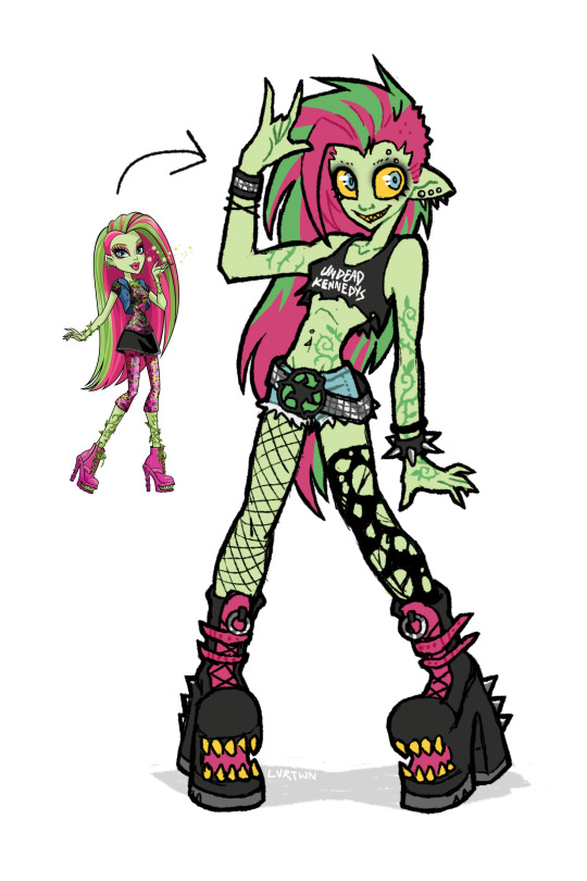
venus if she was awesome
speedpaint and more thoughts under the cut
venus has always been one of my favorite characters, though i feel her design is pretty underwhelming with a lot of wasted potential. this is kind of a redesign, kind of my own personal headcannon, and kind of how i imagined venus in my head as a kid.
this is supposed to be my version of g1 venus, more similar in facial features and keeping the straight hair. i absolutely love her new hair and face in g3 but im hesitant to call the new outfit an improvement. both g1s outfit and g3s outfit are bad in their own ways. i dont want it to seem like im shitting on the new design. again i think the face sculpts, hair, and body types of g3 are so awesome. its great to see more diversity being included in the designs. i just decided to go with g1 venuses look because thats the venus i grew up with
i definitely took some inspiration from g3s outfit for this design. i like the idea of it but the execution is just not great, not to say her original outfit is any better. i feel like out of all of tge original monsters she was the one with the most waisted potential. i love her personality and the abilities she has but the way she was styled has always bothered me.
in the movies shes described as “eco-punk” which is SUCH a cool style to go with a plant monster character. i just feel like the “punk” in “eco-punk” was never really represented in her outfits. i personally love punk music and clothing; ive been an active member in my local diy scene for many years and i love seeing all the outfits people put together.
i thought i would give her an outfit that shows off a couple of my personal favorite staples of punk style. big chunky leather boots with lots of straps and buckles. kept the shoe mouths from the original because they cool as hell. lots of leather, studs, spikes. i gave her denim cutoff shorts inspired by her gen 3 outfit, same with the torn black top. punk style has a big focus on comfort, practicality, and making things yourself. i imagine she cut a pair of old pants into shorts, roughly cut her “undead kennedys”band shirt tank into a crop top, and probably repurposed the remaining fabric. i also totally didnt draw this whole thing as an excuse to use that pun. i included asymmetrical leg accessories, with one fishnet stocking and one torn up sock. i also feel like she repurposed these, continuing to wear her old torn up socks instead of just throwing them out. i gave her a big chunky studded belt matching one of her cuffs with a recycling symbol belt buckle. i feel like it communicates an important aspect of her personality just at a glance, plus i just love big belt buckles. lastly i added piercings because 1. theyre cool and 2. i for some reason remembered her having an eyebrow piercing but i guess she never had one.
i mostly kept her body and hair the same. changed her ears and hair color slightly but thats just personal preference. i decided to make the vines on her body look more like tattoos instead of being 3d. i imagine she can make them grow into real vines, but when shes not using her powers theyre just flat against her skin. gave her a facial expression that made her look a little more unhinged. she might only do things for the good of the earth but she can still mind control people at will.
i wish i leaned a little bit more into the plant theming but im overall still super happy with how this came out. maybe ill made more monster high redesigns in the future
172 notes
·
View notes
Text
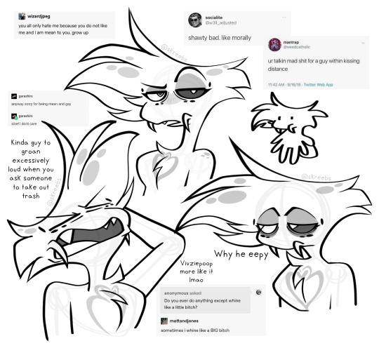
Surprise! I am going to rant about my own redesign and art! I think this is me mentally preparing for the helluva boss episode next week and praying to god it’s actually good. I’ve also been nursing a bit of a hangover today so forgive me if my wording is a bit more jumbled than usual
Im a big fan of my Angel Dust redesign, but in the general aspect of my art, a lot of my poses are a bit flat. That can be from either posing issues on my end, trouble with facial features, or just some secret third thing, but I think so far Ive been enjoying drawing much more cartoonishly as of recent. That vox canon & headcanon drawing was super super fun to do even though it was supposed to be vivzies style, but I used to have a style with more sharp angles and pointy curves that I honestly kind of miss, I also miss playing with cartoonish proportions!!
My art style may end up changing eventually, but my main pieces will stay in my usual style and my more doodle-y ones will probably be in a more cartoony style like the ones above. While theyre definitely closer to canon and meant to be inspired as such, the difference is that I can draw diverse body types in said artstyle! I also cant lie, Angel’s chest fluff is one of my absolute favourite things to draw and it’s so easy in this style…
About my redesigns though! This is mostly about Angel, but I’m gonna slap this here from DMs with a friend: “Im so pleased with this genuinely im so happy he has his little pedipalps, theyre technically also still his fangs but now he can move them and stuff and :33 typically for male spiders the pedipalps are a reproductive organ but that isnt the case for angel or many other arachnid or insect sinners id say so I think personally most of them have developed pedipalps for primarily other reasons like fangs in Angels case or maybe something similar to cat whiskers for other people”
In my original angel dust redesigns I just couldn’t find a way to draw his fangs in a way that made me happy because I want to keeo the same energy in his face as the original. Big clunky fangs that stick out just didn’t work for him and while they made him look like a spider, he lost that sort of angel-ness that I need when drawing him so I instead looks to the pedipalp aspect of spiders to move them off of his mouth and more onto his cheeks. It’s a very small change but it improved the design in my eyes significantly and just really made me a lot happier. I wont be updating his redesign post as of right now and maybe never will, but if I do yknow why now!
I just really really like drawing this guy a bit rubbery, hes supposed to be fluffy so like he should move kinda soft in a way? I dunno how to explain it rn, its 2 AM at the time of writing this so im gonna lay the hell down now!
#hazbin hotel#hazbin critical#hazbin hotel criticism#hazbin hotel critical#angel dust#hazbin angel dust#hazbin angel#anti vivziepop#angel dust hazbin#angel dust hazbin hotel#angel dust redesign#hazbin redesign#hazbin hotel redesign#my art#will add alt text later
103 notes
·
View notes
Text
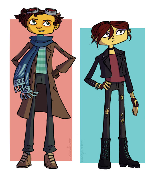
my take on teenage raz and lili!
some design notes under the cut:
They're intended to be about 16 here! I didn't go for anything too drastic in terms of changes -- these are largely just what I'd consider natural evolutions of their canon designs
For Raz, my main focus besides just making him look older was to add a bit more resemblance to the other Aquatos in his design, since his relationship with them wouldn't be strained like it is during canon
Raz is shown with very straight hair in canon, but since most of his family's hair is more wavy or curly I tend to imagine he styles it that way on purpose as part of his Sasha Nein cosplay or whatever. He wouldn't still feel the need to do that at this point, though, so for this design I wanted to make it more curly, similar to Augustus or Frazie, while still similar to his canon style. This turned out to be incredibly difficult and I'm still not entirely happy with where I landed, but it's good enough
I didn't think he would still wear the helmet but I didn't want to discard it entirely, so the goggles were a compromise. I meant to give them some visible scratches and wear and tear since they're presumably the same goggles he's been wearing since he was 10, but I forgot. rip
Obviously the most notable change to Raz's outfit is the scarf -- I wanted something that would tie him visually to the other Aquatos while still fitting with his general look. I imagine they gave it to him as a gift, sort of an acknowledgement that even if he doesn't perform with them as an acrobat, doing his Psychonaut work is his own way of being an Aquato
Raz's outfit here is honestly very similar to his PN2 outfit. This is because in my eyes "long coat and turtleneck" is Peak Character Design and cannot be improved on. (Hence why I may not be the best person to redesign Raz.) He has an actual coat rather than just an oversized blazer this time though, so that's an improvement. With the turtleneck I was was vaguely intending for it to be color-wise something of a middle ground between the Sasha-style green striped turtleneck and the Aquato blue/green and white stripes, but it ended up basically just being the PN1 stripes with the PN2 color. which, you know, that works
I went back and forth on what their heights should be -- I thought it would be kind of funny if Raz ended up short and Lili ended up taller than him, but then I decided to just make them more in line with their families, with Raz being tall and lanky and Lili being average verging on short. Except then I accidentally made Lili tall anyway because I was only vaguely considering her height relative to Raz. I guess Lili's probably taller than her dad now? good for her ig
Most of their facial features are just slight variations of how they look in canon -- slightly smaller eyes and so on. the only real specific change is that Lili has a more defined nose now, similar in shape to her father's
Lili's outfit here is more different from either of her canon outfits than Raz's is, but there's still not much that really requires a ton of explanation. The goal was to make her look vaguely cool and fashionable, although as I am neither of those things I cannot guarantee I was successful
I tried a couple different hairstyles for Lili, and I'm still not entirely set on this one -- Originally what I settled on was to give her two braids, which I did like, but I kept doing sketches of her where I just drew the top part of the hair and was like "ngl this kind of works on its own" and so I ended up going with the short hair. I also briefly tried an asymmetrical haircut but I couldn't get it to look right. I think this one suits her though
Lili's tattoo (on her left wrist) was a later addition to the design, and even in the later stages of drawing this I wasn't sure whether to keep it. I like it conceptually I just haven't figured out a consistent design for it yet, only that it has to be of plants
god these notes got way longer than I meant them to be I am so sorry. Uh basically I'm still figuring out the details of these designs but for now here's Raz and Lili, they're teenagers now, thanks for reading
#still not completely set on these designs but i think i've mostly gotten an idea of what i want from them#i'll probably revisit them in the future. i'm happy with these for now tho#razputin aquato#lili zanotto#psychonauts#psychonauts 2#my art
73 notes
·
View notes
Note
2. What's your favorite and least favorite design in either show?
9. Since you mentioned drawing your redesigns, I have to ask - is there any way I could see Verity having a jolly ol' time on a swing? I was looking over your art again and the thought just struck me on impact out of nowhere.
13. Where does Lilith fit in Hellbound Hostel? Is there anything planned for her yet / concepts you're tossing around?

9. I know this probably isn't what you were imagining but!!! I love conversations on swings and I wanted to draw Eden and Verity together.
2. Favorite and least favorite designs are hard to figure out, most designs I like have glaring details I don't and designs I dislike have potential somewhere in the design. I'll pick the ones from Hazbin that I like/dislike the most as they are, speaking roles only.


Carmilla Carmine is my least favorite design. Her hair completely throws her design off balance imo. I hate the fact none of these characters have ears and I thought Carmilla’s earrings were dangling from her hair at one point. When her hair is down, her design is better I guess… but then there isn't anything that screams hell or sinner in her design. The hairstyle at least alludes to horns, without it she is just a grey human with red eyes and slightly big arms. I kind of wish she kept her extremely long fingers from the pilot, but that wouldn’t tie in well with her fighting style imo??? Eh.

Breaking my own rules since they never speak but, but this design ruins every scene it is in. What an attention grabbing eyesore, it was impossible to watch the overlord meeting with her just sitting on the side orz


Sir Pentious is probably my favorite design in the show, but the story behind his design just makes me sad. I don't like his tail and the eyes pasted all over it, slithering on your eyes?? ow. The hood acting like hair and flaring out is very enjoyable to watch. His palette is also more balanced than most characters. Prefer him without the hat though.
Breaking the rules again, my real favorites are background characters.


13. In Hellbound Hostel, Hellborn are created through a ritual that only requires one participant. Eden is more like a creation to [Lucifer] than a daughter and she has no mother. Sort of an [Adam] parallel. I might shift Lilith's role/traits to one of the Sins, Idolatry.
The Sins are effectively Eden’s family as they are all fallen angels that rebelled with [Lucifer]. A lot of the early/pilot stuff with Lilith shows her as wanting rebellion from sinners and I think Idolatry would also stoke that flame. She is a champion of individualism and finding your own “gods” to worship. She believes that the free will that humans were granted makes them superior to The Creator.
As for the aspect of someone from hell residing in heaven as a potential villain? I have some ideas but most of the conflict I’m figuring out right now is episodic conflicts centering around the hotel, like a power outage and trying to get residents excited for a hellborn holiday.
Thank you for asking! :D
#dys draws#dys rants#ask game#hazbin hotel redesign#hellbound hostel#hazbin critical#hazbin hotel critical#hazbin hotel rewrite#hazbin hotel criticism#hazbin hotel critique#charlie morningstar redesign#vaggie redesign#reblog
101 notes
·
View notes
Text


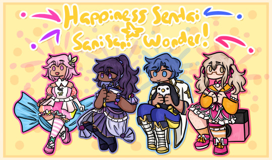
so i like the april fools shuffle units a normal amount. i have done redesigns for almost all of them and i draw them A Lot.
rambling additional notes on all of the redesigns below
a couple notes if you ever want to draw any of these redesigns for yourself at any point: i'd appreciate being credited for these redesigns (obviously anyone not redesigned i don't need credit for lol) and you don't need to follow my specific skin tone + hair/eye color schemes i have laid out. those are how i personally like to draw the characters and i've included them for anyone who might want to stay completely accurate to my redesigns, but you're welcome to use your own preferred color schemes for the cast when drawing them with these outfits!
now onto the fun(?) stuff
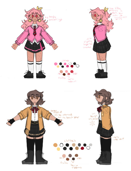
aoharu is pretty straightforward with redesigns, its basically just leoni but with a sun theme instead of stars. adding the image for the color palettes for the unchanged designs just because it has the notes for ichisaki too (their changes were too minor to completely redraw them, in my opinion).
ichika remains entirely unchanged design-wise other than adding a sun pin to her suspenders. saki stays mostly the same too, other than changing the design on her armband and switching her pigtails for a ponytail (in an attempt to seem a little more mature/imitate airi's hairstyle/move on from her childhood self since she's started to believe that honami and shiho want nothing to do with her and ichika anymore).
not too much to say about airi and ena's outfits either, i wanted to go a little more cute with airi and cool with ena, but there's minor changes with both of their hairstyles, with airi switching her pigtails for a ponytail as well (moving on from her idol days but still maintaining her usual sort of style) and ena's hair being a bit longer/messier.

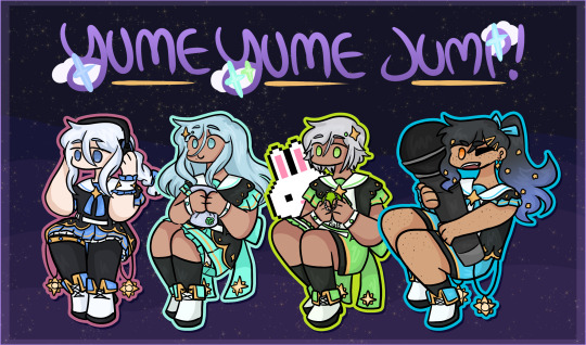
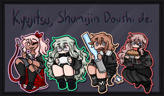
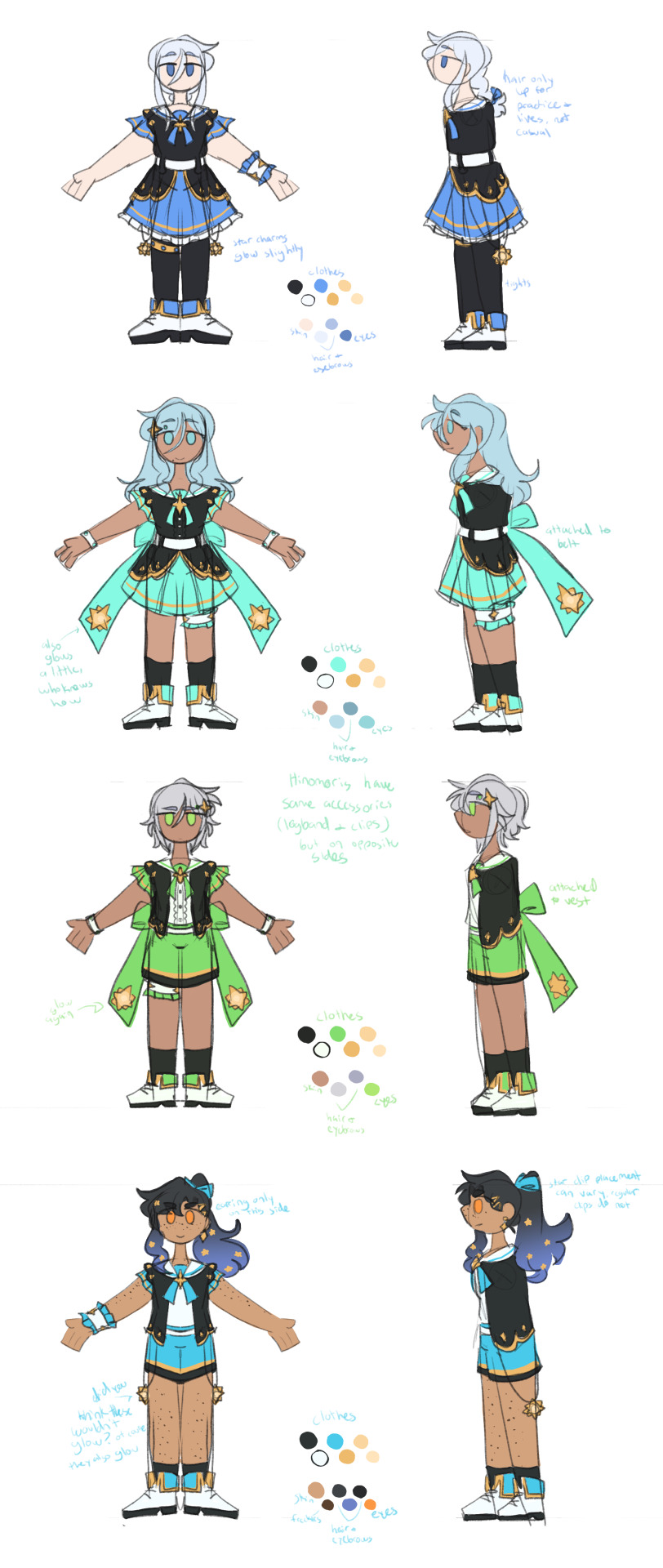
yyj is definitely the most drastic, they're the only unit where i changed every single character... i have a lot of trouble drawing the mmj outfits, but also the lighter color scheme and clover theme just didn't really make sense for yyj to me? so instead i went with a mainly black and character color combo for their color schemes, alongside gold and white to accent it and a more spacey/dreamlike theme. everyone's black and white are slightly tinted with their character colors too!
they're split into pairs for matching accessories, but it doesn't mean much otherwise. kanade and an both have the dangling star charms and a single larger wristband (with those being on opposite sides from each other) as well as no buttons on the front of their outfits, while both hinomoris have the large bows on the backs of their outfits, smaller wristbands on both arms, a legband, and star shaped clips (like the other pair, the clips and legbands are on opposite sides from each other) and they do have buttons. they're split differently for the same style outfits though, with kanade/shizuku and shiho/an being the matching pairs this way.
kanade has the most obvious design changes. i swapped her character color to a medium-light blue rather than red, because tbh she kind of stood out too much if she was still red. she's not meant to be the leader of the unit, she doesn't want to stand out. her hair is a lot shorter than canon and she usually keeps it braided for practice and performances (and leaves it loose otherwise) (both the haircut and style were initially suggestions from shizuku). shes the only member of the unit to wear tights and to lack any star shaped hair accessories.
shizuku i don't have that much to say about, i had designed kanade first and then shizuku to match. its pretty straight forward i think? she's got the tallest socks not counting kanade's tights though.
for both an and shiho i wanted to go a slightly cooler/less feminine direction, while still sticking to the general theme i had going. which lead to the shorts and vest combo! otherwise the only notable change with either of them is that an's changed her clips to two regular gold ones and she's got a ponytail now when they practice/perform, much like kanade's braid.
fts was both very fun and an absolute pain to redesign because on one hand, i can do whatever i want, on the other hand, it's like vbs there's really no consistent theme to carry through everything. except a lot of layers i guess. so my goal was to kind of merge their casual aesthetics with something more vbs-like.
tsukasa wearing his jacket incorrectly was inspired by my own tendency to do so whenever i get too warm. i think he just does it because he thinks it looks cool though (its a little silly and a pain to keep it on but he's committed to the look). also leaving his middle layer as his fish jacket from his casual sprite was a funny little thing i thought worked for him.
with rui my goal was just pockets. lots of pockets. they're probably hiding little robots and tools in those pockets. i should have put more pockets on their pants too but oh well. combine that with wanting some obnoxious bright greens and blues and at least one item that kind of clashed color-wise with the rest (their pants in this case) and this is the result. the sketch doesn't convey it well but their black jacket and pants are both kind of loose, while the green hoodie and tshirt underneath fit okay. also their hair is kind of long if they ever untied it, but no one ever sees that.
hapisen for the most part sticks to their canon sprites, just simplified slightly for my sanity. mafuyu's costume still drives me insane to draw though, that's so many layers to think about.
other than questioning my sanity every time i draw mafuyu, there's only one change from her sprite, which is making her hairtie one decorated with pompoms much like a lot of other parts of her costume. i just thought it tied things together a little more.
the upper half of haruka's outfit is more or less completely unchanged (other than making it fit in a way that looks slightly more masculine), but then i replaced his skirt with pants and gave him boots (wxs meiko, who is the sprite haruka's outfit is originally just a recolor of, wears heels). i figured if i was going for a more princely sort of design for haruka then changing those felt fitting. beyond that he's obviously got shorter hair (a choice he makes after seeing kohane decide to change herself, wanting to embrace the genuine person he wants to be beyond the idol people knew him as) and that's about it. hits this guy with the transgender beam.
kohane's outfit is really just a bit simplified from the original with sizing/proportions of elements adjusted to (in my opinion) suit her better. the ribbons in her hair felt like a cute addition (and i like to give kohane ribbons in general), while her hair length is an in between of her two standard canon ones, longer than the usual one we see but shorter than pre-canon/early mainstory. her glasses are optional, she changes between them and contacts with how she's feeling for the day and what kind of shows hapisen is planning. the more intense the show, the less likely she is to wear her glasses.
kyushumi was kind of intended as niigo but without one member in a mostly white outfit since they don't have someone like kanade who is intentionally trying to save people. although they're also a little happier off anyway, so they don't need someone like that. they're my most drawn shuffle unit, so also probably my most thought-through redesigns.
each design takes slight inspiration from a member of niigo (nene/kanade, minori/ena, honami/mafuyu), but that was just kind of as a personal guide for what kind of vibes to go with for the outfits. they've all got personal touches to them.
nene's hoodie is very loose on her body and arms, but a normal fit in the length, and her shorts are actually long enough to be seen. she just wants to be comfy, she's tired a lot, very low energy girl. glasses because i think nene should wear glasses anyway, so as opposed to canon nene who i like to believe just favors contacts, this nene does not.
minori is pretty obviously similar to ena's outfit, but there's a few nods to mmj in here. she's got clover shaped earrings, the pattern along the bottom of her dress is meant to resemble the tips of the clover leaves from mmj's symbol, and her shoes are just the mmj unit outfit shoes in different colors.
the goal with honami's outfit was simply "how little skin can she have exposed" because i imagine her being more worried about that than usual here. so long sleeves, long skirt, high collar, etc. her hair is longer (for no particular reason tbh, i simply liked how it looks) but still styled the same, and she's got a solid red scrunchie now. the four buttons on her outfit are all meant to look like the moon, two full moons and two opposite facing crescents. also i will never stop joking about the fact that she's naturally the second tallest girl in the cast (not counting vs, then she's third tallest) and i gave her tall heels on top of that. she is towering over all of her unitmates here.

while you're welcome to use these designs for any (non-incest) ships you'd like, i do have a personal list of ships that are canon to my own au with the shuffle units, which is what i originally designed these for. the "canon" ships are
ichika/saki
ena/airi
honami/kanade
akito/touya
mafuyu/rui (qpr)
haruka/kohane
mizuki/nene
however you are not by any means required to follow these specific ships! i have no desire to enforce the ships that go with these, so draw whatever ships you might prefer with these designs. i'm happy to see anything!
anyway if you made it this far congrats on surviving i know this is a lot of text o7 i hope you've enjoy my silly little character design insanities ^^;
#you guys have no idea how much these live rent free in my head#the chibis were a fun little project#and then it turned into the full sketch references for everyone once i realized i needed a better way to share my designs#project sekai#prsk art#project sekai fanart#prsk fa#w1f1 draws#saki tenma#ichika hoshino#airi momoi#ena shinonome#kanade yoisaki#shizuku hinomori#shiho hinomori#an shiraishi#akito shinonome#touya aoyagi#tsukasa tenma#rui kamishiro#emu ootori#mafuyu asahina#haruka kiritani#kohane azusawa#mizuki akiyama#nene kusanagi#minori hanasato#honami mochizuki#april fools shuffle units
165 notes
·
View notes
Text
Kiss Kiss Fall into another old hyperfixation
Anyway, I randomly wanted to redesign the main cast of Ouran in my style/ with headcanons and my own embellishments
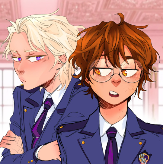
Here's a screenshot redraw, I'll put all the redesigns below the break bc I did all the main characters & wanna talk about the choices I made. Also I made up that uniform redesign on the spot bc I when I was doing the characters I just put them in casual clothes lmao
(I might do some others later, like Renge, Kasanoda, Yasuchika, Benibara, etc.)
Going in order of my least favorite to top favorite. And dont mind that I didn't color the clothes, that's not whats important here lmao
Mori is only at the bottom because I don't like the drawing that much, I still think the design is pretty good. Though, like right when I finished coloring, I decided a bun/top-knot would look better so it's a bit disappointing there. In my head, Mori is kind of struggling to figure out who he is & what he wants to do, which is why he follows Honey around and doesn't talk much. He does genuinely like being around the other hosts though.
Also, the undercut because A) he has the reputation for being the scary one & it kinda suits that, B) uh do I even have to say it? ...its hot He does lowkey look like Sokka from Avatar tho, especially with the blue accents
(edit: I accidentally deleted Mori's file so now this is the only copy so 😭)
Honey is next because again I think the drawing itself is a little off and the design is pretty close to Basil from Omori, which i didn't notice until it was too late lmao. One of the main things I didn't like about his character in the show was obviously how childlike he was & how girls still flirted with him even though he looked and acted 6; So now he still acts a bit childish but doesn't play it up as much & definitely has a more normal voice, not a fckn child's.
Haruhi! I definitely had to keep her glasses cuz they were really cute and kinda sold the whole 'commoner' thing in a way. But other than that I mainly wanted to balance out her femininity and masculinity to make her more androgynous/nonbinary/gender-fluid since she definitely has some of that going on in the show as is. I also gave her dark circles under her eyes to kinda show that she worked really hard to get into Ouran with low status.
Next up is Tamaki of course, getting into the characters I'm most happy with the designs of. One small thing I tried to do for each of them was give them varying hair tones; so even though Honey and Tamaki are both blond, I went very platinum-blond with him. When I started drawing him, my only real thought was "he has to be a pretty boy" so I dont have much to say about my choices, but i do think I succeeded. Don't mind the modern mullet thing, I can't stop it
Kyouya is definitely one of my favorite characters as is, seeing as he has one of the more fleshed out & heart-wrenching backstories in the show. I think the only thing I really wanted to change was getting rid of the Anime Bangs, so I just gave him this kinda sleek, kinda messy pushed-back look with a blue tint. Even though it's simple, I really struggled to come up with anything, until I found a page from the author saying smth like "I don't like the idea of him wearing neat clothes" with a picture of him in like a track suit so I did kinda the same outfit
My absolute #1 favorites, Hikaru & Kauru. They're honestly the ones that started it all because Kauru has been my favorite since I first saw the halloween episode (iykyk).
I don't know why, but I wanted their hair to be fluffier/curly and more of a natural(?) ginger color. I knew I wanted Kauru's to be redder and Hikaru's a bit lighter/blonder, but only subtly. I also gave Kauru a scar on his cheek from that time in Karuizawa, but most notably, I gave them blue and pink eyes as their signature colors. Lastly, their expressions are slightly different, because no matter how much they are in sync and try to match each other perfectly, Kauru's a much gentler soul than Hikaru, so I made Hikaru's smile a bit more snarky while Kauru's is soft.
Thank you for looking at my art/ reading my thoughts, here's an extra little design edit & comparison

(lol, I think they're mimicking Kyouya in this panel idek) (Also here you can see I tried the bun hairstyle w Mori, I think it looks good, but this is a really simple drawing so.)
#ouran high school host club#ouran hshc#haruhi fujioka#tamaki suoh#kyouya ootori#mitskuni haninozuka#takashi morinozuka#hikaru hitachiin#Kauru hitachiin#character redesign#my fanart#my art#screenshot redraw#im hyperfixating again#ouran redesigns#33xhausted art
66 notes
·
View notes
Photo


Noooooo, I didn’t draw kaijus to put them into DMC...
Titanus Ghidorah (my redesigned version) - Titanus Daevas and Apocryphan - Titanus Shinchū
Titanus Ghidorah:
Ichi is the main controller of the body. A prideful, borderline arrogant kaiju, Ichi acts as the mastermind or intelligent one of the three heads. He’s the one that plans everything and keeps Ni and San under control; he is capable of keeping his emotions under wrap, so no one knows what he’s visibly feeling at that point in time, though his actions says a lot more than his words do, despite him enjoying long and debatable conversations. Easily the most level-headed one and to keep focused on the main goal, unlike his fellow heads. He knows that brute force or manipulation alone isn’t enough to crush his enemies, so often, he blends the styles together to cause mass carnage and annihilate his enemies with lethal efficiency. Godzilla hates Ichi the most out of the heads.
Ni is the second head, and the most destructively violent one of the three heads. His head structure is made to cause absolute catastrophe by having a bite force stronger than Ichi or San’s, and no kaiju (minus Godzilla) is able to escape his jaws alive, or at the very least, shattered bones and profusive bleeding (that is difficult or impossible to stop due to venom glands Ni has). His electrical breath is the most devastating, but severely difficult to control, and more than likely can have just as much damage done to themselves as to the rest of the world. To rival his power, Ni is the boaster and highly aggressive. He sees the world as his playground - he is the king of Kings, he doesn’t have to follow orders (except he does, as Ichi controls a majority of the body). If an area in the world is too peaceful, or there is no battles amongst the kaiju, Ni is the most likely one to start it, as there always has to be conflict, or else what is the point in the world that they live in? Though, admittedly, the only one who can keep Ni calm for long periods is Mothra; no one is sure why this is the case, but kaiju and humans alike don’t complain much, considering Ni is a walking disaster ready to burst at any given moment.
San is the third and last head. The most “innocent” one of the heads, San has appropriately adopted the name of “Kevin”, given to him by the humans who took notice of his dorky personality, but despite his pleasant mannerisms, he has his own dark side. Internally, San is sadistic, manipulative, and cunning. His outside personality isn’t an entire lie, but it’s not the entire truth. The reality is that his base nature fights against the kaiju he tries to be, a tug of war that lasts millennia with neither half gaining the upper hand for too long. San tries his best, he really does, but the scent of freshly drawn blood and screams of tiny humans tempts his inner bloodlust, and so he loses himself in the moment, focused only on the ruin that follows. He would cause chaos alongside the other two heads, but wouldn’t immediately end his opponents. Instead, he’d be the type to drink their blood, throw out taunts, mocking them, insulting them, using his slick words to get them to slip. He’d even eat the ashes of dead humans that have been vaporized, just to watch the horror fly on the faces of the humans who knew the ash pile moments before. Once San snaps out of it, he feels nothing but overwhelmingly crushing guilt; he knows he can’t be forgiven for the crimes, and knows that his thoughts would claw him from the inside out. But he tries to not let it get to him. The only thing to keep them at bay is try to make up what he’s done, to be the kind kaiju people knew him as, but trust is a tricky thing, and San often finds himself alone. No one knows how to pull him from his darkened state, though who knows, maybe he’ll find someone... maybe. (Oh, and he uses his horn to skewer and slash body parts off his opponents, that horn is razer sharp and can cut through steel painfully easily.)
Titanus Daevas:
Daevas is the first daughter of the Queen, Mothra, and the Devil, King Ghidorah. While it may appear that she has two heads that are separate individuals, it’s actually just Daevas, but split into two heads... if that makes sense. The extra head allows her to watch from both behind or below, while the other watches the front or above; additionally, it also means shes able to grasp objects or other kaiju, as with her front limbs, they’re more so meant for tearing into flesh with their serrated edges than actual carrying. Height wise, she’s taller than her father, though in overall bulk/mass, she is lighter with a more sleek build. Her tail is like that of a scorpions, with the curved edge holding a prevalent venom that prevents blood clots and induces mild paralysis, hindering her opponents limbs so that she may use her electrical beams to blast the opponent into puddles of blood. Or, if she so wished, she could use the barbs on her tail to slam into the opponent and have them break off similar to spines, though usually the process to regrow the barbs takes a considerable amount of time, so its only used for emergencies.
Daevas (or Olvida, her human name) is a lost soul making due with what she has. Due to Ichi not caring for Daevas like how Ni does, he ultimately abandons her, which causes Ni to try and blow apart Ichi’s head; he does deeply care for his daughter, but his insecurities are deep, as he fears that he’d accidentally hurt or kill Daevas, or that he’d be a horrible example of a parent and lead her down a dark path like the one he has treaded upon. Ichi, noticing the internal struggle, manipulates Ni into giving into his head (as in reality, Ni isn’t as strong-willed like Ichi is), and convinces him that Daevas would be a lot safer being in the hands of Mothra than his own, and Ni caves. He was broken, and Mothra attempted to intervene, to try and reign in Ni and bring out his parental side, but he is too far gone, Ichi wormed too far into his psyche to where Ni wishes he didn’t have Daevas. He was always going to be a failure of a father, so why did he bring in such a precious life that he would inevitably destroy? His thoughts crushed Mothra, and it led to a long-felt depression to come crashing down. She started blaming herself for what has happened; this reflected in how she cares for Daevas (and soon, her younger sister, who has yet to hatch), where Mothra found herself lost more in her thoughts than caring for her daughter, and Daevas noticed. She wasn’t dumb, she noticed the look in her mother’s eyes. Looking at Daevas made Mothra succumb deeper into the abyss, a constant reminder of how Ni left, leaving Daevas fatherless. He was always around, yet, he ignored Mothra and Daevas whenever they were nearby, but when Daevas wanders up to him? He’d snap, but it was a cover up to try and prevent the merciless tears from pouring out. Daevas never tried again.
An accident, that’s what she convinced herself she was. Her thoughts were even more solidified where one day, her mother was gone. Daevas had a dream before she woke up to Mothra being missing, the soft whispers of “I’ll be going away soon, but I’ll be back, I promise” resonated within her skull, and the young kaiju knew that those words were rooted in reality, but it wasn’t the full truth. A day she waited, a week, a month, a year. She wasn’t coming home, she had lied. Daevas left the nest that was once her home, knowing that she had been abandoned by the only hope left in her life - she was pained by this, oh the shattering of her heart echoed throughout her chest, making it hard to swallow and hard to breathe. But she endured, she was just an accident after all, along with her younger sister. Her sister was born after Ni had left the family, and was still only a larva when Mothra had abandoned them. She was weaker than Daevas, significantly weaker; she struggled to eat, her moves were sluggish, and her exhaustion knew no limits. Other kaiju would’ve abandoned her, seeing her as more of a burden to their survival than their own kin, but Daevas wouldn’t be like their parents. She cared for her sister, took her with on her travels. They never stayed in one spot, always moving, always surviving. Soon, she has reached her young adult hood, and her sister began to change into her moth form, though she was still reliant on Daevas. Daevas didn’t mind, she was her sister after all, and no matter the day, she’d care for her little sister. Even if she would die in her attempts to keep her safe.
Daevas is a survivor, so she doesn’t interact with the other kaiju in fear they’d attempt to harm her or her little sister. Not to mention, they’d think she was the hidden heir to the Devil, and while she doesn’t wish to be associated with her father, part of her yearns to be recognized by him, to at least be acknowledged that the power she has gives her great potential. Dae isn’t one to dwell on those thoughts for too long though, as it would risk the safety of both her and her sister, so she buries it under hard work hunting for food and making sure her sister is safe. Now, I wouldn’t say she’s the type to get over trauma easily, but Dae always attempts to look at it from a logical stand point: those kaiju that affected her the most aren’t in her life anymore, and so theres no point in dwelling on the suffering she had to go through. If she ever meets them again? She’ll attempt to let the past be the past, and focus on the future. The daughter of the Devil is more of a brawn over brains, but it’s not to say she is “dumb”. She’s a quick learner when it comes to learning to survive, but socializing? She is significantly slower with. She’d be hostile at first, definitely, and will likely keep up a hostile or intimidating front for a while for those she doesn’t know, but slowly over time, she’ll tolerate other kaiju being around. She prefers not to talk though, her speech is kinda... meh. Basic words to get the point across, but if you use too many big words, she won’t understand. Don’t try explaining it to her either, she’ll look at you like you’re an insane mad man.
Titanus Apocryphan:
The son of the Devil and Muto Queen, and the half-brother of Daevas and her sister. He is recognized as the true heir to Ghidorah, though he could care less about such a title. In the end, it is just a title, it has nothing of value and just a term to label something, which quite frankly, Apocryphan hates. King, queen, prince, princess, it doesn’t matter, and so he does get into scuffles with Godzilla sometimes when the King tries to assert his dominance over him, but if theres one thing Apocryphan hates, its control. Now, Apoc is nice, borderlining on a gentleman, but he shares no desires in being an alpha, no desires in having a mate and continuing the bloodline, he just wishes to experience life itself. Call him a hippie, if you will, but he’s the non-pacifist hippie. Just don’t piss him off; Apocryphan is one of the bulkiest kaiju, and he’d definitely body you if you can’t fly or don’t have matching bulk to withstand him toppling you. He’s by no means as agile as say, Daevas, but he does have a nasty lightning breath attack, able to use an EMP ability, and able to deal an AOE electric attack to knock down flyers temporarily. Despite him having appendages similar to wings, they’re more so used for protecting himself; flexible, yet undeniably tough hide, able to withstand extreme temperatures and resistant to damage. He’s the tank, so to speak.
When he was born, he was actually adored by Ichi; the primary head adored his son, pride swelling within his chest at the sight of his spawn. He raises him well alongside his Queen, Barb, teaching him how to fight and in some cases, teaching him brutality if the situation so calls for it. Barb got on his hide for teaching their son such a thing, but it was quickly dismissed by Ichi, who told her he wouldn’t be trying to teach his son such things again. Barb was doting upon her son, though not overly so. She told stories about her species to a young Apocryphan, who was fascinated by such tales, and sometimes his father would come in to tell his own book of history about the kind he was apart of. In short, Apocryphan had the family Daevas had lost, and that made her nearly ignite herself into flames when she finds out about Apoc.
Now to the part I want to write about - Apocryphan and Daevas are heated rivals, but it’s pretty one-sided. Apoc genuinely wants to bond with the half-sister his father never spoke of, but Daevas sees him as just... well, a replacement for her. All those years of surviving, and this is the reward she receives for all of her painful suffering? She brews with intense, bloody hatred at the sight of him, and wants to slash him apart to show her dominance over her younger half-brother. What Apoc sees though? Just someone that’s broken, agonizingly so. So despite all of the near-death scenarios he throws himself into, he still tries to get to know Dae, to hear her story. That’s one she’ll likely never tell Apoc to his face though. His presence alone is a slap to the face for her.
Titanus Shinchū
Ah, the youngest sister of Dae, and older sibling of Apocryphan. Now, admittedly, she is the weakest character out of the ones I’ve written about so far. From what I do have of her, she is admittedly very weak for a kaiju. She can still be a thorn for humanity, but can be dealt with quickly. She was born with an autoimmune disease, so her body is constantly fighting herself, leaving her drained a majority of the time and difficult to... well, live. She doesn’t give up though, she would be the one too angry and stubborn to die, angry at the world. She never is harsh to her older sister, but everyone else, including Godzilla? Sarcastic and rude, always having a biting remark to nip at them. In a way, shes envious about the life they live - they don’t suffer from all the pain she has to go through, must be nice getting to live a normal life, to actually be able to function properly rather than consume yourself from the inside. I imagine her life span would be shorter compared to Dae, though her benefit is that she’s, thankfully, able to be reborn like how her mother does, but it’s always painful for Dae to see her die. A life of suffering, fueled by the anger that Shin has for the world and the hand that was dealt to their family.
She clings to Dae a lot, admittedly. Dae is the wall, but Shin is the ranged attacker. Her wings are like a dragon fly’s, beating fast that generates a lot of heat to pulse through her body, and she’s able to launch electrical spines at her enemies with, honestly, quite good accuracy. She’s fast in the air, like, ungodly fast, but it takes a huge chunk of energy for her to go that fast, so usually she hovers, as it takes less energy, but honestly? Shin prefers not to fly at all; to her, you’re just painting a big ol’ red target on your underbelly, and while she doesn’t mind dying (since she’ll come back anyway), it’s a pain in the ass to get to her moth form again.
Hates Apoc too, but isn’t blinded by nothing but rage like Dae is. She’ll hear him out, if just to quell her curiosity, but then she’d tell him to scurry back to Ghidorah, he isn’t welcomed here.
that’s all im going to write bc my brain go poof
back to dmc i gooooo
#ghidorah#mothra x ghidorah#ni ghidorah#ghidorah x mothra#legendary ghidorah#king ghidorah#ichi ghidorah#san ghidorah#kevin ghidorah#mosudorah#mothdorah#modorah#godzilla kotm#godzilla king of the monsters#kotm#gkotm#ghidorah king of the monsters#godzilla#kaiju#kaiju oc#i tried :')
153 notes
·
View notes
Text
Moonbeam Duke (Reverse Robins)
Duke was... tough. There's not nearly as many differing designs to draw on for him, and frankly I don't like a whole lot of them. I do like the mainline Signal costumes I've seen (both the black symbol w/ full-face helmet, and the glowing symbol w/ jaw exposed) but they really have more "Independent Hero" vibes.


(These designs are all dope, but not great sidekick material.)
Digging through reference images led me to realize that even in his Elseworld appearances, Duke almost always gravitates towards those knightly vibes. Boy likes his armor with a little fantasy-flair.


("Future's End" & "White Knight" a bit less so, but I still get cyberpunk-knight vibes from both—maybe it’s just me.)
Those that aren't all knightly tend to be stylized but durable street clothes, that are just out there enough to pass for a costume but could just as easily be worn by someone in their everyday life.

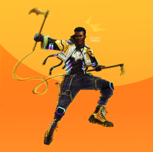
(Last one is this redesign by @sufroyo, but gods do I love it!)
Duke will probably want some of that knightly vibe, but Moonbeam is kinda my Robin figure in this AU; he needs to look like the less-experienced partner to Gotham’s Dark Knight, rather than a Knight in his own right. And I should combine that with his preference for practical, durable, almost-understated fashion.
So… streetwear-squire. Let's see what I can do.
First off, we can get both sets of vibes by starting with a gambeson as our base. Go for a shorter one to emphasize that jacket look, and while they come in a whole variety of styles, I think off-center clasps looks just a little bit more modern. I'd also say he doesn't buckle up his neck, giving it that popped-collar look Duke seems to like.

(Off-centered clasps, as well as a couple casually worn gambesons to show the kind of effect you can get. Duke's is definitely the kind that covers the hip to brush the top of the thigh, but given most people think of gambesons as being knee-length, that's still short.)
And, hell, if Robin can wear bright colors then so can Moonbeam. Using the "It'll help you learn to sneak better" excuse, Duke's gambeson is cream colored. (It also looks better contrasted to Batman's black.)
I like the idea of the gambeson having built-in gloves like in Duke's "Final Knight" costume, but I don't really like the look of Final Knight’s Duke design(s). Erm, any of them. I'd define the difference on the sleeves a little more by giving him hand & arm bracers to wear over the top, probably some simple pauldrons, and maybe a gradient on the arms from cream to grey.

(Not 100% on the gradient, just think the fully light sleeve might not work even with the bracers. Keep the metal simple & understated, though, and remember the lines in the sleeves are from padded fabric rather than any kind of wrappings.)
Still, that's a long stretch of one pretty plain color. The main body needs to be broken up, and Duke should probably have a bit more protection, but we don't want to hamper his mobility. Let's add a demi-brestplate (also called a demi-cuirass or "heroic armor") on top. That protects the upper chest without going past the rib-cage, to avoid hampering movement.
(I really, really like this fluted design, but can't find anything smiliar in a demi. I've also always liked the look of breastplates which are 2 pieces held together by straps under the arms. The last one is just to give you a better idea of the size/form of the thing.)
And a steel-grey utility belt, obviously.
(...I should probably mention, none of this metal should be highly-polished. It's not glinting like a mirror whenever Duke's not redirecting light away from him, it's just a step or two above matte-finishing.)
I'd say Duke's symbol is an iridescent/opalized circle right in the middle of his chest, representing a full moon (or the bat signal minus the bat.) So it looks white, but it shimmers rainbow when it catches the light. Probably has either a black or gold ring around it to help it stand out.

(A normal opal, and opalized glass with light shining through it. No, the ring does not seem to exist outside of pinterest.)
There's also a matching smaller "jewel" on the back of each gauntlet, and Duke claims he uses them to focus his light powers. Whether he does or not, I don't know.
I don't like the look of Duke's "We Are Robin" helmet in-context, but I think it could work here. Match the grey to the breastplate & gauntlets, match the stripes to the gambeson, replace the eye-slits with a thin, one-way visor, lose the ear-circles.

(I did consider having the colors be the other way around, but that felt a little too close to Ghostmaker's look for my liking.)
Give him some dark grey cargo pants, a pair of these sports boots (minus the logos), and some metal knee-pads to finish the look.


______________________________________________________________
A handful of these characters I do actually have a degree of costume evolution in mind beyond just changing identities; Duke is one of them. In this case, it becomes more knightly as time goes on.
In particular, I think Duke swaps the gambeson for a chainmail tunic and the demi-breastplate for a laminar chest piece.
(I like the short sleeve tunic style, and I'm picturing Duke's "White Knight" armor as the basis for the chest piece. I can’t seem to find any laminar reference photos that have that same look; I’m almost picturing a scapular, but made from metal plates.)
The sports boots become combat boots, the knee-pads & bracers get swapped for splint greaves & splint bracers over black leather gloves. The “jewels” are now on the back of the gloves directly, rather than the metal, as the new bracers don’t cover his hands.
He also adds the Bat ear-points to his helmet, adds a dark undersuit to the top to replace the sleeves, and generally ups the contrast by darkening the greys & either polishing the armor or painting it metallic white (if the latter, the chainmail is probably a light, brassy brown to make them pop.)
(These colors, I believe would depend on the artist; it seems like one of those things people would disagree on.)
All of which helps evolve the look toward the Signal's "motorcycle gear meets knight armor" mash-up.
#reverse!robins#reverse robins#reverse robins AU#reverse order robins#reverse order batkids#reverse batkids#reverse batfam#reverse batfamily#duke thomas#the signal#robin duke#robin duke thomas#robin!duke#robin!duke thomas#the signal dc#batfam#batfamily#bat family#bat fam#batkids#bat kids#bat siblings#batsiblings#my life#mine#//#I don’t love this as much as the Shadow costumes; but then this is one full day’s work rather than a whole week.#Moonbeam’s been giving me trouble since the start so I’m mostly spitballing & rolling with my own design sensibilities as I go here.
39 notes
·
View notes
Text
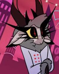
heres my redesign of the radio demon guy. again, i tried to keep a lot of the scene/edge aspects of his design while actually making him 1. look like a 20s radio host and 2. actually mixed race.
the mixed race aspects are subtle, but i didn't want to stray too much from vivzies art style. i just enlarged the nose/flattened it to portray a wide, flat nose in a similar style, while changed his hair to be more curly. since it merges with his fur, its a bit hard to tell, but its definitely workshoppable.
skin color i felt actually was rather accurate to around the same shade of someone i'd consider mixed race, though you can absolutely increase the saturation so he doesn't look undead.... he kind of already is so i think the desaturation isn't as bad as it would be on say, a living character.
a lot of simplifications and making him more deer-like. added a hat with the scene stripes cause i thought making a bowler hat with scene-style stripes would be a great mishmash of 20s attire and the scene aesthetic vivzie loves.
the biggest change imo, is how i'd handle his backstory. disclaimer that i am NOT black and my suggestions should not be taken as final, but rather something that should be used as a jumping board for a sensitivity reader to adapt.
if we want to keep alastor's voodoo and cannibalism aspects, while not condemning it as SPOOKY SCARY BLACK PEOPLE RELIGION, i think it would be prudent to explain that the reason for Alastor's sinning is not because he was evil, but because Christianity deemed his faith as paganism and thus a sin. There are cultures out there that practice ritual cannibalism to honor the dead-- i do not know if voodoo incorporates it, but if it does, i can see that the Angels above condemned it as evil due to their inability to reconcile with faiths that are not their own, casting Alastor down to Hell simply for practicing his own faith.
This would turn him away from the Powers that Be, disillusioned by a world that would deem his faith to be a sin, reveling instead in his status as a demon as an act of rebellion towards Christian hegemony. He's not a bad guy, he's just a man who became a victim of violent colonization and racism and his status as a sinner is *not* as judgement on his character, but a reflection of the hypocrisy of Heaven in that universe, which seems to be a theme in the Hell Shows.
21 notes
·
View notes
Text
The Thing About Redesigns, Rewrites, and Reimagines…
(Part I: Broader Discourse)
To those of you who’ve been keeping tabs or maybe seen my posts floating around the tag, you might recall me mentioning that I felt a bit of hesitancy toward the prospect of joining in on the recent wave of redesign/rewrite content. In the more likely scenario that you haven’t or do not know what the crap I’m talking about, that’s fine lol. Understandable. It was a little thing I had written into my first rewrite/redesign post about Charlie. In a short aside, I explained that it was because I’d felt “bad about tinkering with someone else’s work like this”, and then I’d left it at that. So… yeah. Why am I bringing it up now?
Well, I don’t think I need to tell you that this fandom is… a lot. Y’know people have been talking…discourse is being had… heated, moral arguments are being hurled left and right. And in light of all the growing, reactionary accusations, I…found myself starting to feel bad again.
My initial issue, the reason why I didn’t immediately jump to sharing my ideas was that, for all her faults, I empathize with Viv as a creator and didn’t want to feel like I was disrespecting her, her characters, and her vision by reworking it to suit my own. I had frustrations and criticisms, but I never wanted to make it seem like I was trying to ‘fix’ her work or her style. I really didn’t want to be one of those pretentious dipsh*ts (the kind that take a piece of art, digest it through their own preferences and biases, then spit it back in the artist’s face with a, “There. I made it better”). In the end, I went through with it because I had a small hyperfixation and a tendency to project my own issues onto characters I love (I’m sure some of y'all can relate). And also, I was having fun. But… then more discourse poured in, and I saw all the concerns I expressed reflected in the arguments presented by other fans and artists.
And well… That made me feel like I was doing something wrong, like perpetuating and becoming the exact problems I had wanted to fight against. So, I took a step back. I reevaluated.
Now, I have thoughts (shocker!).
And they are conflicted.
On one hand I agree with the idea that redesigns/rewrites are not inherently bad or disrespectful things when it comes to productions like Hazbin since Viv is not a small creator with no power. She and her team have ultimate authority over the show’s events, and those plans will not be derailed by what is basically some random tumblr artist’s fanart/fanfiction.
In regards to the critical side of things, that kinda comes with consuming and digesting the messages and presentation of a work of art. Ideally, it should get people to discuss in this capacity, especially when it deals with such sensitive subject matter as Hazbin does (and especially when it is executed with evidently problematic notions which do bleed into the designs at times).
Still, I do think this trend can be disrespectful if the intention and presentation are made with an aggressive holier-than-thou attitude which explicitly seeks to one-up the creator. Though I understand where it comes from, I think that can be just straight, undiluted maliciousness with a generous helping of pretentious, self-appointed superiority. And I don’t think it’s necessary to pick apart the style itself. You don’t have to like it, of course, but I feel like stating your preference for one way of drawing over another and asserting it as if it were some objective truth antagonizes the entire point of individual artistic expression and personal taste. Criticize the lack of diversity (something which, I’d like to add, is not actually unique to Hazbin) and potentially problematic aspects, but not the style. Even then, it’s important to be constructive not destructive.
That being said, I don’t expect everyone to agree with me (especially if anyone who’s a die-hard fan finds this) Whether you do or not is on you, and that’s okay.
This is more a snippet of my thoughts than a fully developed rant. I just wanted to share where I’m at right now. There will be a part 2 to this expanding some of my feelings while also outlining where I might go from here because things are going on in my head, and I don’t actually know whether I will continue or not with this project. Right now, it feels like it’s drifting toward a more original direction (Charlie feels like an entirely different yet vaguely similar character and dang it I’m attached…It’s kinda weird lol) so….anyway—I digress.
Thank you for reading.
#hazbin hotel critical#hazbin hotel criticism#hazbin hotel redesign#hazbin hotel rewrite#hazbin rewrite
14 notes
·
View notes
Text
Oh hey, Homestuck 2 updated. With a flashback, no less. It's been a loooong time since we've seen Harry, but I remember liking him. Honestly I like all the new characters more than the HS2 incarnations of the old characters.
You’re still at home. Stuck.
oh_you.jpg
Oh Jesus, John and Roxy in the "Guardian" style. Kind of interesting the presentation, though, that this is how the kids see their parents. Good way of explaning why where weren't like this before.
that SUPPOSEDLY DIVINE NEGLIGEE’s inability to accommodate your dads AWKWARD MAN-BOD was downright sacrilegious
I just like this sentence.

It's weird that we're getting a room introduction for Harry, the one character who actually got one in HS2. Huge emphasis on costumes and outfits here, which is what leads a lot of people to think Harry might be a Heart player. That's into fan-theory, though. In actual Homestuck, Kanaya was the "fashion" troll, and Jade was the one who had all the different outfits she kept switching between, so add "Space" to the board here. Also, the fucking Bunny is back.

Harry is basically trying to get a redesign here, and he doesn't like his bag. He does apparently need something to carry his stuff in. That's...odd. He has a sylladex, we saw him use it before this flashback takes place. Is the bag like Dad's wallet, a physical item representing a video game-y abstraction?

This is the best panel in the update

Okay, Harry has "Sleezy Headbanger" and "IdeogranicDramaturgy" in his contact list. These are new characters, and the second update in a row with mysterious new names in people's phones.
You know, it's really weird that the Omega Kids don't have logos, requiring Vrissy to be represented by a silhouette of her own head here. Especially since Harry changed closes in this very update and didn't take advantage of the opportunity to do some branding. Those simple shirts were famously good-selling merch, and they served a story purpose, so it's odd HSBC isn't doing them.

Man, Harry is just all the original four kids, isn't he? He's got the rambly nature of Dave with the dumb sincerity of John.
D'aww
VRISSY: I think they should 8e here Soon, so let's take a seat and Chill out, okay?
HARRY: ...my my, how can i resist ya? ;)
VRISSY: Oh my G8D, I told you Never to S8y that Again!!!!!!!!
Is that a fucking Mamma Mia reference? Out of nowhere, without Vrissy even setting him up for it?

Anyway, we're caught up to the present, and the three kids are united.
Though, Given Vrissy's sudden furious rage, it looks like the four kids are meeting up for the first time. We're actually going to get a conversation with the four new kids, something that never happened with the four originals in HS1. I'm actually really excited for this. Yiffy gets to meet another person who just furiously hates her sight unseen. What a novelty for her that'll be!
26 notes
·
View notes
Note
wait are there different kinds of car within the model name or is the difference just the year? bc my dad had a jeep cherokee (before it exploded) and it didn’t look like your car but it was also a newer one.
both!
so an individual car model can have multiple body styles and trim levels


both of these, for example, are 2009 honda civics. the one on the left is a 4 door sedan, the one on the right is a 2 door coupe. but they’re both the same car
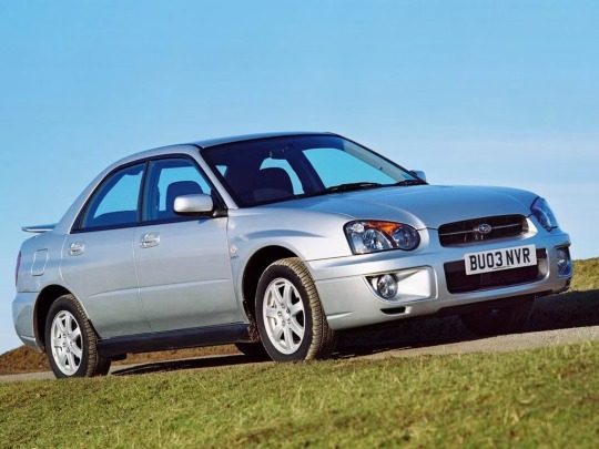
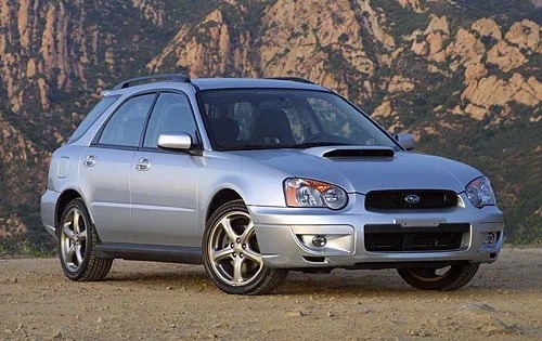
or another example, 2004 subaru impreza. the one on the left is an impreza sedan, the one on the right is a higher trim level (WRX, a sports model) and body style (wagon/hatchback depending on who you ask). they are however both still 2004 subaru imprezas
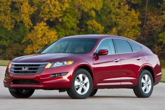
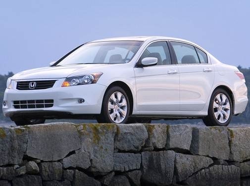

all three of these are 2010 honda accords. the top left is a crosstrek model, built to be a true crossover (mix between a sedan and an SUV), top right is a 4 door sedan, and the bottom is a 2 door coupe with a bigger engine. all three are vastly different but fall under the same model name
occasionally a trim level will split off and become its own thing. one example of this is the toyota supra

this is an early 1980s toyota celica supra. at the time, the main model was the celica, and supra was the name of a higher more performance-driven trim level, kind of like the impreza wrx. come 1986 though, the car split off from the celica name and became its own car:
this is a 1986 toyota supra. i would include a picture of a celica from the same year but i’m out of images i can post on mobile lol, but they became two different cars.
and then finally yes, year changes a lot. cars will keep the same name but be constantly improved and redesigned over time. every time one model undergoes a major revamping, that’s a new generation of the car
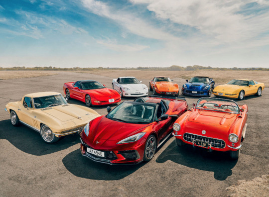
this photo is one of every generation of chevrolet corvette, a model that has been in production from the late 1950s (the red convertible on the bottom right) to now (the red convertible bottom center). they all look vastly different but share some similarities and are all, at their core, the same car
on a final note, sometimes there are years between generations of the same car, where a model gets discontinued and then the name is brought back later. this is where the cherokee comparison comes in. they made the first cherokee up through 2001, then discontinued it, replacing it with a model called the liberty. they brought back the cherokee name with a new model in 2015. this happens pretty often! the aforementioned toyota supra is an example of this too, they made the first four generations from 1978 to 2002, then brought back the name with a new sports car that borrowed some styling from the older models but had entirely new modern design and internal workings, about four years ago
hope this makes sense, if you wanna know more you have my discord lol
51 notes
·
View notes
Text
The redesigns have returned! It feels good to be doing these again. I'm really happy with how these turned out. I'm betting that these won't be as popular as the designs I've already done, but it would feel weird to redesign everyone else and leave them out so :P
As always, design notes will be under the cut!
Tools used: XP Pen Artist 15.6 Pro, Clip Studio Paint
Reblogs >>> Likes!
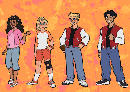
Paulina
Okay y'all have NO IDEA how long I've waited to use butterfly clips in a hairstyle and I'm so happy with how it looks on Paulina! Her normal hairclip just wasn't enough for me. I also saw that kind of sweater and shirt style a lot while looking up inspiration for the clothes and thought it was super cute for her. I kept her low-waisted capris and added a little flare at the hem, and I gave her chunky white sandals inspired by Willow Pill's entrance look on Season 14 of Drag Race.
Star
I think I had the most fun with Star's redesign and reinterpretation. I gave her a more sporty look. I put her hair up in a ponytail and gave her a knee brace to reflect that. I don't know if this was a common experience for everyone, but I knew girls who played volleyball and it seemed like they always had a knee brace on. I also put a bandage on her nose implying she's had work done on it.
Dash & Kwan
Not much has really changed with them, so I thought I'd just group them together here. This is another instance of me just drawing a character in my own style and having changes naturally happen though that. The difference is really in the details. While I was looking over their sketches I thought that Dash and Kwan look like a preppy Bill and Ted and that's when I knew they were perfect.
#my art#digital art#fanart#danny phantom#paulina sanchez#dp star#danny phantom star#star danny phantom#dash baxter#dp kwan#danny phantom kwan#kwan danny phantom
275 notes
·
View notes
Last Seen Blogs

edcastfan
calenturas ajenas

fuckyeahpipesofpan
Pipes of Pan
yourtimestartsnow
best of taskmaster
kwanisms
𝐛𝐨𝐨𝐤𝐢 writes (sometimes)
trekkele
Boldly Going, Nerds