#moving element css
Explore tagged Tumblr posts
Visit Tumblr Blog
Explore Tumblr blogs with no restrictions, modern design and the best experience.
Last Seen Tumblr Blogs


Fun Fact
Tumblr has 16.74 million mobile monthly users in the US.
Text
Animated Element CSS
#moving element css#html css animation#codingflicks#frontend#html css#html#css#frontenddevelopment#webdesign#css animation examples#css animation tutorial#css3#pure css animation
4 notes
·
View notes
Text
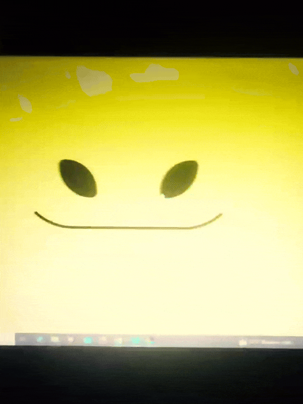
Edgaring time!
Tutorial on how to make your own responsive Edgar :D I will try to explain it in really basic terms, like you’ve never touched a puter (which if you’re making this… I’m sure you’ve touched plenty of computers amirite??? EL APLAUSO SEÑOOOREEES).
If you have some experience I tried to highlight the most important things so you won’t have to read everything, this is literally building a website but easier.
I will only show how to make him move like this:
Disclaimer: I’m a yapper.
Choosing an engine First of all you’ll need something that will allow you to display a responsive background, I used LivelyWallpaper since it’s free and open-source (we love open-source).
Choosing an IDE Next is having any IDE to make some silly code! (Unless you can rawdog code… Which would be honestly impressive and you need to slide in my DMs and we will make out) I use Visual Studio!!!
So now that we have those two things we just need to set up the structure we will use.
Project structure
We will now create our project, which I will call “Edgar”, we will include some things inside as follows:
Edgar
img (folder that will contain images) - thumbnail.png (I literally just have a png of his face :]) - [some svgs…]
face.js (script that will make him interactive)
index.html (script that structures his face!)
LivelyInfo,json (script that LivelyWallpaper uses to display your new wallpaper)
style.css (script we will use to paint him!)
All of those scripts are just literally like a “.txt” file but instead of “.txt” we use “.js”, “.html”, etc… You know? We just write stuff and tell the puter it’s in “.{language}”, nothing fancy.
index.html
Basically the way you build his silly little face! Here’s the code:
<!doctype html> <html> <head> <meta charset="utf-8"> <title>Face!</title> <link rel = "stylesheet" type = "text/css" href = "style.css"> </head> <body> <div class="area"> <div class="face"> <div class="eyes"> <div class="eyeR"></div> <div class="eyeL"></div> </div> <div class="mouth"></div> </div> </div> <script src="face.js"></script> </body> </html>
Ok so now some of you will be thinking “Why would you use eyeR and eyeL? Just use eye!“ and you’d be right but I’m a dummy who couldn’t handle making two different instances of the same object and altering it… It’s scary but if you can do it, please please please teach me ;0;!!!
Area comes in handy to the caress function we will implement in the next module (script)! It encapsulates face.
Face just contains the elements inside, trust me it made sense but i can’t remember why…
Eyes contains each different eye, probably here because I wanted to reuse code and it did not work out and when I kept going I was too scared to restructure it.
EyeR/EyeL are the eyes! We will paint them in the “.css”.
Mouth, like the eyeR/eyeL, will be used in the “.css”.
face.js
Here I will only show how to make it so he feels you mouse on top of him! Too ashamed of how I coded the kisses… Believe me, it’s not pretty at all and so sooo repetitive…
// ######################### // ## CONSTANTS ## // ######################### const area = document.querySelector('.area'); const face = document.querySelector('.face'); const mouth = document.querySelector('.mouth'); const eyeL = document.querySelector('.eyeL'); const eyeR = document.querySelector('.eyeR'); // ######################### // ## CARESS HIM ## // ######################### // When the mouse enters the area the face will follow the mouse area.addEventListener('mousemove', (event) => { const rect = area.getBoundingClientRect(); const x = event.clientX - rect.left; const y = event.clientY - rect.top; face.style.left = `${x}px`; face.style.top = `${y}px`; }); // When the mouse leaves the area the face will return to the original position area.addEventListener('mouseout', () => { face.style.left = '50%'; face.style.top = '50%'; });
God bless my past self for explaining it so well, but tbf it’s really simple,,
style.css
body { padding: 0; margin: 0; background: #c9c368; overflow: hidden; } .area { width: 55vh; height: 55vh; position: absolute; top: 50%; left: 50%; transform: translate(-50%,-50%); background: transparent; display: flex; } .face { width: 55vh; height: 55vh; position: absolute; top: 50%; left: 50%; transform: translate(-50%,-50%); background: transparent; display: flex; justify-content: center; align-items: center; transition: 0.5s ease-out; } .mouth { width: 75vh; height: 70vh; position: absolute; bottom: 5vh; background: transparent; border-radius: 100%; border: 1vh solid #000; border-color: transparent transparent black transparent; pointer-events: none; animation: mouth-sad 3s 420s forwards step-end; } .face:hover .mouth { animation: mouth-happy 0.5s forwards; } .eyes { position: relative; bottom: 27%; display: flex; } .eyes .eyeR { position: relative; width: 13vh; height: 13vh; display: block; background: black; margin-right: 11vh; border-radius: 50%; transition: 1s ease } .face:hover .eyeR { transform: translateY(10vh); border-radius: 20px 100% 20px 100%; } .eyes .eyeL { position: relative; width: 13vh; height: 13vh; display: block; background: black; margin-left: 11vh; border-radius: 50%; transition: 1s ease; } .face:hover .eyeL { transform: translateY(10vh); border-radius: 100% 20px 100% 20px; } @keyframes mouth-happy { 0% { background-color: transparent; height: 70vh; width: 75vh; } 100% { border-radius: 0 0 25% 25%; transform: translateY(-10vh); } } @keyframes mouth-sad { 12.5%{ height: 35vh; width: 67vh; } 25% { height: 10vh; width: 60vh; } 37.5% { width: 53vh; border-radius: 0%; border-bottom-color: black; } 50% { width: 60vh; height: 10vh; transform: translateY(11vh); border-radius: 100%; border-color: black transparent transparent transparent; } 62.5% { width: 64vh; height: 20vh; transform: translateY(21vh); } 75% { width: 69vh; height: 40vh; transform: translateY(41vh); } 87.5% { width: 75vh; height: 70vh; transform: translateY(71vh); } 100% { width: 77vh; height: 90vh; border-color: black transparent transparent transparent; transform: translateY(91vh); } }
I didn’t show it but this also makes it so if you don’t pay attention to him he will get sad (mouth-sad, tried to make it as accurate to the movie as possible, that’s why it’s choppy!)
The .hover is what makes him go like a creature when you hover over him, if you want to change it just… Change it! If you’d rather him always have the same expression, delete it!
Anyway, lots of easy stuff, lots of code that I didn’t reuse and I probably should’ve (the eyes!!! Can someone please tell me a way I can just… Mirror the other or something…? There must be a way!!!) So now this is when we do a thinking exercise in which you think about me as like someone who is kind of dumb and take some pity on me.
LivelyInfo.json
{ "AppVersion": "1.0.0.0", "Title": "Edgar", "Thumbnail": "img/thumbnail.png", "Preview": "thumbnail.png", "Desc": "It's me!.", "Author": "Champagne?", "License": "", "Type": 1, "FileName": "index.html" }
Easy stuff!!!
Conclusion
This could've been a project on git but i'm not ready and we're already finished. I'm curious about how this will be seen on mobile and PC,,, i'm not one to post here.
Sorry if I rambled too much or if i didn't explain something good enough! If you have any doubts please don't hesitate to ask.
And if you add any functionality to my code or see improvements please please please tell me, or make your own post!
98 notes
·
View notes
Text
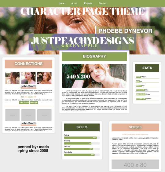
Green Apple Character Page Theme
[ preview ] + [ code ]
This is a Roleplay Character theme page.
The code is on payhip as a 'pay what you want' file. So it's completely free, but if you'd like to donate, it is much appreciated.
This is my first attempt at creating a page after copious amounts of css and html studying, but it's still not perfect, so I hope you find use of it regardless. It is commented in the code to hopefully help you navigate it easier.
Rules:
You are allowed to edit this code to your liking, but you're NOT allowed to redistribute this theme as your own, or in general. Do not remove the credit from the theme. You can move it around, but don't get rid of the link back to my page.
Features:
Header Image - 100% width x 400px height
Navigation Bar
Connections - 120x100 images
Bio - 540x200 image
Verses - 400x80 images
Stats
Skills
I created this code with 'root' styling, so much like main themes, the color customizing can be done at the beginning of the code where you see 'root'. There are elements in the code that are given those colors, so if you change one of the hex codes, it'll change other colors in the theme itself. If you have any questions, feel free to message me.
*whispers* the psd used on the images is this one*
#rph#themehunter#rp theme#character theme page#jpdpage#jpdtheme#jpdre#i'm sorry it's not super responsive in terms of screen resolutions#but this is my first theme ok? I'M JUST A BABY
61 notes
·
View notes
Text
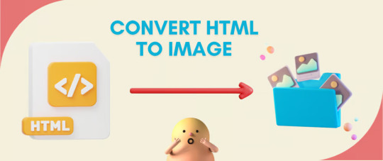
Convert HTML to Image: A Step-by-Step Guide ✨
Do you want to turn some HTML code you've made that's on your website and have a way to convert it into an image for you to save?
Well, look no further! I too wanted to do the same thing but funny enough, there weren't any straightforward tutorials out there that could show you how! After hours of searching, I finally discovered the solution~!
This is an old tutorial I made 🐼

💛 Set your environment
Before we dive into the conversion process, I'll assume you already have your HTML code ready. What you want to learn is how to turn it into an image file. You should have a good grasp of HTML and JavaScript. For this tutorial, we'll use the following HTML code example:
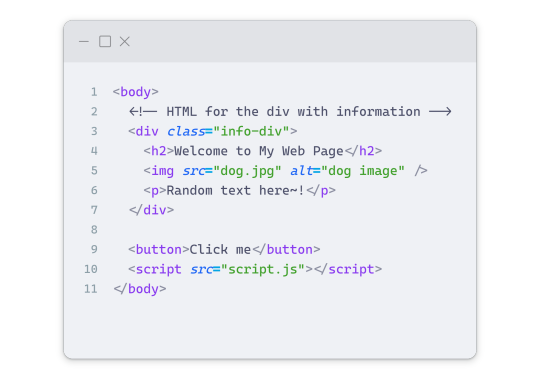
We won't include the CSS code, as it doesn't affect this tutorial. The JavaScript file (script.js) at the bottom of the body element is where we'll add the functionality for the conversion.
Your page should resemble the following:
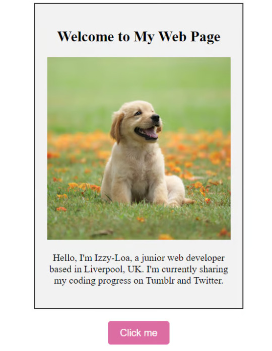
As you can see, the "Click me" button will handle the conversion. We aim to convert everything within the div.info-div into an image.
💛 Using the html2canvas JavaScript Library
The html2canvas library allows you to take screenshots of webpages and target specific elements on a screen. Here are the steps to include the library in your project:
The steps to put the library in your project:
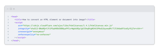
Visit the html2canvas website for more information.
Copy the CDN link from here

and include it in a script tag in your project's head tag in the HTML file:
That's it for including the library on the HTML side. Now, let's move on to the JavaScript code.
💛 JavaScript Functionality
Here's the JavaScript code to handle the conversion:
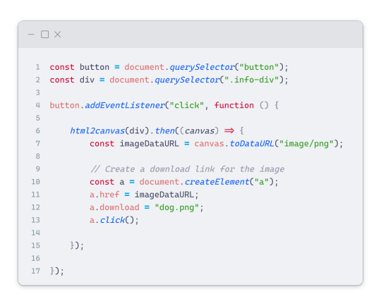
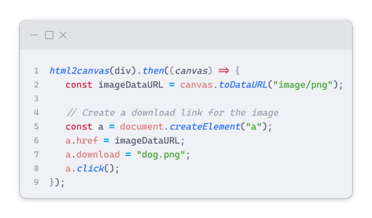
In this code, I want to turn the whole div.info-div into an image, I put it into a variable in const div = document.querySelector(".info-div");.
I also put the button into a variable in const button = document.querySelector("button");
I added a click event listener to the button so when the user clicks the button, it will follow the code inside of the event listener!
You can find similar code like this in the documentation of the html2canvas library:
What is happening here is:
We add the div (or what the element we want to take an image of) into the html2canvas([element]).then((canvas)
Added the image file type url to a variable = const imageDataURL = canvas.toDataURL("image/png"); - You can replace the png to other image file types such as jpg, jpeg etc
Created an anchor/link tag, added the href attribute to imageDataURL
The download attribute is where we will give the default name to the image file, I added "dog.png"
Perform the click() function to the anchor tag so it starts to download the image we created
And that's it!
💛 The End
And that's it! You've successfully learned how to turn your HTML into an image. It's a great way to save and share your web content in a unique format.

If you have any questions or need further clarification, please comfortable to ask. Enjoy converting your HTML into images! 💖🐼
#my resources#coding#codeblr#programming#progblr#studying#studyblr#programmer#html#html css#javascript#neocities#coding tips#html5 tutorial#html tutorial
155 notes
·
View notes
Text
HELLO
I'M BACK
So much has happened this summer (I finished grad school! I moved halfway across the country!) and I'm trying to get back into a routine that involves having a life again: reading books, watching movies, playing video games, and, of course, drawing and painting again.
I am currently revamping my website. For many years, my website was solely a professional portfolio and shop. White background, simple links, zero personality. Purely a hub to point to my social medias, where all the fun stuff was. I hated going to my own website because it was boring and uninspiring.
Last year, I made a neocities account and learned HTML/CSS for fun. I became obsessed after realizing how much more exciting it is to NOT have a bland, minimalist, corporate-esque website. I love exploring everyone's fun neocities sites, which are nostalgic and truly personalized. It made me hate my old website even more. Then I had a big brain moment: incorporate the fun elements of my neocities site into my website. LOOK AT IT NOW. There is COLOR. Silly fonts. There is a pixelated space background. Tiny gifs sprinkled about!
I will be actually be maintaining my website's blog. That's where the main, long-form content of all my art-making will live. Social media will just get snippets of that content. I do think there is a way to connect Tumblr to my blog so that whatever I post there will be posted here, too, but I haven't tried it yet.
Anyway, Hello Hello Hello Tumblr!
57 notes
·
View notes
Text
i should be doing things i don’t want to do so of course my brain is stuck thinking about all the silly fics i have not had time to write (there are many serious fics in progress that i also do not have time to write but this post is about the silly ones)
i want a coffee shop/flower shop cazador/astarion au that is pure fluff. crack taken seriously situation where cazador is a little unnerving but he’s just a socially awkward, depressed, probably neurodivergent guy. astarion’s a little rude about it and fantasizes about what if he’s a serial killer and whatnot but no. they get together and it’s fine. the sex has elements of light bdsm and it’s fine. caz saves astarion’s business from bankruptcy. astarion moves cities a few years later, and they separate and drift apart. the end. i don’t know what the audience for this fic would be, i am just interested in waging psychological warfare against the reader.
i also want to write a fic about how cazador overturns vellioth as a modern au told through caz’s reddit account. honestly i started writing this one and realized there’s no existing ao3 workskin for what i’m looking for and the prospect of doing the css is daunting. all i have rn is a post in r/breakingbad asking if the chemically-caused murders in the show are accurate and a post in r/reddit complaining about the new ui because caz strikes me as the type of person to take the transition from old reddit to new reddit badly
13 notes
·
View notes
Text
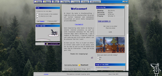
website update log #24 (April 13th, 2025)
I FINISHED RECREATING THE WEBSITE !!!

the look is more or less the same, with subtle differences and the removal of the image carousel (for now) BUT EVERYTHING IN THE HTML AND CSS FILE HAS BEEN CHANGED!!
i made a system for me to edit and add panels really easily, where i used classes for the panel design and reusable elements (ie “long-box” for really long elements like the github chart, and “three-boxes” for three panels in one row), and IDS for specific non-reusable elements like the navbar and the comment section.
now that editing the website became more flexible (compared to the previous version atleast), i FINALLY CREATED A GOOD LOOKING MOBILE VERSION OF MY WEBSITE WITH BOTTOM NAVBARS AND STUFF

i had a hard time making the previous version compatible to mobile, so it just doesnt look that great…

and besides the one before this, which looks really decent and actually mobile optimized,

it just gets worse and worse…


when i created these websites i never had “making it look great for mobile” in my mind at ALL..but when i found out how important it is for people to have a good-ish mobile experience, i gave it a try lol
ANYWAY!! NOW THAT THATS OUT OF THE WAY, LET ME SHOW YOU THE CHANGES IVE MADE TO THIS SITE YAYY!!!
- replaced the twitter feed panel to an “88x31 buttons ive made” panel

i made a whytee.xyz 88x31 button A YEAR AND A HALF AFTER I REDESIGNED MY WEBSITE

moved the under construction disclaimer from an overlay to its own panel

modified the "made by sushiwt" box by adding "built with firefox/chrome and vscode" and a "- 2025" beside the year

and i FINALLY made the artwork section for my website..
now all that's left is the section about myself, and this website is BASICALLY FINISHED!!!!
developing this website was so fun, and until i get the urge to remake it again, it will look like this for a while…
thank you for reading these logs btw :> i really really really appreciate you coming along for the ride (and by “the ride” i mean the creation of this)
- sushiwt <3
10 notes
·
View notes
Text

Day 2 - 100 Days CSS Challenge
Welcome to day 2 of 100 days of css challenge, where we will be together getting a given image result into reality by code.
We already know the drill since we did the first challenge, now let's get right into the different steps:
First step : Screenshot the image and get its color palette

No crazy color palette here, we only have two colors
White
This shade of green: #3FAF82
To make things more organized and get used to coding in an organized way, even if not doing it here wouldn't make any difference because we only have two colors, in more complex projects we would have a lot, we will define our colors at the beginning of our CSS code (well, only the green in this case):
:root { --main-green: #3FAF82; }
And this is how we'll use it whenever we want:
color: var(--main-green);
Second step : Identify the image elements
What elements do I have?
Three lines: line1, line 2, and line 3. I'll add them to my HTML starter template, again I'll leave the frame and center there:
<div class="frame"> <div class="center"> <div class="line-1 line"></div> <div class="line-2 line"></div> <div class="line-3 line"></div> </div> </div>
Third step : Bring them to life with CSS
Applying the background color
Only one line should be changed in the CSS code already added to .frame class:
background: var(--main-green);
So this is what we have going on for now :

Creating the lines
Now let's create our lines; if you noticed I gave each one two classes line-number and then line. I'll use the line class to give them all the common properties they have such as the color, height, width, position, border-radius, and shadow. And then I'll use the line-number to move them wherever I want using the left, top, right, bottom properties of an absolutely positioned element in CSS.
Let's start by creating all of them:
.line { left: -45px; position: absolute; height: 9px; width: 100px; background: white; border-radius: 10px; box-shadow: 2px 2px 5px rgba(0, 0, 0, 0.2); }
And just like this you'll see this in the browser:

You only see one line because the three are overlapping each other, and that's why we'll move each one of them exactly where we want using this:
.line-3 { top: 22px; } .line-1 { top: -22px; }
Now our static menu is ready:

Creating and analyzing the animations
As of observing, we can see that:
Line one goes down to line 2
Line three goes up to line 2
THEN line 2 disappears
THEN lines 1 and rotate to create the X
line-one-goes-down animation
This is my line-one code in the static version:
.line-1 { top: -22px; }
What I'm trying to do here is simply a movement translated by changing top from -22px to it becoming 0px:
@keyframes line-one-goes-down { 0% { top: -22px; } 100% { top: 0px; } }
line-three-goes-up animation
Again, I'm trying to go from top being 22px to it being 0px:
@keyframes line-three-goes-up { 0% { top: 22px; } 100% { top: 0px; } }
line-two-disappear animation
Making disappear simply means turning its opacity and width to 0:
@keyframes line-two-disappear { 0% { opacity: 1; width: 100px; } 100% { opacity: 0; width: 0px; } }
I'm gonna apply these animations and see what happens , before I create the rotation animations
.center.active .line-1 { animation: line-one-goes-down 0.5s forwards; } .center.active .line-2 { animation: line-two-disappear 0.5s forwards; } .center.active .line-3 { animation: line-three-goes-up 0.5s forwards; }
forwards means that the element will stay in the final state after the animation and not return to its original state.
This is what applying those three animations looks like:
Last but not least : let's Create the X
We only have to animations left for this: rotate-line-1 and rotate-line-2. Let's create them:
@keyframes rotate-line-1 { 0% { transform: rotate(0deg); } 100% { transform: rotate(45deg); } } @keyframes rotate-line-2 { 0% { transform: rotate(0deg); } 100% { transform: rotate(-45deg); } }
And that is my friends how we finished this challenge!
Happy coding, and see you tomorrow for Day 3!
#100dayscssChallenge#codeblr#code#css#html#javascript#java development company#python#studyblr#progblr#programming#comp sci#web design#web developers#web development#website design#webdev#website#tech#html css#learn to code
18 notes
·
View notes
Text
Instead of doing a Six Sentence Sunday today, I think I'll do a short tutorial on copying over fanfic from FFnet to Ao3.
So you've got some old fics on FFnet and you'd like to back them up to Ao3, given the instability of FFnet. And for whatever reason you don't have the original files for the fics, or maybe you have edits to the FFnet versions that you don't want to lose that the OG files don't have. Whatever the reason, you're looking to directly copy over your fic from FFnet to Ao3. And you're looking for a relatively easy way to do so, but Ao3's import functionality doesn't work with FFnet web pages.
Never fear! It's actually a fairly easy process to get your fic copied over from FFnet.
First, head over to FFnet and open up the fic you want to port over to Ao3. You don't need to log in if you don't want to, just so long as the fic in question is yours and you can access the page, then you're good.
In a separate tab, open Ao3 and login, then choose the option for posting a new work.
Now back on the FFnet tab, you should be able to directly copy over the title, summary, fandom, and what little tagging was available on that site onto the relevant Ao3 fields in the tab you have for a new fic. You'll also want to take note of the published date on FFnet and back date the new work in the Ao3 tab.

FFnet may not have a lot of useful tag data, but it's pretty easy to replicate and build off that in Ao3.
Now for the hard part. Which is still pretty easy. Getting the fic body, plus any notes in the fic itself, copied over to FFnet.
While getting around FFnet's lockdown on the text of the fics they host is fairly simple - I'm pretty sure it's entirely css based - you don't really need to do that in order to get the body of your fic copied. And, honestly, even if you do have a work around in place to allow copying of the fic's text... you will probably find the following method a lot easier still.
In the body of the fic, right click the first line of the fic, which should bring up a menu with a bunch of options. On Firefox or Chrome you want the inspect option.

This'll bring up the dev tools with the html inspection tab open and, if you give it a few seconds to load, the specific line you right clicked to inspect should become the visibly selected section of the html.
The selected section of the html should be a paragraph (or <p>) element. You're going to want to right click the div (<div>) element that encapsulates that paragraph and the rest of the paragraphs in the fic body. This'll bring up another browser menu with the option to copy, which will bring up a flyout menu when you select it. From that flyout menu, you want the select the option for Inner HTML.

You have officially copied the html for the fic body. And you can dump that entirely in html format straight into Ao3's html work text editor. Then switch it to rich text for easier editing if you want to fix any spelling, grammar, formatting, or aesthetic issues. I typically try to fix at least the line breaks since it took a long while before FFnet adopted real line breaks and so there are a lot of fics where I have various combinations of dashes, em-dashes, equals signs, and other characters as line breaks. I figure, if I'm bringing the fic to Ao3 then I can try to make it more screen reader friendly in the process.
You can also move fic notes around in order to move pre/post fic notes out of the fic body or basically whatever you want to the fic. Maybe re-read it to determine any additional tagging you want to add now that your fic has access to Ao3's much more robust tagging system.
But that's it. You can hit post and have your fic with all it's original notes, and a back dated post date to reflect when it was actually written, all available on Ao3 now.
It's a pretty quick process, all told, and the only real bottleneck you might encounter is any time spent in re-editing the fic between migrating and posting. Even chaptered fics are fairly easy to migrate with this process, since the bulk of the work in publishing a new chapter is just copying the inner html and then moving any notes to the appropriate location before hitting post.
Anyway, for my fellow fic writers looking to move your old FFnet fics to a more stable archive, I hope this process helps a lot.
#kitkatt0430 rambles#fanfiction archiving#migrating from fanfiction.net to ao3#ao3#ffnet#fanfiction.net#tutorial
13 notes
·
View notes
Text
I've seen some Reddit refugee PSAs going around, so I thought I'd contribute a few tips of my own that I haven't seen covered:
If you go to the original iteration of your post (not any subsequent reblogs, your ORIGINAL post) you can delete any comments you don't like. This does not apply to text added by reblog, only to the message bubble section.
Ublock Origin has trouble figuring out which parts of desktop to get rid of. If you want to delete a certain element (for example, the store widget), and your usual method isn't working, what you want to do is: - Right-click - Inspect Element/Inspect (Q) - Look at the thing that's highlighted, then go all the way up until you hit the nearest "div = class" marker - Right-click - Hover over "Copy," then pick "CSS Selector" - Click your Ublock extension icon - Click the gears - Find a blank space on the list that pops up and type "www.tumblr.com##" without the quotes - Paste whatever you copied with CSS Selector after that, with no space between it and the ## - Click "Apply changes"
You can hide your follower lists and liked lists. This is actively encouraged. Desktop solution: - Account (the person icon in the corner) - Scroll down until you find your blog name and click "Blog Settings" - Scroll through the page that pops up until you find "Share posts you like" and "Share the Tumblrs you're following" and toggle them off. This is the 3rd and 4th section of that page for me, respectively Mobile solution: - Your blog (the person icon in the bottom right corner) - Settings (gear in the top right corner) - Scroll down to "Pages" - Toggle "Likes" and "Following"
Desktop only: Left your Tumblr logged in on someone else's phone/computer? Worried about account security? No problem! - Account (the person icon in the corner) - Settings (NOT Blog Settings. Just Settings. It has a gear icon) - Scroll all the way to the bottom - You have a list of any logins that have happened on your account. They come with the IP addresses used to access it. It tells you where it happened, and from what operating system. Deleting those with the X next to the listing logs that iteration out. If you have any on that list that you DON'T recognize, I recommend logging them out and changing your password. Note: It says the list is only for the past 30 days. This is a lie. I have some that date back over a year.
Desktop only: You can make gradient text in your posts by following these instructions.
If your post has been blowing up and you're sick of the notifications, deleting the original post will delete its notes from your activity. THIS CANNOT BE UNDONE. If you would still like to check on the post, just not have it in your activity, reblog it before deleting it. You can continue to check the notes tab from the reblog while the original is gone.
It is common etiquette to tag spoilers for new games/shows/etc (ie, released in the last two months) as #[insert fandom here] spoilers, sensitive subjects as #[insert sensitive topic] tw, and long posts as #long post. Yes, even if you have a readmore (which you can add by clicking the weird squiggly line when you start a new block).
There is a bug on desktop involving readmore lines. Whenever you go back to edit a post that has a readmore in it, it moves the readmore down by one block. Make sure you move it back into its proper place each time by clicking and dragging.
You can click and drag different blocks of text to reorder them. Only regular blocks, though; not lists like this one. You can also do this with images you've inserted.
Desktop only: You can delete/remove tags/add tags en masse to posts using the Mass Post Editor. - Account (person icon in the corner) - Scroll down to your blog - Mass Post Editor - Select any posts in the grid you want. "Edit tags" is only for removing tags, you need "Add tags" to add more
Desktop only: You can see any blog's history of posts by typing in [blogname].tumblr.com/archive. The page that pops up looks very similar to the Mass Post Editor. You can filter posts on that blog by any of their most used tags, by month, or by post type. This is especially useful for locating pornbots. Some pornbots will try to legitimize their place by picking a random popular tag (for example, #horror) and reblogging the top 10-100 posts in that tag without commentary. See if they've been active for more than week with the archive month filter. Granted, the person may also be a new user, like yourself. It takes some deduction. But it's much easier to use the archive than it is to scroll through all of their posts until you hit the bottom.
Desktop only shortcuts: J = move down one post. Useful for scrolling fast or getting past a notoriously long post (as in "Do you like the color of the sky" and all its cousins) K = move up one post Shift + R = reblog a post. Does not add tags L = like a post C = create a new post (brings up options on what kind of post) . (period) = return to the top of the page Shift + Q = add a post to your queue. Does not add tags Shift + P = cycle through the color palette
116 notes
·
View notes
Text
You know what, I'll bother making this post. It's long overdue.
PSA: Please don't install uBlock Origin rules for Tumblr that use :nth-of-type(), and please remove or fix any you have installed. They can and will hide the wrong things. I'll show you a few alternatives below.
First, an example of how we get here. I've used the uBlock Origin element picker to try to hide the "Get a Domain" sidebar item:
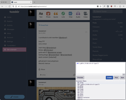
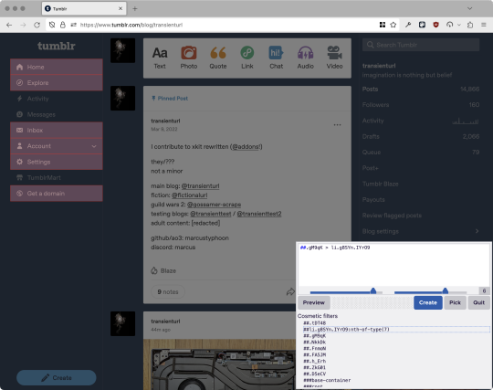
With some different adjustments of the sliders, it gave me these two snippets, one of which targeted a whole bunch of sidebar items, and the other of which selected the right one. Great, right? Read on.
www.tumblr.com##li.g8SYn.IYrO9:nth-of-type(7) www.tumblr.com##.gM9qK > li.g8SYn.IYrO9
As you can see, these both target a particular kind of sidebar item via "li.g8SYn.IYrO9"—fine—and as you can probably guess, the second one counts them all up and hides the seventh it finds.
This is bad, because what it actually hides depends on exactly how many sidebar items there are! Users can "snooze" Tumblr Live, which will make an item appear or disappear, and users with/without Ad-Free subscriptions will have or not have another. I have seen many, many people accidentally hide their activity, messages, inbox, etc using someone else's rule that's supposed to hide Live. Worse, some rules intended for e.g. recommended post carousels that use nth-of-type translate to something like "hide item number three on the dashboard no matter what it is," which will lead to a seemingly random post on your dashboard disappearing!
This isn't a problem specific to Tumblr, of course—I personally think uBlock Origin should never autogenerate these rules—but Tumblr has a ton of elements that aren't in fixed positions, so I feel comfortable wording that PSA the way I did. On a very static site, those rules might be fine. Here they almost always aren't.
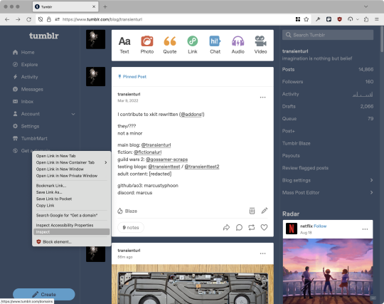
So how do we fix this? First of all, as a developer of XKit Rewritten (check out @addons!), I must suggest you check if it has a feature to do what you want. Plenty of times it won't, though, and if not, we want to make a rule that hides an element based on what it is, not where it is. Here are three ways to make a robust rule:
First, I'll right-click the element I want and use the inspect element tool in my browser's developer tools to look at the element I really want (Firefox and Chrome/Edge/Opera have different but overall similar interfaces for this):
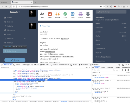
The HTML looks, for reference, like this (Tumblr sucks at code blocks but I'll try):
<li class="IYrO9 g8SYn" title="Get a domain"> <a class="tDT48" href="/domains"> <div class="kn4U3"> <svg> <use href="#managed-icon__earth"></use> </svg> </div> <div class="a132D"> <span class="ZC1wz">Get a domain</span> <!-- other unimportant stuff removed--> </div> </a> </li>
What's something unique about this element, preferably about the outermost element, and preferably contained within the <angle brackets> (HTML tags)? In this case, we have it easy: title="Get a domain" is definitely unambiguous and fulfills all of those three. If you're very familiar with web design using CSS, you'll know how to target that; if you've vaguely heard of CSS, you may be able to look at a reference sheet of CSS selectors, see [attribute=value], and figure it out, and if neither is true, I'll spoil it for you and say that we just put it in square brackets in this case.
So—taking the rule uBlock Origin made, removing the :nth-of-type() and replacing it with our better selector—here's our first working, bug-free uBlock Origin rule:
##li.g8SYn.IYrO9[title="Get a domain"]
Okay, great. But what if we didn't have that attribute to target? What if our top-level element looks the same as the other ones? What if we want this rule to work if we change our Tumblr language to Spanish? Let's move on to :has().
:has() is a CSS selector (supported in uBlock Origin even in browsers where you can't use it for web development yet, i.e. Firefox), that lets you check the contents of an element for whatever is in the parentheses. Let's assume that Tumblr would never make two sidebar items with the same icon, and target that href="#managed-icon__earth" property:
##li.g8SYn.IYrO9:has([href="#managed-icon__earth"])
Yep, that works too!
Finally, what if we couldn't use either of those because we need to target the content of the page that's not contained within the <angle brackets>? We can take a look at the uBlock Origin documentation and find that it has something for that too: :has-text(). You can do very powerful things with this (e.g. you can sort of implement Blacklist entirely using uBlock Origin using something like article:has-text), but it doesn't perform well and can pretty easily be used incorrectly, so I'd suggest you avoid it when possible.
However, let's try using it here to target the "Get a domain" label text:
##li.g8SYn.IYrO9:has-text(Get a domain)
And that also works!
With these techniques, you should be able to target any specific thing you'd want to hide without using any fragile positional selectors. If you're going to share your uBlock Origin rules with others, please make use of this! If you're just using your rules for yourself, then hopefully I've given you enough information so that you can understand what a rule does and decide for yourself if it's worth bothering to fix (menu item order might not change that often, so maybe you're fine with certain rules being a bit prone to breakage; if your rule hides the first post in your timeline you really do need to fix that one!)
-
And, of course, a note for you web developers out there: :has() isn't natively supported in Firefox quite yet, so you can't really use it (I would not recommend using JQuery's simulated version—it's not quite the same). And :has-text() is just not a thing for CSS at all. Just use javascript at that point! Edit: No longer true in 2024; style away!
Final note: any rule with a random 5-character string like g8SYn will eventually break when Tumblr rebuilds its CSS map, though they haven't done that in ages. But when they do: no, it's not "Tumblr devs breaking our rules because they hate us." (Yes, I hear that sentiment a lot in contexts when it almost always makes zero sense.) If you're fairly experienced with CSS you can sometimes make Stylus/uBlock Origin rules that don't reference any, but it's usually convoluted and more trouble than it's worth.
80 notes
·
View notes
Text
Things I've learned about AO3 styling recently
It's rather difficult to work around the existing default styling of things like <p> and <h#>s. Better to use <div>s to circumvent that entirely.
If you use <p> and <div> elements in the same block, the <div> will inherit the <p> because AO3 puts freakin <p>s on EVERYTHING
^^ you don't need to add extra padding or margin on stuff a lot because of the existing margins on <p>s which, as we have noted, go on everything thanks to AO3's parser. Just keep it in mind.
ID css selectors don't work. Use classes instead.
AO3 doesn't really style lists or tables, so you can use those selectors without working around anything
Selectors like :nth-child still work though!!
Just keep your nesting organized and save your work somewhere where the tab stops and formatting makes sense, because AO3's html editor likes to move stuff around and it's hard to find after the fact. Keep a copy for editing.
40 notes
·
View notes
Text
CSS OC Backstories

I'm going to be concentrating on other stuff and putting these girls on the back burner for a bit, but before I do, I might as well post their backstories here as well!
These are taken directly from my notes, so writing wise these aren't the best, but I hope you enjoy it nonetheless <3
Their introduction post
Content and trigger warnings I guess: death, child death (kinda, it gets reversed almost immediately) brief implication of violence, mention of declining mental health??

Mara Dorsey:
Mara was a result of a fling, so her father didn't really stick around. Her mother cut contact with her own family and moved away after Mara was born.
She grew up having a natural fascination with all things creepy. Her mother adored her quirky habits. They had a very good and loving relationship. She even gave Mara an old family heirloom, a necklace with a green stone. Mara was told that it used to belong to a wicked witch. Mara's mother passed away when she was 7 years old, with her mother's family heirloom starting to glow for the first time at her funeral.
There weren't any relatives who could take her in, so she grew up in foster care. The years were tough on her, and Mara didn't have any of her magical abilities yet, so she developed other more violent means to defend herself and others. She has a very intimidating appearance but is still a good person. Mara would often defend and fight for the kids who couldn't do so themselves.
Her anger came out in other ways as well. She had a habit of sneaking to a wrecking yard to hit things with a baseball bat.
Mara had a near death experience in the said wrecking yard, which led her to meet Amari for the first time. She was very frightened when she first saw Amari, the wicked witch from her mother's stories. The old sounding English that she spoke in didn't help much either. After a while of talking, she found out that Amari was actually her ancestor. She offered her a deal. Amari would teach how to unlock her full potential, and Mara would take her as a "passenger" in her head so that she could see more than just her limbo realm. Mara was granted the ability to come back from the dead. She dies, but only temporarily. The second Mara dies, her body starts to heal itself. The more severe the damage, the longer it takes.
After meeting Amari in limbo, Mara started to see her everywhere, but only by her, no one else knows she's there. She also can possess Mara whenever she pleases.
Kibosh was able to sense something off about her and contacted her personally about joining Scare School.
Briar Lovell
Briars family has a generational curse that causes monstrous transformations for those affected. It skips generations, and it's triggered differently depending on the individual. Unfortunately, there hadn't been a case in years, causing Briars parents to be none the wiser.
Briar had a normal life before her puberty hit at around 12 years old. It was filled with your average staples of childhood, with some eerie elements in the mix. Briar has had very good senses since birth and was good in sports. Brair was also fascinated by the paranormal and loved telling scary stories during her sleepovers. But, as stated before, the changes in her body brought about a staggering transformation, heavily linked to her emotions. She was very scared and stressed out during the early days but tried to live a normal life in spite of it, hiding the change from everyone. Being the excitable girl she is, this eventually led to disaster when her emotions spilled over. The following terror and panic didn't help either. She even harmed one of her friends by accident. Her parents only discovered the truth after Briar showed up in her backyard in complete hysterics. Her other claw had blood on it.
In an attempt to protect Briar, her parents hid her away by moving to a more secluded location and forbid her from interacting with others. They also made sure that the area had a lot of wildlife, so that if anyone would see Briar by accident, they would just assume it's a bear or something similar. Briar continued to bottle up her emotions in an attempt to protect those around her. She didn't want a repeat of the previous situation. This took a huge toll on her mental health, but luckily, she had a supportive family that helped her through all of it. Briar also threw herself in her hobbies and studies, which were now done through homeschooling. Things like photography, scrapbooking, and boy bands kept her afloat during this time.
With the support of her family, she got better over time, but true salvation came when a mysterious letter came from somewhere called "Scare School."

Amari Adesanya
Amari's story has been mostly lost to history, only really living on in myths and ghost stories. She was born into a large family in the 1600s, being the oldest daughter. The village she grew up in was your average small religious community with very little room for individuality. Around 15 years of age, she was accused of witchcraft and was "mercifully" banished into the wilderness. Amari was rescued by an older woman in the forest who turned out to be a witch and took Amari under her wing. They lived in peace within the woods, Amari learning witchcraft along the way.
Everything went wrong after the woman was discovered by the villagers and killed on the spot.
This sent Amari over the edge, and she went on a rampage. She laid waste to any settlement she came across, eventually ending up in her original village. During all of this, Amari imagined the spirit of her teacher echoing in her ears, urging her to continue. Amari held seige to the settlement for an entire week before she was killed in action. In her final breath, she cursed all of mankind for their cruelty.
One of her younger siblings took her necklace off of her body, not knowing that it now included her spirit.
Centuries went by as Amari waited in limbo. Her violent and vengeful death caused her spirit to become stuck. With countless days in her hands, she was able to shape the realm in her image and practice her magic freely. All of the waiting eventually got tiring, so she was very interested when Mara showed up in her realm, becoming practically thrilled after finding out that she was her descendant. Amari offered a deal to Mara so that she could control her newfound powers better and allow Amari access to the outside world for the first time in hundreds of years.
There are a lot of new interesting things for a 1600s woman to observe in the modern day, but one thing is still the same. Her hatered for humankind. She had very little patience for any person that Mara talked to, especially if anyone was even slightly rude.
Amari doesn't admit her involvement in Mara being contacted by Gibosh to join Scare School, but it's more than likely that she did something. She had seen how tough life in the human realm was, so giving Mara a chance to escape from it would be more than expected for Amari.
#casper's scare school#caspers scare school#casper scare school#oc#original character#oc lore#oc backstory#witch oc#shapeshifter oc#ghost oc#oc: amari#oc: briar#oc: mara#writing
6 notes
·
View notes
Text
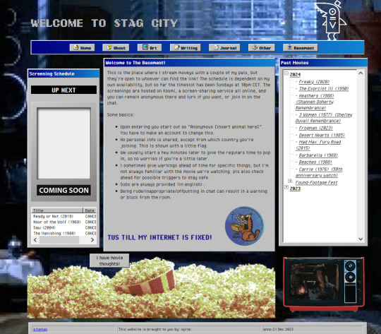
STAGCITIES UPDATE!!!
Very excited for this one: I re-did a lot of the css on my website! It's responsive, better sectioned, and just looks prettier imo.
Here's a quick tour.
Zoomed-out to 70% to fit, but the home page! left is old, middle is new, right is a mobile device impression.
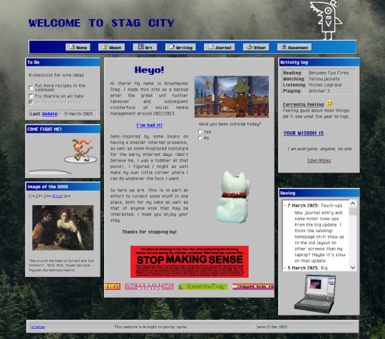
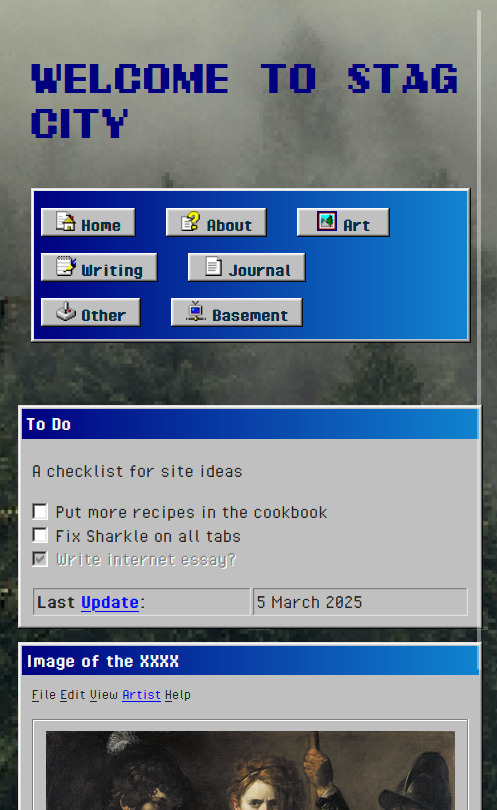
The header and footer are the same on every page. Sharkle is now at the top and works everywhere! I took some bits from the main section of the old homepage and moved them to the sidebars. On the whole, I think it looks a bit more organized.
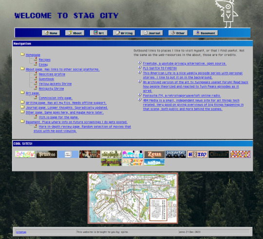
sitemap is basically the same, but now has a fun map of the manhattan subway there.
the about is also basically the same. it's the same length everywhere, and opening up tabs within this page stretches them out all the way to the bottom if needed.
same goes for art and writing!
journal got some overhaul! as you may see (this is 70% again) elements don't start floating away from the center when screensize changes. kitty is still grumpy tho

other page now has the zine and some preview images!

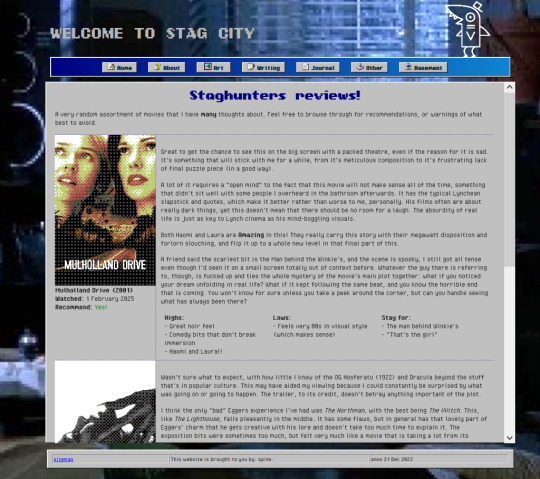
basement looks WAY nicer, and now has a good popcorn link to the reviews page
Very proud of managing this, but I still gotta fix some more of the old pages before I get to making new stuff. TLDR: gridbox my bestie <3
#stagcities#neocities#wasn't too big of a challenge to overhaul#just the usual keep track of closing tags on things
5 notes
·
View notes
Text
Yet Another Anchor Positioning Quirk
New Post has been published on https://thedigitalinsider.com/yet-another-anchor-positioning-quirk/
Yet Another Anchor Positioning Quirk
I strongly believe Anchor Positioning will go down as one of the greatest additions to CSS. It may not be as game-changing as Flexbox or Grid, but it does fill a positioning gap that has been missing for decades. As awesome as I think it is, CSS Anchor Positioning has a lot of quirks, some of which are the product of its novelty and others due to its unique way of working. Today, I want to bring you yet another Anchor Positioning quirk that has bugged me since I first saw it.
The inception
It all started a month ago when I was reading about what other people have made using Anchor Positioning, specifically this post by Temani Afif about “Anchor Positioning & Scroll-Driven Animations.” I strongly encourage you to read it and find out what caught my eye there. Combining Anchor Positioning and Scroll-Driven Animation, he makes a range slider that changes colors while it progresses.
Amazing by itself, but it’s interesting that he is using two target elements with the same anchor name, each attached to its corresponding anchor, just like magic. If this doesn’t seem as interesting as it looks, we should then briefly recap how Anchor Positioning works.
CSS Anchor Positioning and the anchor-scope property
See our complete CSS Anchor Positioning Guide for a comprehensive deep dive.
Anchor Positioning brings two new concepts to CSS, an anchor element and a target element. The anchor is the element used as a reference for positioning other elements, hence the anchor name. While the target is an absolutely-positioned element placed relative to one or more anchors.
An anchor and a target can be almost every element, so you can think of them as just two div sitting next to each other:
<div class="anchor">anchor</div> <div class="target">target</div>
To start, we first have to register the anchor element in CSS using the anchor-name property:
.anchor anchor-name: --my-anchor;
And the position-anchor property on an absolutely-positioned element attaches it to an anchor of the same name. However, to move the target around the anchor we need the position-area property.
.target position: absolute; position-anchor: --my-anchor; position-area: top right;
This works great, but things get complicated if we change our markup to include more anchors and targets:
<ul> <li> <div class="anchor">anchor 1</div> <div class="target">target 1</div> </li> <li> <div class="anchor">anchor 2</div> <div class="target">target 2</div> </li> <li> <div class="anchor">anchor 3</div> <div class="target">target 3</div> </li> </ul>
Instead of each target attaching to its closest anchor, they all pile up at the last registered anchor in the DOM.
The anchor-scope property was introduced in Chrome 131 as an answer to this issue. It limits the scope of anchors to a subtree so that each target attaches correctly. However, I don’t want to focus on this property, because what initially caught my attention was that Temani didn’t use it. For some reason, they all attached correctly, again, like magic.
What’s happening?
Targets usually attach to the last anchor on the DOM instead of their closest anchor, but in our first example, we saw two anchors with the same anchor-name and their corresponding targets attached. All this without the anchor-scope property. What’s happening?
Two words: Containing Block.
Something to know about Anchor Positioning is that it relies a lot on how an element’s containing block is built. This isn’t something inherently from Anchor Positioning but from absolute positioning. Absolute elements are positioned relative to their containing block, and inset properties like top: 0px, left: 30px or inset: 1rem are just moving an element around its containing block boundaries, creating what’s called the inset-modified containing block.
A target attached to an anchor isn’t any different, and what the position-area property does under the table is change the target’s inset-modified containing block so it is right next to the anchor.
Usually, the containing block of an absolutely-positioned element is the whole viewport, but it can be changed by any ancestor with a position other than static (usually relative). Temani takes advantage of this fact and creates a new containing block for each slider, so they can only be attached to their corresponding anchors. If you snoop around the code, you can find it at the beginning:
label position: relative; /* No, It's not useless so don't remove it (or remove it and see what happens) */
If we use this tactic on our previous examples, suddenly they are all correctly attached!
Yet another quirk
We didn’t need to use the anchor-scope property to attach each anchor to its respective target, but instead took advantage of how the containing block of absolute elements is computed. However, there is yet another approach, one that doesn’t need any extra bits of code.
This occurred to me when I was also experimenting with Scroll-Driven Animations and Anchor Positioning and trying to attach text-bubble footnotes on the side of a post, like the following:
Logically, each footnote would be a target, but the choice of an anchor is a little more tricky. I initially thought that each paragraph would work as an anchor, but that would mean having more than one anchor with the same anchor-name. The result: all the targets would pile up at the last anchor:
This could be solved using our prior approach of creating a new containing block for each note. However, there is another route we can take, what I call the reductionist method. The problem comes when there is more than one anchor with the same anchor-name, so we will reduce the number of anchors to one, using an element that could work as the common anchor for all targets.
In this case, we just want to position each target on the sides of the post so we can use the entire body of the post as an anchor, and since each target is naturally aligned on the vertical axis, what’s left is to move them along the horizontal axis:
You can better check how it was done on the original post!
Conclusion
The anchor-scope may be the most recent CSS property to be shipped to a browser (so far, just in Chrome 131+), so we can’t expect its support to be something out of this world. And while I would love to use it every now and there, it will remain bound to short demos for a while. This isn’t a reason to limit the use of other Anchor Positioning properties, which are supported in Chrome 125 onwards (and let’s hope in other browsers in the near future), so I hope these little quirks can help you to keep using Anchor Positioning without any fear.
#amazing#amp#anchor positioning#animation#animations#approach#Articles#attention#browser#change#chrome#code#colors#comprehensive#CSS#eye#fear#focus#Future#game#gap#grid#how#inset#it#Method#One#Other#positioning#Read
3 notes
·
View notes
Text
An Update LONG Overdue
Heyo!
As I anticipated, things have been progressing a bit more slowly than over the summer. This is because of college classes starting up, and getting into some of the more complicated elements of coding this project. But, that doesn't mean I haven't made some REALLY good progress the past month or so! Can somebody say "Almost functional battle system?"
Apologies for the lack of frequent updates, as well! I was hoping to have more to show by now, honestly, but the damn battle system has been a real major pain in the ass to get right. I wanna make this fangame as good as it can be.
Wait... did I just say "Fangame...?"
Fangame?
Sooooooo... about the whole "Interactive webcomic" thing... I've been craftily obscuring the truth from you all for the past 2-3 months. I made the switch to coding an actual full-on game of Versotale in Gamemaker. And not a single person realized!
...Huh? What do you mean, "Everyone figured it out?"
Anyway, I know the switch sounds daunting. And I didn't wanna reveal this change until I was confident it was a better alternative than html and javascript and all that website crap. But the funny thing is... I got more work done in one month of game coding than I did an entire year on the website. It's almost like Gamemaker was built to make games, huh? I genuinely think that, had I continued trying to finagle javascript and css and html and all that, I'd still be just trying to figure out how to get Asriel to move on a screen. So... yeah, I think this was the right decision.
I don't think I'll entirely scrap the website, primarily because I want to make that the hub for all VT content.
I'll update you guys soon next time I have some significant non-spoiler progress to show off. In the meantime, have this!
See you all next time!
28 notes
·
View notes